CLIENT / Aix Box, Culture & Sport Services in Aix-en-Provence, France
Project Overview
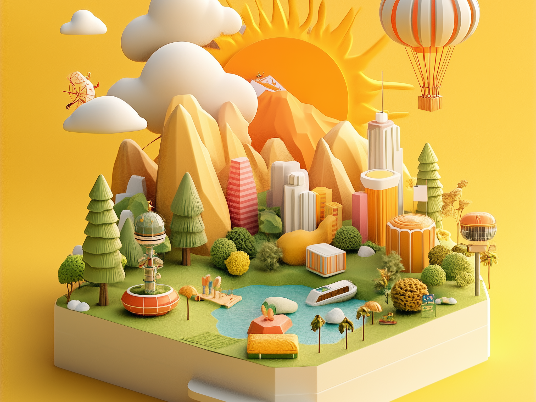
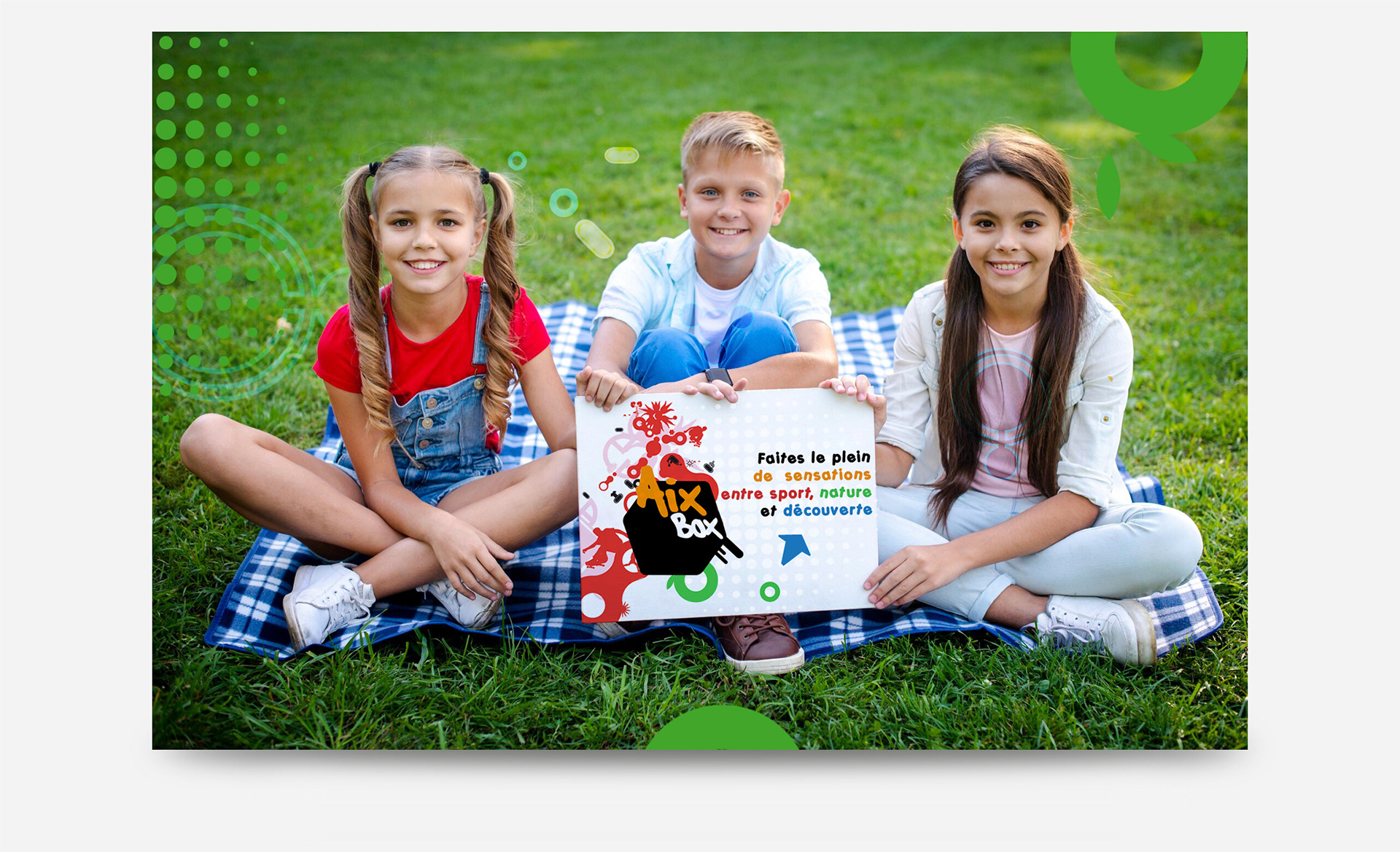
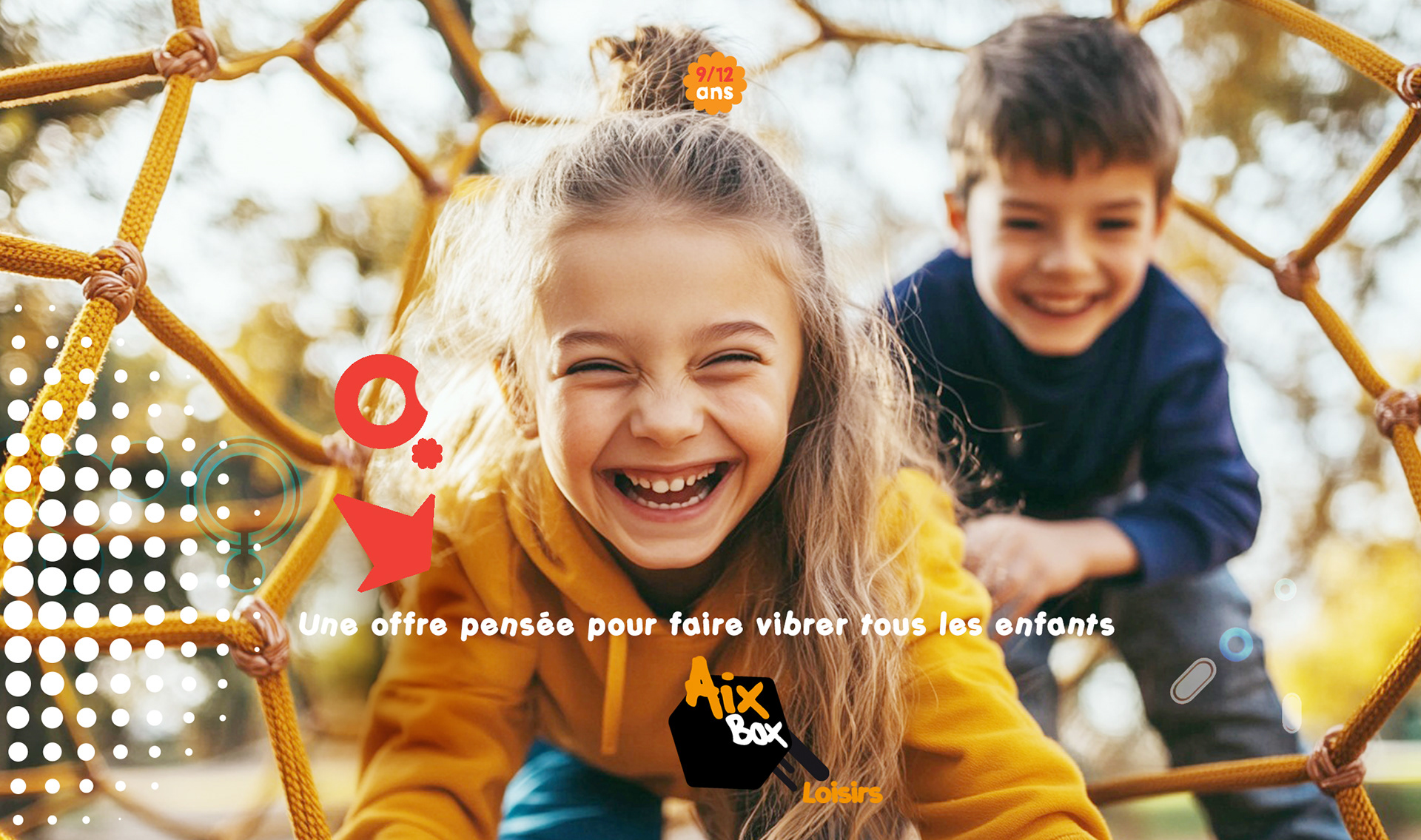
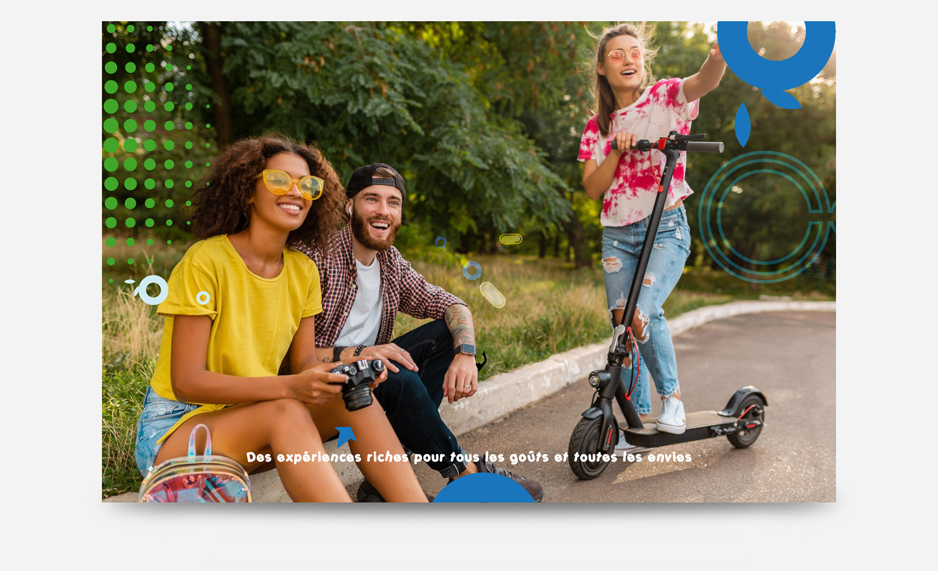
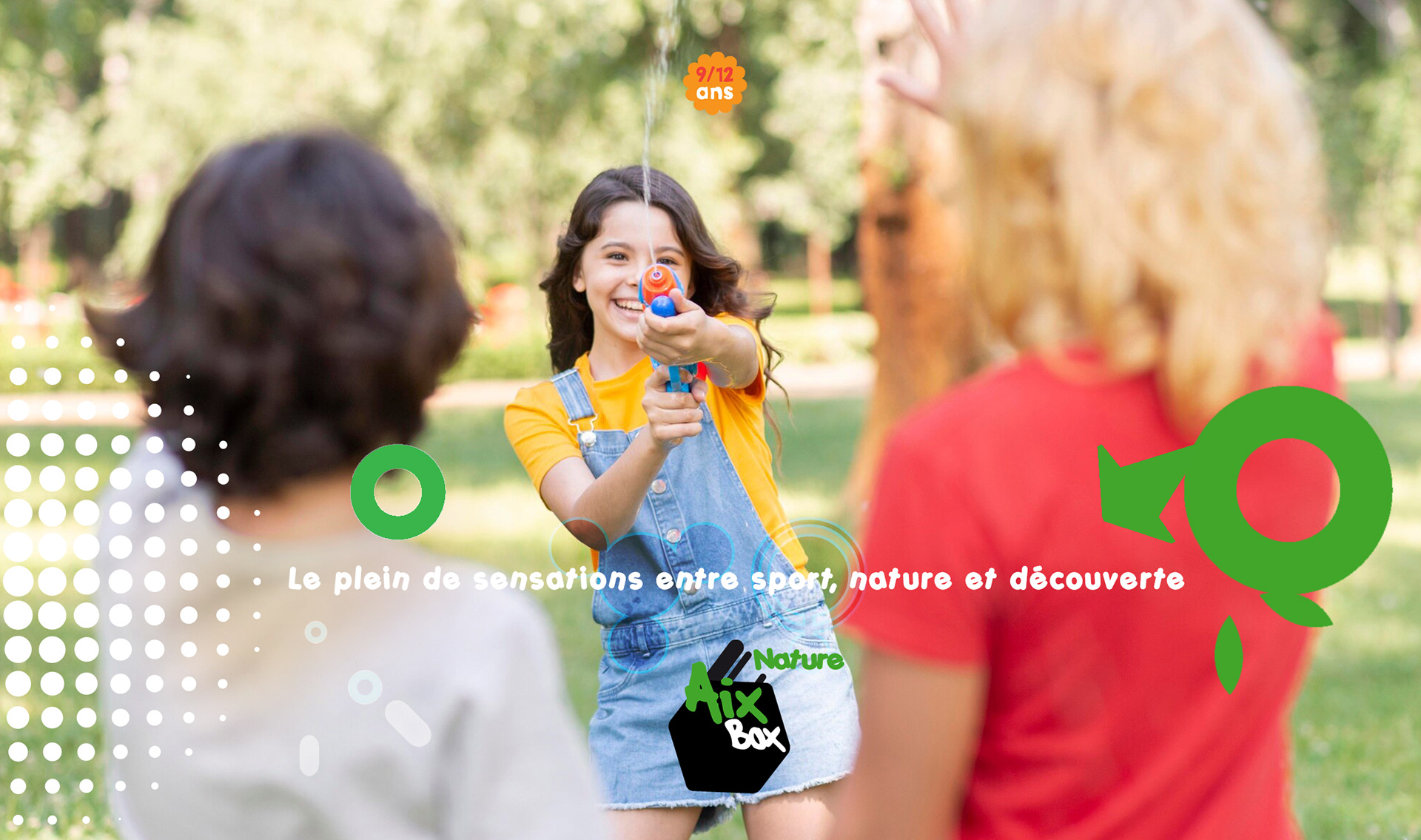
The City of Aix-en-Provence launched "Aix Box," a summer program offering youth activities in sports, arts, and culture.
Designed to engage ages 6-18, it fosters creativity, teamwork, and community through workshops, games, and educational experiences.
Local venues and professionals ensure a rich, dynamic experience for all participants.
Designed to engage ages 6-18, it fosters creativity, teamwork, and community through workshops, games, and educational experiences.
Local venues and professionals ensure a rich, dynamic experience for all participants.
Approach & Solution
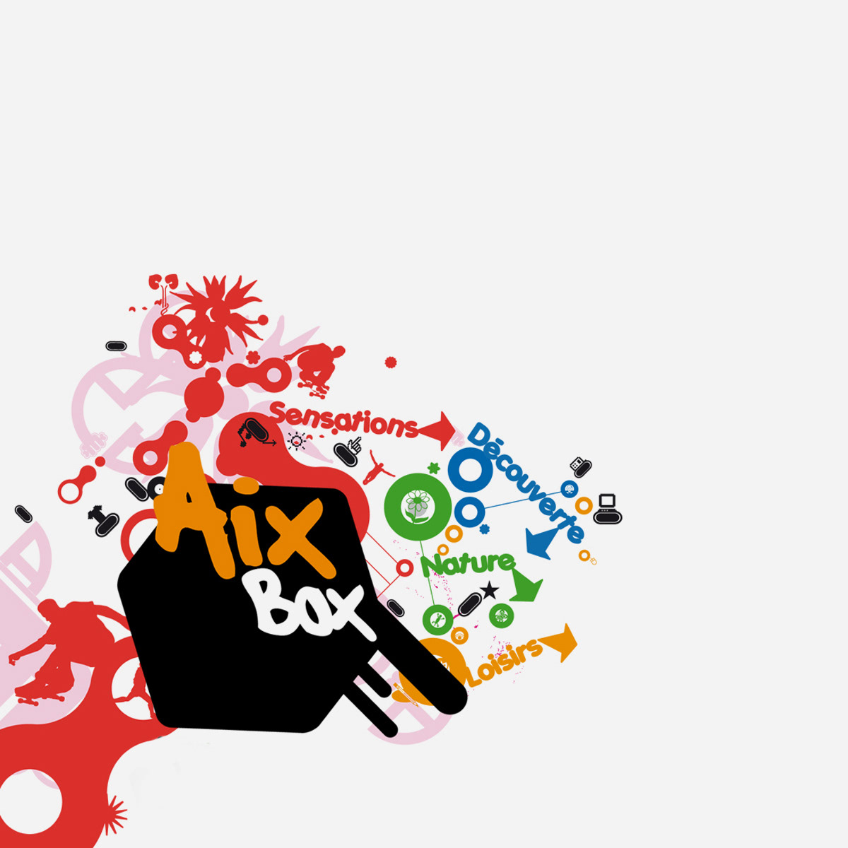
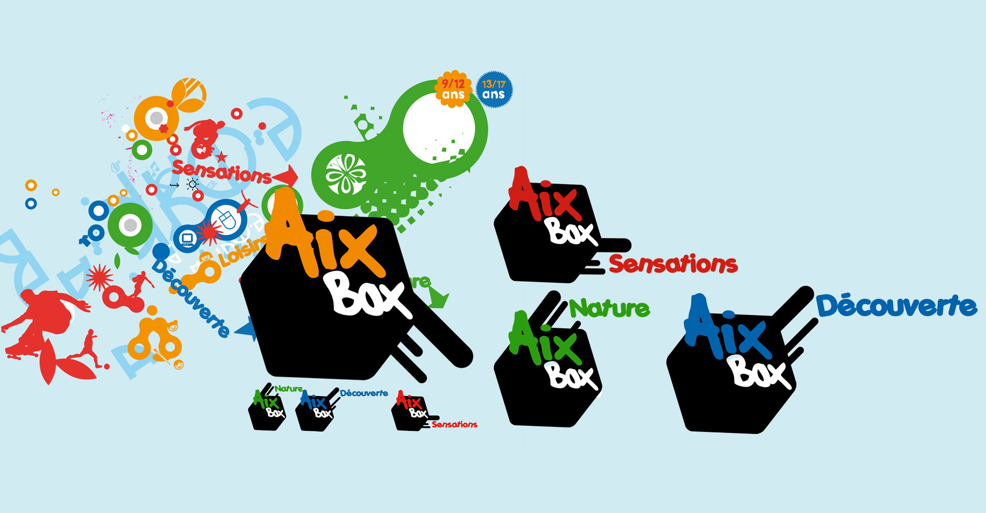
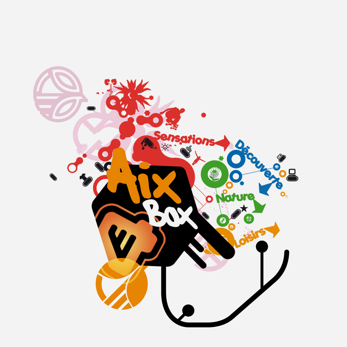
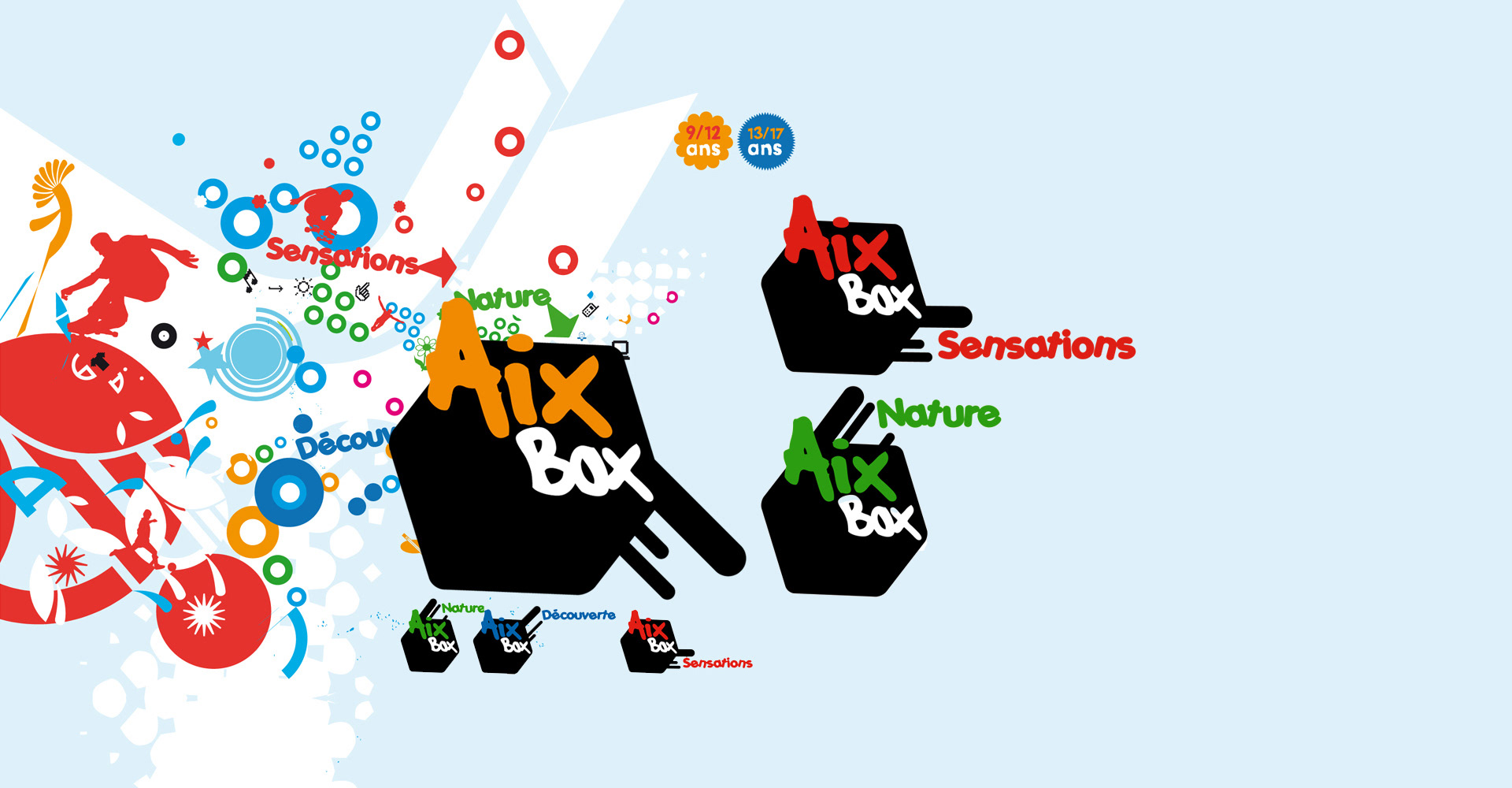
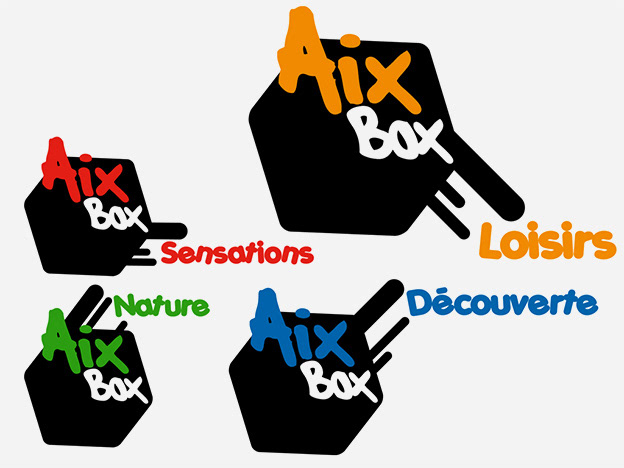
The AixBox identity was designed to be dynamic, playful, and structured, reflecting the diversity of activities offered.
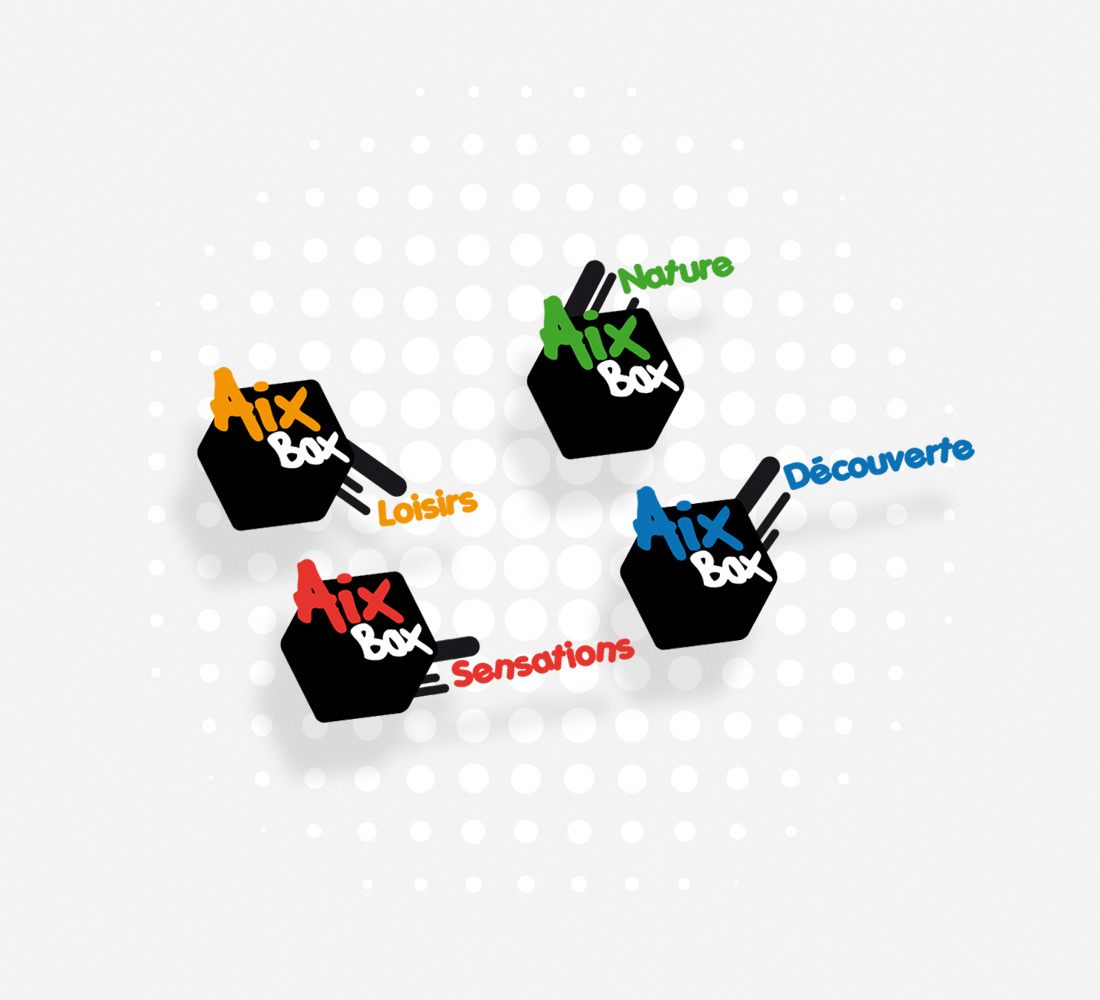
- The hexagonal logo system organizes the program into four themes—Leisure, Nature, Sensations,
and Discovery—each distinguished by a bold color.
- The handwritten typography adds an approachable, youthful touch, while the structured black boxes
provide cohesion.
- The dotted background reinforces movement and energy, ensuring a vibrant and
engaging visual identity adaptable across all communication materials.

LOGO DESIGN: A SMART & SUPPORTIVE IDENTITY
Color Palette: Bright, playful colors (orange, green, blue, red) to represent different activity themes.
Typography: Bold, handwritten-style font for a fun, dynamic feel.
Graphic Elements: Hexagonal black boxes with extending lines, symbolizing connection
and expansion.
Imagery: Exploding graphics and icons represent diverse activities, with organic shapes
and arrows guiding exploration.
Typography: Bold, handwritten-style font for a fun, dynamic feel.
Graphic Elements: Hexagonal black boxes with extending lines, symbolizing connection
and expansion.
Imagery: Exploding graphics and icons represent diverse activities, with organic shapes
and arrows guiding exploration.

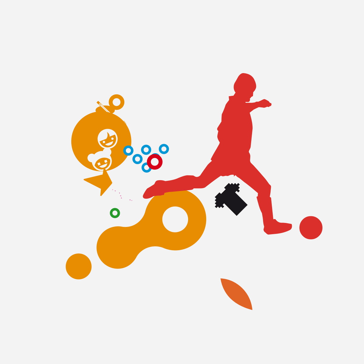
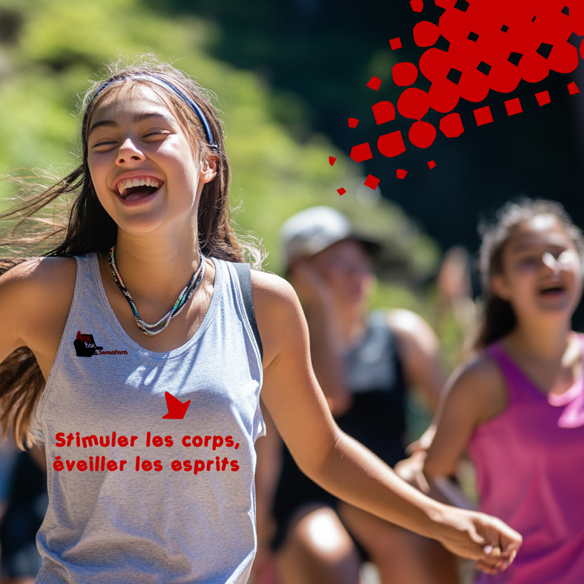
Concept Breakdown 2: Active kids, active design
For AIXBOX, I created a vibrant and playful visual system that channels the spontaneous energy of youth culture and sports.
The concept uses bold, hand-drawn shapes and splashy graphic elements to evoke movement, creativity,
and fun.
For AIXBOX, I created a vibrant and playful visual system that channels the spontaneous energy of youth culture and sports.
The concept uses bold, hand-drawn shapes and splashy graphic elements to evoke movement, creativity,
and fun.


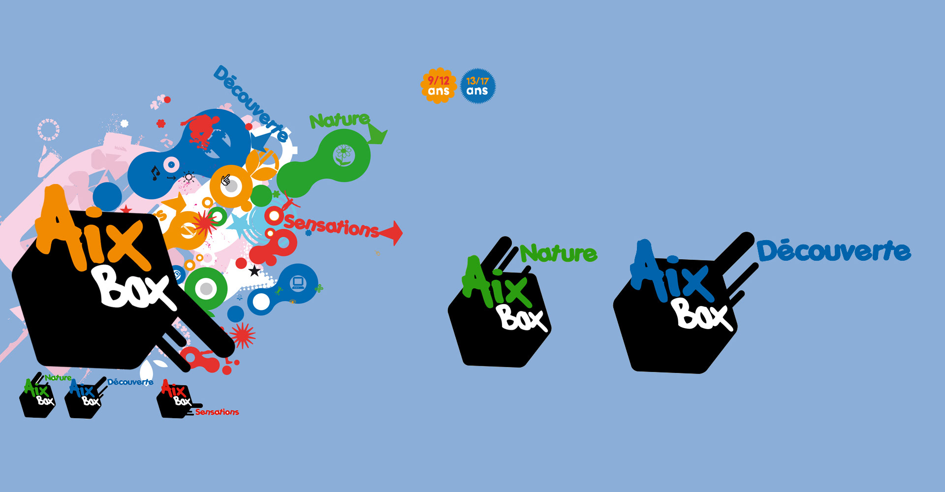
A lively, multi-color palette helps distinguish age groups and activities, while dynamic icons and layered illustrations reinforce a sense of action and discovery.


The logotype uses bold shapes, arrows, and playful splashes, echoing children's lively spirit in action.
The result is a visual language that feels energetic, welcoming, and instantly engaging for children and parents.
The result is a visual language that feels energetic, welcoming, and instantly engaging for children and parents.


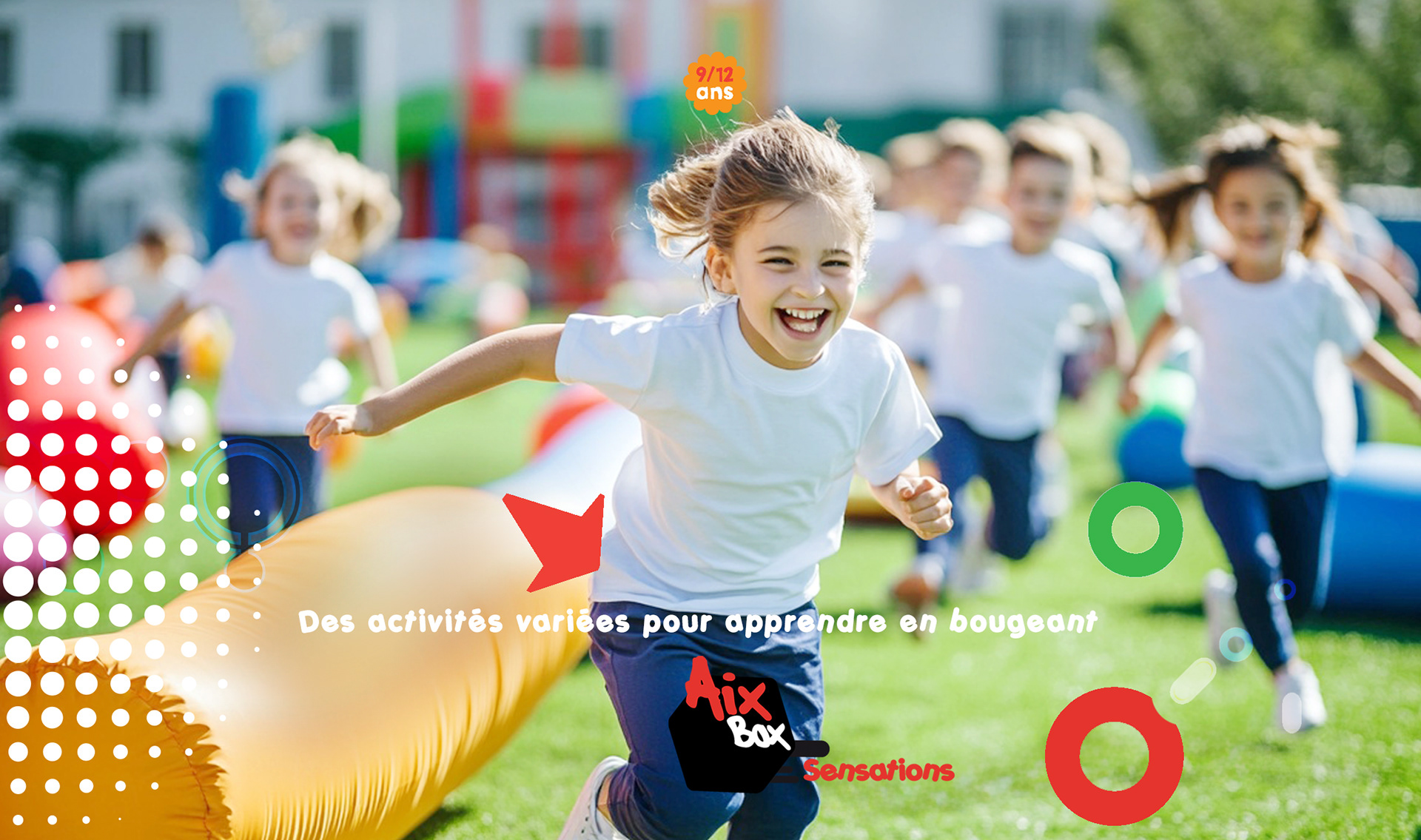
This visual system uses color-coded tags and bold, angular logomarks to create a playful sense
of direction and activity.
The icons for each theme are paired with their unique palette, making navigation effortless and fun.
of direction and activity.
The icons for each theme are paired with their unique palette, making navigation effortless and fun.


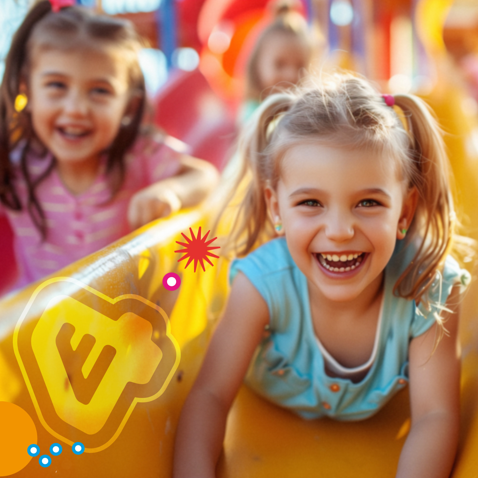
The dotted bursts and color rays radiate from the kids, expressing joy, movement, and the “spread” of positive energy through group play.
These graphic accents feel like sound waves or comic book action lines, amplifying the feeling of excitement
and shared experience.
These graphic accents feel like sound waves or comic book action lines, amplifying the feeling of excitement
and shared experience.

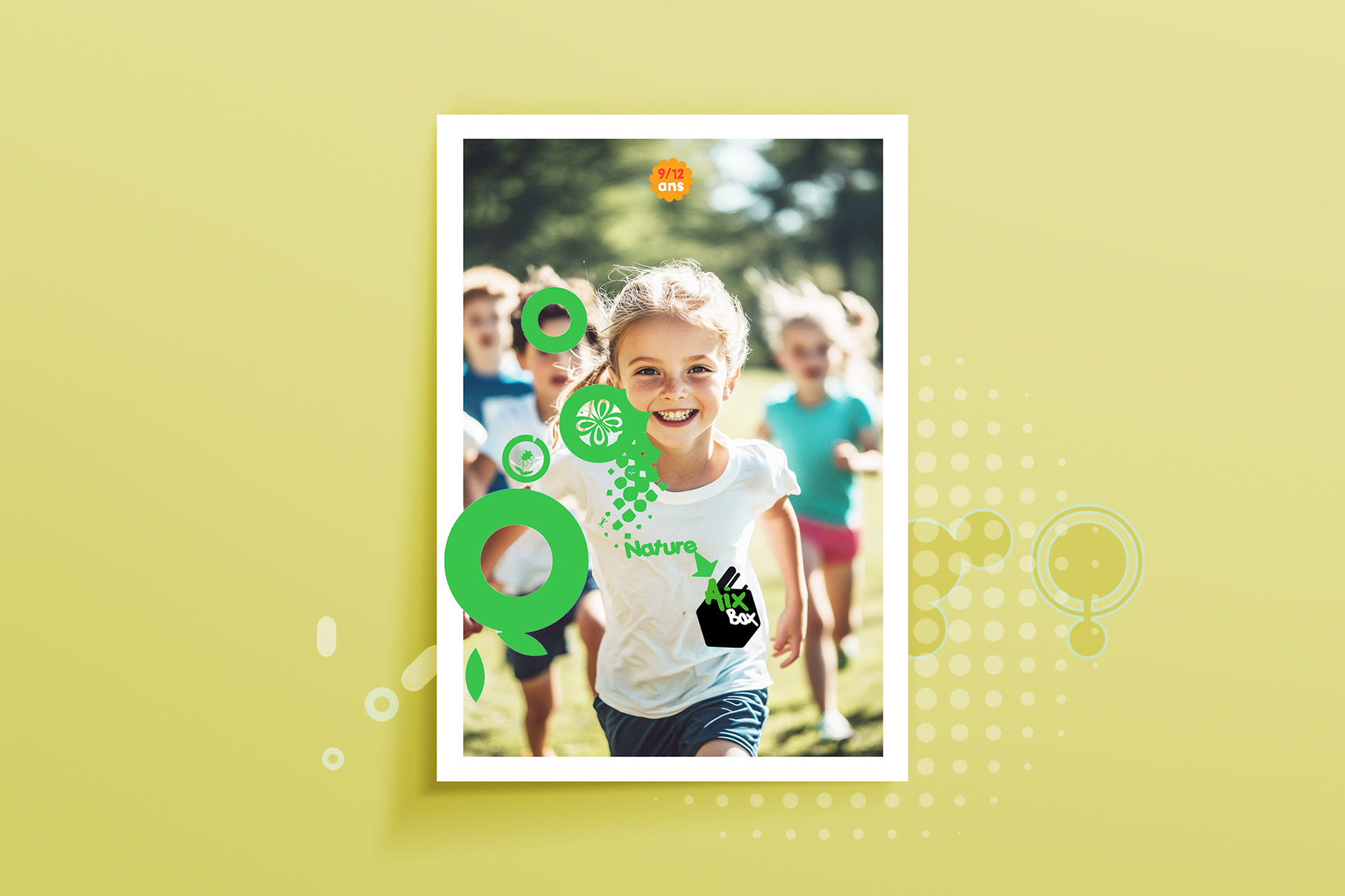
ICONOGRAPHY: VIBRANT TAGS OF ADVENTURE
Each AixBox icon uses a bold, hand-drawn style to channel the playful, energetic spirit of the brand.
The black hexagon is a strong anchor for the “AixBox” wordmark, while each subcategory is brought to life
with its vibrant color and handwritten lettering.
The words extend outward from the tag-like icon, evoking dynamic movement and a sense of activity.
This playful, modular approach makes each sub-logo feel distinctive and connected to the whole system.

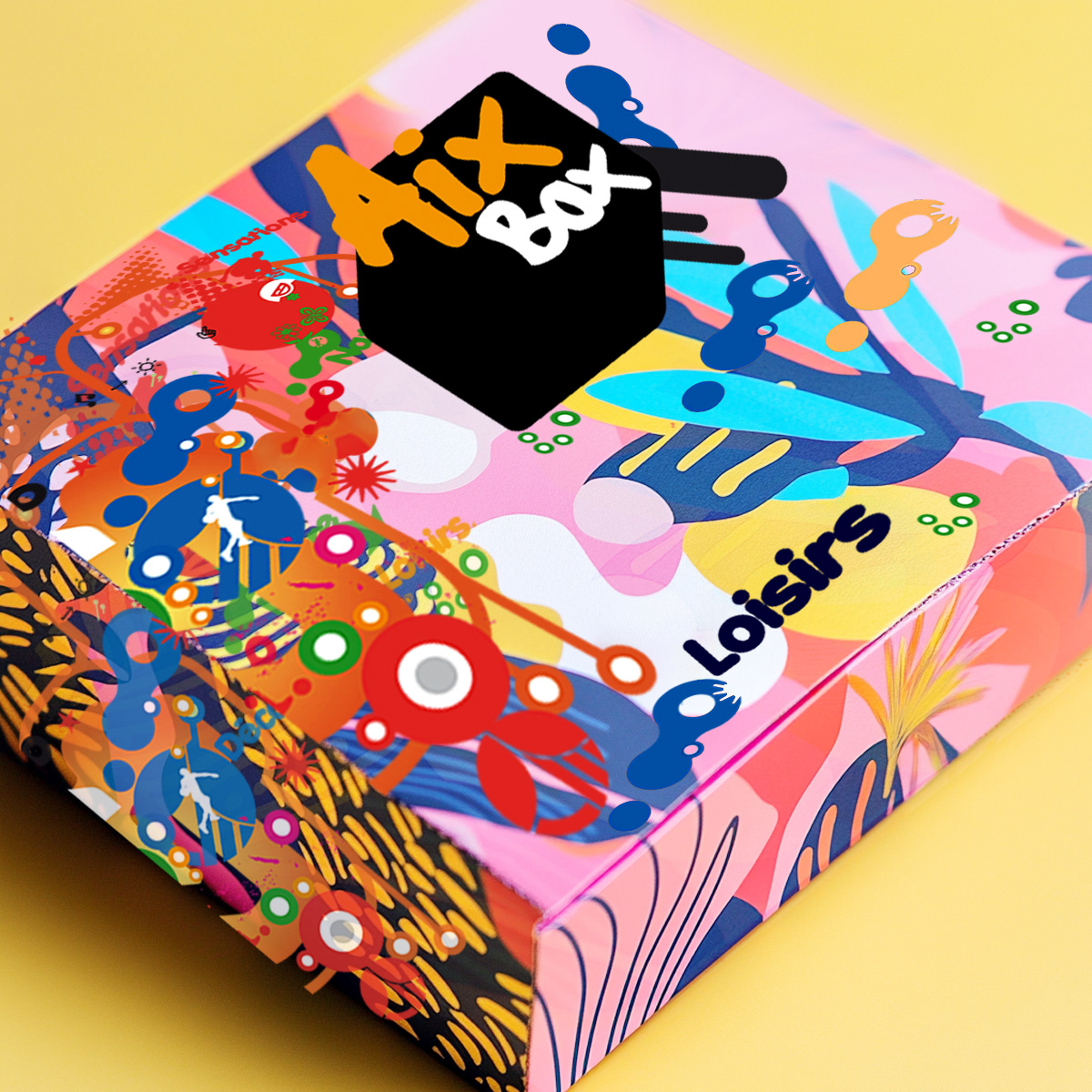
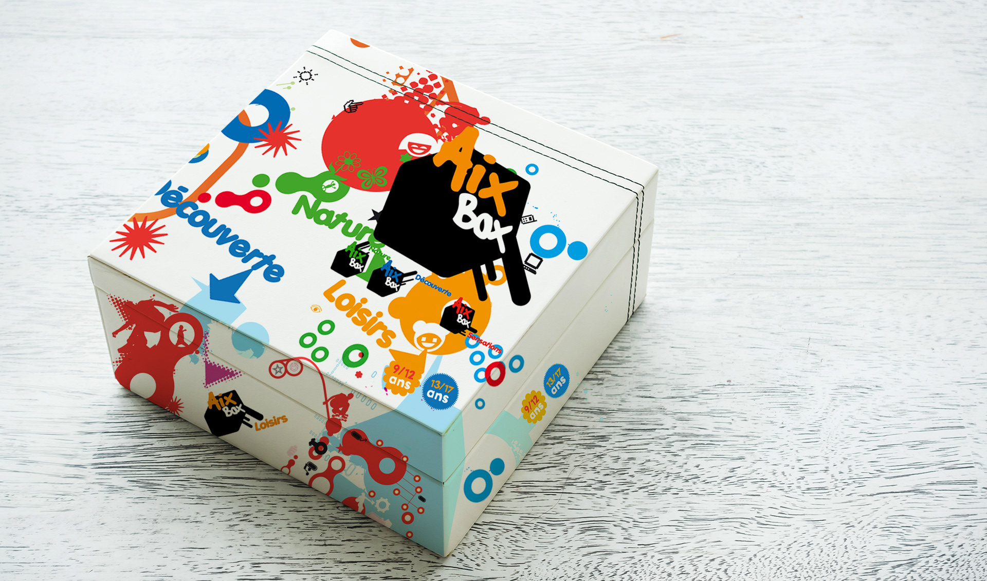
Concept Breakdown 2: AIx box play boxes
The AixBox packaging design explodes with playful energy and creativity, bold colors, scattered shapes, and lively icons to reflect the diversity of activities.
The boxes are covered in expressive graphics—splashes, arrows, and character silhouettes—that immediately communicate a sense of movement and fun.
Each theme is color-coded and labeled, making it easy for kids and parents to identify at a glance.
The boxes are covered in expressive graphics—splashes, arrows, and character silhouettes—that immediately communicate a sense of movement and fun.
Each theme is color-coded and labeled, making it easy for kids and parents to identify at a glance.
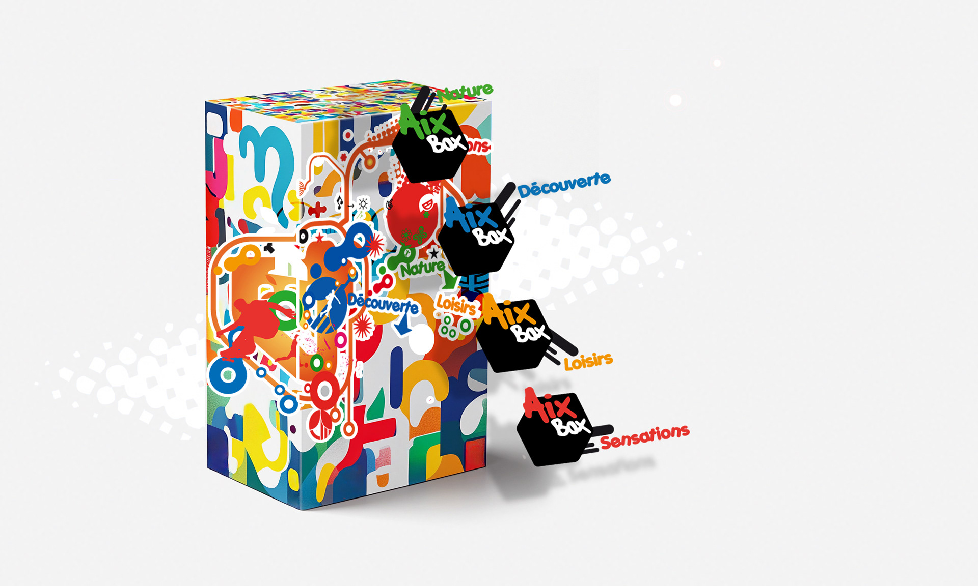
The visual chaos is intentional: it mirrors youth activities' messy, interactive world, inviting children
to dive right in.
The black AixBox “tag” anchors each design, giving it a strong brand presence while letting the playful elements shine.
The packaging extends the experience, making it dynamic, inclusive, and bursting with curiosity.
to dive right in.
The black AixBox “tag” anchors each design, giving it a strong brand presence while letting the playful elements shine.
The packaging extends the experience, making it dynamic, inclusive, and bursting with curiosity.