CLIENT▸ Dr Hersha, Expert Clinical Psychologist, NY, USA
ROLE ▸ Art Director Freelance (Trovit Group, NYC)
SCOPE ▸ Logo Design, Visual Identity, Website, Digital Design
ROLE ▸ Art Director Freelance (Trovit Group, NYC)
SCOPE ▸ Logo Design, Visual Identity, Website, Digital Design
The Challenge
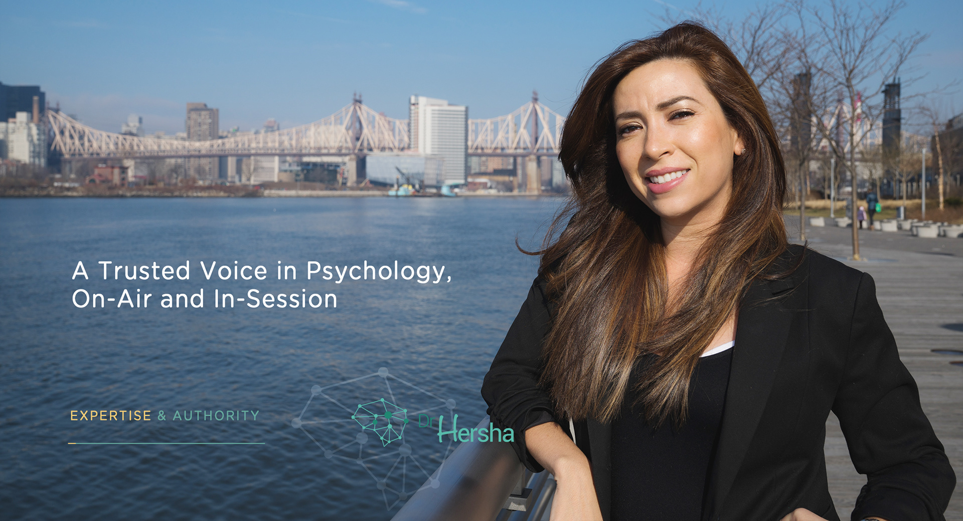
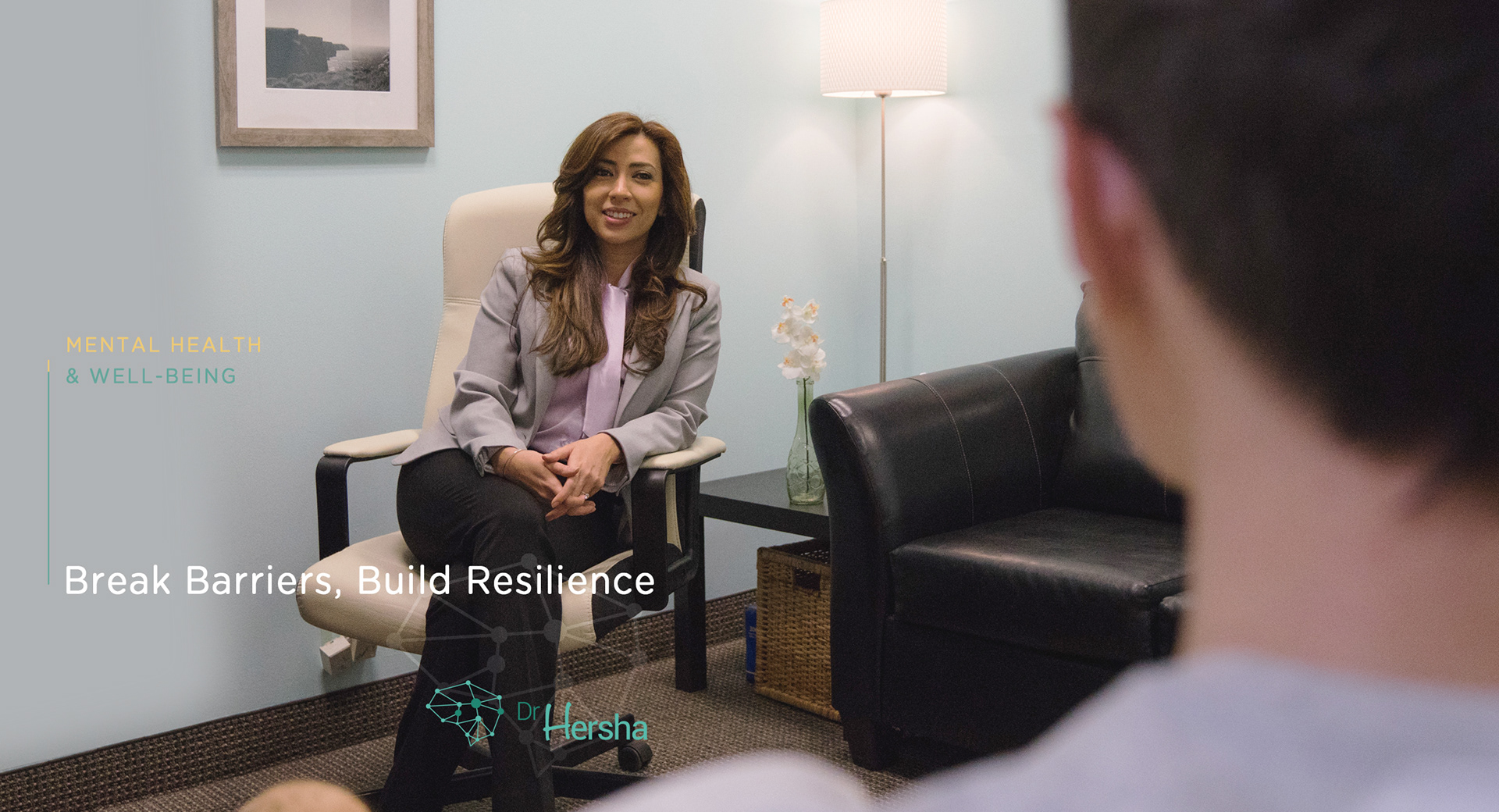
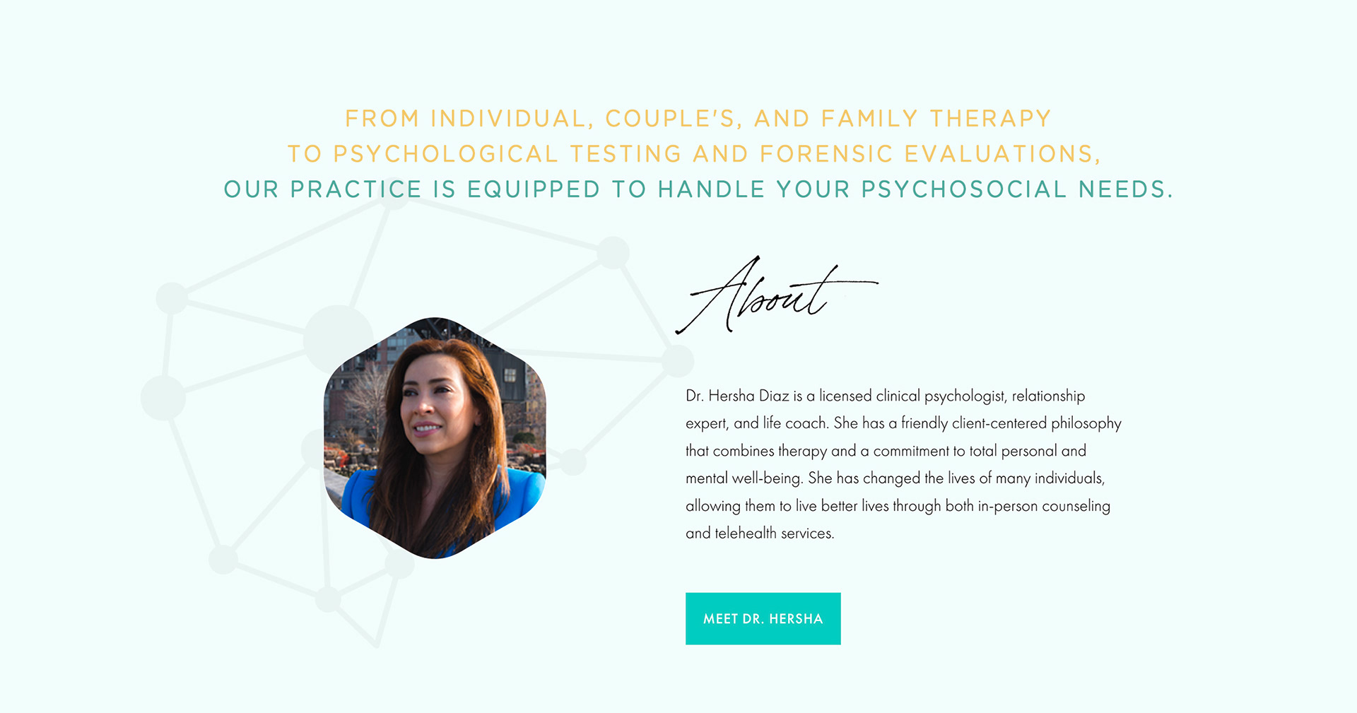
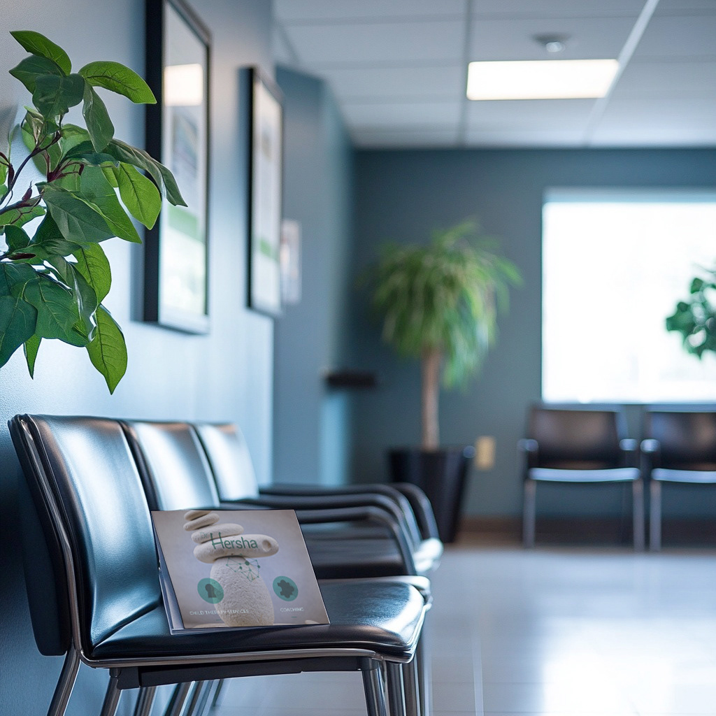
Create a visual identity for a therapy practice that feels trustworthy, calm, and contemporary
Balance professionalism with warmth, avoiding overly clinical or overly “wellness cliché” design
Build a system that supports both patient comfort and long-term practice growth
Create a visual identity for a therapy practice that feels trustworthy, calm, and contemporary
Balance professionalism with warmth, avoiding overly clinical or overly “wellness cliché” design
Build a system that supports both patient comfort and long-term practice growth
Strategic Approach
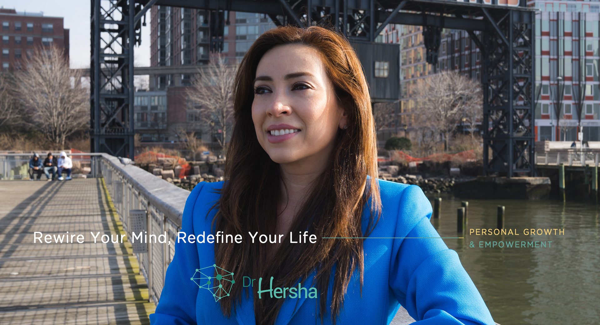
Position the practice around safety, clarity, and human connection
Use typography, spacing, and color to create emotional calm and ease of navigation
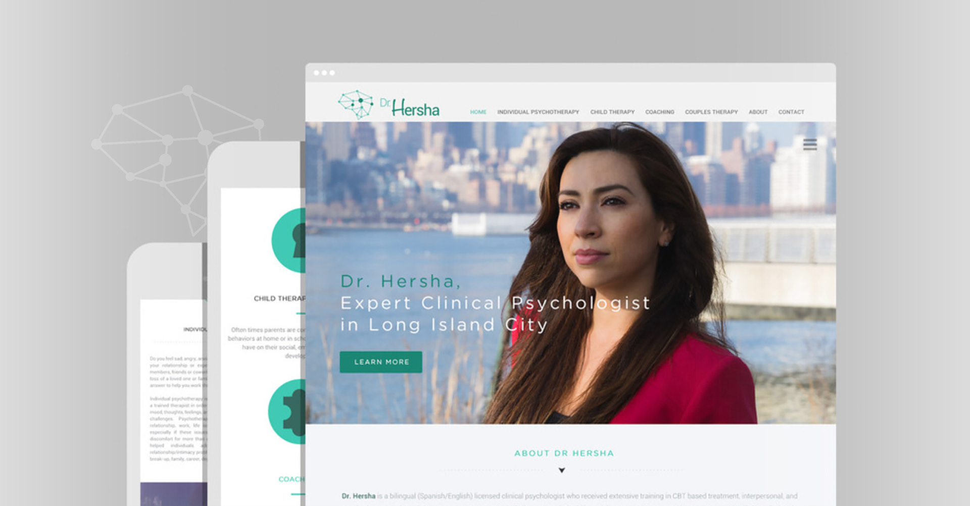
Design a scalable identity that works across web, print, intake materials, and communications
Position the practice around safety, clarity, and human connection
Use typography, spacing, and color to create emotional calm and ease of navigation
Design a scalable identity that works across web, print, intake materials, and communications
Creative Solution
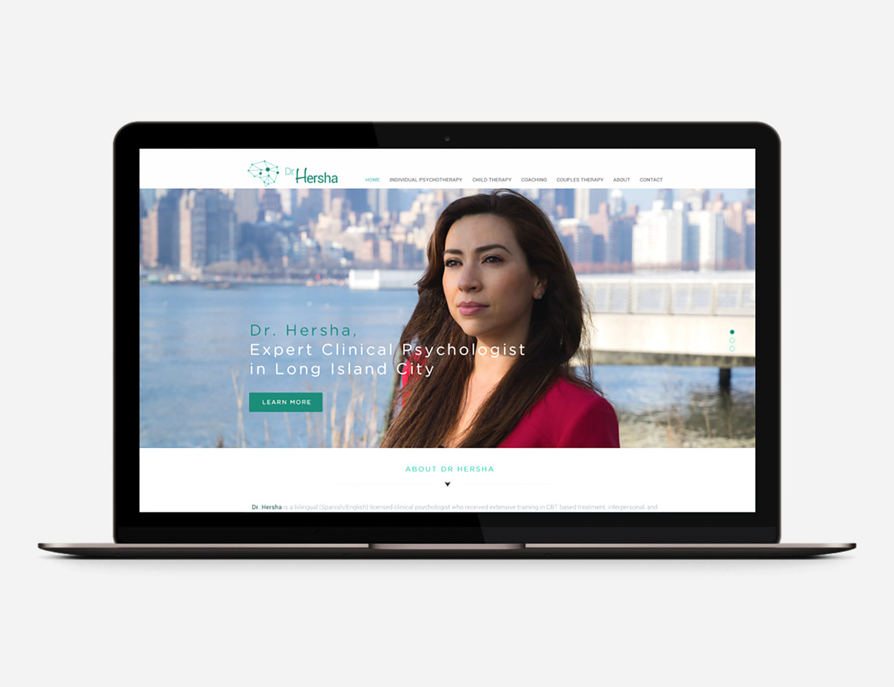
A refined, minimal identity built to feel grounded and reassuring
A visual language that emphasizes softness through structure: calm hierarchy, intentional white space, and restrained tone
A system designed to support sensitive content with clarity and dignity
A refined, minimal identity built to feel grounded and reassuring
A visual language that emphasizes softness through structure: calm hierarchy, intentional white space, and restrained tone
A system designed to support sensitive content with clarity and dignity
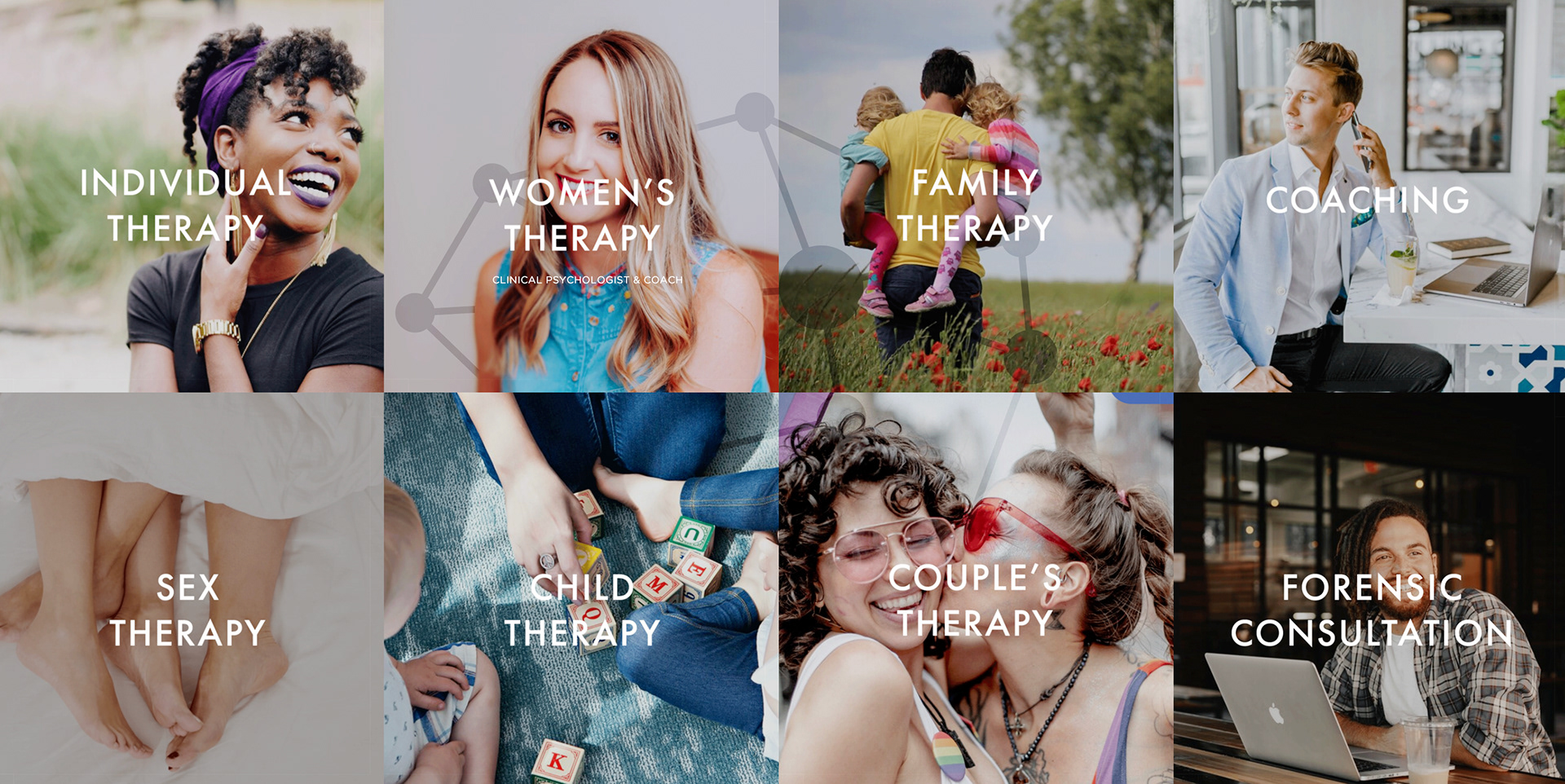
Scope & System
Logo and core identity architecture
Typographic hierarchy optimized for readability and accessibility
Calm color system designed for trust and emotional ease
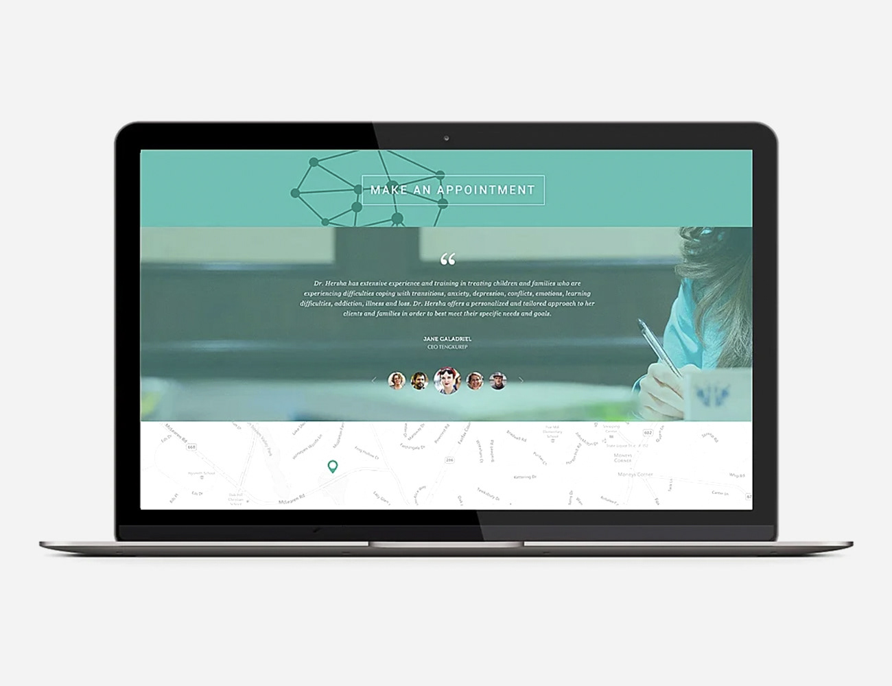
Layout rules and templates for consistent communication across touchpoints
Logo and core identity architecture
Typographic hierarchy optimized for readability and accessibility
Calm color system designed for trust and emotional ease
Layout rules and templates for consistent communication across touchpoints
Key Results
A clear, cohesive identity that strengthens trust at first impression
A modern look that differentiates the practice while remaining approachable
A system that supports consistent communication without constant redesign
A clear, cohesive identity that strengthens trust at first impression
A modern look that differentiates the practice while remaining approachable
A system that supports consistent communication without constant redesign
Impact & Performance
Improved clarity across patient-facing materials
Stronger perception of professionalism and care
A scalable foundation that supports future services, content, and growth
Improved clarity across patient-facing materials
Stronger perception of professionalism and care
A scalable foundation that supports future services, content, and growth
Deliverables
+ Logo and visual identity system
+ Brand guidelines (core rules)
+ Patient-facing templates (intake/handouts as applicable)
+ Website visual direction and digital assets
+ Logo and visual identity system
+ Brand guidelines (core rules)
+ Patient-facing templates (intake/handouts as applicable)
+ Website visual direction and digital assets
Role & Leadership
Brand Design Lead
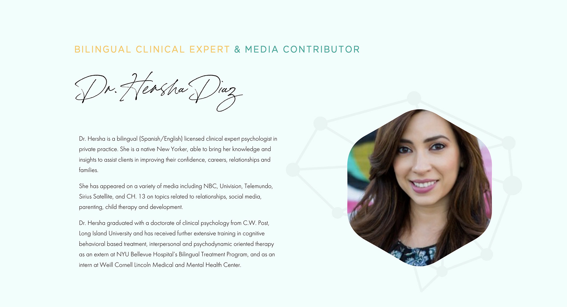
Led brand development from positioning through implementation, translating emotional trust into disciplined visual structure.
Brand Design Lead
Led brand development from positioning through implementation, translating emotional trust into disciplined visual structure.

Why This Work Matters
Therapy brands carry a unique responsibility: they must reduce friction and build trust before a conversation even begins.
This project shows how disciplined design, typography, space, tone, and structure can create a calm, credible experience that supports patients and helps a practice communicate with care and clarity.


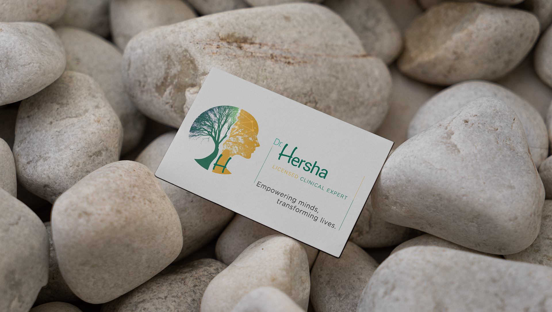
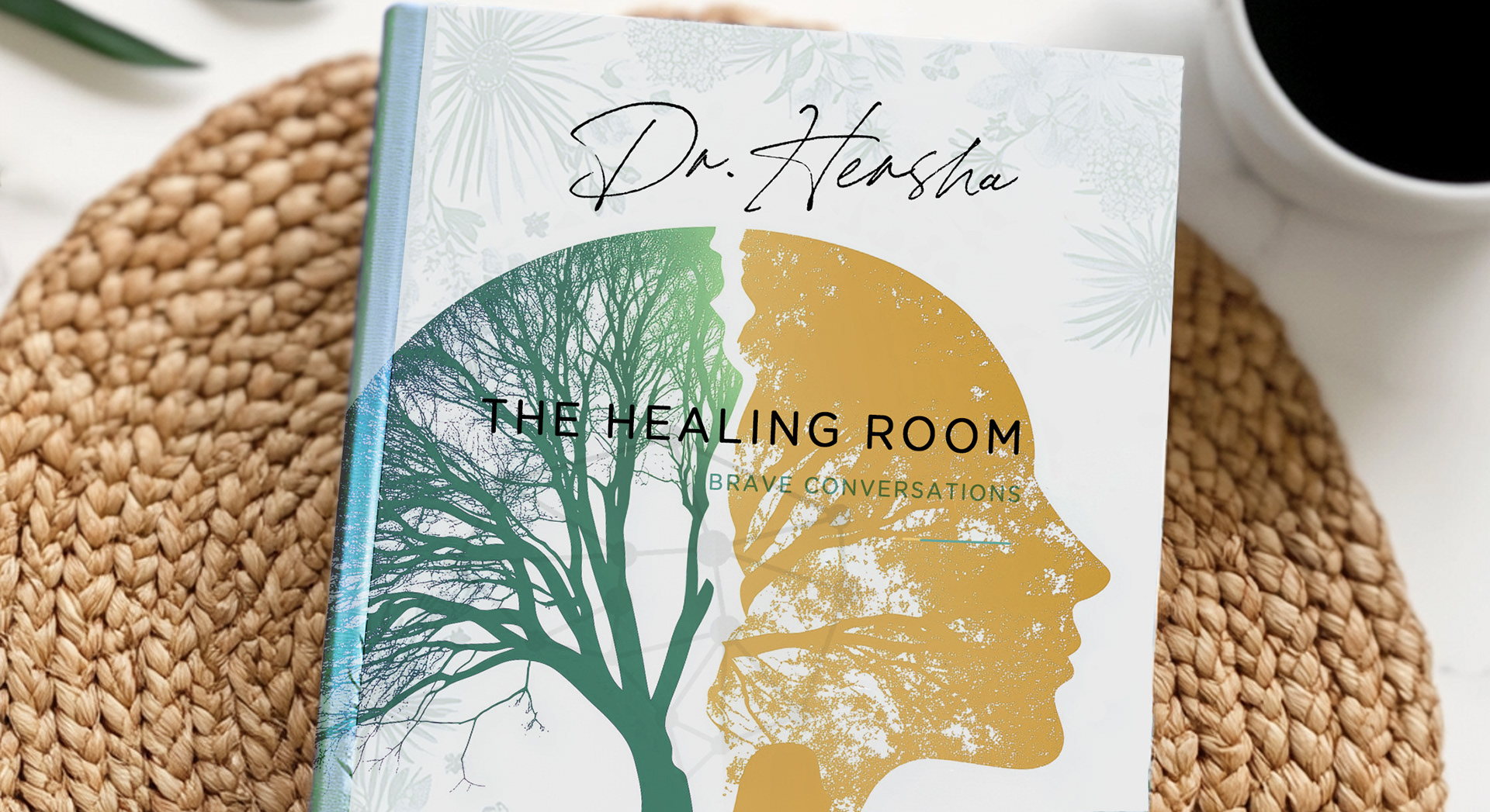
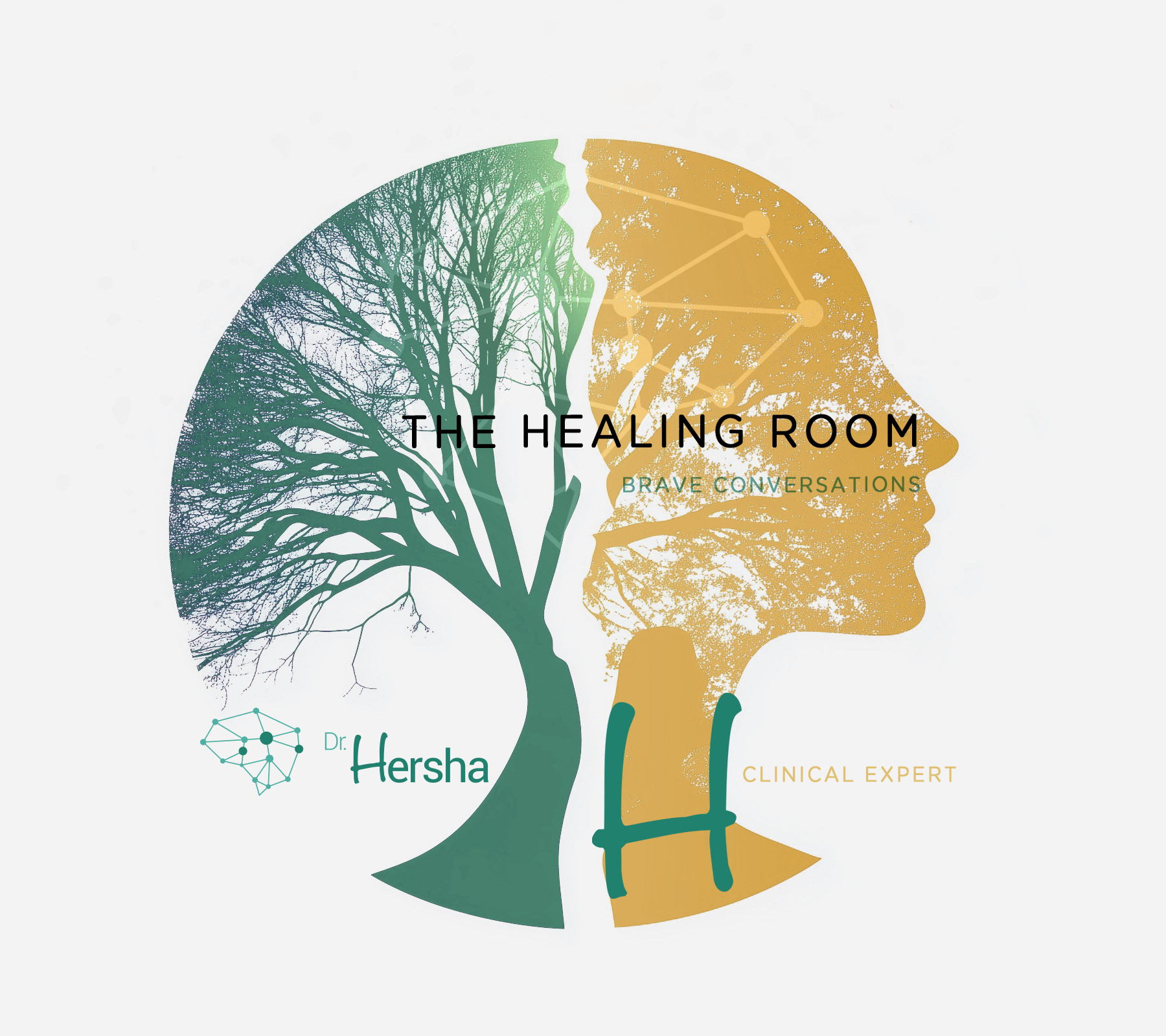
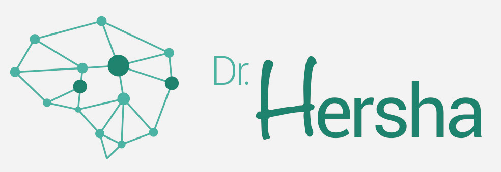
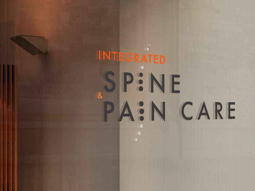
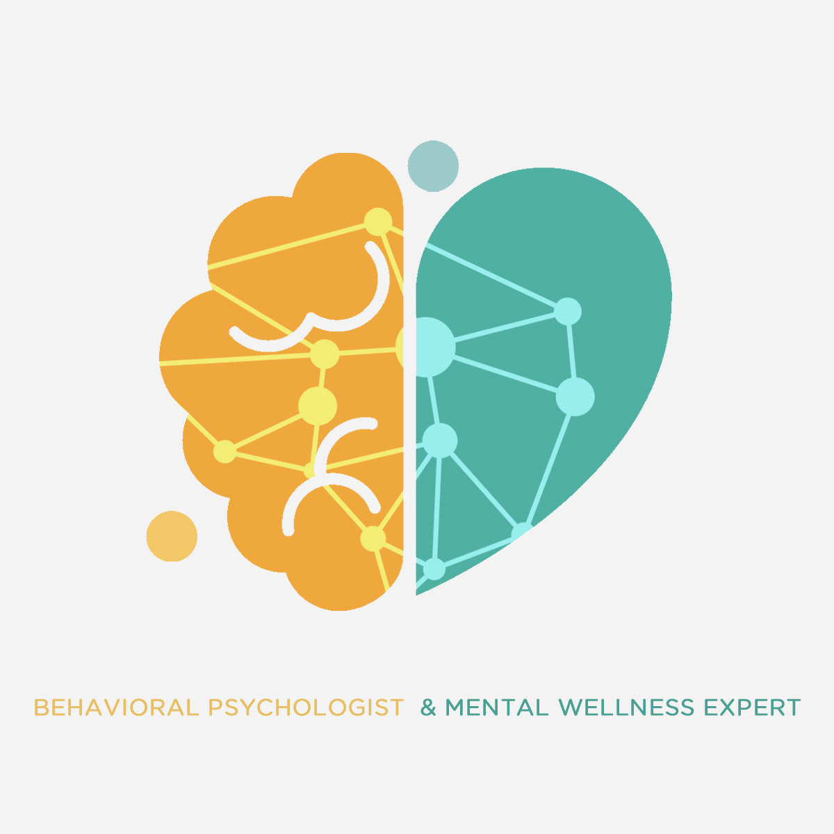
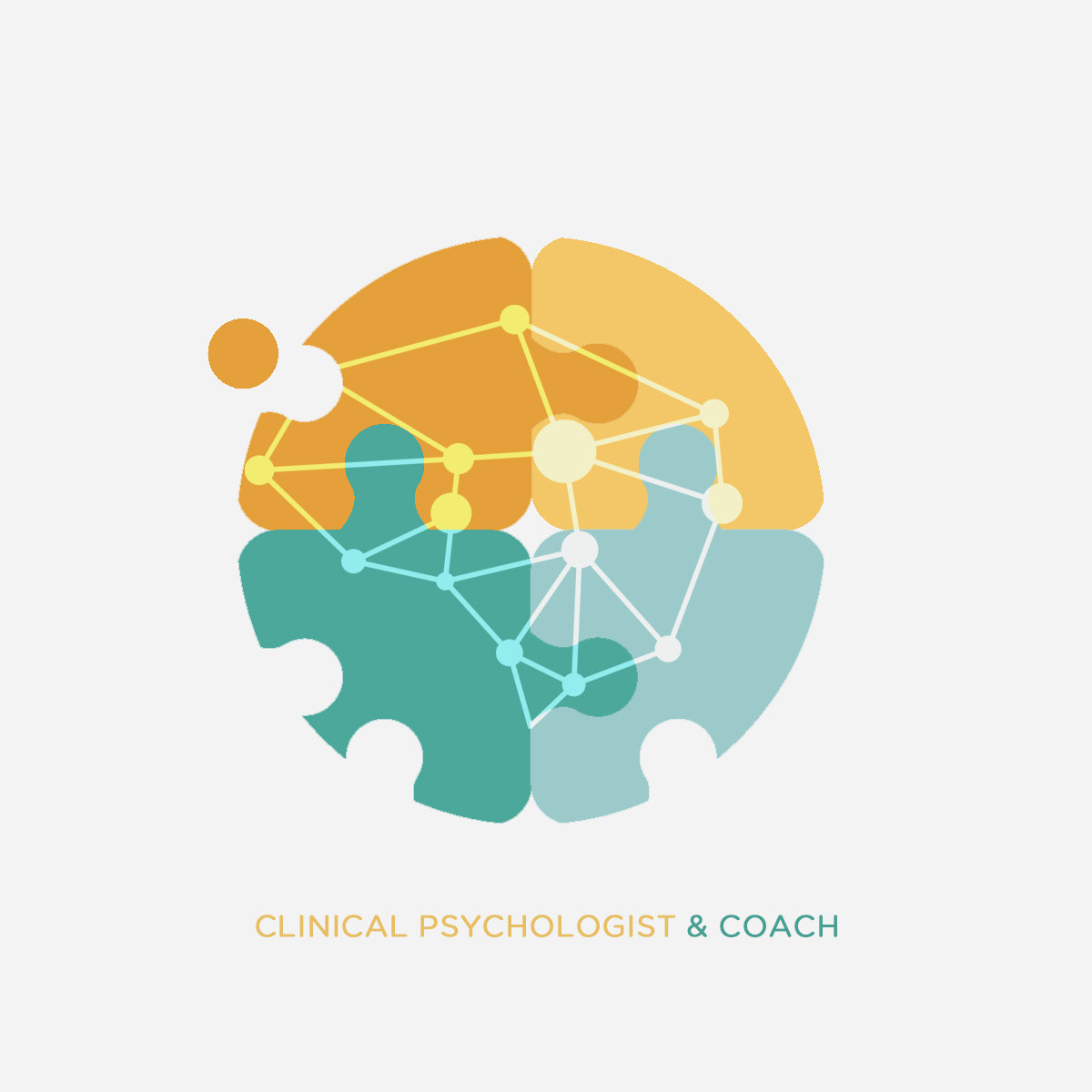
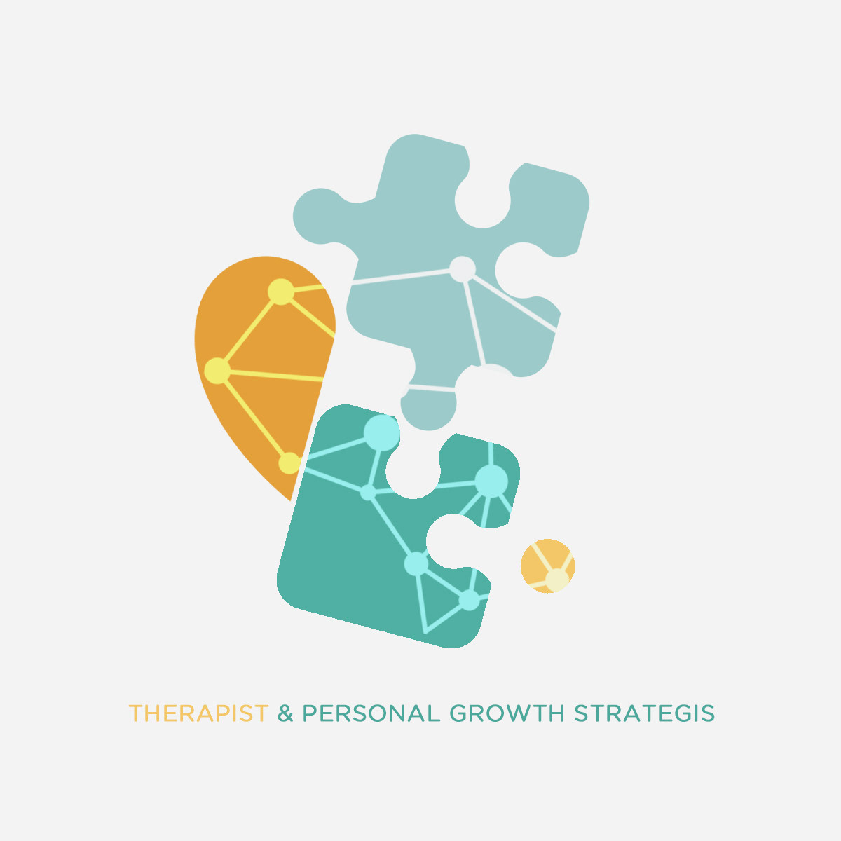
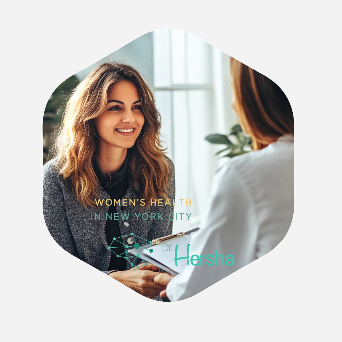
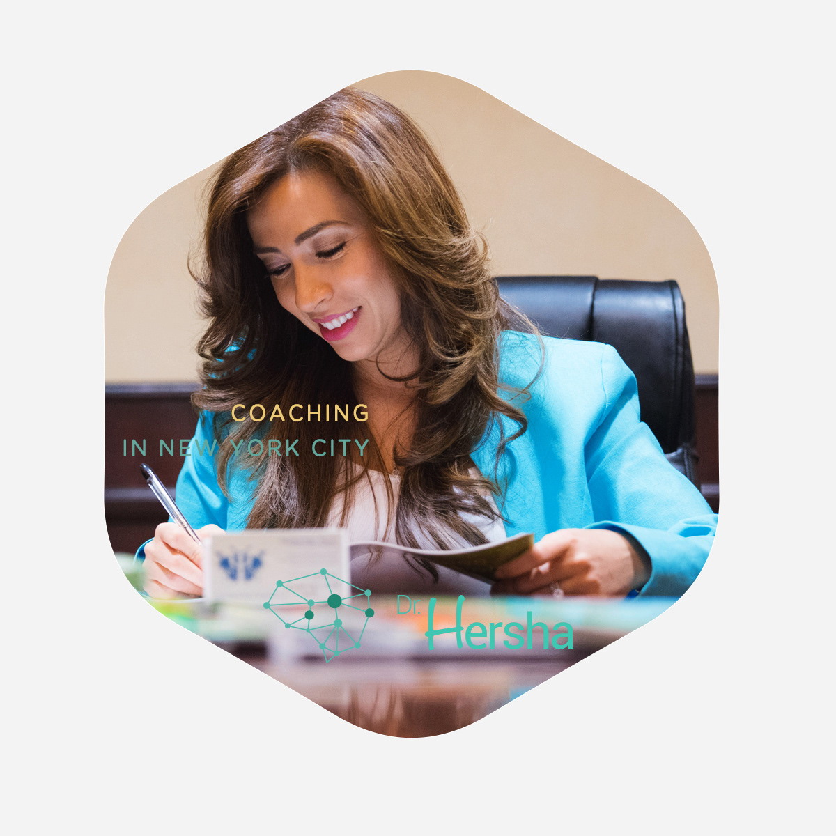
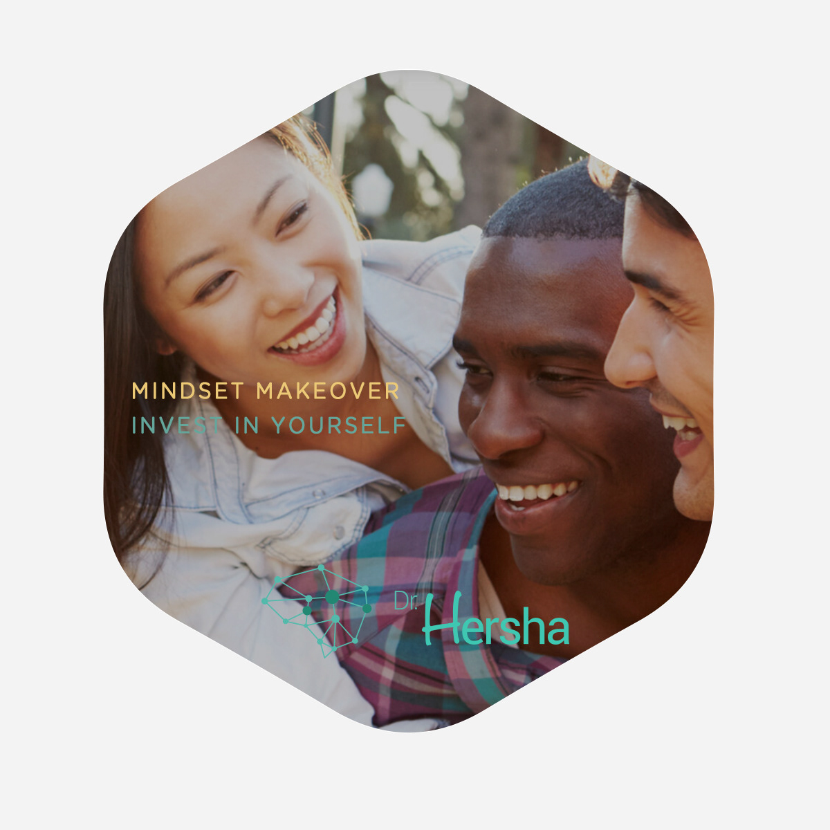
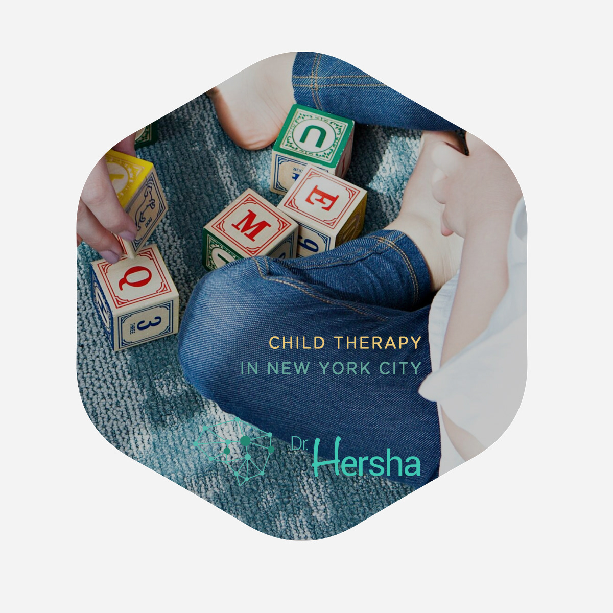
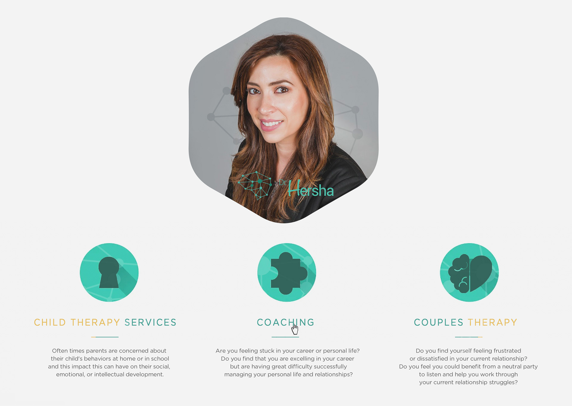
The logo was designed as a calm, minimal mark, communicating professionalism and warmth through restraint, balance, and clarity.

Need a brand identity that feels
calm, trustworthy & human?
calm, trustworthy & human?