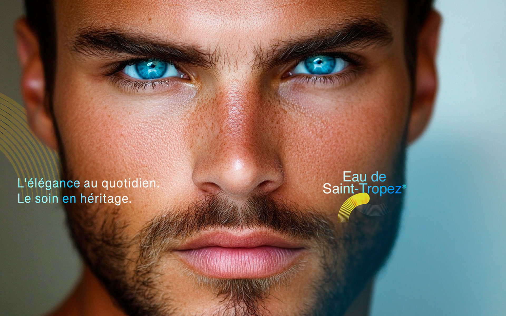
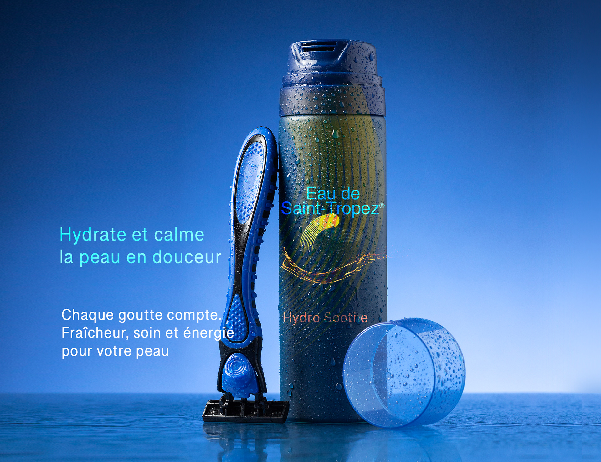
CLIENT / Eau de Saint-Tropez
Project Overview
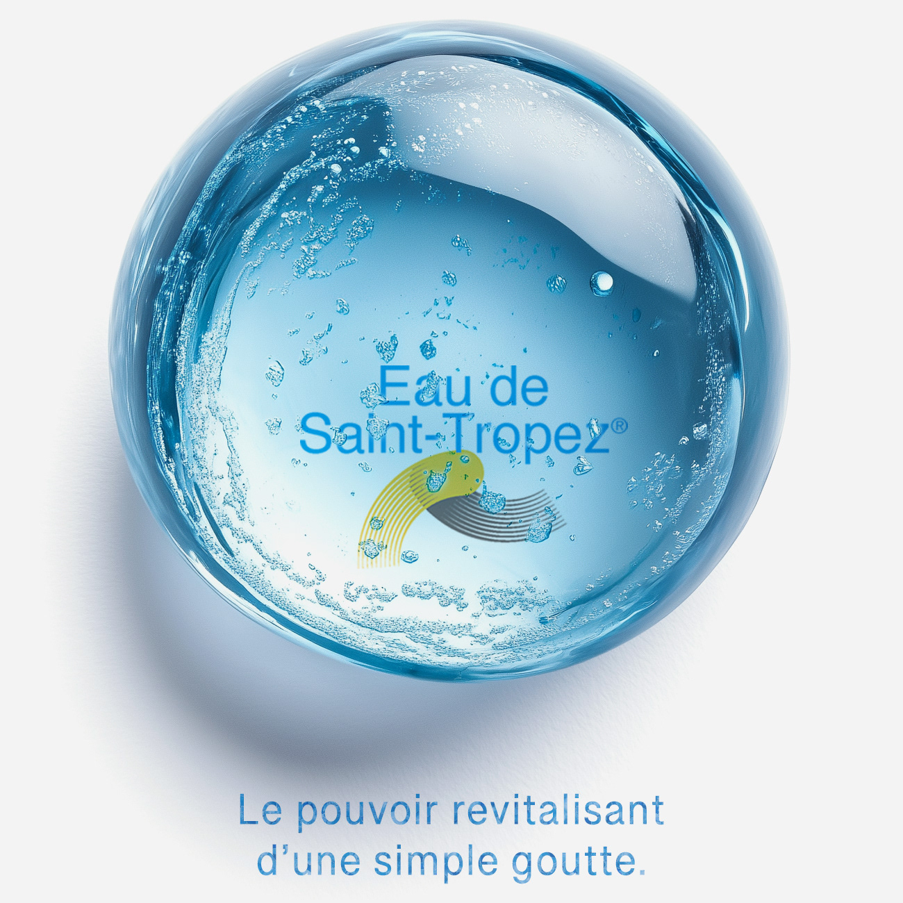
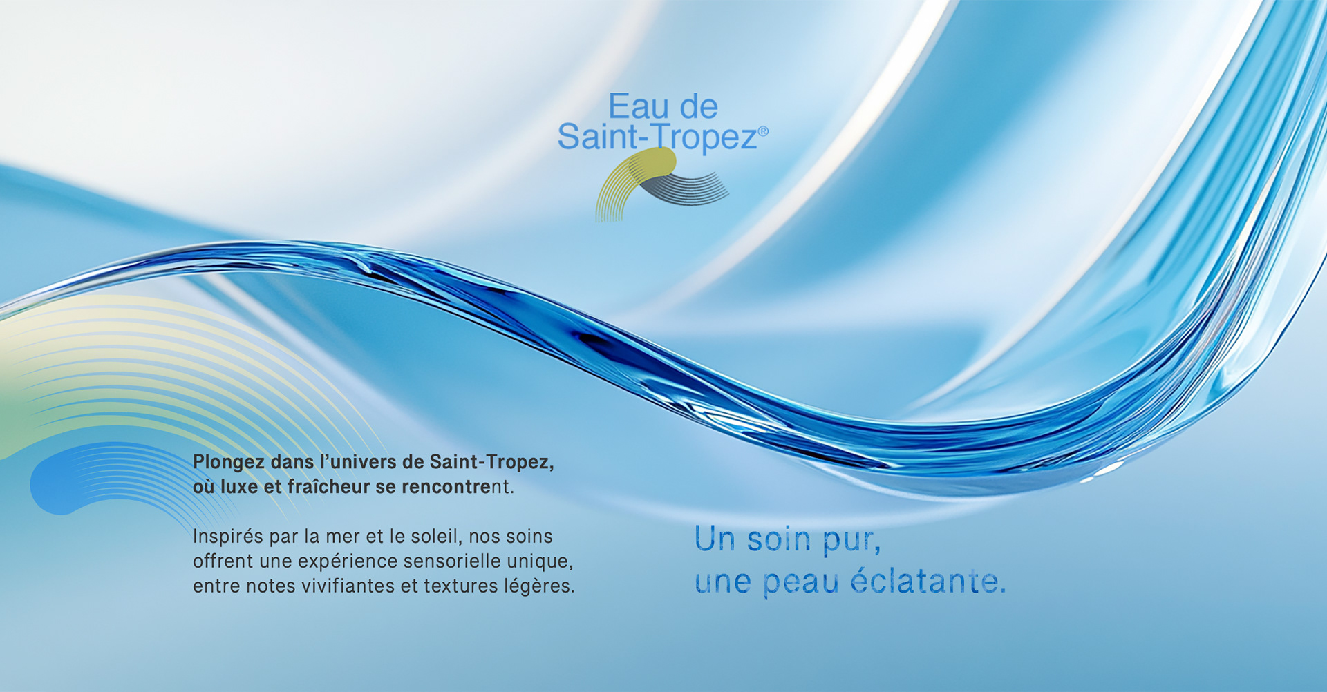
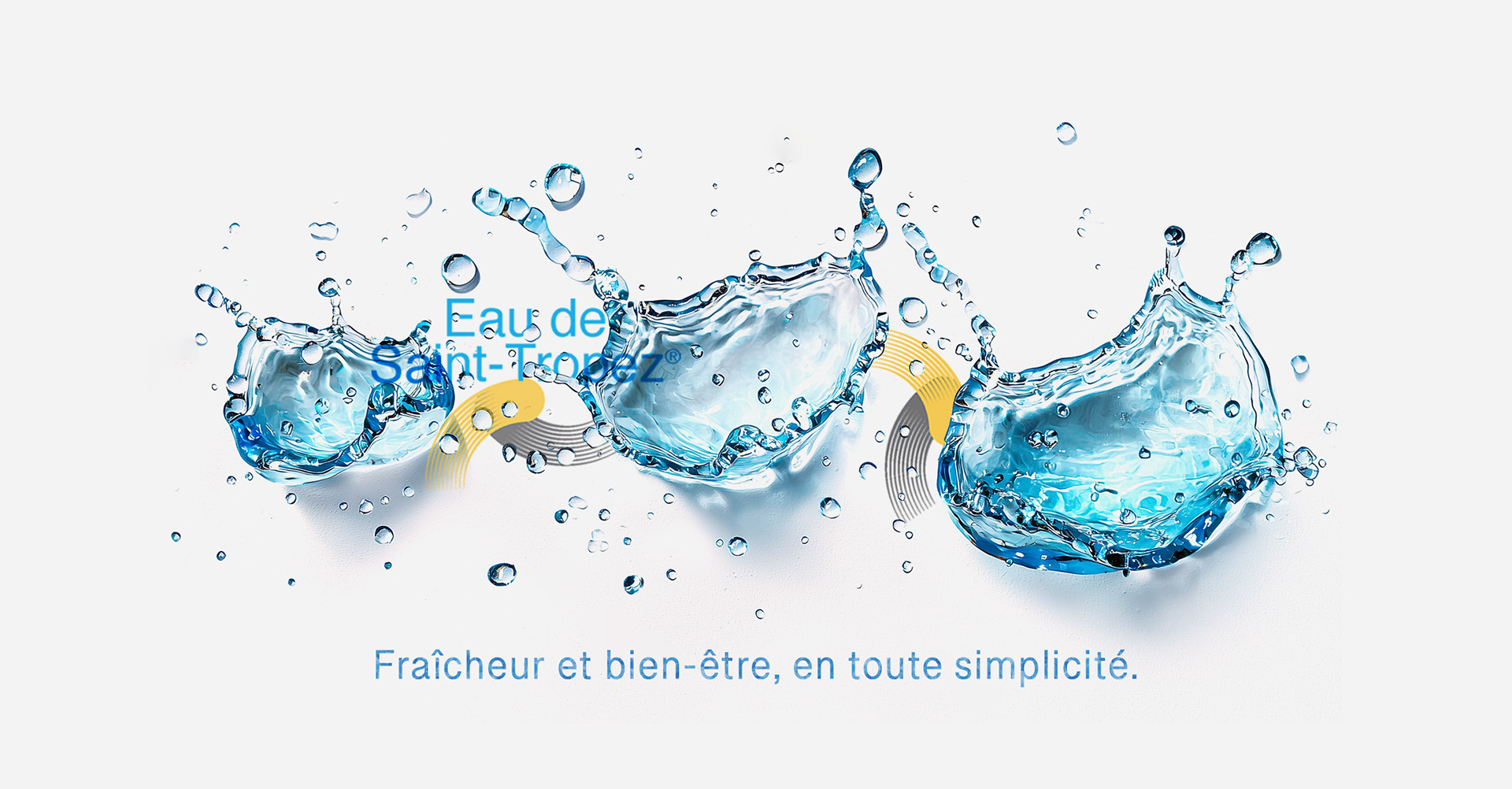
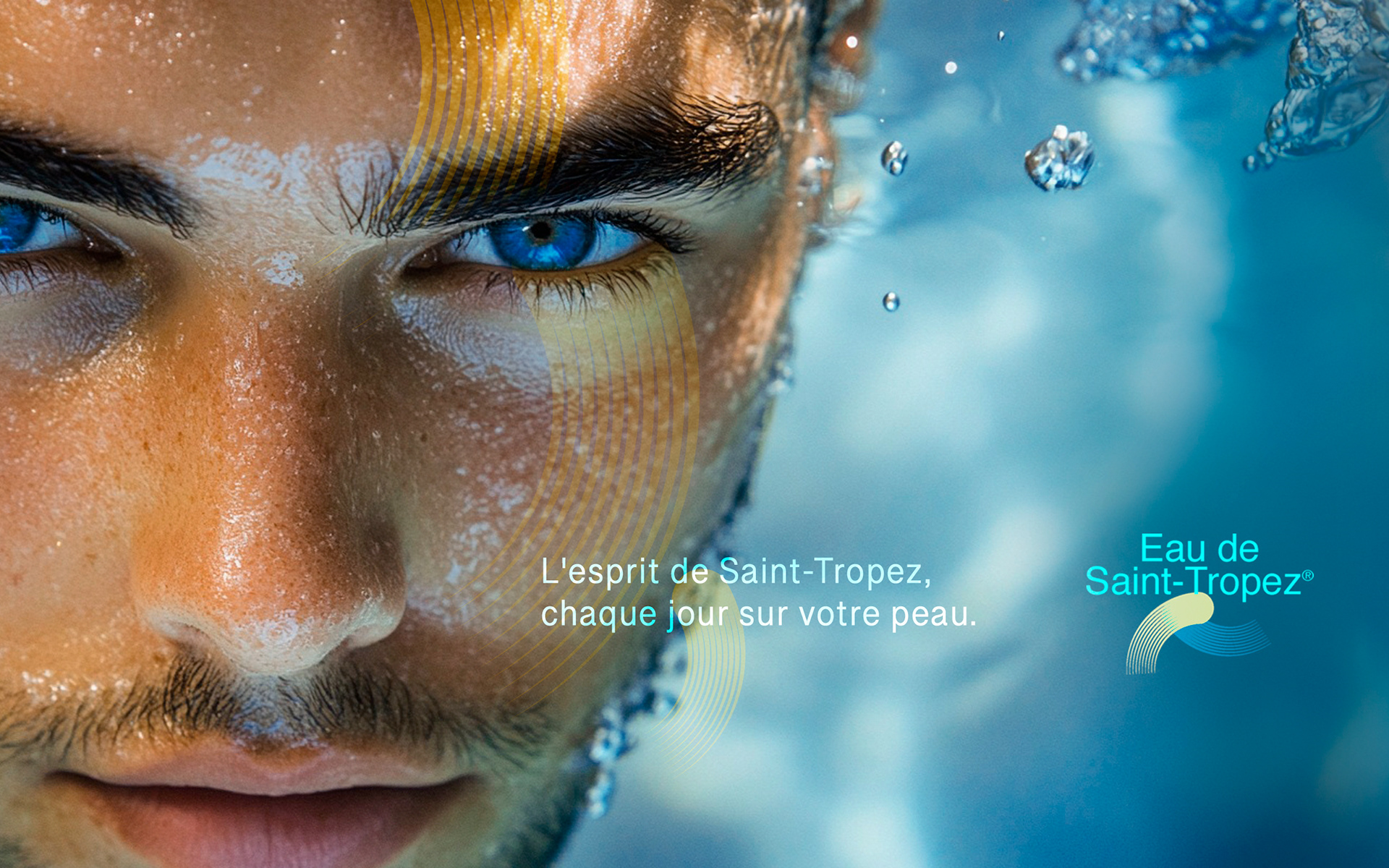
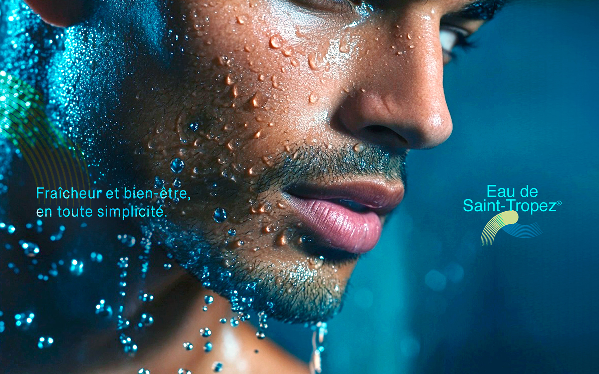
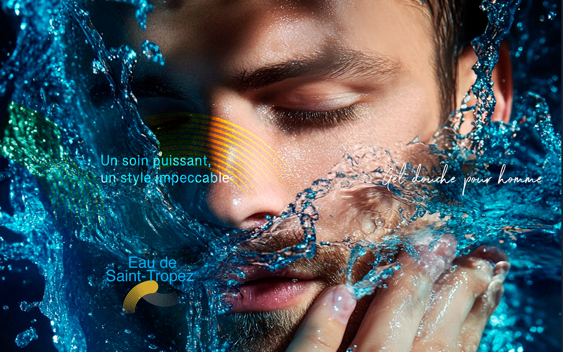
Eau de Saint Tropez wanted a brand identity to launch its new line of shower gel and body wash products for men in France.
They were expecting a visual identity that could capture the essence of sophistication and freshness while reflecting their new products' luxurious and high-quality nature.
They were expecting a visual identity that could capture the essence of sophistication and freshness while reflecting their new products' luxurious and high-quality nature.
Approach & Solution
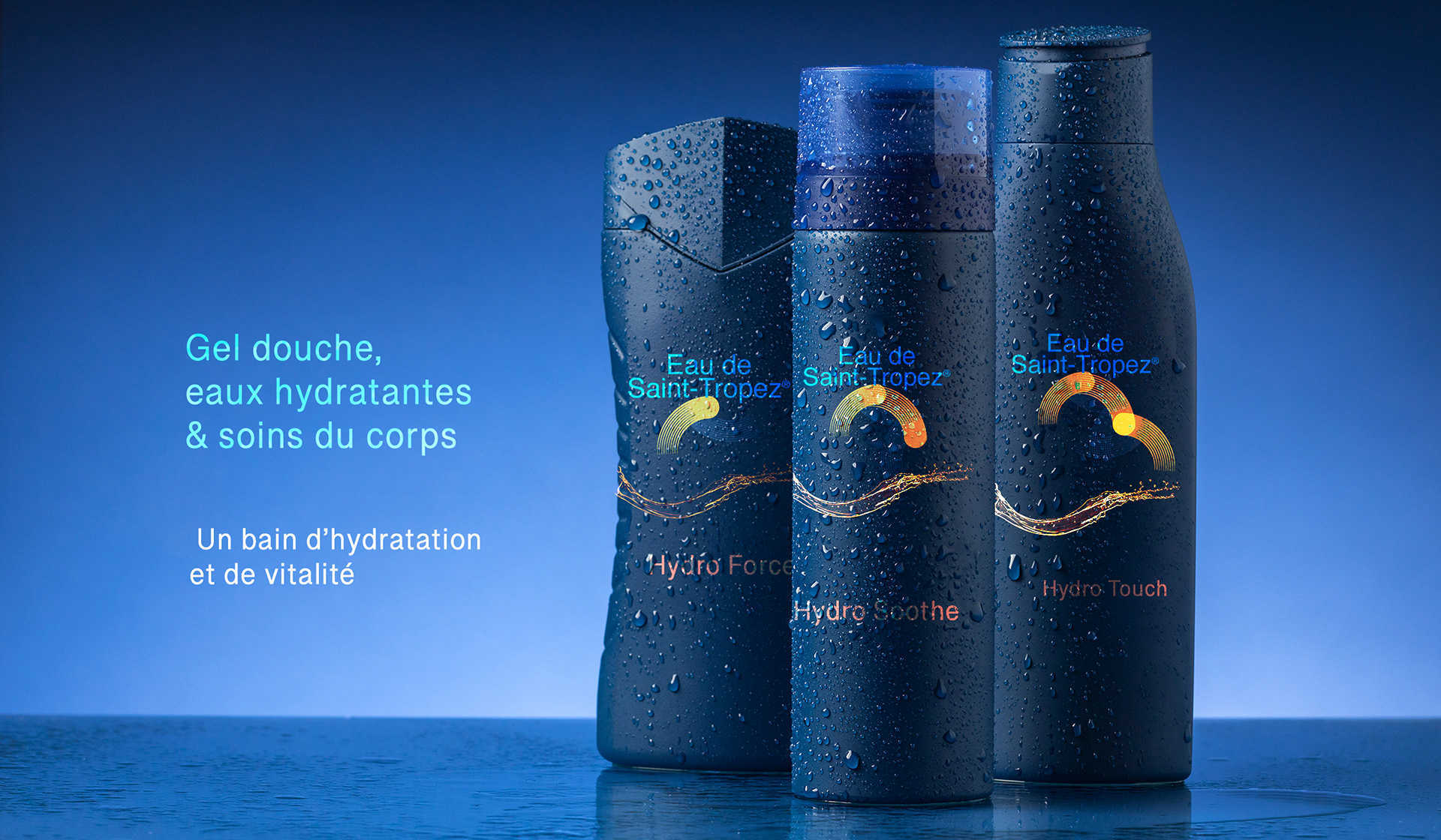
I created a logo and graphic design that embodied sophistication and freshness:
- Combining these colors evoked elegance, a vibrant lifestyle, and the Riviera, appealing to the
modern male consumer.
- The logo featured clean, refined lines, ensuring it stands out as both premium and dynamic.
- This cohesive approach enhanced the brand's image and resonated with its target audience.
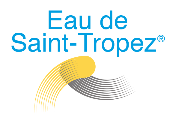
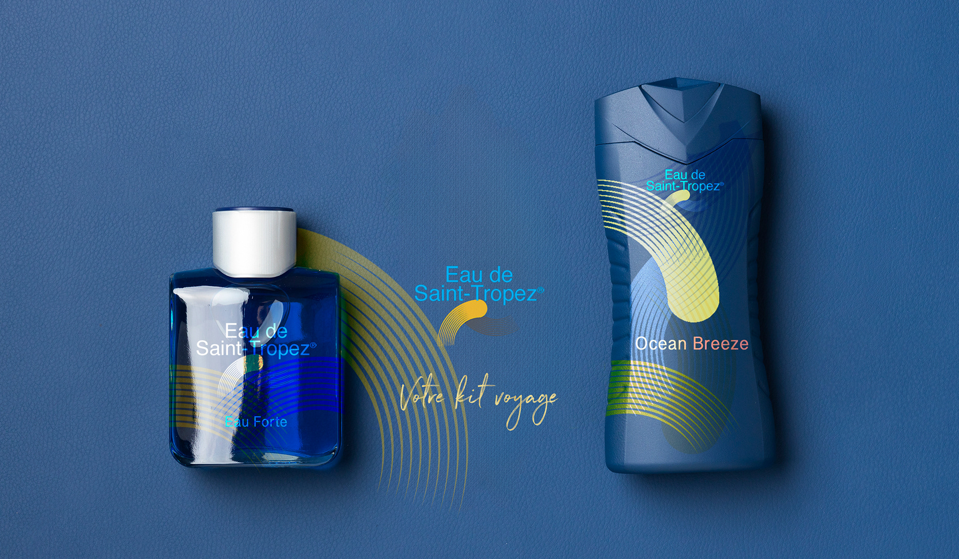
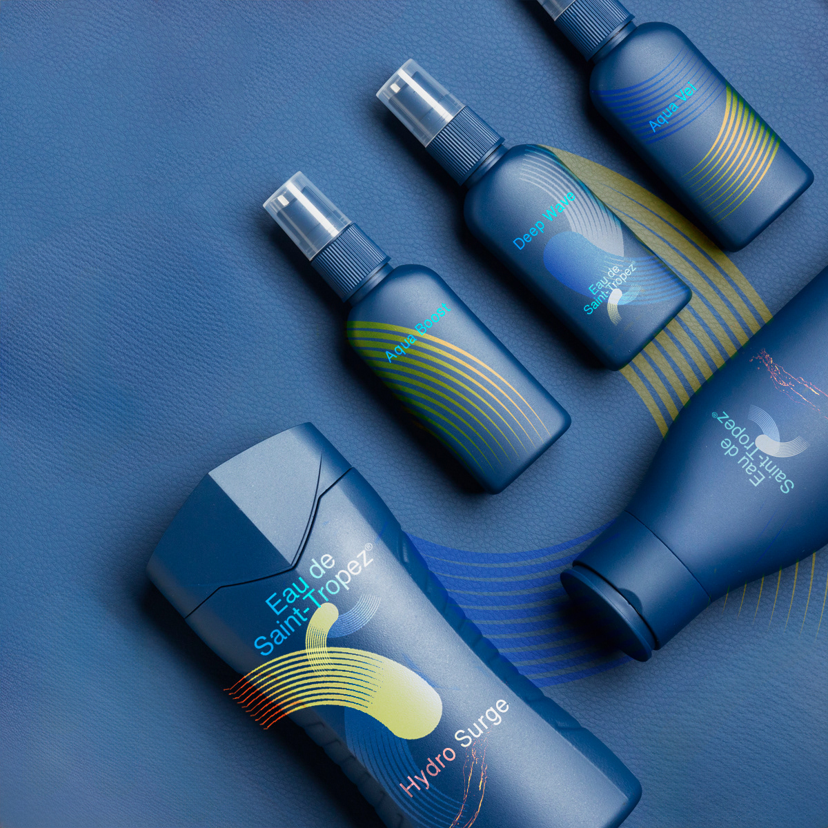
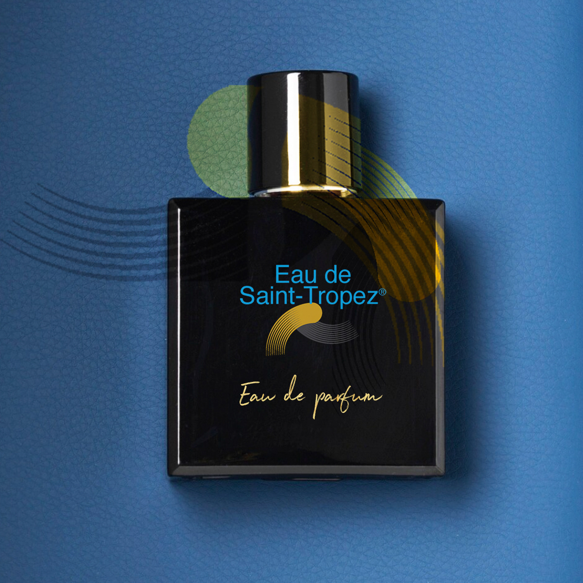
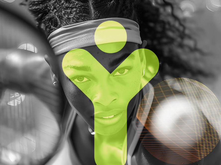
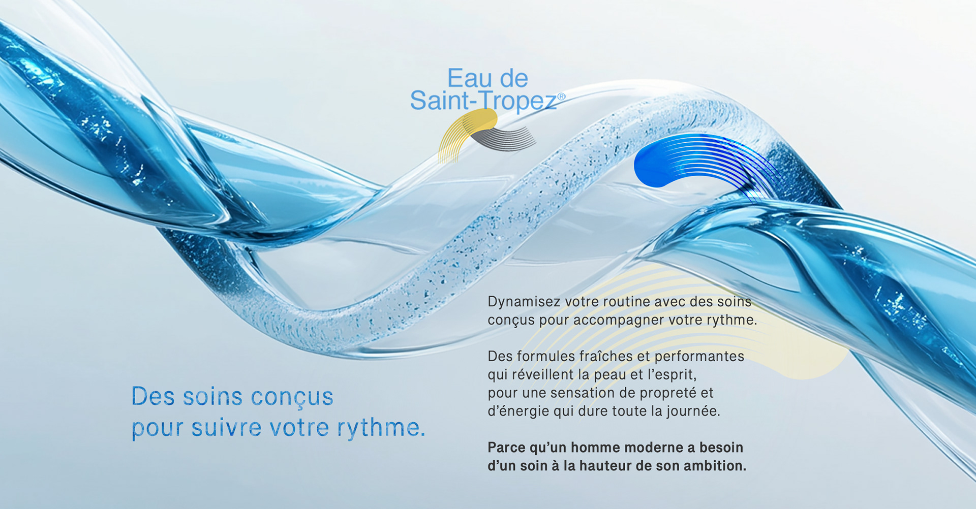
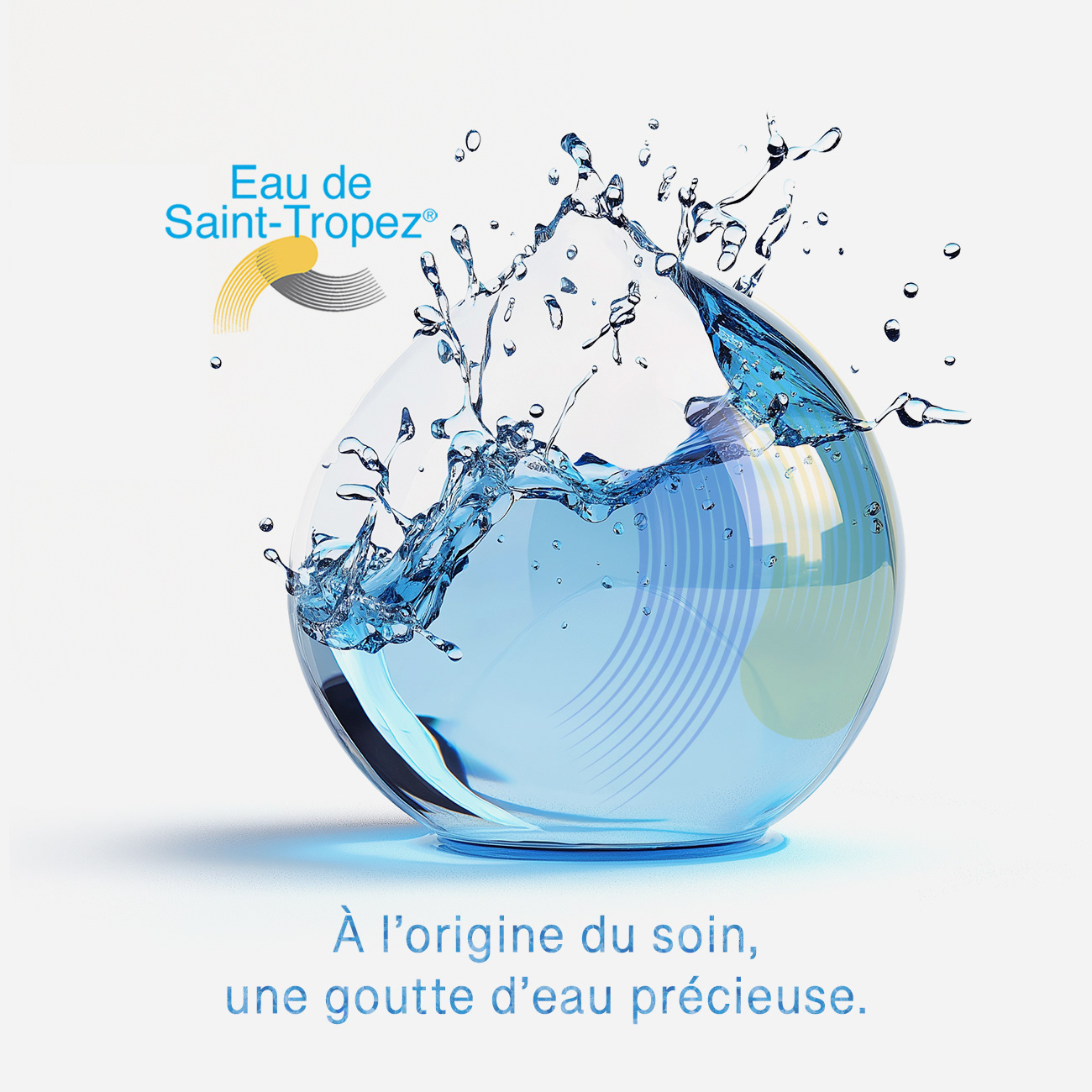
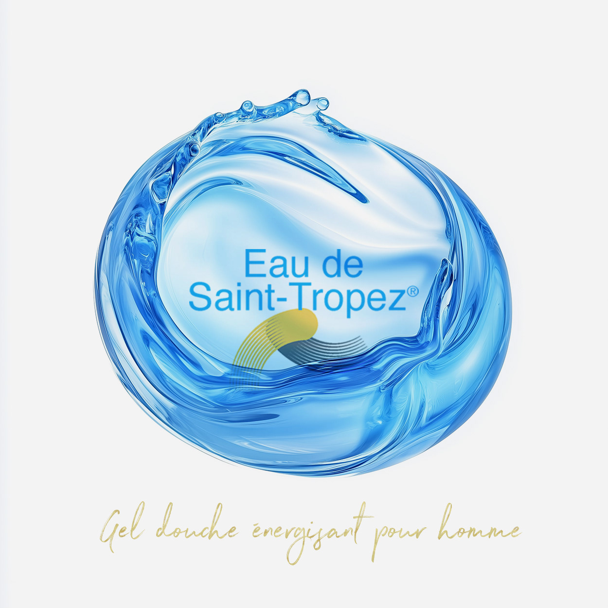
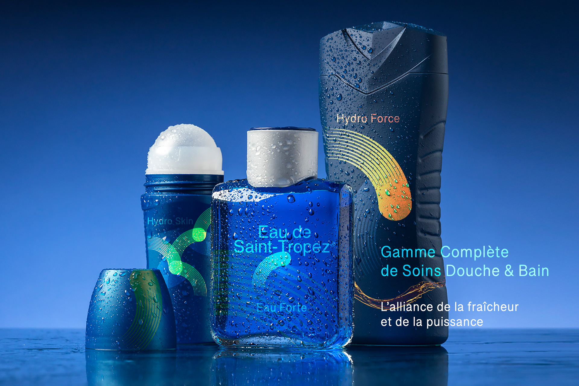
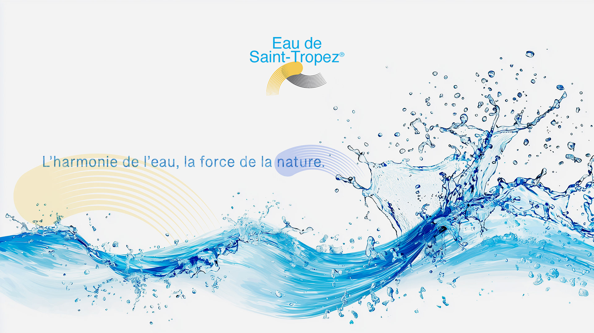
LOGO DESIGN: A SIGNATURE SYMBOL OF RIVIERA ELEGANCE
The logo embodies a blend of sophistication and freshness, capturing the essence of the French Riviera lifestyle to position the brand as a distinguished choice in the men's grooming market.:
- Typography & Style: A clean, modern font ensures clarity and accessibility, reflecting
the brand's luxurious and high-quality nature.
- Color Palette: Blue conveys calmness and luxury, while yellow adds vitality and energy,
evoking elegance and a vibrant lifestyle.
- Graphic Elements: Abstract, dynamic shapes suggest adaptability and seamless integration,
aligning with the brand's innovative approach to men's grooming products.


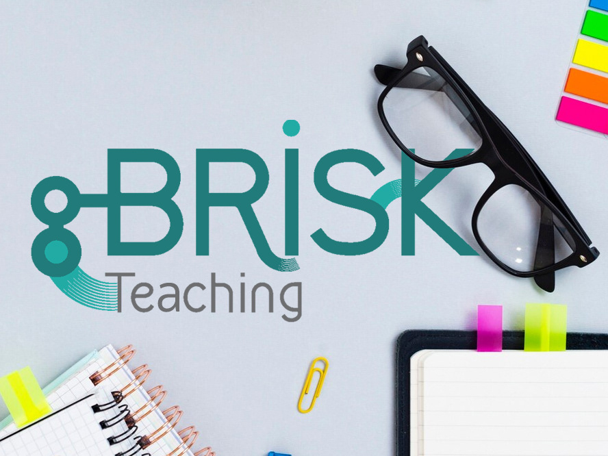
Concept Breakdown 2: AI THAT THINKS WITH YOU Everyplace ANYTIME
This AI tool transforms abstract ideas into clear, visual learning.
It’s intuitive, adaptable, and designed to support—not replace—how students and teachers think. With a calm, thoughtful voice, it brings clarity to complexity and helps users navigate layered content through innovative, responsive design.
More than a tool, it’s a values-driven partner: free, ethical, and built for real people doing meaningful work. It encourages curiosity, invites collaboration, and empowers users to ask better questions—making education more accessible, thoughtful, and human.