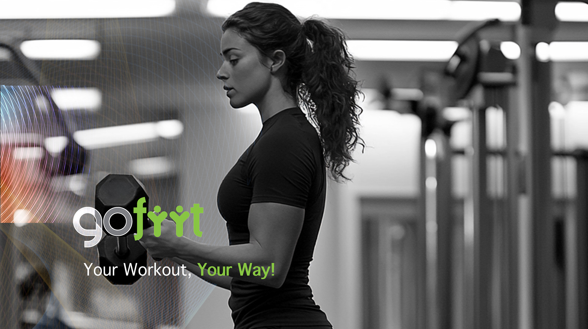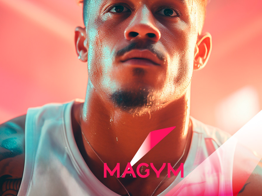
CLIENT / GoFiit, Paris, France

Project Overview
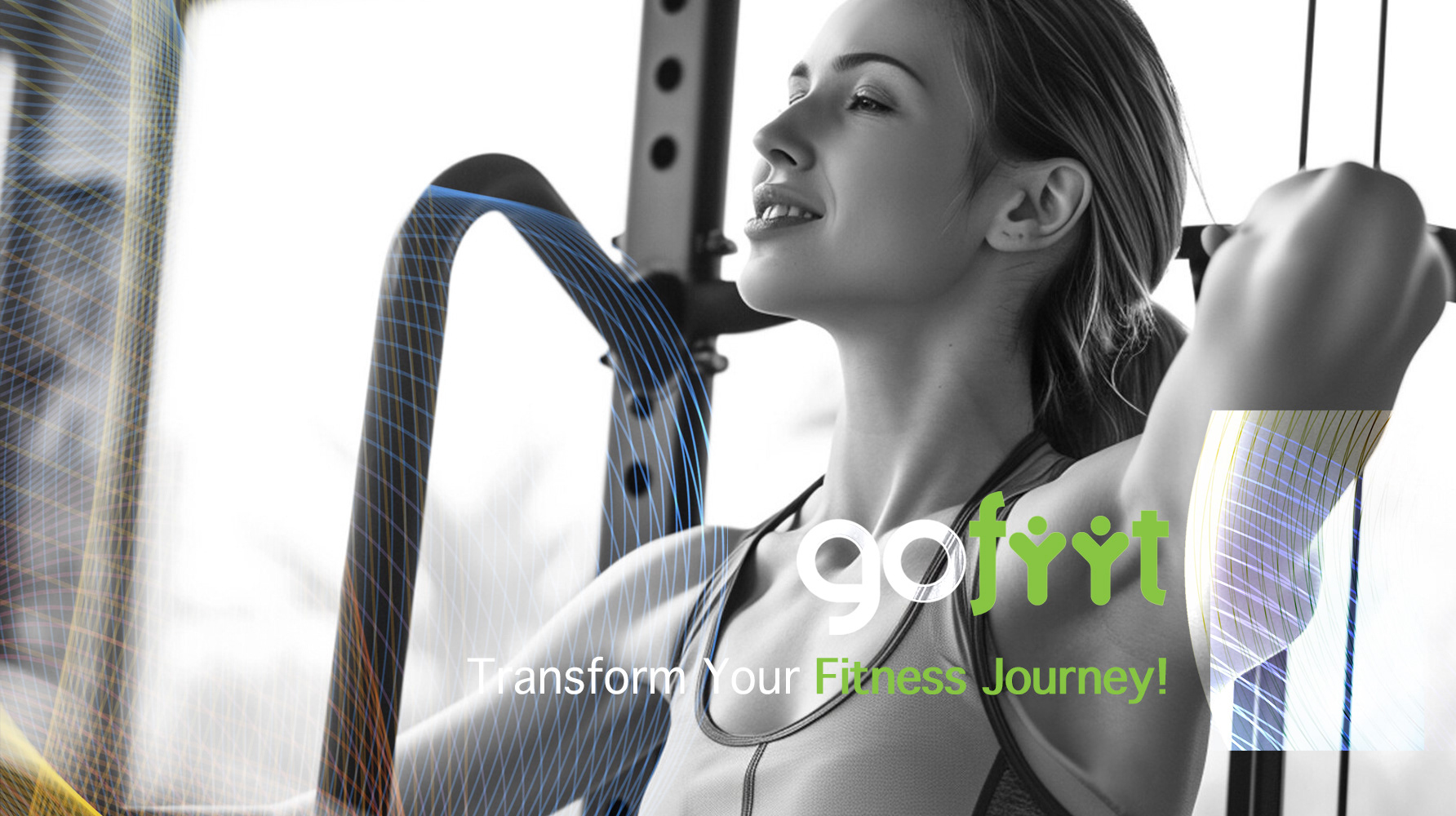
Gofiit needed a dynamic, modern brand identity to launch its free sports training platform.
The design had to be fresh, approachable, and versatile across digital platforms,
appealing to fitness enthusiasts and reinforcing its high-quality, accessible content.
The design had to be fresh, approachable, and versatile across digital platforms,
appealing to fitness enthusiasts and reinforcing its high-quality, accessible content.
Approach & Solution
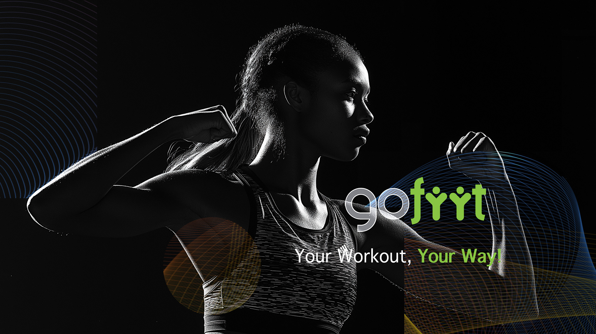
I combined black and white visuals to enhance the impact of the brand’s vibrant logotype:
- The minimalist use of black and white in the background and typography created a clean,
modern canvas that allowed the bright green to stand out, symbolizing energy, vitality,
and growth.
- This contrast magnified the freshness and dynamism of the logo, making it the focal point
of the design.
- The aesthetic was bold yet sleek, emphasizing Goofiit’s mission to offer free, accessible sports
training while ensuring the brand remained visually compelling across all platforms.
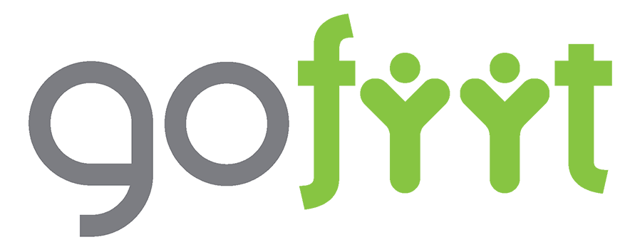
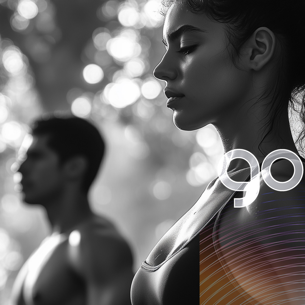
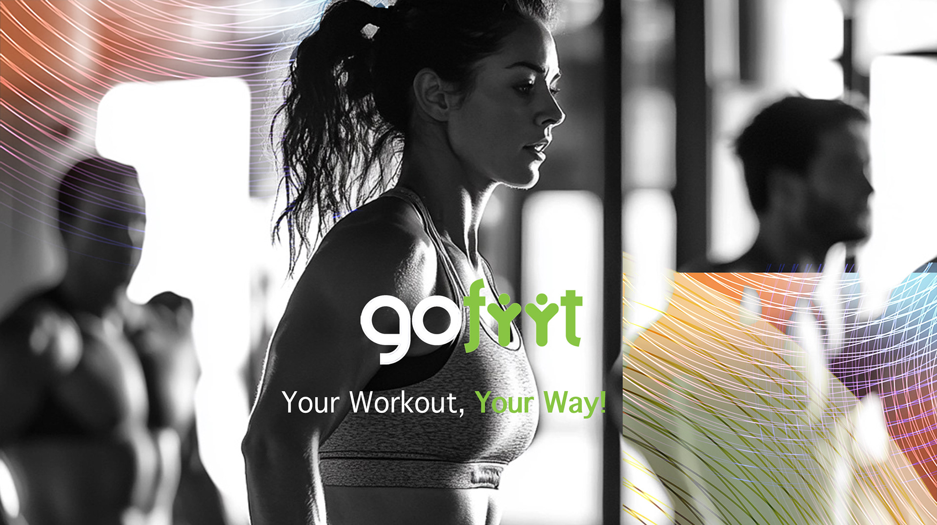
LOGO DESIGN: AN ENERGETIC SPORTS TRAINING IDENTITY
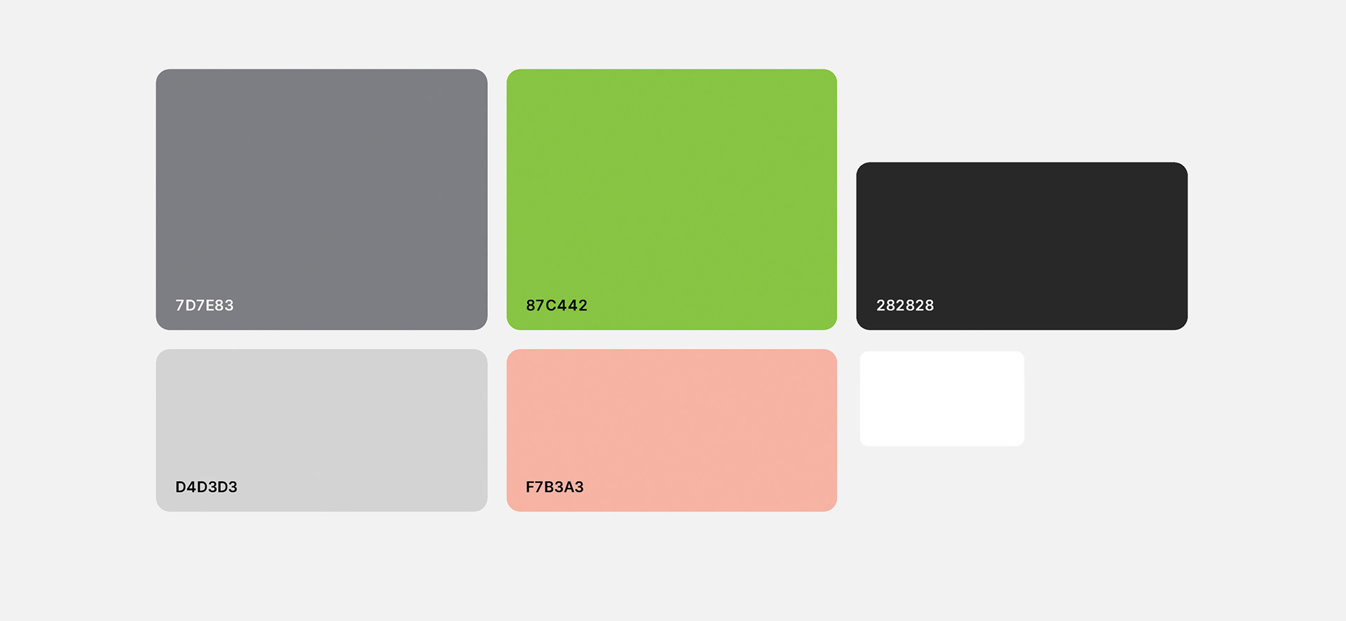
Color Palette: Vibrant green (energy, growth) contrasts with dark gray and white
for a modern, clean look.
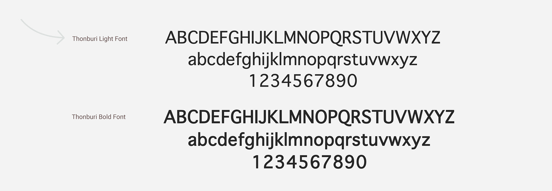
Typography: Modern sans-serif for clarity and accessibility.
Graphic Elements: Sleek, dynamic shapes of people reflecting movement and athleticism.
Imagery: Black and white visuals enhance the bold logo.
for a modern, clean look.
Typography: Modern sans-serif for clarity and accessibility.
Graphic Elements: Sleek, dynamic shapes of people reflecting movement and athleticism.
Imagery: Black and white visuals enhance the bold logo.
Visual Identity Kit: Colors & Typography

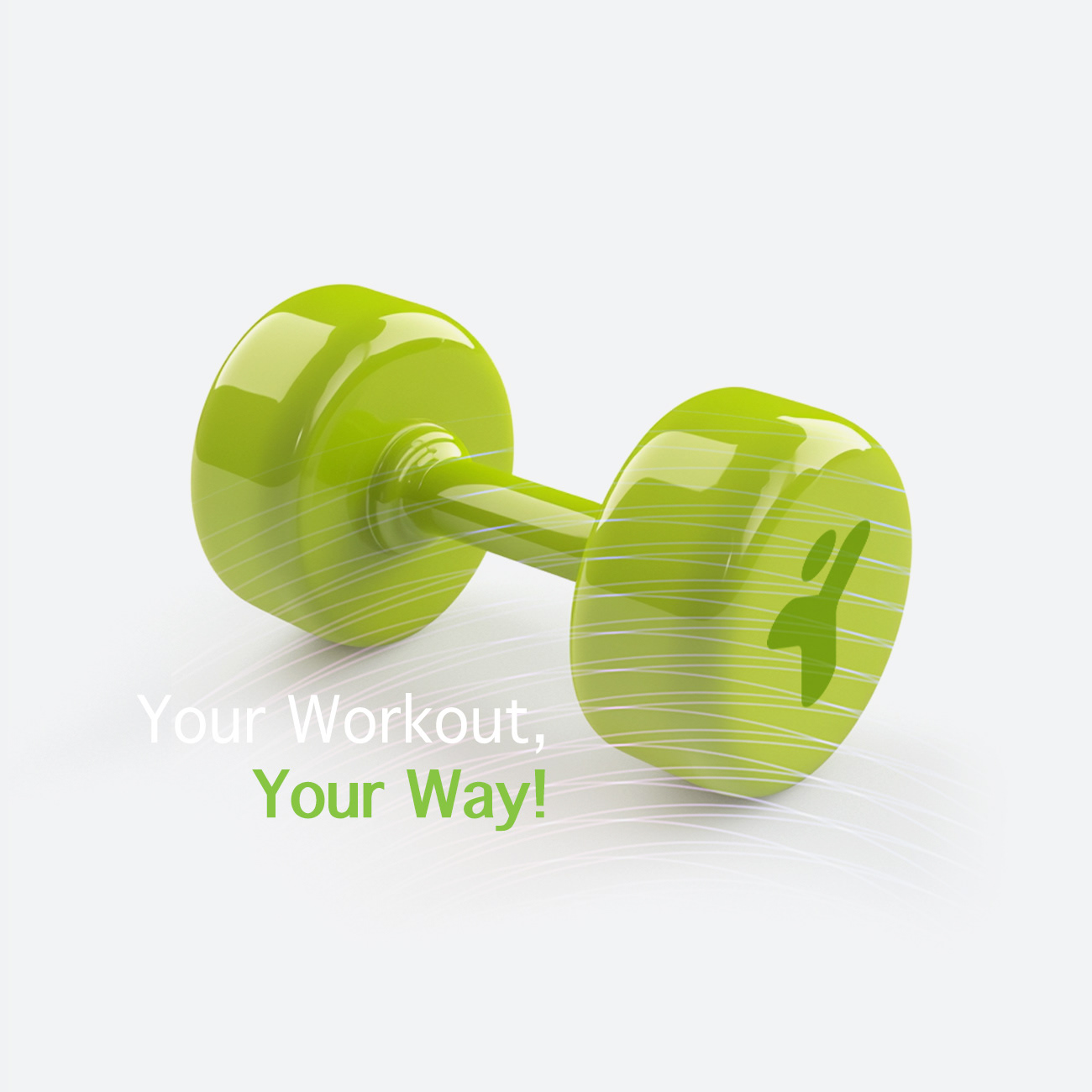
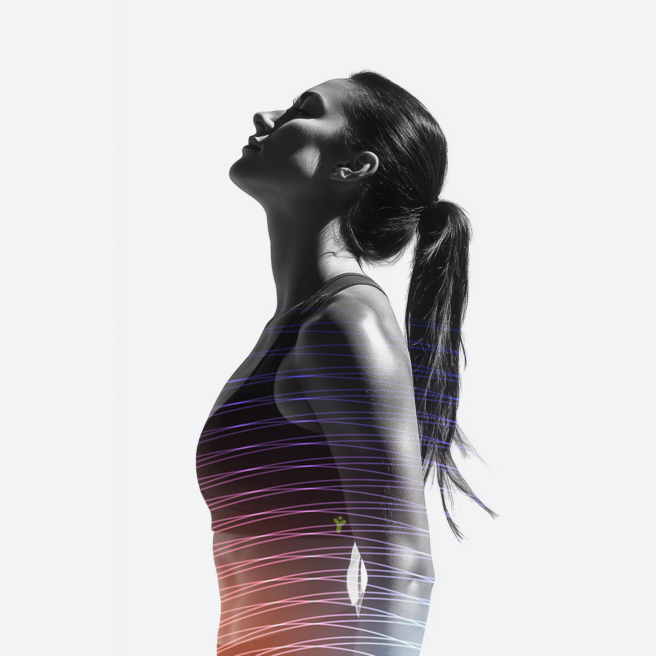
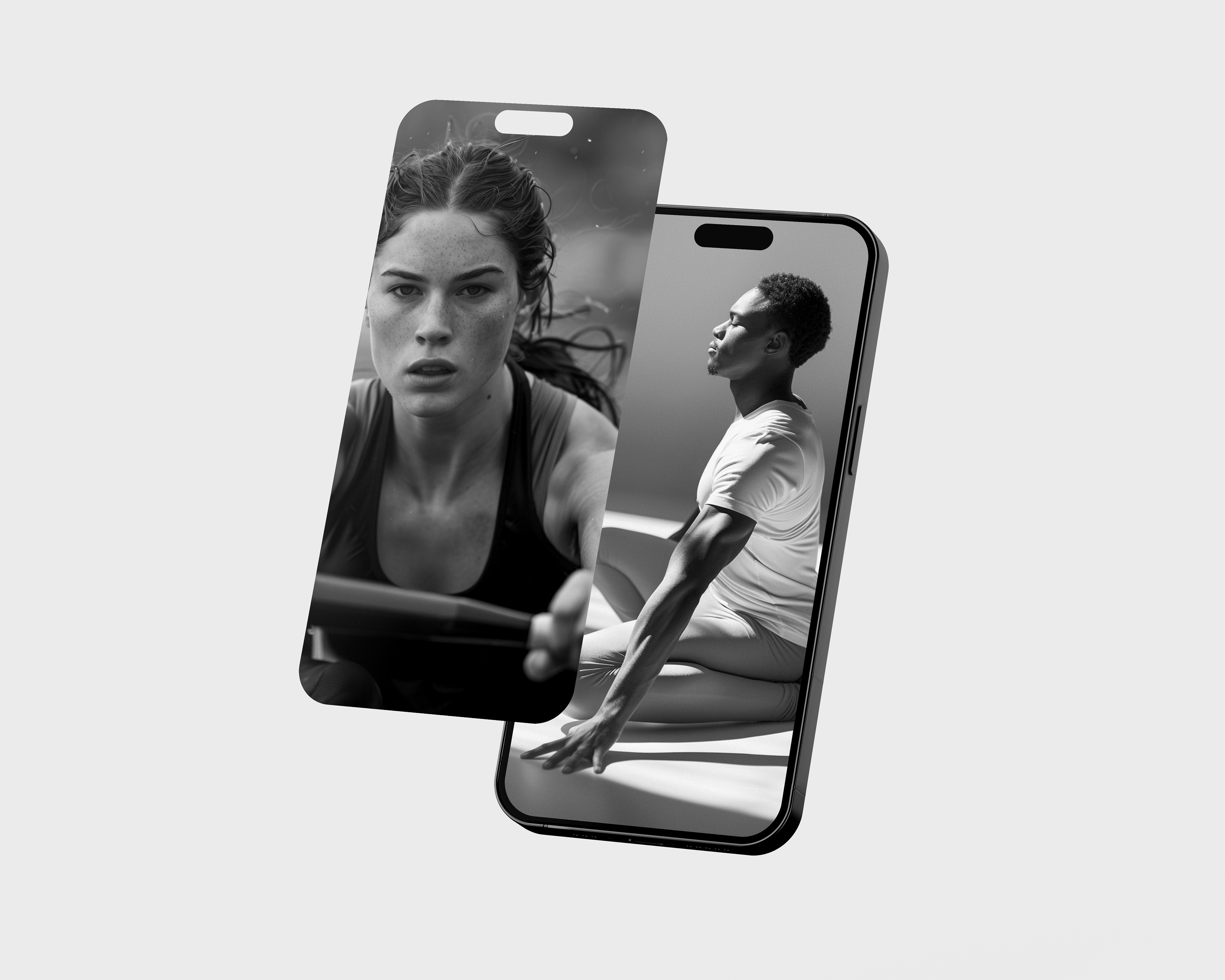
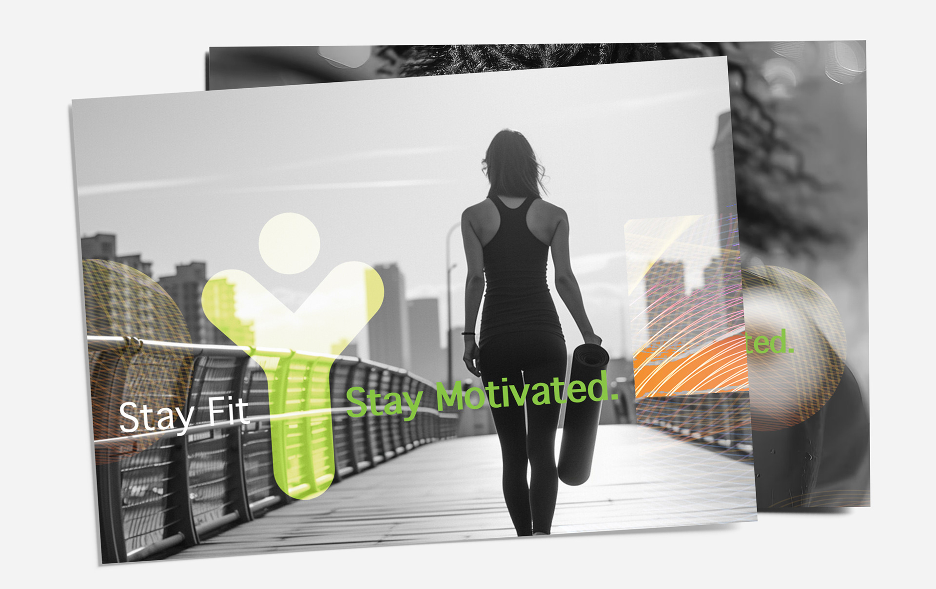
BRAND IDENTITY: MOVE YOUR WAY
For GoFiit, I created a dynamic brand identity that energizes and empowers fitness enthusiasts:
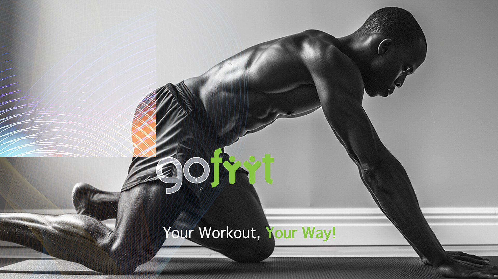
- The design leverages powerful black-and-white photography contrasted with vivid green accents
and kinetic linework, expressing movement, motivation, and personal progress.
- The custom logotype and icons echo human figures in motion, reinforcing the inclusive, community-driven
spirit of the brand.
- Vibrant overlays and clean typography keep the visual system fresh, motivating, and instantly recognizable
across every touchpoint.
For GoFiit, I created a dynamic brand identity that energizes and empowers fitness enthusiasts:
- The design leverages powerful black-and-white photography contrasted with vivid green accents
and kinetic linework, expressing movement, motivation, and personal progress.
- The custom logotype and icons echo human figures in motion, reinforcing the inclusive, community-driven
spirit of the brand.
- Vibrant overlays and clean typography keep the visual system fresh, motivating, and instantly recognizable
across every touchpoint.
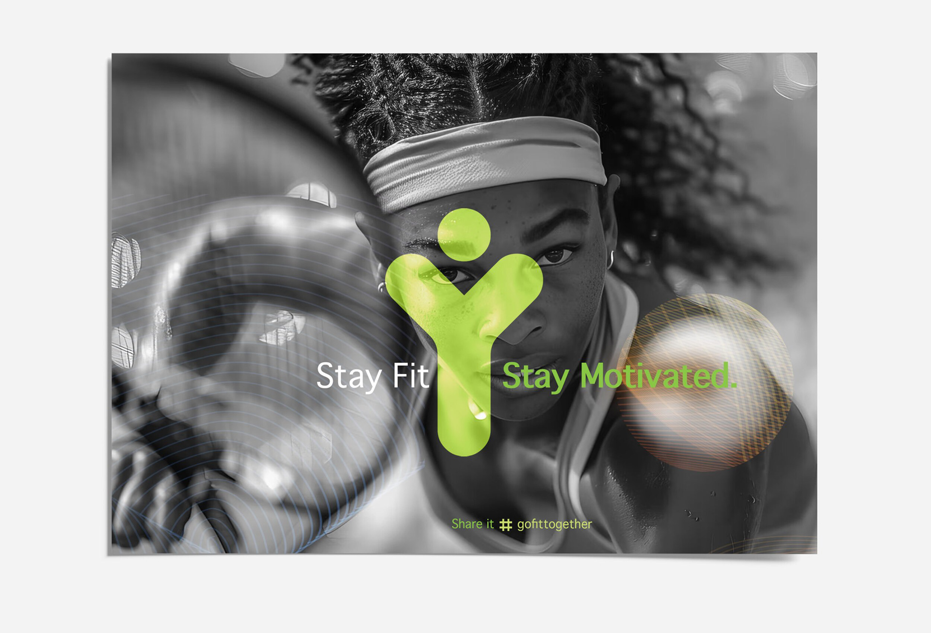
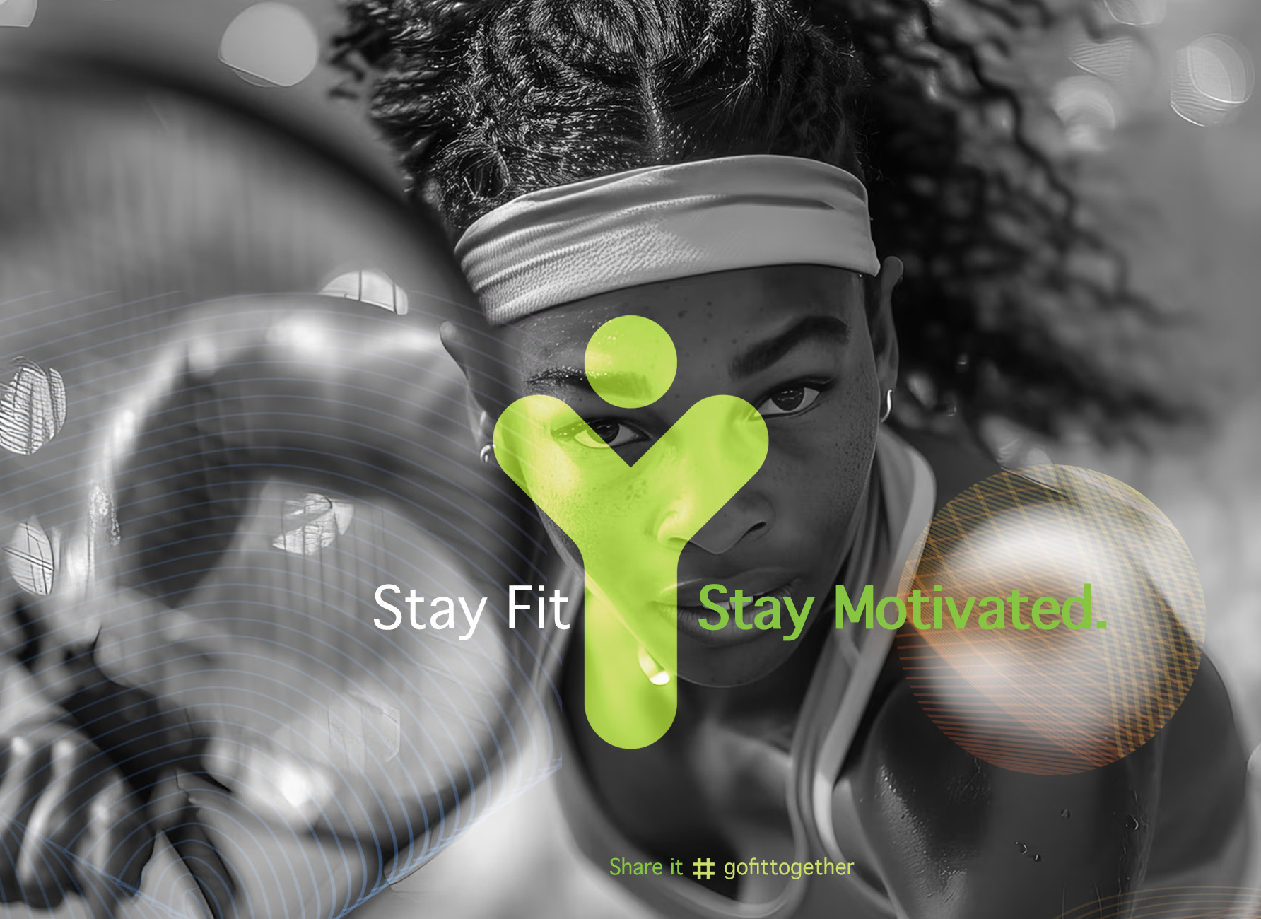
KEY ELEMENTS:
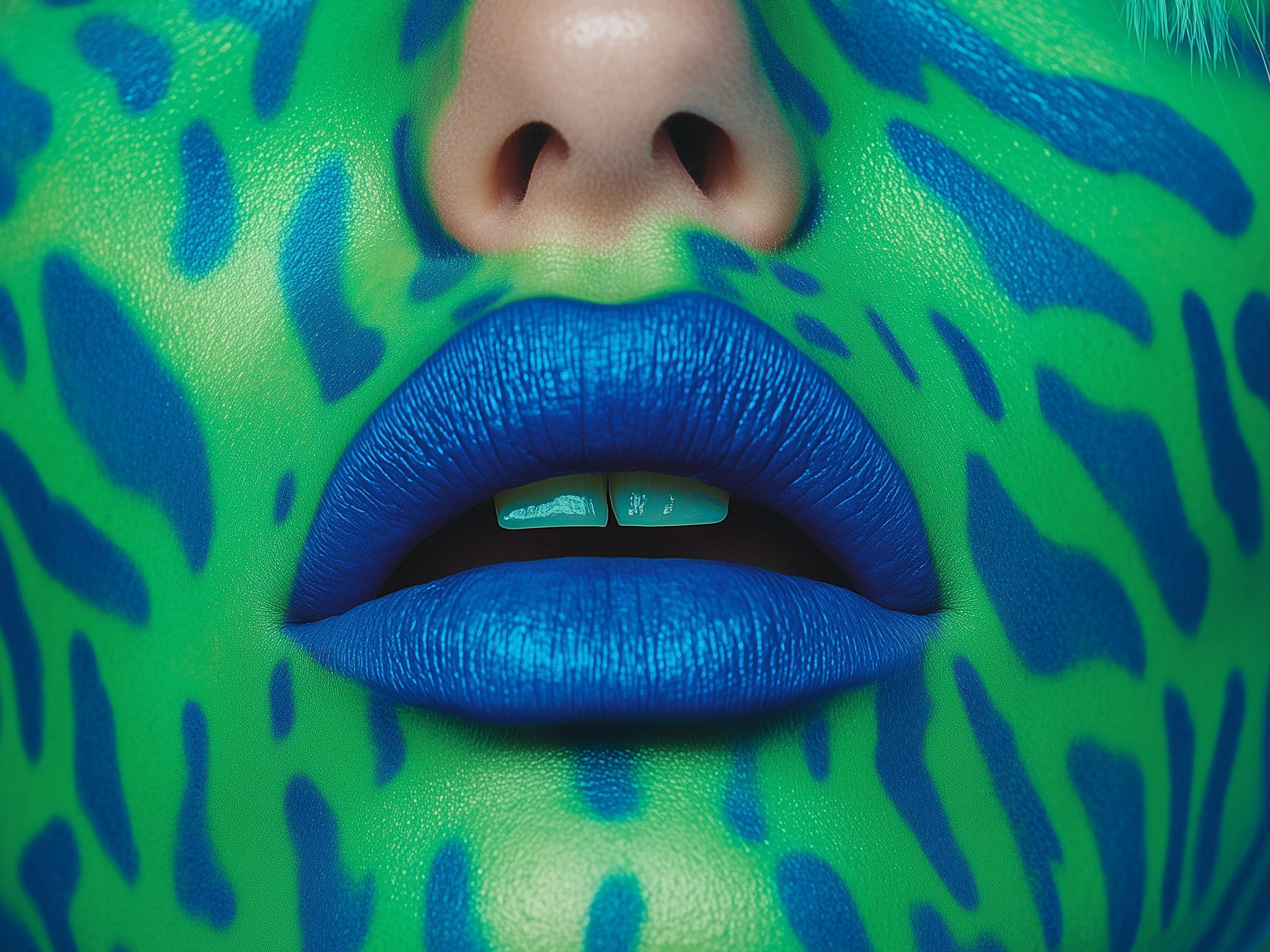
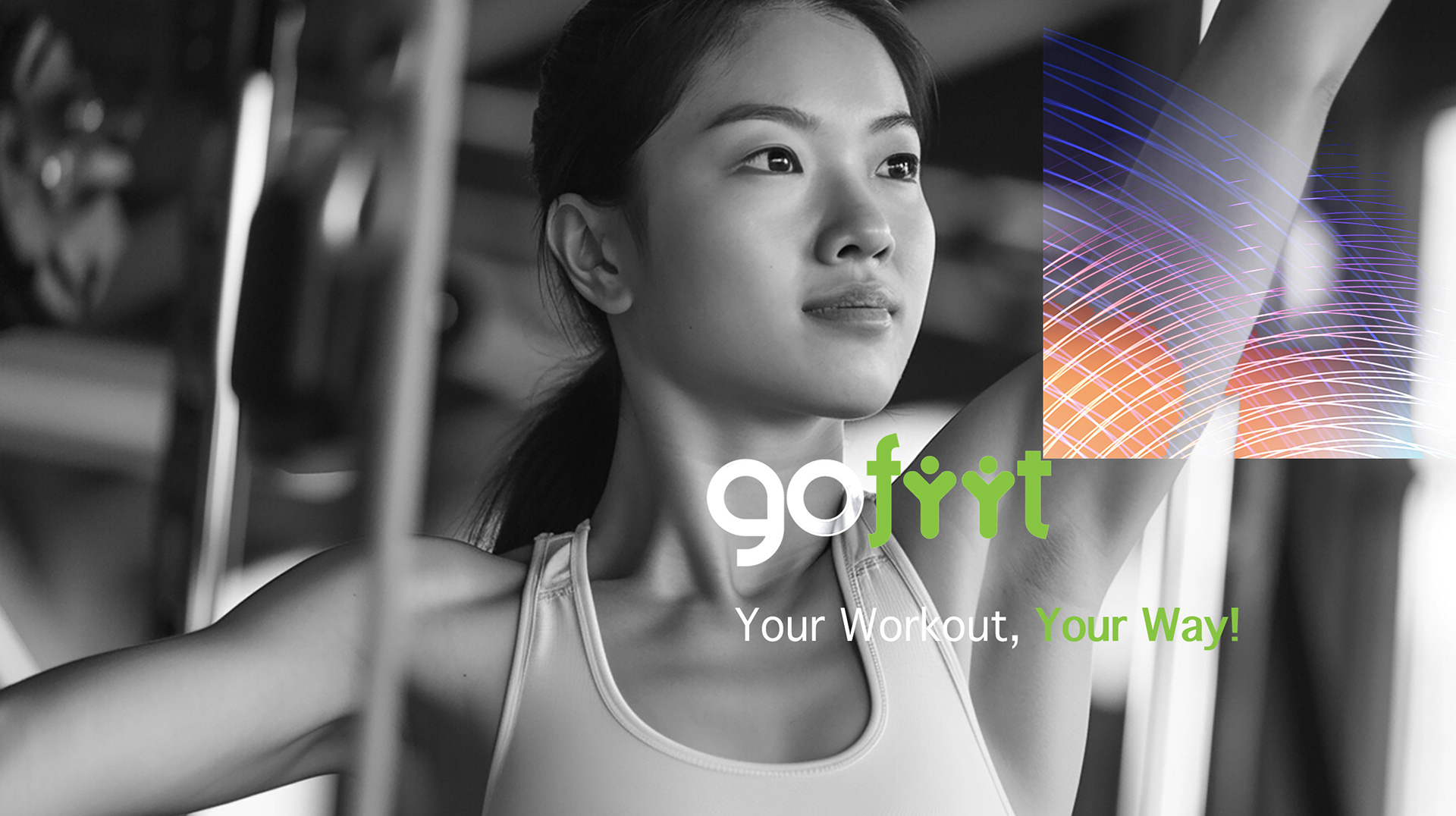
- Monochrome Portraits + Green Accents:
Emphasize determination and energy, while the green conveys vitality and inclusivity.
- Dynamic Line Graphics:
Symbolize movement, rhythm, and the personalized journey each member takes.
- Human-Inspired Logo:
The logo shapes suggest both people and activity, making fitness feel welcoming and social.
- Modern, Inviting Typography:
Ensures clarity and approachability for every user, on digital and print assets alike.
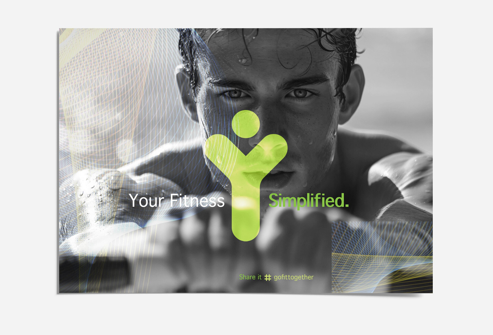
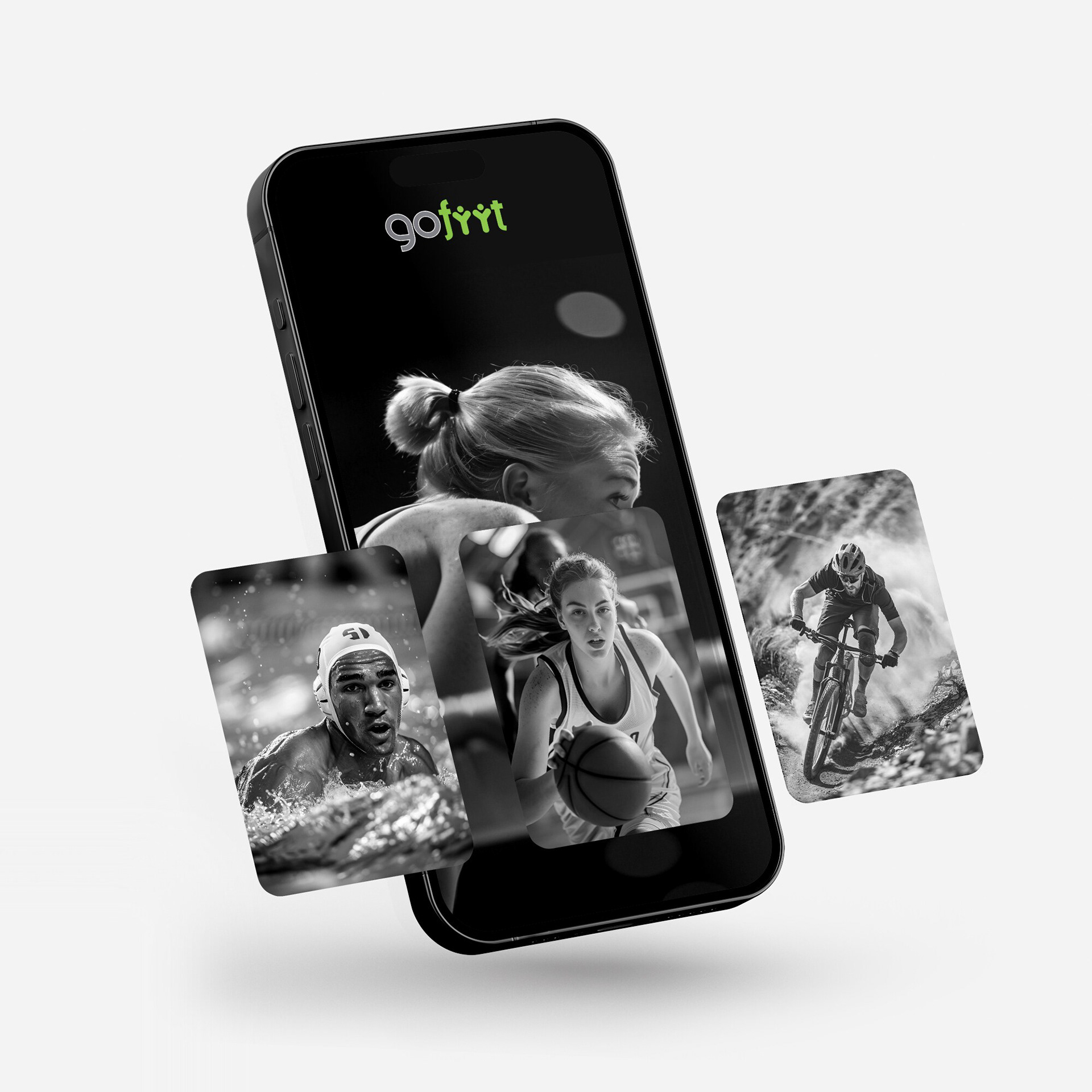
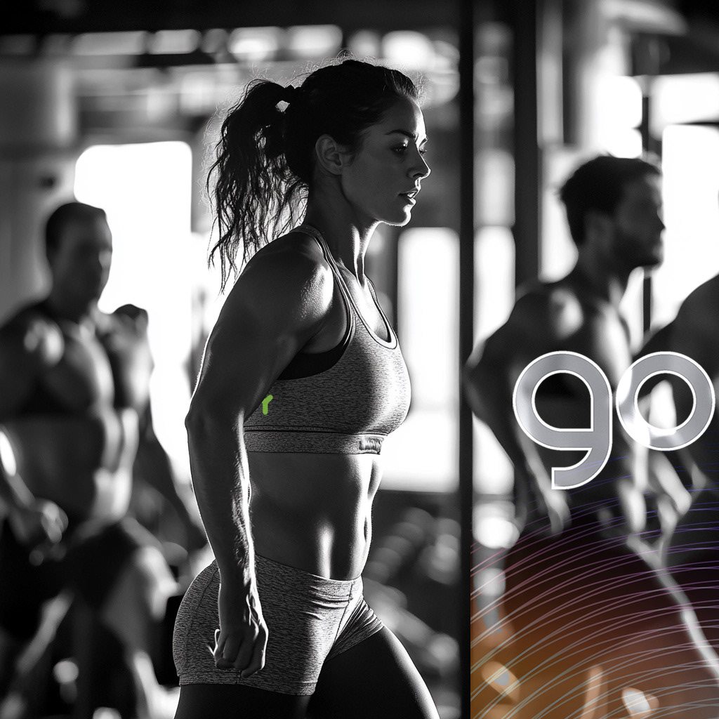
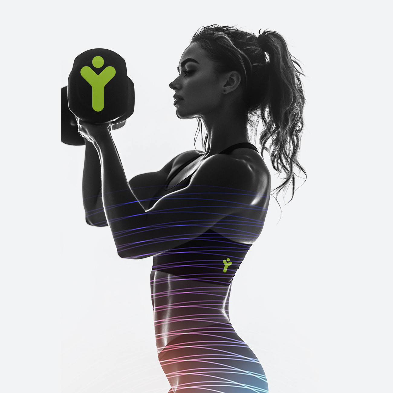
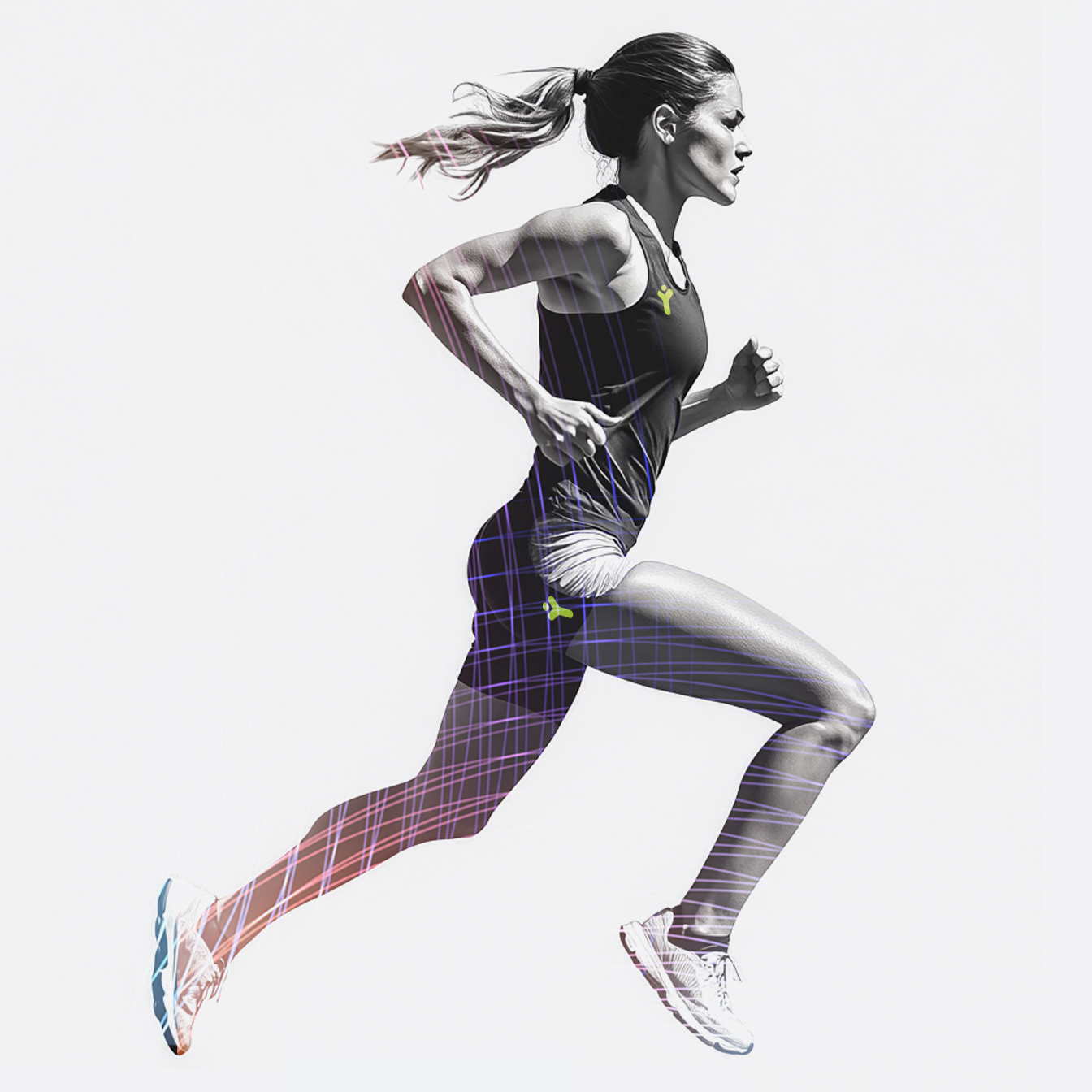
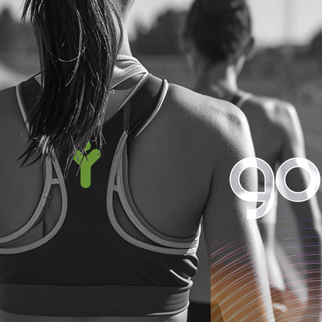
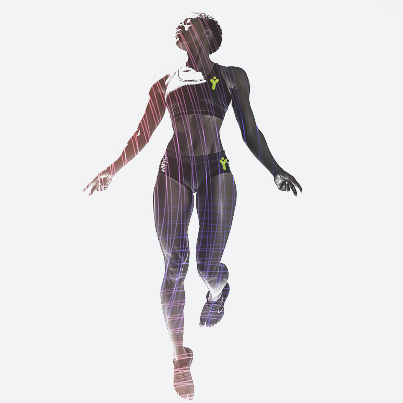
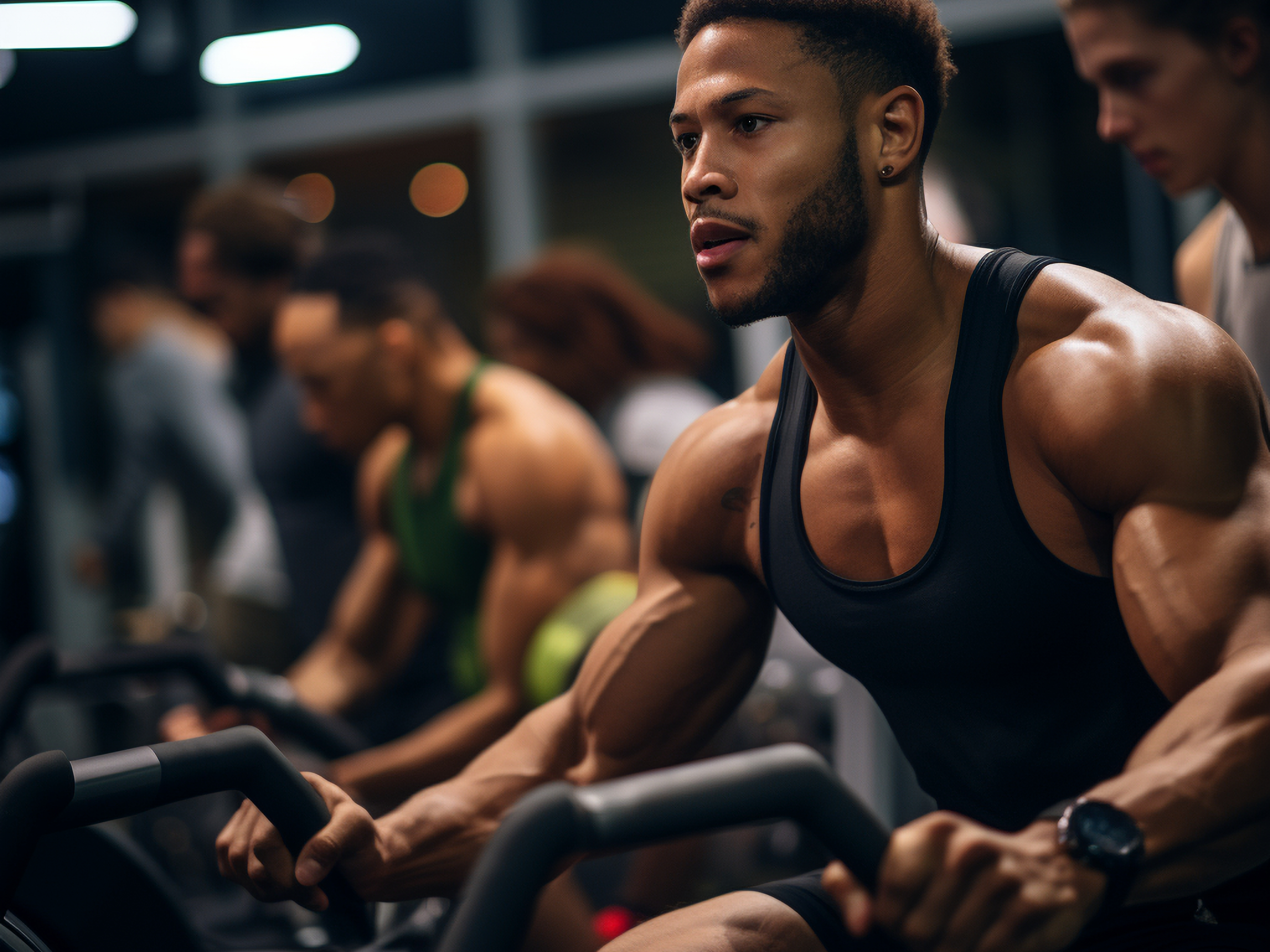
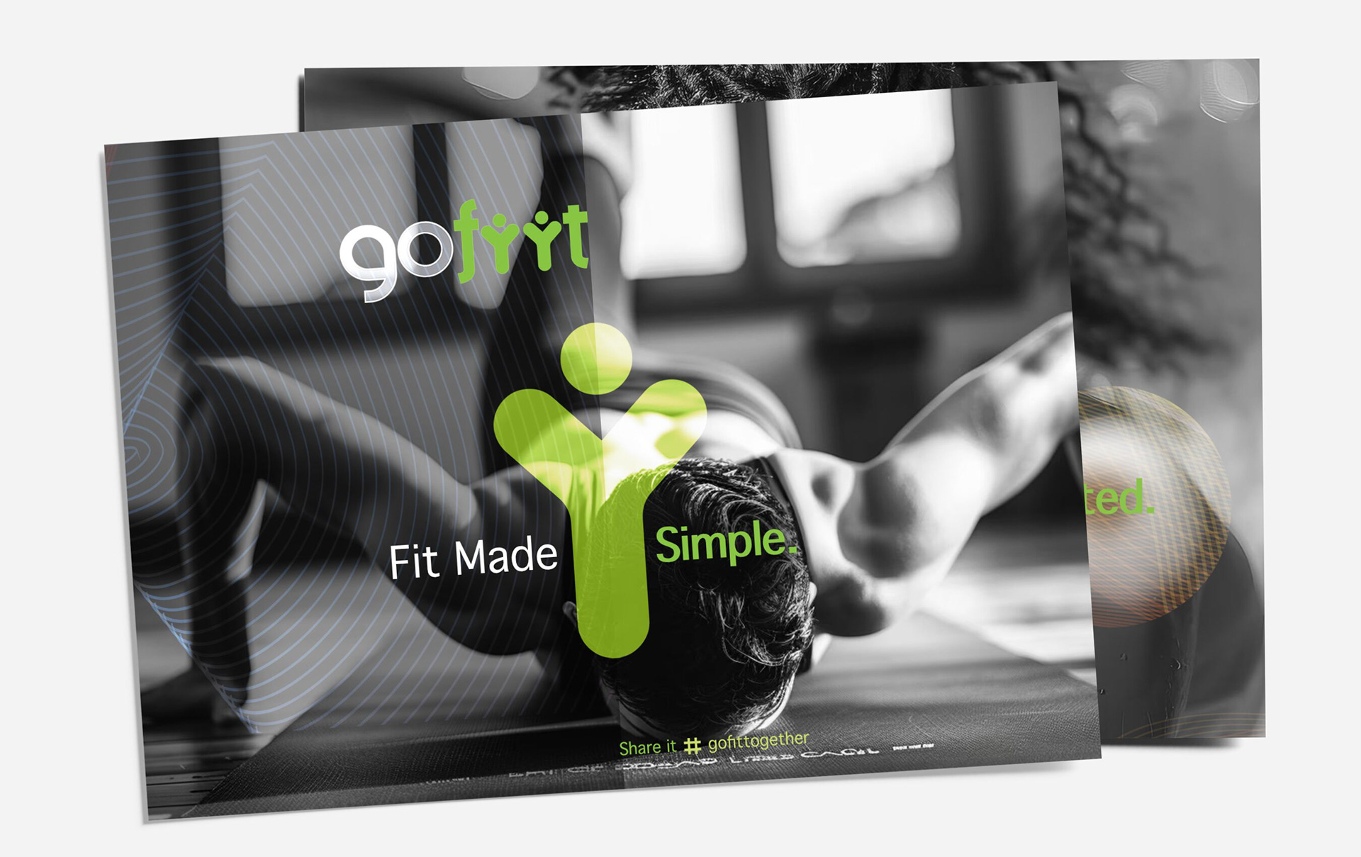
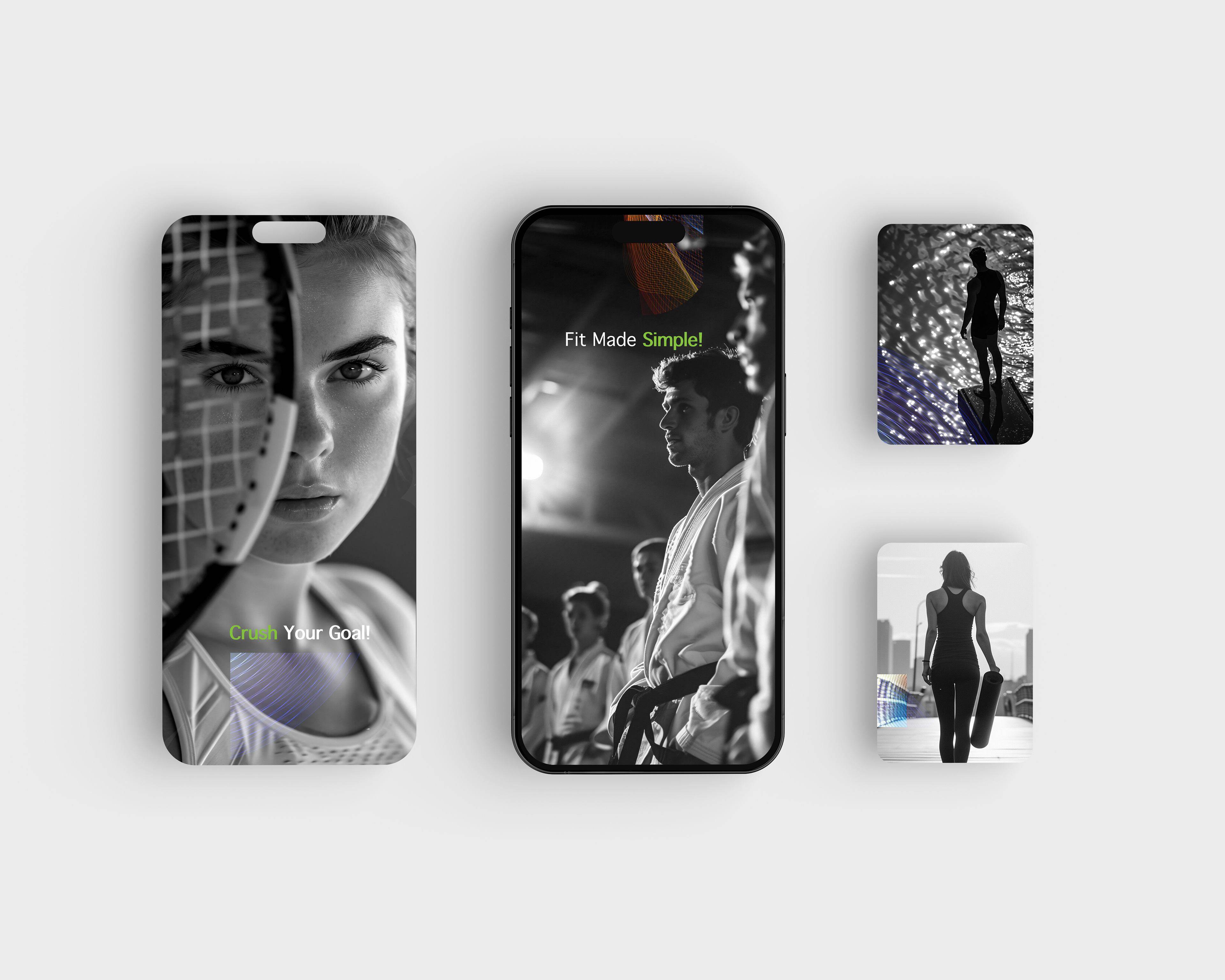
Concept Breakdown 2: IDENTITY IN MOTION
My design brings together the spirit of action and community, using vibrant gradient lines over striking monochrome photography to convey both energy and individuality.
The visuals pulse with motion with the flowing overlays represent momentum, progress, and the freedom to shape your own fitness story.
Central to each piece is the GOFIIT green icon, positioned as a symbol of support and belonging.
The mix of close-ups and full-body shots captures real moments of focus, strength, and confidence across different athletes.