CLIENT / Com & Co, Marseille, France
Project Overview
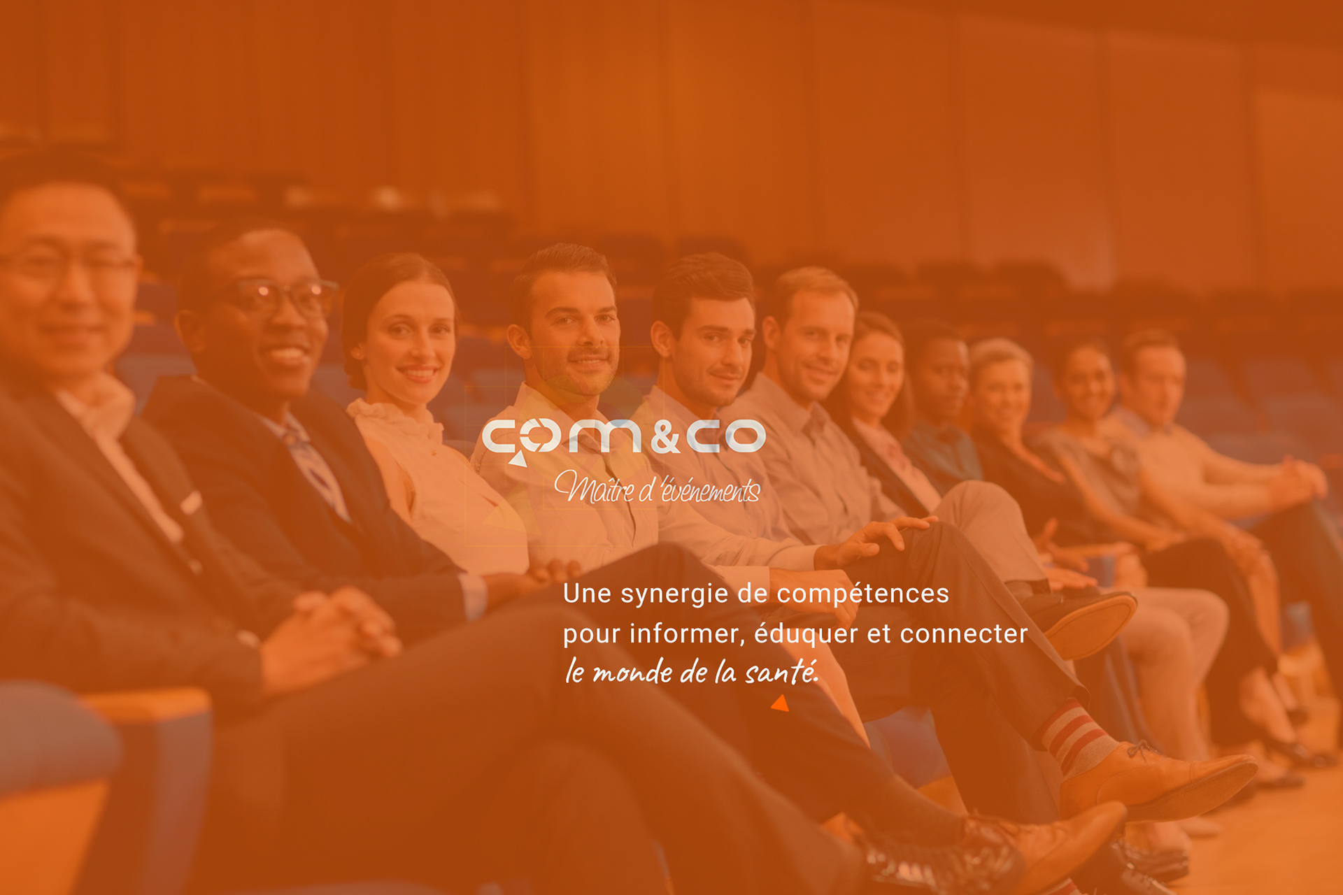
Com&Co, a prominent French event agency specializing in the healthcare sector, sought to create its brand identity to reflect its dynamic approach to organizing digital, hybrid, and in-person events.
The objective was to elaborate a cohesive visual language through all the medical congresses or conferences that would resonate across various platforms and enhance audience engagement.
The objective was to elaborate a cohesive visual language through all the medical congresses or conferences that would resonate across various platforms and enhance audience engagement.
Approach & Solution
As Associate Art Director, I led the development of a comprehensive graphic identity that encapsulates Com&Co's innovative spirit and commitment to excellence:
- Logotype Design: Crafted a modern and versatile logotype that embodies the agency's
forward-thinking ethos.
- Visual Identity: Established a cohesive visual system, including color palettes and typography,
to ensure consistency across all branding materials.
- Digital Assets: Designed engaging digital content tailored for online platforms,
enhancing the agency's digital presence and outreach.
This branding strategy strengthened its position in the competitive event management landscape.
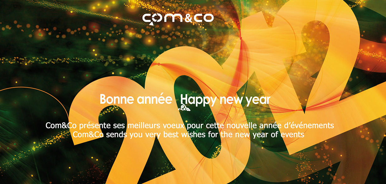
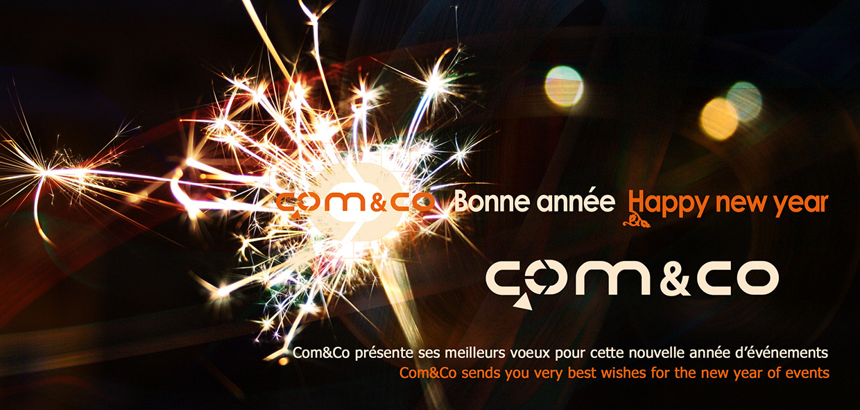
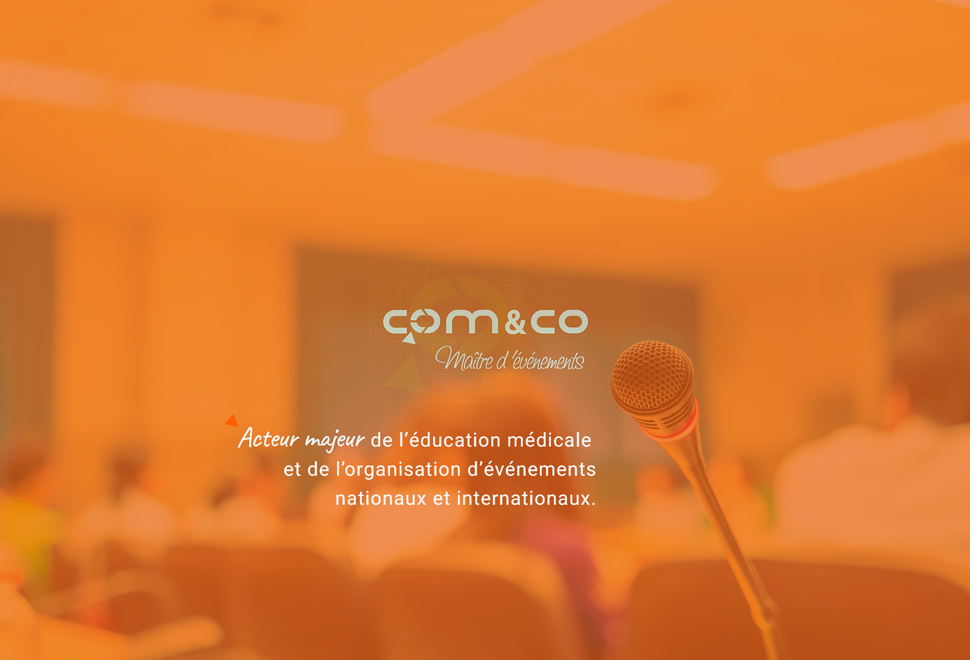
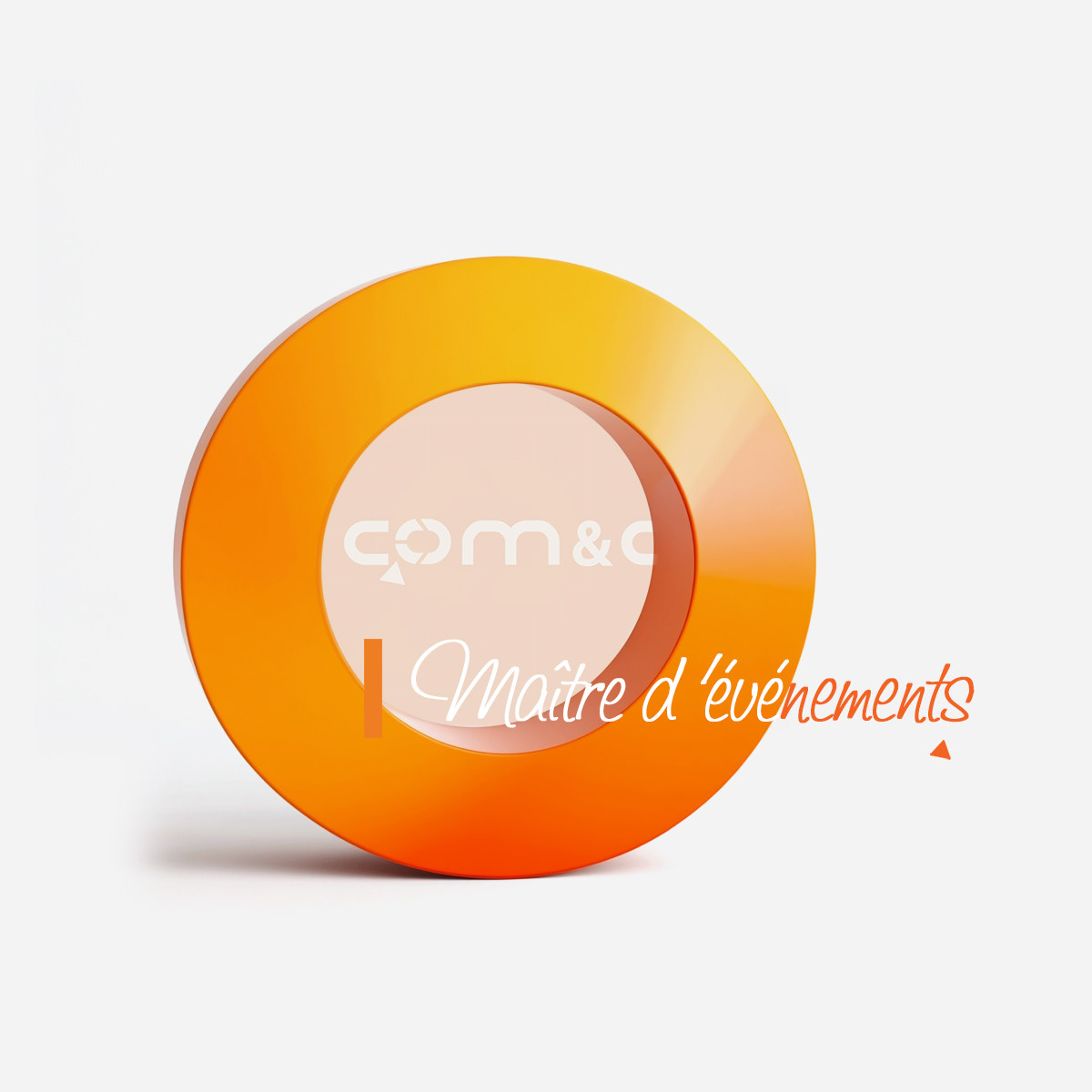
LOGO DESIGN: STRUCTURE, CREATIVITY AND MOVEMENT
The logo was designed to reflect the agency’s core strengths—communication, coordination, and creativity in event management. The geometric shapes and construction lines suggest precision, structure, and a strategic approach, which are key elements in organizing large-scale events:
- Geometric grid and shapes reflect the agency’s structured, strategic approach to
event planning and communication.
- Rounded, bold typography gives the logo a contemporary and professional look while
remaining friendly and accessible.
- Arrow and circular motion embedded in the “O” symbolize creativity, progress,
and the dynamic nature of the agency’s work.
- Bright orange palette evokes energy, visibility, and collaboration — key values for an
event-focused agency.
The logo's clean, modular design allows it to be flexible and impactful across digital, print, and environmental applications.
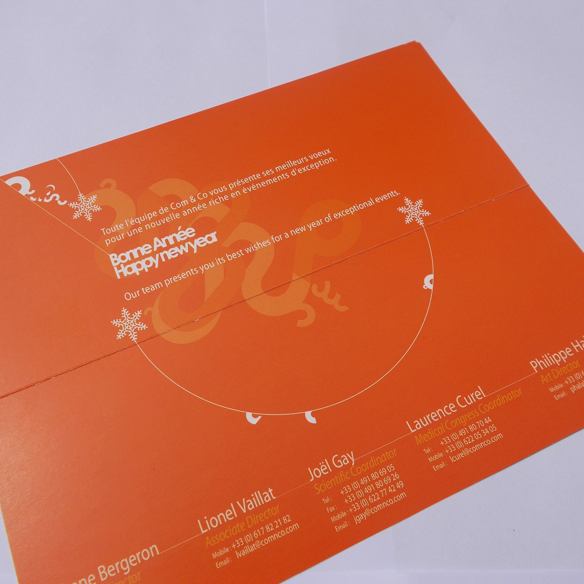
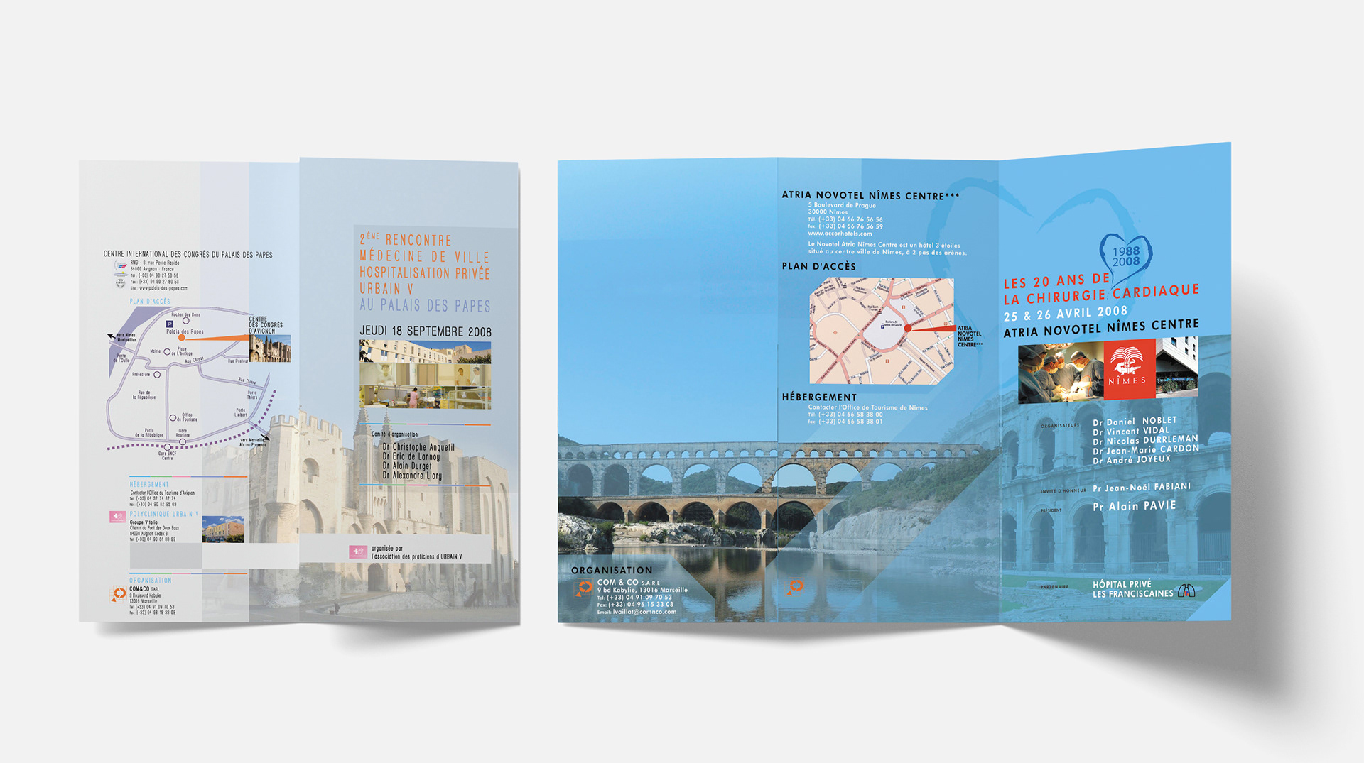
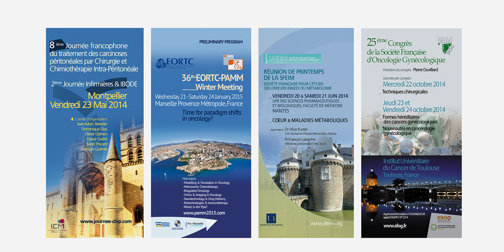
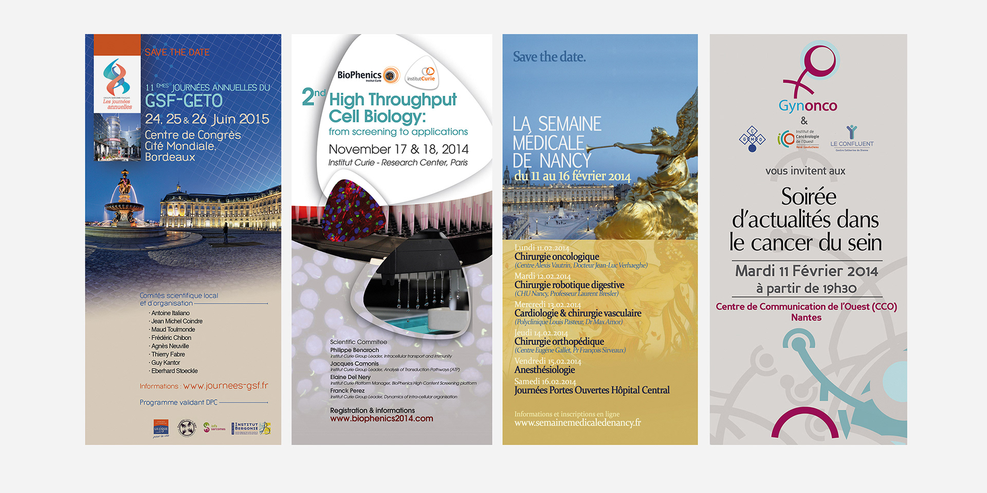
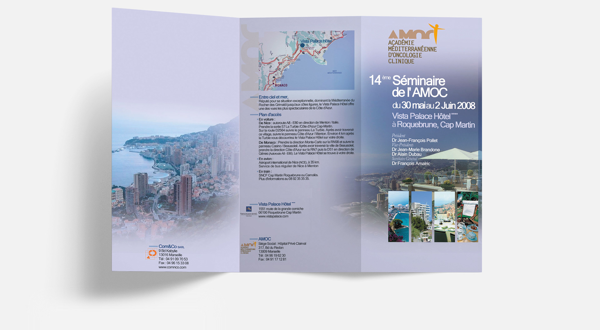
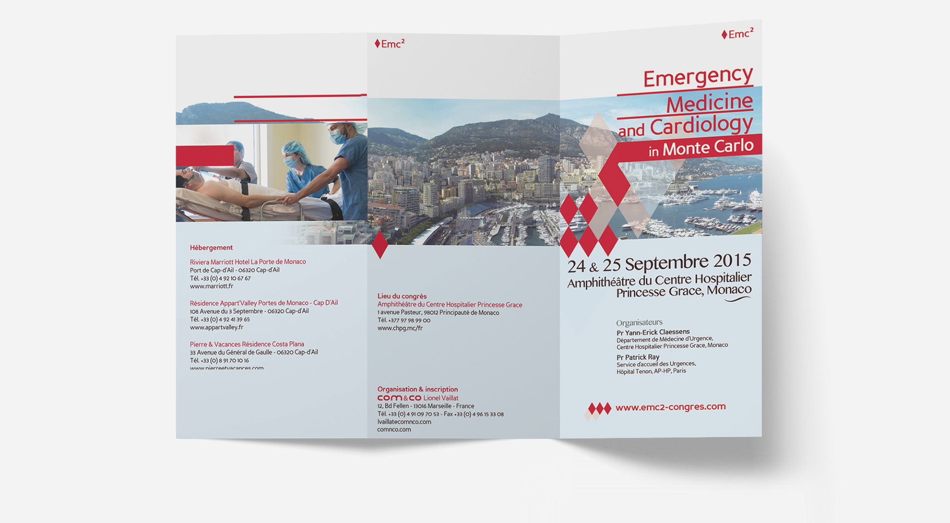
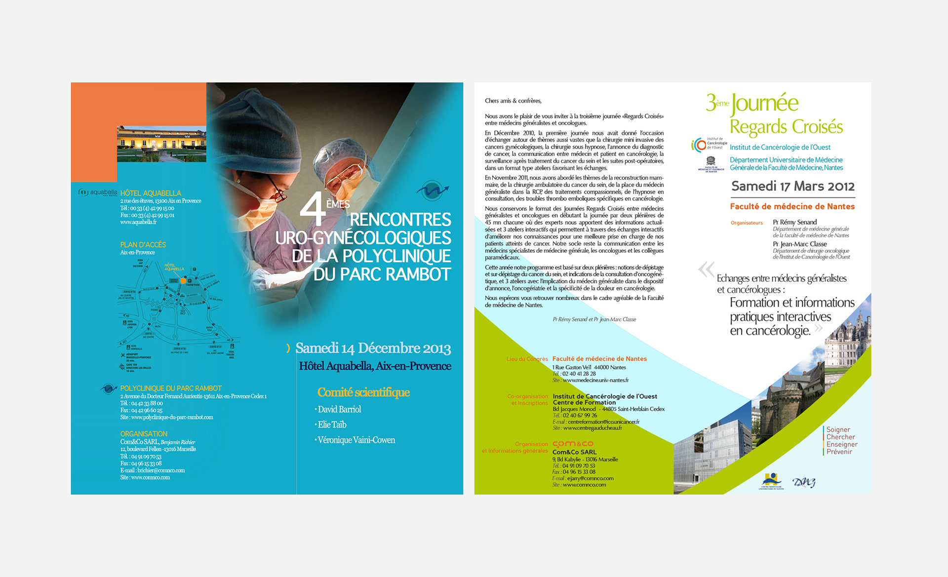
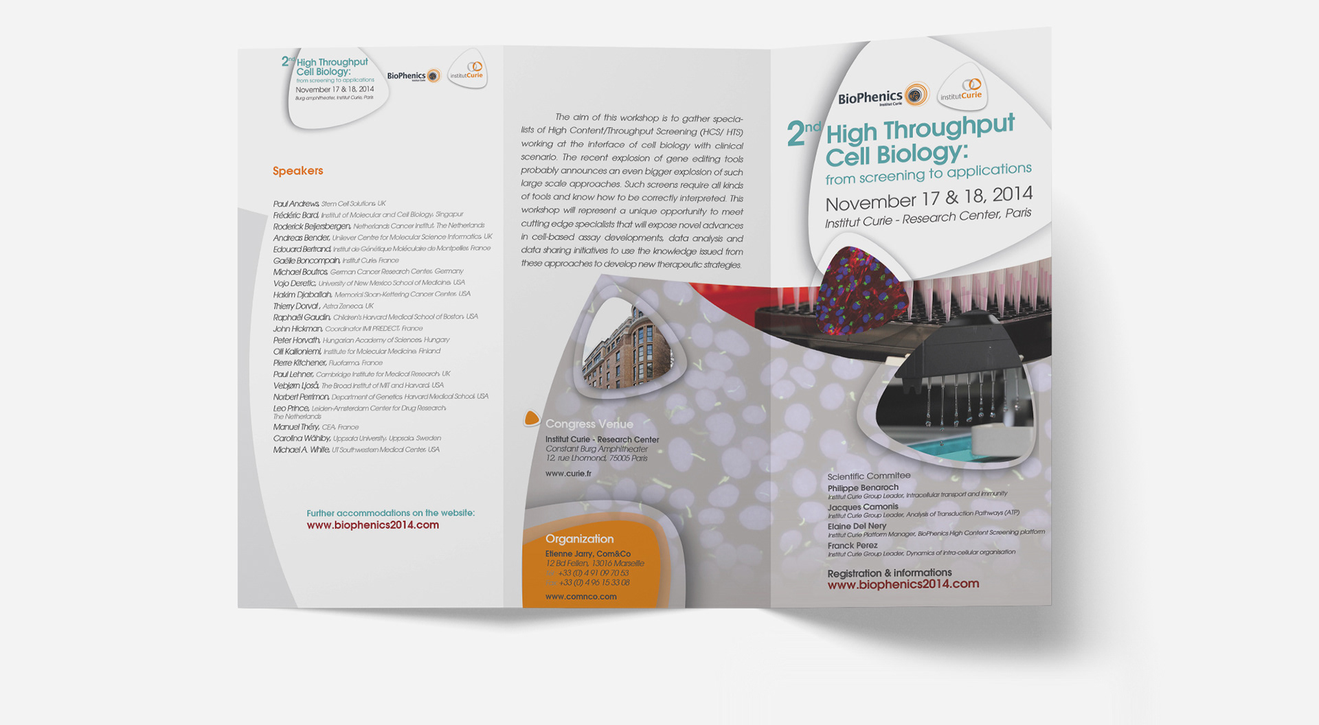
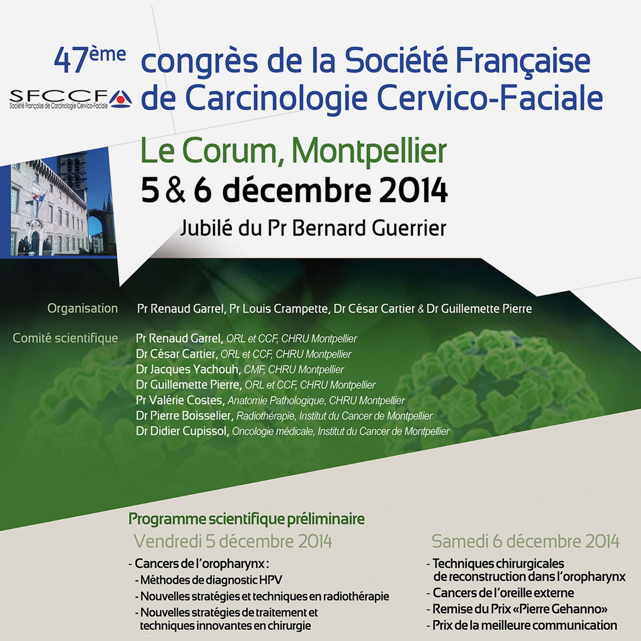
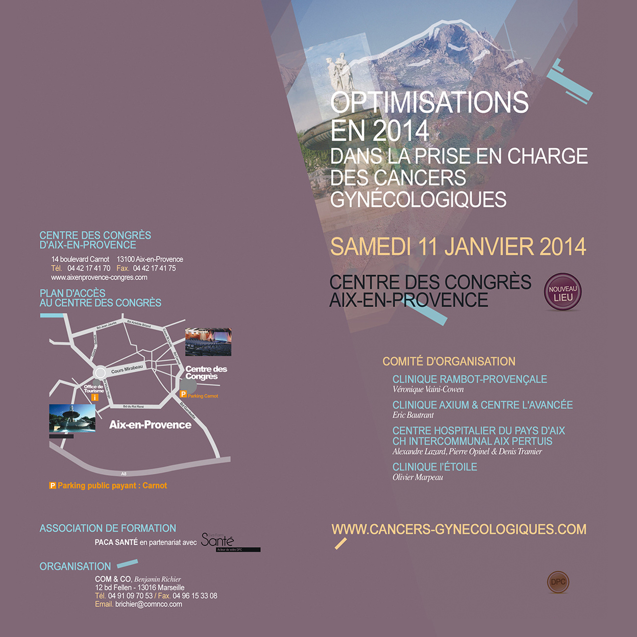
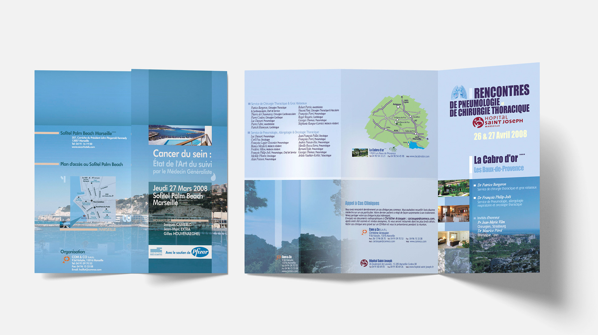
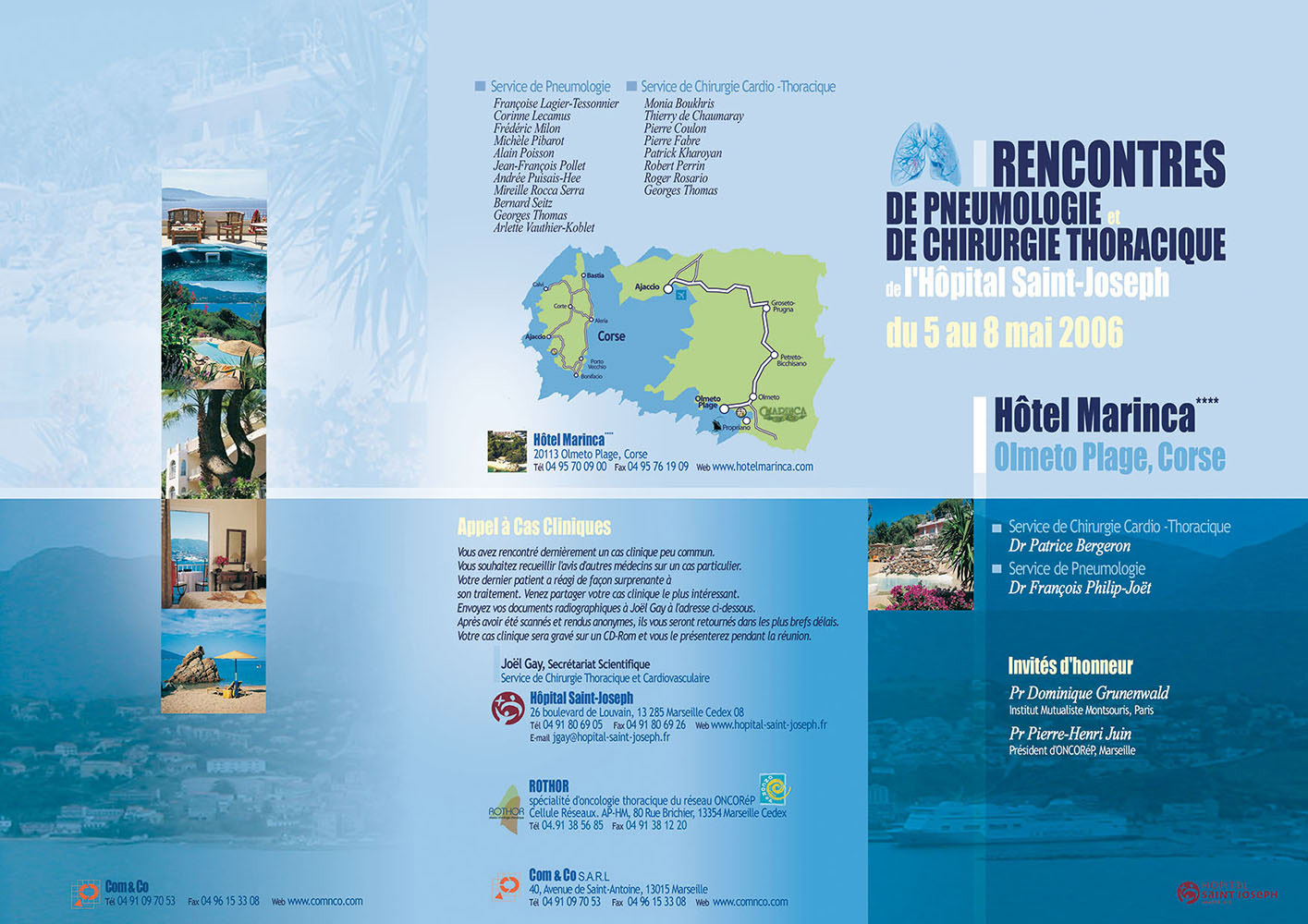
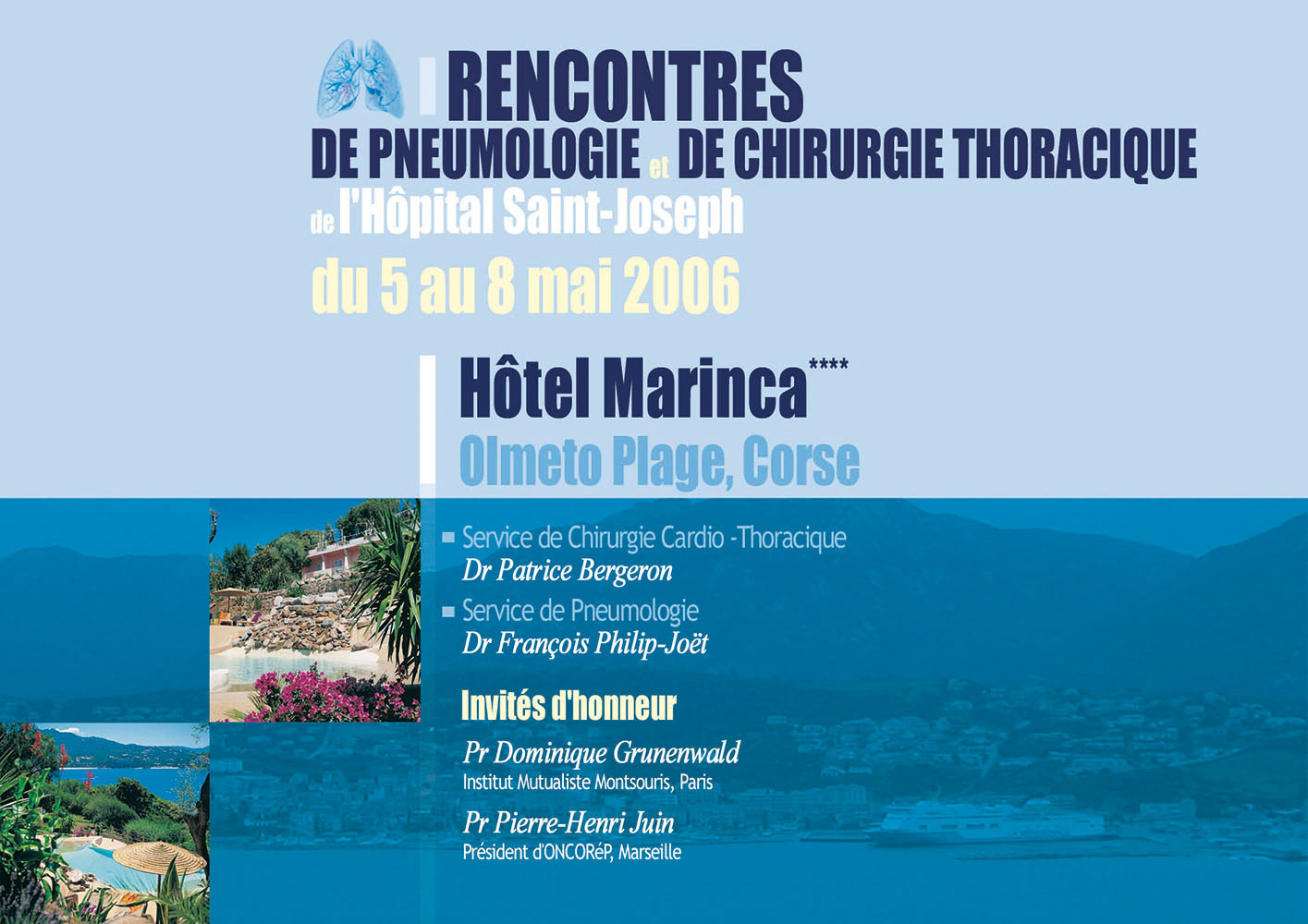
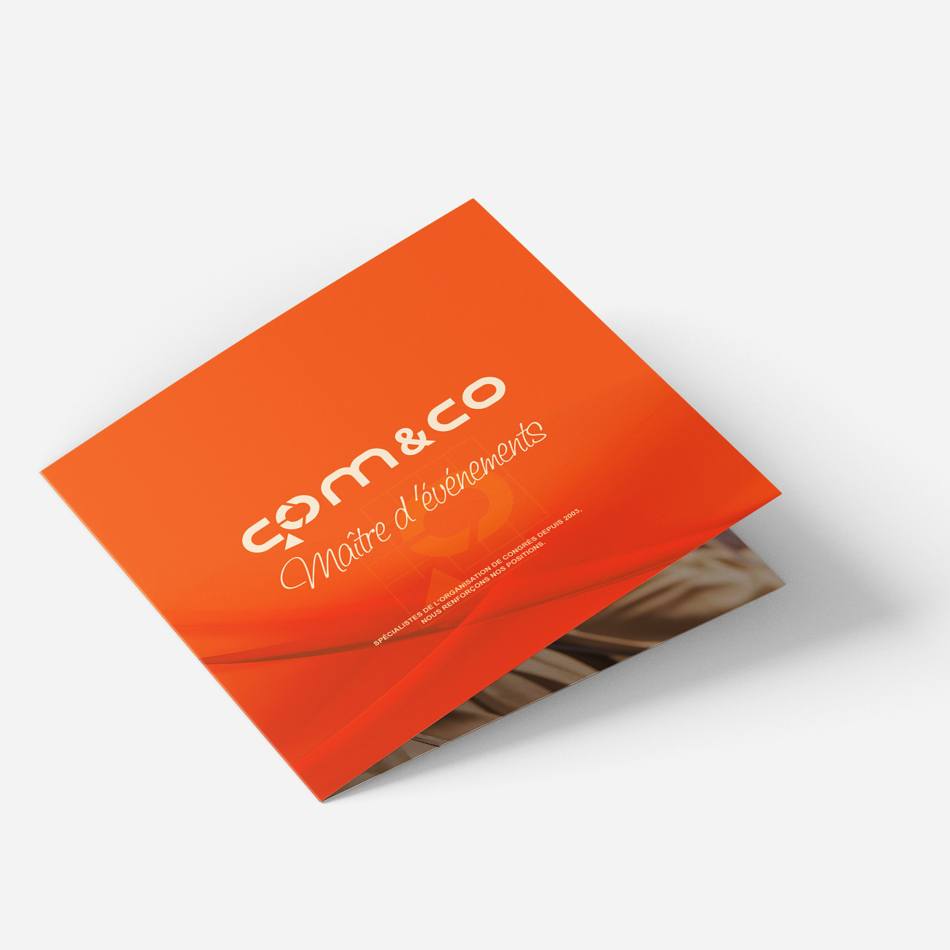
graphic Breakdown 1: custom identity for each congress
For Comnco, I created a tailored graphic identity for each medical congress the company organized.
Each trifold brochure was designed to reflect the event’s theme, location, and scientific focus through custom layouts, visual hierarchies, and color palettes.
I managed print and digital formats, ensuring consistency across all materials while adapting the tone to suit medical and academic audiences.
The result was a clear, structured, and professional system that helped distinguish each congress visually.

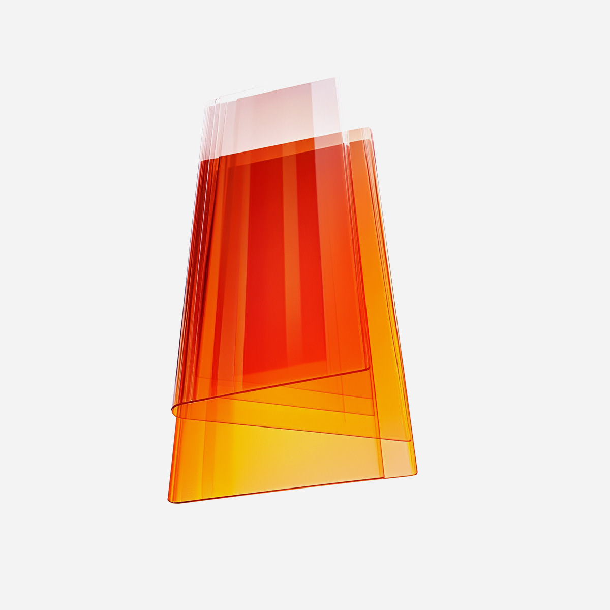
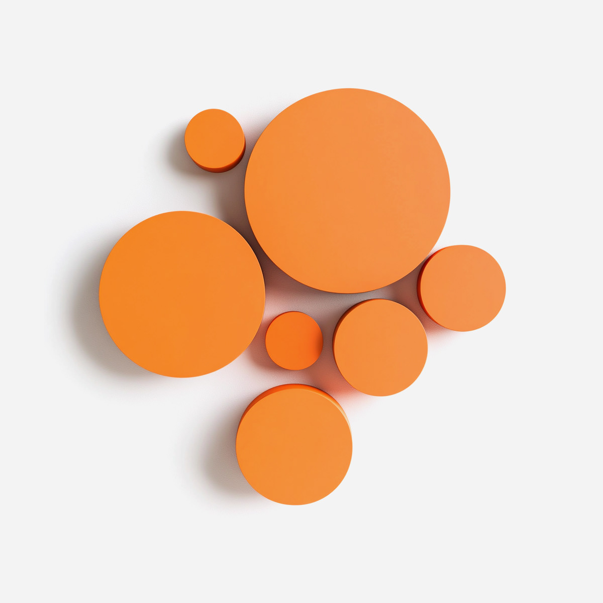
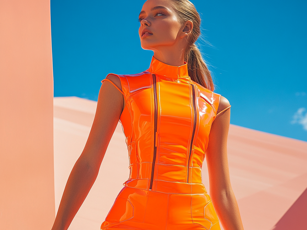
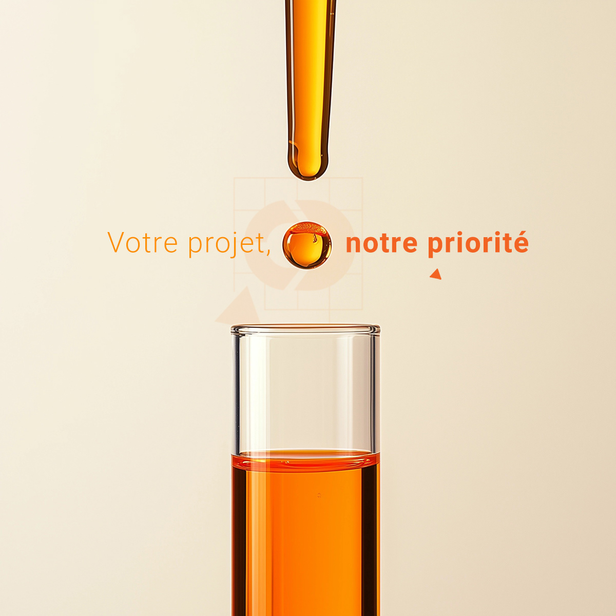
graphic Breakdown 2: the science of orange
These visuals embody the Comnco identity through a refined use of orange, a color associated with energy, visibility, and clarity.
Orange evokes urgency, innovation, and communication in the medical and scientific world:
- The test tubes and drop reference clinical precision and laboratory work.
- The circular and spherical forms suggest continuity, motion, and holistic care.
- The minimal, high-gloss aesthetic balances professionalism with warmth.
Together, these images create a modern, clean visual language that is directly aligned with Comnco’s mission in the healthcare event sector.

graphic Breakdown 3: rethinking medical aesthetics
These visuals demonstrate a careful attention to detail and a deliberate departure from the standard blue-white codes often used in medical communications.
I crafted a distinct visual identity for each event—balancing professional clarity with graphic freshness.
From bold geometric layouts to nuanced color contrasts, I introduced warmer tones, gradients, and layout shifts that made the brochures feel more inviting and modern—without losing the authority needed for scientific or clinical audiences.

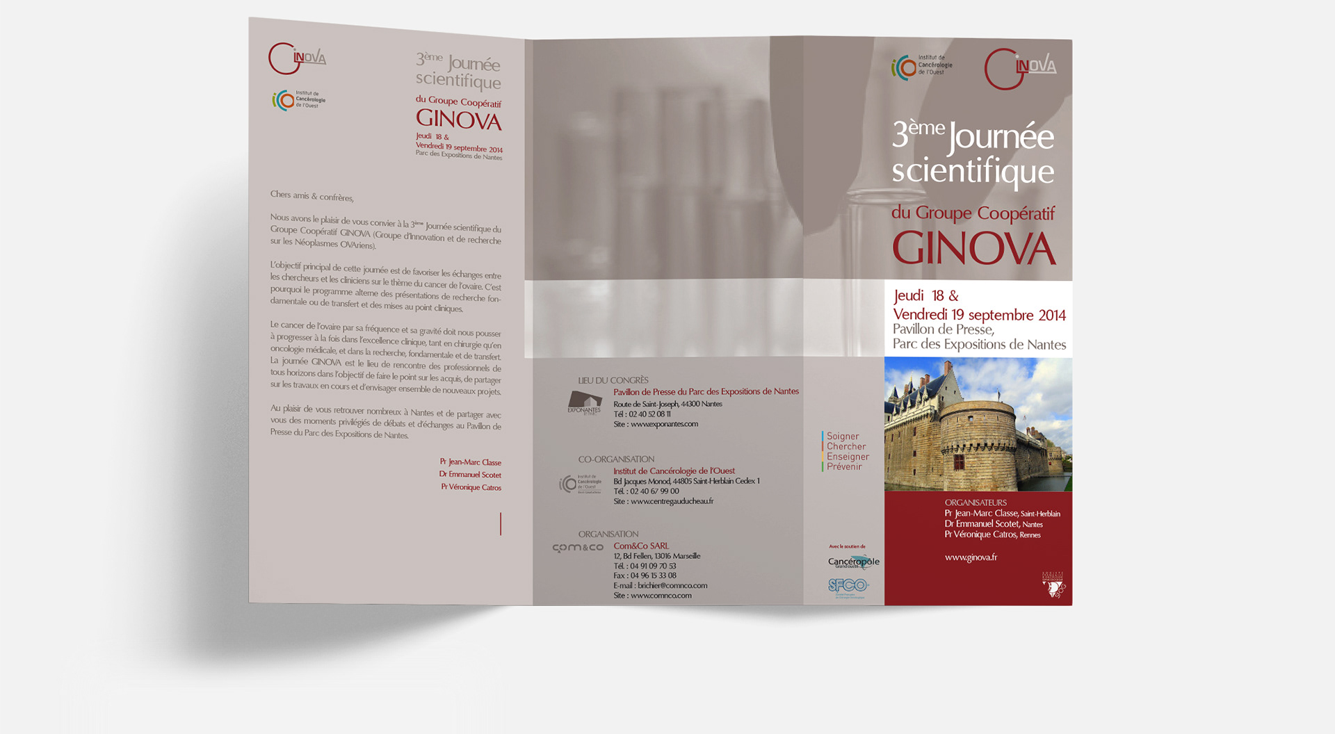
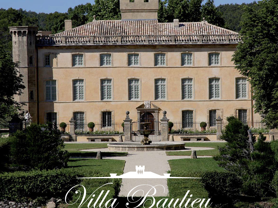
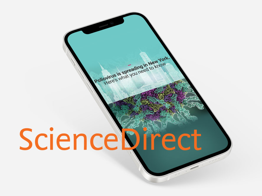
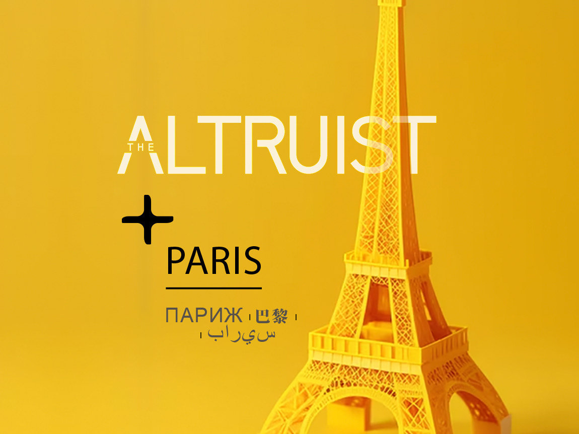
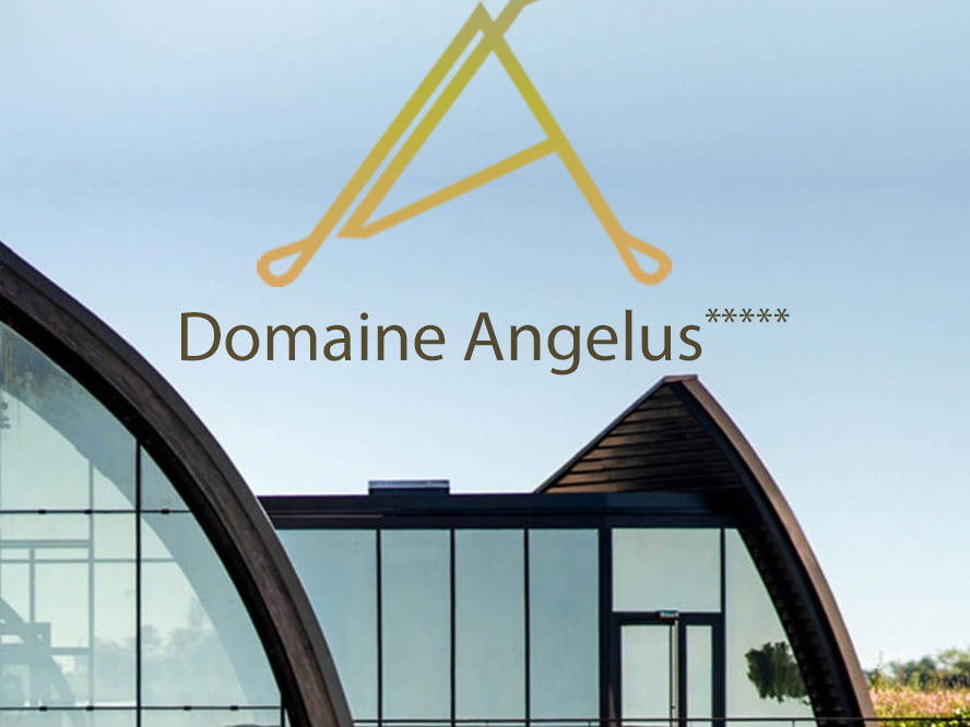
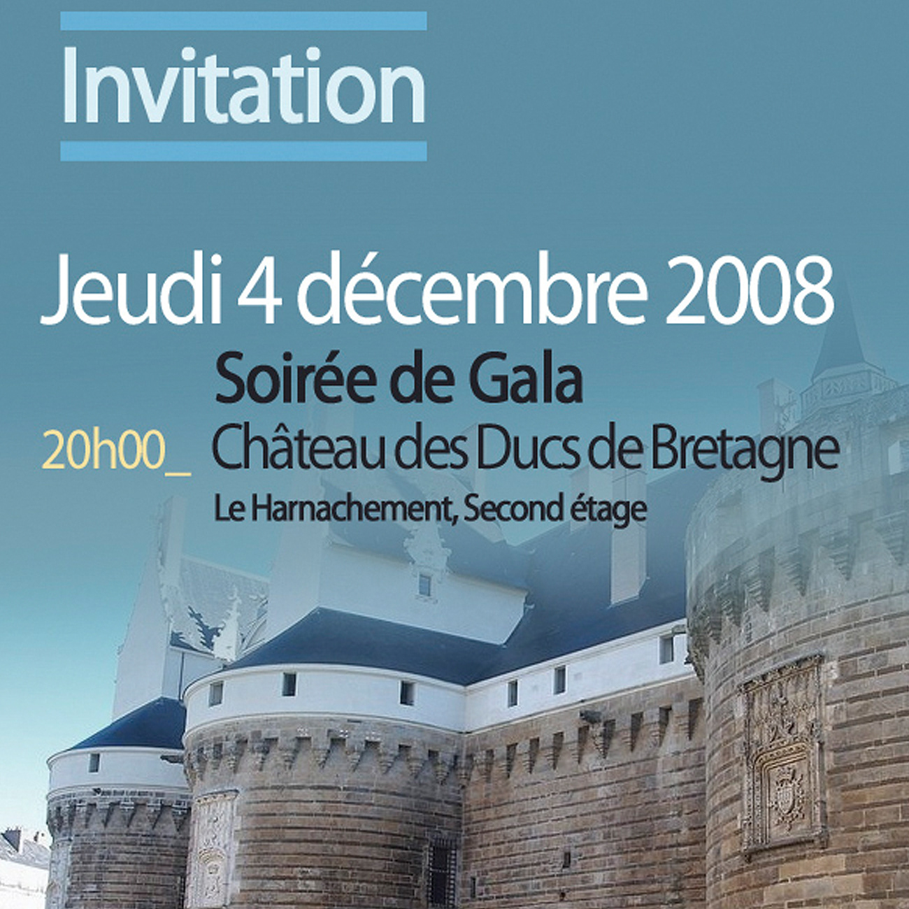
concept Breakdown 1: designing events through geography, not generality
I deliberately chose to highlight the location for each of these congress visuals rather than rely on generic
or clinical medical imagery.
The design creates a stronger emotional connection with attendees by featuring cityscapes, architecture,
or iconic landmarks from the event’s host city, grounding the scientific content in a real, memorable place.
This approach not only enhances visual diversity across events but also reflects the human dimension
of each gathering, making the identity of each congress more distinctive and welcoming.

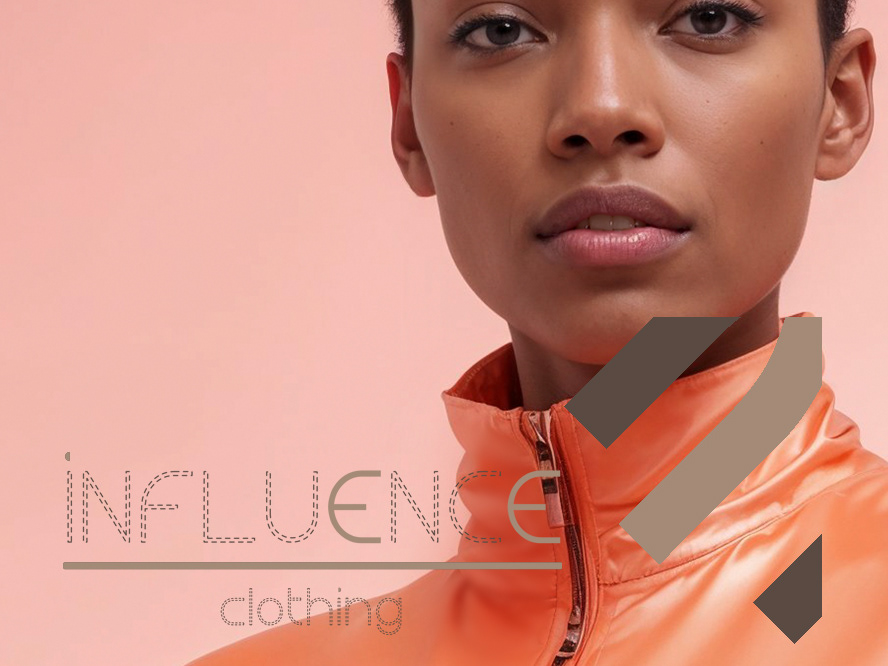
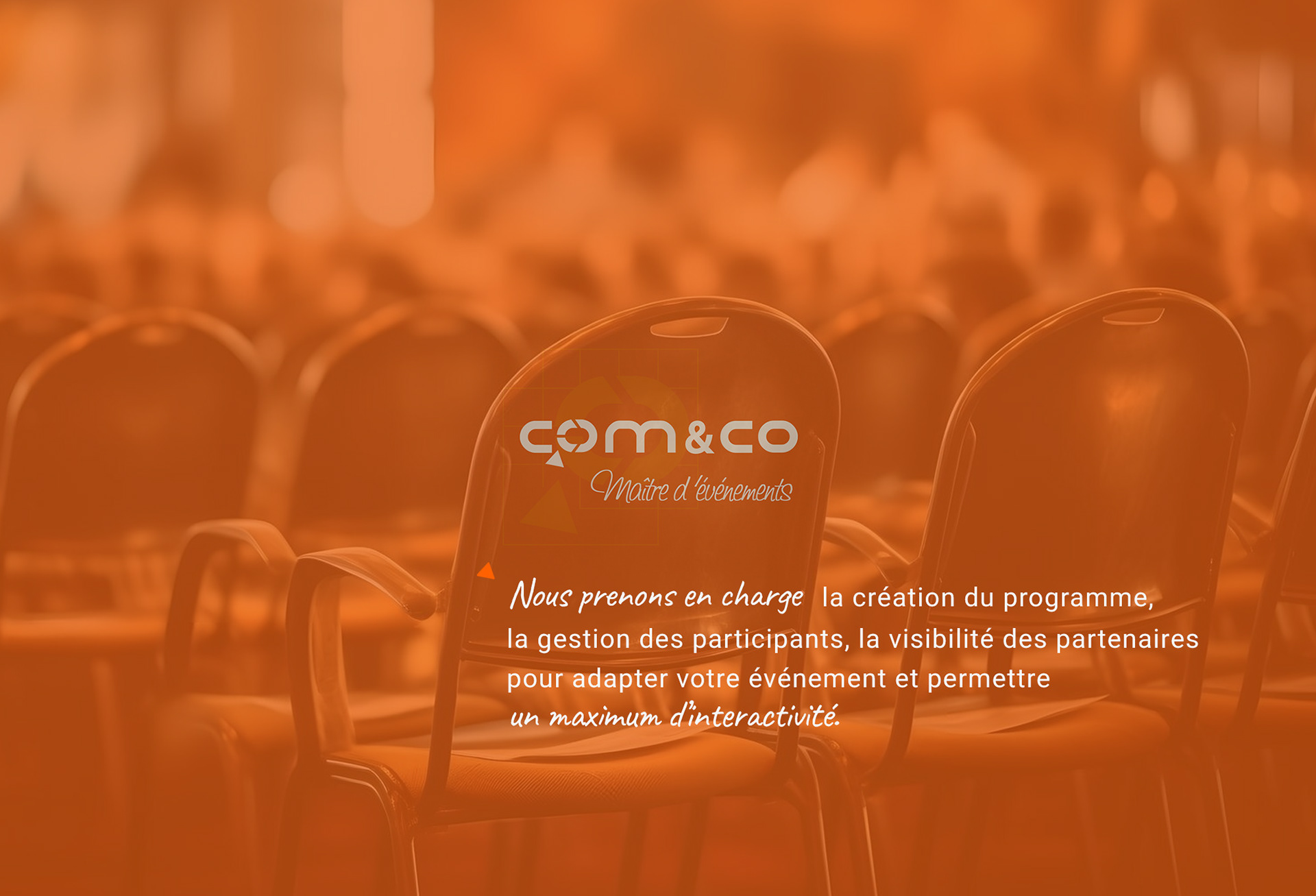
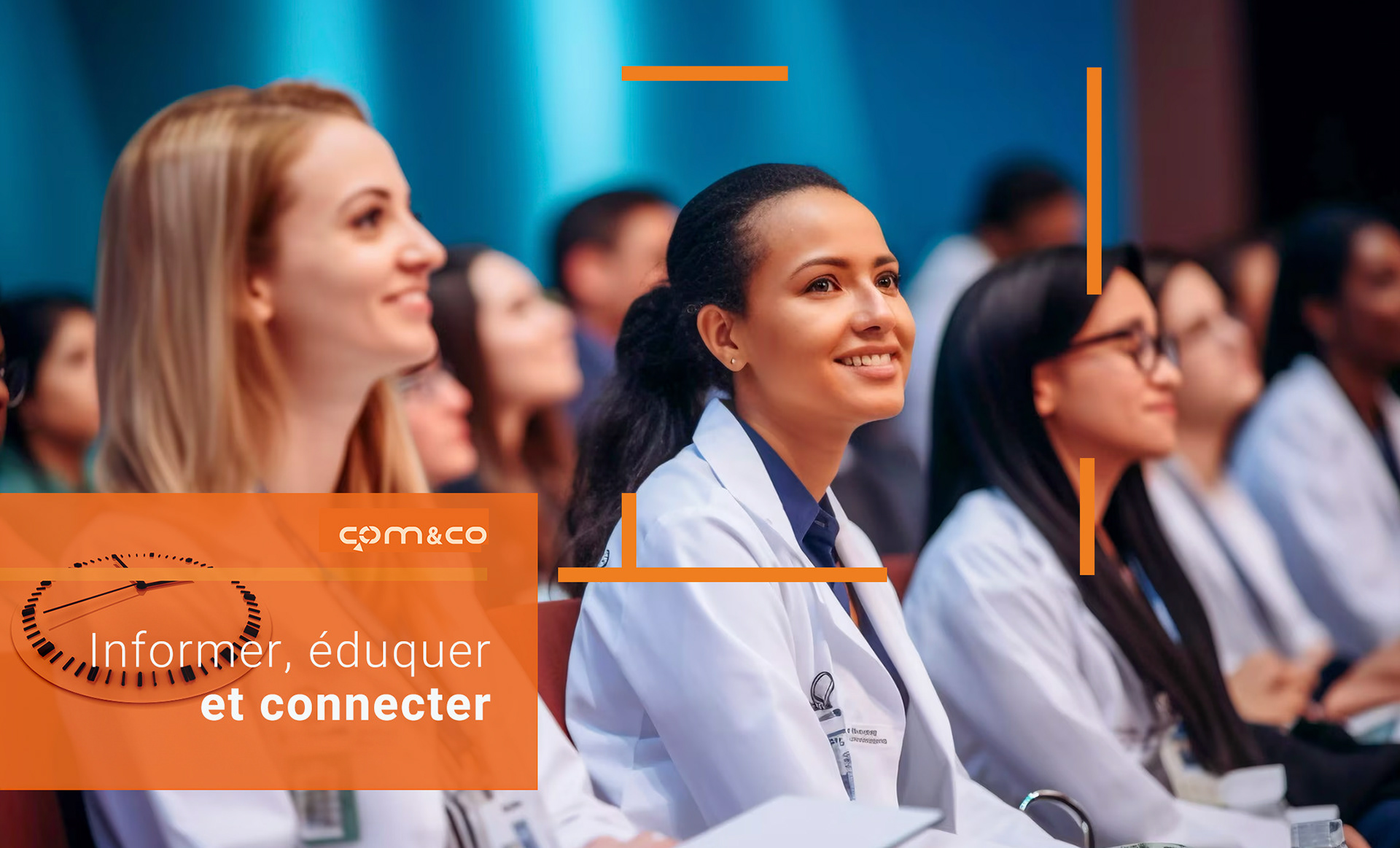
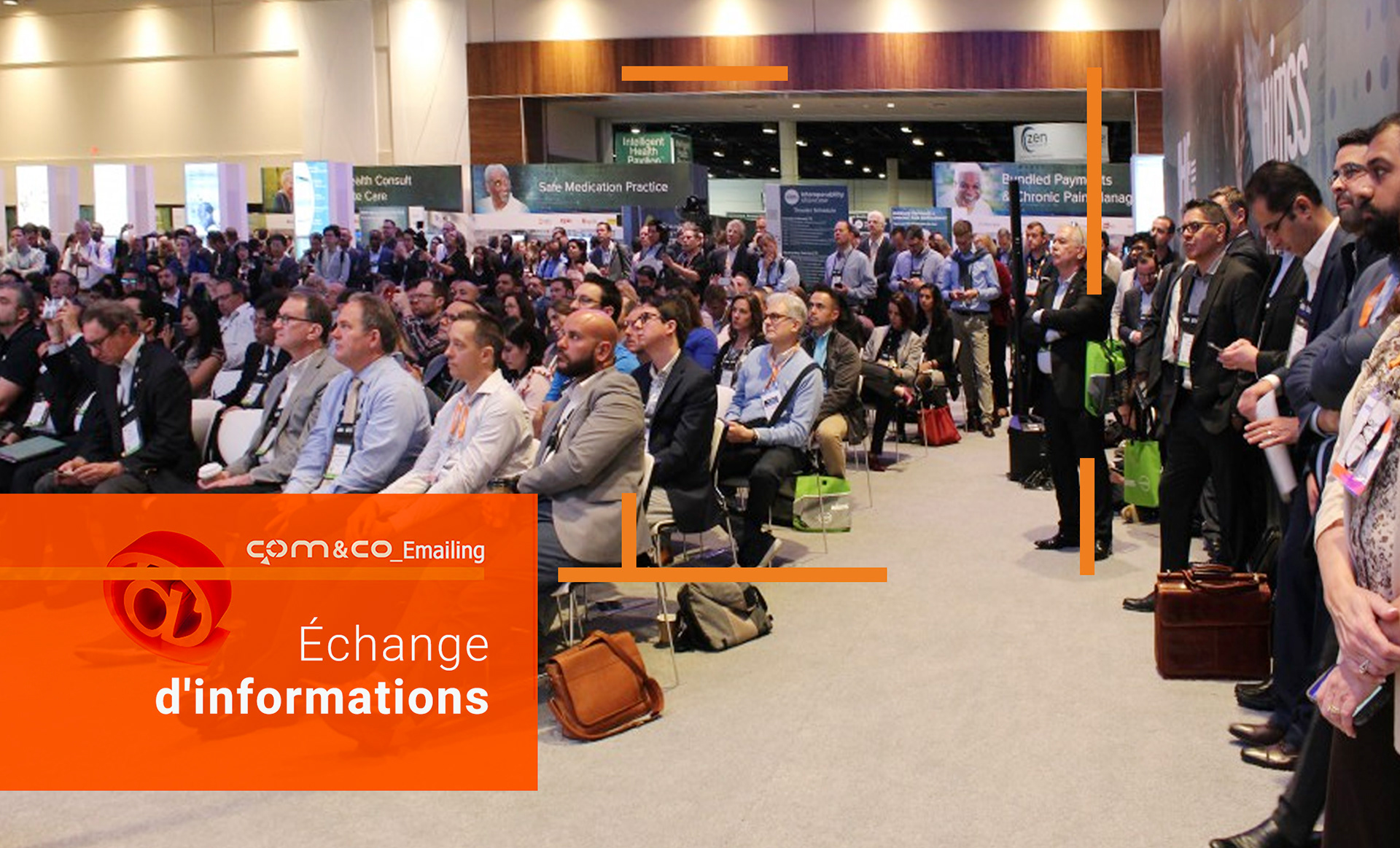
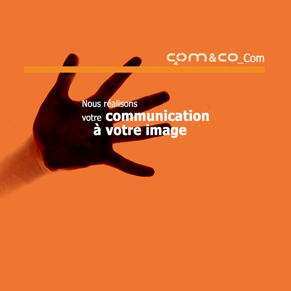
concept Breakdown 2: clarifying services
I designed these images to introduce and differentiate Comnco's range of services.
Each layout highlights a specific function through contextual photography and color-coded overlays, such as education, information exchange, and connection.
Comnco’s signature orange consistently reinforces brand recognition, while the framing elements guide
the viewer’s attention and create a unified visual identity across platforms.
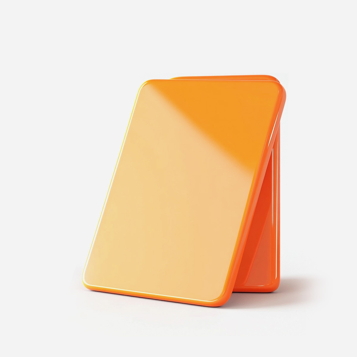
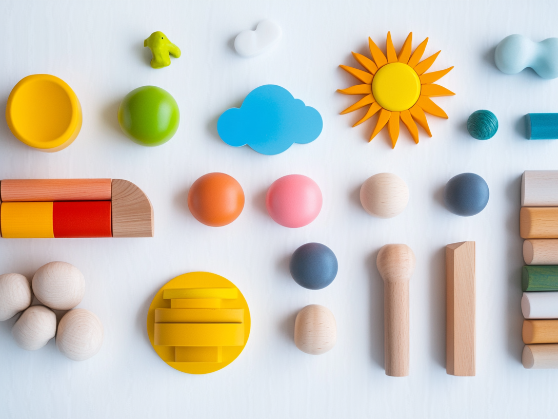
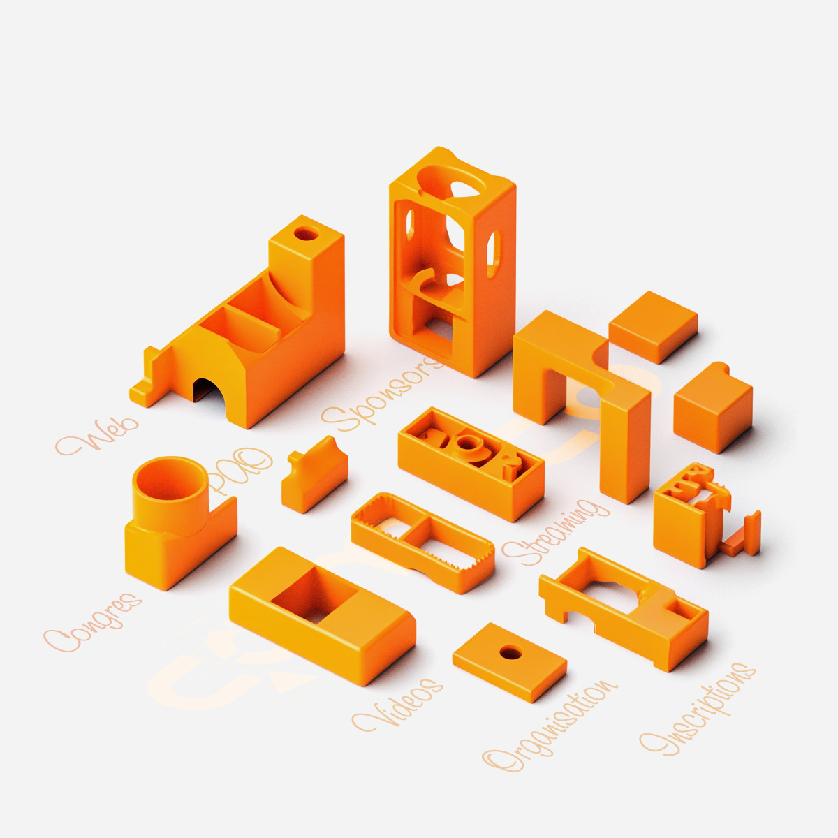
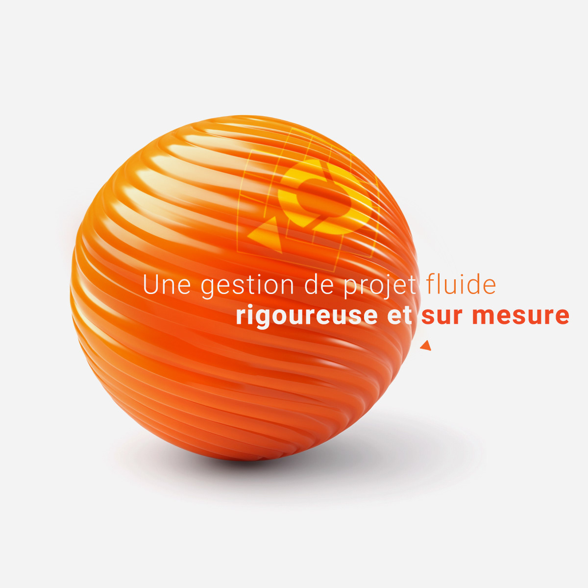
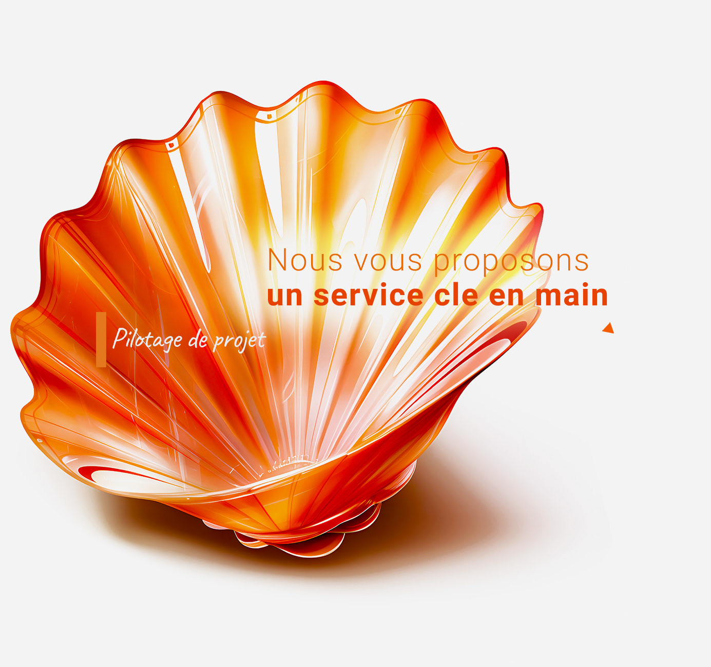
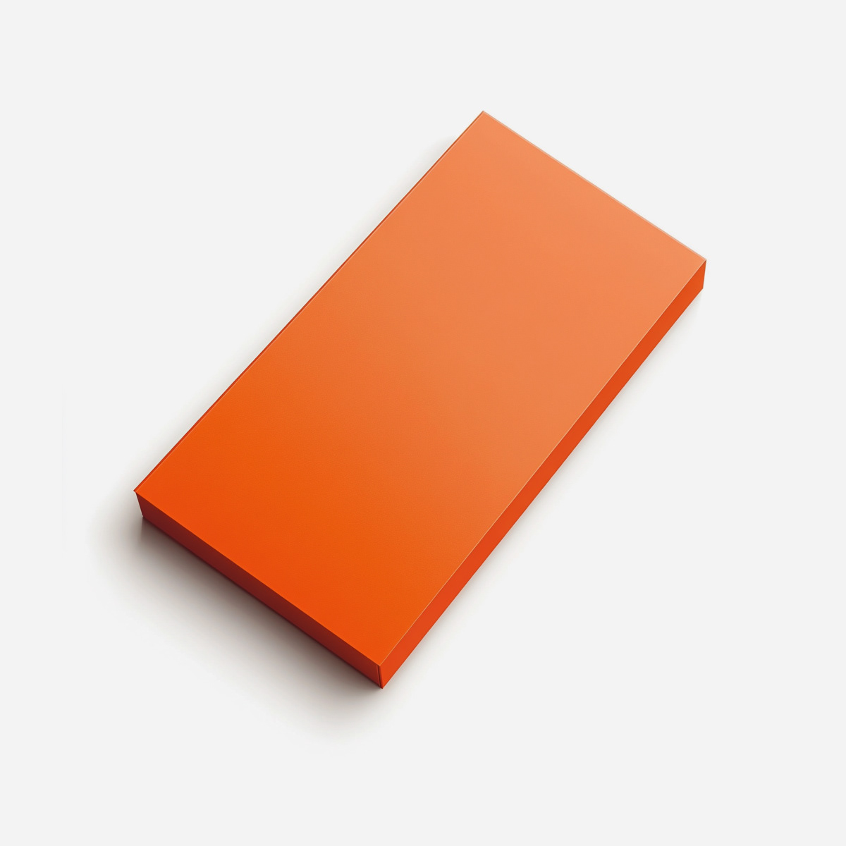
concept Breakdown 3: Visual Metaphors for Comnco's expertise
These visuals express Com&Co’s identity through sculptural forms and a bold orange palette, symbolizing clarity, precision, and creative energy.
Each 3D object metaphorically reflects a service: the shell for turnkey support, the swirl for project flow, and the hand for tailored communication.
The design avoids medical clichés and brings warmth to the scientific sector.


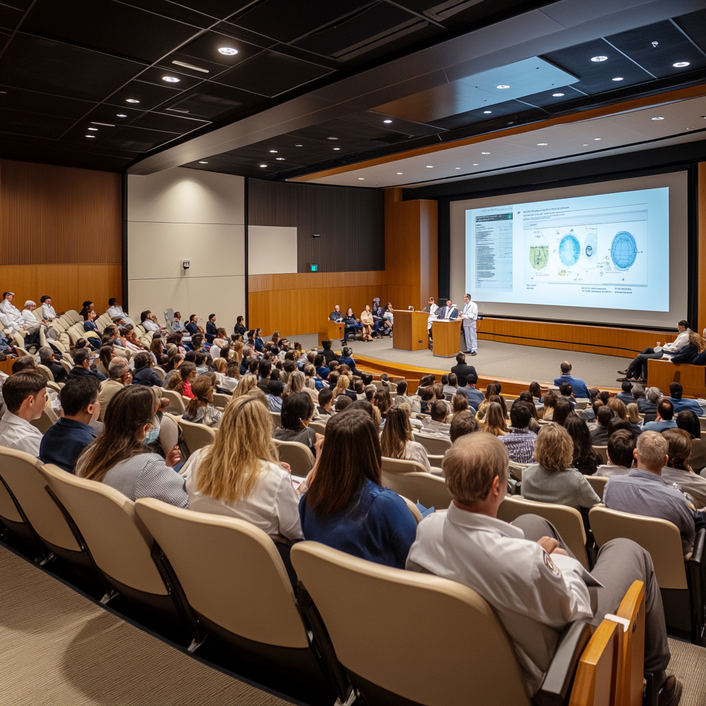
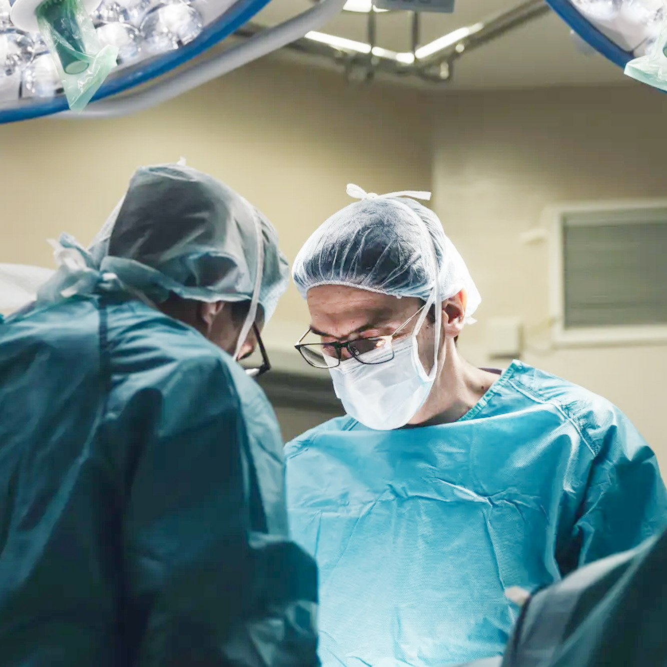
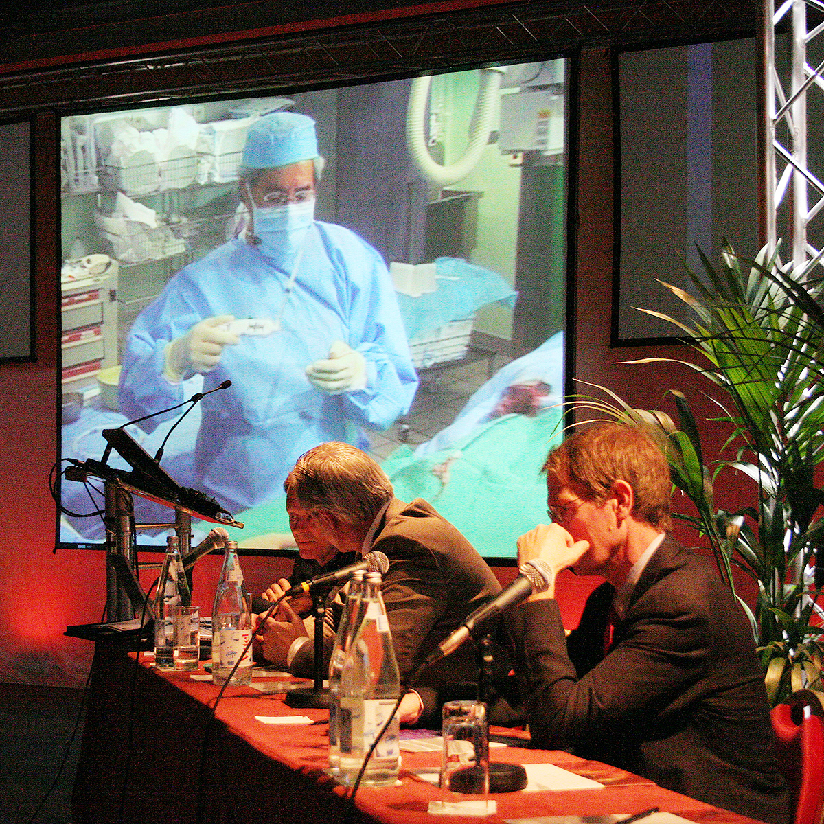
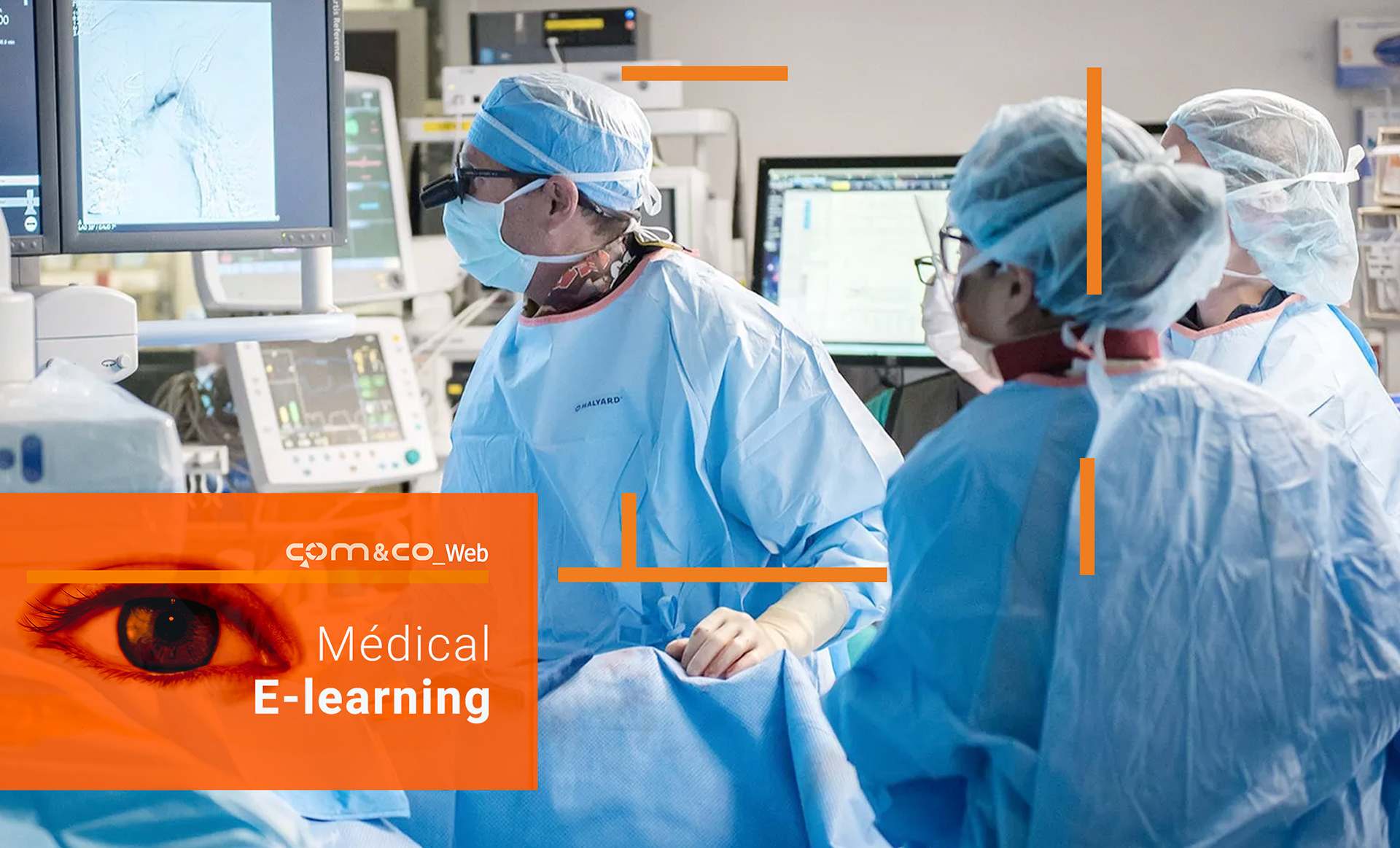
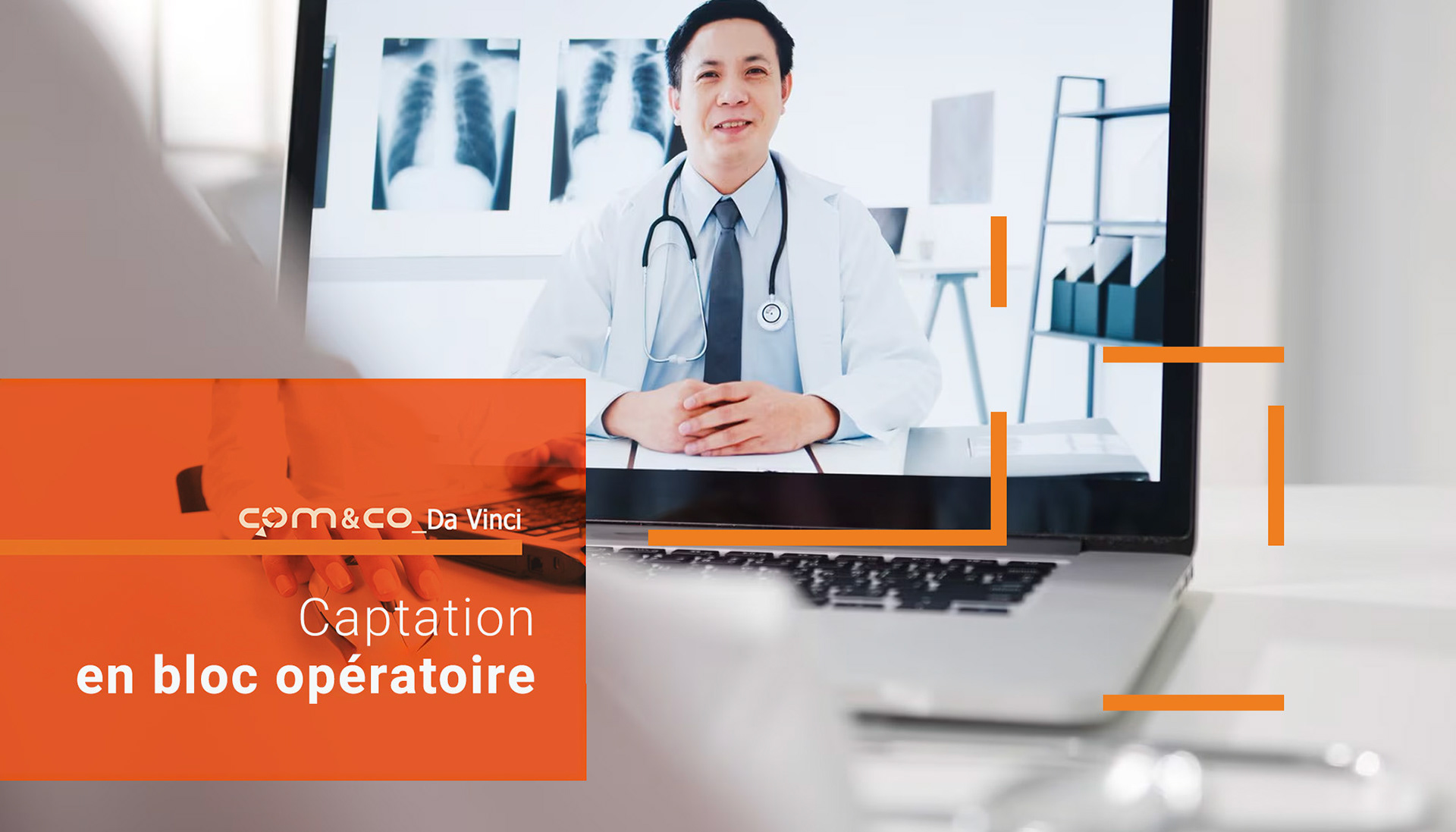
innovative medical approach: live surgery, real impact
Com&Co revolutionized medical congresses by introducing live surgical sessions broadcast in real-time from the operating room to the auditorium.
This bold format allowed attendees to observe advanced techniques as they happened, turning passive learning into an immersive, high-stakes educational moment.
It set a new standard for scientific engagement and showcased the agency’s ability to merge logistics, innovation, and medical excellence.
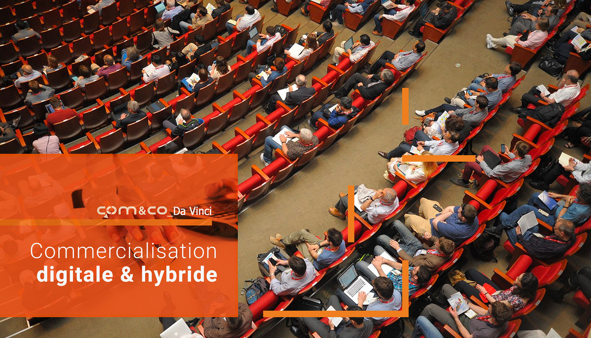
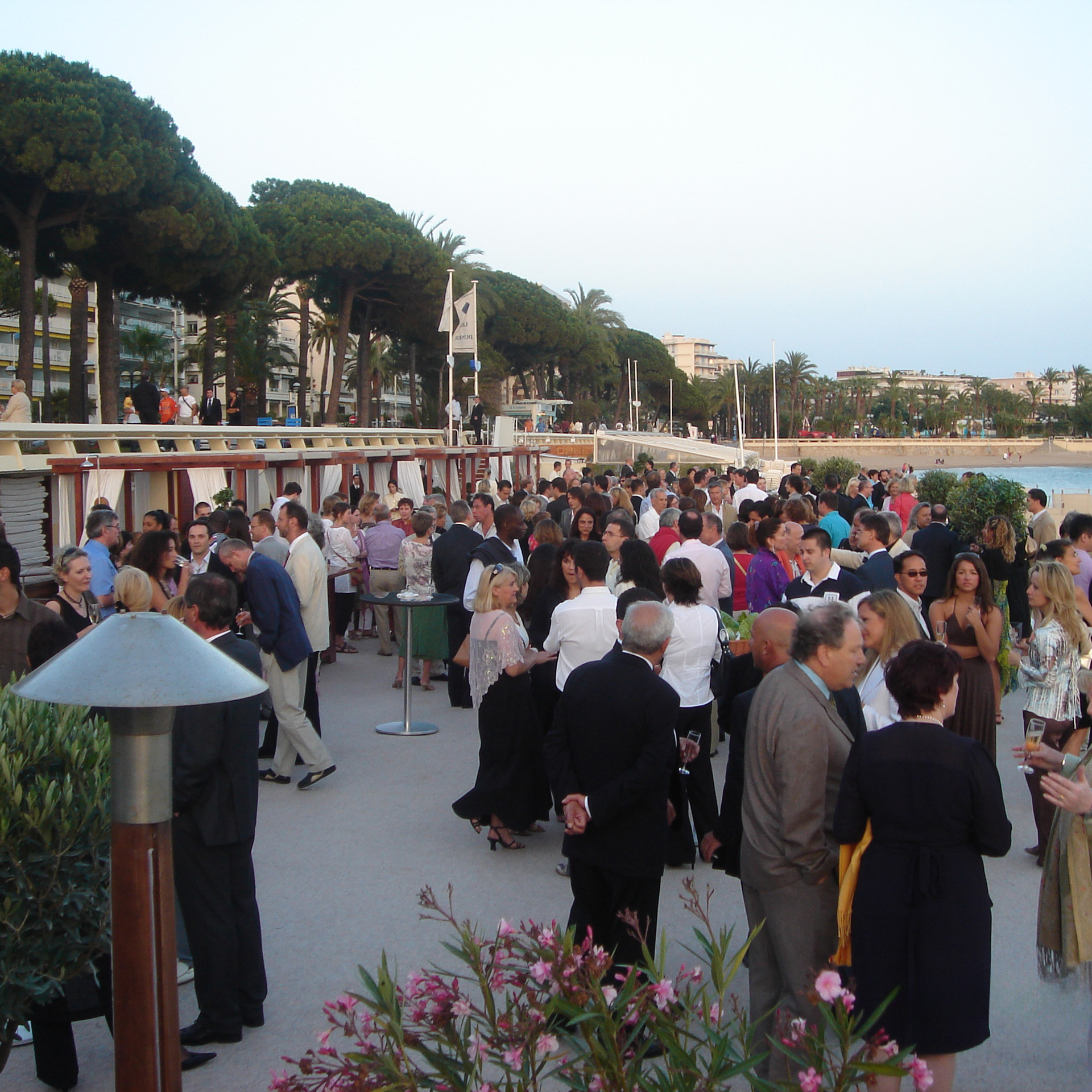
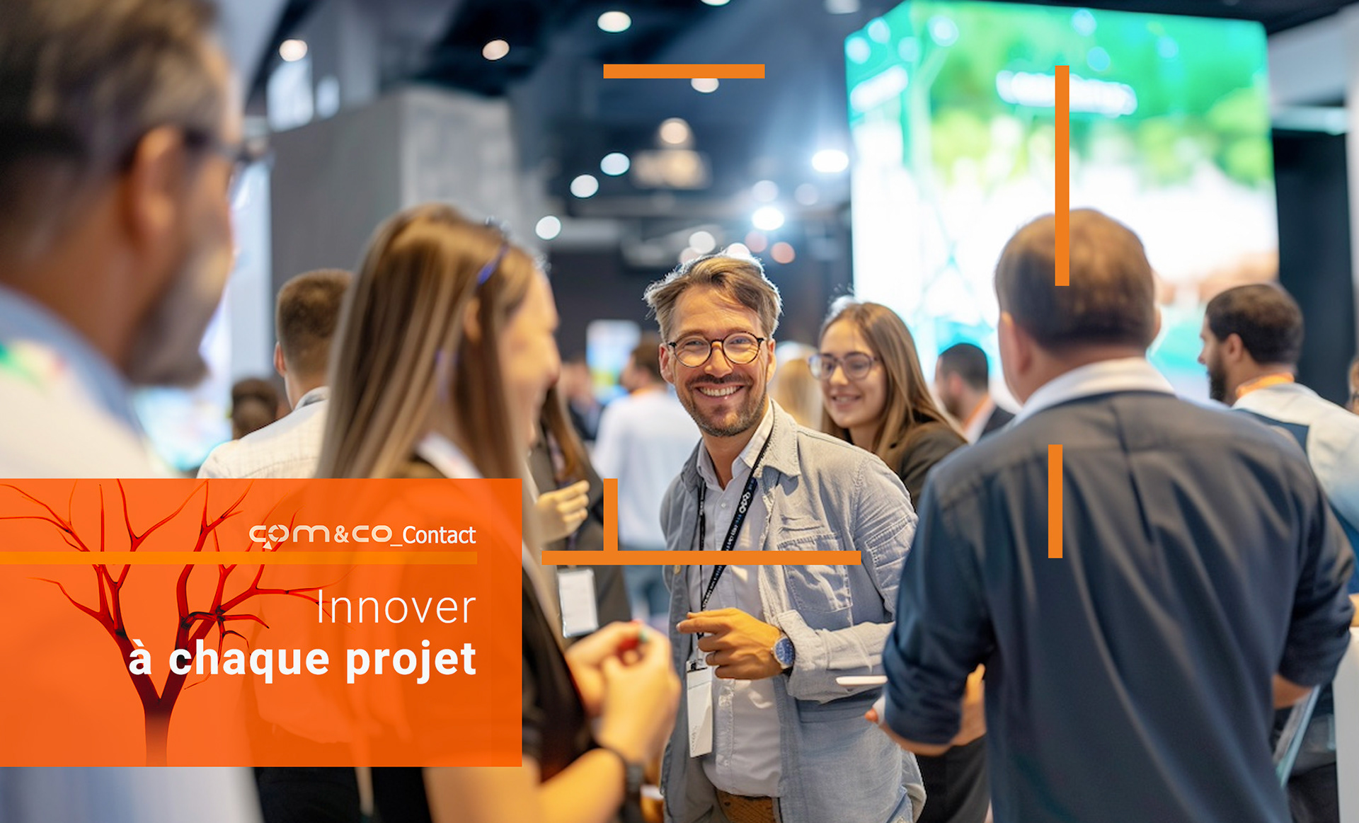
visual Breakdown 1: from concept to reality
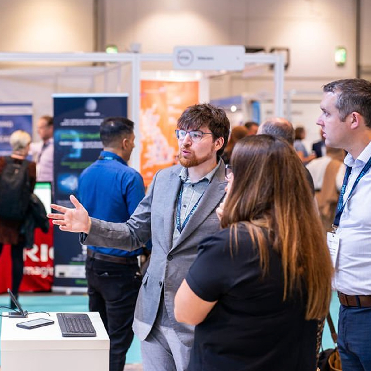
More than just abstract branding, these images capture the on-the-ground reality of Com&Co’s work, like auditoriums filled with engaged professionals, dynamic pharmaceutical booths, and even live surgical procedures broadcast during sessions.
This blend of documentation and design grounds the visual identity in tangible outcomes, reinforcing the agency’s reputation for delivering seamless, high-caliber scientific events.