CLIENT / The Altruitst by Le Cab, New Hybrid & Connecting Magazine, Paris, France
Project Overview
The Altruist Magazine, a hybrid print-digital publication, needed a cohesive brand identity for its launch. The goal was to merge traditional editorial design with modern interactivity, creating a seamless and engaging reader experience.
I developed a dynamic logo, bold color palette, and versatile typography to reflect
the magazine’s innovation, connectivity, and cultural relevance.
The new identity positioned The Altruist Magazine as a forward-thinking publication,
fostering audience engagement and uniting diverse voices across mediums.
Approach & Solutions
The layout I designed for The Altruist Magazine’s first issue delivered strong results.
It blended a clean aesthetic, structured grids, and dynamic typography for a cohesive print and digital environment:
- I enhanced readability and visual appeal by combining a clean, modern aesthetic
with structured grids and dynamic typography.
- The seamless integration of long-form articles with shorter pieces ensured a fluid narrative
while interactive digital features drove higher user engagement.
- This fresh, versatile design positioned the magazine as an innovative publication,
helping it gain traction with its target audience and establish a strong foundation for future issues.
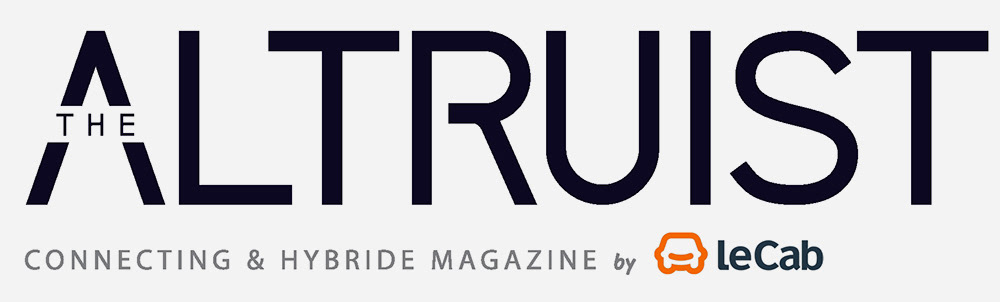
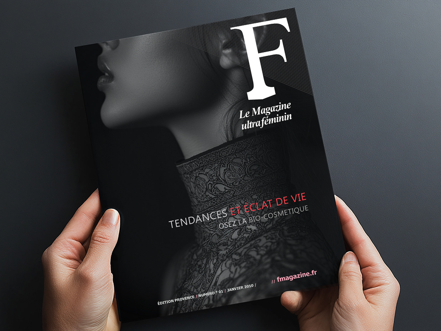
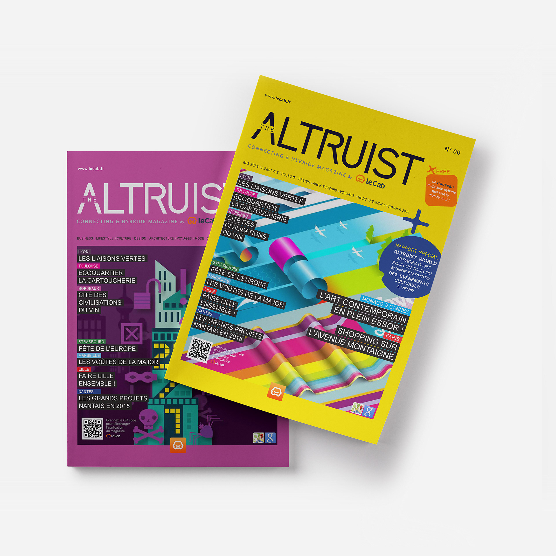
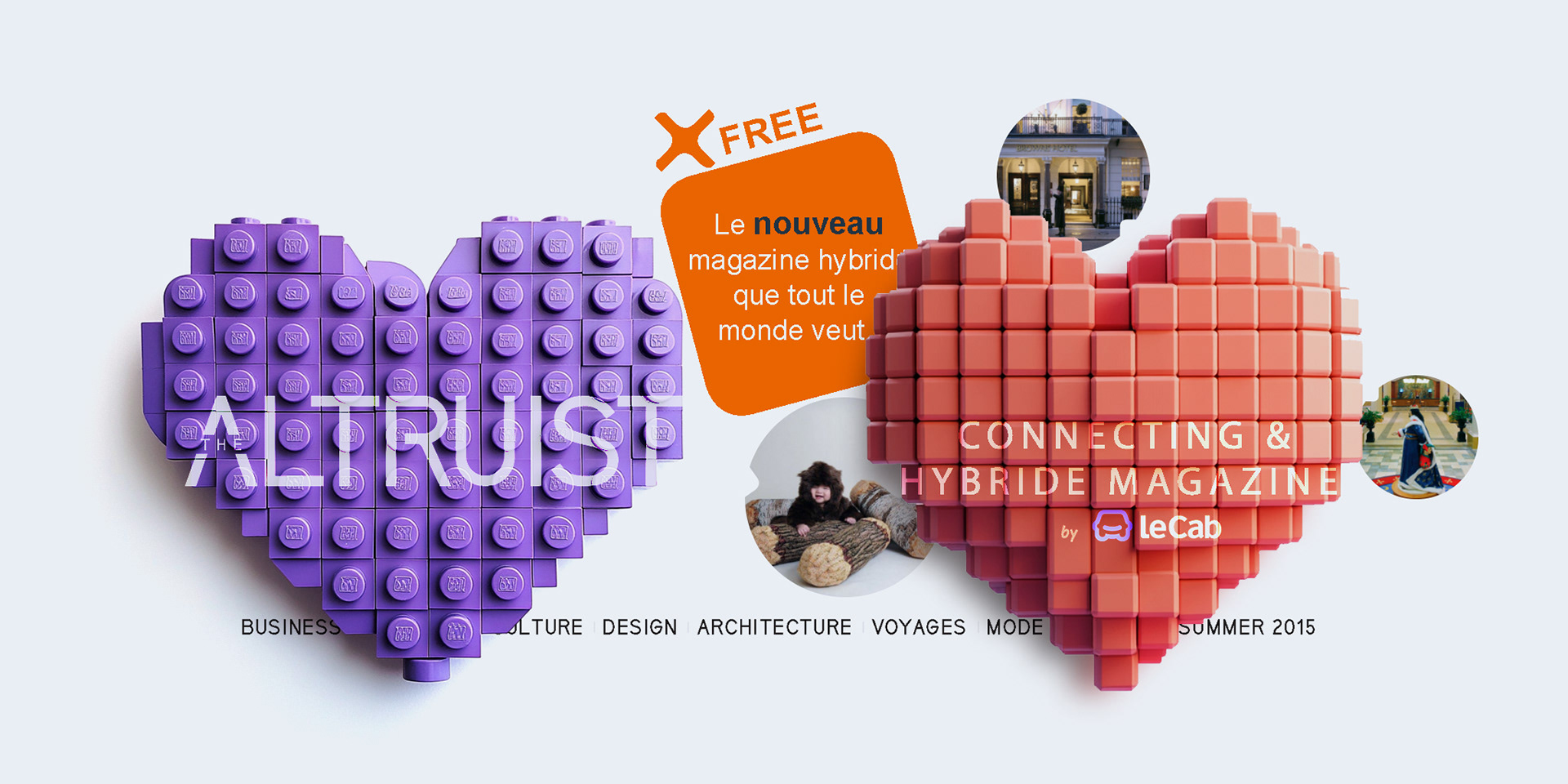
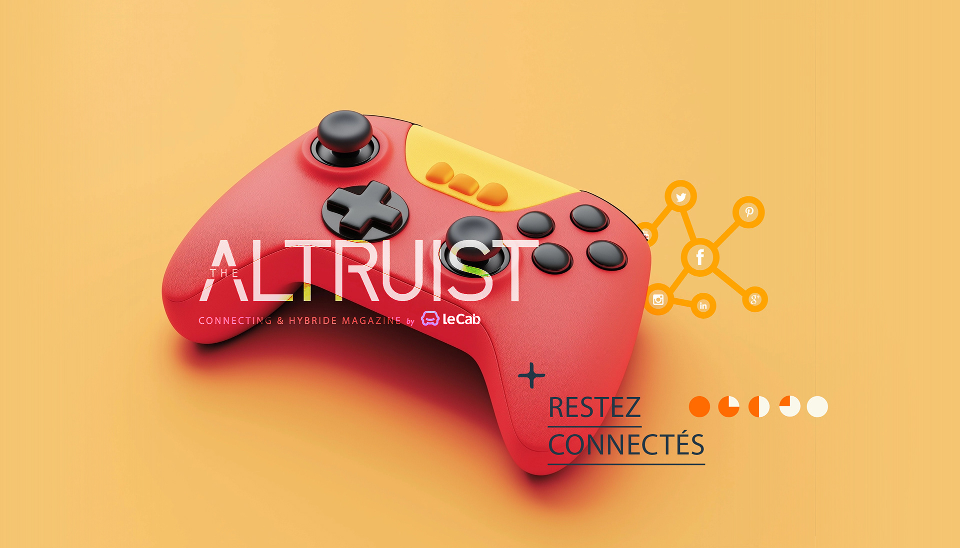
LOGO DESIGN: A CONNECTING & HYBRID MAGAZINE
The Altruist logo embodies modernity and connectivity, aligning with its identity as a hybrid magazine by Le Cab:
- The bold sans-serif typography ensures clarity, while the stylized "A" adds a distinctive,
dynamic touch.
- The tagline reinforces the magazine’s mission, with “hybride” reflecting its French influence.
- Seamlessly integrating Le Cab’s branding, the design establishes The Altruist as an innovative,
forward-thinking publication.
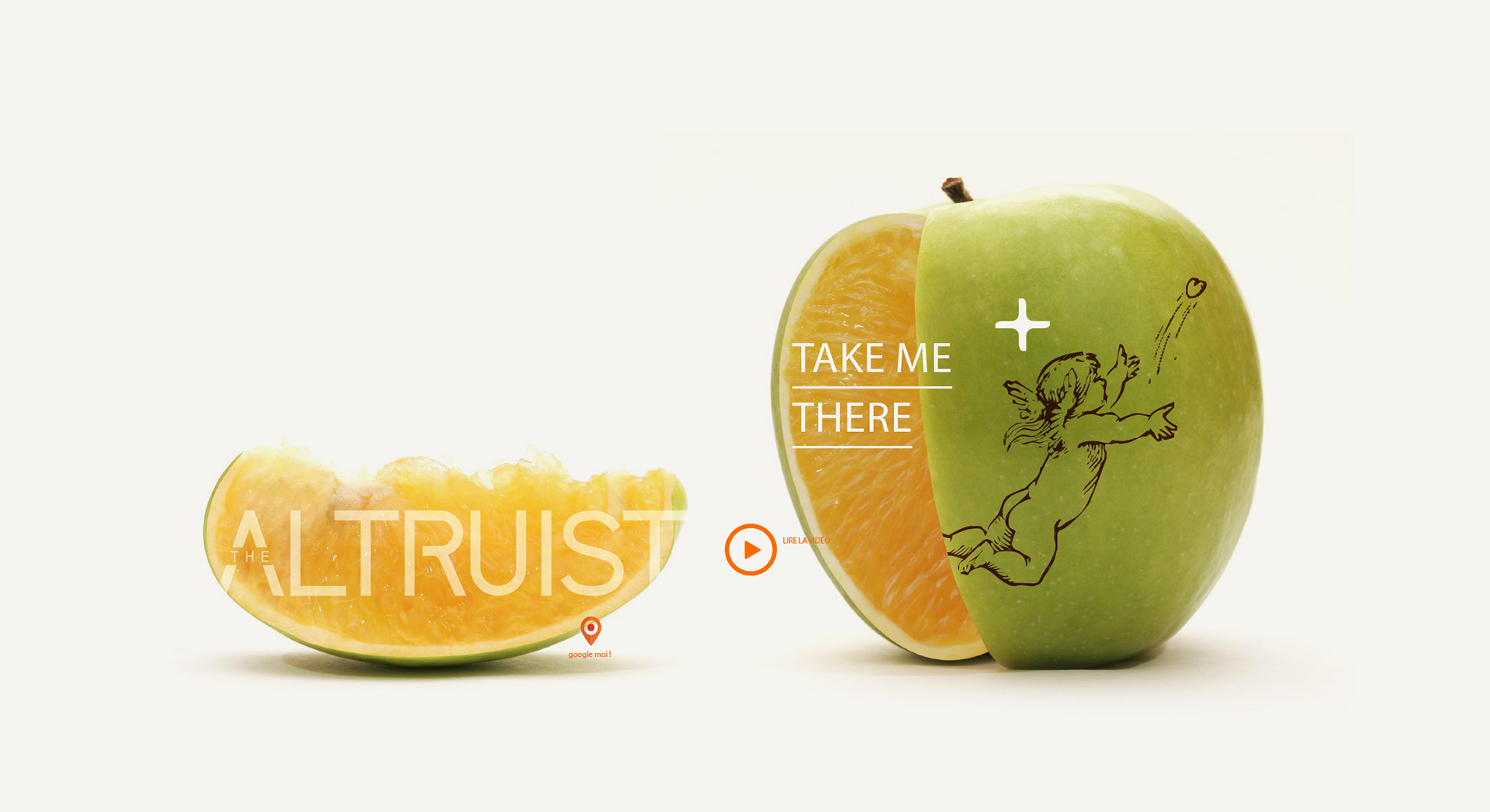
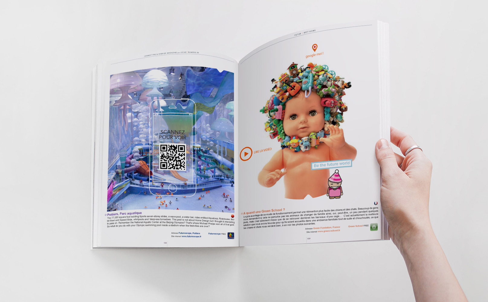
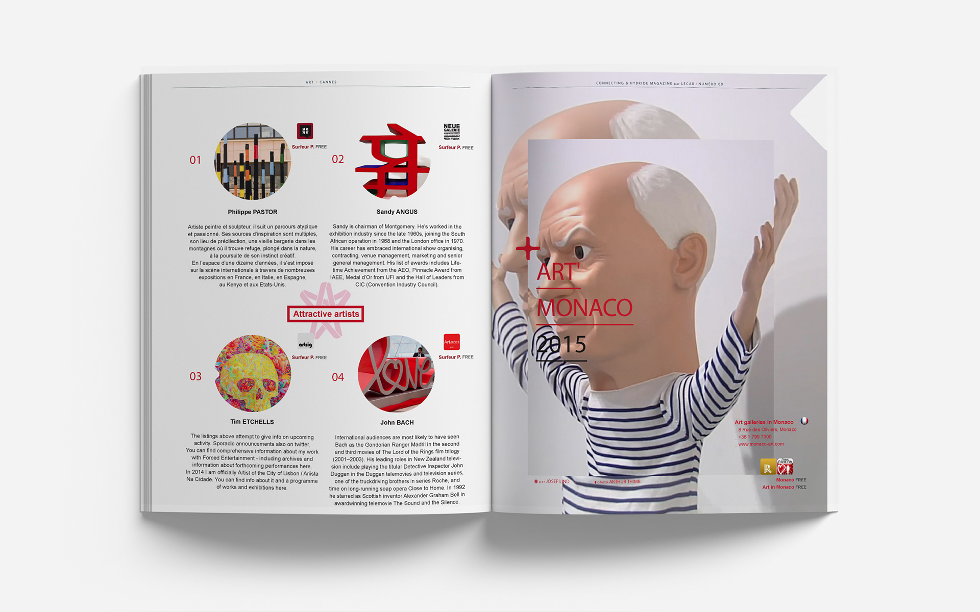
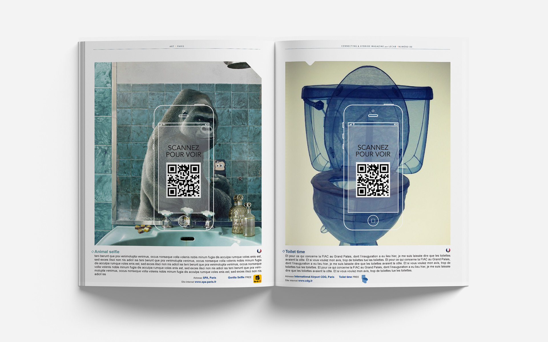
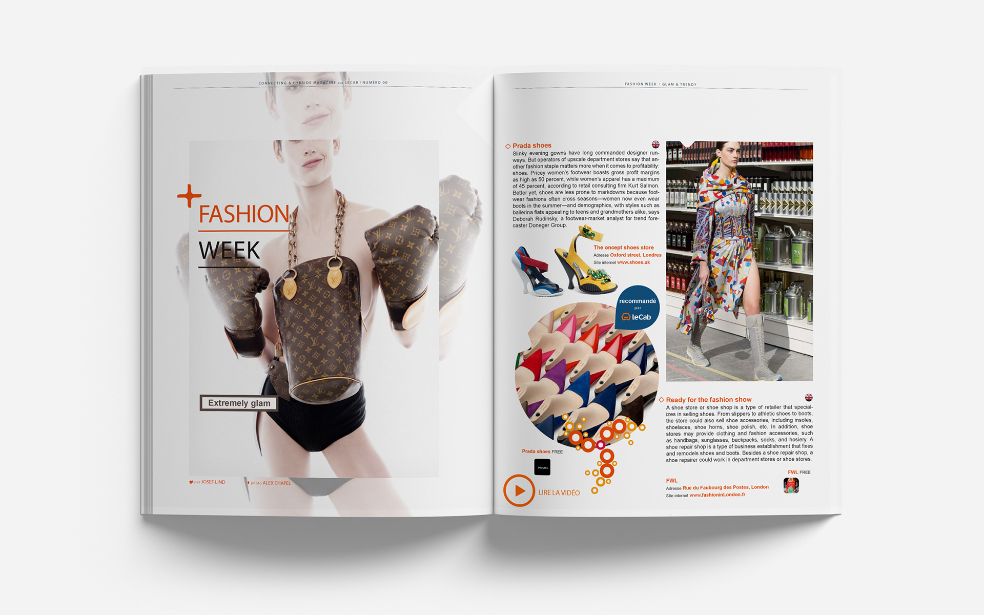
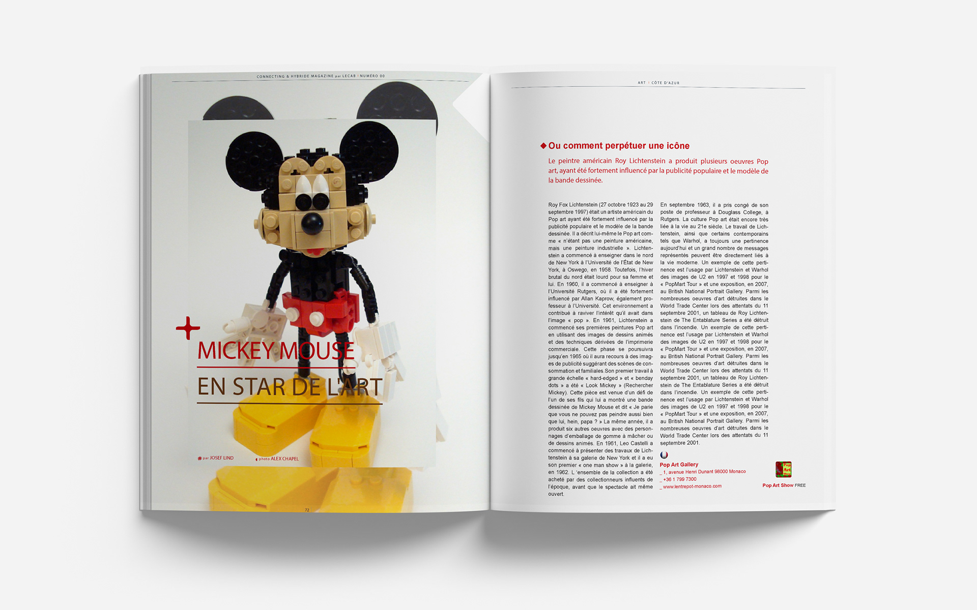
Concept Breakdown 1: blending genres, triggering curiosity
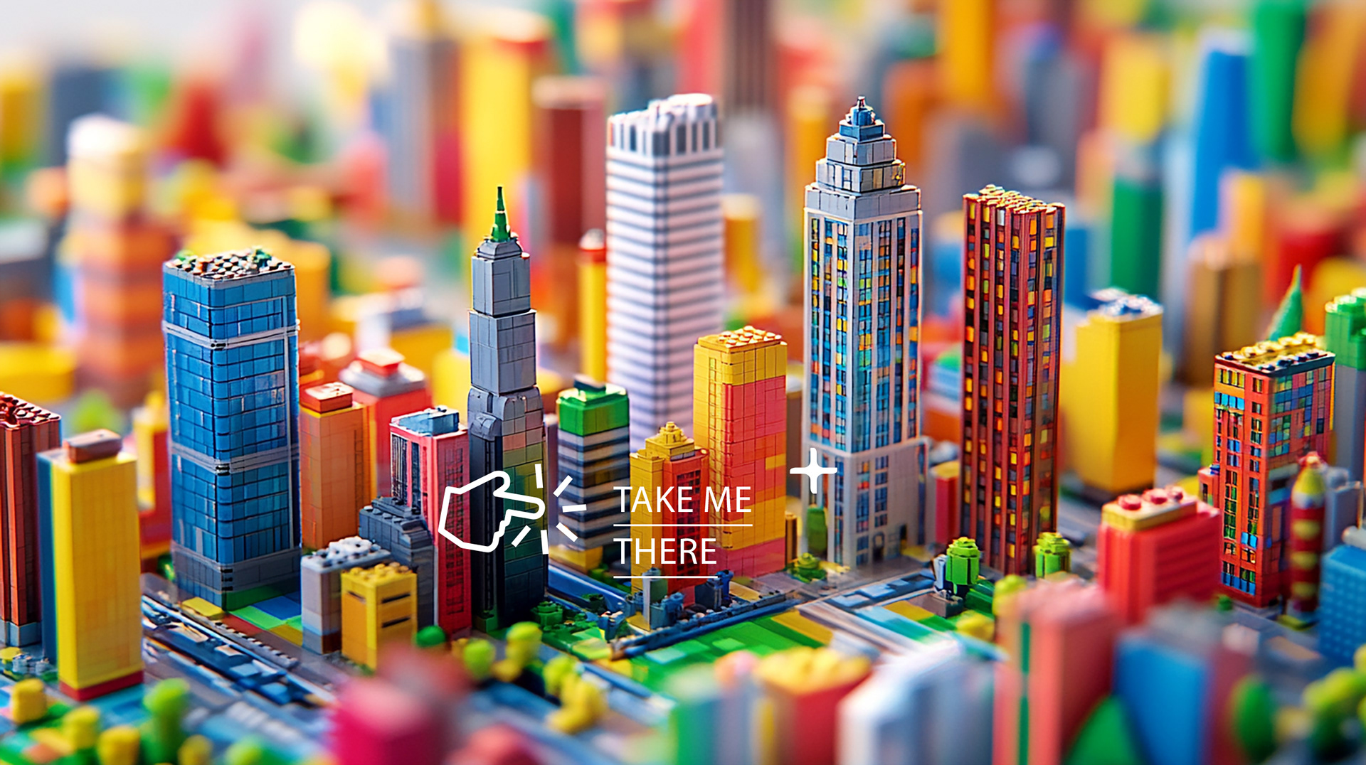
I designed a bold editorial layout for The Altruist magazine that merges playful surrealism with refined minimalism.
Each page pairs sharp, curated typography with unexpected visual juxtapositions, like a grapefruit nested in an apple or toy blocks reimagined as architecture—to provoke emotion and invite exploration.
The imagery is always original, refined, and deliberately offbeat, playing with hybrid genres to make everyday objects feel extraordinary.
Bright color fields and layered iconography reinforce the magazine’s positive, idea-driven tone while encouraging interaction (scan, swipe, share).
The overall direction celebrates creativity with elegance and a touch of irony and intrigues readers.
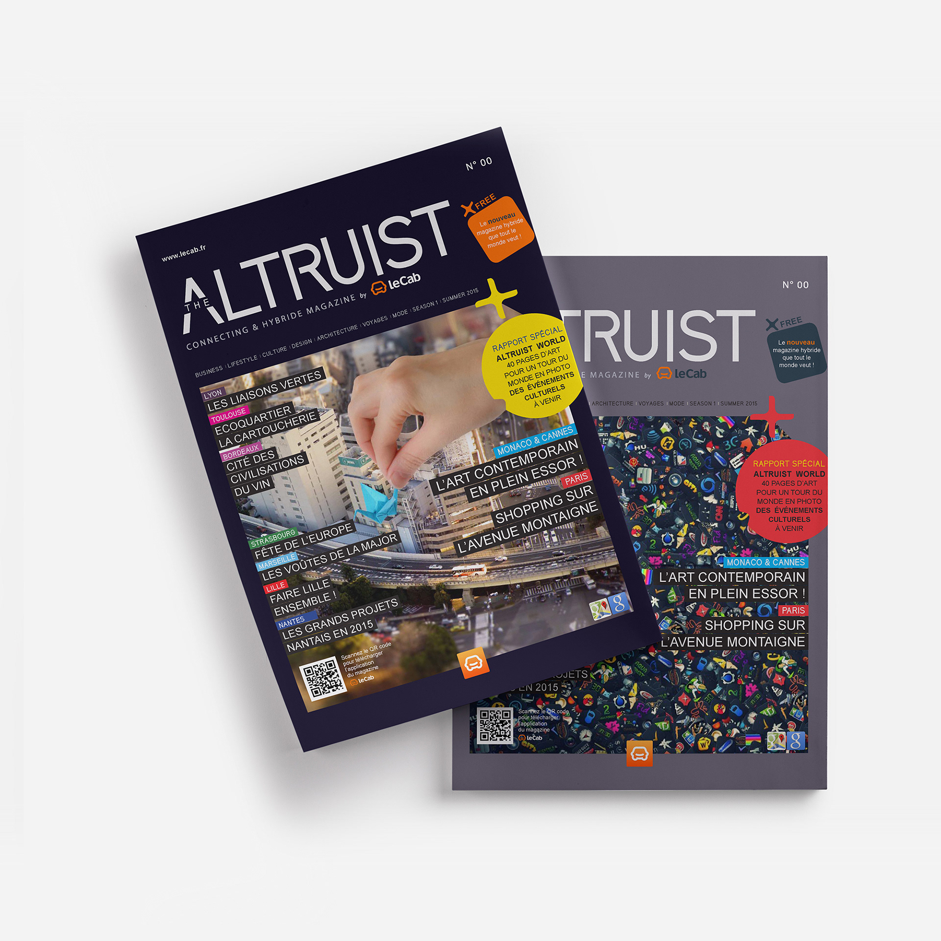
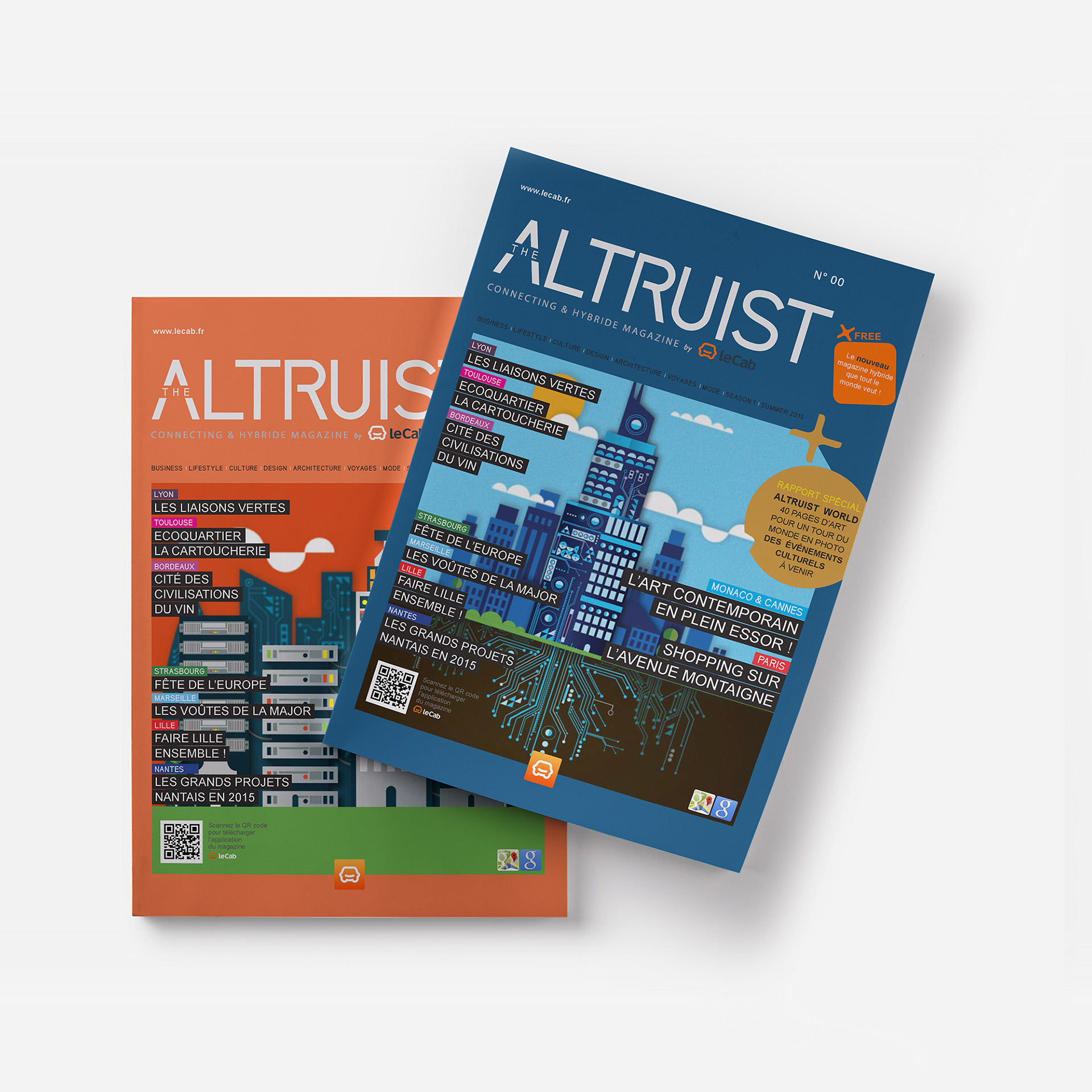
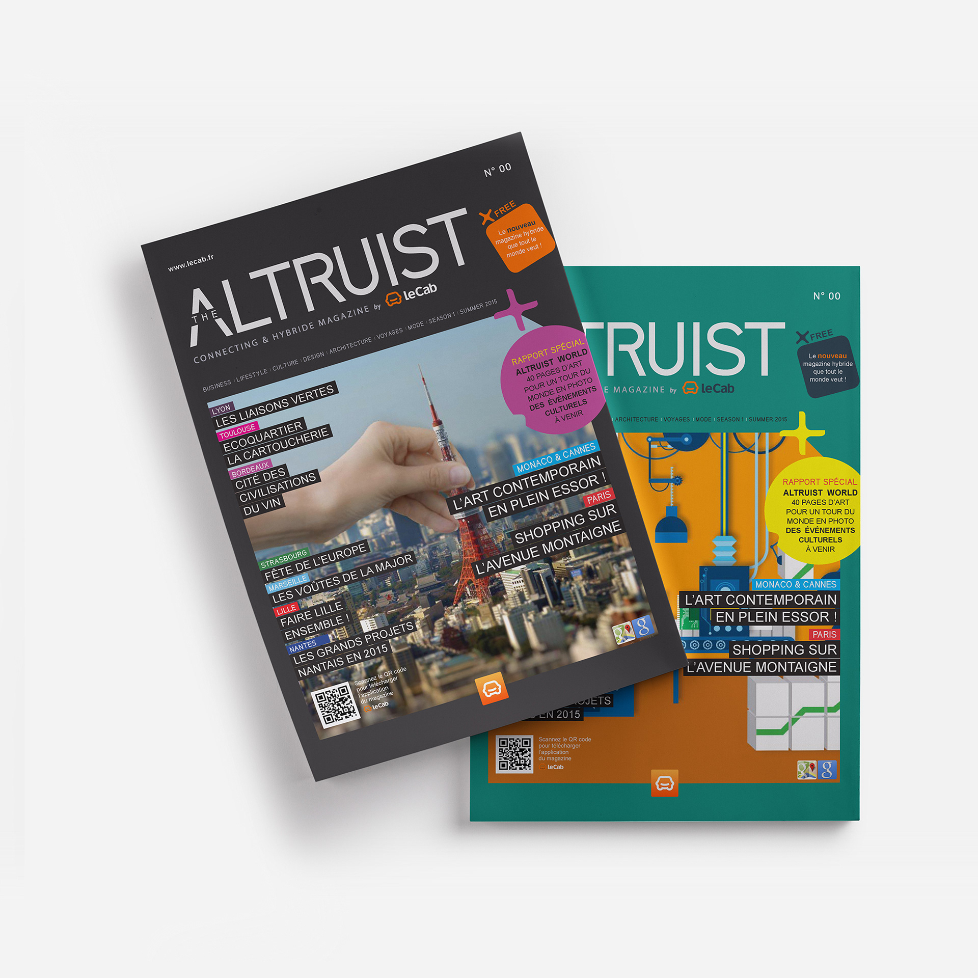
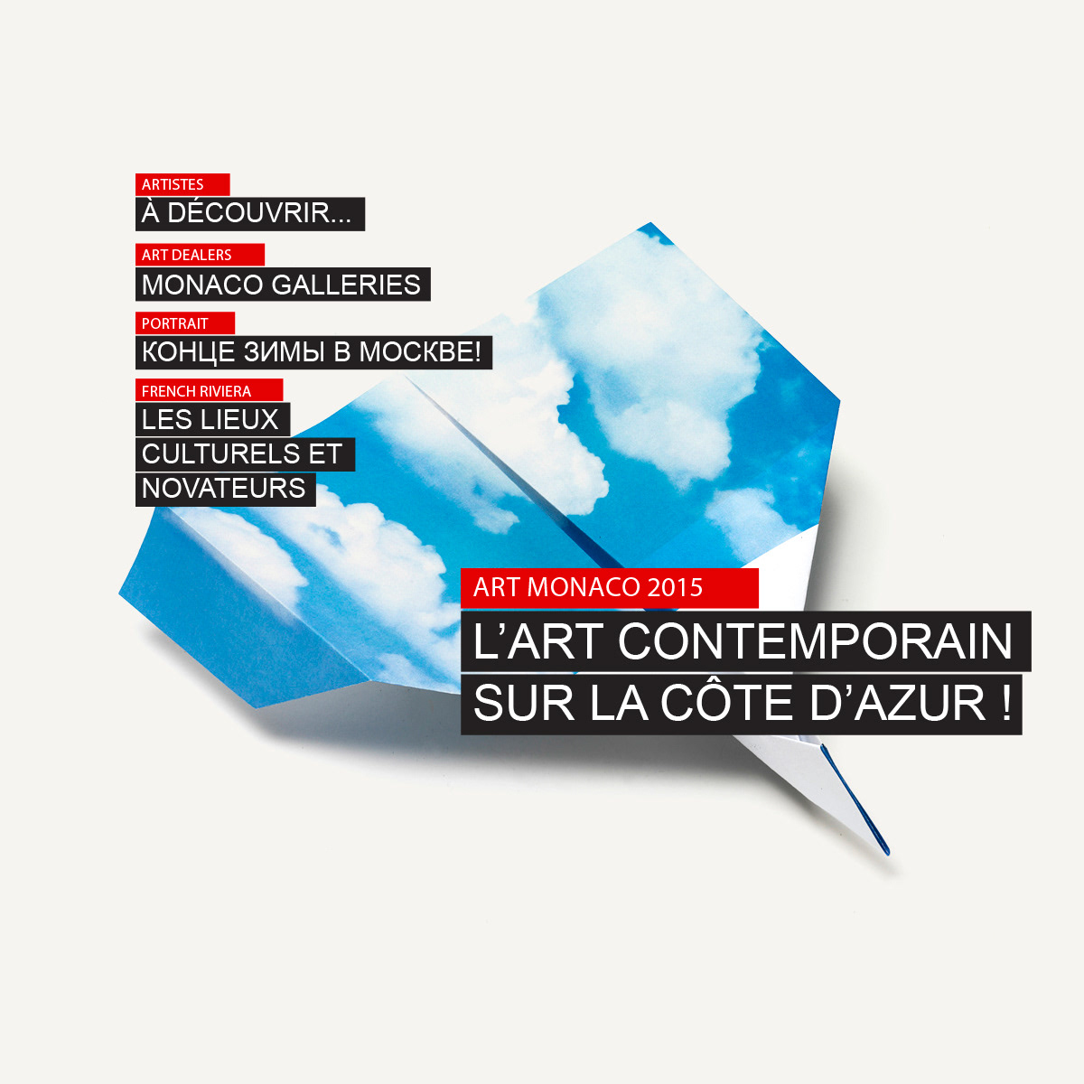
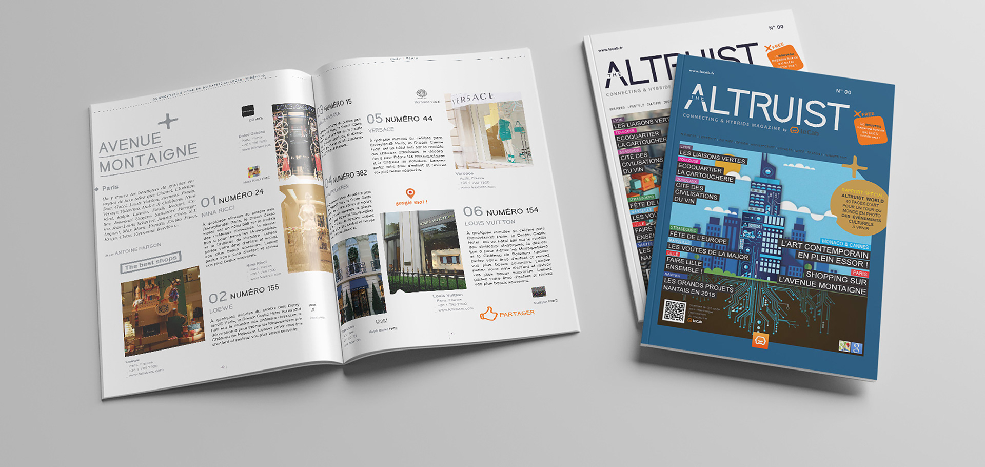
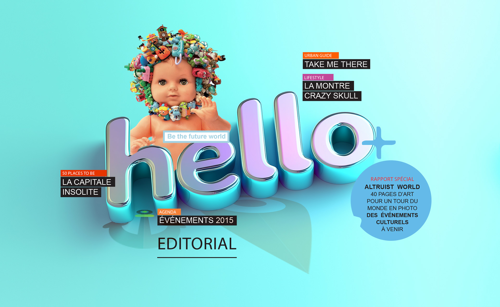
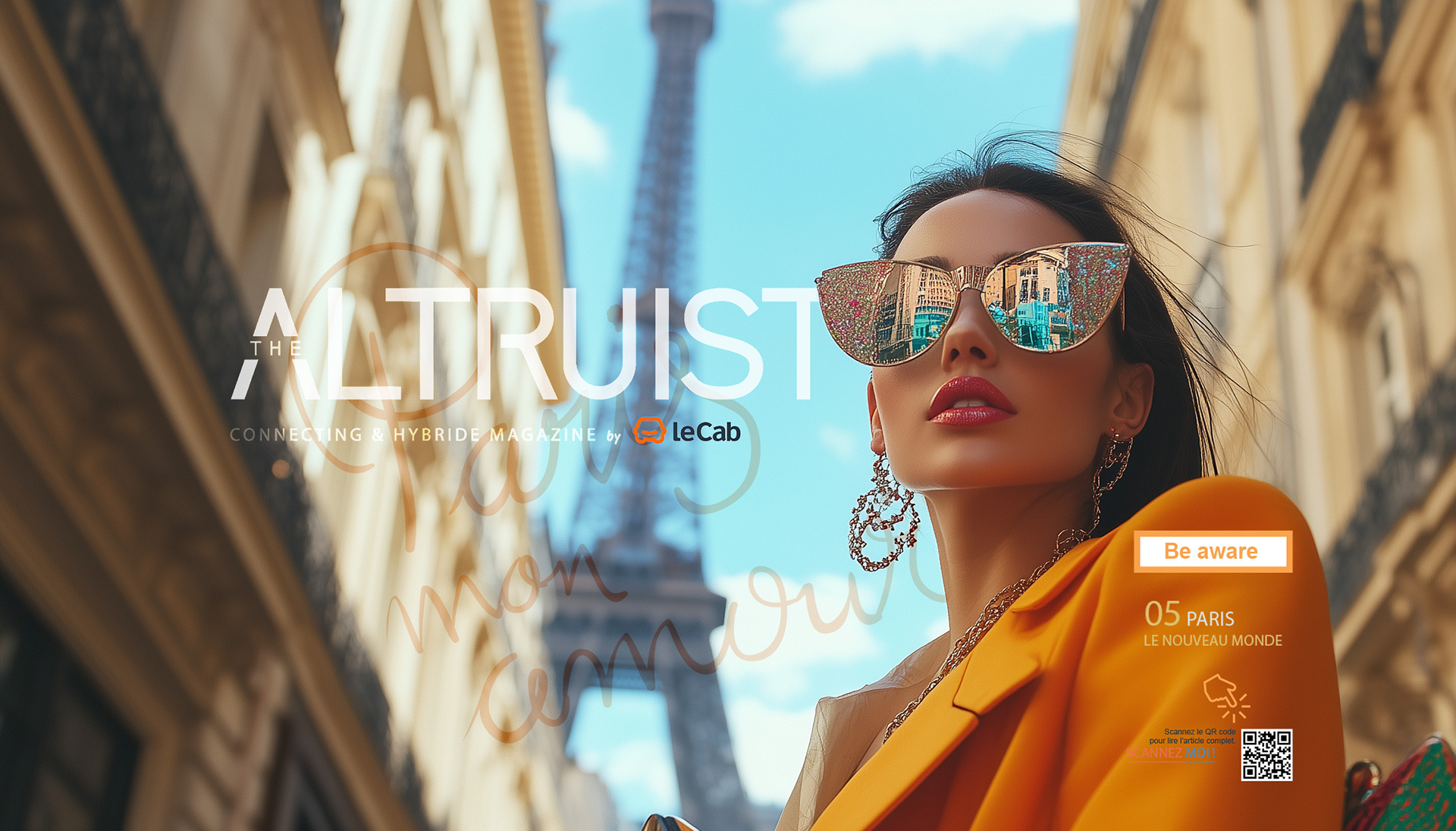
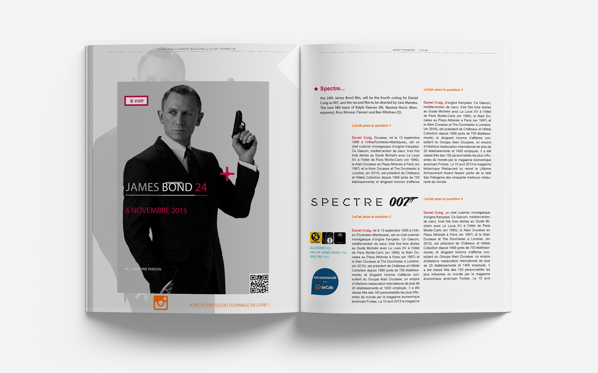
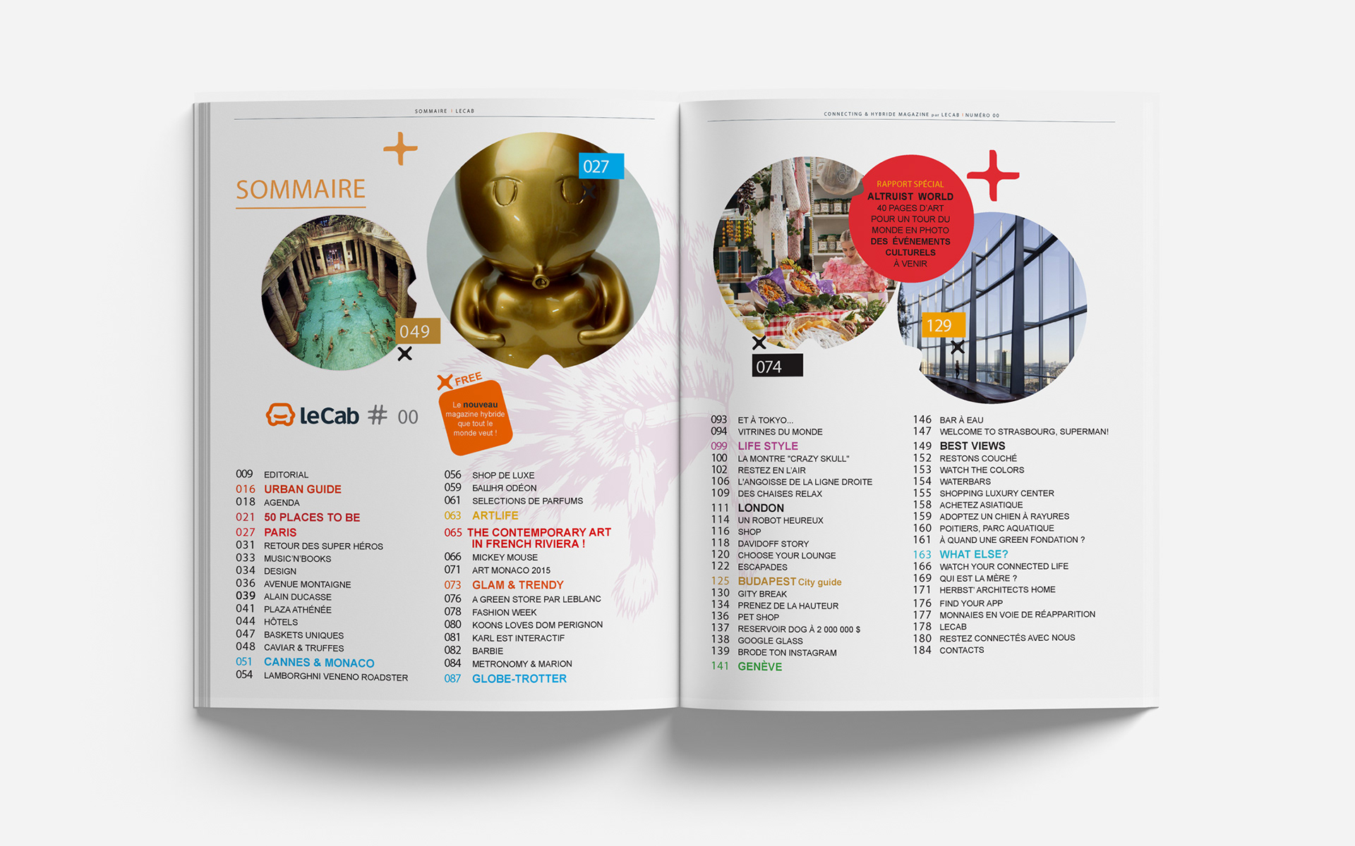
Covers design: visual narratives for a hybrid world
The cover design for The Altruist magazine reflects a bold editorial approach that merges urban storytelling with visual playfulness.
Each issue uses layered photo montages—hands interacting with cities, symbolic objects, or whimsical juxtapositions, to communicate the idea of a hybrid, connected world.
The color coding, playful shapes, and bold text blocks organize dense content while energizing the layout.
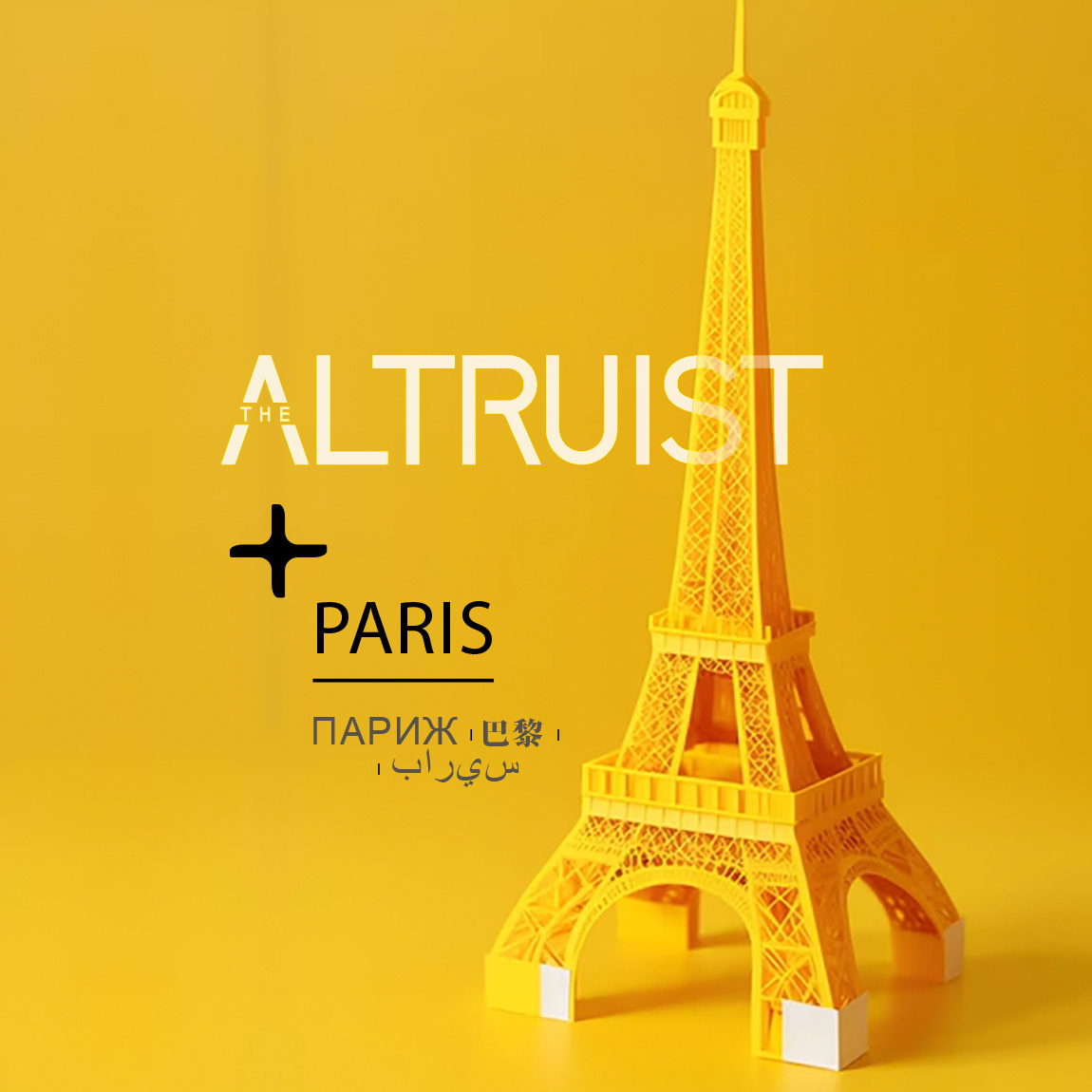
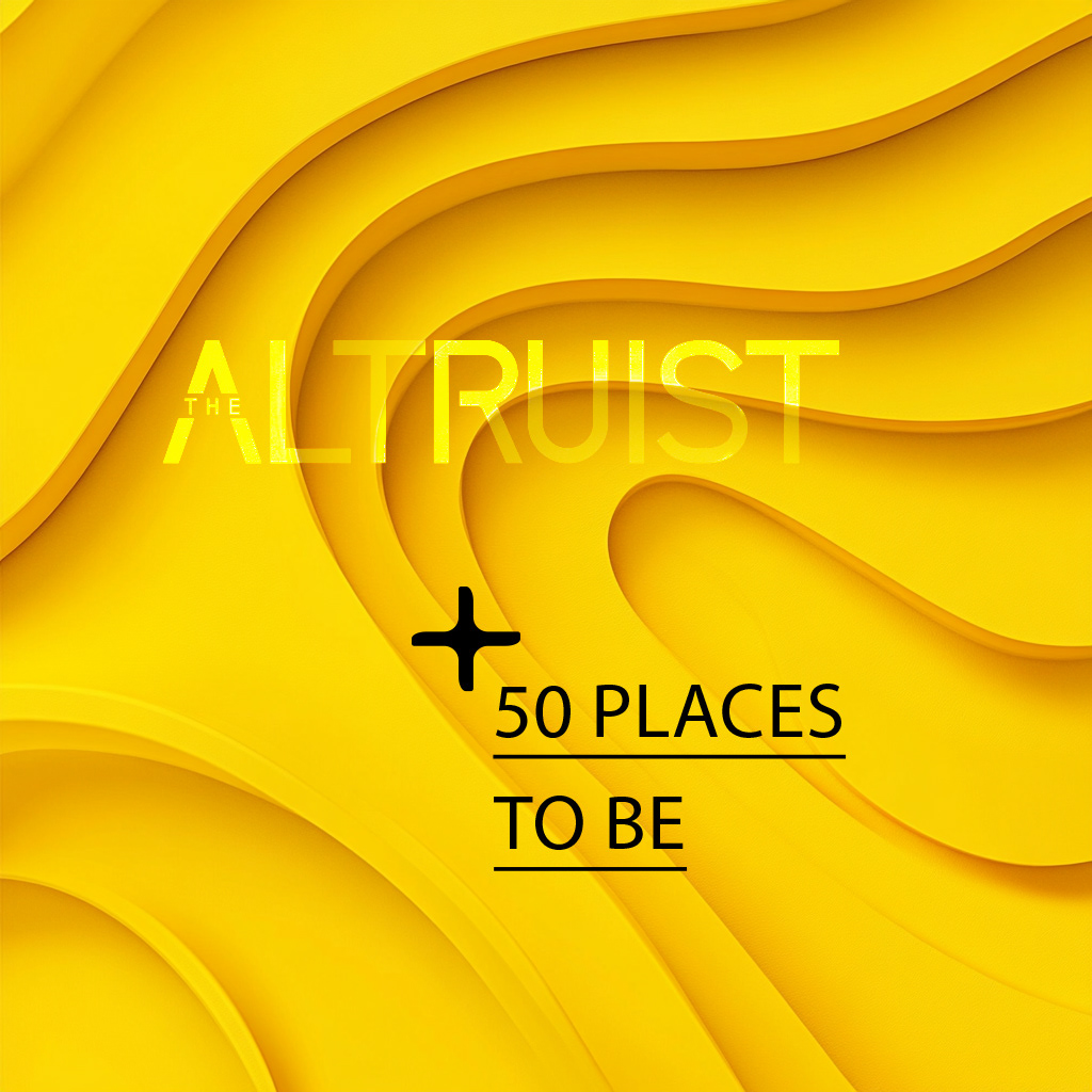
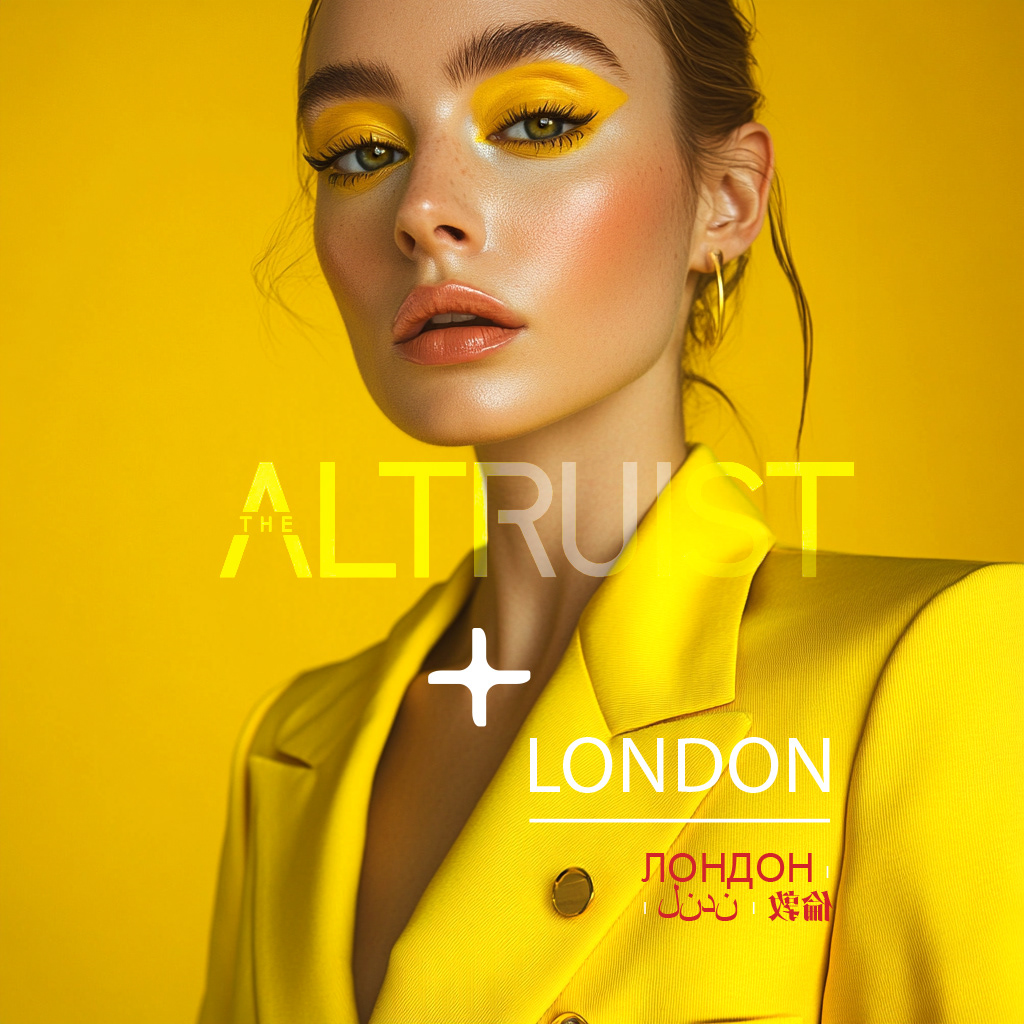
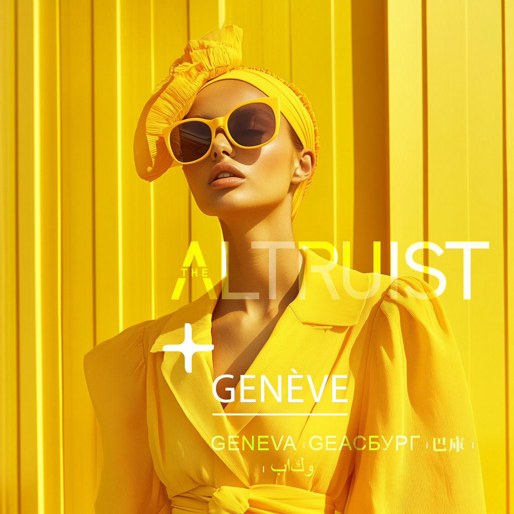
Concept Breakdown 2: AI THAT THINKS WITH YOU Everyplace ANYTIME
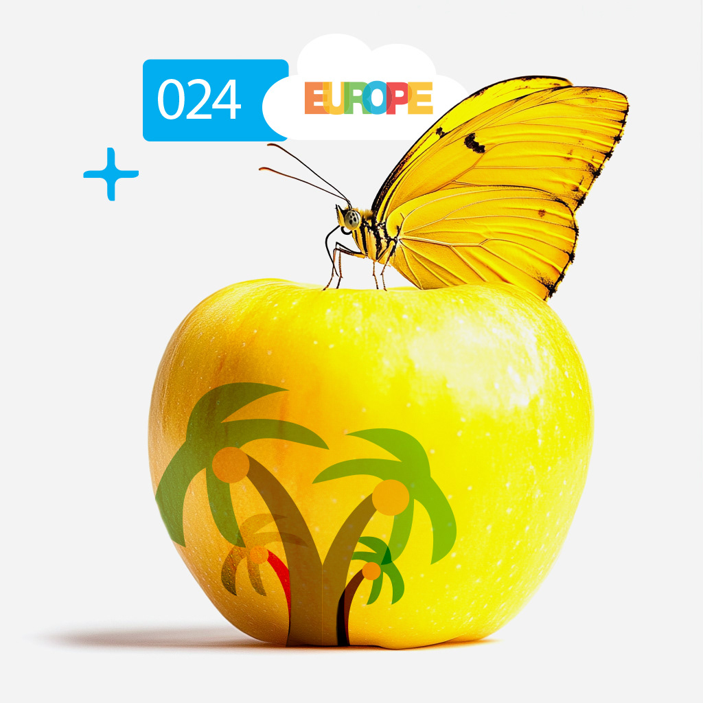
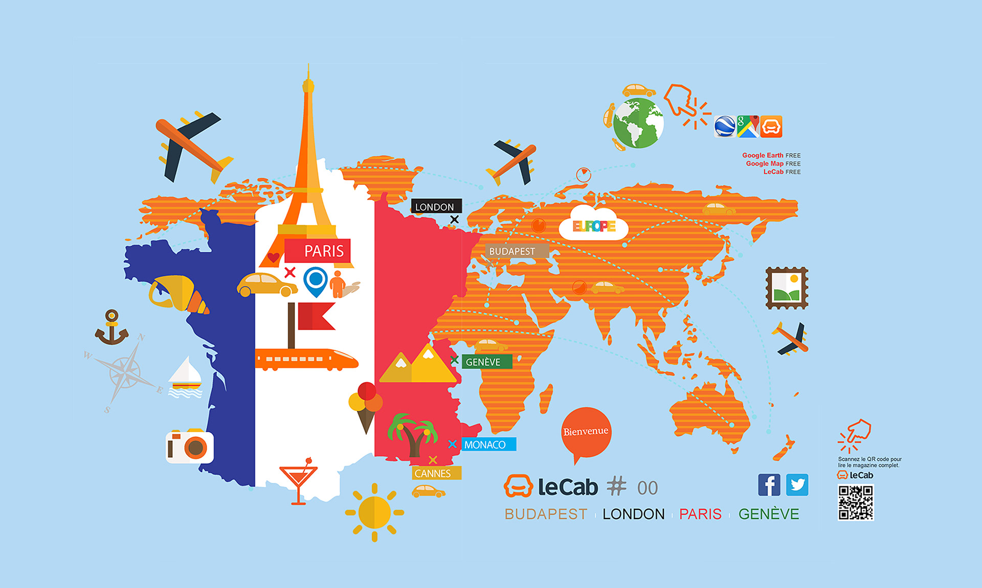
This bold yellow series for The Altruist magazine plays with cultural references, contemporary design, and optimistic energy.
Yellow acts as the connective thread—symbolizing creativity, clarity, and curiosity—making each issue feel radiant, forward-looking, and instantly recognizable:
- Concept Highlights: Cultural Fusion: By mixing international languages, icons, and landmarks,
each visual expresses a global, inclusive identity.
- Visual Consistency: A unified yellow palette ties the travel, fashion, and architecture themes together,
creating coherence across diverse content.
- Optimism & Movement: Yellow evokes sun, warmth, and spontaneity, capturing the magazine’s aspirational
and lifestyle-driven tone.
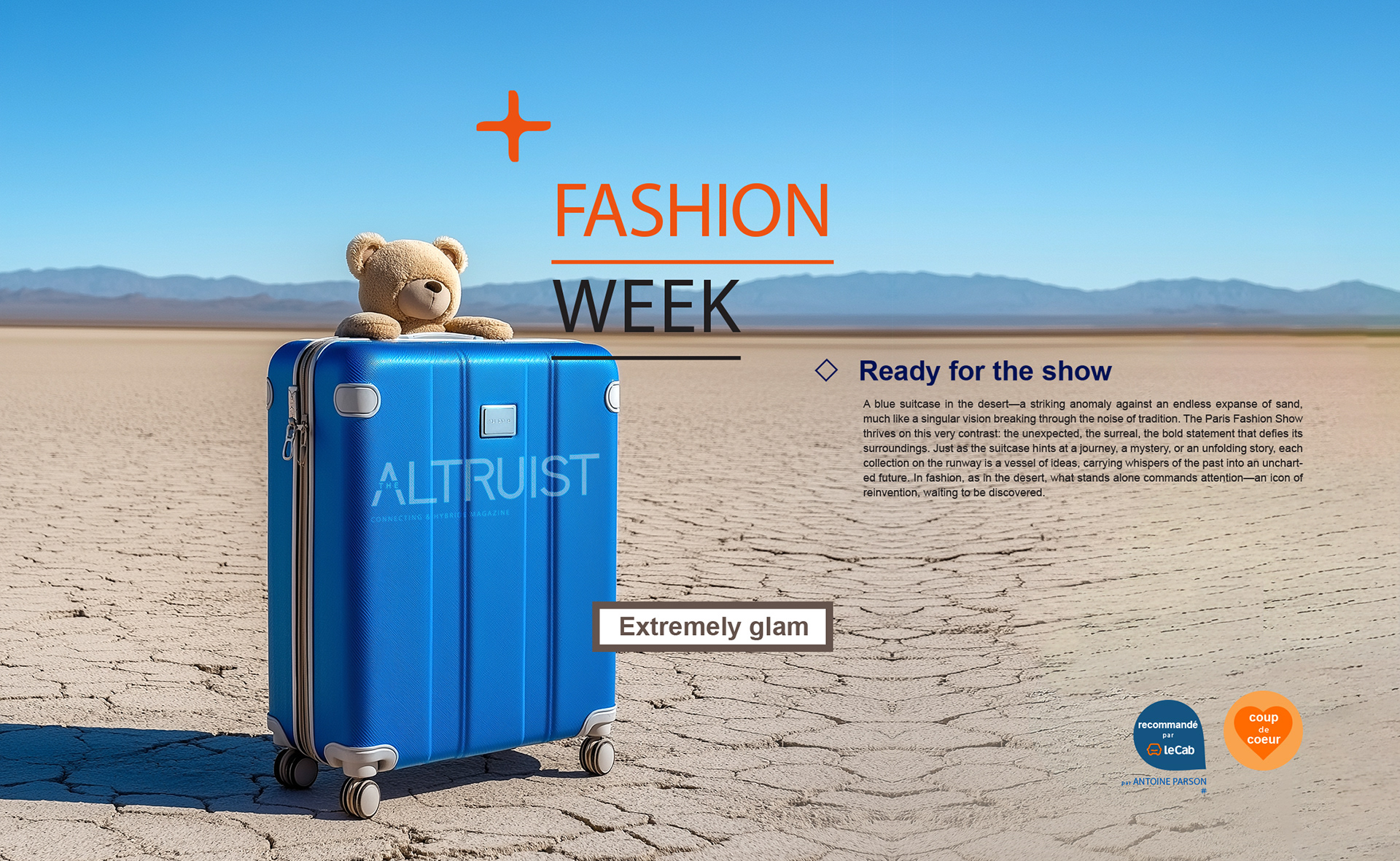
Concept Breakdown 1: AI THAT THINKS WITH YOU Everyplace ANYTIME
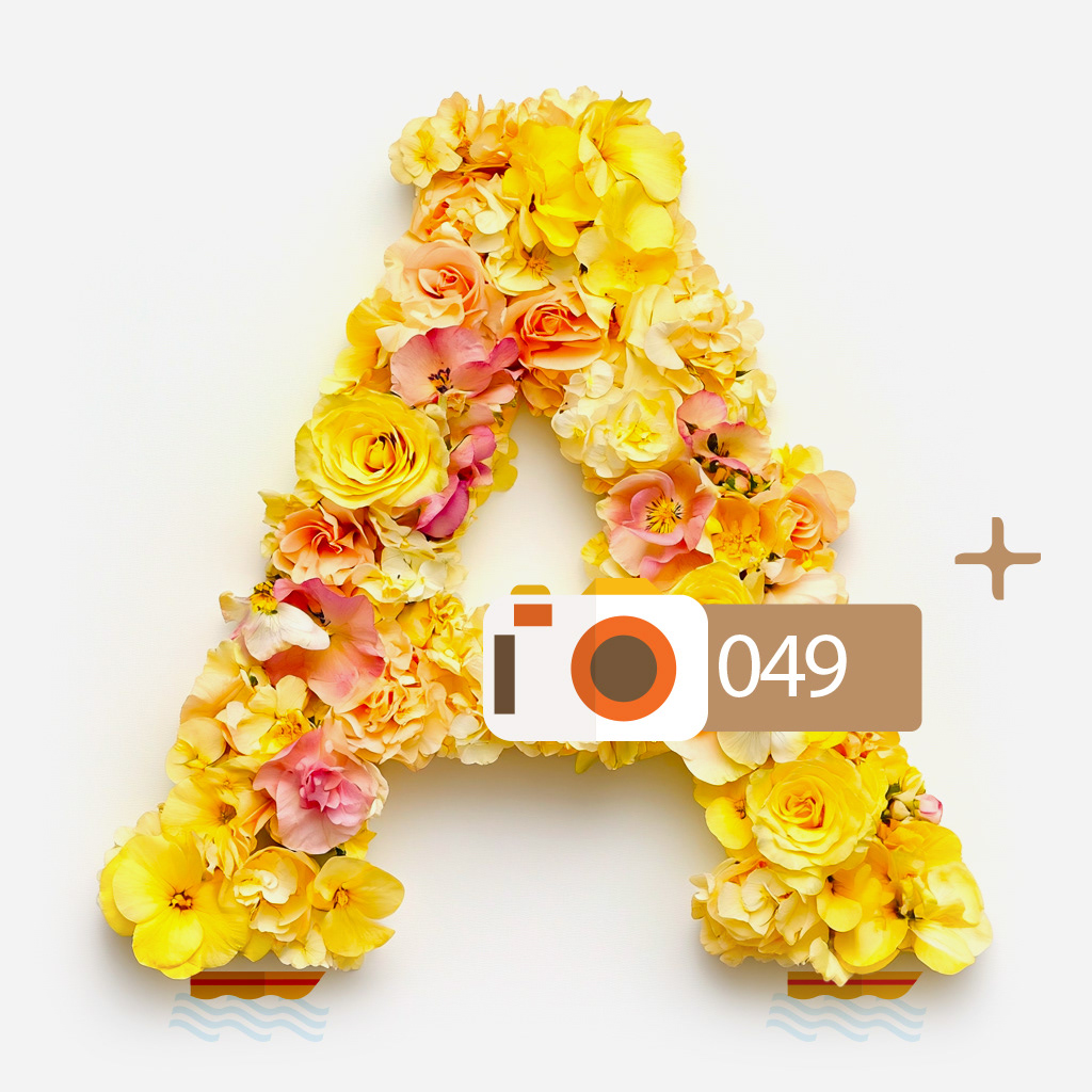
These transitional pages break away from traditional layouts by blending surreal visuals with editorial clarity.
Each spread becomes a visual pause, playful, bold, and immersive.
From a suitcase in the desert to a furry letter “A,” they introduce sections with personality and unexpected storytelling.
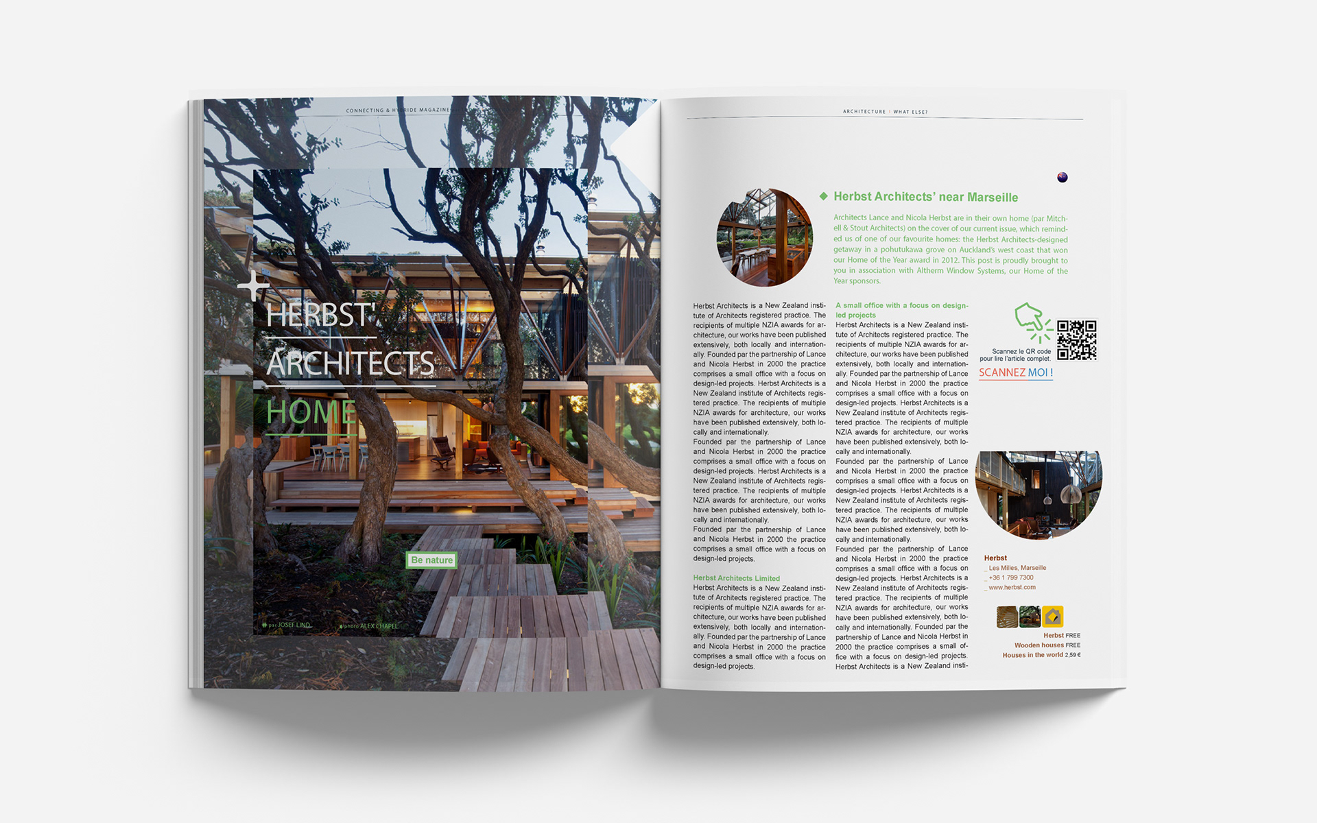
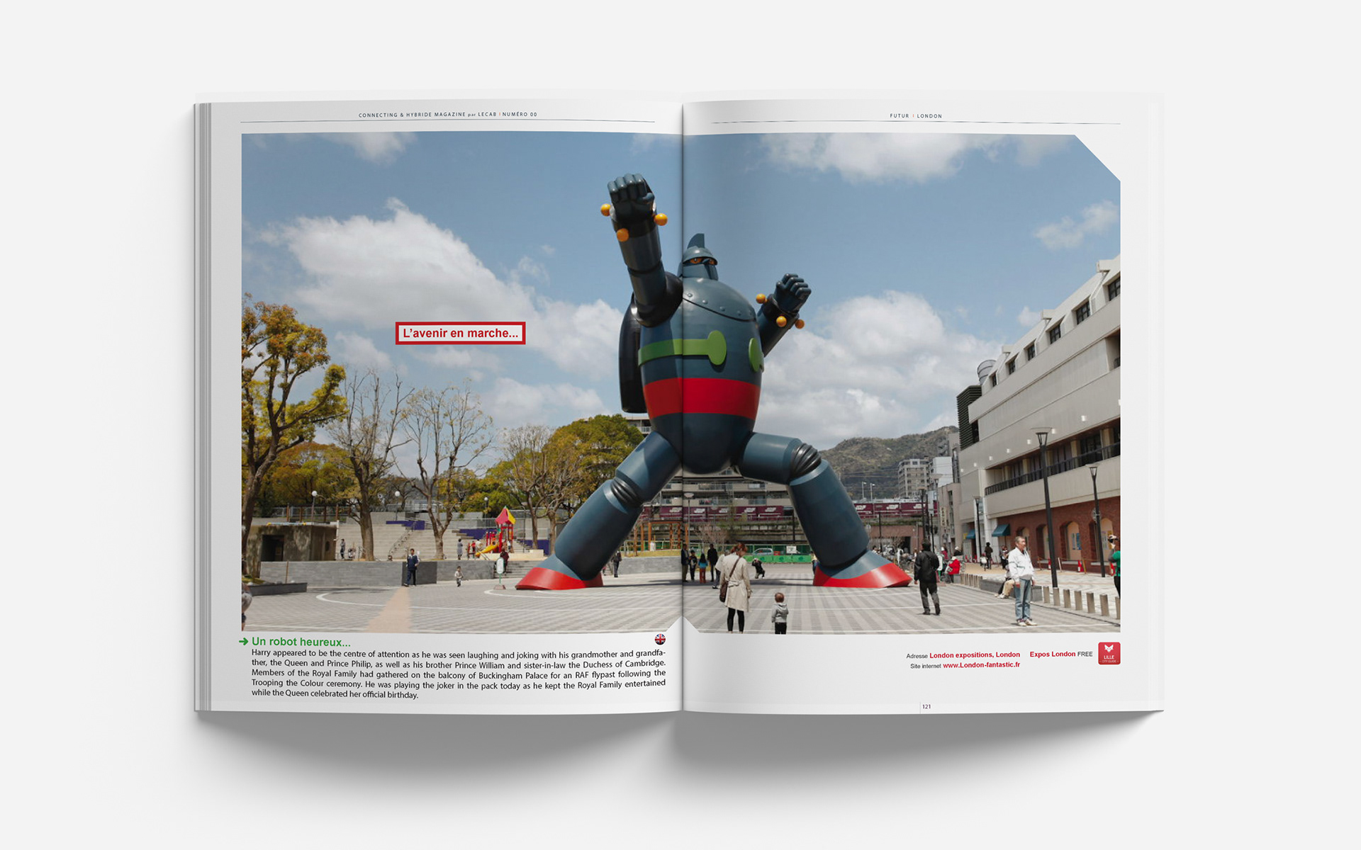
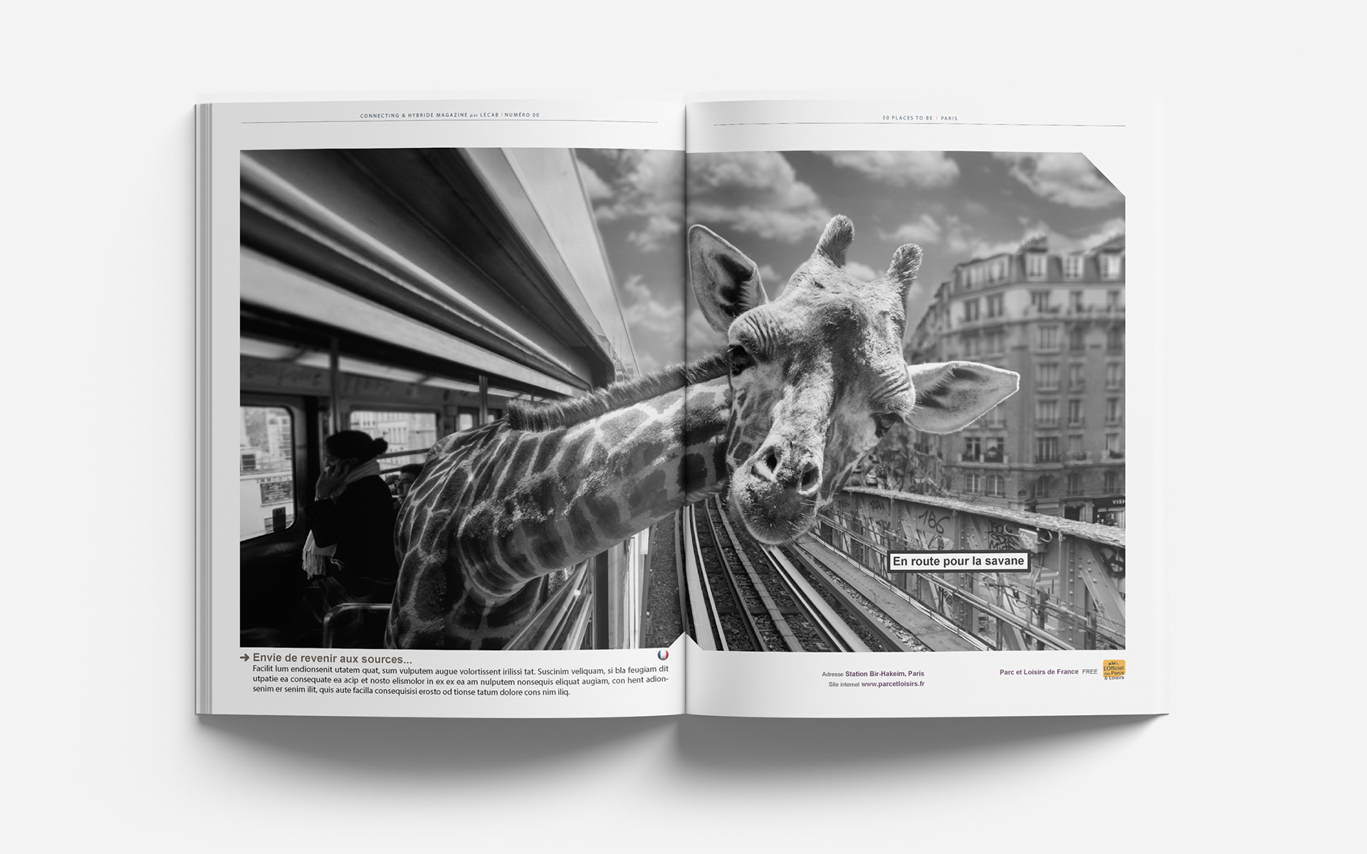
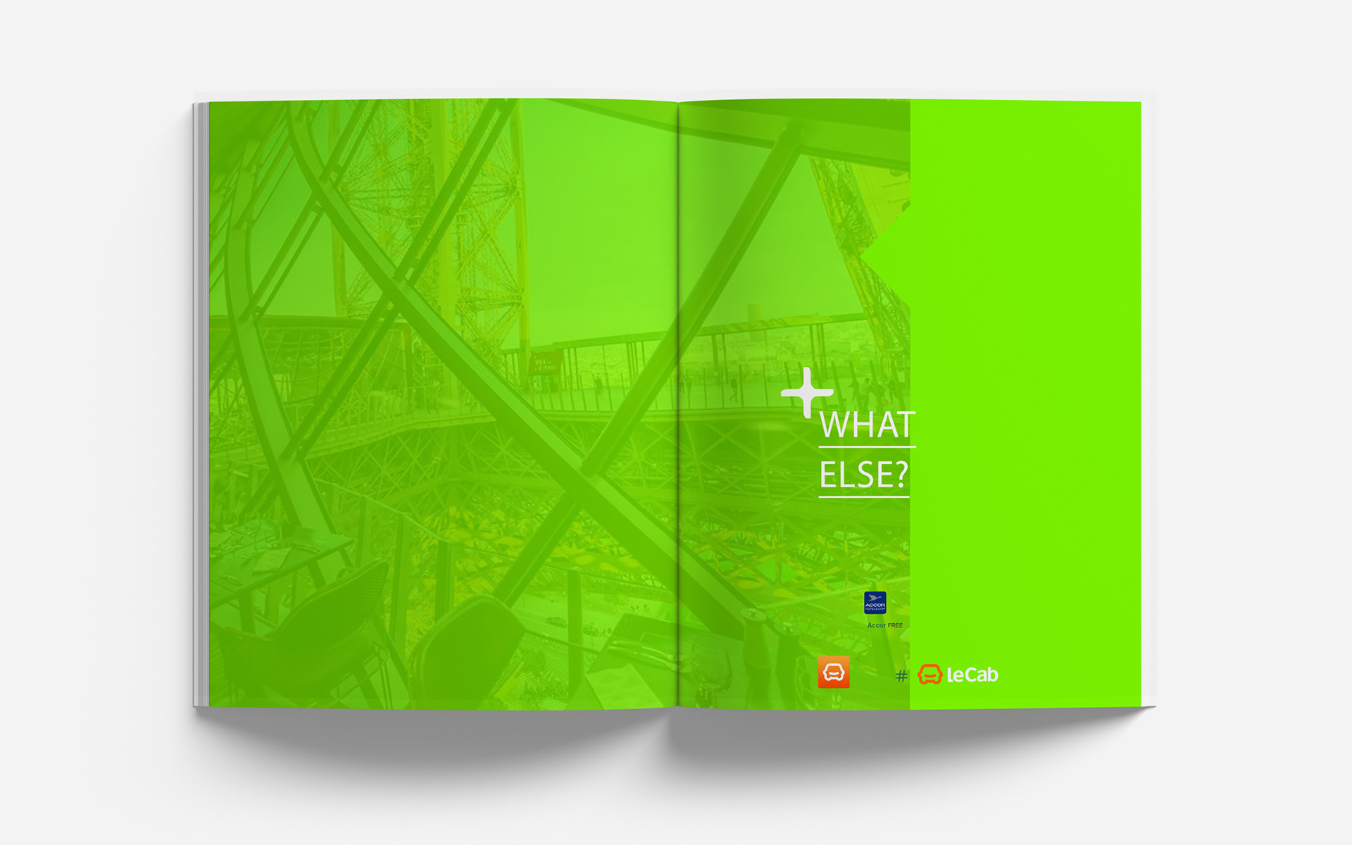
Concept Breakdown 2: immersive layouts & editorial rhythm
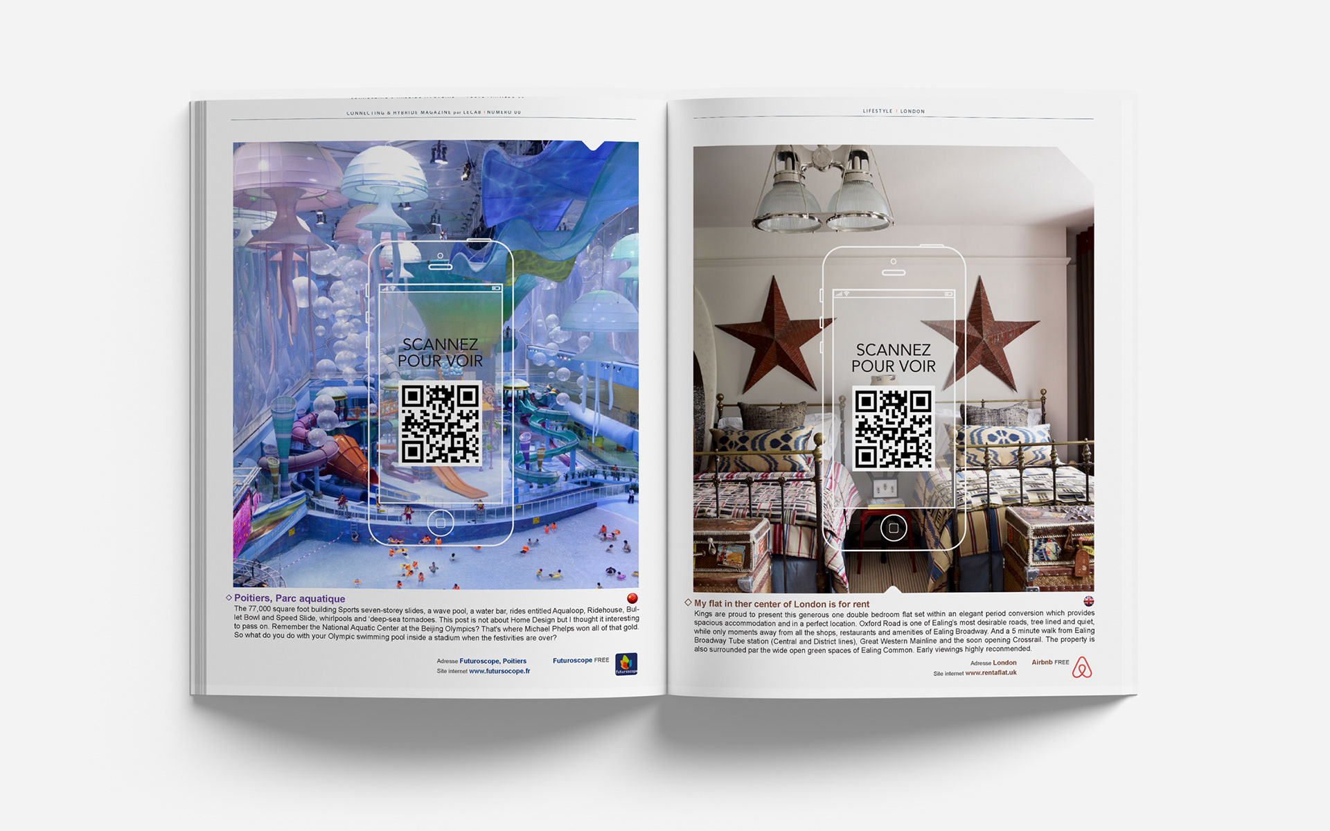
The magazine design uses full double-page photographs to create high-impact visual breaks that pull readers into each new feature.
These panoramic visuals serve as both storytelling tools and transitions.
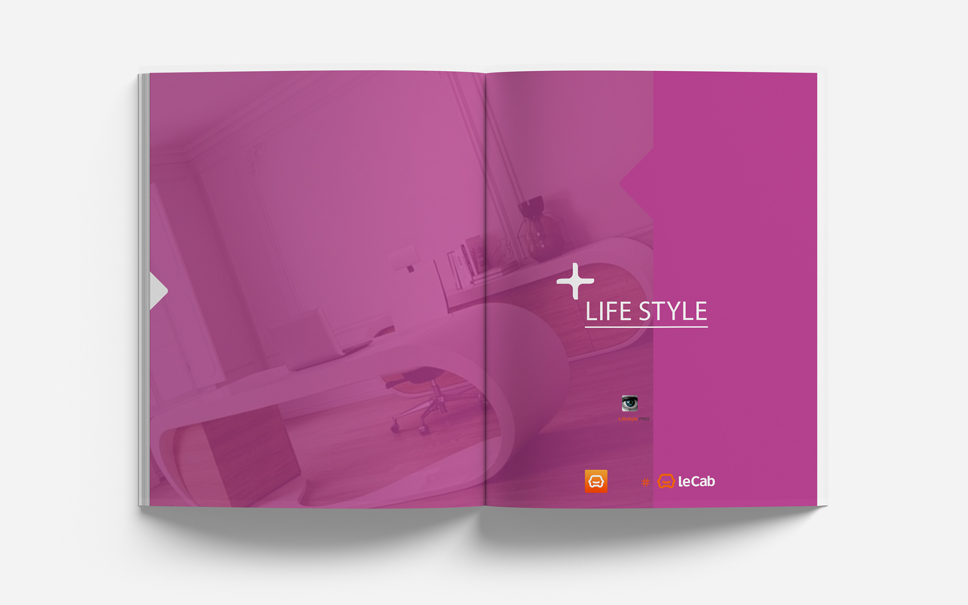
Section intros are defined by bold, monochrome double spreads (like “LIFESTYLE”), setting the editorial rhythm while providing a clear orientation.
This alternating pattern, image, content, and color ensures visual diversity, structured flow, and a rich, immersive reading experience.
The magazine design uses full double-page photographs to create high-impact visual breaks that pull readers into each new feature.
These panoramic visuals serve as both storytelling tools and transitions.
Section intros are defined by bold, monochrome double spreads (like “LIFESTYLE”), setting the editorial rhythm while providing a clear orientation.
This alternating pattern, image, content, and color ensures visual diversity, structured flow, and a rich, immersive reading experience.
Concept Breakdown 2: AI THAT THINKS WITH YOU Everyplace ANYTIME
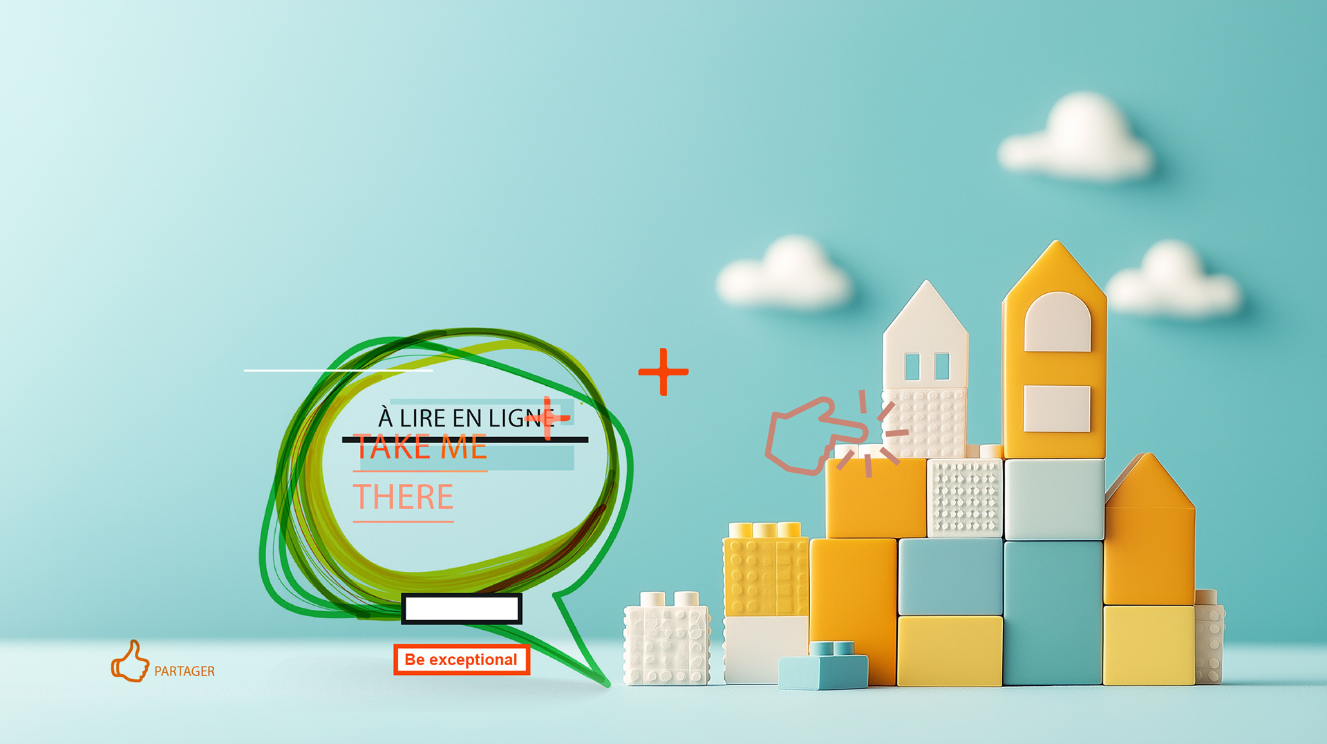
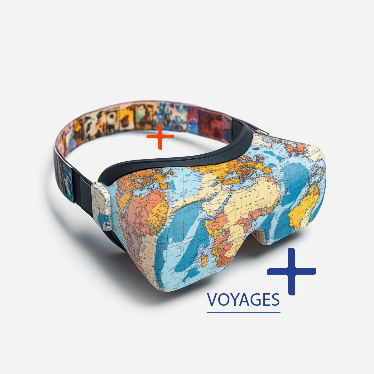
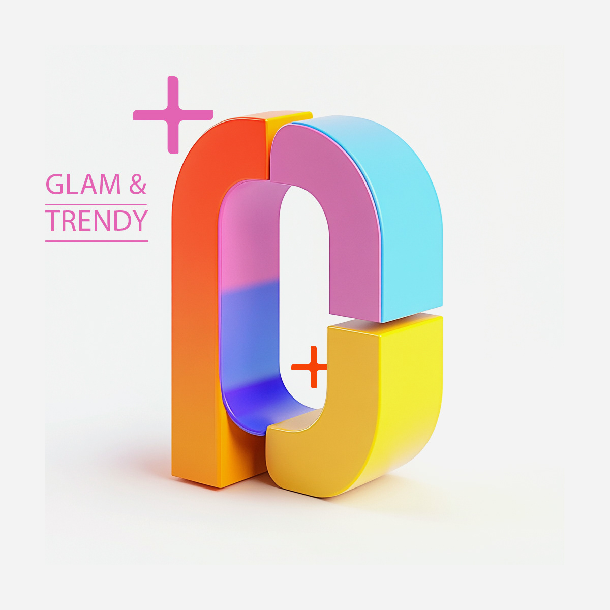
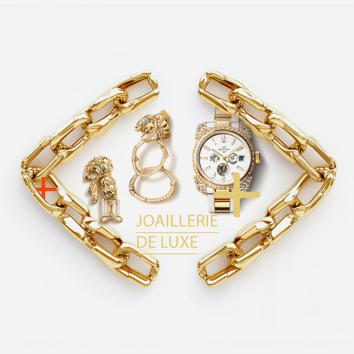
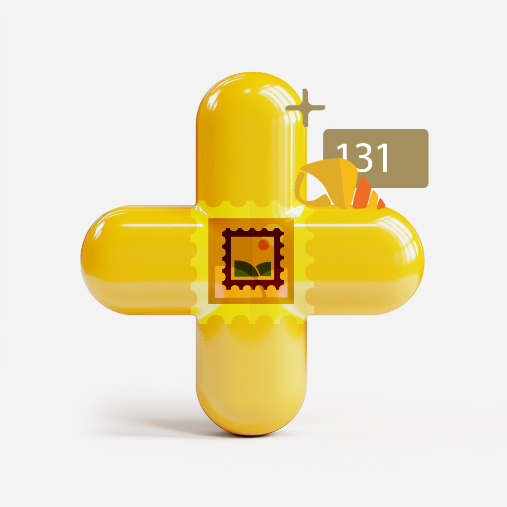
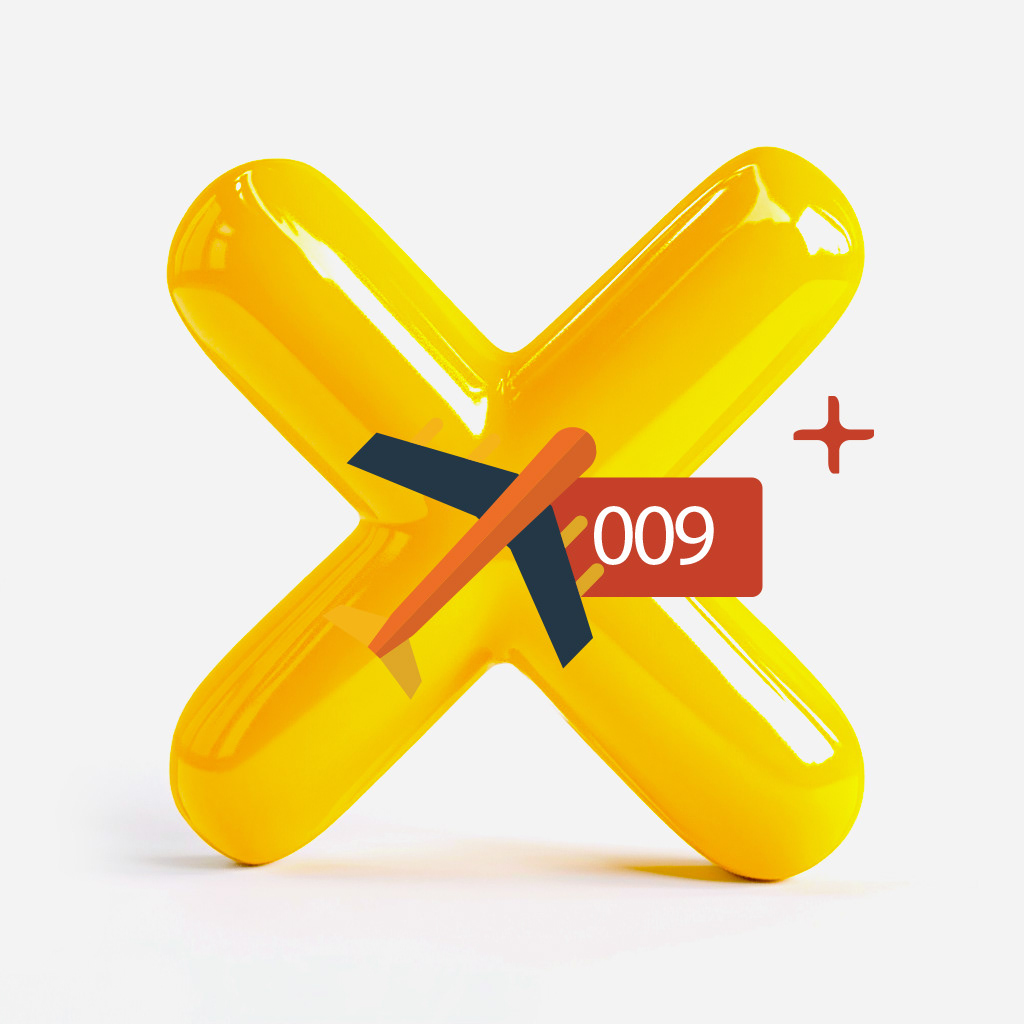
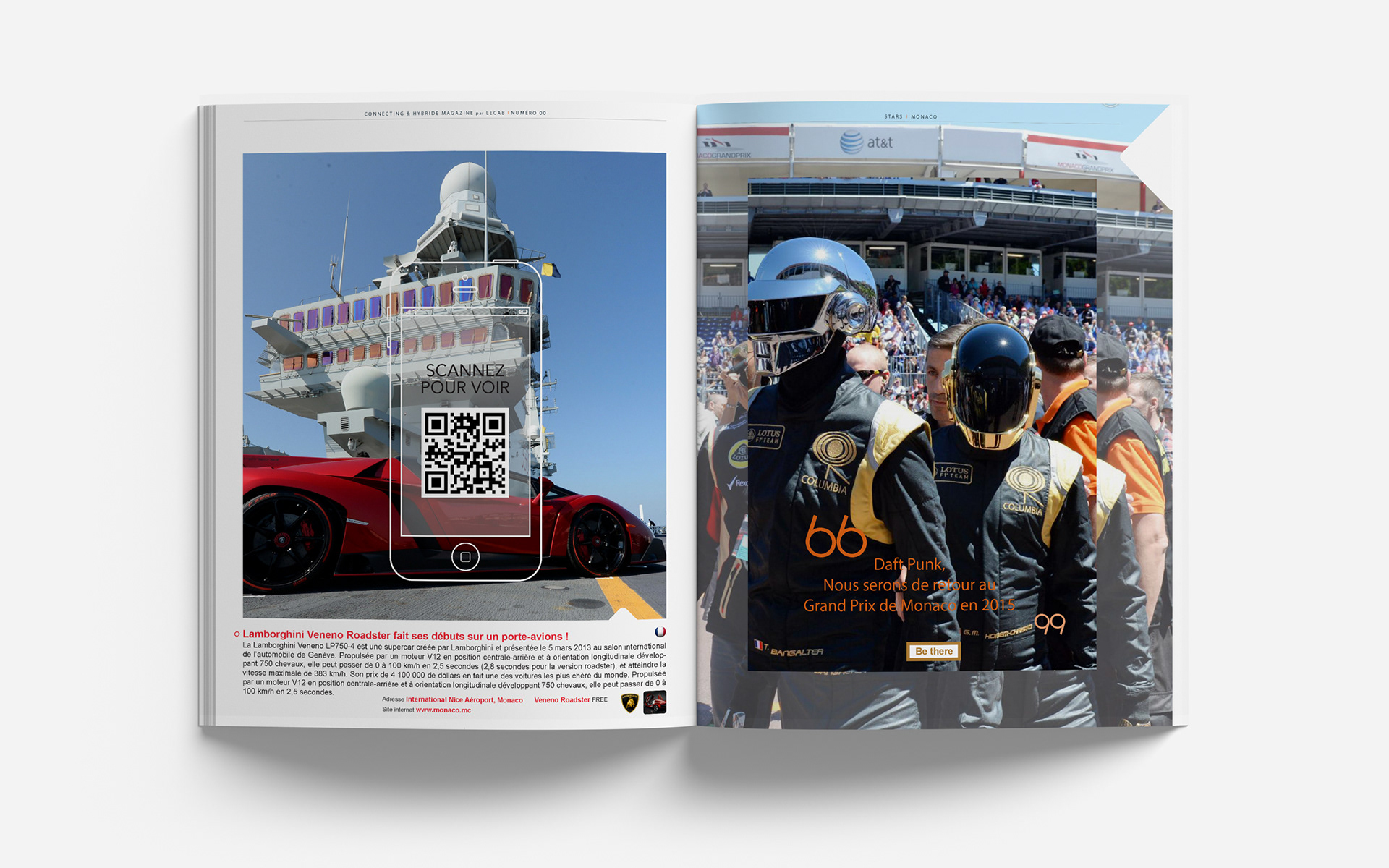
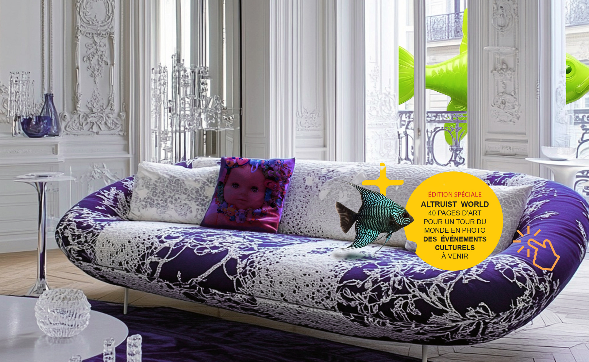
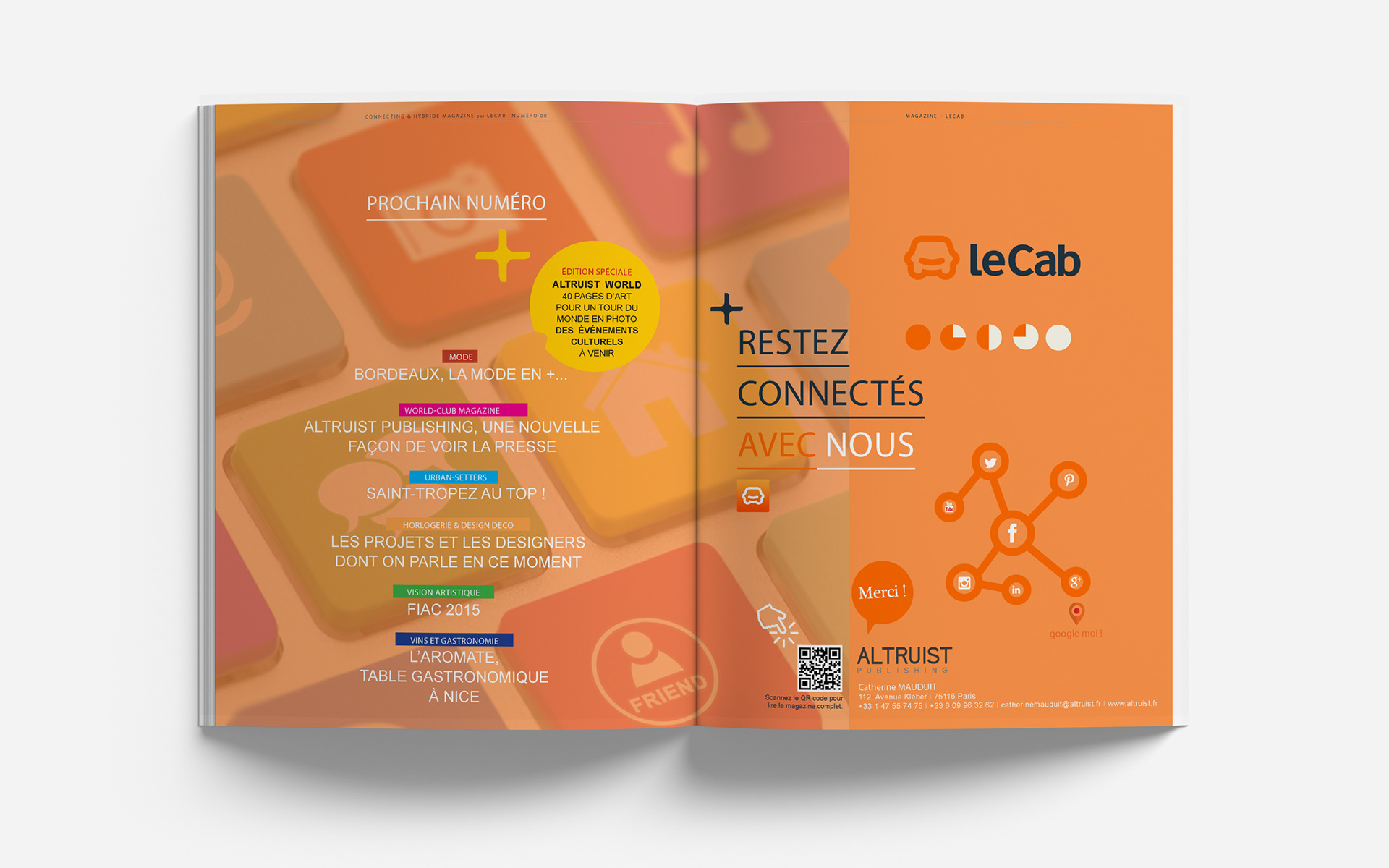
These bold yellow icons are part of The Altruist magazine’s visual language, playful, functional, and instantly recognizable:
- The Plus (+) signals curated discoveries, tips, or travel highlights—playfully marked with stamps or croissants.
- The Cross (×) introduces contrasts, critiques, or deeper editorial takes through layered visual cues.
- Their glossy, inflated 3D style adds a tactile, modern feel that supports intuitive navigation and editorial clarity.
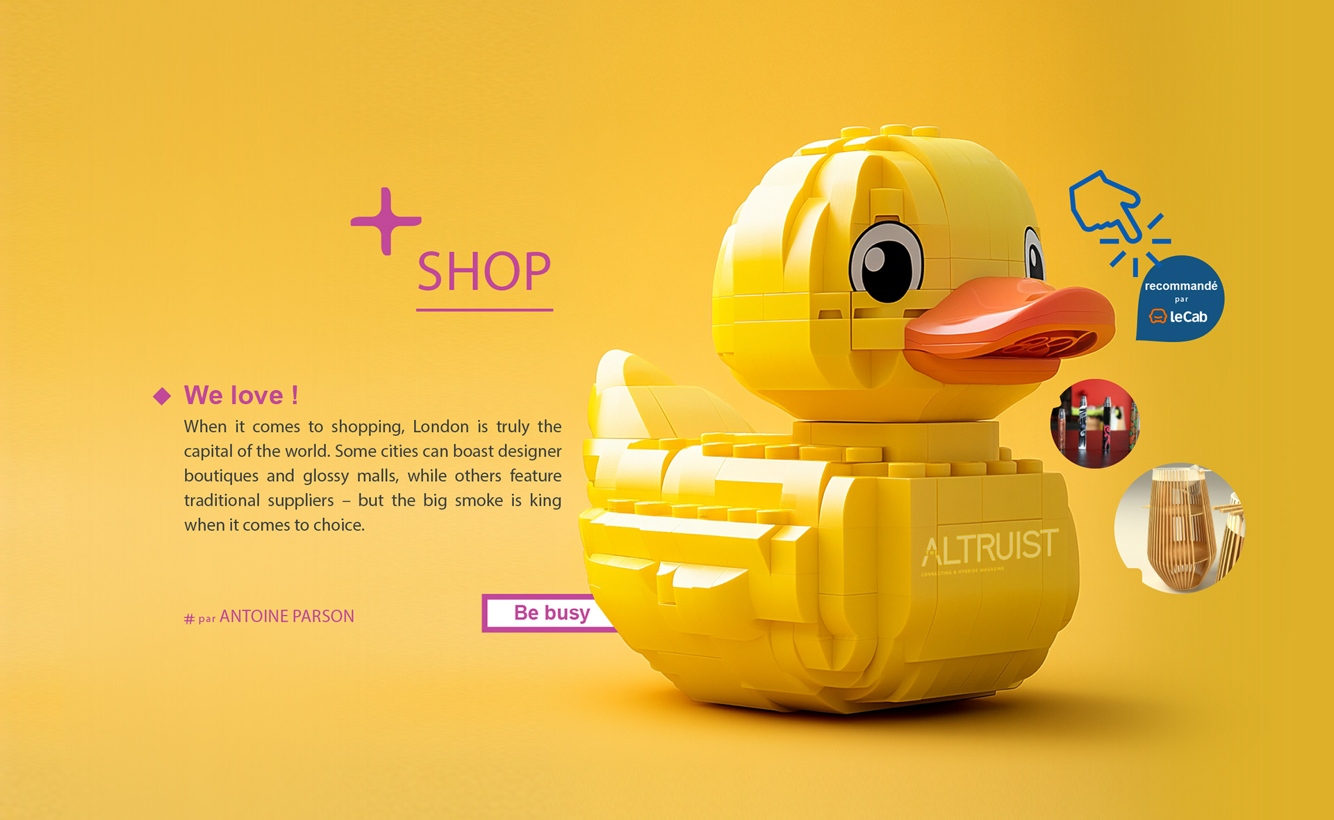
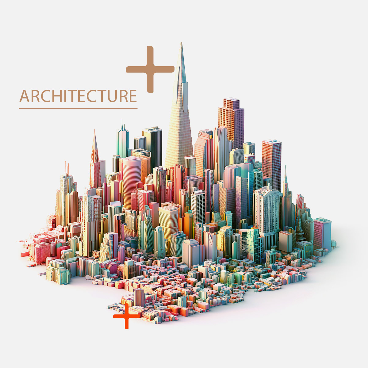
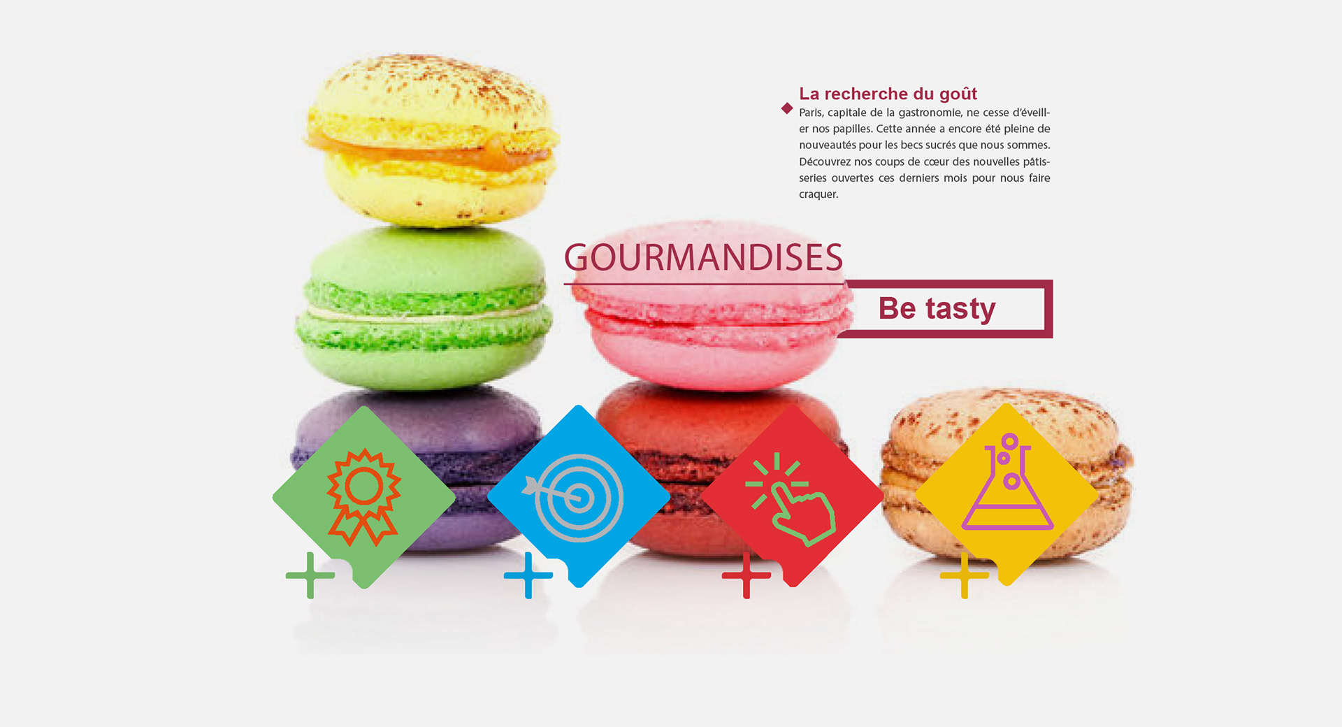
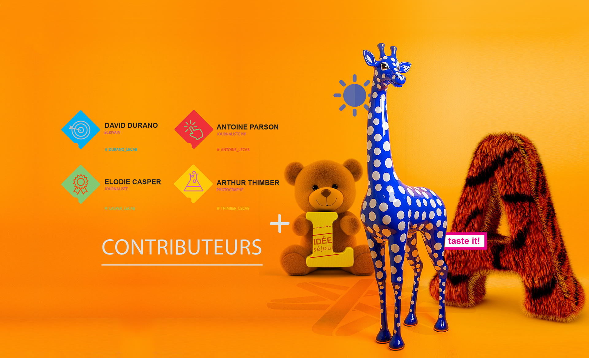
illustrations: playful precision
This visual series for The Altruist uses vibrant yellow, surreal juxtapositions, and tactile 3D objects to create a playful yet polished tone.
From a duck mascot to floral typography, each element blends humor, editorial clarity, and symbolic meaning,
turning everyday icons into striking visual anchors.