CLIENT / Coming Of Age, NYC
Project Overview
The Coming of Age brand identity draws inspiration from the Japanese Seijin Shiki tradition, symbolizing growth, transformation, and new beginnings:
- The logo design reflects a refined balance between modern minimalism and
traditional Japanese aesthetics, incorporating subtle calligraphic influences.
- The identity captures the essence of maturity and personal evolution through clean typography
and thoughtful composition.
- This project embodies a seamless blend of cultural heritage and contemporary design.
Approach & Solutions
The design process focused on blending Japanese elegance with modern simplicity, creating a timeless and sophisticated logo.
A minimalist aesthetic ensures versatility across digital and print applications, maintaining a refined, premium look.
The final identity embodies the brand’s ethos of transformation and cultural appreciation.
A minimalist aesthetic ensures versatility across digital and print applications, maintaining a refined, premium look.
The final identity embodies the brand’s ethos of transformation and cultural appreciation.
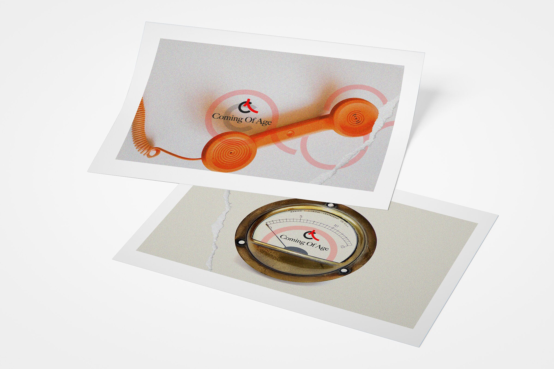
LOGO DESIGN: INSPIRED BY JAPANESE TRADITION & TIMELESS GROWTH
The Coming of Age logo is inspired by the Japanese tradition of Seijin Shiki (成人式), the "Coming of Age" ceremony celebrated when individuals reach adulthood.
The design reflects growth, transformation, and the passage of time, embodying the elegance and discipline associated with Japanese aesthetics.
The design reflects growth, transformation, and the passage of time, embodying the elegance and discipline associated with Japanese aesthetics.
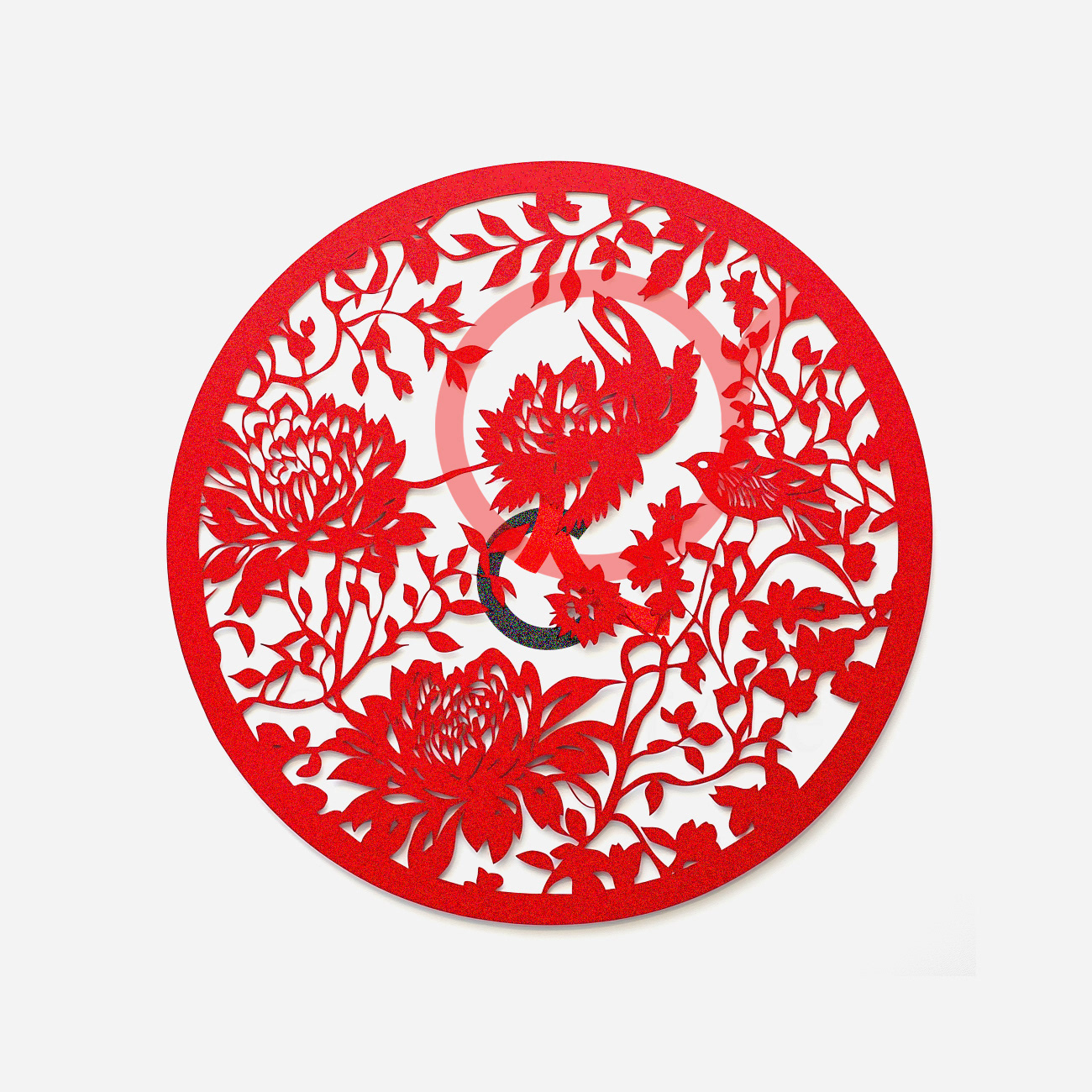
GRAPHIC STUDY 1: KYRIE-INSPIRED PAPER CUT CIRCLE
This detailed paper cut draws from Kyrie, the Japanese art of paper cutting.
It blends cranes, peonies, and birds to symbolize growth and transformation, some of the key themes for “Coming of Age.
The design communicates tradition and craftsmanship, offering a unique, tactile look that positions the brand
as sophisticated and culturally resonant.
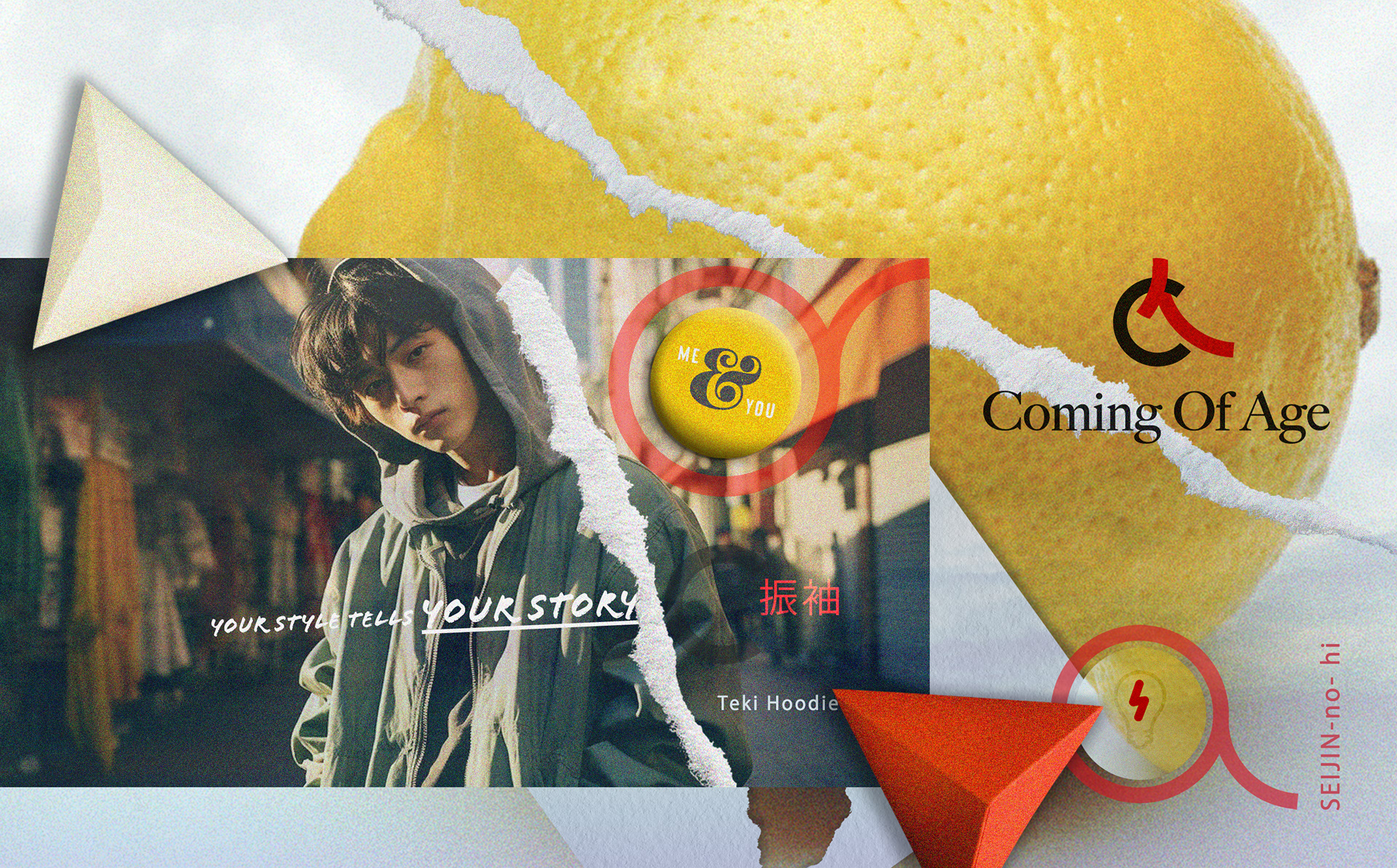
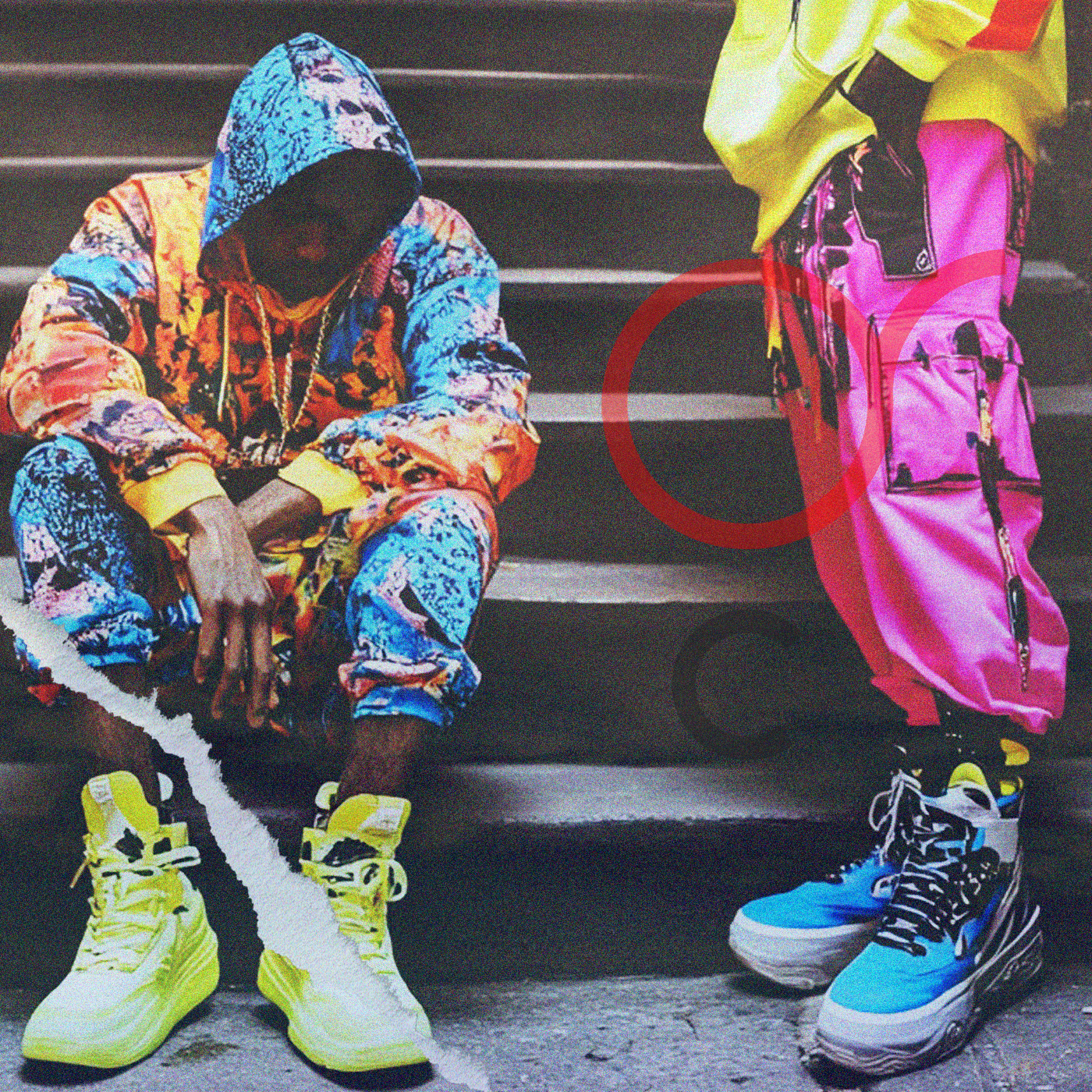
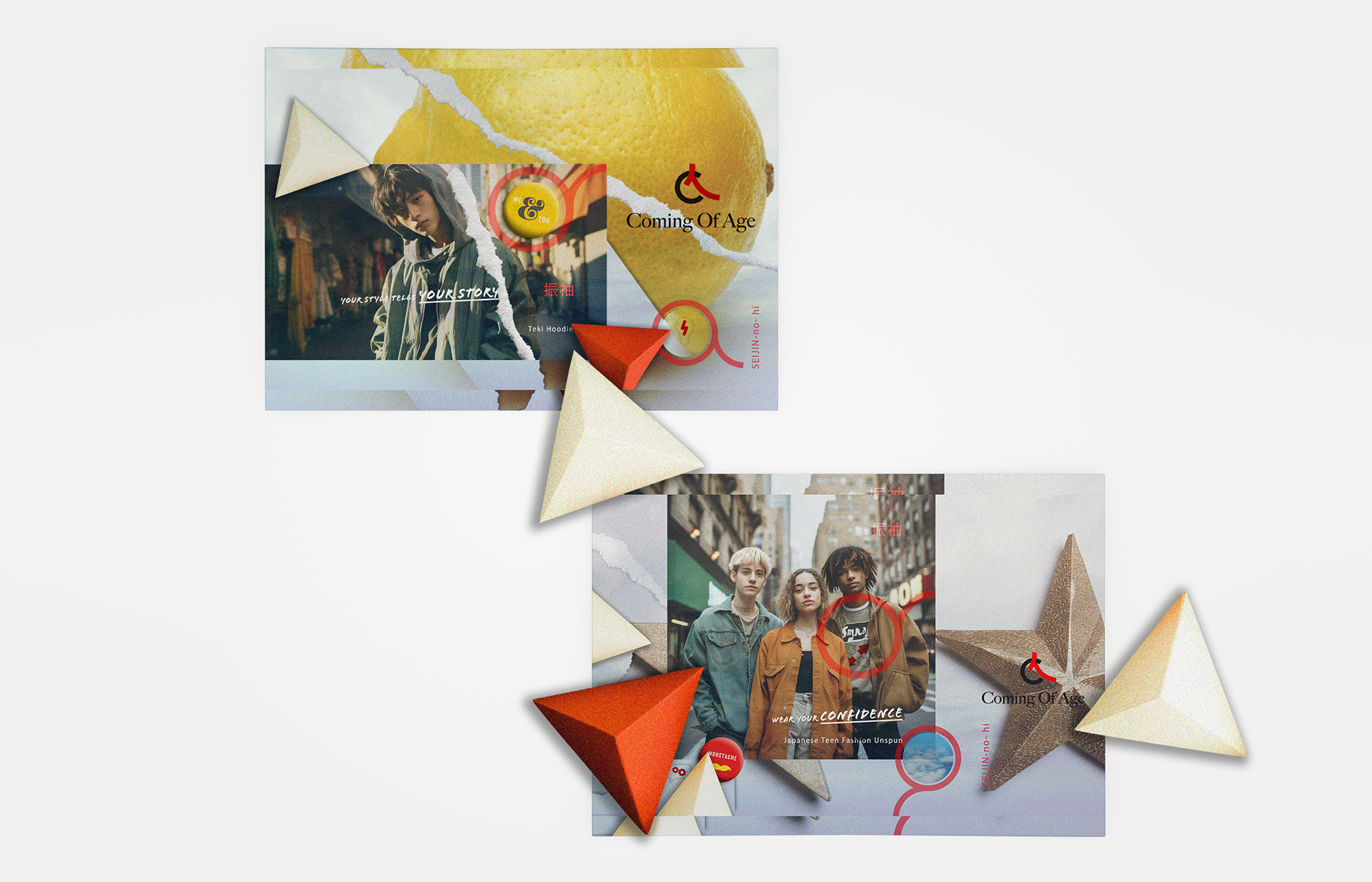
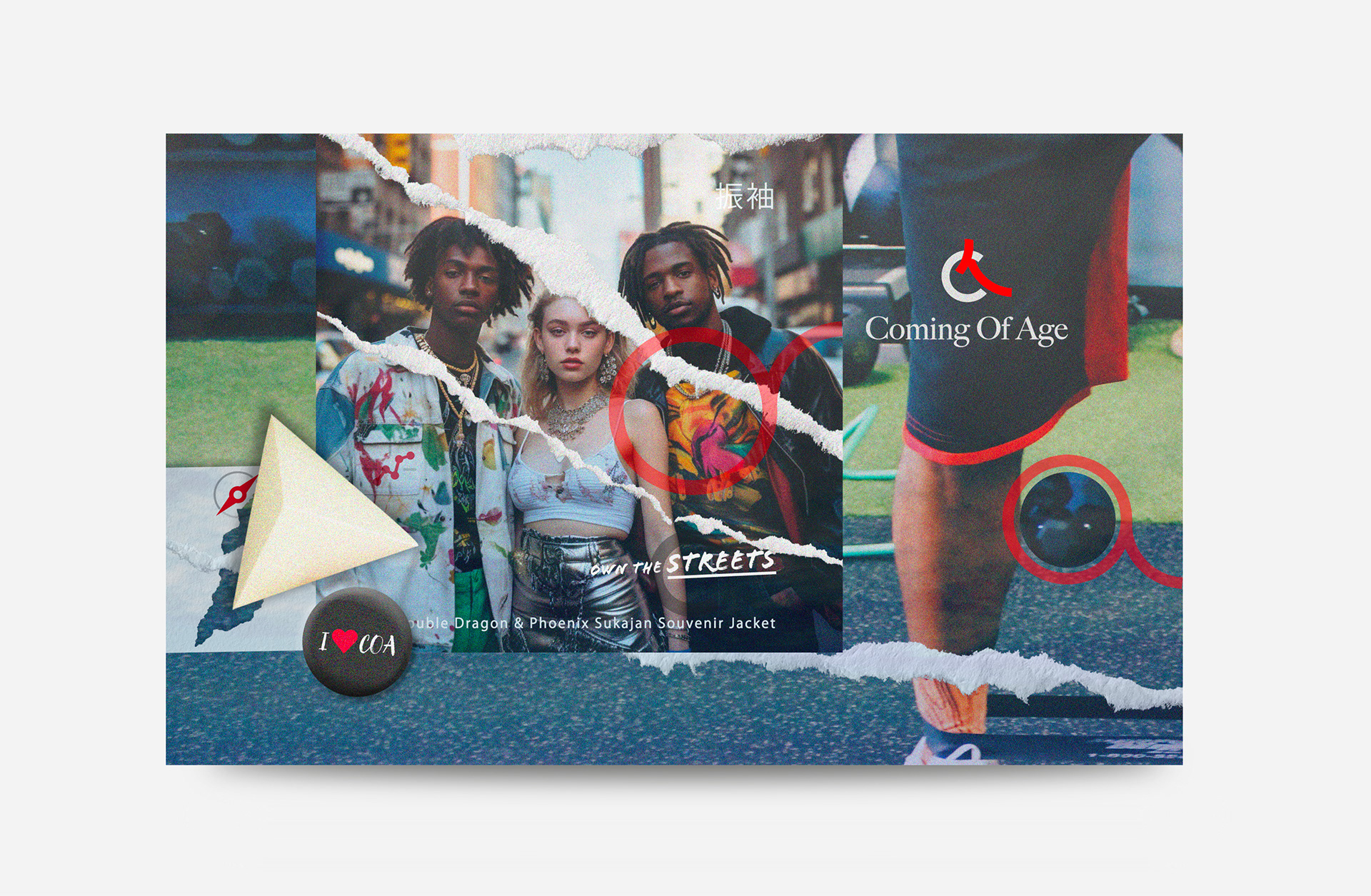
CONCEPT Breakdown 1: WASI-SABI ON THE STREETS
As the designer, I carefully selected and created visuals that blend authentic Brooklyn street photography with Japanese-inspired graphics, aligning with the brand’s guidelines.
I chose urban portraits and candid moments to capture U.S. youth culture's raw energy and confidence.
Then, I layered them with torn paper effects, red circular motifs, and surreal collages inspired by Japanese aesthetics, such as wabi-sabi, origami, and Koinobori.
This approach allowed me to fuse textured overlays and geometric shapes, highlighting the brand’s dual heritage, bridging Japanese craftsmanship and visual storytelling with the attitude of contemporary American style, and expressing a spirit of individuality and self-confidence.
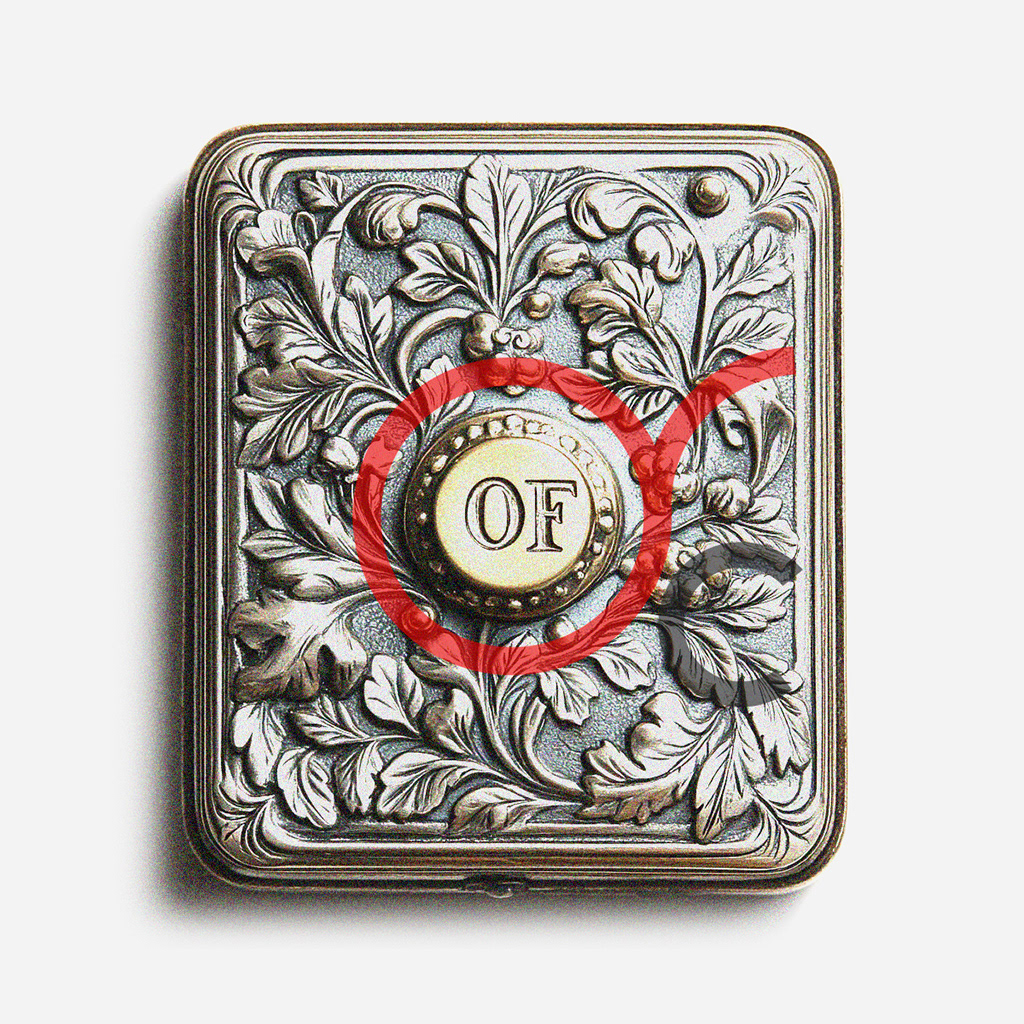

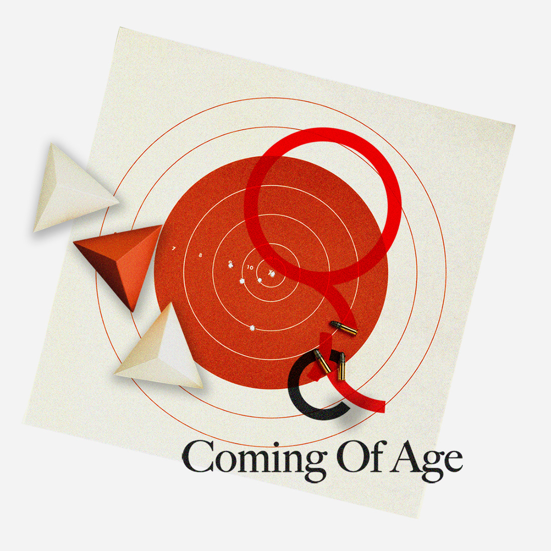
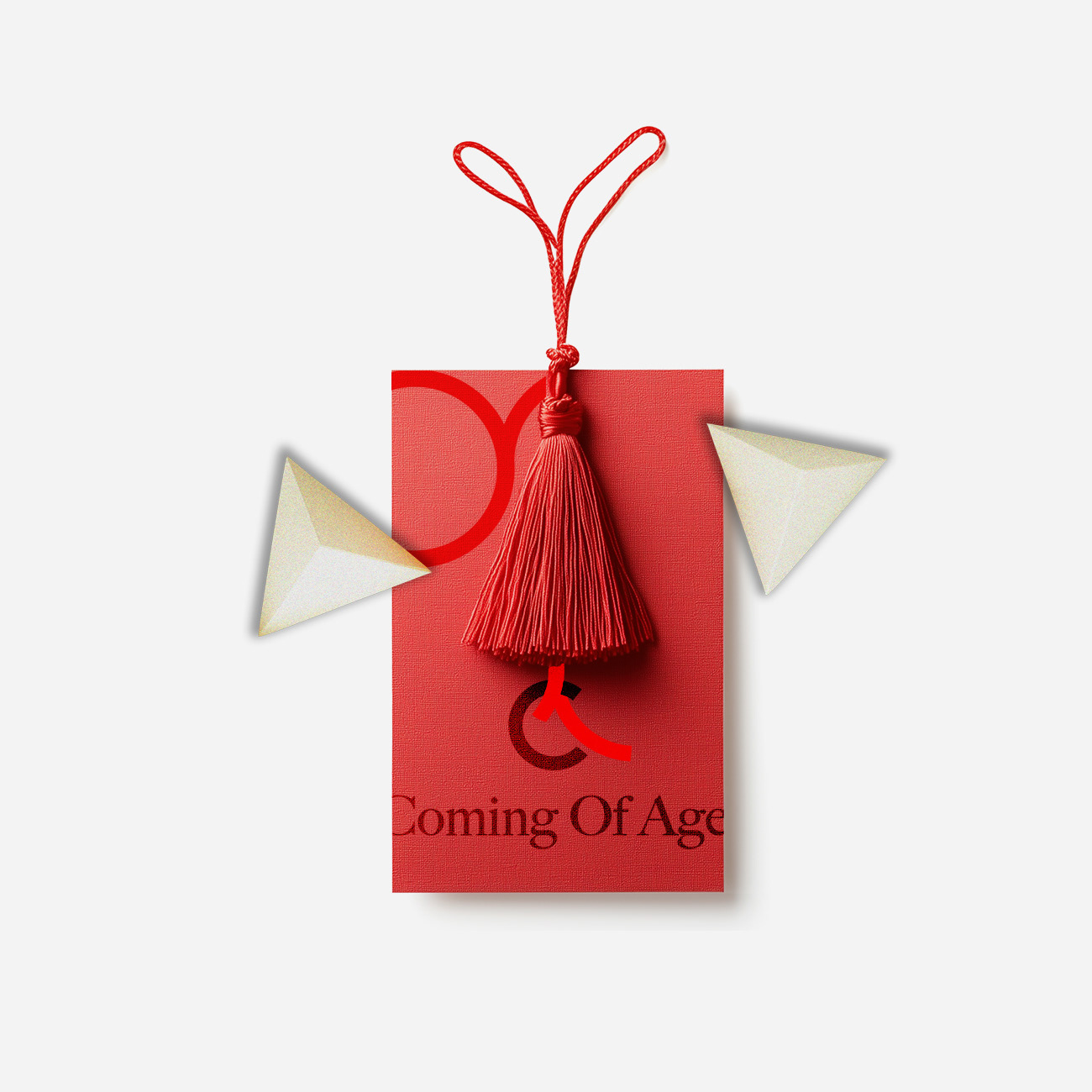
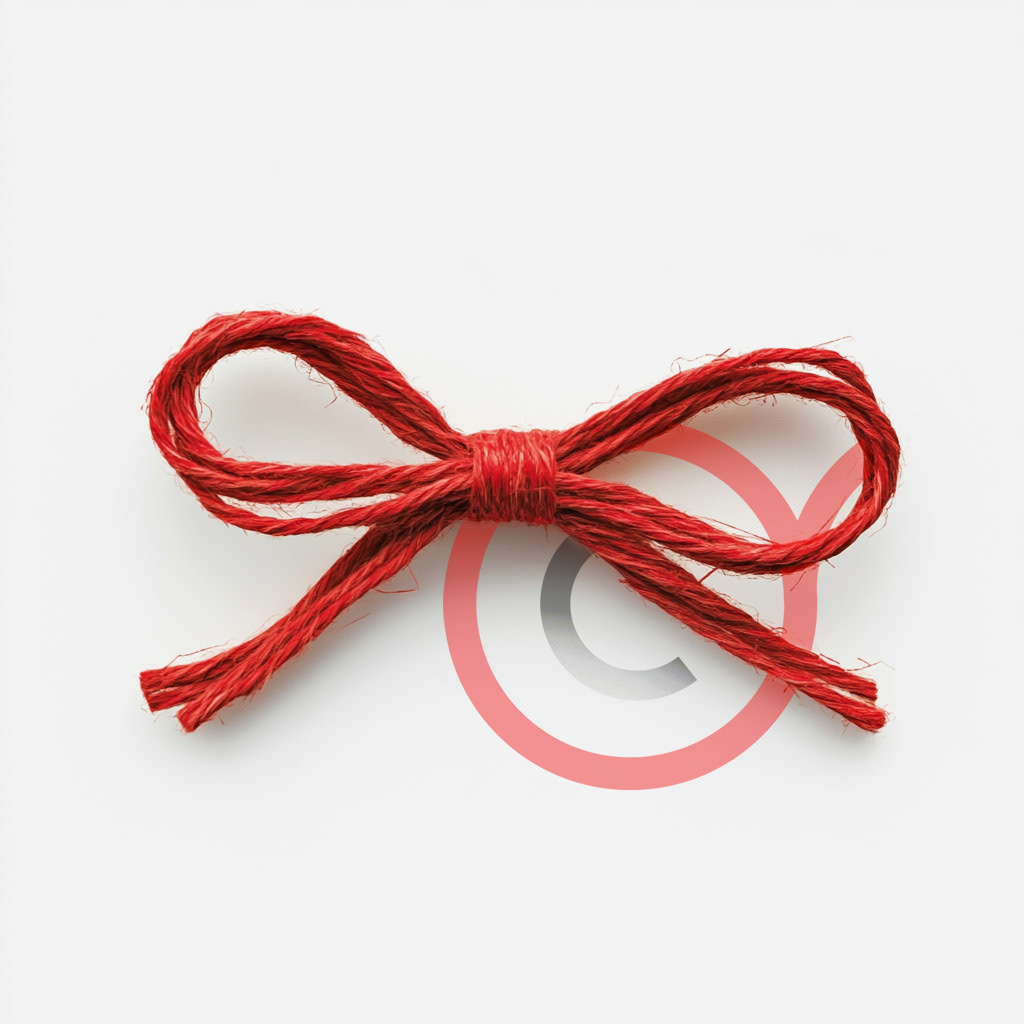
GRAPHIC STUDY 2: Red Mizuhiki-inspired knot
Referencing the Mizuhiki knot used in Japanese celebrations, the red cord overlays the “C” as a symbol of connection and meaningful life transitions.
This simple but powerful motif stands for unity and celebration and can be easily adapted across the brand’s visual materials for strong, cohesive recognition.
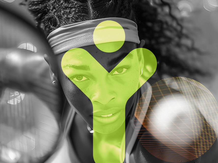
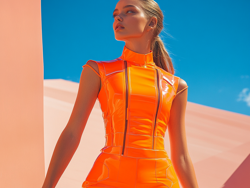
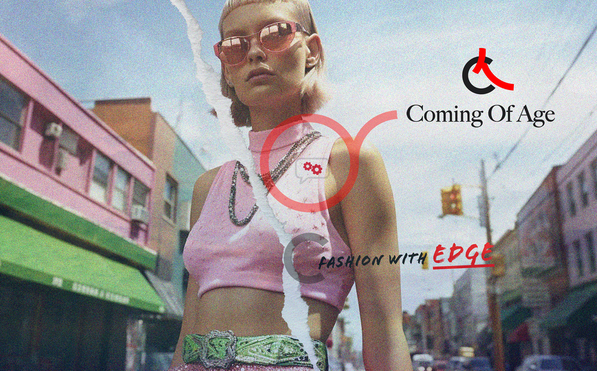
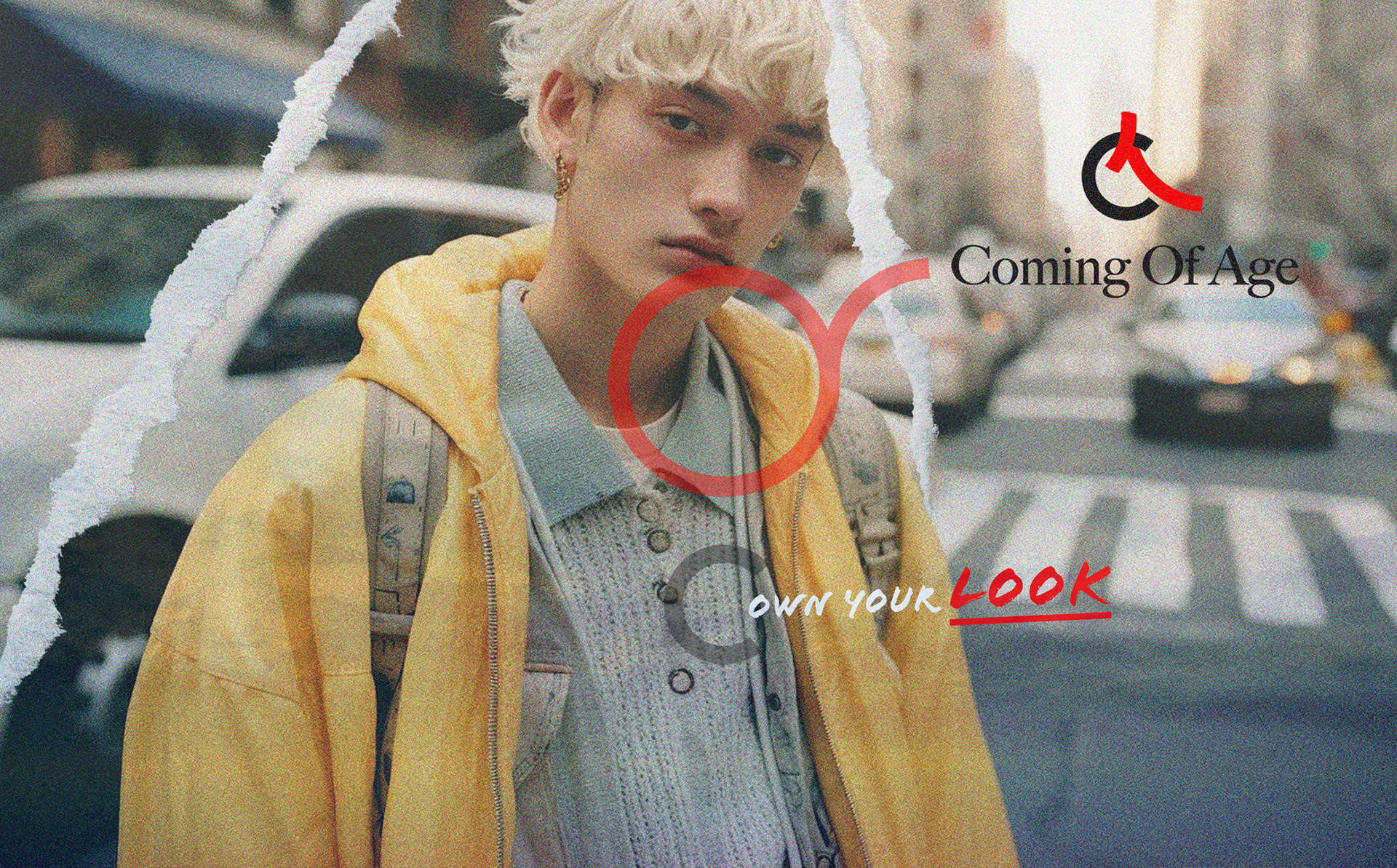
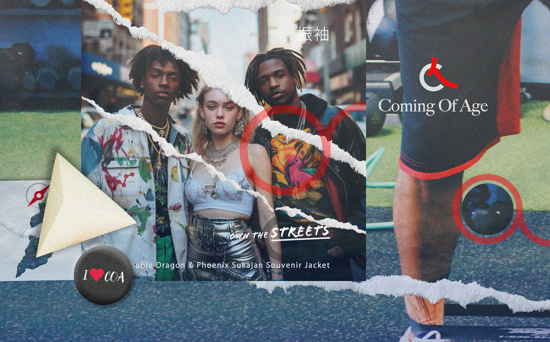
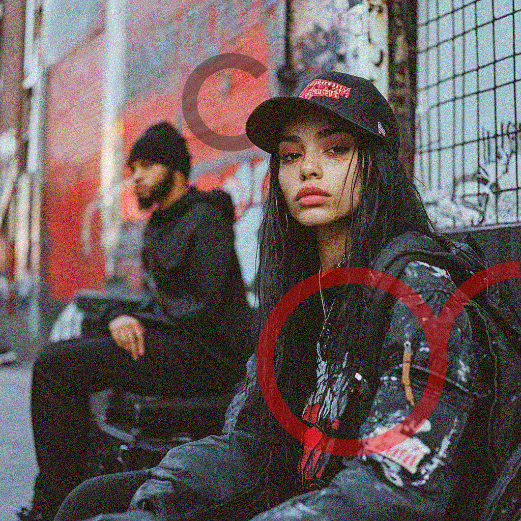
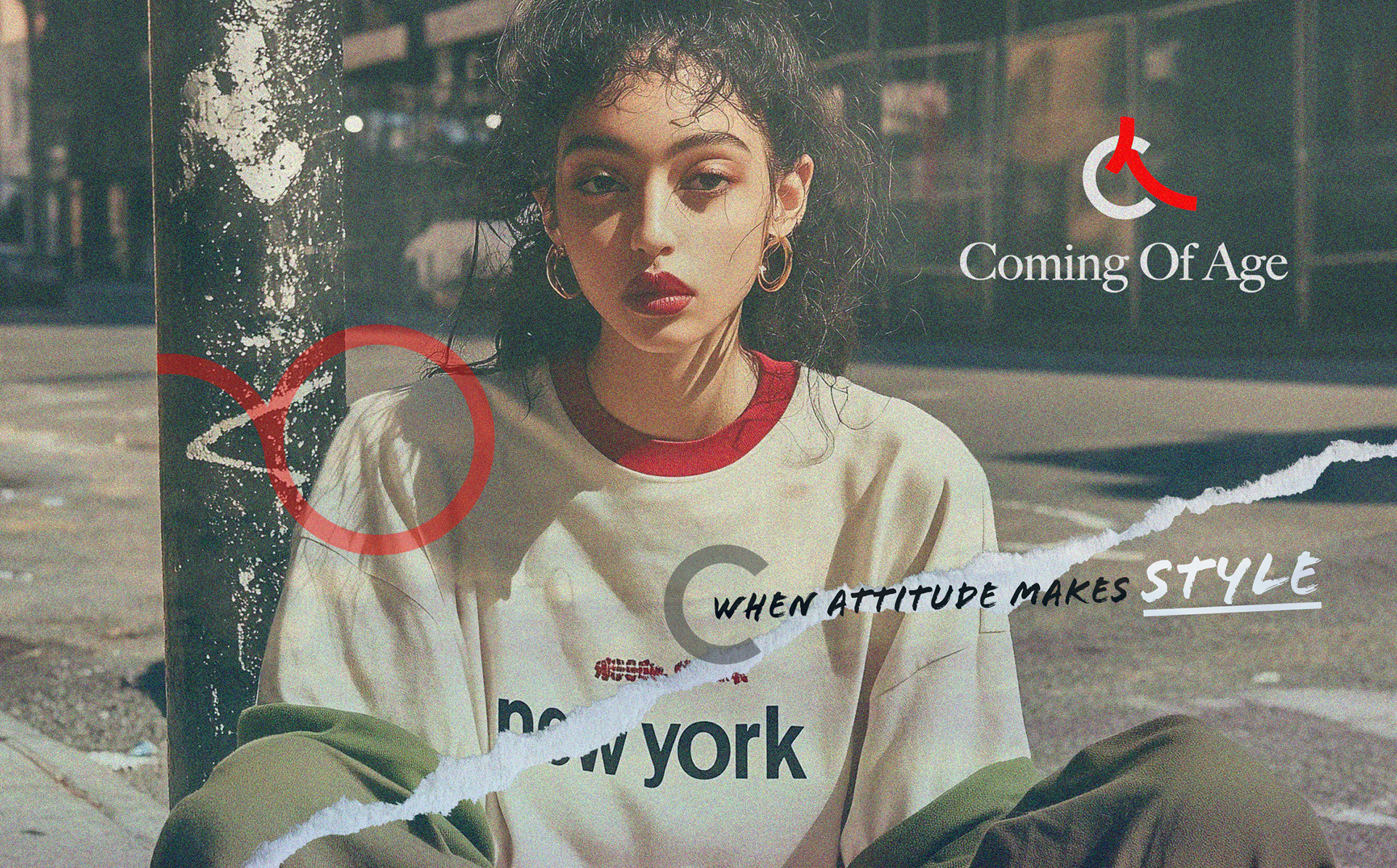
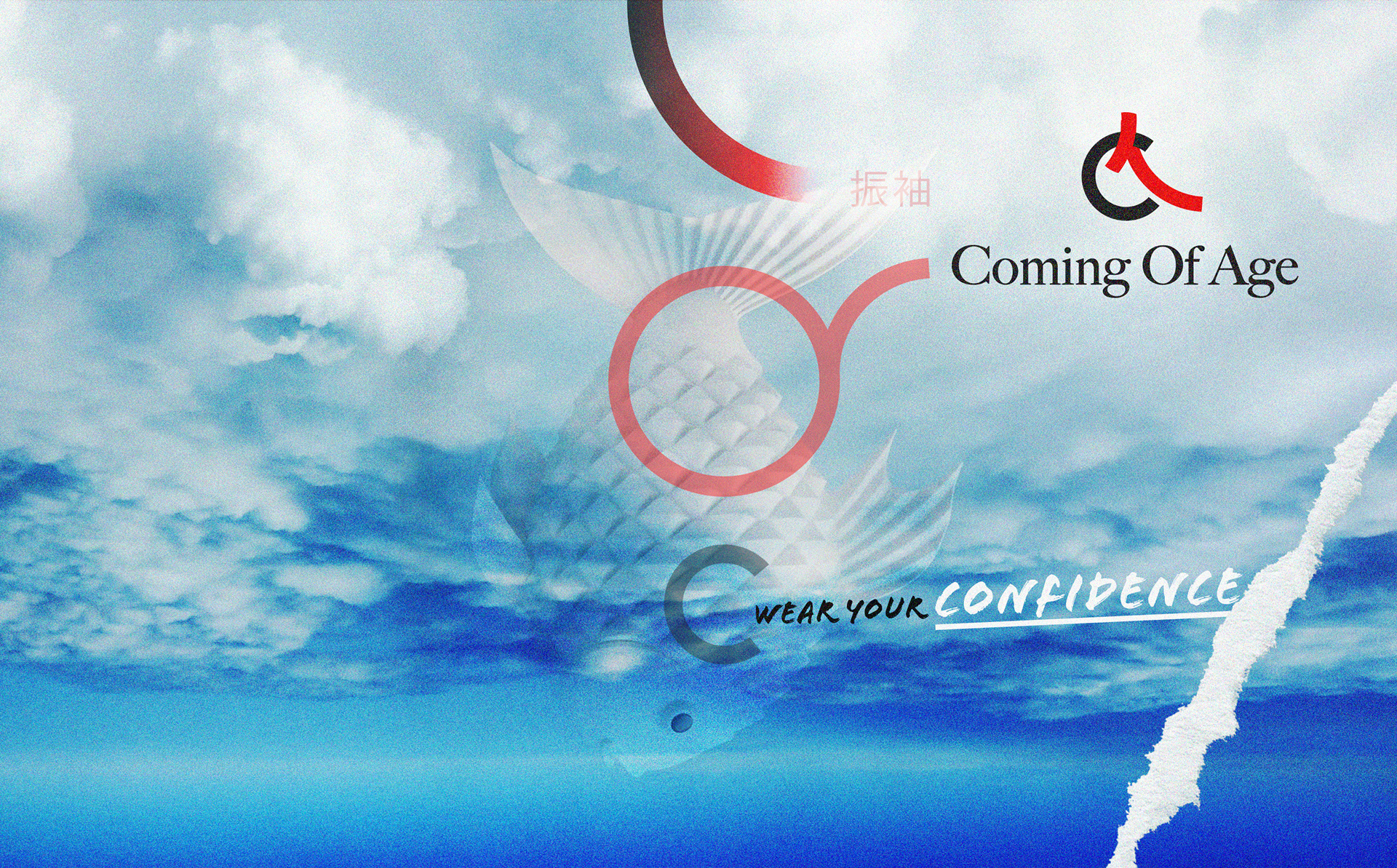
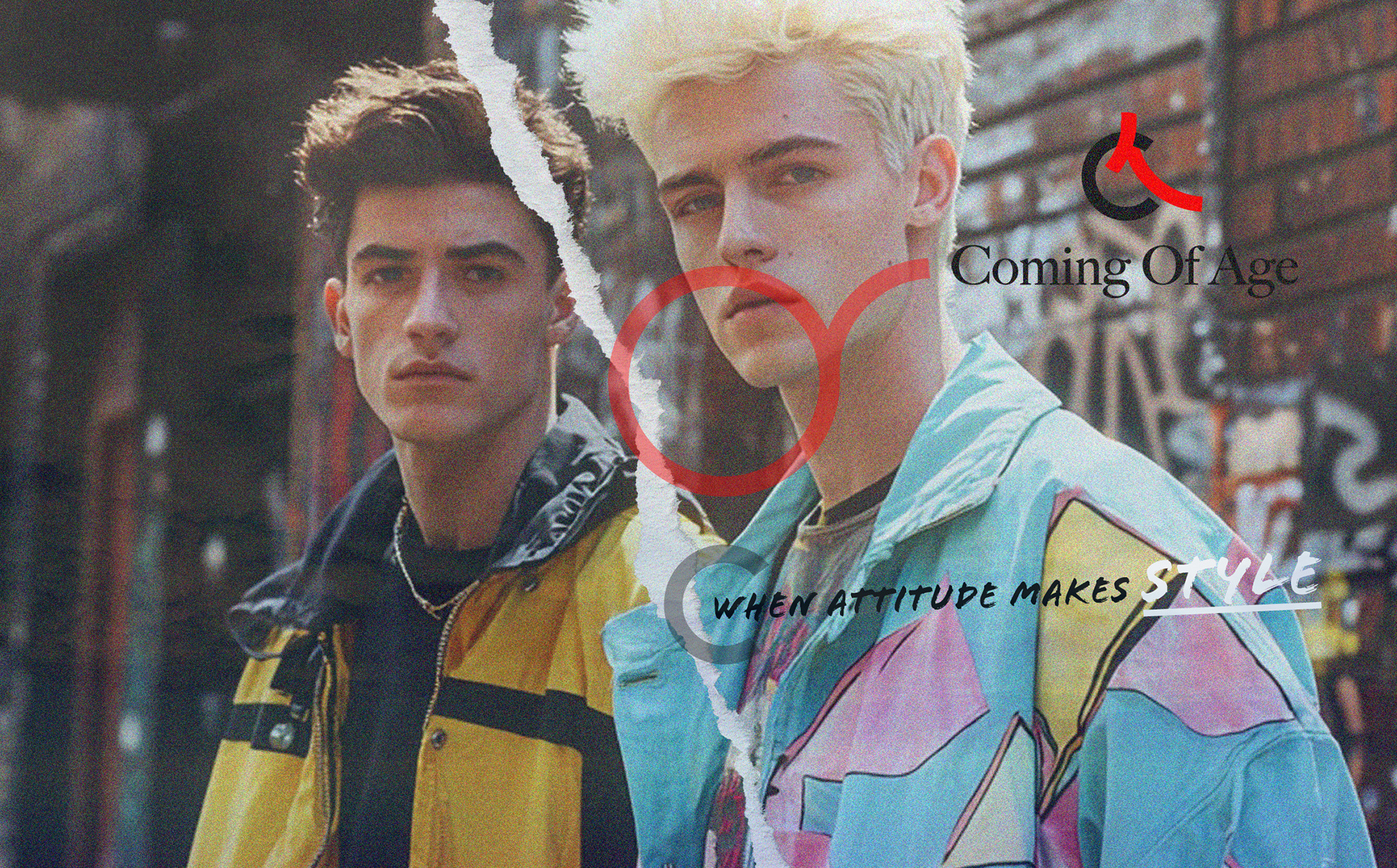
STREET ATTITUDE, SIGNATURE STYLE
The idea behind “When Attitude Makes Style” is to spotlight how personal expression and self-confidence shape the identity of the Coming of Age brand.
I selected candid, street-inspired photography with a raw, authentic vibe—mirroring Japanese street culture and the diversity of American urban life.
The graphic overlays—torn edges, bold brush lettering, and minimalist Japanese-inspired circles—emphasize individuality and the creative tension between tradition and modernity.
The result is a visual language in which style isn’t just about clothes but also about the attitude and personality behind them.
The photography and graphic treatment intentionally blend American street fashion’s candid energy with Japanese visual codes, circles, origami shapes, and symbolic motifs, creating a bold, globally relevant identity.
This strategy positions the brand as contemporary and culturally rich, resonating with a new generation seeking meaning and individuality in their clothing.
This strategy positions the brand as contemporary and culturally rich, resonating with a new generation seeking meaning and individuality in their clothing.
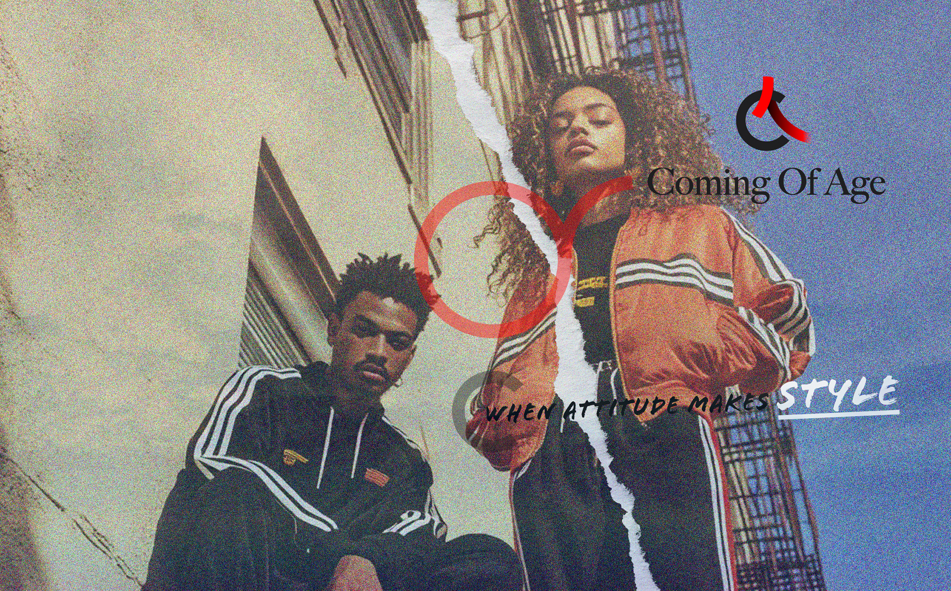
I designed these visuals for Coming of Age to showcase how personal attitude transforms style into a statement of identity.
The campaign leverages authentic street photography, breaks from conventional, overly polished fashion imagery, and channels a documentary that feels true to youth culture.
I layered in bold, hand-drawn graphics, including torn paper edges and Japanese-inspired red circle motifs, to reinforce the idea of individuality and cultural remixing.
The tactile, collage-like treatment references both the imperfection and dynamism of self-expression.
At the same time, the streetwear and casual styling highlight that true style is shaped by attitude, not just clothing.
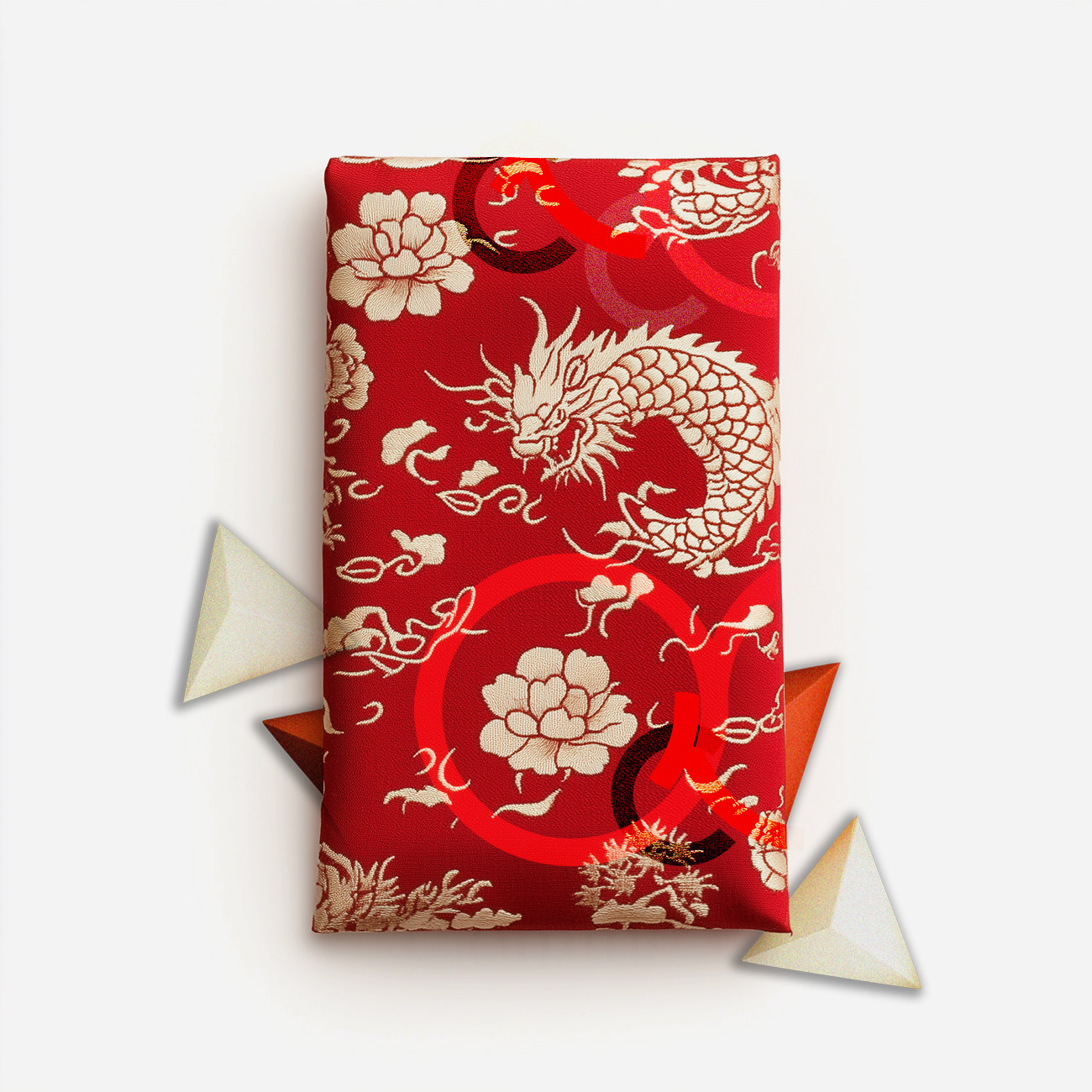
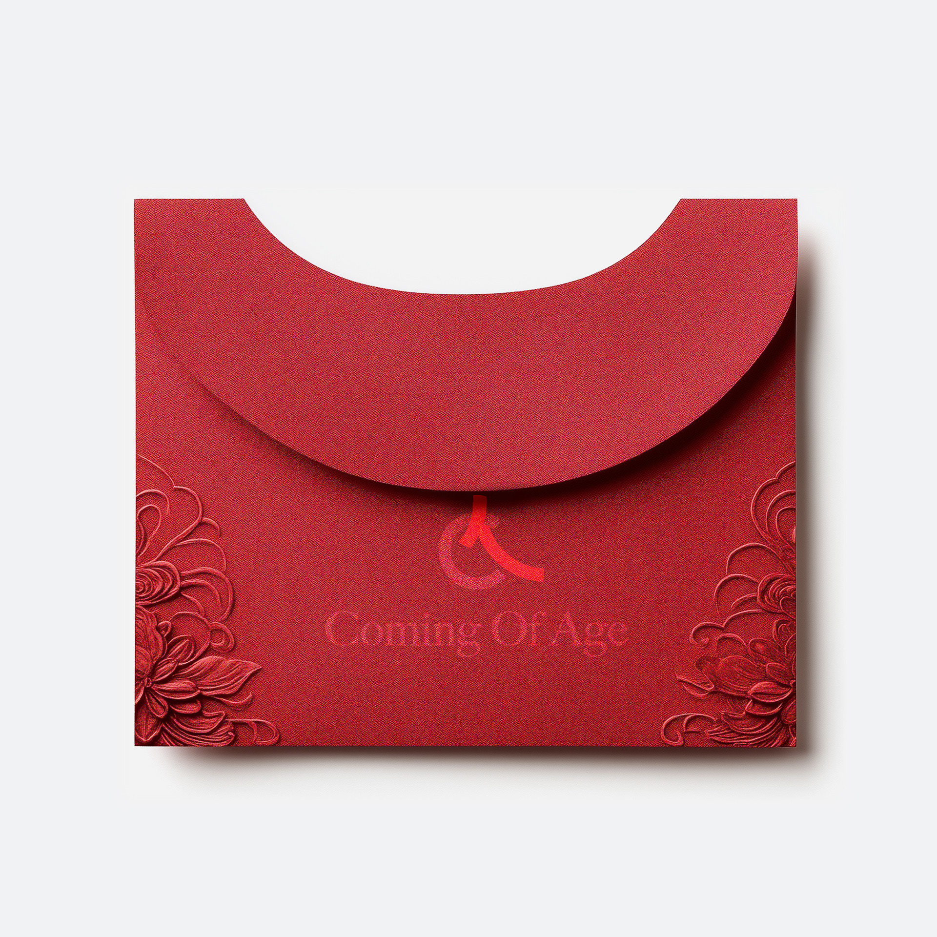
GRAPHIC STUDY 3: textile pattern wrapping with dragon
Inspired by Japanese kimono patterns and furoshiki wrapping, this visual features dragons, peonies,
and cloud motifs to evoke strength, luck, and heritage.
Layered “C” marks subtly connect the design to the brand.
It creates an immediate sense of ritual and value in packaging, grounding the brand in authentic cultural storytelling and a memorable unboxing experience.