CLIENT / La Cave Aixoise, Aix-en-Provence, France
Project Overview
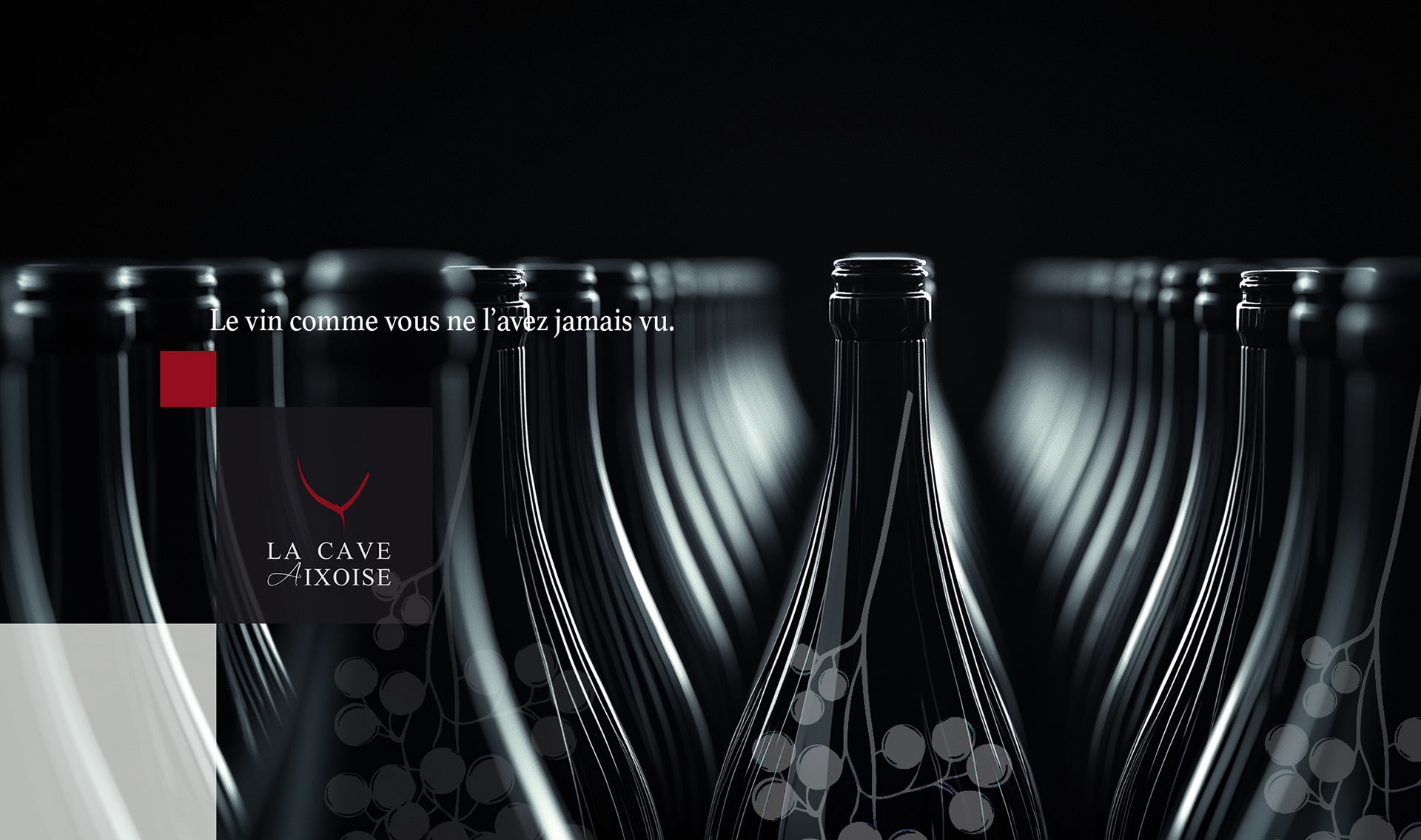
The client recently opened a new wine store in Aix-en-Provence and needed a distinctive identity to establish themselves as a premium wine retailer.
Approach & Solution
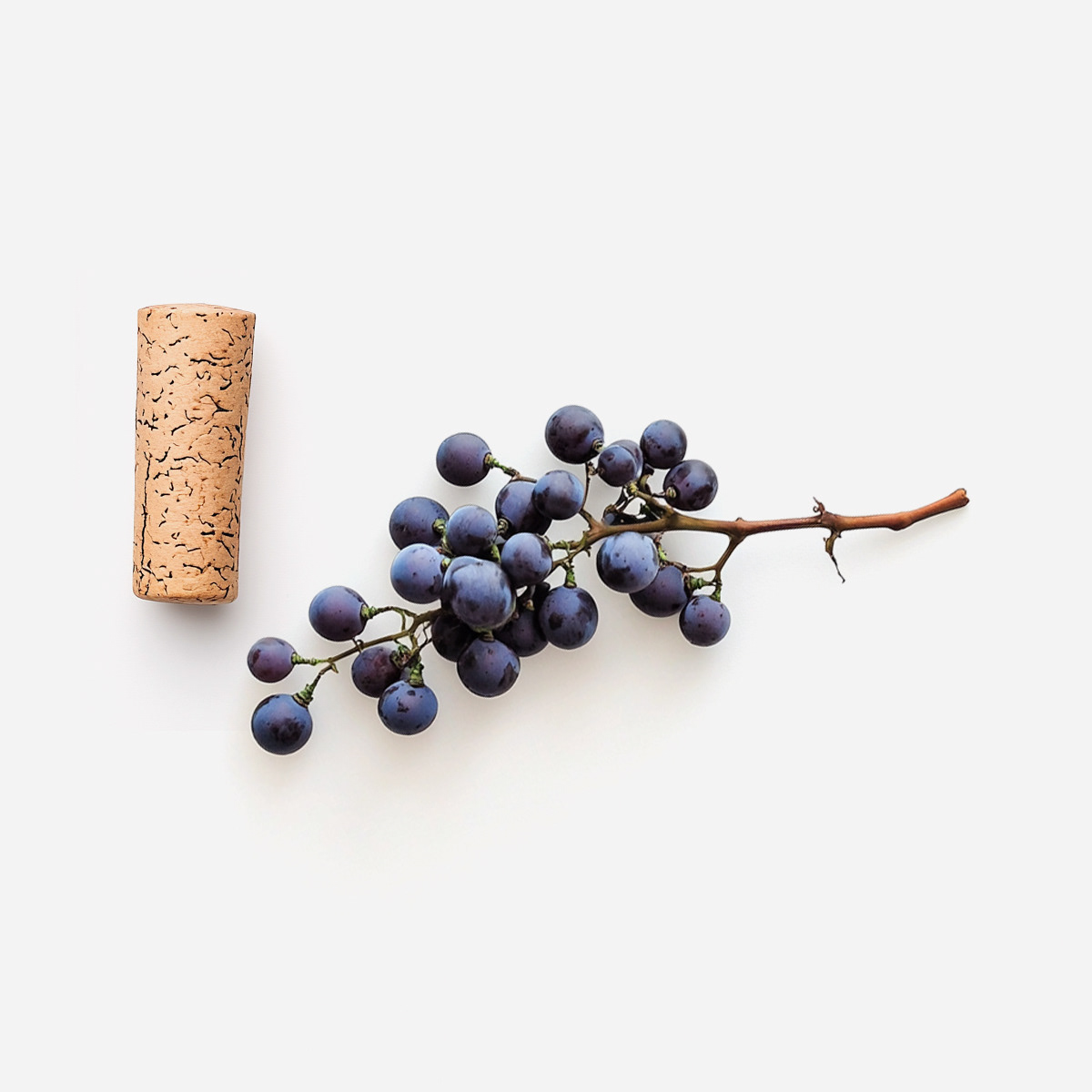
The vine's natural shape inspired me, and I used it as the foundation for the logotype:
- The design embodies elegance and minimalism, reinforcing the brand’s prestige and high quality.
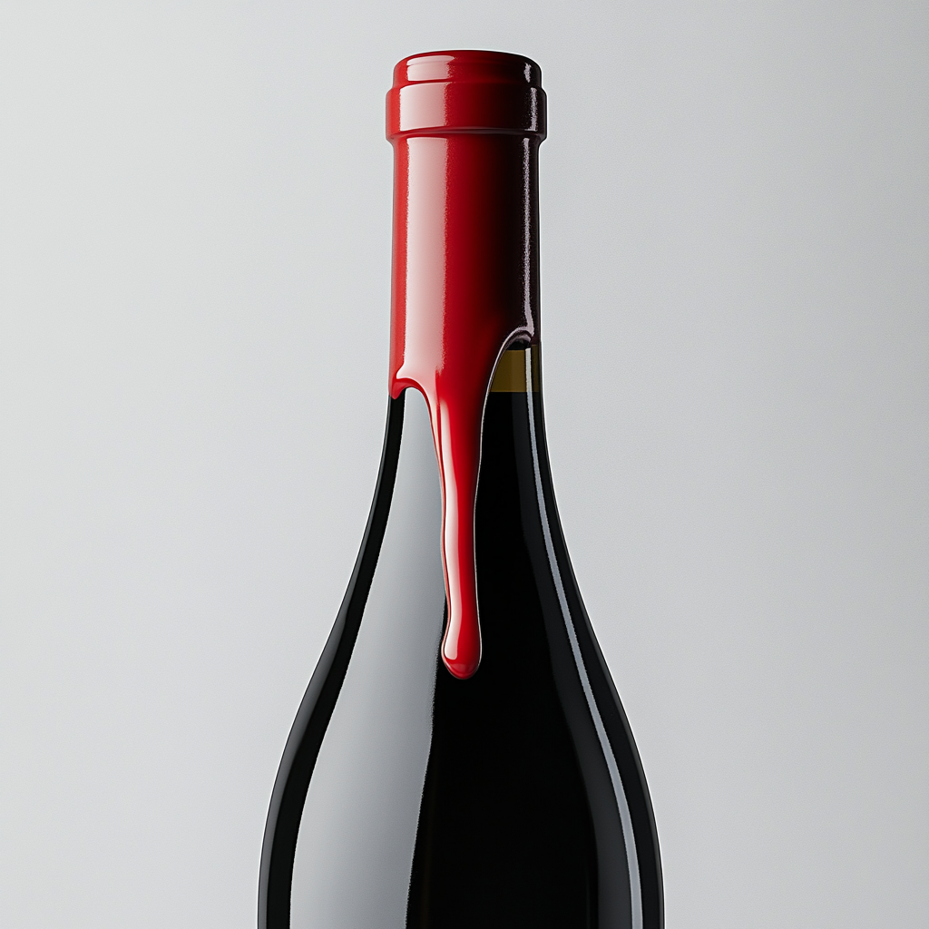
- A predominantly dark color palette enhances sophistication, while a subtle red accent symbolizes
the richness and refinement of the wine world.
- The design embodies elegance and minimalism, reinforcing the brand’s prestige and high quality.
- A predominantly dark color palette enhances sophistication, while a subtle red accent symbolizes
the richness and refinement of the wine world.
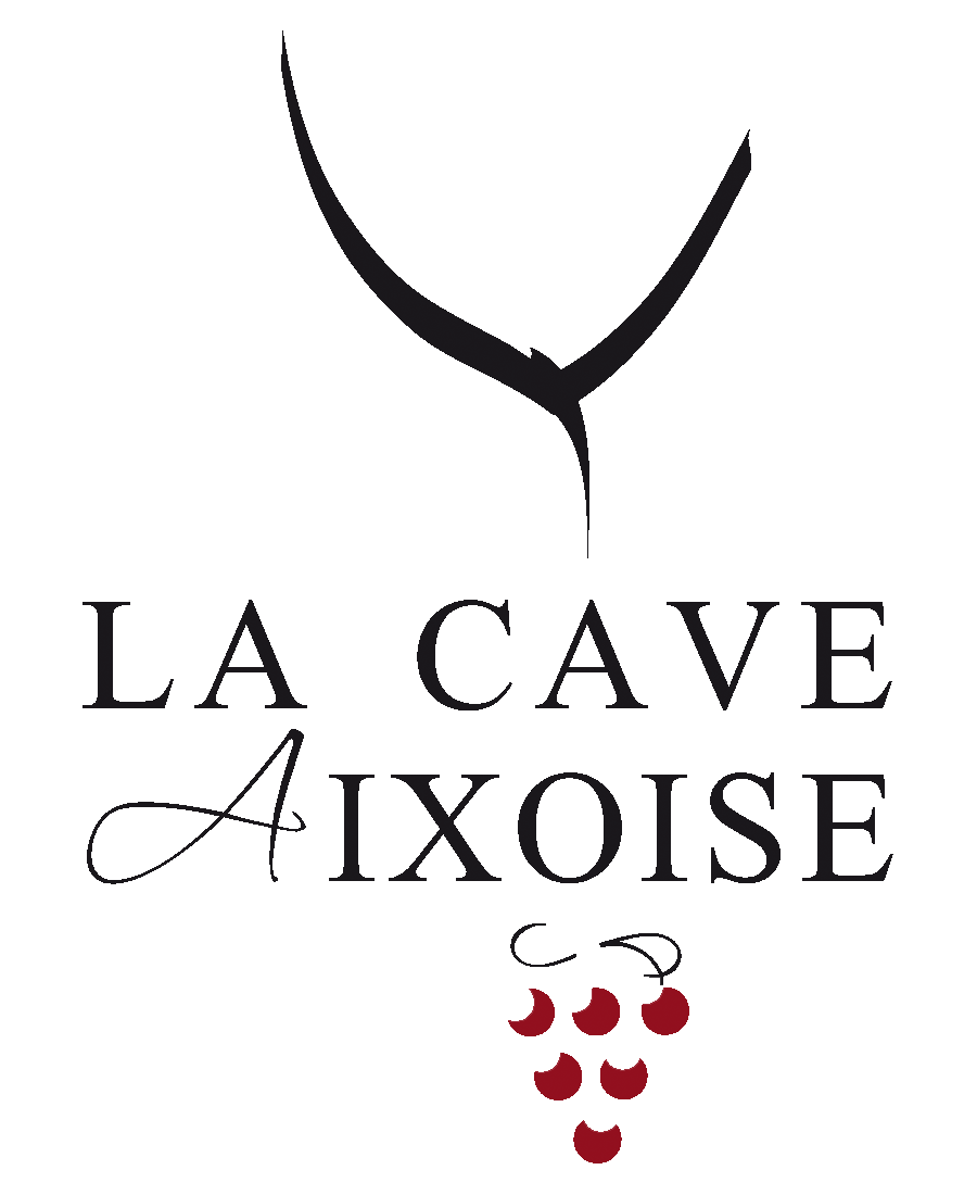
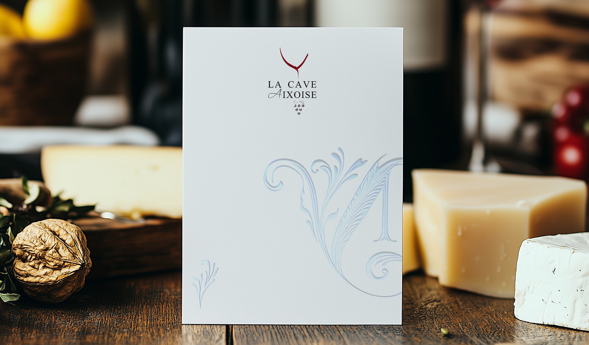
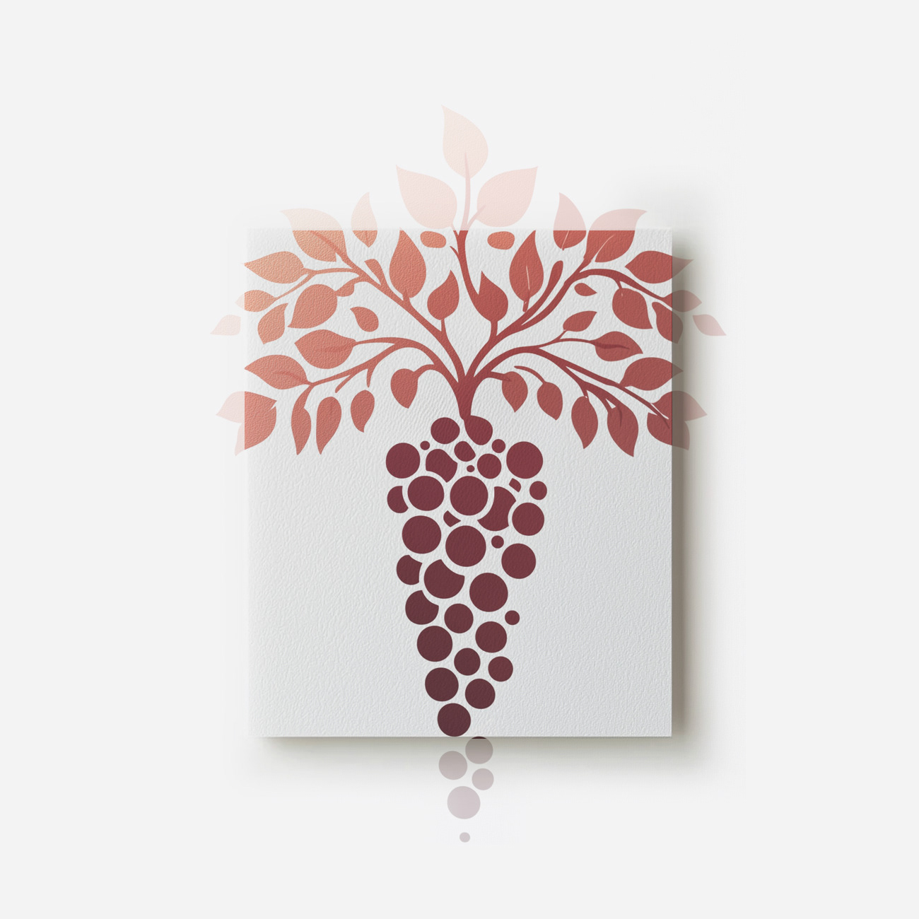
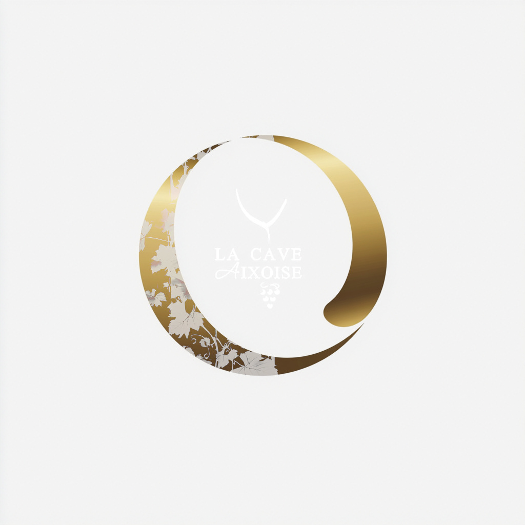
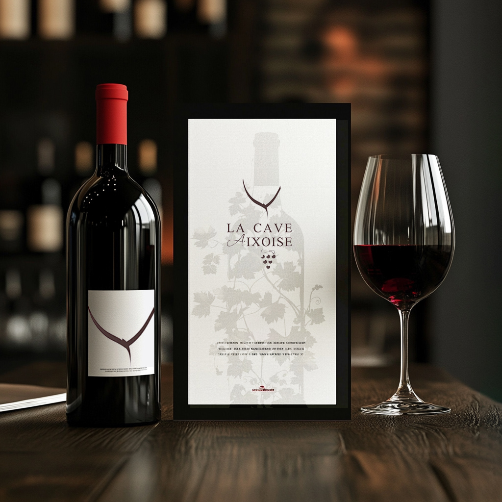
LOGO DESIGN: TIMELESS REFINEMENT
Concept: An elegant fusion of typography and symbolism.
The abstract vine and grape cluster represent heritage, craftsmanship, and refined taste.
Typography & Style: Classic serif with a script accent for sophistication and authenticity.
Color Palette: Deep red, black, and neutrals, evoking richness and tradition.
The abstract vine and grape cluster represent heritage, craftsmanship, and refined taste.
Typography & Style: Classic serif with a script accent for sophistication and authenticity.
Color Palette: Deep red, black, and neutrals, evoking richness and tradition.
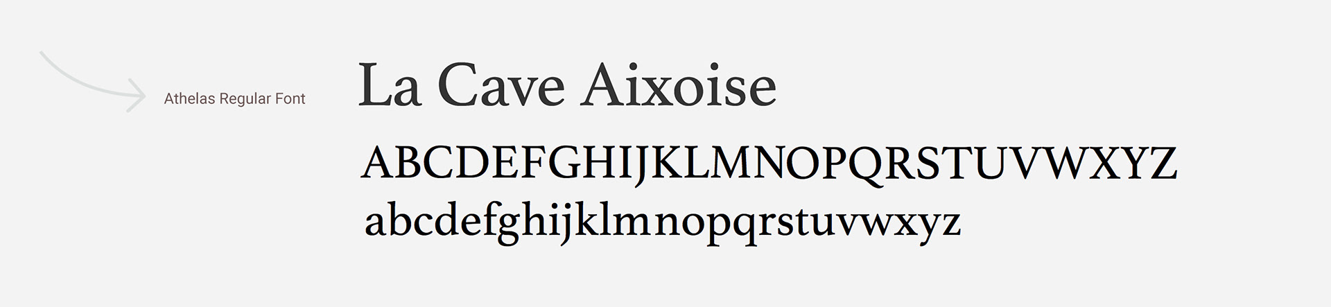
Visual Identity Kit: Colors & Typography


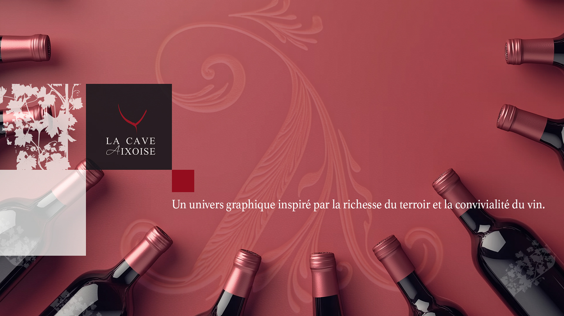
a Contemporary identity: tradition refined
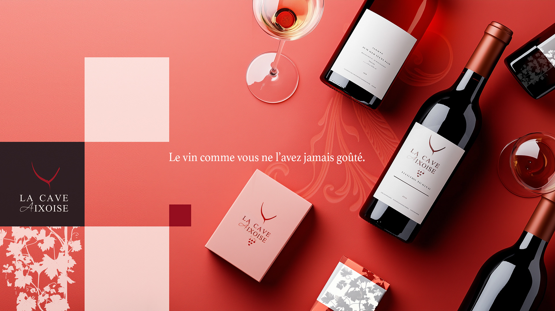
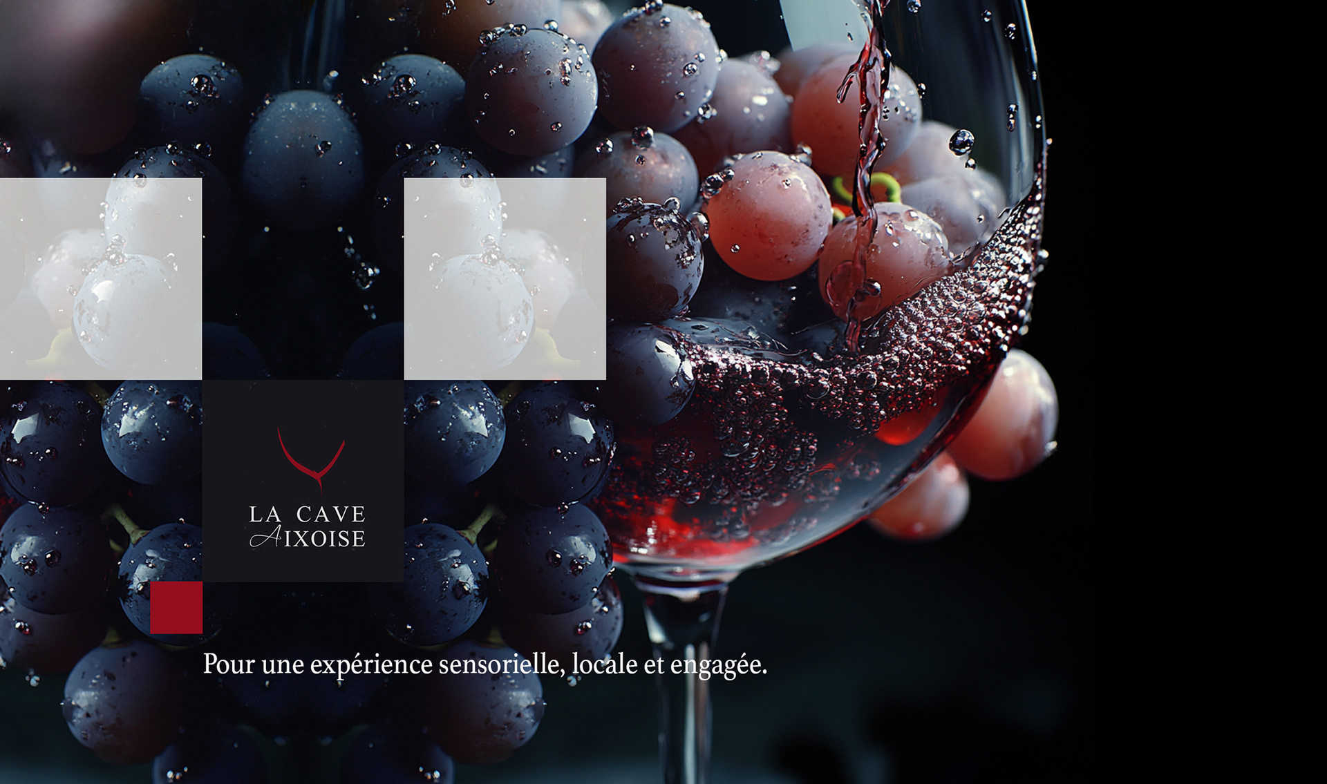
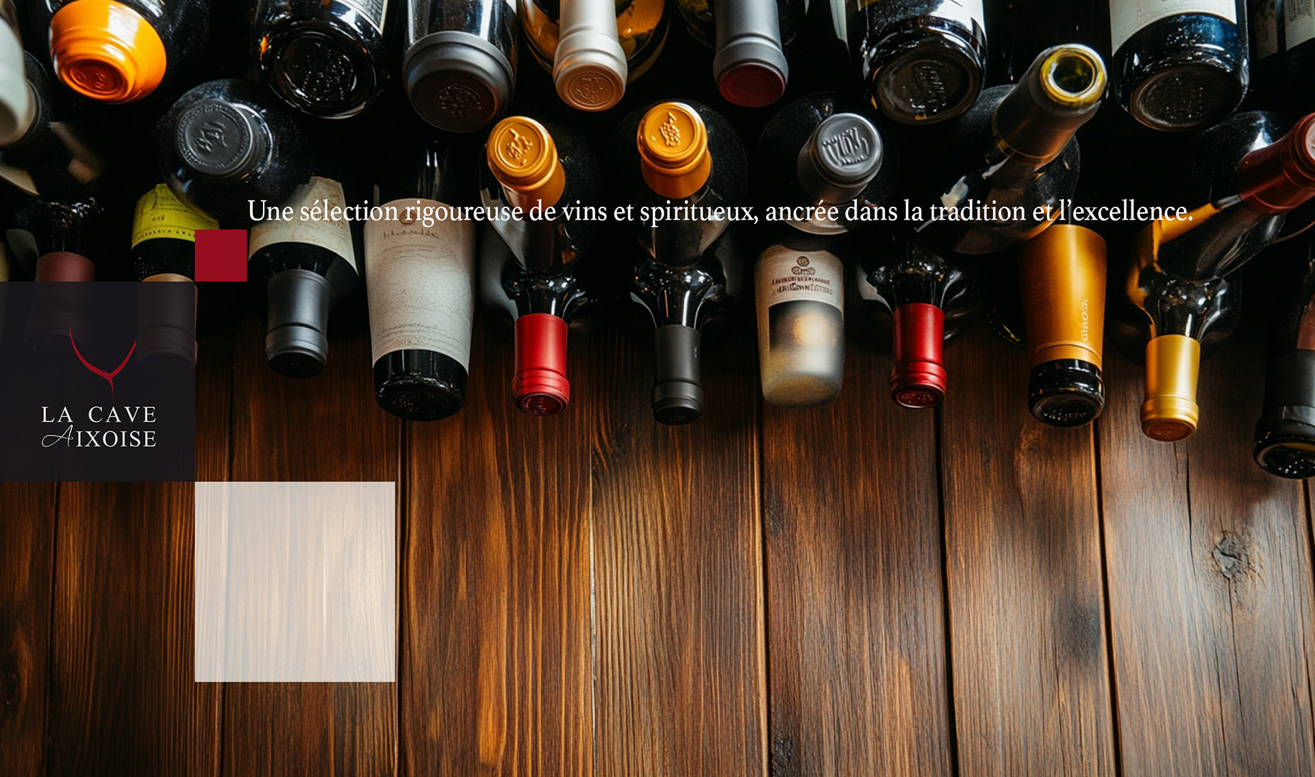
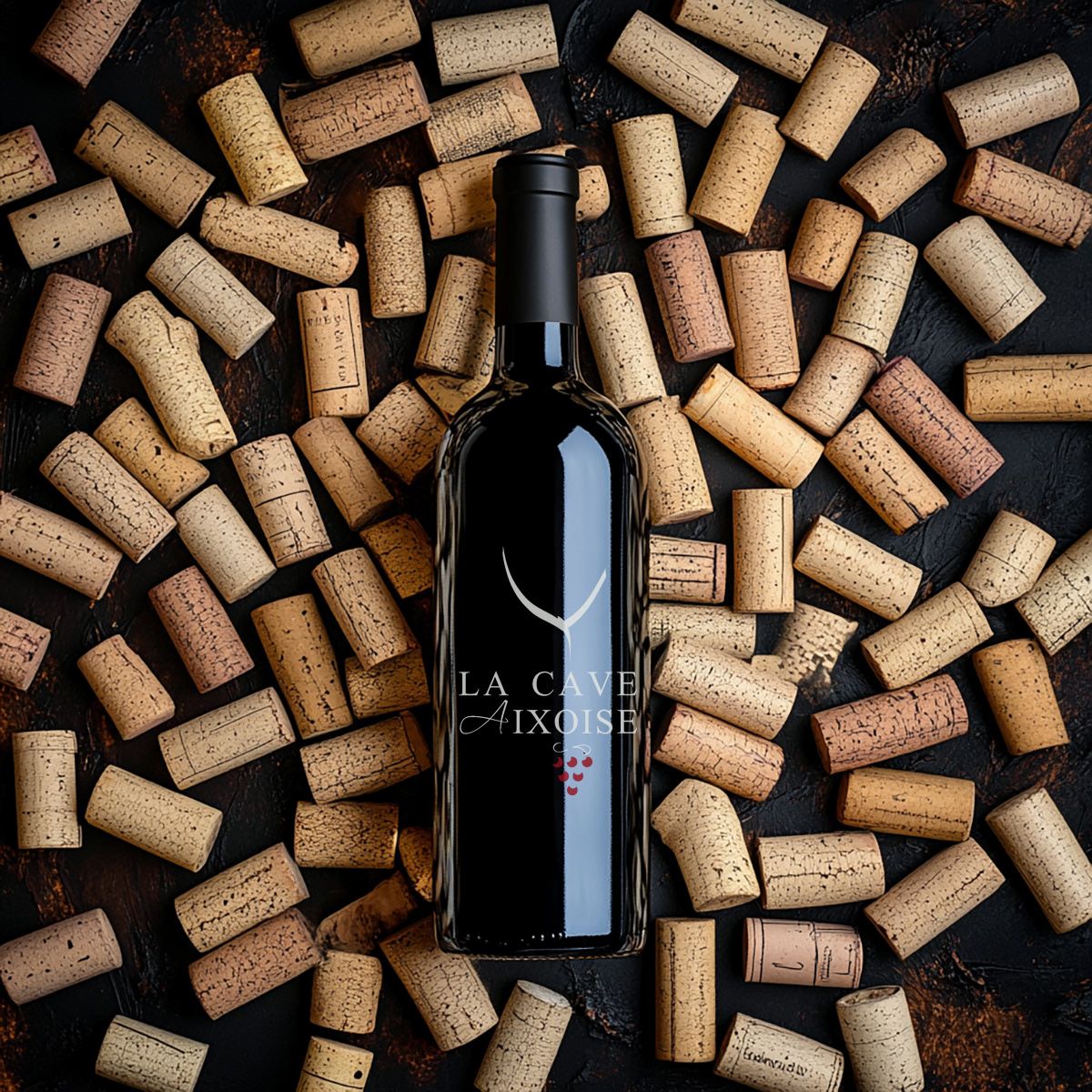
I created a visual identity and packaging design that blends elegance, tradition, and sensory appeal.
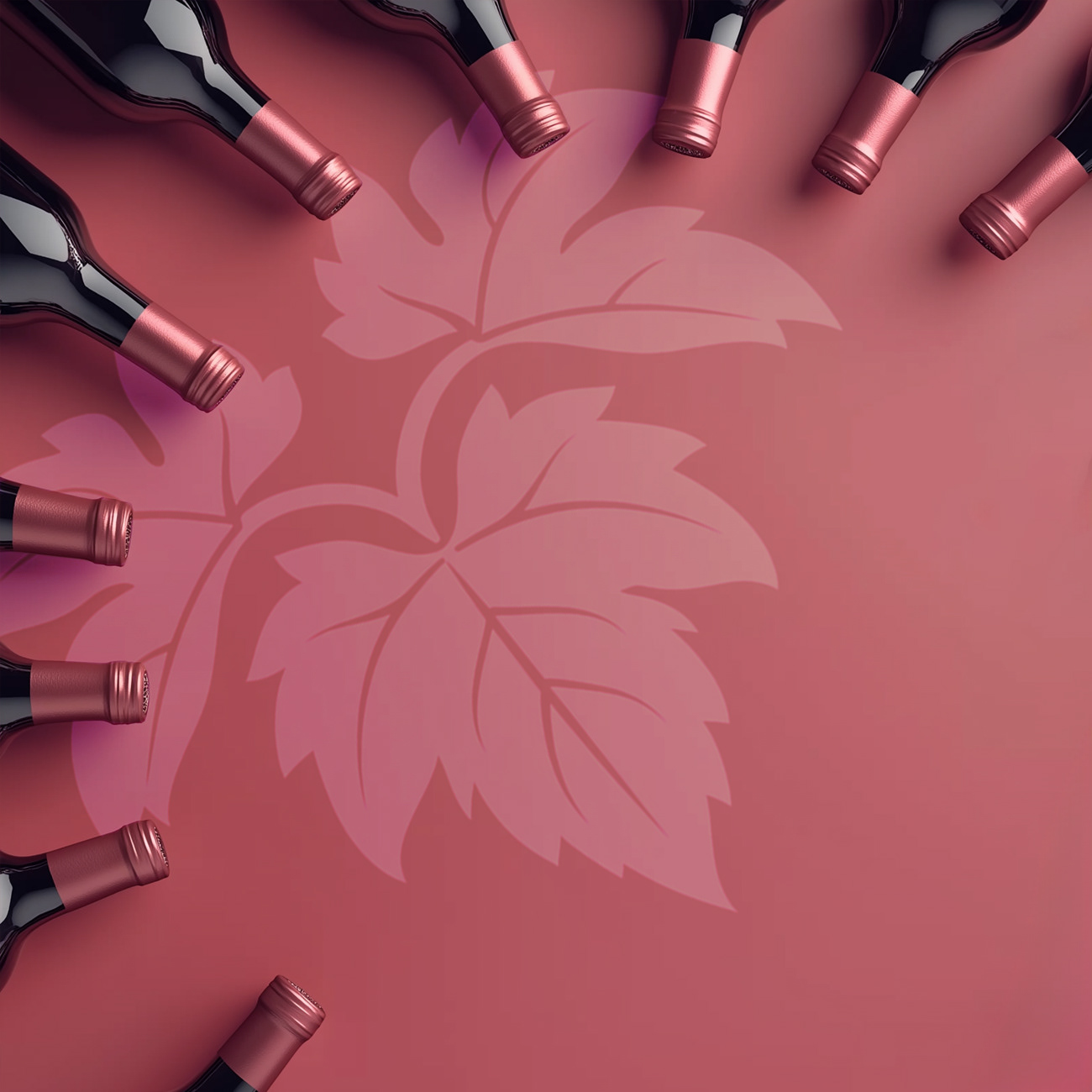
The graphic system is built around rich, deep tones—mainly burgundy and black—referencing the color of wine and evoking sophistication.
Minimalist overlays and geometric shapes provide structure and highlight the products, while high-contrast photography emphasizes the tactile, flavorful world of wine.
This brand identity positions La Cave Aixoise as a local, curated wine destination rooted in tradition but presented with a contemporary, engaging twist.
I created a visual identity and packaging design that blends elegance, tradition, and sensory appeal.
The graphic system is built around rich, deep tones—mainly burgundy and black—referencing the color of wine and evoking sophistication.
Minimalist overlays and geometric shapes provide structure and highlight the products, while high-contrast photography emphasizes the tactile, flavorful world of wine.
This brand identity positions La Cave Aixoise as a local, curated wine destination rooted in tradition but presented with a contemporary, engaging twist.
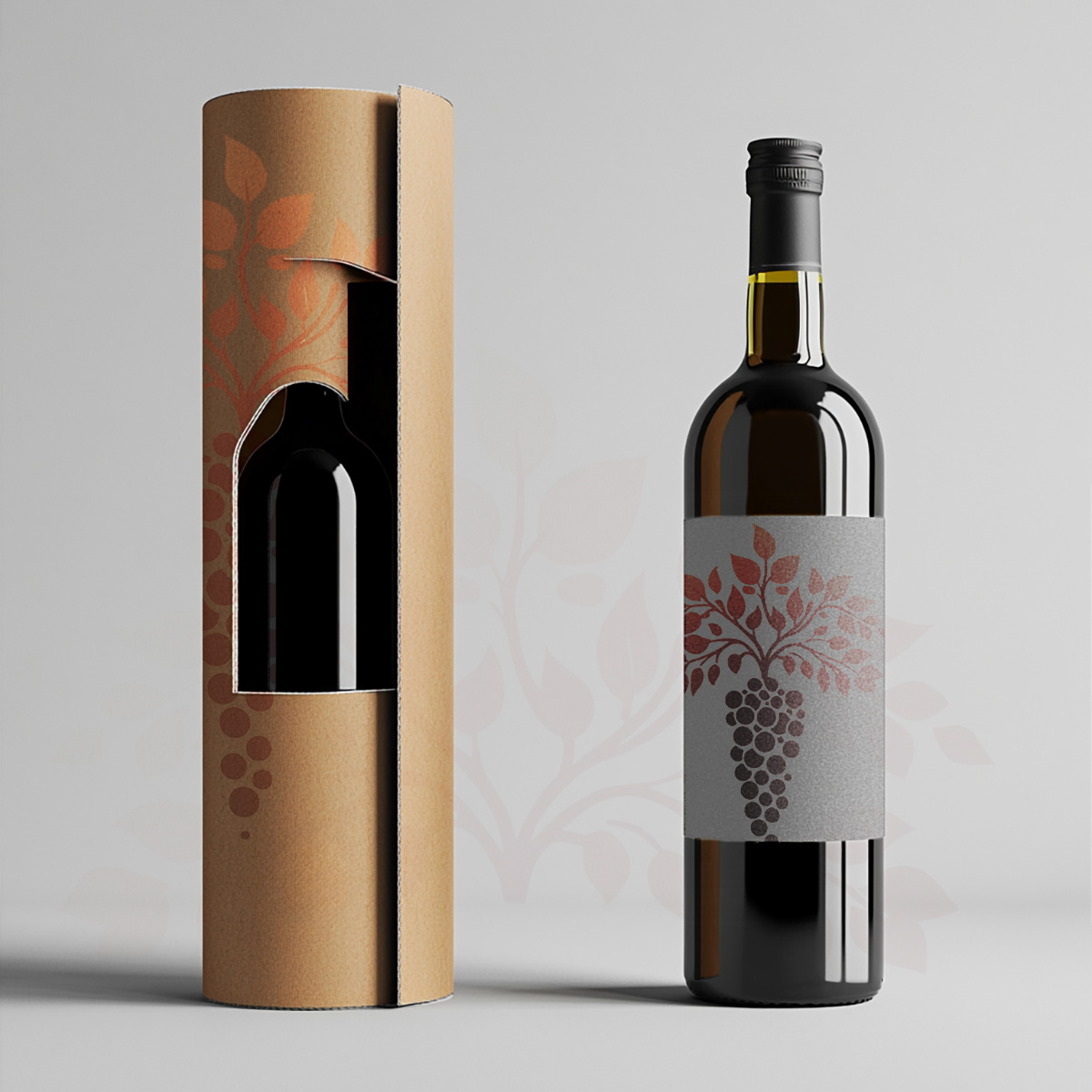
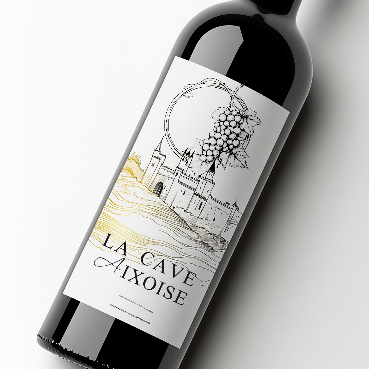
The brand identity combines traditional wine symbols, grape clusters and vines, with modern, minimalist design.
Rich reds and blacks create a premium, sensorial feel, while gold details and hand-drawn motifs add a crafted, artisanal touch.
The packaging and logo work together to express both heritage and contemporary elegance, appealing to wine lovers who value authenticity and style.
Rich reds and blacks create a premium, sensorial feel, while gold details and hand-drawn motifs add a crafted, artisanal touch.
The packaging and logo work together to express both heritage and contemporary elegance, appealing to wine lovers who value authenticity and style.

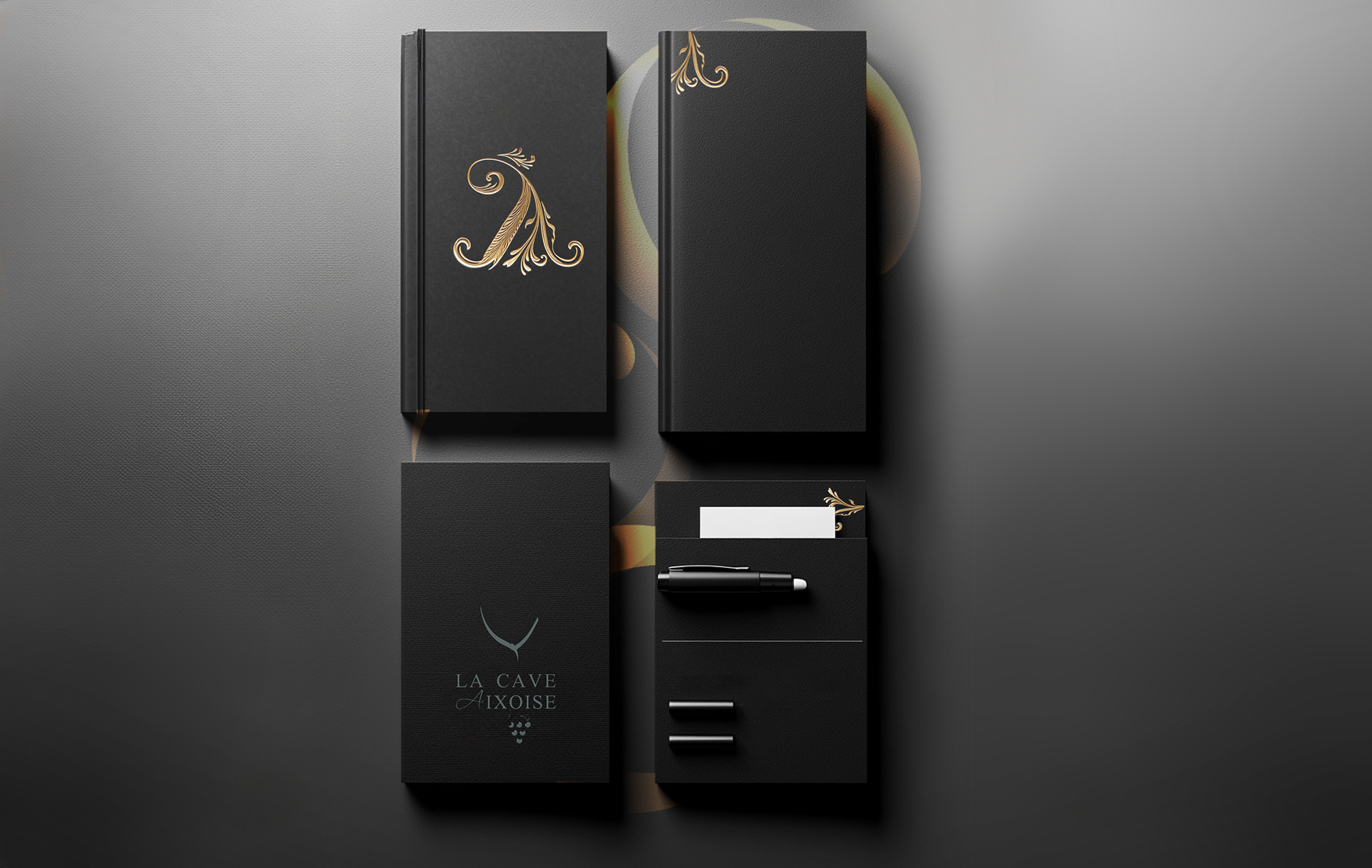
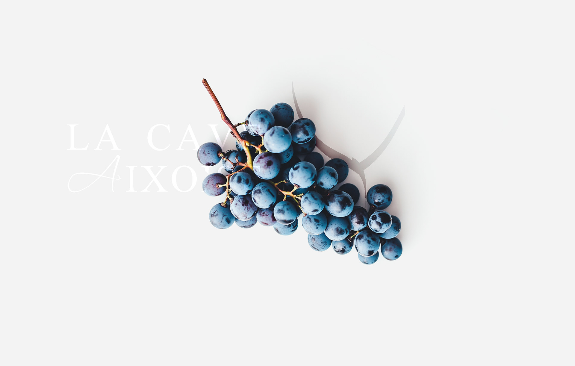
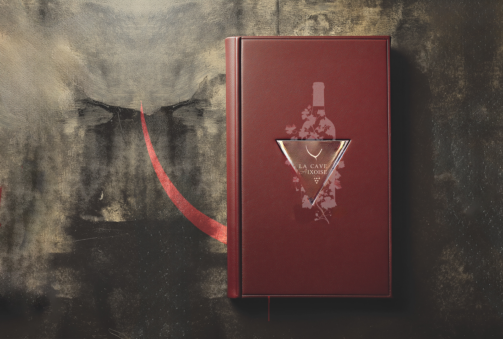
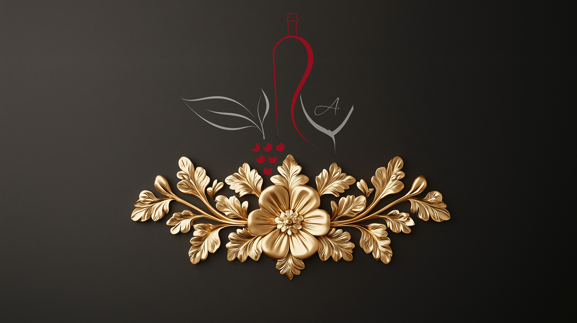
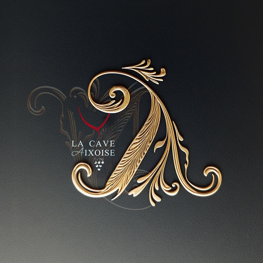
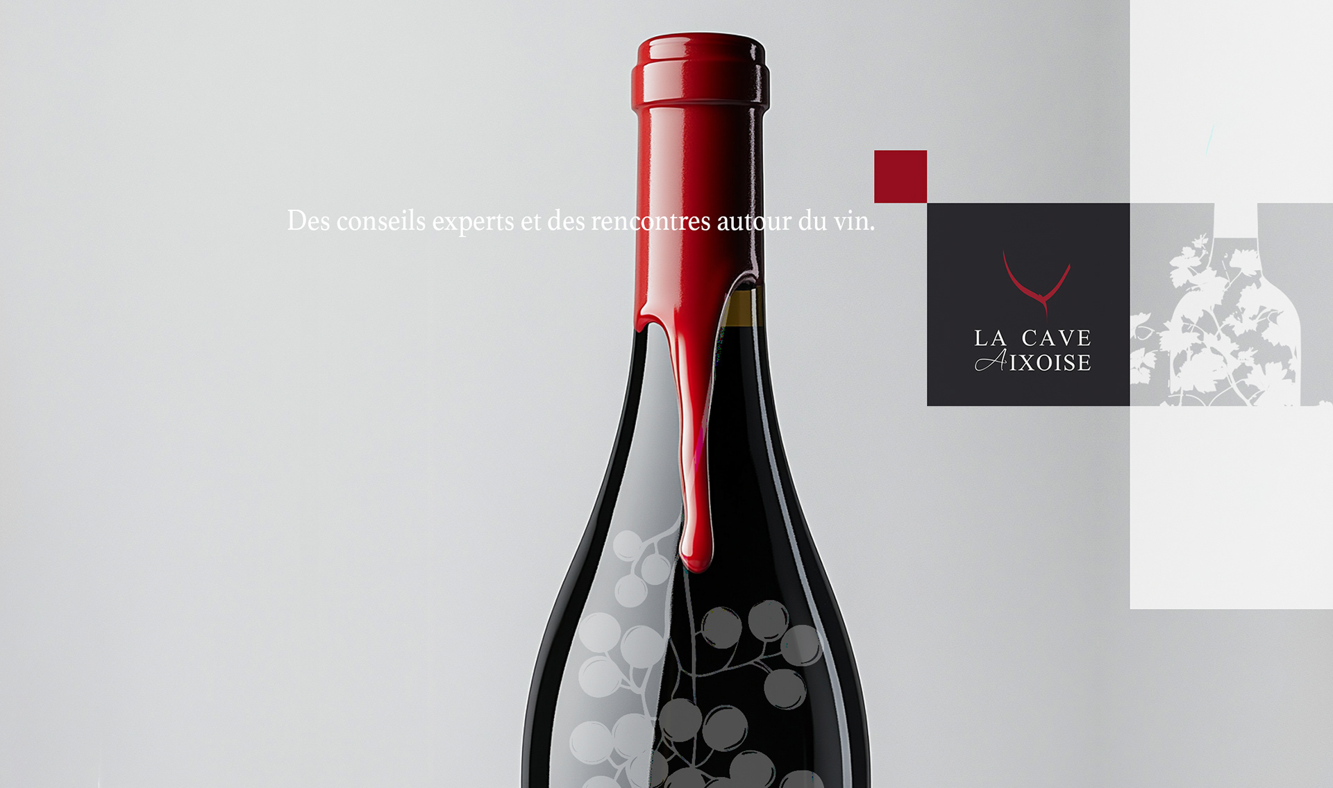
Concept Breakdown 1: blending heritage & elegance
This graphic concept for La Cave Aixoise blends sophistication with a sense of history and craftsmanship:
- The deep burgundy color evokes fine wine and elegance, while the gold-embossed triangle logo adds a touch
of prestige.
- Subtle vine illustrations behind or around the logo reinforce the connection to the vineyard, and the bold red
brushstroke gives a dynamic, artistic flair, suggesting both the pour of wine and creative energy.
- The overall design feels exclusive, tactile, and rooted in tradition, perfect for a premium wine brand.

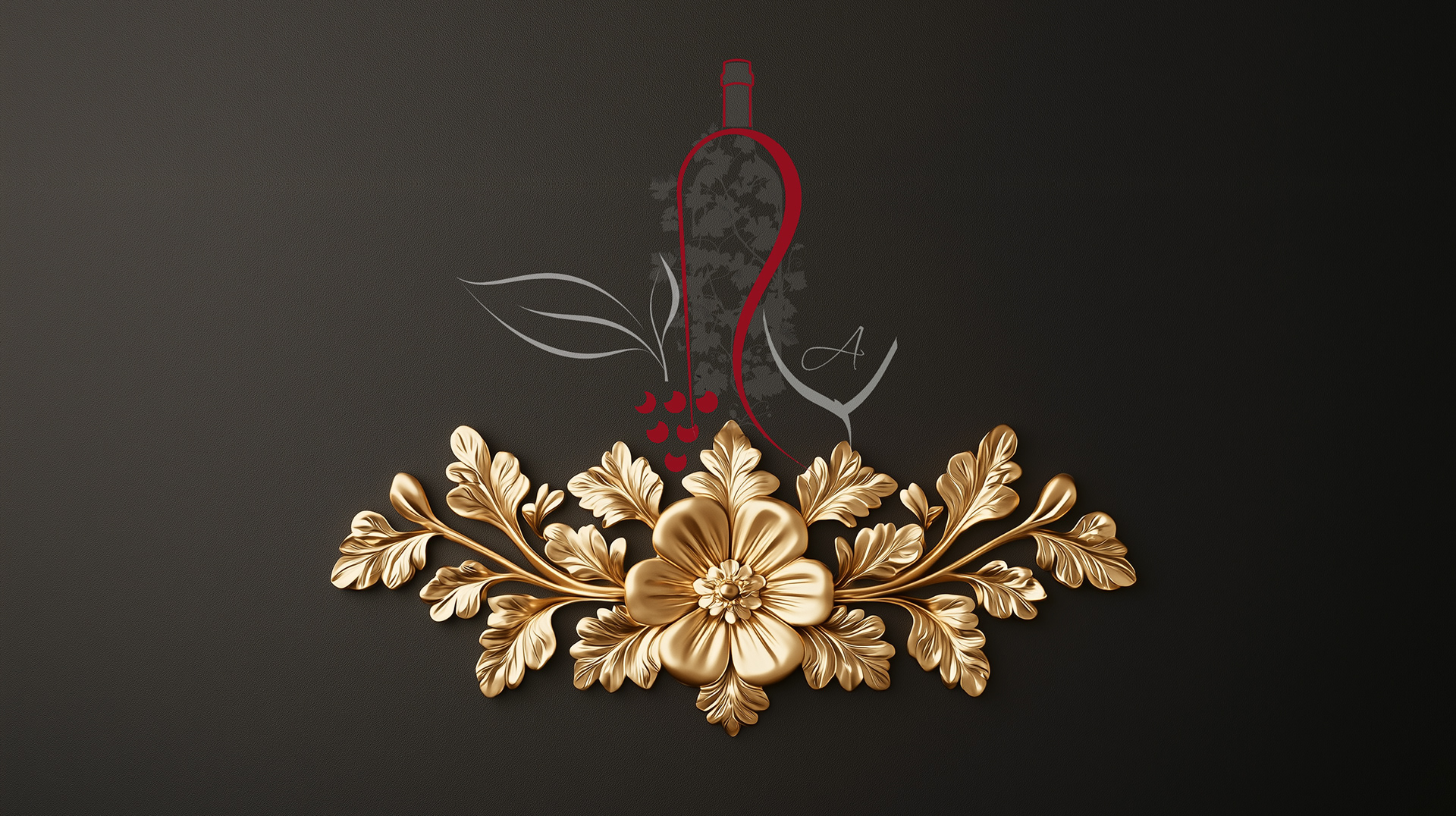
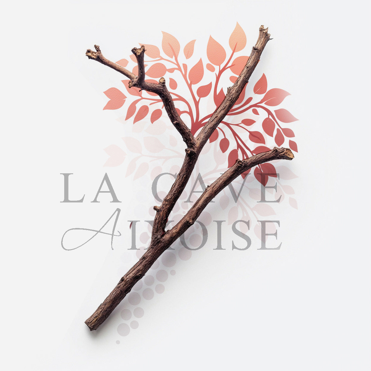
Concept Breakdown 2: artisanal spirit with natural roots
The visual system combines organic elements like branches and grapevine motifs, with minimalist, elegant layouts.
The graphic signature is a stylized grape bunch transforming into a tree, symbolizing growth, heritage, and terroir.
Earthy, muted tones and natural materials emphasize authenticity and eco-consciousness.
The design feels inviting and refined, instantly communicating the brand’s connection to the land, quality, and craftsmanship in every detail, from wall art to wine labels and packaging.
Concept Breakdown 3: nature-inspired sophistication
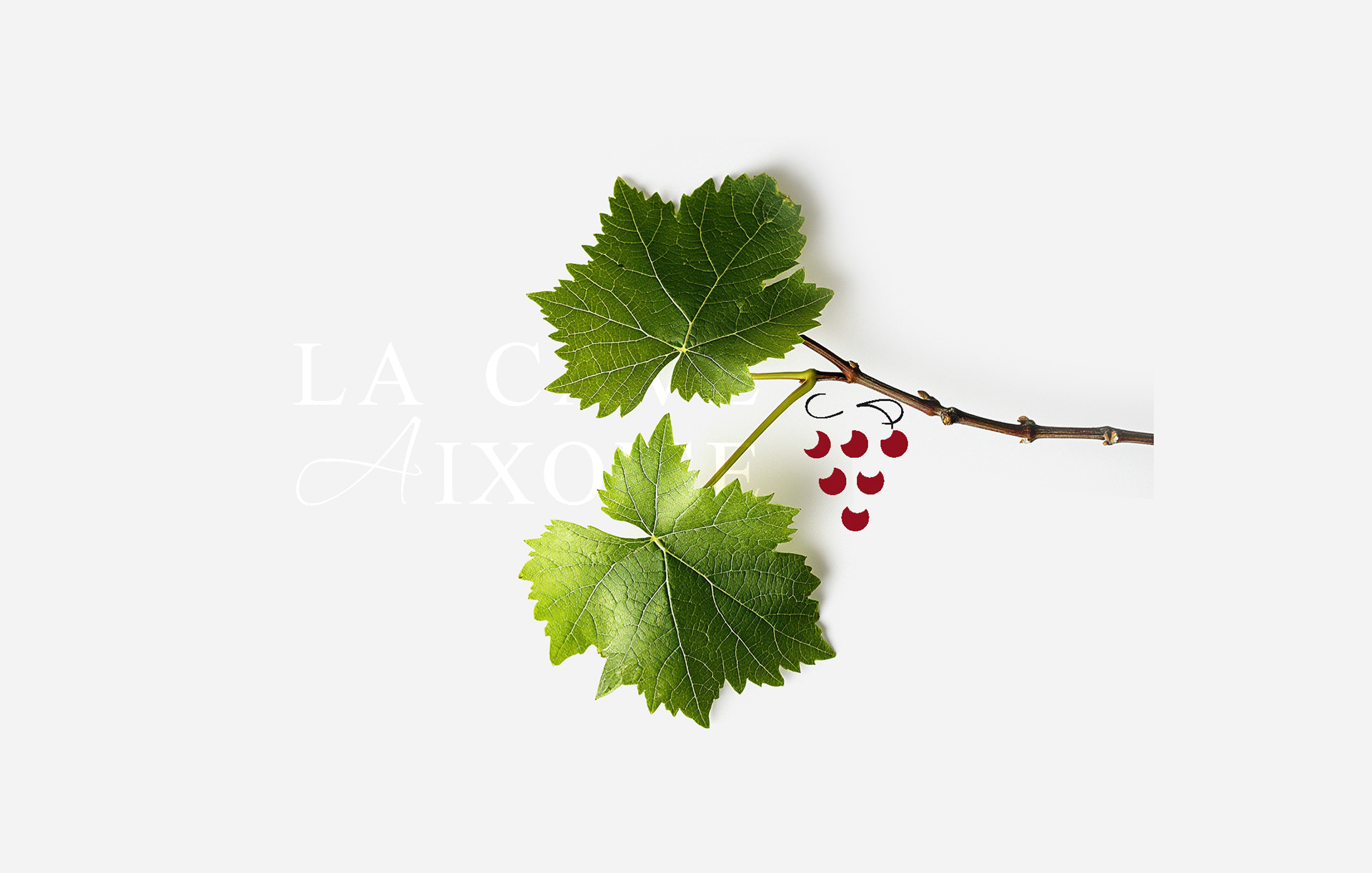
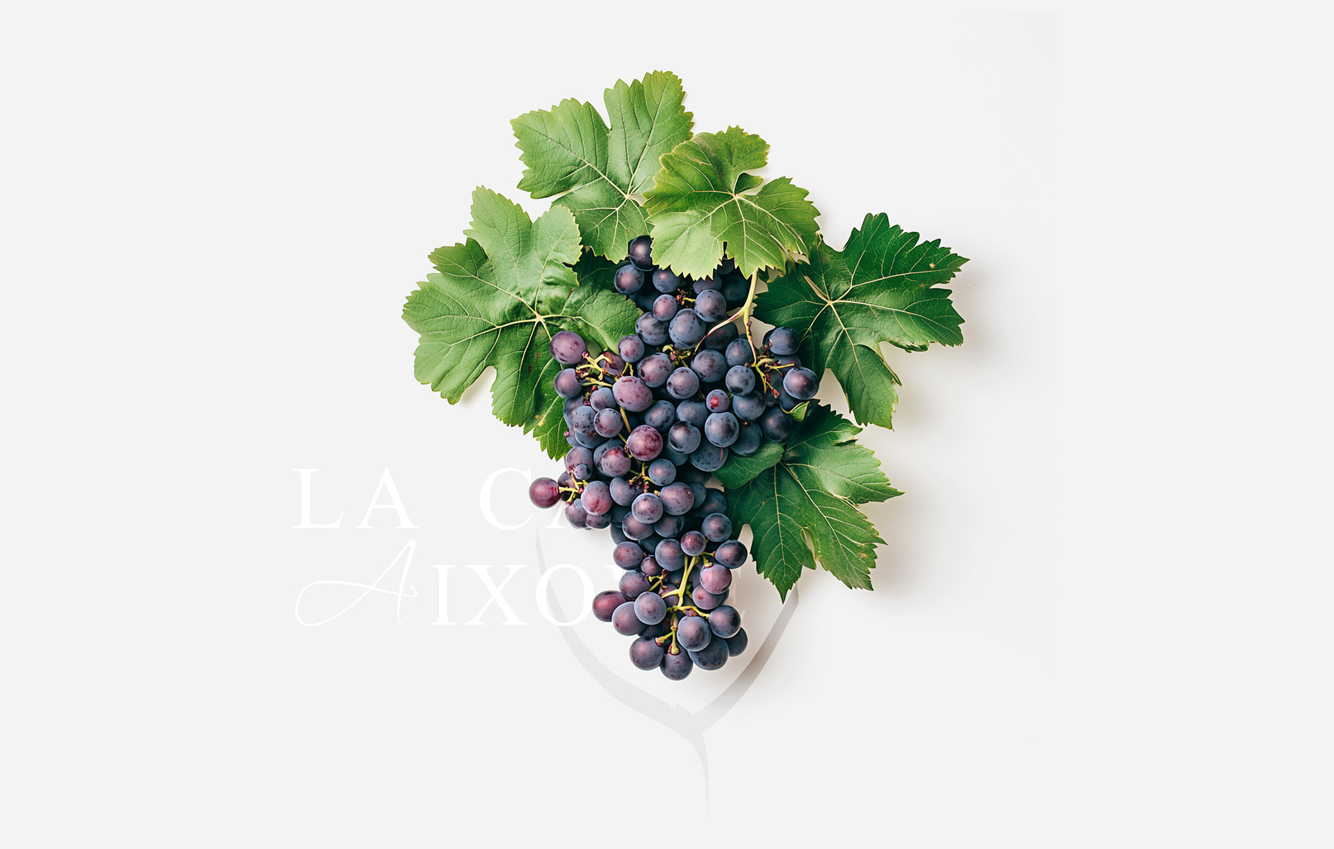
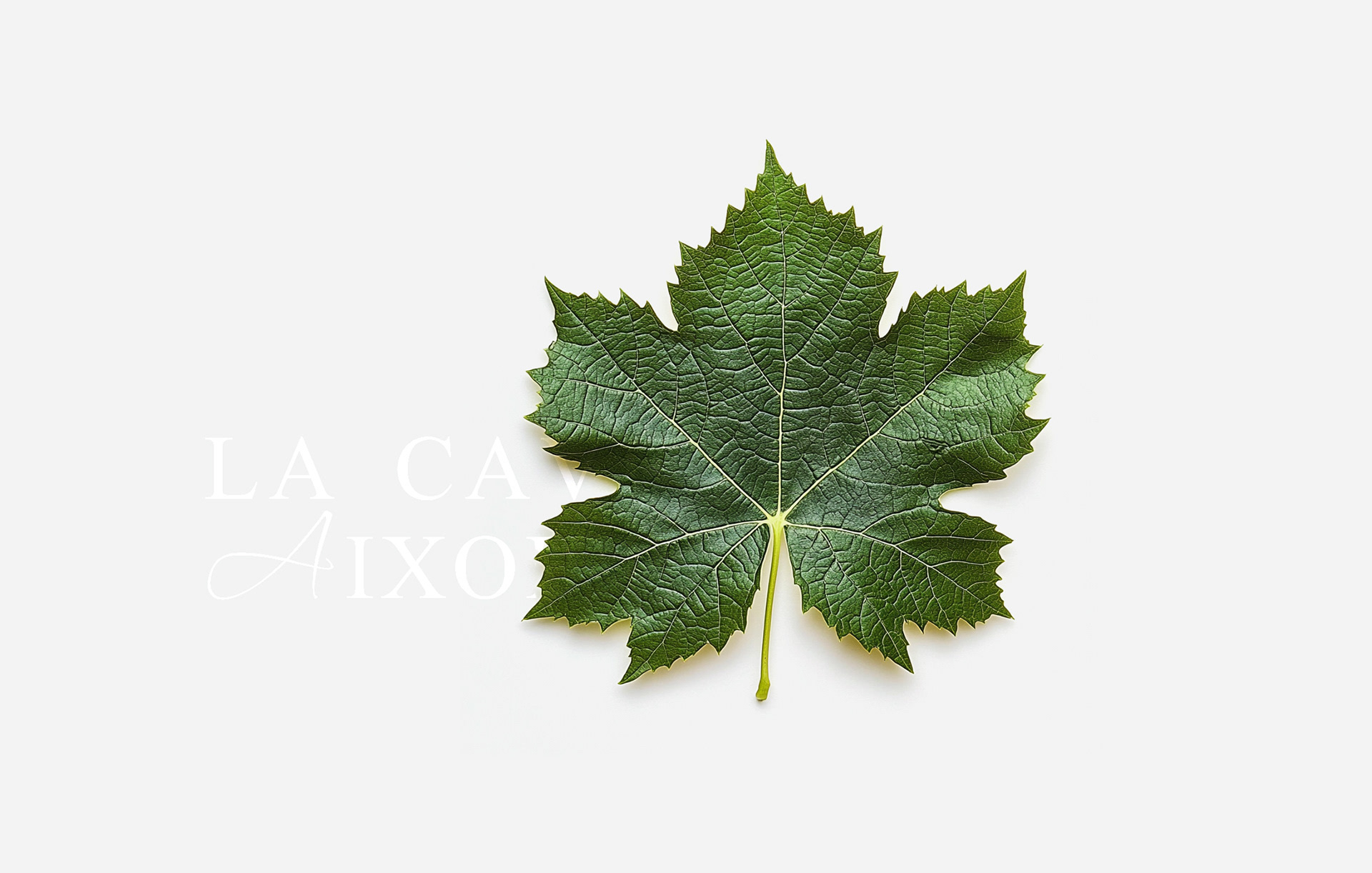
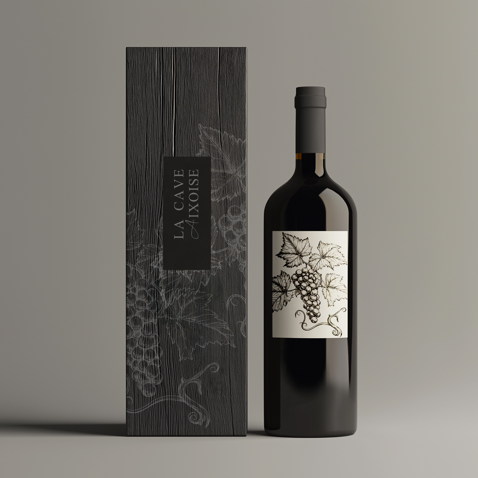
The design centers around the image of a grapevine, grapes, leaves, and branches, symbolizing the authentic, artisanal roots of winemaking and the store’s dedication to terroir and tradition.
A refined, minimalist grapevine motif is repeated across labels, packaging, wall art, and point-of-sale displays, creating a strong, recognizable visual language.
Soft, earthy tones and natural materials are paired with elegant typography, reflecting both rustic authenticity and high-end French wine culture.
This approach creates an immersive, sensory experience, connecting the customer emotionally with the product and the story of the vineyard.
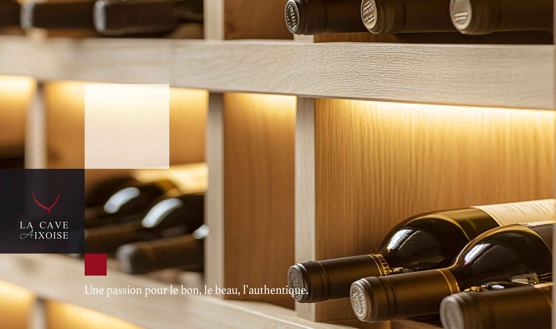
timeless icones: elevating wine tradition
For La Cave Aixoise, I designed a premium iconography system that combines classic wine symbols, grapevines, grapes, leaves, and elegant gold flourishes, with modern minimalist touches.
For La Cave Aixoise, I designed a premium iconography system that combines classic wine symbols, grapevines, grapes, leaves, and elegant gold flourishes, with modern minimalist touches.
These icons bring together tradition and contemporary style, adding sophistication and unity across all labels, packaging, and branded assets.
The result is a cohesive, instantly recognizable visual language that elevates the wine store’s identity and experience.


Concept Breakdown 2: AI THAT THINKS WITH YOU Everyplace ANYTIME
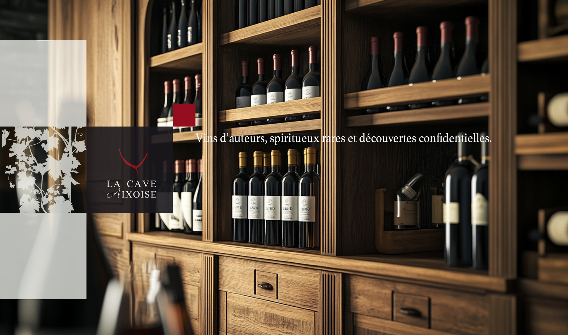
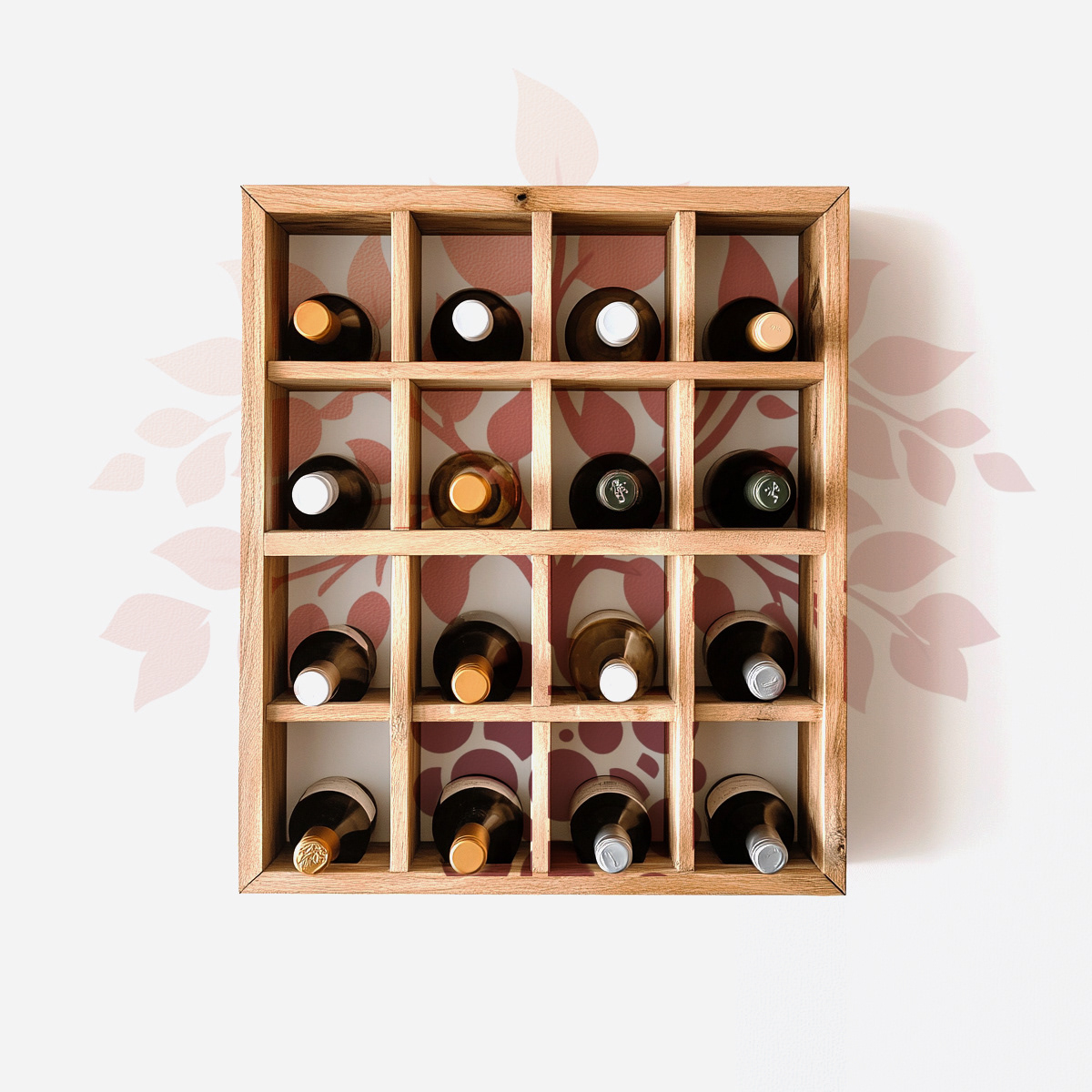
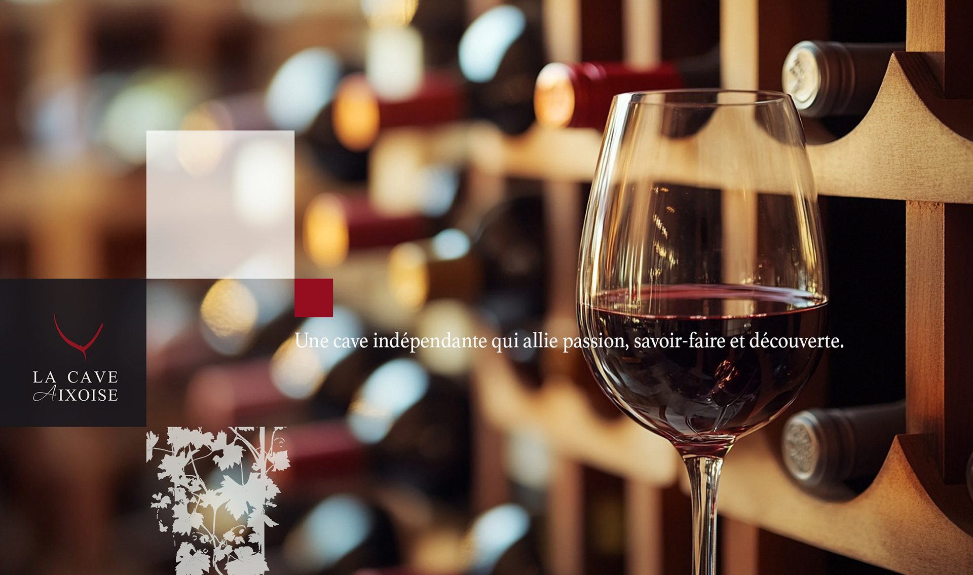
All the visual identity for La Cave Aixoise showcase a refined and cohesive brand identity rooted in craftsmanship and authenticity.
The graphic idea centers around warm wood textures, soft lighting, and carefully placed brand marks, all reinforcing the sense of a premium, inviting wine experience.
All the visual identity for La Cave Aixoise showcase a refined and cohesive brand identity rooted in craftsmanship and authenticity.
The graphic idea centers around warm wood textures, soft lighting, and carefully placed brand marks, all reinforcing the sense of a premium, inviting wine experience.
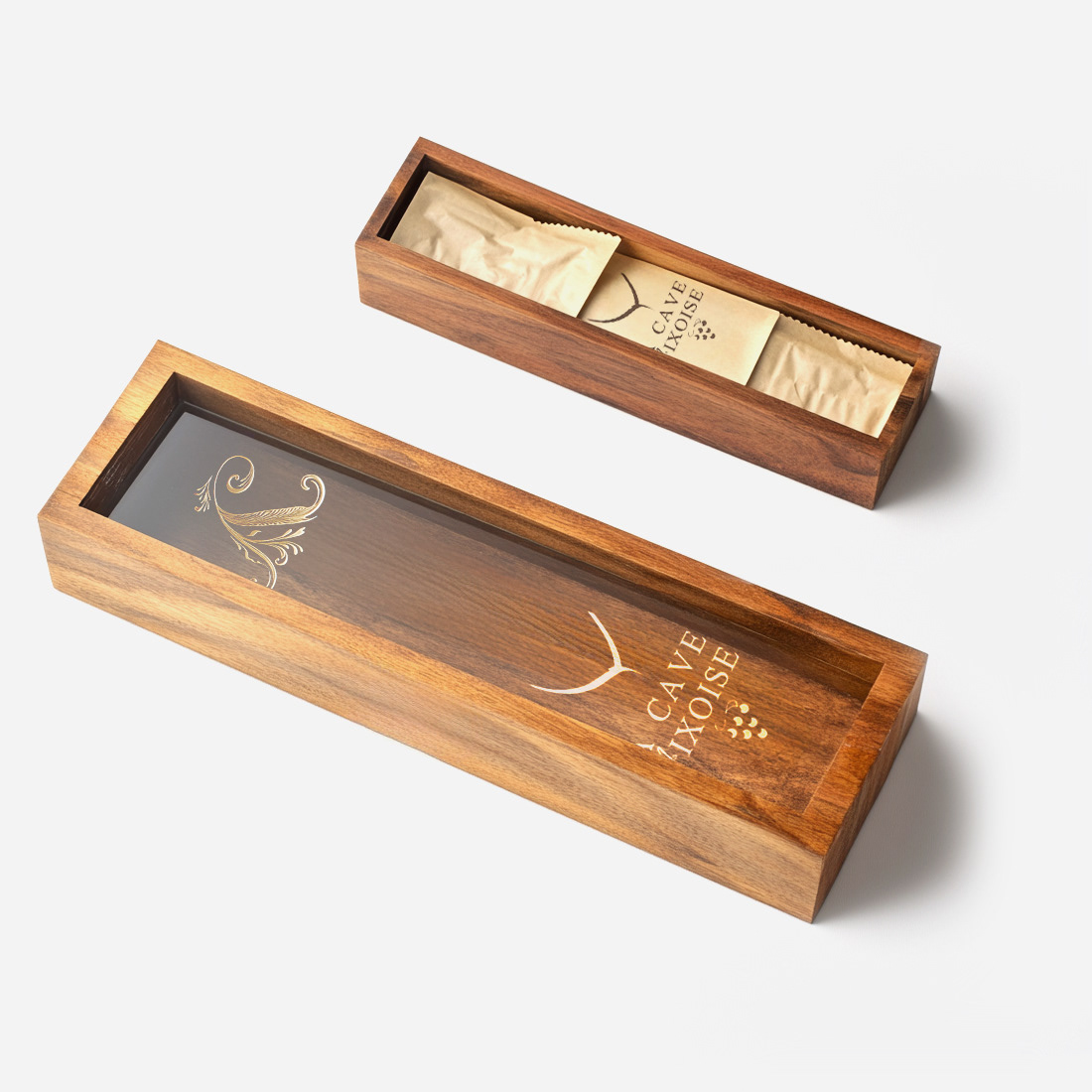

Each image blends the elegant logo with subtle geometric overlays and a sophisticated color palette—deep reds, creamy whites, and natural wood tones—evoking both tradition and modernity.
The packaging and in-store materials are thoughtfully designed to highlight the quality and heritage of the wines, using tactile materials and minimal, classy branding.
The result is a brand universe that feels both luxurious and accessible, capturing the passion and savoir-faire of the wine store in Aix-en-Provence.

Key Results & Impact For La Cave Aixoise

REBRANDED LA CAVE AIXOISE
leading to a 40% increase in foot traffic within 3 months
CREATED A PREMIUM VISUAL IDENTITY
that attracted a younger, design-savvy audience
BOOSTED GIFT BOX BY 25%
during the first holiday season post-launch
STRENGTHENED THE SHOP'S POSITION
as a standout wine destination in Aix-en-Provence
leading to a 40% increase in foot traffic within 3 months
CREATED A PREMIUM VISUAL IDENTITY
that attracted a younger, design-savvy audience
BOOSTED GIFT BOX BY 25%
during the first holiday season post-launch
STRENGTHENED THE SHOP'S POSITION
as a standout wine destination in Aix-en-Provence
Want to refresh your retail brand
and drive real business results?
and drive real business results?