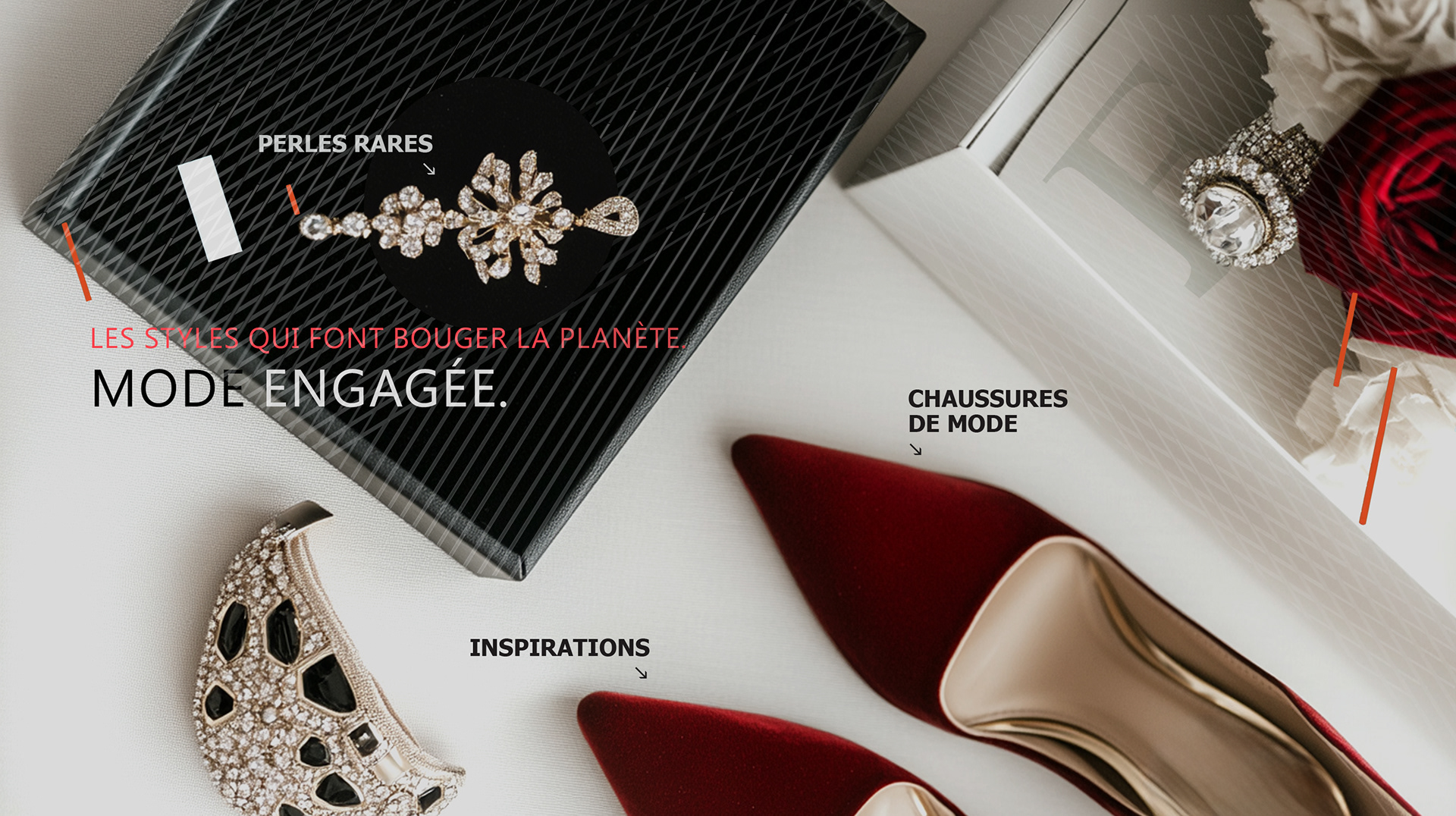
CLIENT / F Mag, Le Magazine Ultrafeminin, Aix-en-Provence, France

Project Overview
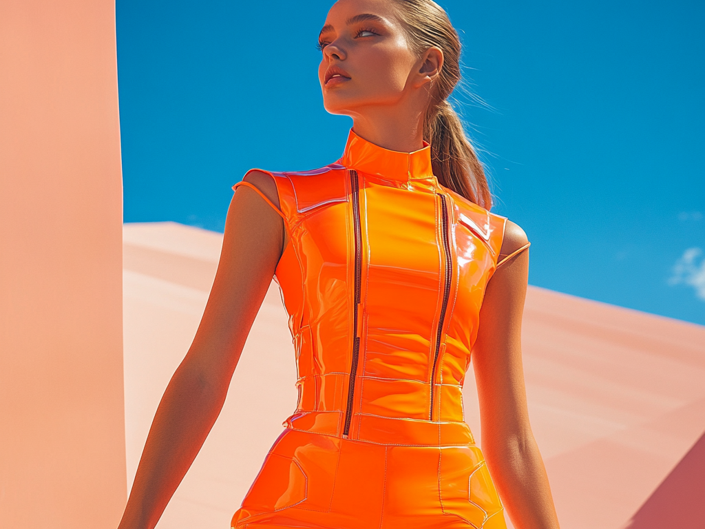
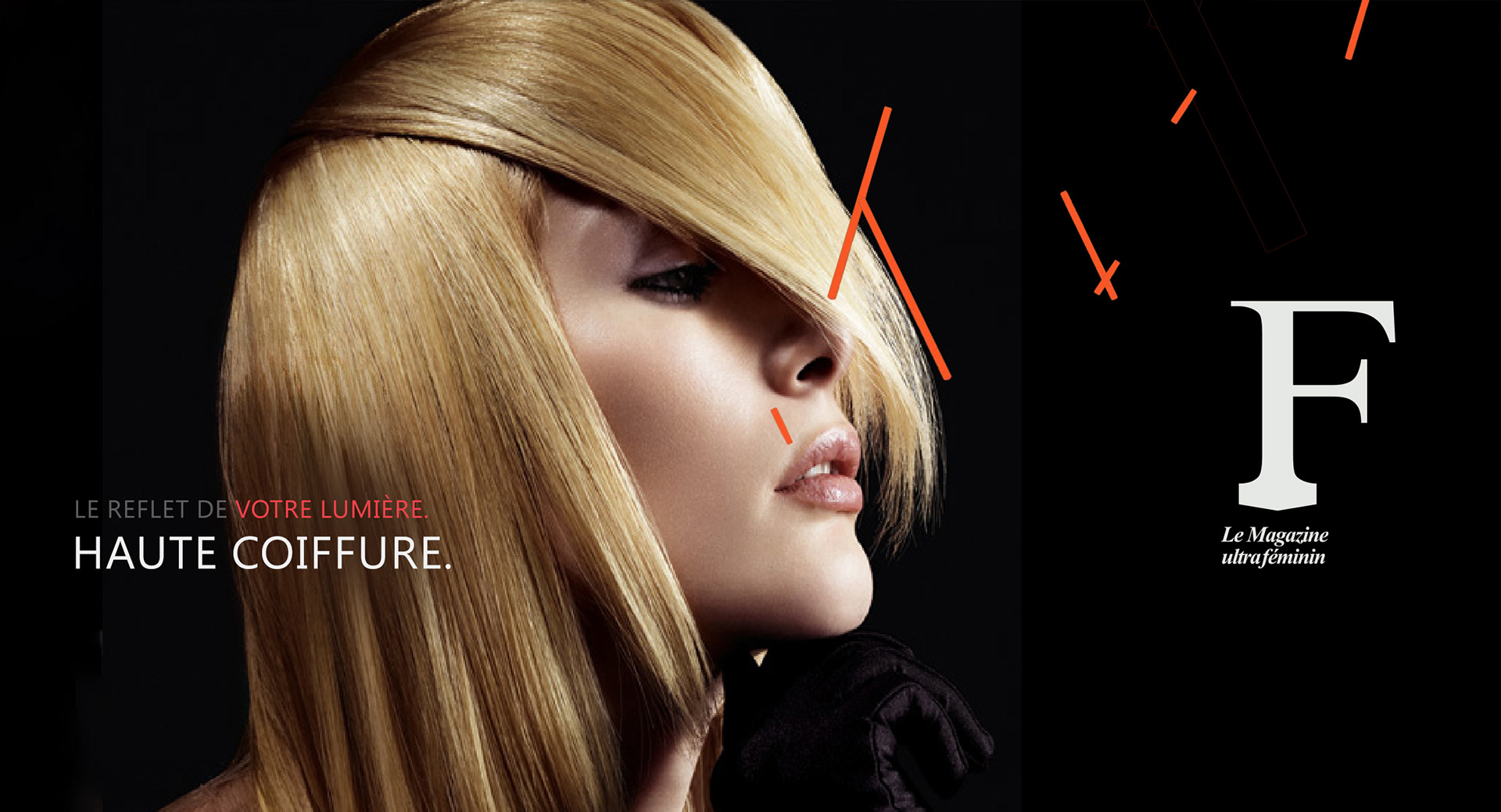
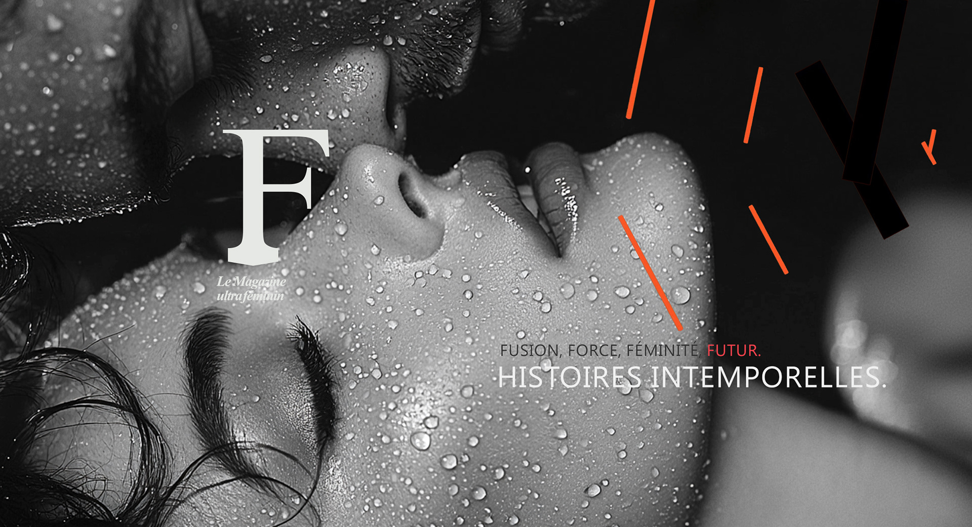
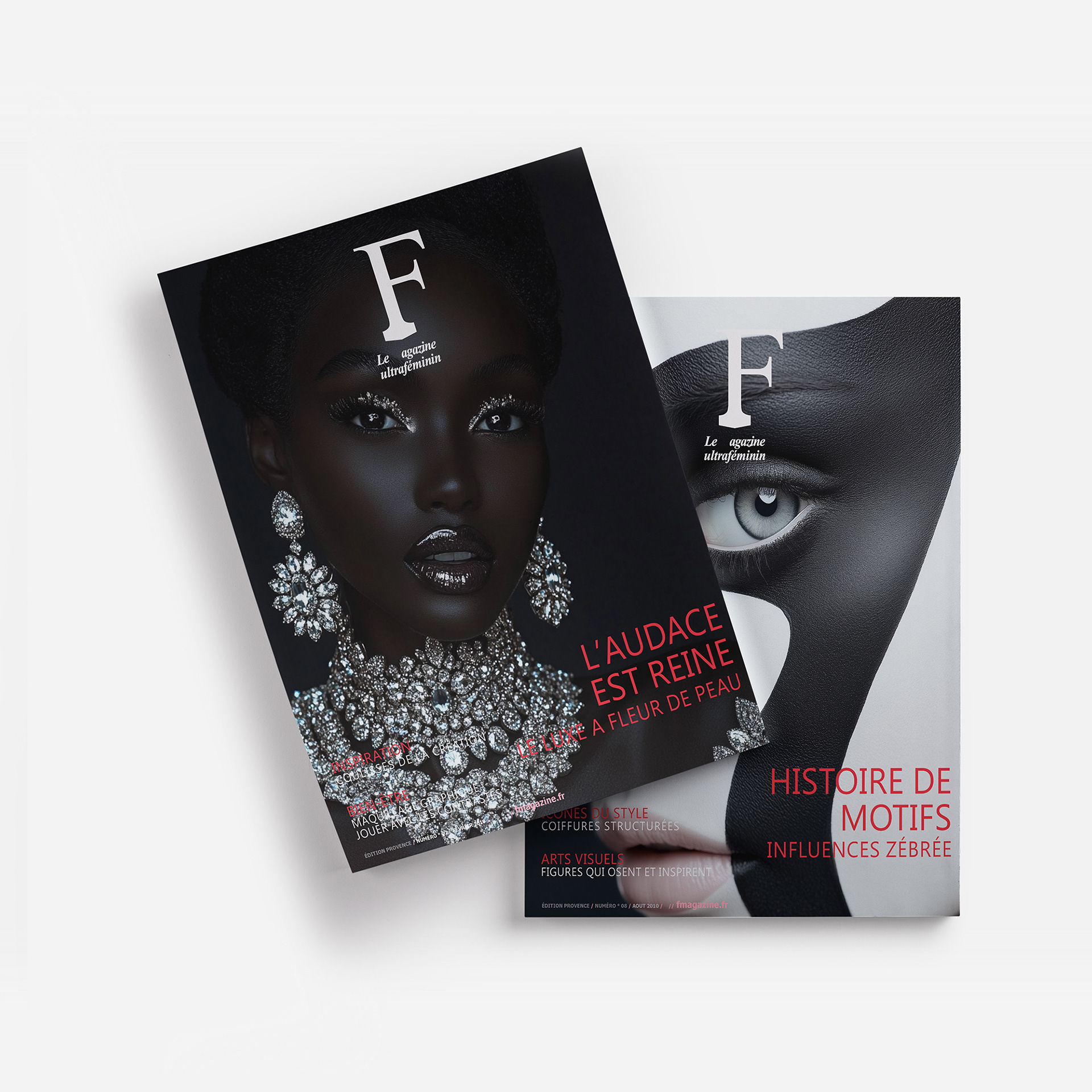
The client sought a distinctive and instantly recognizable visual identity for F Mag, Le Magazine Ultra-feminin, a new lifestyle and fashion magazine.
The goal was to craft an image that would position the publication as a leading trend authority—modern, bold, and effortlessly stylish.
The goal was to craft an image that would position the publication as a leading trend authority—modern, bold, and effortlessly stylish.
Approach & Solutions
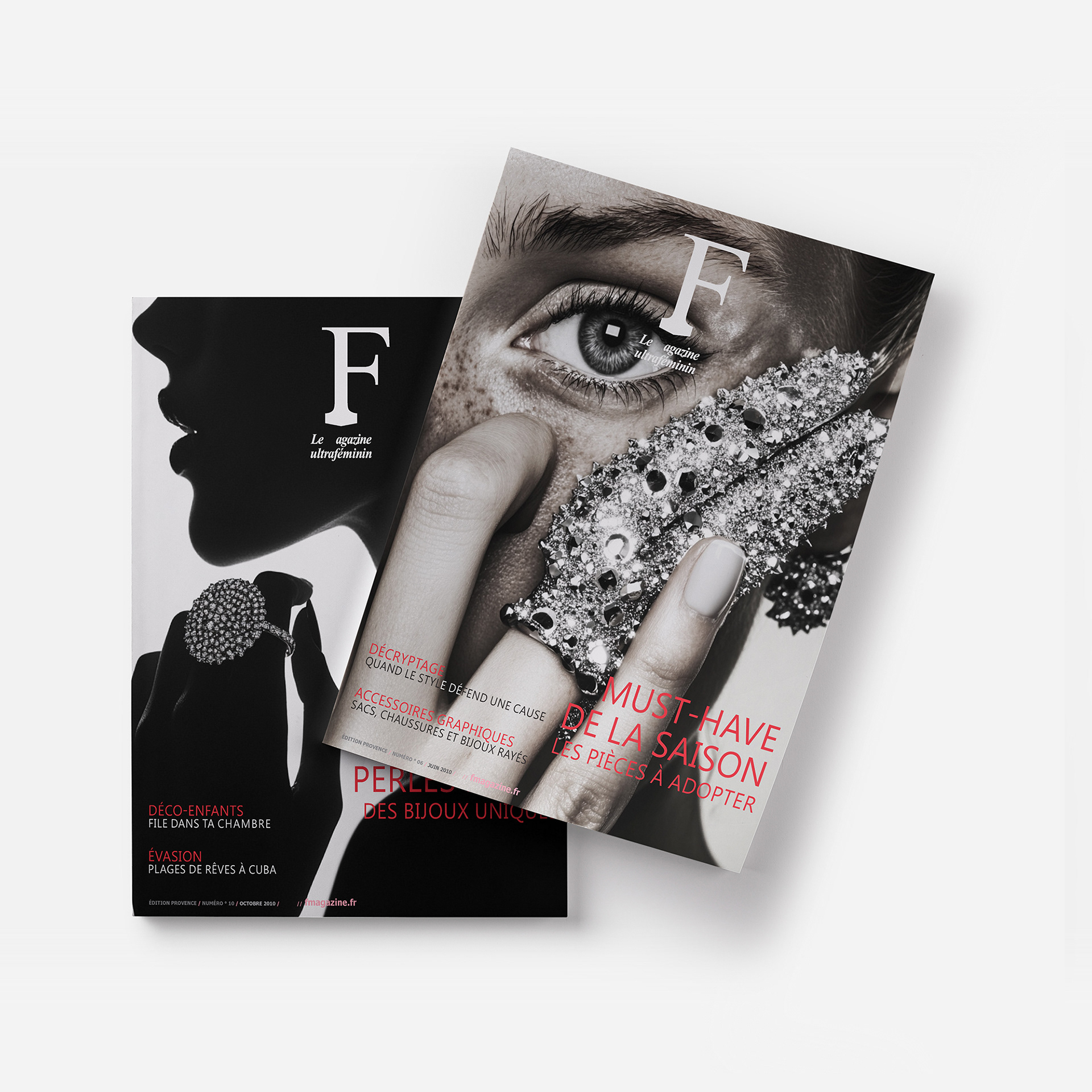
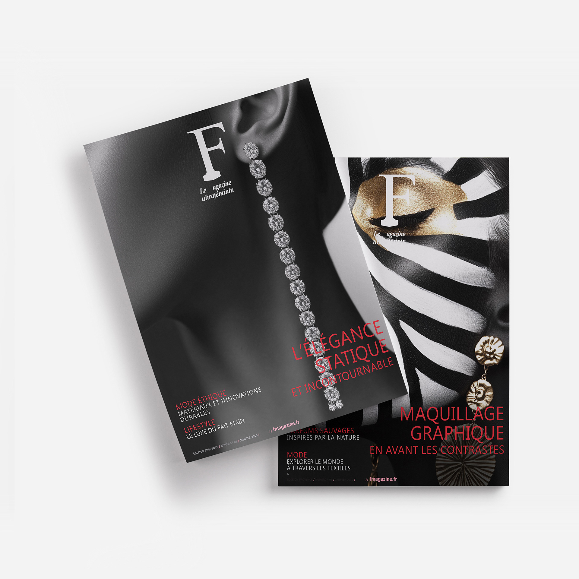
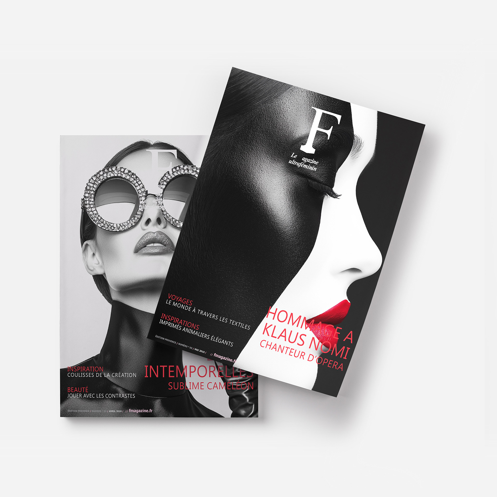
I designed F Mag’s identity to be as bold and striking as the fashion world it represents:
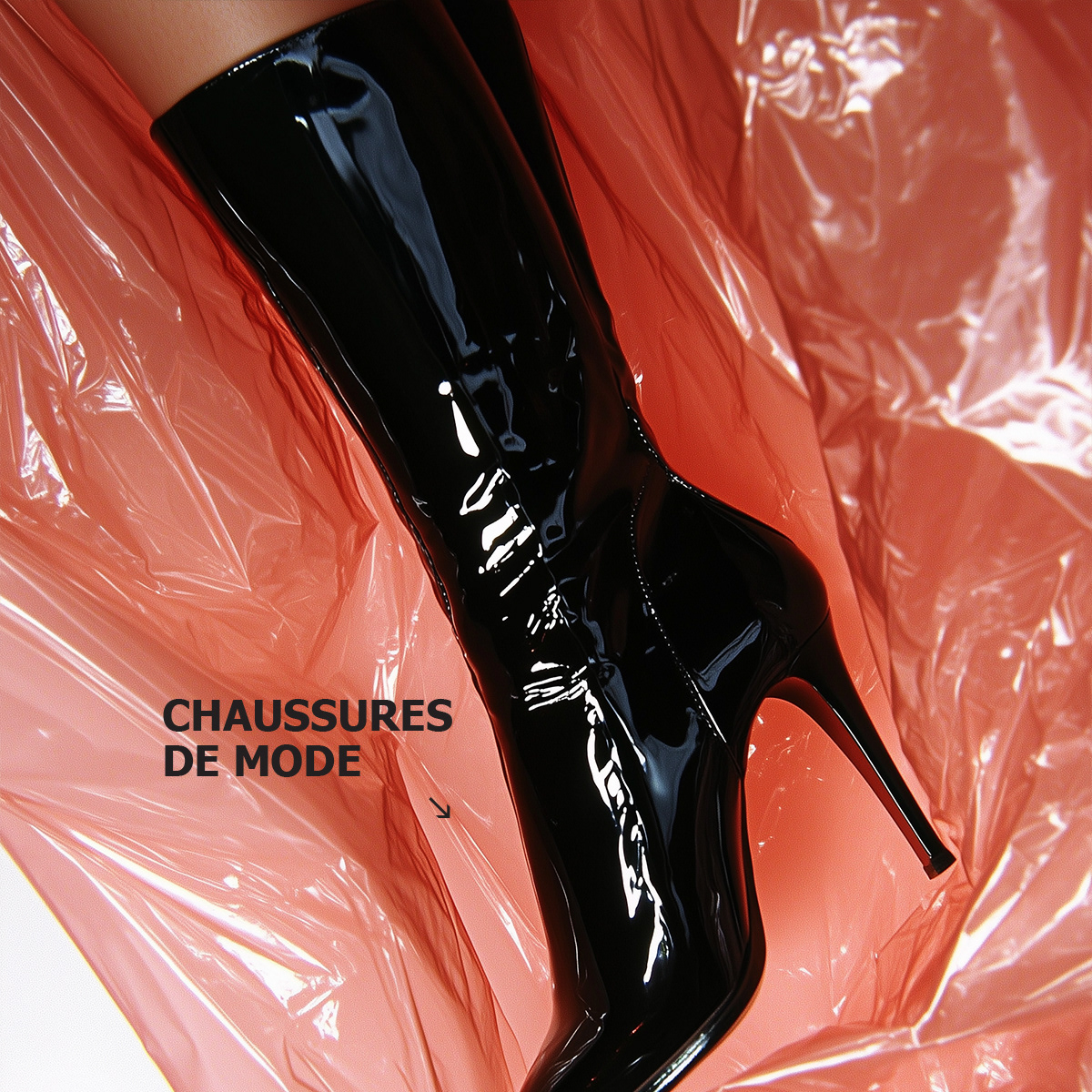
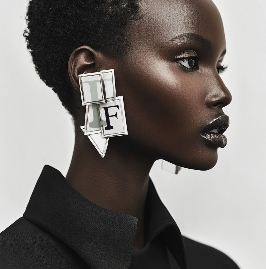
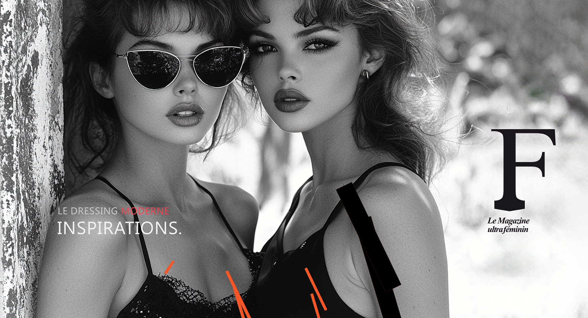
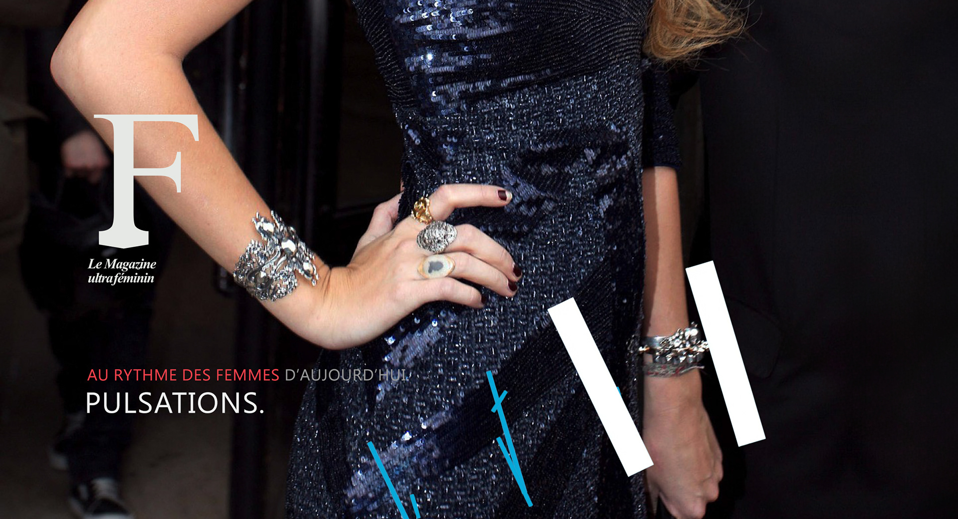
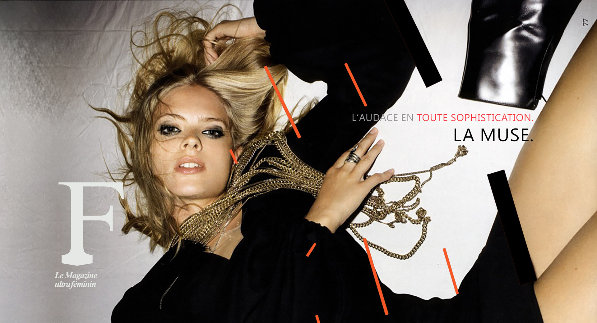
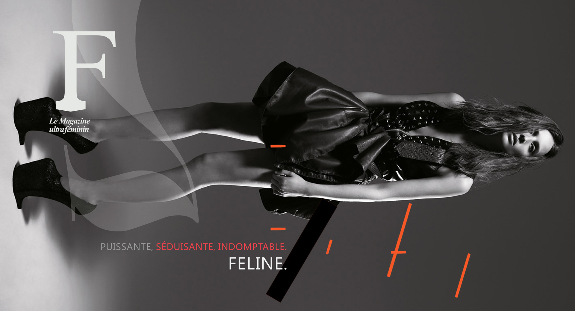
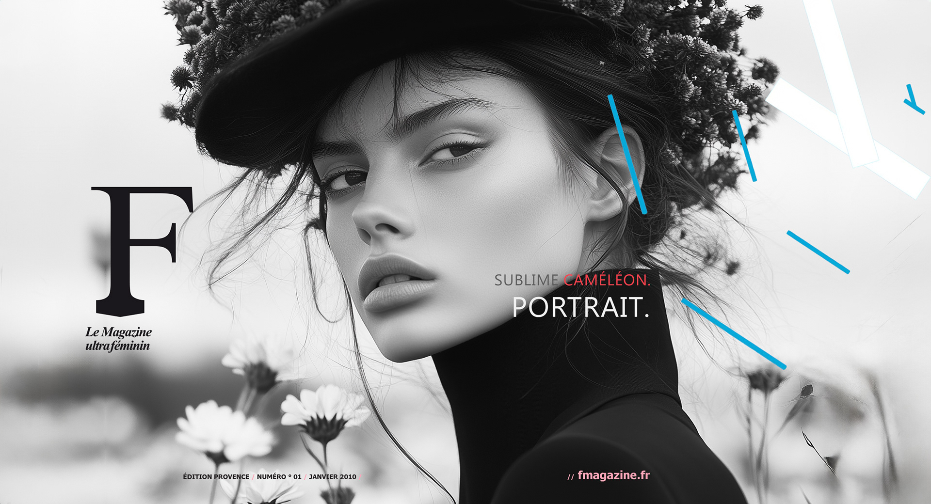
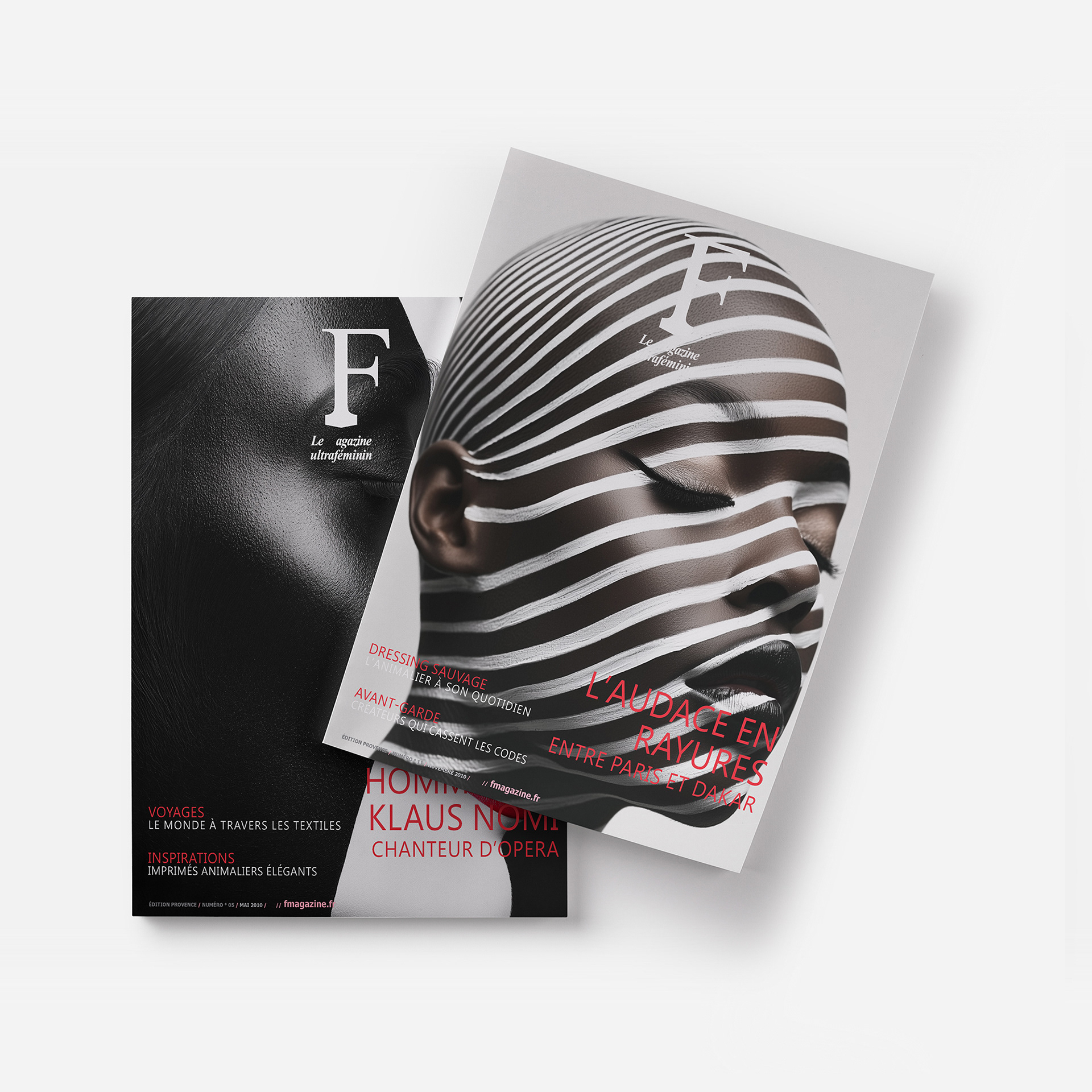
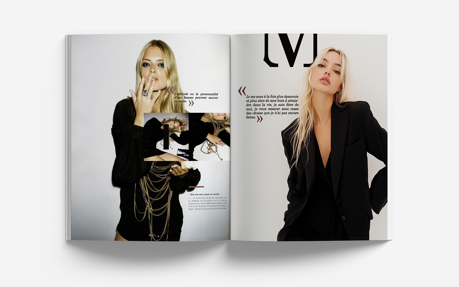
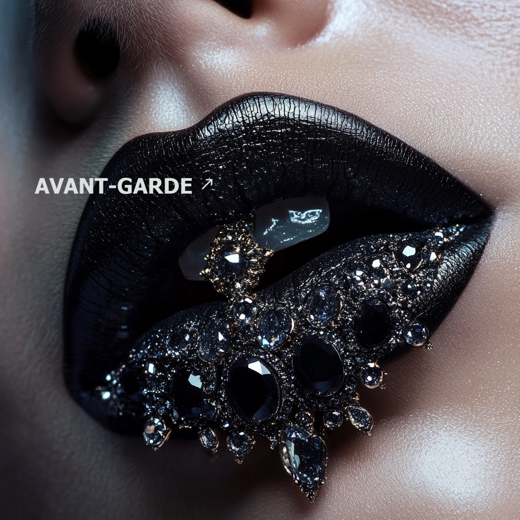
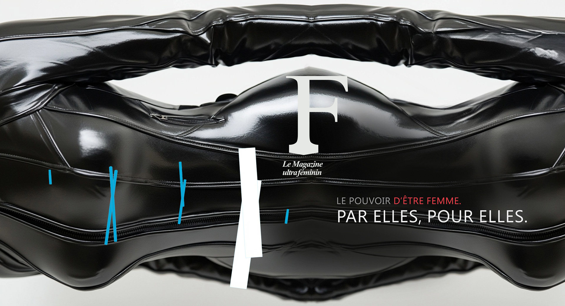
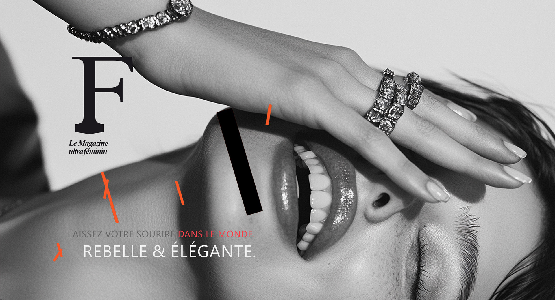
- My approach was rooted in high-contrast visuals, using black-and-white imagery with deep,
intense grays to create a sense of drama and sophistication.
- This aesthetic choice reinforces the magazine’s modern, editorial edge, making each spread iconic
and timeless.
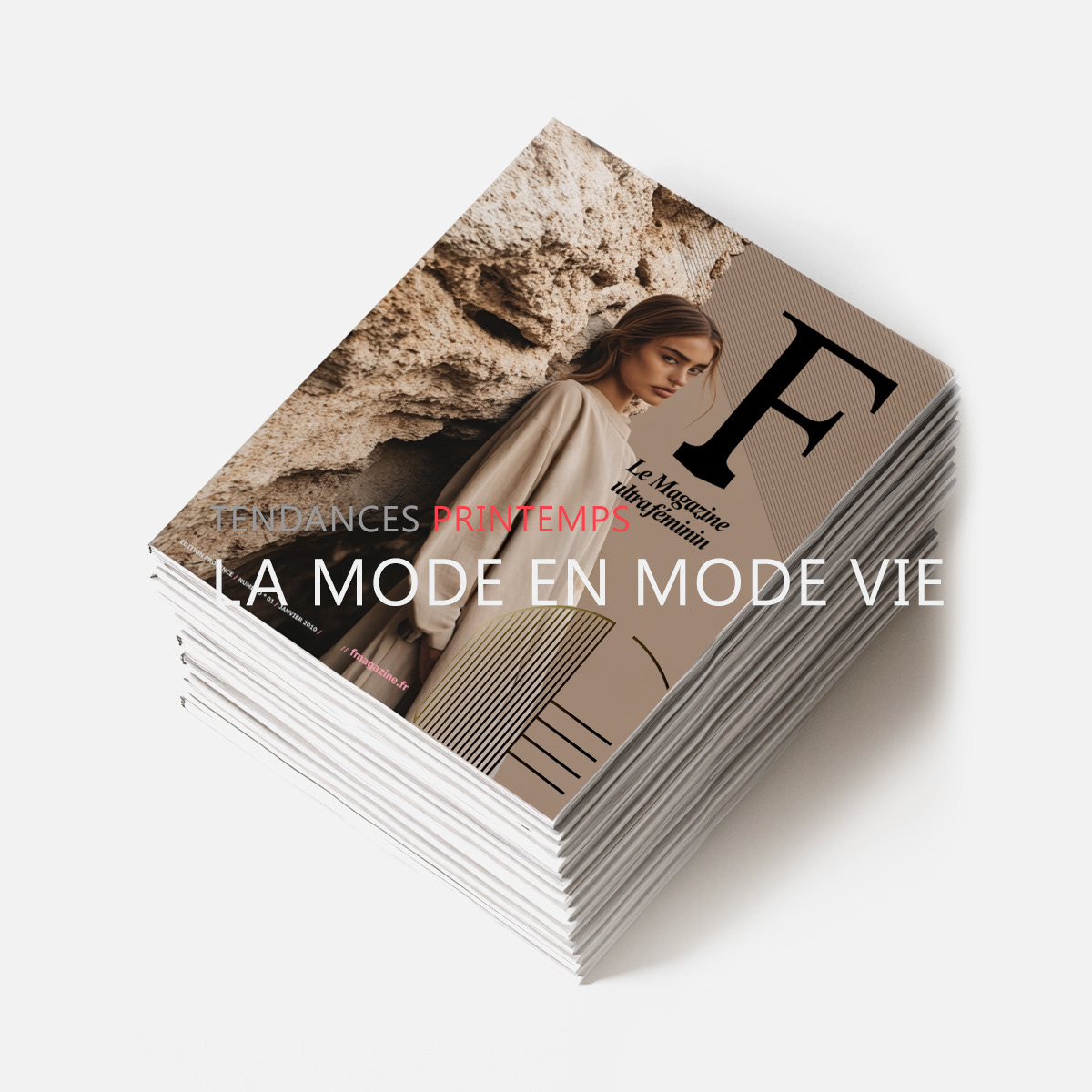
- The typography follows the same philosophy to establish a distinctive, high-fashion look—a potent mix
of refined serifs and bold sans-serifs.
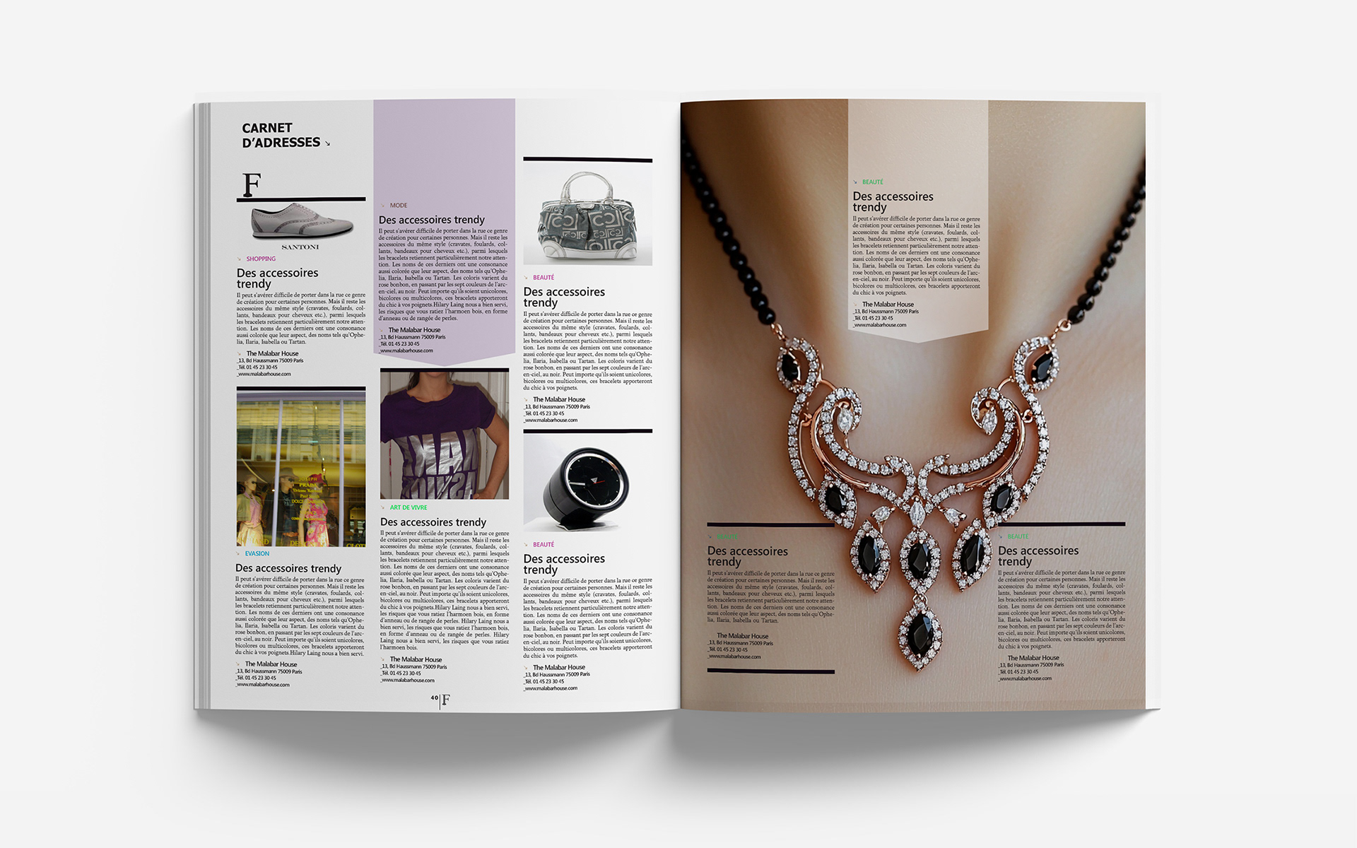
- The layout is intentionally minimalist yet structured, allowing the striking photography to take center stage
while maintaining balance and luxury.
- This visual approach ensures that F Mag stands out as a trendsetting, high-impact publication,
immediately recognizable for its bold artistic direction and editorial sophistication.
- My approach was rooted in high-contrast visuals, using black-and-white imagery with deep,
intense grays to create a sense of drama and sophistication.
- This aesthetic choice reinforces the magazine’s modern, editorial edge, making each spread iconic
and timeless.
- The typography follows the same philosophy to establish a distinctive, high-fashion look—a potent mix
of refined serifs and bold sans-serifs.
- The layout is intentionally minimalist yet structured, allowing the striking photography to take center stage
while maintaining balance and luxury.
- This visual approach ensures that F Mag stands out as a trendsetting, high-impact publication,
immediately recognizable for its bold artistic direction and editorial sophistication.
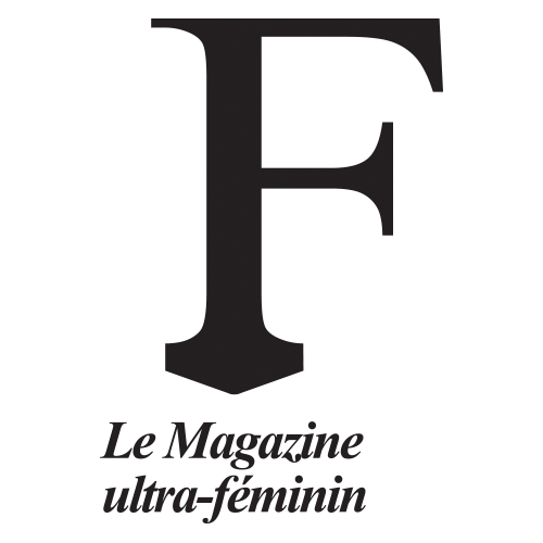
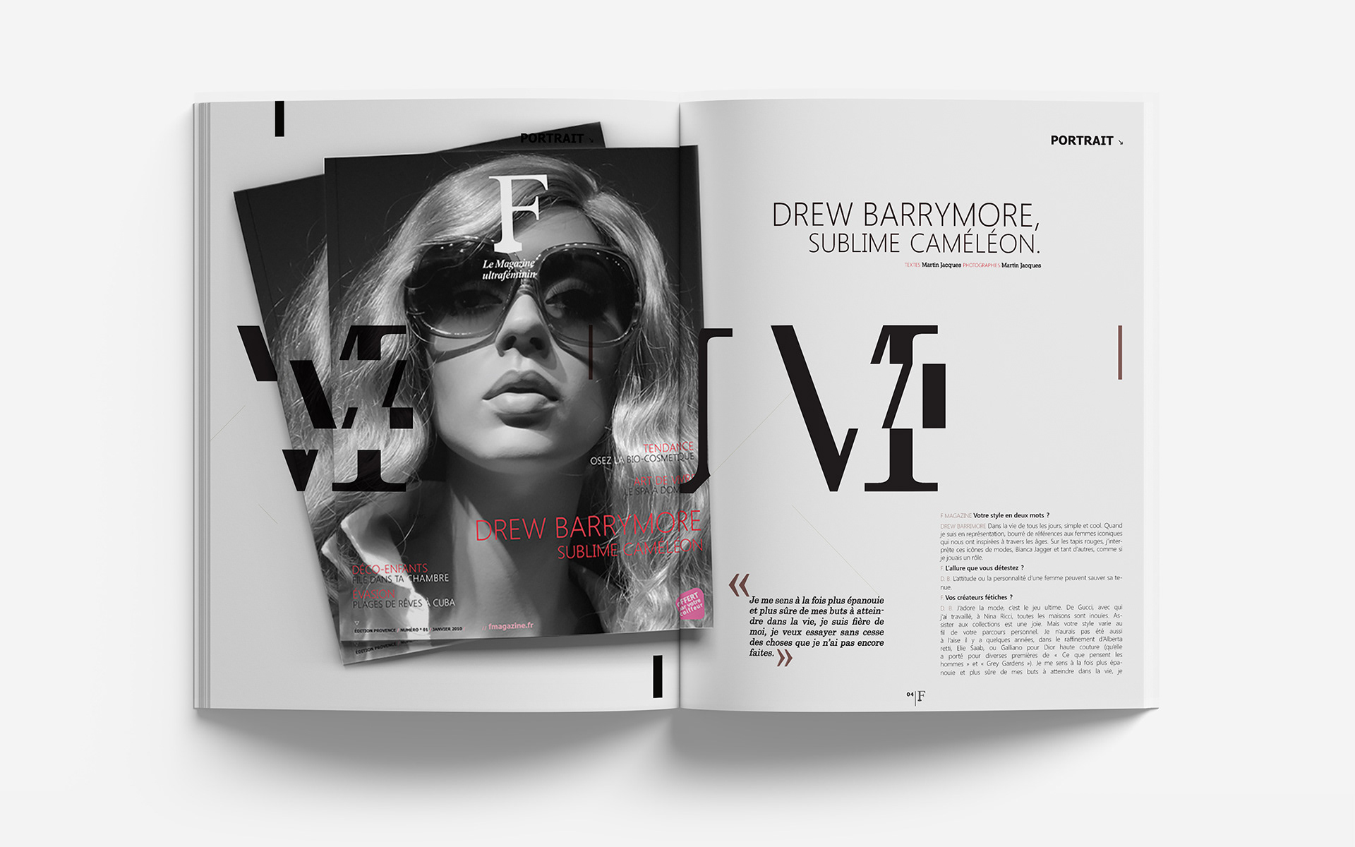
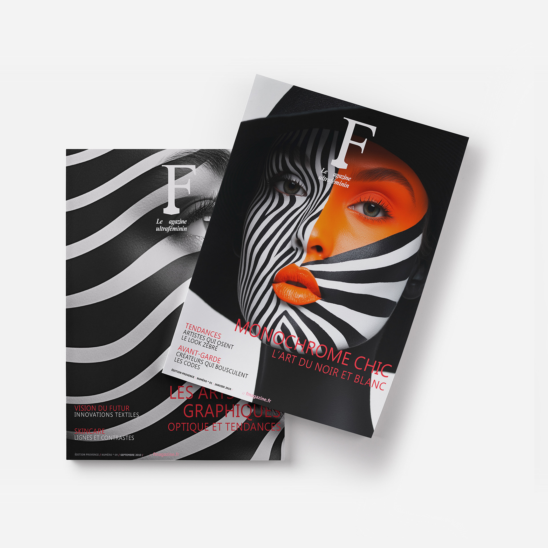
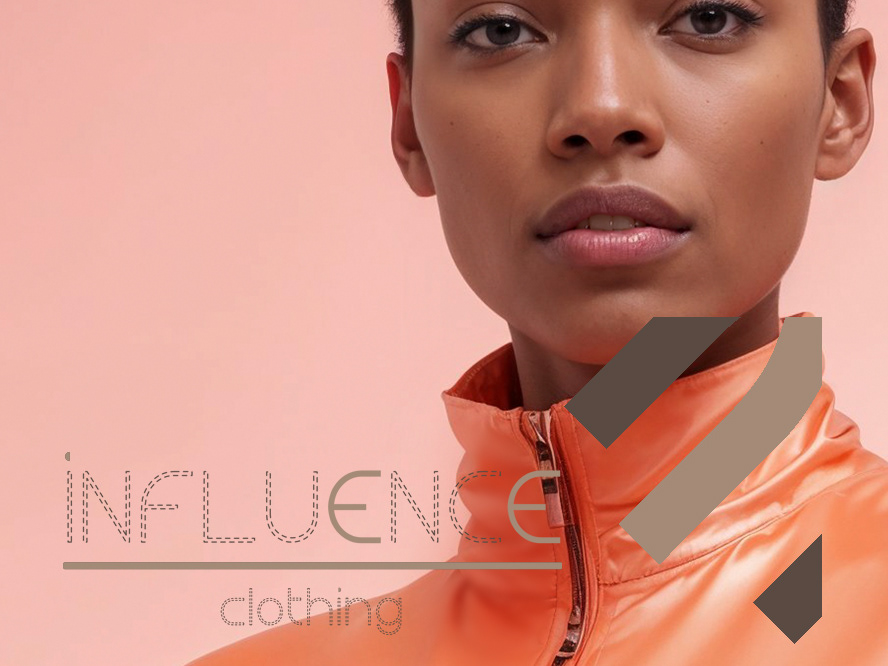
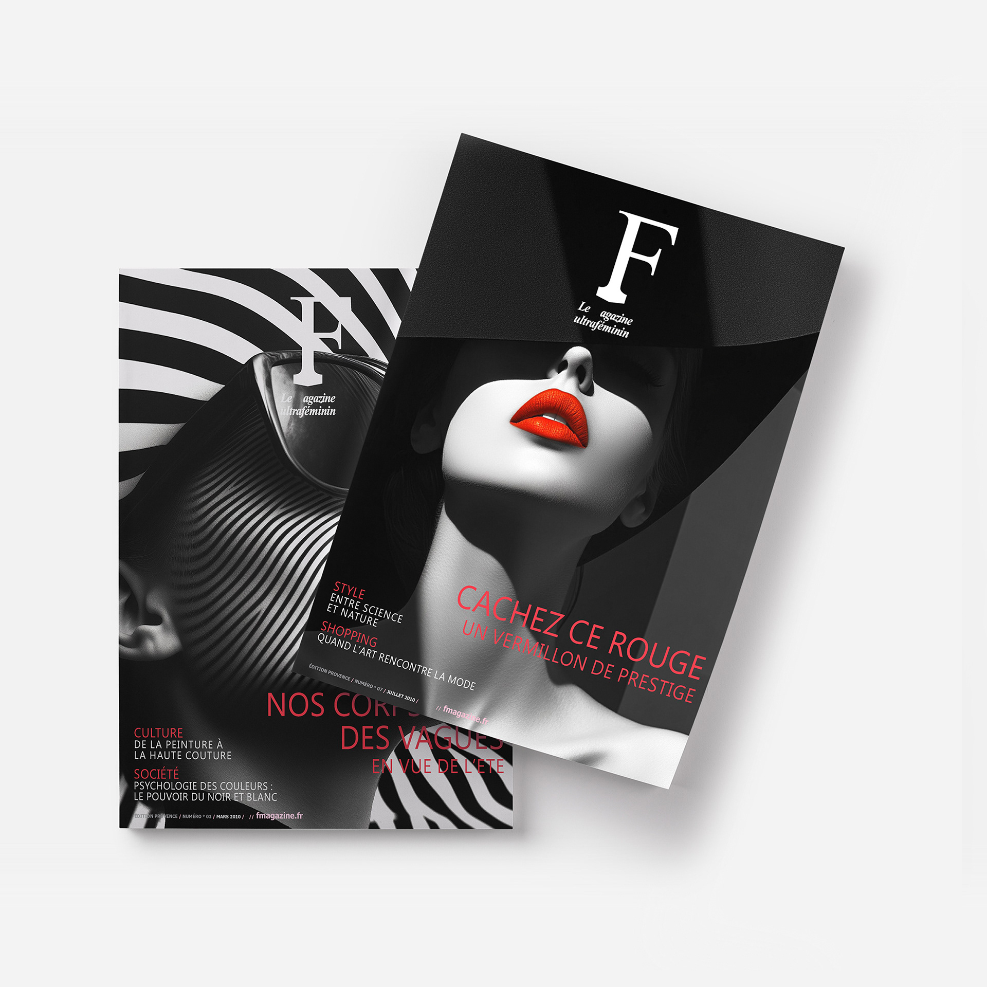
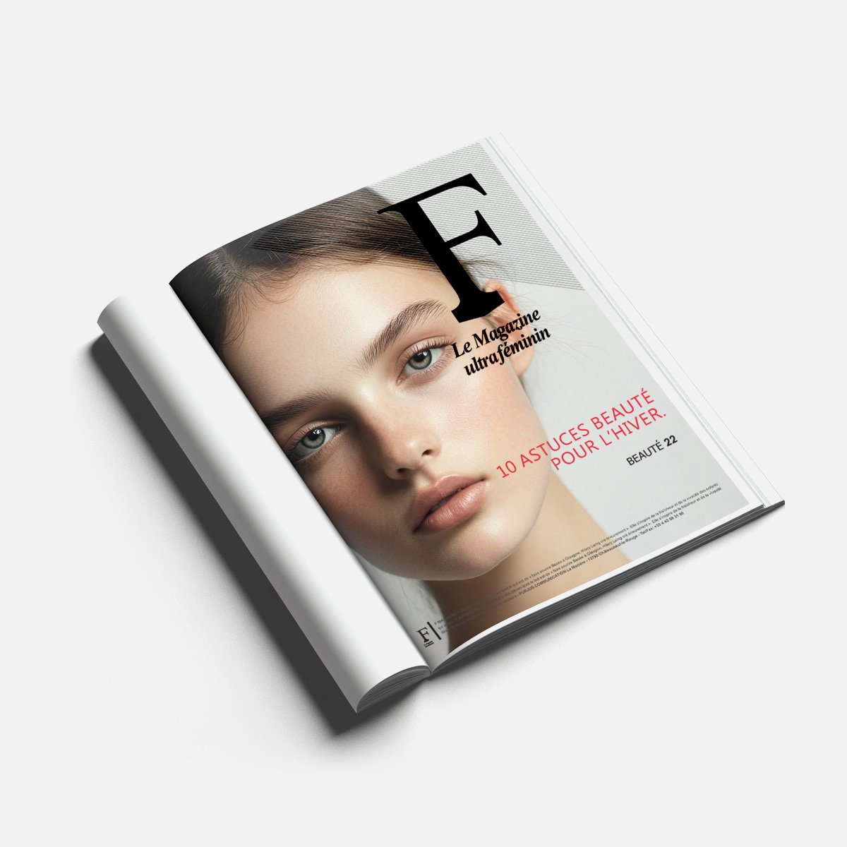
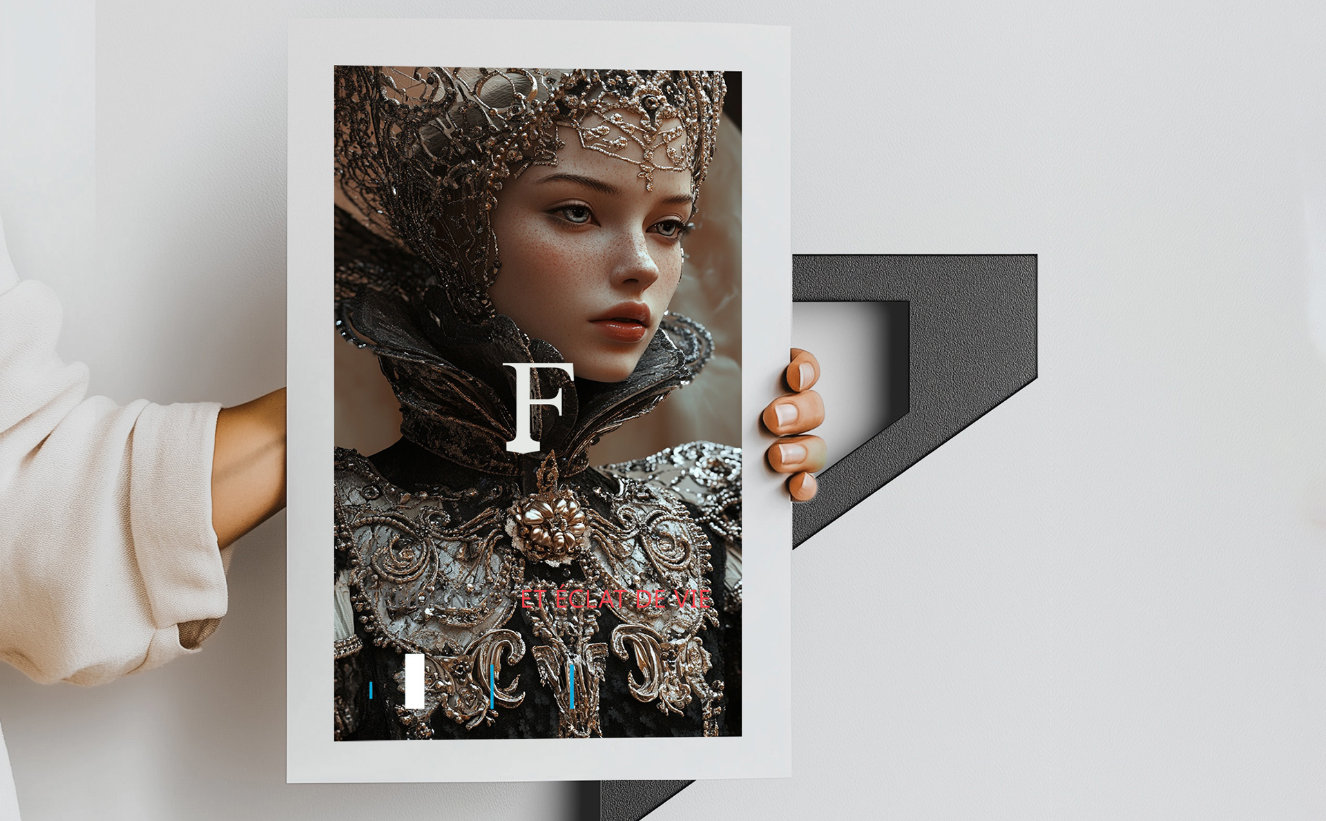
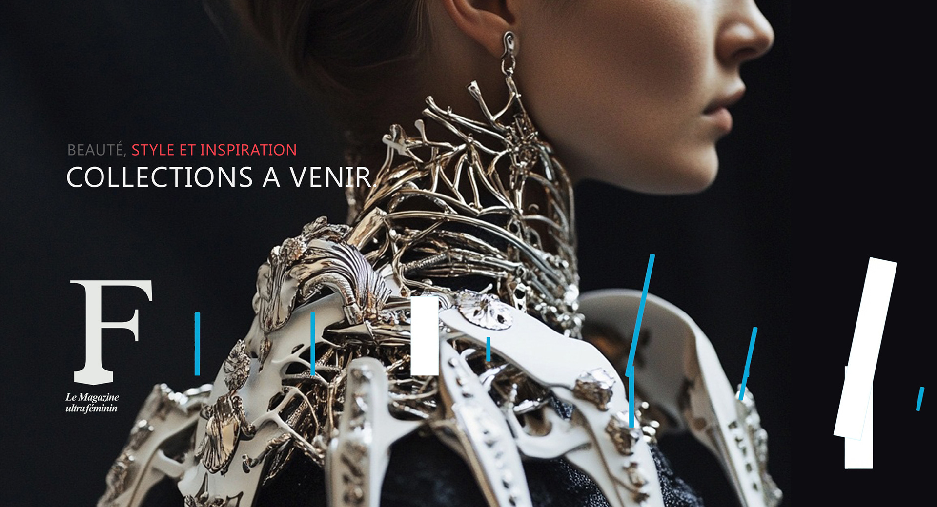
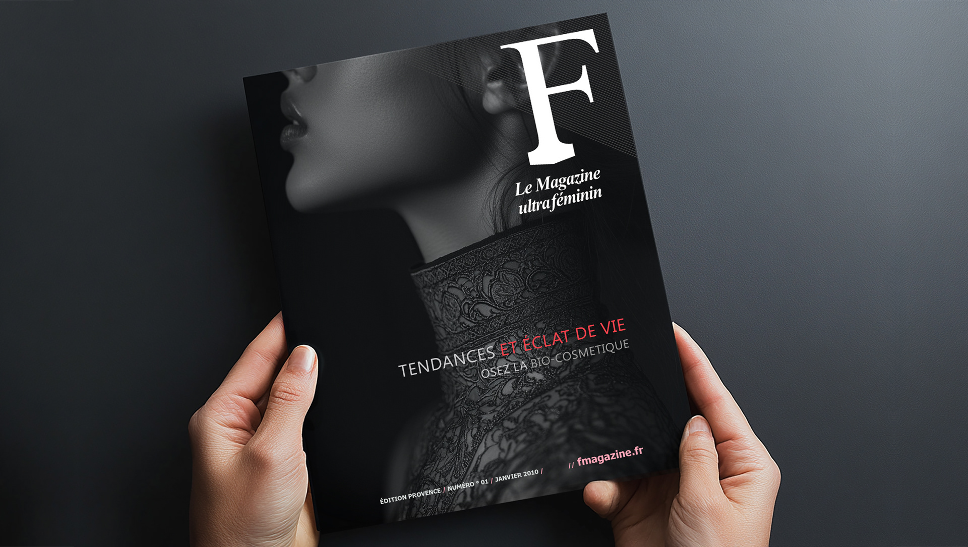
LOGOTYPE: A BOLD IDENTITY FOR A TREND-DEFINING FASHION MAGAZINE
The logotype was designed to be iconic and versatile, ensuring adaptability across print, digital, and social media platforms.
The layout structure creates a strong visual hierarchy, instantly engaging content while maintaining a sleek, high-end appeal.
To achieve this, I developed a branding system that balances high fashion aesthetics with an editorial edge:
- Typography: A blend of refined serif and bold sans-serif fonts to evoke sophistication and modernity.
- Color Palette: A striking yet adaptable tone selection that complements fashion photography
and editorial content.
- Graphic Elements: Minimalist yet dynamic layouts highlighting the magazine’s trend-driven essence.
- Photos: Black-and-white imagery with deep, intense grays to create a sense of drama and sophistication.
Concept Breakdown 2: AI THAT THINKS WITH YOU Everyplace ANYTIME
This AI tool transforms abstract ideas into clear, visual learning.
It’s intuitive, adaptable, and designed to support—not replace—how students and teachers think. With a calm, thoughtful voice, it brings clarity to complexity and helps users navigate layered content through innovative, responsive design.
More than a tool, it’s a values-driven partner: free, ethical, and built for real people doing meaningful work. It encourages curiosity, invites collaboration, and empowers users to ask better questions—making education more accessible, thoughtful, and human.