Brisk Teaching builds AI tools for teachers, an audience that did not ask for AI and has good reasons to be skeptical of it. The category's visual defaults- glowing gradients and abstract neural imagery- signal technology to investors and signal risk to educators. I built a typographic, system-led identity that makes the product legible instead of impressive, working across the interface, the sales materials and the conference floor.
CLIENT ▸ Brisk Teaching, Free AI for Teachers, CA, USA
YEAR ▸ 2021
AREA ▸ Logo Design, Brand Identity, Visual Identity, Campaign Materials, Iconography, Digital Assets
AUDIENCE ▸ Teacher, School Administrator, Investor
SCOPE ▸ Brand identity, visual system, iconography, campaign materials
SCALE ▸ 9 templates, 4-month engagement
ROLE ▸ Brand Designer (Freelance)
TEAM ▸ Worked with 1 UX designer and 1 teacher advisor
PROCESS ▸ Led cross-functional brand audit → visual identity system → rollout guidelines
YEAR ▸ 2021
AREA ▸ Logo Design, Brand Identity, Visual Identity, Campaign Materials, Iconography, Digital Assets
AUDIENCE ▸ Teacher, School Administrator, Investor
SCOPE ▸ Brand identity, visual system, iconography, campaign materials
SCALE ▸ 9 templates, 4-month engagement
ROLE ▸ Brand Designer (Freelance)
TEAM ▸ Worked with 1 UX designer and 1 teacher advisor
PROCESS ▸ Led cross-functional brand audit → visual identity system → rollout guidelines

The Challenge
• A technical AI product sold to a cautious, non-technical audience
• Sophistication to communicate without the complexity that makes teachers
close the tab
• One system spanning product interface, sales collateral, and conference
presence
• A technical AI product sold to a cautious, non-technical audience
• Sophistication to communicate without the complexity that makes teachers
close the tab
• One system spanning product interface, sales collateral, and conference
presence
Strategic Approach
• System-led architecture, so hierarchy does the explaining instead
of copying
• Restraint as the credibility move. In education, calm reads as trustworthy
• Built to evolve, because an AI product ships new features faster
than a brand book can follow
• System-led architecture, so hierarchy does the explaining instead
of copying
• Restraint as the credibility move. In education, calm reads as trustworthy
• Built to evolve, because an AI product ships new features faster
than a brand book can follow
Creative Solution
• A typographic identity. The character comes from structure,
not from technological cues
• Modular components that make complex functionality legible
on first encounter
• Iconography and a flexible visual language that absorb new features
without a redesign
• A typographic identity. The character comes from structure,
not from technological cues
• Modular components that make complex functionality legible
on first encounter
• Iconography and a flexible visual language that absorb new features
without a redesign
Scope & System
• Scalable brand architecture
• Typographic hierarchy for technical and non-technical audiences
• Modular layouts for email, app interface, and partner dashboards
• Scalable brand architecture
• Typographic hierarchy for technical and non-technical audiences
• Modular layouts for email, app interface, and partner dashboards
Deliverables
+ Brand identity and visual system
+ Email campaign templates
+ App product design (interface and icons)
+ Print and digital brand assets and templates
+ Sales and partner-facing materials
+ Brand identity and visual system
+ Email campaign templates
+ App product design (interface and icons)
+ Print and digital brand assets and templates
+ Sales and partner-facing materials
Role & Leadership
▸ Brand Designer, audit through rollout, working across product, sales, and marketing.
Worked with a UX designer on the product side and a teacher who tested every decision against a real classroom, which is the only review that matters in edtech.
The decision that shaped everything: no gradients, no neural network imagery, no glow. Those cues make an AI company look like an AI company, which is exactly what a teacher suspects.
▸ Brand Designer, audit through rollout, working across product, sales, and marketing.
Worked with a UX designer on the product side and a teacher who tested every decision against a real classroom, which is the only review that matters in edtech.
The decision that shaped everything: no gradients, no neural network imagery, no glow. Those cues make an AI company look like an AI company, which is exactly what a teacher suspects.
On The Work
▸ Selling AI to educators is a trust problem before it is a feature problem.
The category's visual defaults impress investors and alarm users, so the smart move is to look like a tool rather than a technology.
▸ Selling AI to educators is a trust problem before it is a feature problem.
The category's visual defaults impress investors and alarm users, so the smart move is to look like a tool rather than a technology.


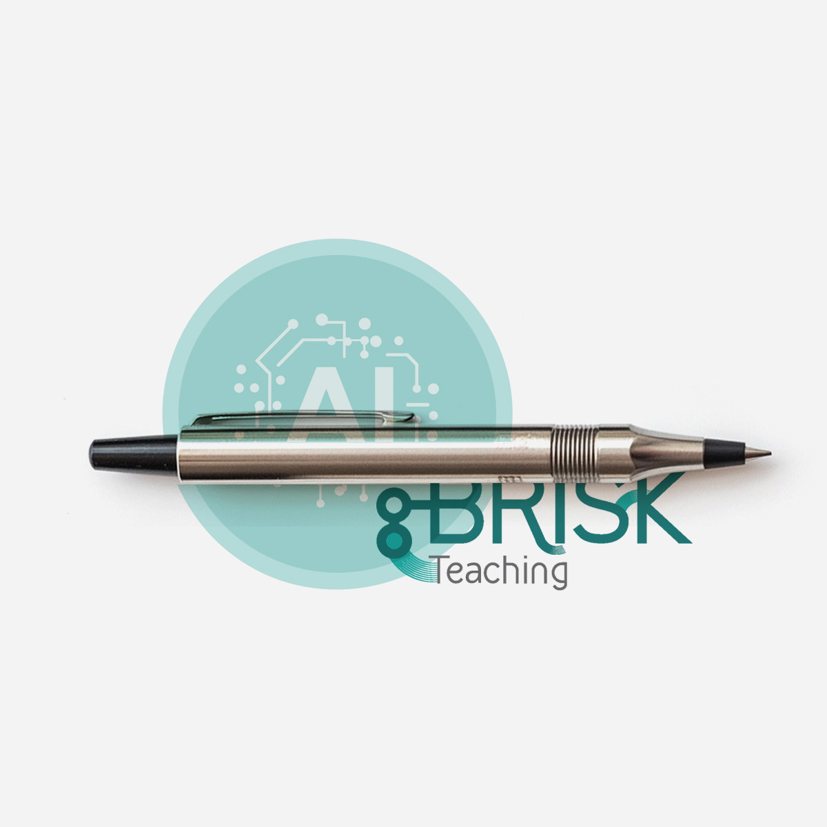
A clear, confident mark designed to anchor the system across digital
and marketing applications, with flexibility for motion and scalable use.
and marketing applications, with flexibility for motion and scalable use.


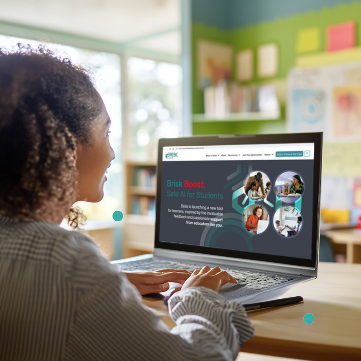


❝ The system improved clarity and consistency across high-volume digital touchpoints, supporting stronger engagement and smoother partner communications.❞











Building an edtech brand that
links educators and students?
links educators and students?