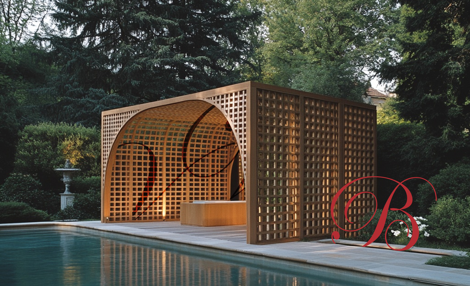
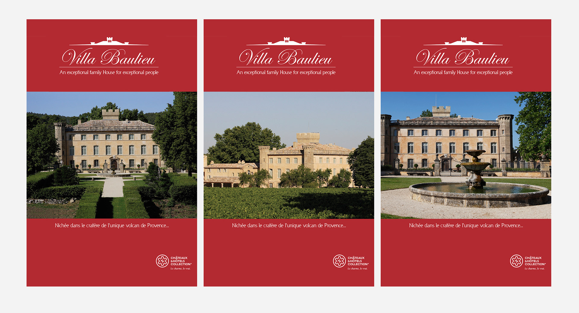
CLIENT / Villa Baulieu & Cuvée Bérengère, Rognes, France
Project Overview
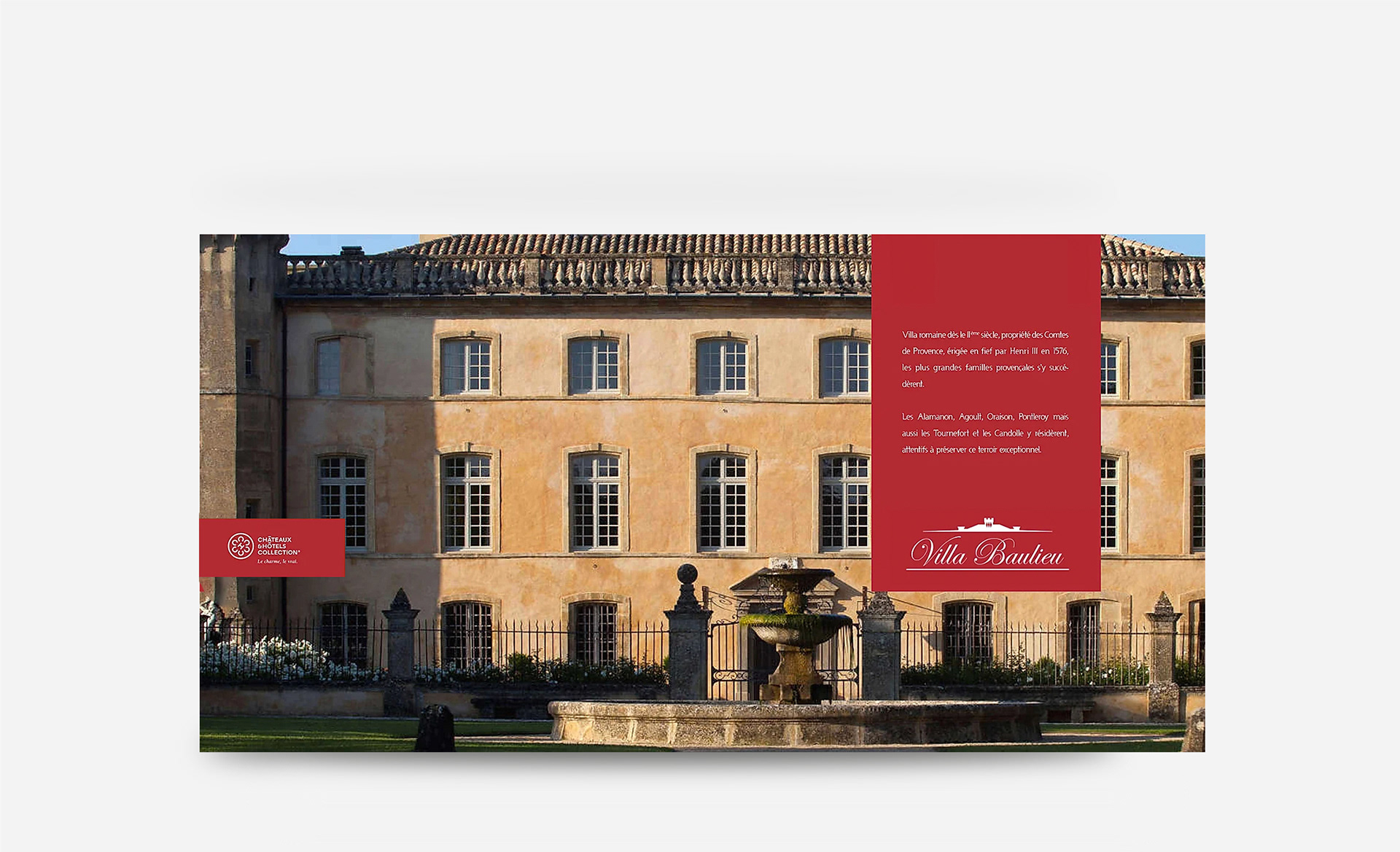
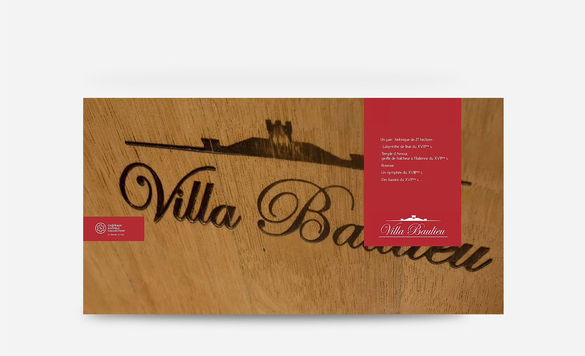
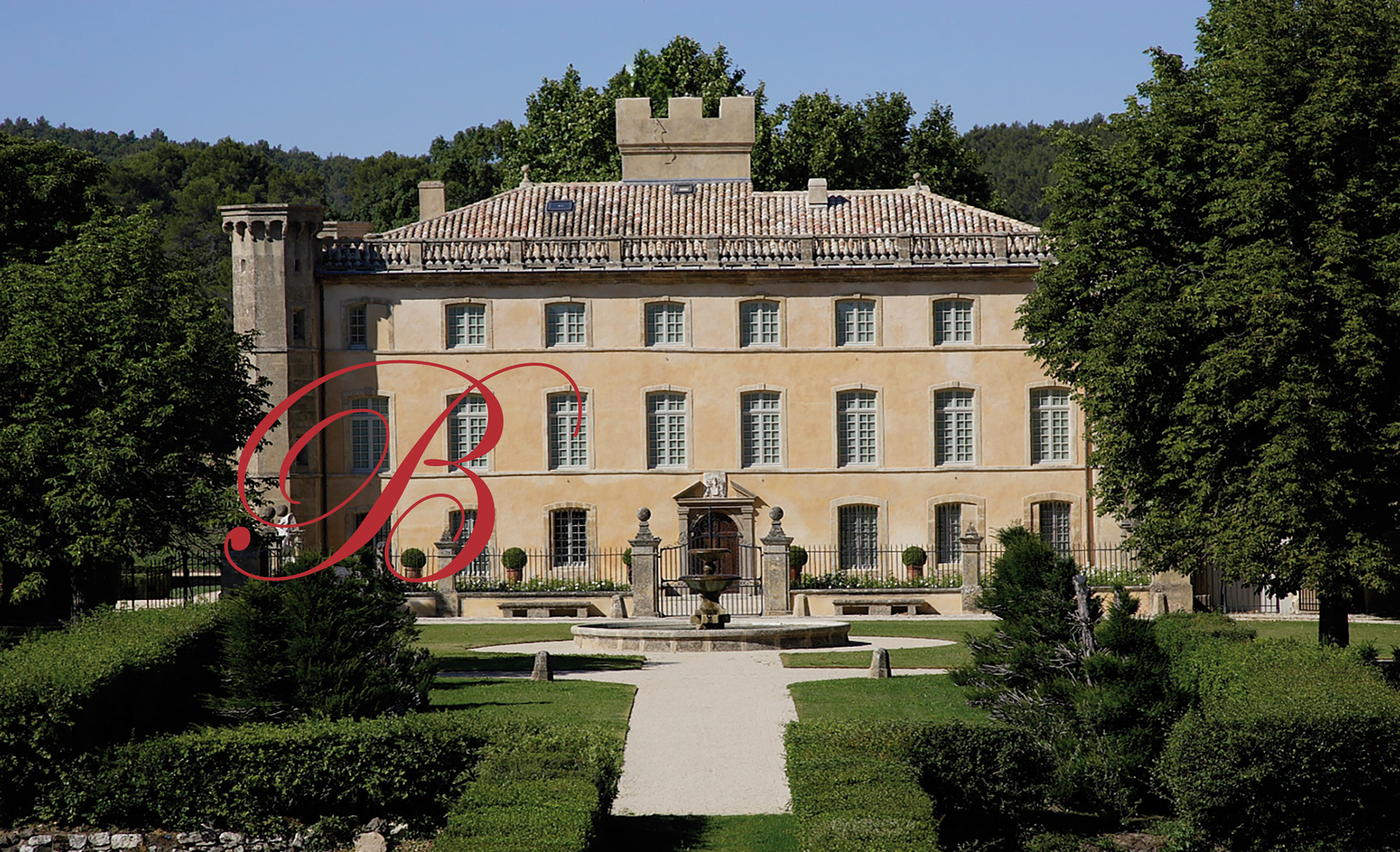
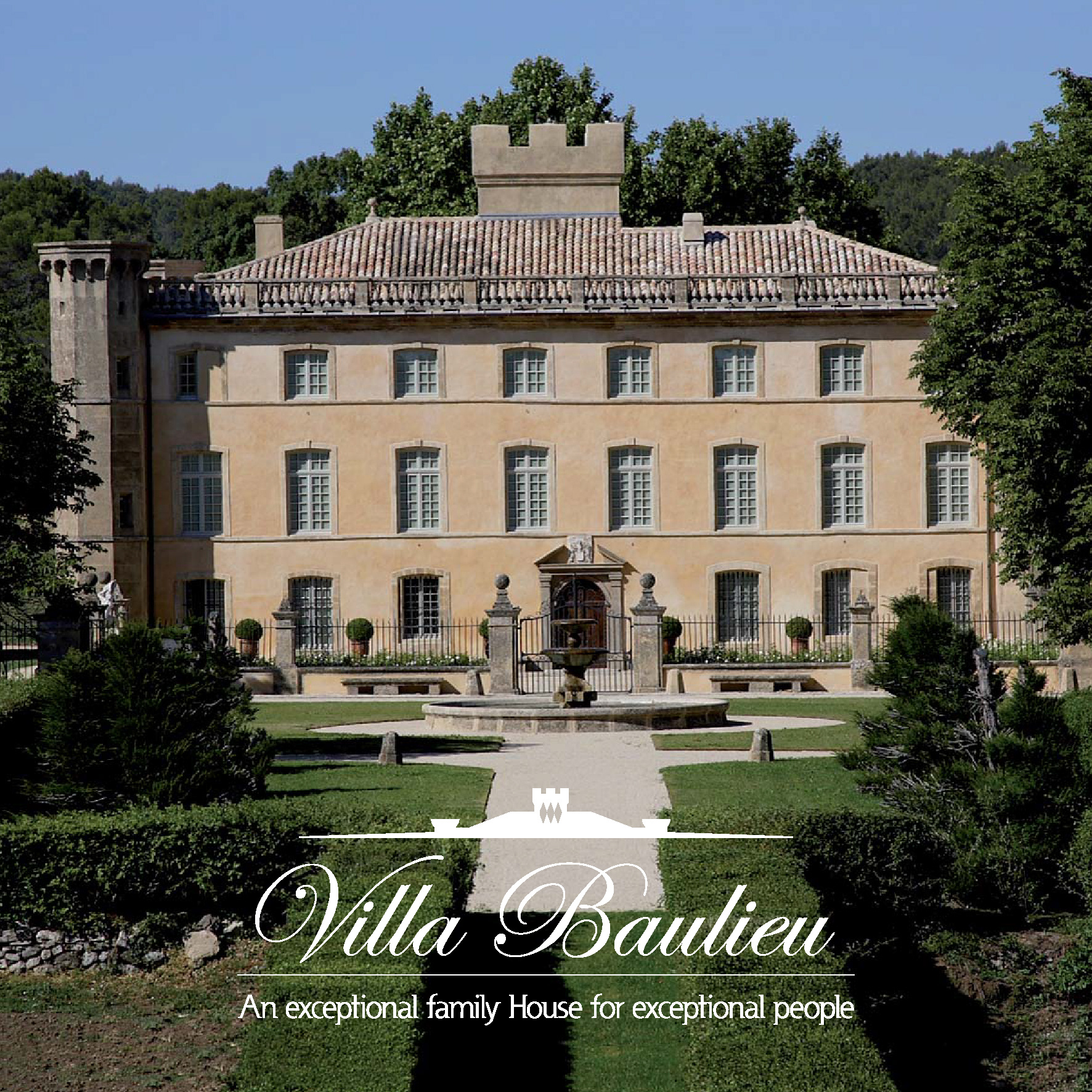
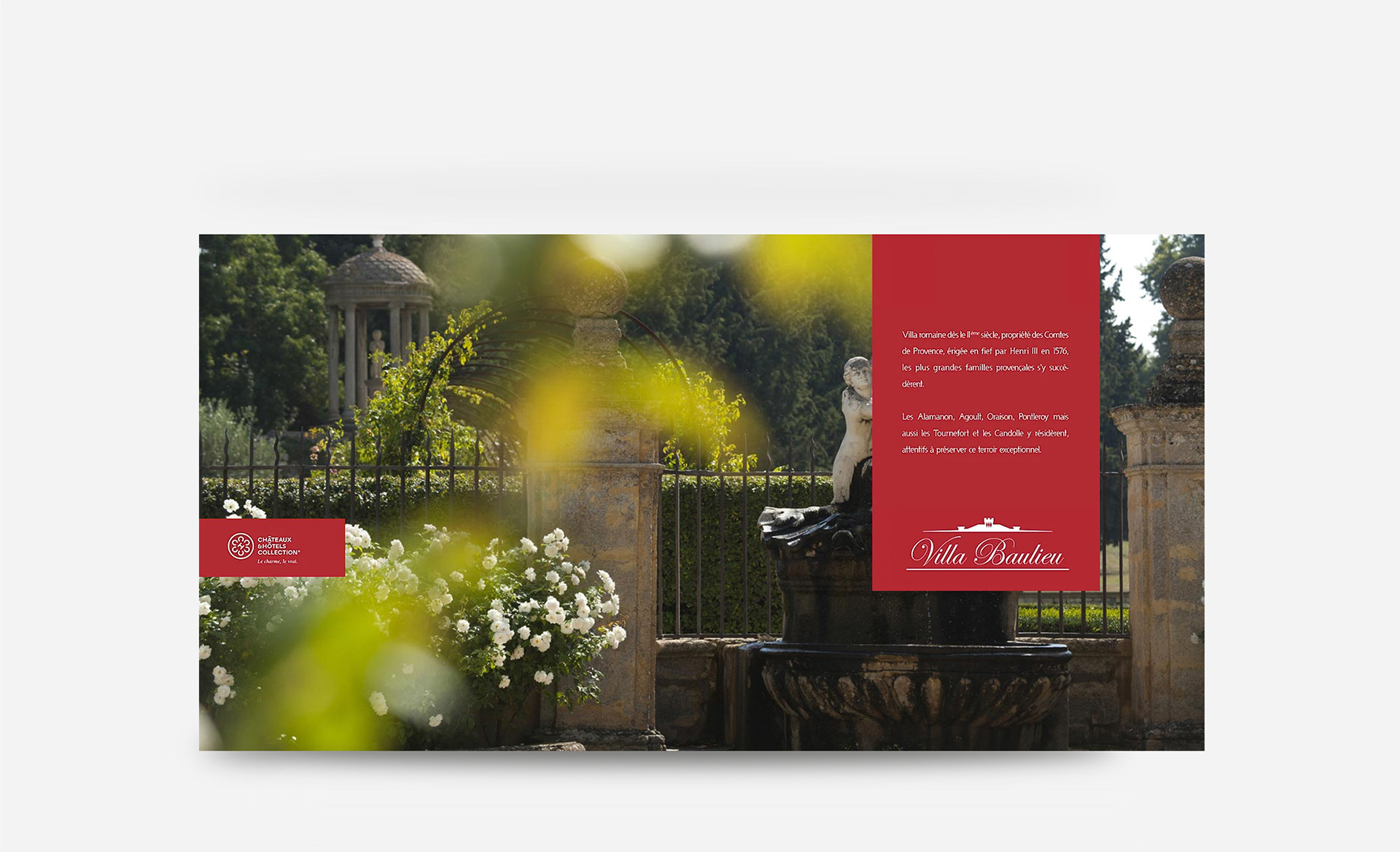
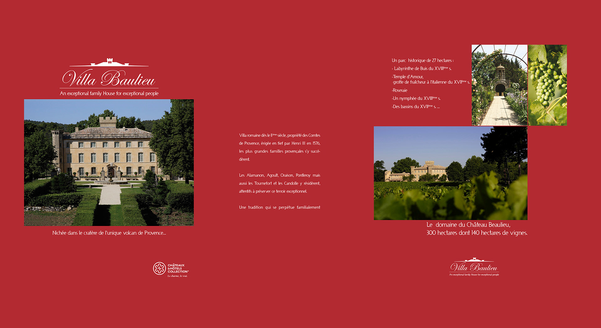
The family who owns the Castle "Villa Baulieu" has been producing wine for a decade
when they transformed their residence & domain into a very high luxury guest house.
when they transformed their residence & domain into a very high luxury guest house.

Approach & Solution
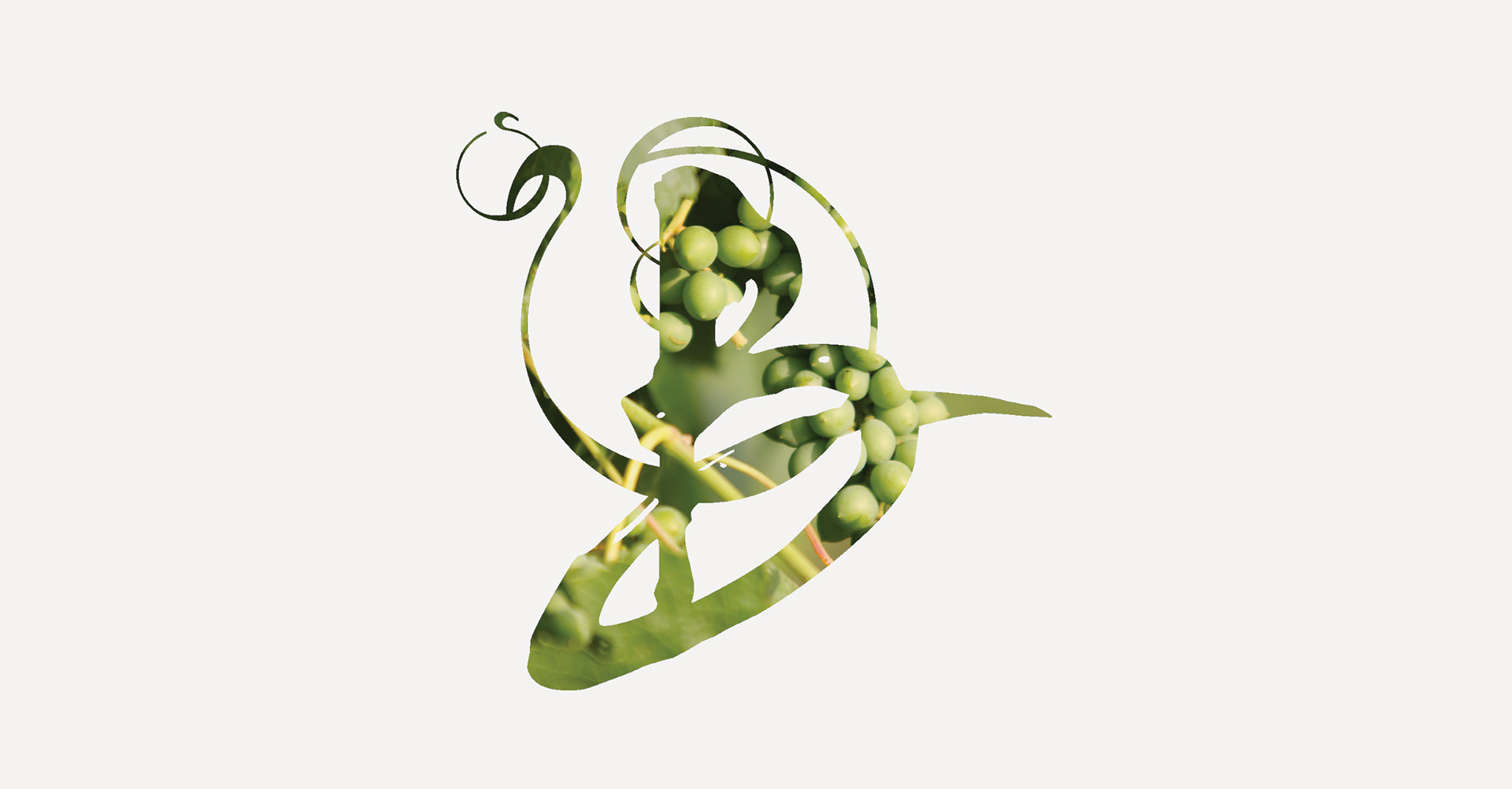
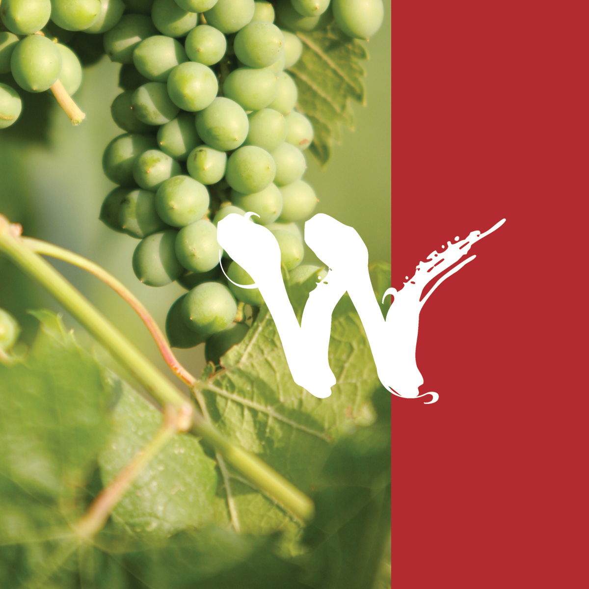
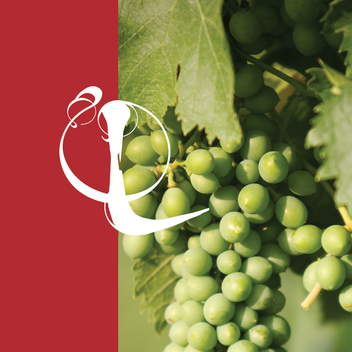
Building on my work designing Villa Baulieu's wine labels, I created a bespoke logotype inspired
by the flowing, organic nature of vines:
- This custom typography evokes the elegance and heritage of the estate while maintaining
a refined aesthetic.
- I developed a visual identity with a regal, monarchical feel, emphasizing the location’s prestige,
history, and exclusivity.
- The combination of classic script typography and a minimalist architectural silhouette conveys
tradition and sophistication, reinforcing Villa Baulieu’s status as an exceptional destination.

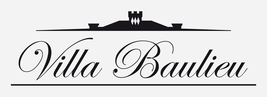
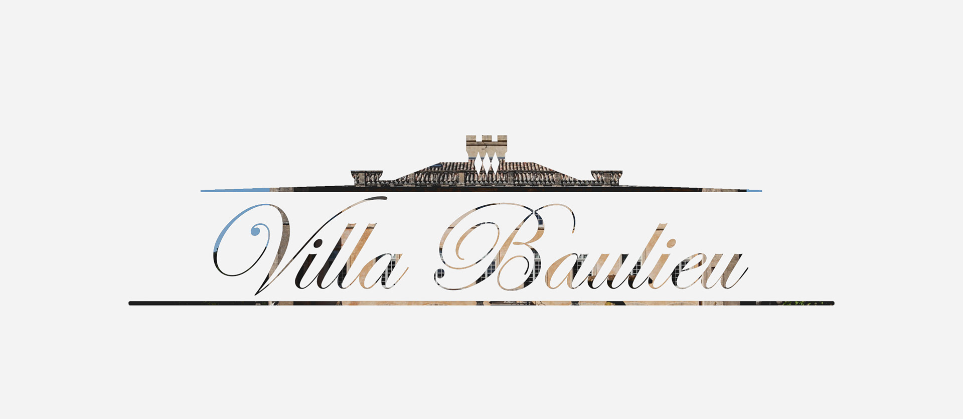
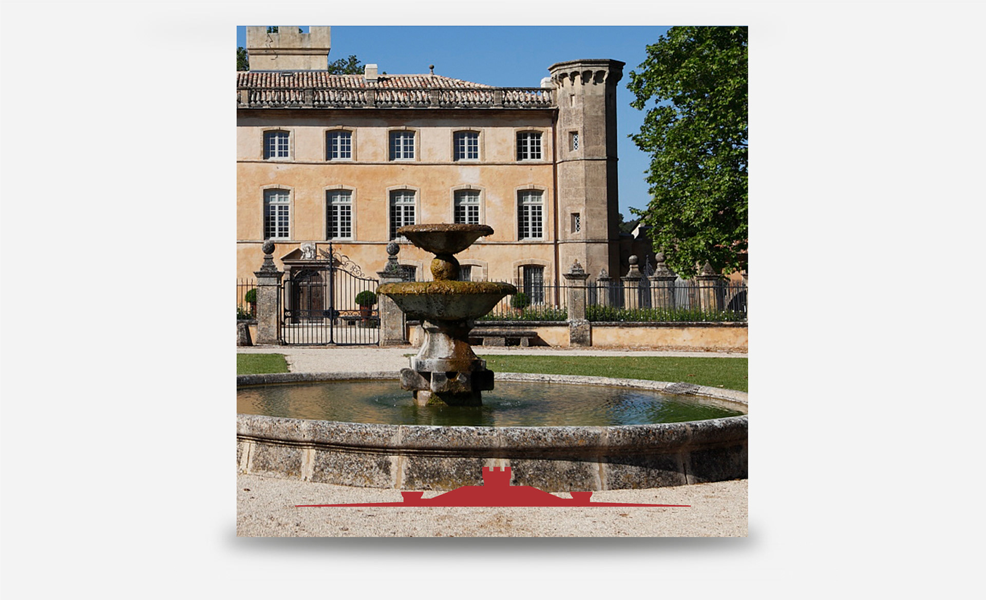
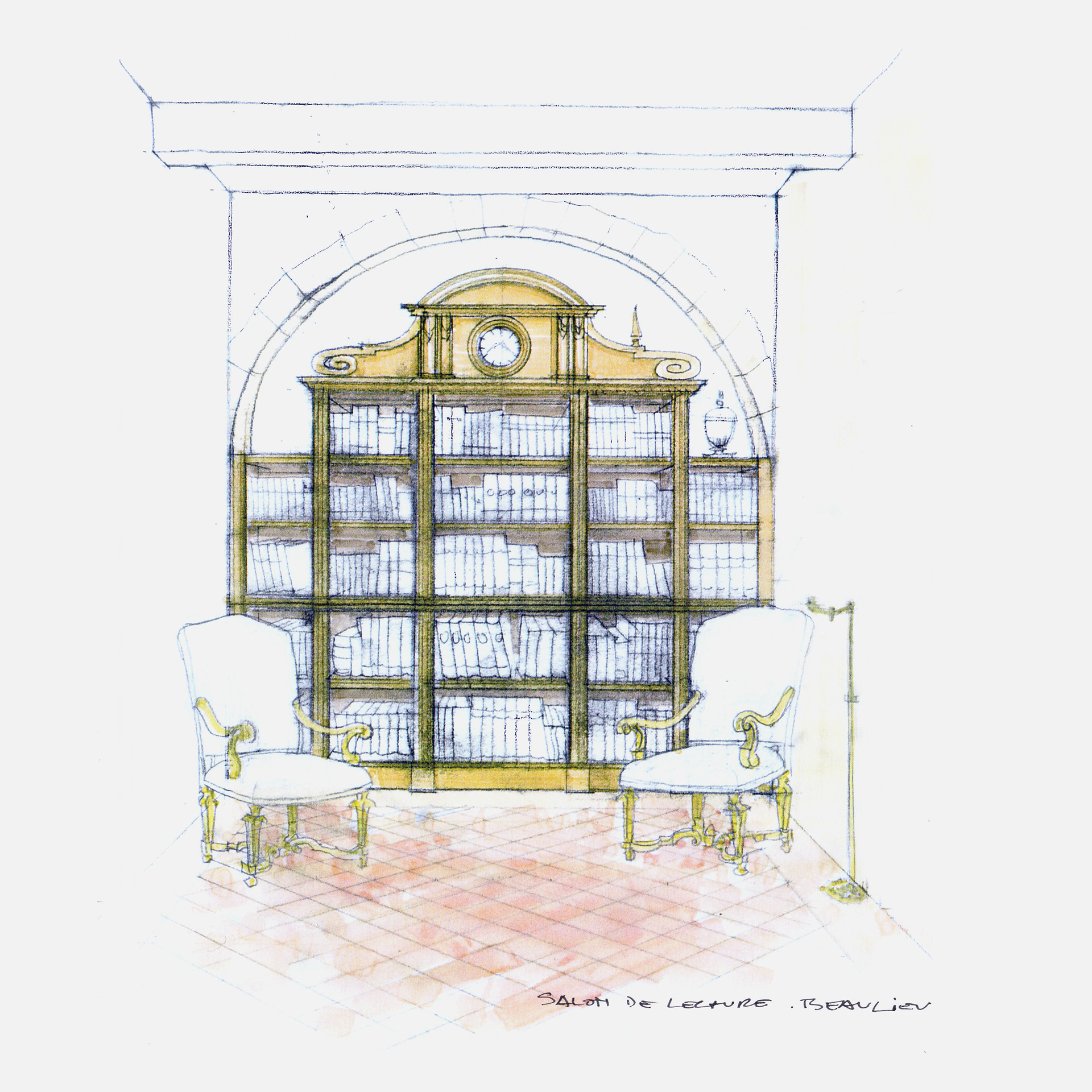
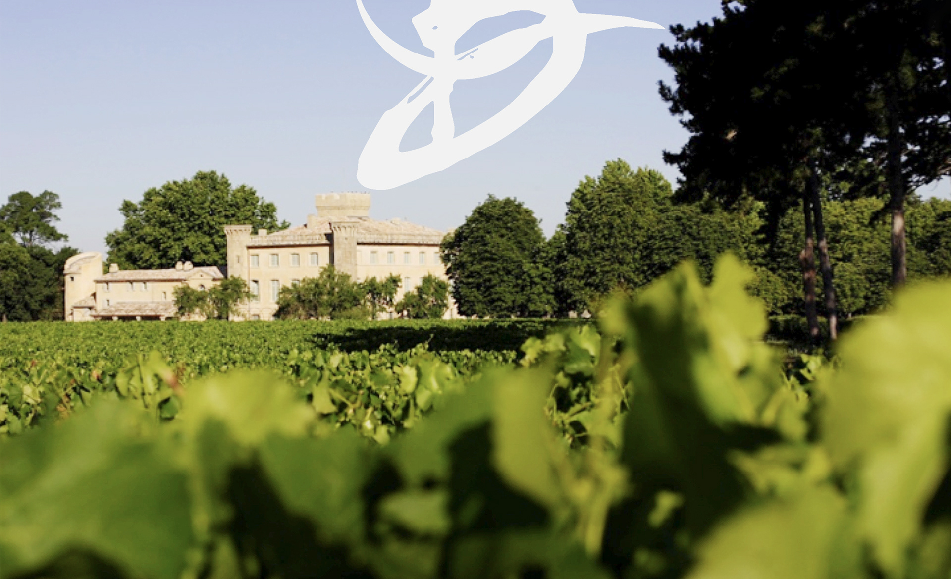
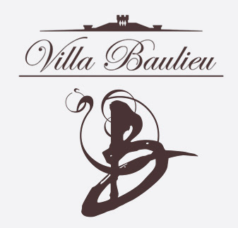
LOGO DESIGN: WHERE CLASSIC MEETS CHIC
Color Palette: Classic black and white, symbolizing luxury and tradition.
Typography: Elegant script reflecting sophistication and heritage.
Graphic Elements: A château silhouette with battlements, reinforcing prestige.
Imagery: The estate’s iconic architecture evoking history and refinement.
Typography: Elegant script reflecting sophistication and heritage.
Graphic Elements: A château silhouette with battlements, reinforcing prestige.
Imagery: The estate’s iconic architecture evoking history and refinement.


Concept Breakdown 2: AI THAT THINKS WITH YOU Everyplace ANYTIME
This AI tool transforms abstract ideas into clear, visual learning.
It’s intuitive, adaptable, and designed to support—not replace—how students and teachers think. With a calm, thoughtful voice, it brings clarity to complexity and helps users navigate layered content through innovative, responsive design.
More than a tool, it’s a values-driven partner: free, ethical, and built for real people doing meaningful work. It encourages curiosity, invites collaboration, and empowers users to ask better questions—making education more accessible, thoughtful, and human.
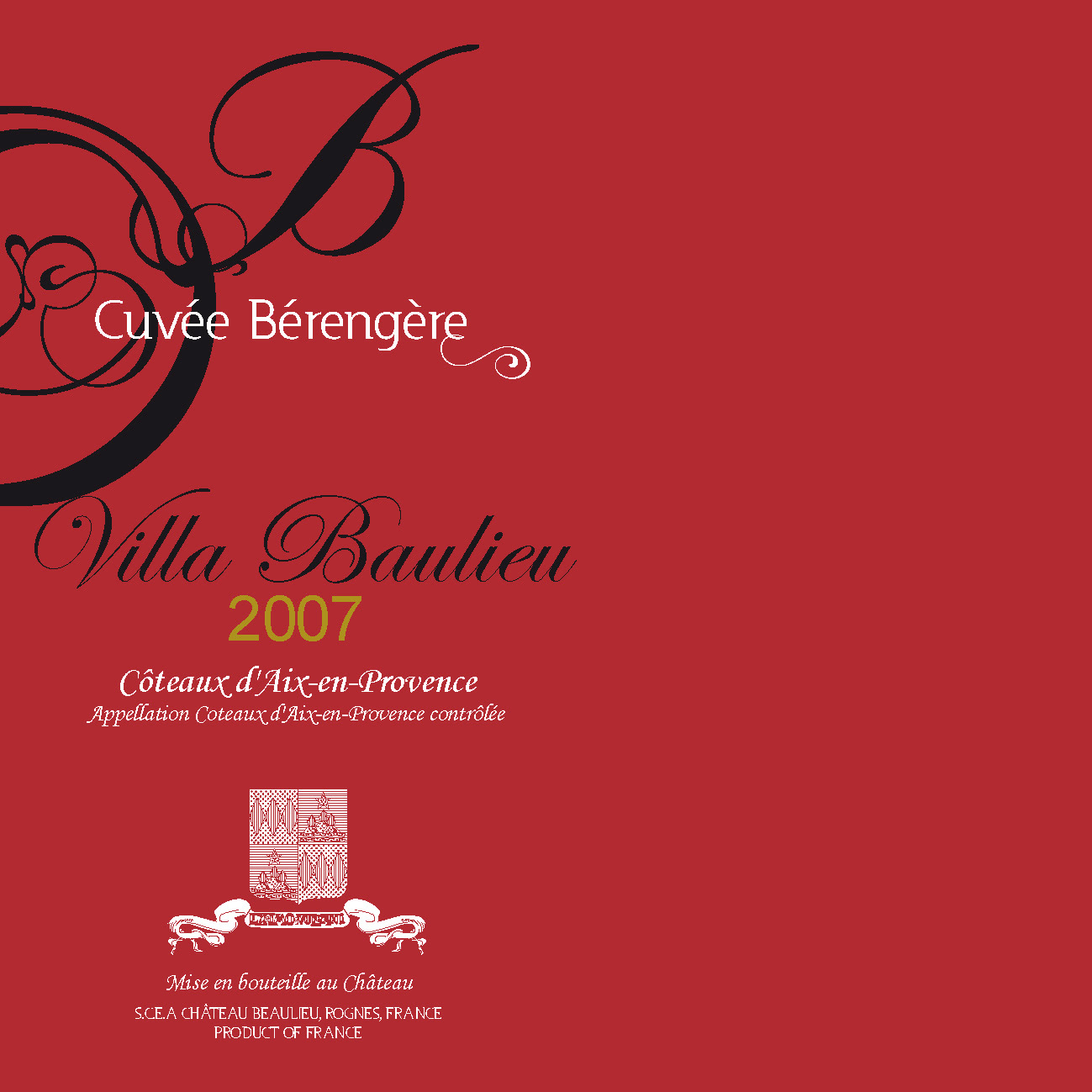
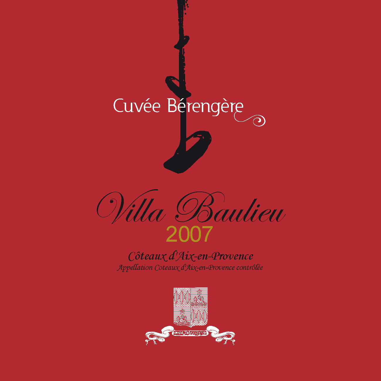
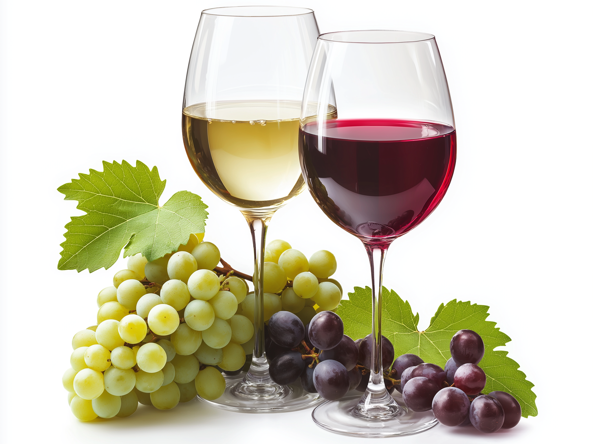
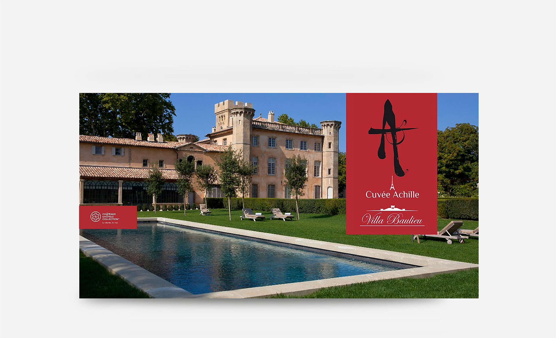
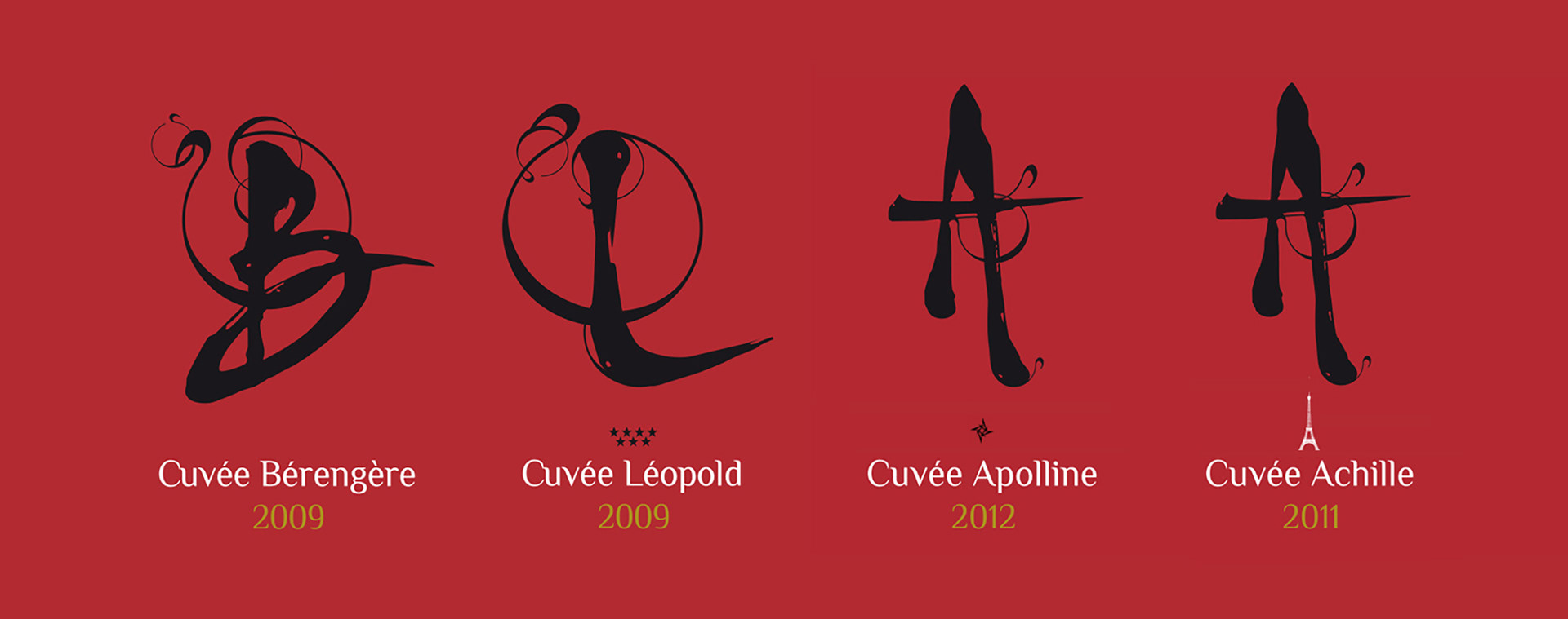
These Villa Baulieu wine labels blend tradition with artistic expression through bold calligraphy,
rich symbolism, and elegant typography:
rich symbolism, and elegant typography:
- Custom hand-drawn initials evoke craftsmanship with expressive strokes and ink splatters.
- Deep red background exudes luxury, while black, white, and gold text enhances contrast.
- Graphic details like the Eiffel Tower (Cuvée Achille) and a four-star rating (Cuvée Léopold)
add exclusivity.
add exclusivity.
- The design positions the wines as sophisticated, premium, and artistically avant-garde

Concept Breakdown 2: AI THAT THINKS WITH YOU Everyplace ANYTIME
This AI tool transforms abstract ideas into clear, visual learning.
It’s intuitive, adaptable, and designed to support—not replace—how students and teachers think. With a calm, thoughtful voice, it brings clarity to complexity and helps users navigate layered content through innovative, responsive design.
More than a tool, it’s a values-driven partner: free, ethical, and built for real people doing meaningful work. It encourages curiosity, invites collaboration, and empowers users to ask better questions—making education more accessible, thoughtful, and human.
This AI tool transforms abstract ideas into clear, visual learning.
It’s intuitive, adaptable, and designed to support—not replace—how students and teachers think. With a calm, thoughtful voice, it brings clarity to complexity and helps users navigate layered content through innovative, responsive design.
More than a tool, it’s a values-driven partner: free, ethical, and built for real people doing meaningful work. It encourages curiosity, invites collaboration, and empowers users to ask better questions—making education more accessible, thoughtful, and human.