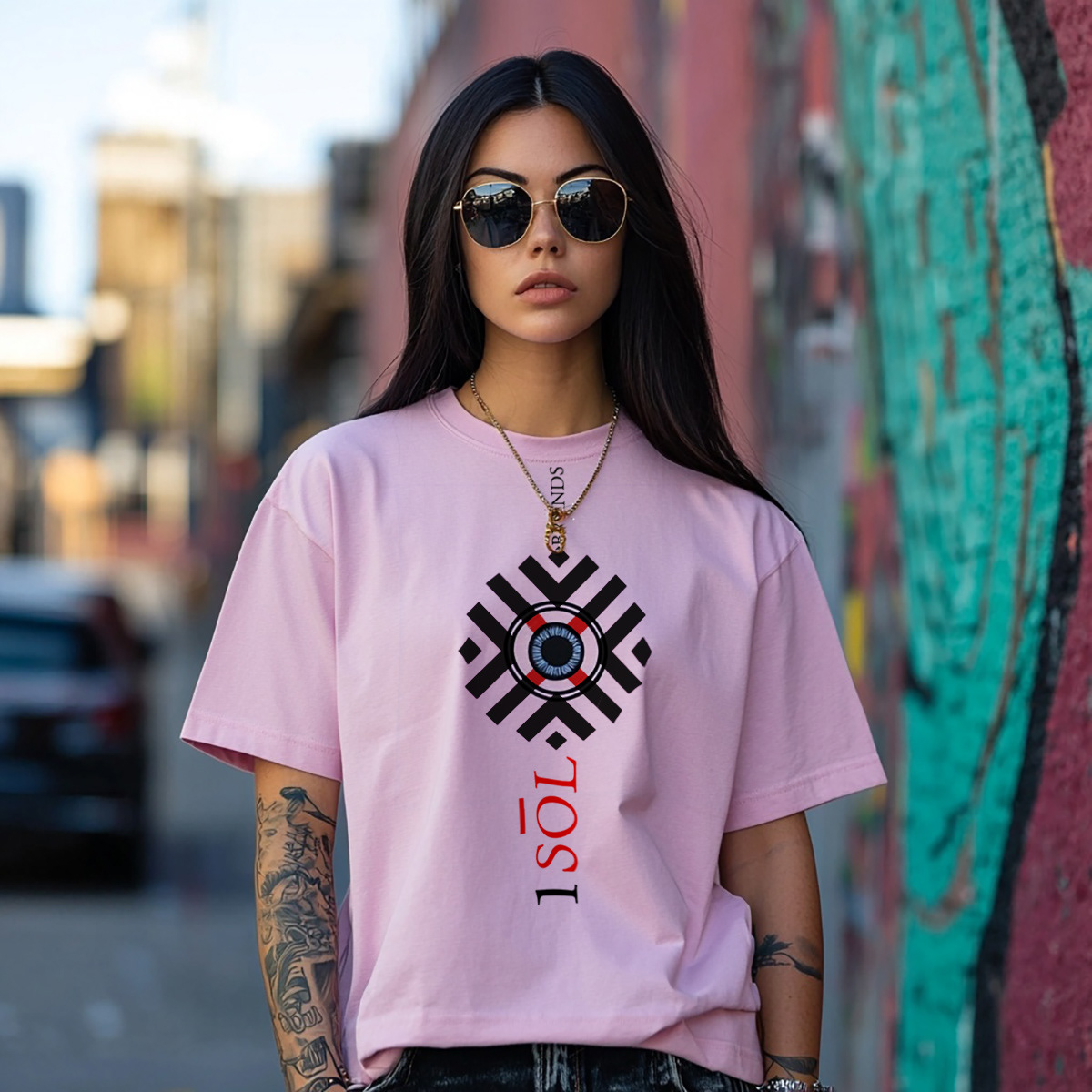
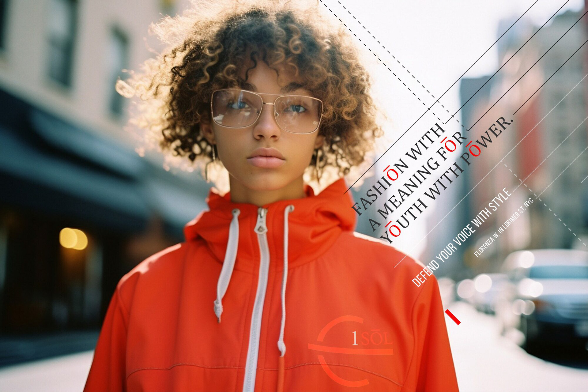
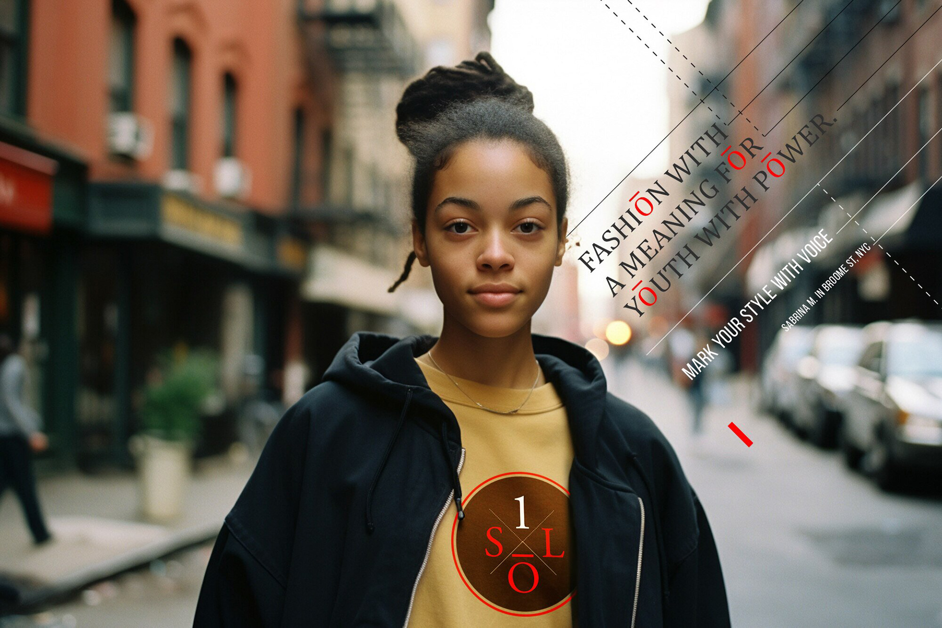
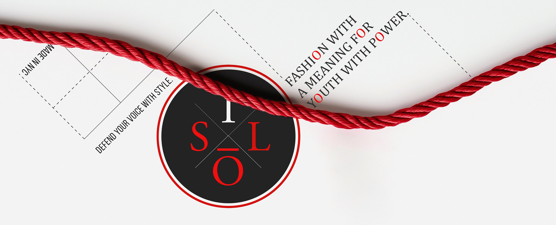
CLIENT / ISOL Brands, NYC
Project Overview
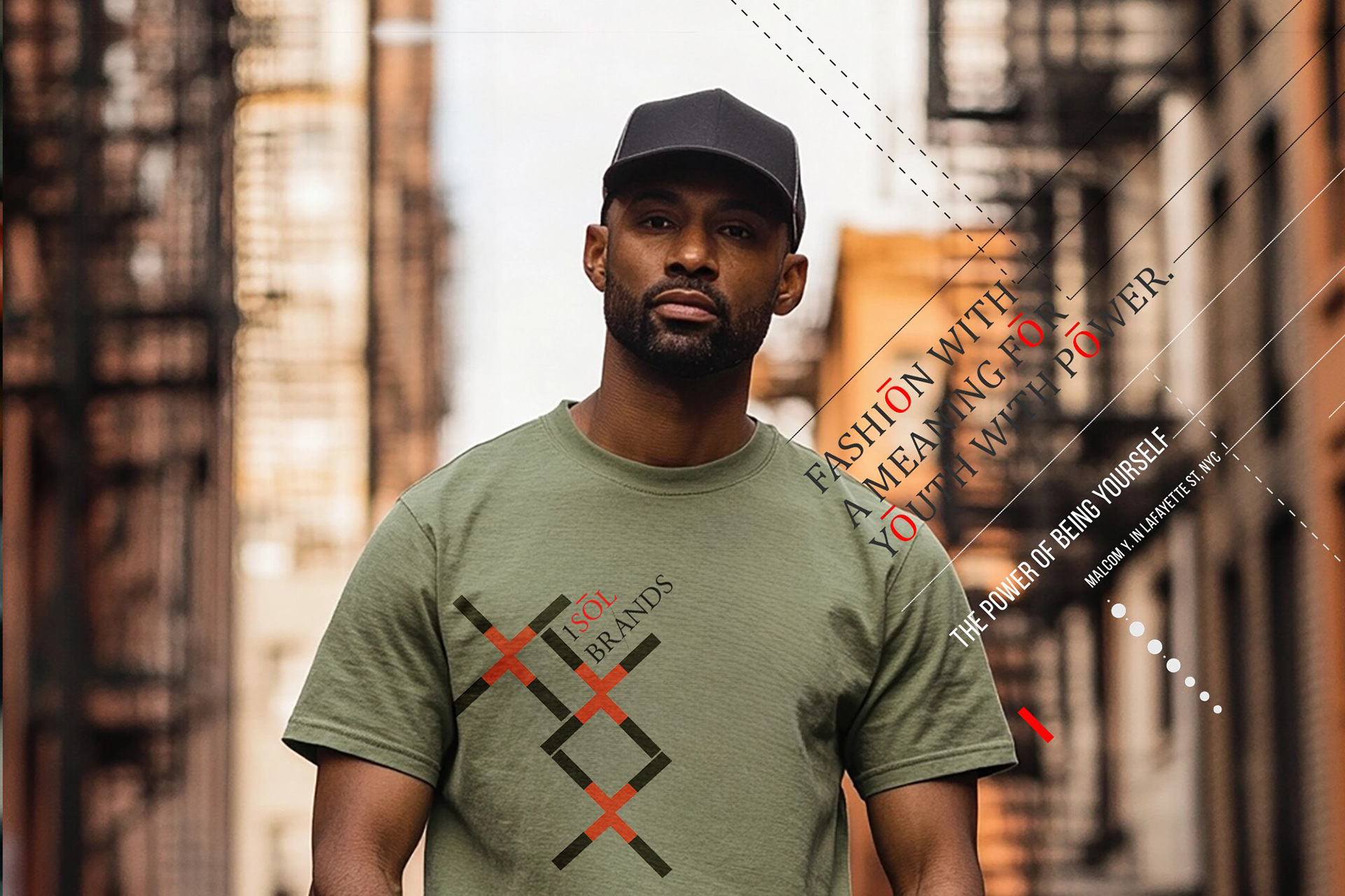
The client, ISOL Brands, a young New York-based company, wanted a visual identity that resonates with their youthful audience while reflecting their commitment to social rights:
- Their goal was to create a modern, bold, and dynamic brand image that appeals to young people
and aligns with their advocacy.
- They sought a design that conveys energy, inclusivity, and a sense of purpose.
- The challenge was to blend creativity with activism in a cohesive and impactful visual expression.
Approach & Solution
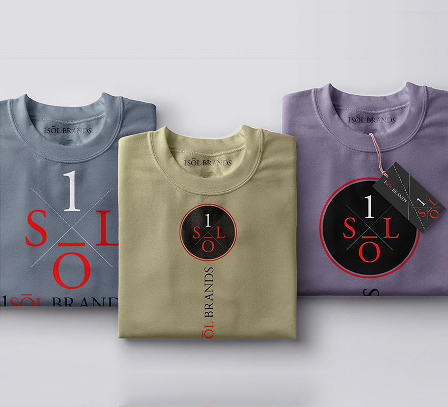
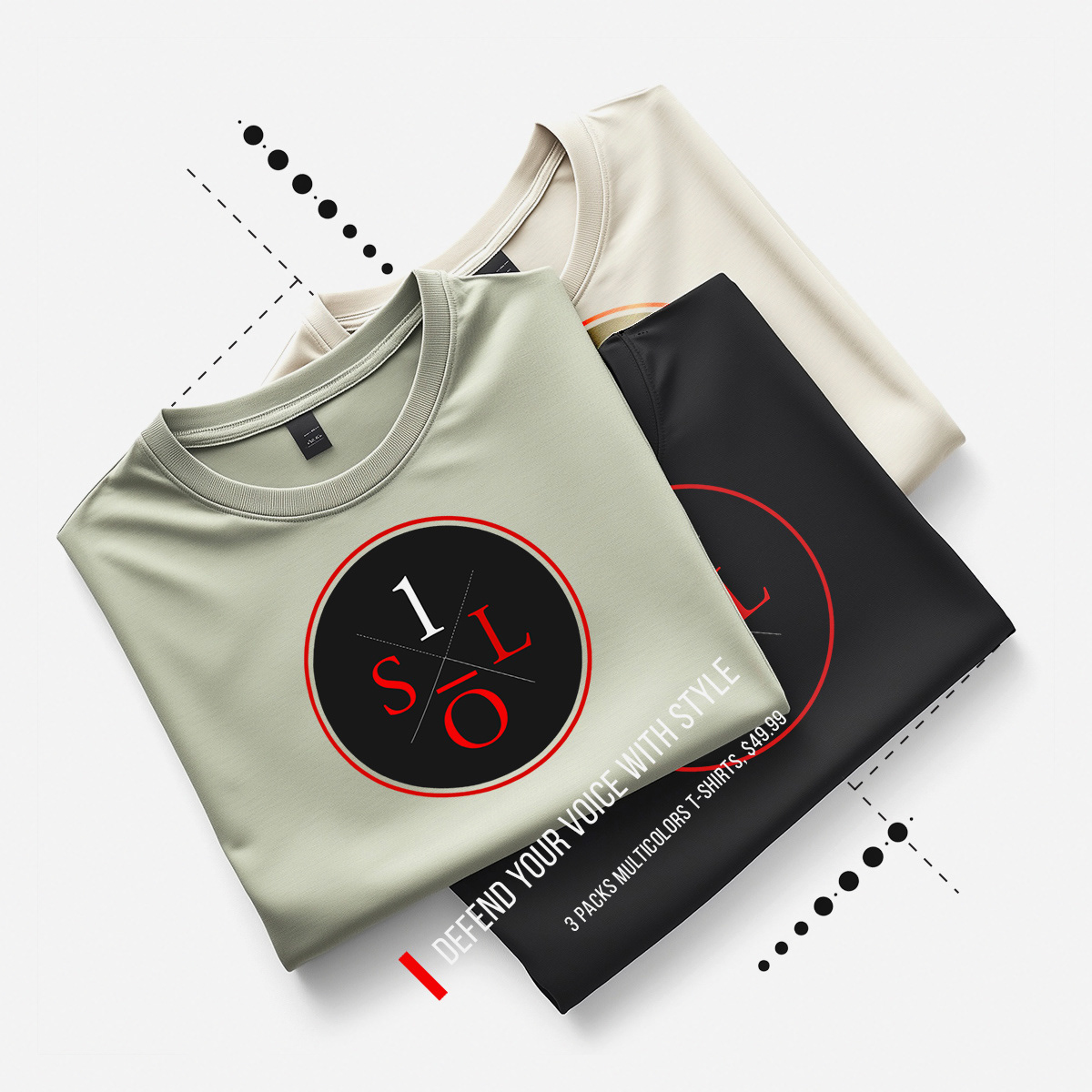
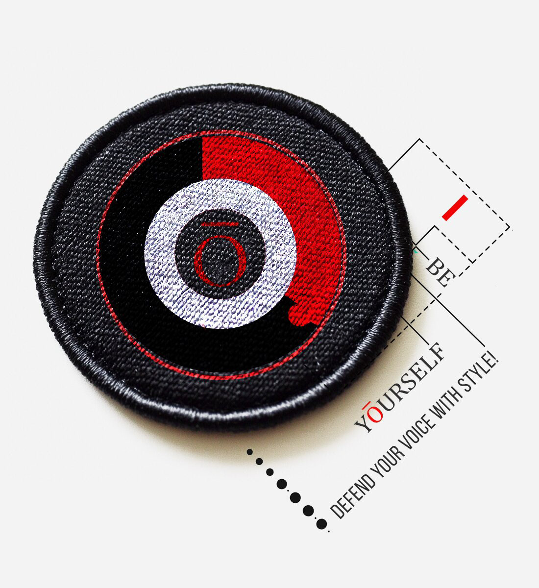
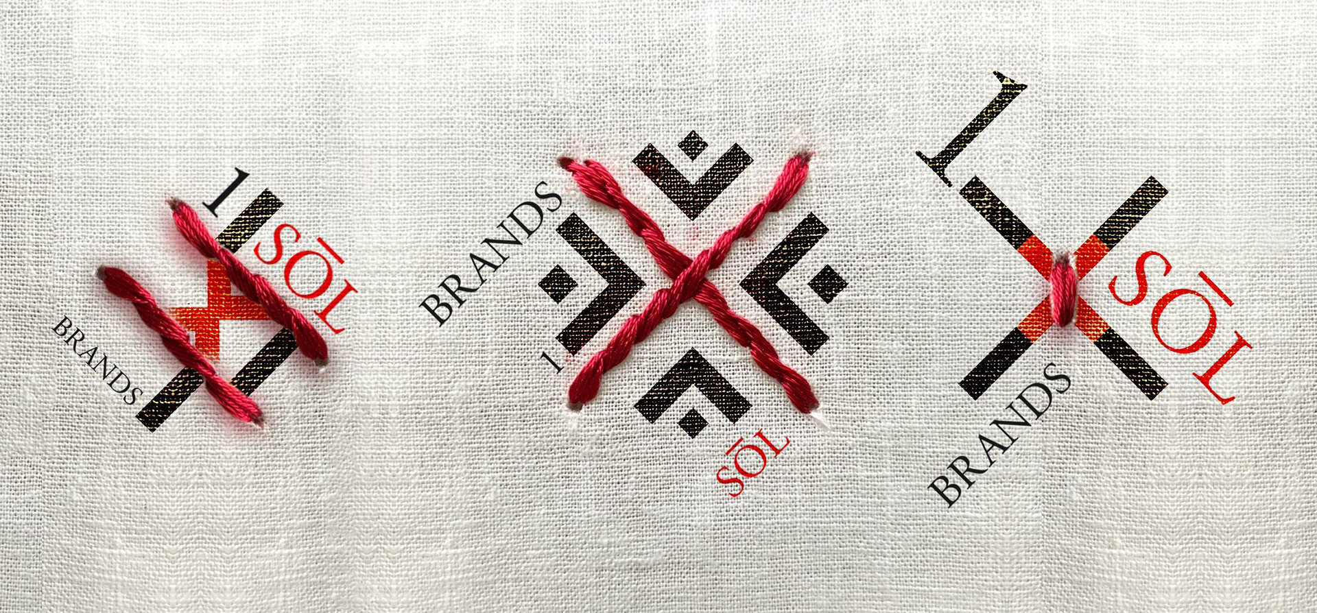
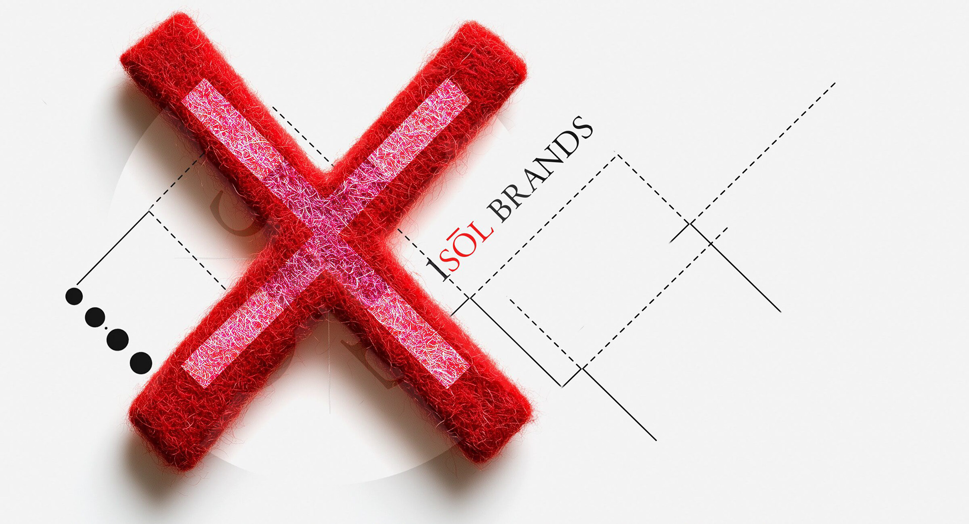
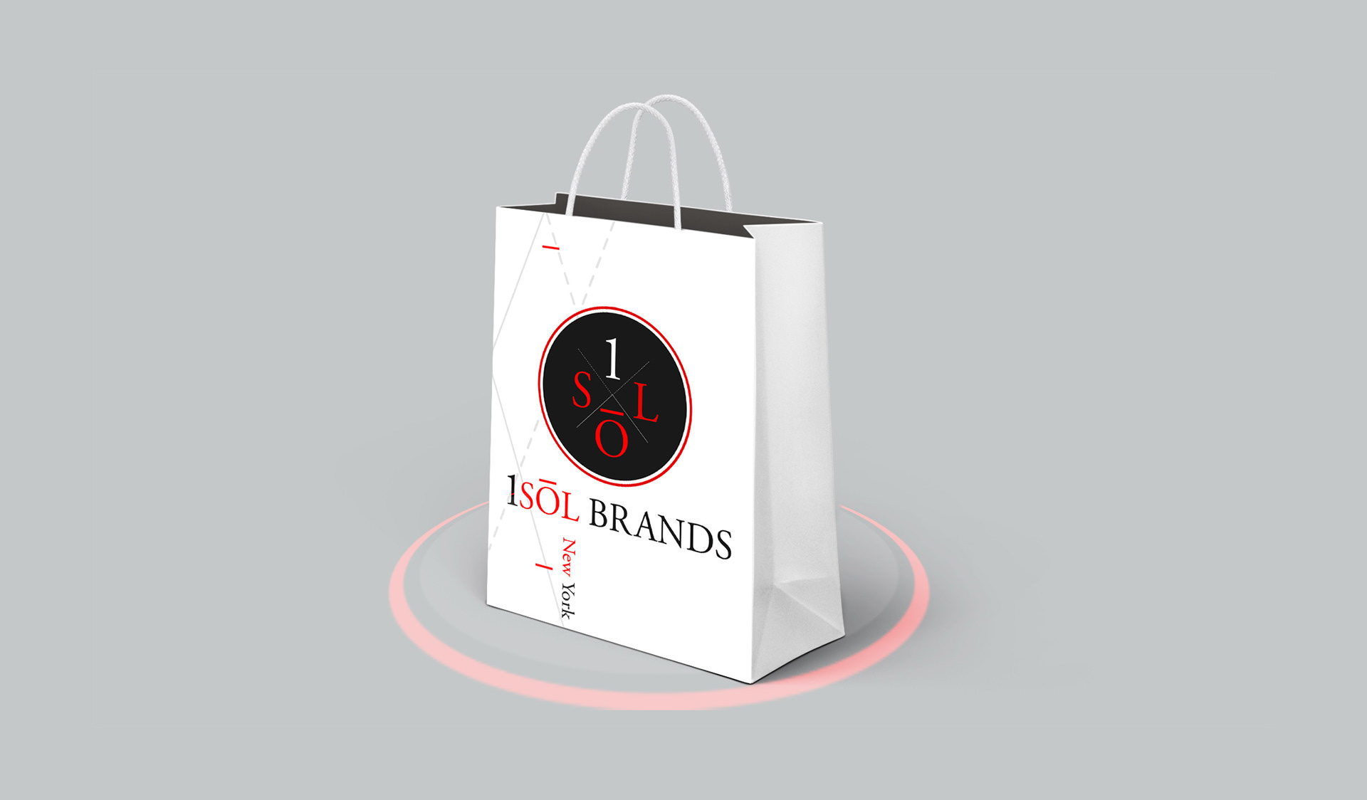
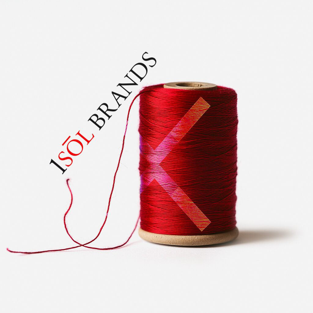
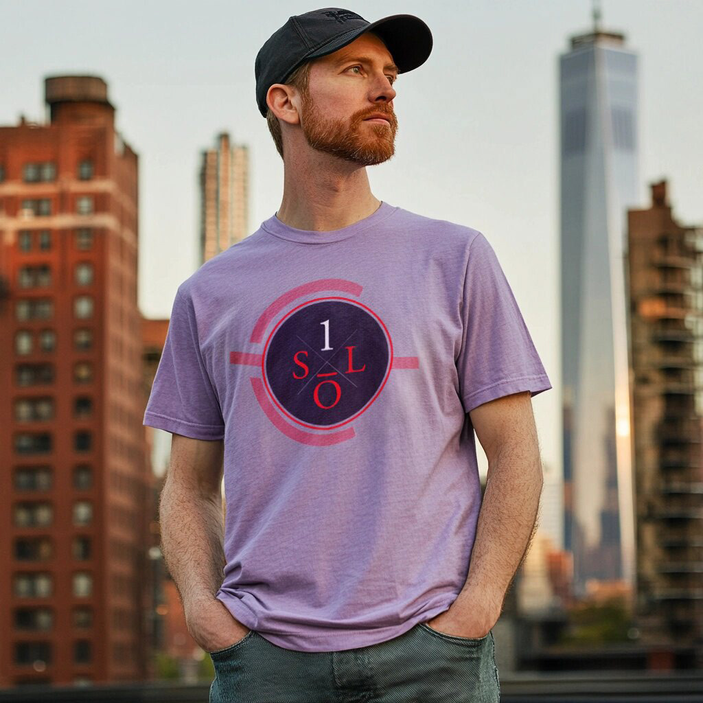
For their fashion identity, I centered the design around the image of a sewing button, symbolizing both the fashion industry and the interconnectedness of social advocacy:
- This element was stylized into a graphic target, representing precision, focus, and inclusivity.
- The design merges creativity with activism, creating a bold, memorable visual with layered meaning.
- The result captures the brand’s youthful energy while communicating its dedication to style
and social rights.


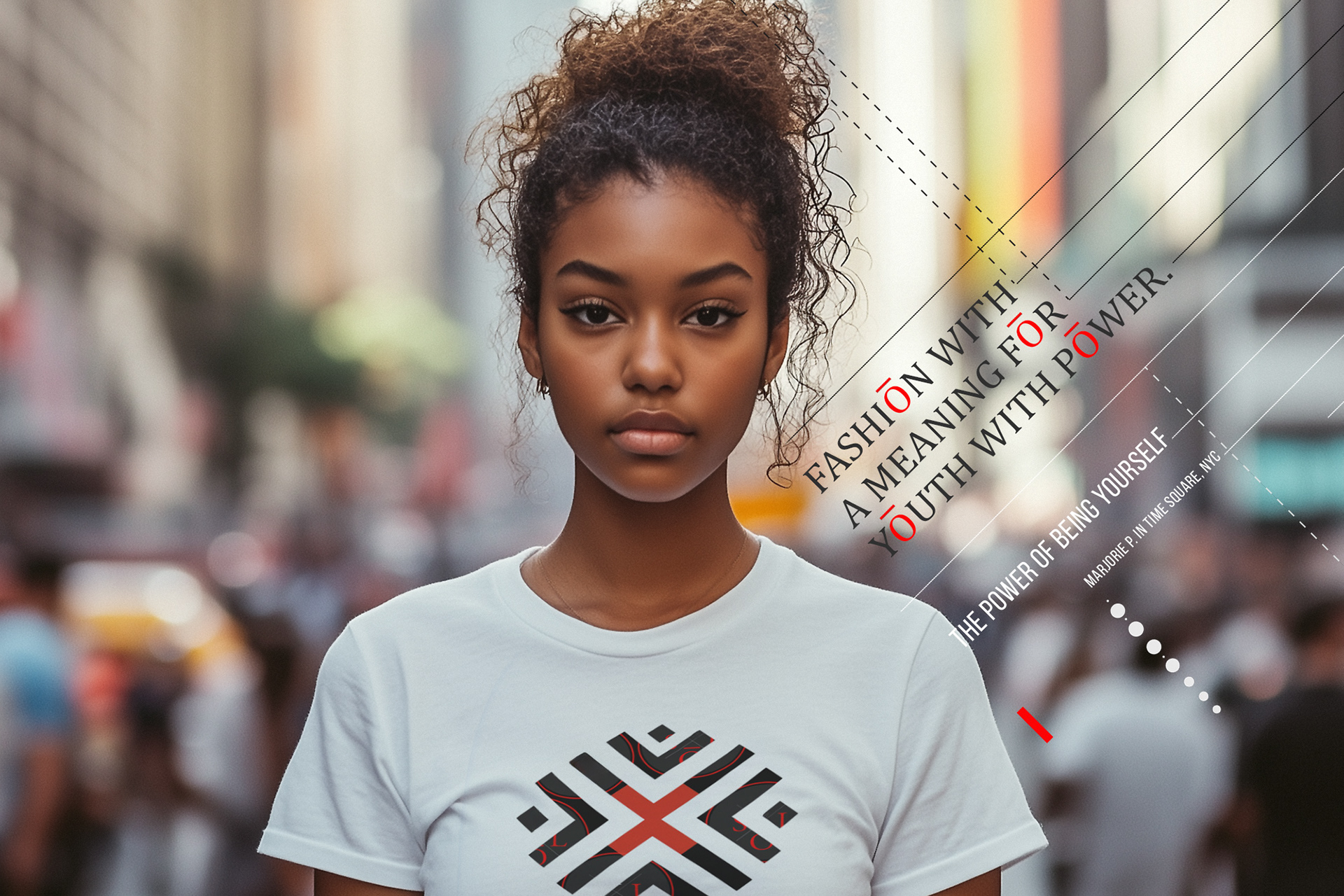
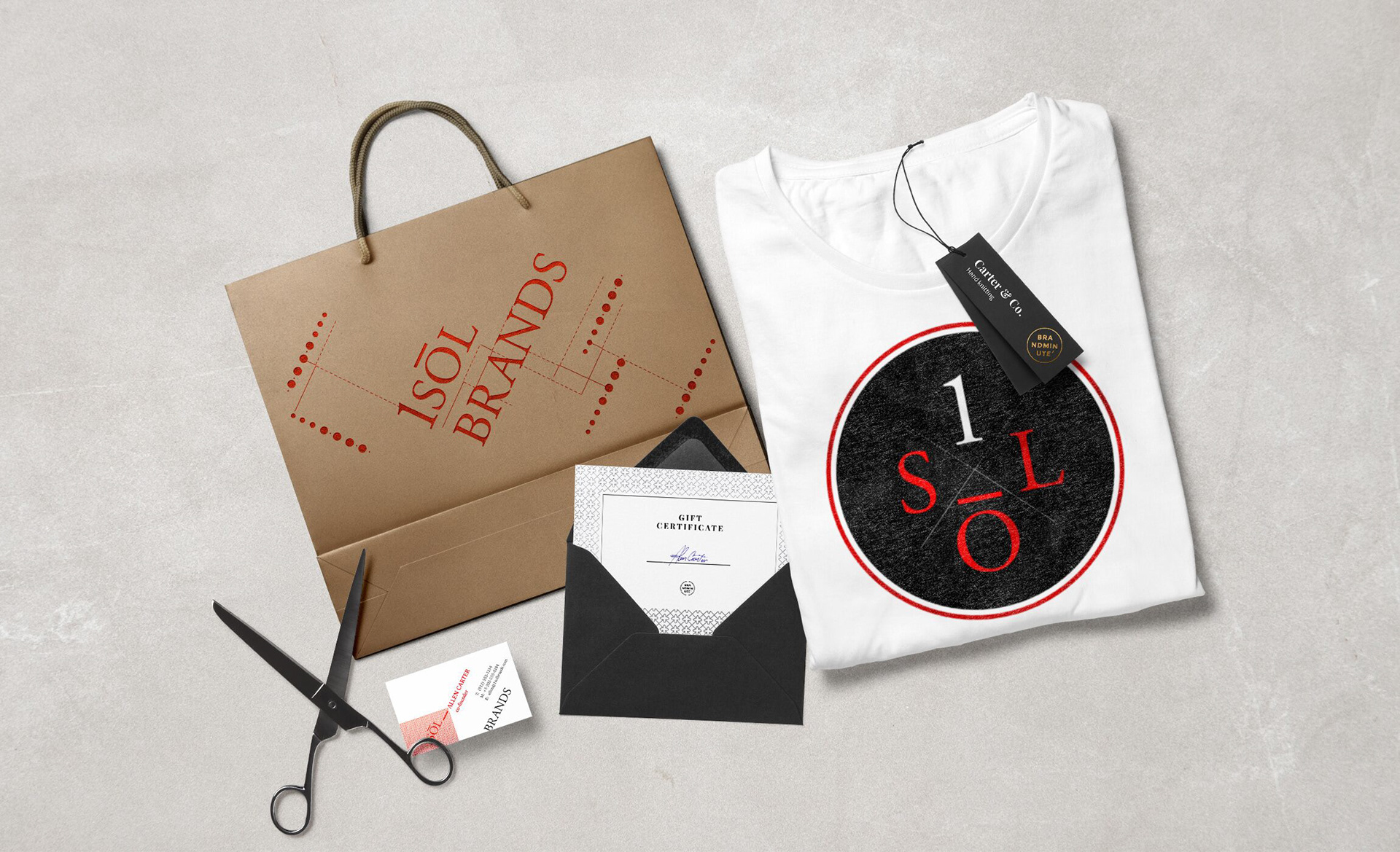
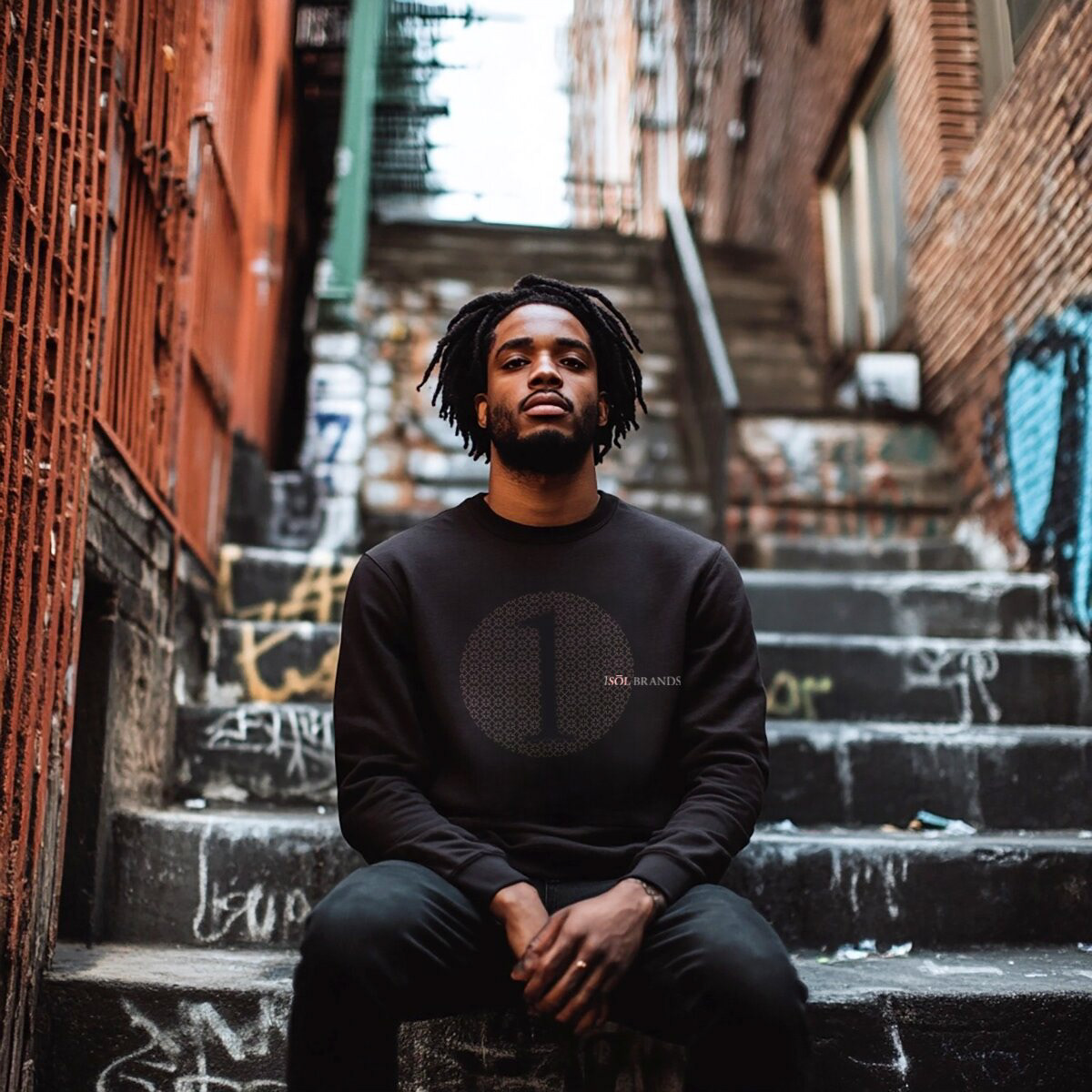
LOGO DESIGN: INSPIREED BY THE JAPANESE CULTURE
The Coming of Age logo draws inspiration from Japan's Seijin Shiki ceremony, symbolizing growth and new beginnings:
- It harmoniously blends modern minimalism with traditional Japanese aesthetics,
featuring subtle calligraphic elements.
- This design embodies maturity and personal evolution through clean typography
and thoughtful composition.
- It creates a timeless, sophisticated identity that resonates with the brand's transformation
and cultural appreciation ethos.