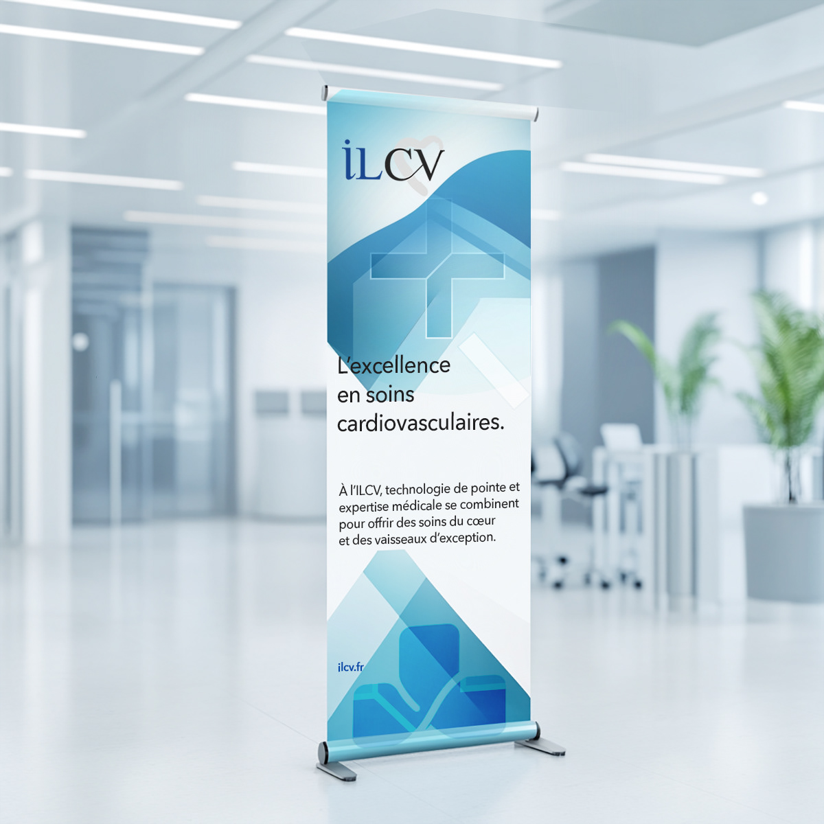
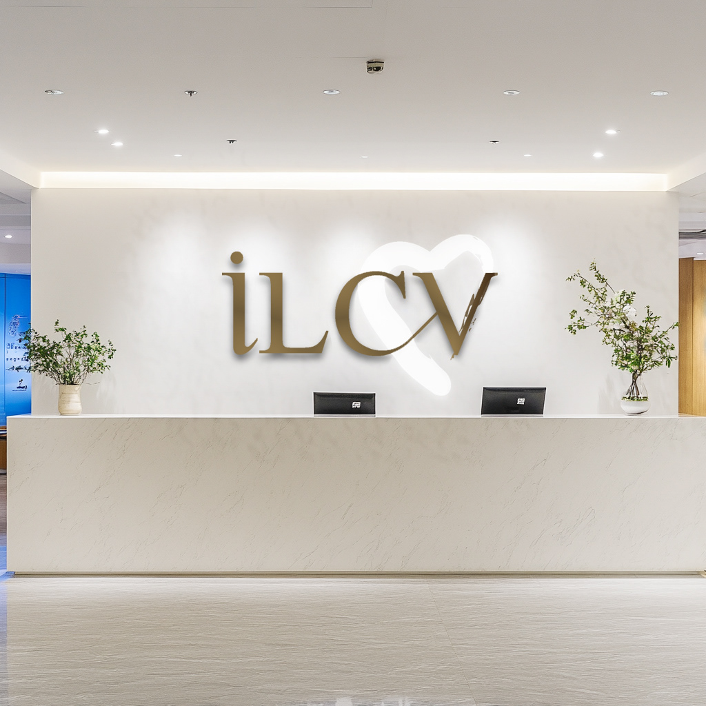
CLIENT / ILCV, Institut Lorrain du Coeur et des Vaisseaux, France

Project Overview
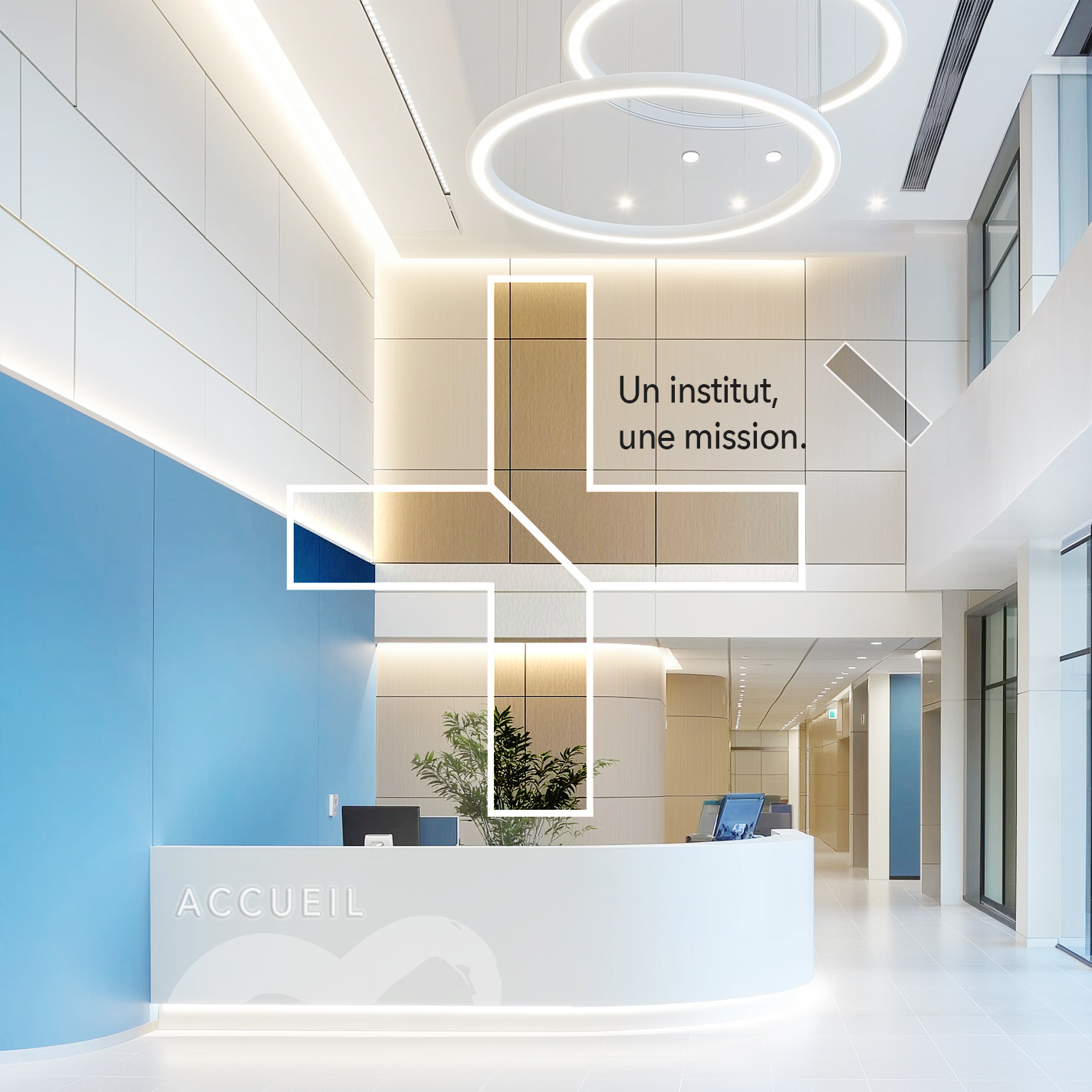
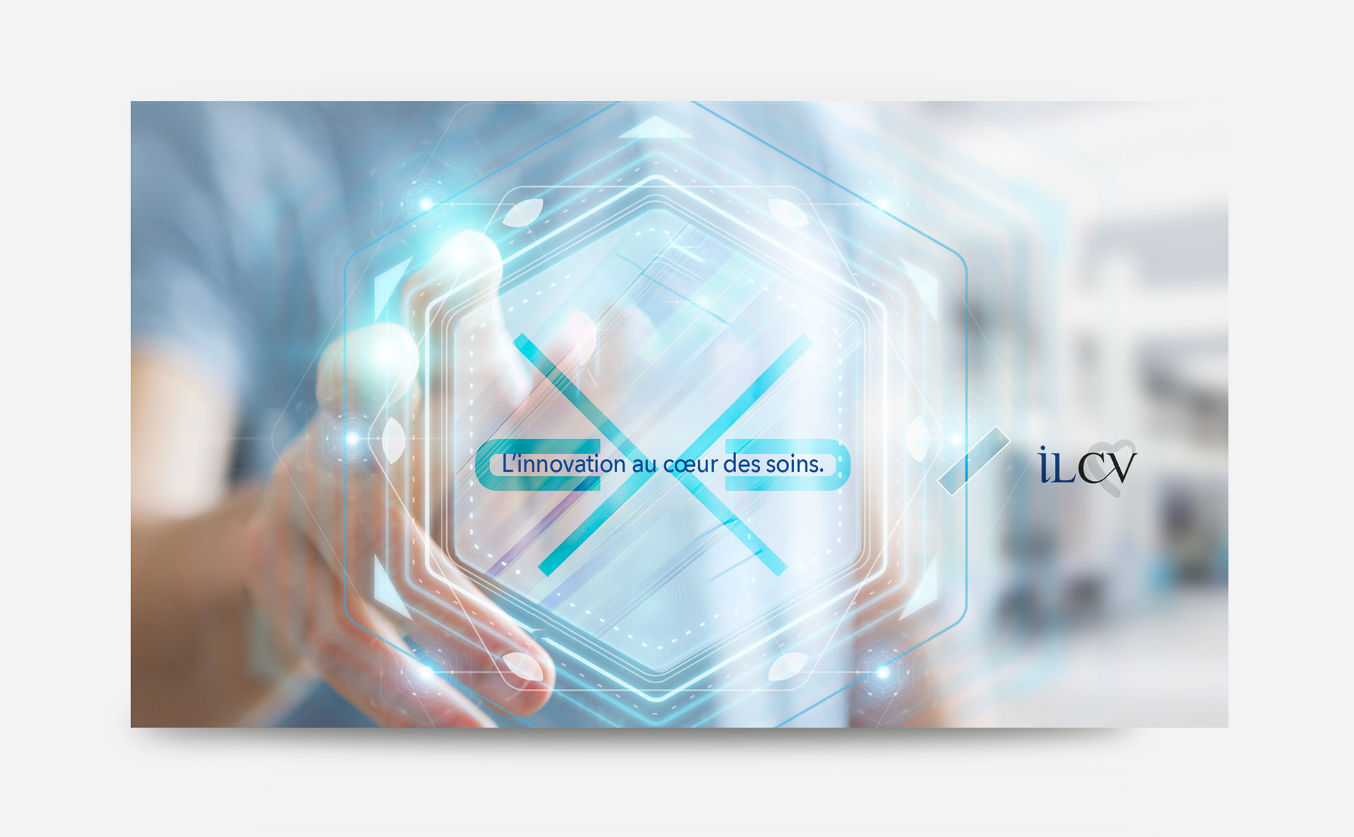
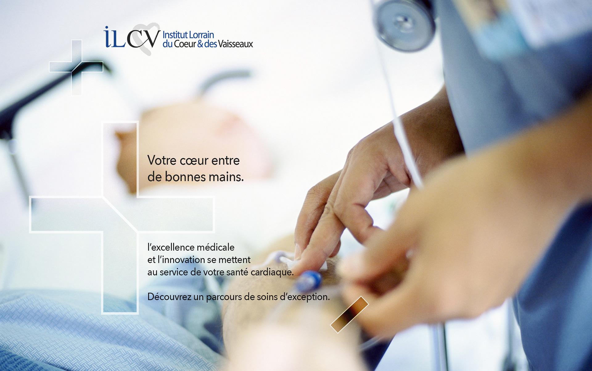
ILCV sought a strong, institutional visual identity reflecting its unique position in France as a modern hospital dedicated to cardiovascular care.
The goal was to convey the institute's innovation, medical excellence, and human-centered approach through a cohesive logo and brand guidelines.
The goal was to convey the institute's innovation, medical excellence, and human-centered approach through a cohesive logo and brand guidelines.

Approach & Solution
I designed ILCV’s brand identity to reflect its excellence in cardiovascular care through a modern, trustworthy, and adaptable visual system:
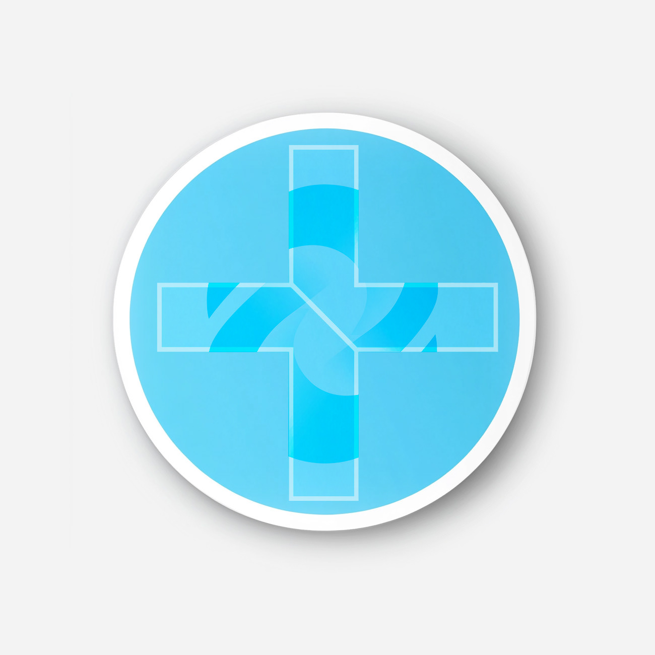
- The logo integrates symbolic elements of circulation and stability, using a clean aesthetic
and a medical-inspired color palette.
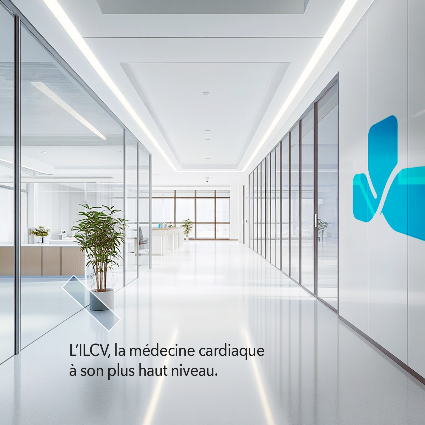
- A comprehensive brand guideline ensures consistency across all platforms,
reinforcing ILCV’s innovative and patient-focused approach.
- The result is a distinctive, strategic identity that enhances recognition and credibility.
- The logo integrates symbolic elements of circulation and stability, using a clean aesthetic
and a medical-inspired color palette.
- A comprehensive brand guideline ensures consistency across all platforms,
reinforcing ILCV’s innovative and patient-focused approach.
- The result is a distinctive, strategic identity that enhances recognition and credibility.
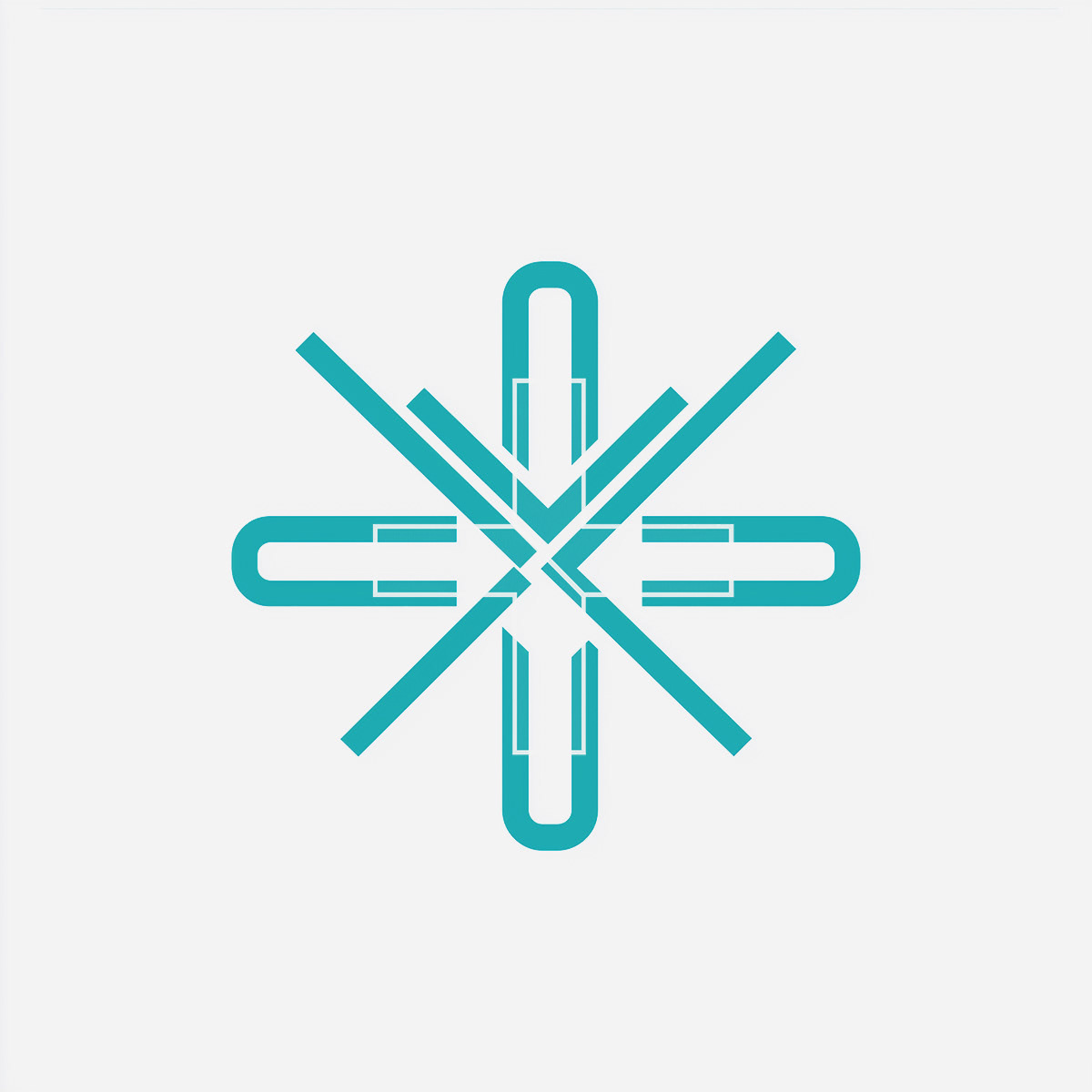

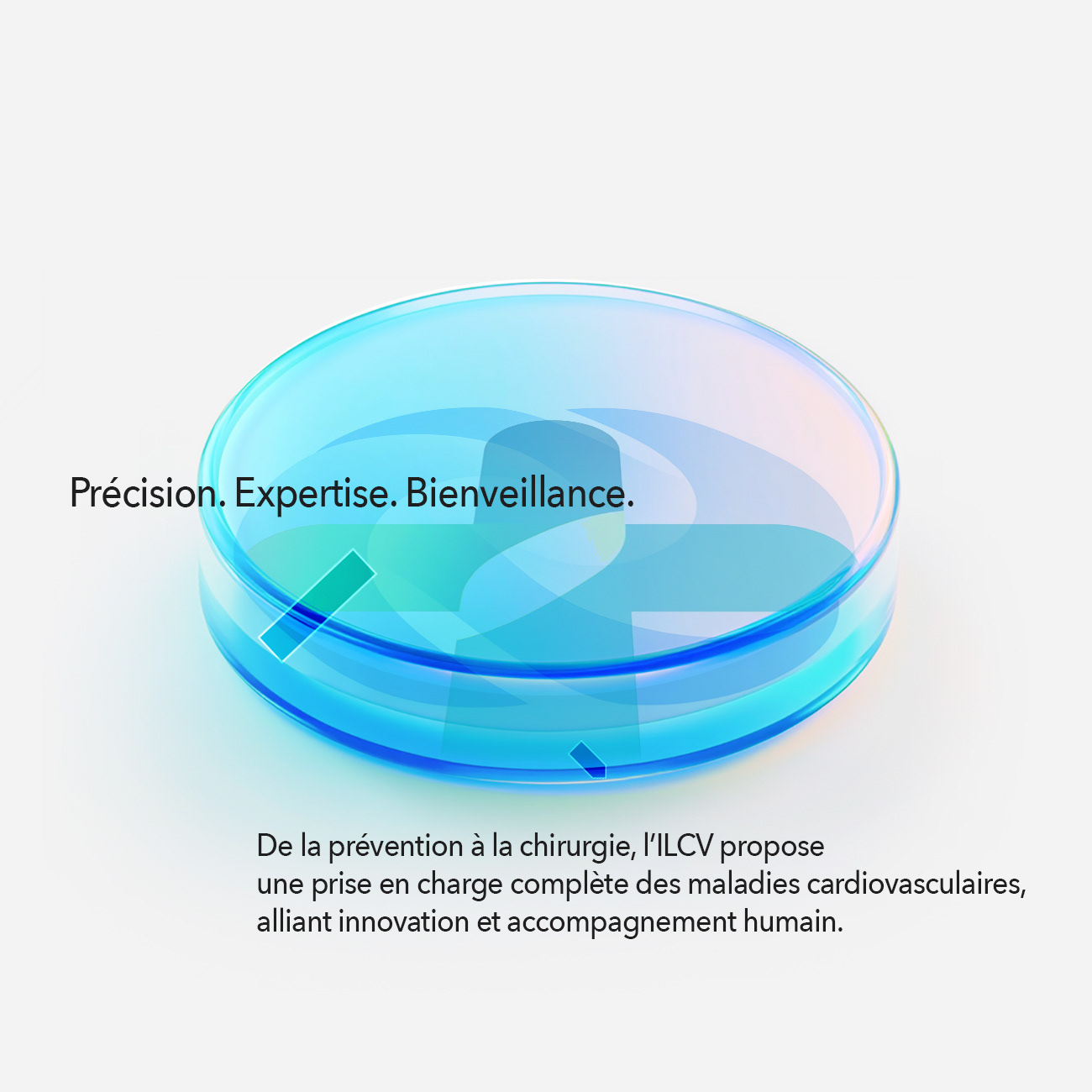
LOGO DESIGN: THE HEART OF VESSEL MARK
The logo was designed to express both medical precision and accessibility of care. It incorporates visual elements that symbolize:
- The cardiovascular system: Using fluid, dynamic shapes that evoke blood circulation.
- Modernity and expertise: A clean, contemporary typeface that conveys trust and professionalism.
- Institutional credibility: A deep blue color, representing serenity and rigor, paired with lighter tones
to reflect transparency and medical innovation.
- Modernity and expertise: A clean, contemporary typeface that conveys trust and professionalism.
- Institutional credibility: A deep blue color, representing serenity and rigor, paired with lighter tones
to reflect transparency and medical innovation.

Brand Guidelines
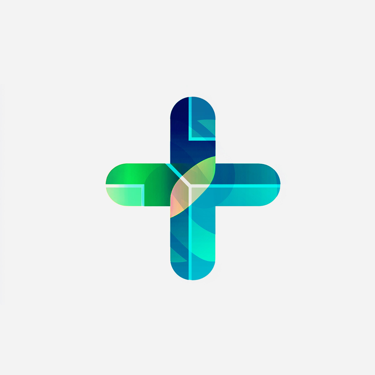
To maintain consistency and clarity in all communications, I developed a comprehensive brand guideline that includes:
- Color strategy to ensure a professional and welcoming feel.
- Typography selection for readability and modern appeal.
- Graphic elements and iconography inspired by medical imagery to create a cohesive visual system.
- Color strategy to ensure a professional and welcoming feel.
- Typography selection for readability and modern appeal.
- Graphic elements and iconography inspired by medical imagery to create a cohesive visual system.


Concept Breakdown 1: AI THAT THINKS WITH YOU Everyplace ANYTIME
This AI tool transforms abstract ideas into clear, visual learning.
It’s intuitive, adaptable, and designed to support—not replace—how students and teachers think. With a calm, thoughtful voice, it brings clarity to complexity and helps users navigate layered content through innovative, responsive design.
More than a tool, it’s a values-driven partner: free, ethical, and built for real people doing meaningful work. It encourages curiosity, invites collaboration, and empowers users to ask better questions—making education more accessible, thoughtful, and human.


Concept Breakdown 2: AI THAT THINKS WITH YOU Everyplace ANYTIME
This AI tool transforms abstract ideas into clear, visual learning.
It’s intuitive, adaptable, and designed to support—not replace—how students and teachers think. With a calm, thoughtful voice, it brings clarity to complexity and helps users navigate layered content through innovative, responsive design.
More than a tool, it’s a values-driven partner: free, ethical, and built for real people doing meaningful work. It encourages curiosity, invites collaboration, and empowers users to ask better questions—making education more accessible, thoughtful, and human.

BRAND IDENTITY
Compass Motif: Represents guidance, exploration, and inspiration
for artists and creators.
for artists and creators.
Circular Elements: Symbolize connectivity and interdisciplinary collaboration.
Photography & Illustrations: A mix of maritime imagery and
artistic visuals to reflect Artimed’s dynamic ecosystem.
artistic visuals to reflect Artimed’s dynamic ecosystem.
Print Collateral: Invitations, event posters, and brochures designed
to establish a cohesive presence.
to establish a cohesive presence.


Concept Breakdown 3: AI THAT THINKS WITH YOU Everyplace ANYTIME
This AI tool transforms abstract ideas into clear, visual learning.
It’s intuitive, adaptable, and designed to support—not replace—how students and teachers think. With a calm, thoughtful voice, it brings clarity to complexity and helps users navigate layered content through innovative, responsive design.
More than a tool, it’s a values-driven partner: free, ethical, and built for real people doing meaningful work. It encourages curiosity, invites collaboration, and empowers users to ask better questions—making education more accessible, thoughtful, and human.