CLIENT / Acutis Biosciences, NJ, USA
Project Overview
Acutis sought to establish Acutis Biosciences as a new entity in the biopharma market to leverage its expertise in biomarker research and development.
The decision stemmed from a desire to expand beyond their existing diagnostics focus and address the growing demand for advanced biopharma solutions.
The decision stemmed from a desire to expand beyond their existing diagnostics focus and address the growing demand for advanced biopharma solutions.
Approach & Solution
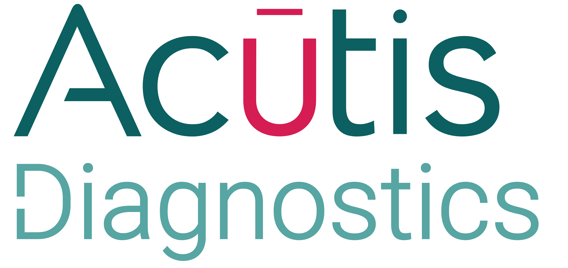
I developed a logotype and brand identity embodying Acutis Biosciences' biomarker
services expertise:
- The design emphasizes precision and innovation, key attributes in the biopharma sector.
- The logotype reflected the company’s cutting-edge research while maintaining
a professional and authoritative presence.
- By integrating sleek typography and subtle scientific elements, the identity reinforces
Acutis Biosciences’ role as a trusted leader in advanced diagnostics and biopharma solutions.


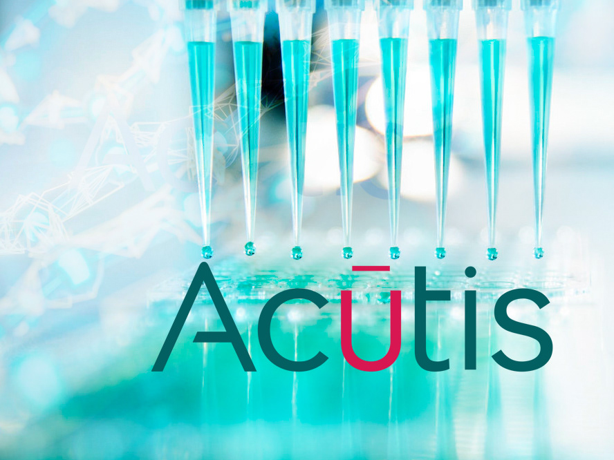
LOGO DESIGN: CRAFTING A DISTINCT IDENTITY FOR ACUTIS BIOSCIENCES
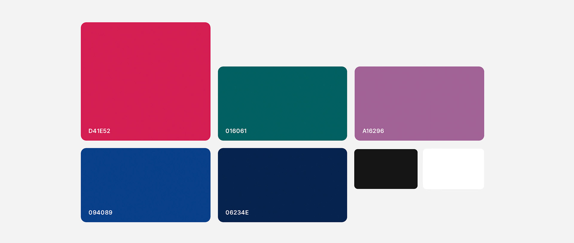
- Color Palette: Deep teal symbolizes trust and expertise, while vibrant magenta conveys innovation and cutting-edge science.
- Typography: Modern and precise, reflecting scientific rigor and technological advancement.
- Graphic Elements: The abstract central form suggests molecular structures and data-driven insights,
reinforcing Acutis Biosciences’ role in pioneering biomarker solutions.
Visual Identity Kit: Colors & Typography


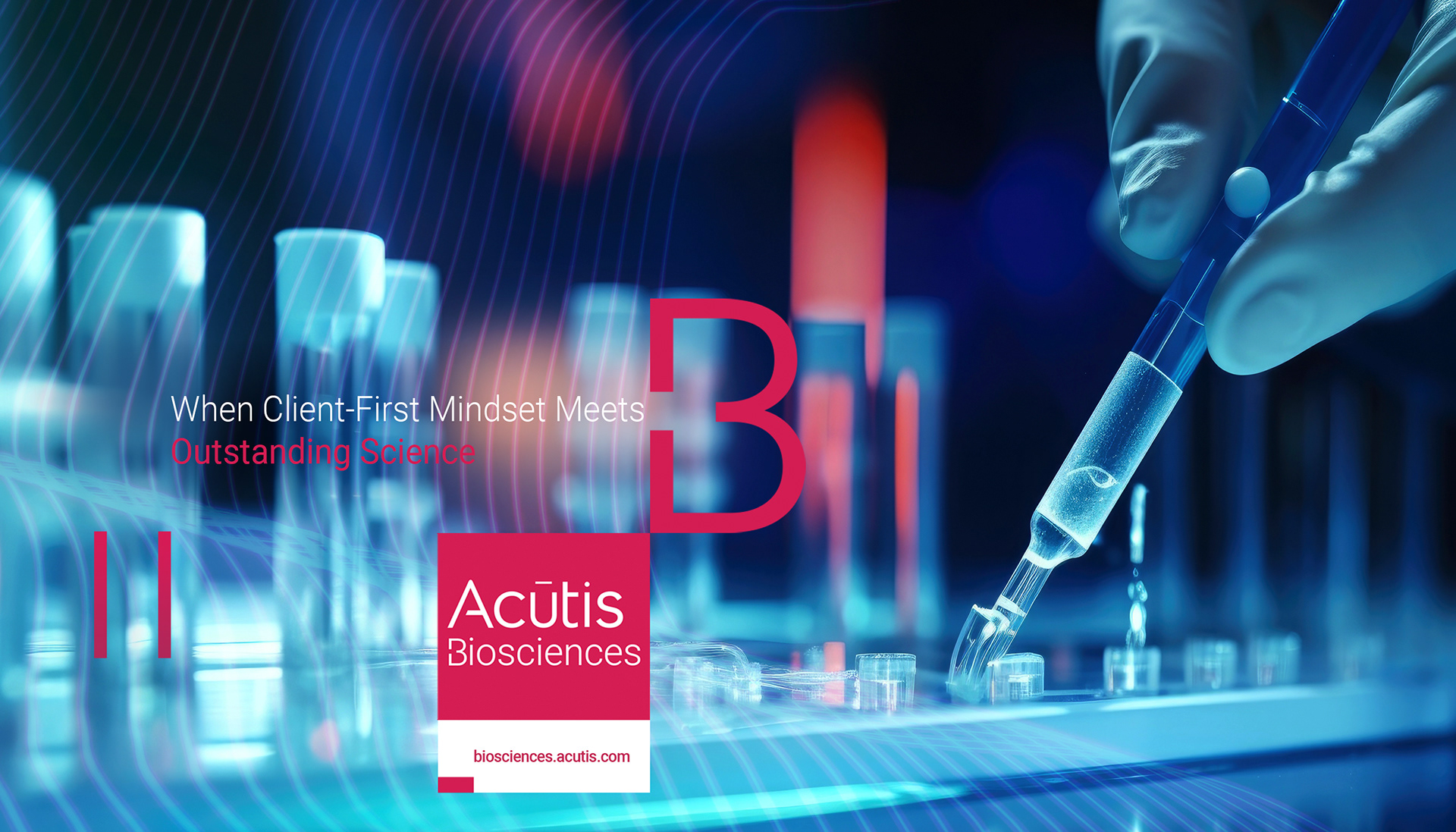
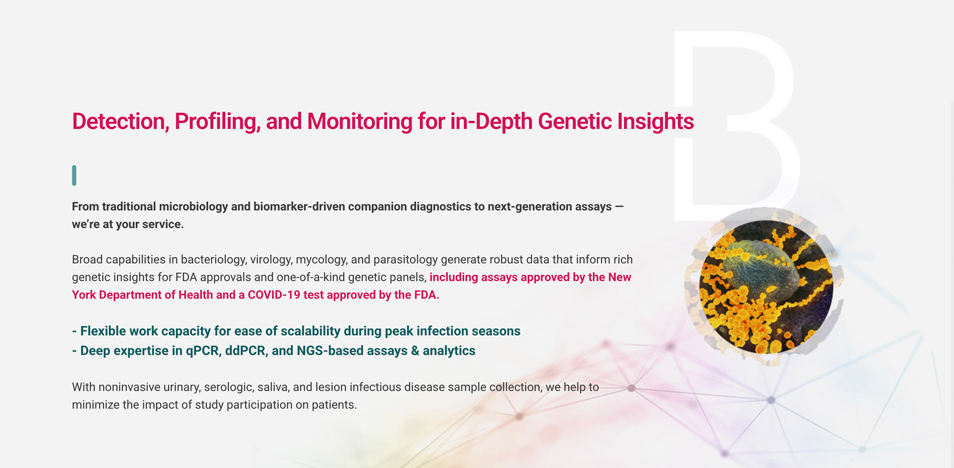
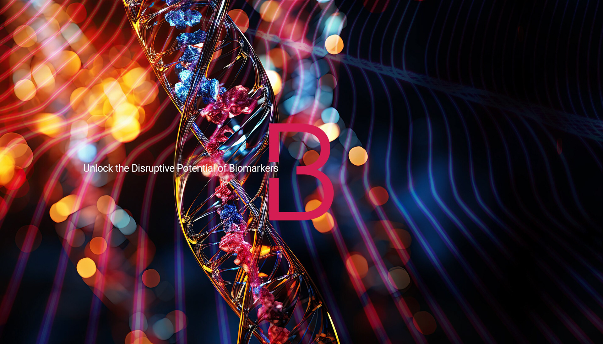
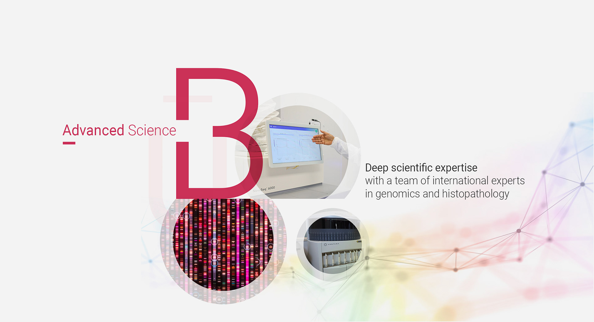
GraPHIC IDENTITY: DYNAMIC BRAND SYSTEM FOR NEXT-GEN SCIENCE
I developed a bold, modern graphic identity for Acutis Biosciences that visually expresses their advanced position in genomics and precision medicine:
- By combining luminous color gradients with network mesh effects and scientific imagery, I wanted to create
a sense of movement and energy that reflects Acutis’s cutting-edge research.
- The large “B” motif acts as a memorable anchor throughout the brand, reinforcing the Acutis Biosciences name
and ensuring instant recognition.
- Overall, this visual system positions Acutis as a forward-thinking leader—making the science both engaging
and approachable for clients, partners, and investors.

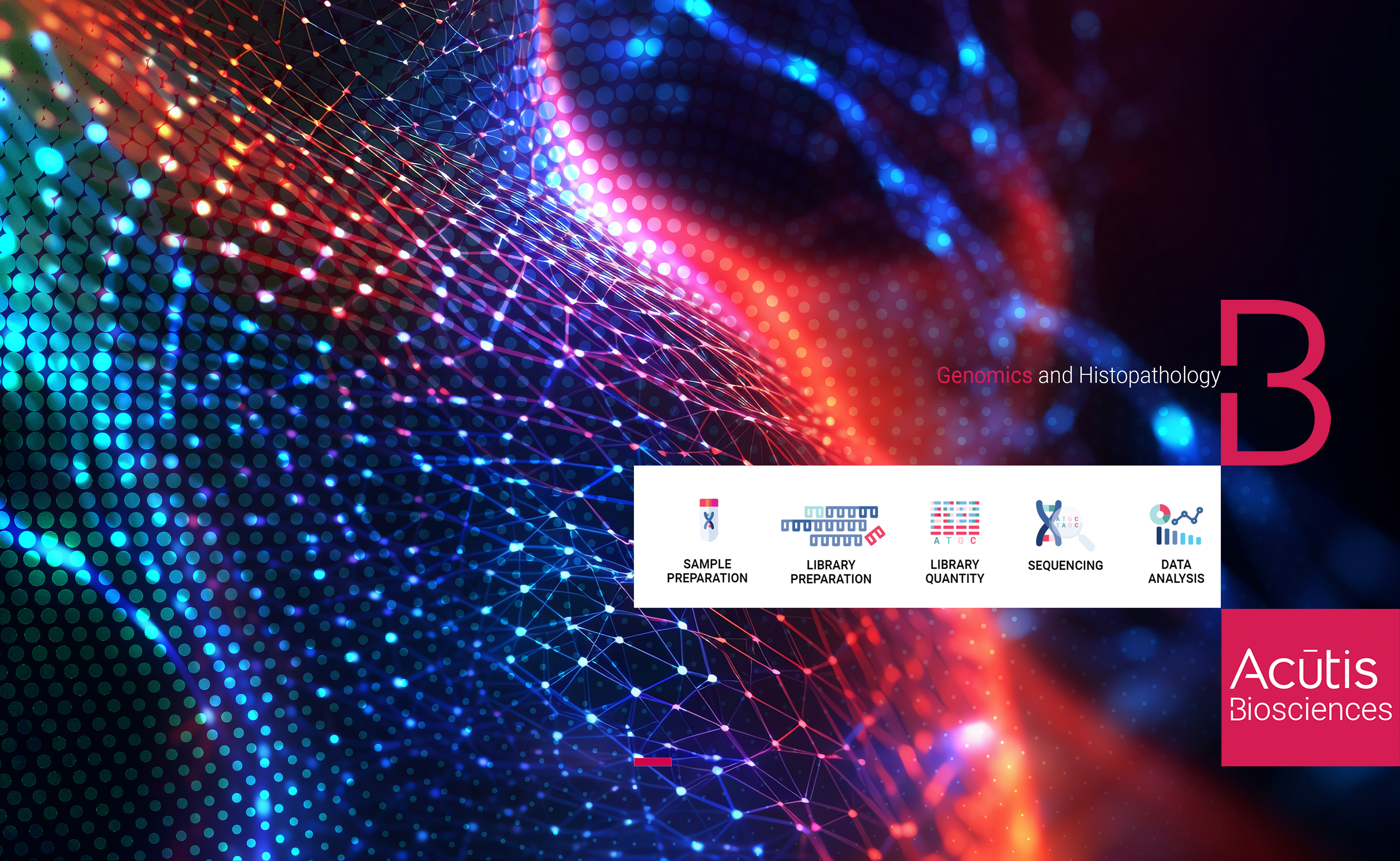

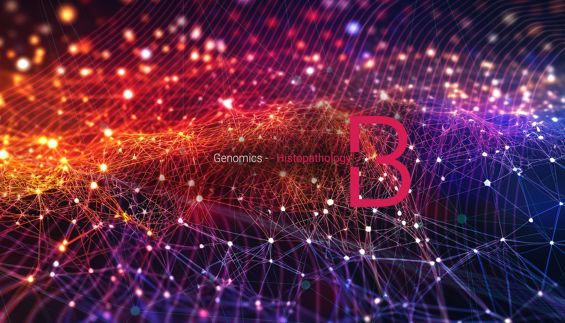
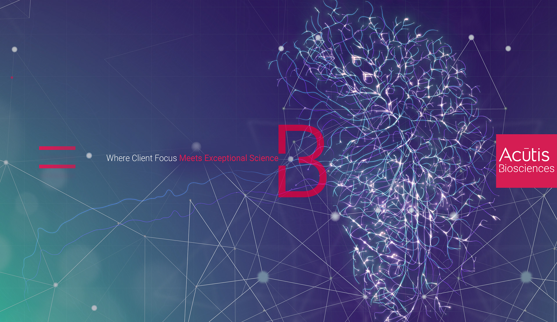
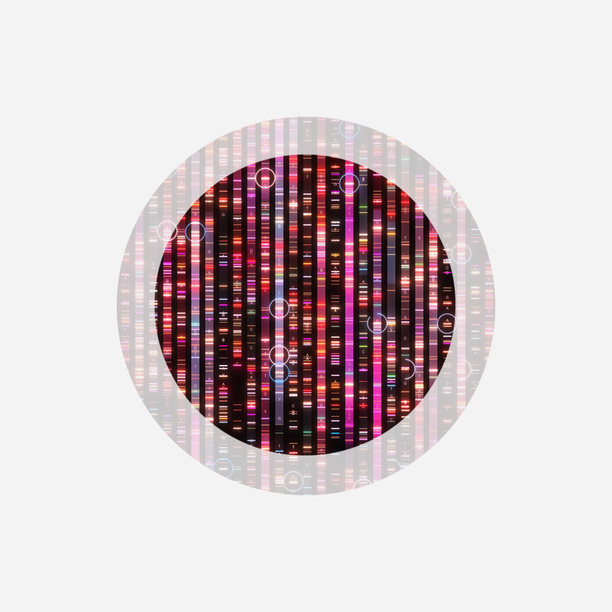
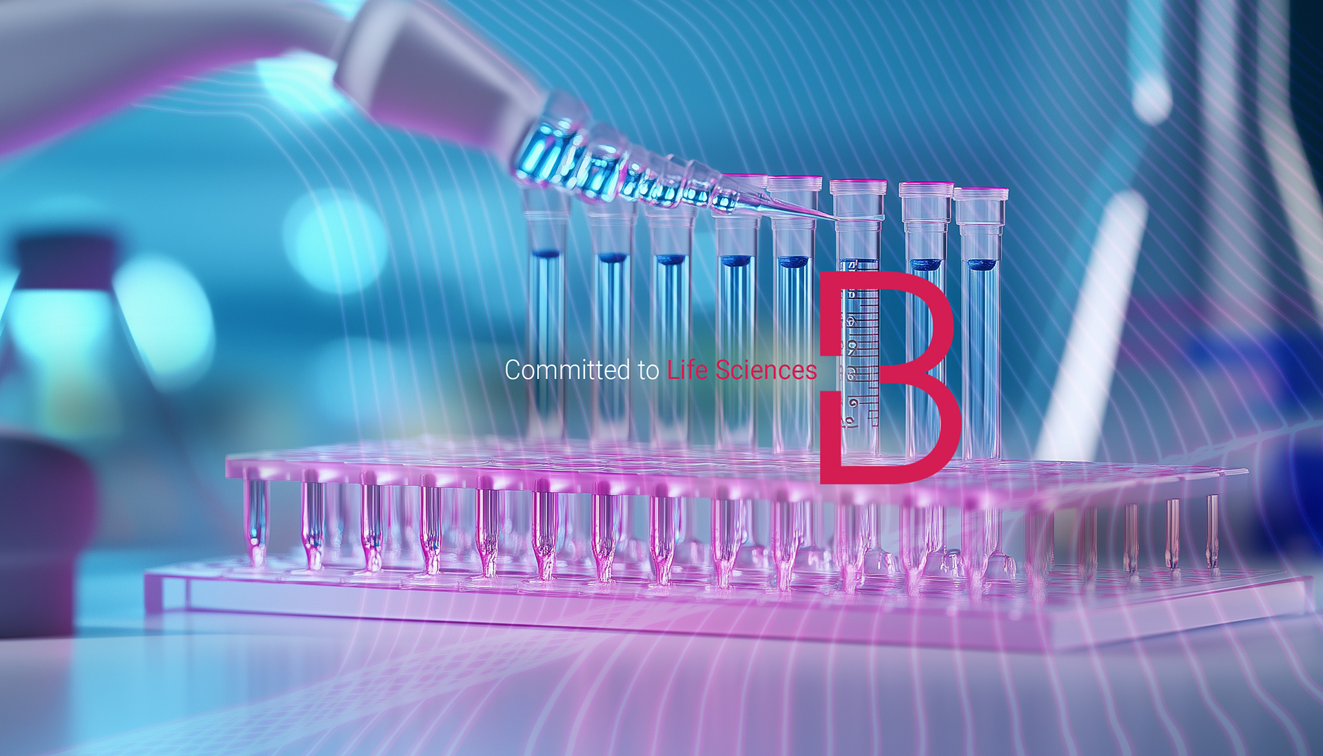
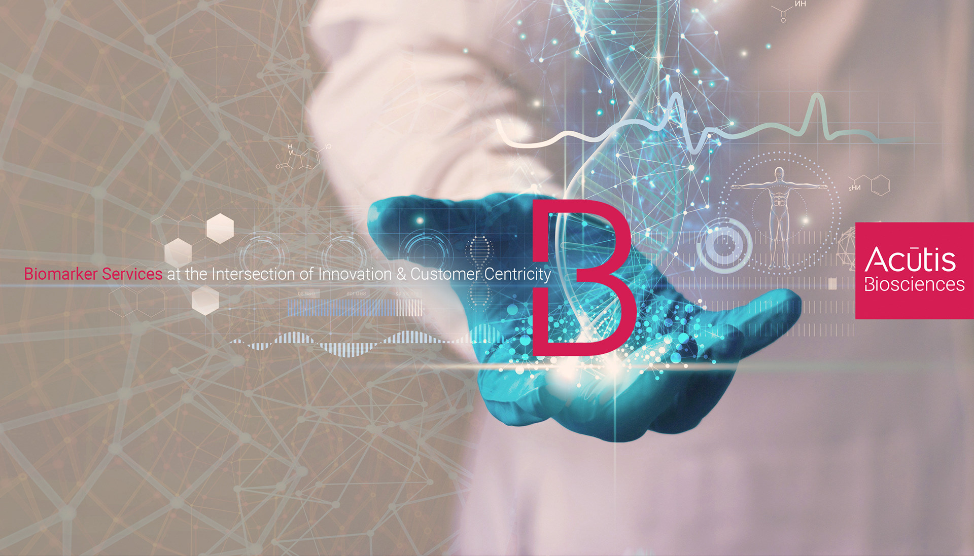
Concept Breakdown 1: A BOLD LANGUAGE FOR SCIENCE
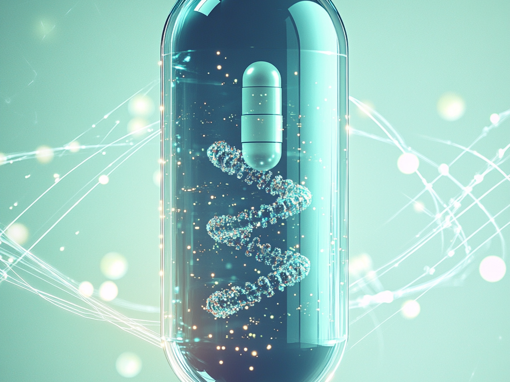
I developed a brand identity for Acutis Biosciences that transforms advanced scientific research into striking, modern visuals.
The glowing DNA strands, vibrant gradients, and network patterns convey innovation and precision, while the prominent “B” monogram provides a memorable anchor across all materials.
Clean typography, intuitive icons, and a clear graphic system ensure information is accessible, reinforcing Acutis’ reputation for clarity and excellence in precision medicine.


Concept Breakdown 1: BREAKING BIOTECH CONVENTIONS
For Acutis Biosciences, I intentionally shifted away from the sterile blue-and-white palettes typical of biotech labs, introducing a vibrant spectrum of colors:
- This energetic visual language conveys innovation, accessibility, and a modern scientific outlook.
- The dynamic gradients and luminous overlays signal breakthrough thinking while making complex science approachable and visually engaging.
- This use of color not only differentiates Acutis in a conservative sector, but also reflects the brand’s forward
thinking spirit and client-focused innovation.

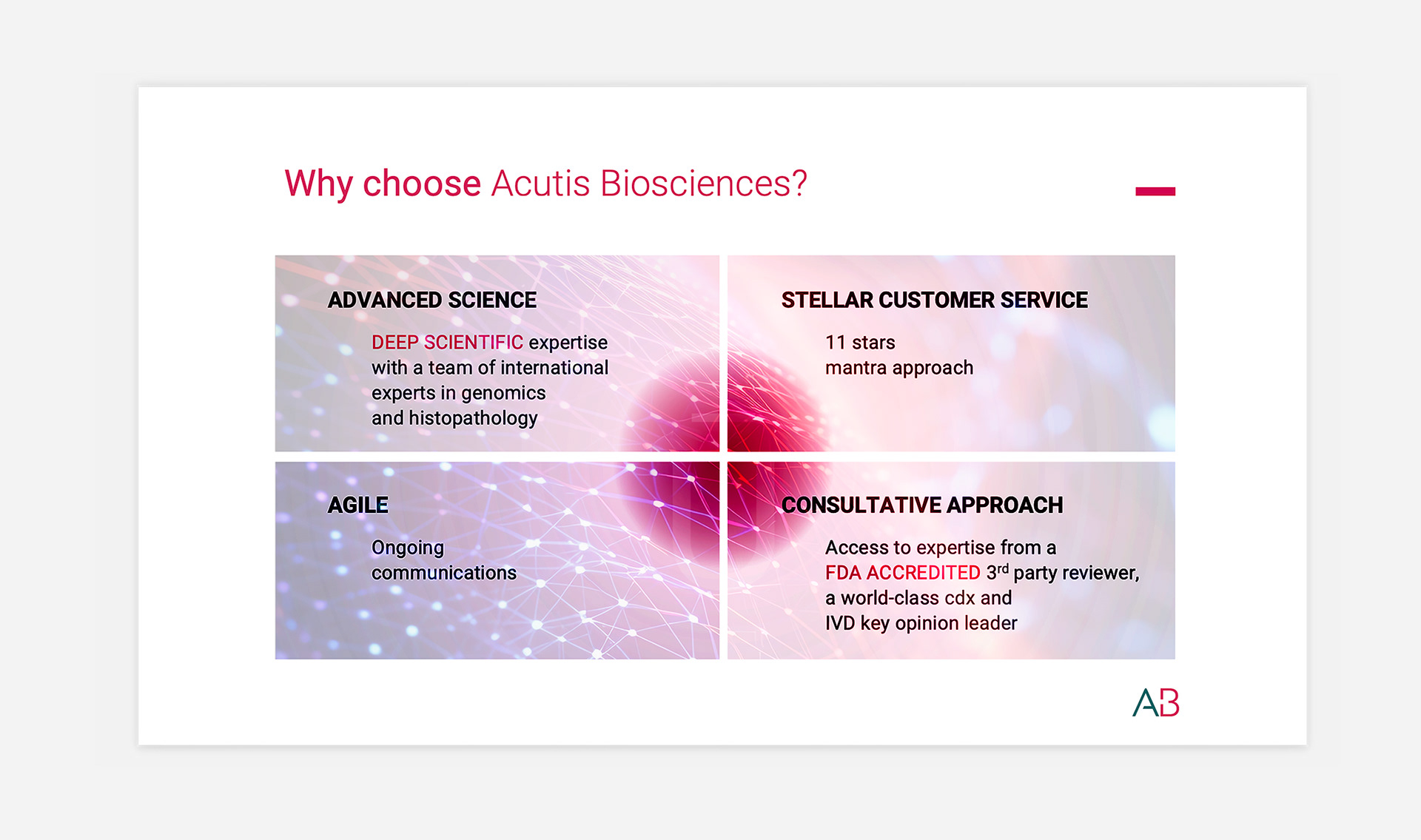
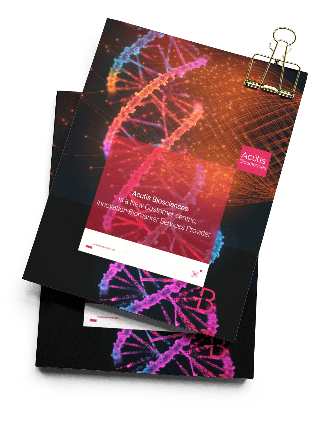
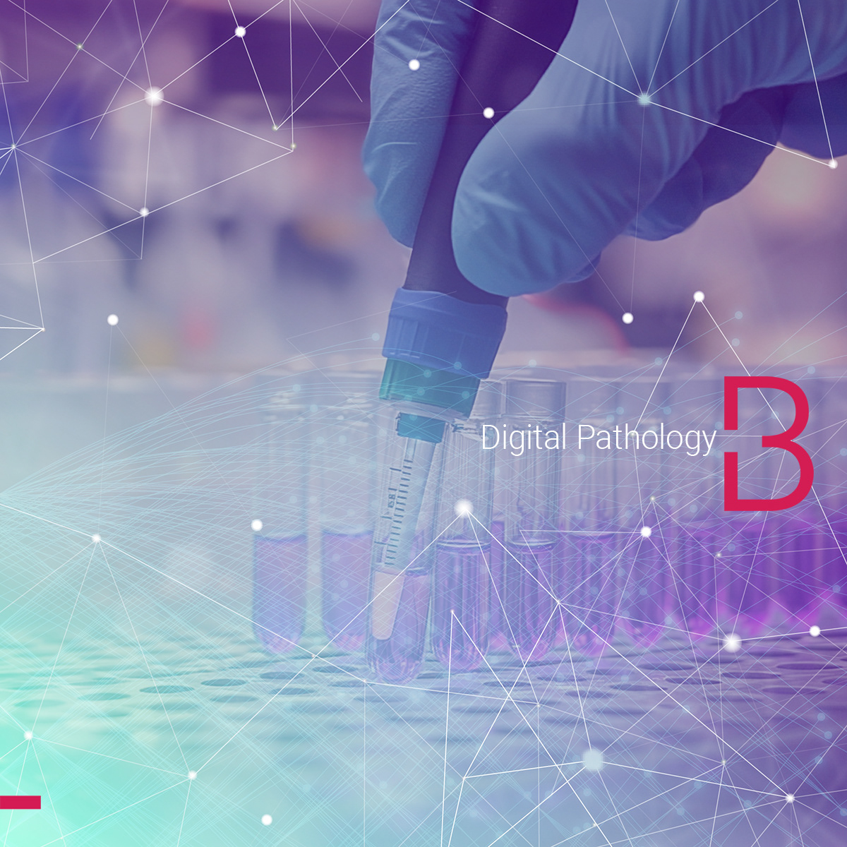
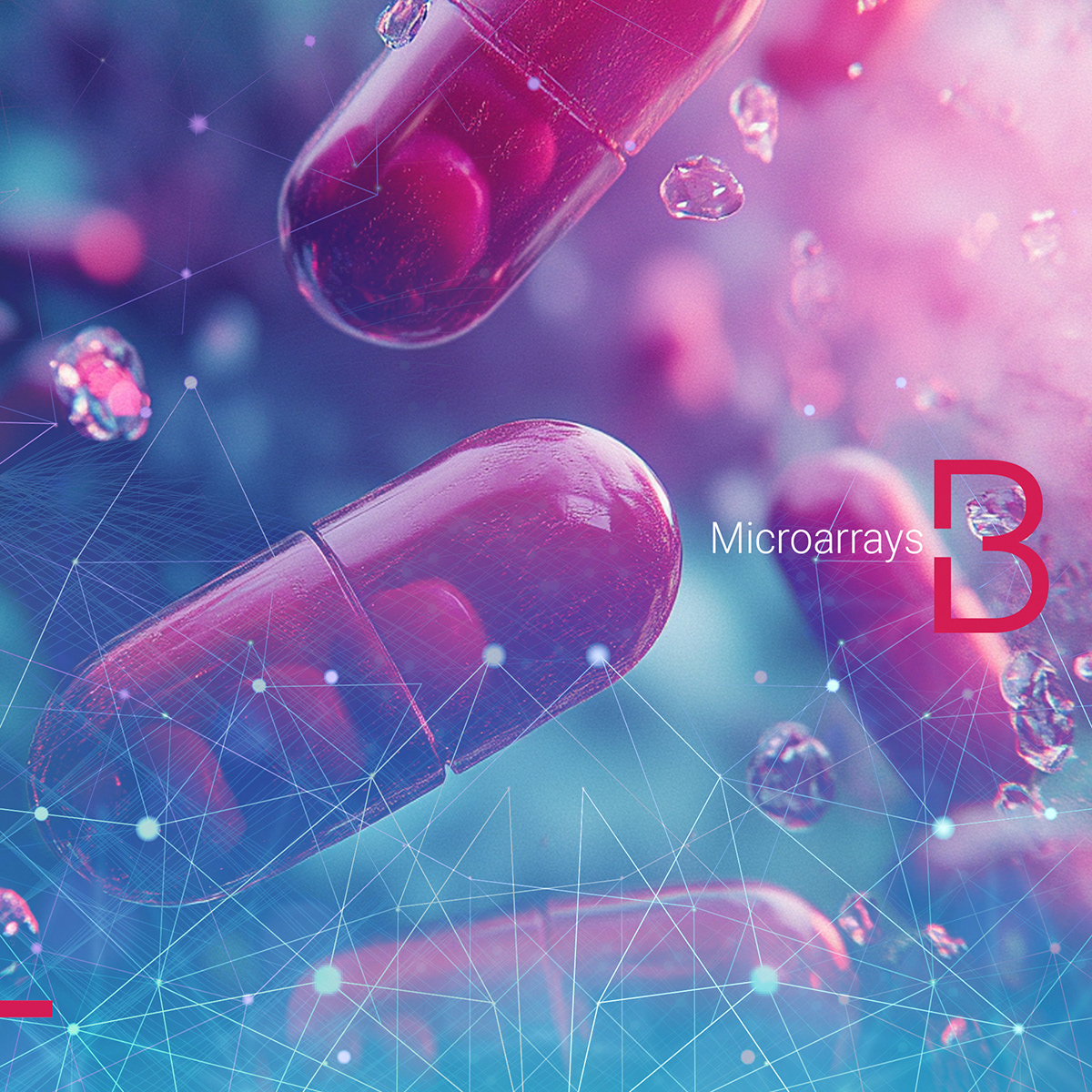
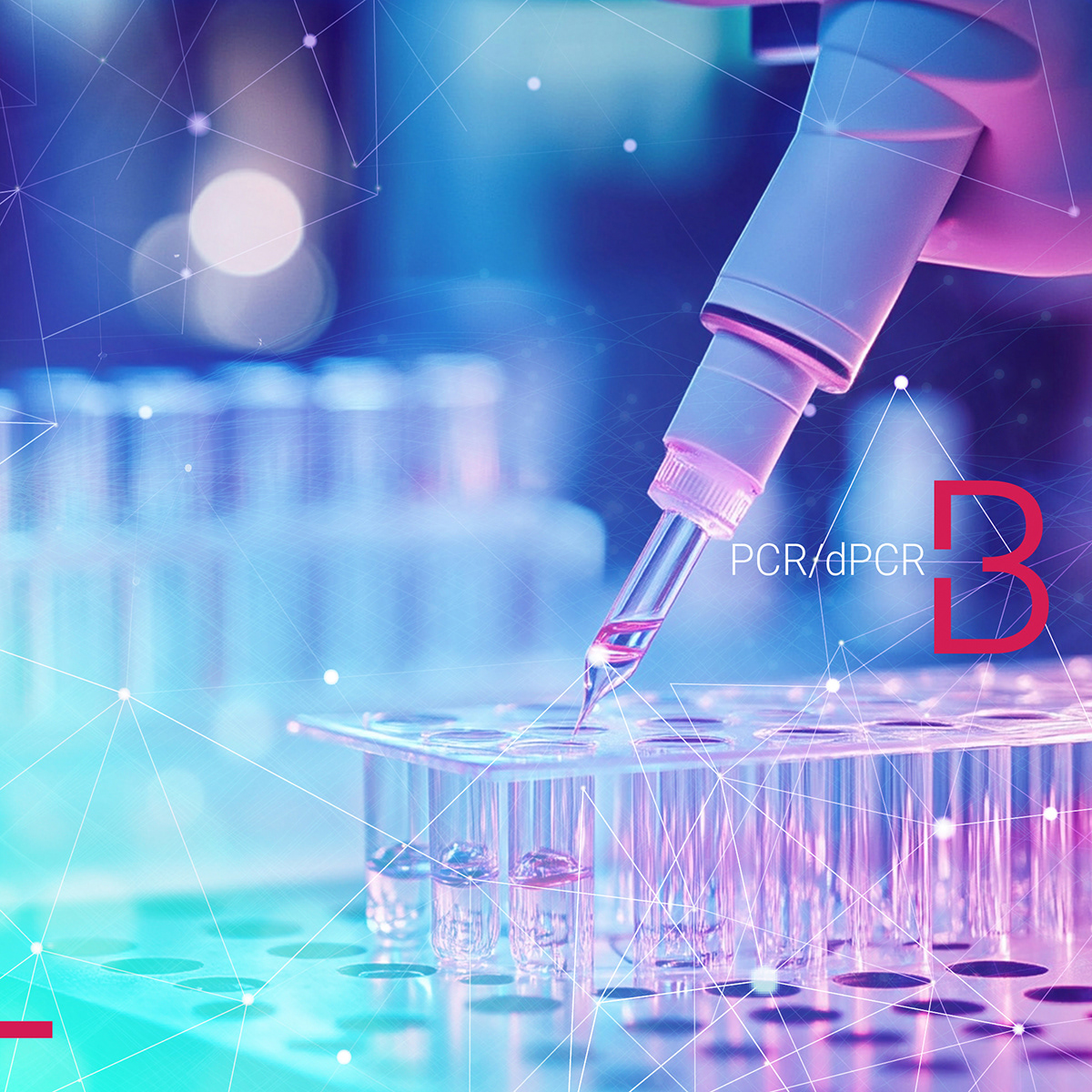
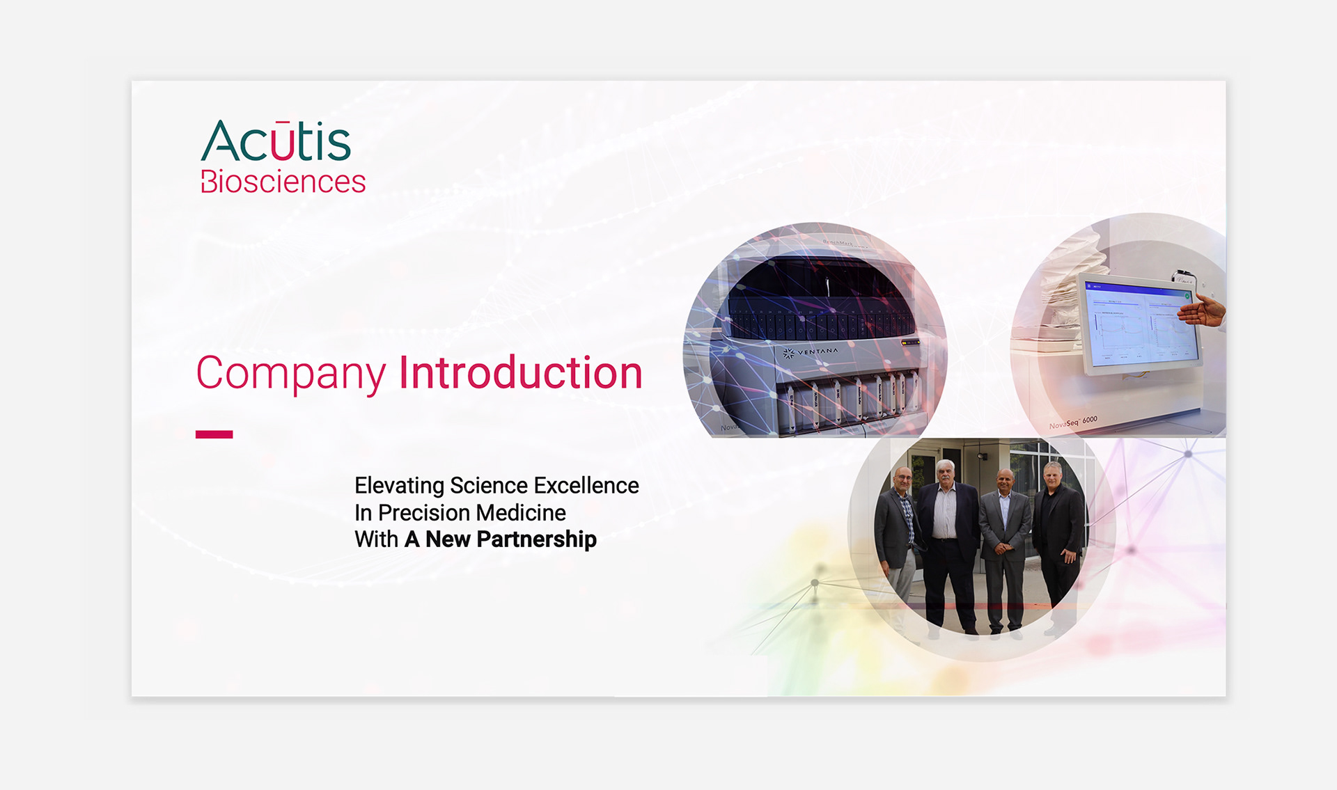
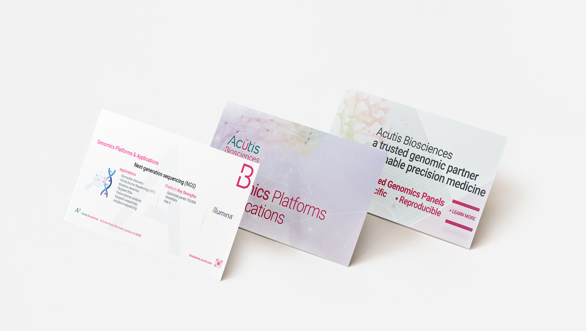
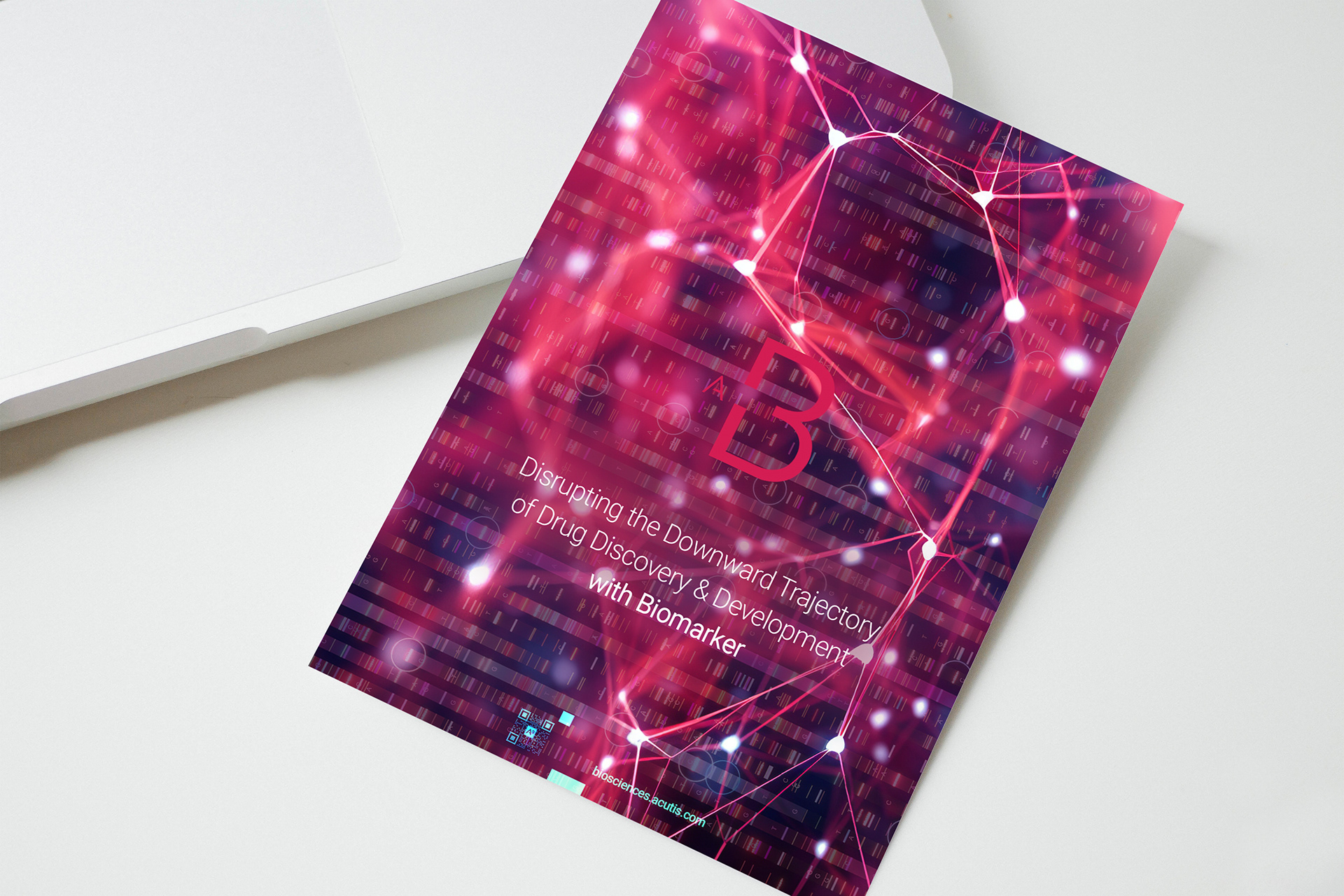
PRINT & DIGITAL ASSETS: consistent brand rollout across collateral
To ensure the brand felt cohesive and recognizable at every touchpoint, I adapted the vibrant visual system, dynamic gradients, molecular networks, and the iconic "B", across business cards, brochures, flyers, and other communication tools.
Each asset leverages the luminous color palette and scientific motifs, instantly signaling innovation while maintaining clarity and professionalism.
From bold, full-bleed covers to clean, information-driven layouts, these materials reinforce Acutis Biosciences’ advanced, approachable personality.
This consistent application supports both internal alignment and a strong, memorable market presence.

Key Results & Impact For Acutis Biosciences

My work gave Acutis Biosciences a strong, strategic visual foundation, supporting business development, funding efforts, and long-term credibility in the competitive biosciences space.
DEFINE A COMPLETE BRAND SYSTEM
for Acutis Biosciences, establishing a credible and differentiated identity at launch
DESIGNED A DISTINCT LOGO & VISUAL LANGUAGE
that reflects scientific innovation and biotech clarity
CRAFTED VERSATILE ASSETS
improving both usability and visual appeal
CREATED SCALABLE ASSETS
for web, print, presentations, and lab applications to ensure consistent branding
CONTRIBUTED TO VISUALLY COMPELLING INVESTOR PRESENTATIONS
enhancing brand confidence during fundraising
enhancing brand confidence during fundraising
LED NEW SOCIAL MEDIA CAMPAIGNS & FRESH CREATIVE CONCEPTS
resulting in a 30% increase in website traffic within 6 months
ENABLE FASTER MARKET ROLLOUT
by delivering ready-to-use, systematized design elements
resulting in a 30% increase in website traffic within 6 months
ENABLE FASTER MARKET ROLLOUT
by delivering ready-to-use, systematized design elements
ALIGNED WITH ACUTIS' PARENT BRAND
while positioning Biosciences for independent recognition and future growth
while positioning Biosciences for independent recognition and future growth
Looking to launch or scale your biotech brand with clarity and credibility?