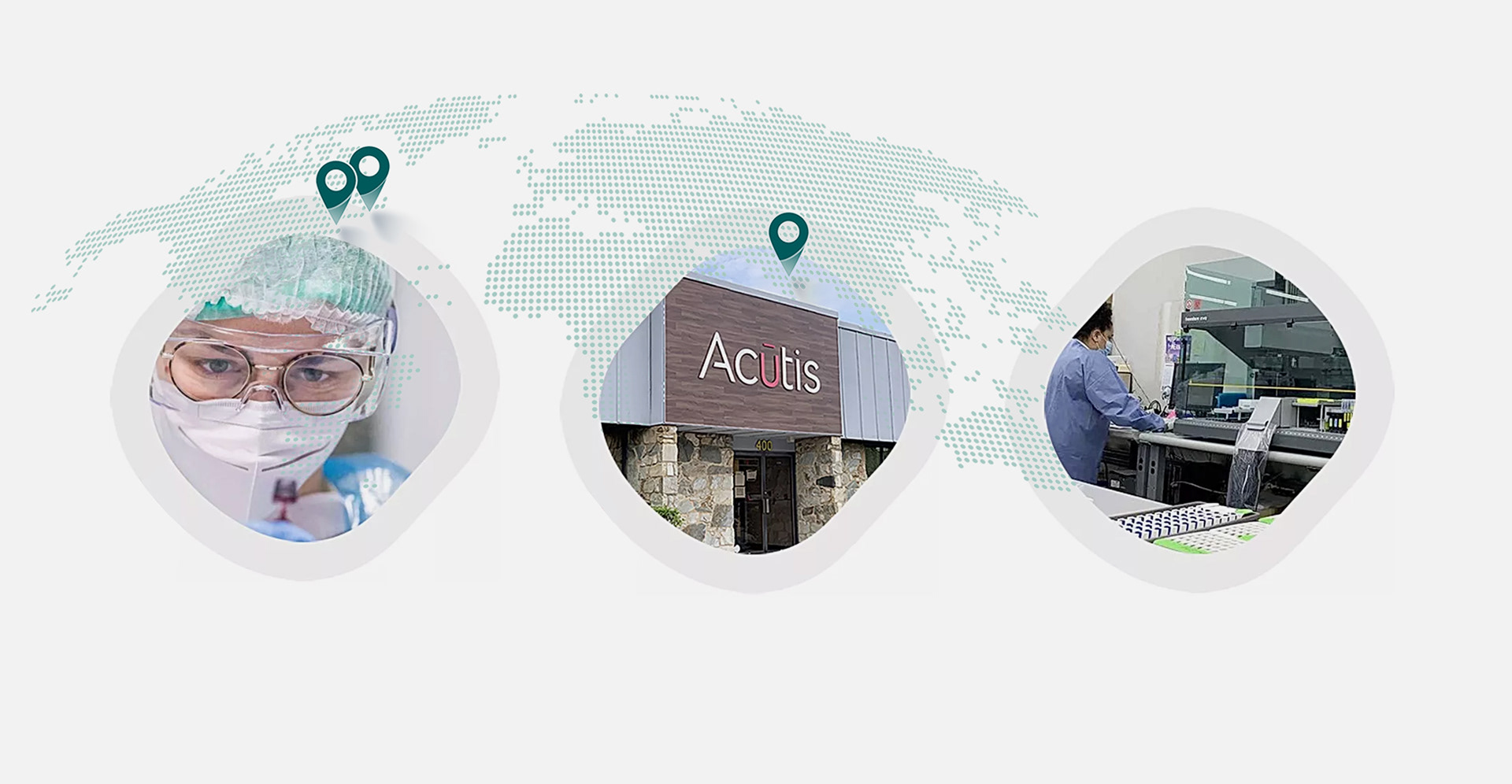
CLIENT / Acutis Diagnostics, Hicksville, NY, USA
Project Overview
Acutis, a leader in clinical toxicology, is dedicated to advancing science through innovation and forward-thinking strategies.
Founded in 2016, the company sought to strengthen its presence in the U.S. market with a complete rebrand.
In 2018, we developed a new logotype and visual identity to reflect Acutis’ evolving vision and ambitions.
Founded in 2016, the company sought to strengthen its presence in the U.S. market with a complete rebrand.
In 2018, we developed a new logotype and visual identity to reflect Acutis’ evolving vision and ambitions.
Rebranding Approach
In collaboration with copywriter Robert Sawyer, we brought simplicity, accuracy, and sharpness into
Acutis's identity by redesigning the logotype and all the mediums used by sales teams, following the codes of the pharmaceutical industry, and incorporating the notion of the future and high-tech into the visuals.
Acutis's identity by redesigning the logotype and all the mediums used by sales teams, following the codes of the pharmaceutical industry, and incorporating the notion of the future and high-tech into the visuals.
Design Solution
The goal was to align the brand with its evolving vision and position it as a forward-thinking leader in its field:
- The refreshed logo, color palette, and typography introduced a more modern, dynamic image that
resonates with existing and potential clients.
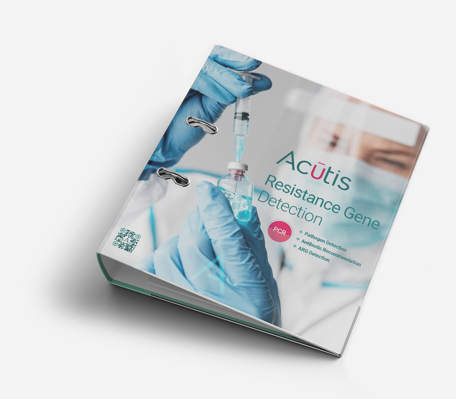
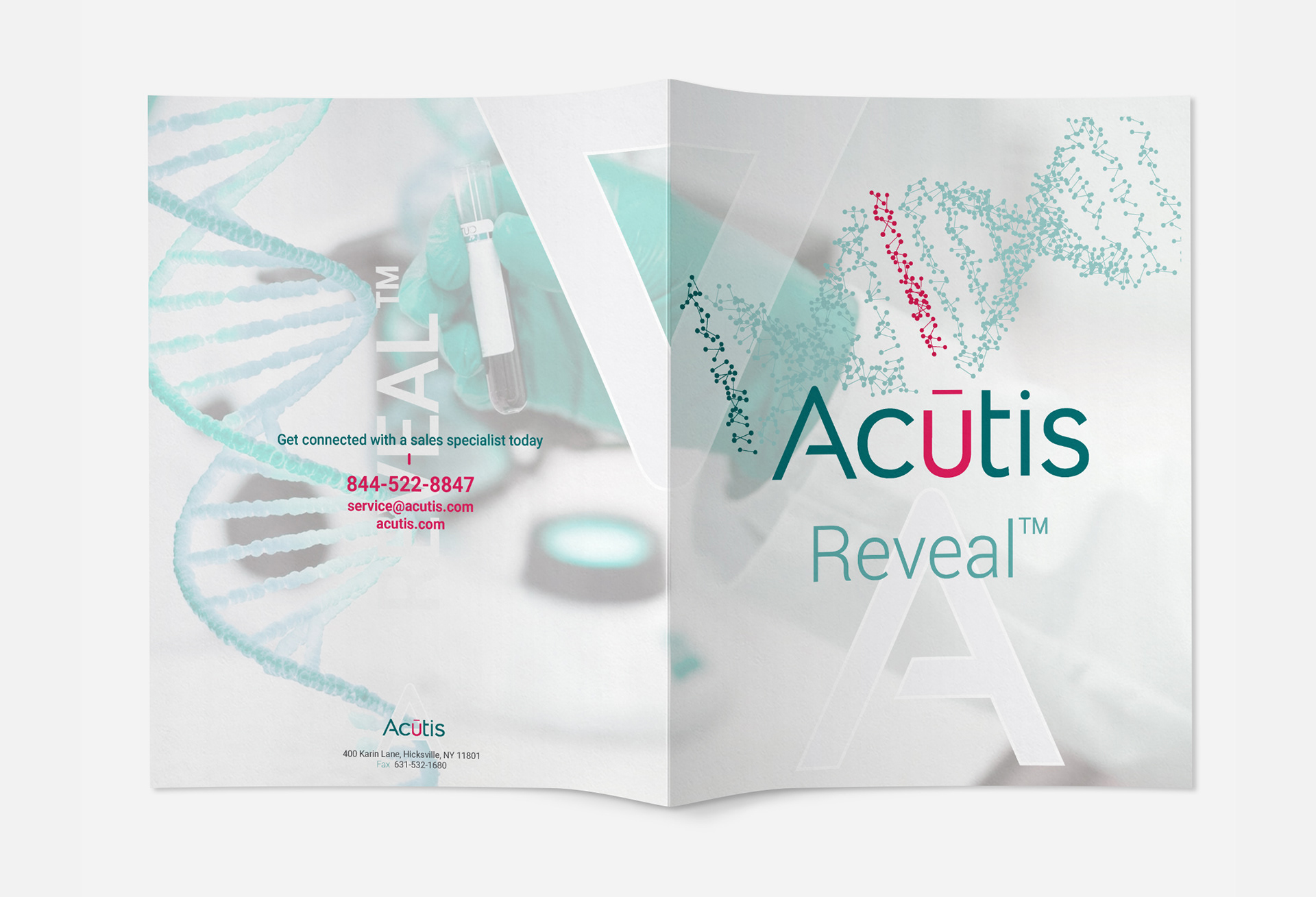
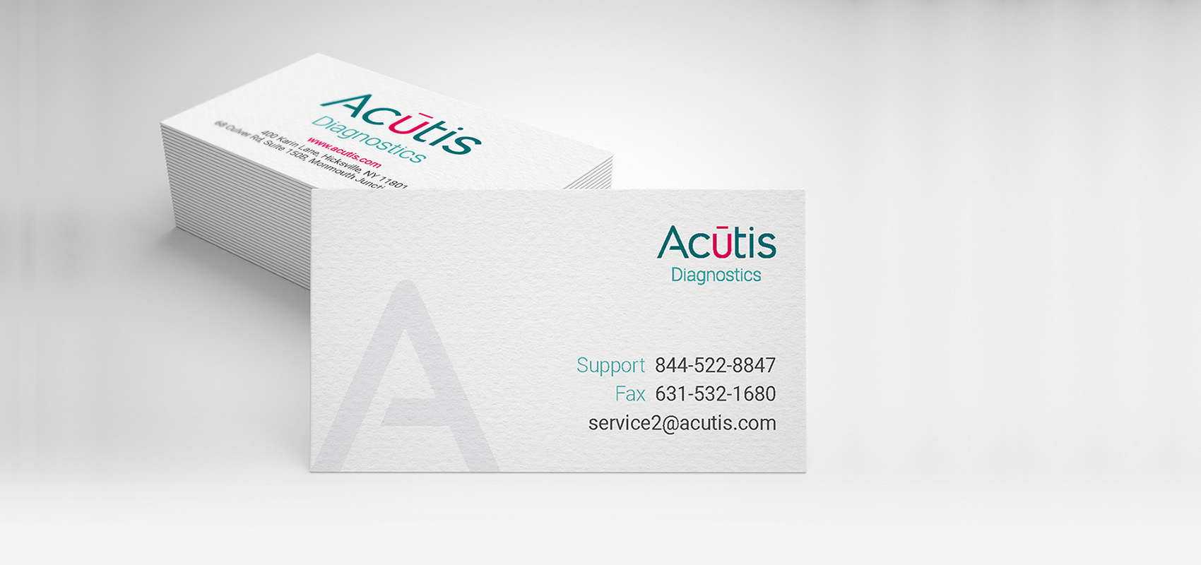
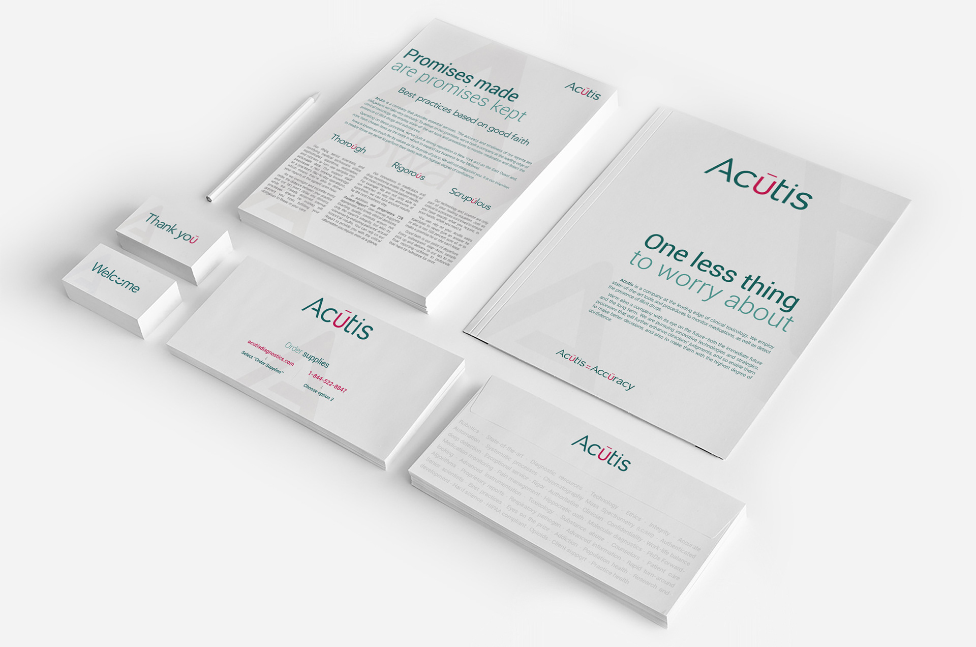
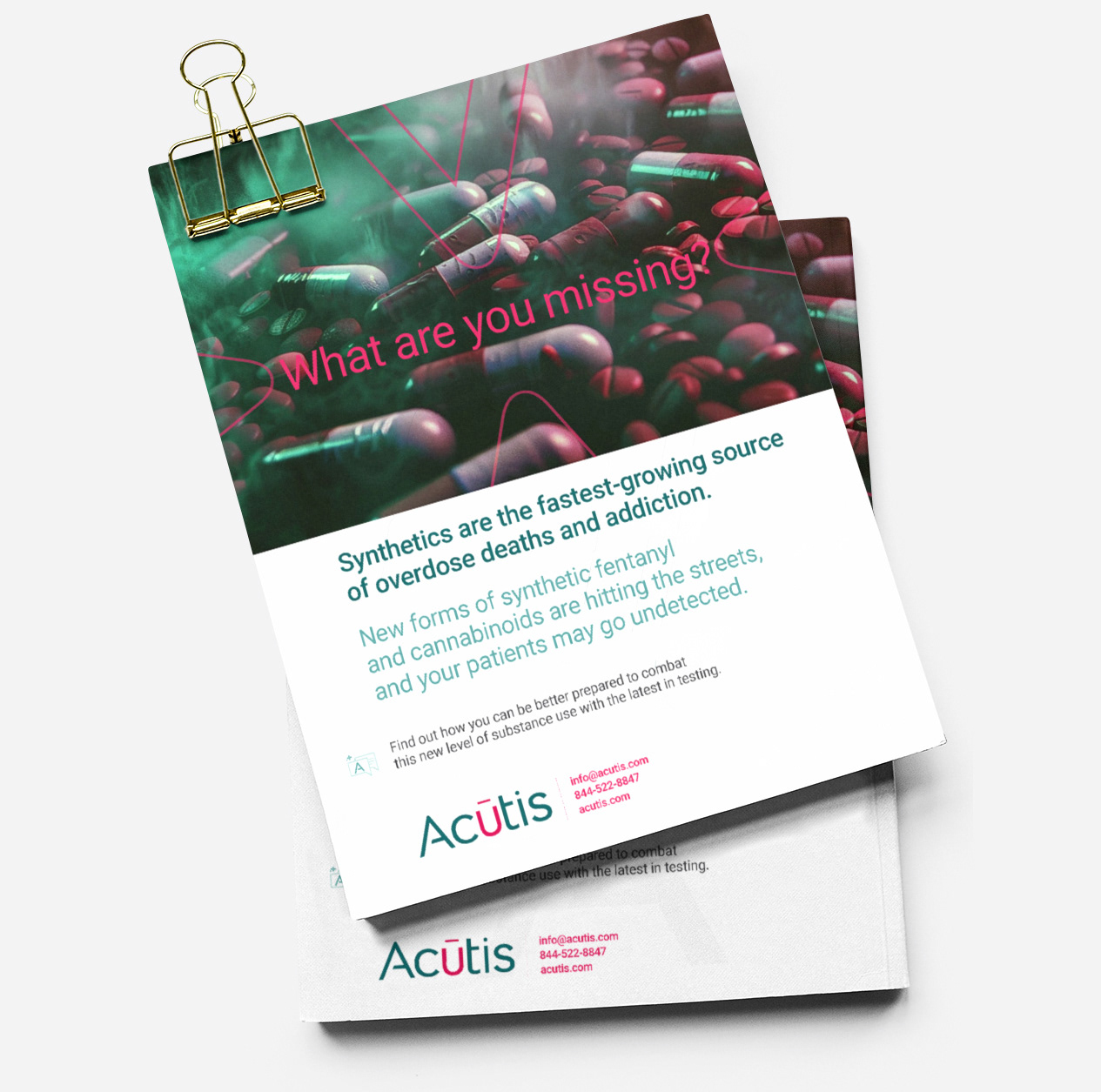
- We updated all print materials—business cards, letterheads, and brochures to elevate
Acutis's professional image and ensure consistency across touchpoints.
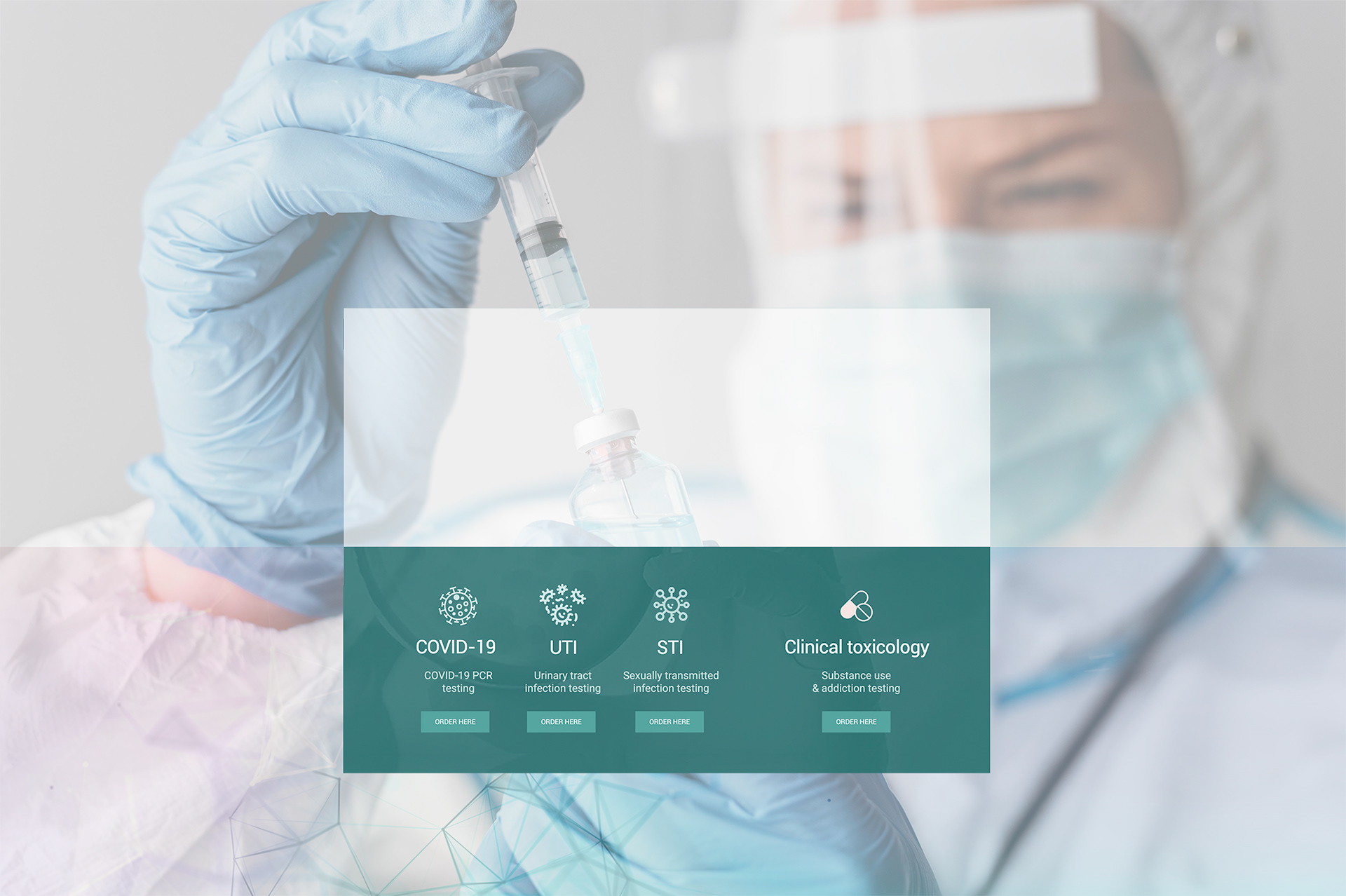
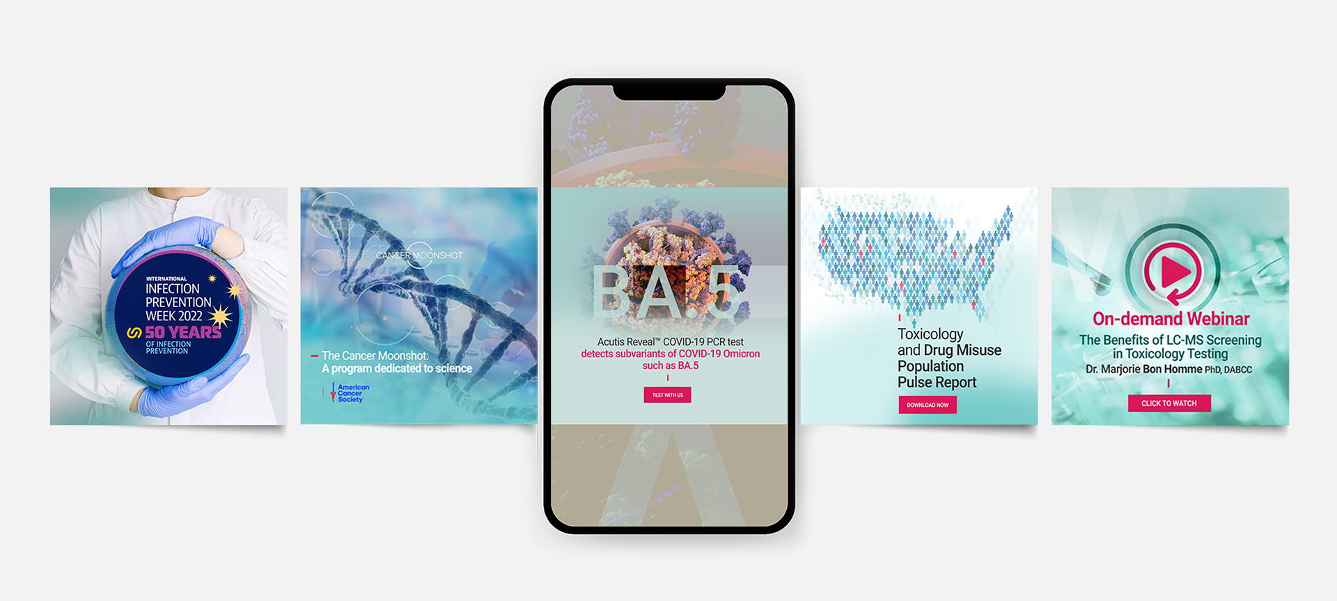
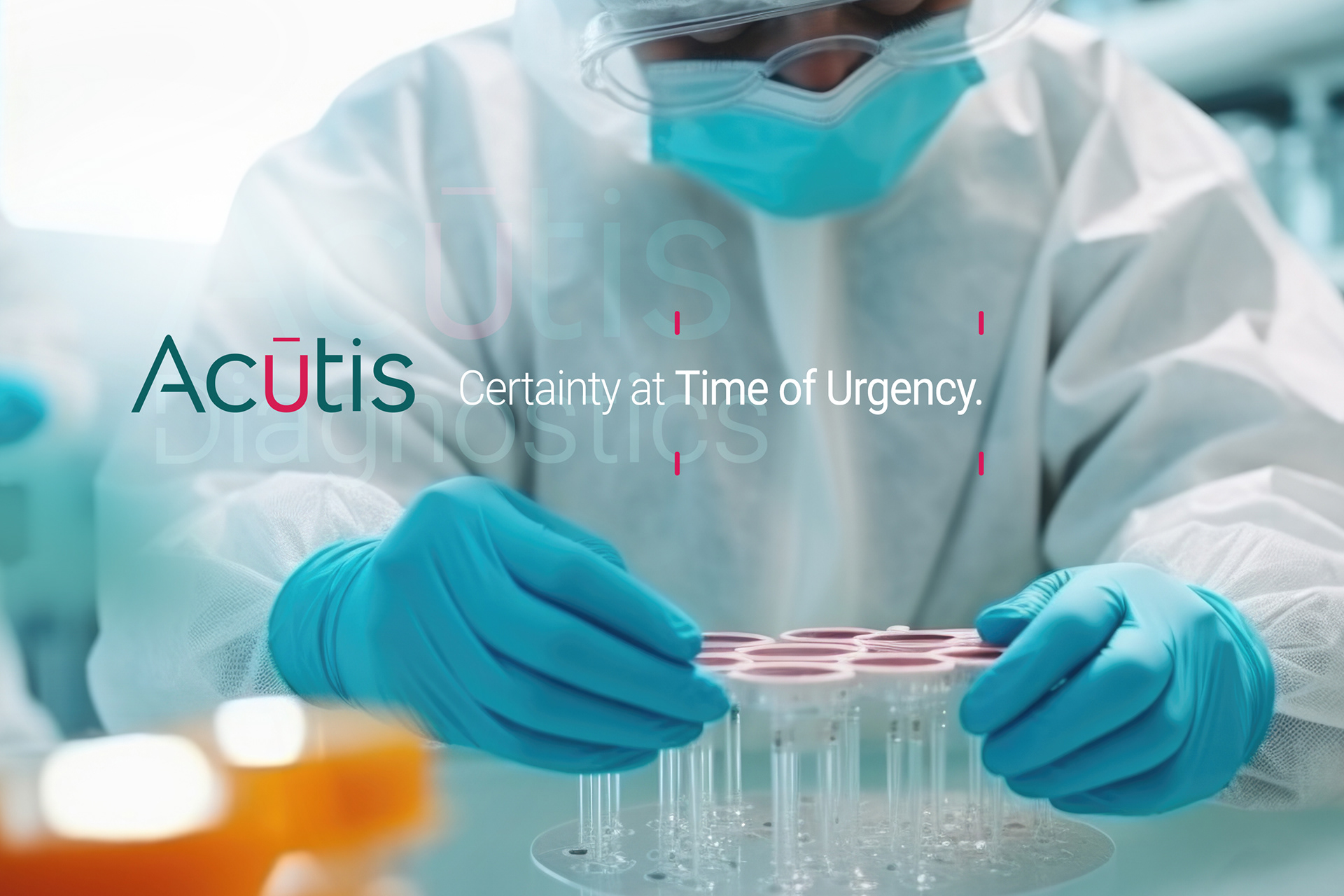
- The redesigned website created a more engaging, user-friendly experience, reflecting updated messaging
and visual identity.
- This comprehensive overhaul enhanced online visibility and strengthened communication
with the audience, resulting in increased engagement and a more impactful brand presence.
- The refreshed logo, color palette, and typography introduced a more modern, dynamic image that
resonates with existing and potential clients.
- We updated all print materials—business cards, letterheads, and brochures to elevate
Acutis's professional image and ensure consistency across touchpoints.
- The redesigned website created a more engaging, user-friendly experience, reflecting updated messaging
and visual identity.
- This comprehensive overhaul enhanced online visibility and strengthened communication
with the audience, resulting in increased engagement and a more impactful brand presence.
Previous logo

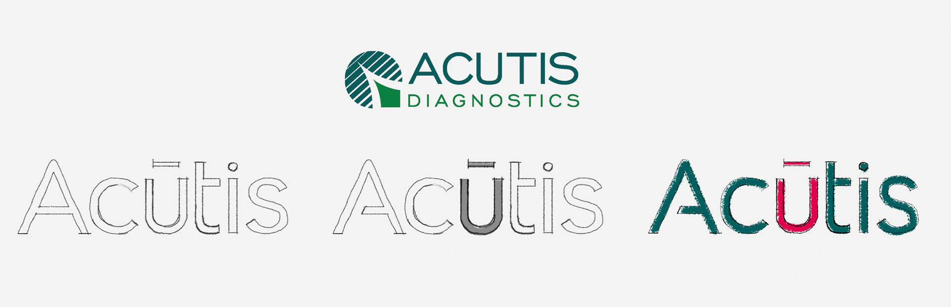

Rebranded identity
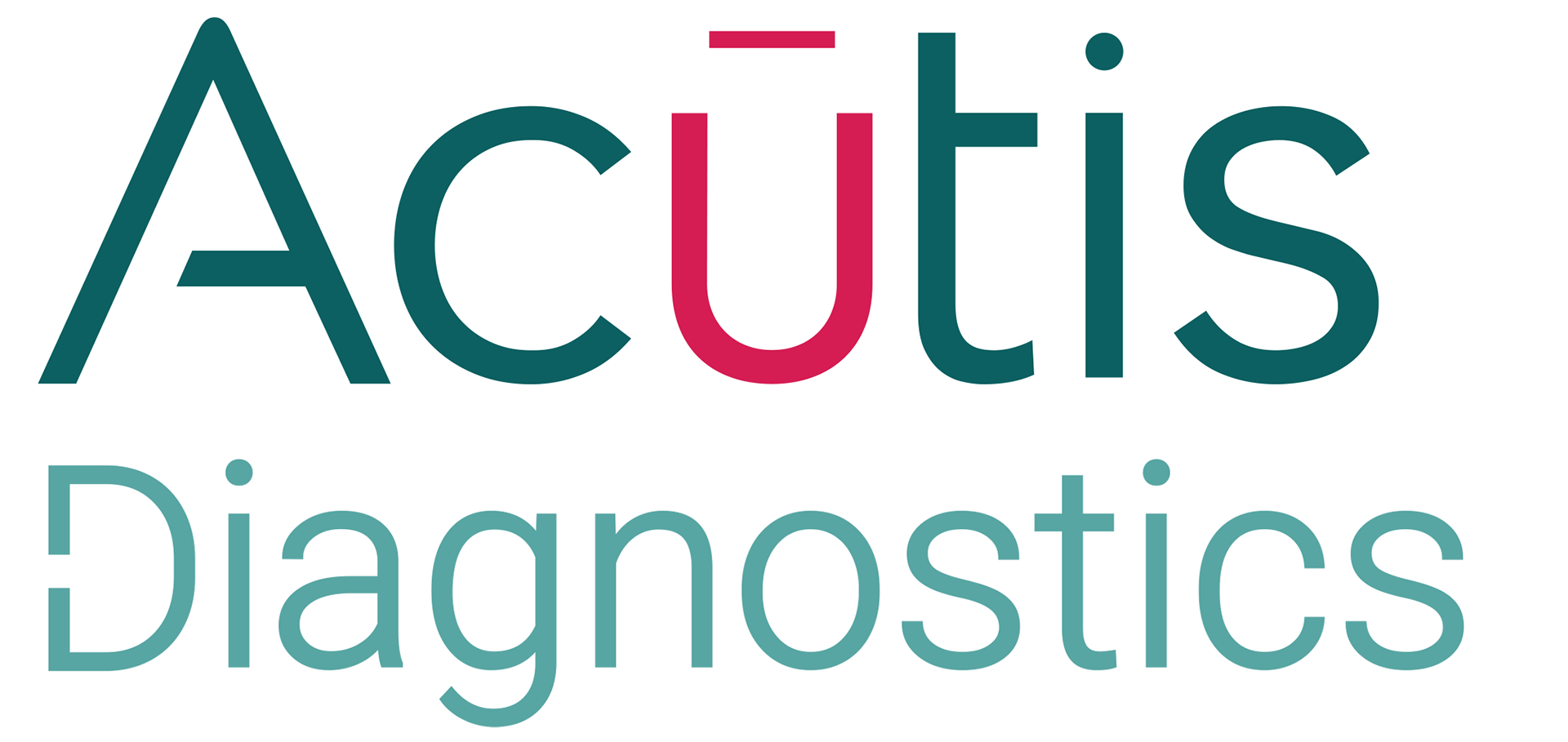
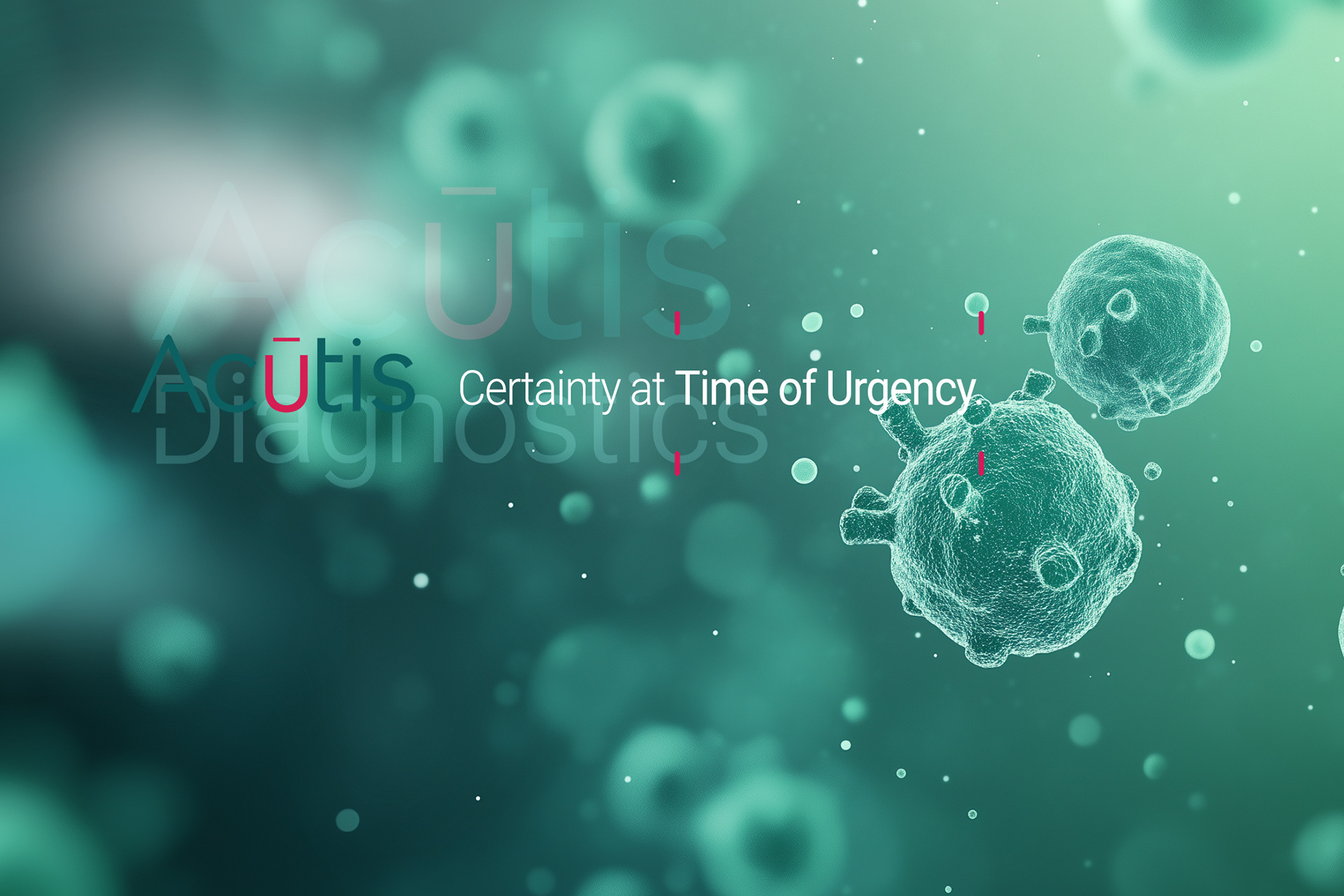
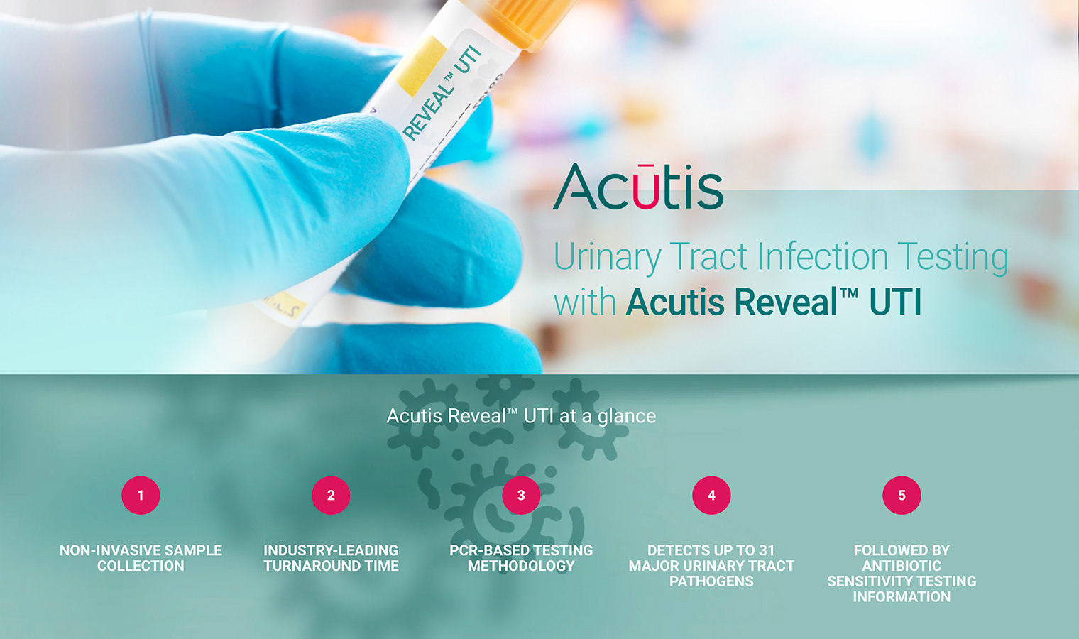
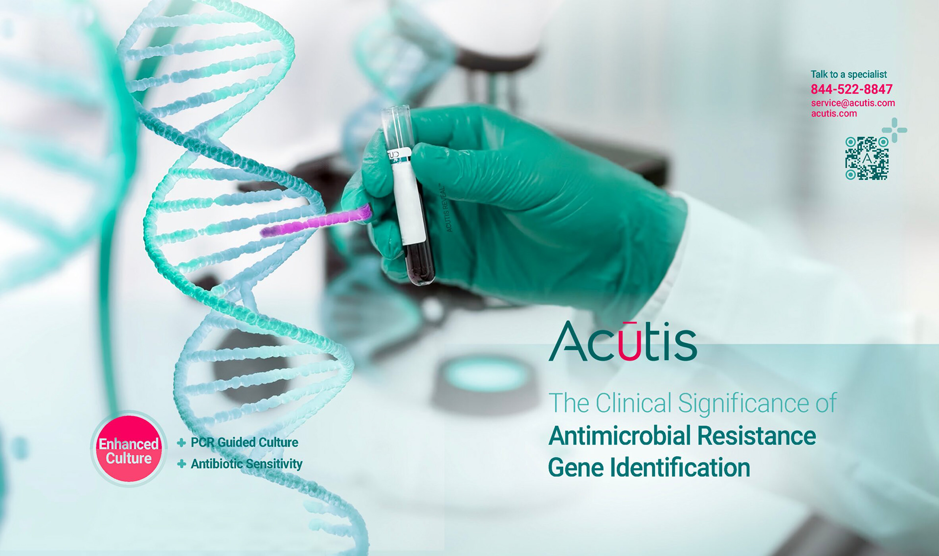
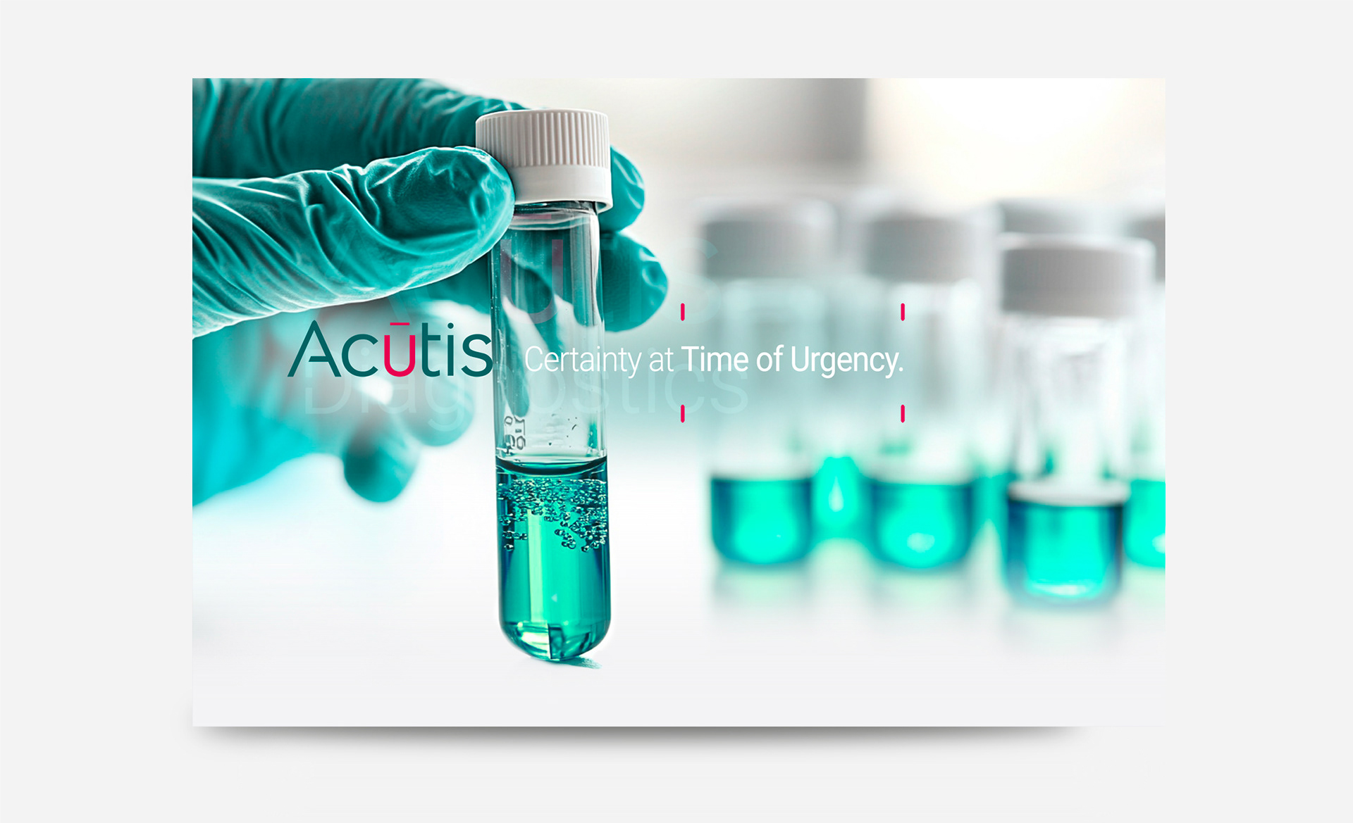
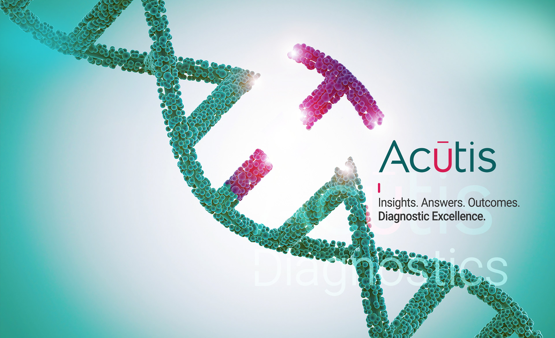
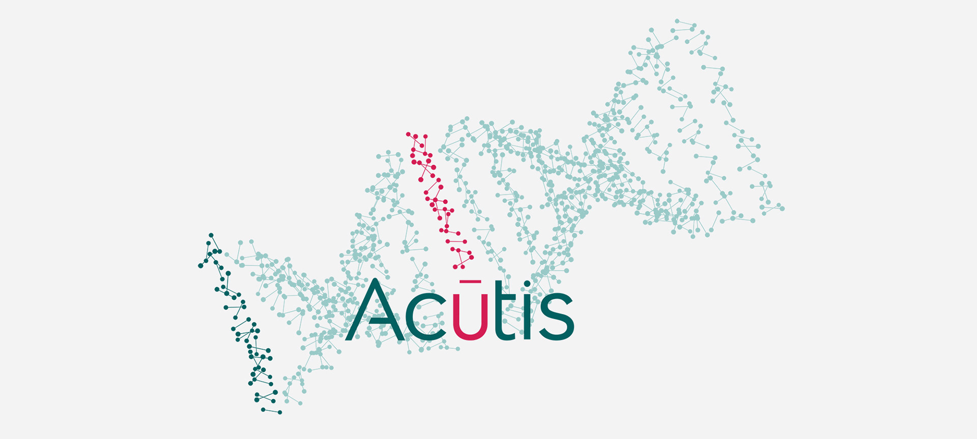
LOGO REDESIGN: PRECISION AND INNOVATION
Concept: A refined and modern logo conveying precision, trust, and innovation in diagnostics.
Typography & Style: A clean, sans-serif typeface with a bold yet minimal design. The macron accent adds uniqueness and emphasis.
Color Palette: Deep teal for reliability and expertise, contrasted with vibrant magenta for innovation and distinction.