CLIENT / Brisk Teaching, Free AI for Teachers, CA, USA

Project Overview
Brisk Teaching is an AI-powered platform designed to streamline educators’ workflows.
The client sought to refresh its existing logotype, maintaining its signature green color
while giving it a more modern, dynamic feel.
A sleek, contemporary typeface will convey AI's intelligence and efficiency while incorporating playful yet professional design elements to highlight the brand's supportive role for teachers.

Approach & Solution
I developed a stylish logotype that embodies the intelligence and efficiency of AI
while maintaining an approachable, supportive feel for educators:
- The design needed to balance professionalism with playfulness, reflecting both the cutting-edge technology
behind the platform and the human-centered mission of assisting teachers.
- The logo blends efficiency and approachability, balancing cutting-edge technology
with teacher-friendly support.
- The identity presents AI as intuitive and supportive, making Brisk Teaching stand out
as a leader in AI-driven education solutions.

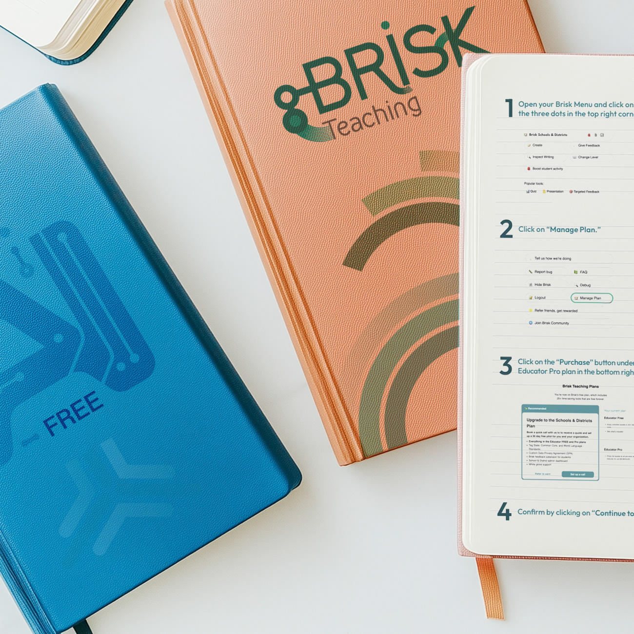
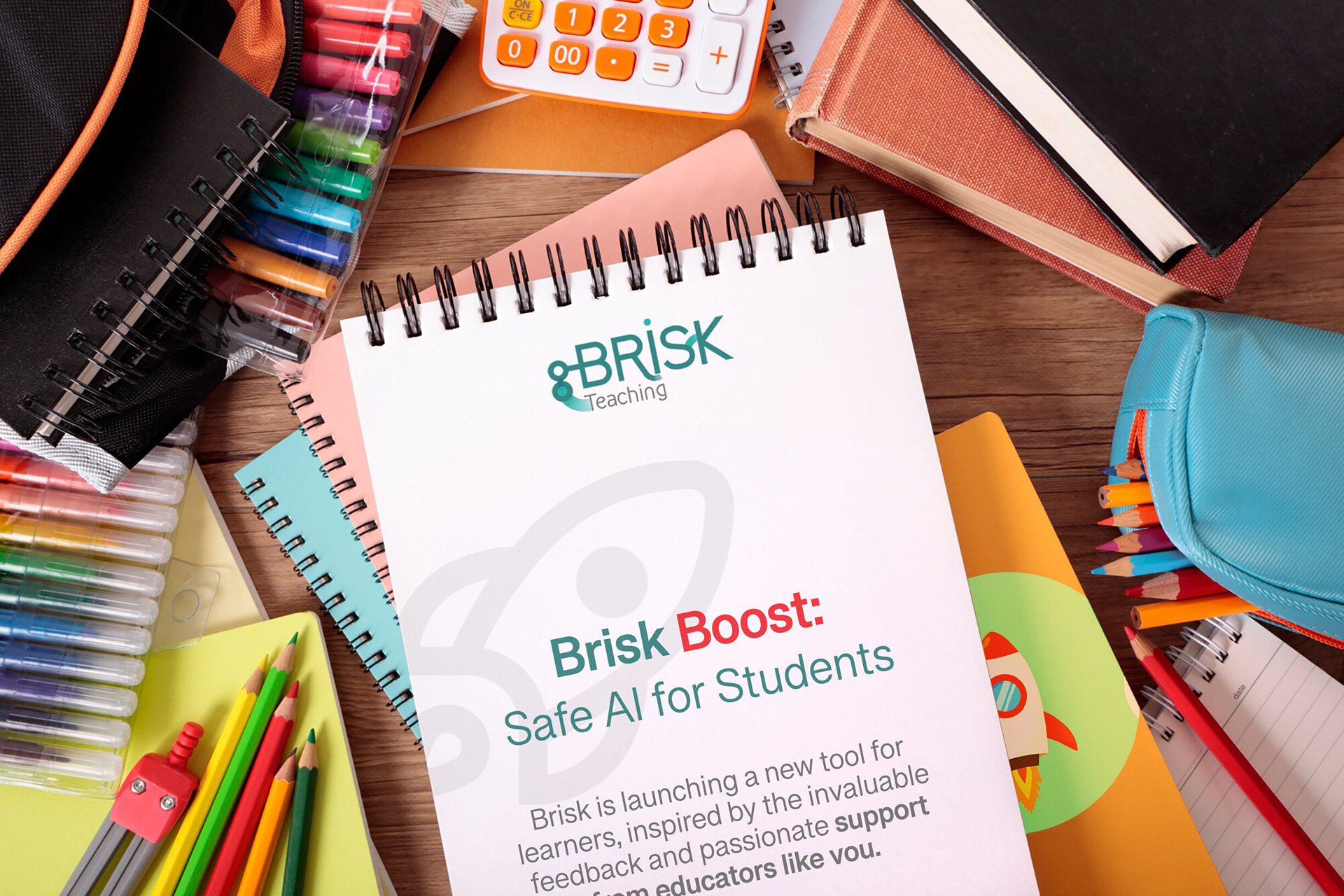
LOGO DESIGN: A SMART & SUPPORTIVE IDENTITY
Color Palette: Teal reflects intelligence and innovation, while gray conveys trust
and professionalism.
Typography: A clean, modern font ensures clarity and accessibility.
Graphic Elements: Abstract, dynamic shapes evoke AI’s adaptability
and seamless integration into teaching.
and professionalism.
Typography: A clean, modern font ensures clarity and accessibility.
Graphic Elements: Abstract, dynamic shapes evoke AI’s adaptability
and seamless integration into teaching.
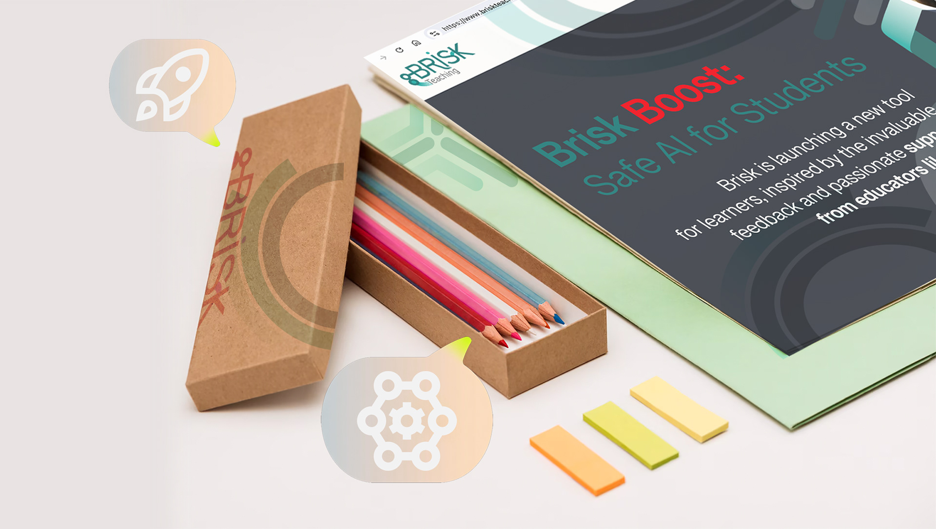
Concept Breakdown 1: AI THAT THINKS WITH YOU Everyplace ANYTIME
This AI tool transforms abstract ideas into clear, visual learning.
It’s intuitive, adaptable, and designed to support—not replace—how students and teachers think. With a calm, thoughtful voice, it brings clarity to complexity and helps users navigate layered content through innovative, responsive design.
More than a tool, it’s a values-driven partner: free, ethical, and built for real people doing meaningful work. It encourages curiosity, invites collaboration, and empowers users to ask better questions—making education more accessible, thoughtful, and human.


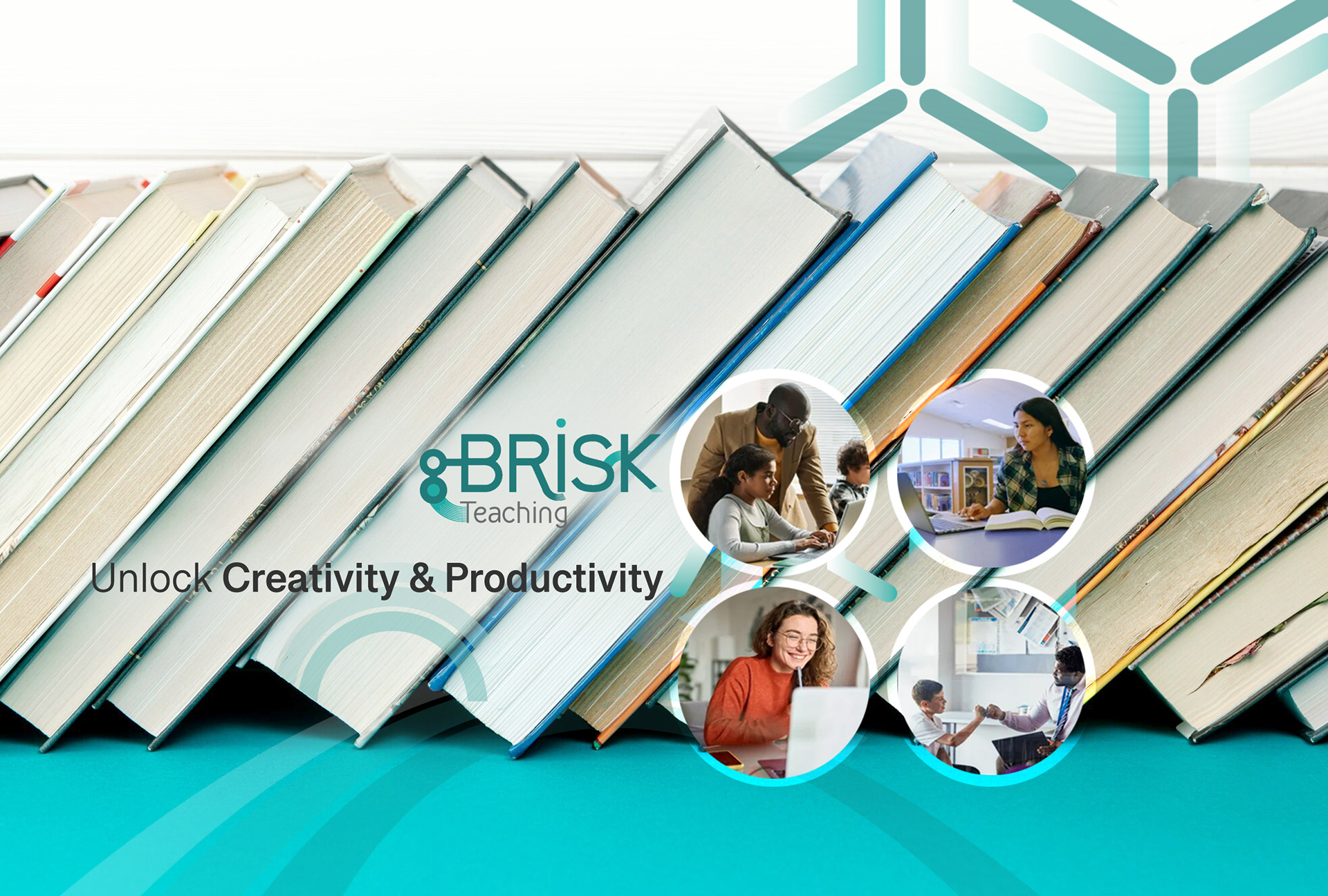


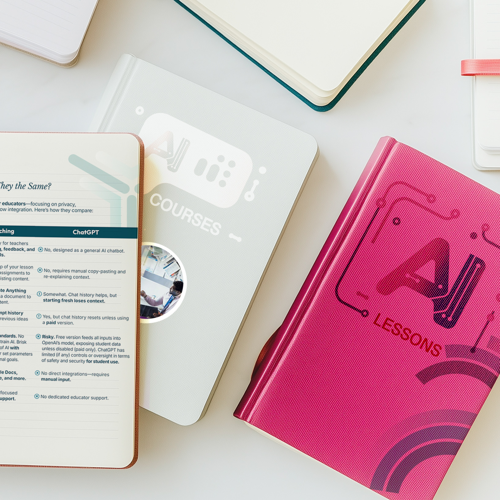
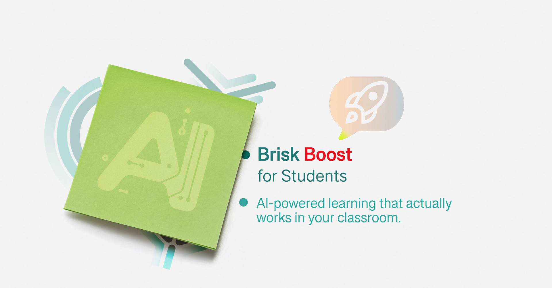
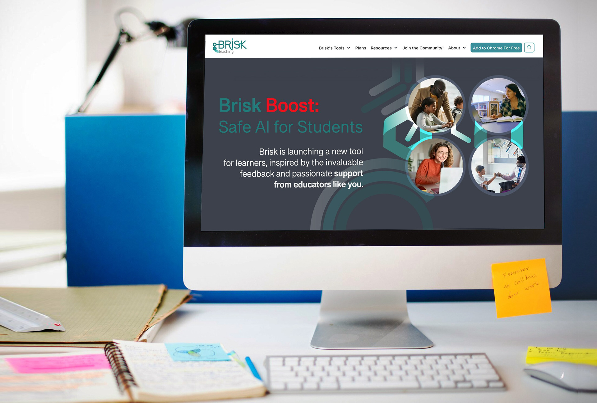
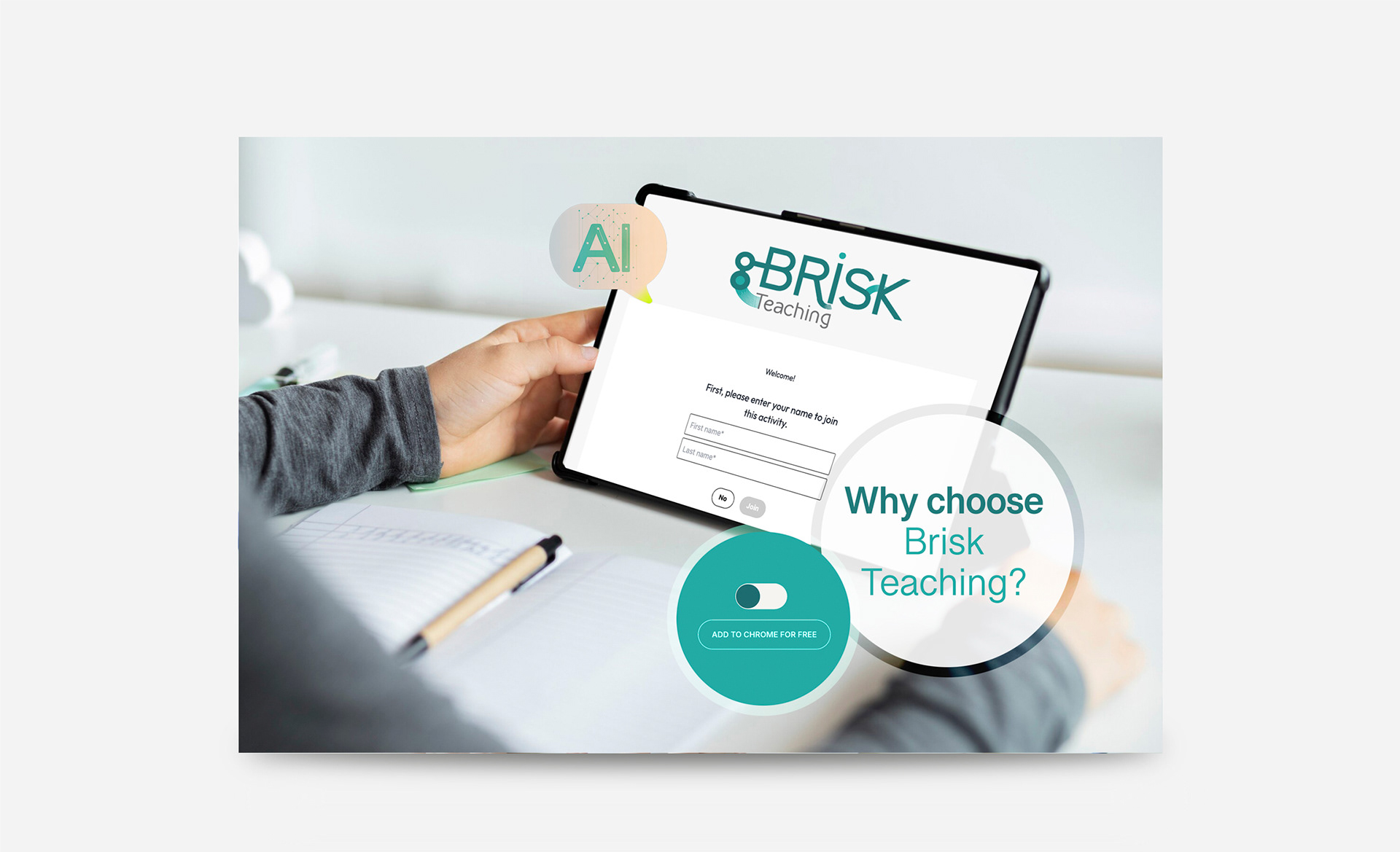
Concept Breakdown 2: Visualizing Complex Ideas for Deeper Learning
Brisk Teaching's AI tools assist educators in transforming complex concepts into explicit, visual learning materials.
The platform enhances students' comprehension and retention by generating presentations, diagrams, and other visual aids.
This visual approach supports diverse learning styles and helps make abstract ideas more tangible.


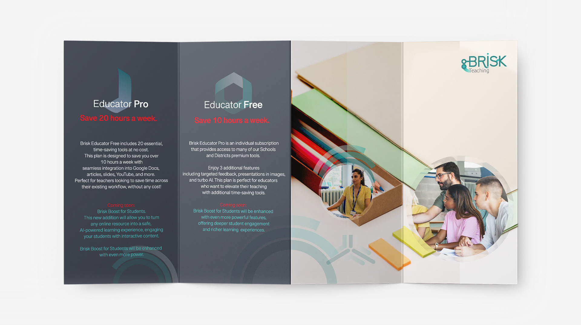
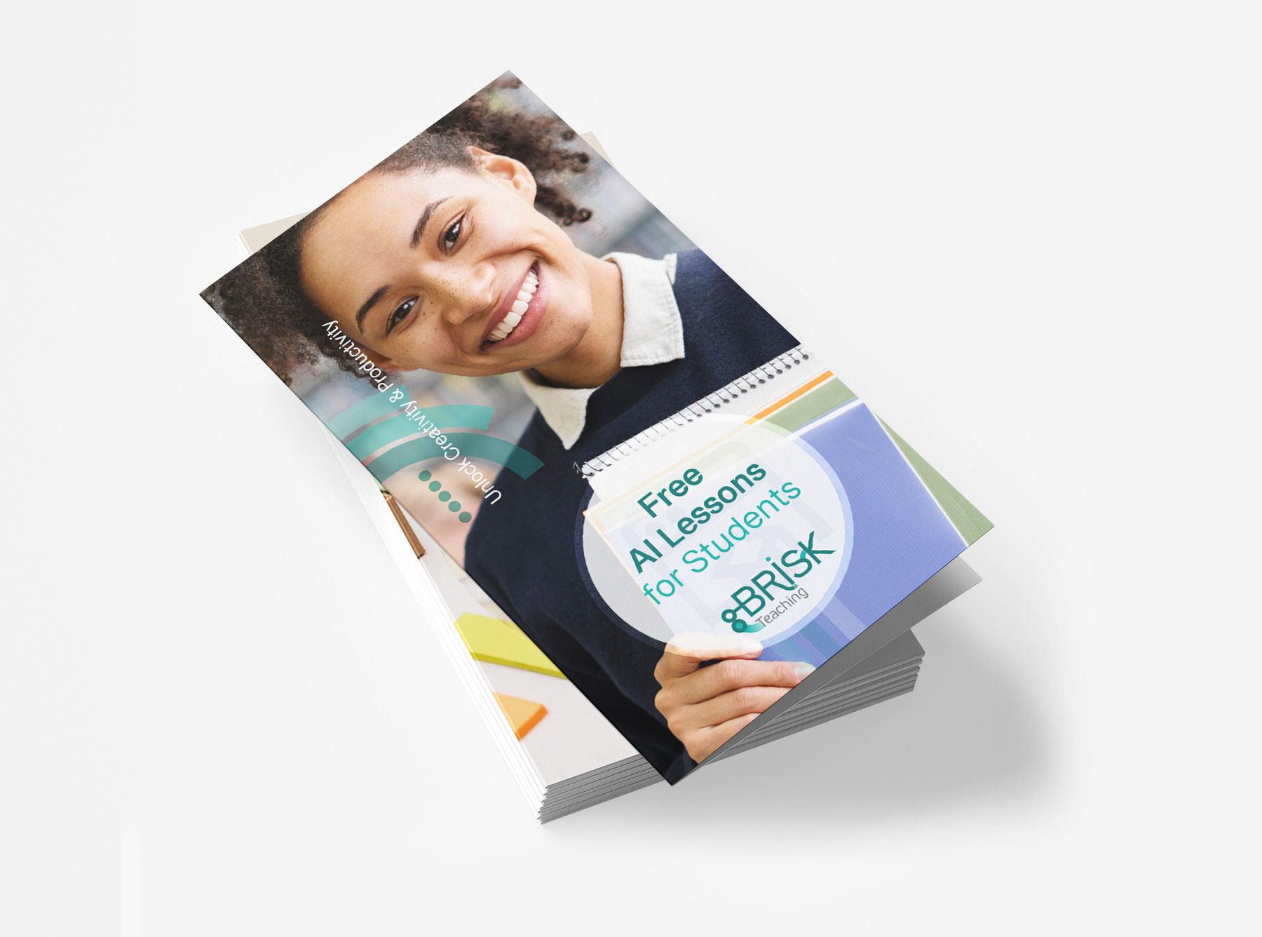
Concept Breakdown 3: Smart & Supportive Identity
The refreshed logotype and brand design for Brisk Teaching aim to embody the intelligence and efficiency of AI while maintaining an approachable, supportive feel for educators.
The design balances professionalism with playfulness, reflecting both the cutting-edge technology behind the platform and its human-centered mission of assisting teachers.
The teal conveys intelligence and innovation, while gray adds a sense of trust and professionalism.
Clean, modern typography ensures clarity and accessibility, and abstract, dynamic shapes evoke AI’s adaptability and seamless integration into teaching..
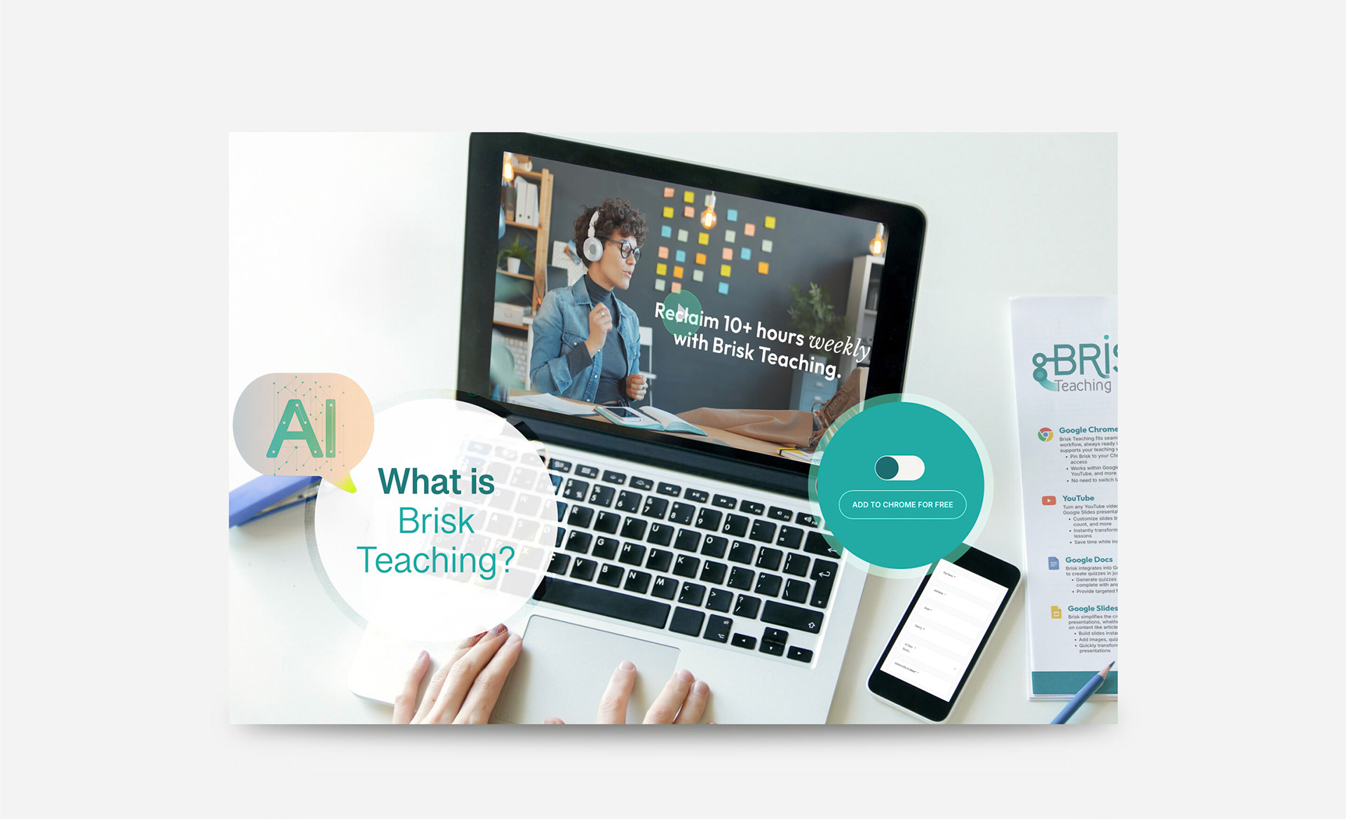
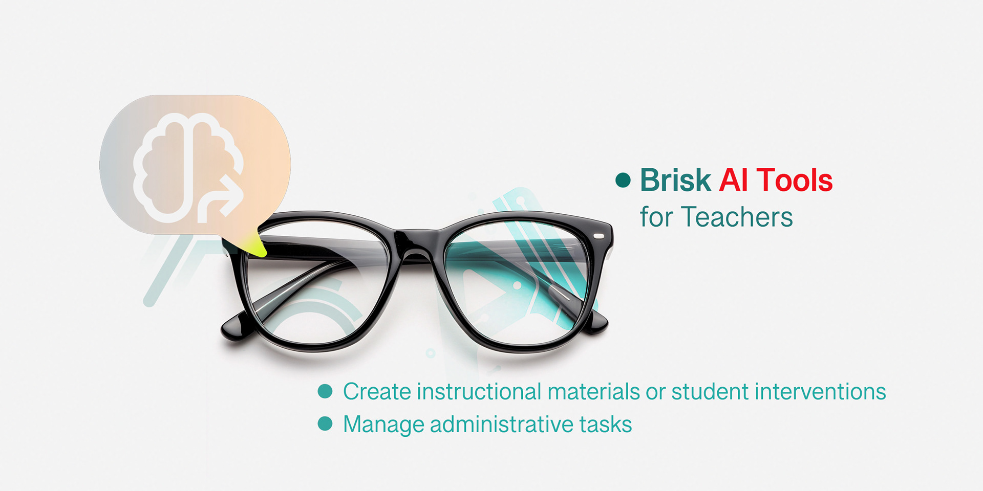
Concept Breakdown 4: Seamless Integration into Educators' Workflows
The icons featured on the Brisk Teaching website represent the various tools and features offered
by the Brisk Chrome extension, designed to assist educators in streamlining their workflows.
The Brisk Teaching brand identity aims to balance professionalism and approachability.
The color palette includes teal to reflect intelligence and innovation, and gray to convey trust
and professionalism.
The typography is clean and modern, ensuring clarity and accessibility. Abstract, dynamic shapes
evoke AI’s adaptability and seamless integration into teaching.