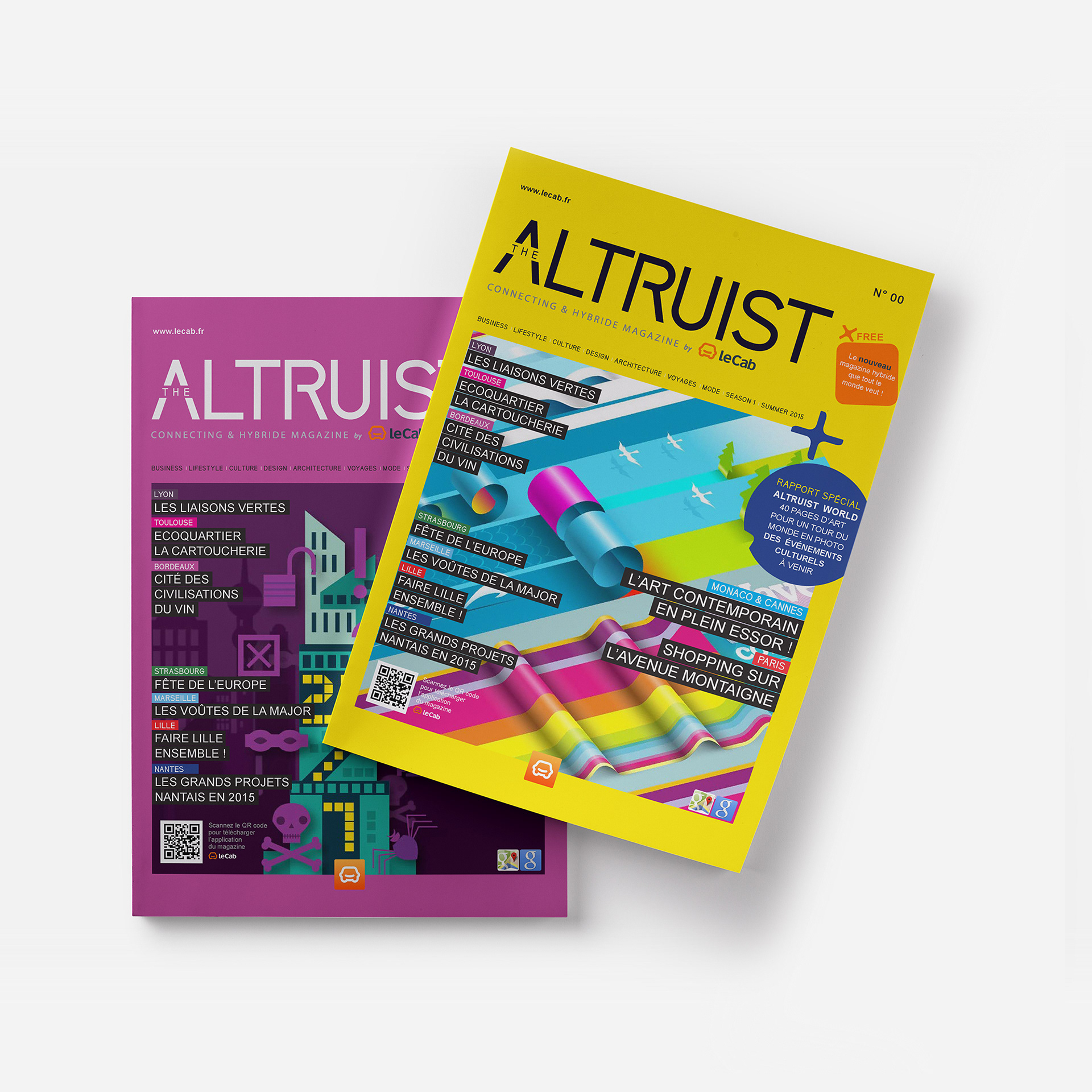
CLIENT / The Altruitst by Le Cab, New Hybrid & Connecting Magazine, Paris, France
Project Overview
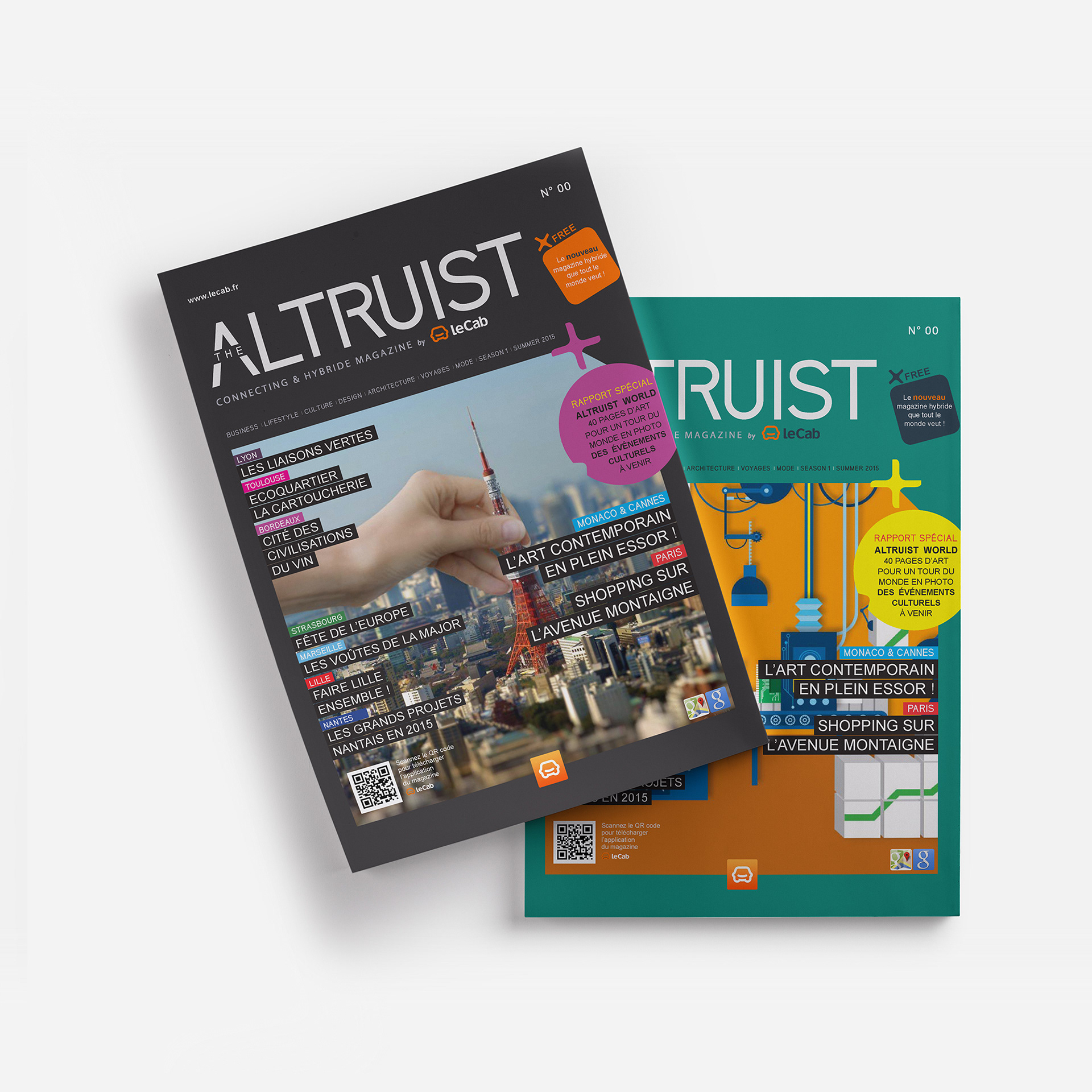
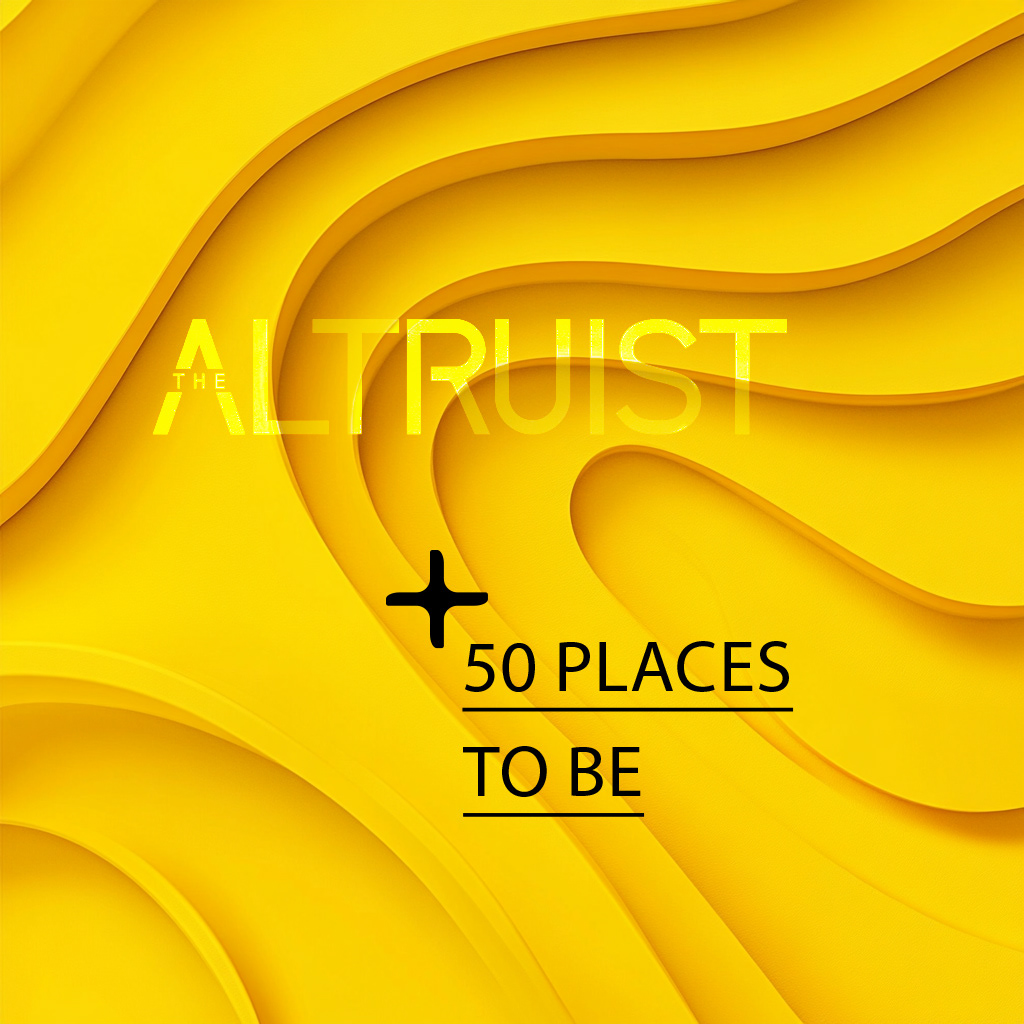
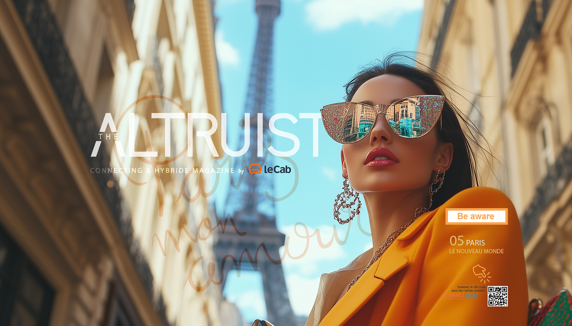
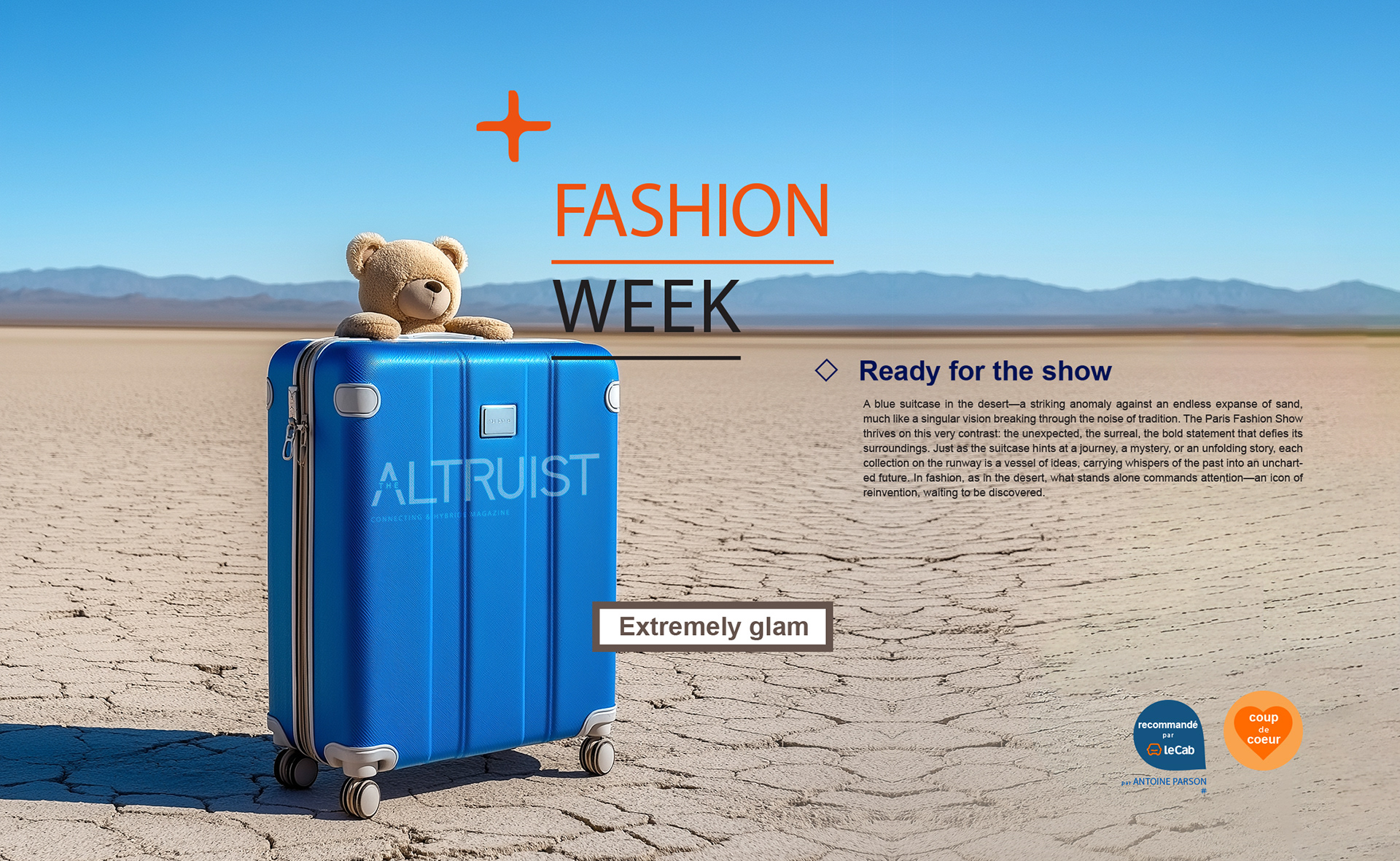
The Altruist Magazine, a hybrid print-digital publication, needed a cohesive brand identity for its launch. The goal was to merge traditional editorial design with modern interactivity, creating a seamless and engaging reader experience.
I developed a dynamic logo, bold color palette, and versatile typography to reflect
the magazine’s innovation, connectivity, and cultural relevance.
The new identity positioned The Altruist Magazine as a forward-thinking publication,
fostering audience engagement and uniting diverse voices across mediums.
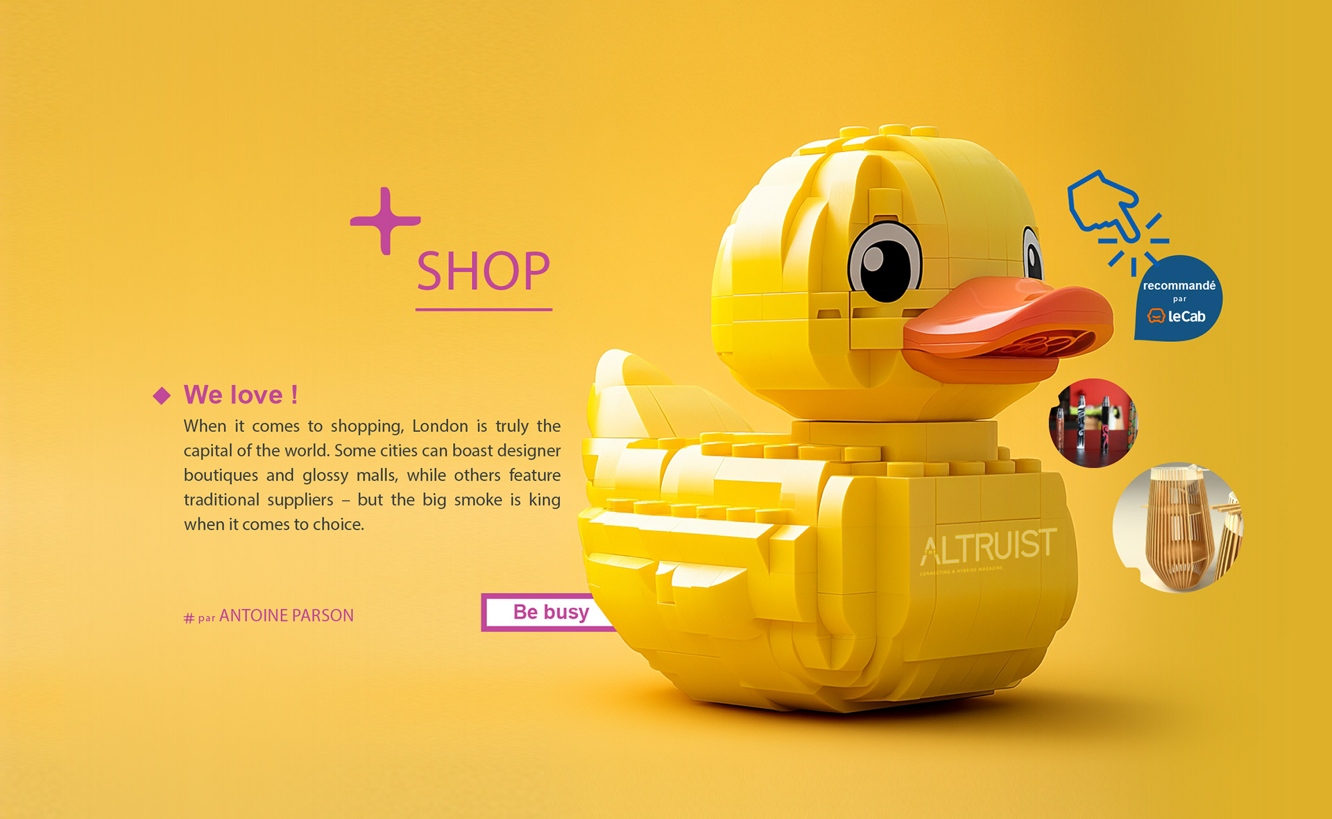
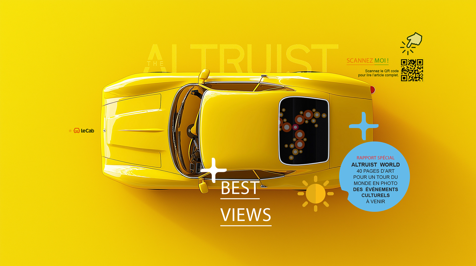
Approach & Solutions
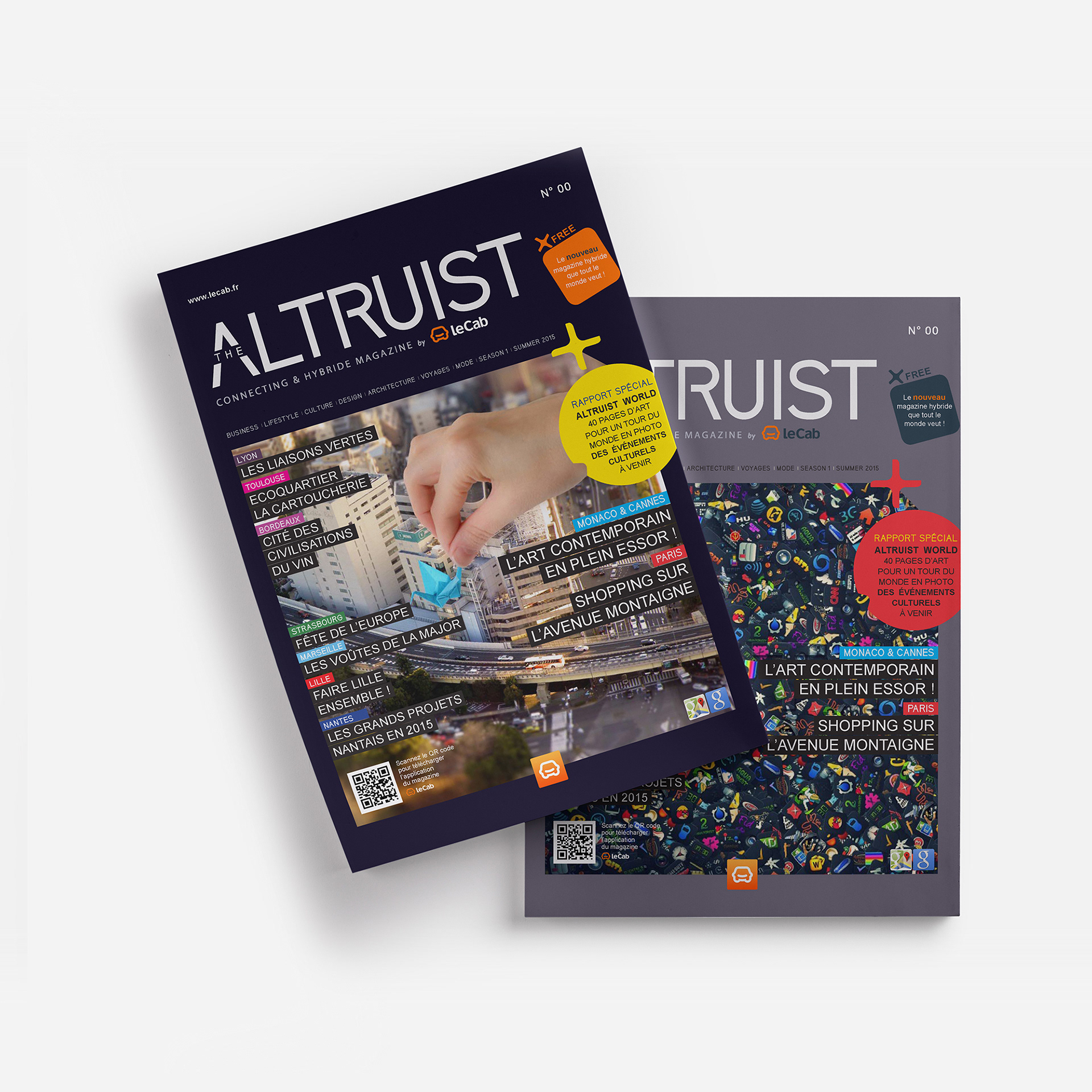
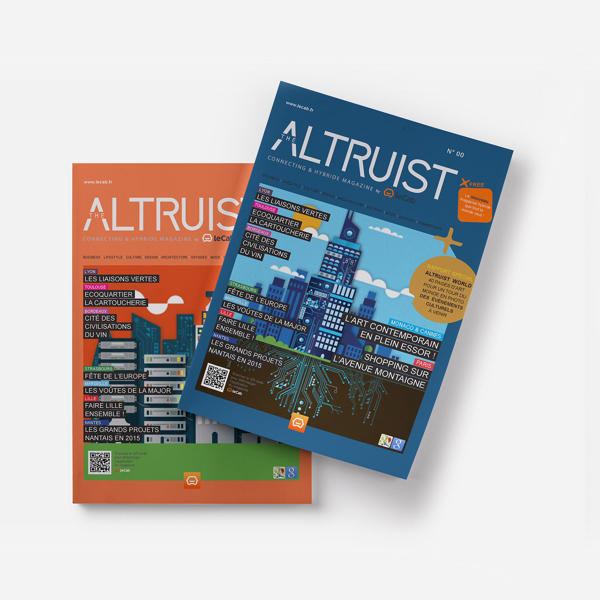
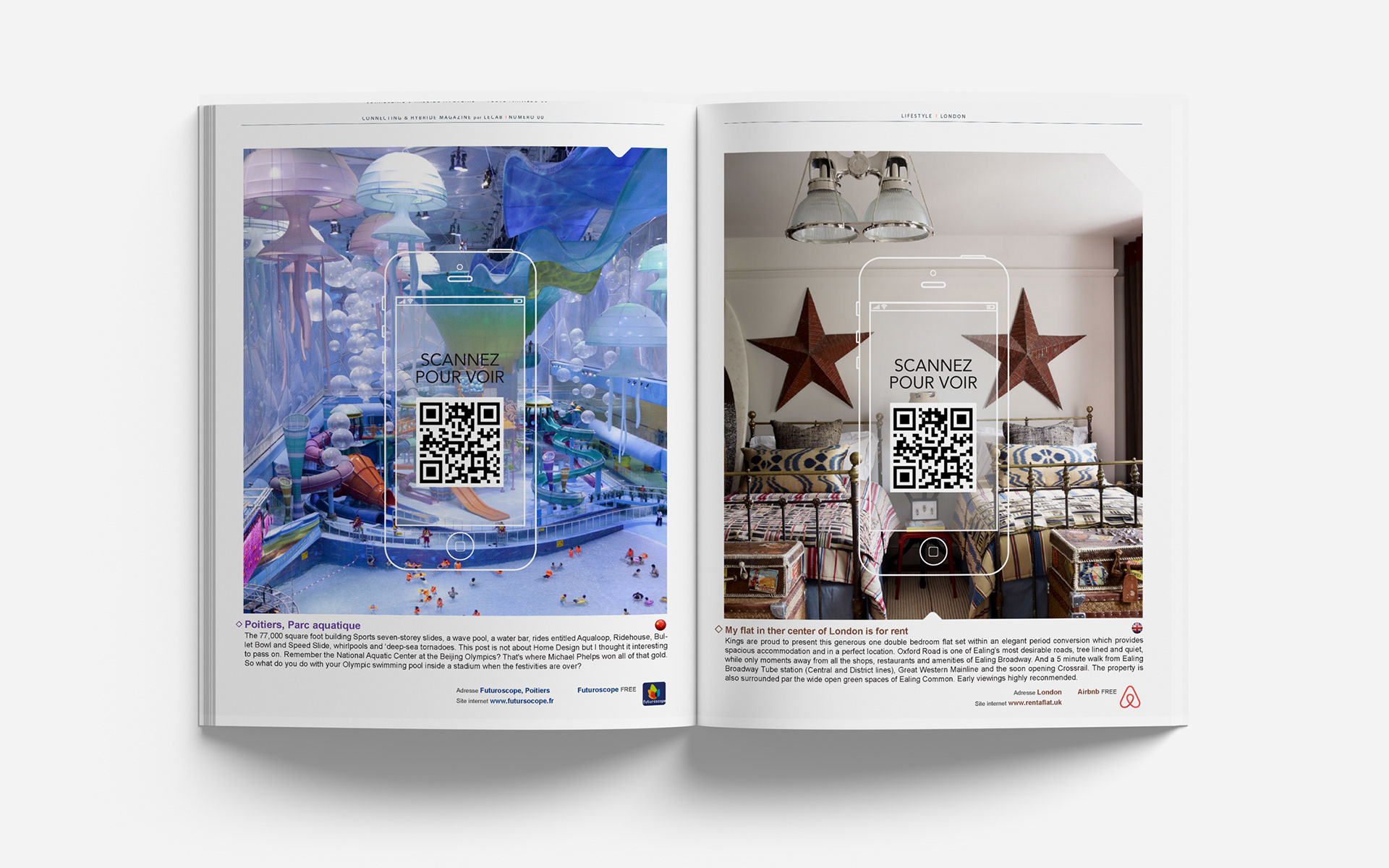
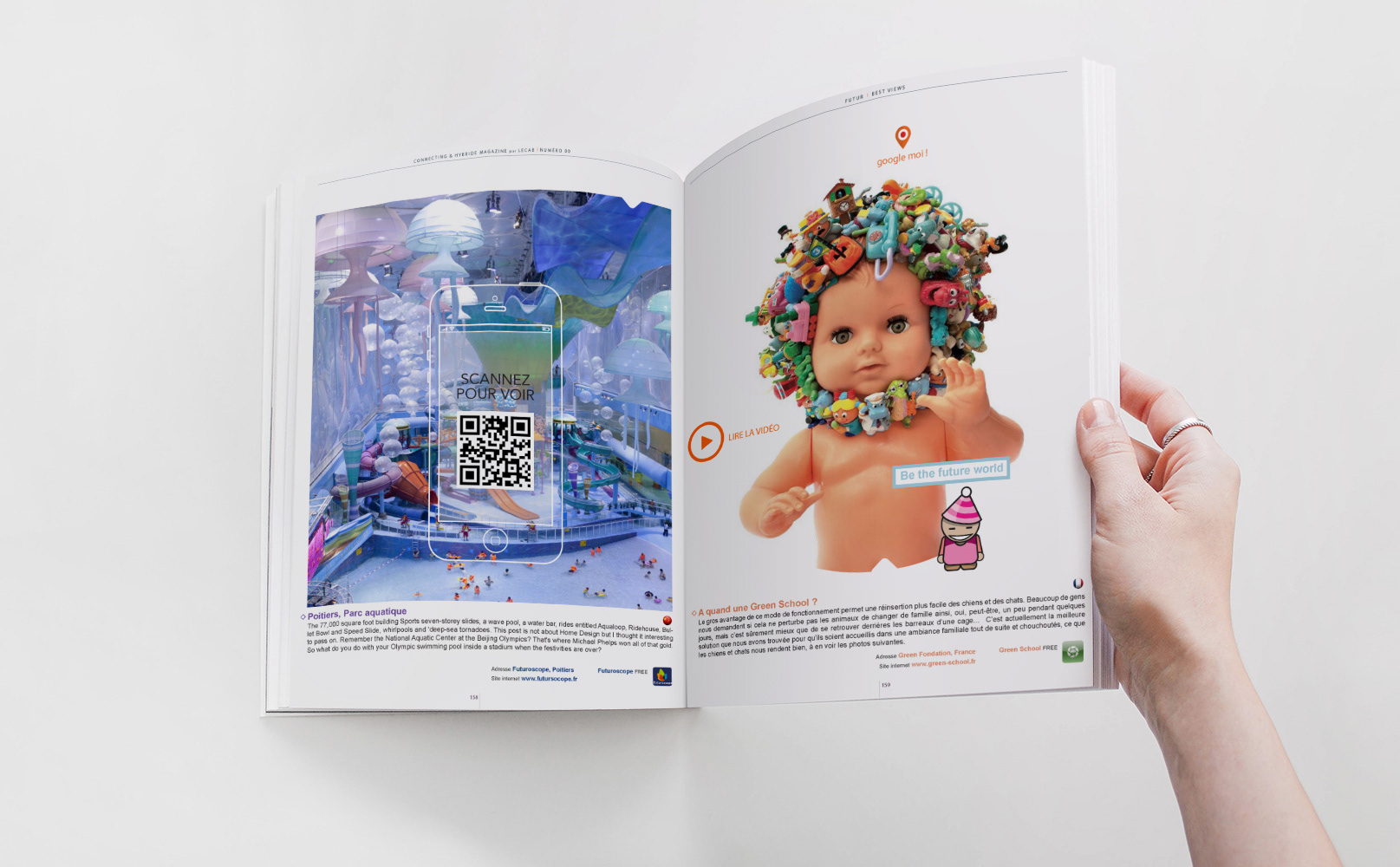
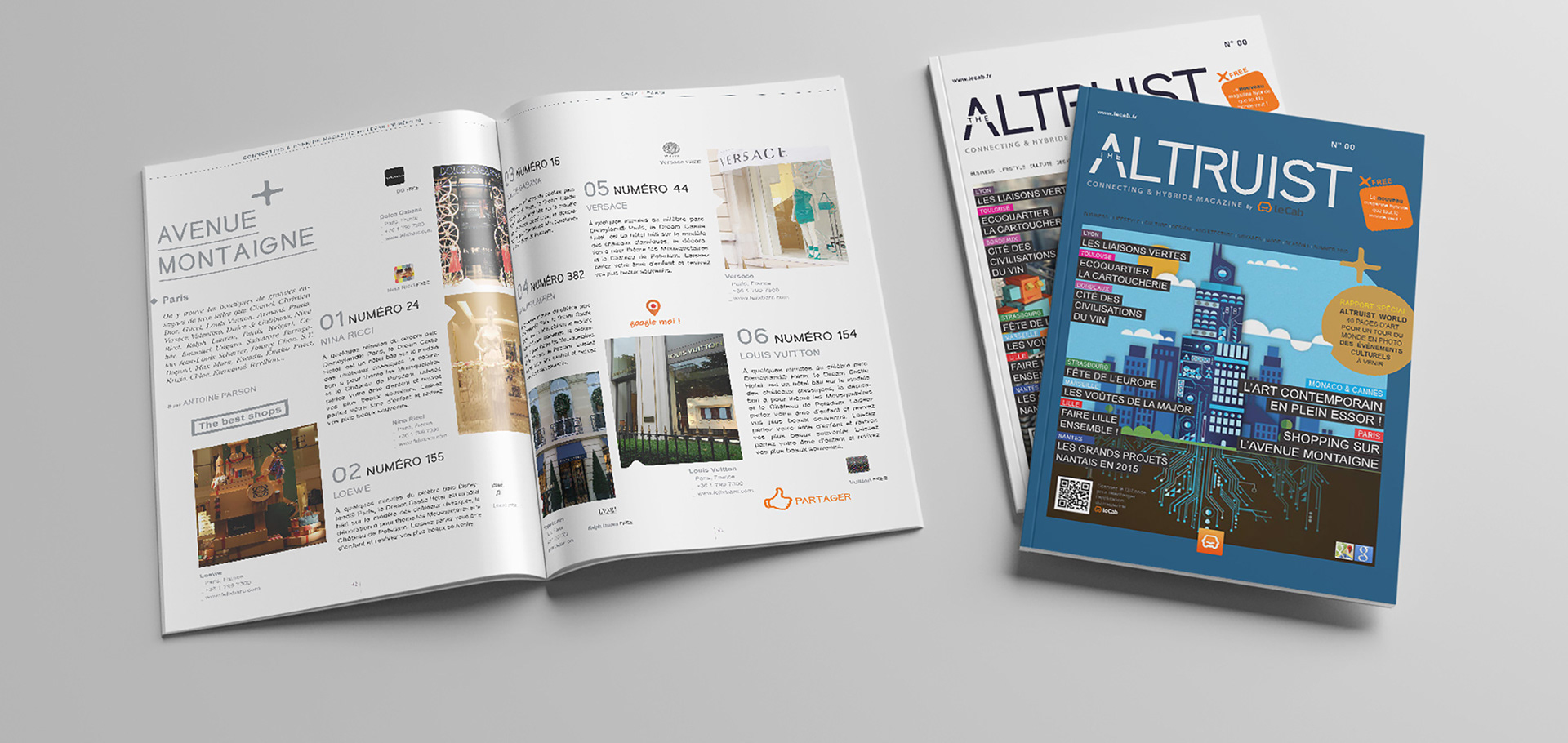
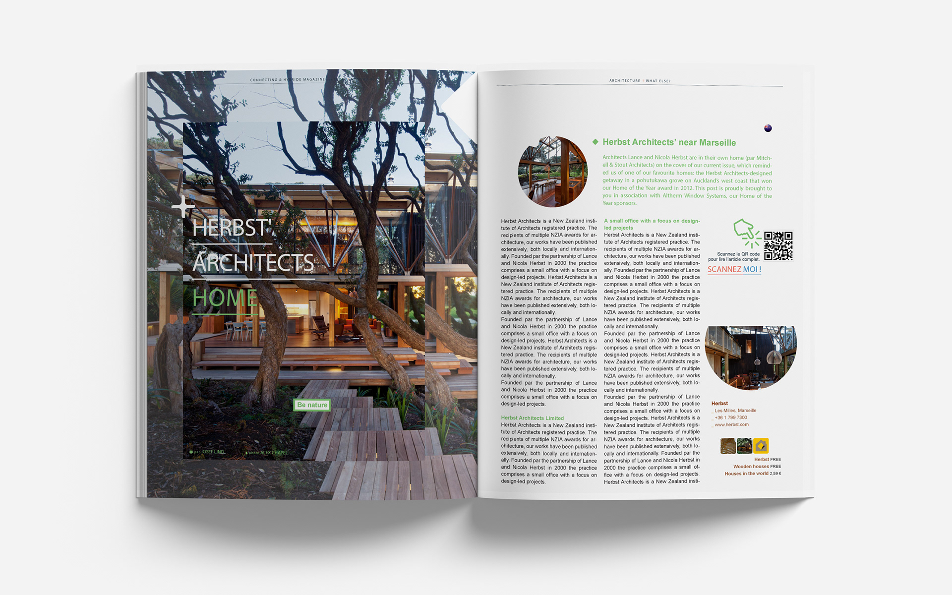
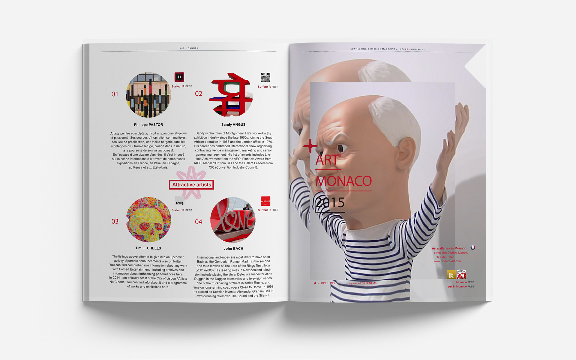
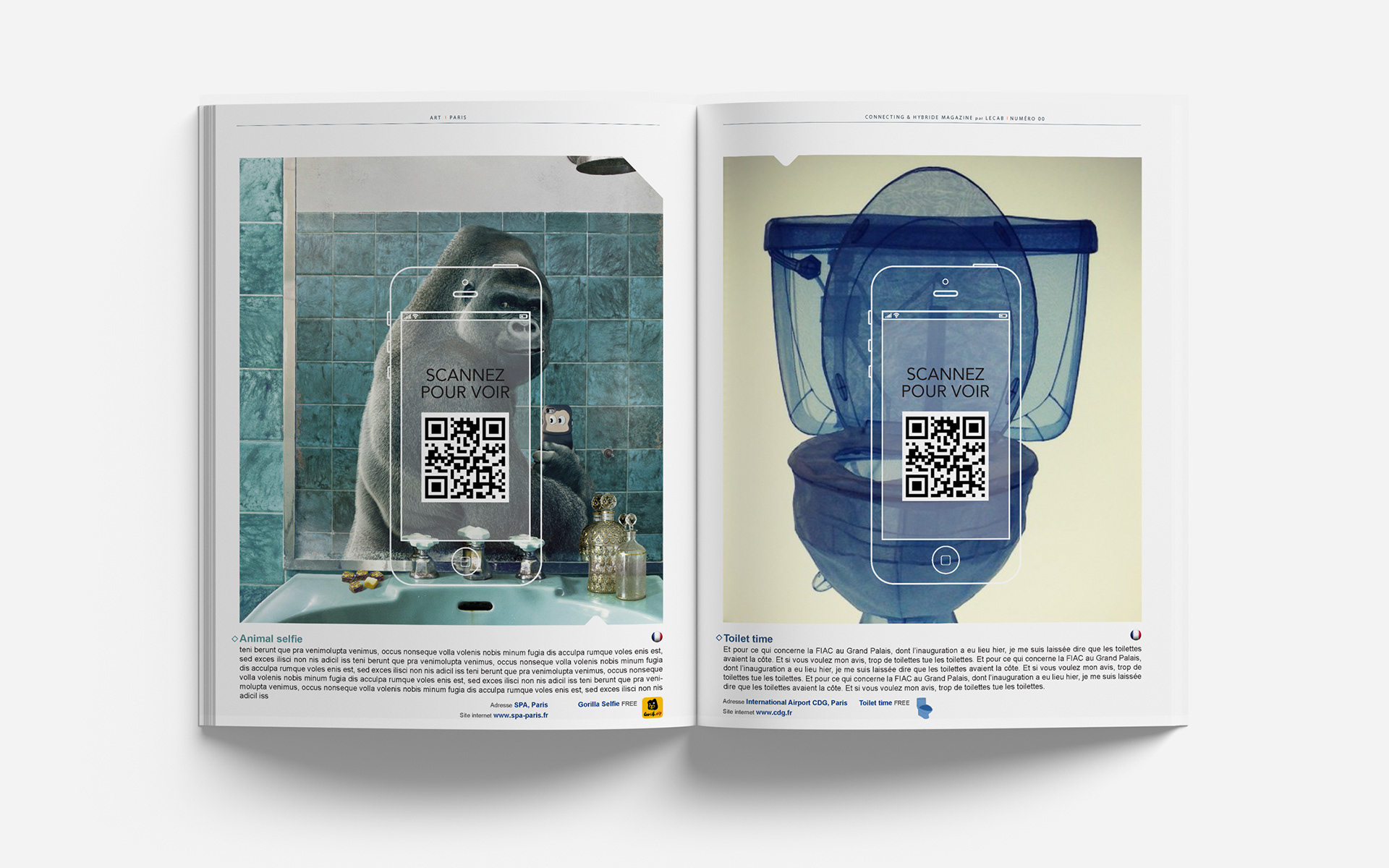
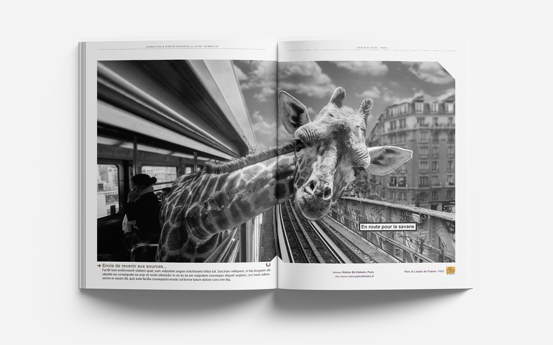
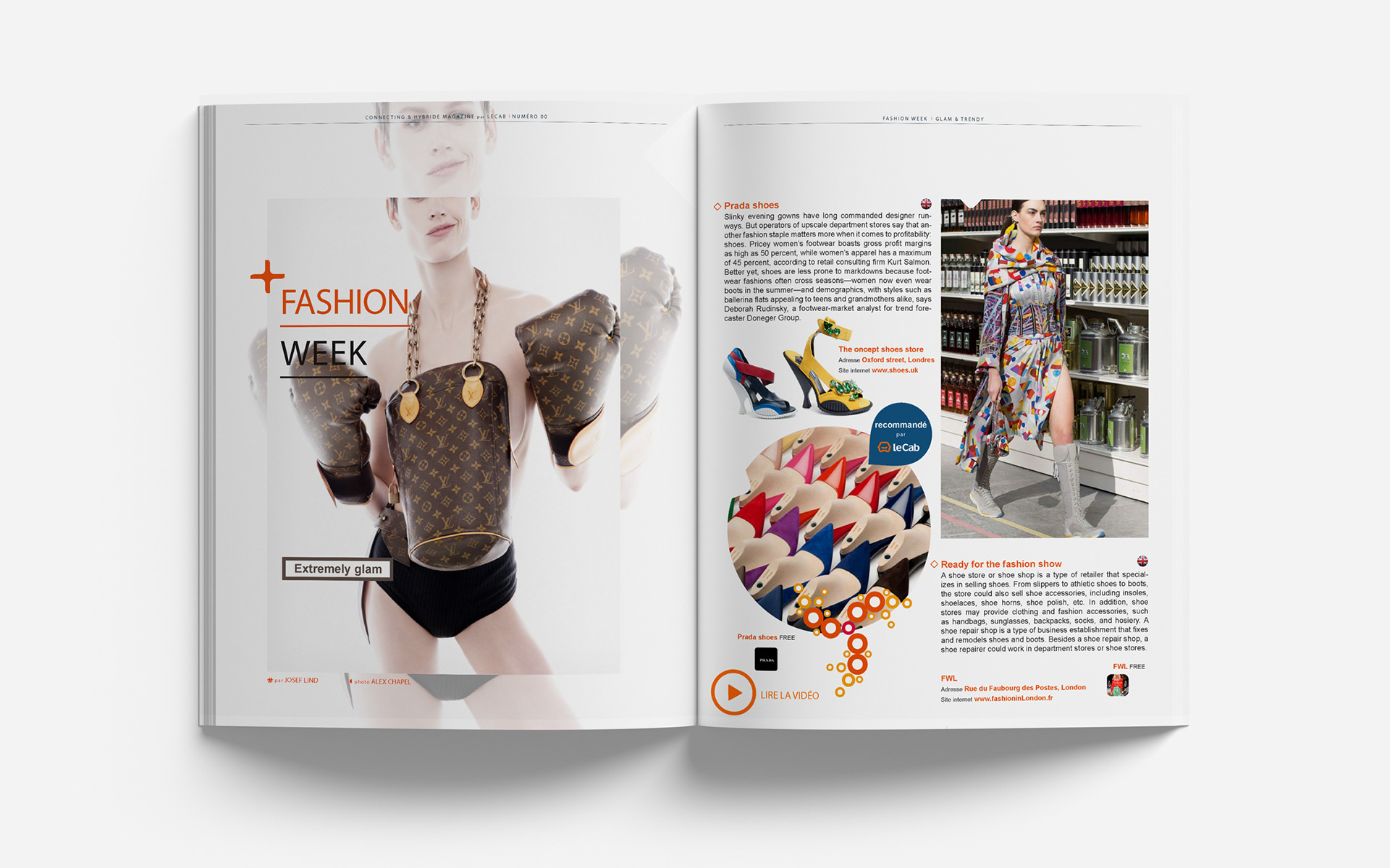
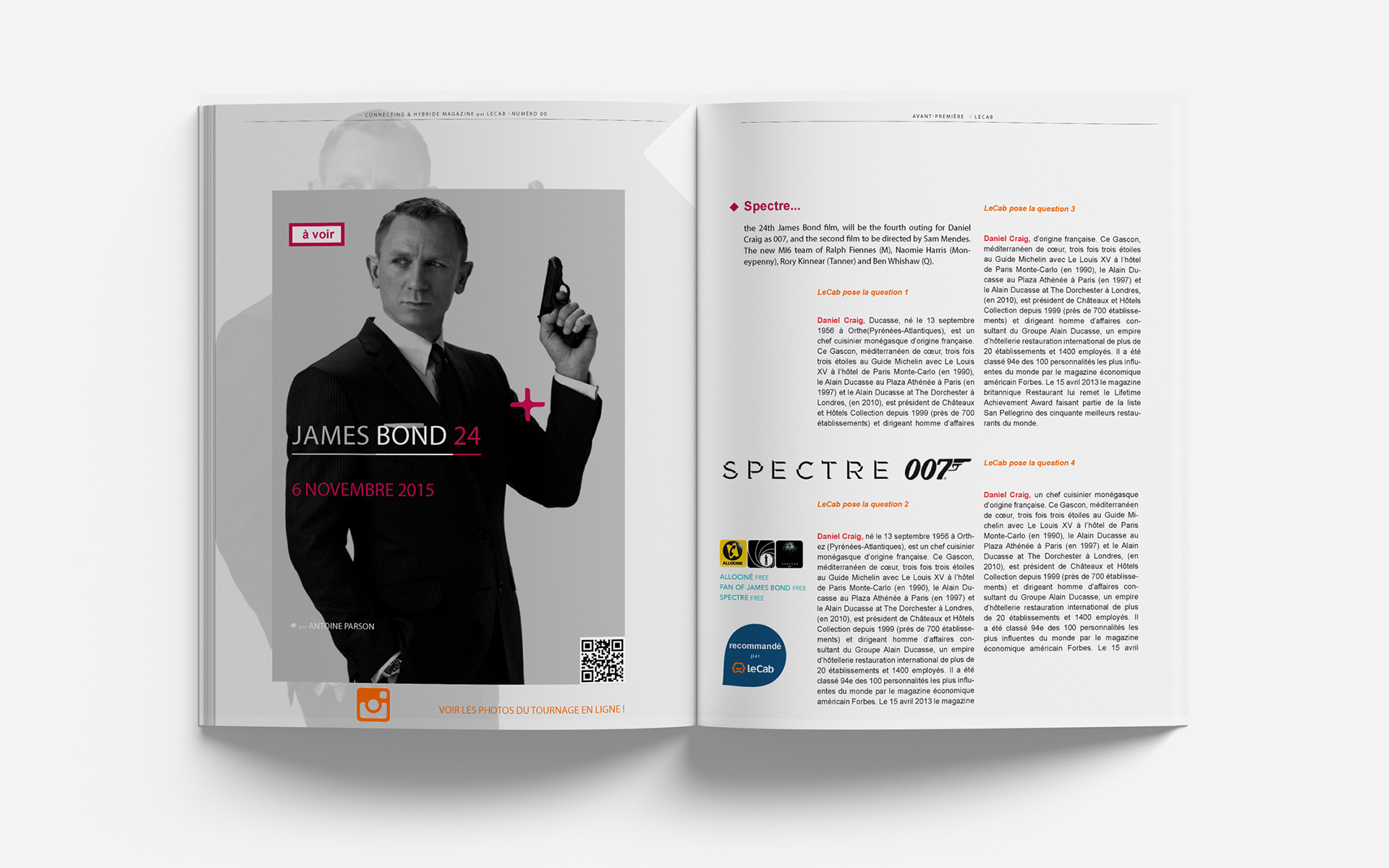
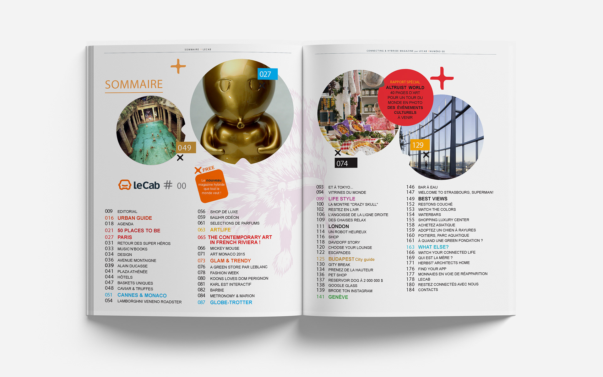
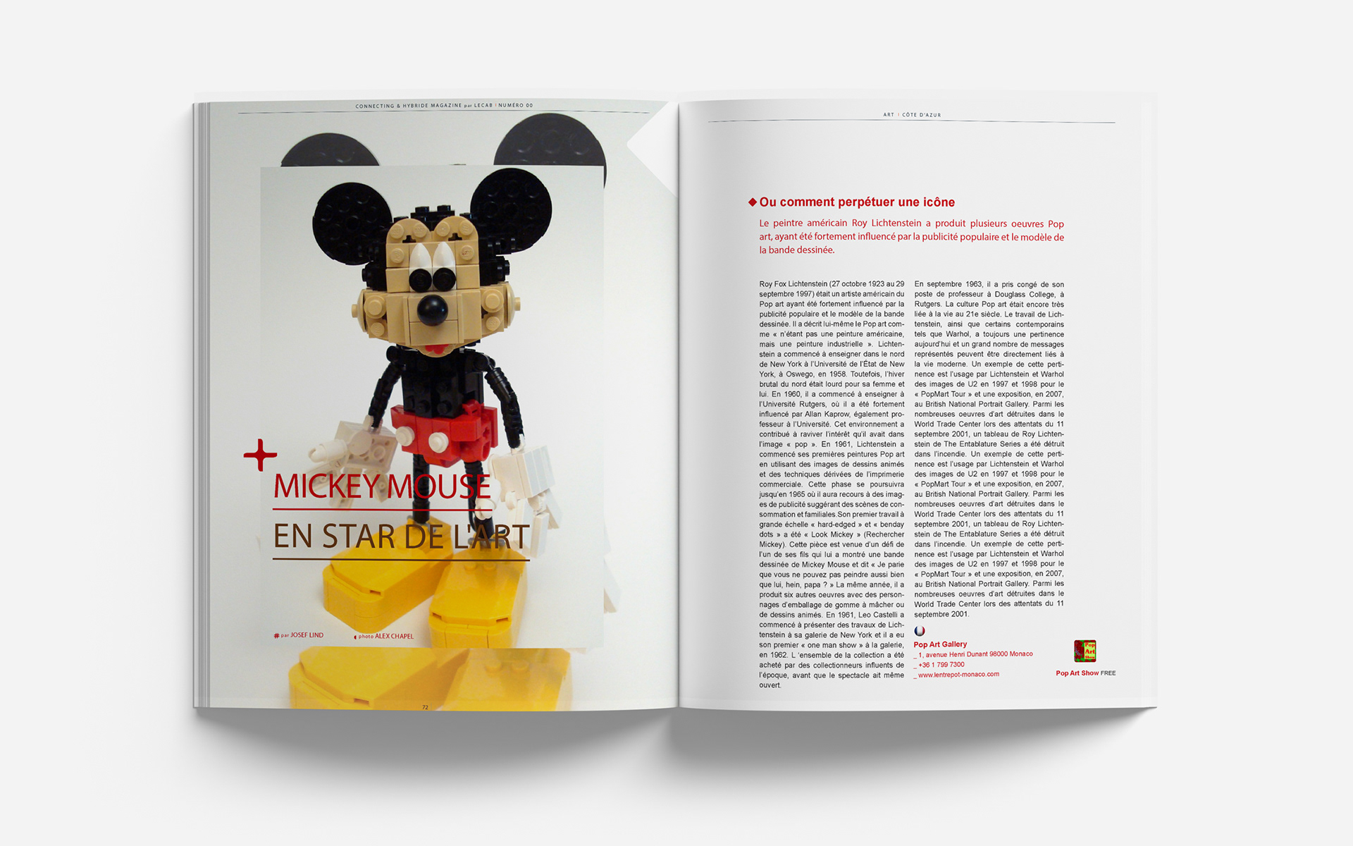
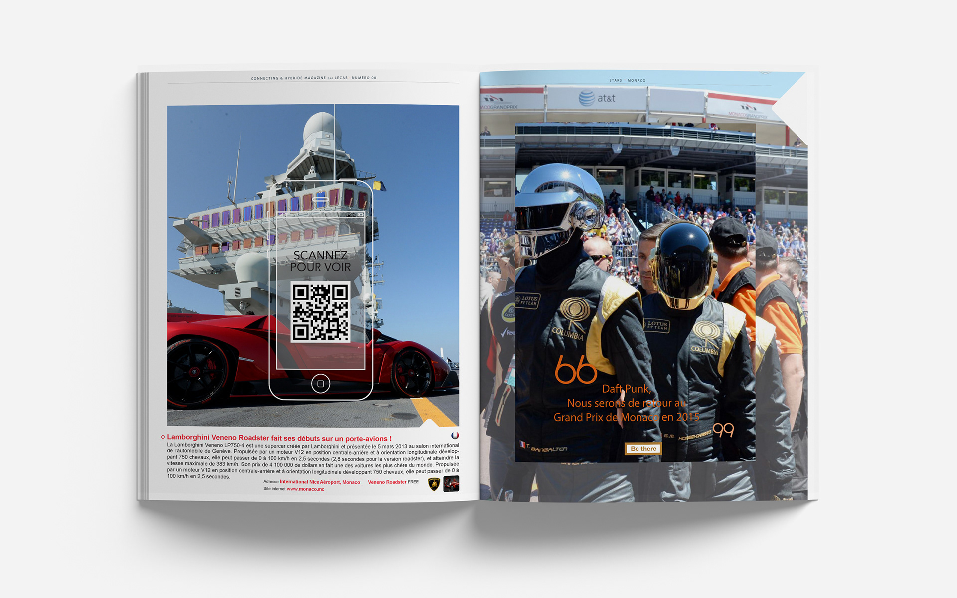
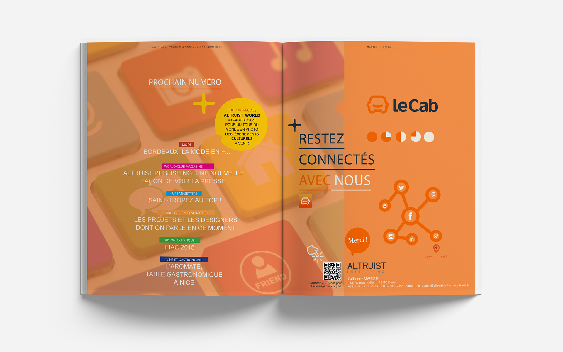
The layout I designed for The Altruist Magazine’s first issue delivered strong results.
It blended a clean aesthetic, structured grids, and dynamic typography for a cohesive print and digital environment:
- I enhanced readability and visual appeal by combining a clean, modern aesthetic
with structured grids and dynamic typography.
- The seamless integration of long-form articles with shorter pieces ensured a fluid narrative
while interactive digital features drove higher user engagement.
- This fresh, versatile design positioned the magazine as an innovative publication,
helping it gain traction with its target audience and establish a strong foundation for future issues.
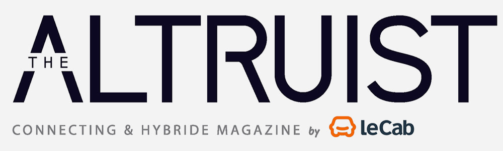
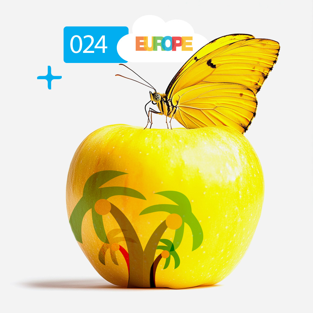
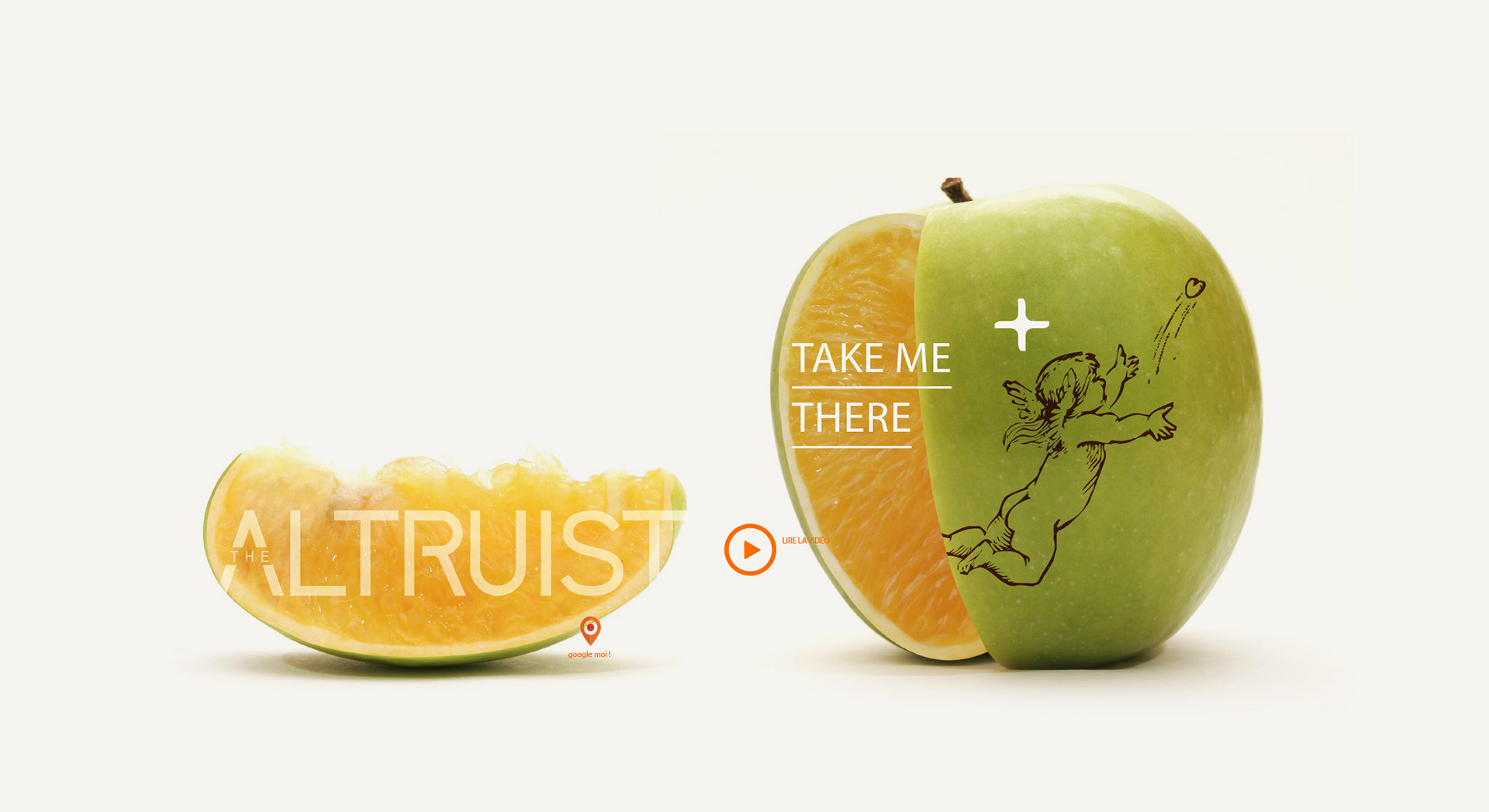
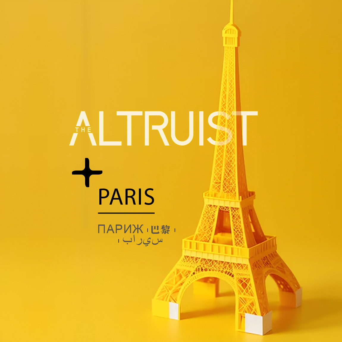
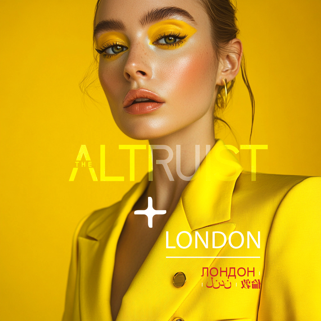
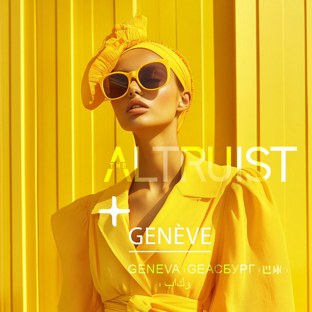
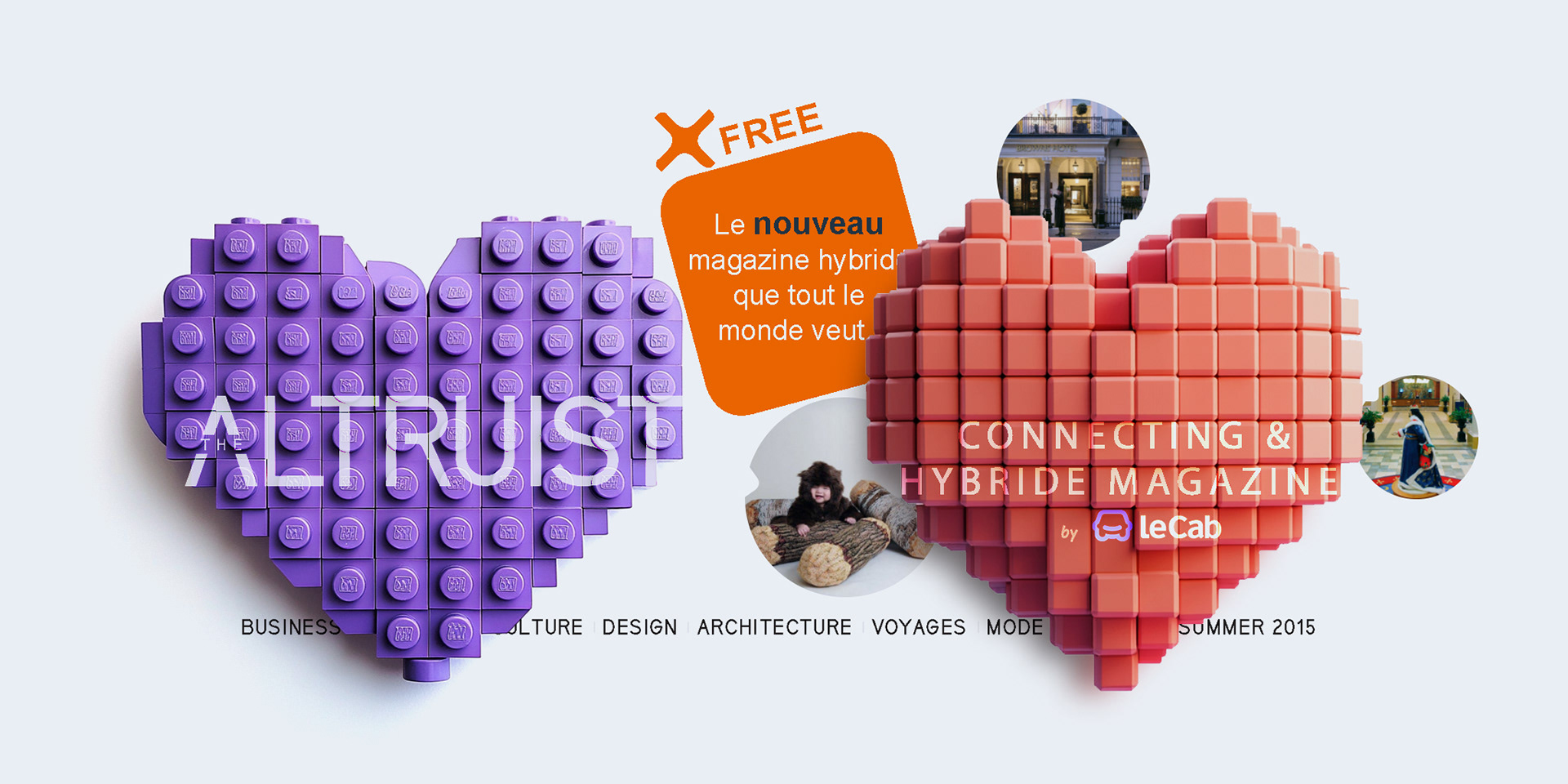
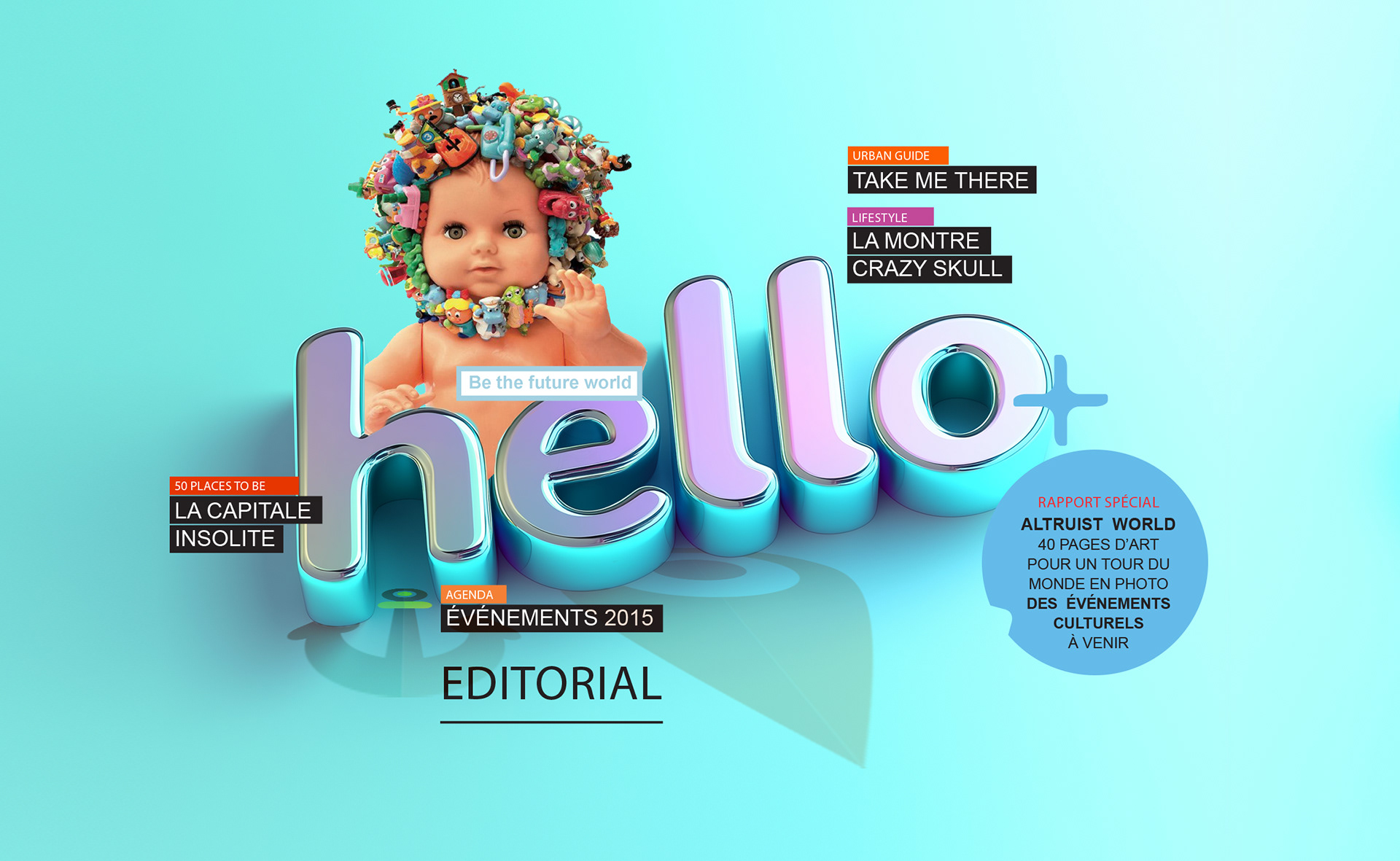
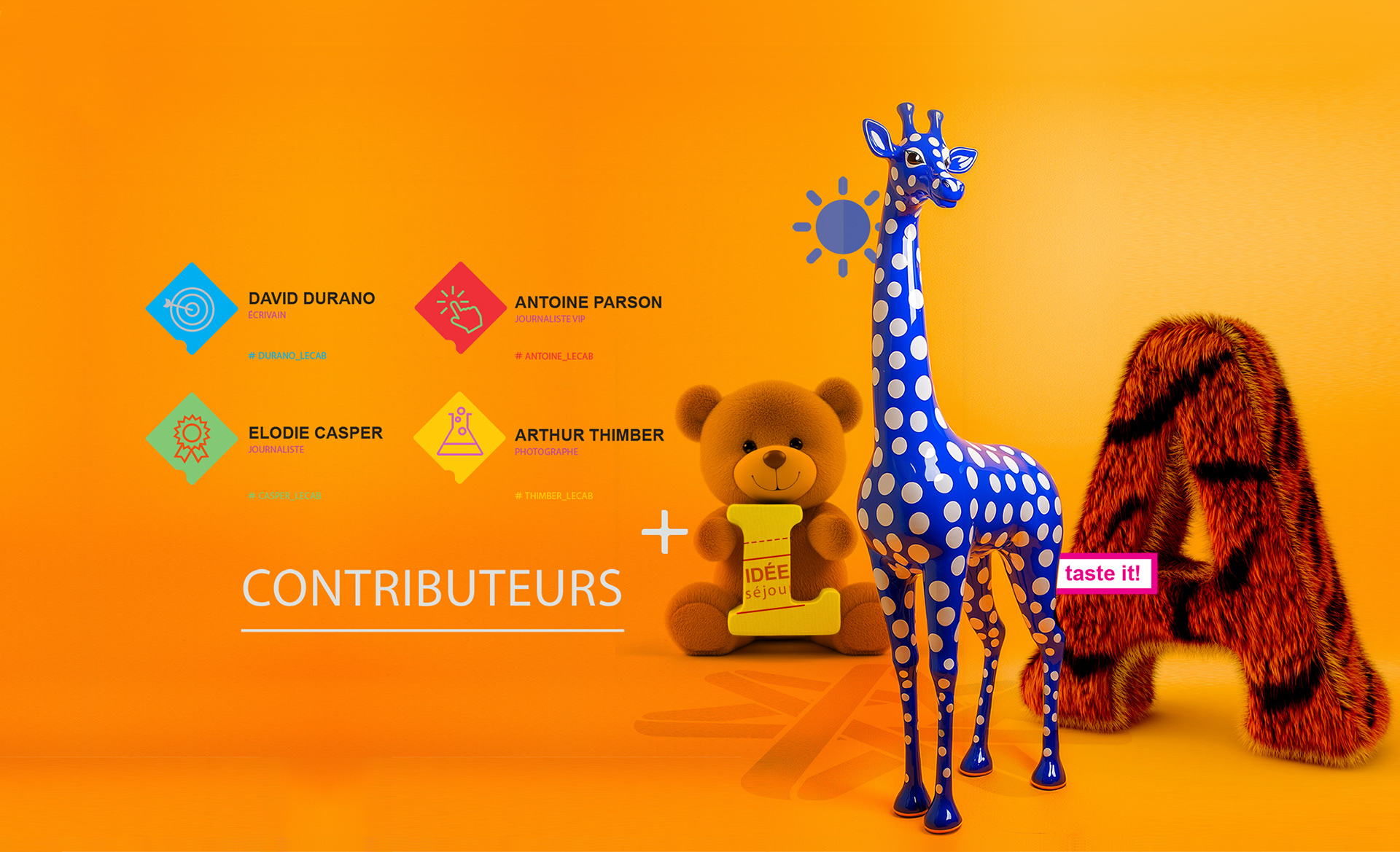
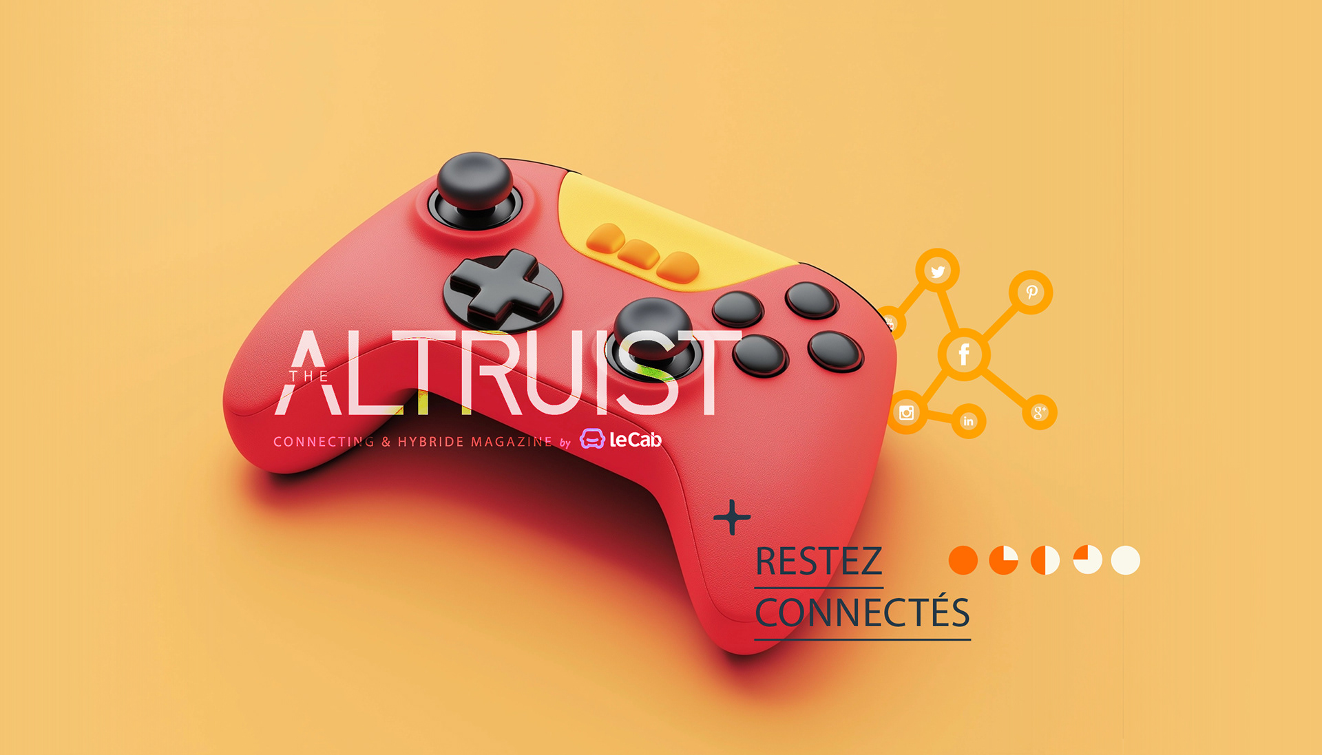
LOGO DESIGN: A CONNECTING & HYBRID MAGAZINE
The Altruist logo embodies modernity and connectivity, aligning with its identity as a hybrid magazine by Le Cab:
- The bold sans-serif typography ensures clarity, while the stylized "A" adds a distinctive,
dynamic touch.
- The tagline reinforces the magazine’s mission, with “hybride” reflecting its French influence.
- Seamlessly integrating Le Cab’s branding, the design establishes The Altruist as an innovative,
forward-thinking publication.
Concept Breakdown 1: AI THAT THINKS WITH YOU Everyplace ANYTIME
This AI tool transforms abstract ideas into clear, visual learning.
It’s intuitive, adaptable, and designed to support—not replace—how students and teachers think. With a calm, thoughtful voice, it brings clarity to complexity and helps users navigate layered content through innovative, responsive design.
More than a tool, it’s a values-driven partner: free, ethical, and built for real people doing meaningful work. It encourages curiosity, invites collaboration, and empowers users to ask better questions—making education more accessible, thoughtful, and human.
Concept Breakdown 2: AI THAT THINKS WITH YOU Everyplace ANYTIME
This AI tool transforms abstract ideas into clear, visual learning.
It’s intuitive, adaptable, and designed to support—not replace—how students and teachers think. With a calm, thoughtful voice, it brings clarity to complexity and helps users navigate layered content through innovative, responsive design.
More than a tool, it’s a values-driven partner: free, ethical, and built for real people doing meaningful work. It encourages curiosity, invites collaboration, and empowers users to ask better questions—making education more accessible, thoughtful, and human.