CLIENT / Integrated Spine & Pain Care


Project Overview
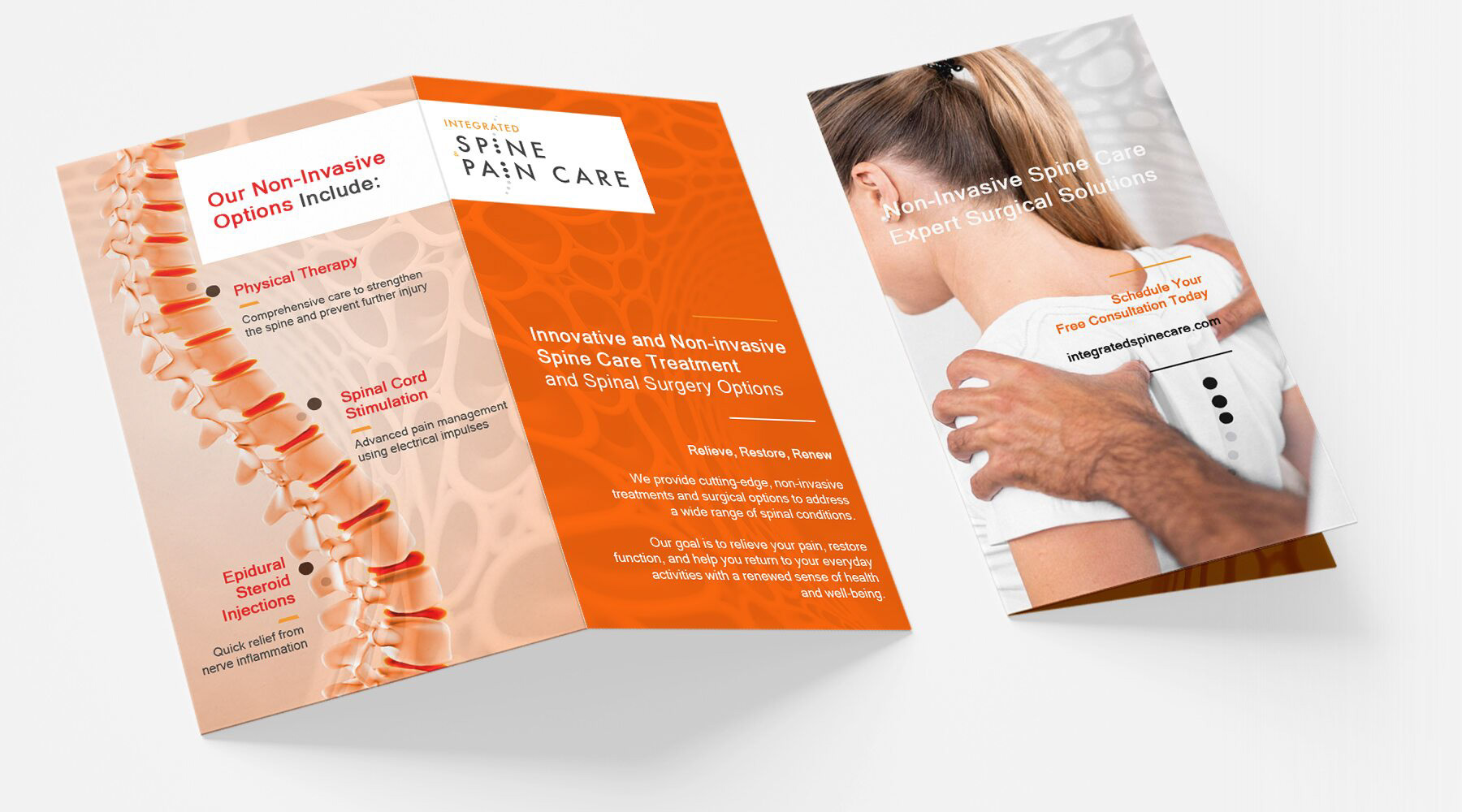
The client needed a logo and print materials to establish a professional, approachable brand identity for their pain management practice.
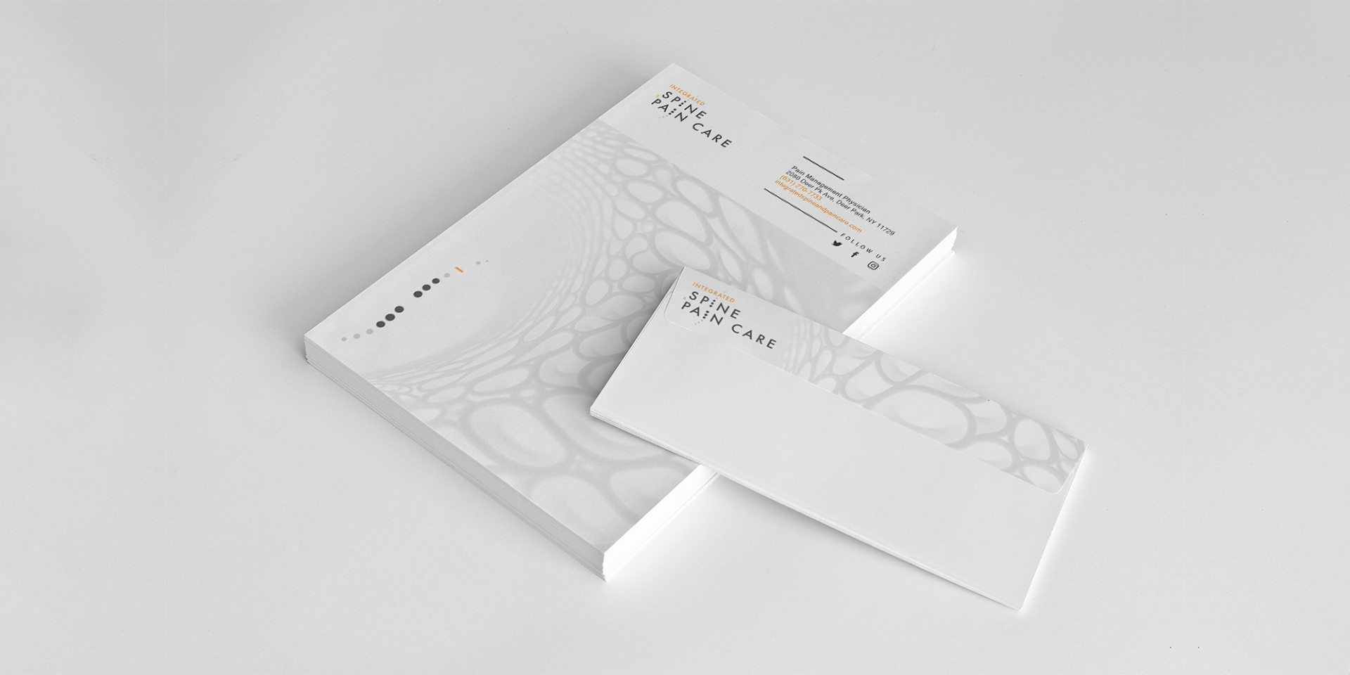
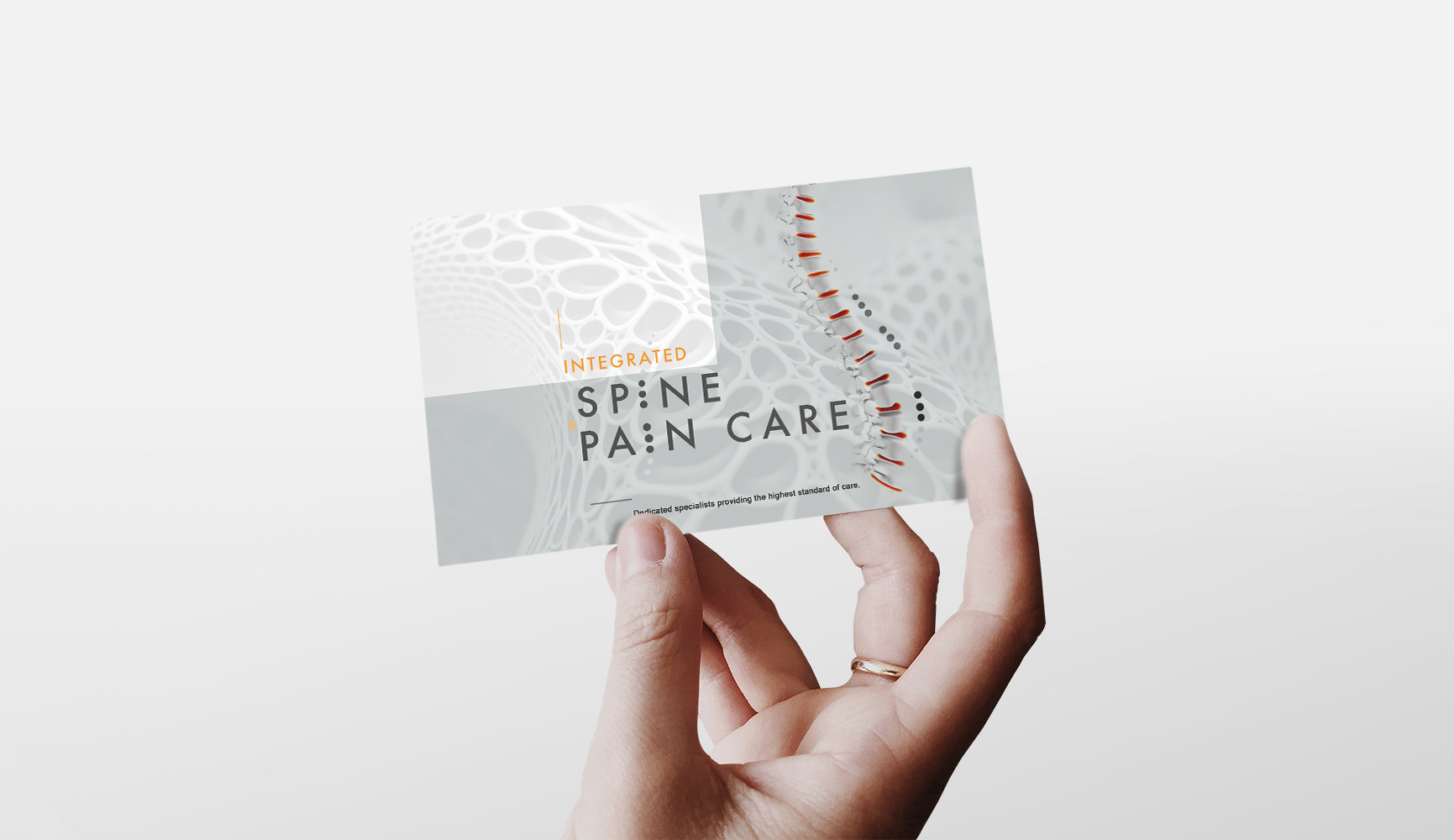
The logo conveyed trust, care, and relief, while print materials—business cards, letterheads, and brochures—would ensure a cohesive, polished presence.
The goal was to reflect compassion and precision through visual design.
The logo conveyed trust, care, and relief, while print materials—business cards, letterheads, and brochures—would ensure a cohesive, polished presence.
The goal was to reflect compassion and precision through visual design.
Approach & Solution
Inspired by the client’s focus on pain management, I crafted a minimalistic, modern vertebra logo that balances anatomical precision with a sense of relief and care:
- The soft, clean lines symbolize the spine’s form while reflecting the client’s healing expertise
and commitment to patient well-being.
- This cohesive visual identity communicates the practice's professionalism and dedication
to compassionate pain management.
- The soft, clean lines symbolize the spine’s form while reflecting the client’s healing expertise
and commitment to patient well-being.
- This cohesive visual identity communicates the practice's professionalism and dedication
to compassionate pain management.


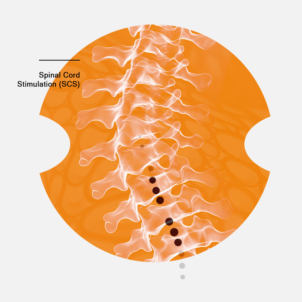
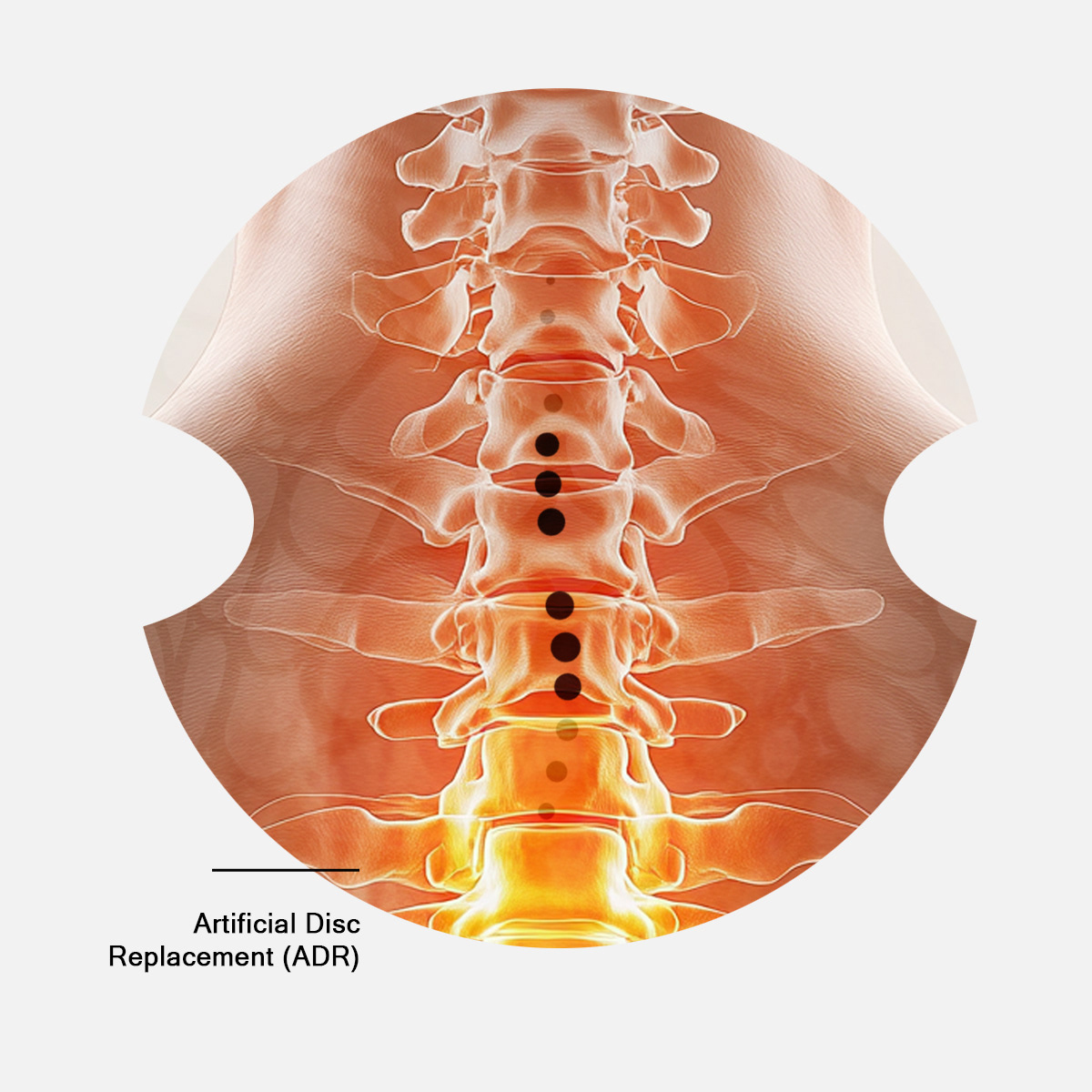
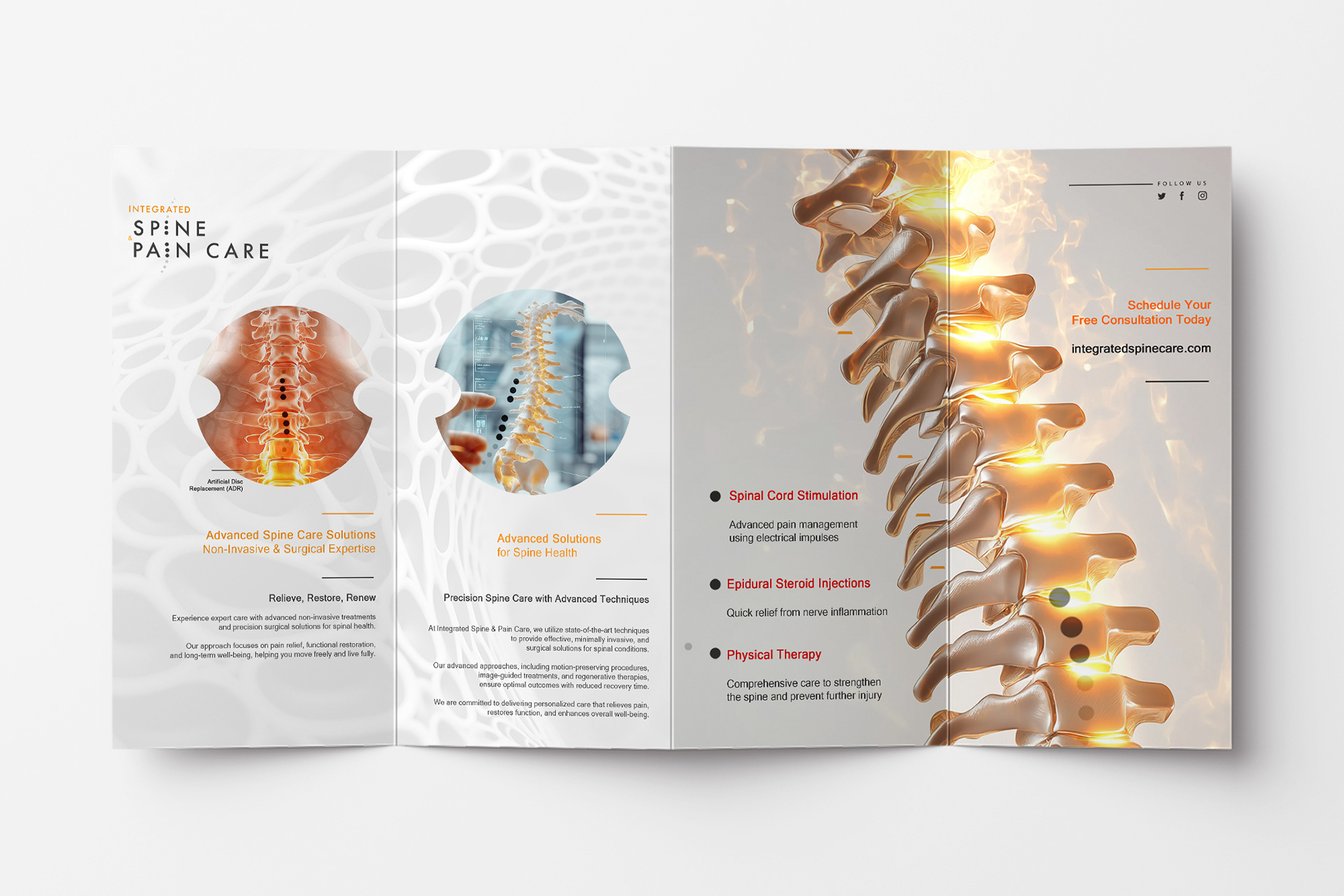
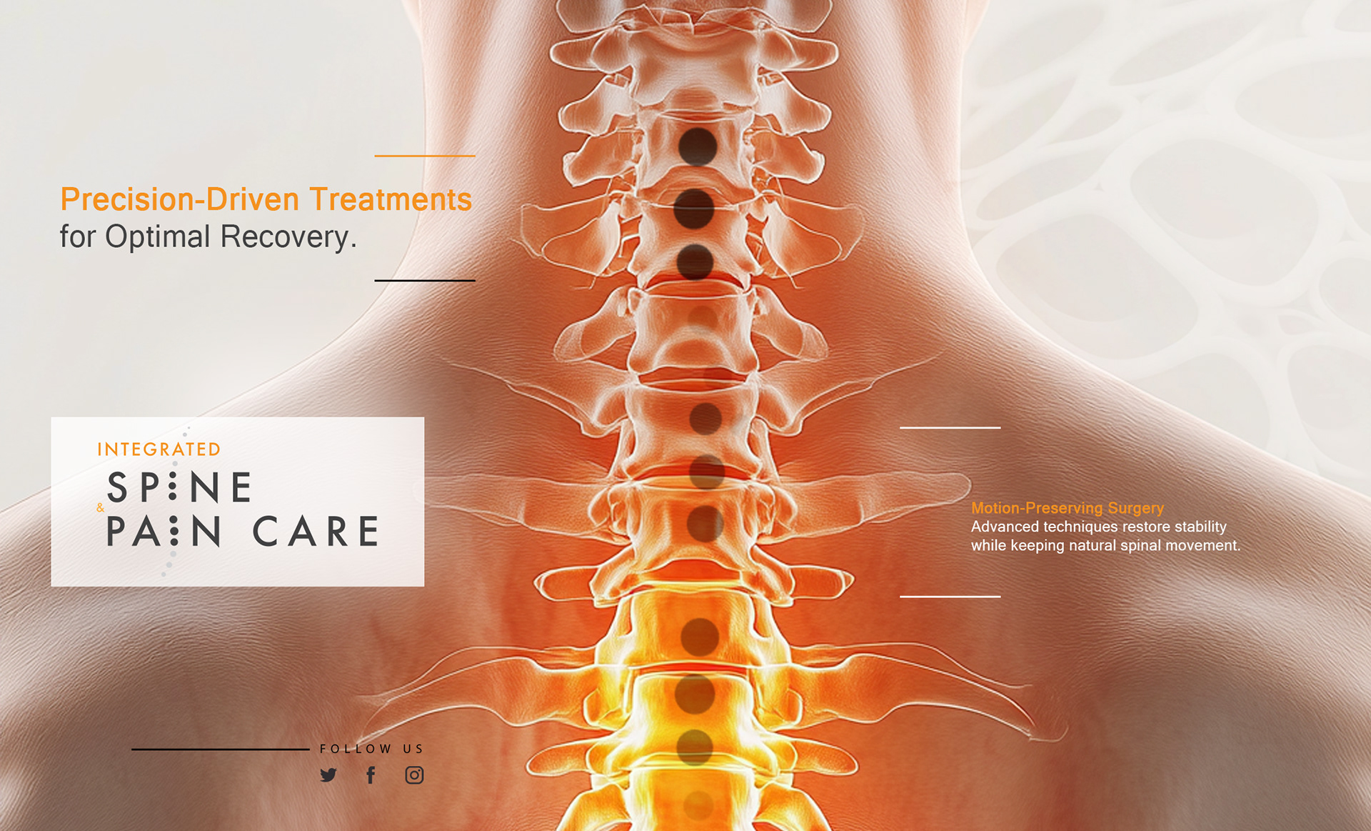
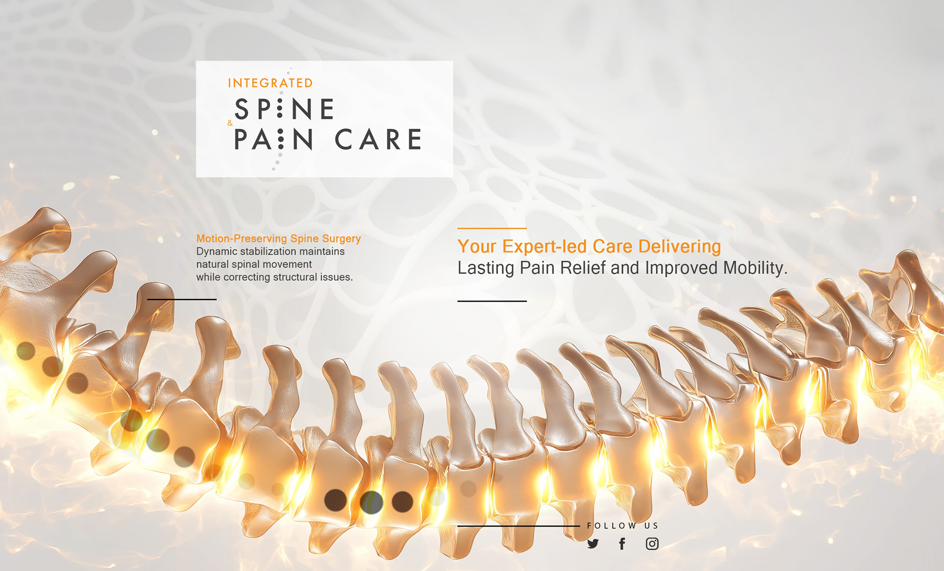
LOGO DESIGN: A DEDICATION TO PAIN MANAGEMENT
Color Palette: Soft, clean lines symbolize the spine's form, reflecting the client's healing expertise.
Typography: Clean, modern sans-serif font for clarity and approachability.
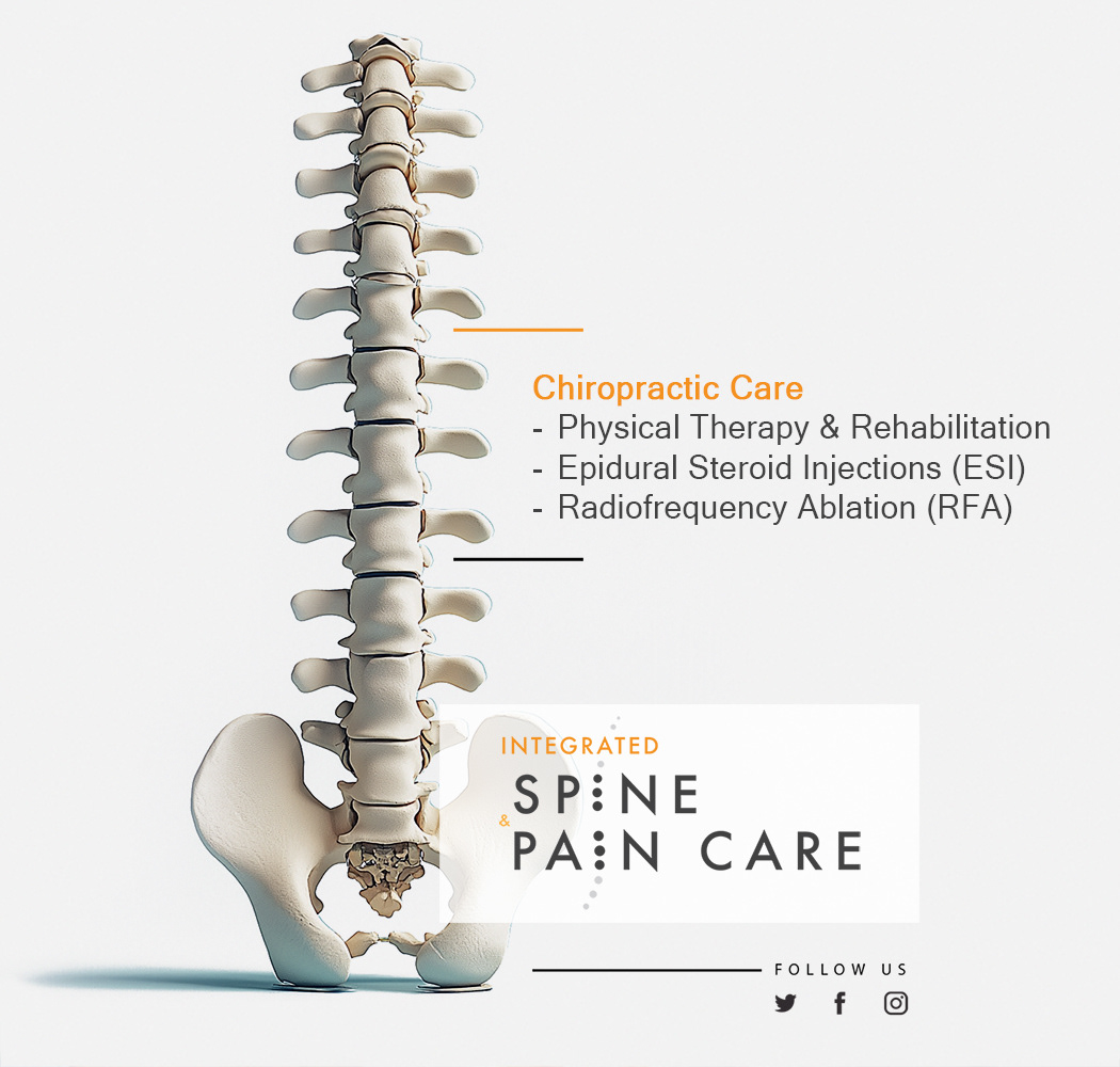
Graphic Elements: A stylized vertebra is a central motif, conveying expertise, trust, and care.
Imagery: The cohesive branding extends to business cards, letterheads, and brochures, ensuring a polished, unified look that enhances patient communication and brand recognition.
Color Palette: Soft, clean lines symbolize the spine's form, reflecting the client's healing expertise.
Typography: Clean, modern sans-serif font for clarity and approachability.
Graphic Elements: A stylized vertebra is a central motif, conveying expertise, trust, and care.
Imagery: The cohesive branding extends to business cards, letterheads, and brochures, ensuring a polished, unified look that enhances patient communication and brand recognition.


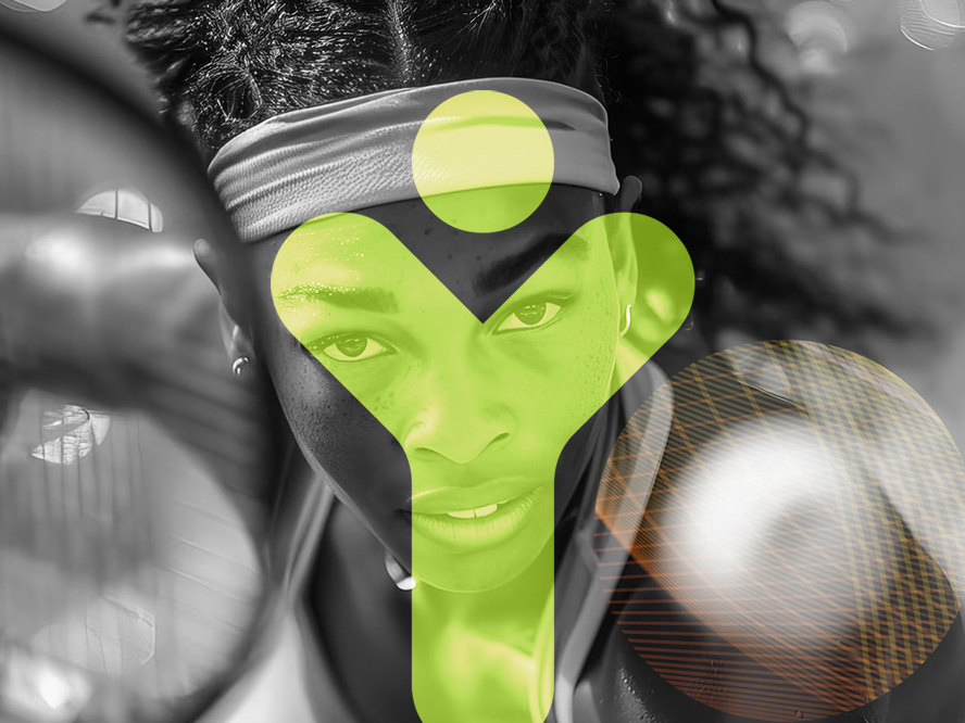
Concept Breakdown 2: AI THAT THINKS WITH YOU Everyplace ANYTIME
This AI tool transforms abstract ideas into clear, visual learning.
It’s intuitive, adaptable, and designed to support—not replace—how students and teachers think. With a calm, thoughtful voice, it brings clarity to complexity and helps users navigate layered content through innovative, responsive design.
More than a tool, it’s a values-driven partner: free, ethical, and built for real people doing meaningful work. It encourages curiosity, invites collaboration, and empowers users to ask better questions—making education more accessible, thoughtful, and human.