CLIENT ▸ Magym
ROLE ▸ Art Director Freelance
SCOPE ▸ Logo Design, Brand Identity, Visual Identity, Campaign Materials, Digital Assets, Experience UX Design,
ROLE ▸ Art Director Freelance
SCOPE ▸ Logo Design, Brand Identity, Visual Identity, Campaign Materials, Digital Assets, Experience UX Design,

The Challenge
Build a recognizable brand identity for a new digital fitness platform
Differentiate the brand in a crowded wellness and training market Create a visual system adaptable across digital products and marketing
Build a recognizable brand identity for a new digital fitness platform
Differentiate the brand in a crowded wellness and training market Create a visual system adaptable across digital products and marketing
The Strategic Approach
Position Magym as an accessible, modern fitness platform
Emphasize energy, movement, and simplicity in the brand language
Develop a flexible identity optimized for digital-first environments
Position Magym as an accessible, modern fitness platform
Emphasize energy, movement, and simplicity in the brand language
Develop a flexible identity optimized for digital-first environments
Creative Solution
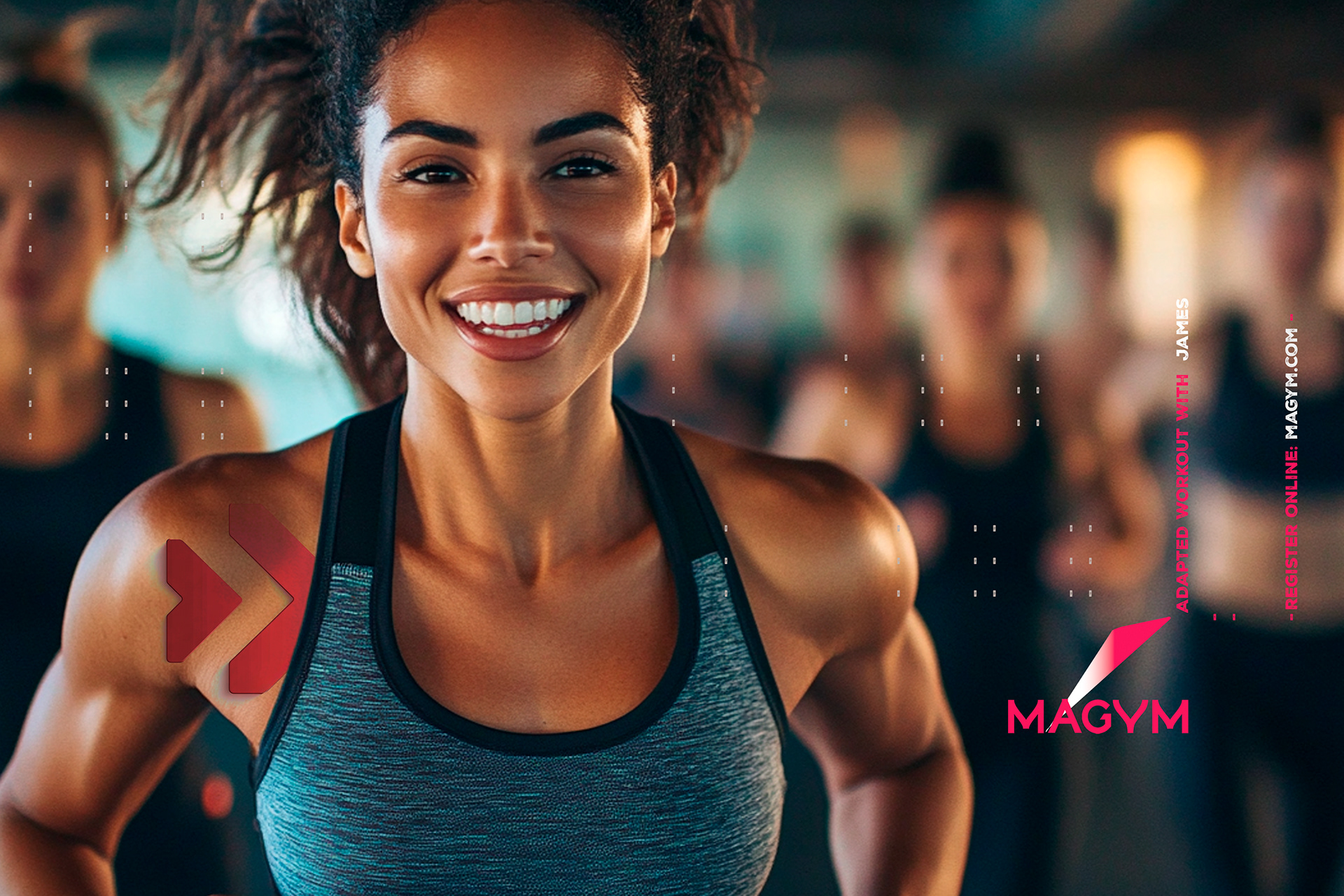
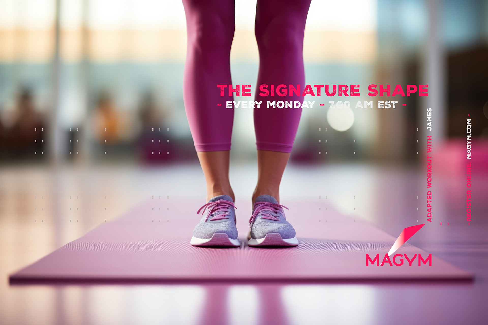
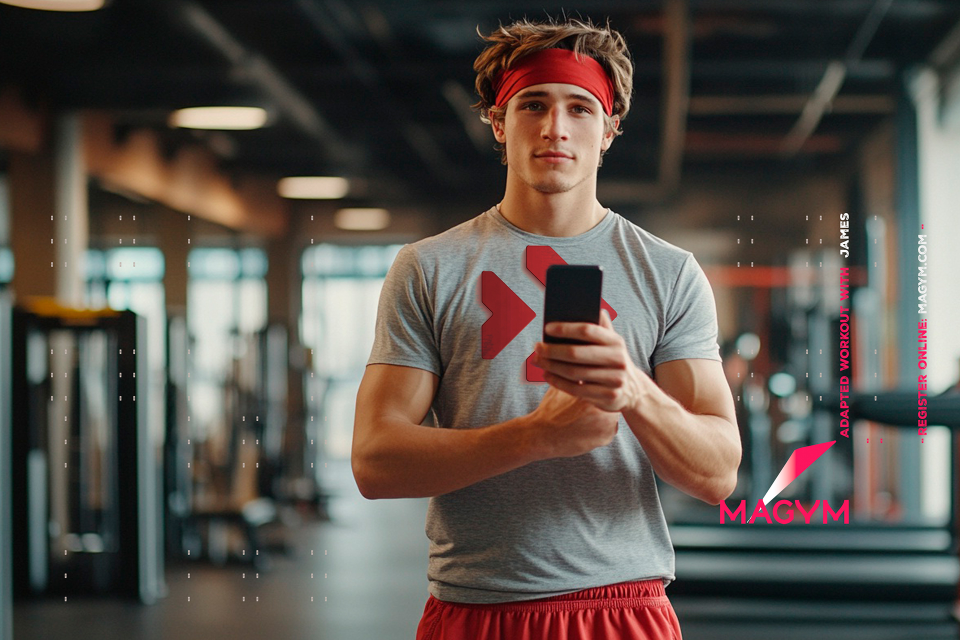
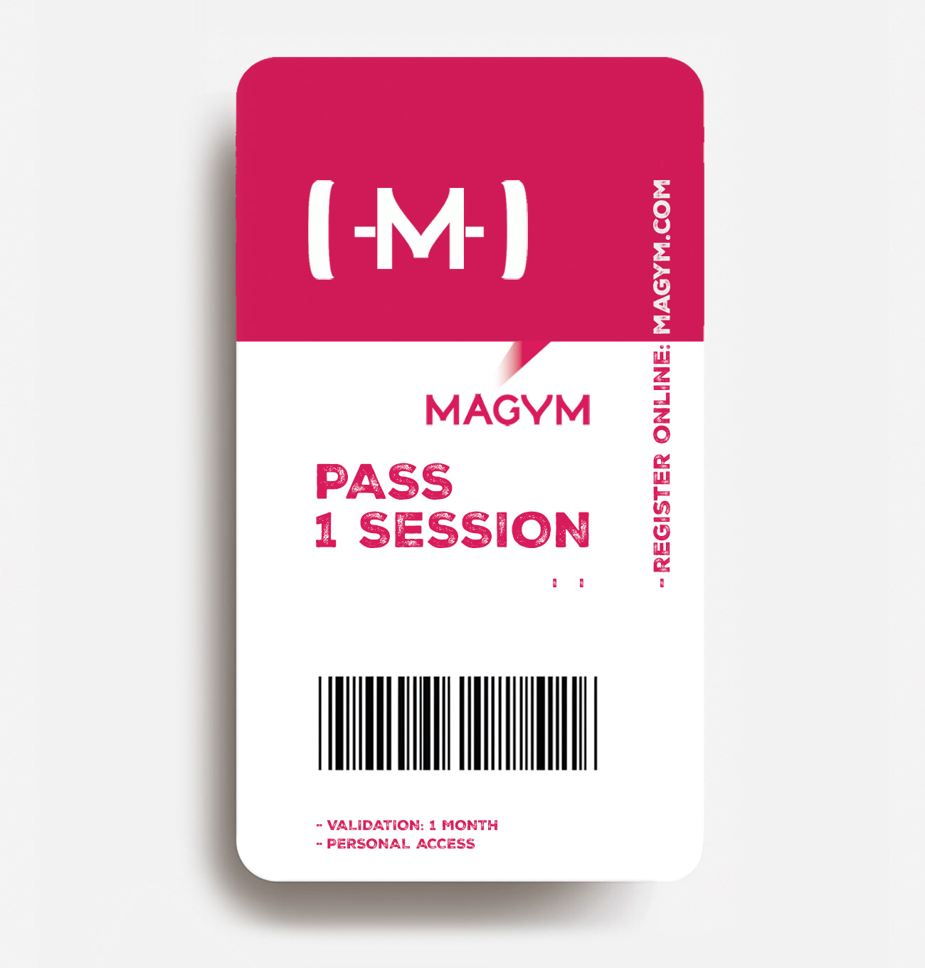
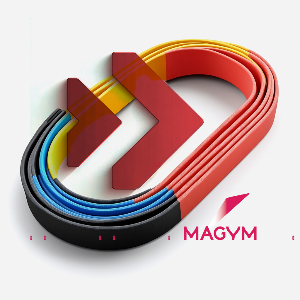
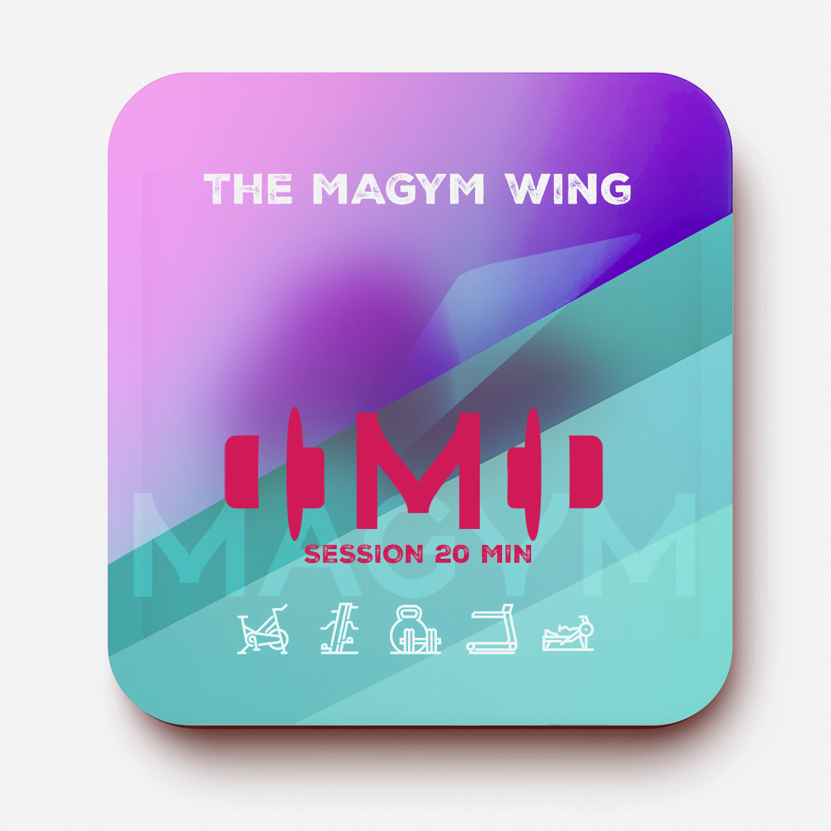
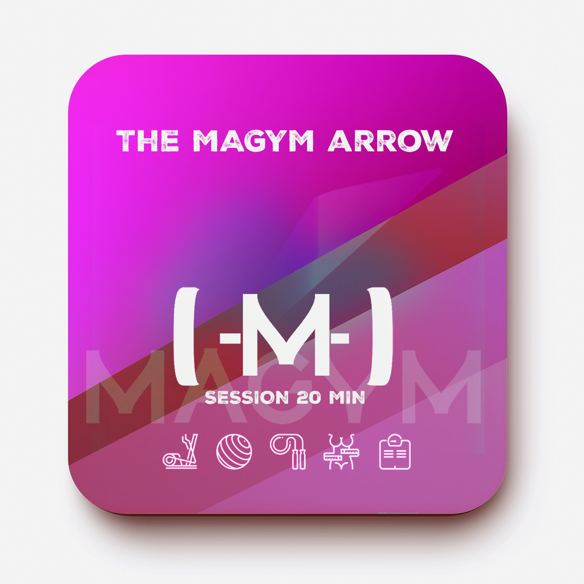
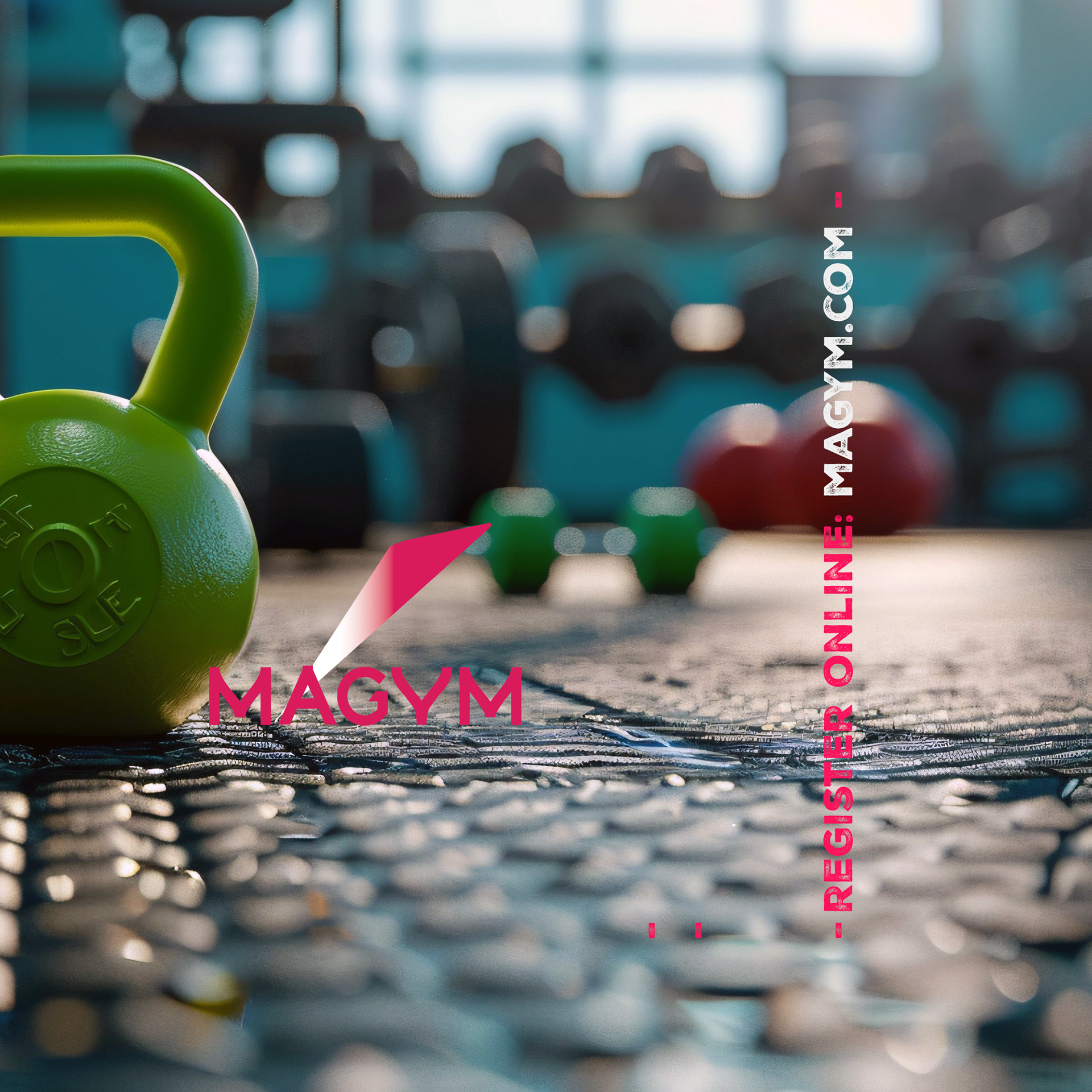
Designed a distinctive logotype and brand identity for the platform
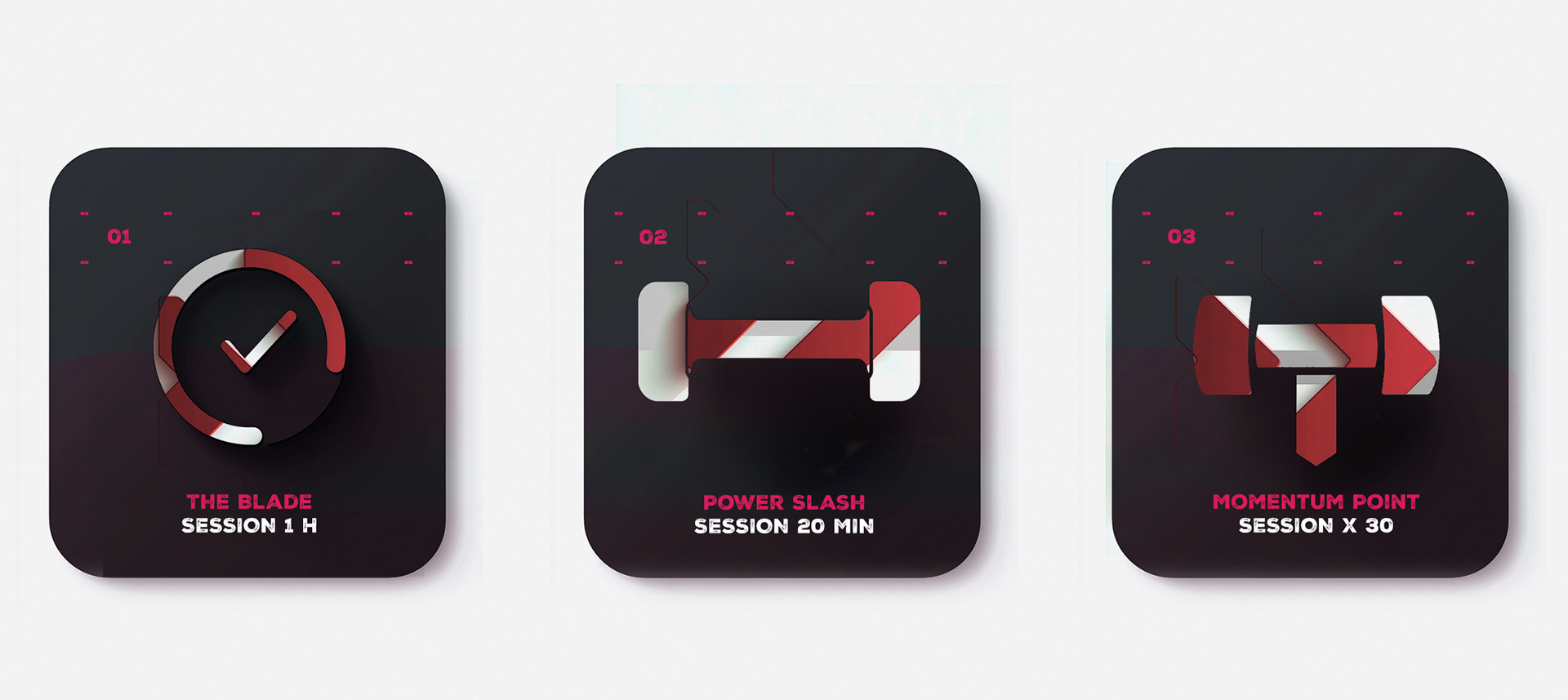
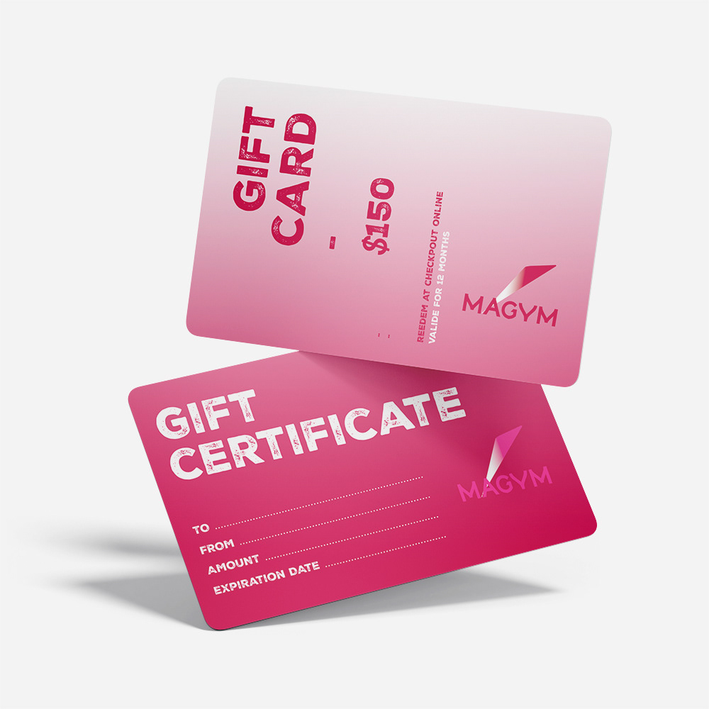
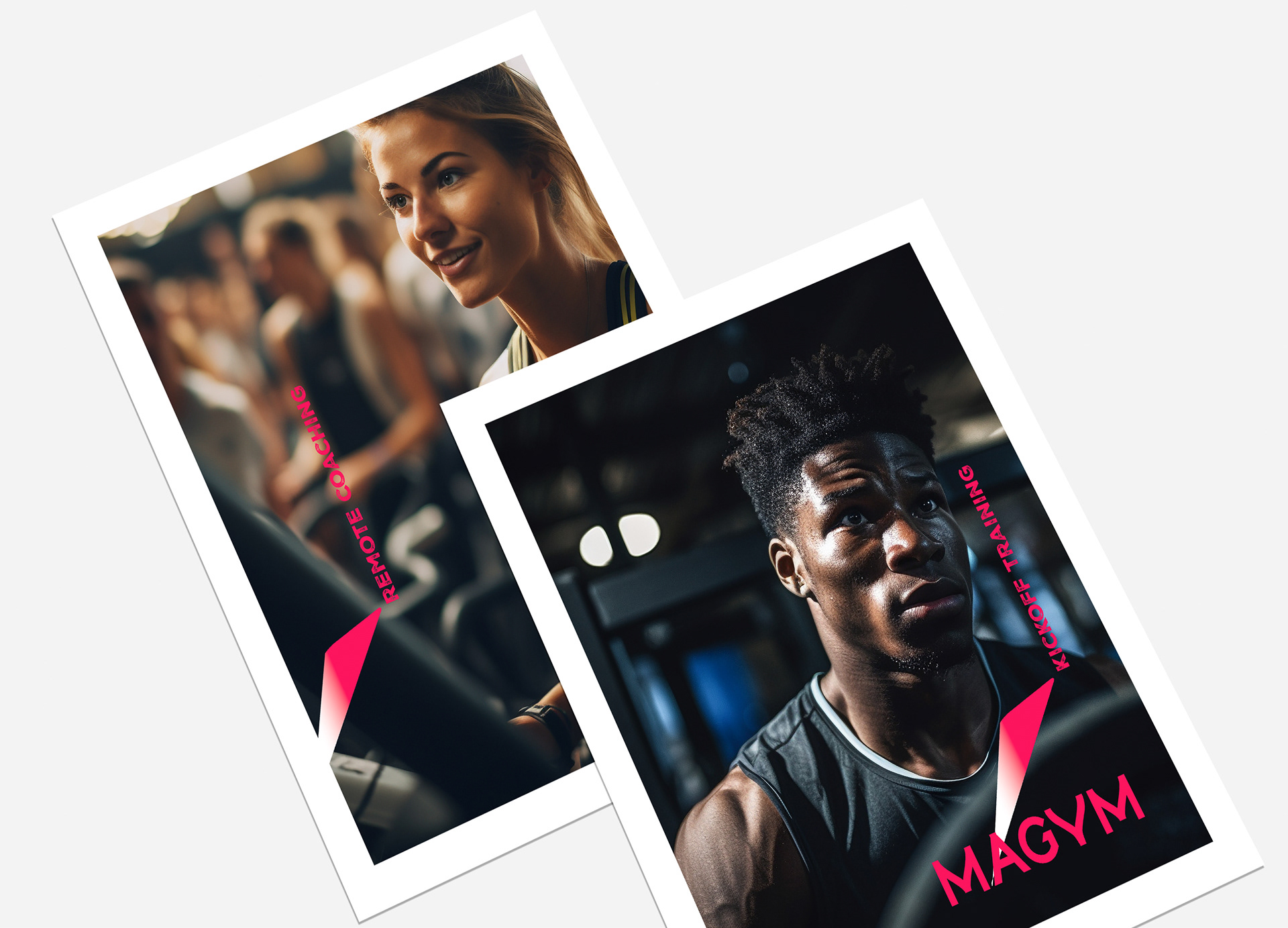
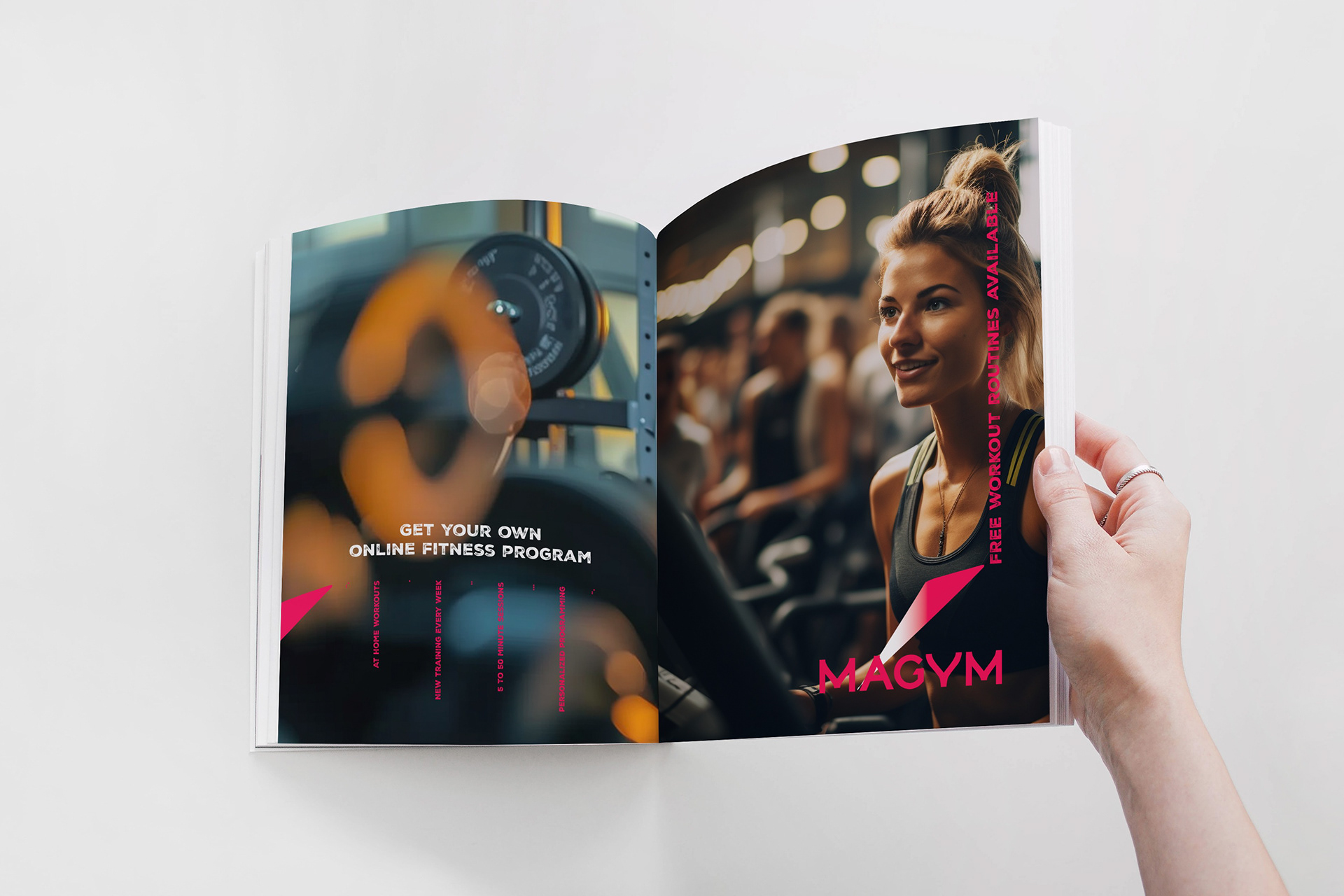
Created a scalable visual system for digital and marketing assets
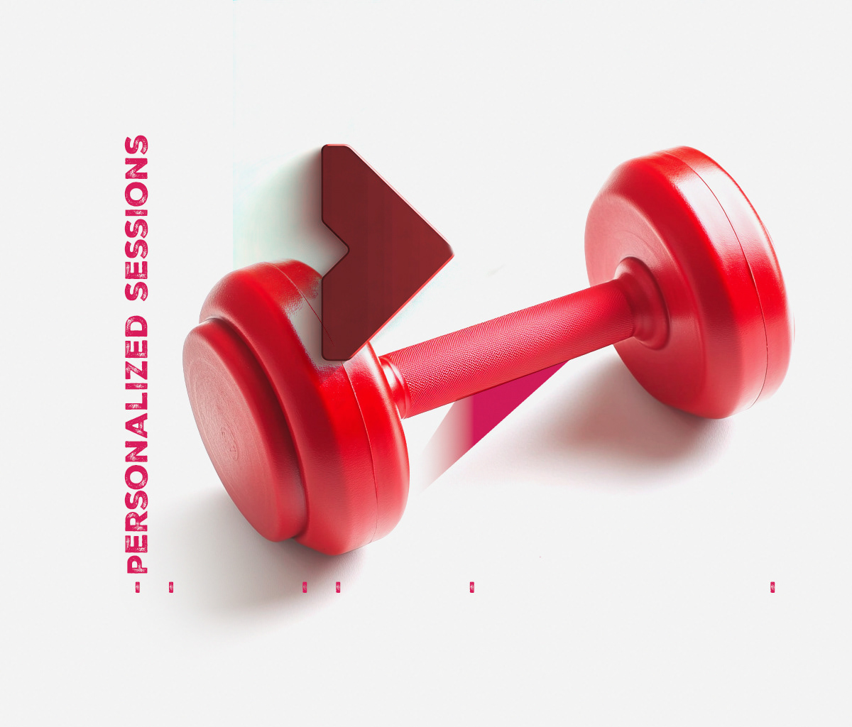
Developed layouts and graphic elements supporting training content and promotion
Designed a distinctive logotype and brand identity for the platform
Created a scalable visual system for digital and marketing assets
Developed layouts and graphic elements supporting training content and promotion
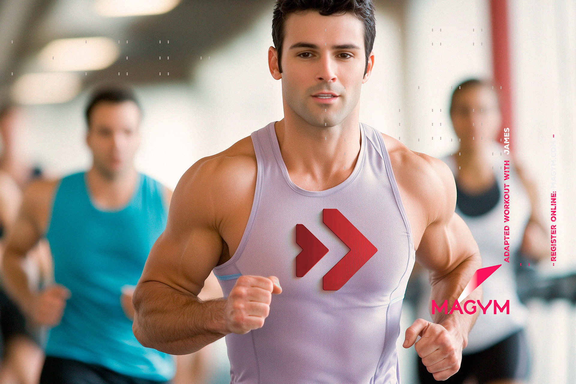
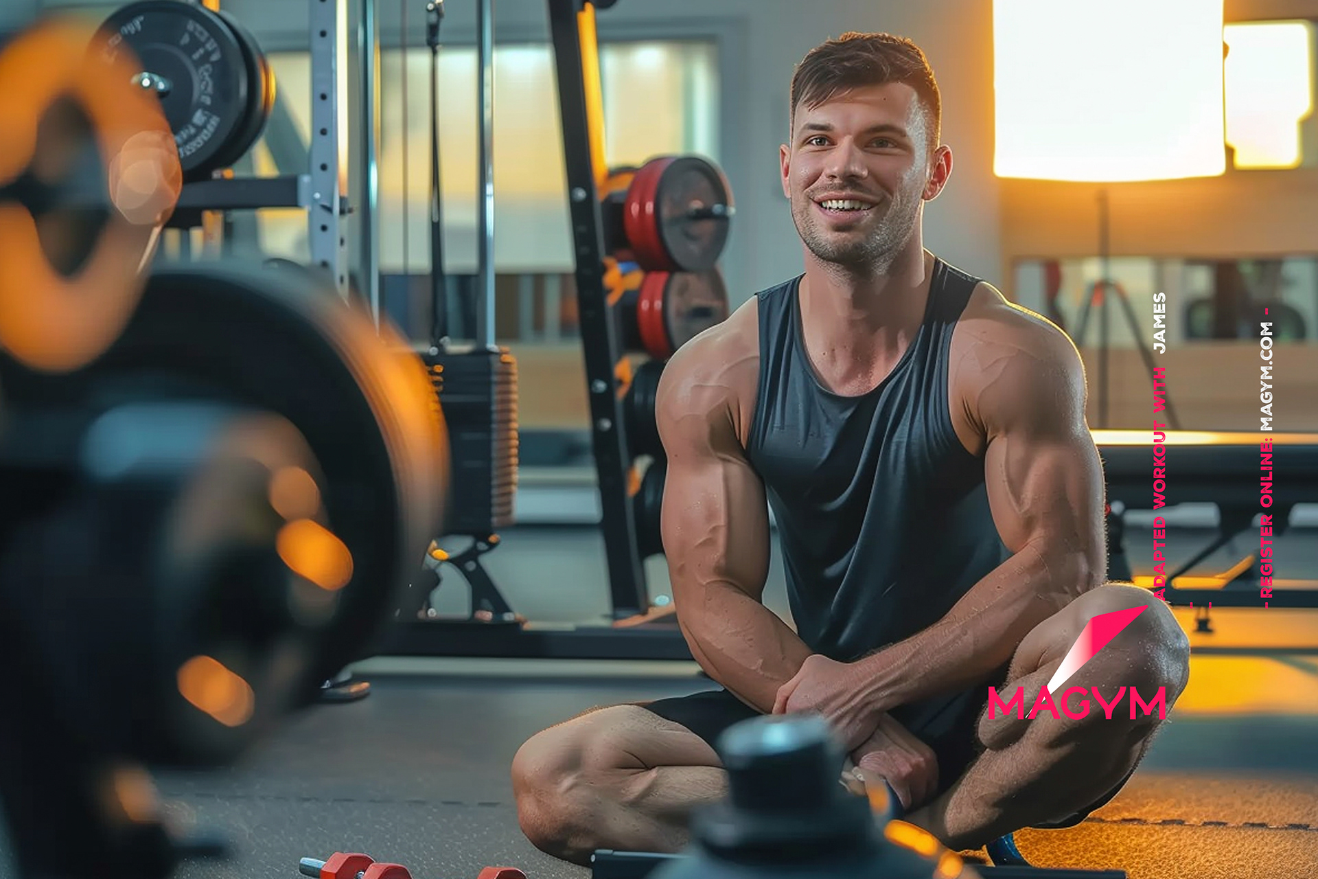
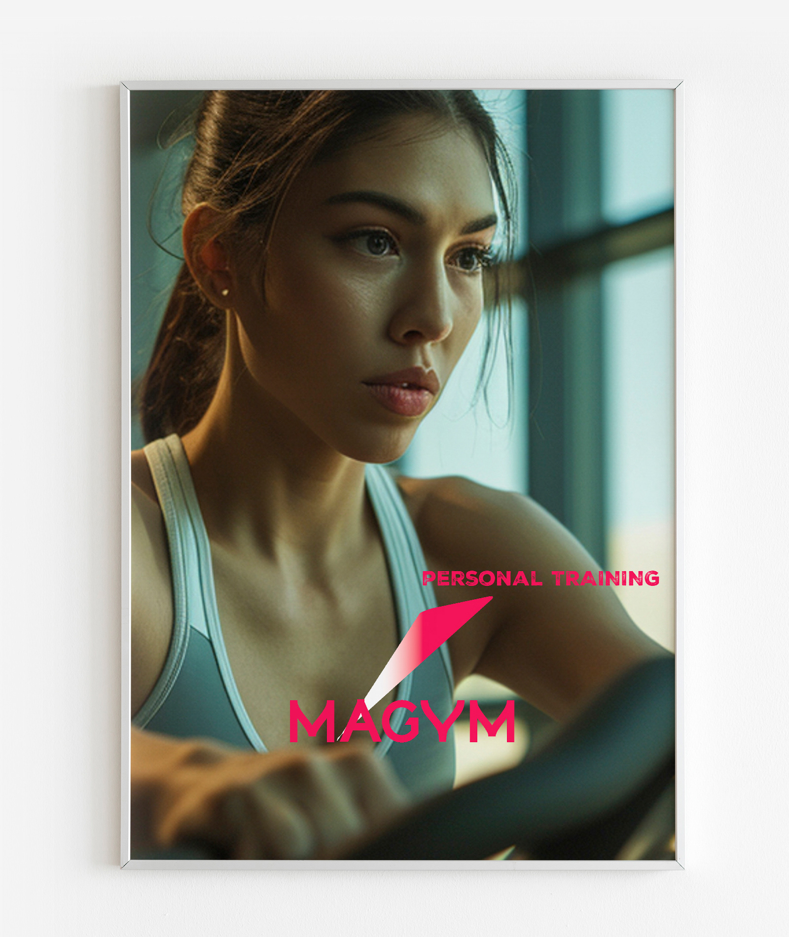
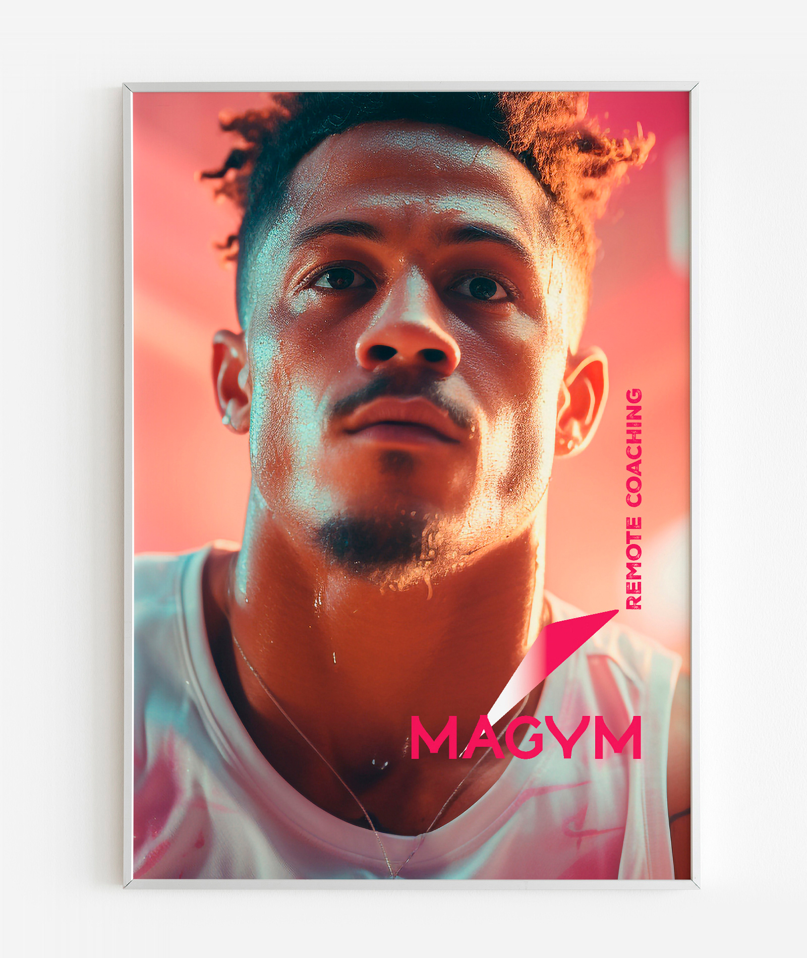
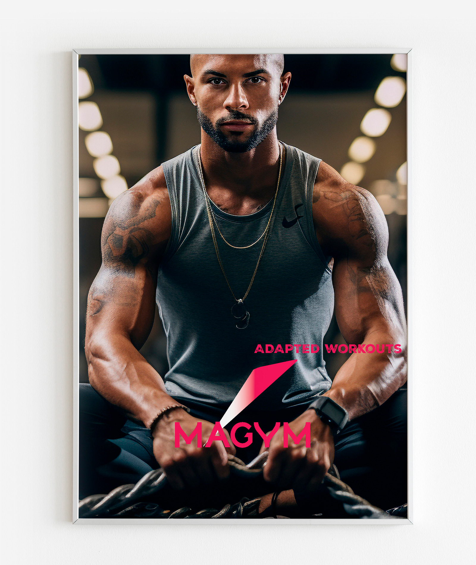
Visual Language
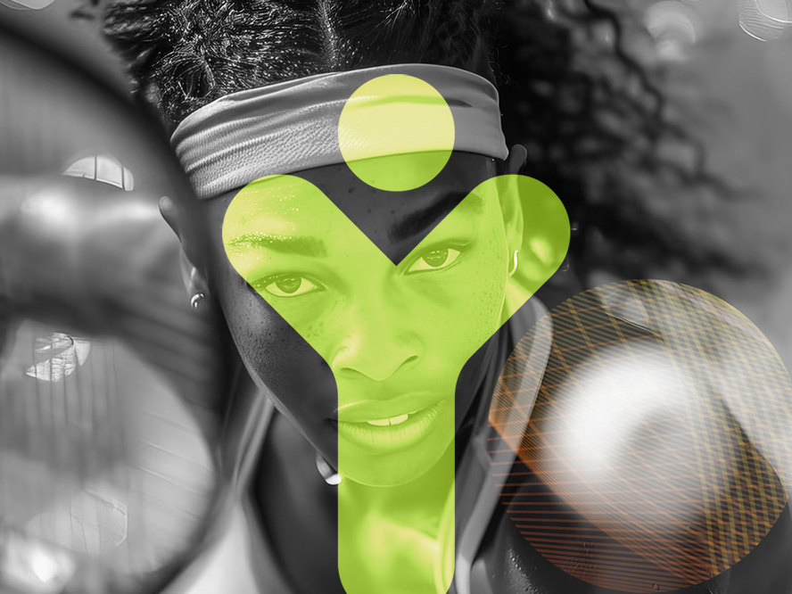
Energetic Simplicity — bold forms and clean typography reflecting movement
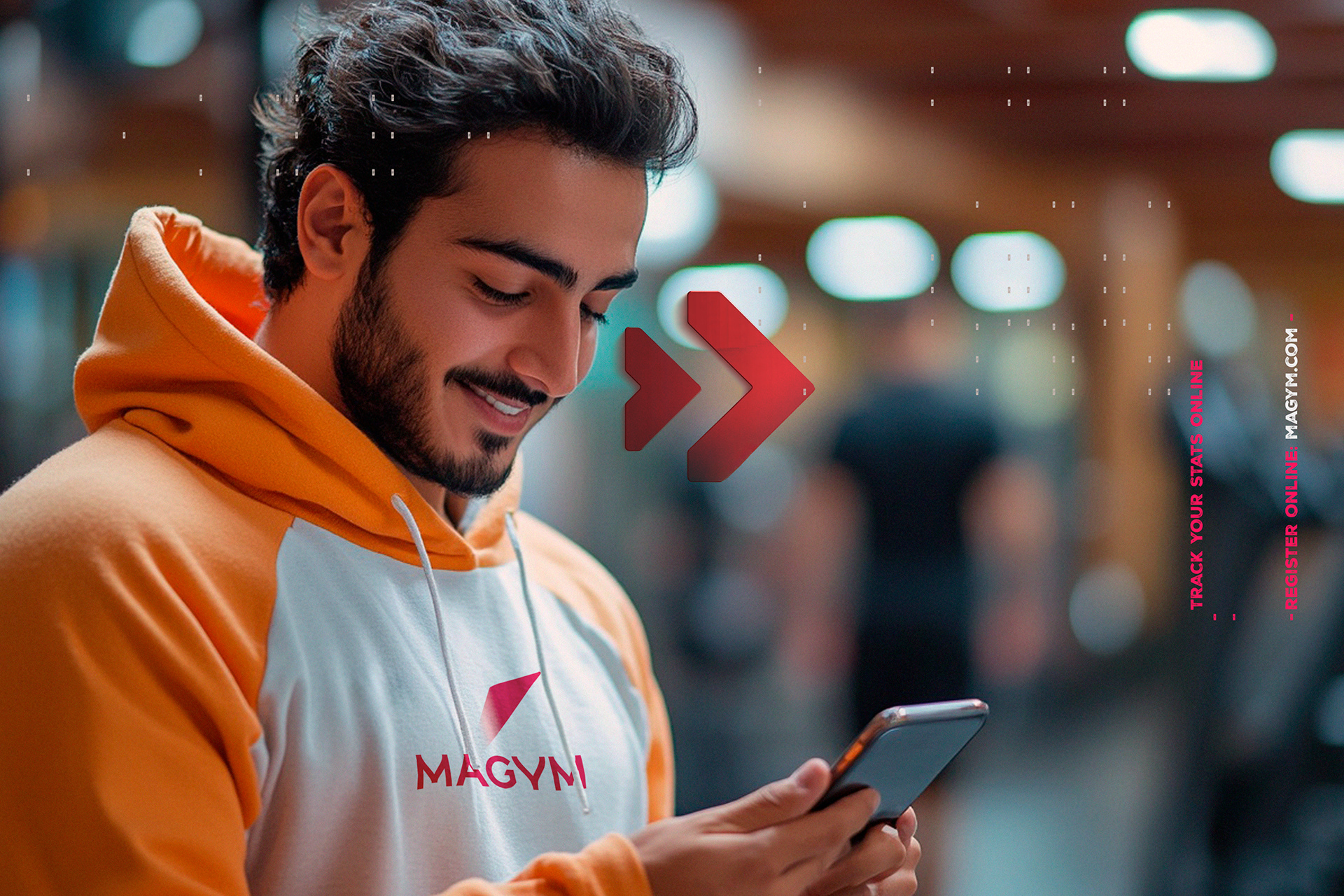
Digital Consistency — visual system optimized for mobile and online content
Motivational Tone — graphic elements conveying accessibility and engagement
Energetic Simplicity — bold forms and clean typography reflecting movement
Digital Consistency — visual system optimized for mobile and online content
Motivational Tone — graphic elements conveying accessibility and engagement
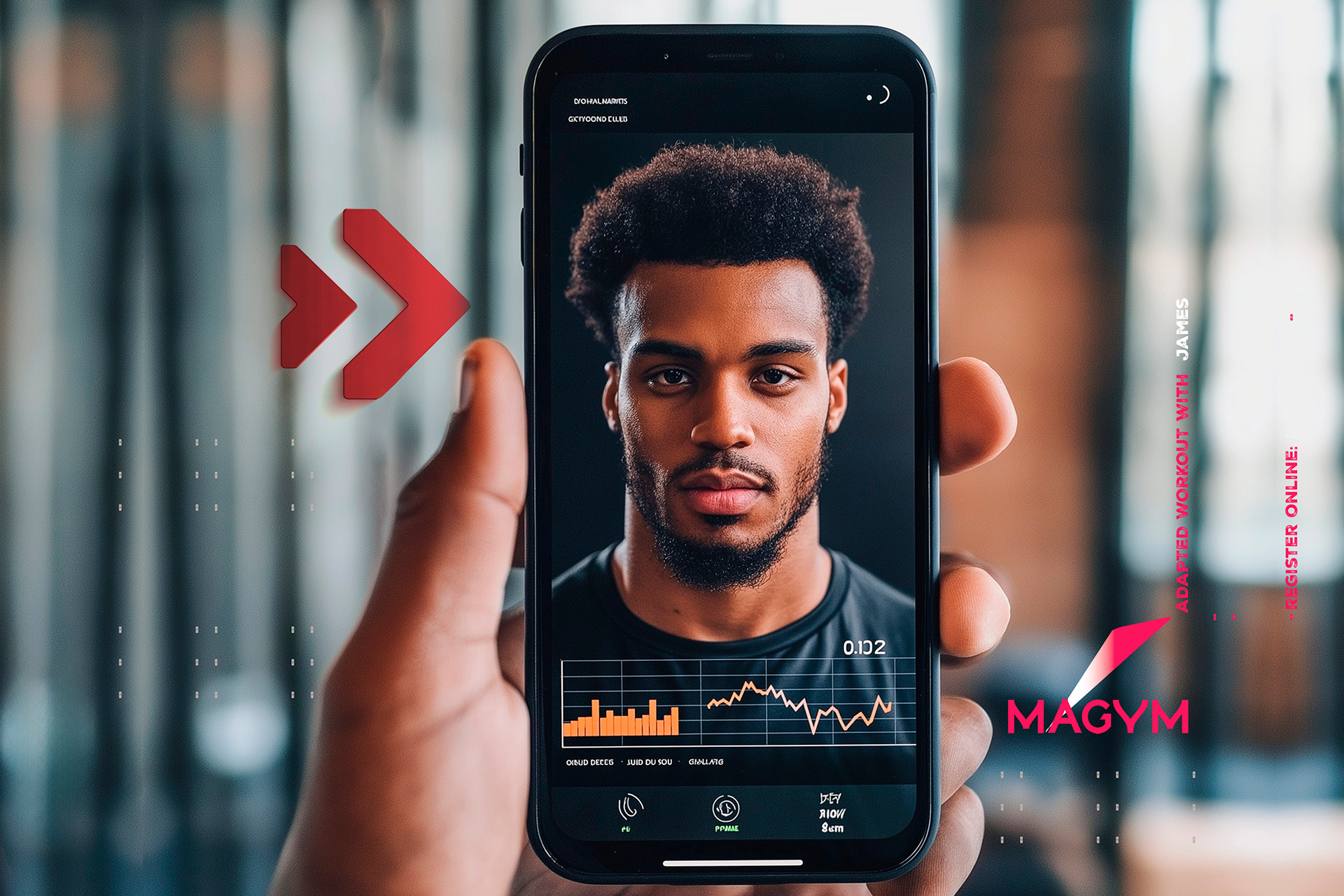
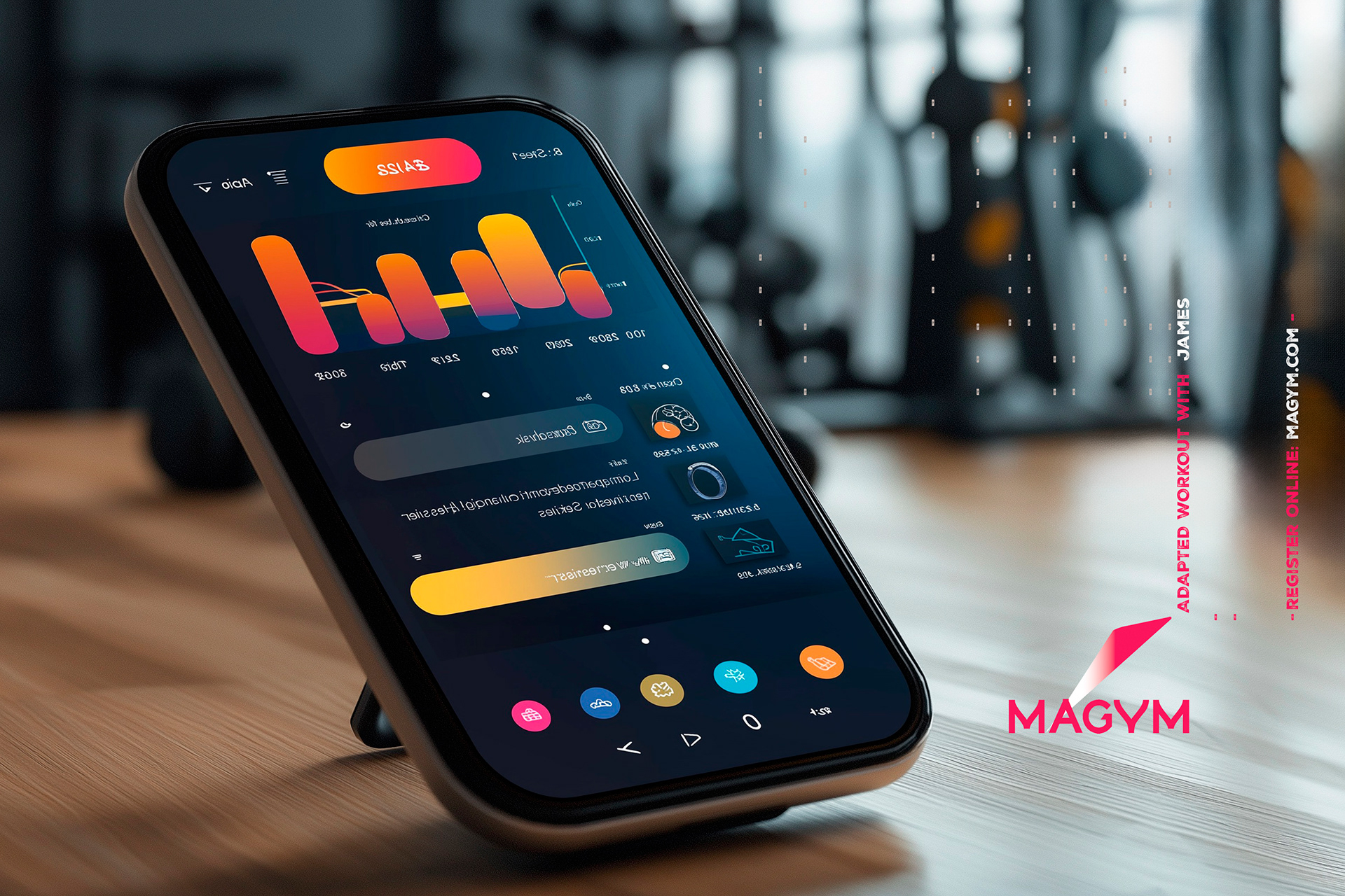
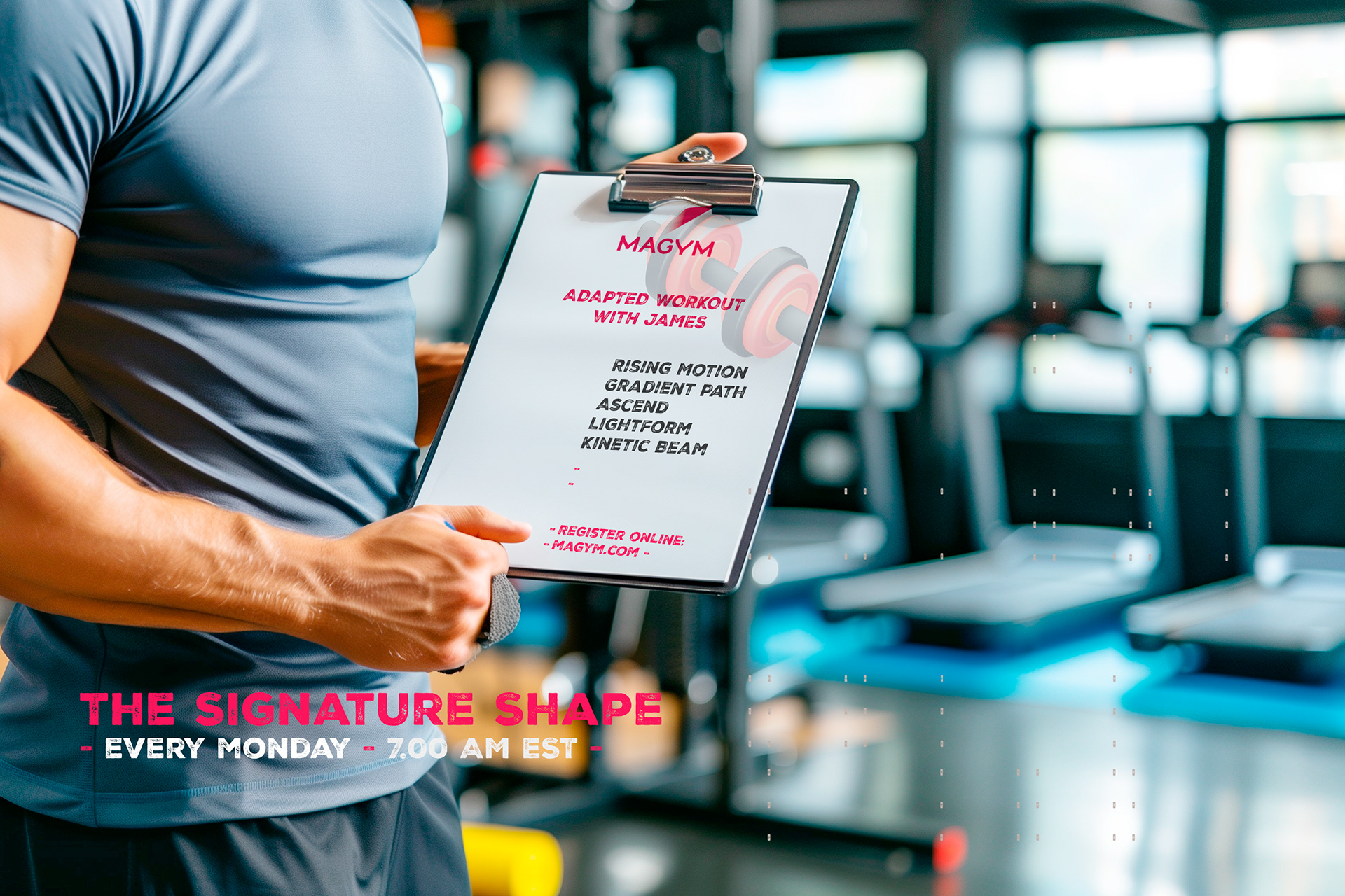
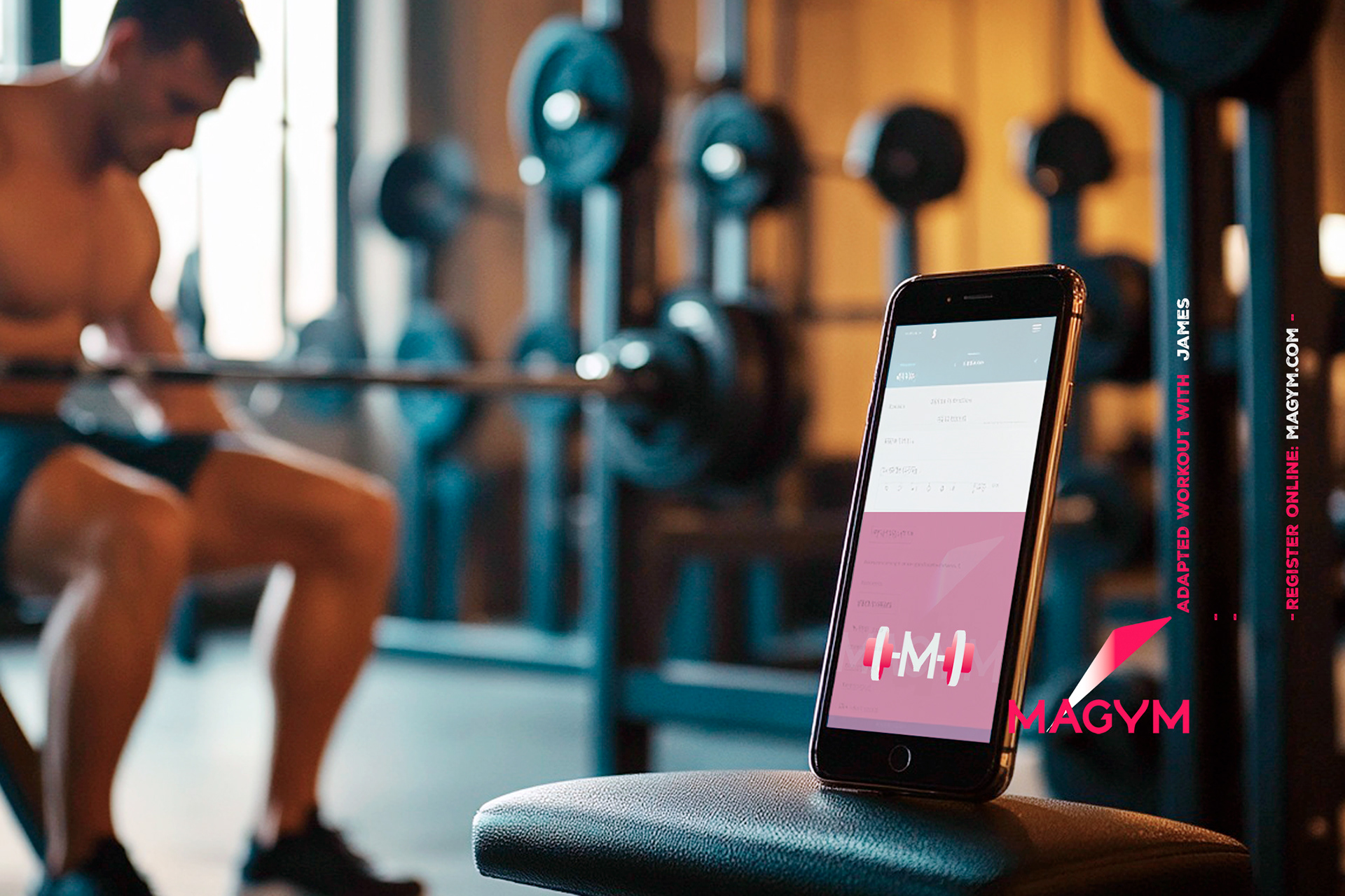
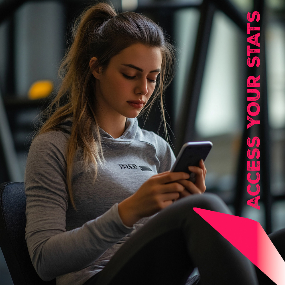
Platform Experience
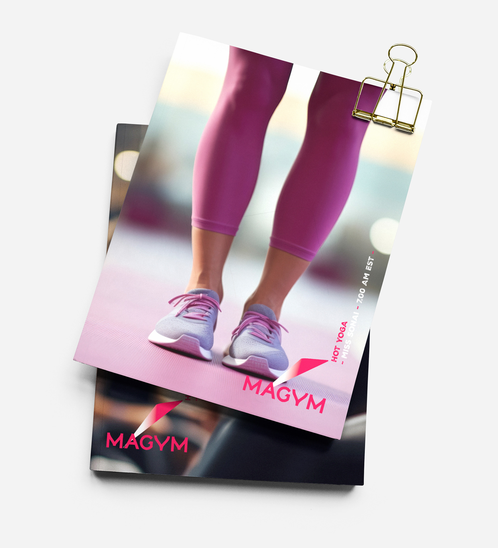
Visual system designed to integrate seamlessly within video training interfaces and mobile screens
Clear typography and hierarchy supporting workout navigation and content readability
Brand elements reinforcing a consistent experience across platform, marketing, and social channels
Visual system designed to integrate seamlessly within video training interfaces and mobile screens
Clear typography and hierarchy supporting workout navigation and content readability
Brand elements reinforcing a consistent experience across platform, marketing, and social channels
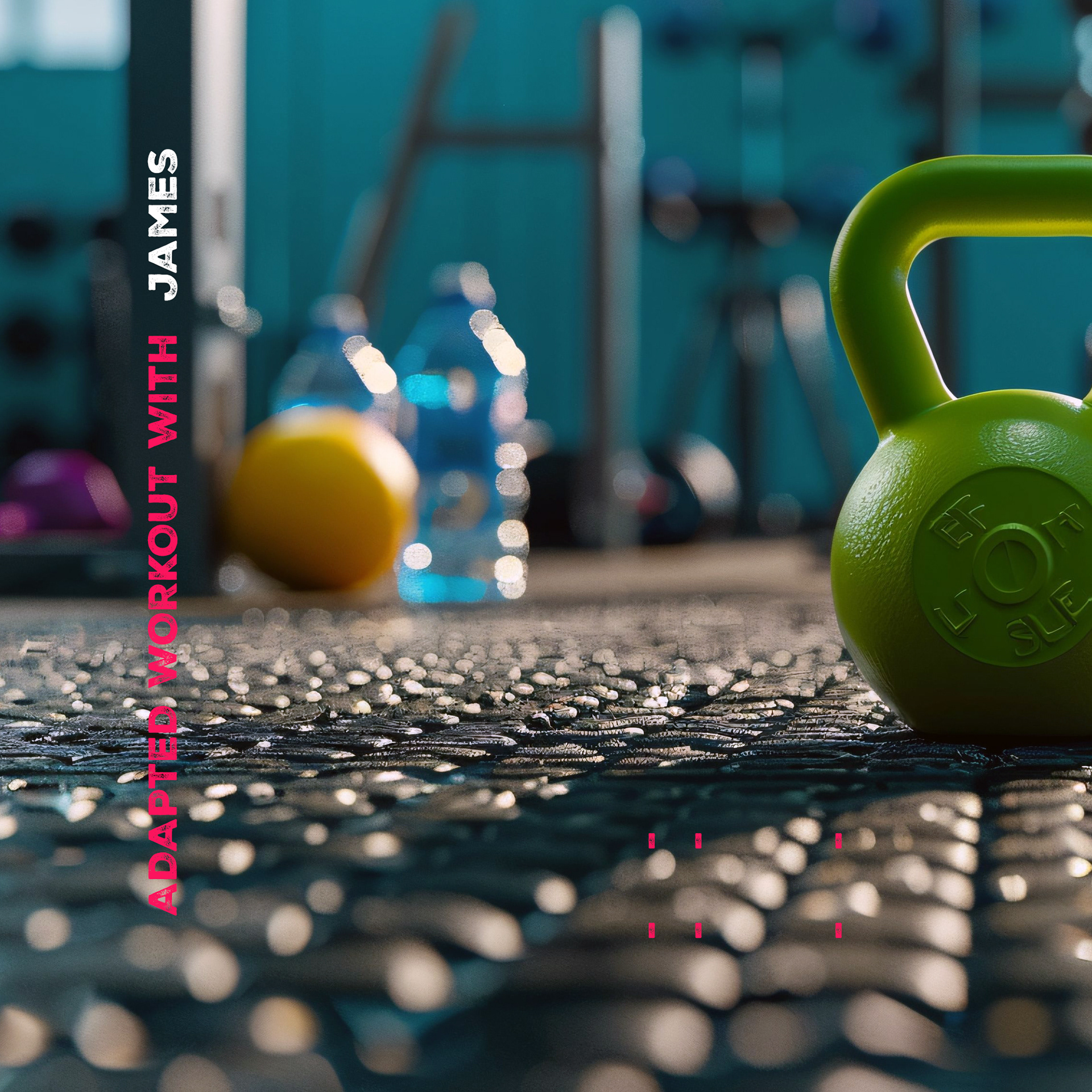
Scope & System
Identity designed to scale across platform UI, marketing, and social content
Graphic framework supporting video, training modules, and promotions
Consistent visual rhythm across digital touchpoints and campaigns
Identity designed to scale across platform UI, marketing, and social content
Graphic framework supporting video, training modules, and promotions
Consistent visual rhythm across digital touchpoints and campaigns
Key Results
+ Established a clear and recognizable brand presence
+ Strengthened visual consistency across digital channels
+ Supported the platform’s launch and user engagement
+ Established a clear and recognizable brand presence
+ Strengthened visual consistency across digital channels
+ Supported the platform’s launch and user engagement
Impact & Performance
Created a cohesive visual identity supporting product growth
Improved clarity and recognition across marketing assets
Enabled consistent brand communication across digital platforms
Created a cohesive visual identity supporting product growth
Improved clarity and recognition across marketing assets
Enabled consistent brand communication across digital platforms
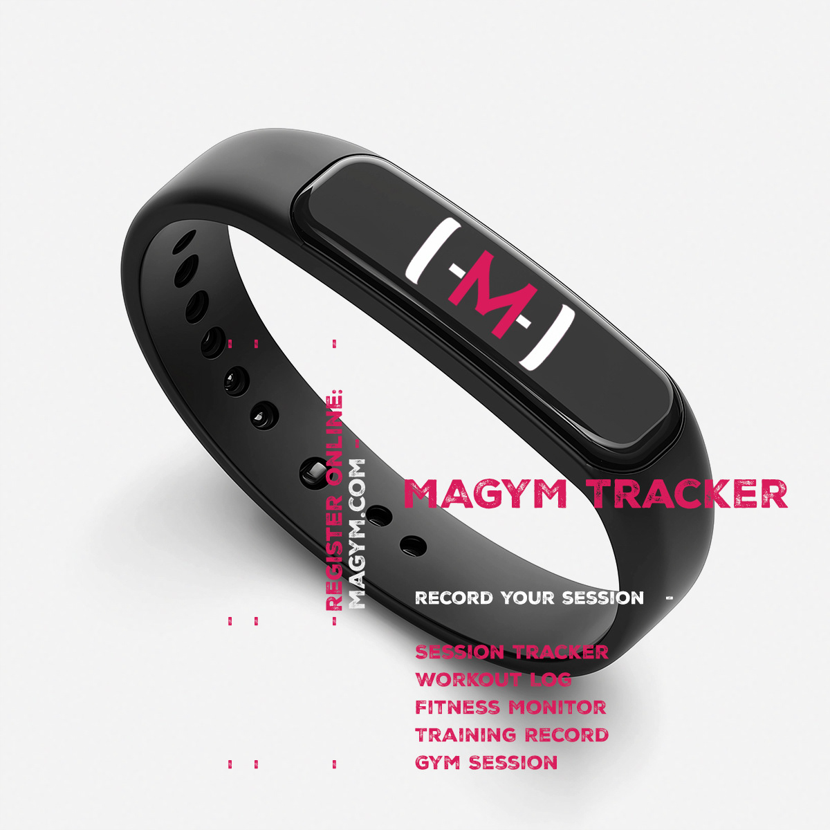
Deliverables
Logotype and core brand identity
Graphic elements and layout templates
Marketing visuals and digital design assets
Logotype and core brand identity
Graphic elements and layout templates
Marketing visuals and digital design assets
Role & Leadership
Brand Design Lead
Led the development of the brand identity and visual system, translating Magym’s positioning into a flexible design framework supporting both platform and marketing communications.
Brand Design Lead
Led the development of the brand identity and visual system, translating Magym’s positioning into a flexible design framework supporting both platform and marketing communications.
Why This Work Matters
The project demonstrates how a focused brand identity and adaptable design system can help emerging digital platforms build credibility, recognition, and engagement in competitive fitness markets.
The project demonstrates how a focused brand identity and adaptable design system can help emerging digital platforms build credibility, recognition, and engagement in competitive fitness markets.
Designed a distinctive logotype establishing a strong and recognizable visual foundation for the Magym brand.


Ready to launch a bold, mobile-first brand that stands out in a crowded market?