CLIENT ▸ Acutis Diagnostics, Hicksville, NY, USA
ROLE ▸ Brand Design Lead (Contract) → Managing team of 3 → Partnering with a copywriter
SCOPE ▸ Re-Branding Identity, Print & Digital assets, Google Ad Campaigns
PROCESS ▸ Led cross-functional brand audit → workshop → visual identity system → rollout guidelines
ROLE ▸ Brand Design Lead (Contract) → Managing team of 3 → Partnering with a copywriter
SCOPE ▸ Re-Branding Identity, Print & Digital assets, Google Ad Campaigns
PROCESS ▸ Led cross-functional brand audit → workshop → visual identity system → rollout guidelines
The Challenge
Modernize a toxicology laboratory brand without losing clinical trust
Clarify positioning in a crowded, commoditized diagnostic market
Build a system capable of supporting sales, compliance, and digital expansion
Modernize a toxicology laboratory brand without losing clinical trust
Clarify positioning in a crowded, commoditized diagnostic market
Build a system capable of supporting sales, compliance, and digital expansion
Strategic Approach
Shift the narrative from service provider to clinical partner
Define a disciplined visual architecture grounded in precision and hierarchy
Develop a scalable identity system aligned with regulatory and healthcare standards
Shift the narrative from service provider to clinical partner
Define a disciplined visual architecture grounded in precision and hierarchy
Develop a scalable identity system aligned with regulatory and healthcare standards
Creative Solution
A refined, high-contrast visual identity signaling scientific rigor
Structured typography and grid systems designed for clarity and authority
A modular brand language adaptable across digital, print, and sales materials
A refined, high-contrast visual identity signaling scientific rigor
Structured typography and grid systems designed for clarity and authority
A modular brand language adaptable across digital, print, and sales materials
scope & System
Full visual identity redesign (logo, typography, color system)
Brand architecture and messaging alignment
Website and digital interface refinement
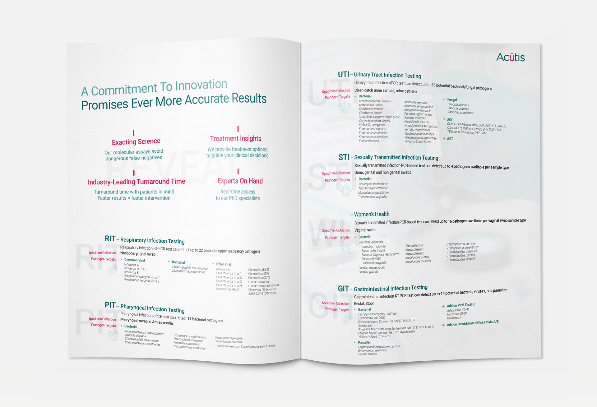
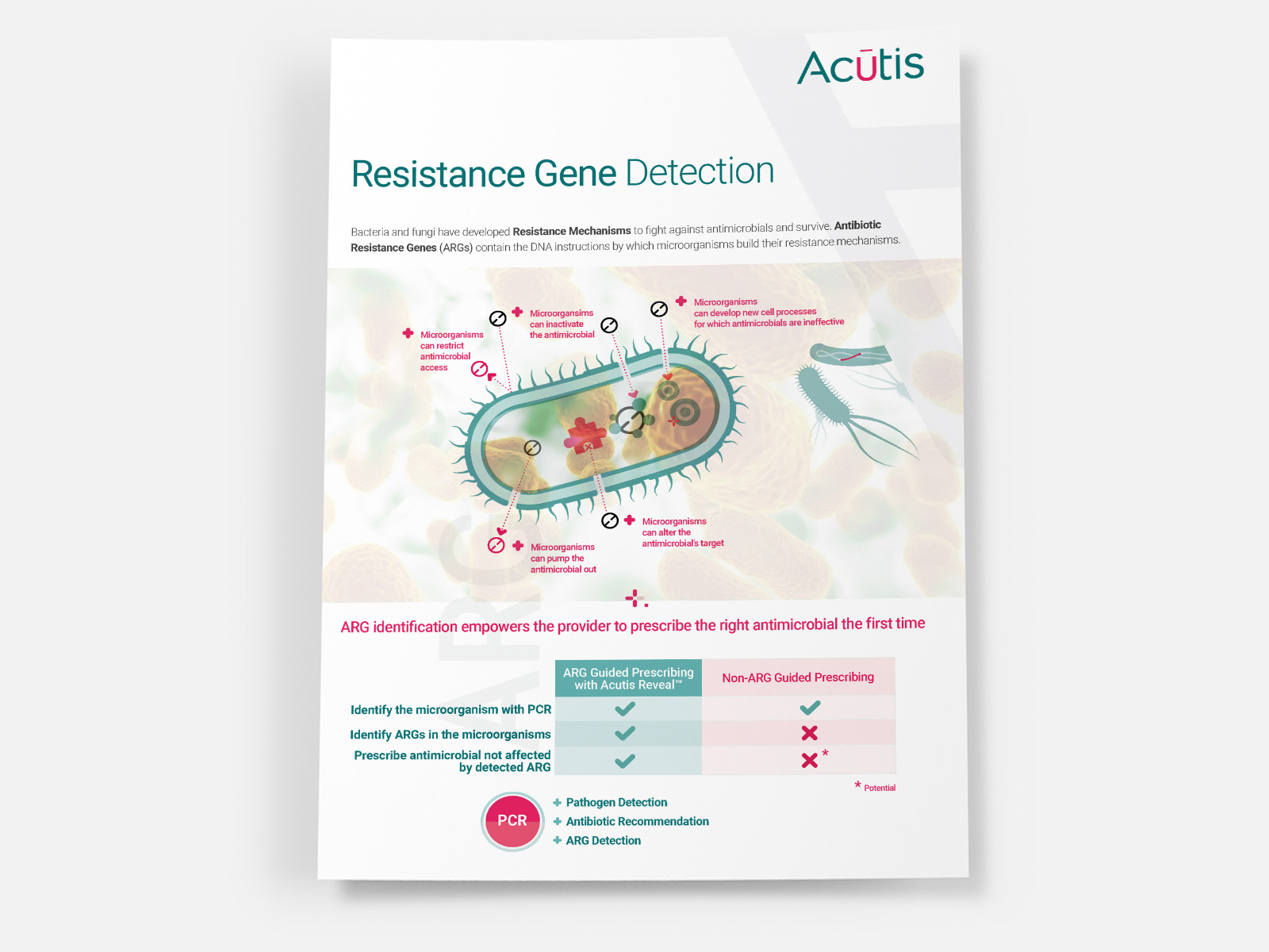
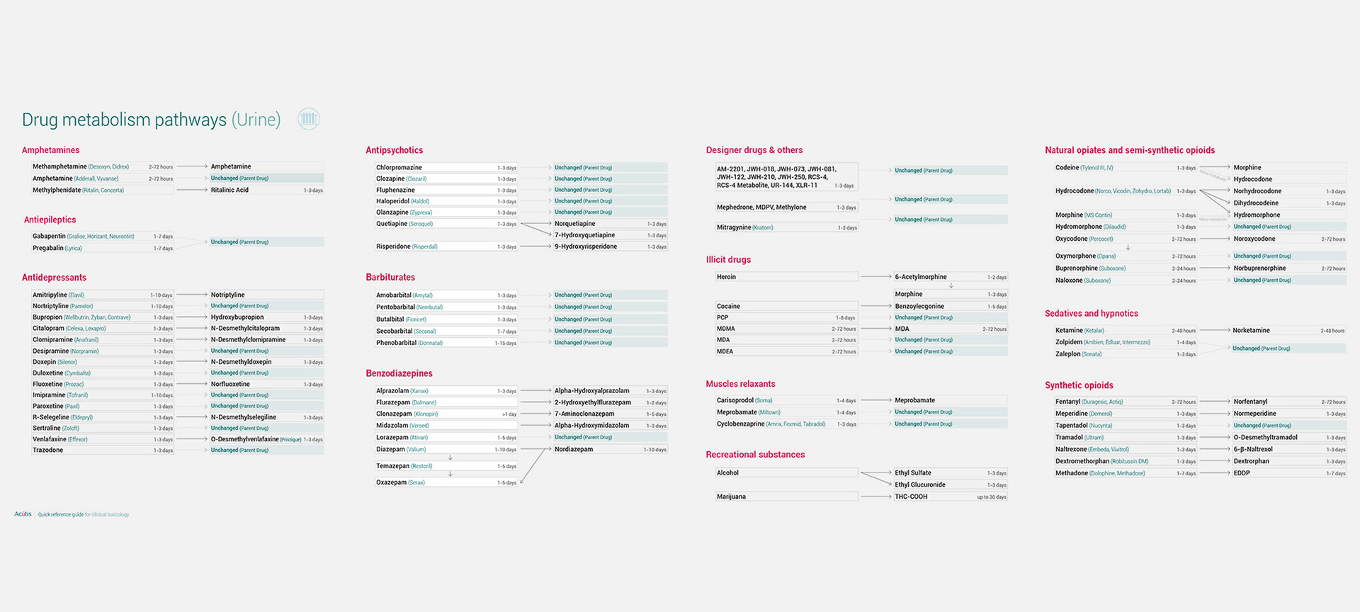
Sales collateral, presentation templates, and lab materials
Implementation rules to ensure long-term consistency
Full visual identity redesign (logo, typography, color system)
Brand architecture and messaging alignment
Website and digital interface refinement
Sales collateral, presentation templates, and lab materials
Implementation rules to ensure long-term consistency
Key Results
Clearer brand positioning within the toxicology market
Improved sales team alignment through consistent messaging and materials
Stronger perceived credibility across provider-facing touchpoints
Clearer brand positioning within the toxicology market
Improved sales team alignment through consistent messaging and materials
Stronger perceived credibility across provider-facing touchpoints
Impact & Performance
Elevated brand perception in competitive clinical environments
Increased consistency across digital and commercial channels
A scalable system supporting future expansion and service evolution
Elevated brand perception in competitive clinical environments
Increased consistency across digital and commercial channels
A scalable system supporting future expansion and service evolution
Deliverables
+ Logo and identity system
+ Brand guidelines
+ Website visual system
+ Sales and marketing collateral
+ Implementation-ready assets
+ Logo and identity system
+ Brand guidelines
+ Website visual system
+ Sales and marketing collateral
+ Implementation-ready assets
Role & Leadership
Brand Design Lead
Led brand repositioning and identity system development from strategic foundation through execution, aligning stakeholders and ensuring consistent rollout across digital, sales, and clinical channels.
Brand Design Lead
Led brand repositioning and identity system development from strategic foundation through execution, aligning stakeholders and ensuring consistent rollout across digital, sales, and clinical channels.
Why This Work Matters
In toxicology, trust is non-negotiable.
Rebranding is not cosmetic; it is strategic positioning.
This project demonstrates how a disciplined identity system can shift perception from commodity testing to clinical authority, reinforcing confidence among providers and supporting long-term commercial growth.
Previous logo (2016)
Rebranded identity (2018 & 2023)
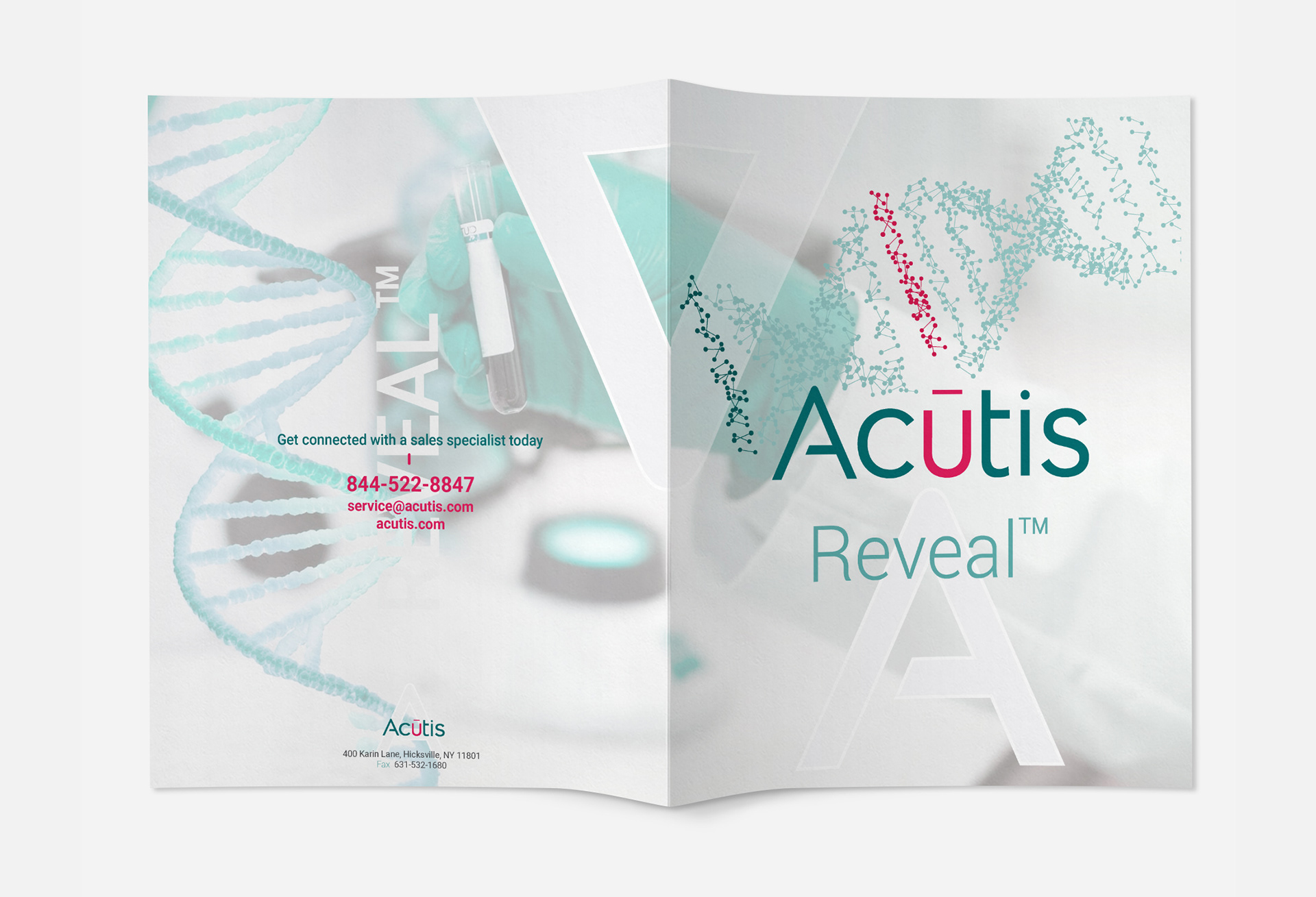
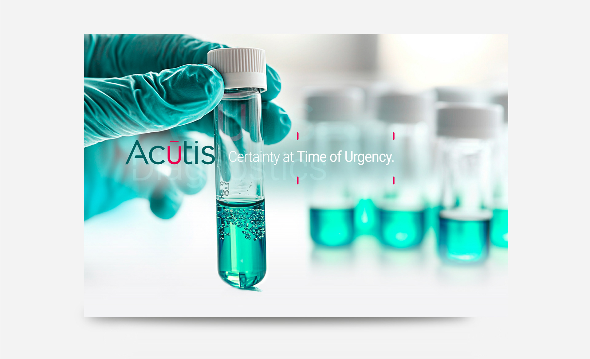
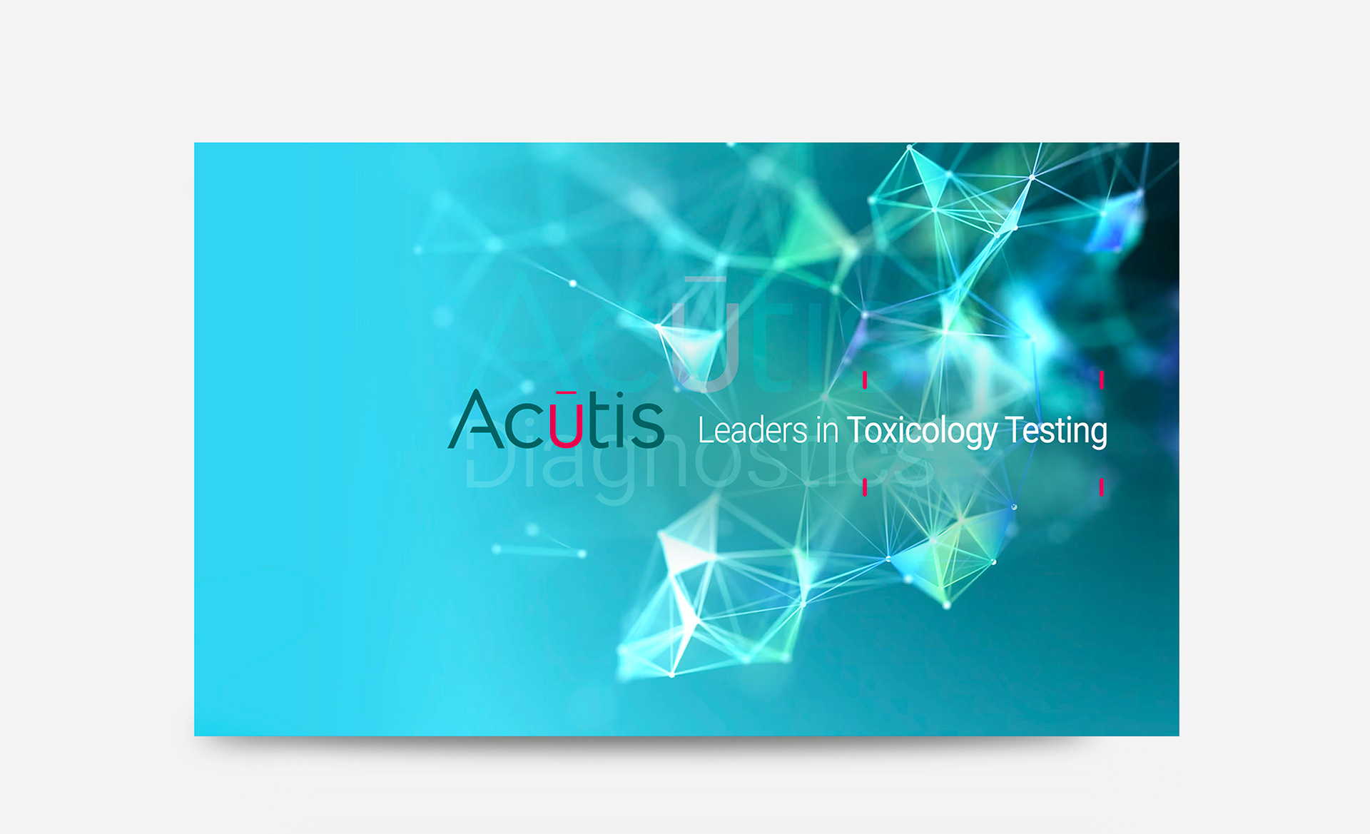
The logo was redesigned as a precise, modern mark, structured to reflect scientific rigor while remaining scalable across digital, clinical, and commercial applications.




❝ Philippe brought a rare blend of clarity, creativity, and professionalism to our visual identity.
His ability to quickly grasp our complex diagnostic work and translate it into compelling design made him a true partner in our communication efforts and sales conversions.❞
His ability to quickly grasp our complex diagnostic work and translate it into compelling design made him a true partner in our communication efforts and sales conversions.❞
⊢
Jibreel Sarij
CEO
Acutis Diagnostics
Jibreel Sarij
CEO
Acutis Diagnostics




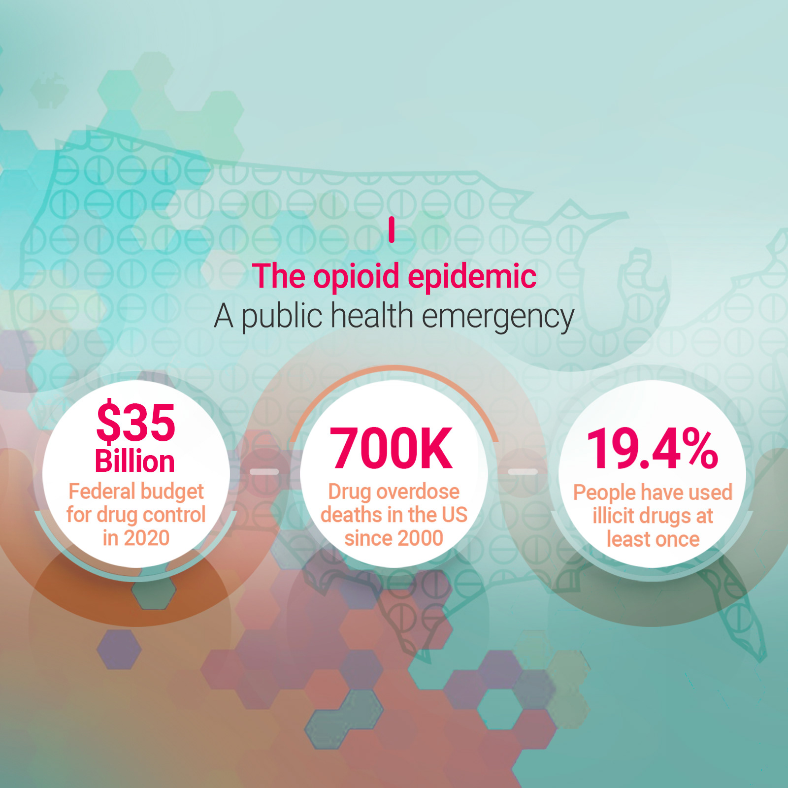
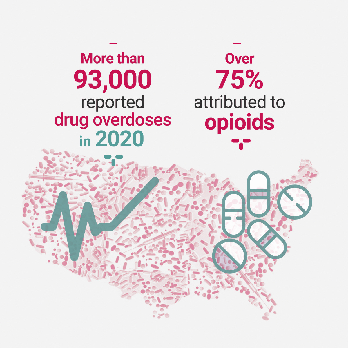

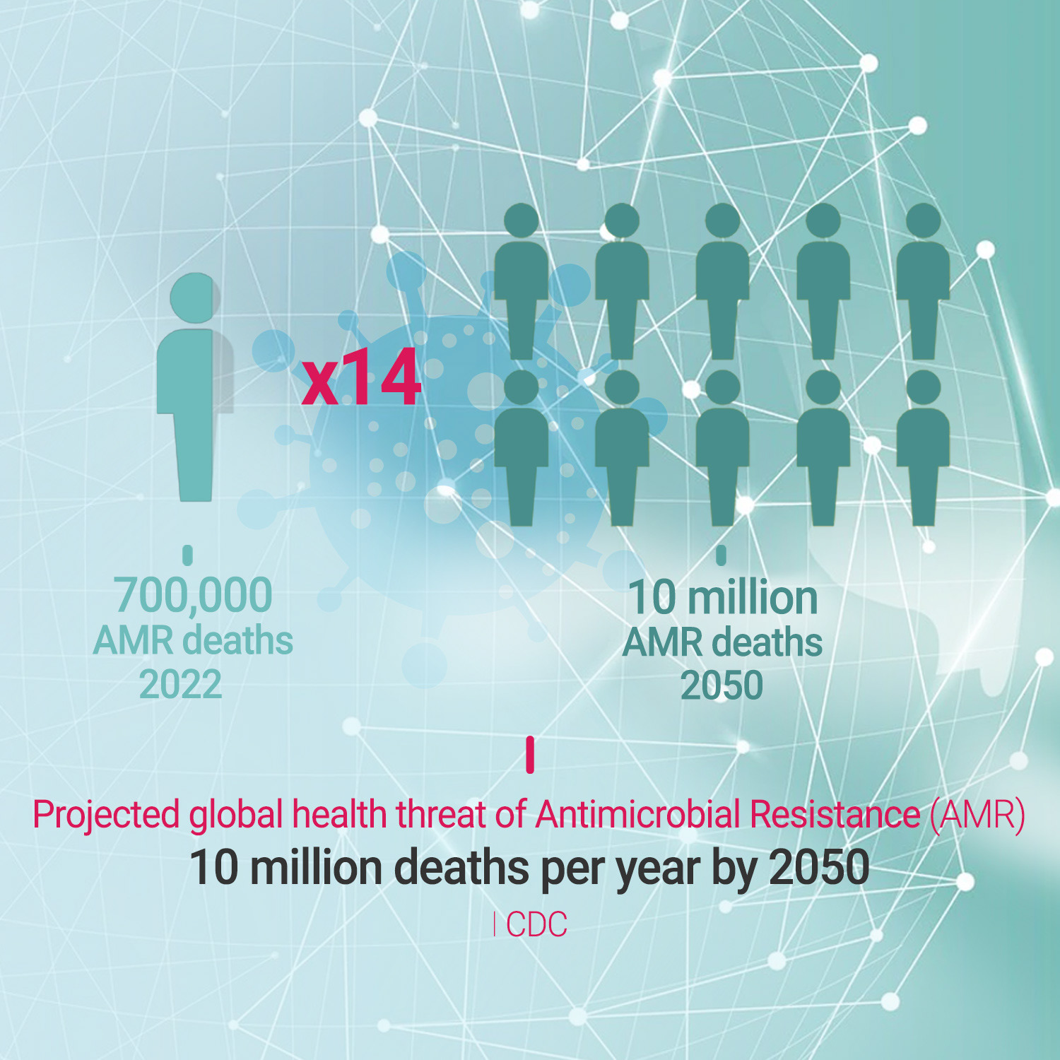


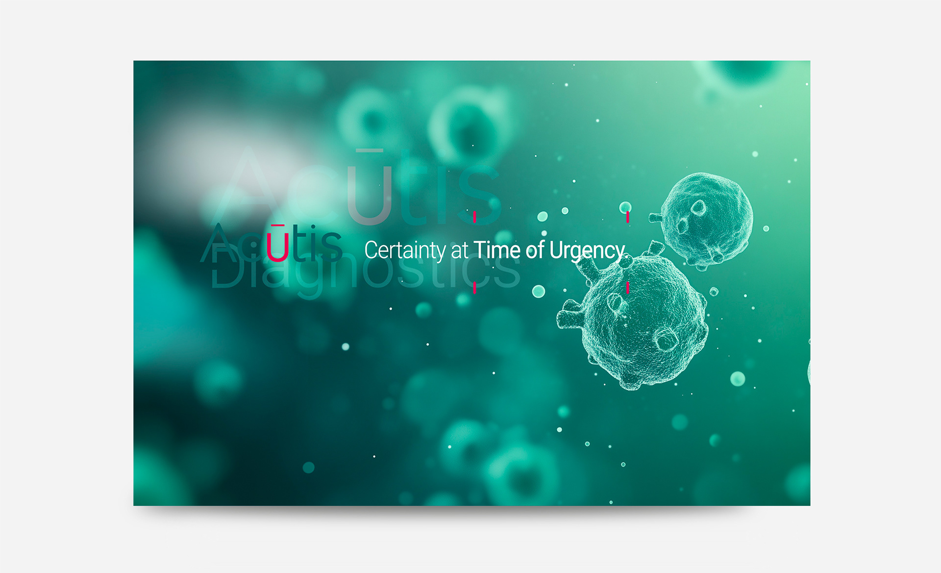
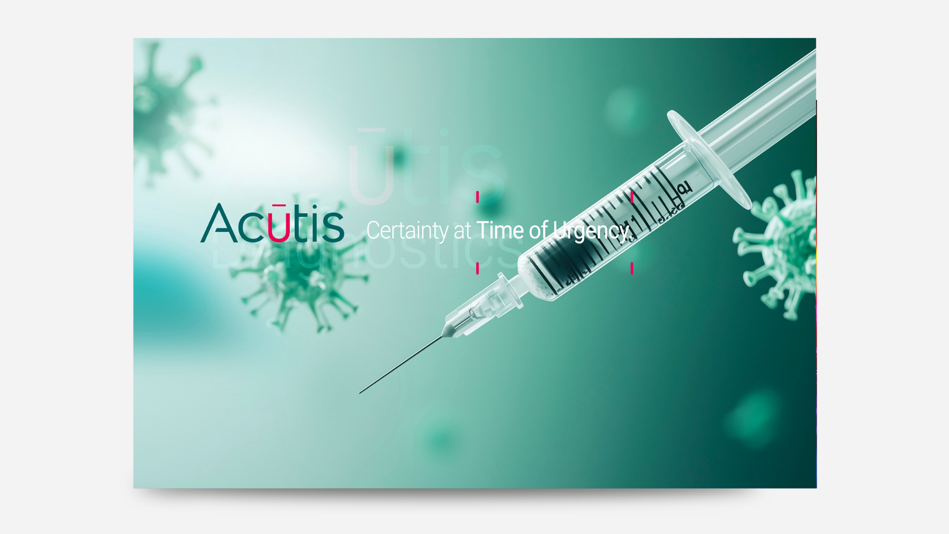
Google Display Campaign
Substance Use and Addiction in the USA
Substance Use and Addiction in the USA
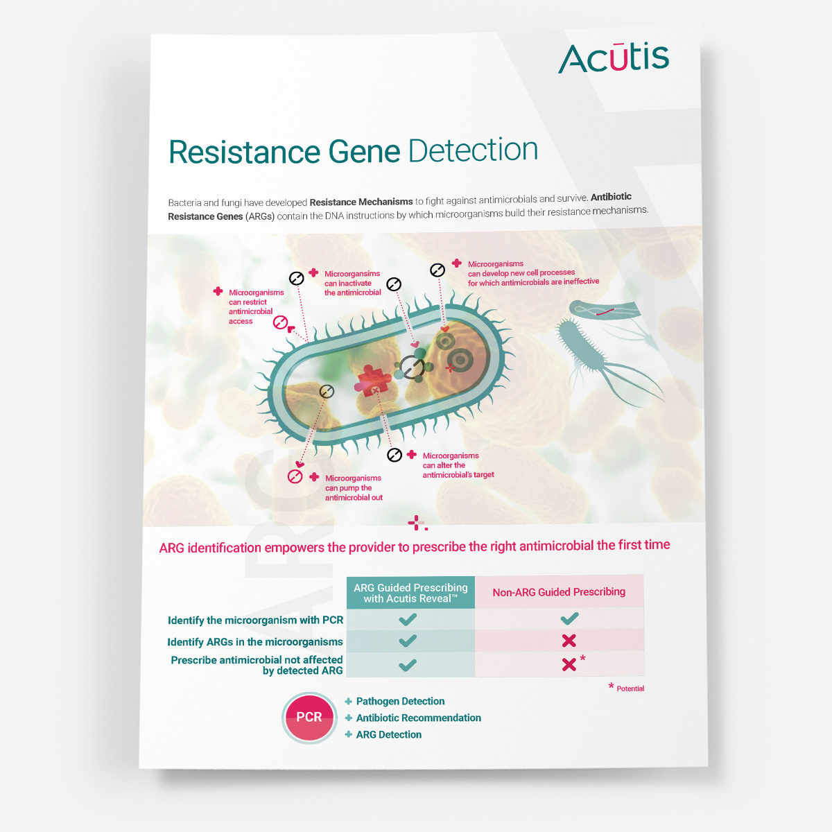
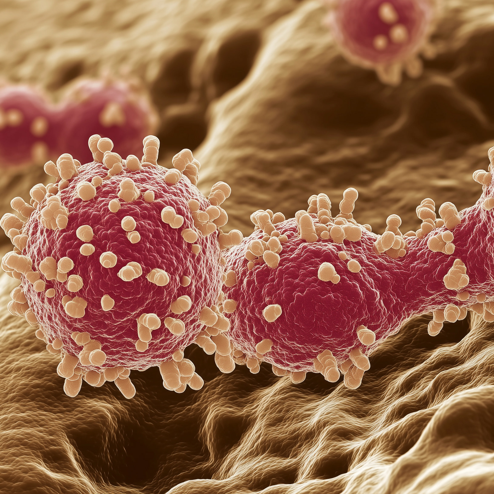
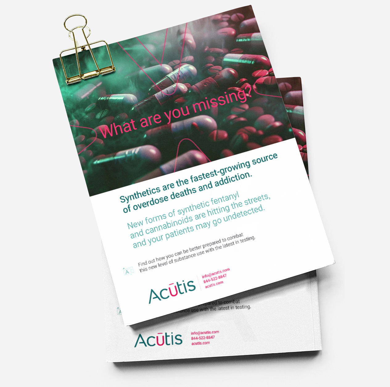
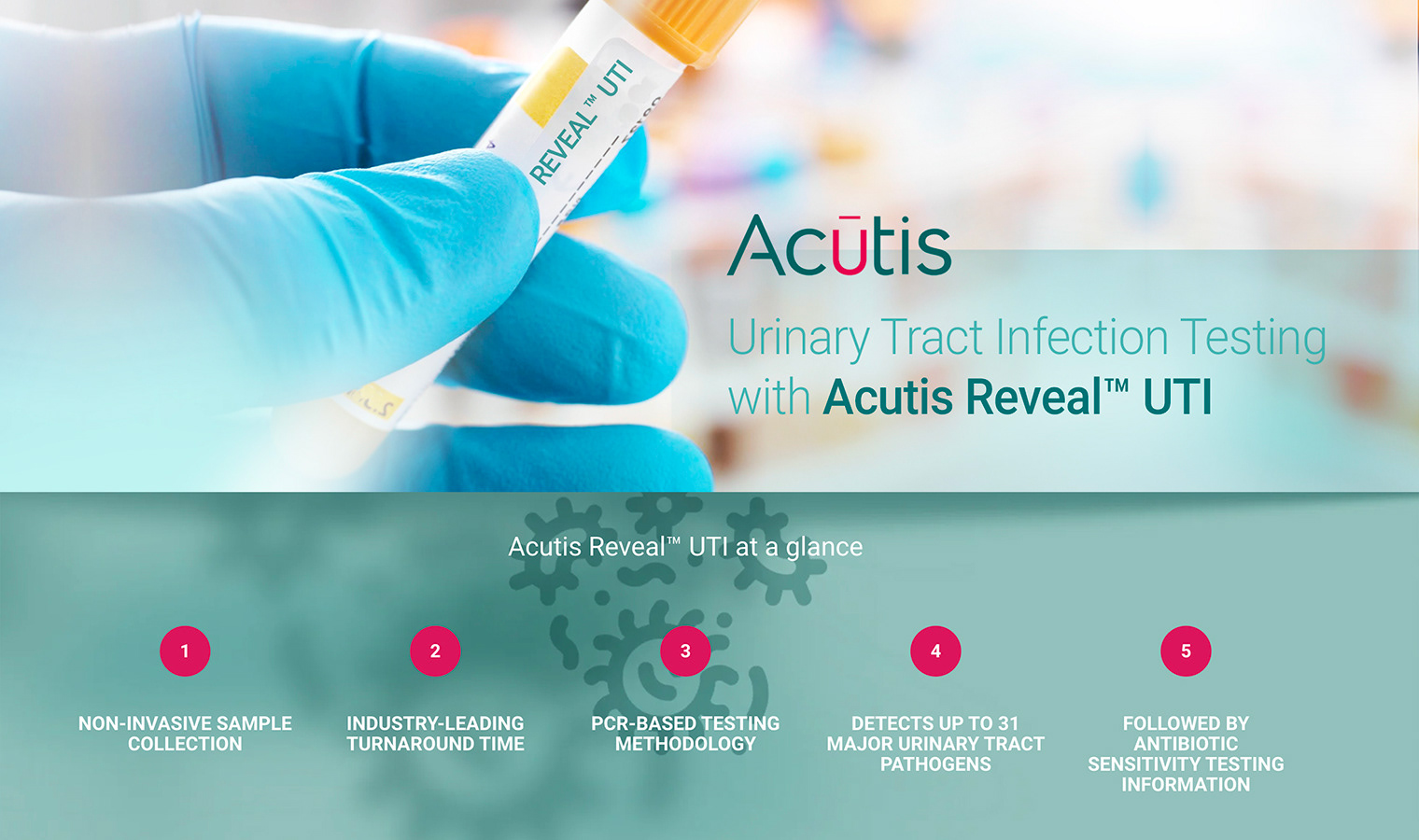
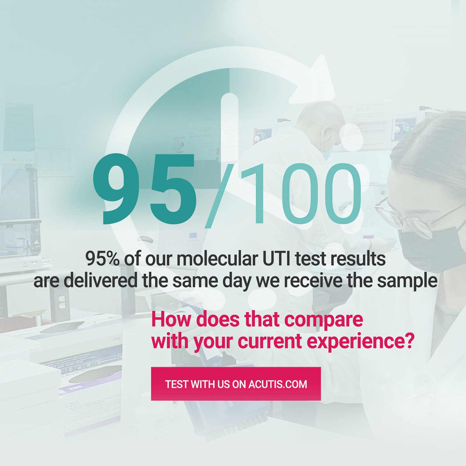
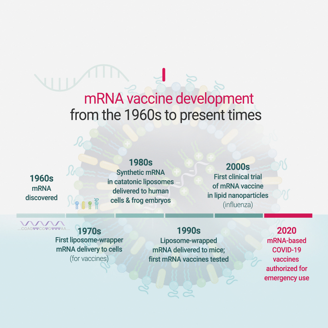
Designed to support national outreach around substance use and addiction in the U.S., this Google Display campaign positioned Acutis Diagnostics as a category leader in advanced toxicology testing.
I led the creative strategy and visual system across multiple ad variations, optimized for clarity, differentiation, and conversion. The campaign emphasized faster turnaround times, expanded drug detection capabilities, and clinical expertise,
driving qualified traffic and supporting measurable increases in engagement and lead inquiries from healthcare
and institutional audiences.
Need to build trust & clarity
in a regulated, science-driven industry?
in a regulated, science-driven industry?


