The brief was a logo for a robotics startup.
The result was a mark so distinctive it attracted unsolicited attention from Samsung and Bose before the product ever shipped.
That's what the right visual language does: it opens doors.
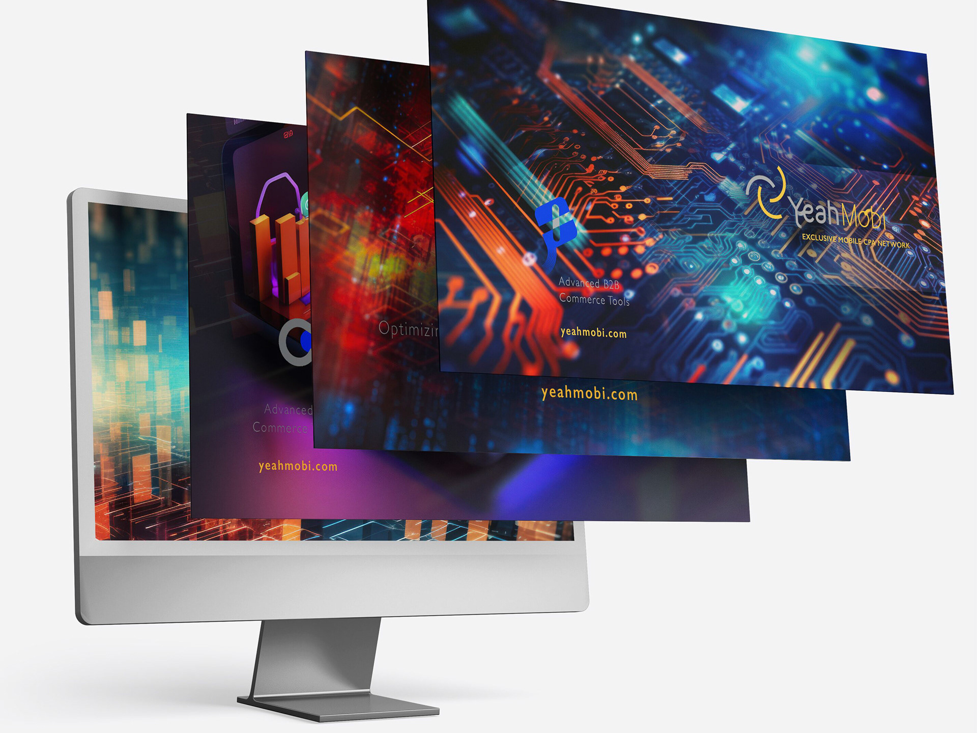
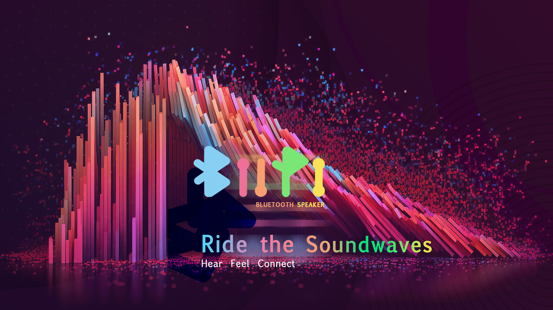
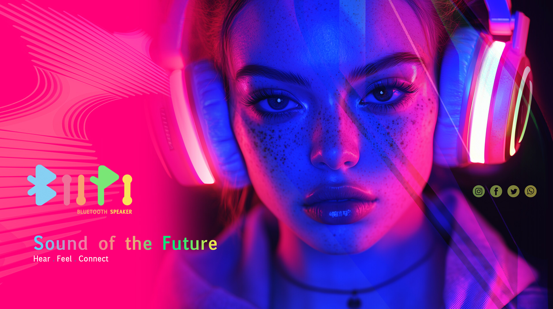
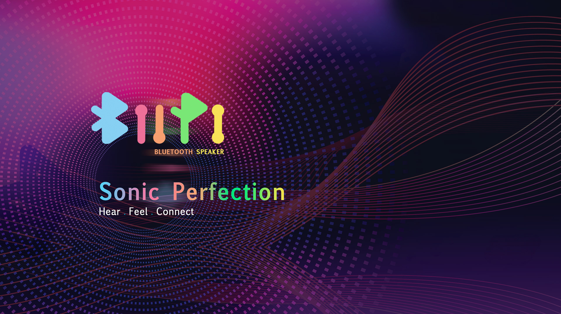
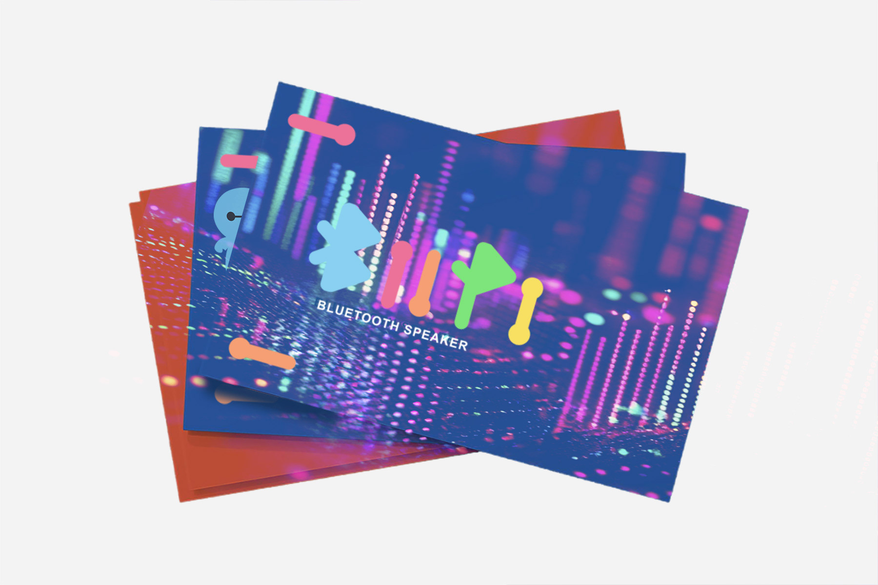
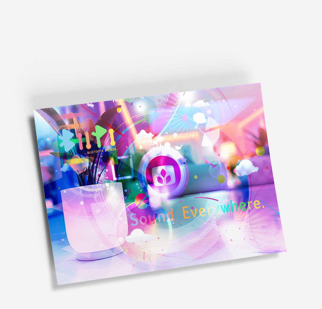
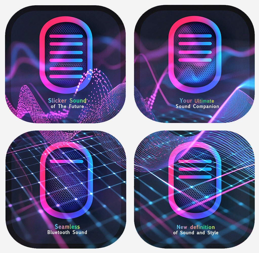
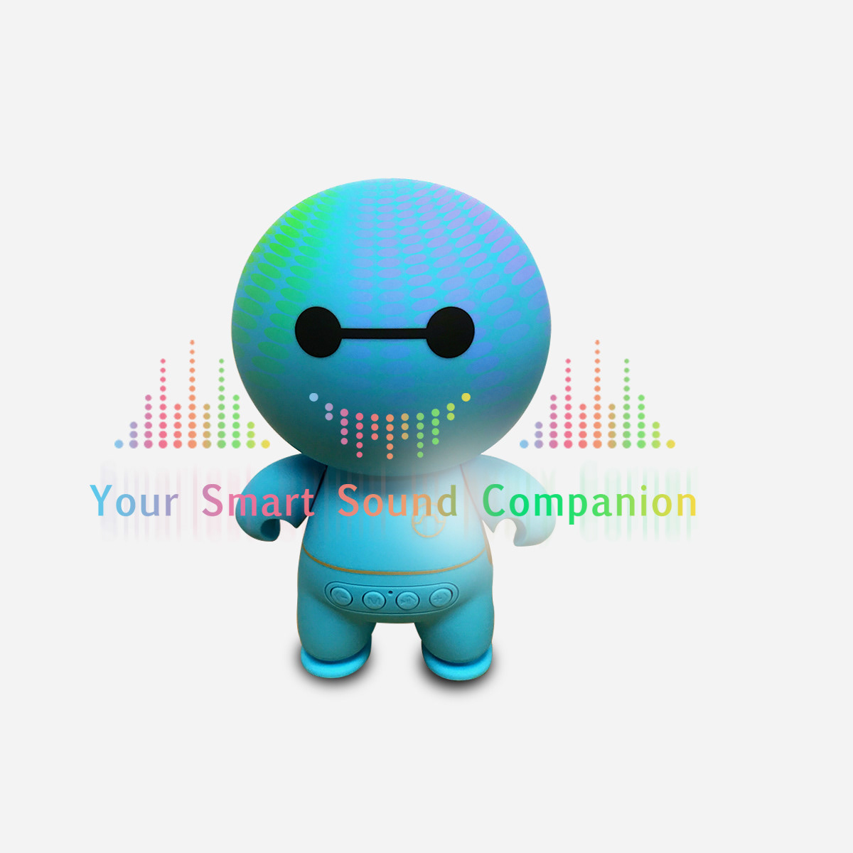
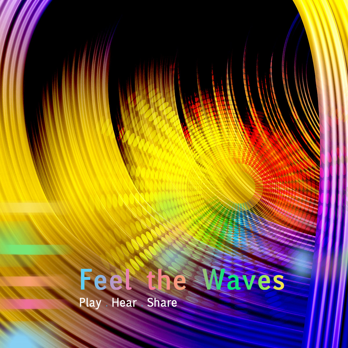
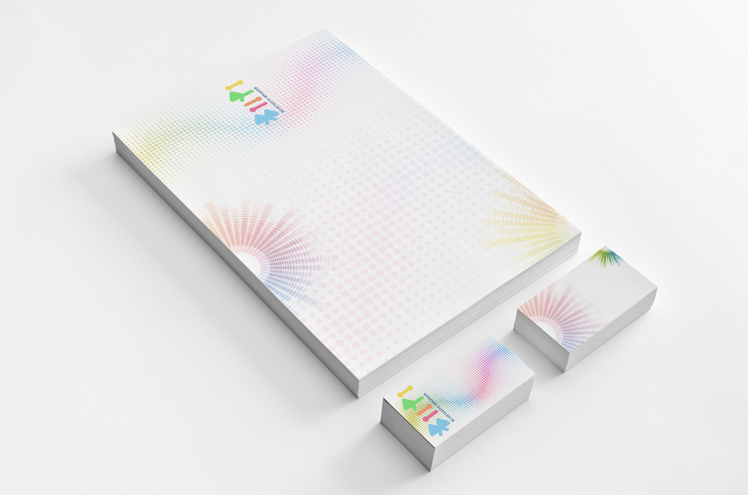
I developed the full brand identity: logotype, visual system, and campaign materials built to establish credibility in a crowded tech landscape.
The result was a mark so distinctive it attracted unsolicited attention from Samsung and Bose before the product ever shipped.
That's what the right visual language does: it opens doors.
I developed the full brand identity: logotype, visual system, and campaign materials built to establish credibility in a crowded tech landscape.
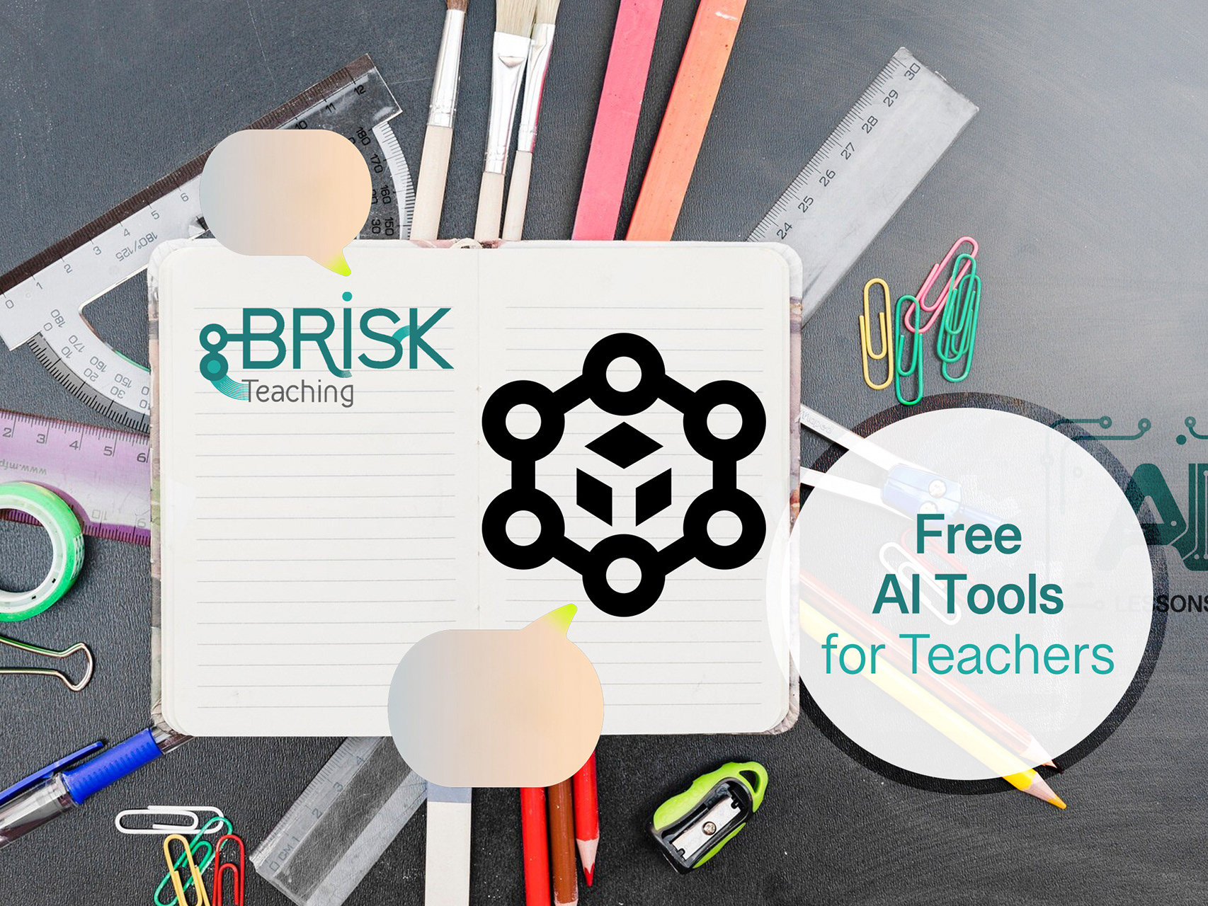
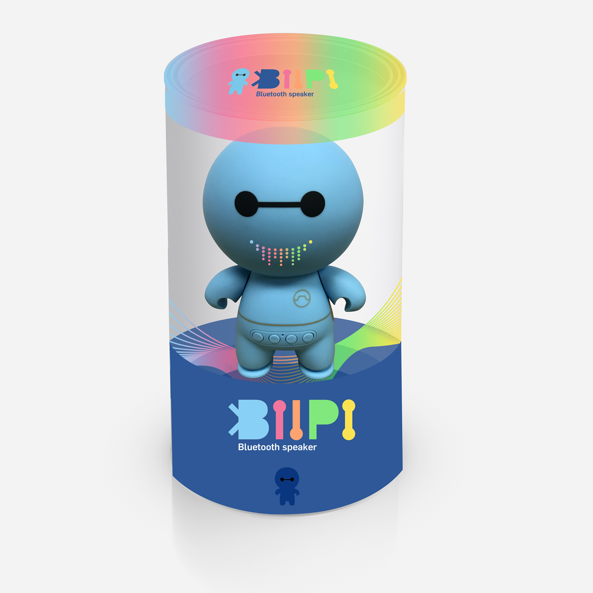
CLIENT ▸ BIIPI Robot, New York, NY, USA
ROLE ▸ Art Director Freelance
SCOPE ▸ Logo Design, Brand Identity, Visual Identity, Campaign Materials, Print Design
PROCESS ▸ Led Cross-functional Brand Audit → Visual Identity System → Rollout Guidelines
ROLE ▸ Art Director Freelance
SCOPE ▸ Logo Design, Brand Identity, Visual Identity, Campaign Materials, Print Design
PROCESS ▸ Led Cross-functional Brand Audit → Visual Identity System → Rollout Guidelines

The Challenge
Early-stage robotics product with limited brand equity
Need for instant recognizability in a technical, competitive space
Logo required to function across hardware, software, and digital touchpoints
Early-stage robotics product with limited brand equity
Need for instant recognizability in a technical, competitive space
Logo required to function across hardware, software, and digital touchpoints
Strategic Approach
Logo-first brand foundation
Emphasis on clarity, memorability, and scalability
Neutral yet distinctive tone to support future brand expansion
Logo-first brand foundation
Emphasis on clarity, memorability, and scalability
Neutral yet distinctive tone to support future brand expansion
Creative Solution
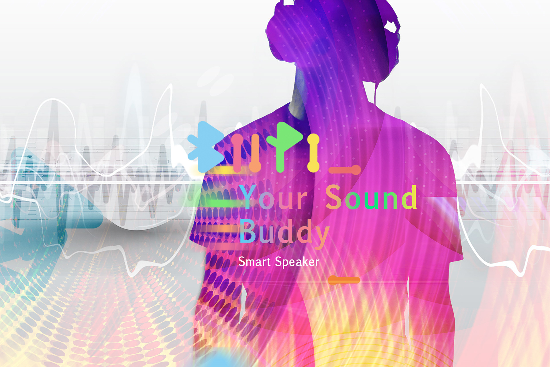
A bold, typographic logotype designed for immediate recognition
Clean, contemporary letterforms aligned with smart robotics and technology
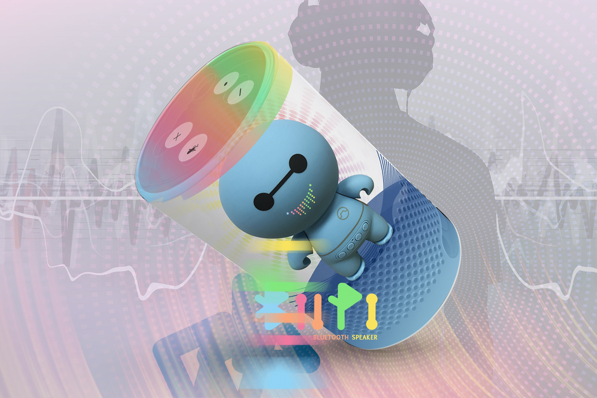
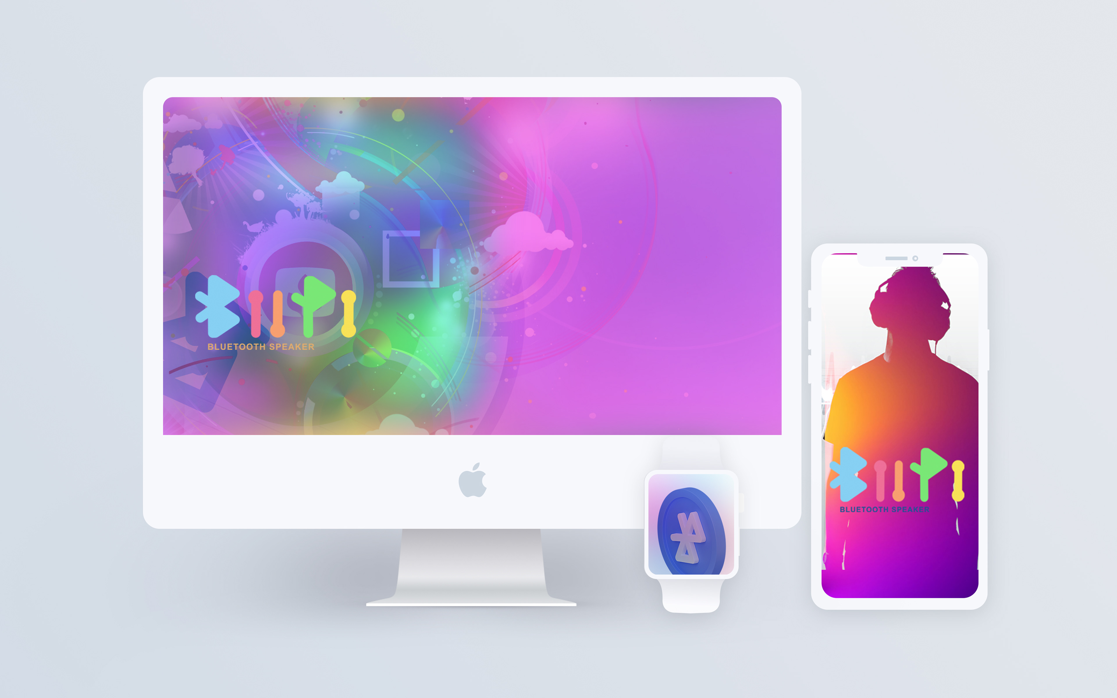
A mark flexible enough to live across interfaces, devices, and partnerships
A bold, typographic logotype designed for immediate recognition
Clean, contemporary letterforms aligned with smart robotics and technology
A mark flexible enough to live across interfaces, devices, and partnerships
Scope & System
Definition of logo structure and proportions
Rules for spacing, scale, and placement
Baseline guidance for future visual extensions
Definition of logo structure and proportions
Rules for spacing, scale, and placement
Baseline guidance for future visual extensions
Deliverables
Final logotype
Usage and spacing guidelines
Digital - and product-ready logo assets
Final logotype
Usage and spacing guidelines
Digital - and product-ready logo assets
Role & Leadership
Brand Design Lead
Led the logo design process from concept through delivery, defining the visual foundation and usage principles for an early-stage smart robotics brand.
Brand Design Lead
Led the logo design process from concept through delivery, defining the visual foundation and usage principles for an early-stage smart robotics brand.


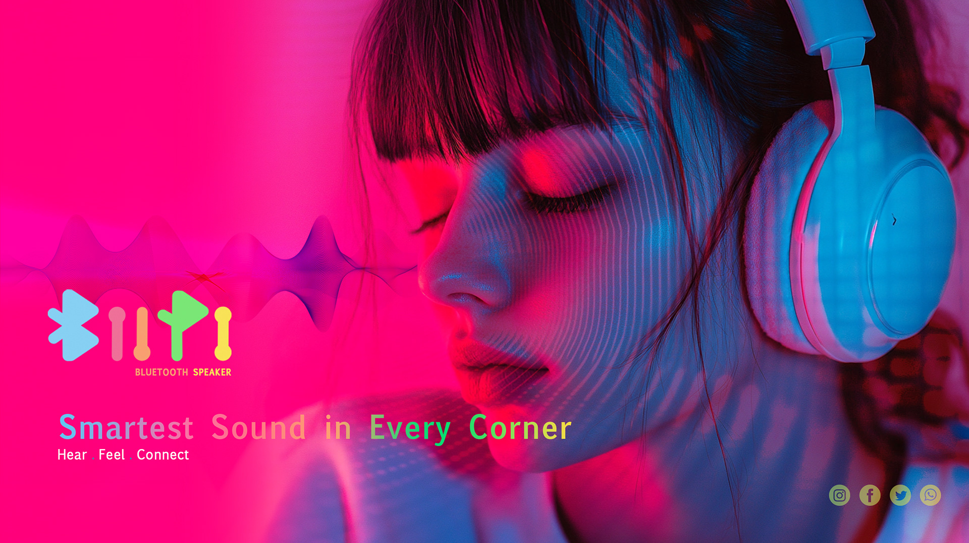
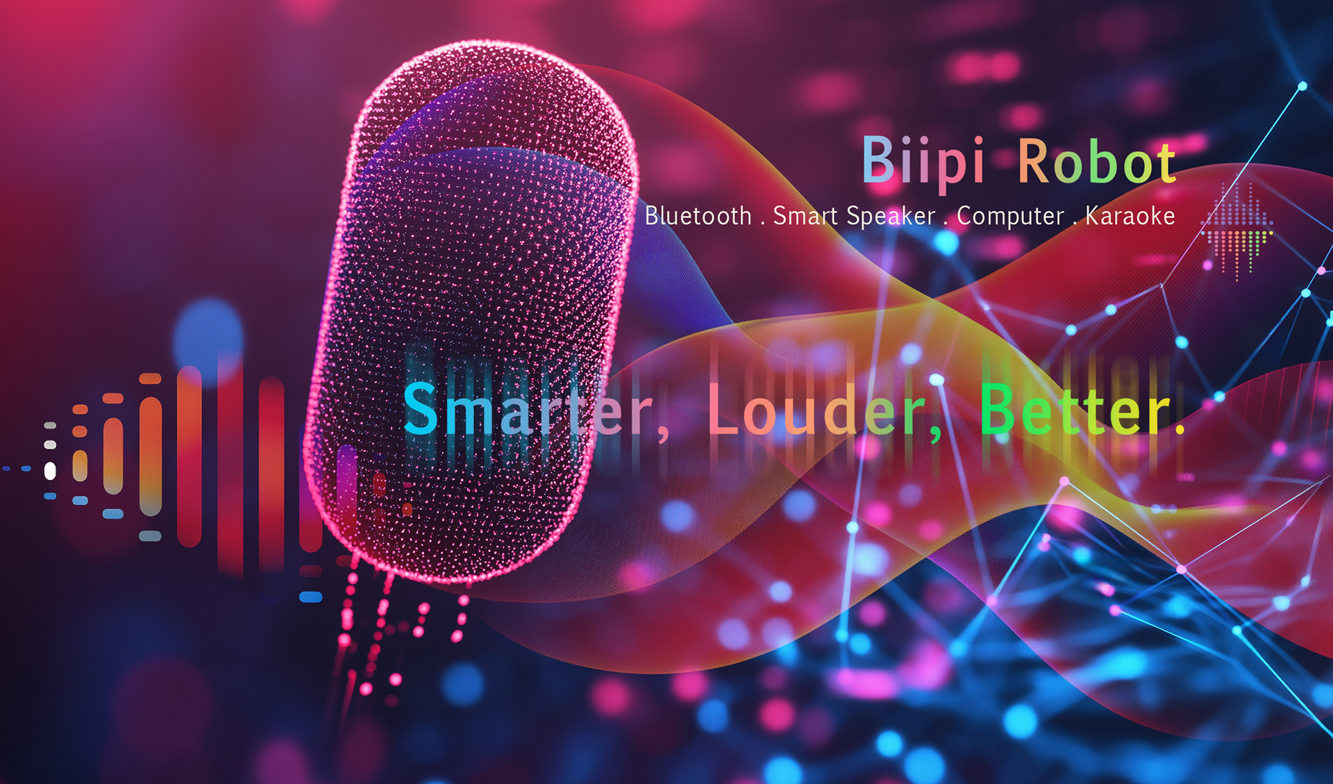
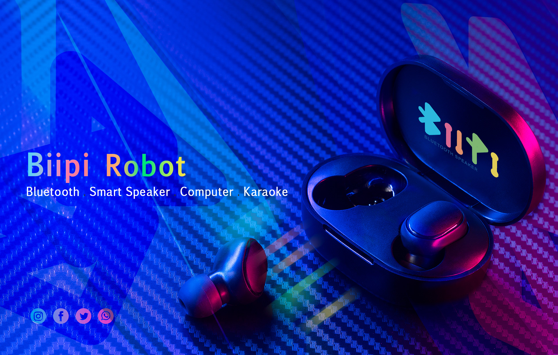
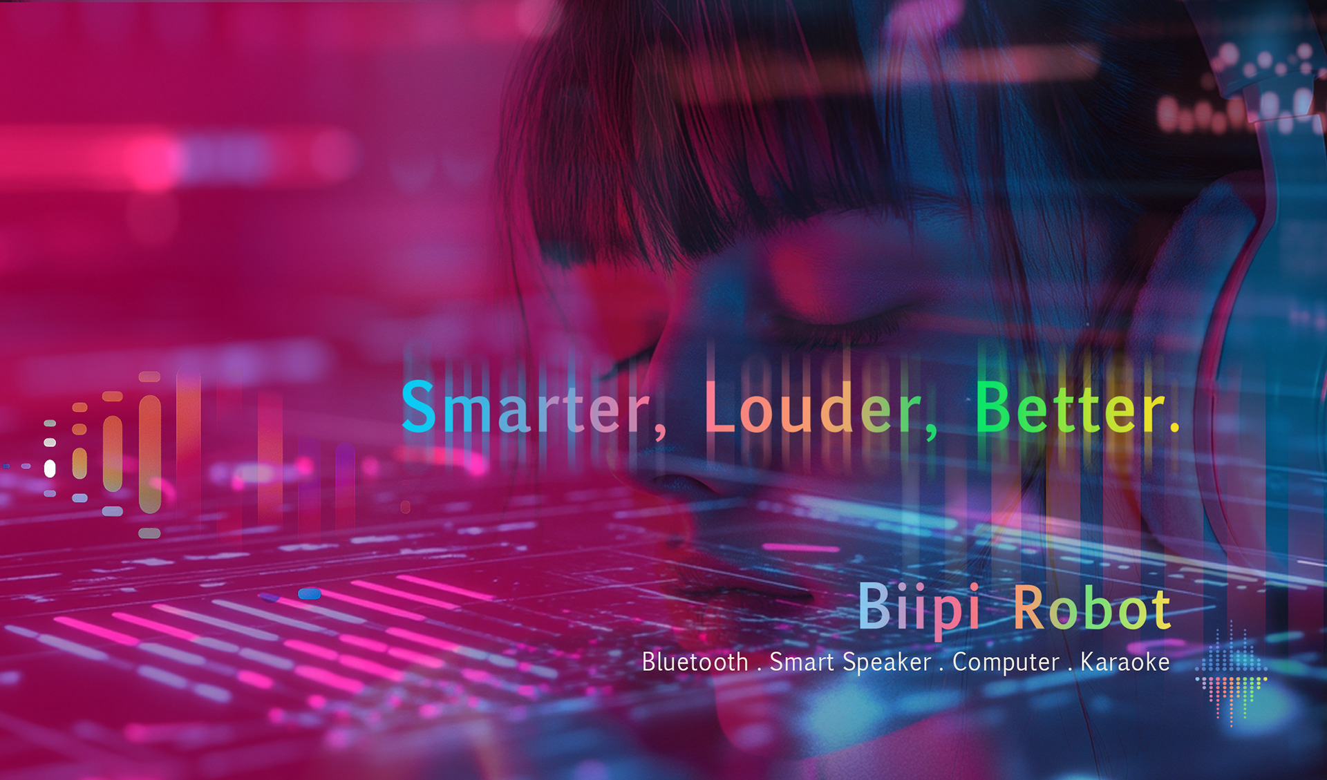


The BIIPI logo was designed as a precise typographic wordmark, providing a clear and stable visual anchor for a smart robotics product in its early growth stage.
On The Work
In emerging technology domains such as robotics, the logo often serves as the first and most persistent point of contact.
In emerging technology domains such as robotics, the logo often serves as the first and most persistent point of contact.
This work demonstrates how a disciplined, logo-led approach can establish credibility early, reduce ambiguity across touchpoints, and create a foundation that allows a product to evolve without constant visual reinvention.


Launching a tech product that needs
to feel smart & approachable?
to feel smart & approachable?