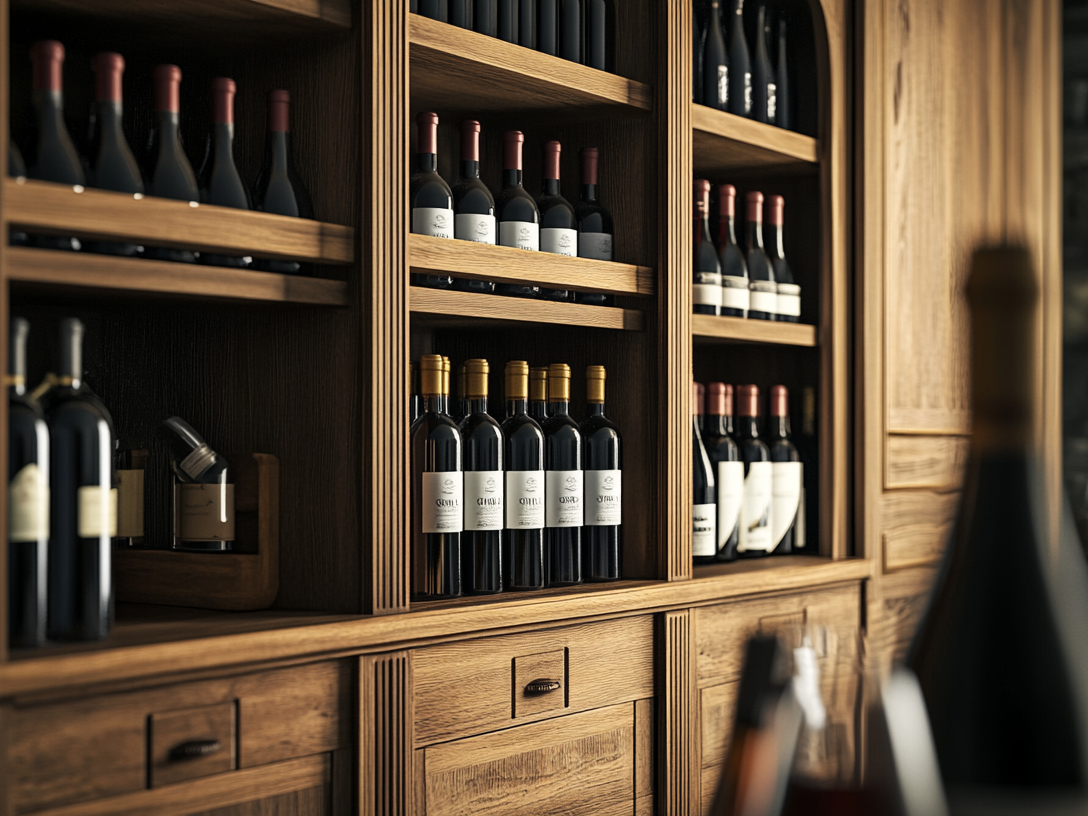
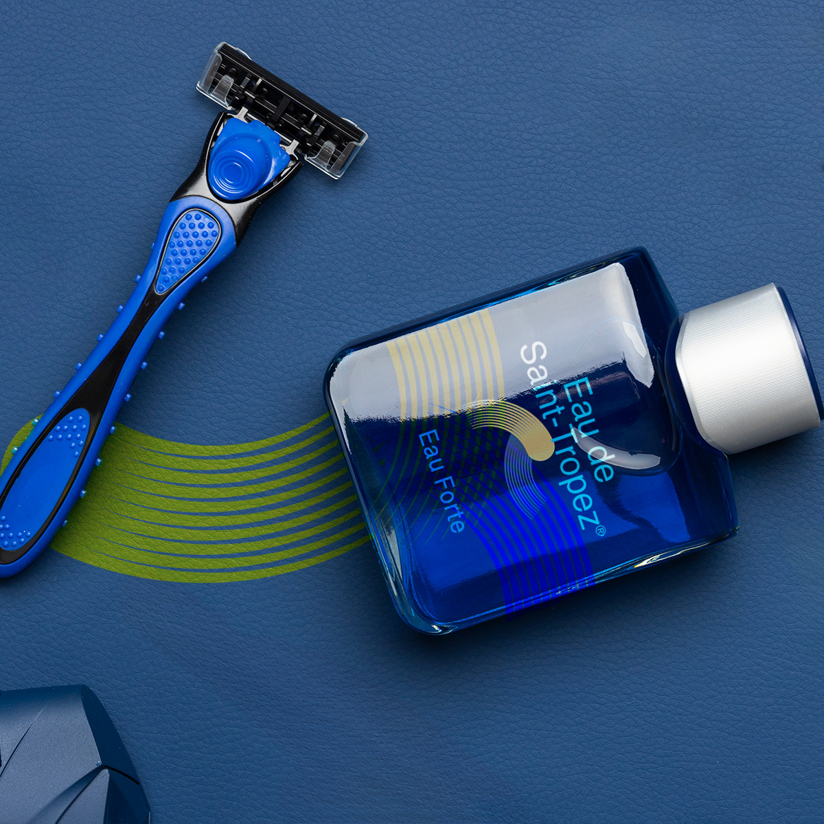
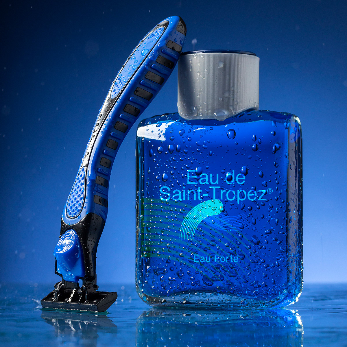
A premium men's skincare brand needed packaging that felt genuinely luxurious. not aspirationally so.
The brief was to translate a specific Mediterranean lifestyle sensibility into a product identity capable
of competing at the premium tier.
The visual system balances restraint with warmth and has been consistently used as the benchmark
for the brand's broader creative direction.
The brief was to translate a specific Mediterranean lifestyle sensibility into a product identity capable
of competing at the premium tier.
The visual system balances restraint with warmth and has been consistently used as the benchmark
for the brand's broader creative direction.
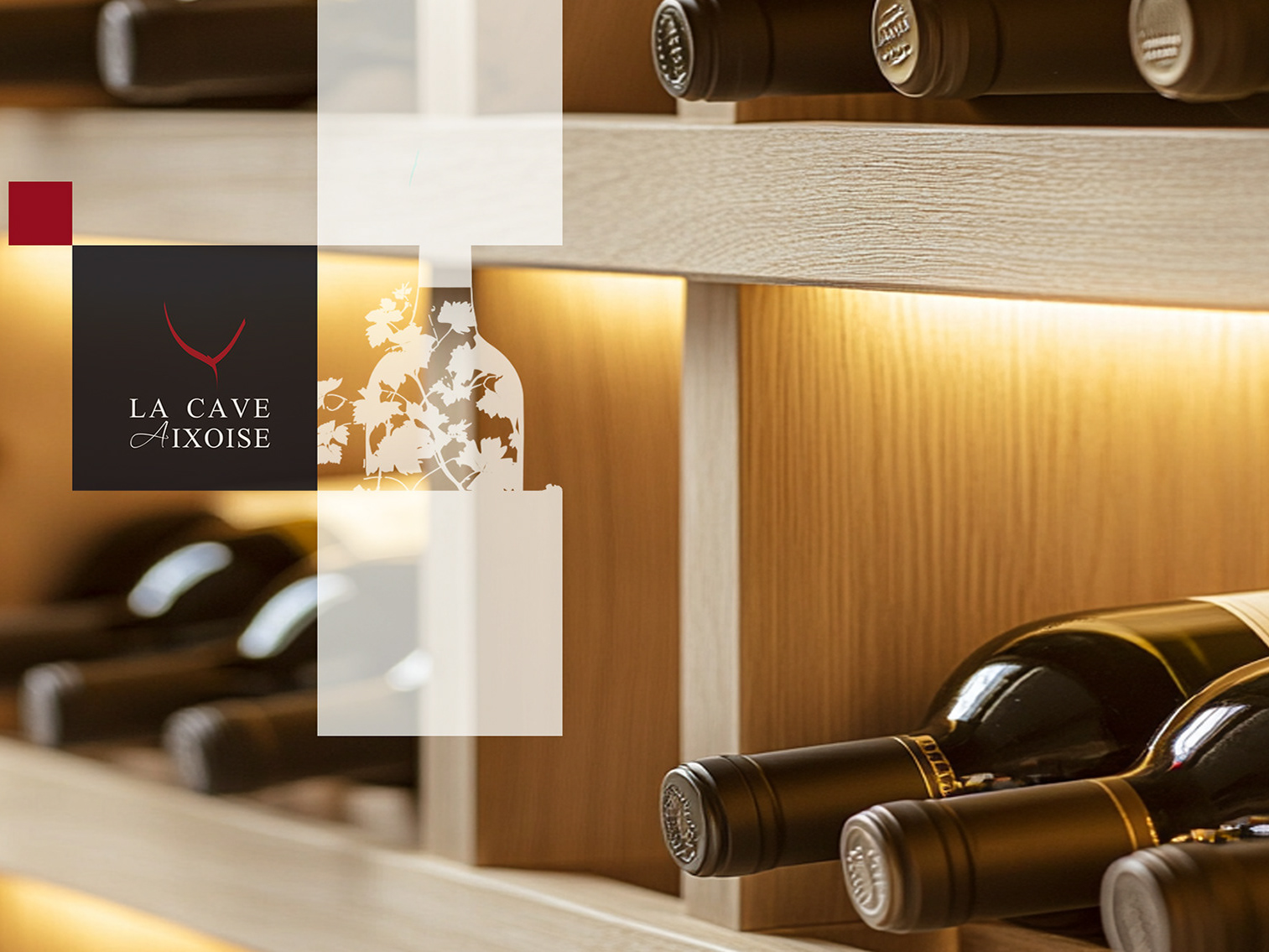
CLIENT ▸ Eau de Saint-Tropez, France
ROLE ▸ Art Director Freelance
SCOPE ▸ Logo Design, Visual Identity, Packaging Design, Campaign Materials
PROCESS ▸ Led cross-functional brand audit → visual identity system → rollout guidelines
ROLE ▸ Art Director Freelance
SCOPE ▸ Logo Design, Visual Identity, Packaging Design, Campaign Materials
PROCESS ▸ Led cross-functional brand audit → visual identity system → rollout guidelines
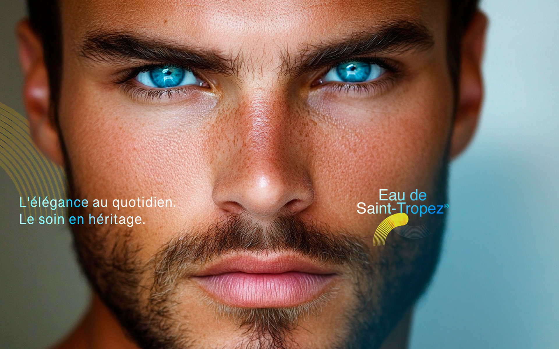
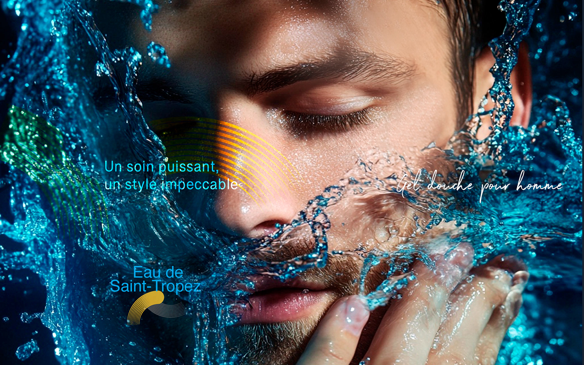
The Challenge
New skincare brand entering a crowded premium market
Need to signal quality and sophistication without clinical codes
Visual identity required to evoke place, mood, and desirability
New skincare brand entering a crowded premium market
Need to signal quality and sophistication without clinical codes
Visual identity required to evoke place, mood, and desirability
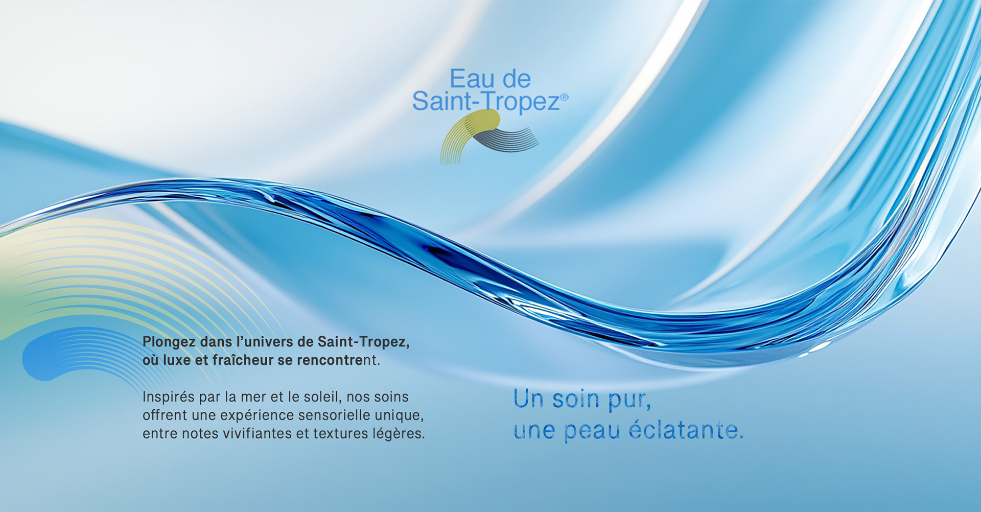
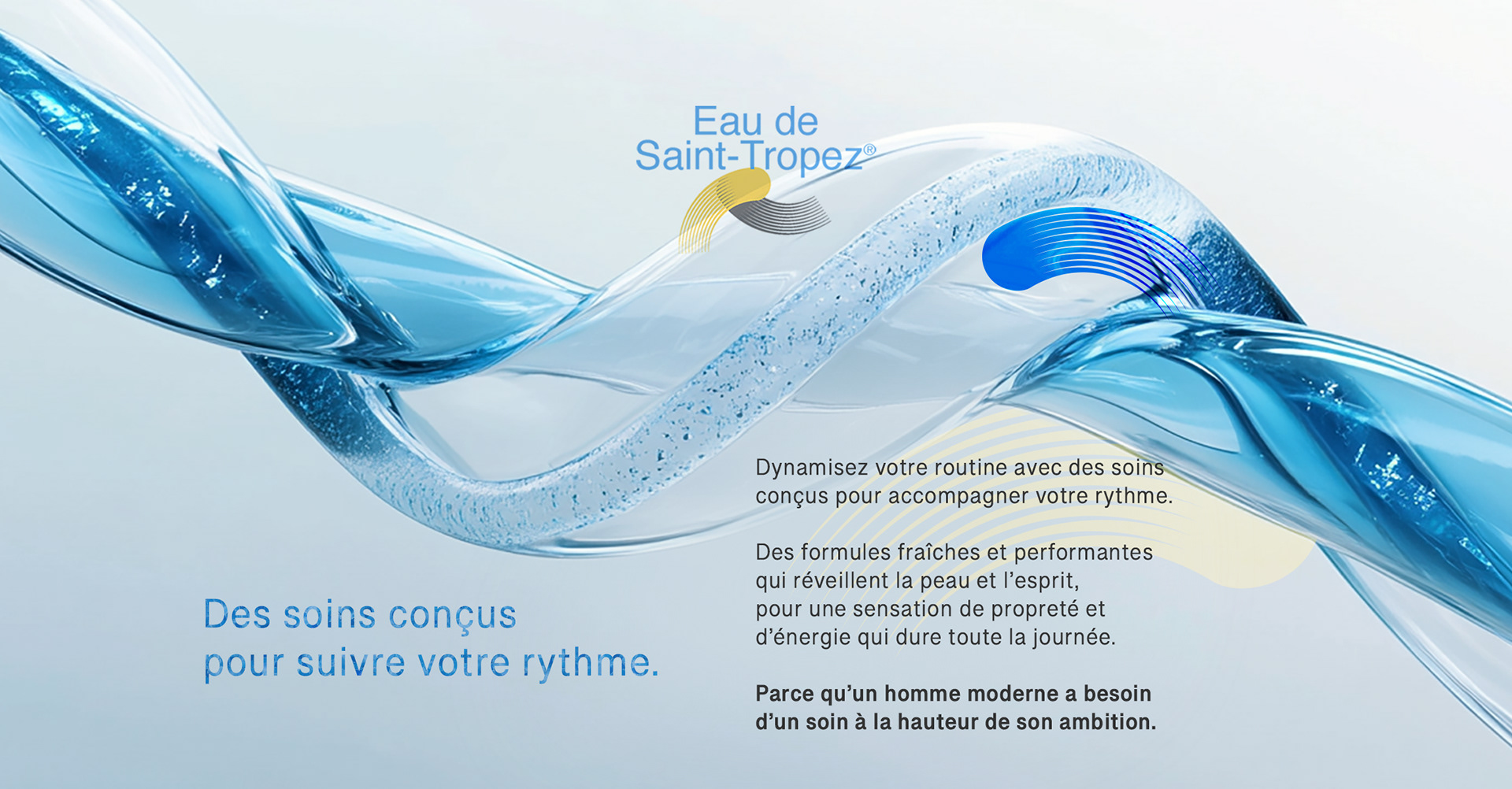
Strategic Approach
Lifestyle-first brand expression
Emphasis on atmosphere, tone, and sensuality over technical claims
Visual cues drawn from Mediterranean culture and contemporary luxury
Lifestyle-first brand expression
Emphasis on atmosphere, tone, and sensuality over technical claims
Visual cues drawn from Mediterranean culture and contemporary luxury
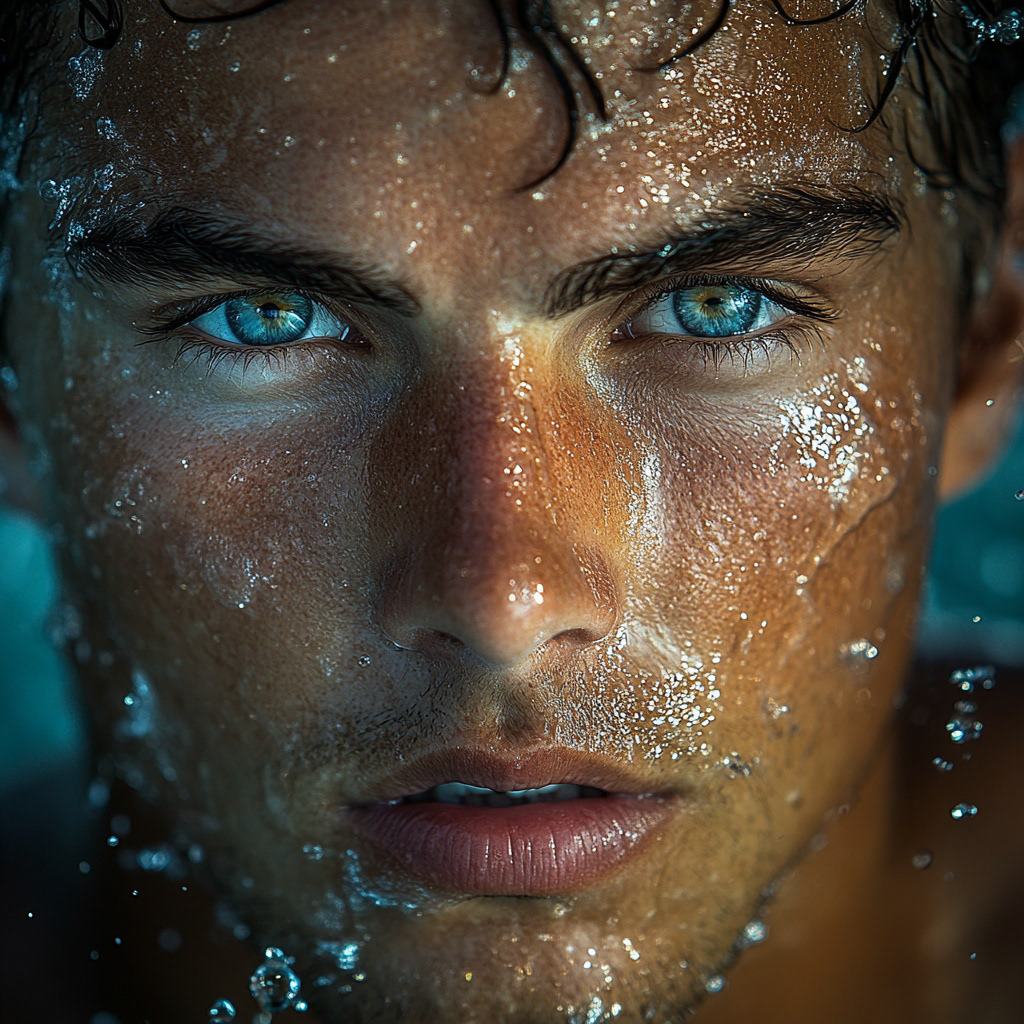
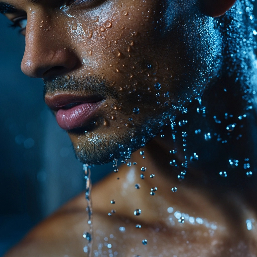
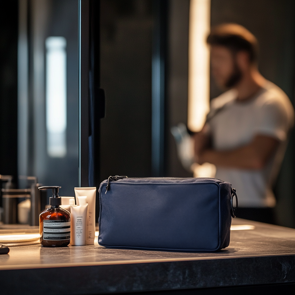
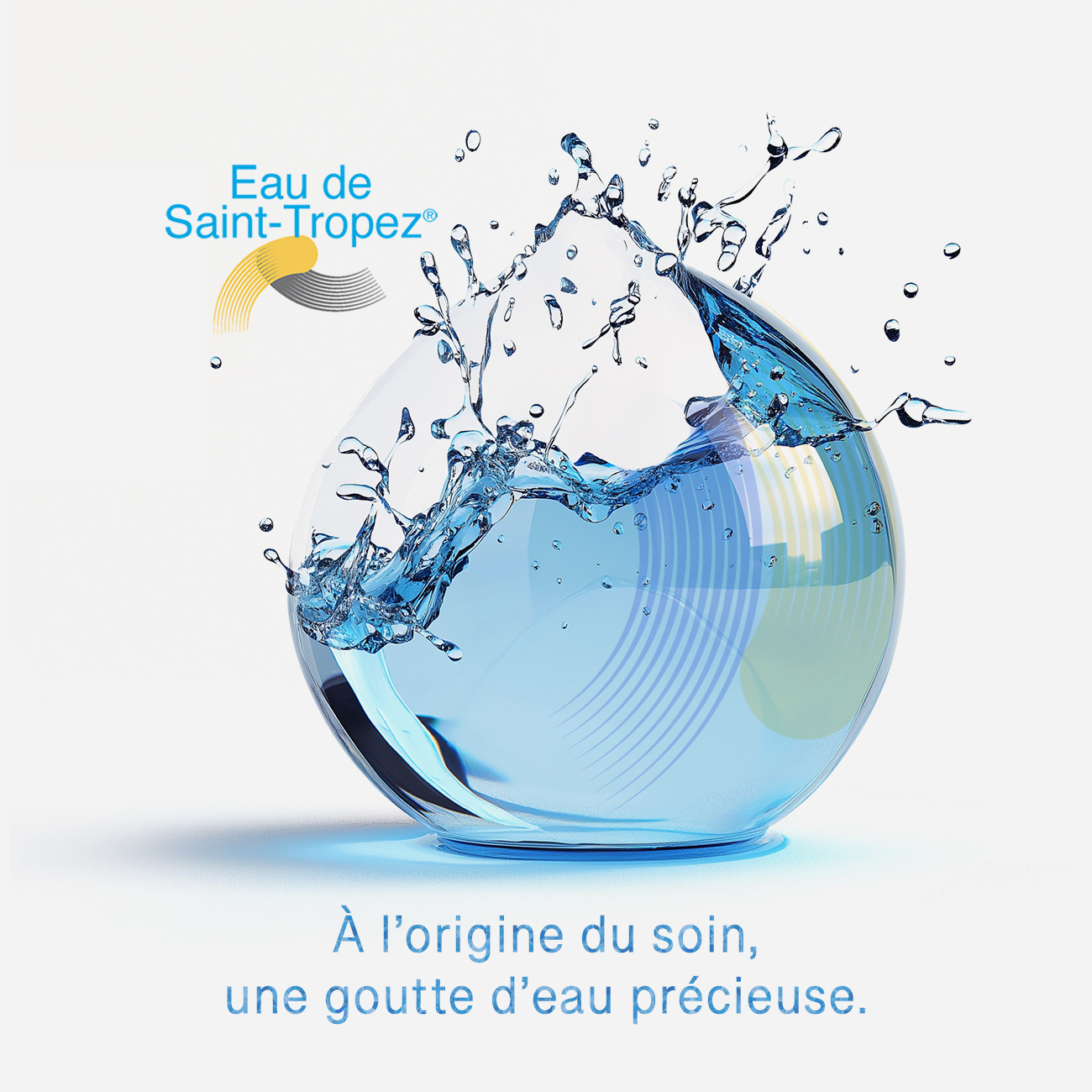
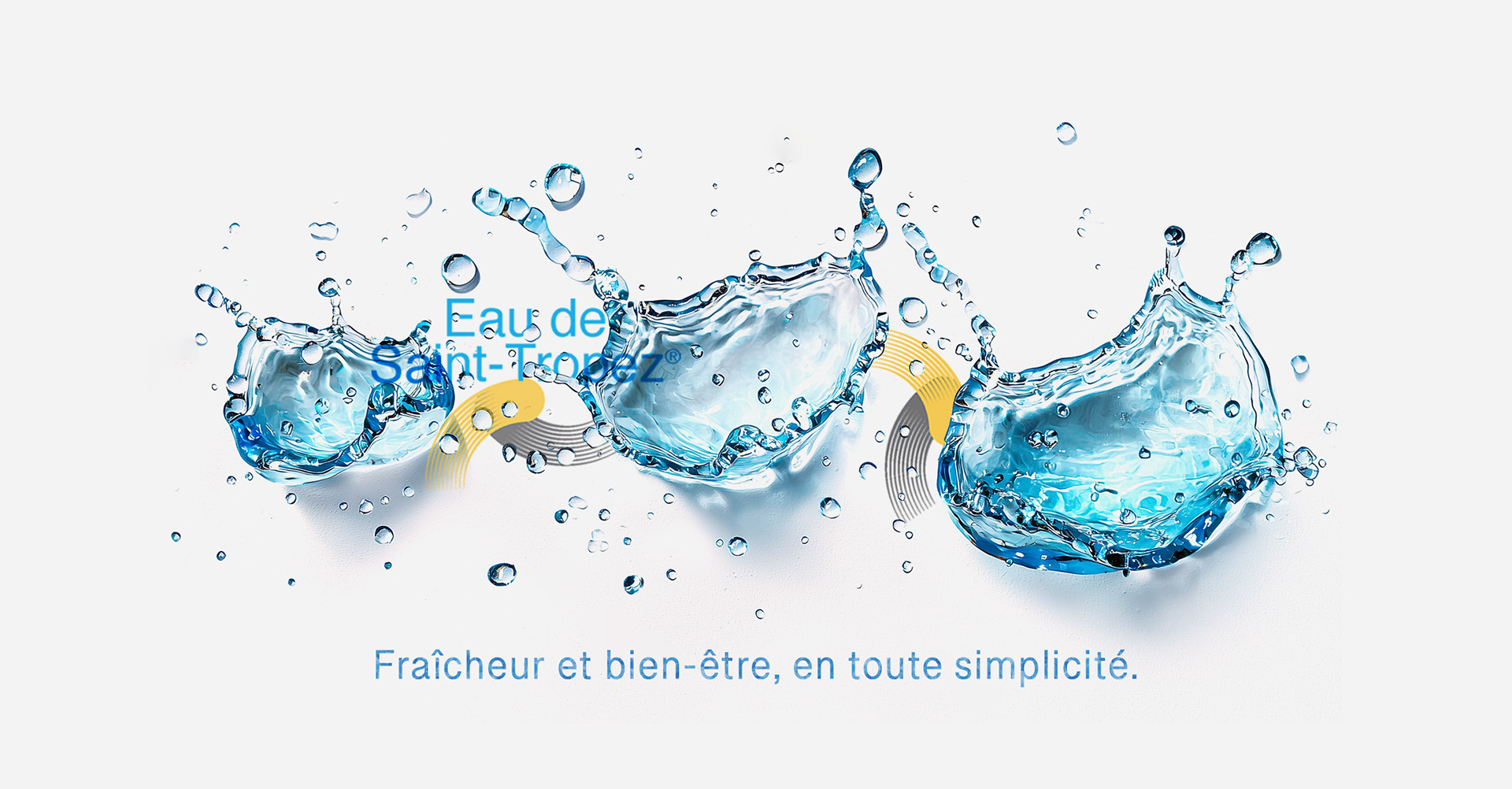
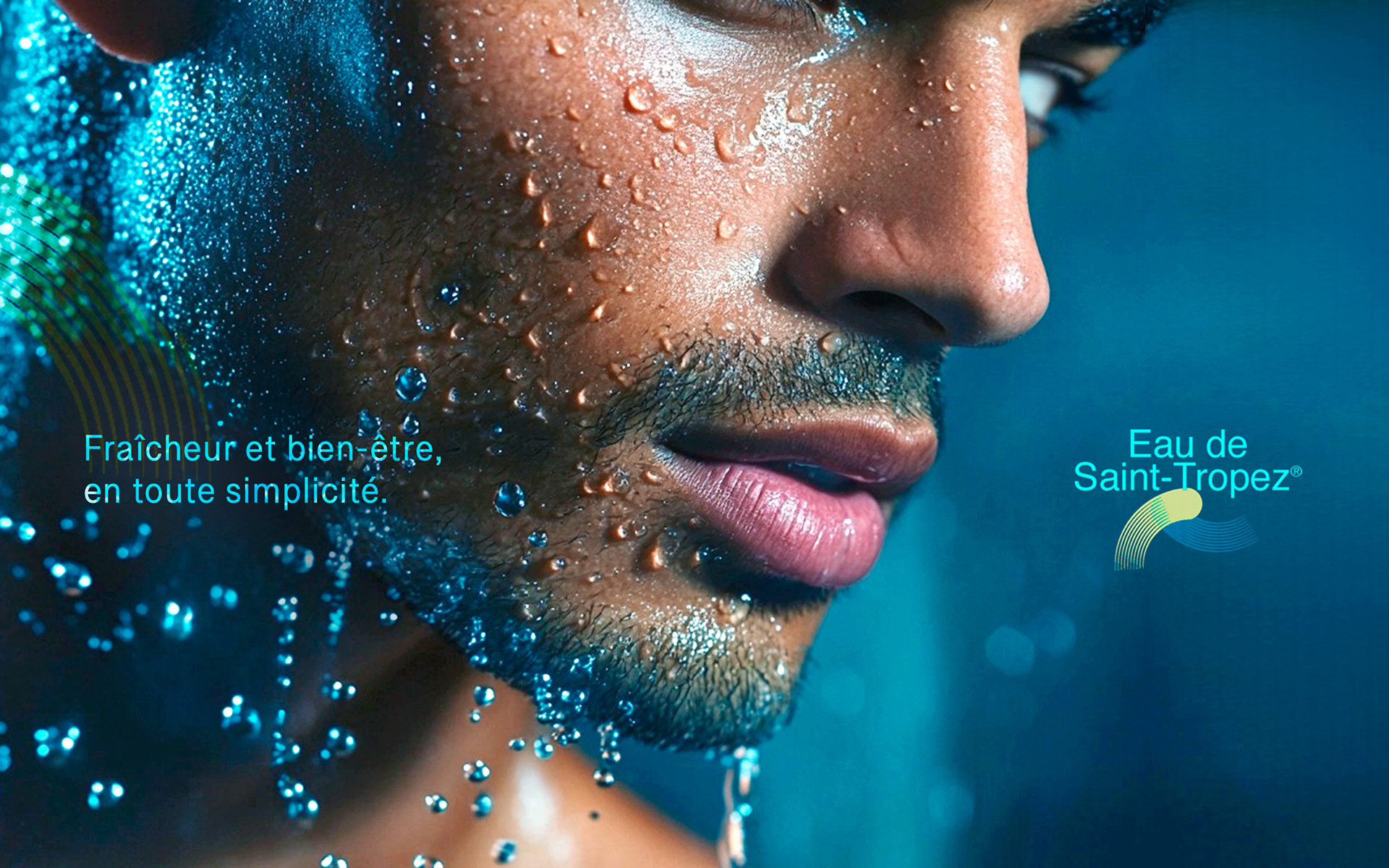
Creative Solution
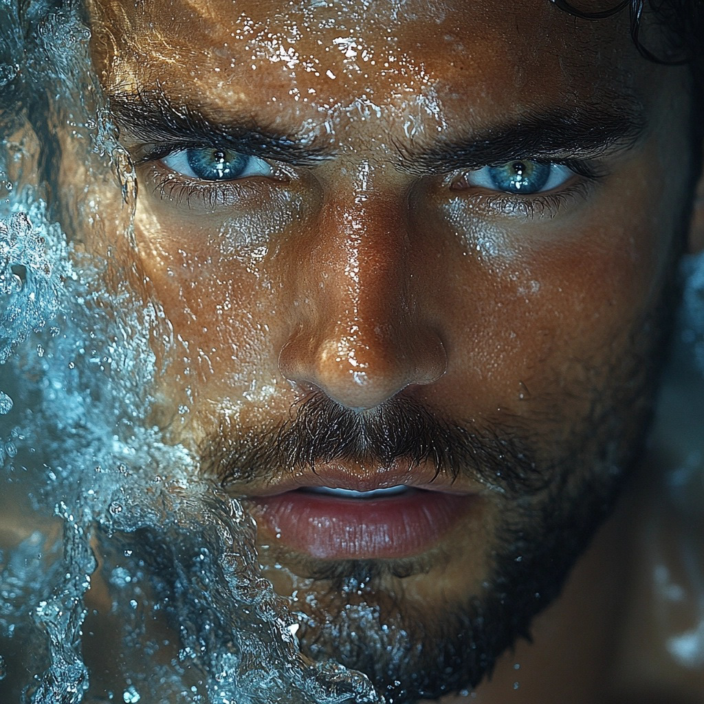
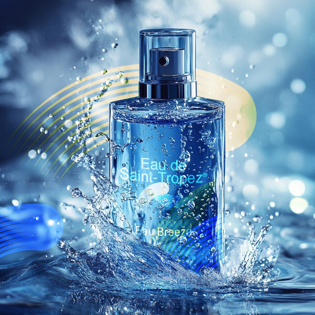
A cohesive visual world built around light, texture, and color
Brand imagery designed to suggest ritual, ease, and confidence
Art direction balancing modern masculinity with understated elegance
A cohesive visual world built around light, texture, and color
Brand imagery designed to suggest ritual, ease, and confidence
Art direction balancing modern masculinity with understated elegance
Scope & System
Visual direction guidelines for brand imagery
Principles for color, light, and composition
Rules for maintaining consistency across campaign and content visuals
Visual direction guidelines for brand imagery
Principles for color, light, and composition
Rules for maintaining consistency across campaign and content visuals
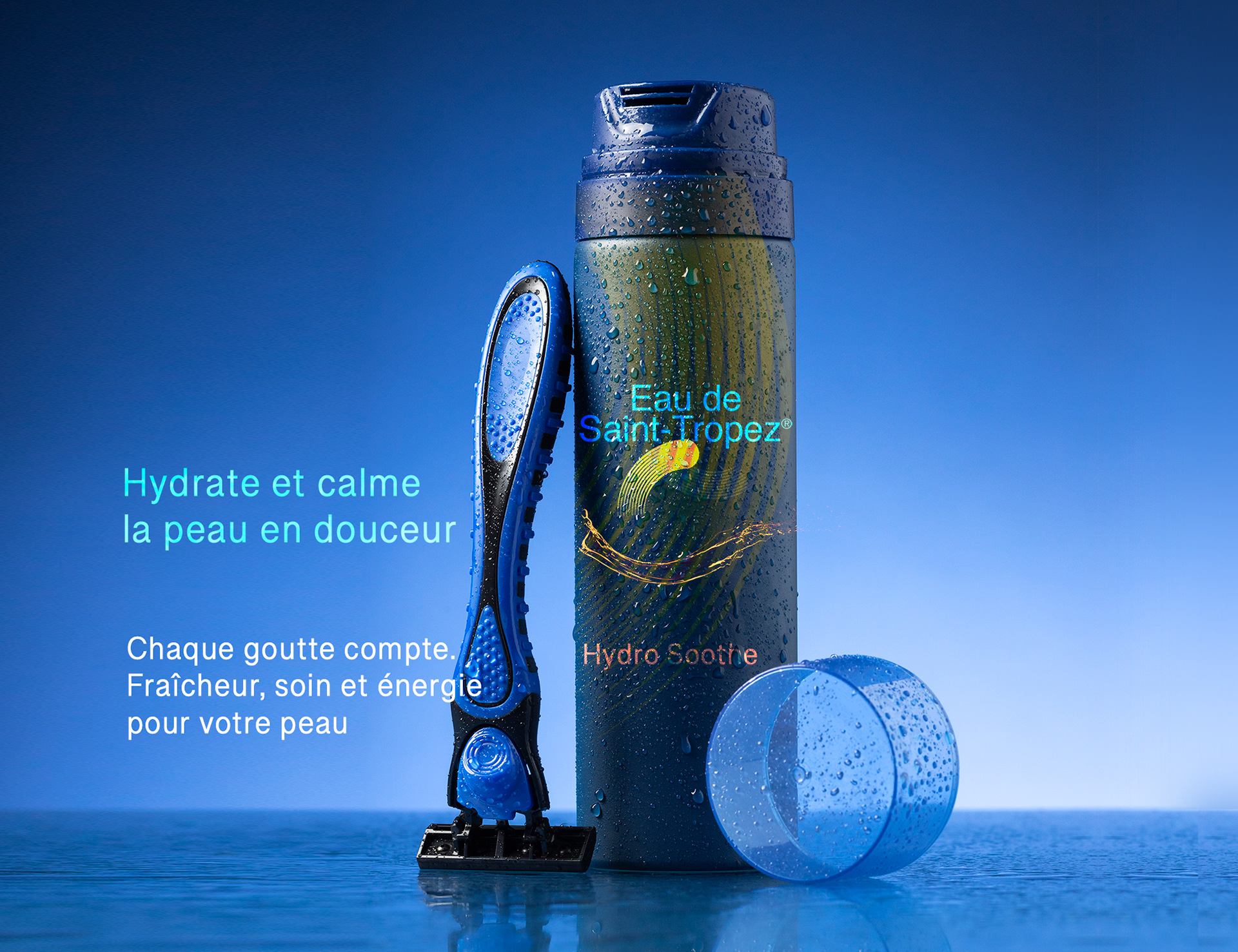
Deliverables
Brand visual direction
Campaign and lifestyle imagery
Digital and social brand visuals
Brand visual direction
Campaign and lifestyle imagery
Digital and social brand visuals
Role & Leadership
Brand Design Lead
Led visual strategy and art direction, defining the brand’s visual language and overseeing execution across imagery and content.
Brand Design Lead
Led visual strategy and art direction, defining the brand’s visual language and overseeing execution across imagery and content.
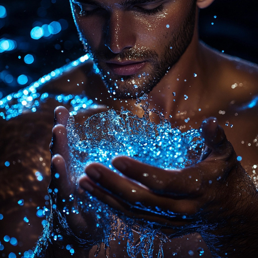
On The Work
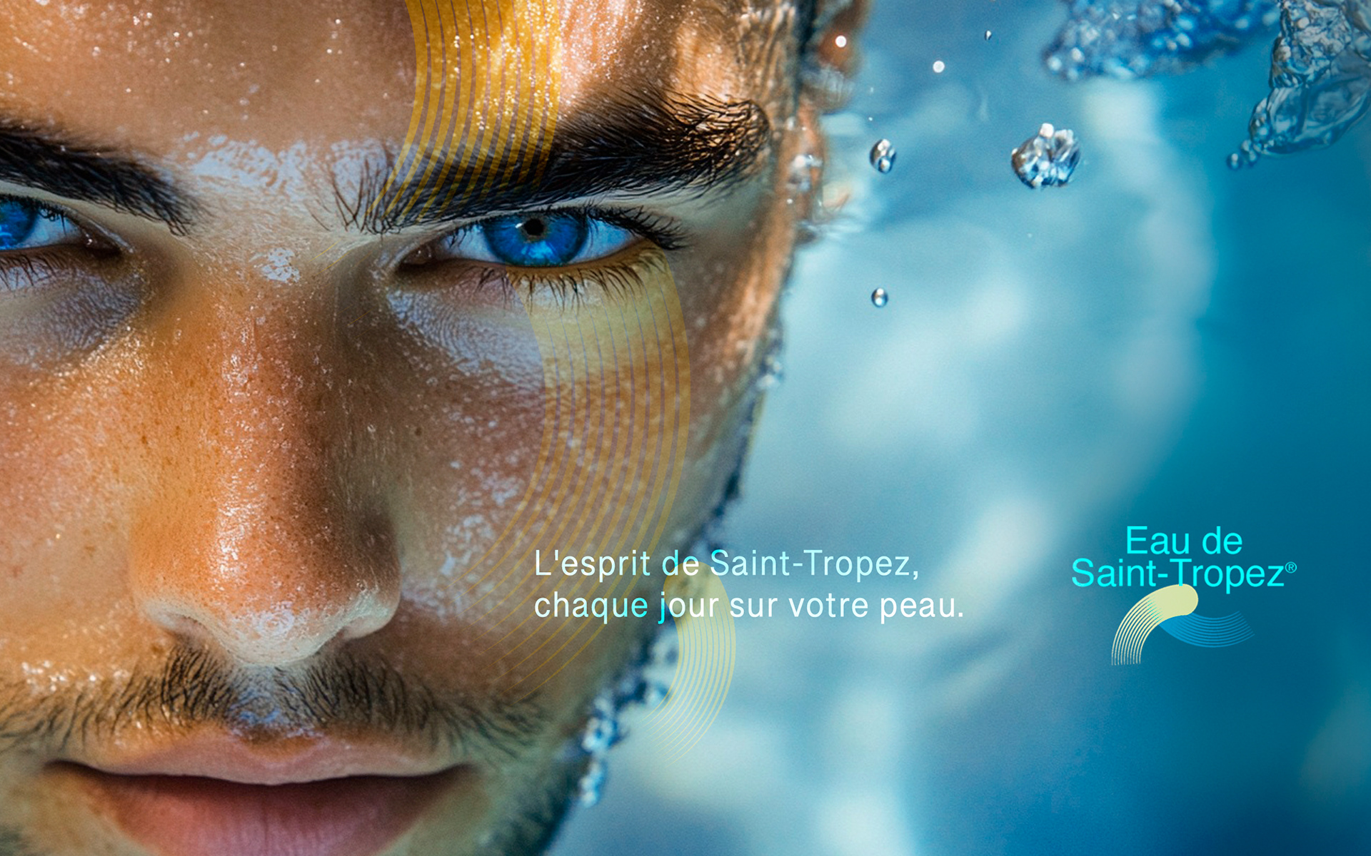
In luxury and skincare, perception precedes proof.
This work shows how visual direction, through mood, composition, and restraint,
can establish desire, credibility, and brand identity before a single product claim
is made.
In luxury and skincare, perception precedes proof.
This work shows how visual direction, through mood, composition, and restraint,
can establish desire, credibility, and brand identity before a single product claim
is made.

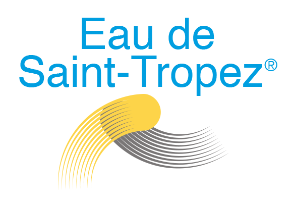
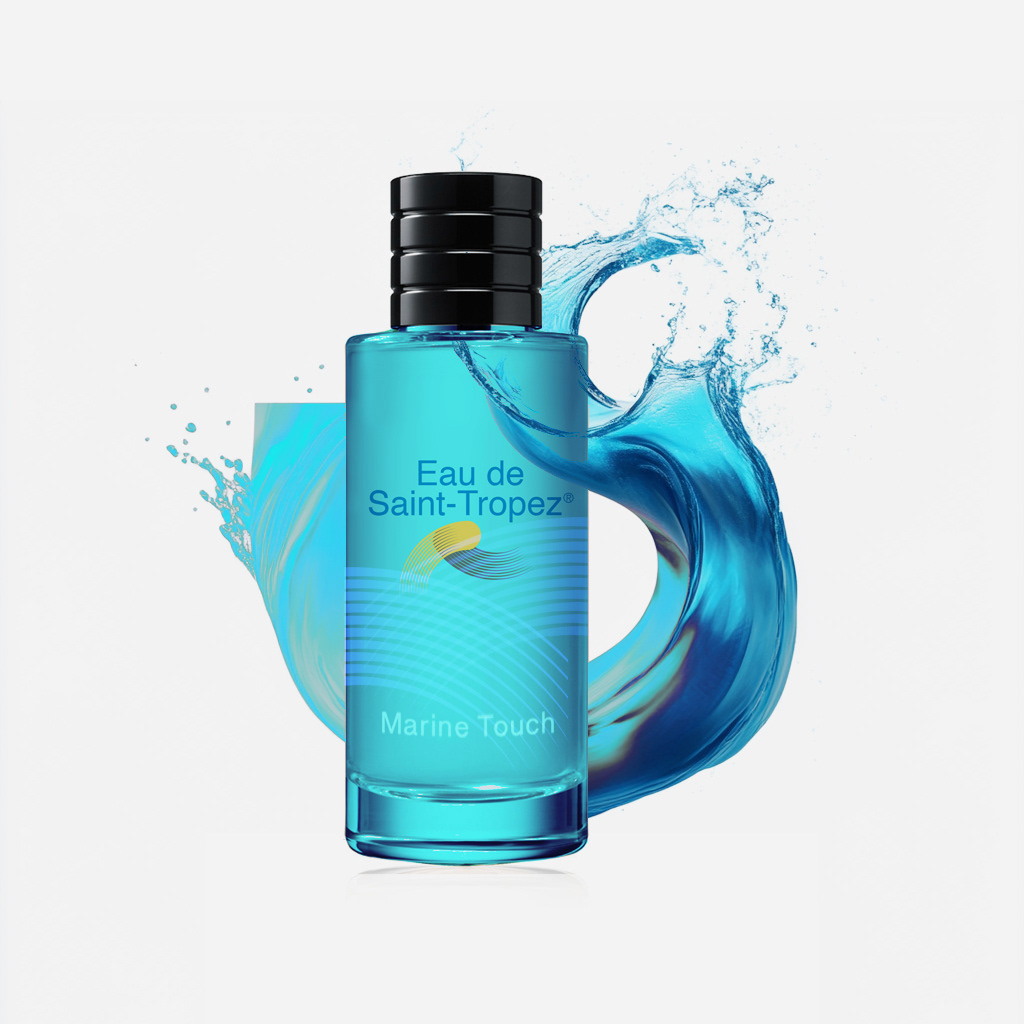
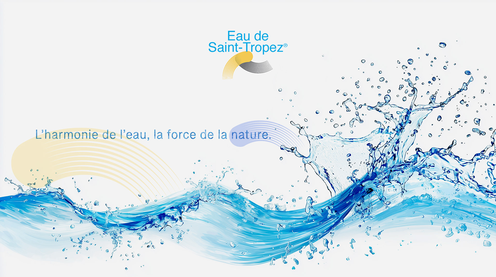
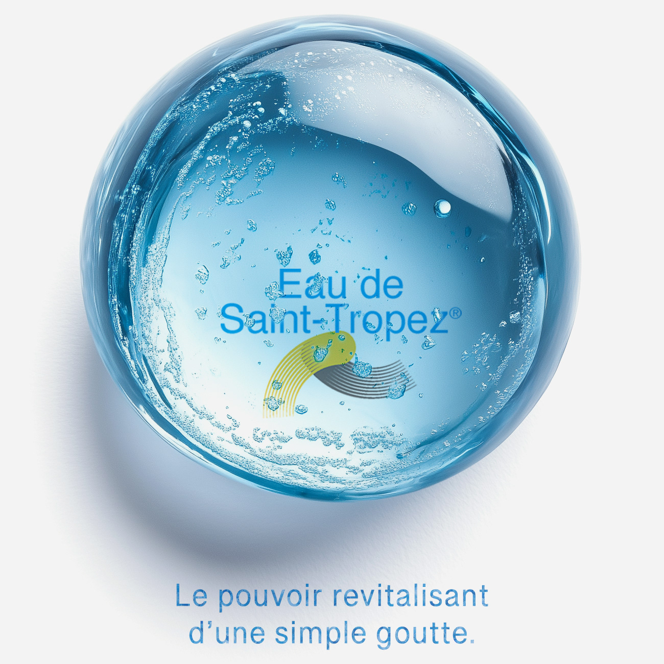
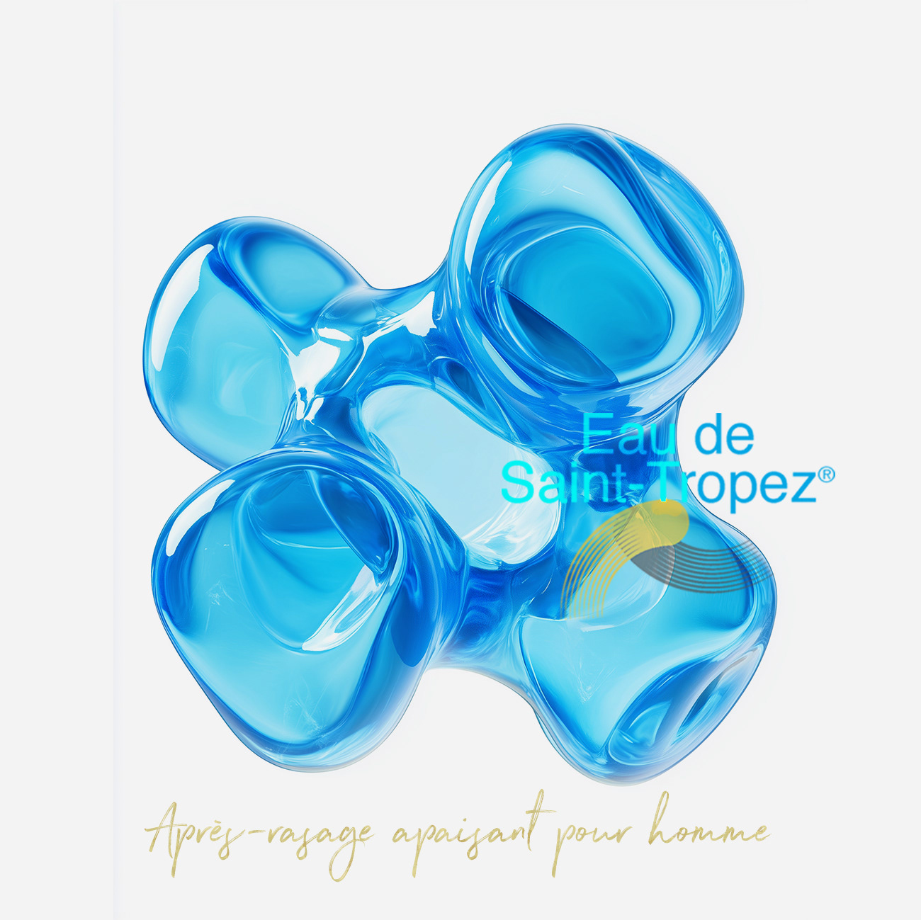
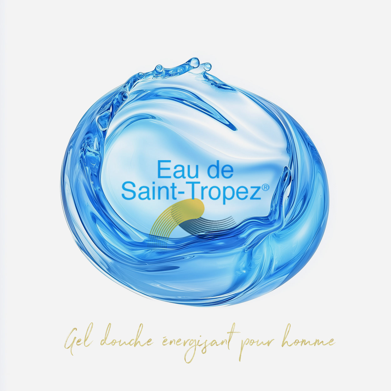
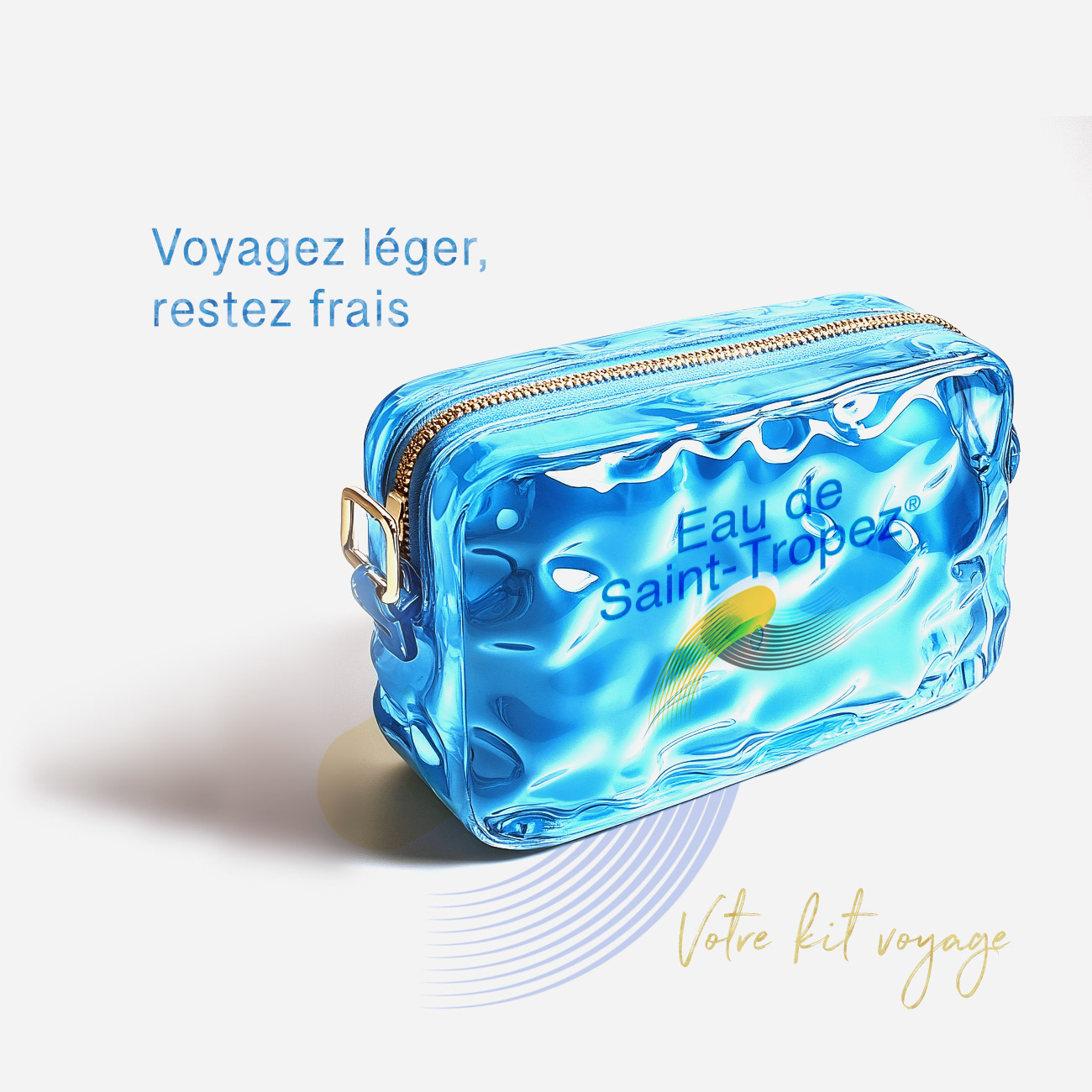
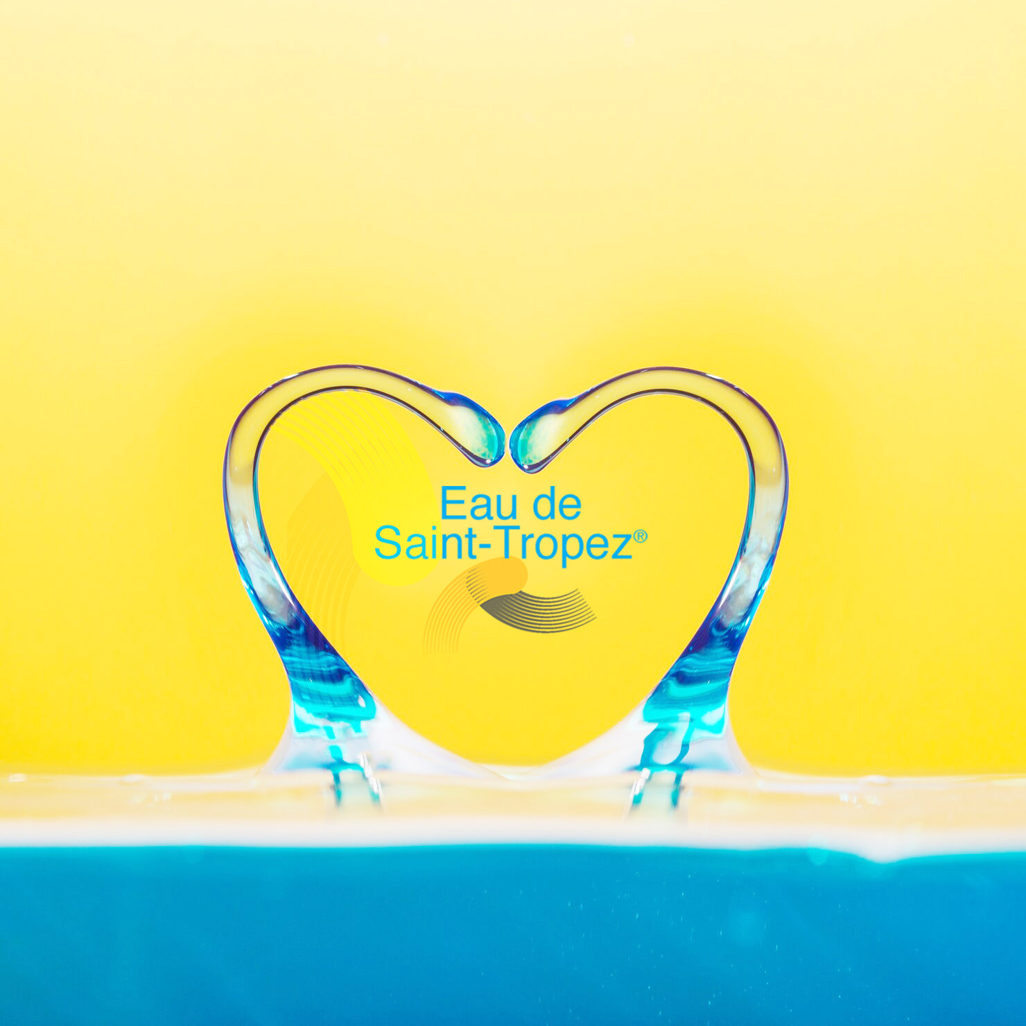
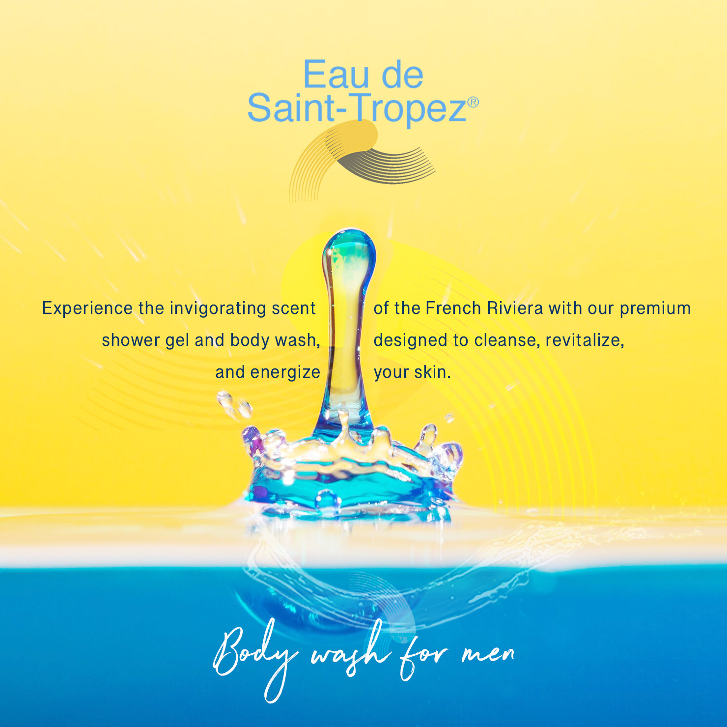
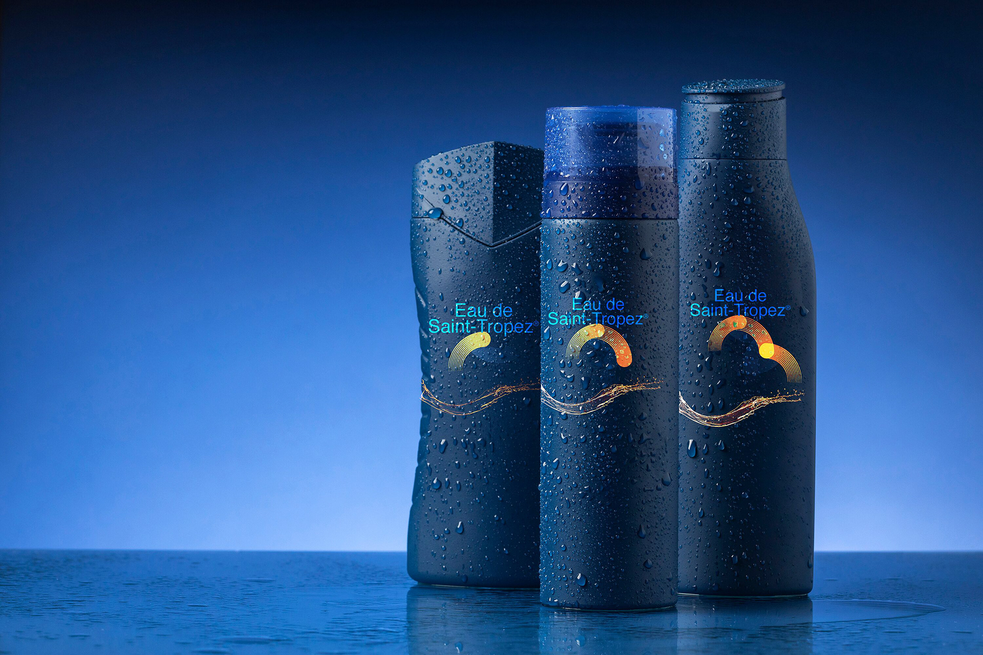
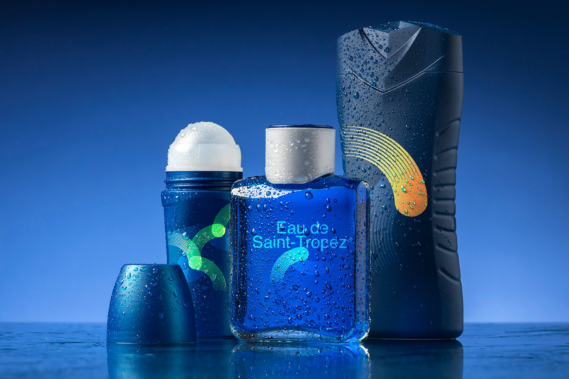
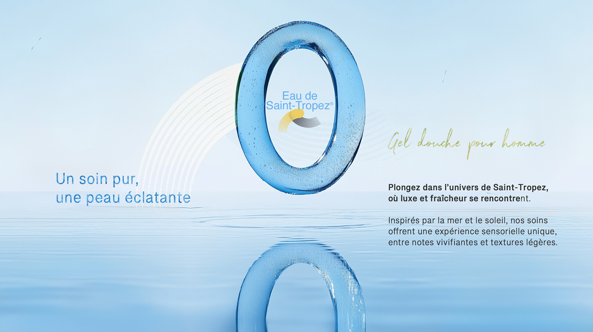
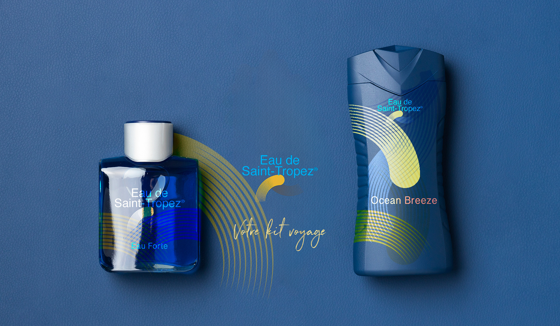
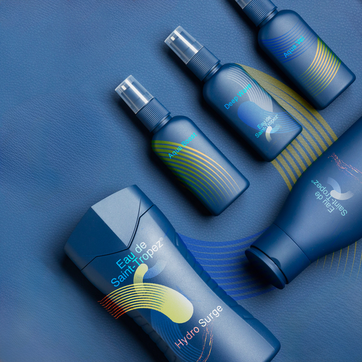
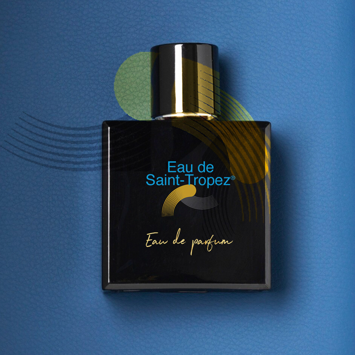
Created a logo that reflects the elegance and lifestyle of the French Riviera
while remaining flexible across product lines.
while remaining flexible across product lines.


Want to create a brand that
captures attention on a global scale?
captures attention on a global scale?