CLIENT ▸ Villa Baulieu & Cuvée Bérengère, Rognes, France
ROLE ▸ Art Director Freelance
SCOPE ▸ Logo Design, Hospitality Identity, Visual Identity, Print Design, Wine Label Design, Packaging Design, Campaign Materials
ROLE ▸ Art Director Freelance
SCOPE ▸ Logo Design, Hospitality Identity, Visual Identity, Print Design, Wine Label Design, Packaging Design, Campaign Materials
The Challenge
Position Villa Baulieu as a contemporary luxury winery hospitality rooted in terroir with international relevance
Express heritage, precision, and modernity without relying on decorative wine clichés
Create a system flexible enough to support long-term brand evolution
Position Villa Baulieu as a contemporary luxury winery hospitality rooted in terroir with international relevance
Express heritage, precision, and modernity without relying on decorative wine clichés
Create a system flexible enough to support long-term brand evolution
Strategic Approach
Built a visual language grounded in restraint, hierarchy, and materiality
Balanced heritage cues with contemporary expression
Focused on typography, visual rhythm, and real-world applications across the estate
Built a visual language grounded in restraint, hierarchy, and materiality
Balanced heritage cues with contemporary expression
Focused on typography, visual rhythm, and real-world applications across the estate
Creative Solution
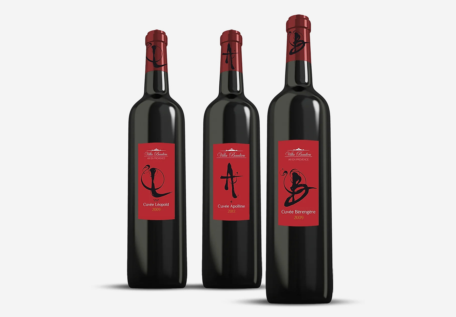
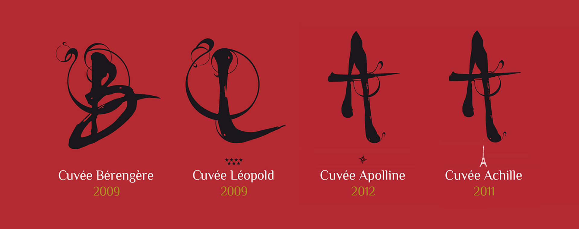
Create a retail-ready wine packaging identity that could stand out on shelf without relying on trends
Balance premium cues with approachability for a broad retail audience
Ensure the system can extend across multiple SKUs while remaining cohesive
Create a retail-ready wine packaging identity that could stand out on shelf without relying on trends
Balance premium cues with approachability for a broad retail audience
Ensure the system can extend across multiple SKUs while remaining cohesive
Scope & System
Create a retail-ready wine packaging identity that could stand out on shelf without relying on trends
Balance premium cues with approachability for a broad retail audience
Ensure the system can extend across multiple SKUs while remaining cohesive
Create a retail-ready wine packaging identity that could stand out on shelf without relying on trends
Balance premium cues with approachability for a broad retail audience
Ensure the system can extend across multiple SKUs while remaining cohesive
Key Results
Established a clear, distinctive identity within the luxury winery landscape
Strengthened perceptions of quality, legitimacy, and craftsmanship
Delivered a durable system supporting long-term brand growth
Established a clear, distinctive identity within the luxury winery landscape
Strengthened perceptions of quality, legitimacy, and craftsmanship
Delivered a durable system supporting long-term brand growth
Impact & Performance
Improved visual coherence across all brand touchpoints
Reduced ad-hoc design decisions through clear visual governance
Increased brand clarity for partners, visitors, and stakeholders
Improved visual coherence across all brand touchpoints
Reduced ad-hoc design decisions through clear visual governance
Increased brand clarity for partners, visitors, and stakeholders
Deliverables
+ Core visual identity system defining tone, hierarchy, and composition
+ Print and editorial applications tailored to winery use cases
+ Flexible framework designed to evolve without losing coherence
+ Core visual identity system defining tone, hierarchy, and composition
+ Print and editorial applications tailored to winery use cases
+ Flexible framework designed to evolve without losing coherence
Role & Leadership
Led art direction and visual system development end-to-end
Partnered directly with ownership and internal teams to align vision and positioning
Oversaw consistency across physical, editorial, and brand-facing touchpoints
Led art direction and visual system development end-to-end
Partnered directly with ownership and internal teams to align vision and positioning
Oversaw consistency across physical, editorial, and brand-facing touchpoints
Why This Works Matters
In luxury wine, visual identity is a signal of rigor and credibility,
not decoration.
A disciplined brand system allows heritage and quality to be expressed
with restraint, while providing the consistency and structure needed
to support long-term growth.
In luxury wine, visual identity is a signal of rigor and credibility,
not decoration.
A disciplined brand system allows heritage and quality to be expressed
with restraint, while providing the consistency and structure needed
to support long-term growth.
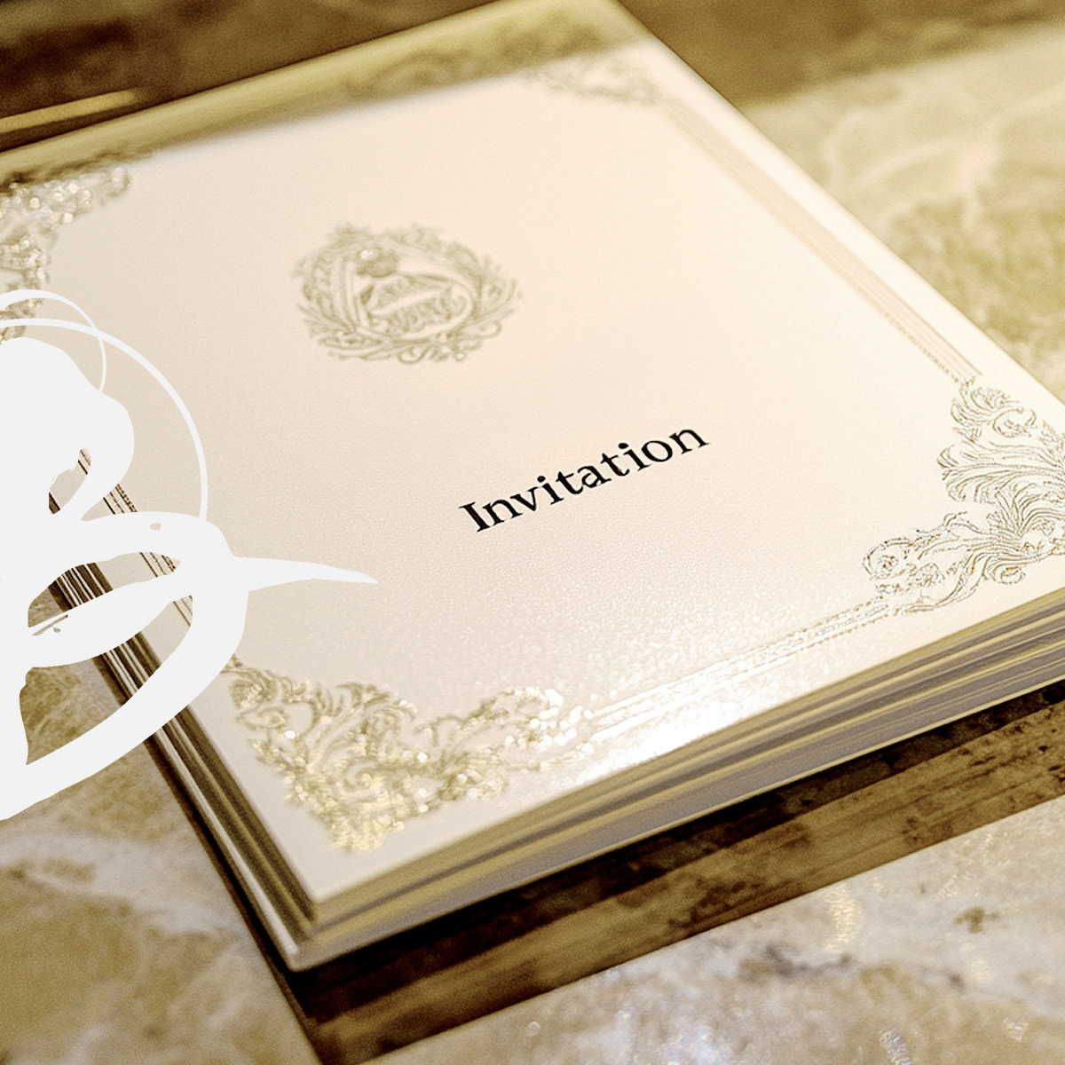
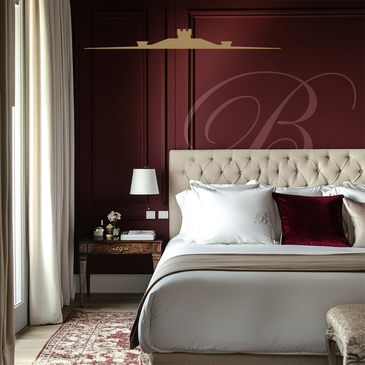
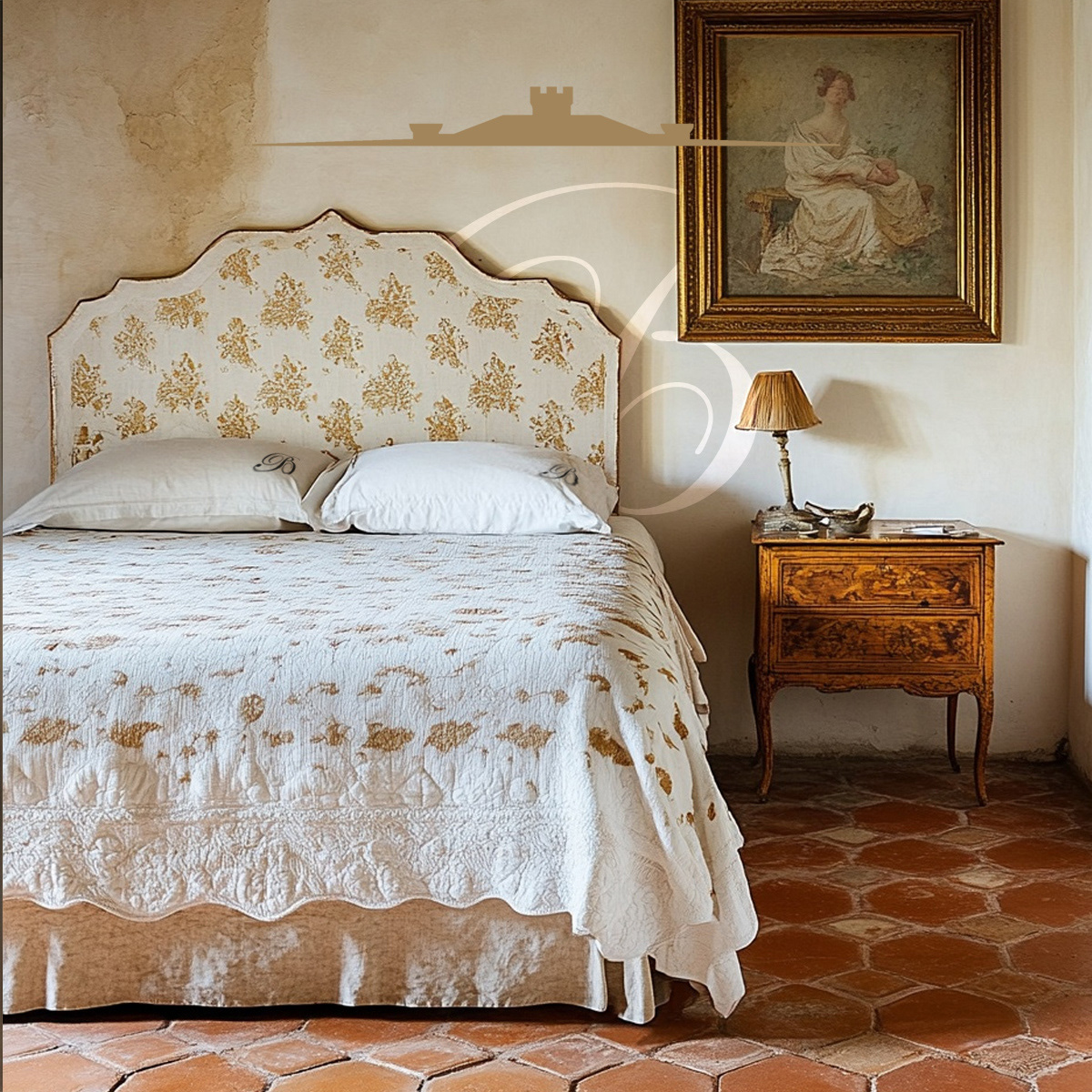
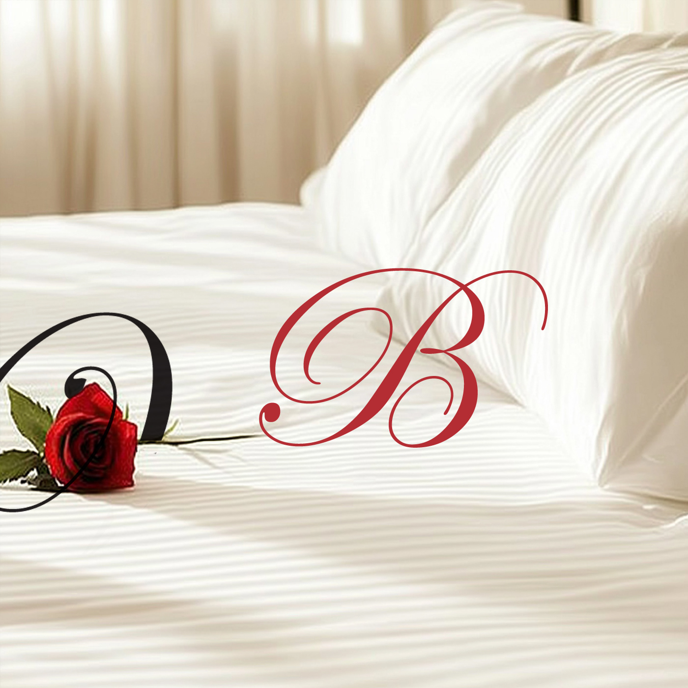
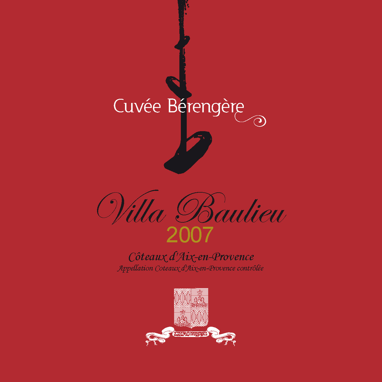



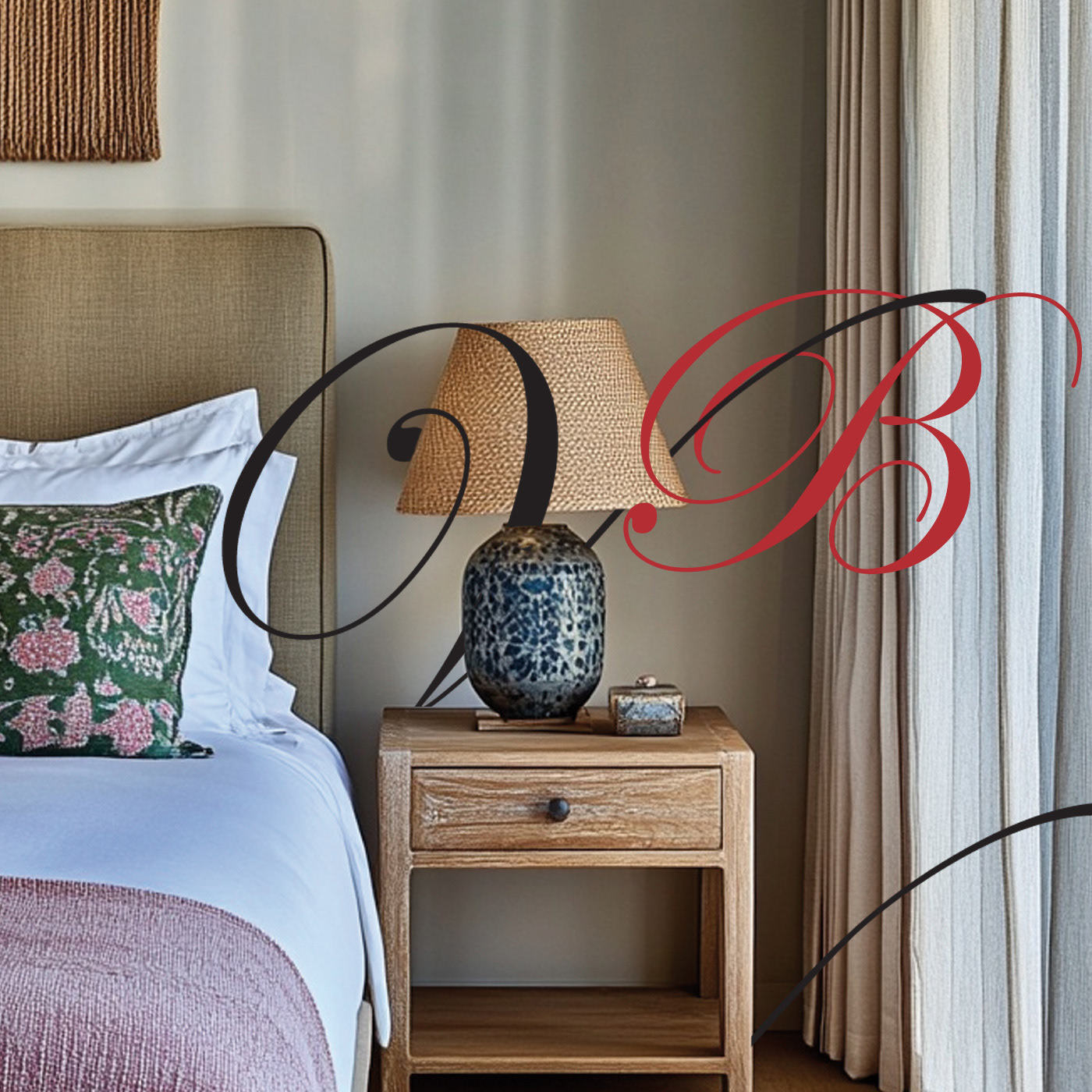

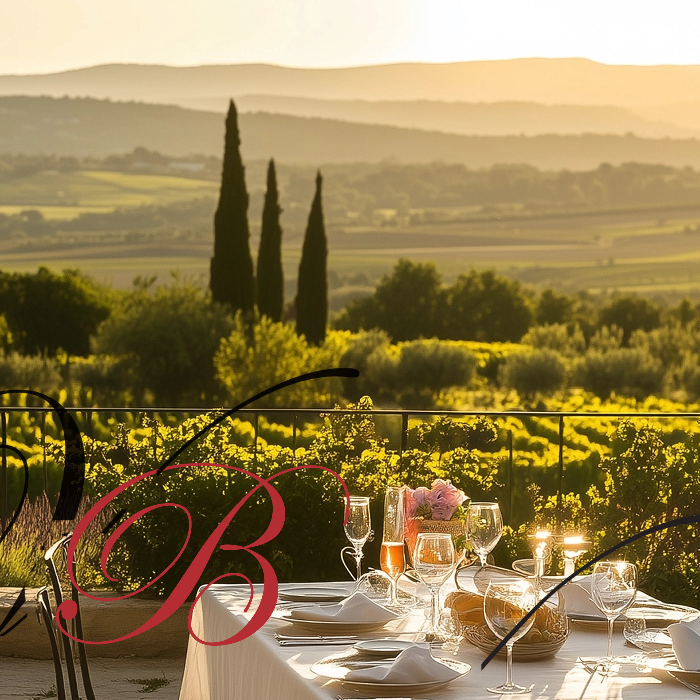
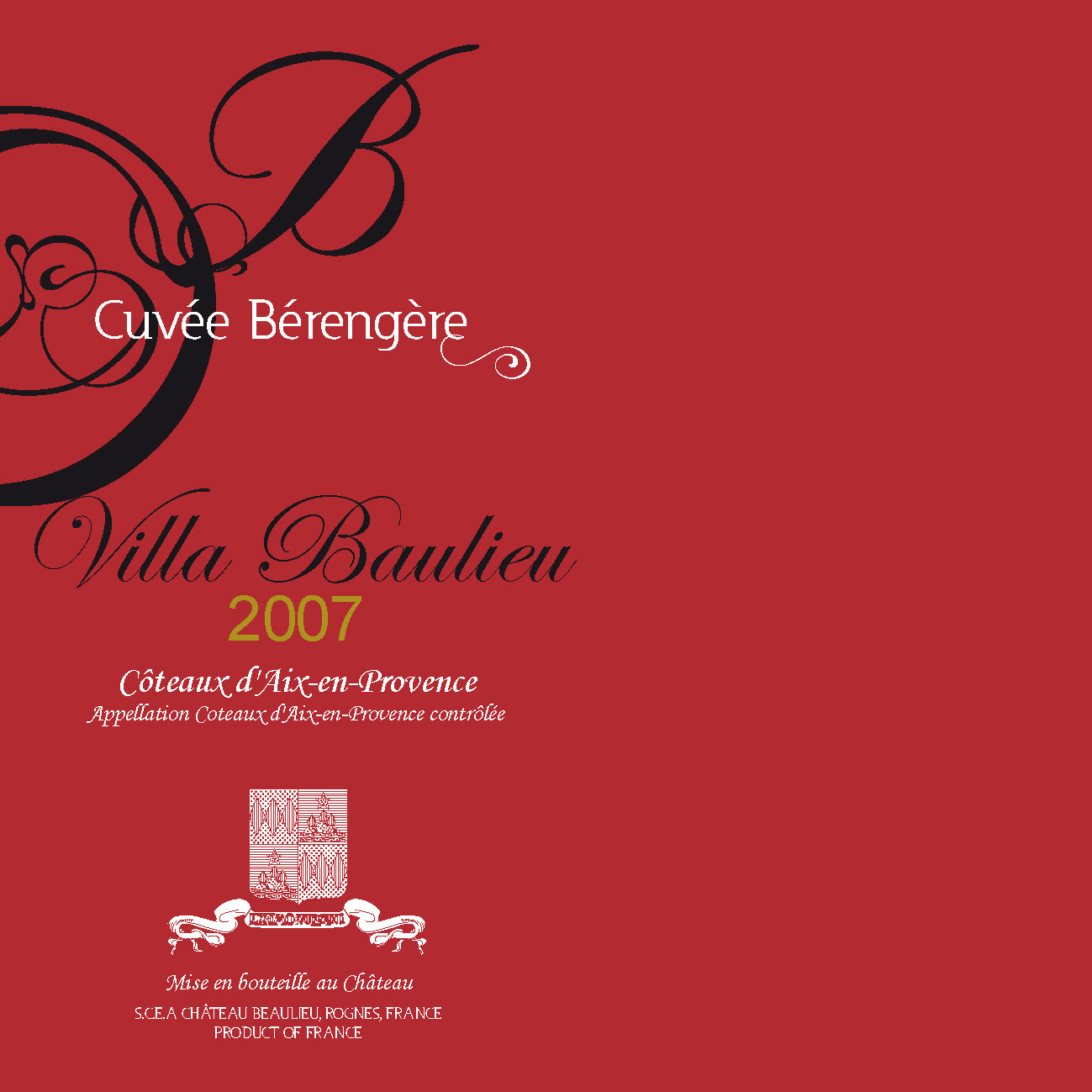
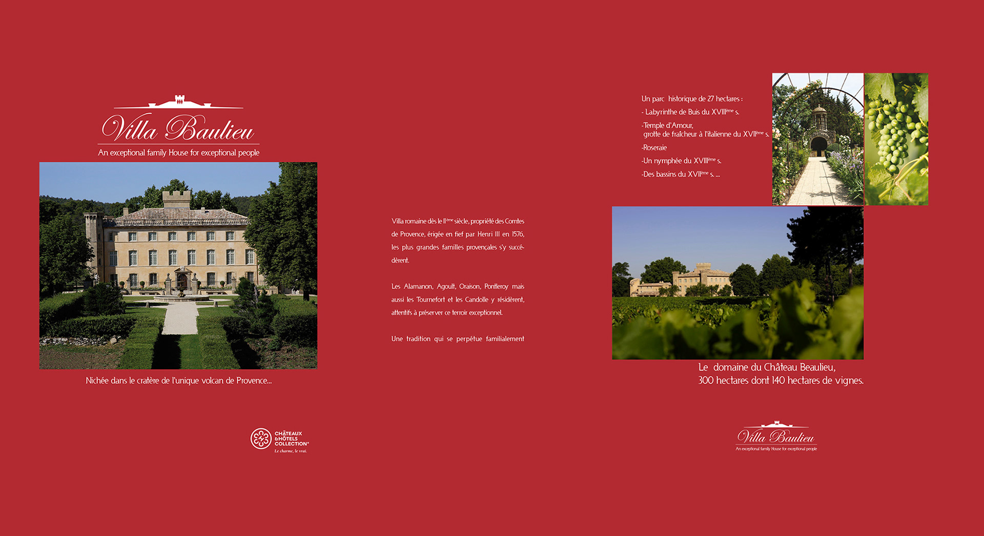
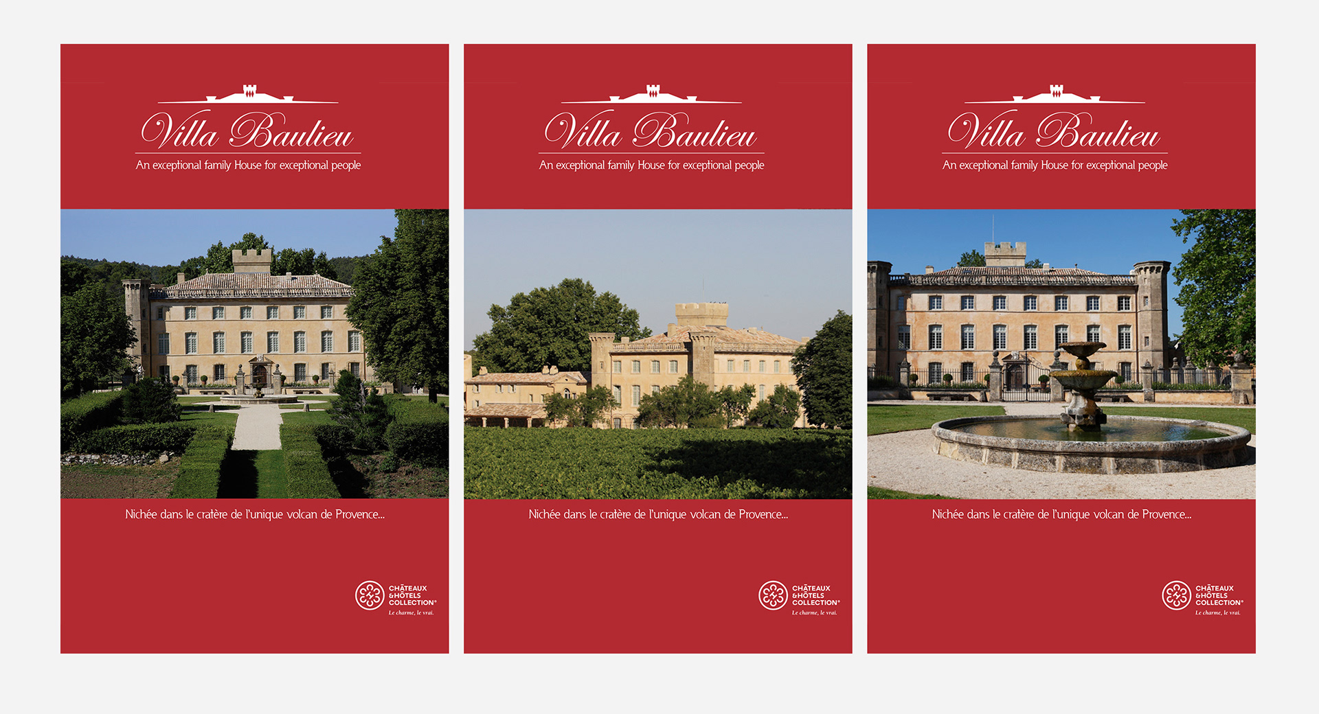
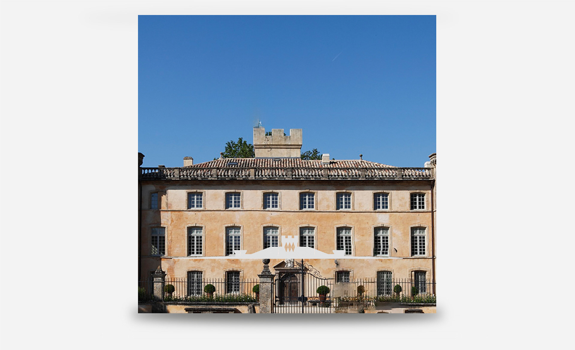
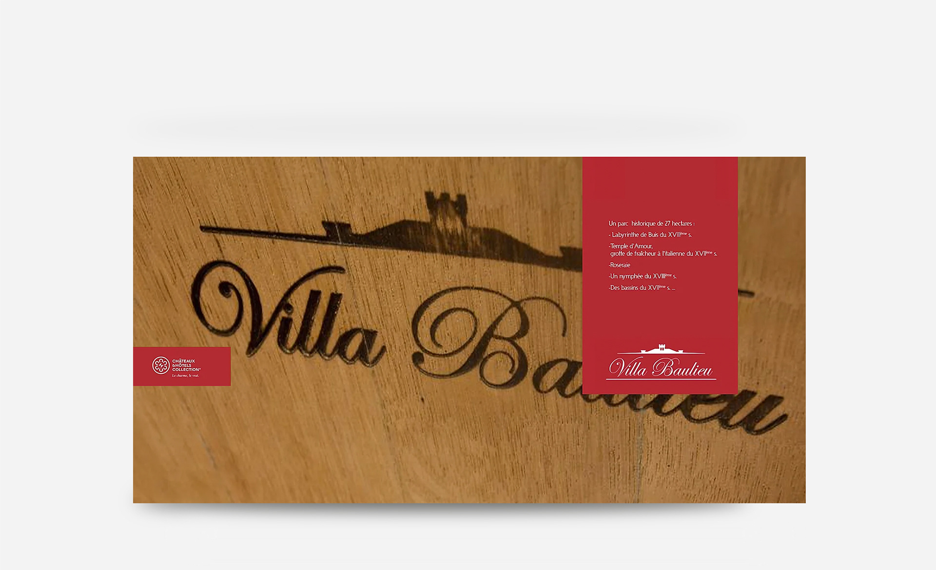
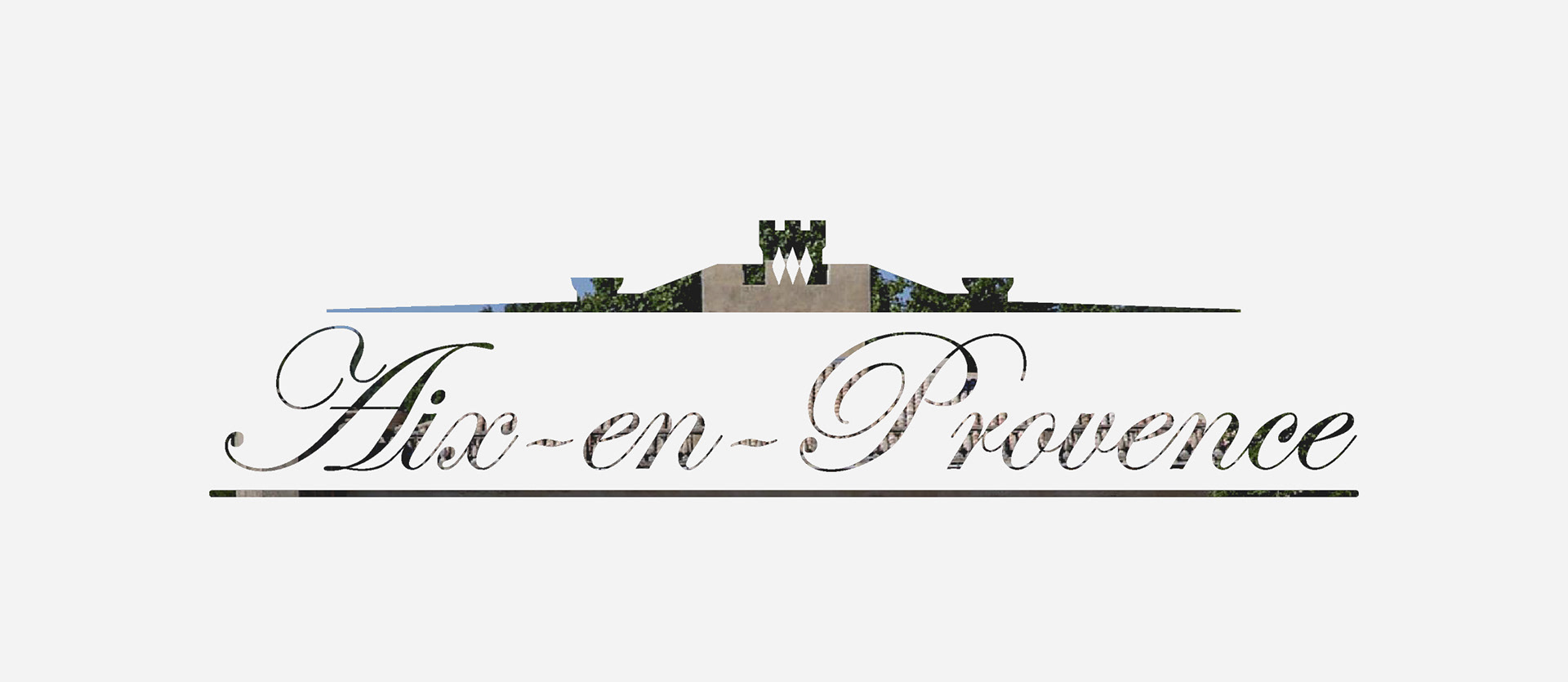
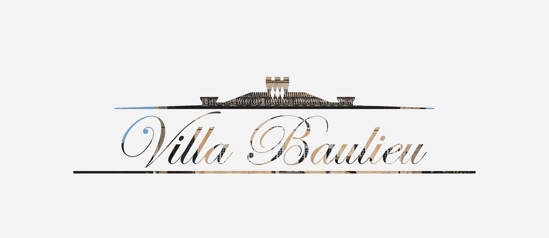
Designed a typographic logotype built on classical proportions and restraint,
reflecting the winery’s elegance, precision, and timeless character.
reflecting the winery’s elegance, precision, and timeless character.
Looking to elevate your luxury brand
for a global audience?
for a global audience?


