CLIENT ▸ VOLVIC, France
ROLE ▸ Art Director Freelance / Purjus Communication
SCOPE ▸ Custom Packaging Labels, Campaign Materials
ROLE ▸ Art Director Freelance / Purjus Communication
SCOPE ▸ Custom Packaging Labels, Campaign Materials
The Challenge
Differentiate Volvic in a bottled water category dominated by generic blue purity cues
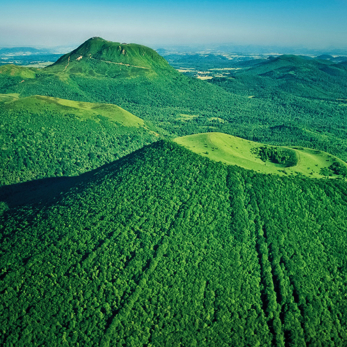
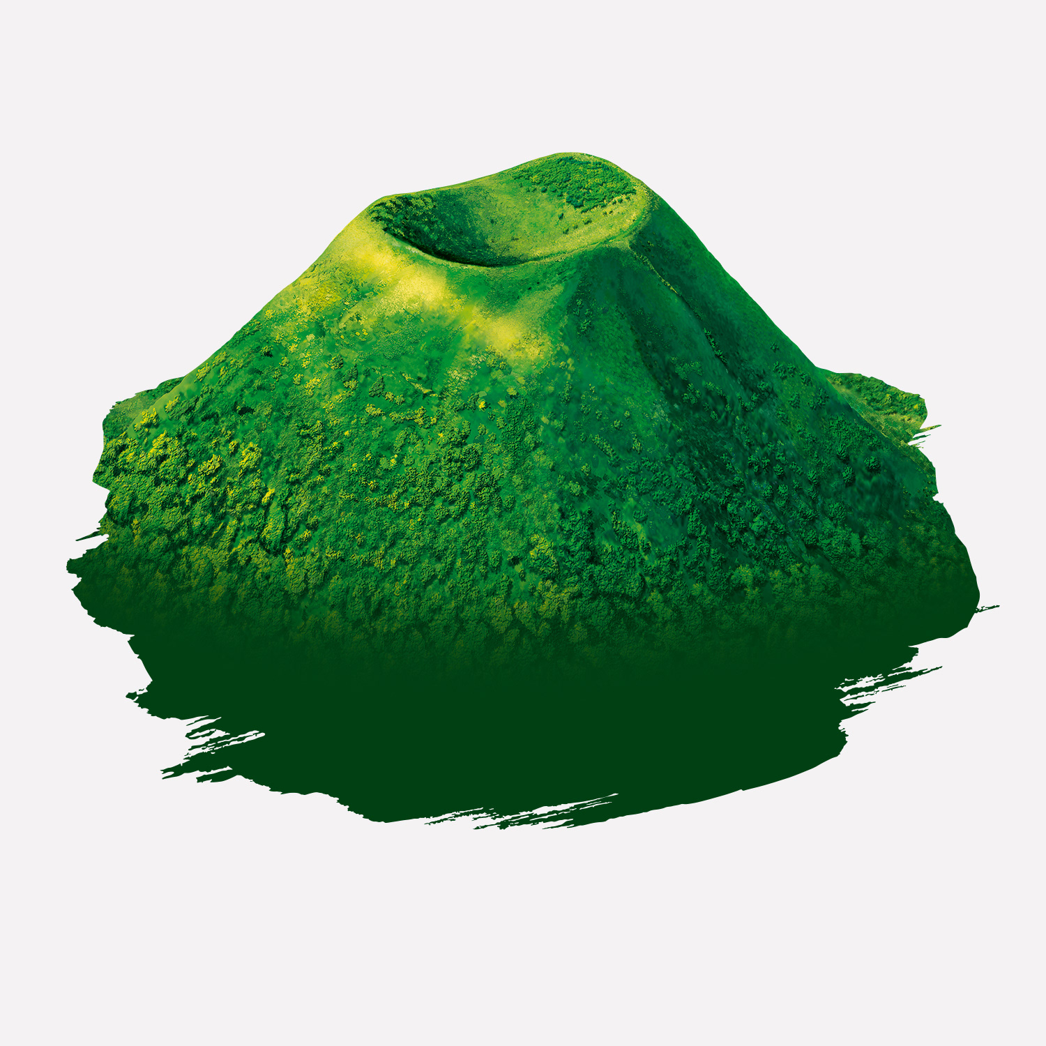
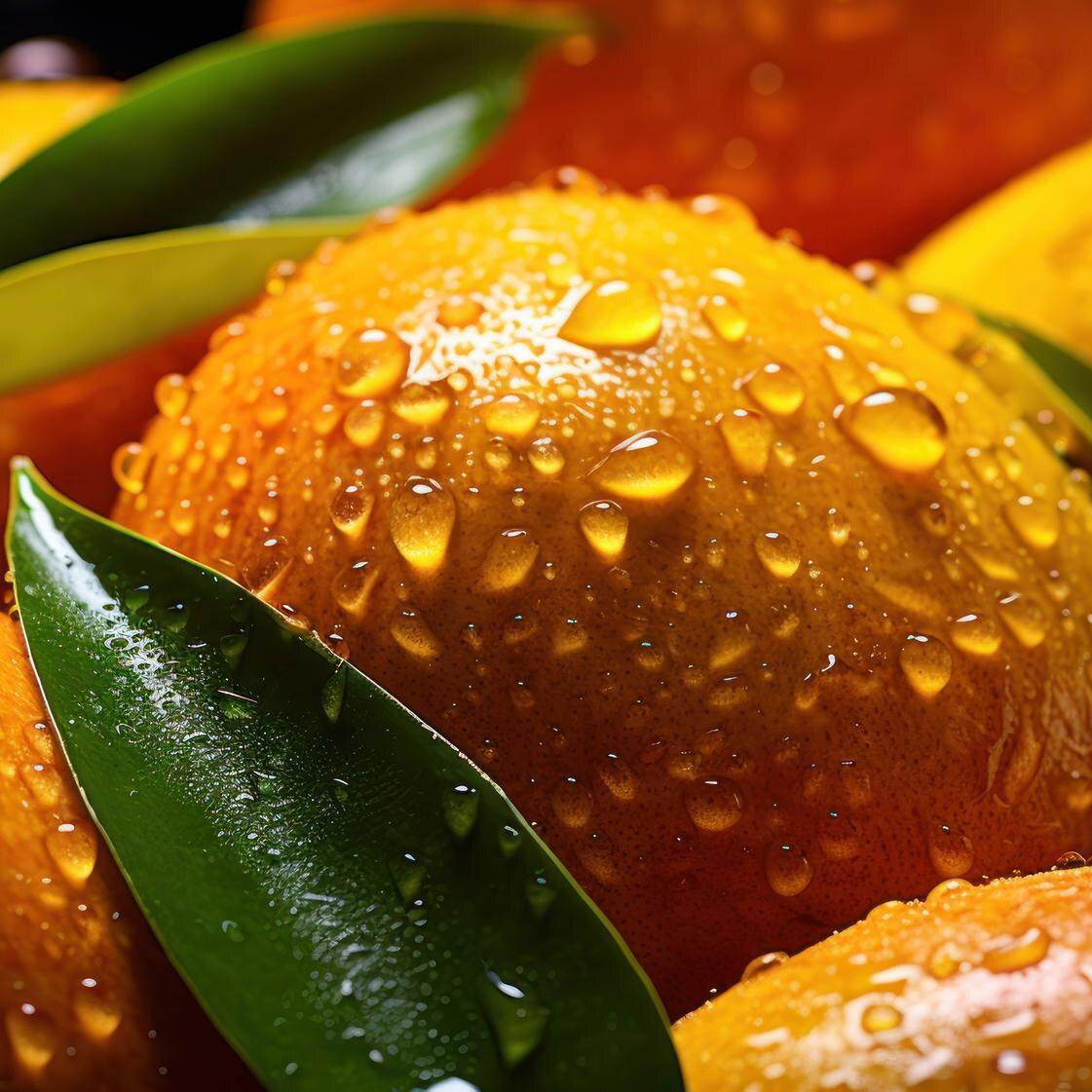
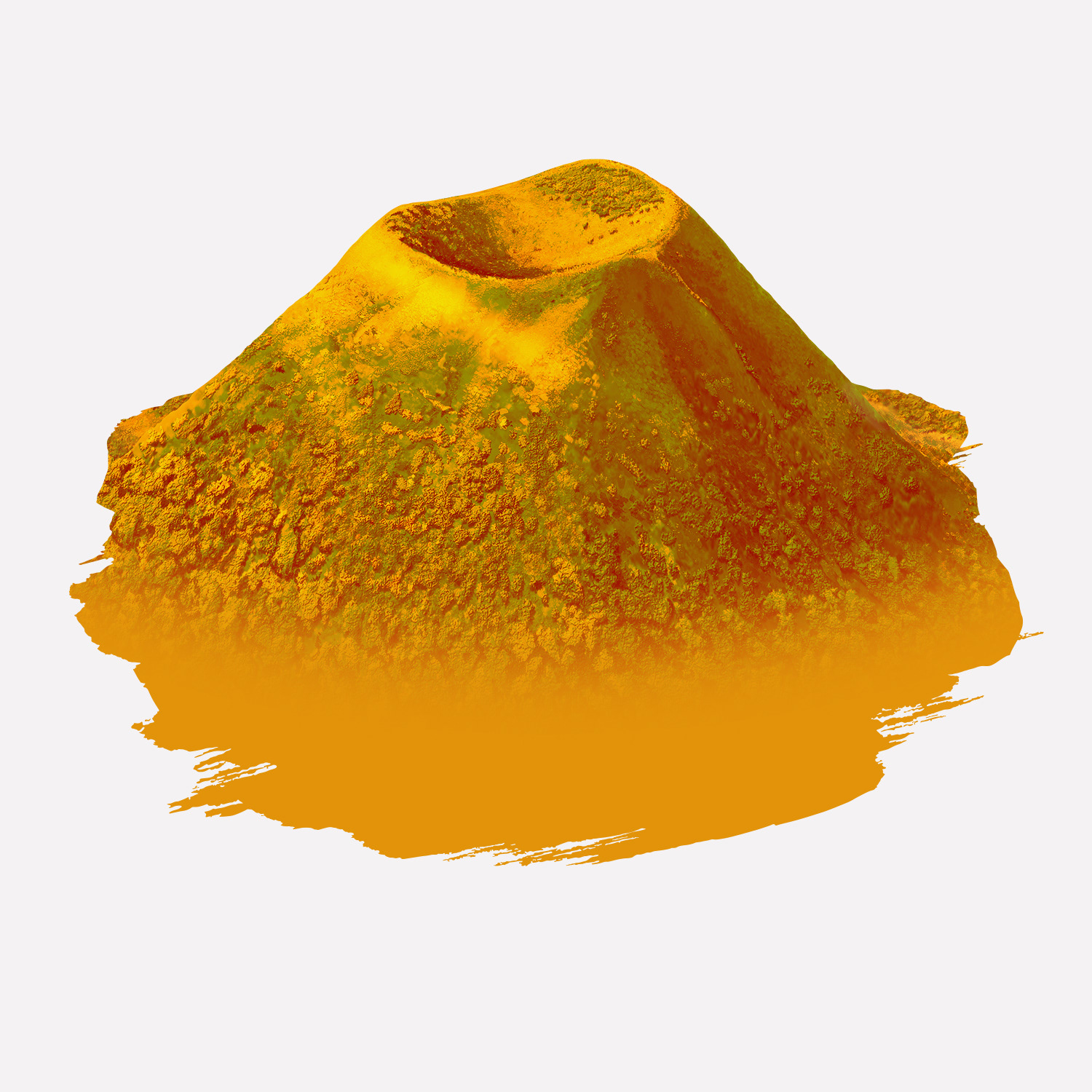
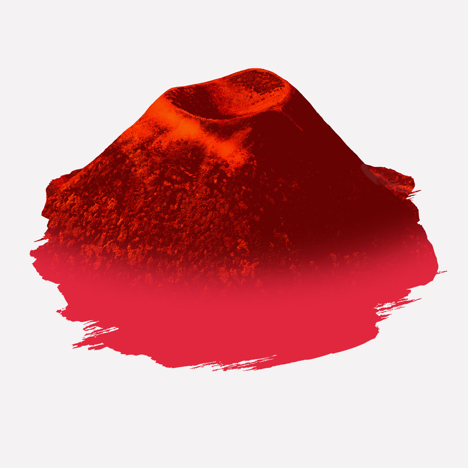
Translate the brand’s volcanic origin in Auvergne into a distinctive visual identity
Create a packaging system with strong global shelf recognition
Differentiate Volvic in a bottled water category dominated by generic blue purity cues
Translate the brand’s volcanic origin in Auvergne into a distinctive visual identity
Create a packaging system with strong global shelf recognition
Strategic Approach
Anchor the brand narrative in volcanic landscape and geological origin
Emphasize natural filtration through volcanic rock as the core differentiator
Establish a visual territory rooted in nature, strength, and purity
Anchor the brand narrative in volcanic landscape and geological origin
Emphasize natural filtration through volcanic rock as the core differentiator
Establish a visual territory rooted in nature, strength, and purity
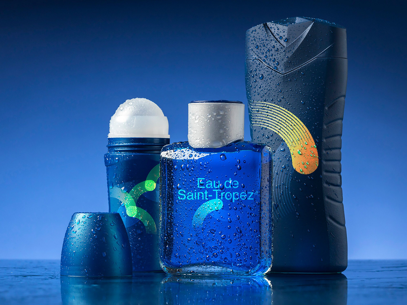
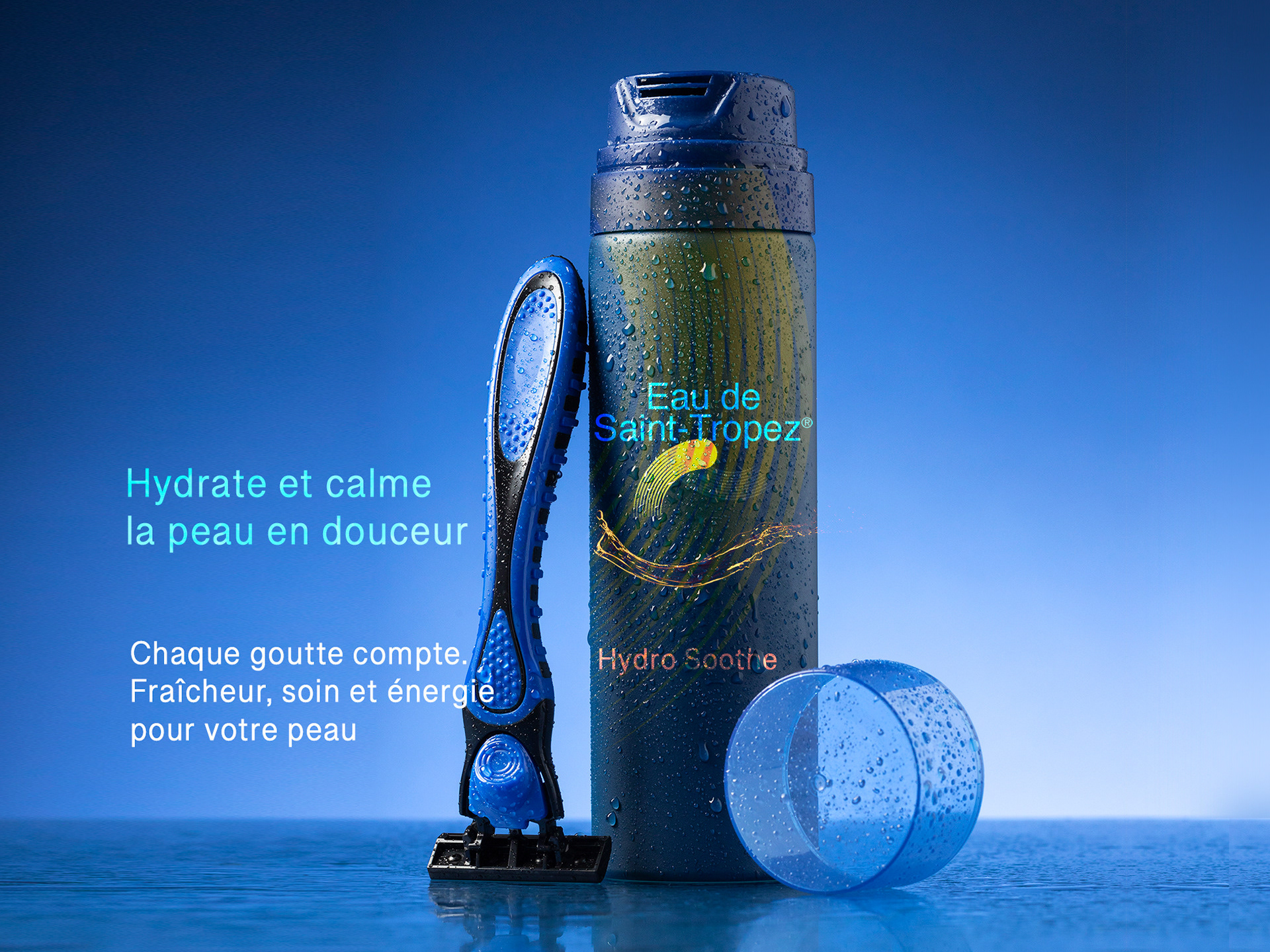
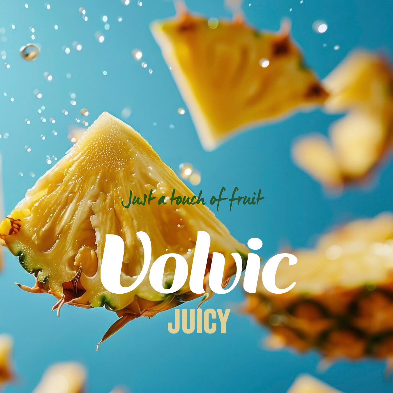
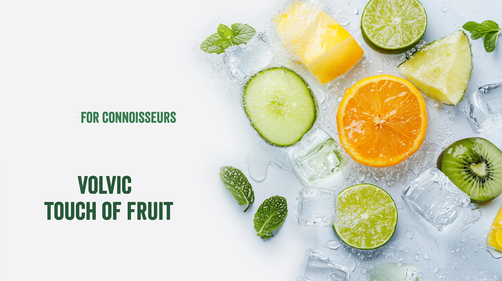
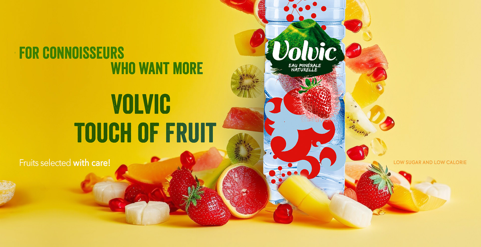
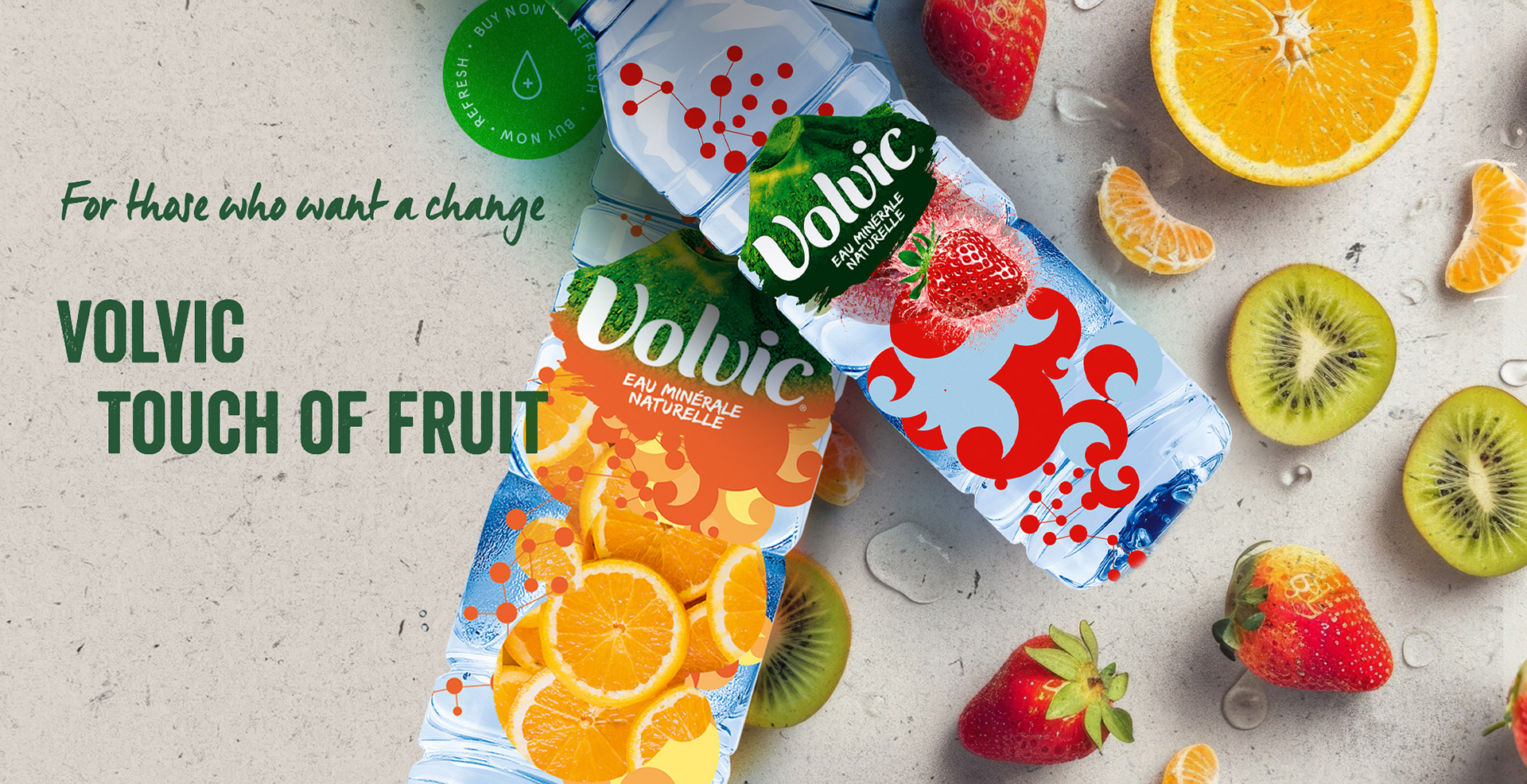
Creative Solution
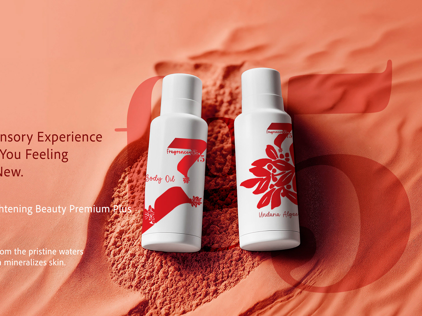
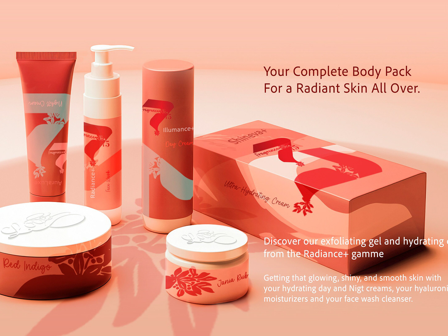
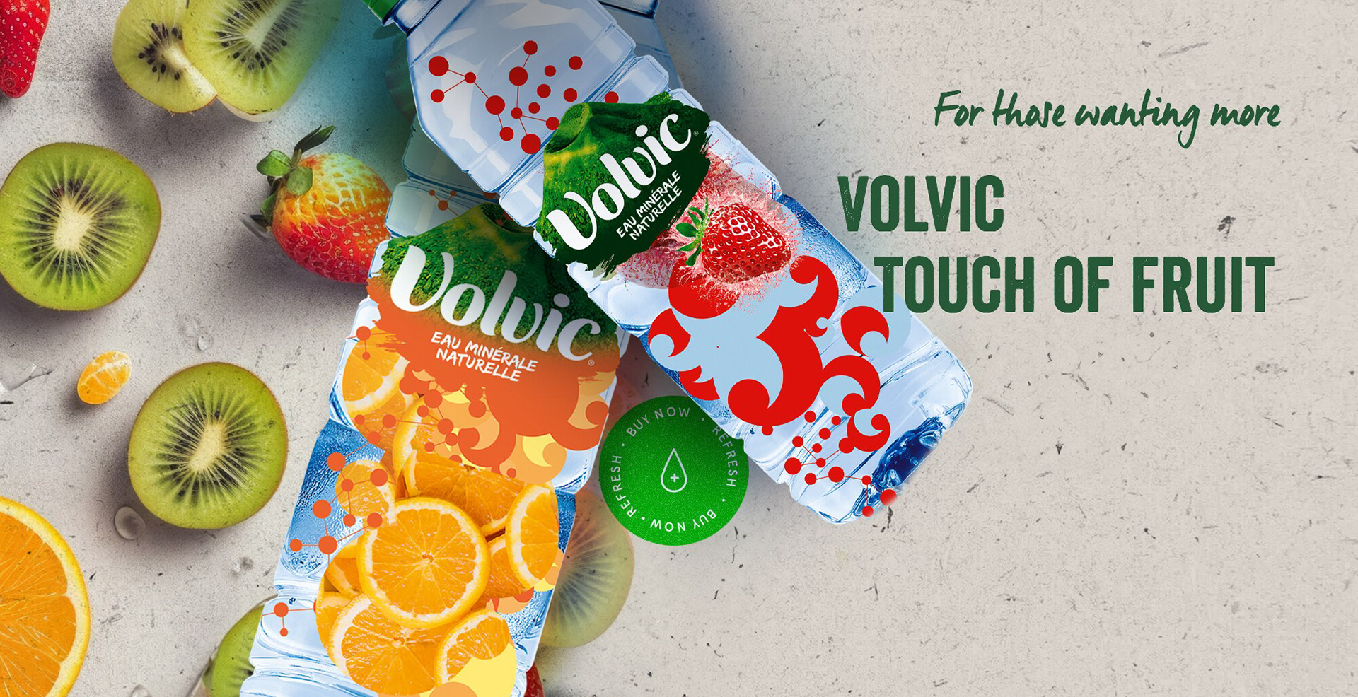
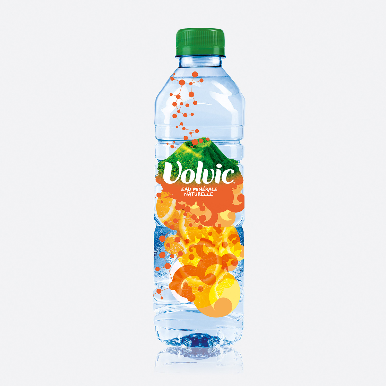
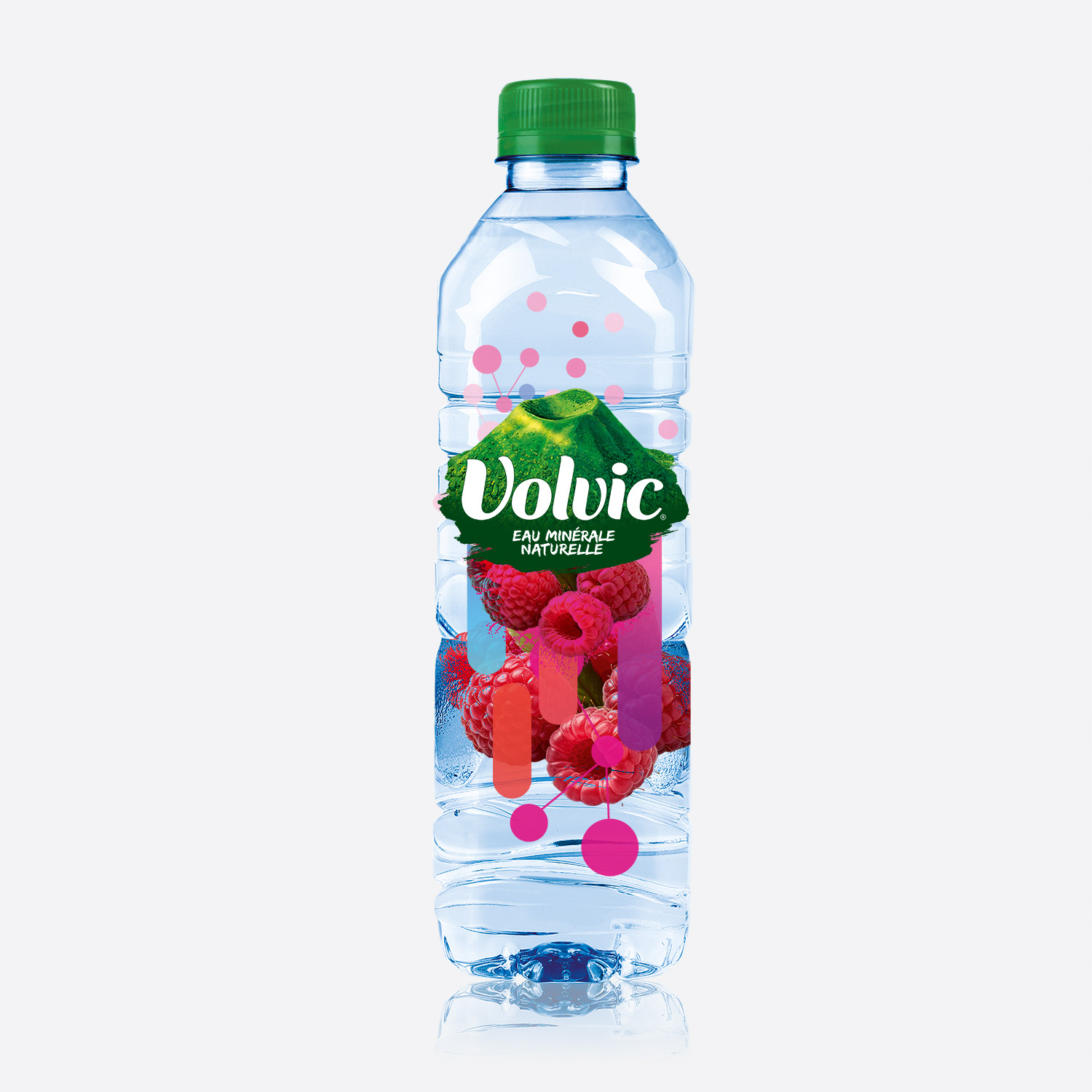
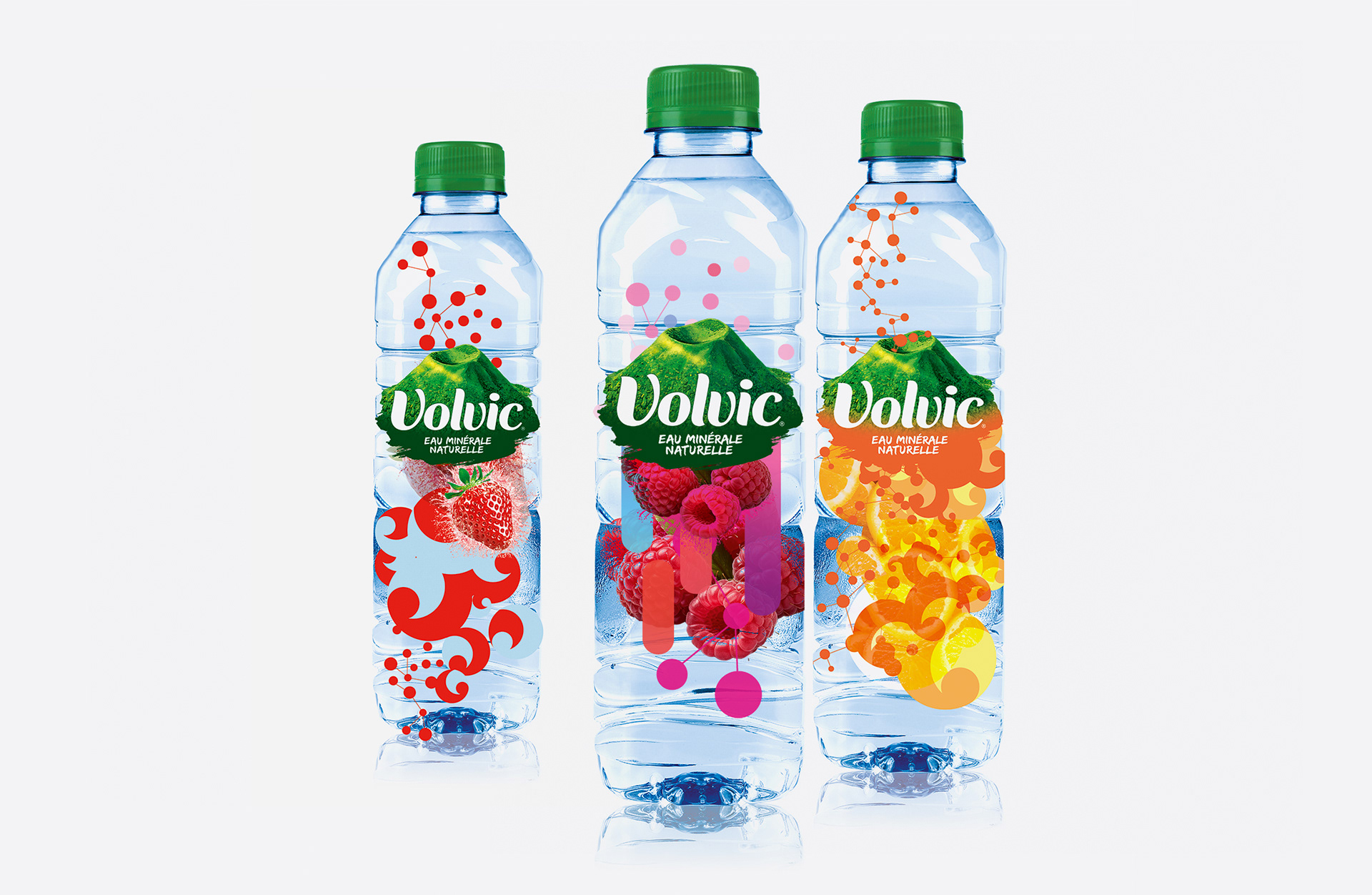
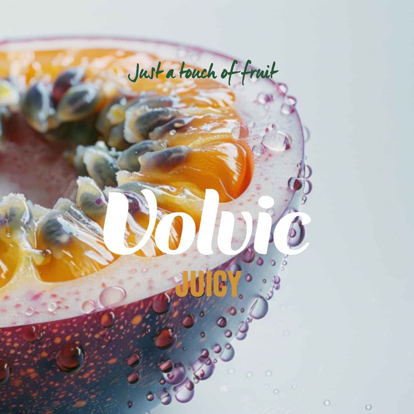
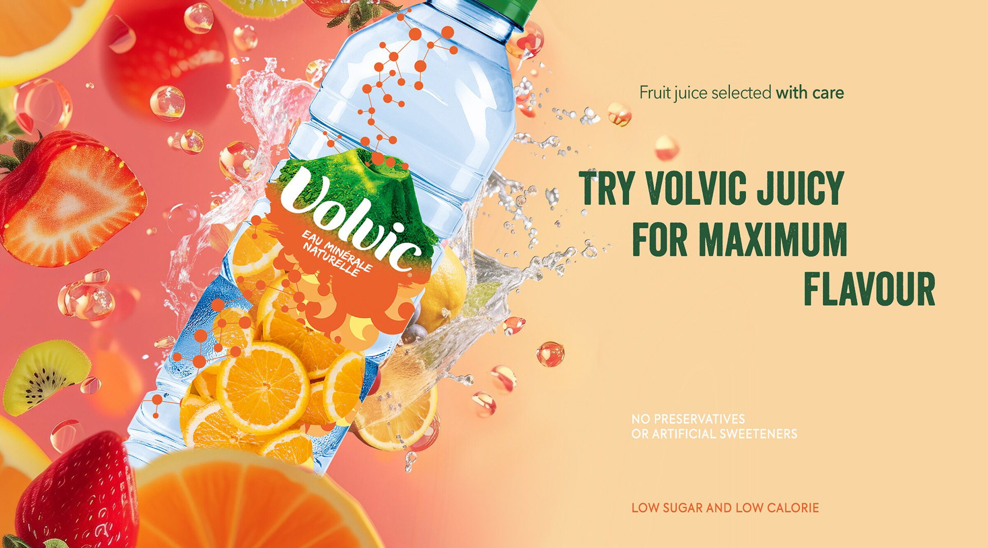
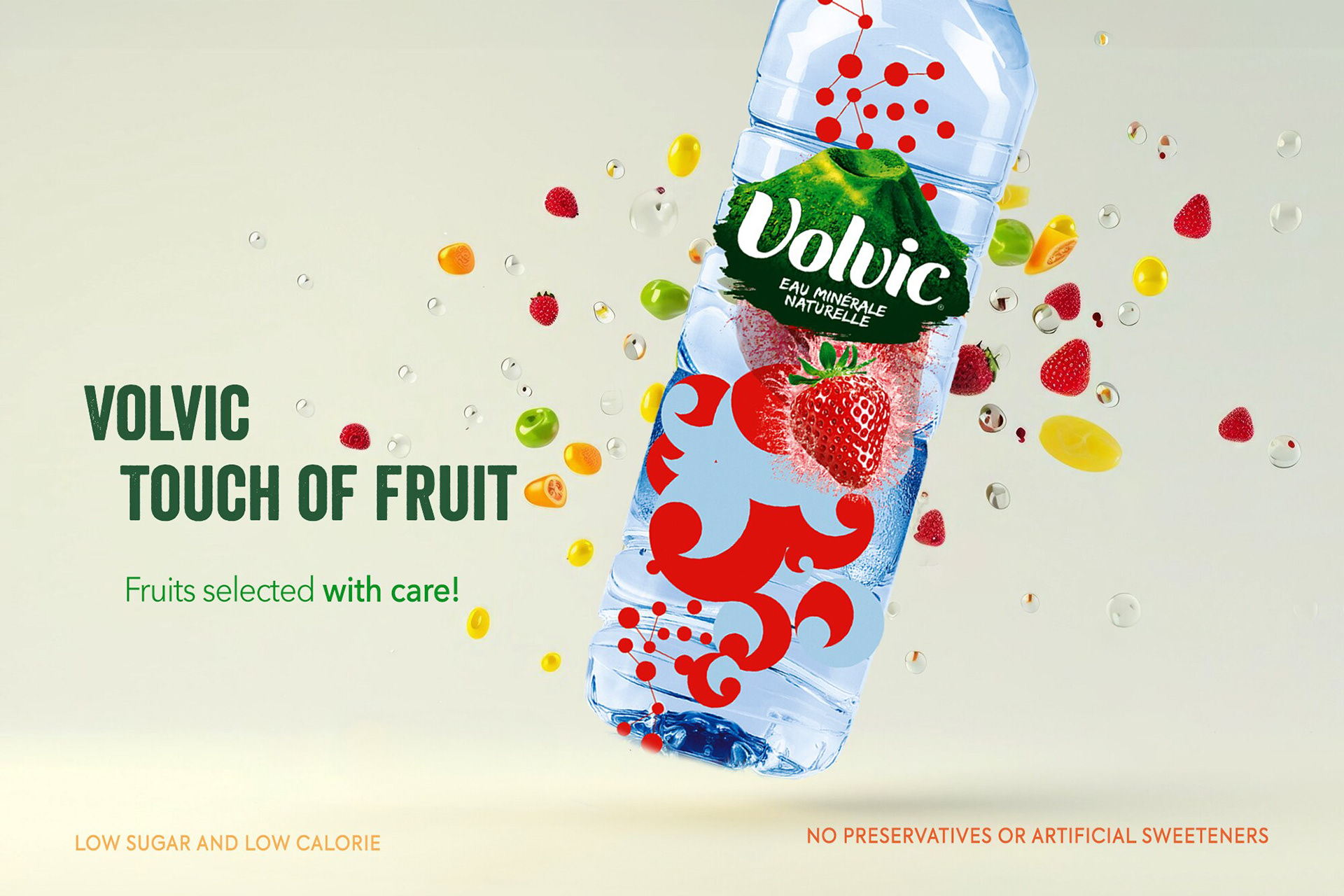
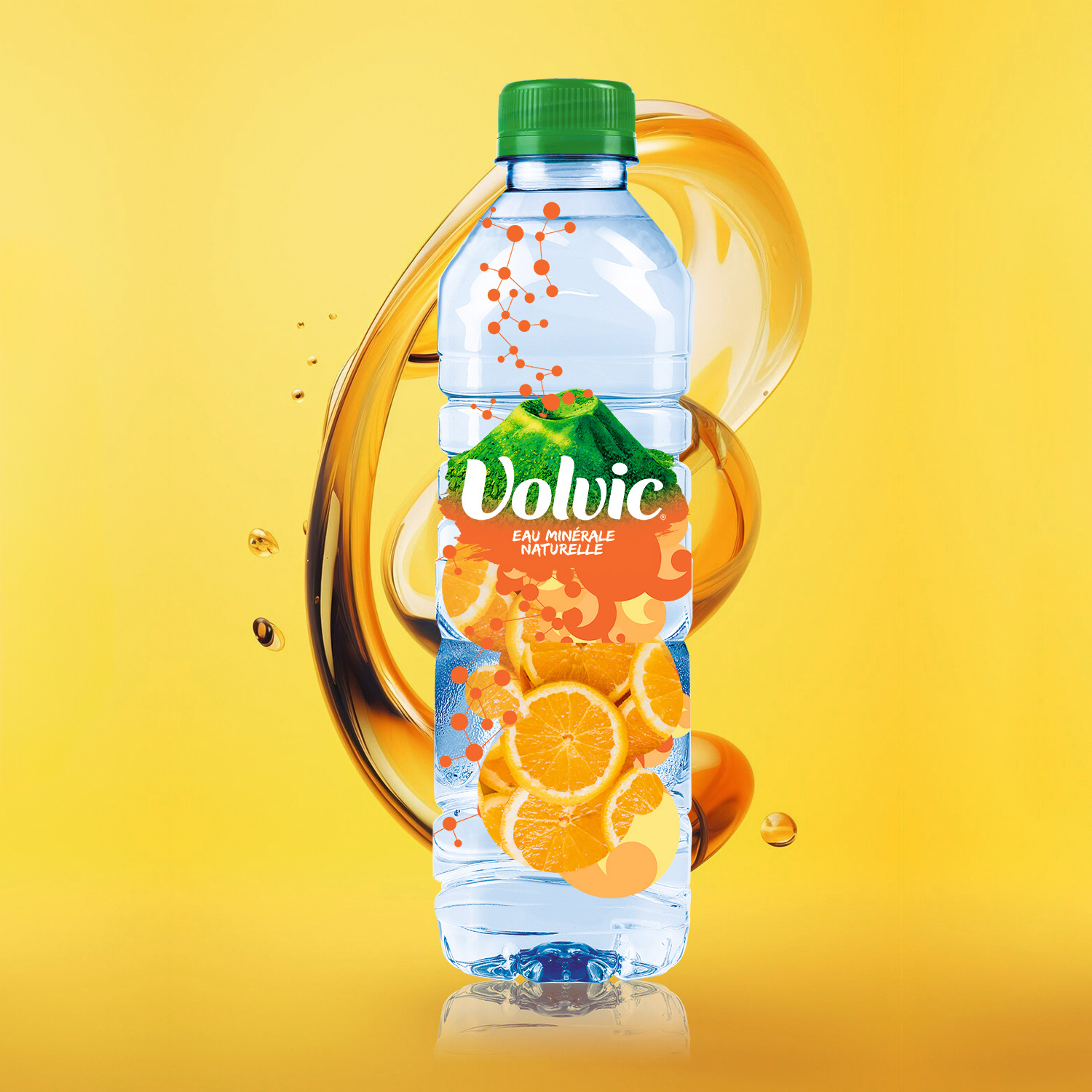
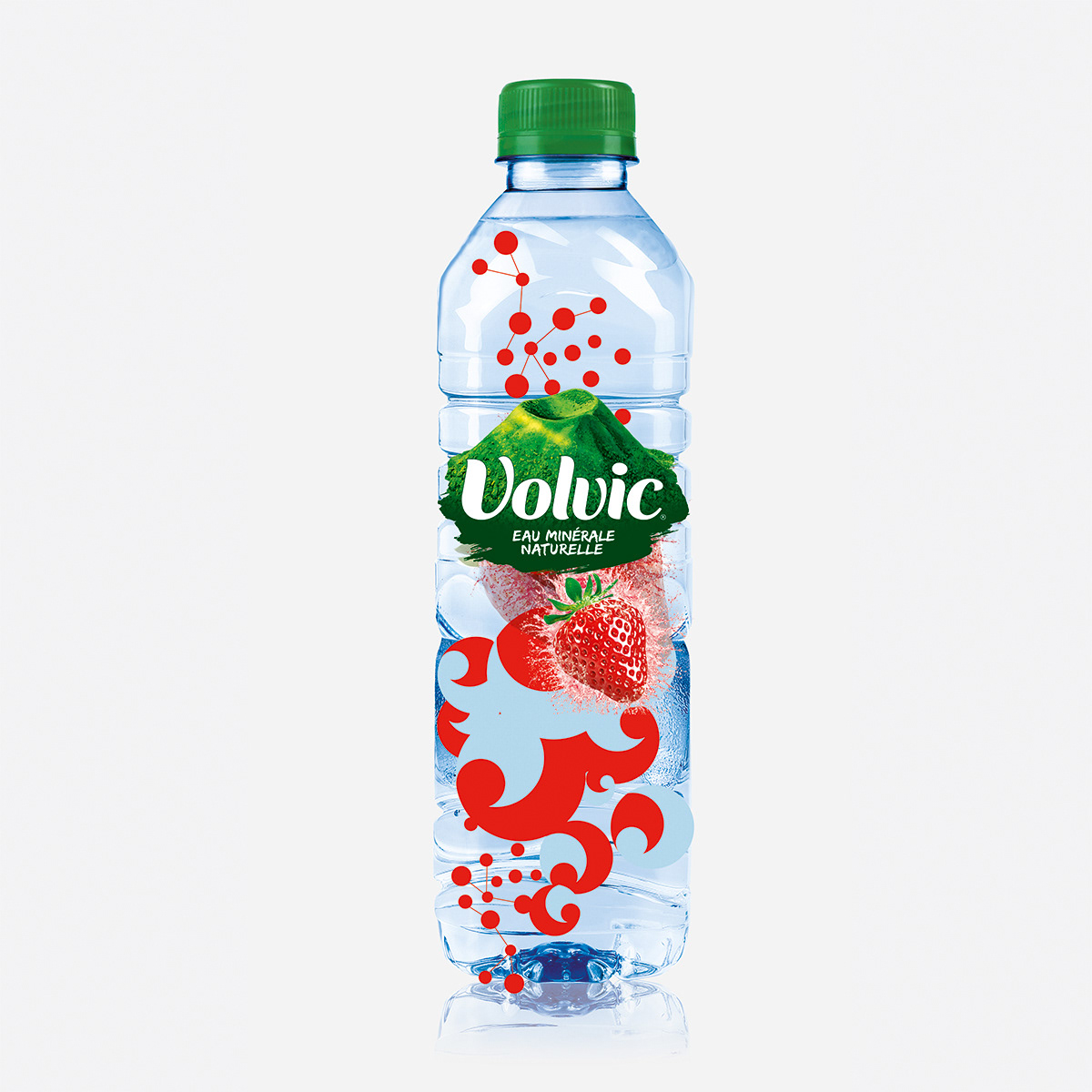
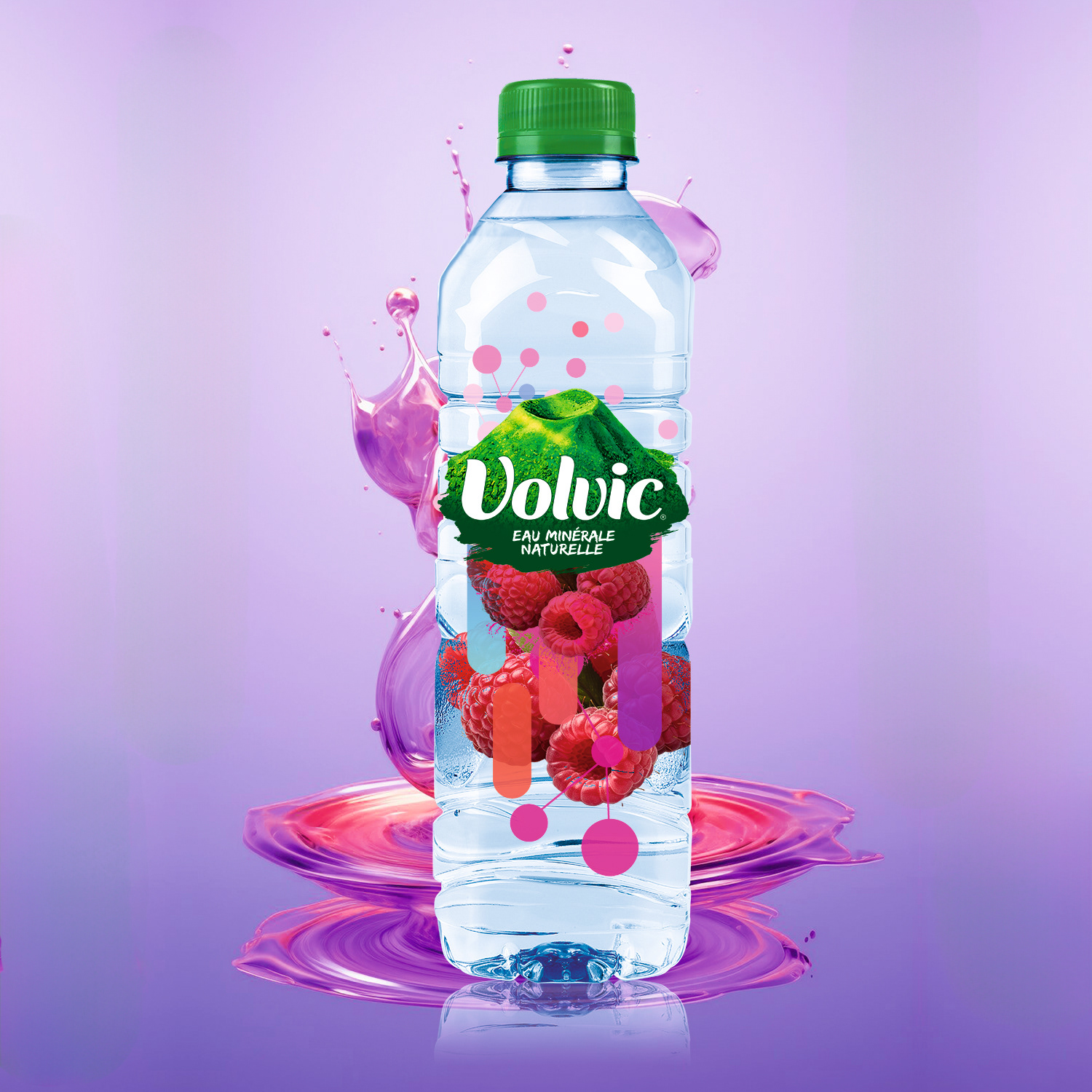
Developed a distinctive packaging identity built around Volvic’s volcanic origin
Designed a clear label hierarchy to improve shelf readability and product recognition
Created a flexible packaging structure adaptable across bottle formats and product variants
Developed a distinctive packaging identity built around Volvic’s volcanic origin
Designed a clear label hierarchy to improve shelf readability and product recognition
Created a flexible packaging structure adaptable across bottle formats and product variants
Visual Language
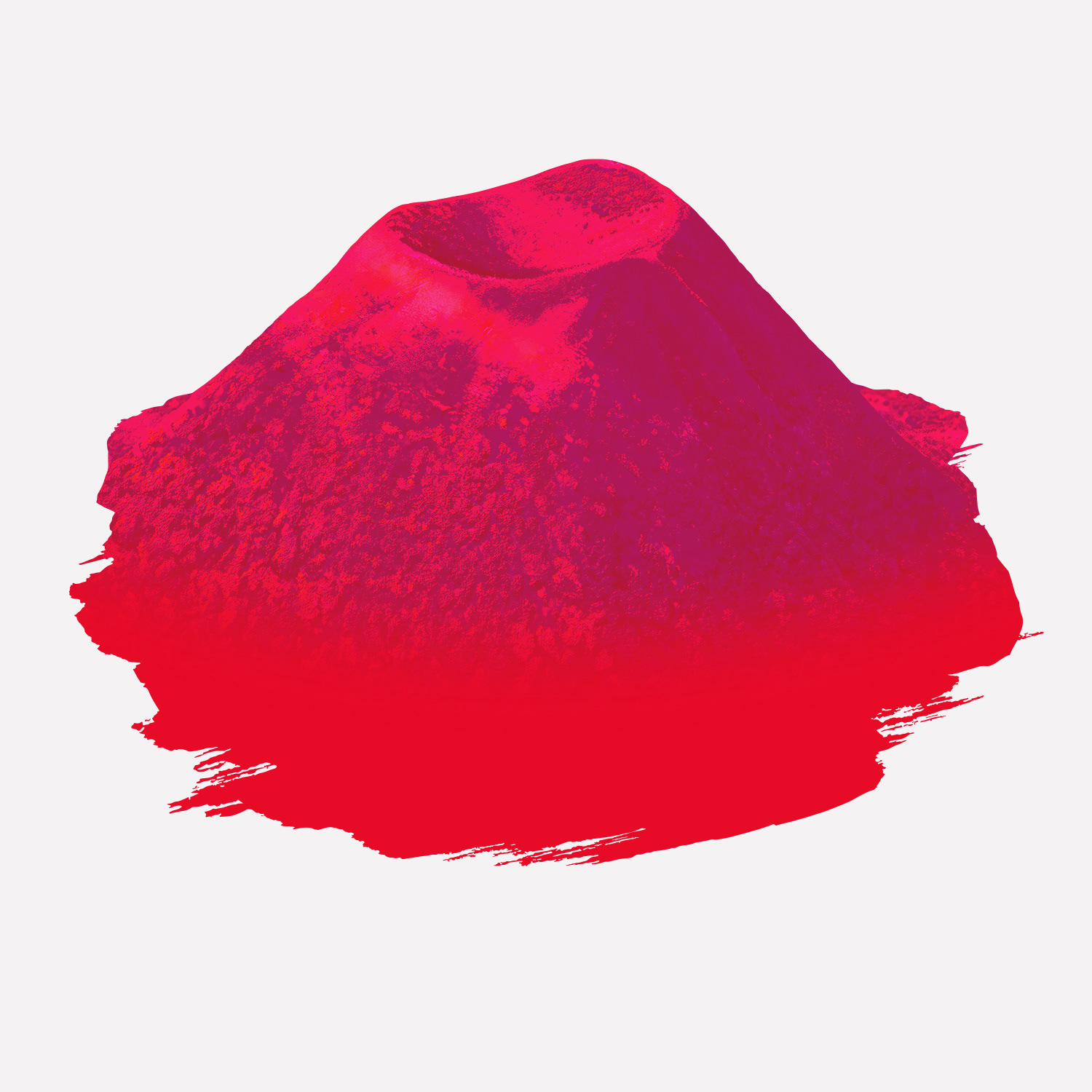
Volcanic Symbolism: graphic elements inspired by volcanic landscapes and geological formations
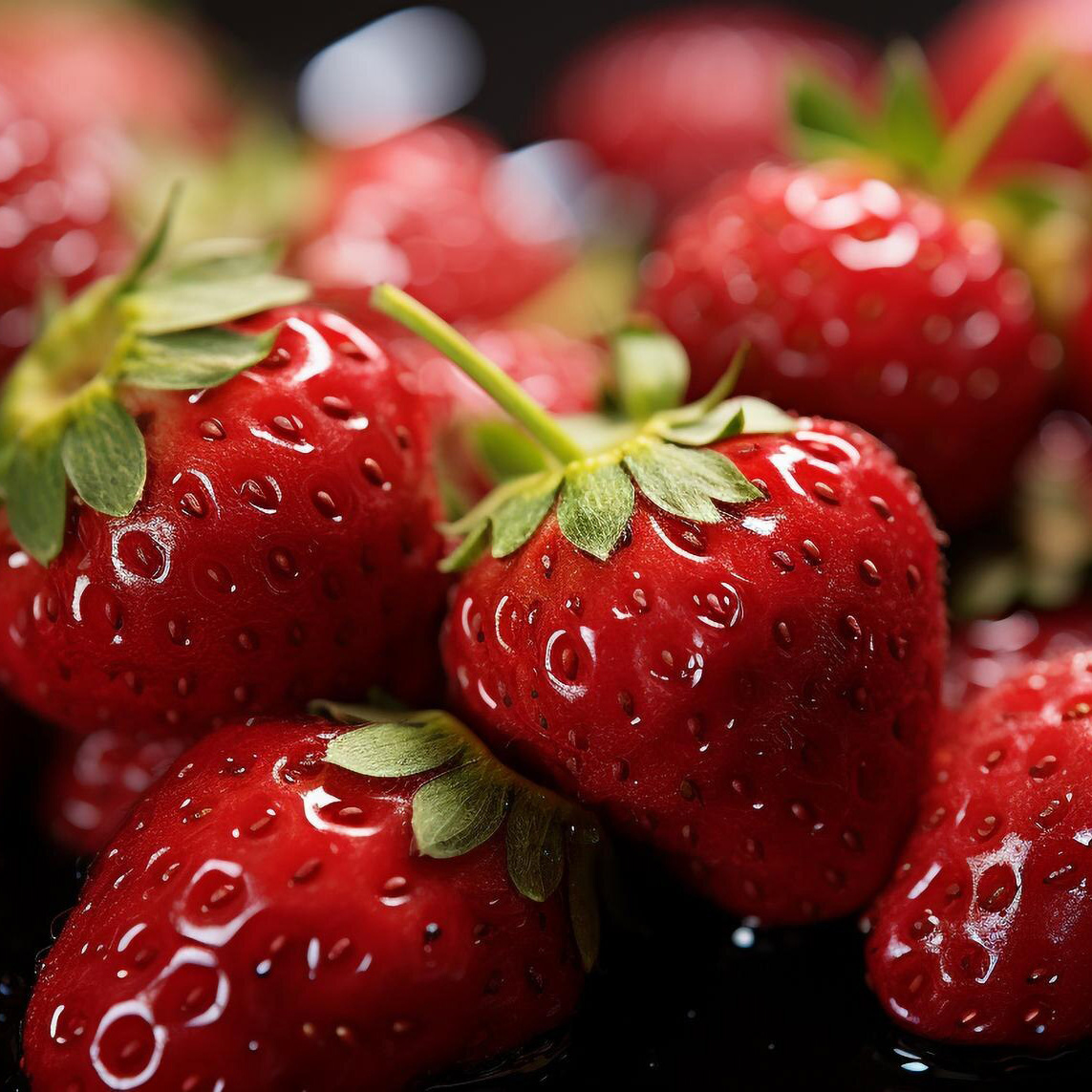
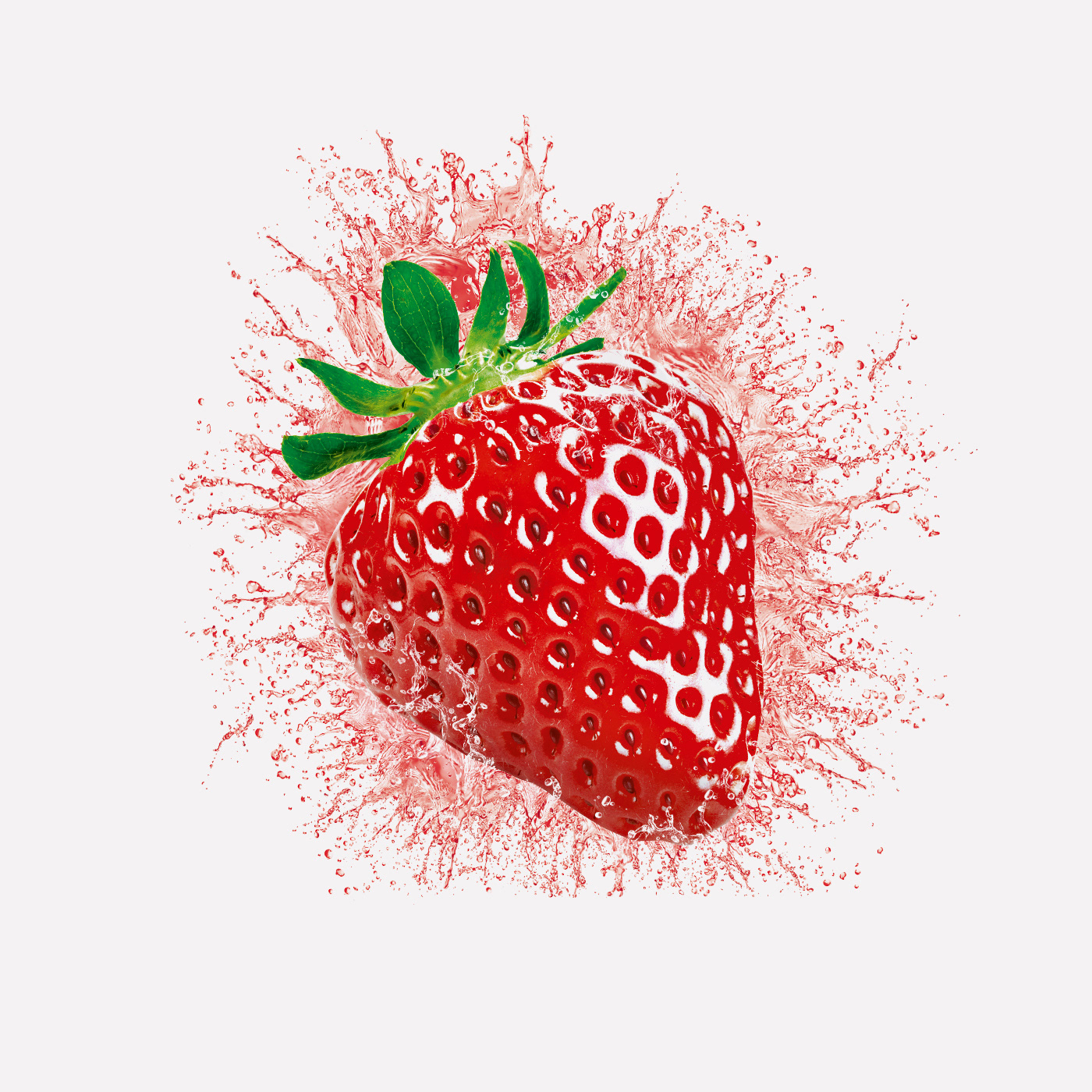
Natural Contrast: green-led palette establishing strong differentiation within the category
Refined Simplicity: restrained typography and composition reinforcing natural purity
Volcanic Symbolism: graphic elements inspired by volcanic landscapes and geological formations
Natural Contrast: green-led palette establishing strong differentiation within the category
Refined Simplicity: restrained typography and composition reinforcing natural purity
Scope & System
Packaging design system across multiple bottle formats
Label hierarchy and product architecture
Visual language and brand guidelines
Packaging design system across multiple bottle formats
Label hierarchy and product architecture
Visual language and brand guidelines
Key Results
Stronger differentiation within the bottled water category
Clearer communication of Volvic’s volcanic heritage
Improved shelf recognition and brand recall
Stronger differentiation within the bottled water category
Clearer communication of Volvic’s volcanic heritage
Improved shelf recognition and brand recall
Impact & Performance
Distribution across 60+ international markets
Production exceeding one billion bottles annually
Reinforced positioning as a premium natural mineral water brand
Distribution across 60+ international markets
Production exceeding one billion bottles annually
Reinforced positioning as a premium natural mineral water brand
Deliverables
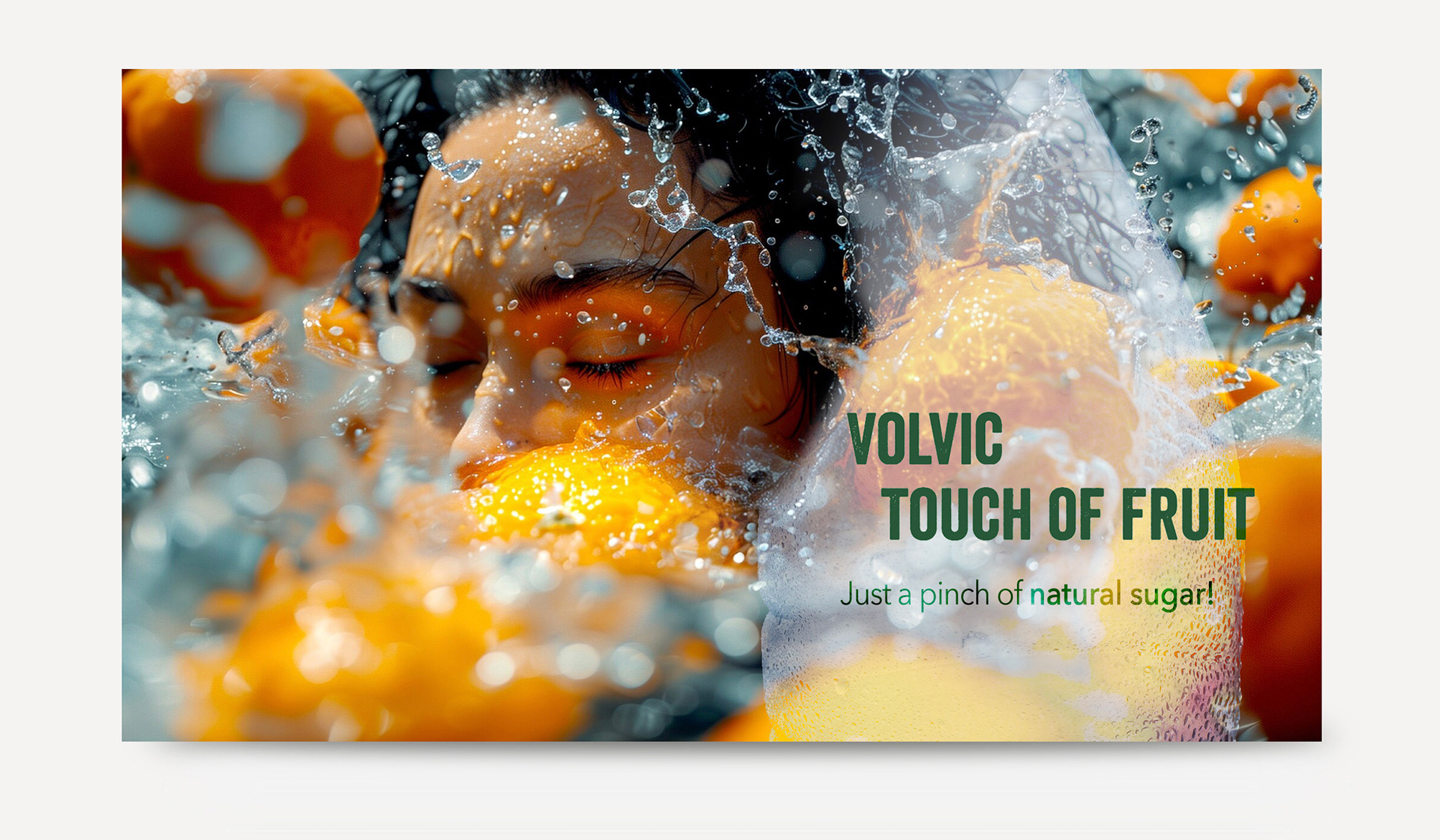
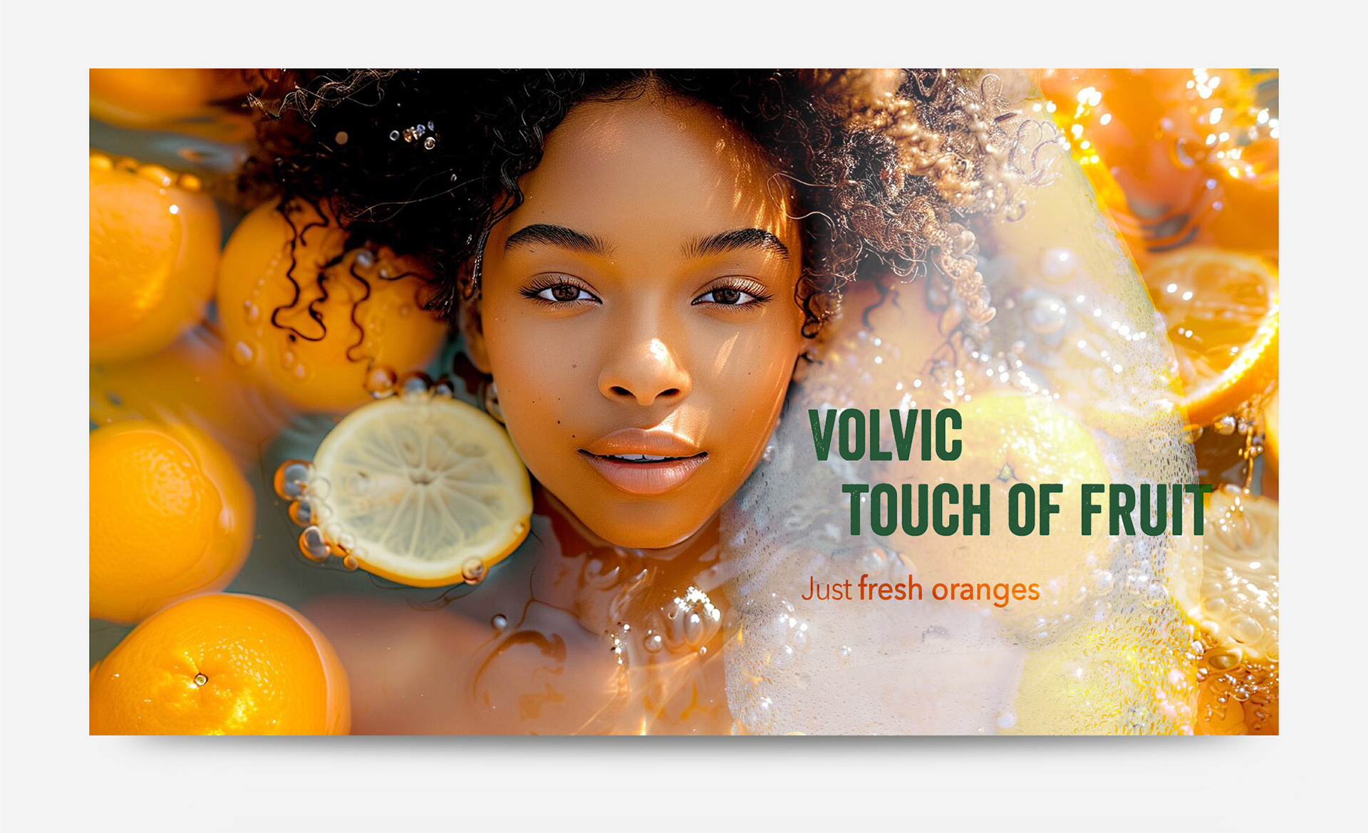
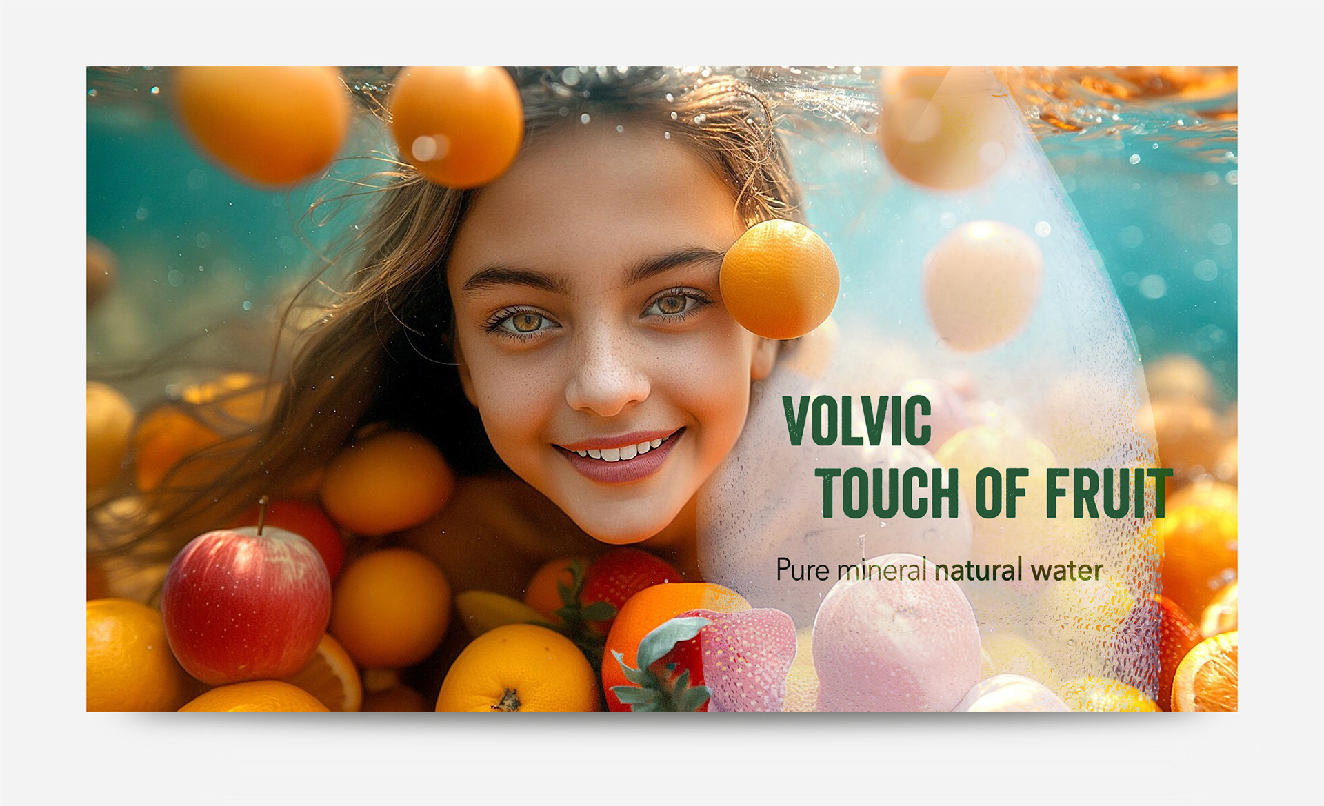
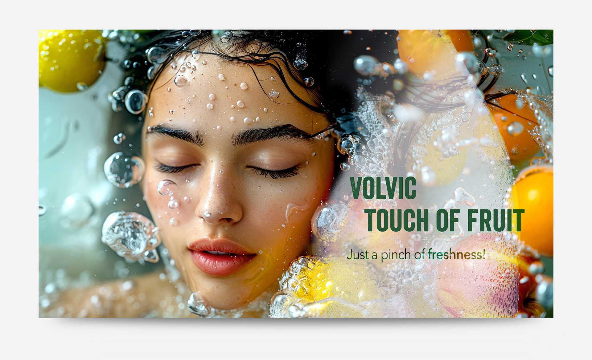
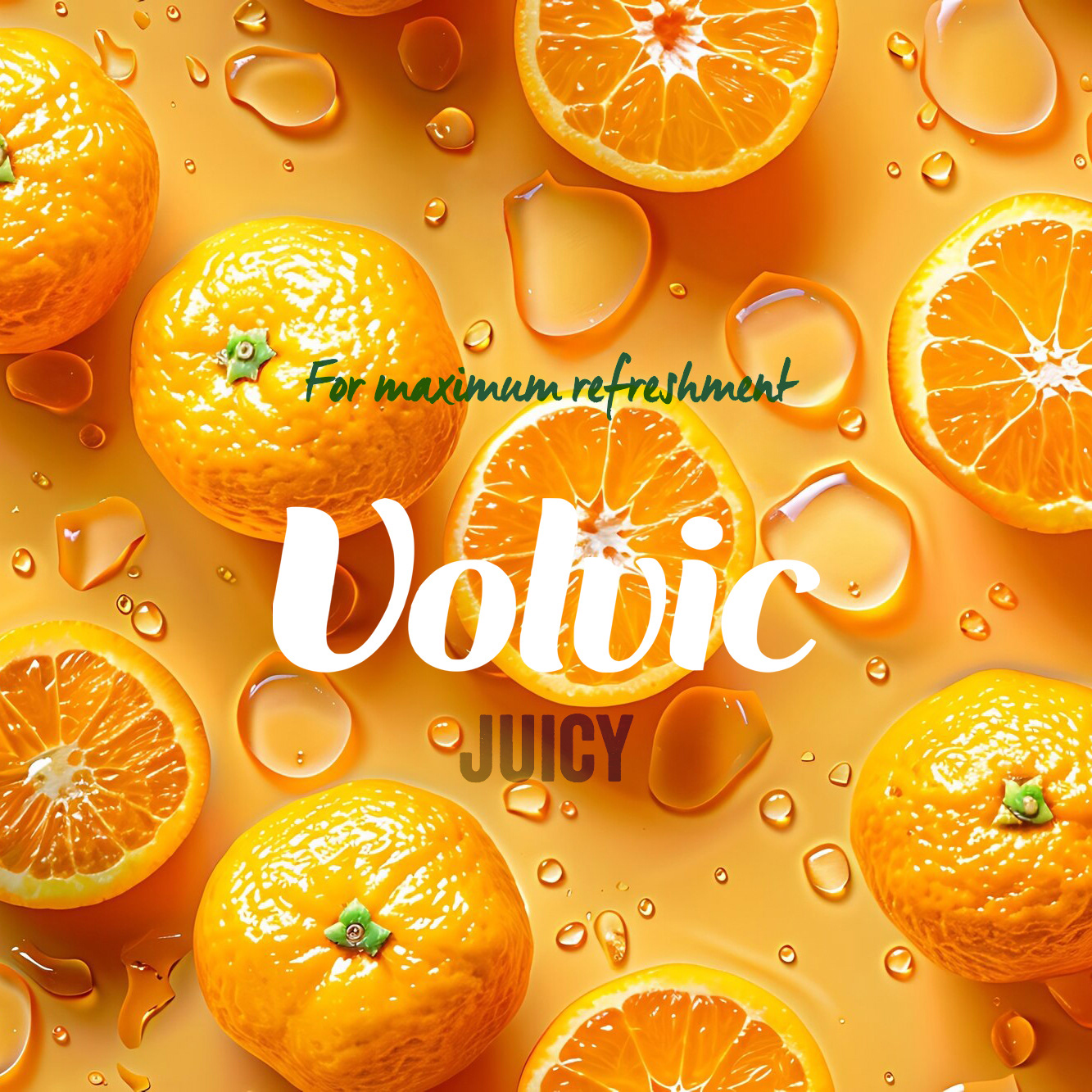
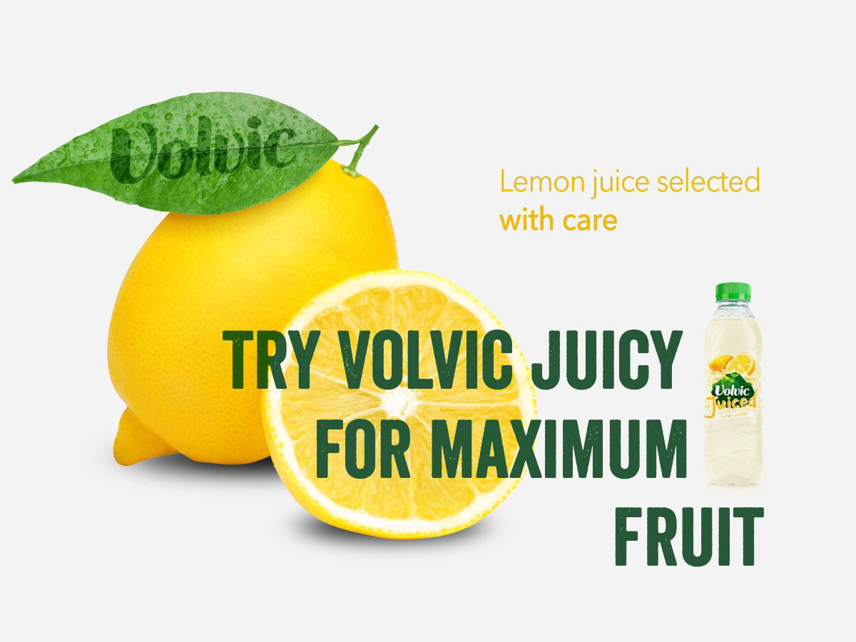
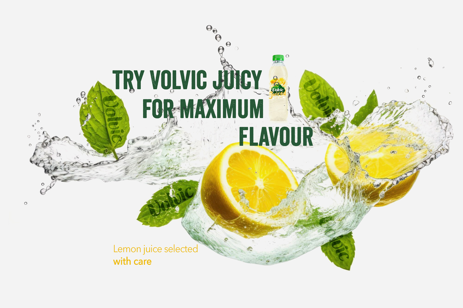
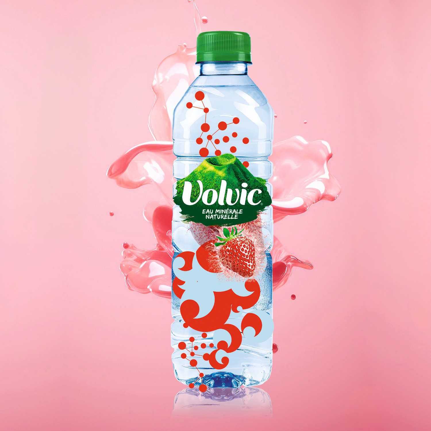
+ Creative direction and visual design for the product launch campaign
+ Campaign visuals and key marketing assets
+ Graphic layouts for digital and promotional materials
+ Creative direction and visual design for the product launch campaign
+ Campaign visuals and key marketing assets
+ Graphic layouts for digital and promotional materials
Role & Leadership
Sr Brand Designer
Led the development of the brand identity and packaging system, translating Volvic’s volcanic origin into a clear visual language and defining the graphic principles, ensuring consistency across products and brand touchpoints.
Led the development of the brand identity and packaging system, translating Volvic’s volcanic origin into a clear visual language and defining the graphic principles, ensuring consistency across products and brand touchpoints.

Why This Works Matters
By grounding the brand identity in Volvic’s volcanic origin, the design establishes a distinctive visual territory that differentiates the brand in the bottled water category while reinforcing its narrative of natural purity and geological authenticity.
By grounding the brand identity in Volvic’s volcanic origin, the design establishes a distinctive visual territory that differentiates the brand in the bottled water category while reinforcing its narrative of natural purity and geological authenticity.


Need to build trust & clarity in a regulated,
science-driven industry?
science-driven industry?