CLIENT ▸ Pédagomagie, Aix-en-Provence, France
ROLE ▸ Art Director + Illustrator Freelance
SCOPE ▸ Logo Design, Graphic Design, Print Design, Illustration, Book Layout Design
ROLE ▸ Art Director + Illustrator Freelance
SCOPE ▸ Logo Design, Graphic Design, Print Design, Illustration, Book Layout Design
The Challenge
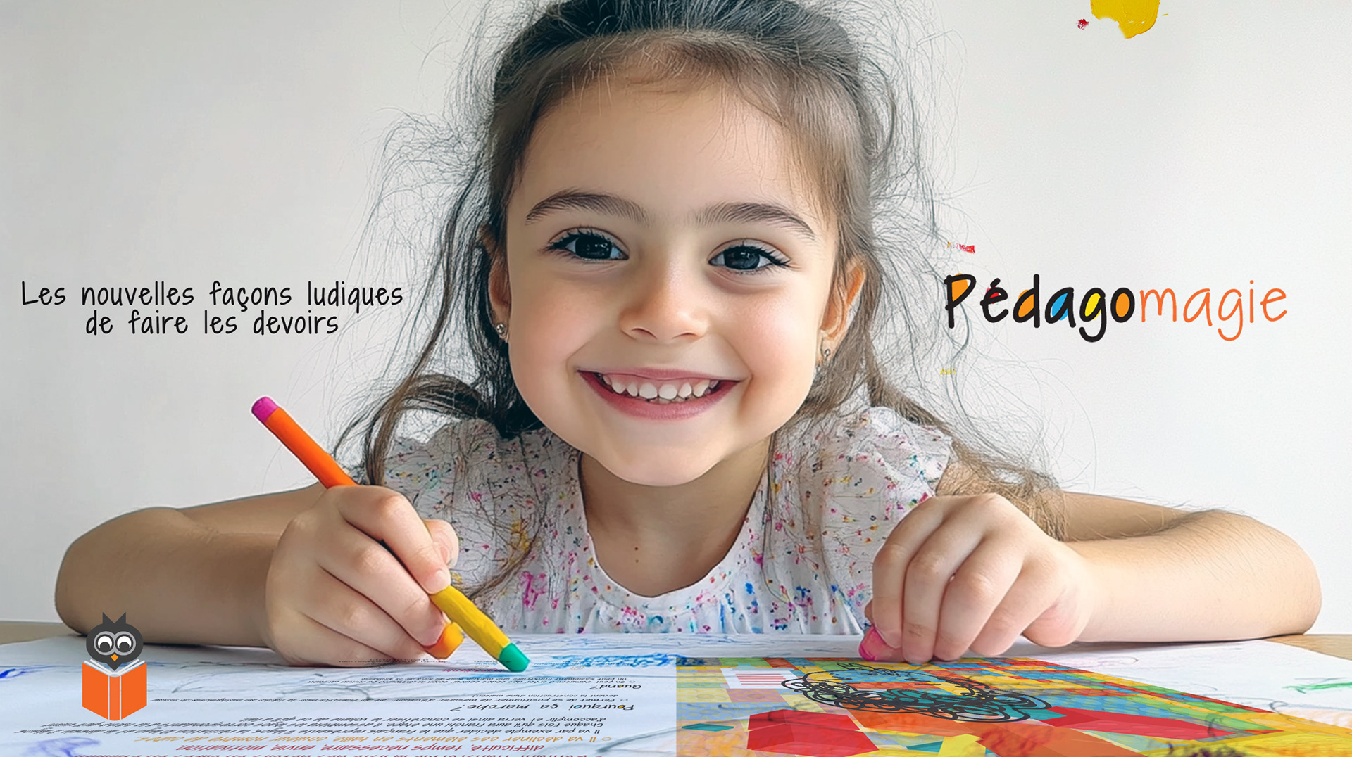
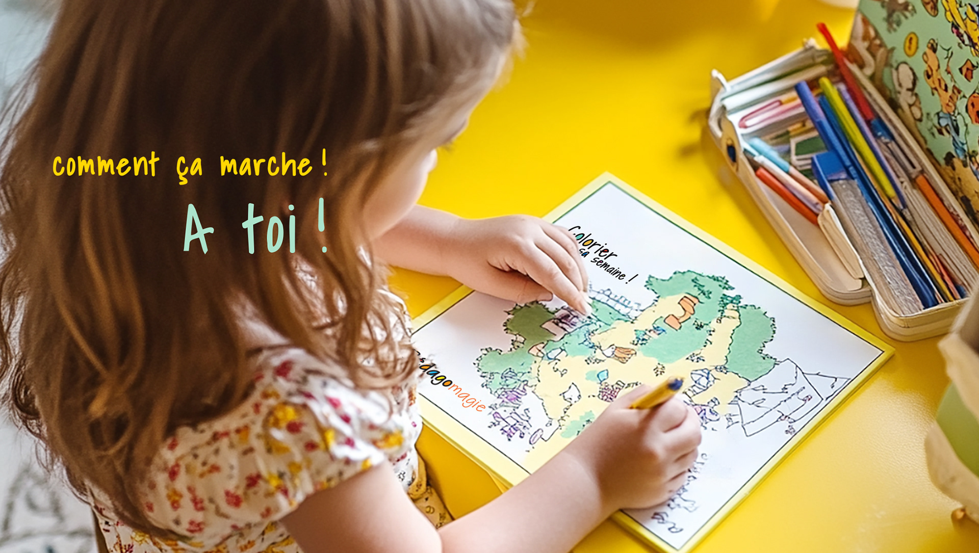
Create an education brand that feels engaging without becoming childish
Establish trust with parents/educators while staying accessible to students
Build a system that scales across print, digital, and classroom materials
Create an education brand that feels engaging without becoming childish
Establish trust with parents/educators while staying accessible to students
Build a system that scales across print, digital, and classroom materials
Strategic Approach
Position Pedagomagie as both playful and rigorous—learning made simple, not simplified
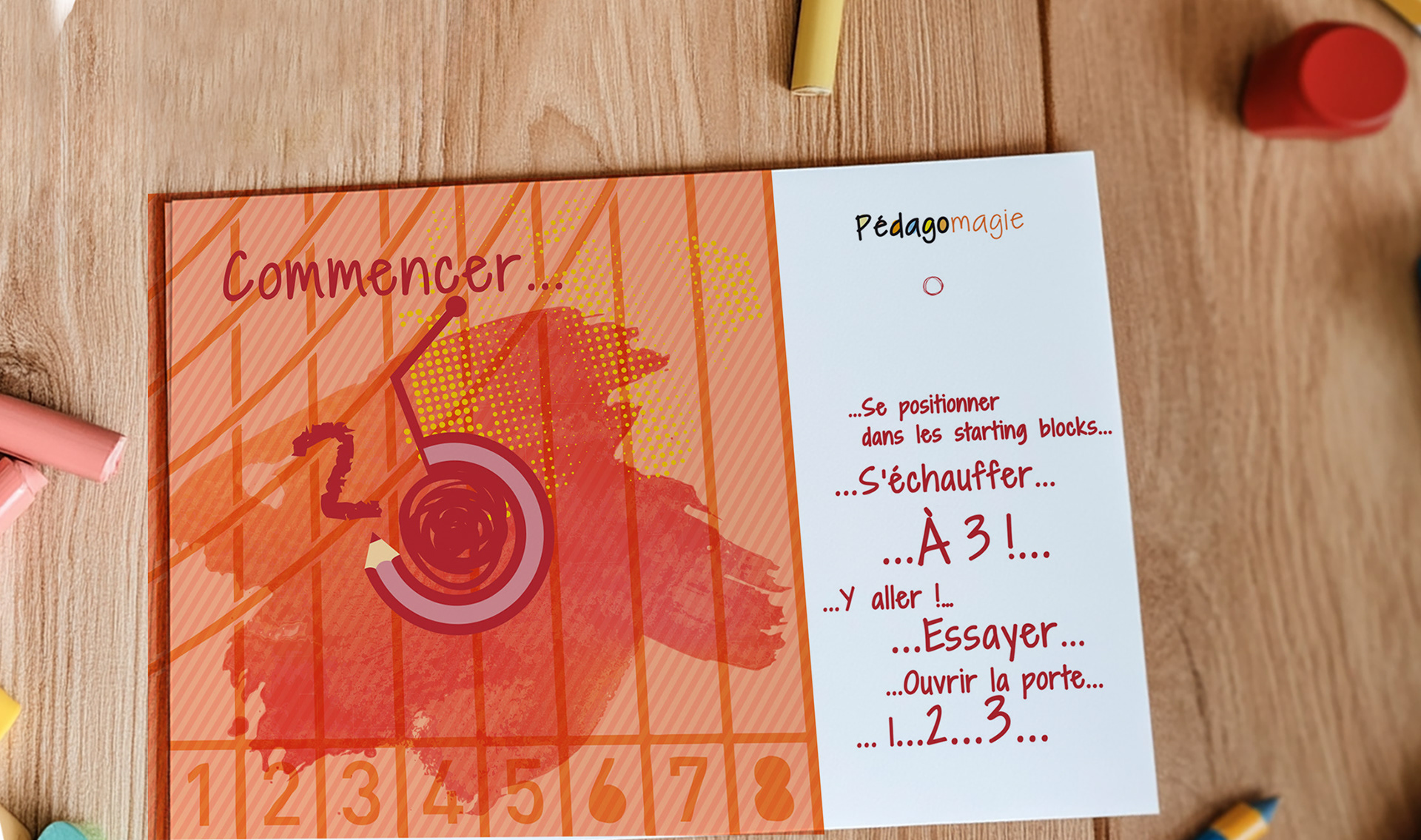
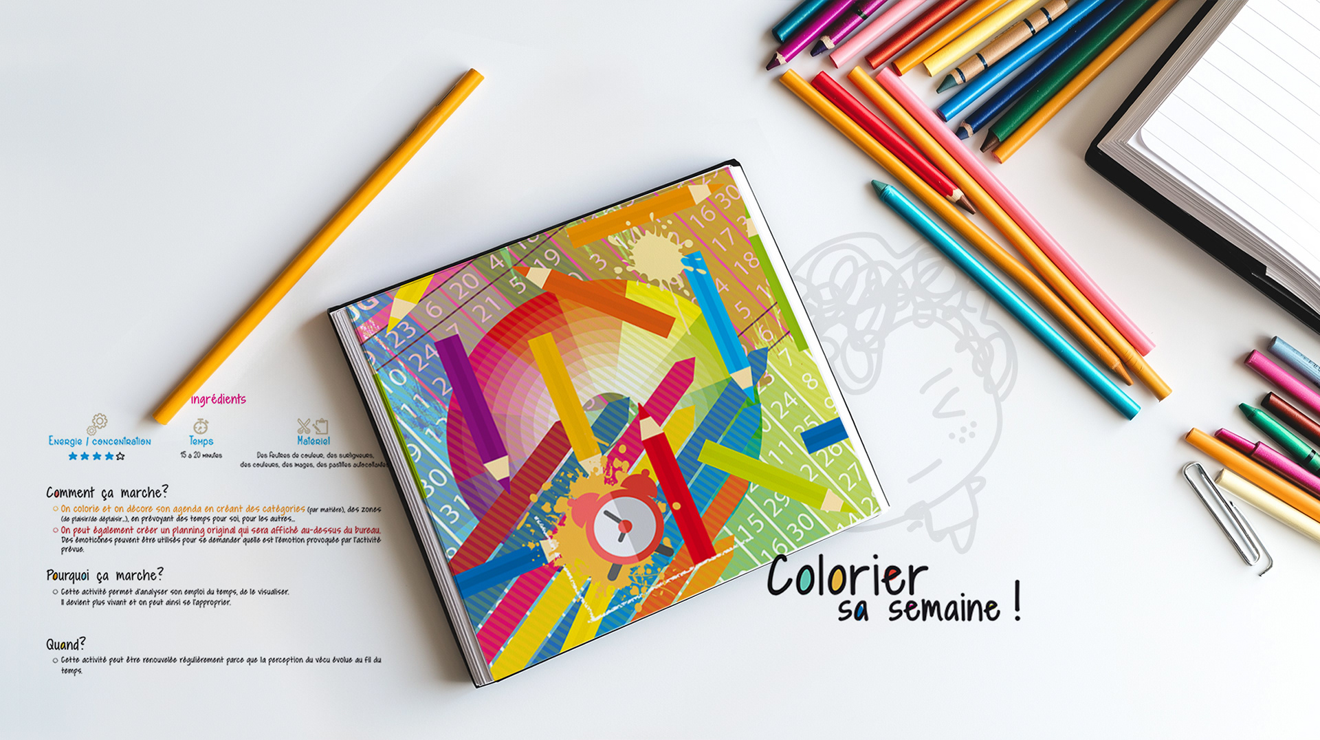
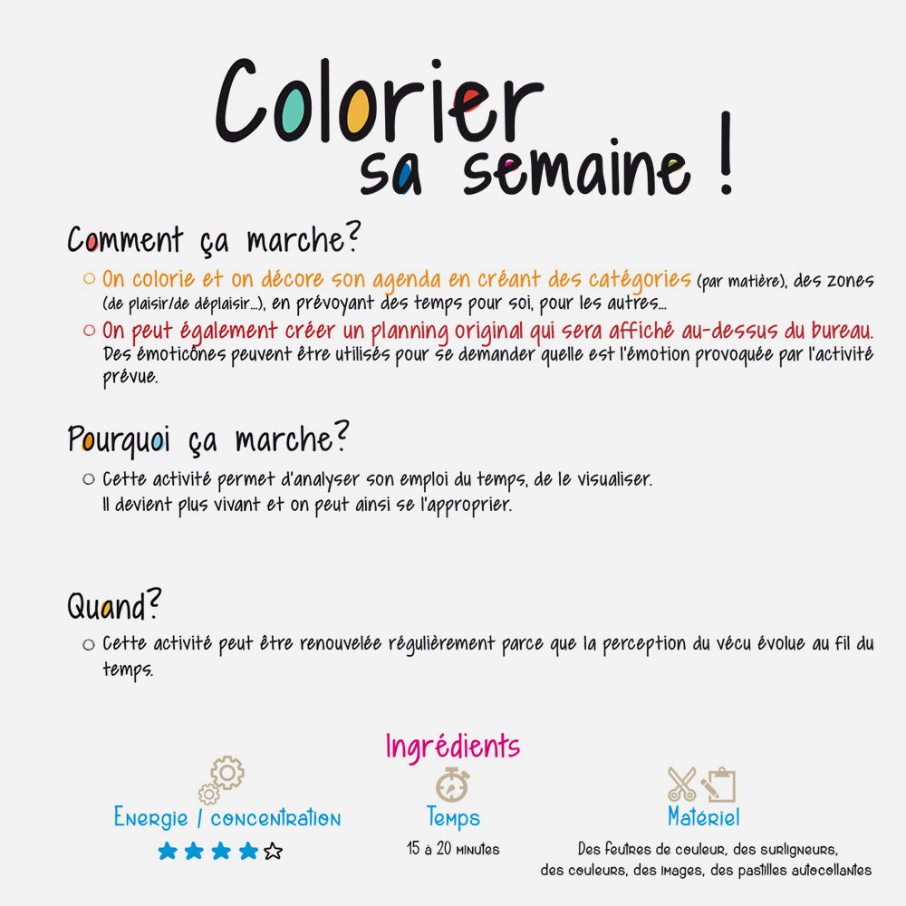
Use clear hierarchy and modular design to support educational content and pacing
Create repeatable templates to enable consistency across future lessons and products
Position Pedagomagie as both playful and rigorous—learning made simple, not simplified
Use clear hierarchy and modular design to support educational content and pacing
Create repeatable templates to enable consistency across future lessons and products
Creative Solution
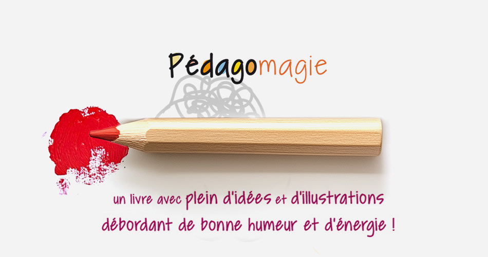
A warm, contemporary identity balancing friendliness with structure
A visual language built around clarity: legible typography, strong spacing, and intuitive layout rules
A system designed to support content-heavy applications while staying light and human
A warm, contemporary identity balancing friendliness with structure
A visual language built around clarity: legible typography, strong spacing, and intuitive layout rules
A system designed to support content-heavy applications while staying light and human
Scope & System
Identity architecture: logo, typography, color logic, graphic elements
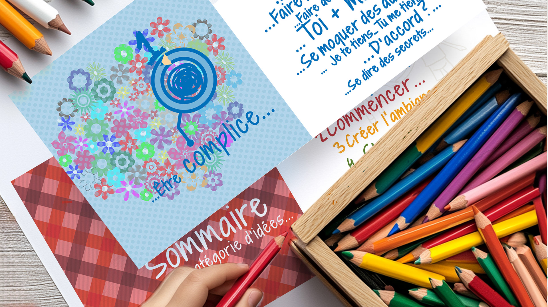
Modular grid and layout templates for educational content
Visual hierarchy rules for titles, instructions, exercises, and callouts
Cross-format adaptability for print worksheets, digital assets, and social communication
Identity architecture: logo, typography, color logic, graphic elements
Modular grid and layout templates for educational content
Visual hierarchy rules for titles, instructions, exercises, and callouts
Cross-format adaptability for print worksheets, digital assets, and social communication
Key Results
Clearer brand recognition and consistency across materials
Improved readability and usability for content-driven educational outputs
A scalable system enabling future growth without redesigning from scratch
Clearer brand recognition and consistency across materials
Improved readability and usability for content-driven educational outputs
A scalable system enabling future growth without redesigning from scratch
Impact & Performance
Stronger trust signal for educators and parents through disciplined design
Faster production enabled by templates and codified visual rules
More cohesive learner experience across touchpoints
Stronger trust signal for educators and parents through disciplined design
Faster production enabled by templates and codified visual rules
More cohesive learner experience across touchpoints
Deliverables
+ Logo and visual identity system
+ Core guidelines (typography, color, layout rules)
+ Template set for educational materials
+ Digital assets for communications and social
+ Logo and visual identity system
+ Core guidelines (typography, color, layout rules)
+ Template set for educational materials
+ Digital assets for communications and social
Role & Leadership
Art Director · Illustrator
Owned identity direction, illustration language, and editorial system design end-to-end, from concept through final production.
Art Director · Illustrator
Owned identity direction, illustration language, and editorial system design end-to-end, from concept through final production.
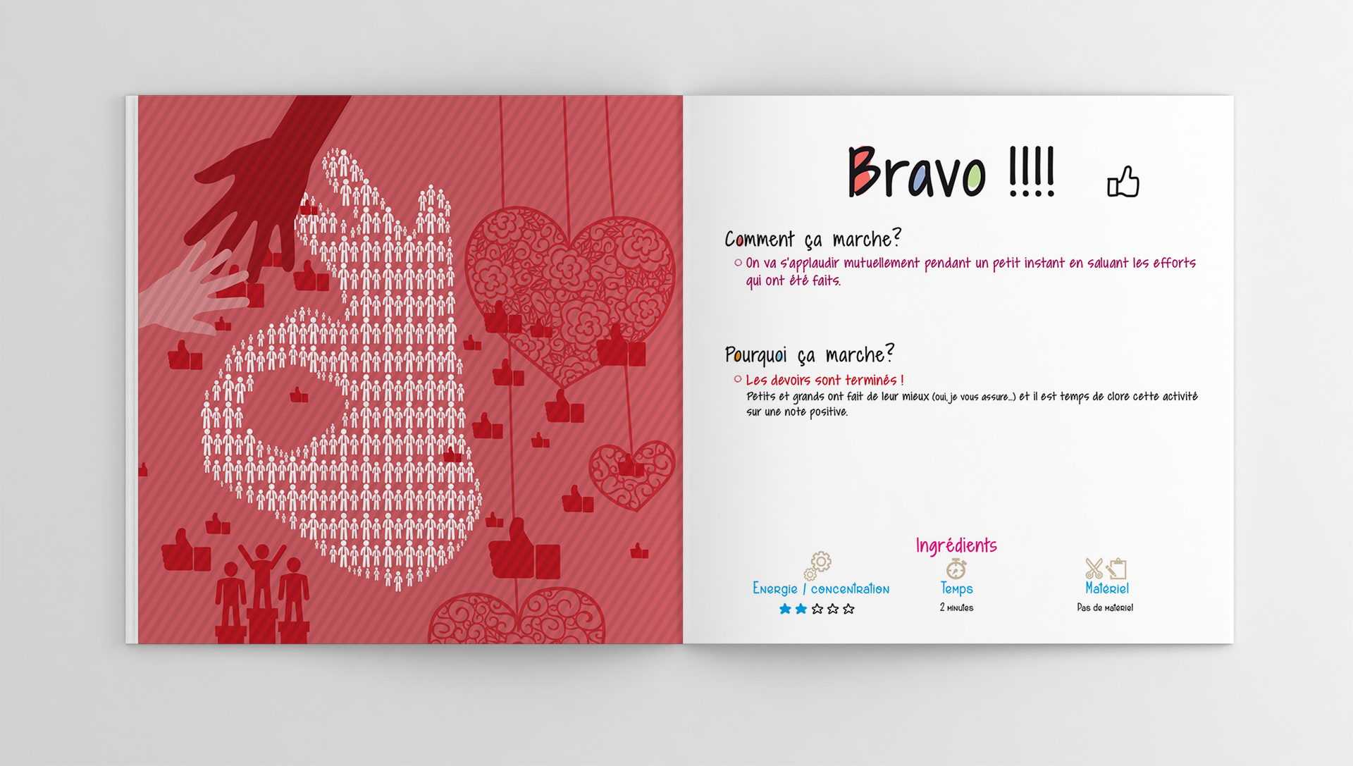
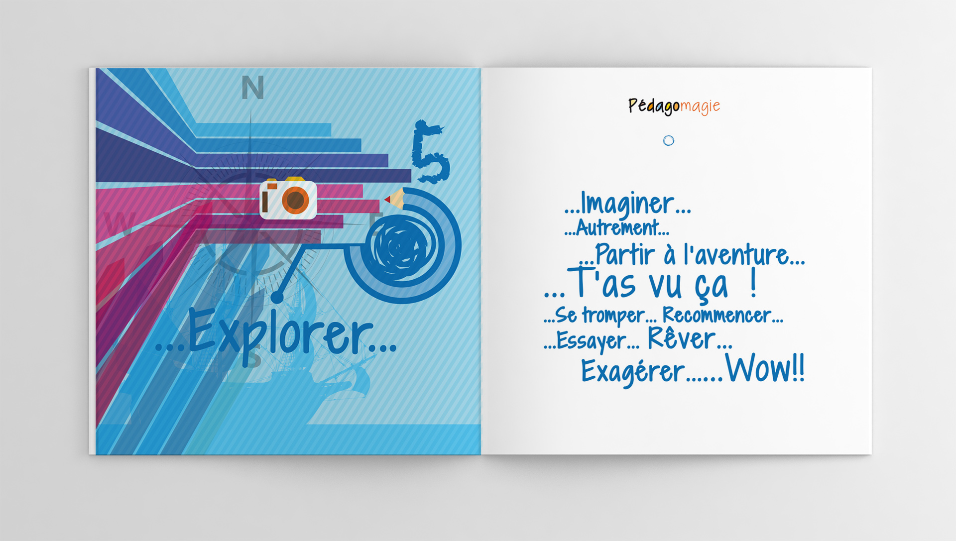
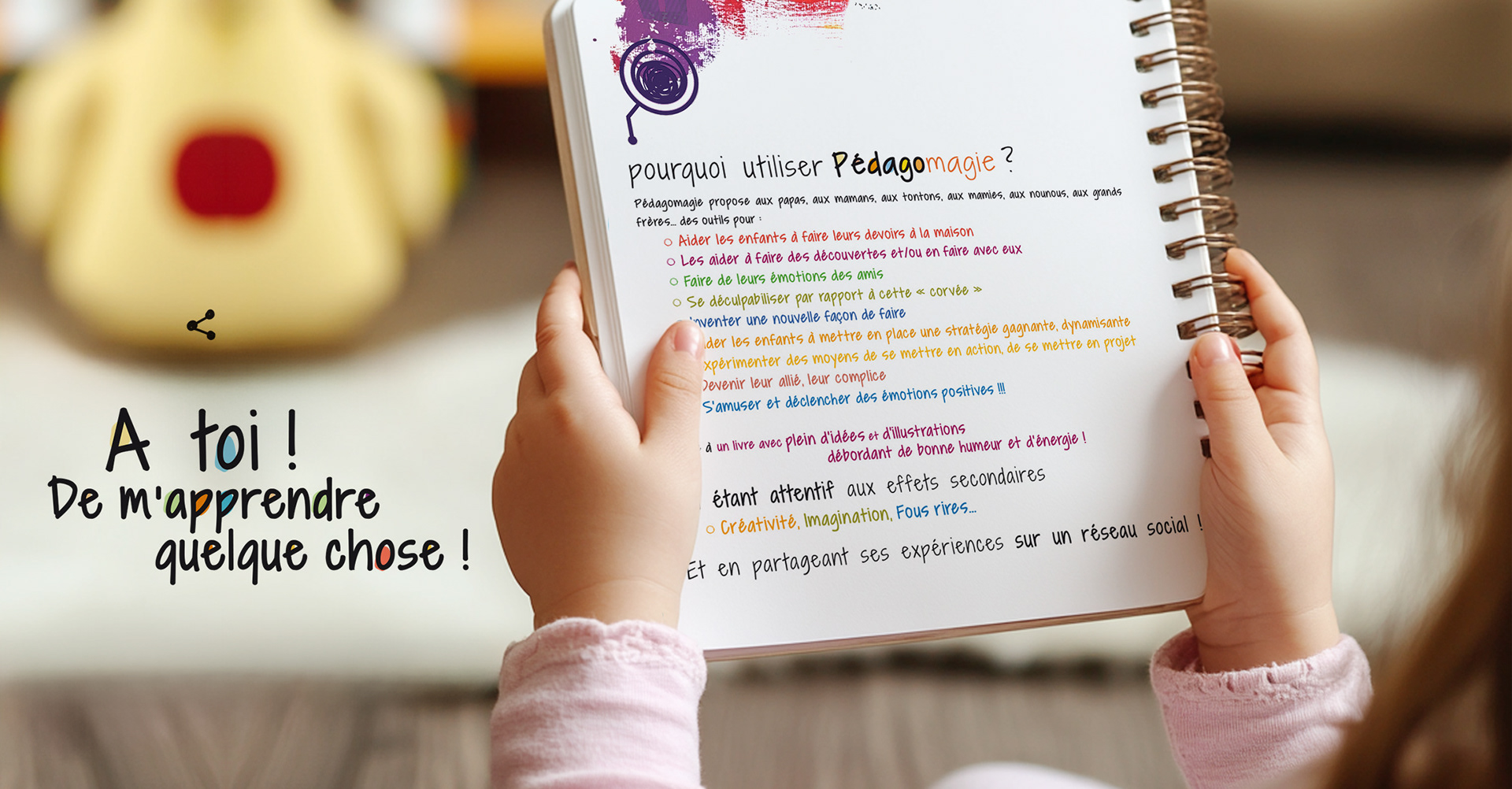
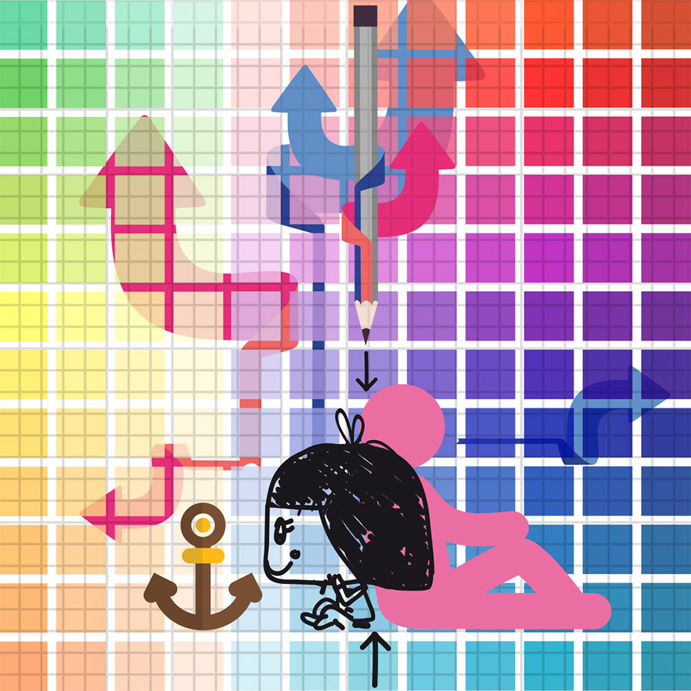
Why This Works Matters
The system balances two forces that usually conflict in education design:
play and structure.
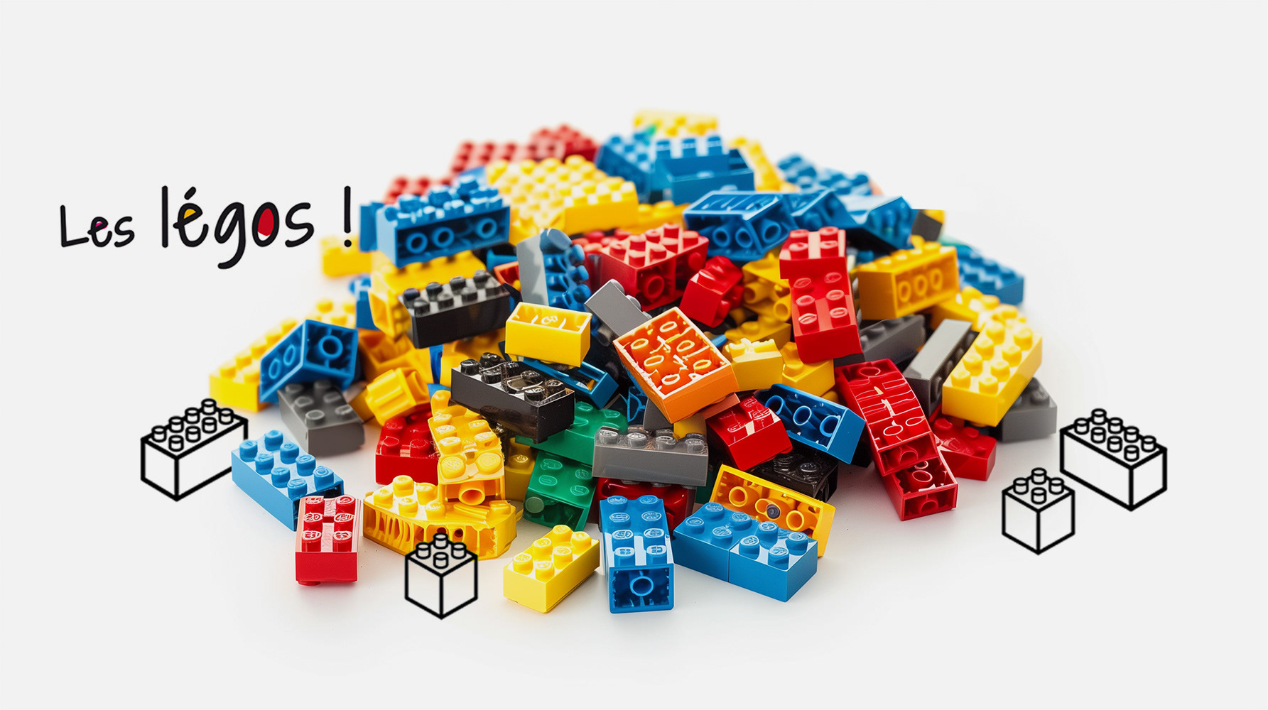
It invites curiosity through color and character, while using hierarchy and layout discipline to keep learning clear, repeatable, and easy to follow, at home or in classroom contexts.
The system balances two forces that usually conflict in education design:
play and structure.
It invites curiosity through color and character, while using hierarchy and layout discipline to keep learning clear, repeatable, and easy to follow, at home or in classroom contexts.
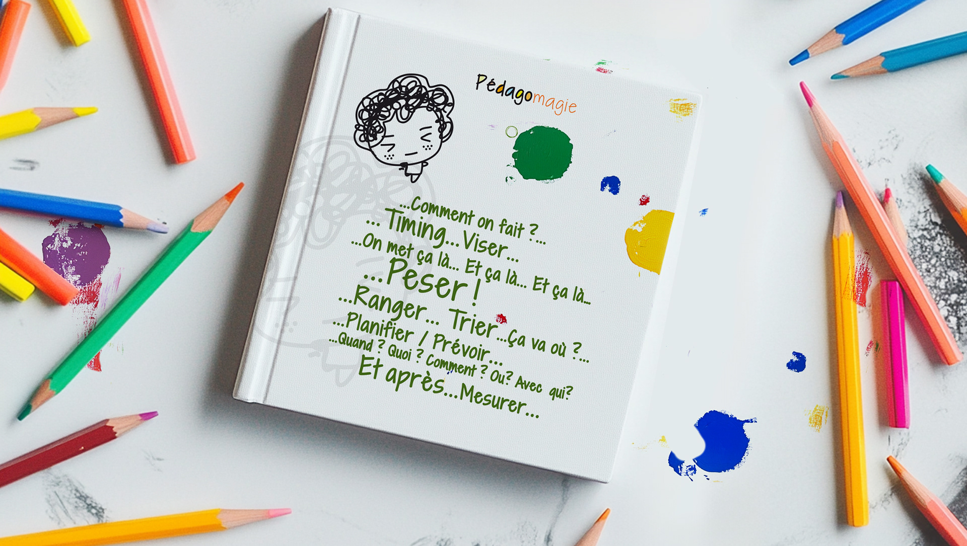

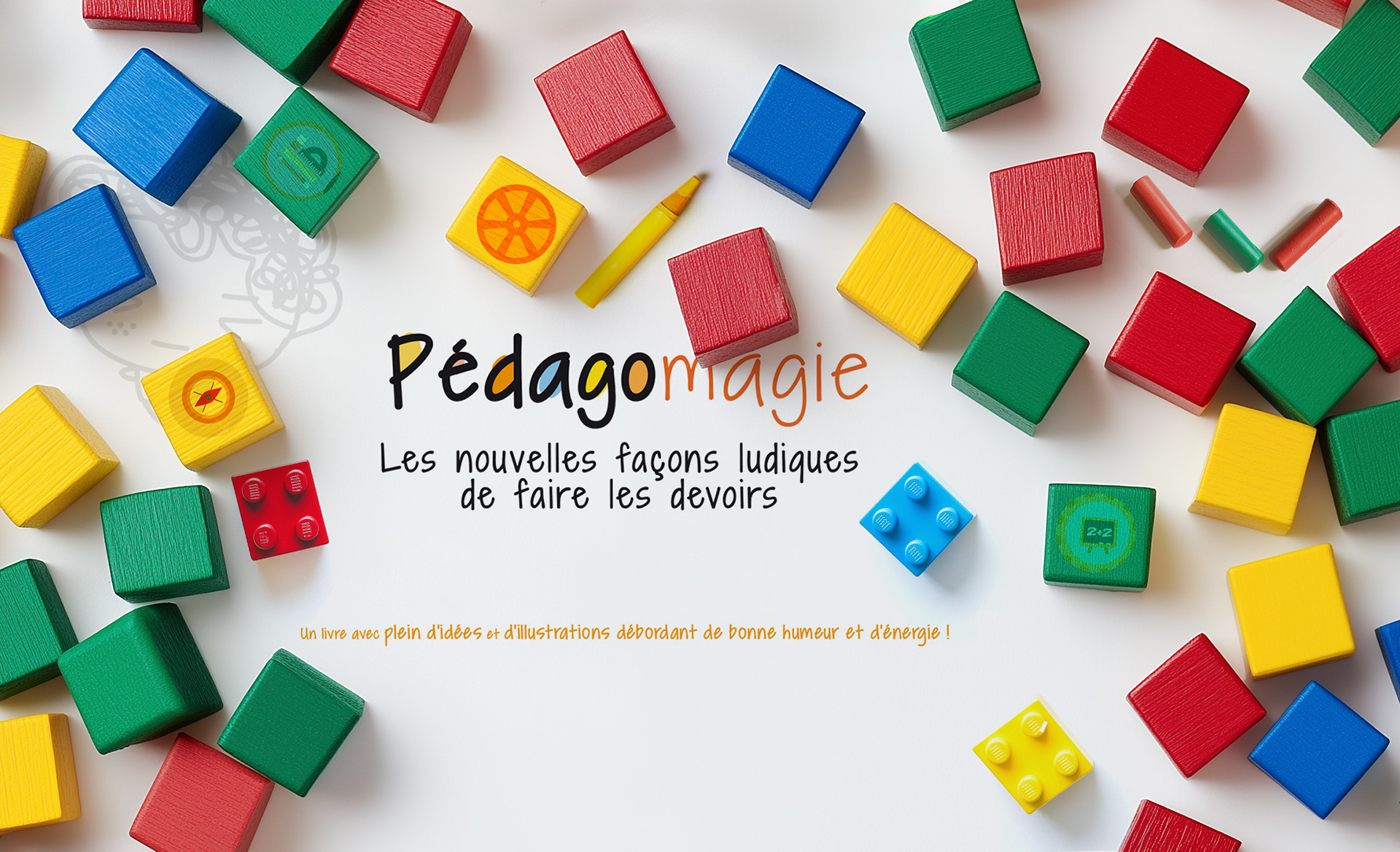
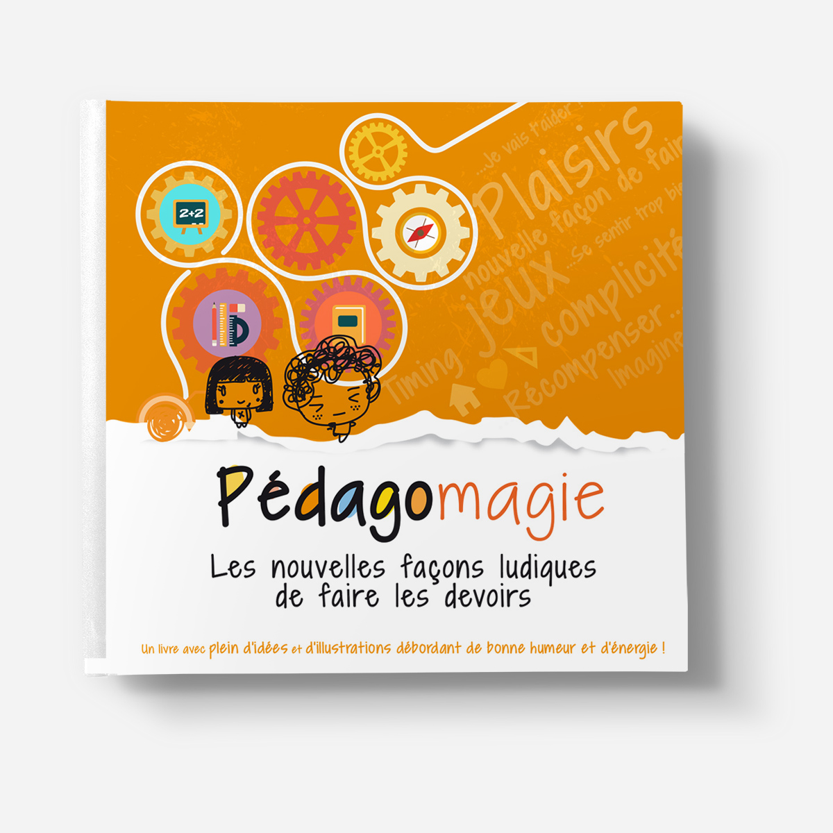
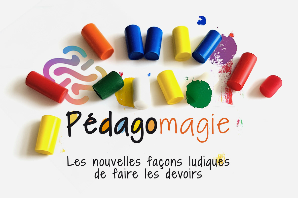
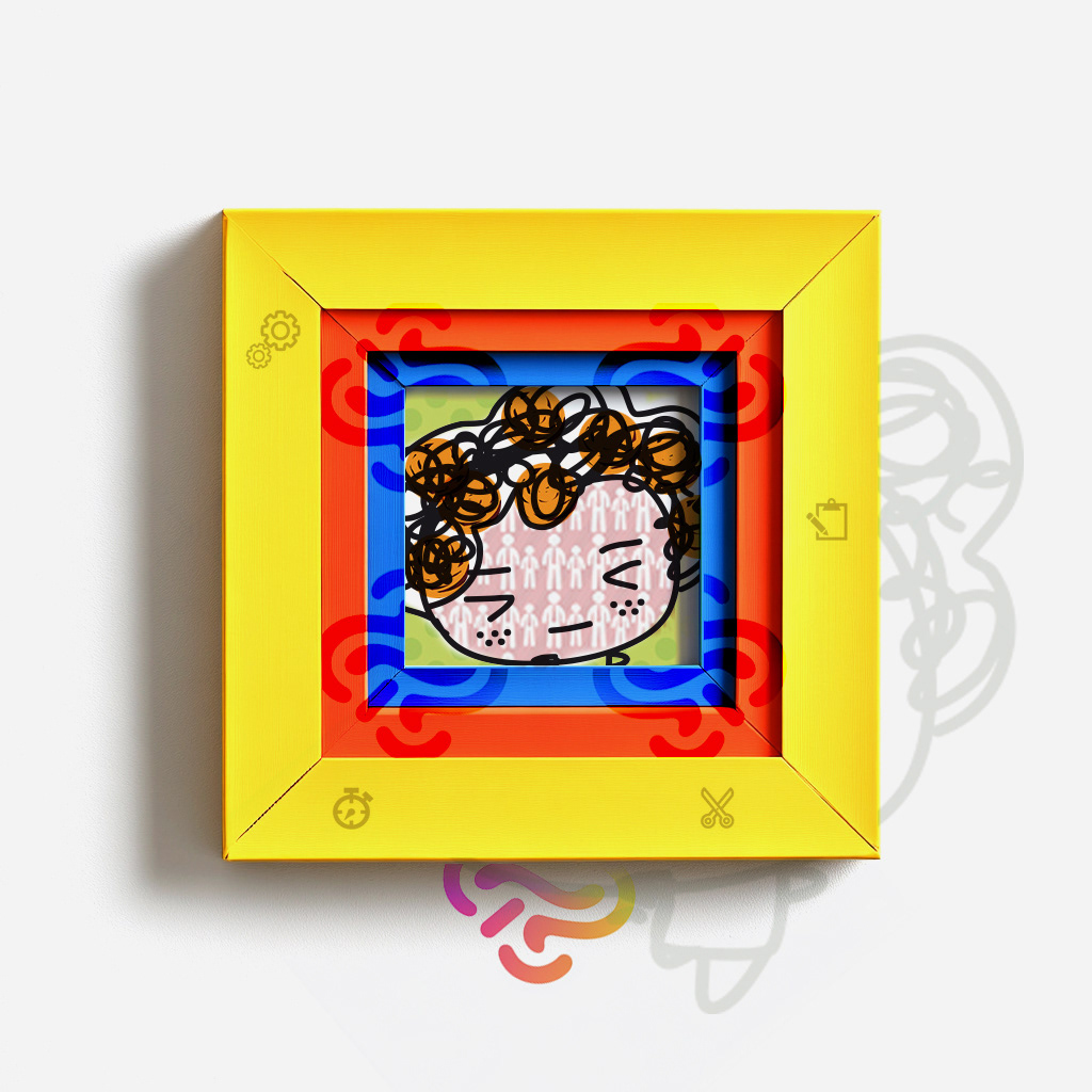
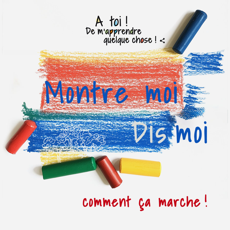
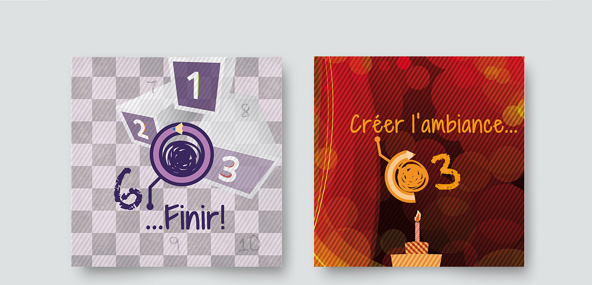
The logo was designed to feel friendly and intelligent,
approachable for children, credible for parents, and educators.
Its rounded forms and energetic structure support the brand idea:
learning as a joyful, shared experience.
approachable for children, credible for parents, and educators.
Its rounded forms and energetic structure support the brand idea:
learning as a joyful, shared experience.


Looking to build a brand that inspires creativity & trust in education?