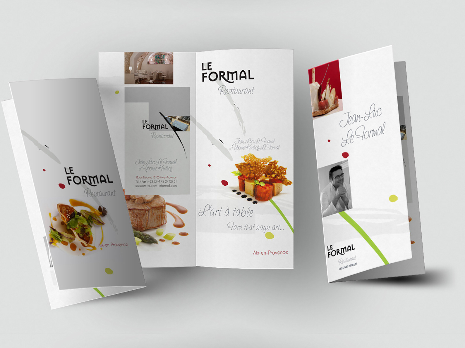
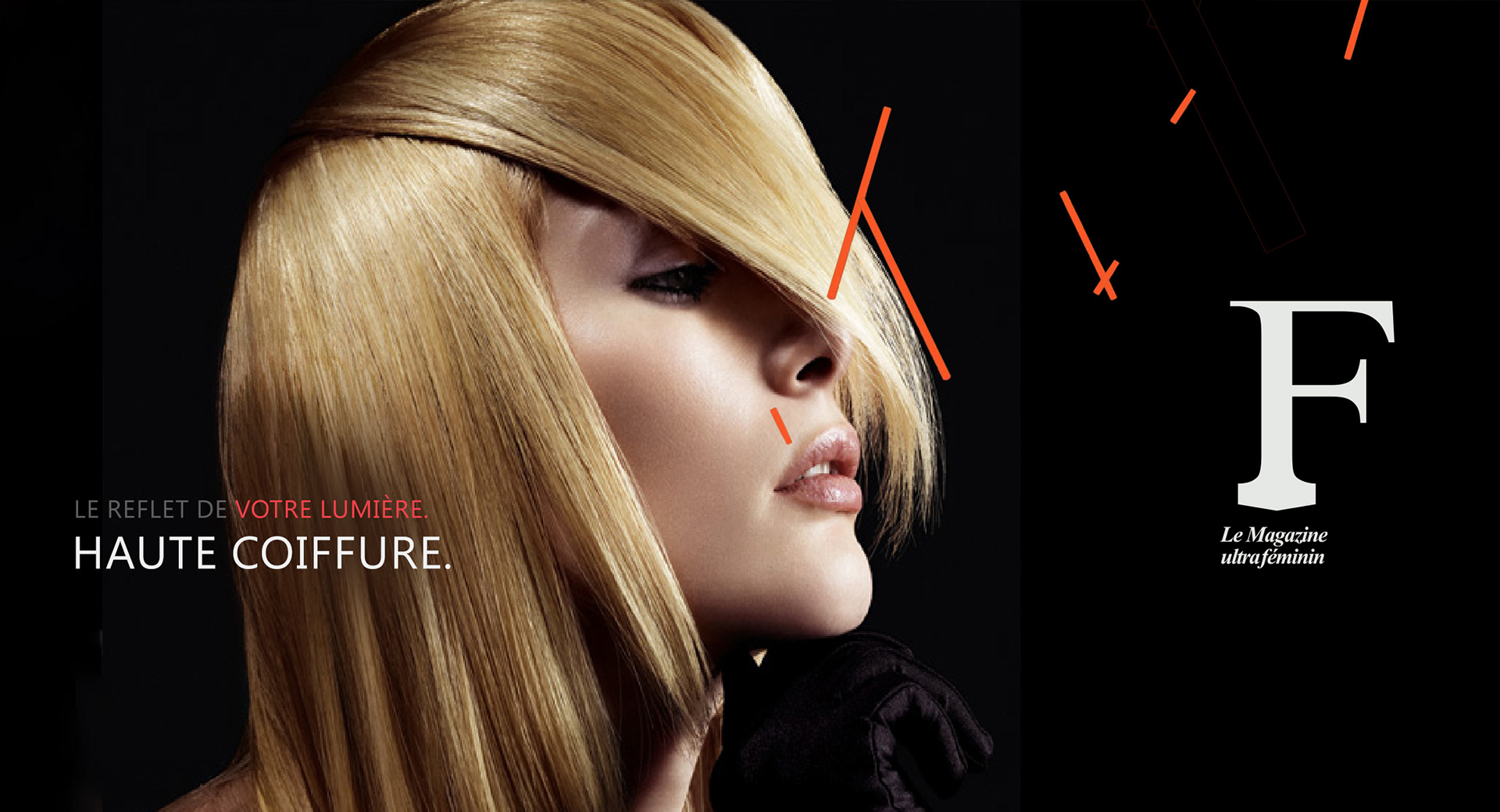
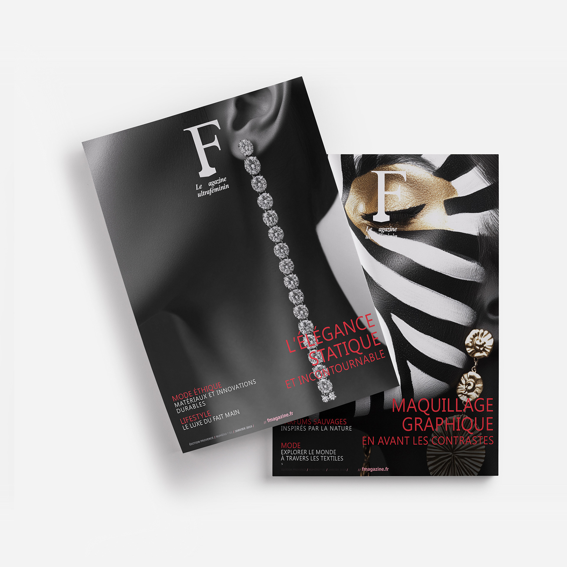
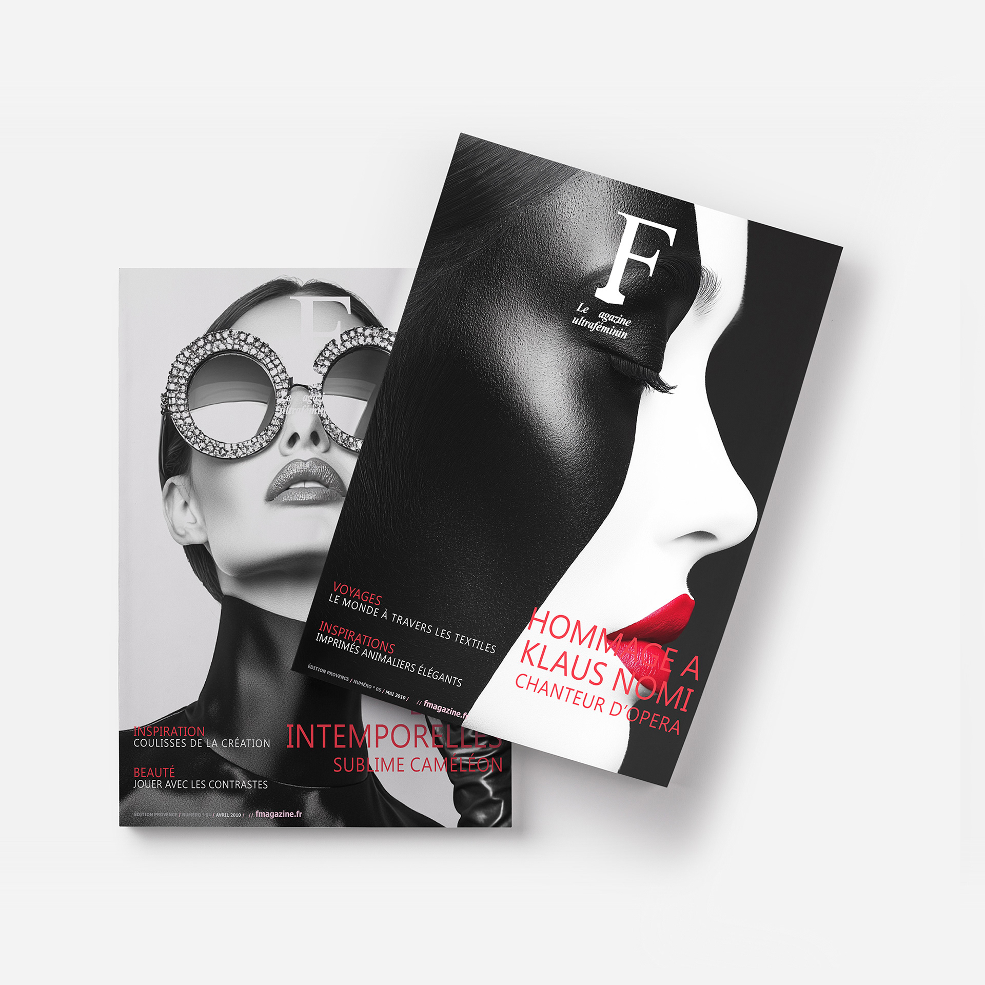
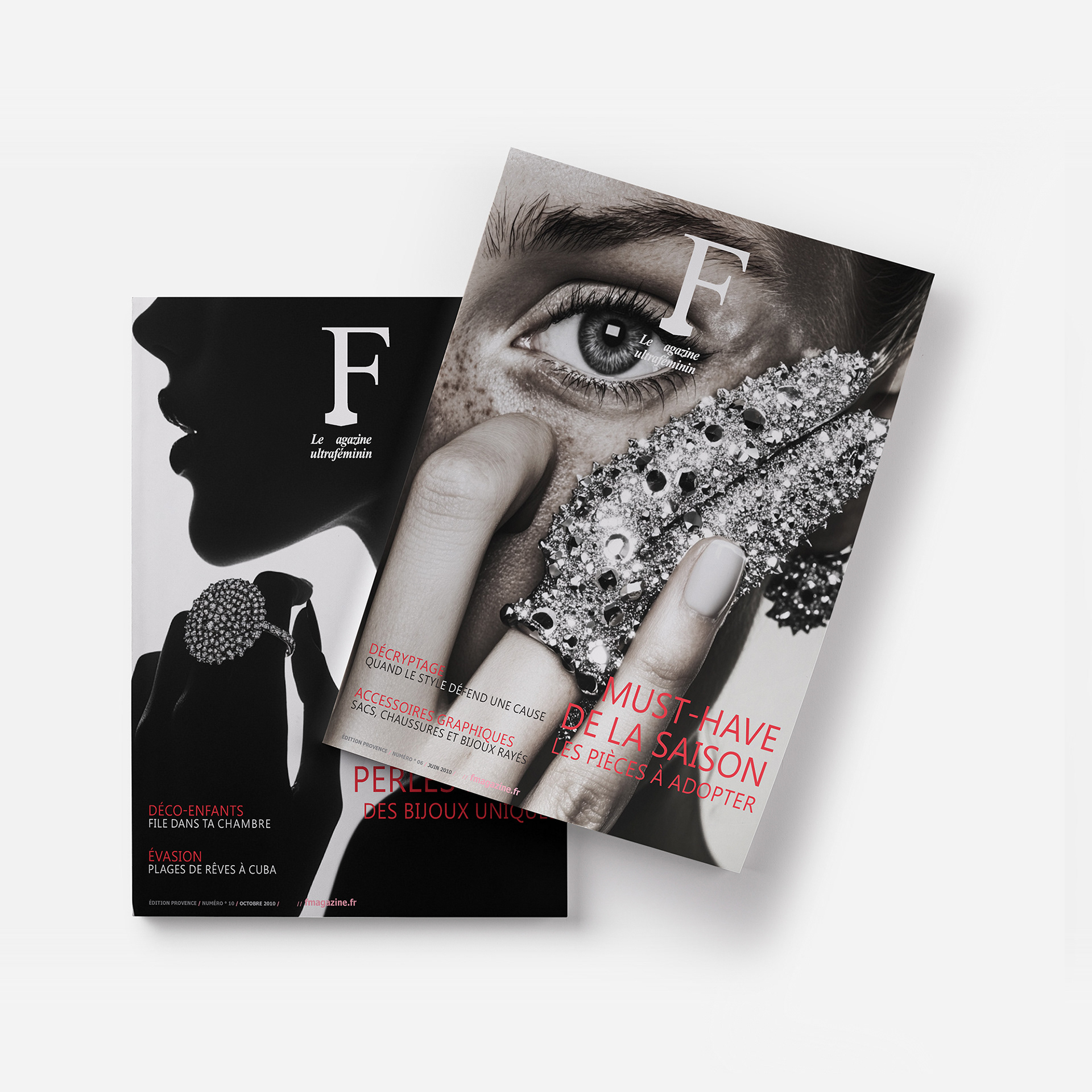
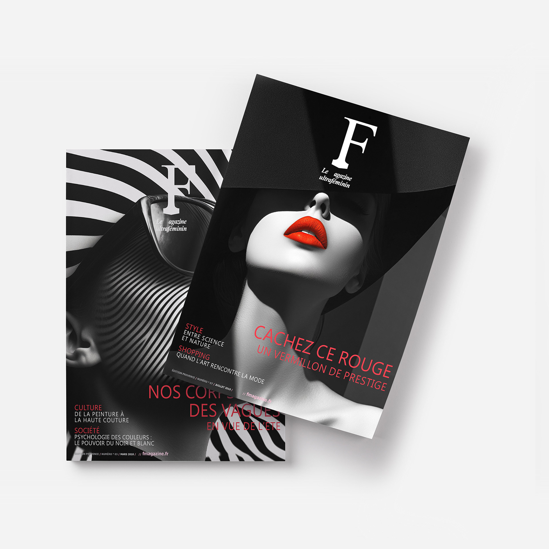
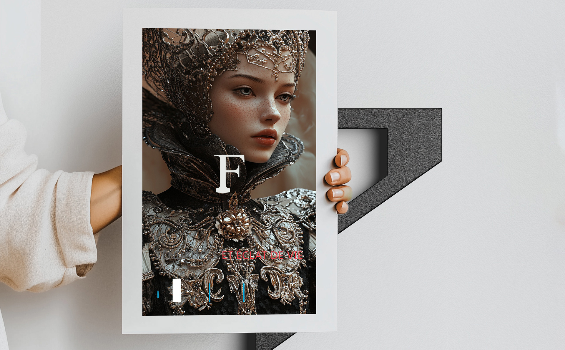
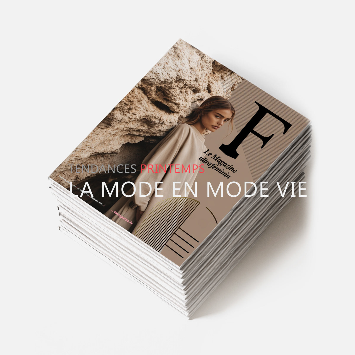
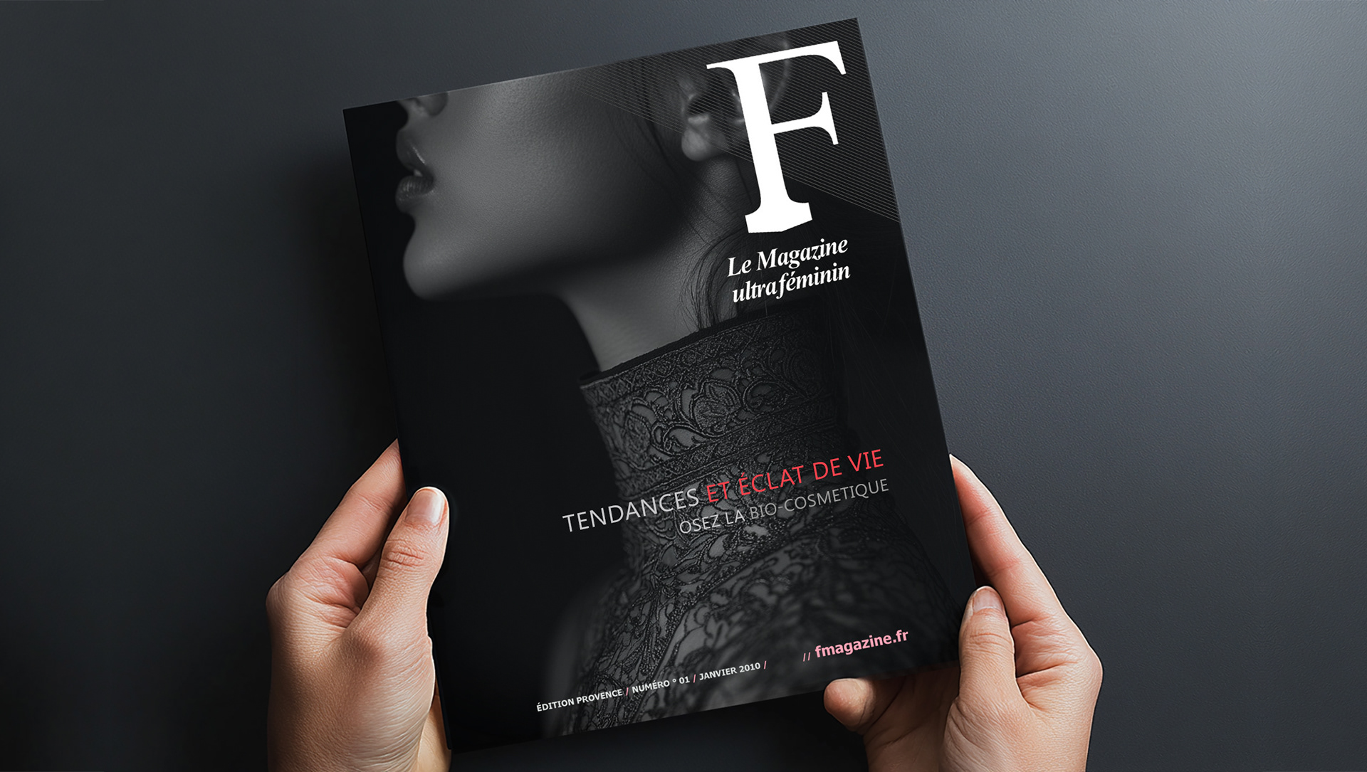
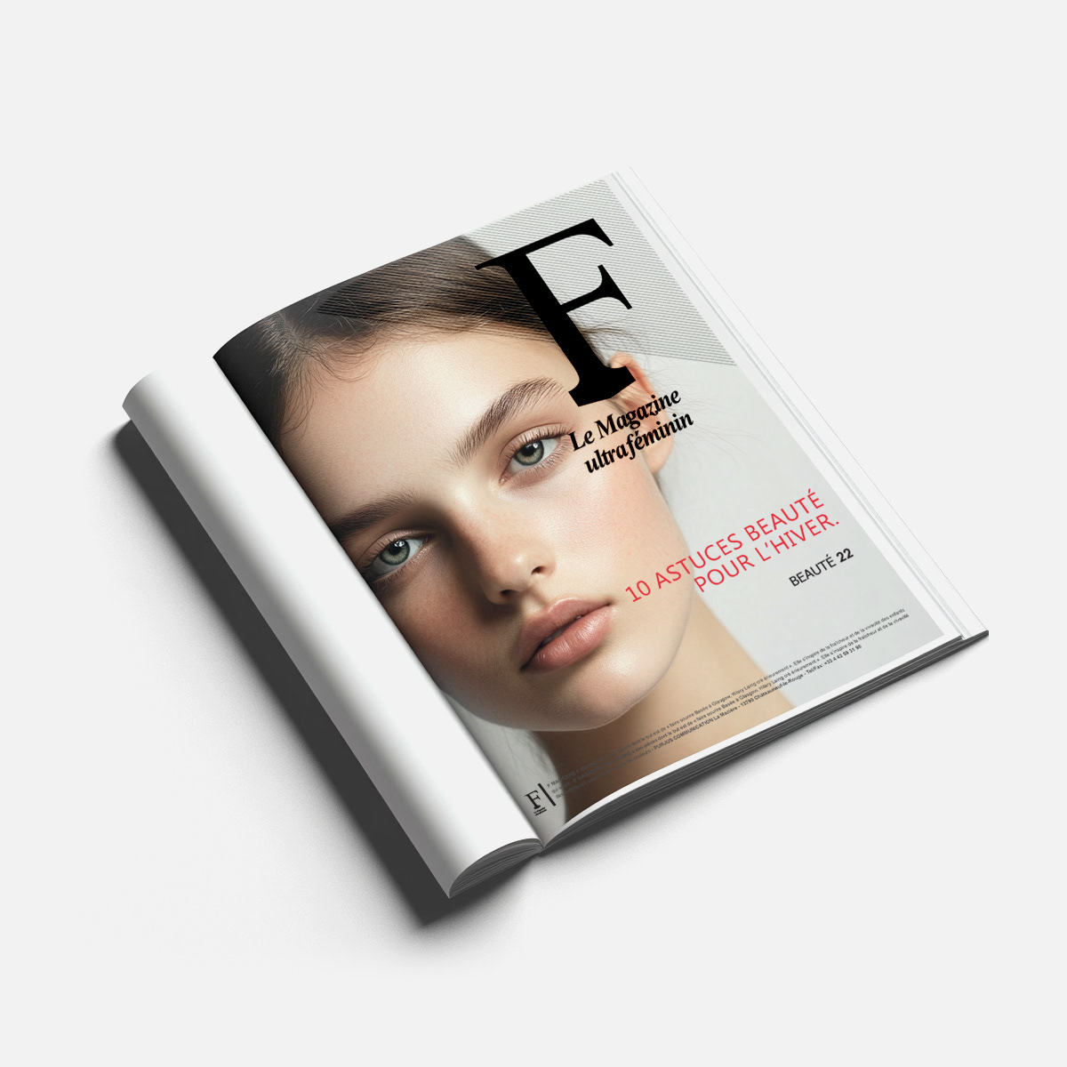
A French fashion publication needed a visual identity and editorial system that could sustain high-volume publishing without losing its fashion-forward edge.
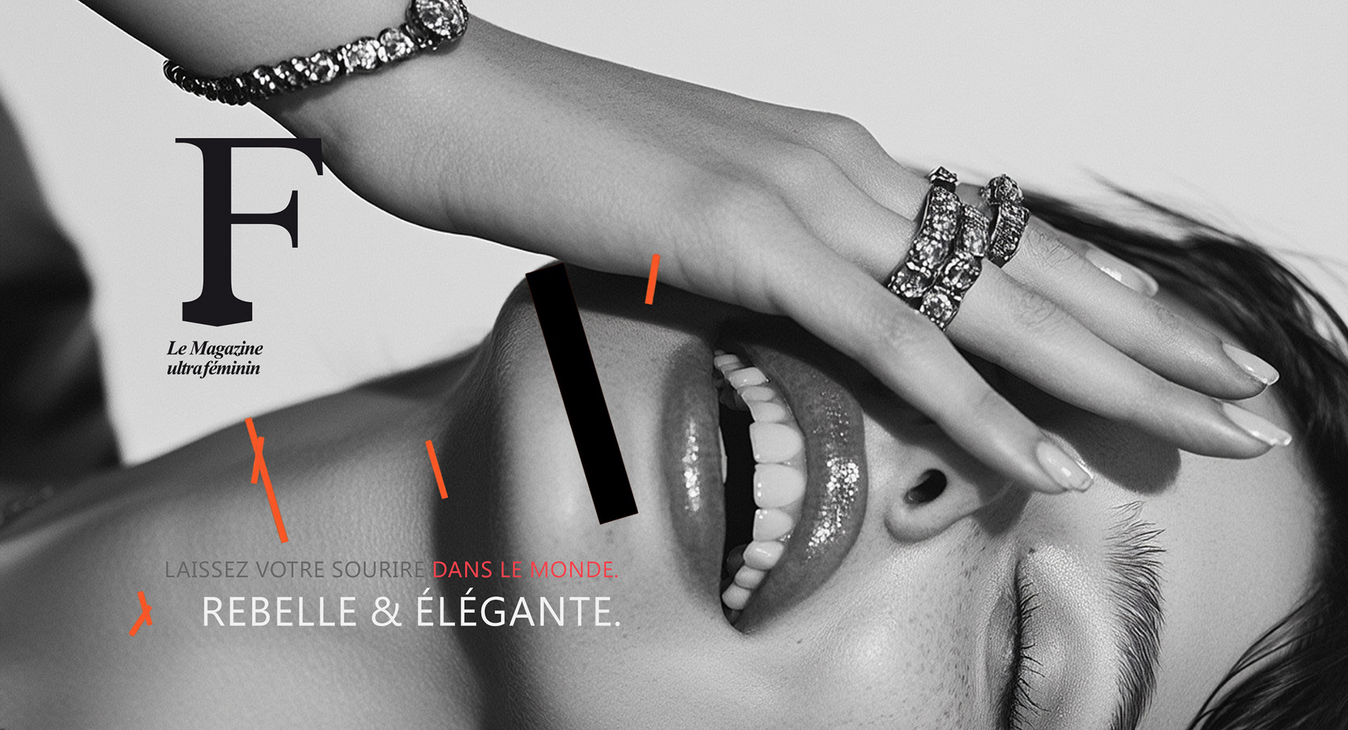
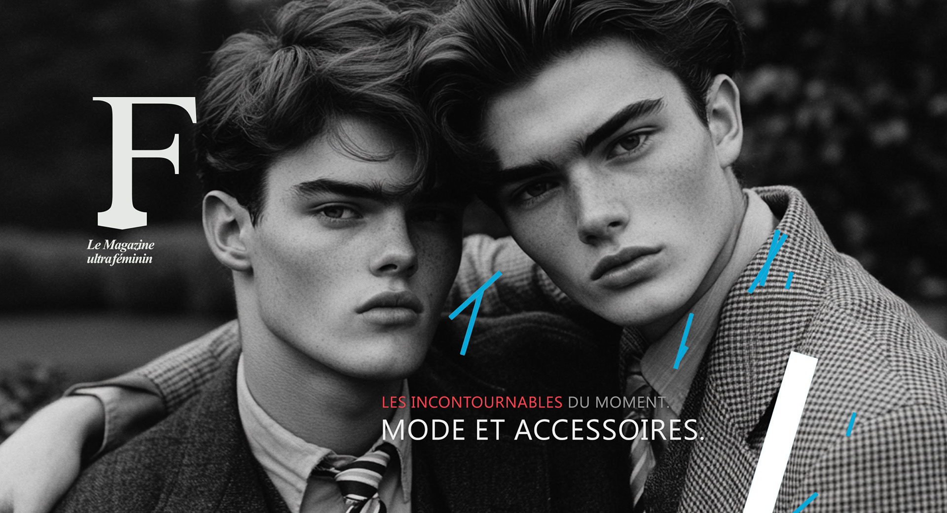
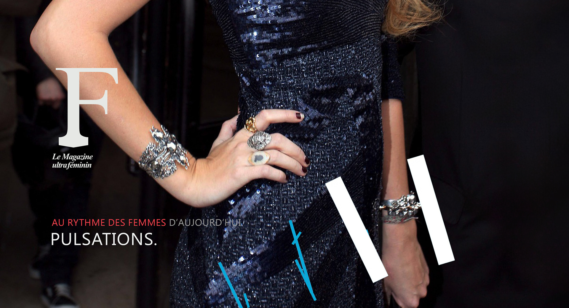
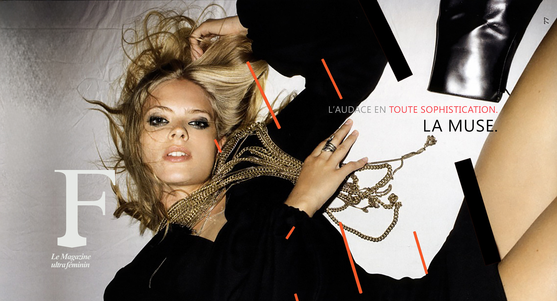
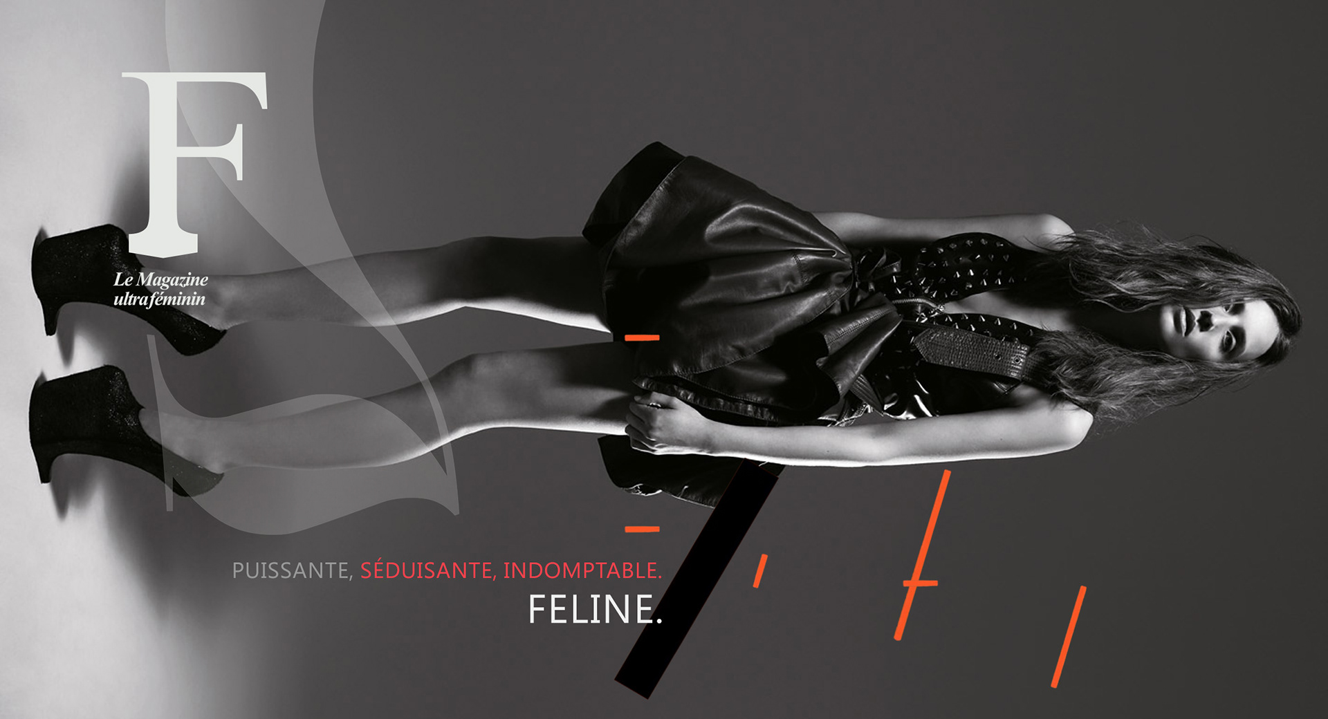
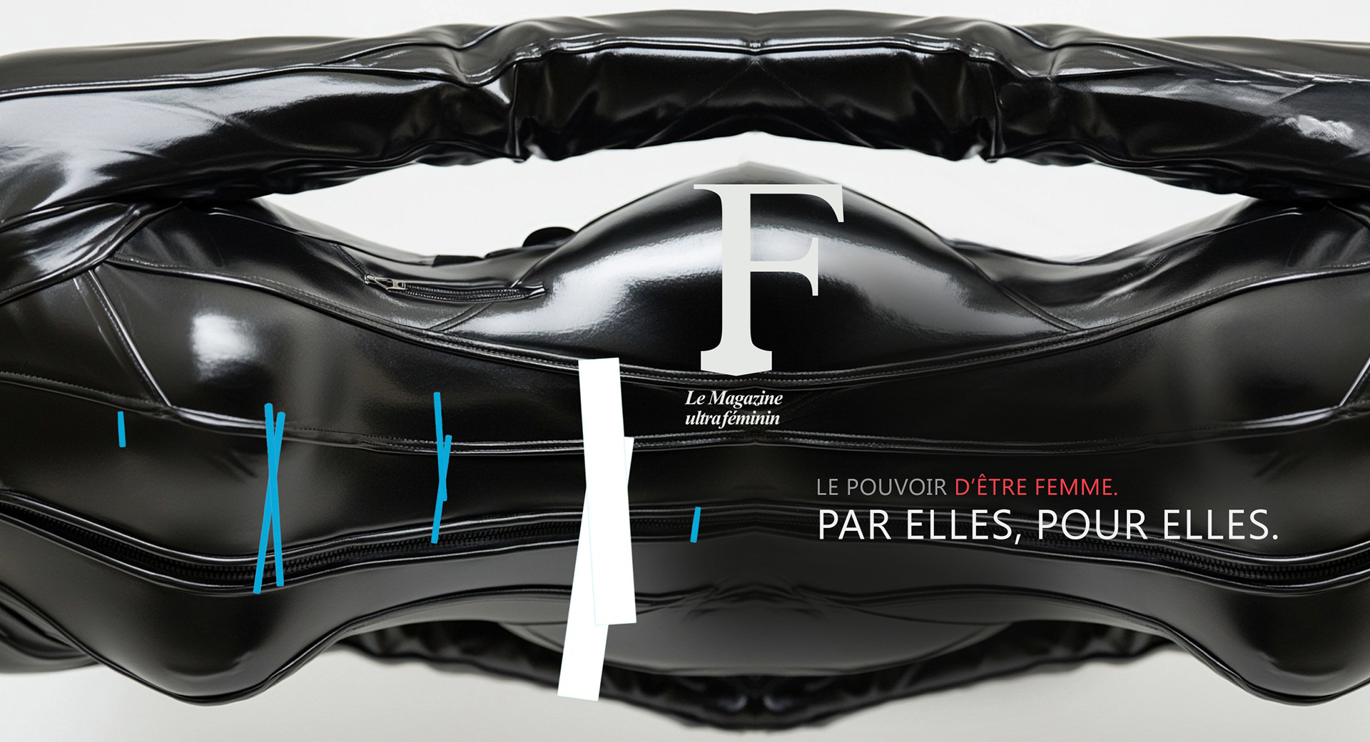
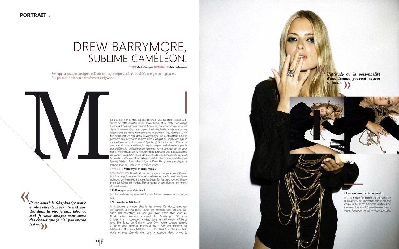
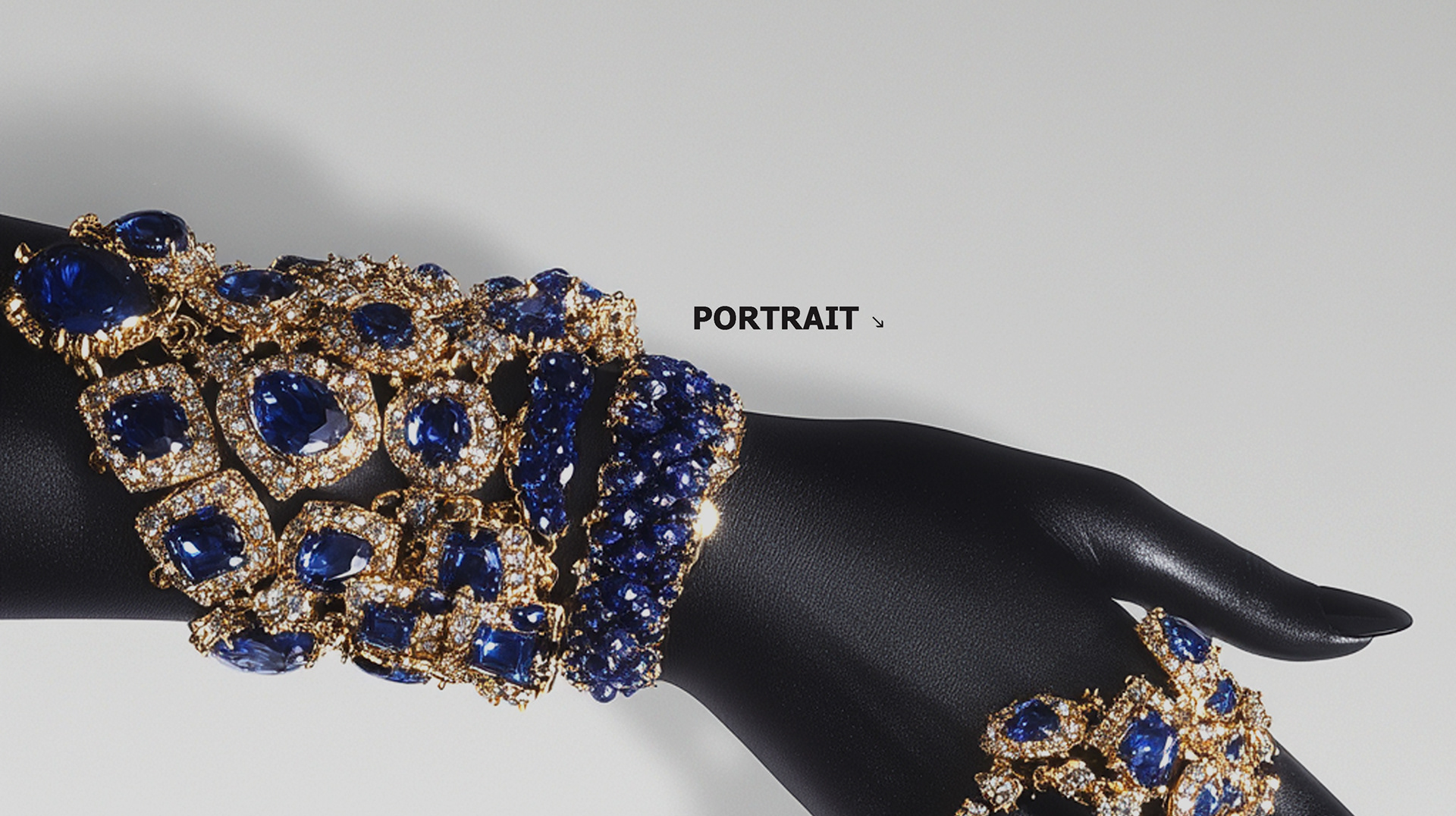
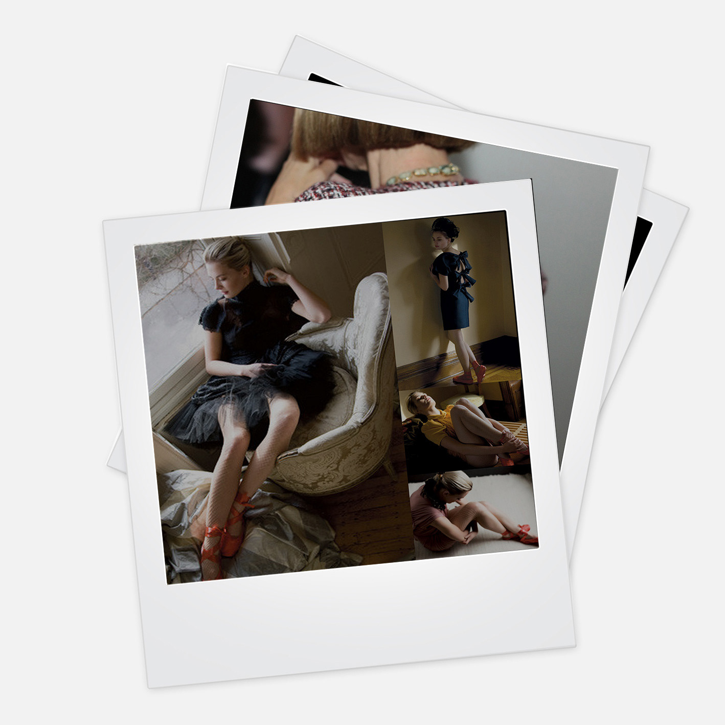
I designed the logo, established the grid logic and typographic voice, and built production-ready templates across features, interviews, and product stories, creating a magazine that feels considered at every page turn, regardless of production pace.
I designed the logo, established the grid logic and typographic voice, and built production-ready templates across features, interviews, and product stories, creating a magazine that feels considered at every page turn, regardless of production pace.
CLIENT ▸ F Mag, Le Magazine Ultrafeminin, Aix-en-Provence, France
ROLE ▸ Art Director Freelancer for Purjus Communications
SCOPE ▸ Magazine Layout Design, Logo Design, Visual Identity, Print Design
ROLE ▸ Art Director Freelancer for Purjus Communications
SCOPE ▸ Magazine Layout Design, Logo Design, Visual Identity, Print Design
The Challenge
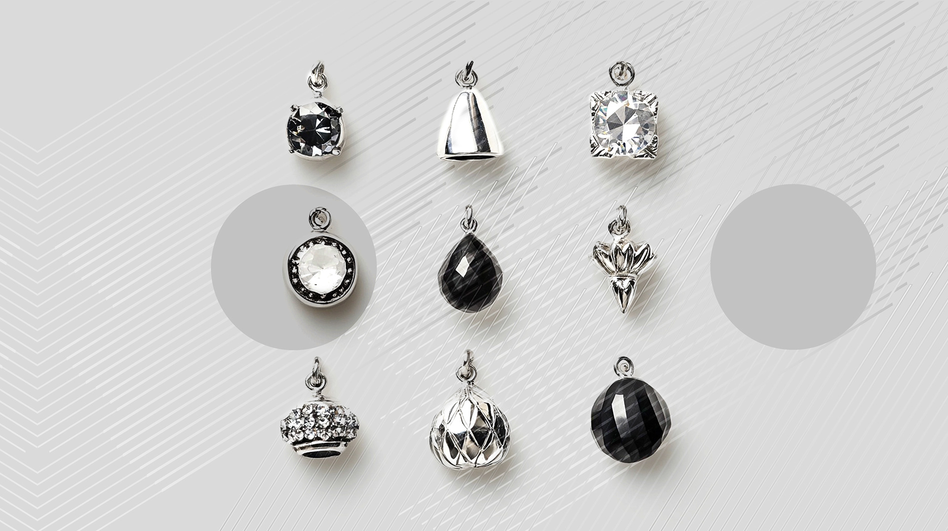
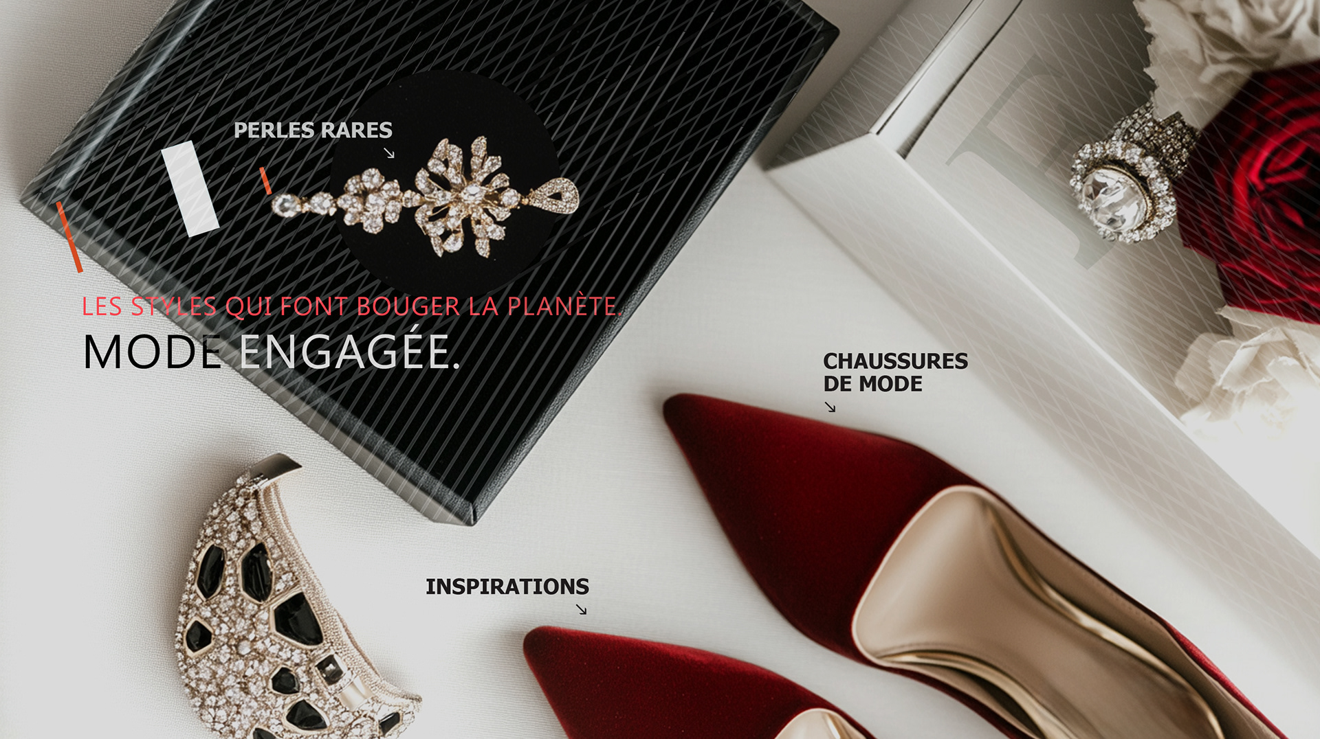
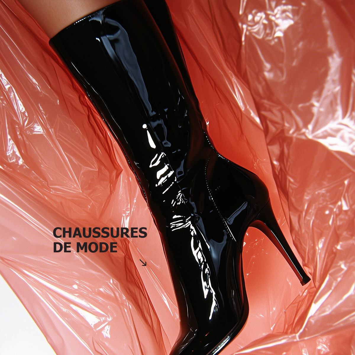
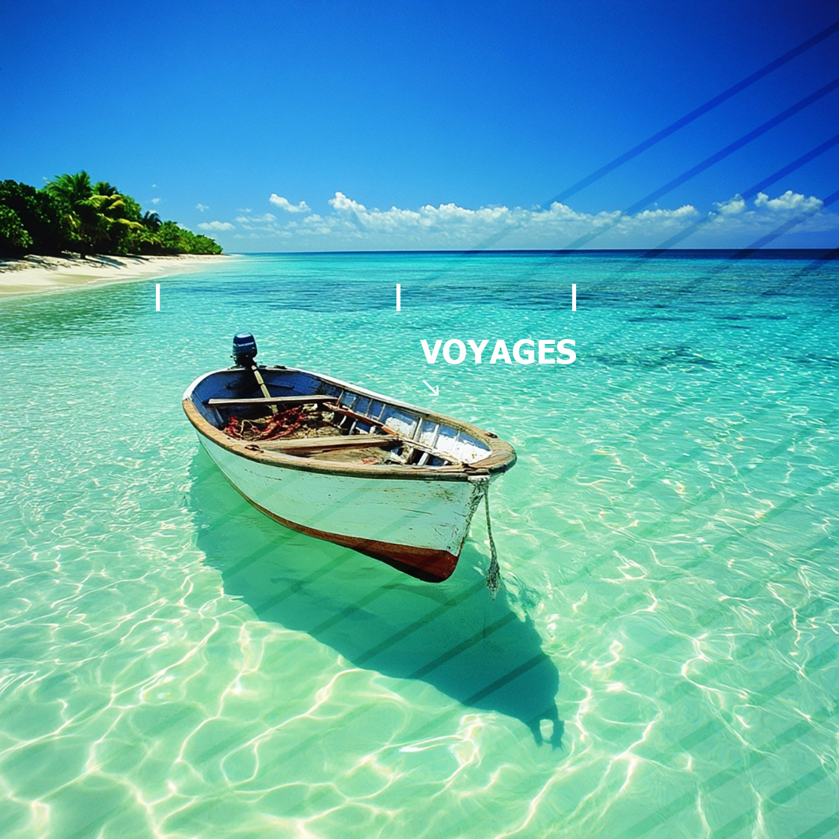
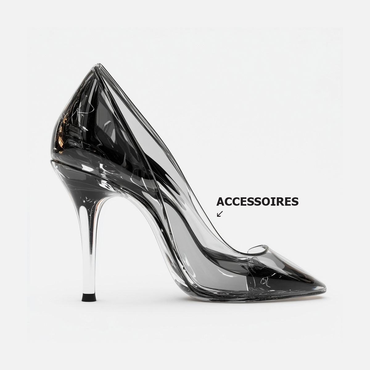
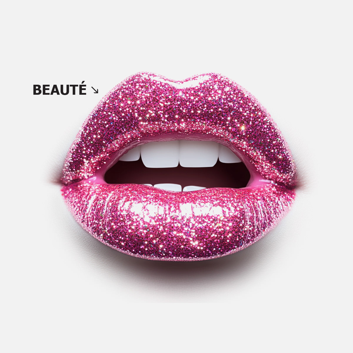
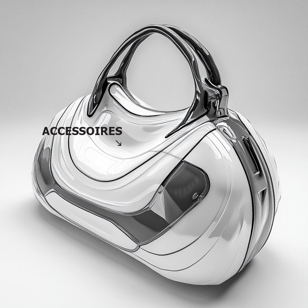
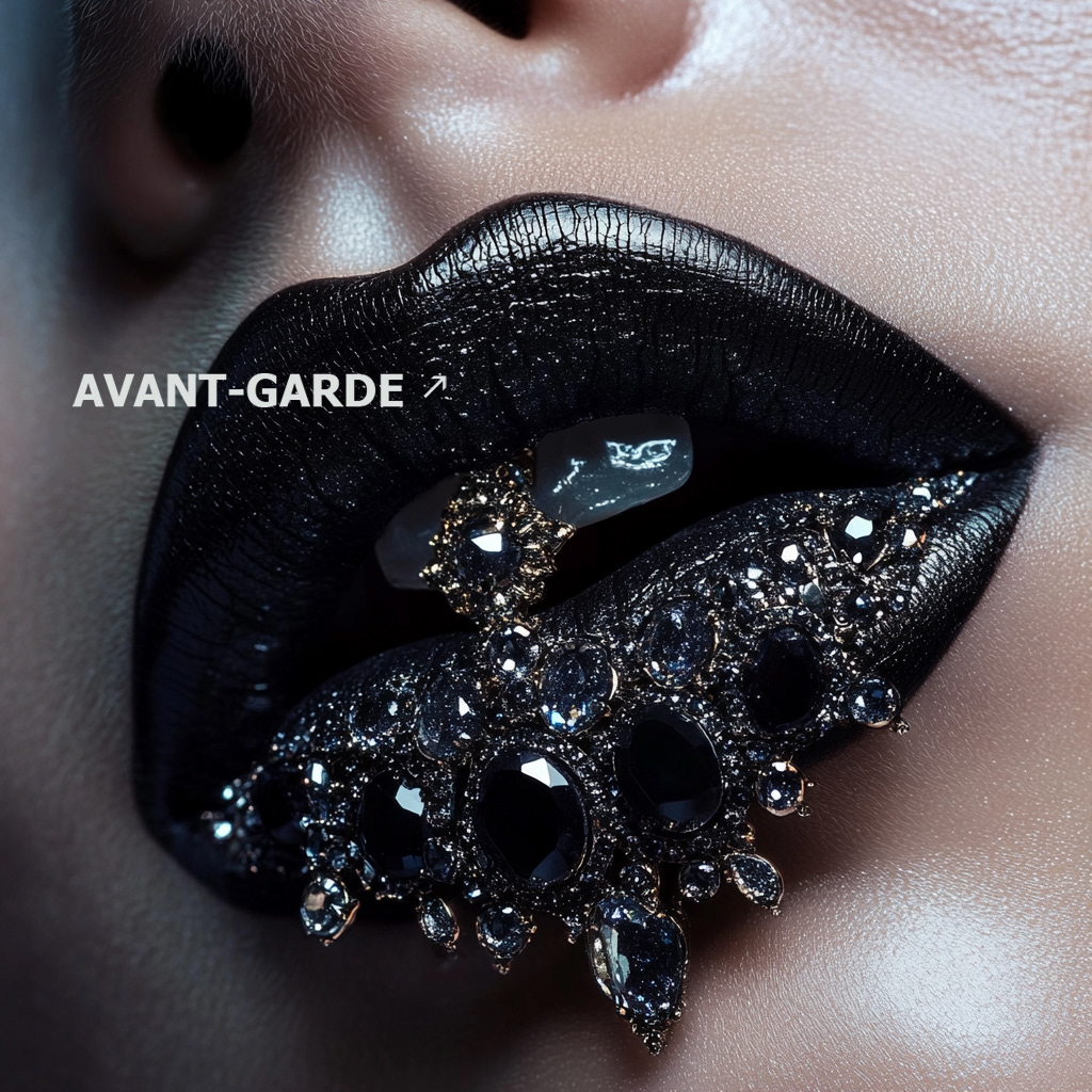
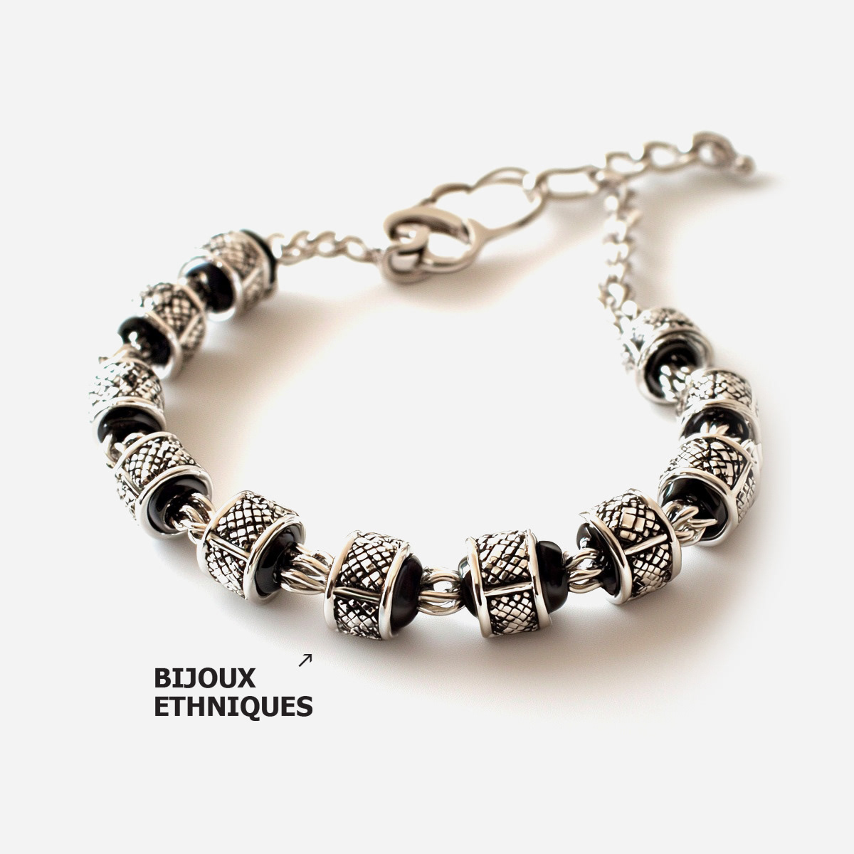
Build a magazine layout language that feels premium and contemporary
Maintain consistency across recurring sections without visual monotony
Design for speed, flexibility, and production reliability
Build a magazine layout language that feels premium and contemporary
Maintain consistency across recurring sections without visual monotony
Design for speed, flexibility, and production reliability
Strategic Approach
System-first editorial design
Clear hierarchy to support fast reading and strong storytelling
Rules for rhythm, spacing, and variation to keep pages dynamic
System-first editorial design
Clear hierarchy to support fast reading and strong storytelling
Rules for rhythm, spacing, and variation to keep pages dynamic
Creative Solution
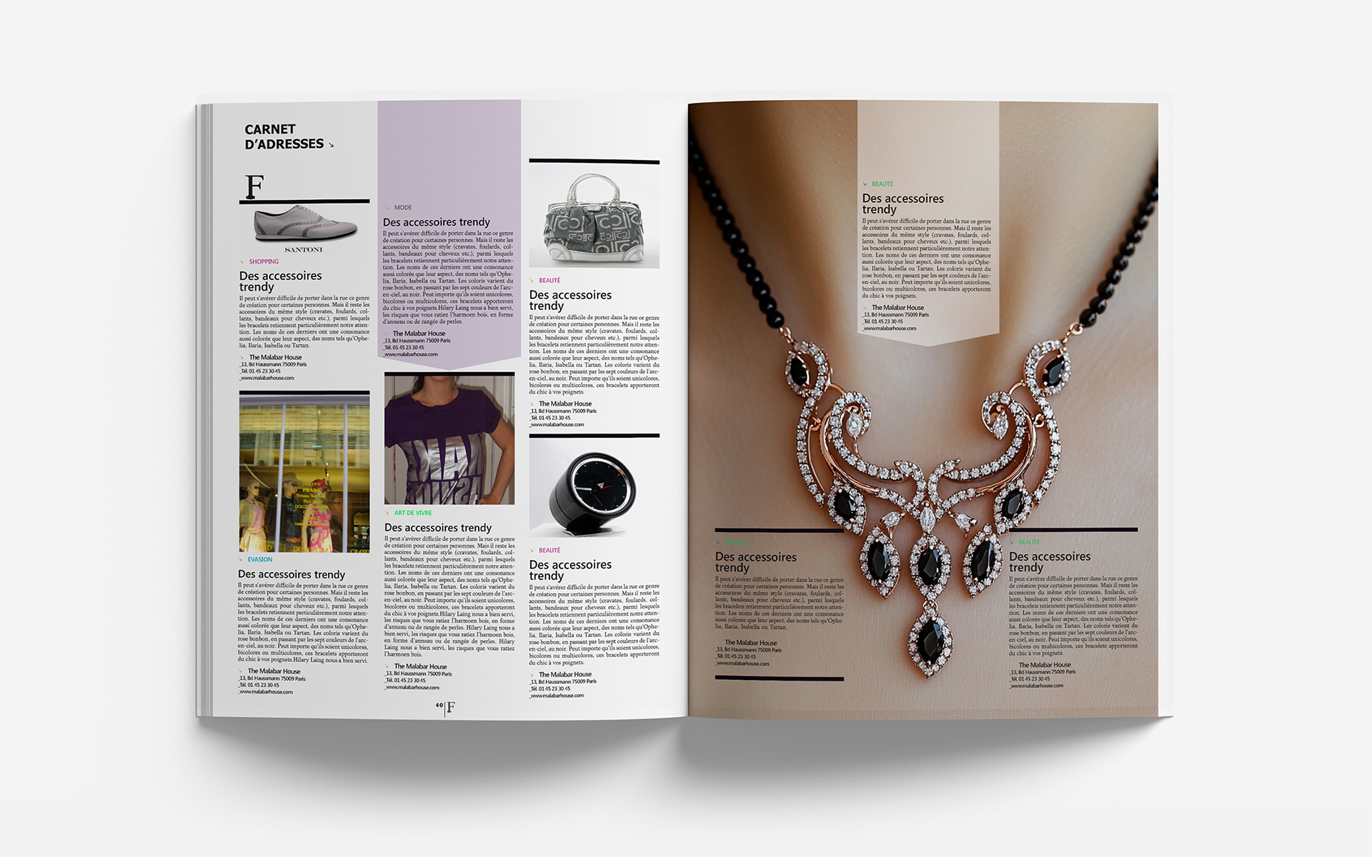
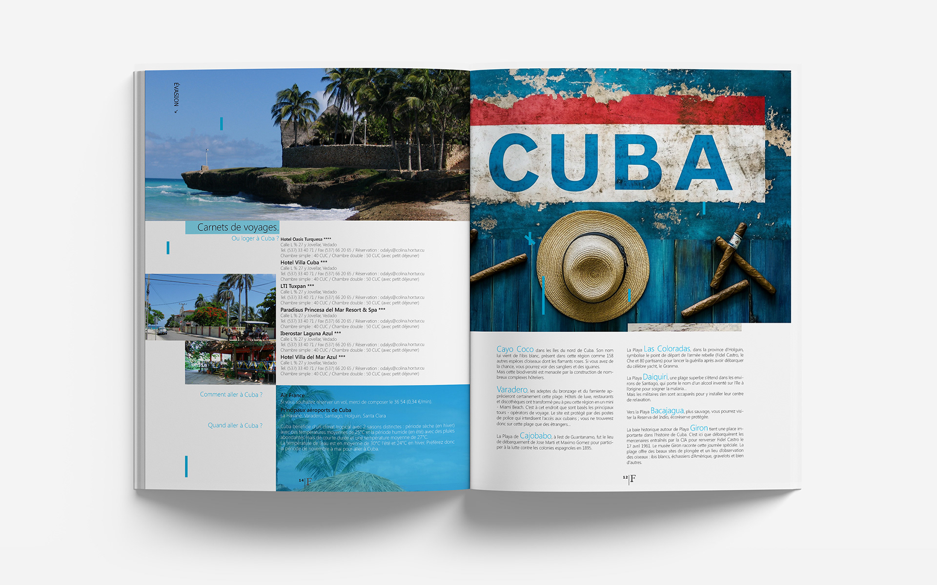
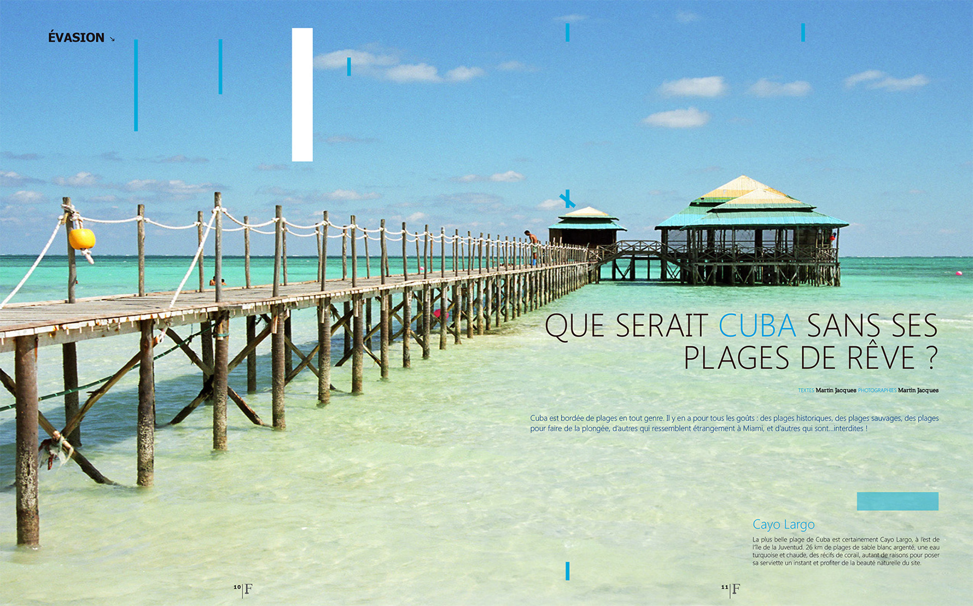
A modular grid framework built for features, interviews, and product stories
A typographic voice that balances elegance with readability
A layout approach that treats pacing as a design tool, structure with controlled surprise
A modular grid framework built for features, interviews, and product stories
A typographic voice that balances elegance with readability
A layout approach that treats pacing as a design tool, structure with controlled surprise
Scope & System
Grid and column logic across formats
Typography scale, styles, and usage principles
Template architecture for recurring sections and feature layouts
Grid and column logic across formats
Typography scale, styles, and usage principles
Template architecture for recurring sections and feature layouts
Deliverables
+ Editorial design system and templates
+ Print-ready layouts across key sections
+ Production files and publishing-ready assets
+ Editorial design system and templates
+ Print-ready layouts across key sections
+ Production files and publishing-ready assets
Role & Leadership
Brand Design Lead
Led the editorial design direction, defining layout rules and templates while guiding execution through production for consistent, publication-ready output.
Brand Design Lead
Led the editorial design direction, defining layout rules and templates while guiding execution through production for consistent, publication-ready output.

Why This Work Matters
Editorial design is where design systems meet the pressure of storytelling.
This work demonstrates how a disciplined layout framework can accelerate publishing while preserving craft, voice, and visual consistency across the entire magazine.
Editorial design is where design systems meet the pressure of storytelling.
This work demonstrates how a disciplined layout framework can accelerate publishing while preserving craft, voice, and visual consistency across the entire magazine.
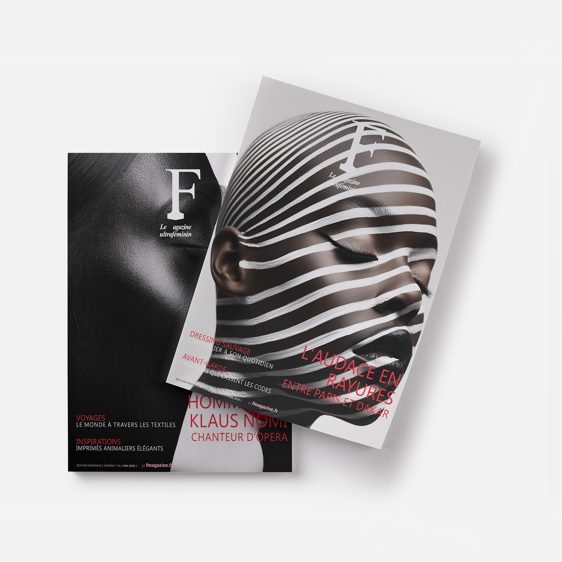
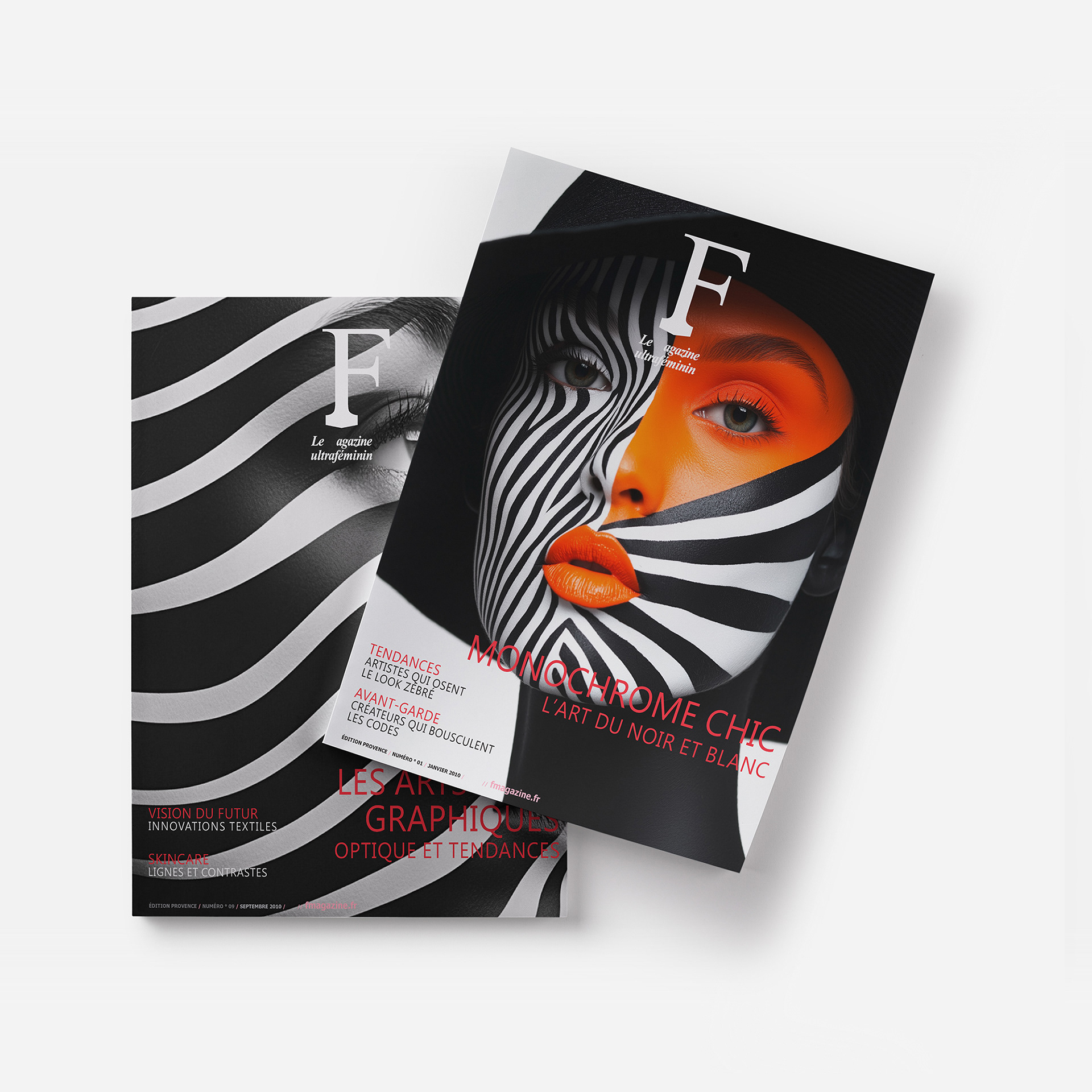
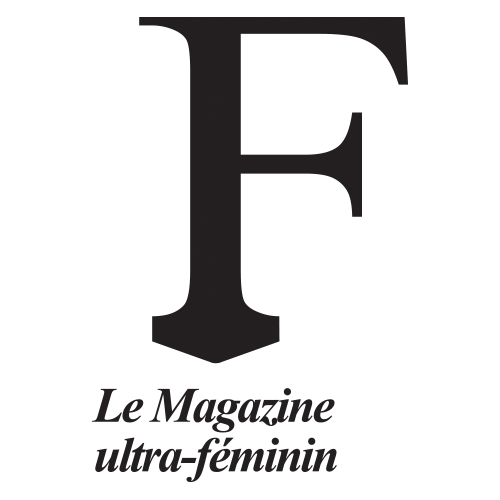
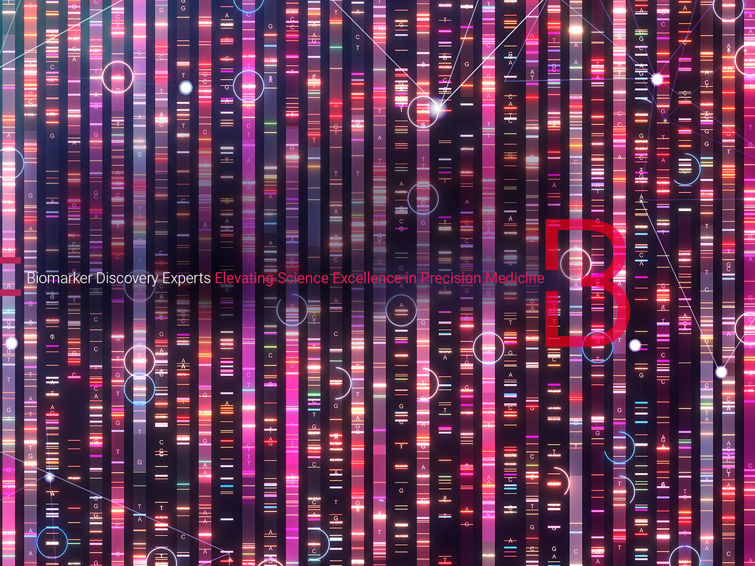
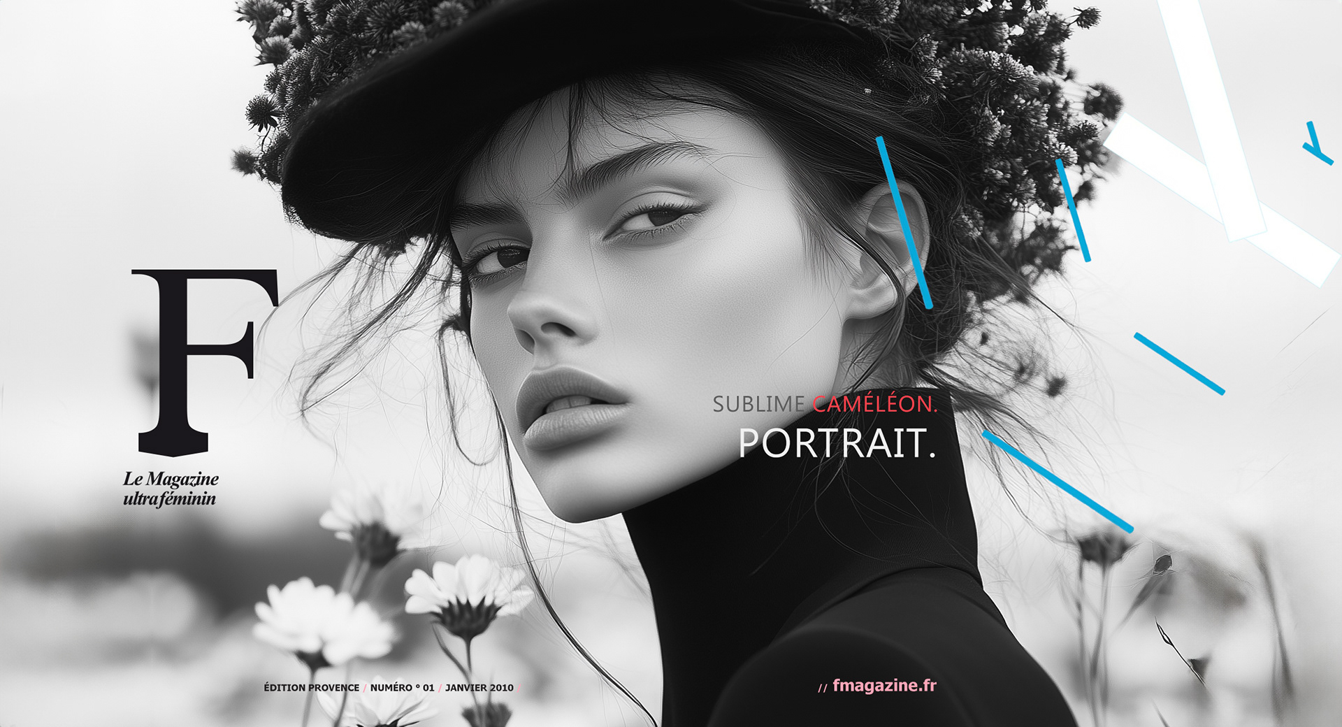
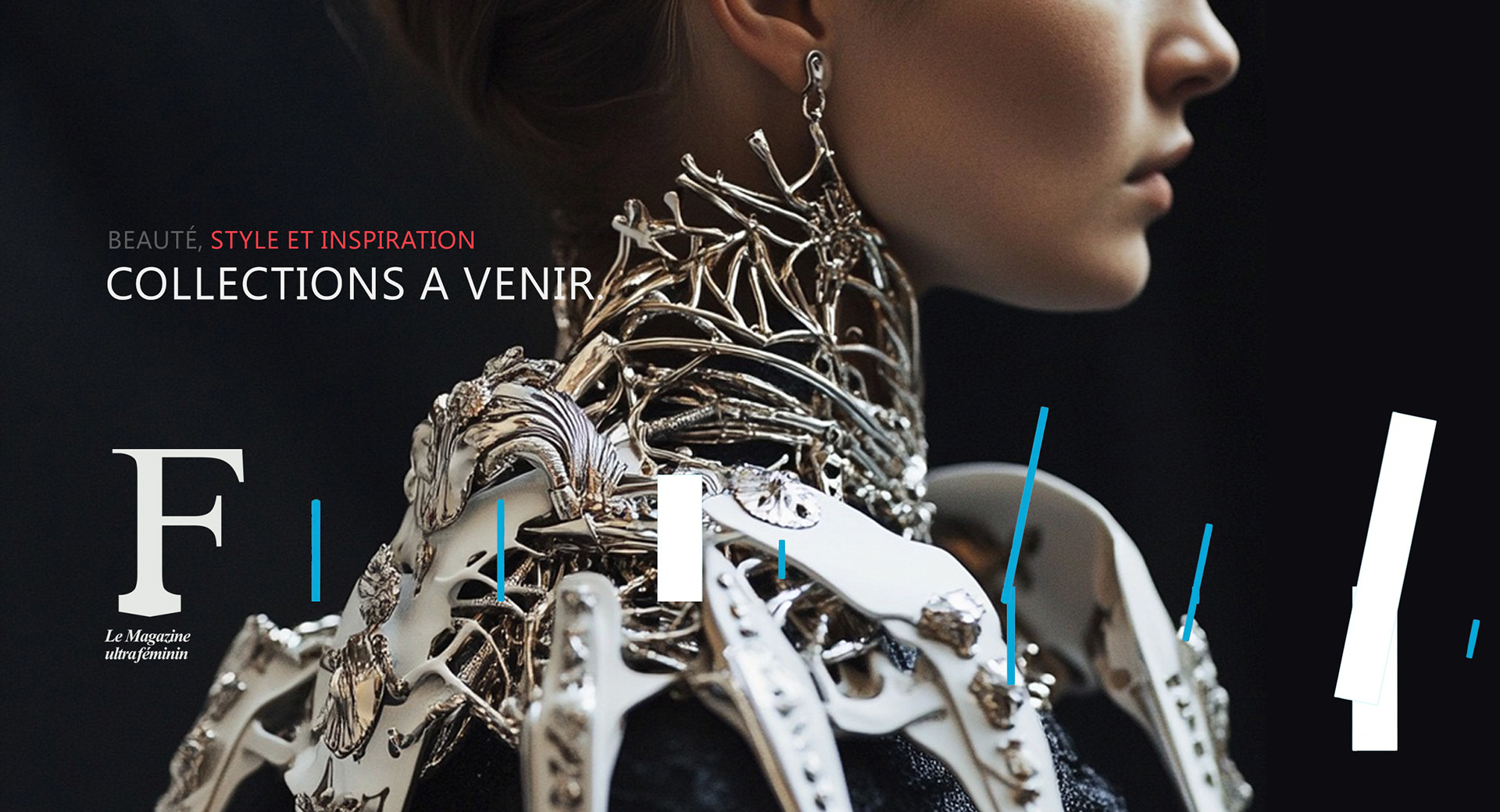
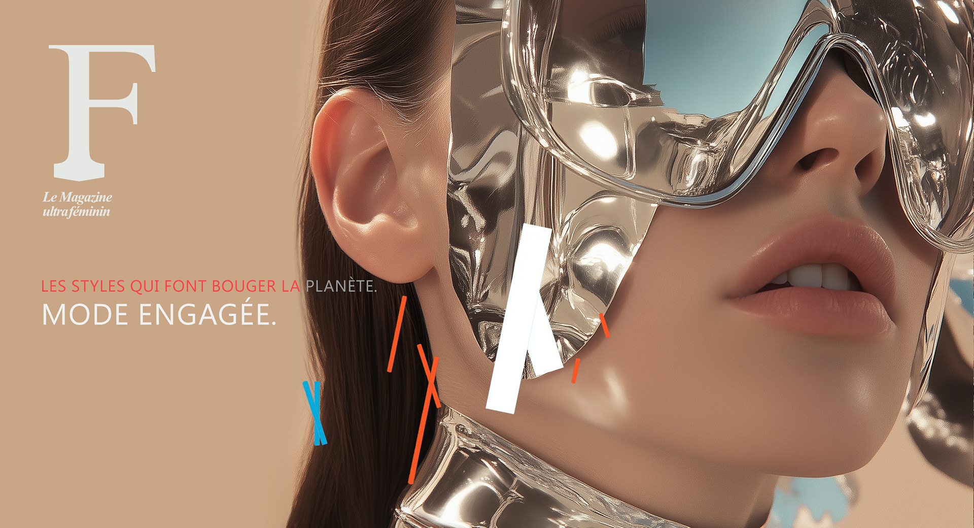
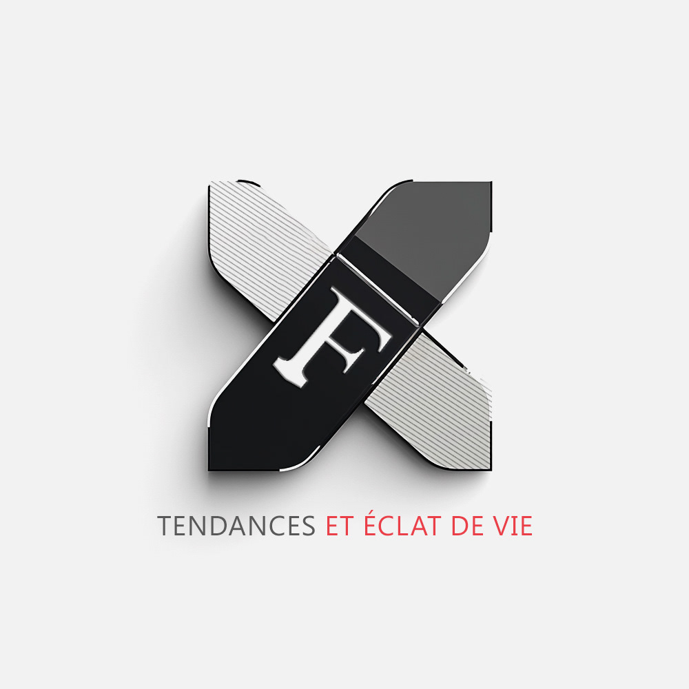
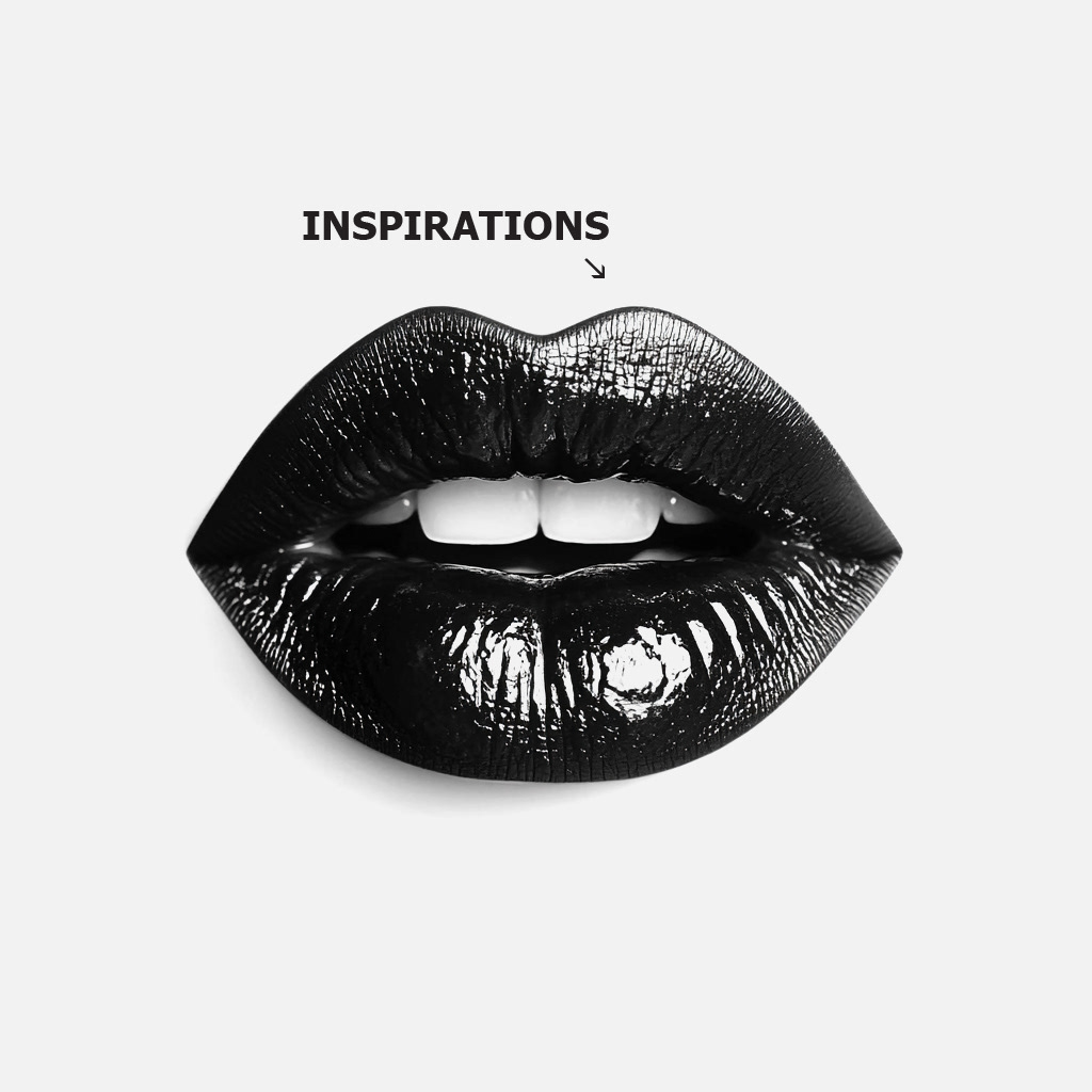
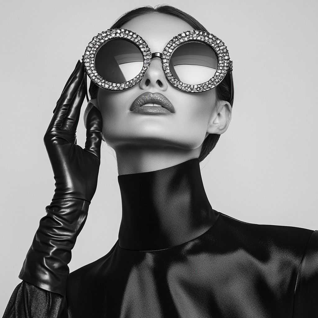
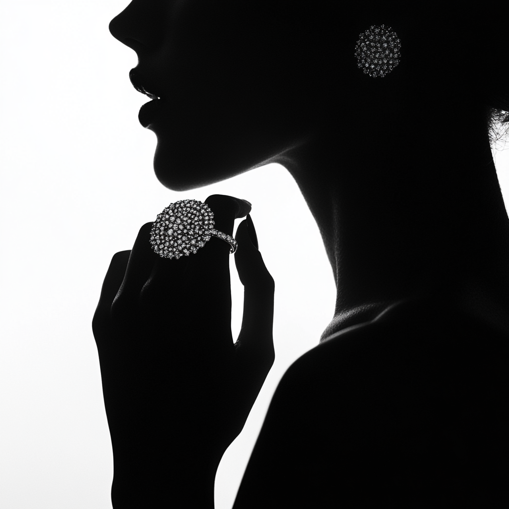
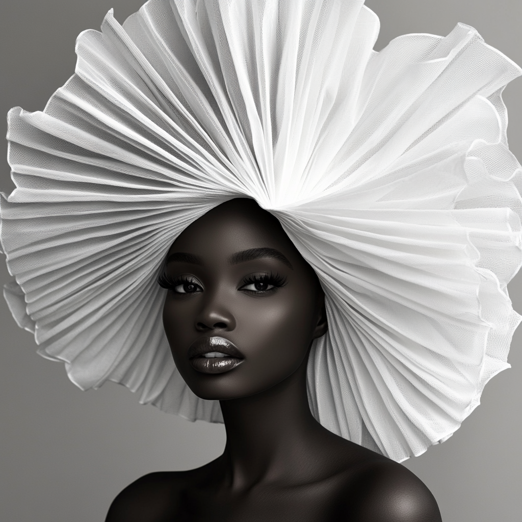
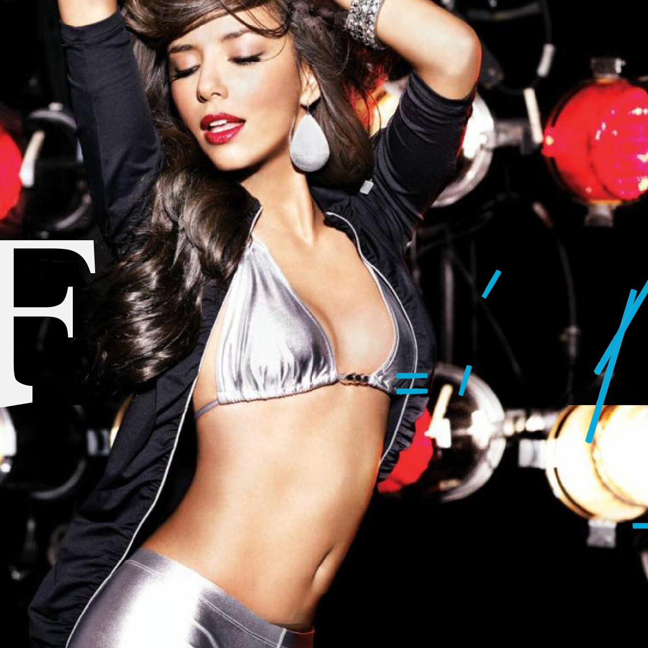
Created a distinctive logo that positioned F-Mag as a contemporary,
digitally fluent cultural publication.
digitally fluent cultural publication.
Looking to launch or reinvent
your publication with a strong,
cohesive brand identity?
your publication with a strong,
cohesive brand identity?