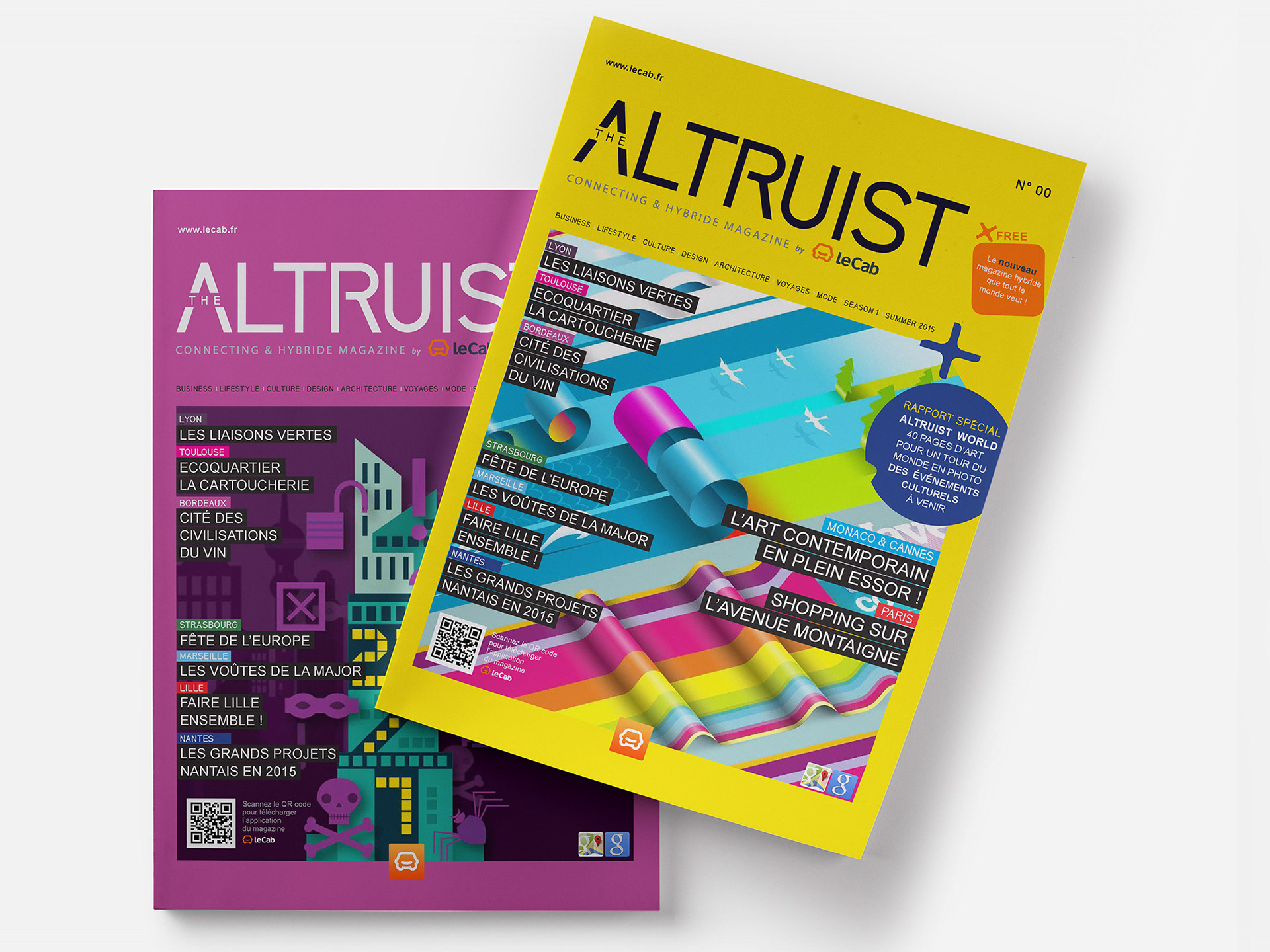
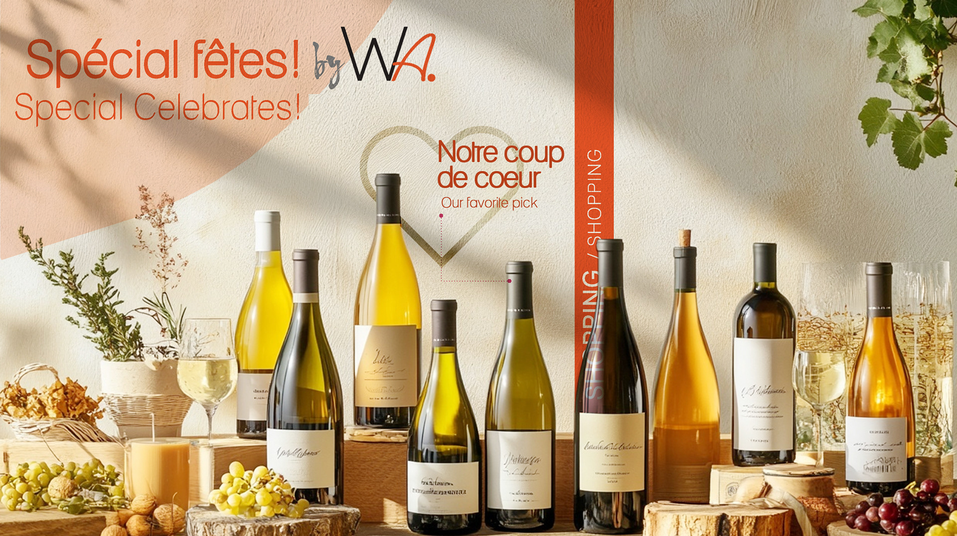
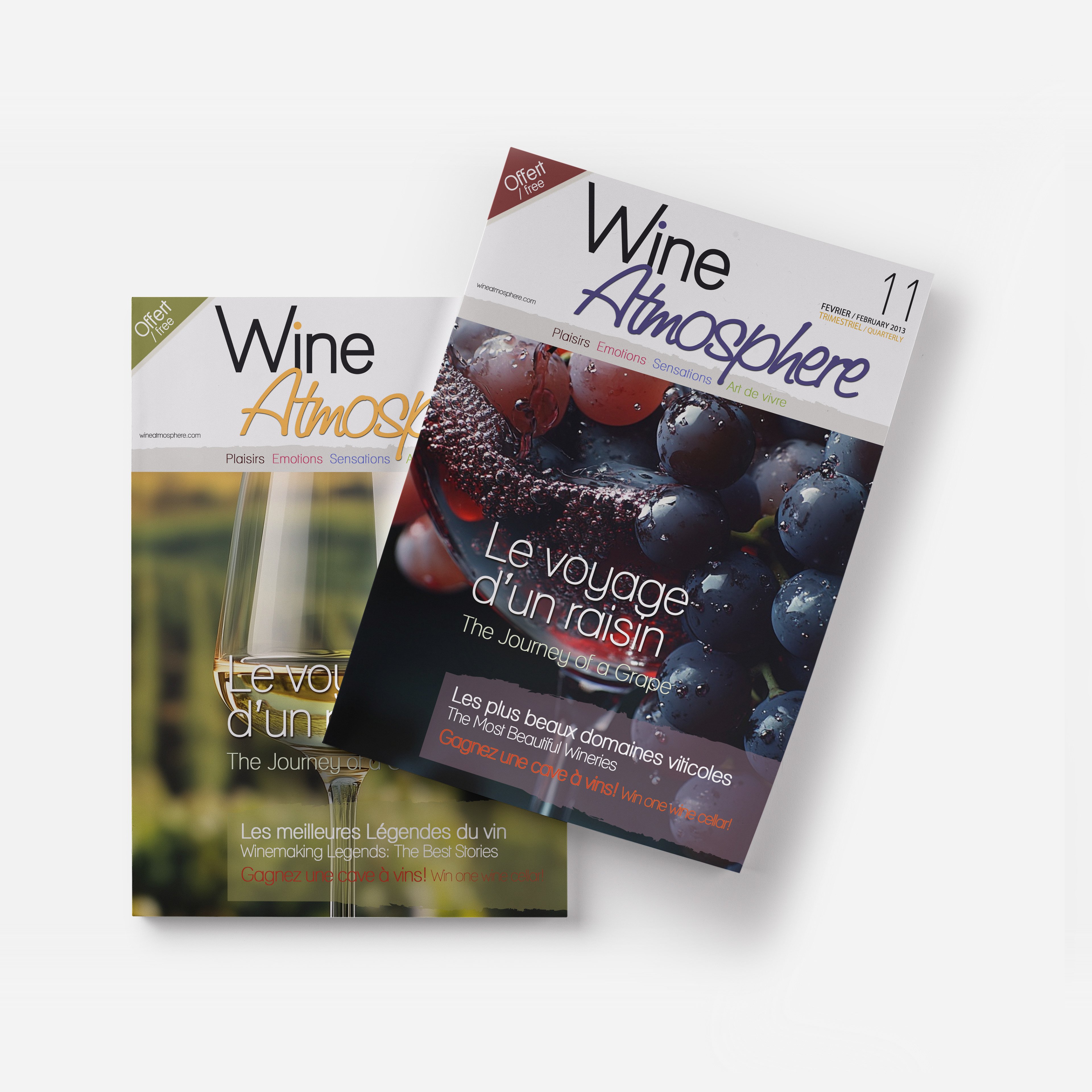
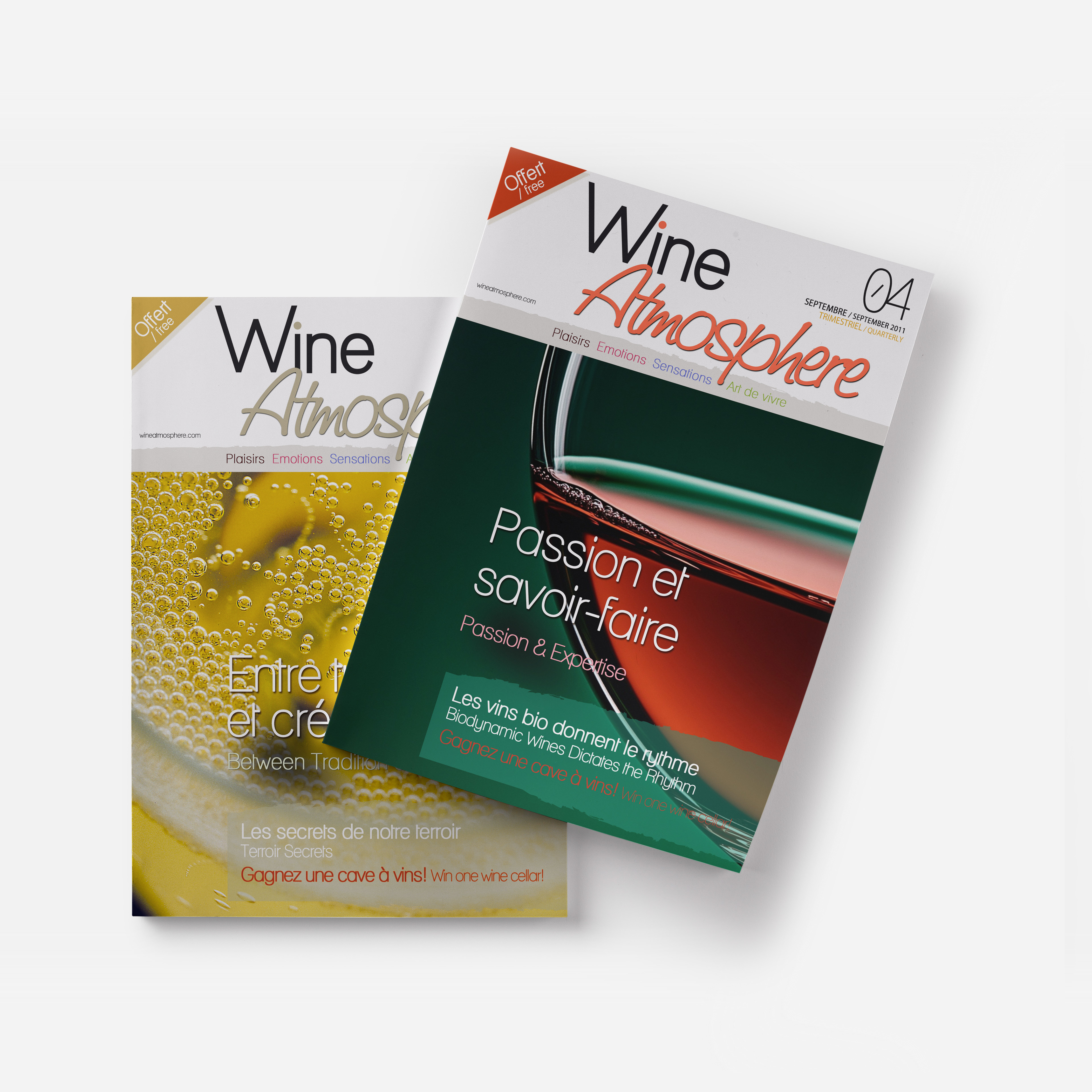
A bilingual wine and lifestyle publication needed a visual system that could hold the sensory world of wine across two languages and multiple formats without becoming decorative.
I built the full editorial identity, masthead, typographic hierarchy, and layout logic, designed to work simultaneously for English and French audiences at the same level of craft.
I built the full editorial identity, masthead, typographic hierarchy, and layout logic, designed to work simultaneously for English and French audiences at the same level of craft.
CLIENT ▸ Wine Atmosphere Magazine, Aix-en-Provence, France
ROLE ▸ Art Director Freelance
SCOPE ▸ Logo Design, Visual Identity, Print
ROLE ▸ Art Director Freelance
SCOPE ▸ Logo Design, Visual Identity, Print
The Challenge
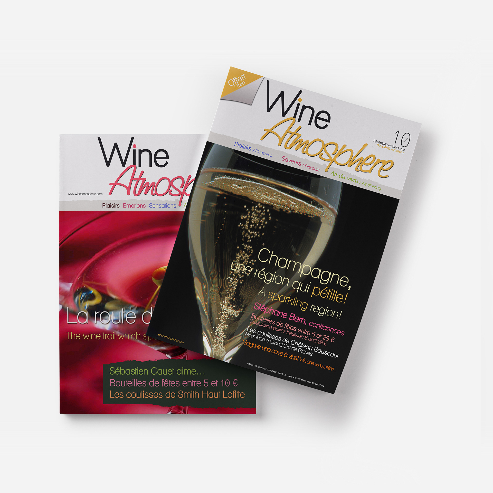
Create a distinctive identity for a new bilingual wine and lifestyle magazine
Balance editorial elegance with clarity across long-form content
Establish a flexible layout system supporting features and recurring sections
Create a distinctive identity for a new bilingual wine and lifestyle magazine
Balance editorial elegance with clarity across long-form content
Establish a flexible layout system supporting features and recurring sections
Strategic Approach
Position the magazine within contemporary wine and culture publishing
Use restrained design to convey premium editorial quality
Develop a system balancing consistency and visual rhythm
Position the magazine within contemporary wine and culture publishing
Use restrained design to convey premium editorial quality
Develop a system balancing consistency and visual rhythm
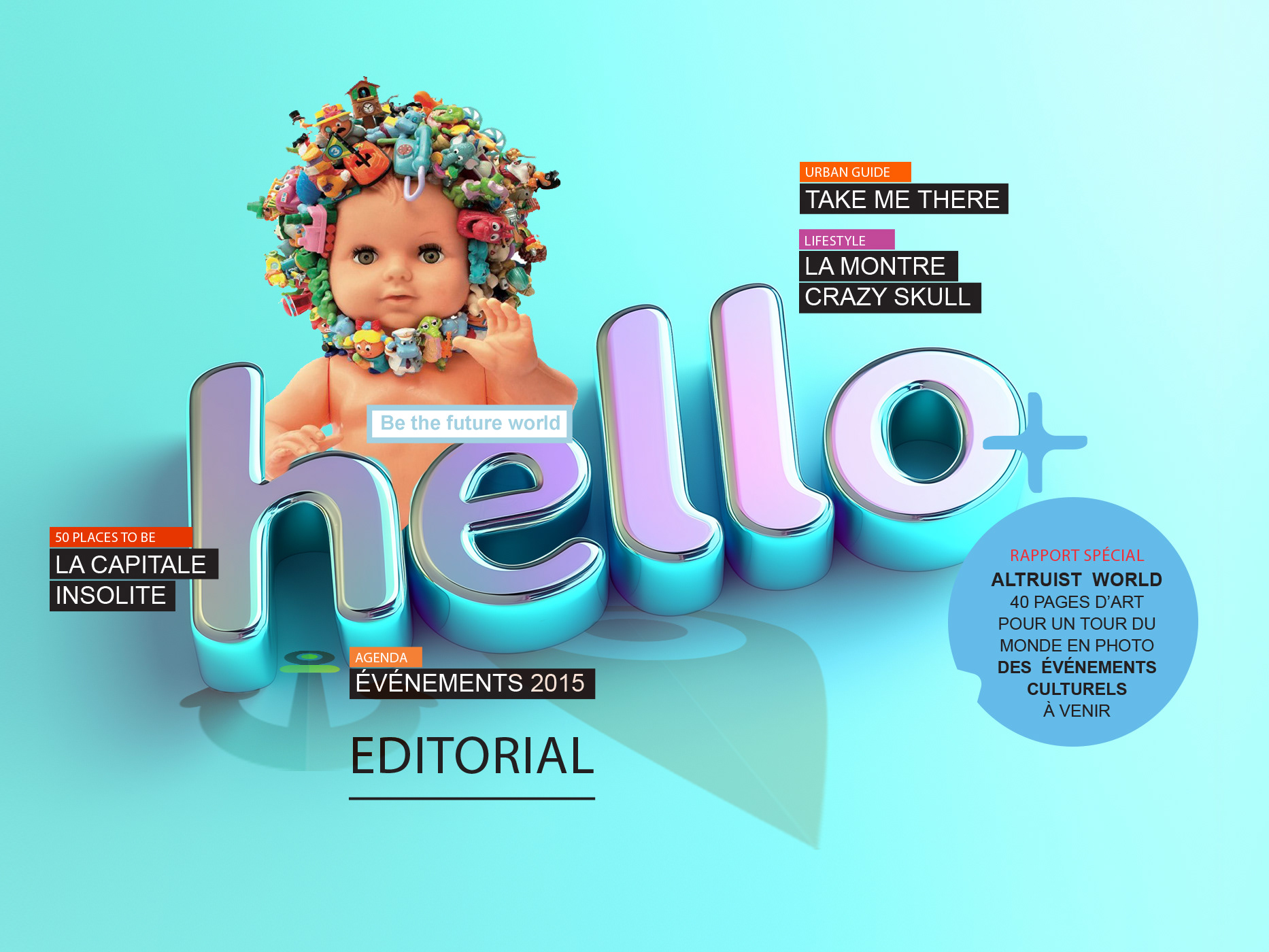
Creative Solution
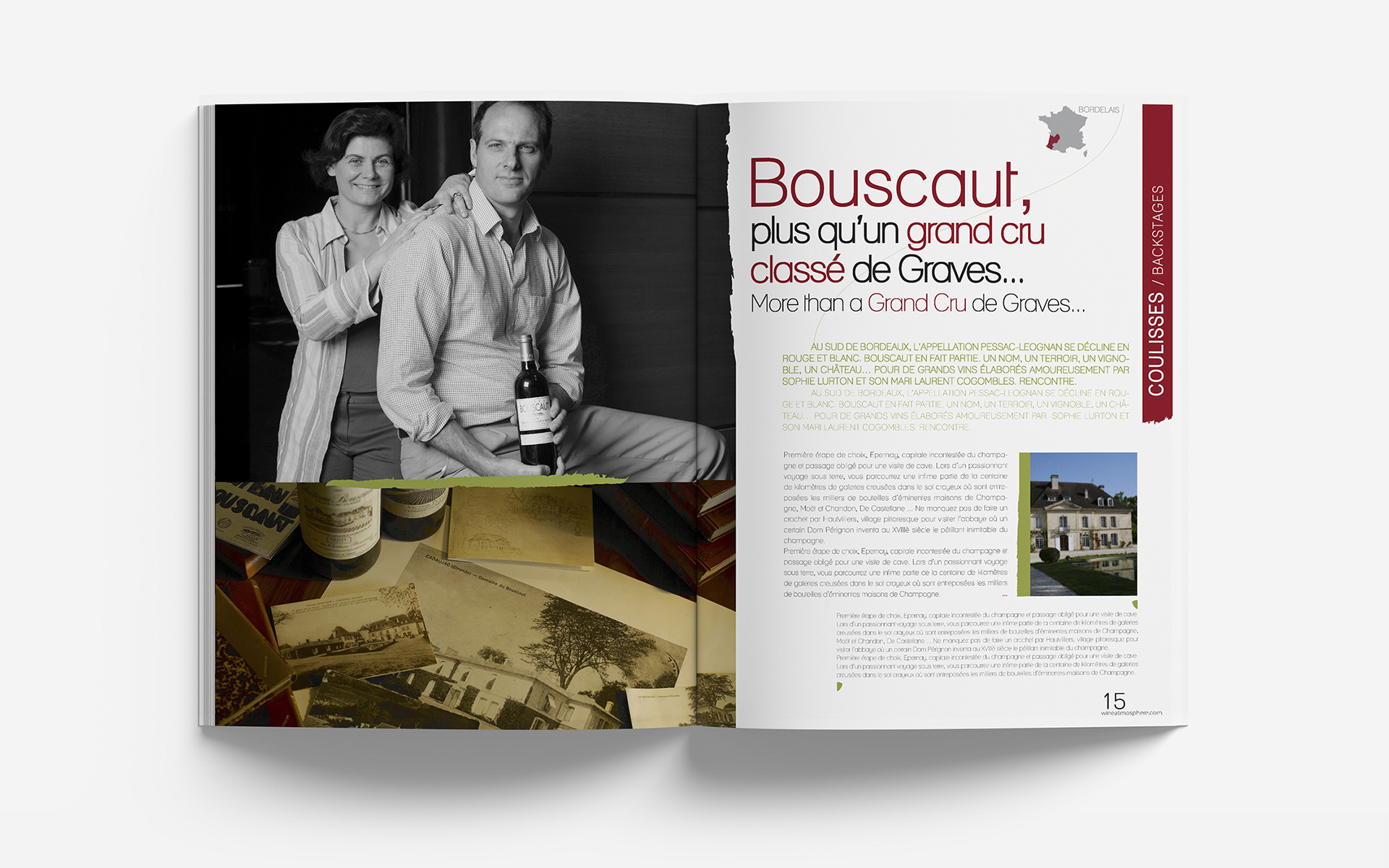
Designed a clean editorial identity centered on typography and composition
Created layouts emphasizing imagery, pacing, and white space
Built a visual structure supporting features, interviews, and editorial sections
Designed a clean editorial identity centered on typography and composition
Created layouts emphasizing imagery, pacing, and white space
Built a visual structure supporting features, interviews, and editorial sections
Scope & System
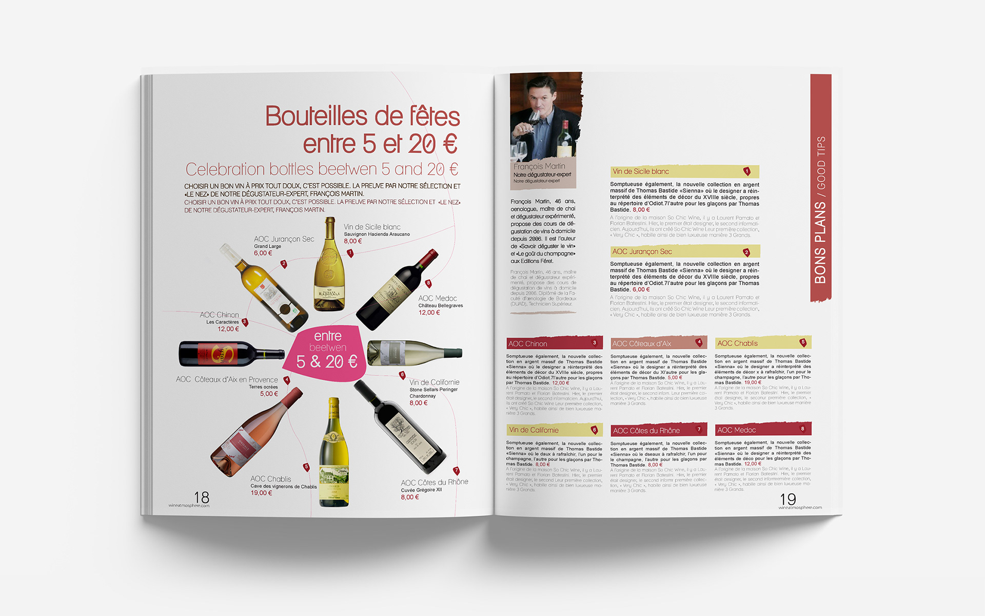
Modular grid for features and recurring sections
Defined typographic hierarchy and spacing rules
Layout templates supporting consistent publication design
Modular grid for features and recurring sections
Defined typographic hierarchy and spacing rules
Layout templates supporting consistent publication design
Deliverables
Editorial identity development
Magazine layout system and templates
Typographic hierarchy and art direction guidelines
Editorial identity development
Magazine layout system and templates
Typographic hierarchy and art direction guidelines
Role & Leadership
Brand Design Lead · Editorial Art Director
Led editorial concept, layout system design, typographic direction, and print production across the publication
Brand Design Lead · Editorial Art Director
Led editorial concept, layout system design, typographic direction, and print production across the publication
On The Work
Strong editorial design transforms content into experience, shaping how readers engage with culture, wine, and storytelling on every page.
Strong editorial design transforms content into experience, shaping how readers engage with culture, wine, and storytelling on every page.
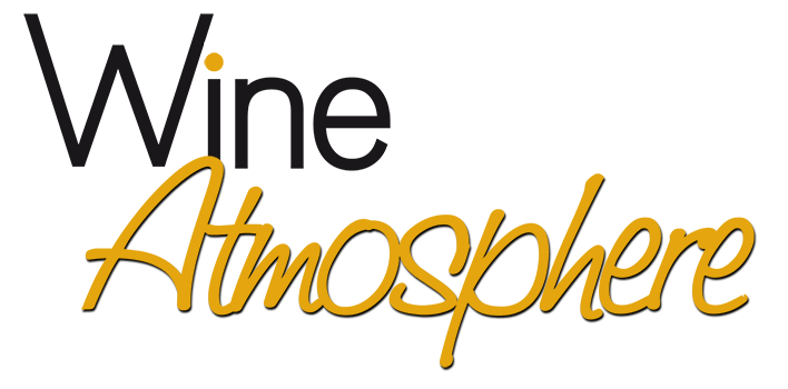
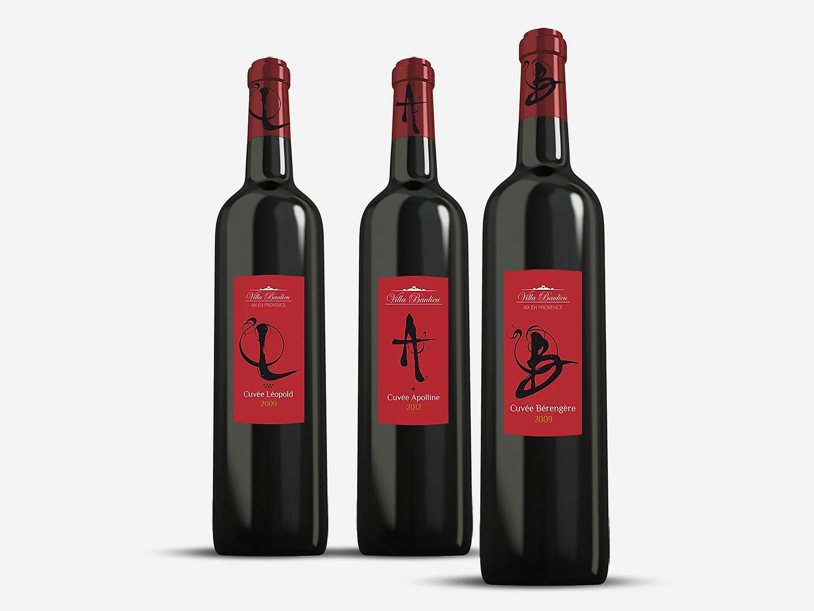
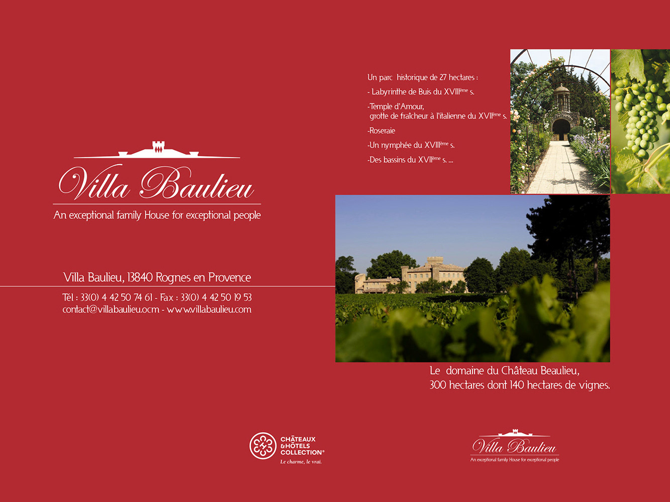
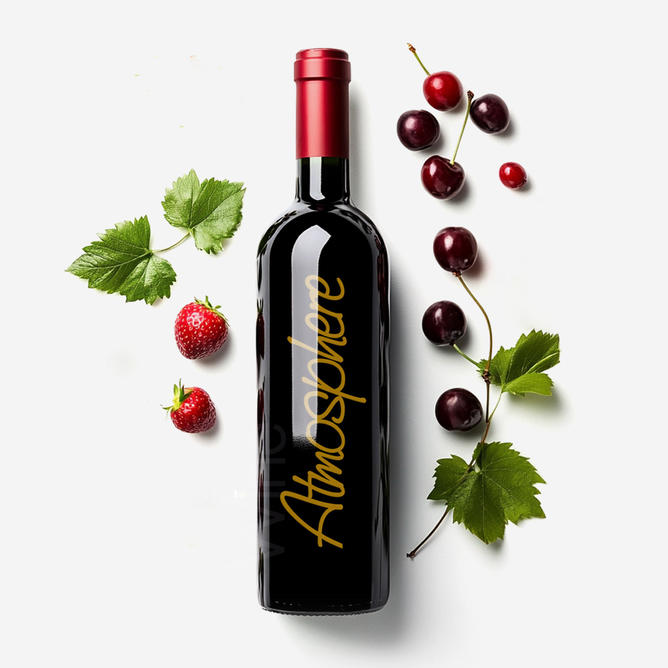
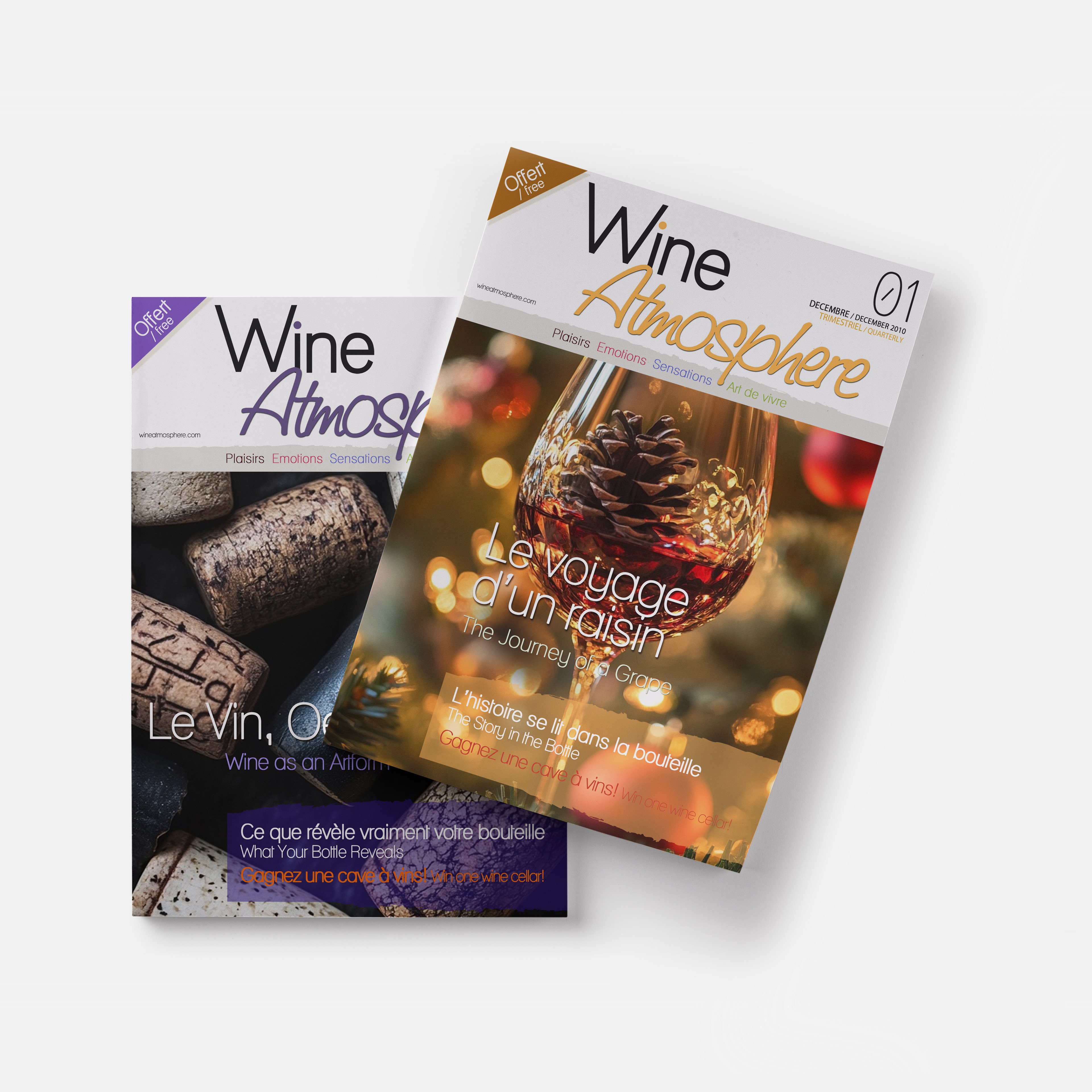
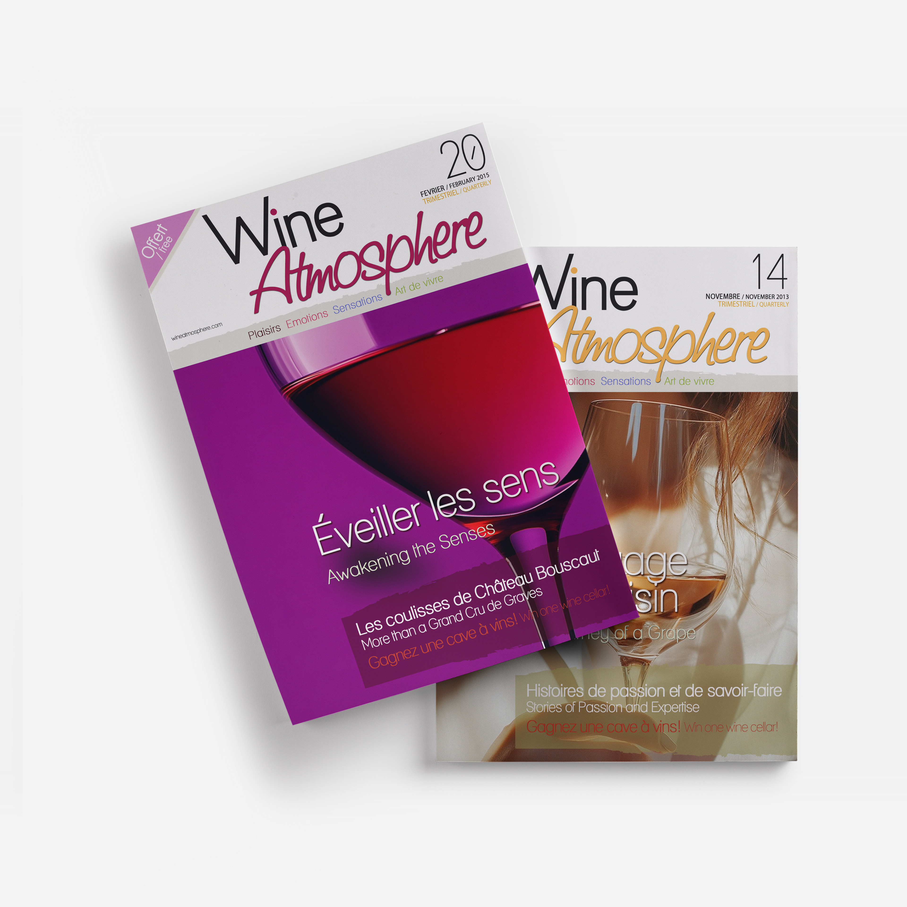
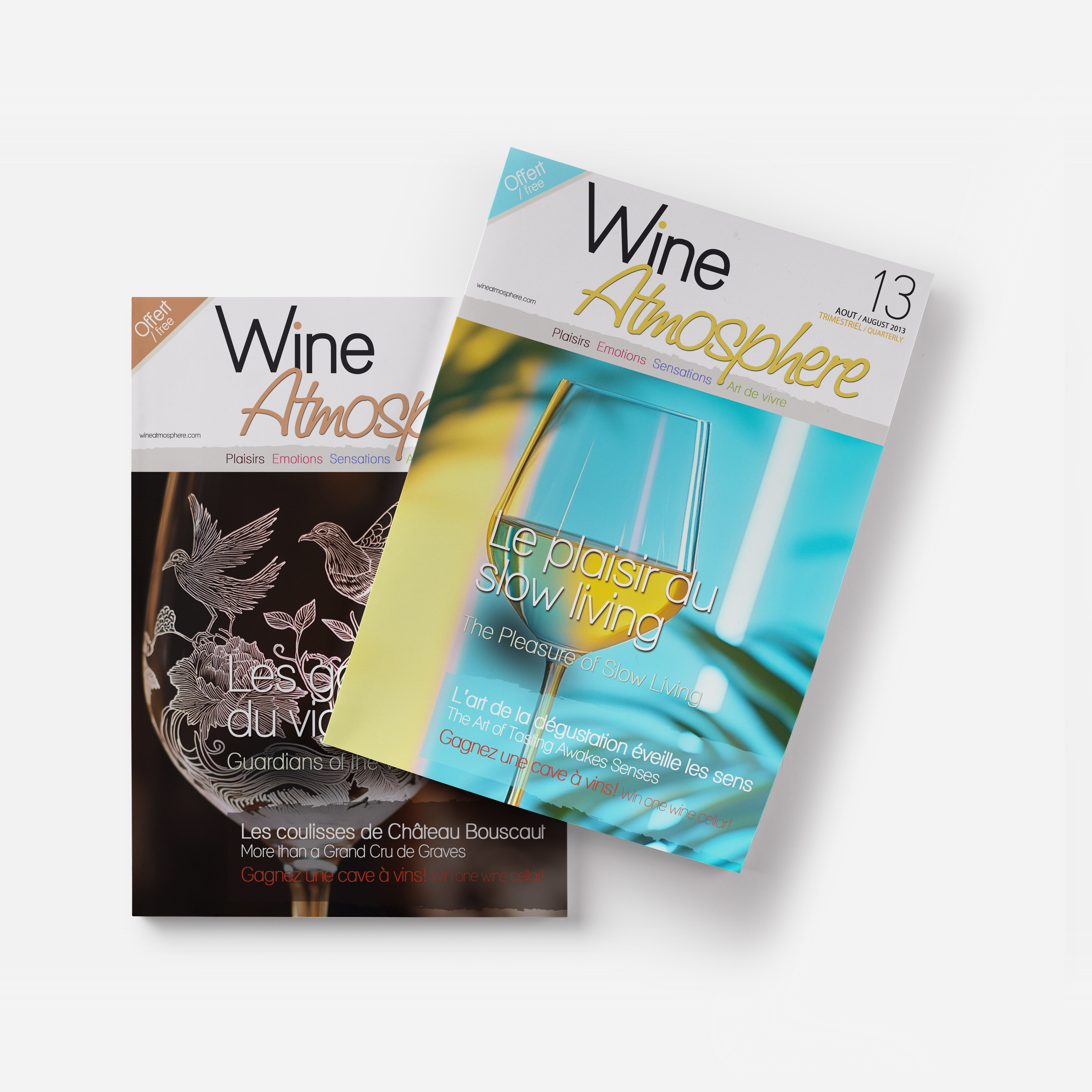
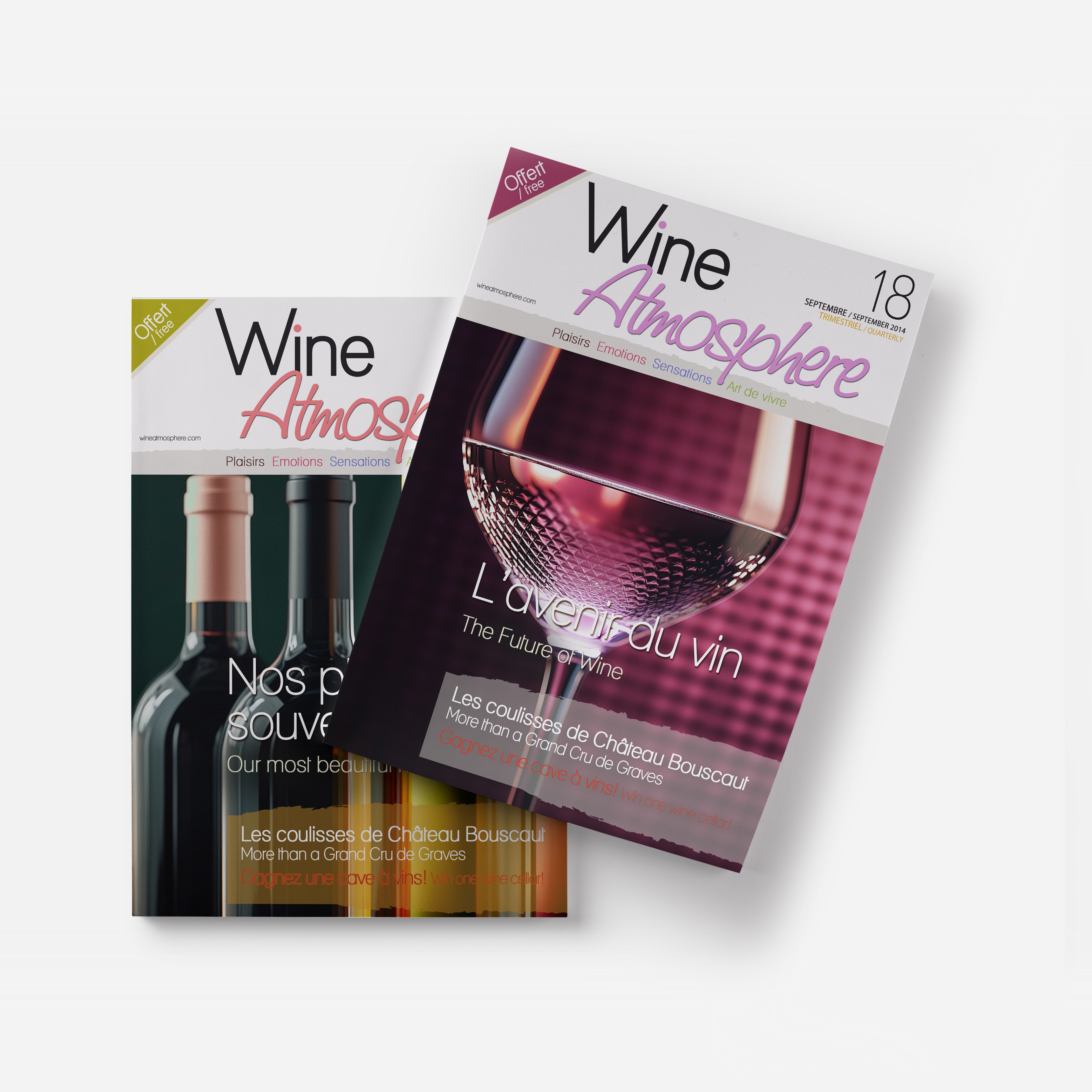
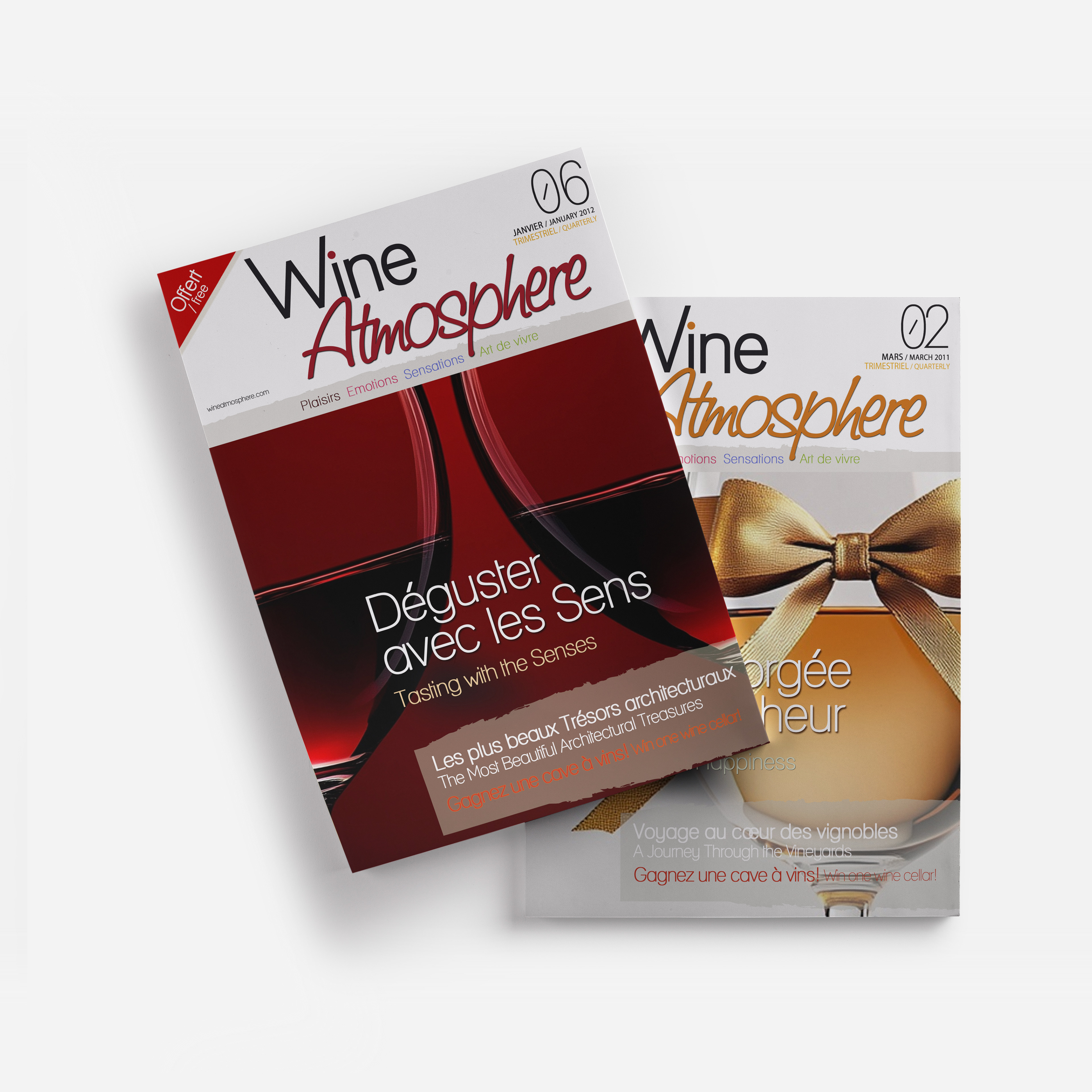
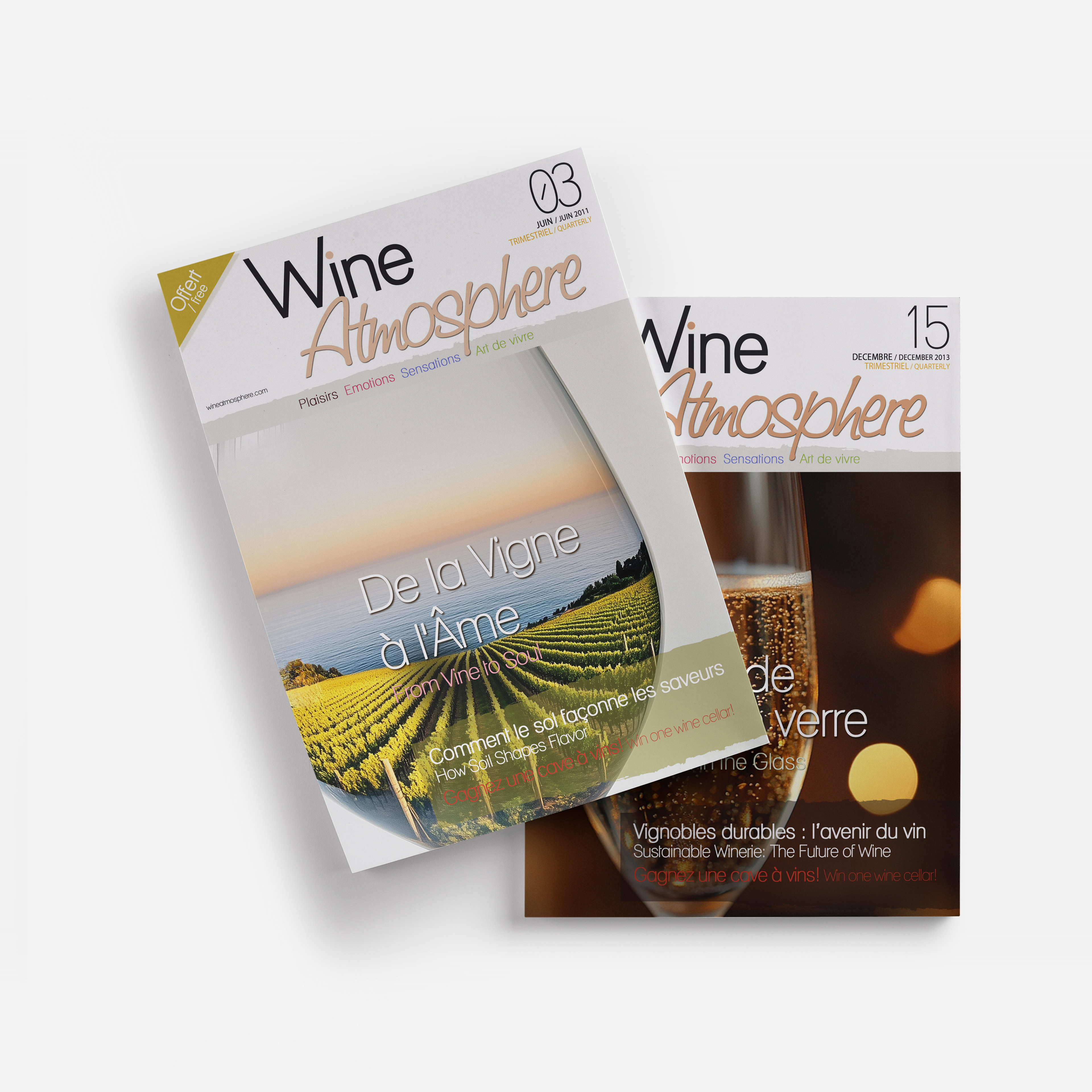
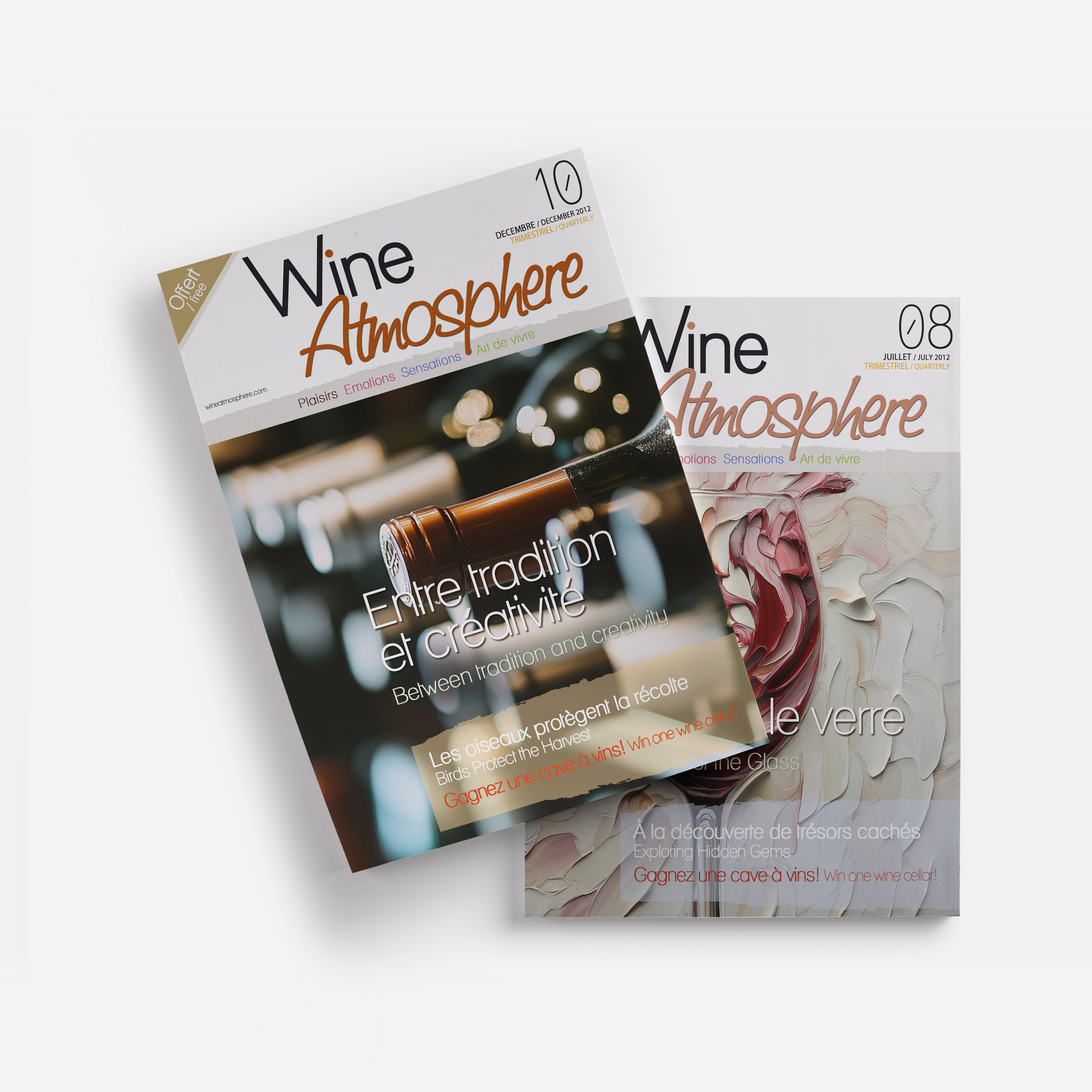
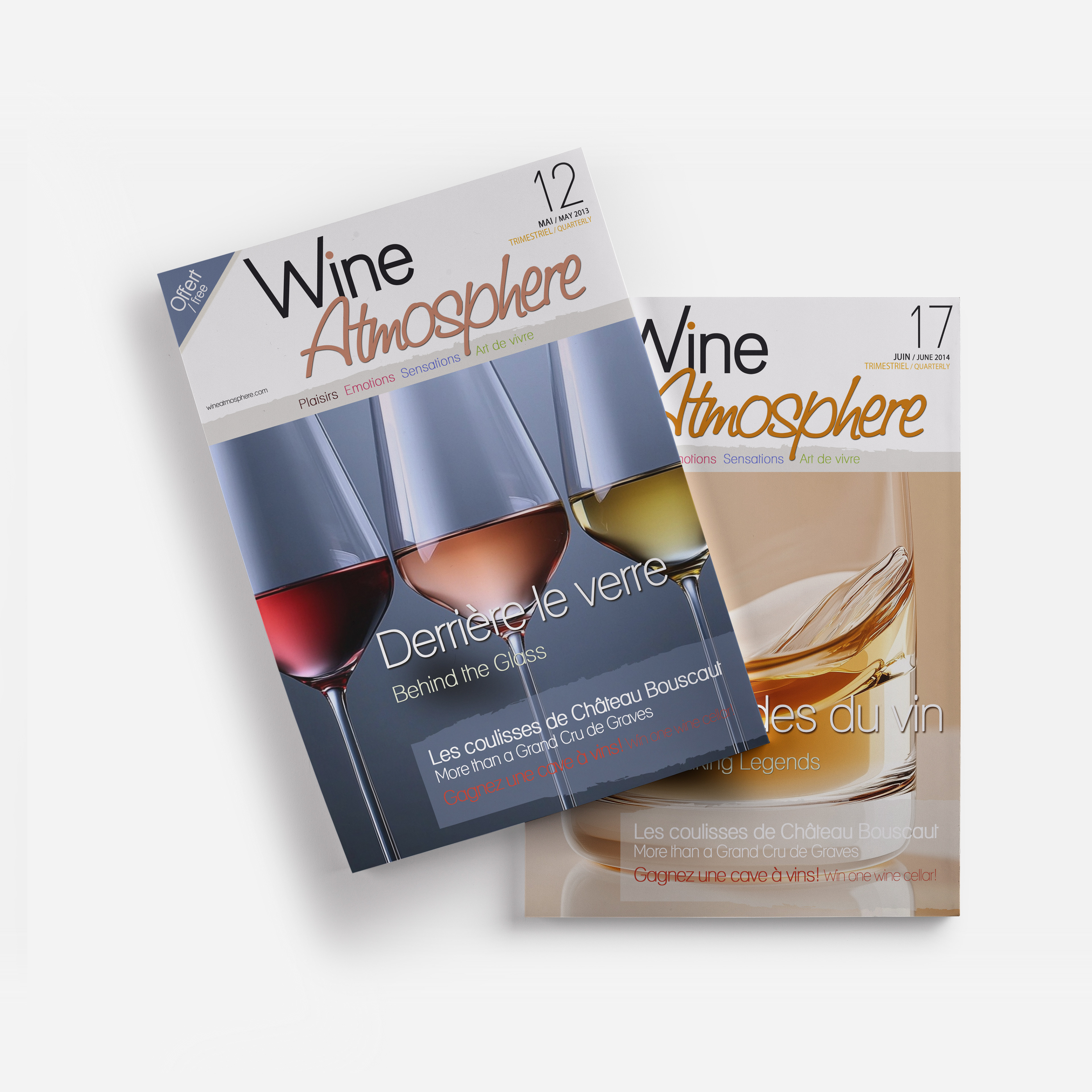
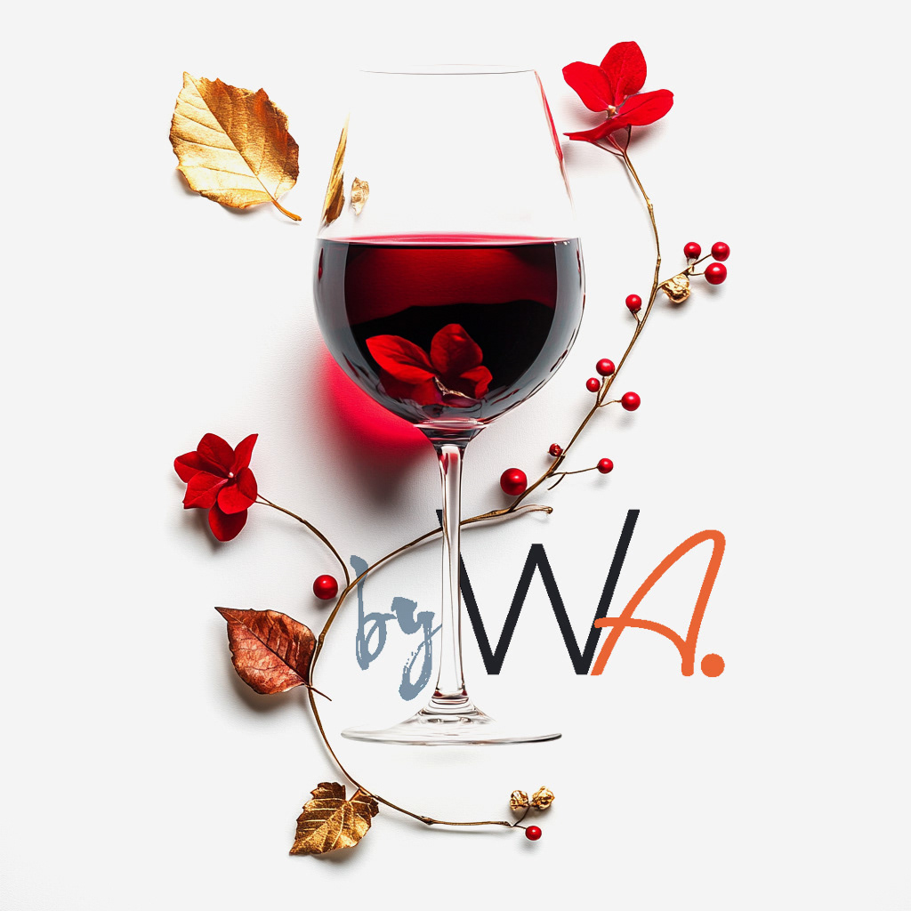
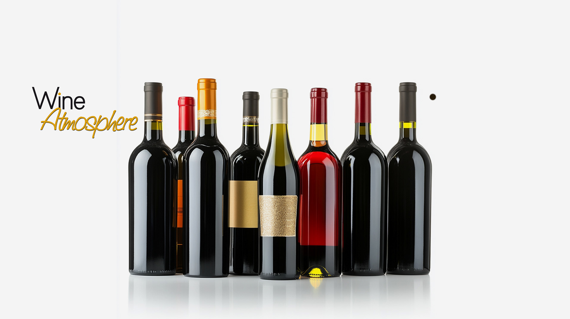
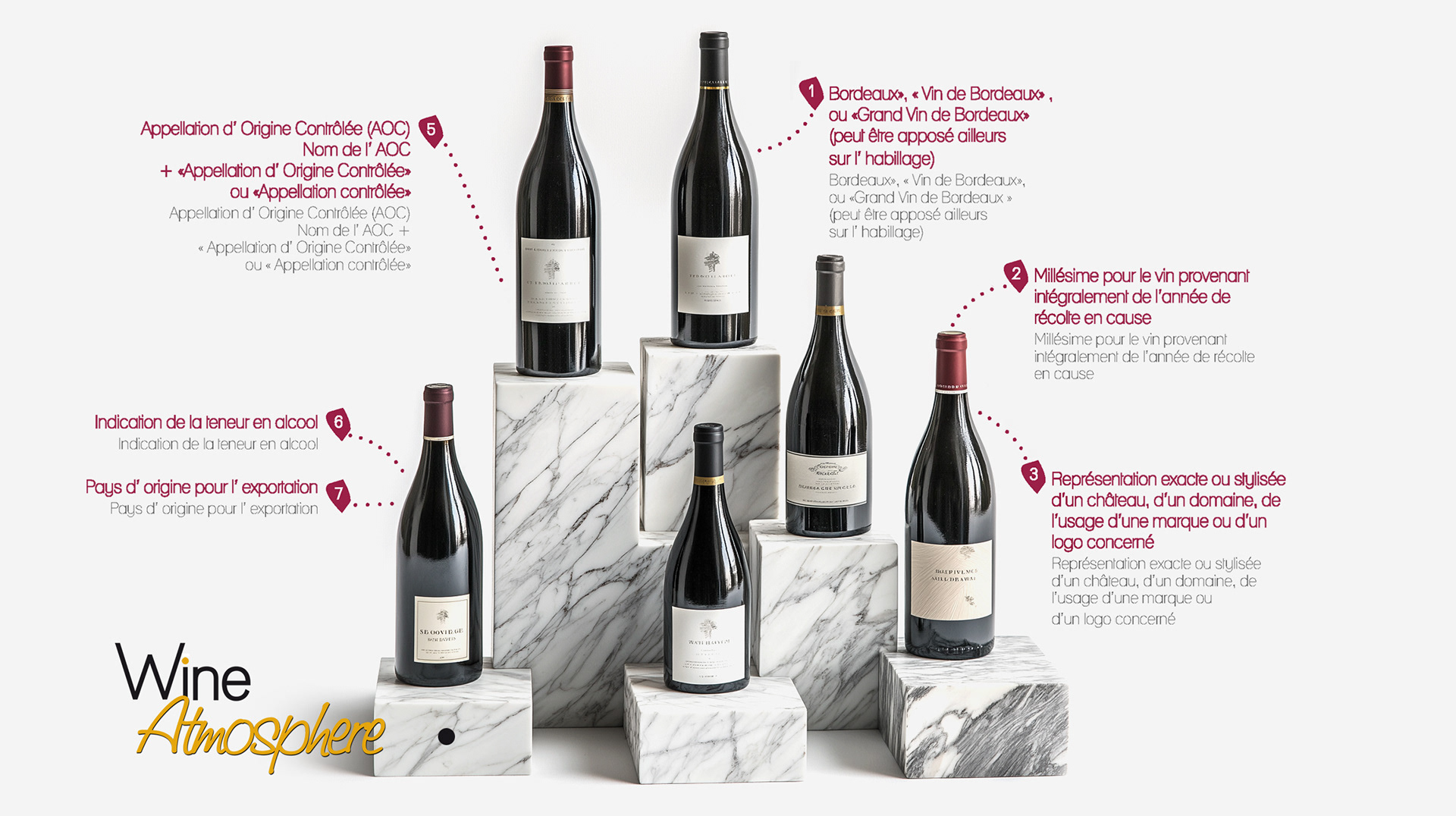
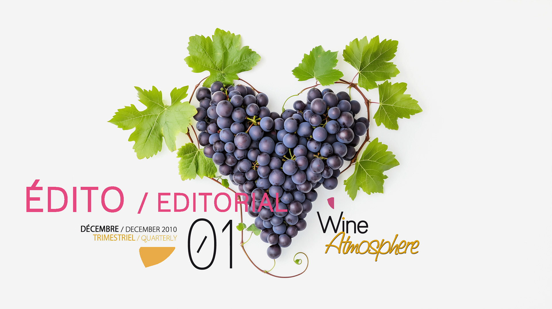
Designed the Wine Atmosphere logo, creating a refined typographic mark that reflects the magazine’s elegant editorial tone.

Seeking to enhance your publication's design and expand your audience?