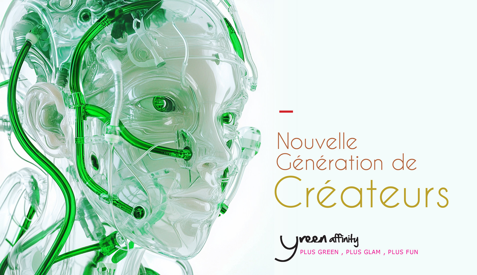
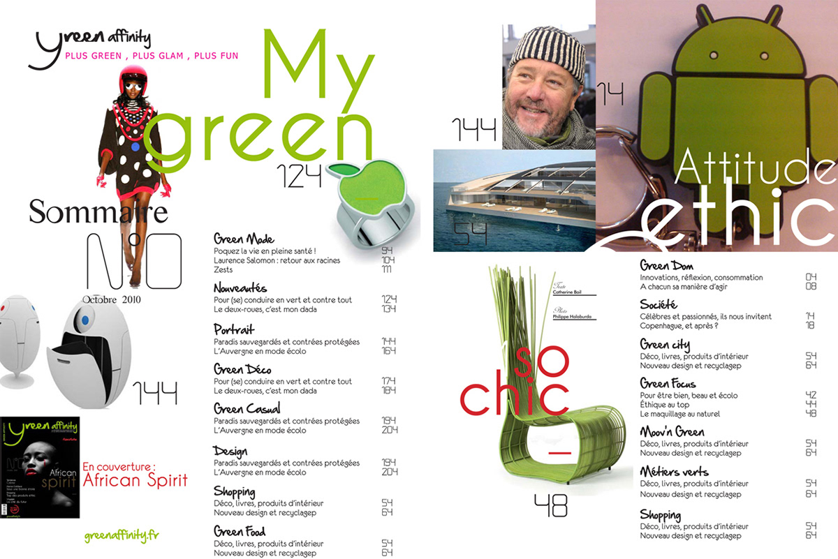
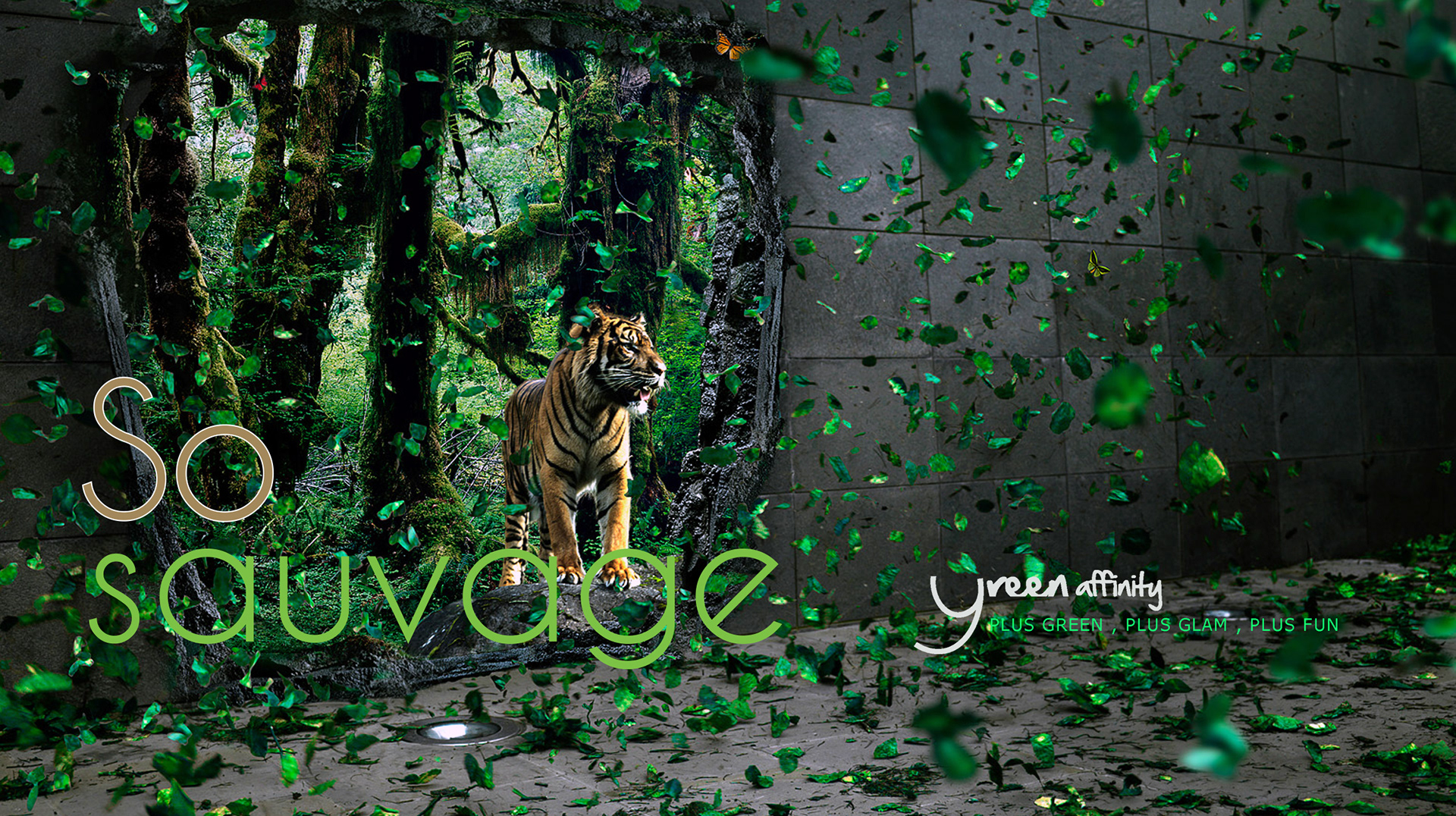
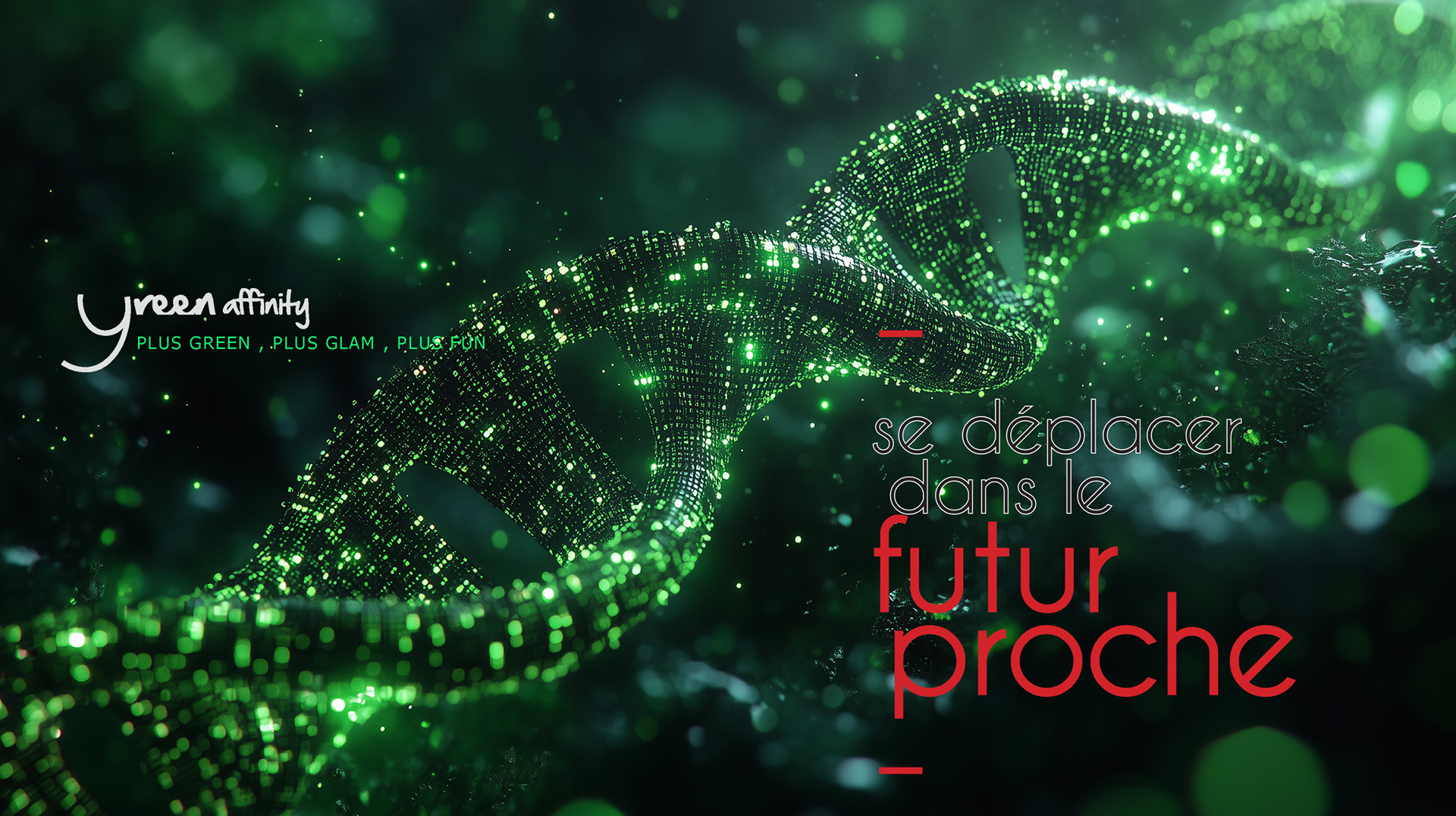
A Paris-based ecology publication needed to position environmental journalism as serious, culturally relevant, and worth paying for, without the visual clichés that plague the category.
I built the full editorial identity from scratch: logo, typographic architecture, modular grid, and illustration direction.
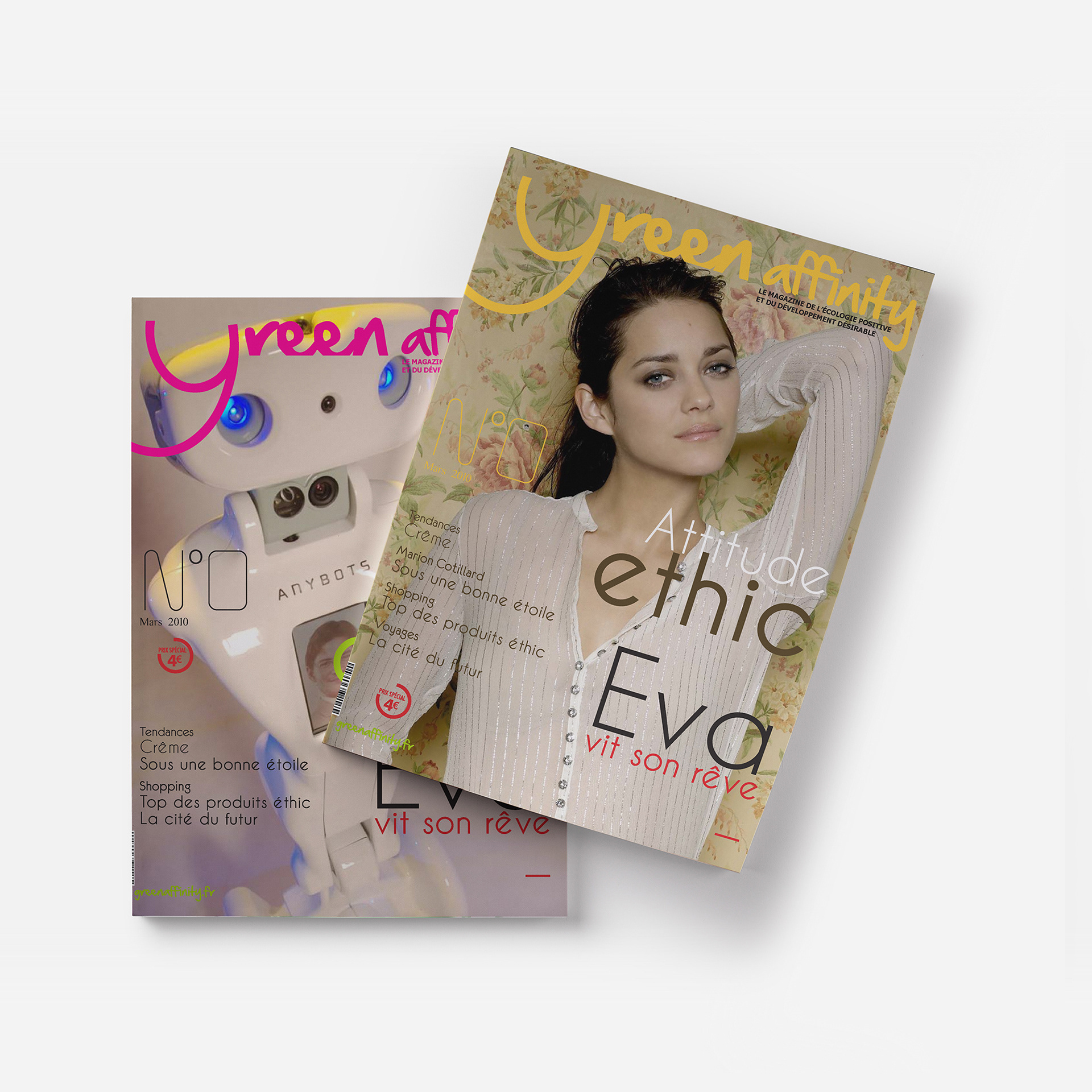
The result is a publication that looks as rigorous as its journalism.
I built the full editorial identity from scratch: logo, typographic architecture, modular grid, and illustration direction.
The result is a publication that looks as rigorous as its journalism.
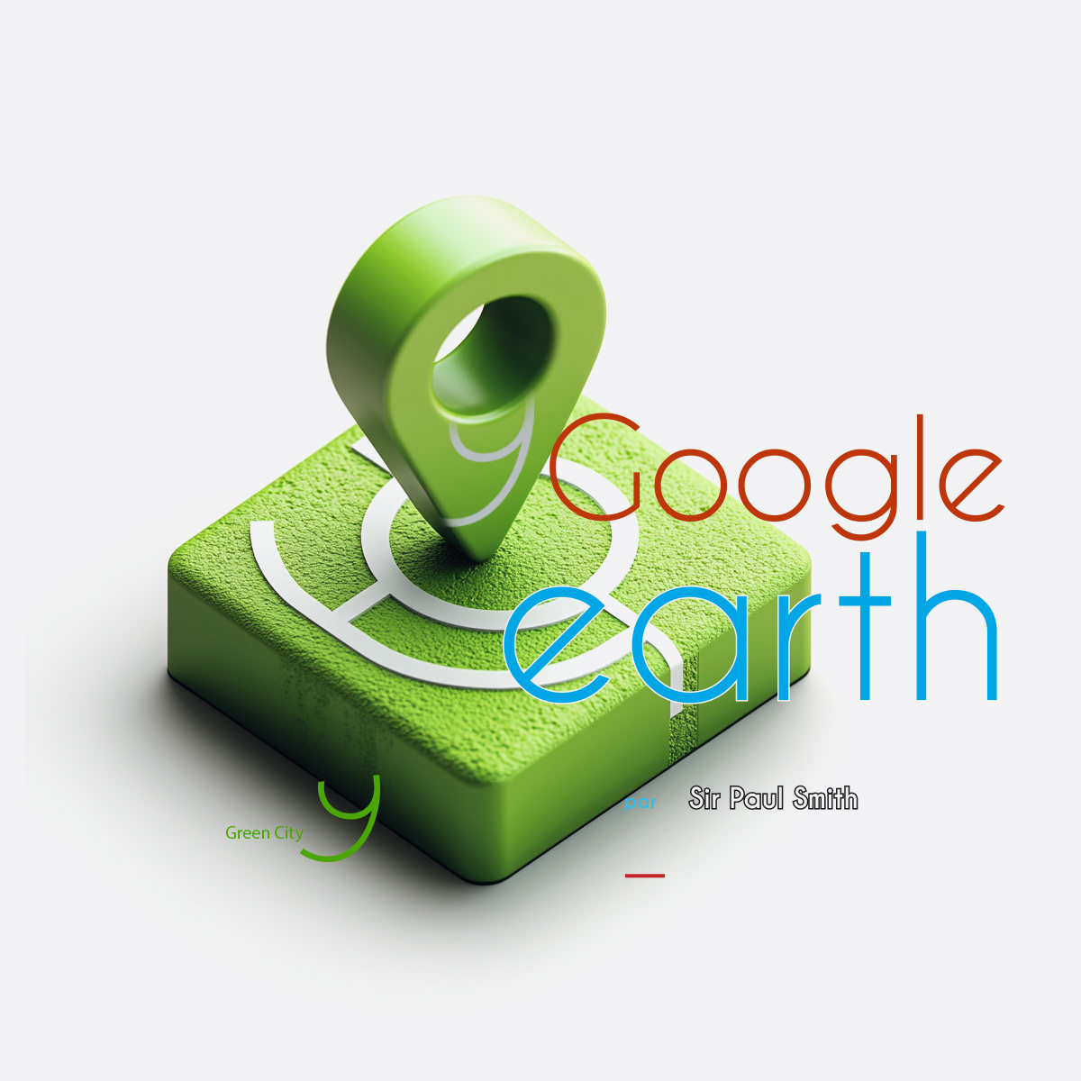
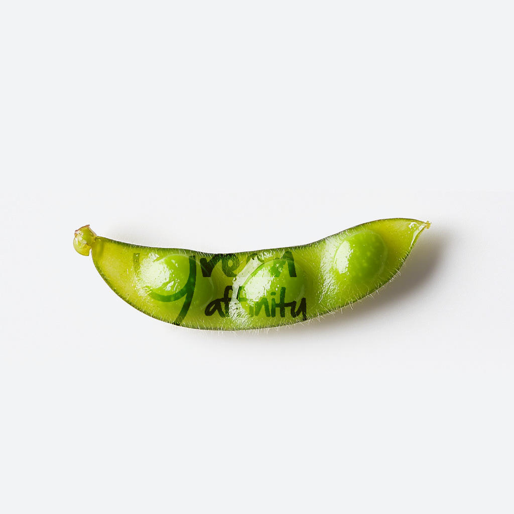
CLIENT ▸ Green Affinity Magazine, Paris, France
ROLE ▸ Art Director Freelance
SCOPE ▸ Logo Design, Magazine Layout Design, Iconography, Illustrations, Visual Identity
ROLE ▸ Art Director Freelance
SCOPE ▸ Logo Design, Magazine Layout Design, Iconography, Illustrations, Visual Identity
The Challenge
Position an ecology magazine as informed and serious without feeling academic
Balance urgency with optimism in environmental narratives
Design a system flexible enough to support diverse topics and contributors
Position an ecology magazine as informed and serious without feeling academic
Balance urgency with optimism in environmental narratives
Design a system flexible enough to support diverse topics and contributors
Strategic Approach
Content-first editorial branding
Visual restraint to support credibility and trust
Clear hierarchy to guide readers through long-form, information-dense content
Content-first editorial branding
Visual restraint to support credibility and trust
Clear hierarchy to guide readers through long-form, information-dense content
Creative Solution
A calm, considered brand identity designed to foreground content
Editorial layouts that prioritize readability and pacing
Visual cues that support reflection rather than spectacle
A calm, considered brand identity designed to foreground content
Editorial layouts that prioritize readability and pacing
Visual cues that support reflection rather than spectacle
Scope & System
Brand identity principles for editorial use
Typographic hierarchy and layout logic
Rules for consistency across print and digital formats
Brand identity principles for editorial use
Typographic hierarchy and layout logic
Rules for consistency across print and digital formats
Deliverables
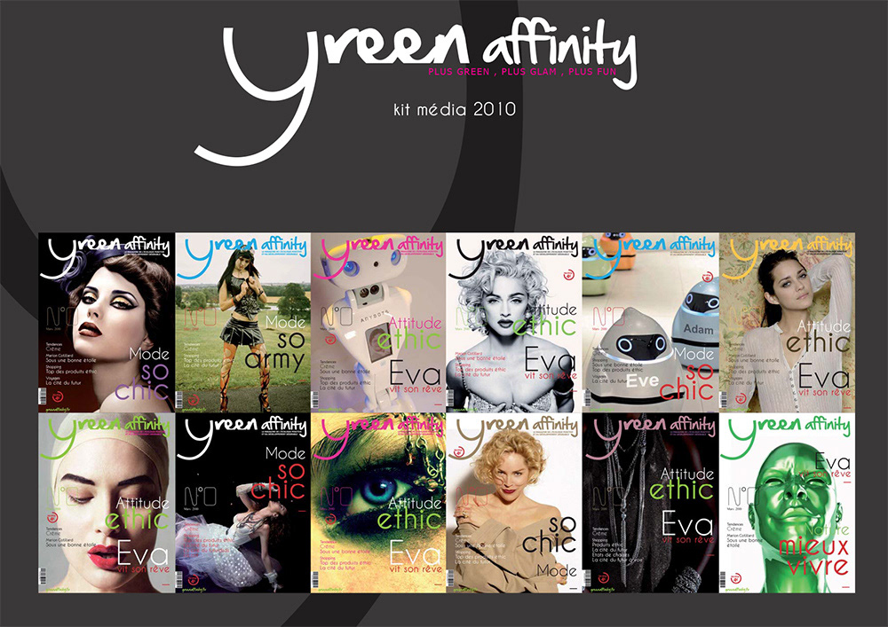
Brand identity and editorial system
Magazine layouts and templates
Print and digital editorial assets
Brand identity and editorial system
Magazine layouts and templates
Print and digital editorial assets
Role & Leadership
Art Director
Established editorial brand architecture, aligning content strategy and visual language into a scalable publication system.
Art Director
Established editorial brand architecture, aligning content strategy and visual language into a scalable publication system.
On The Work
Environmental storytelling depends on trust and clarity.
This work shows how restrained editorial branding can elevate ecological discourse, supporting understanding, reflection, and long-term engagement rather than visual noise.
Environmental storytelling depends on trust and clarity.
This work shows how restrained editorial branding can elevate ecological discourse, supporting understanding, reflection, and long-term engagement rather than visual noise.

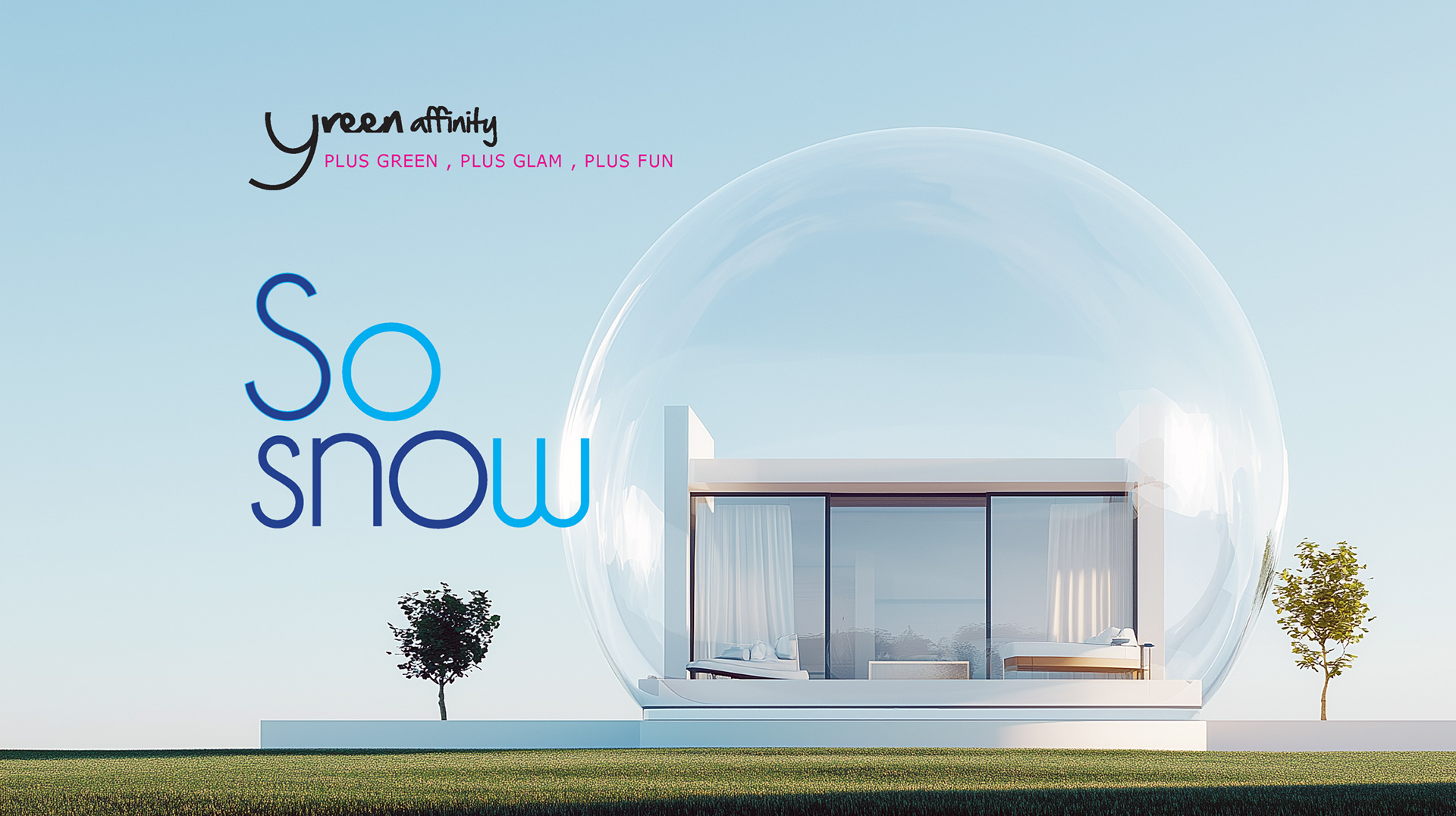
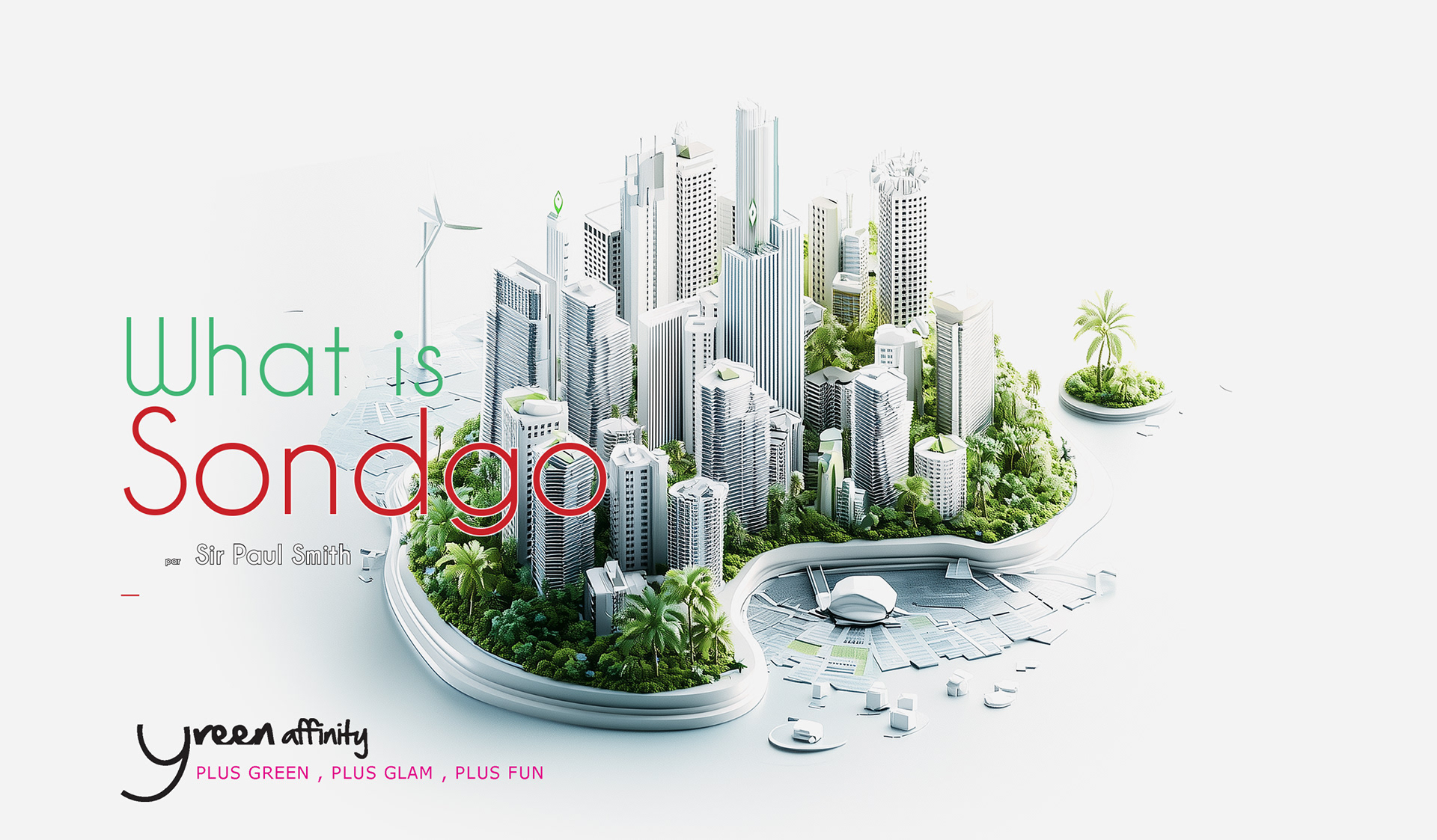
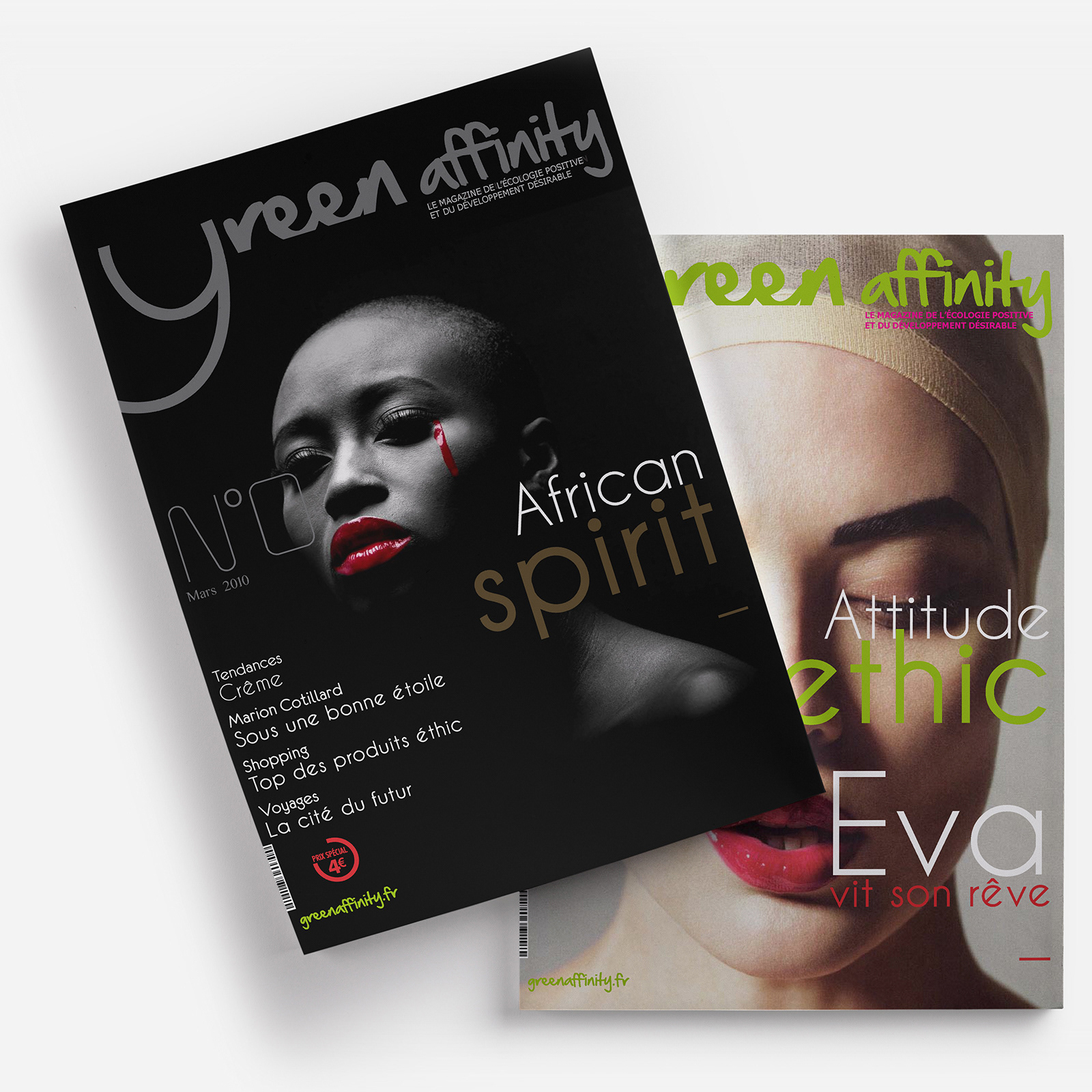
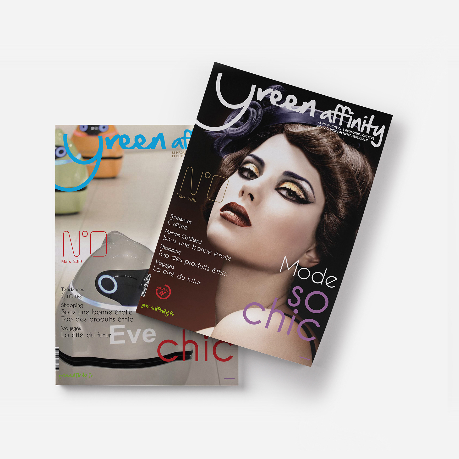
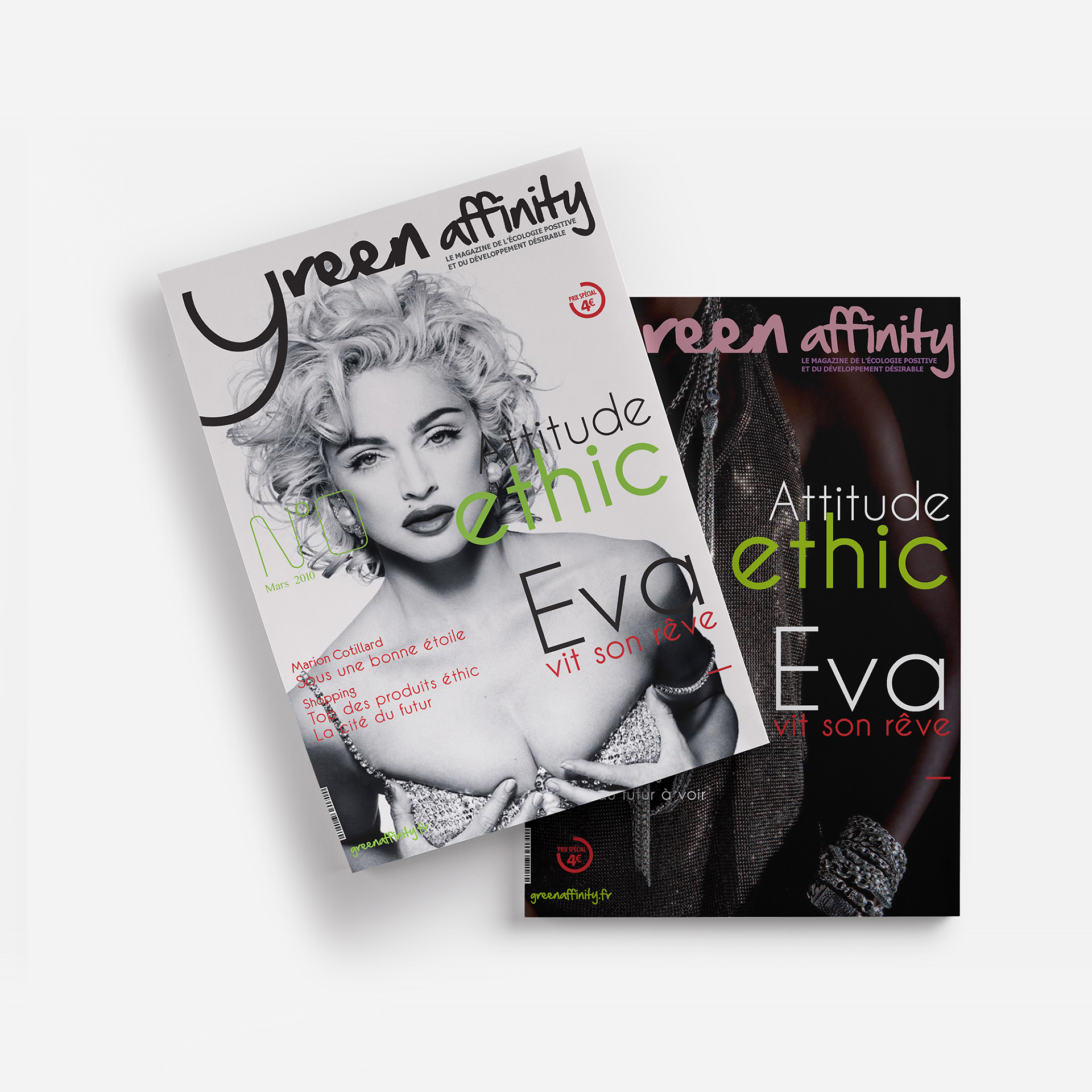
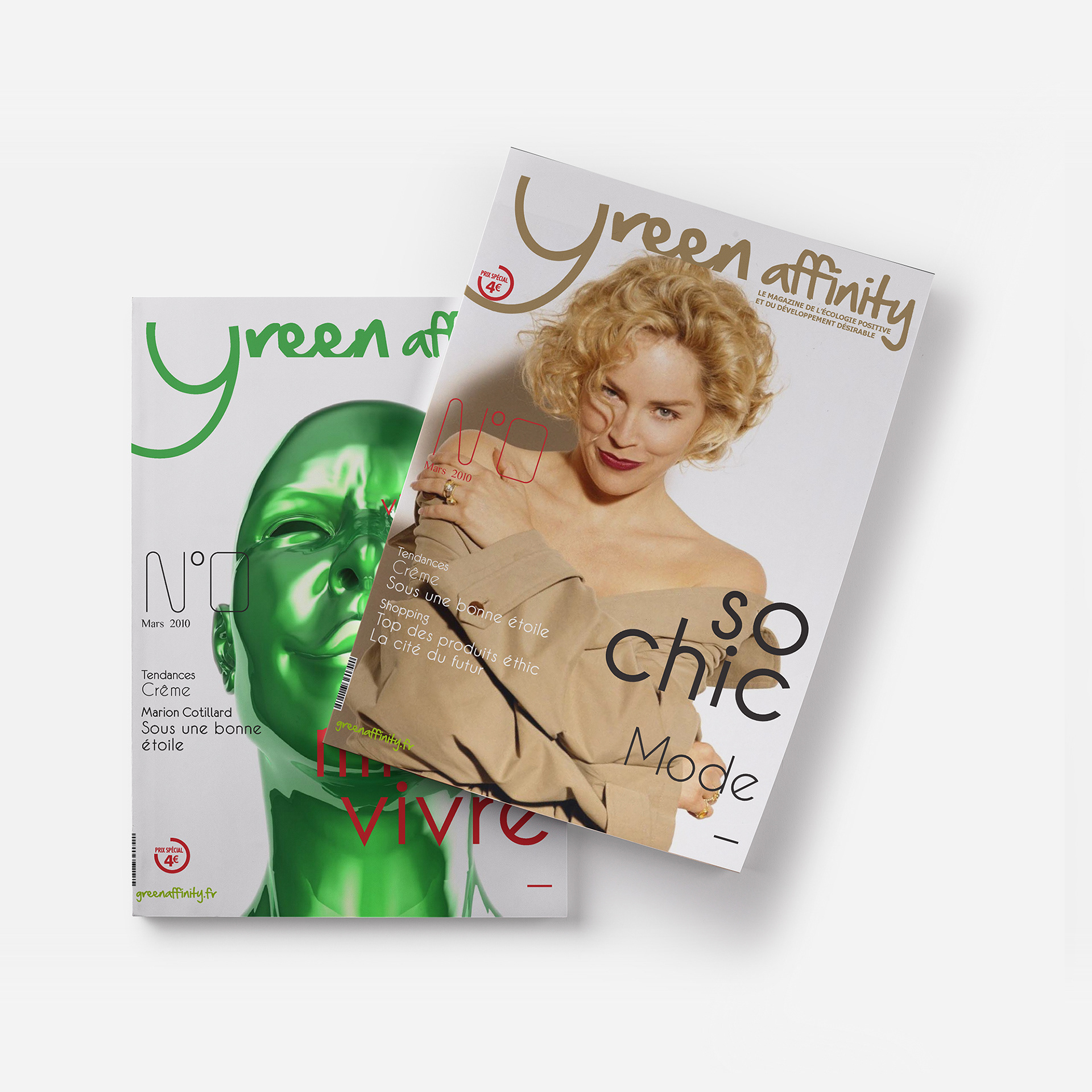
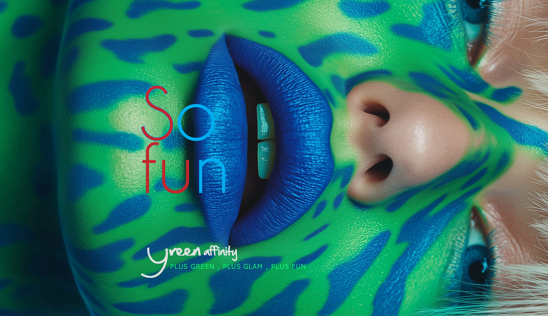
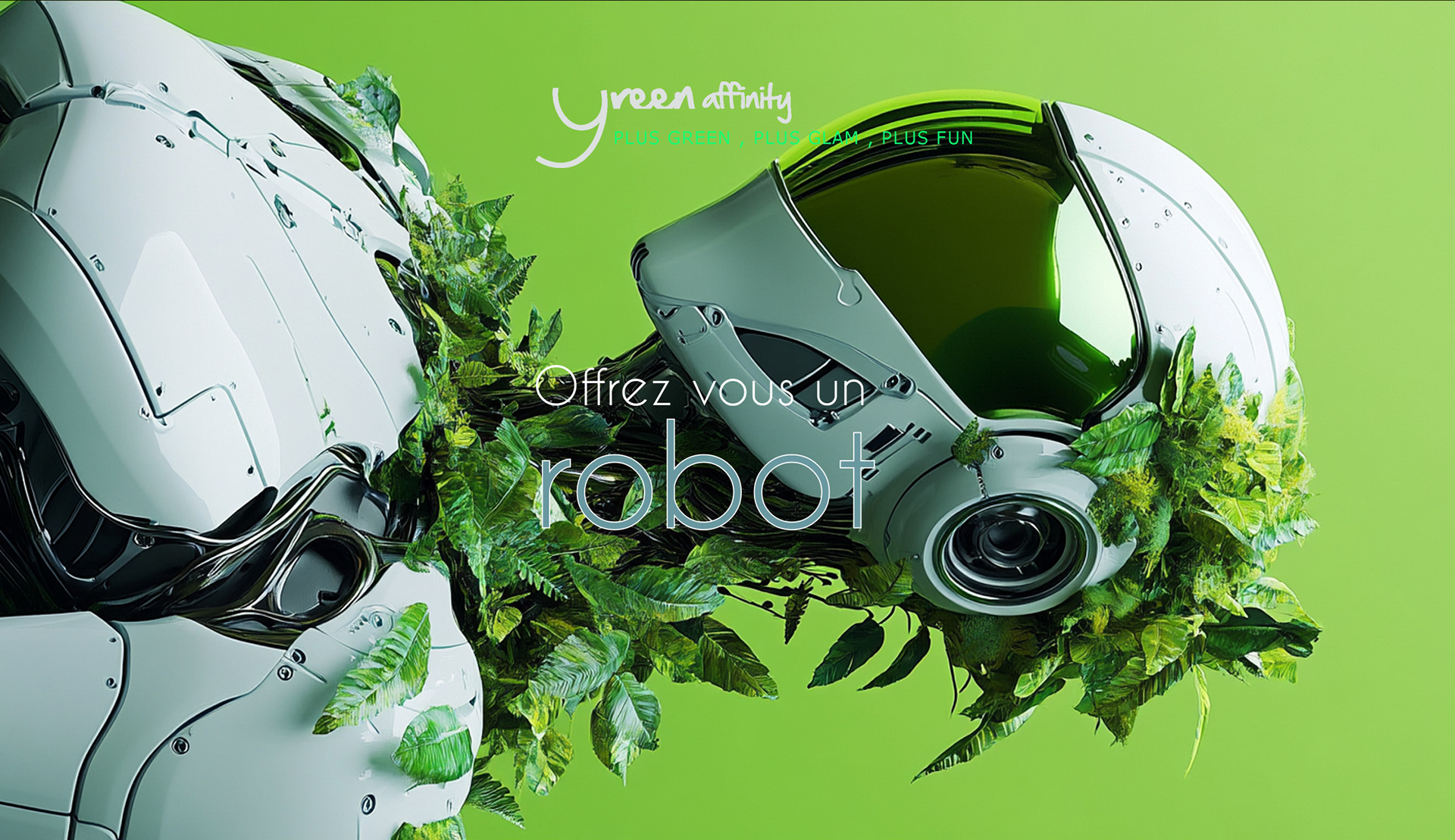
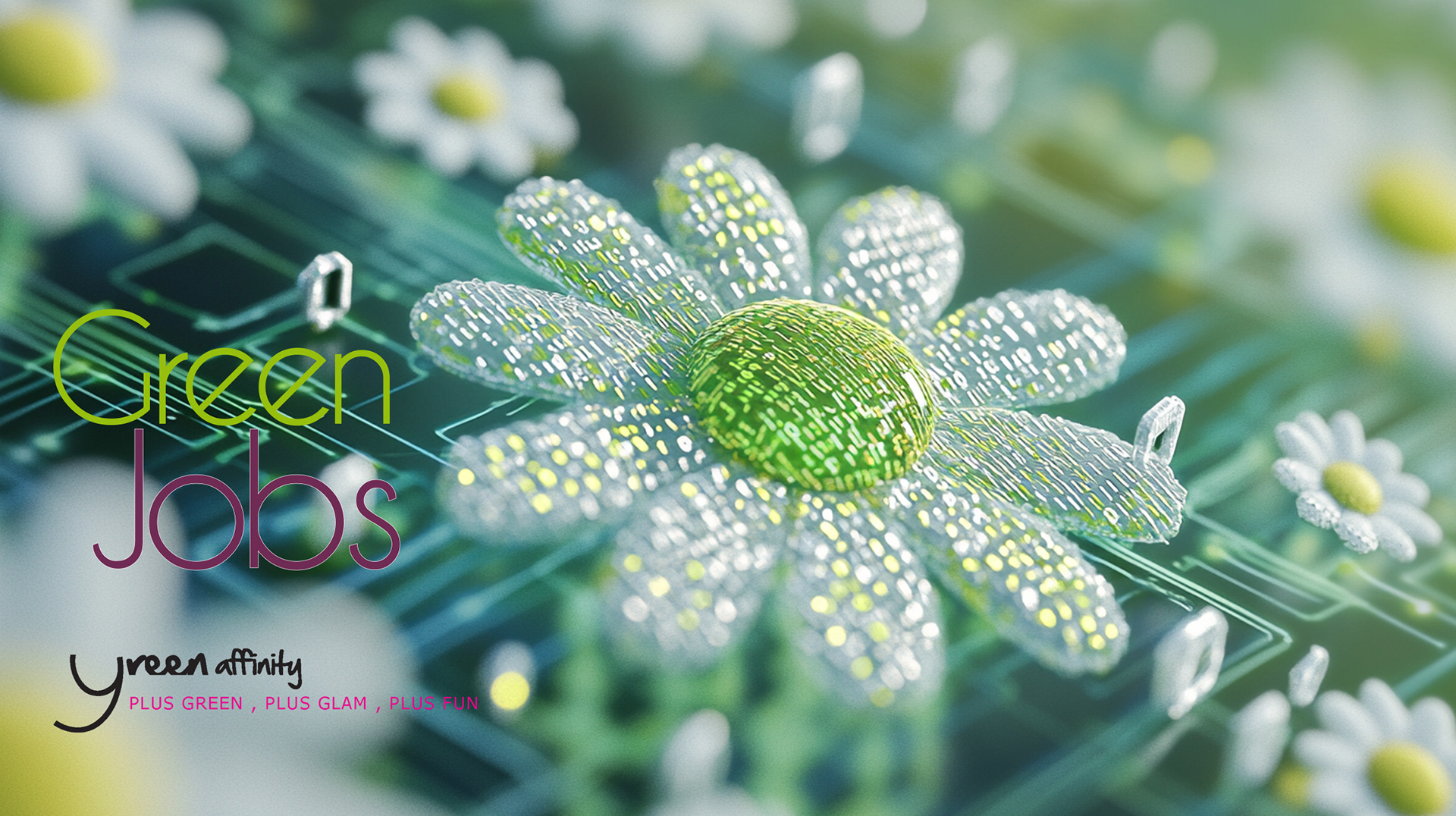
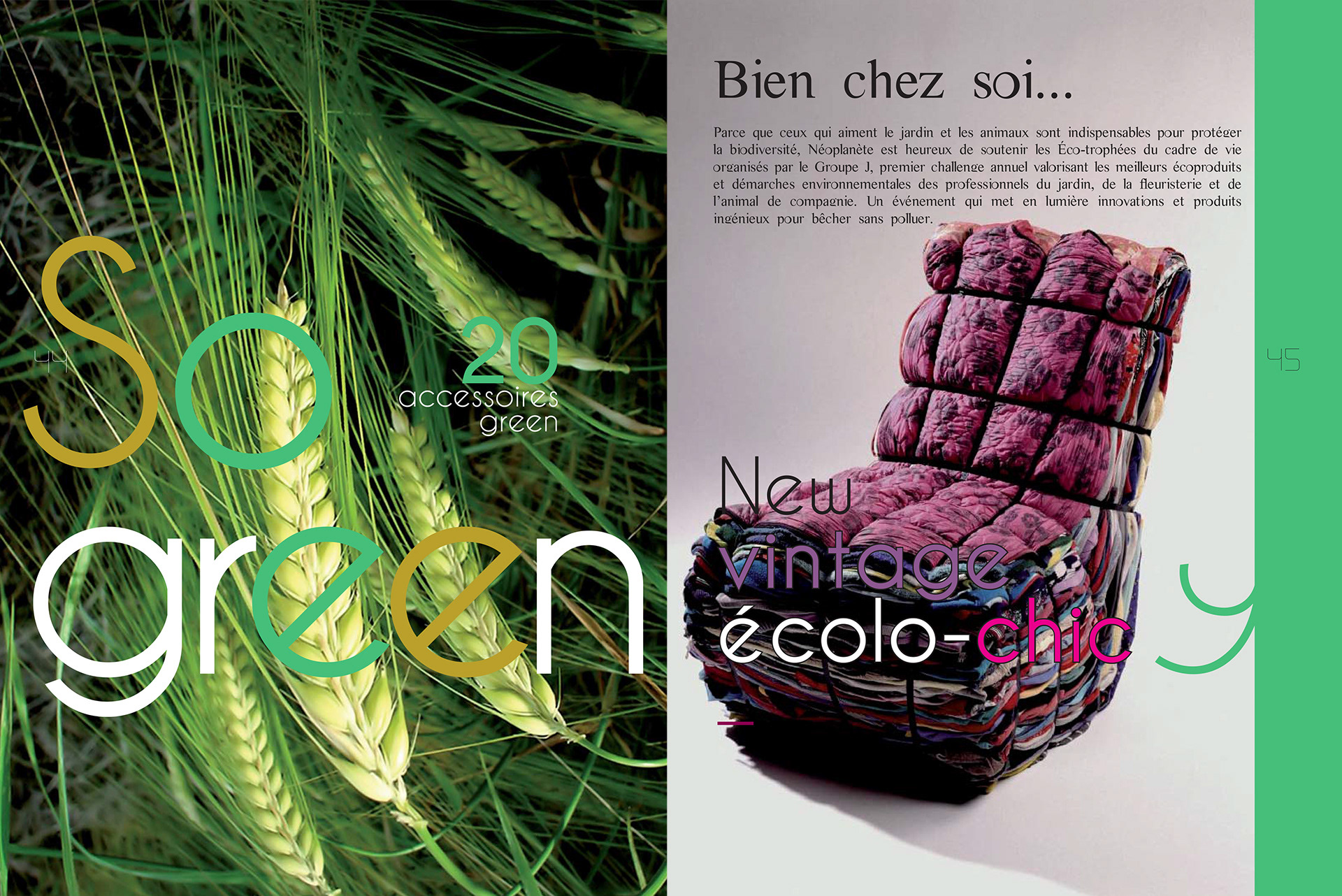
The logo was intentionally quiet and typographic, functioning as an editorial signature rather than a statement, anchoring the brand without competing with content.


Want to make your sustainability message stand out with clarity & style?