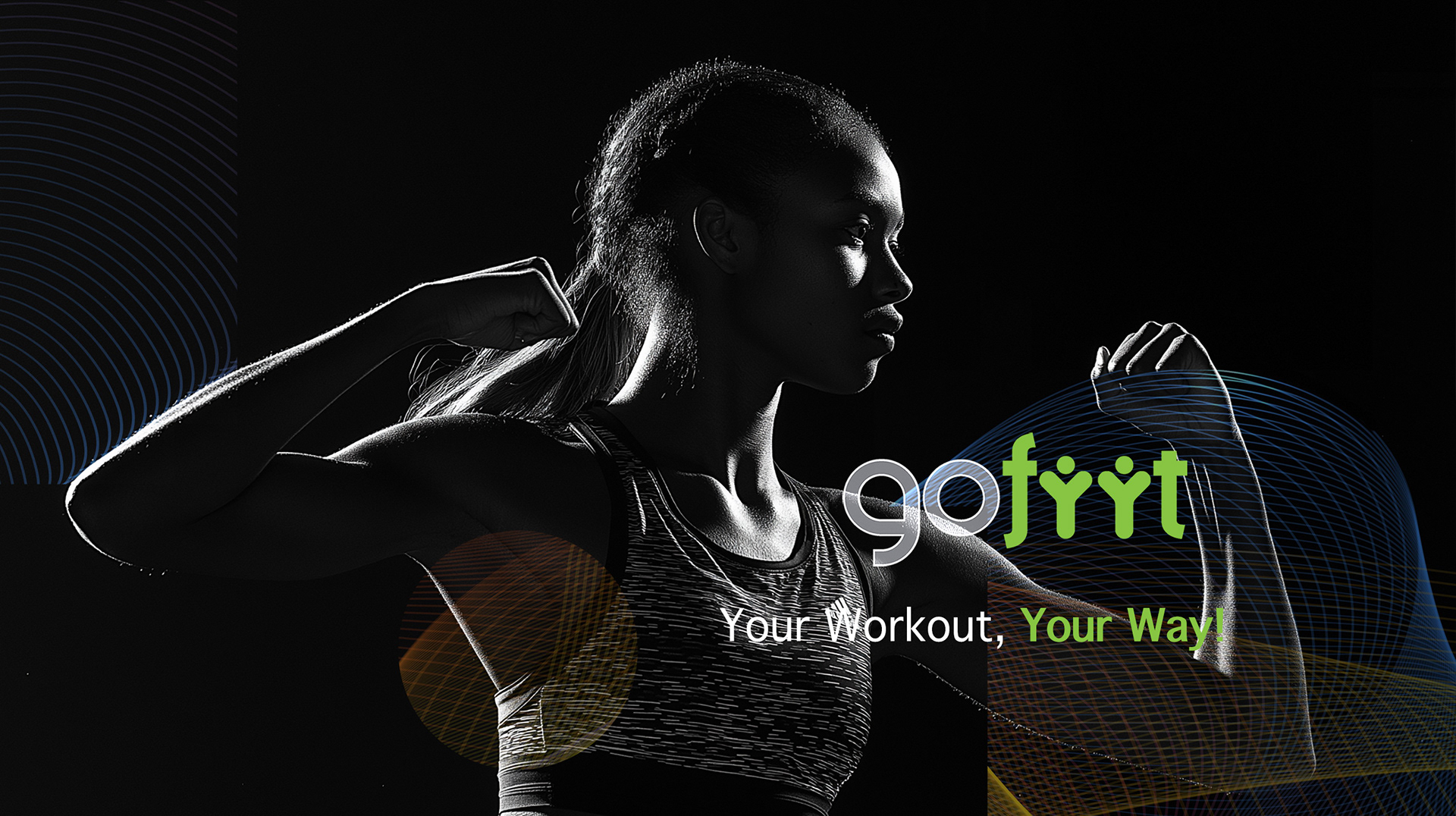
GoFiit was launching into one of the most saturated app categories, where every competitor uses the same visual shorthand: dark screens, shouting type, bodies mid-strain. That look sells the first download and loses the second month.
I built an identity around movement rather than intensity, designed mobile-first so the brand holds at icon size, in-app, and in acquisition creative. In the year after the relaunch, users grew 34%, and subscriptions grew 25%.
I built an identity around movement rather than intensity, designed mobile-first so the brand holds at icon size, in-app, and in acquisition creative. In the year after the relaunch, users grew 34%, and subscriptions grew 25%.
CLIENT ▸ GoFiit, Paris, France
YEAR ▸ 2020-2022
AREA ▸ Health & Fitness — Mobile App, Consumer Digital
AUDIENCE ▸ App User, Acquisition Channel
SCOPE ▸ Brand identity, digital design system, campaign materials
SCALE ▸ 22 screens, 15 templates, 12-month measurement window
ROLE ▸ Art Director (Freelance)
TEAM ▸ Led 2: 1 UX designer, 1 developer
PROCESS ▸ Category audit → positioning → identity and motion system → in-app and campaign application
YEAR ▸ 2020-2022
AREA ▸ Health & Fitness — Mobile App, Consumer Digital
AUDIENCE ▸ App User, Acquisition Channel
SCOPE ▸ Brand identity, digital design system, campaign materials
SCALE ▸ 22 screens, 15 templates, 12-month measurement window
ROLE ▸ Art Director (Freelance)
TEAM ▸ Led 2: 1 UX designer, 1 developer
PROCESS ▸ Category audit → positioning → identity and motion system → in-app and campaign application
The Challenge
A saturated category where every app looks the same
A mark that has to survive at 60 pixels on a home screen
One system covering two jobs: product interface and acquisition creative
A saturated category where every app looks the same
A mark that has to survive at 60 pixels on a home screen
One system covering two jobs: product interface and acquisition creative
Strategic Approach
Motion over intensity. Energy that invites rather than intimidates
Mobile first, not adapted to mobile. The smallest format sets the rules
Built to sustain. A brand people keep opening, not one that wins a single install
Motion over intensity. Energy that invites rather than intimidates
Mobile first, not adapted to mobile. The smallest format sets the rules
Built to sustain. A brand people keep opening, not one that wins a single install
Creative Solution
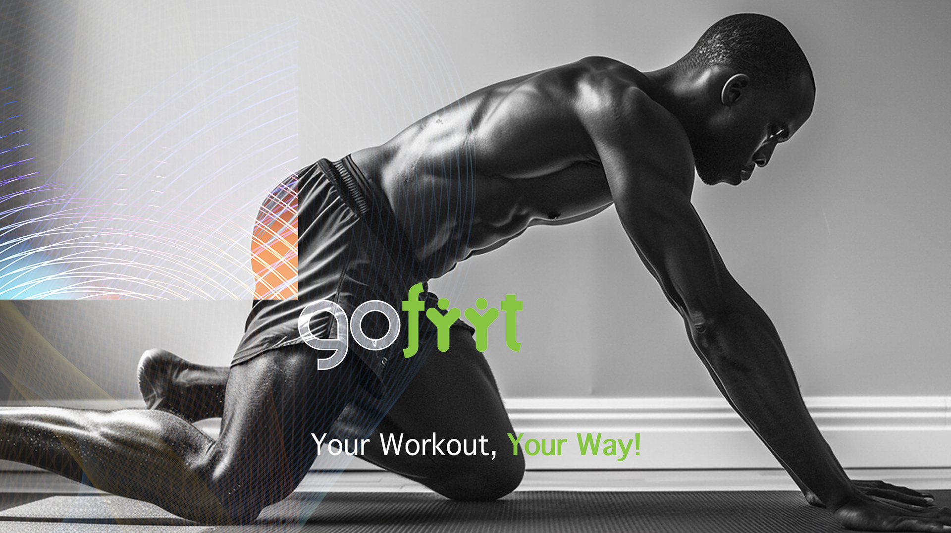
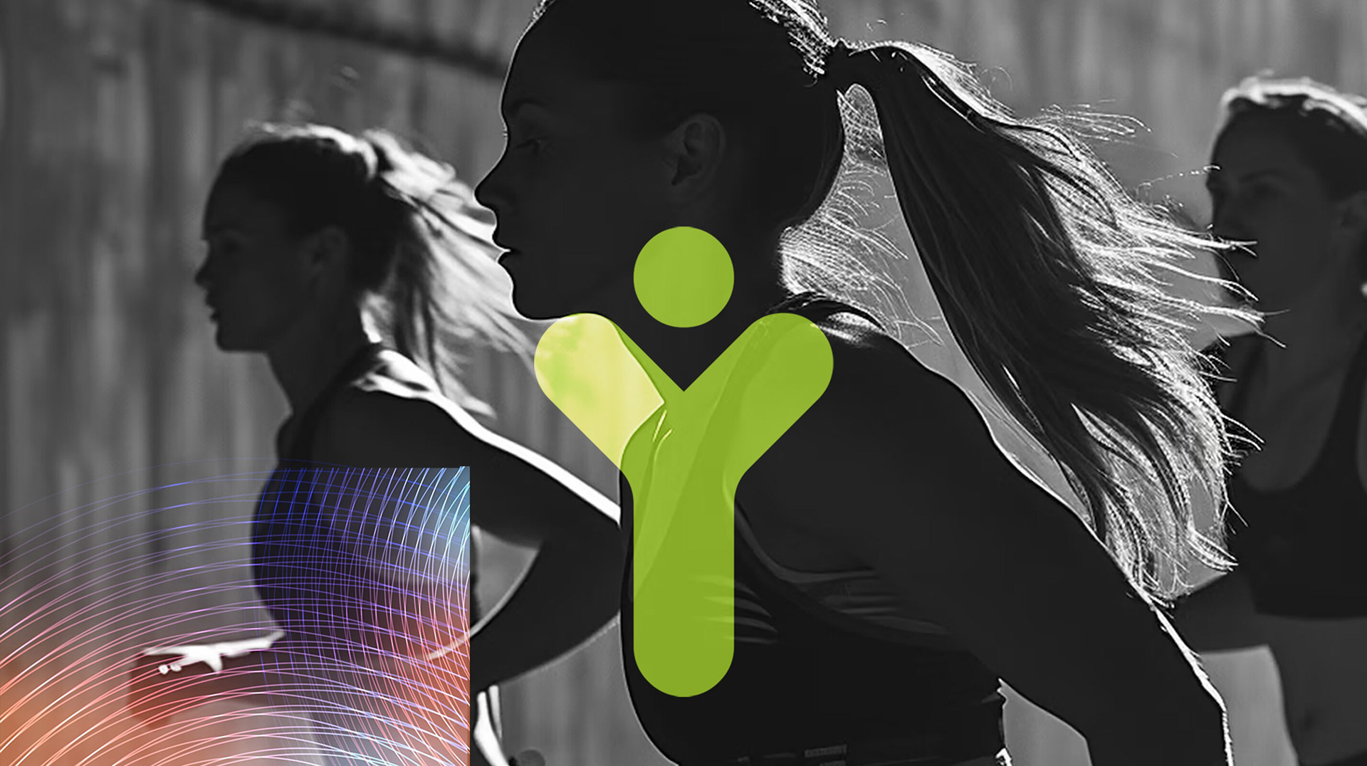
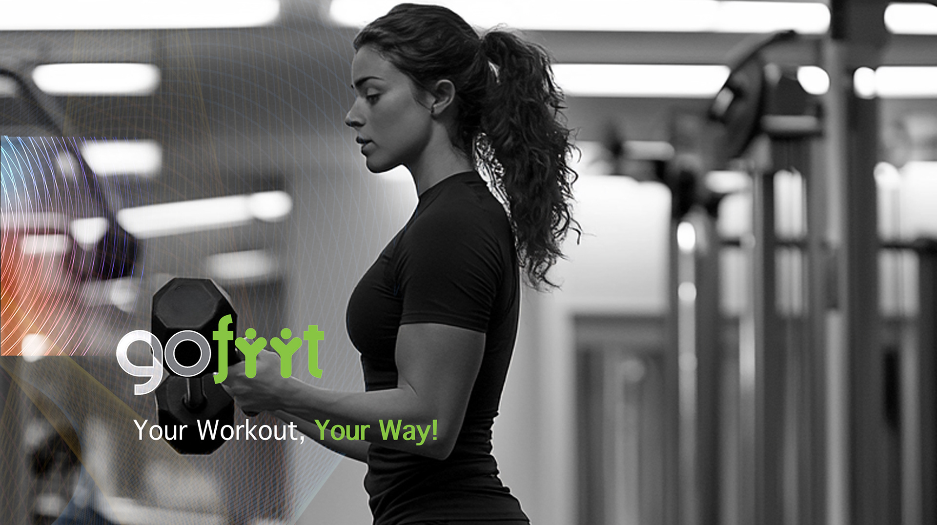
A logotype carrying movement in its construction, legible at icon scale
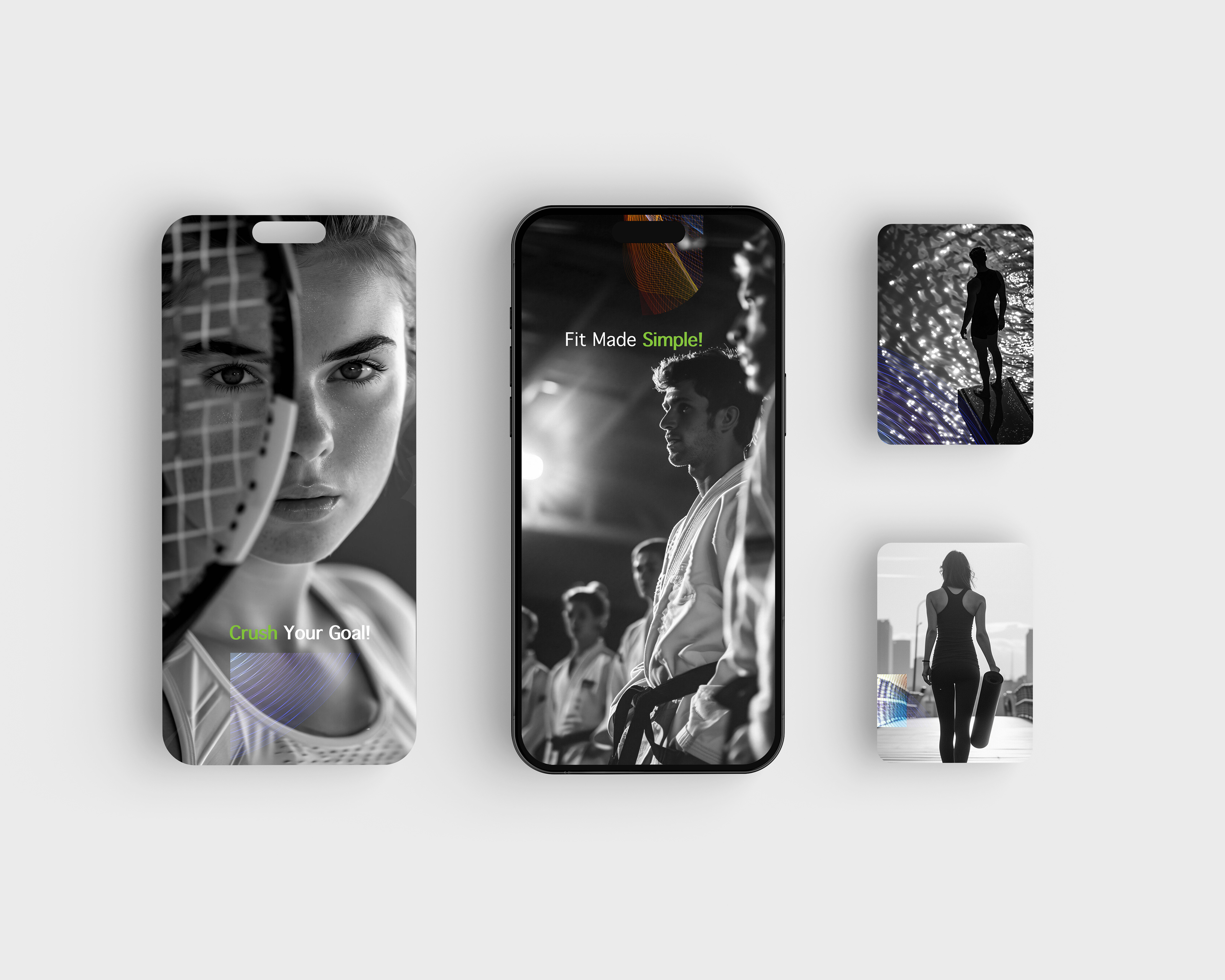
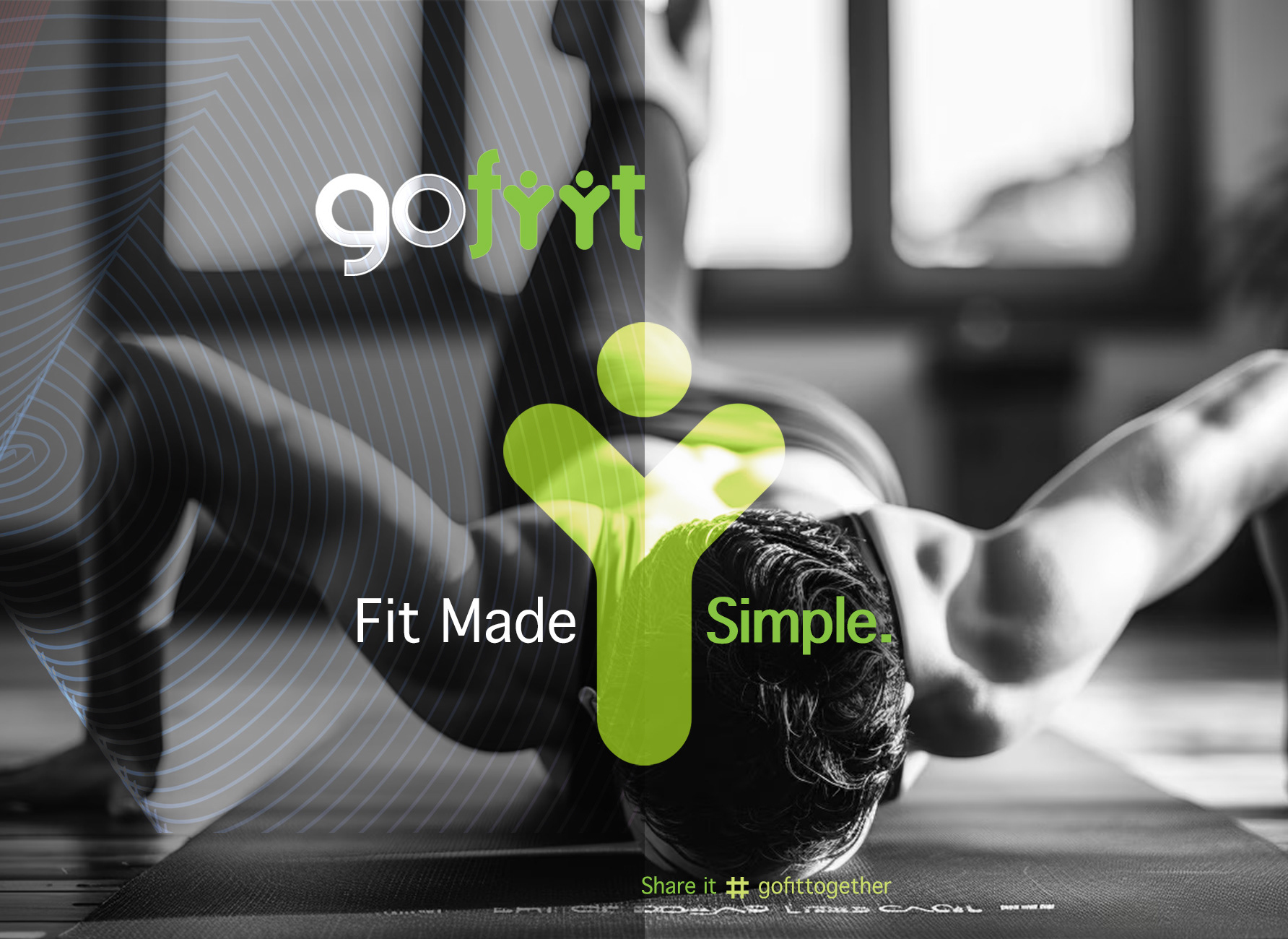
Active geometry drawn from motion, giving the system a graphic language beyond the mark
High contrast tuned for screens, with a rhythm that matches the pace of a session
A logotype carrying movement in its construction, legible at icon scale
Active geometry drawn from motion, giving the system a graphic language beyond the mark
High contrast tuned for screens, with a rhythm that matches the pace of a session
Scope & System
One visual system spanning the in-app interface and marketing channels
Typography and color rules built for screen legibility first
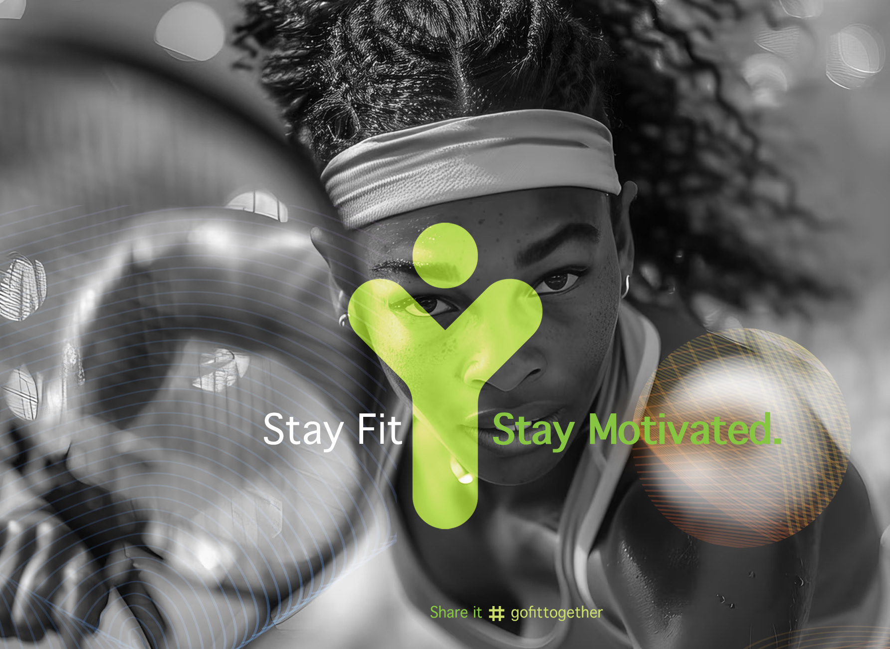
Templates for campaign and social, so acquisition creative stays on brand at volume
One visual system spanning the in-app interface and marketing channels
Typography and color rules built for screen legibility first
Templates for campaign and social, so acquisition creative stays on brand at volume
Deliverables
+ Logotype and brand identity
+ Digital visual system
+ In-app visual language and UI direction
+ Campaign and social templates
+ Brand guidelines
+ Logotype and brand identity
+ Digital visual system
+ In-app visual language and UI direction
+ Campaign and social templates
+ Brand guidelines
Role & Leadership
Art Director, positioning through application.
Led a UX designer and a developer, taking the identity from concept into the live product rather than handing over a guidelines PDF.
Growth followed: 34% more users and 25% more subscriptions in the year after launch.
Art Director, positioning through application.
Led a UX designer and a developer, taking the identity from concept into the live product rather than handing over a guidelines PDF.
Growth followed: 34% more users and 25% more subscriptions in the year after launch.
On The Work
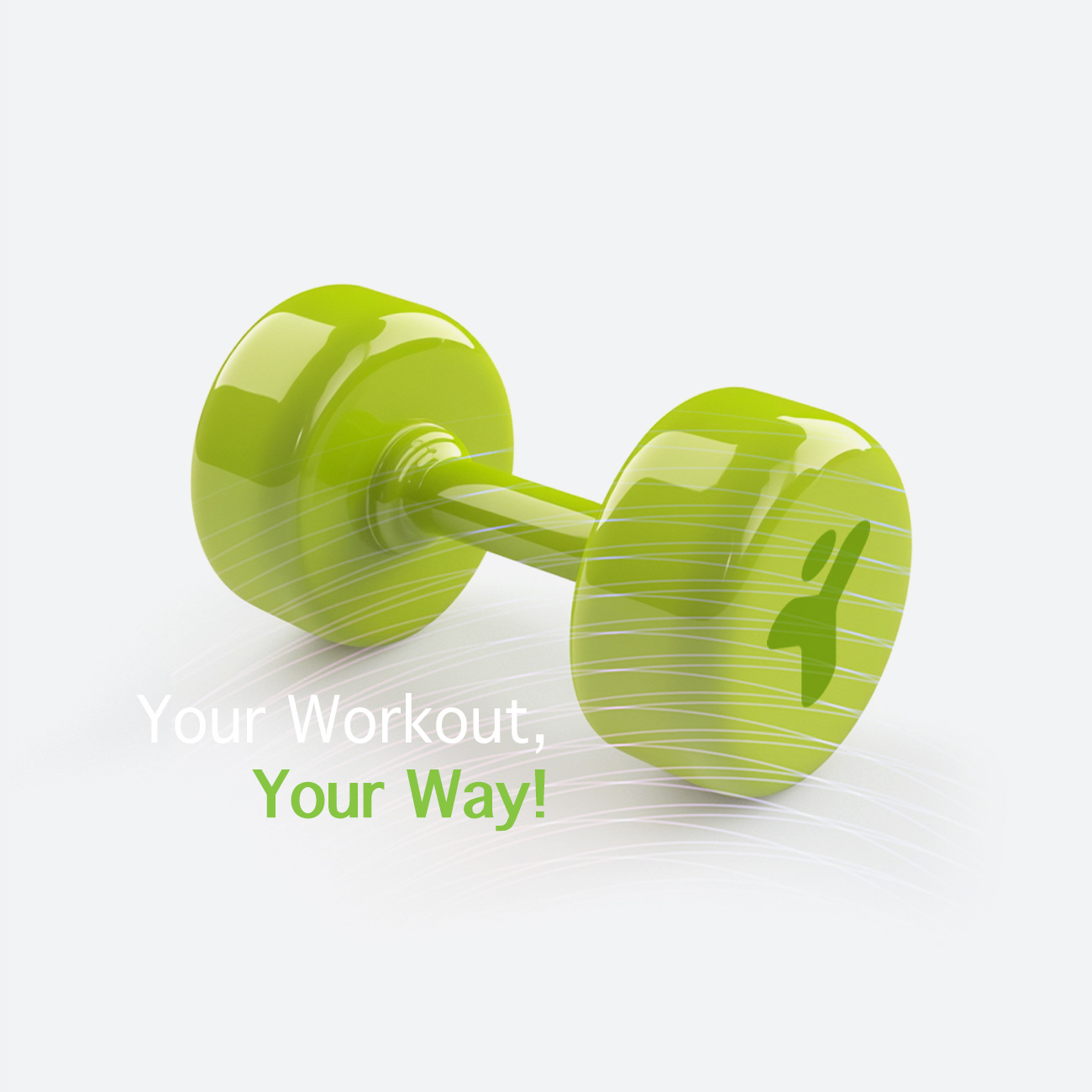
An app brand lives at 60 pixels.
Most identities are designed large and shrunk, which is why so many fitness apps are indistinguishable on a home screen. Designing from the smallest format up is what makes the mark recognizable where it actually gets seen.
An app brand lives at 60 pixels.
Most identities are designed large and shrunk, which is why so many fitness apps are indistinguishable on a home screen. Designing from the smallest format up is what makes the mark recognizable where it actually gets seen.
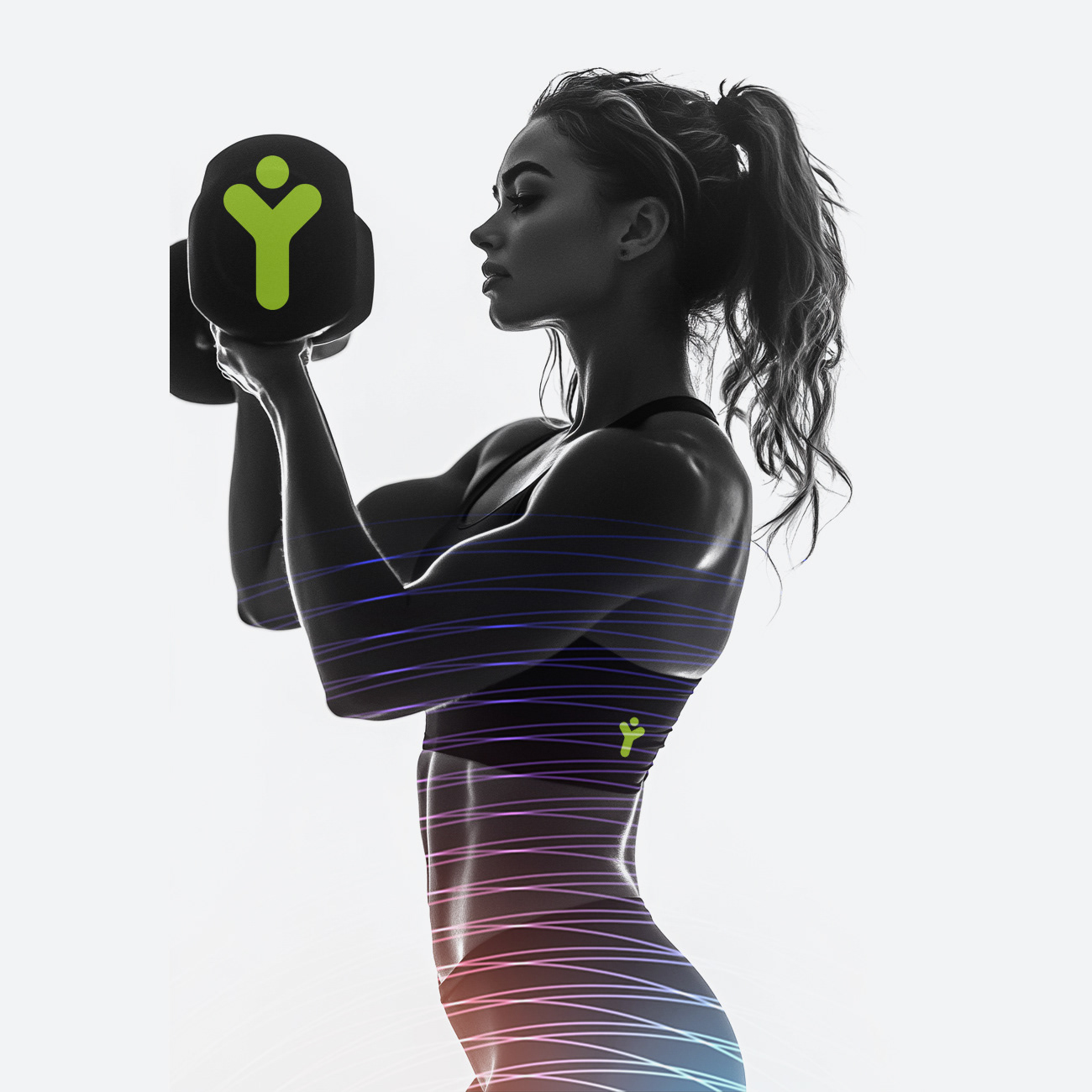
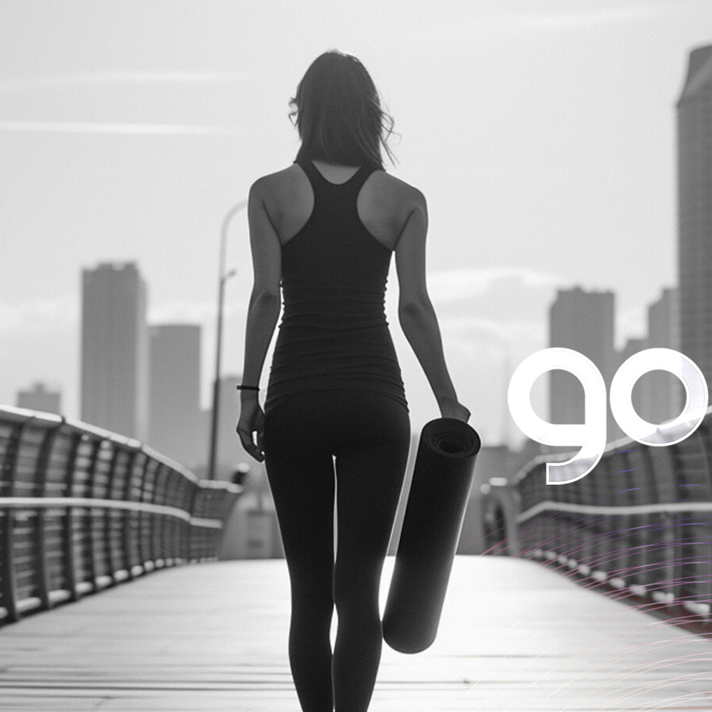
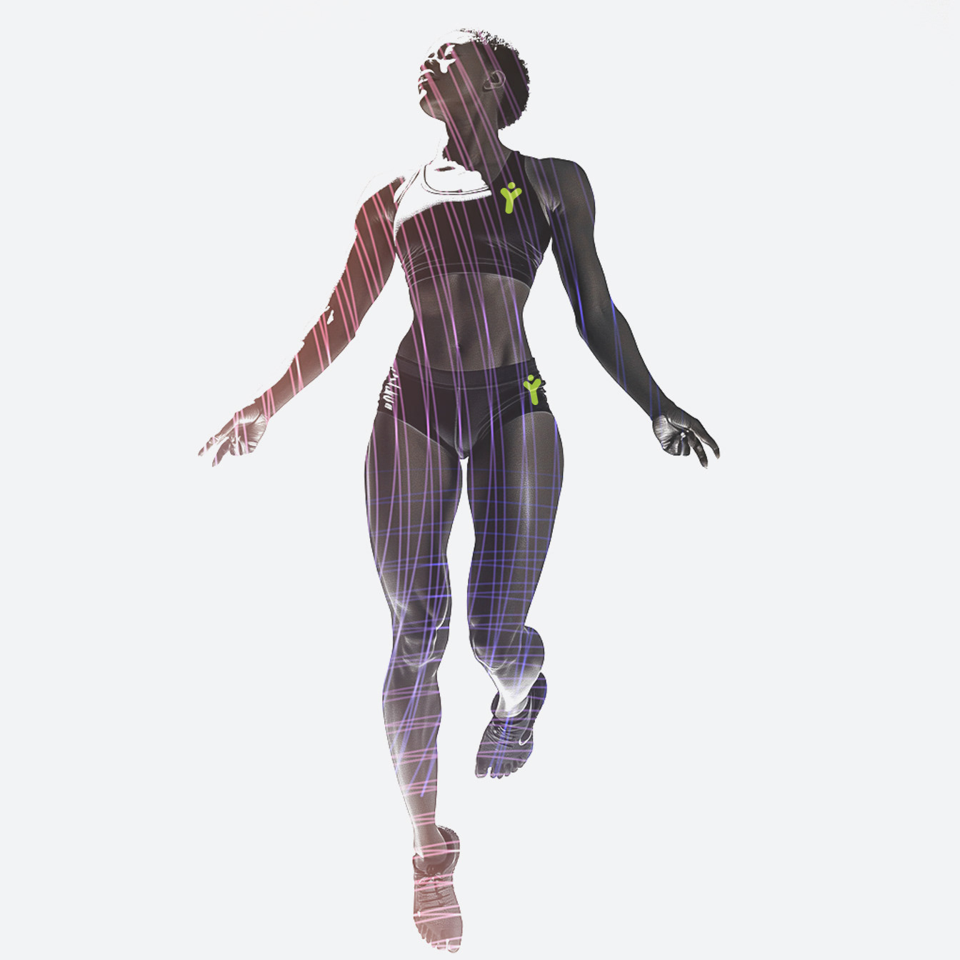
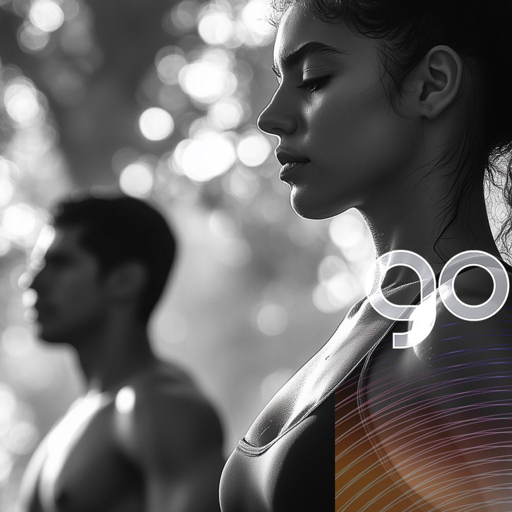
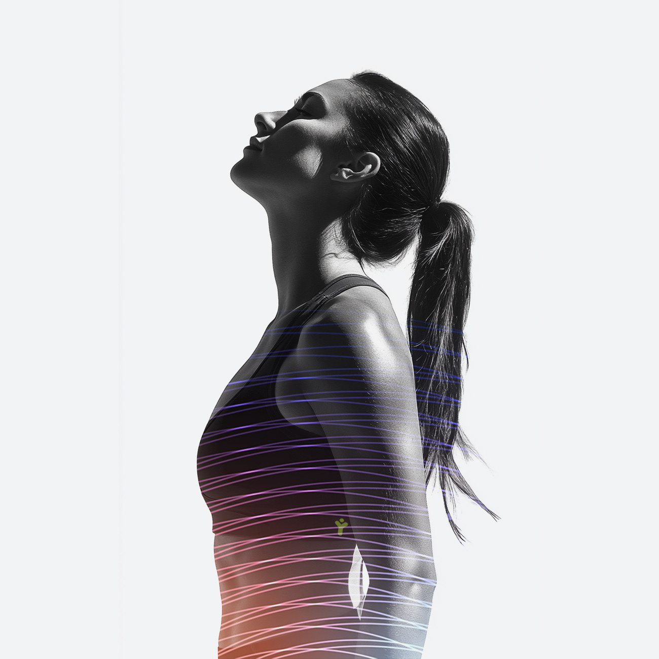
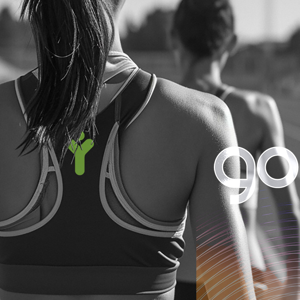
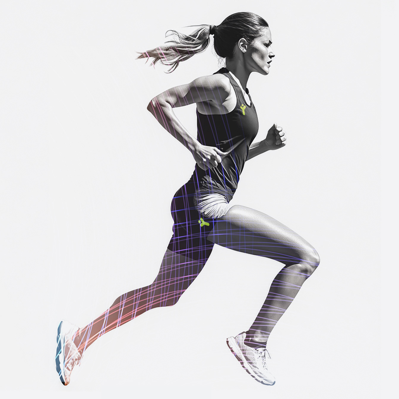
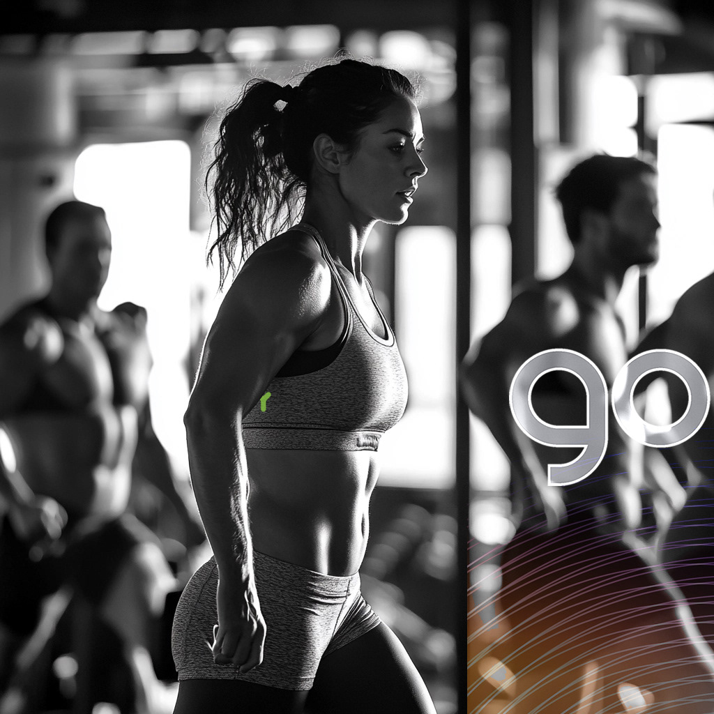
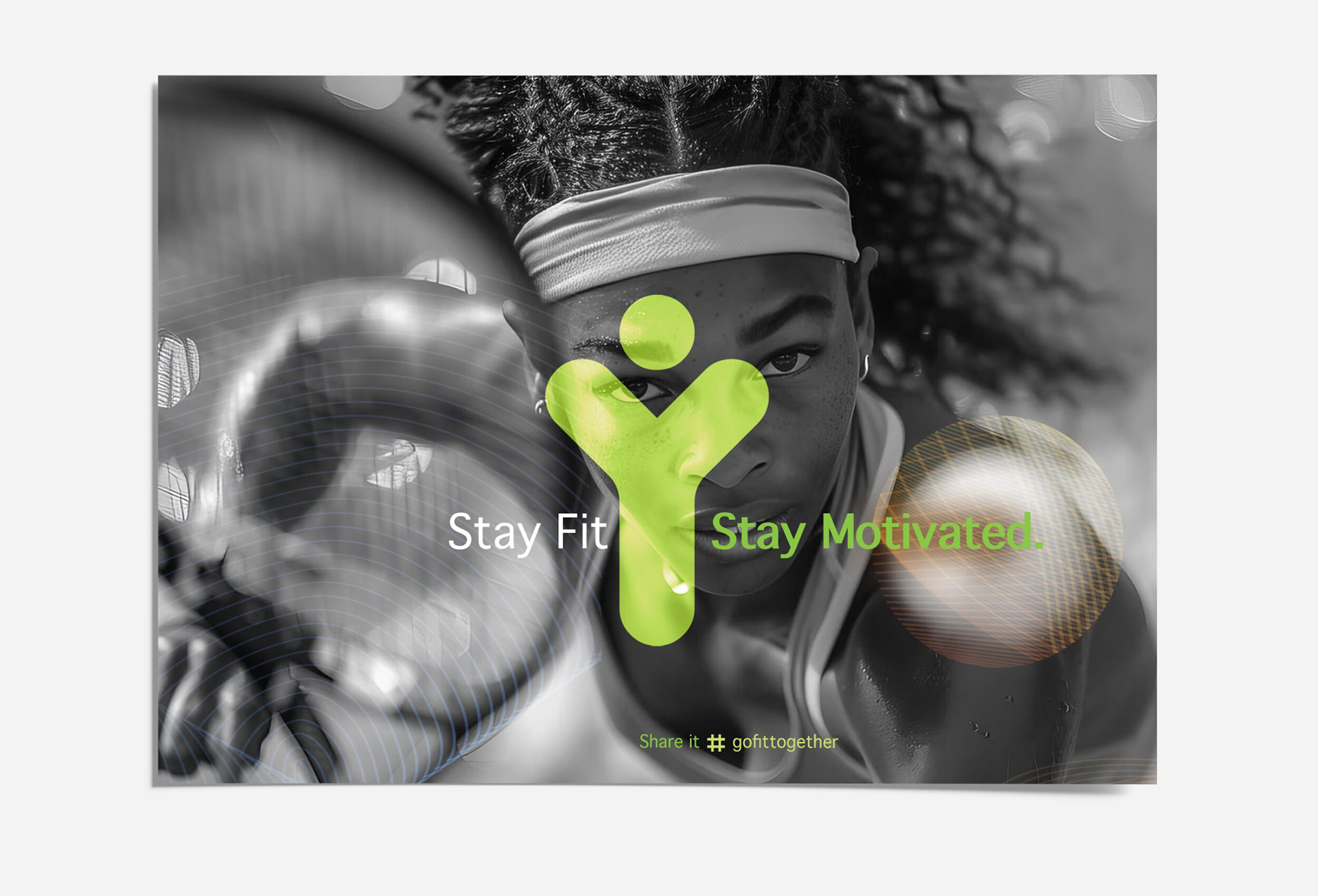
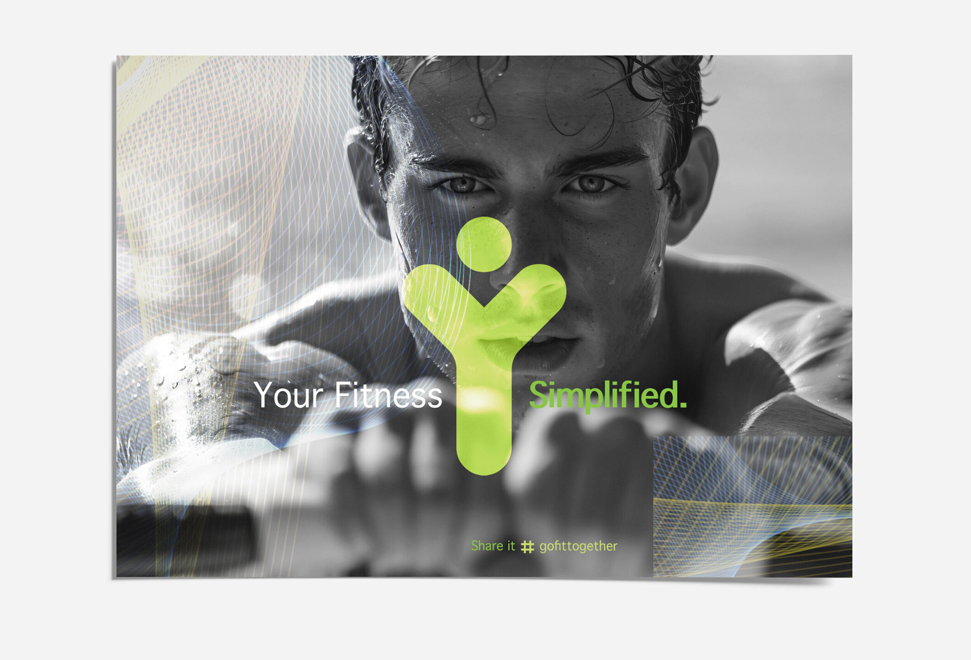
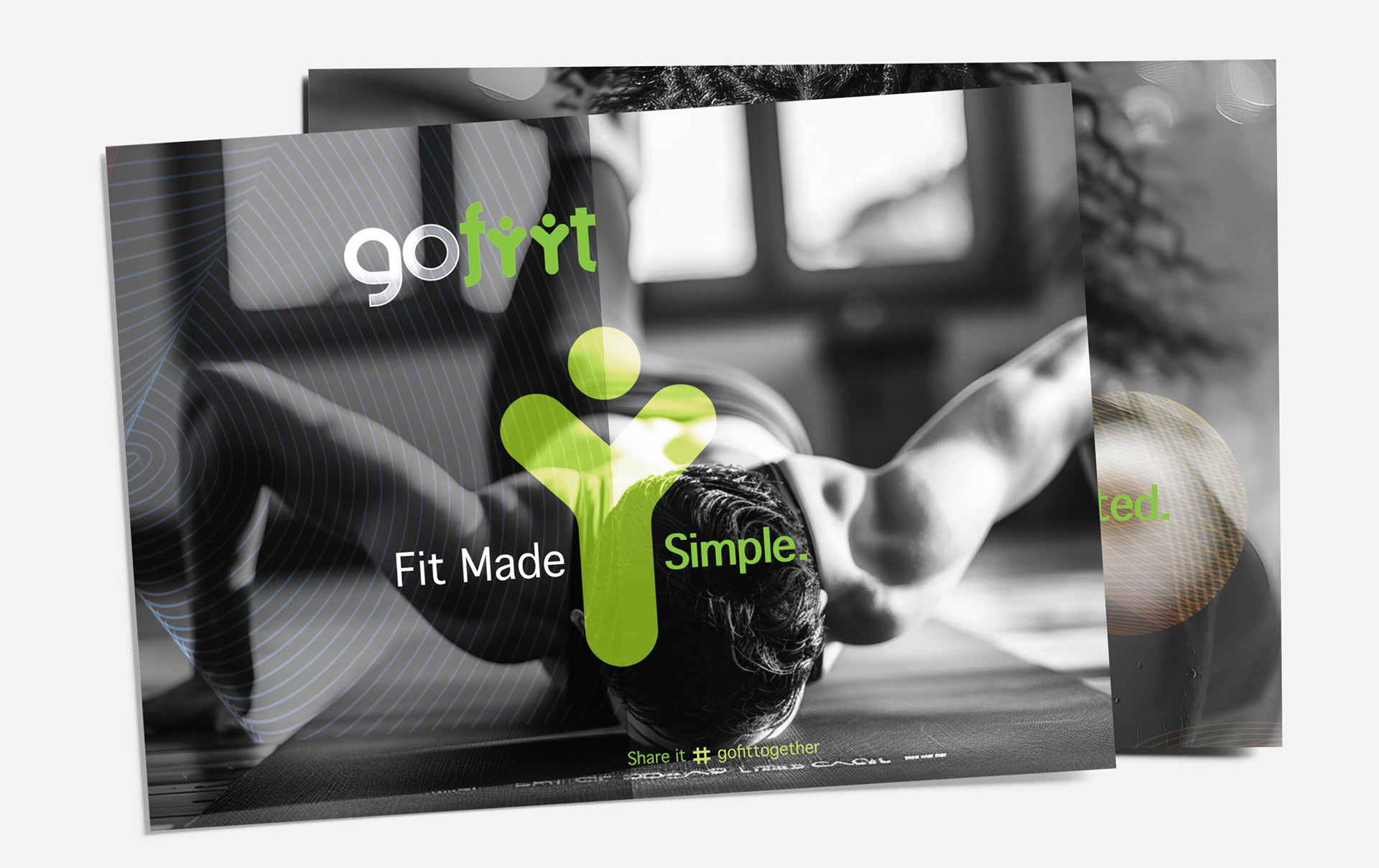
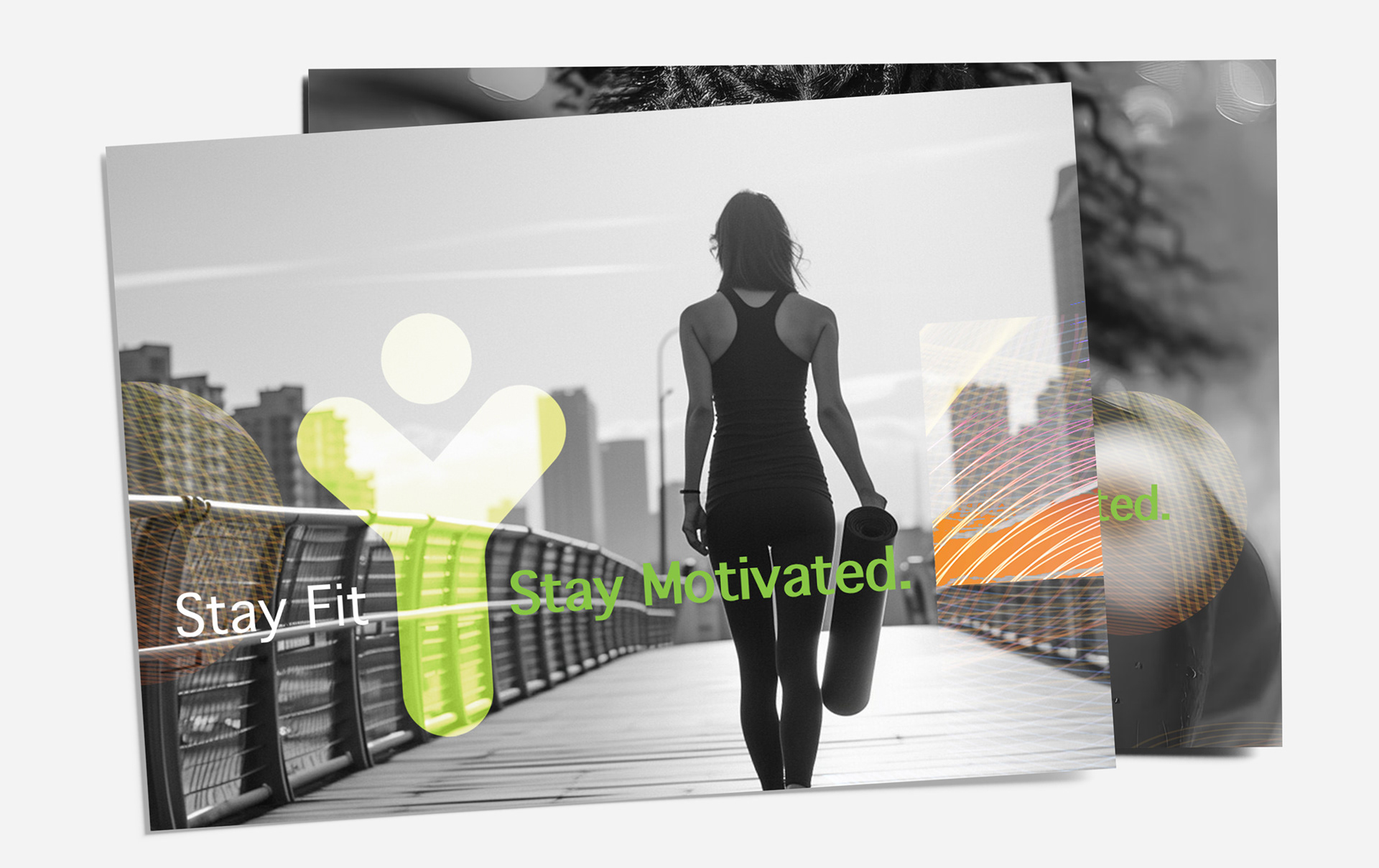
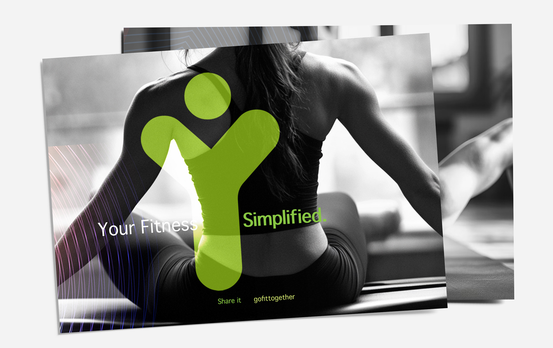

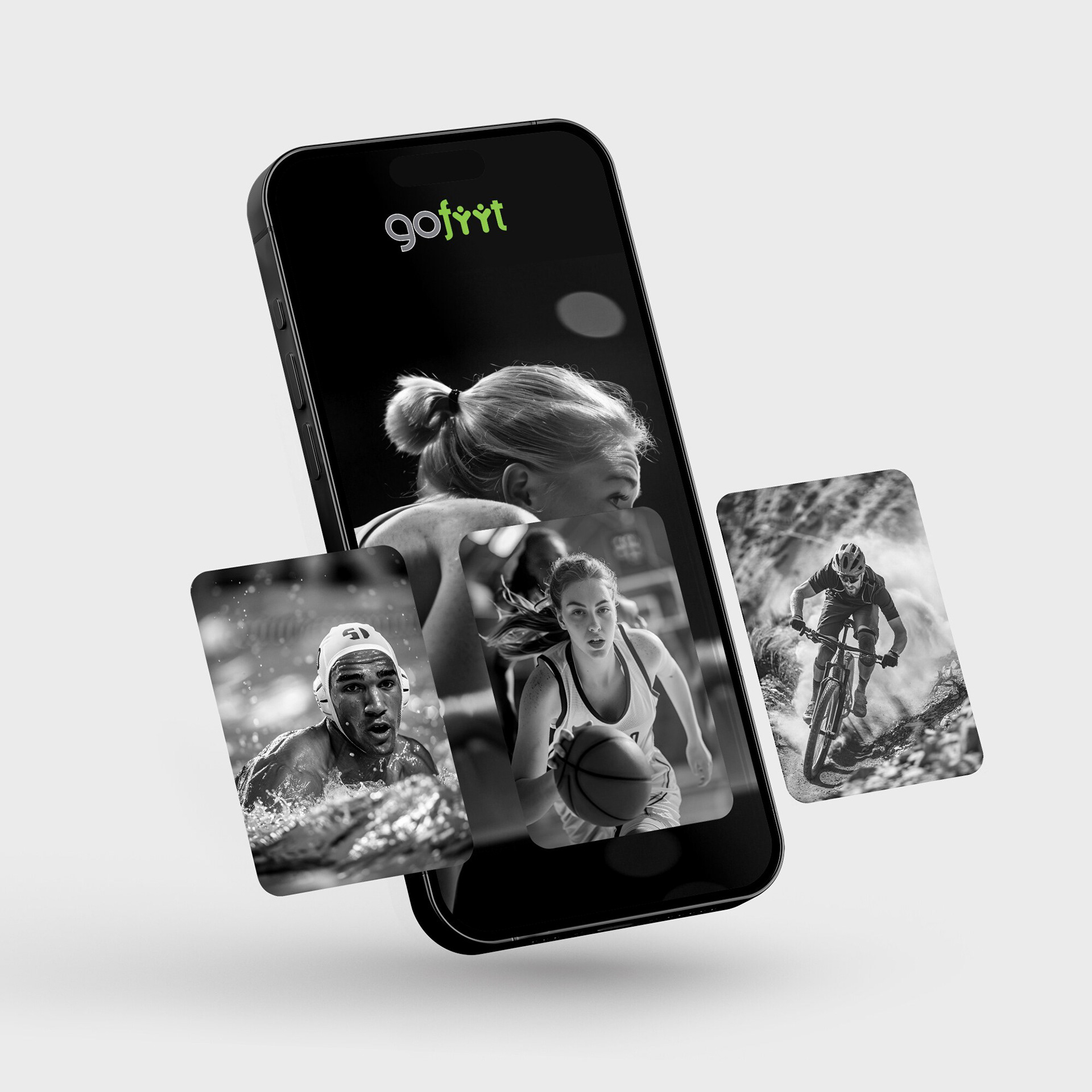
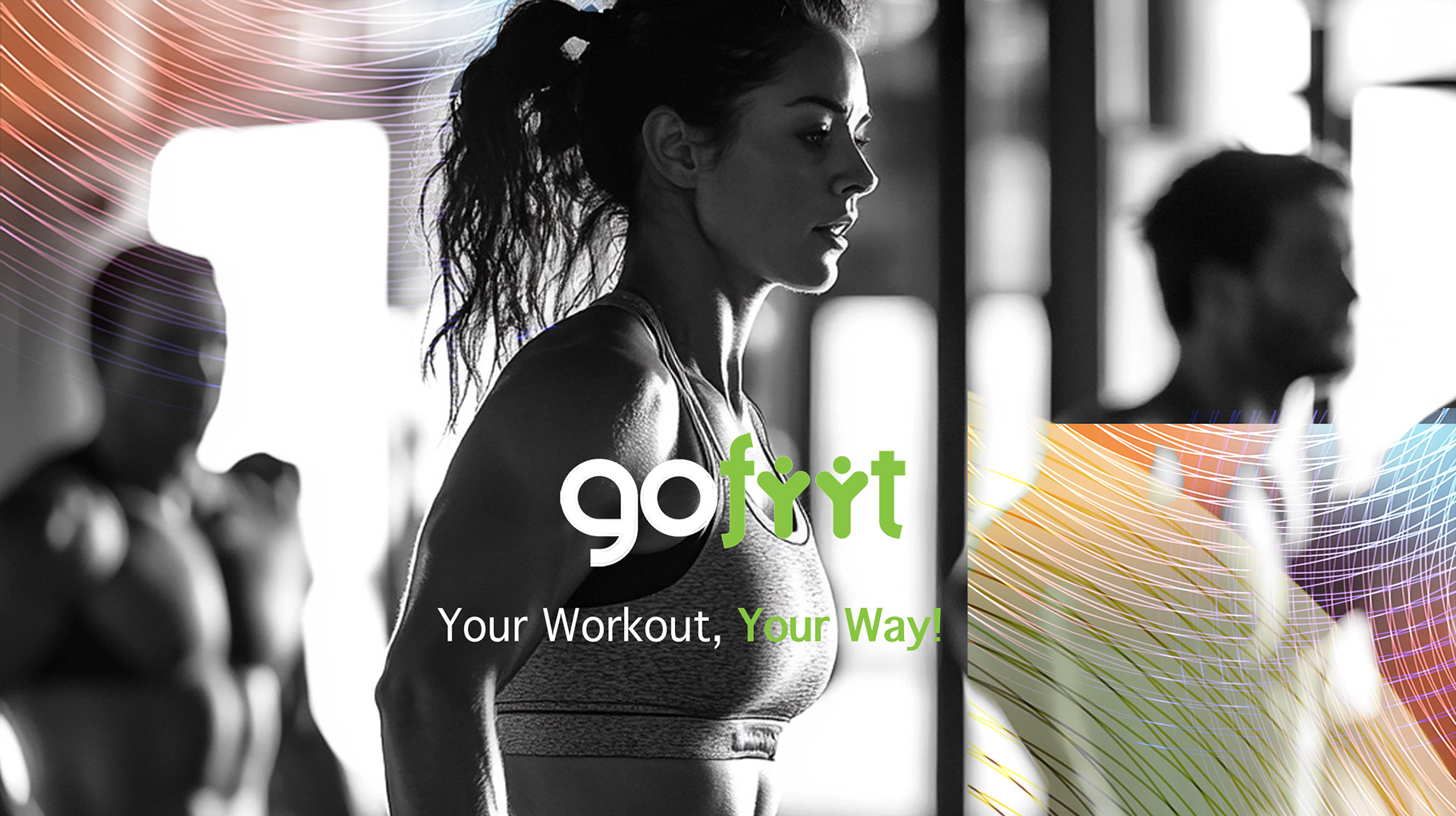
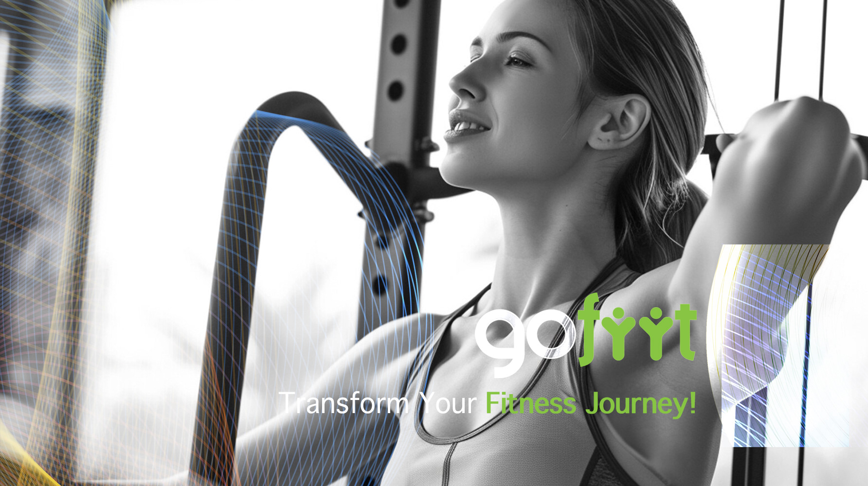
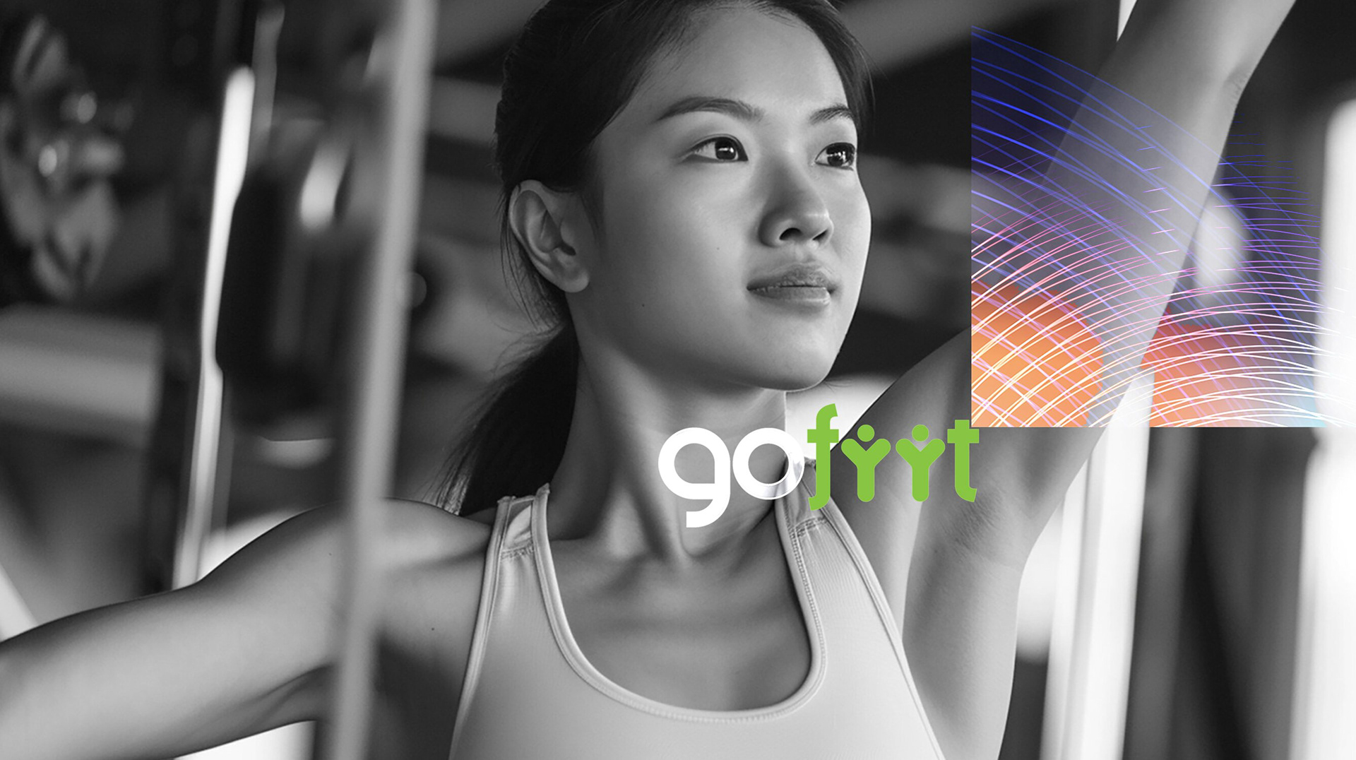
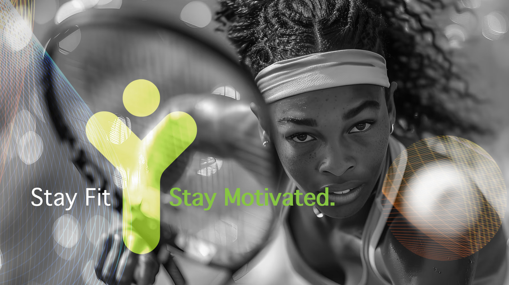
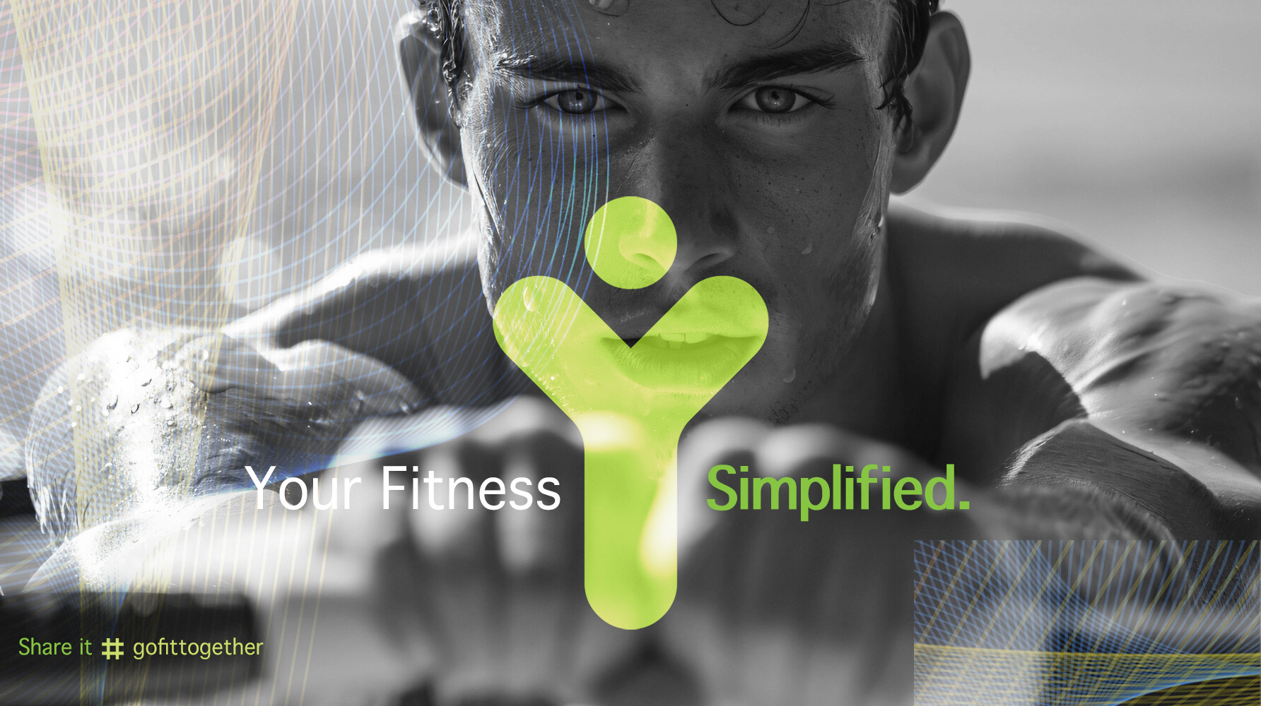
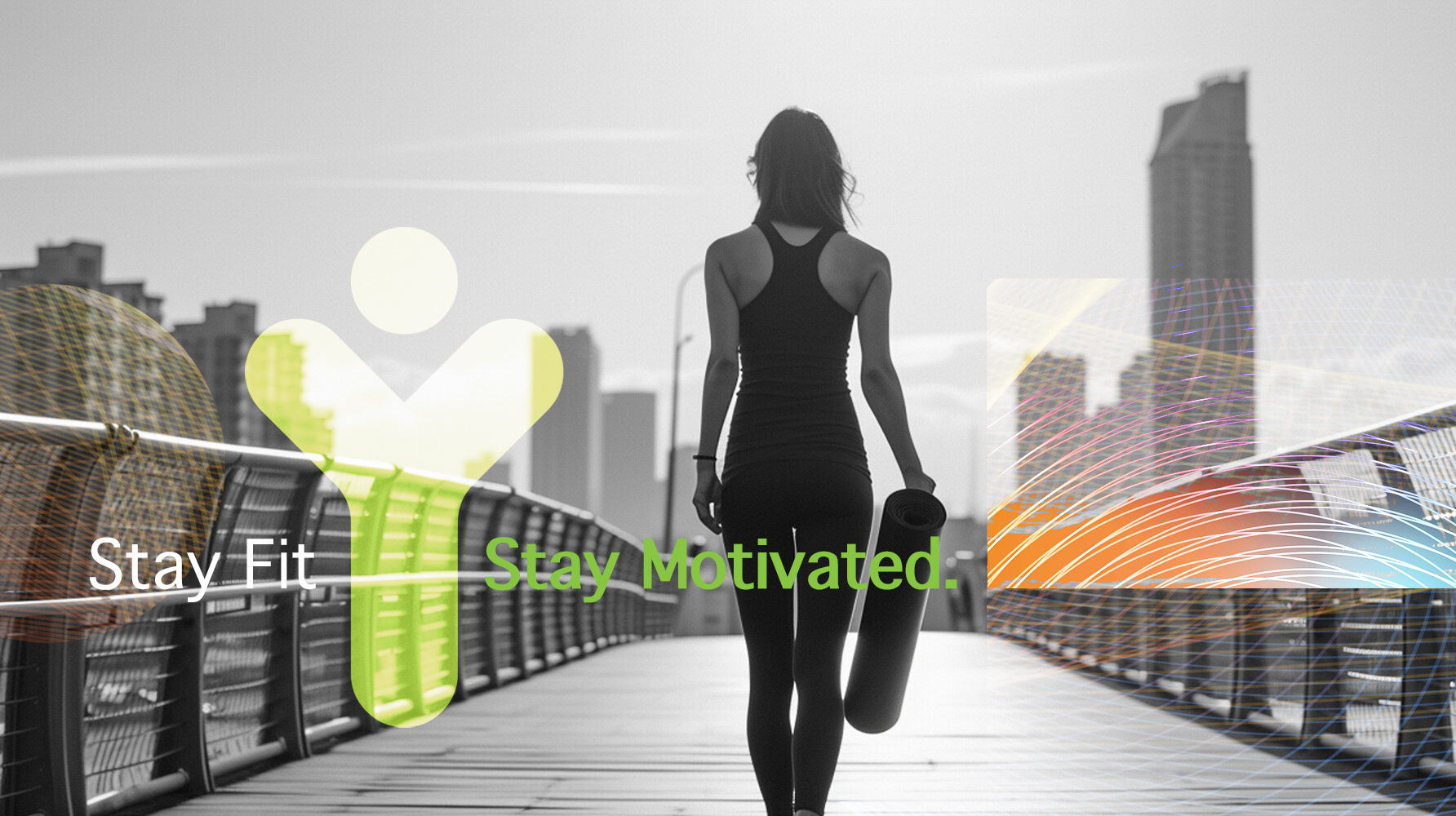
A custom logotype designed to express movement and energy while remaining clear and recognizable across mobile interfaces.
Launching a consumer app that has to stand out at icon size?