CLIENT ▸ ISOL Brands, NYC
ROLE ▸ Brand Designer Freelance
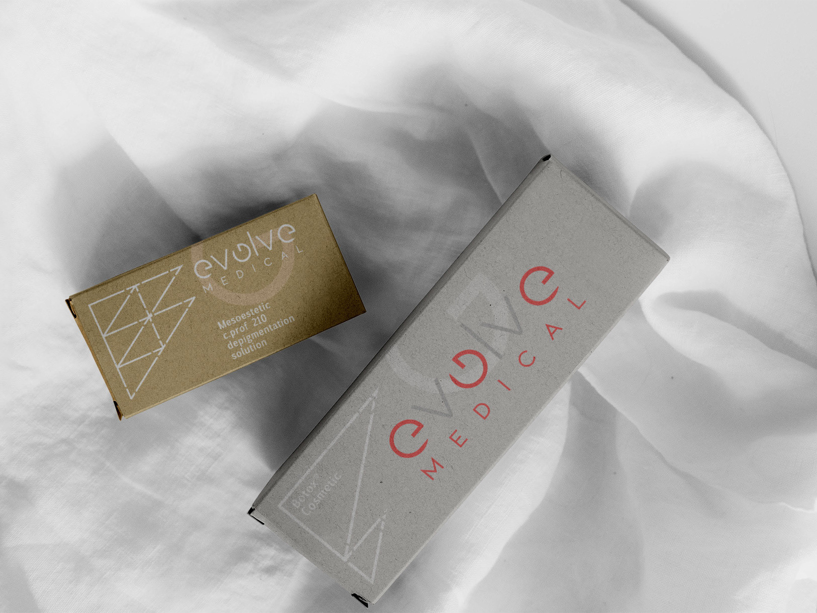
SCOPE ▸ Logo Design, Brand Development, Visual Identity, Campaign Materials, Photo Retouching
ROLE ▸ Brand Designer Freelance
SCOPE ▸ Logo Design, Brand Development, Visual Identity, Campaign Materials, Photo Retouching
The Challenge
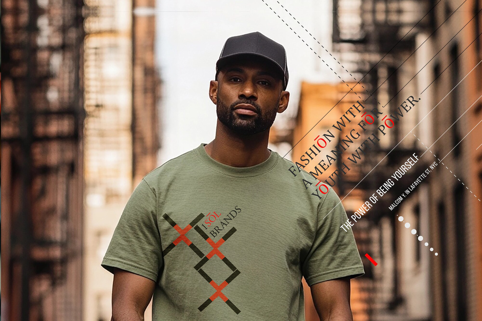
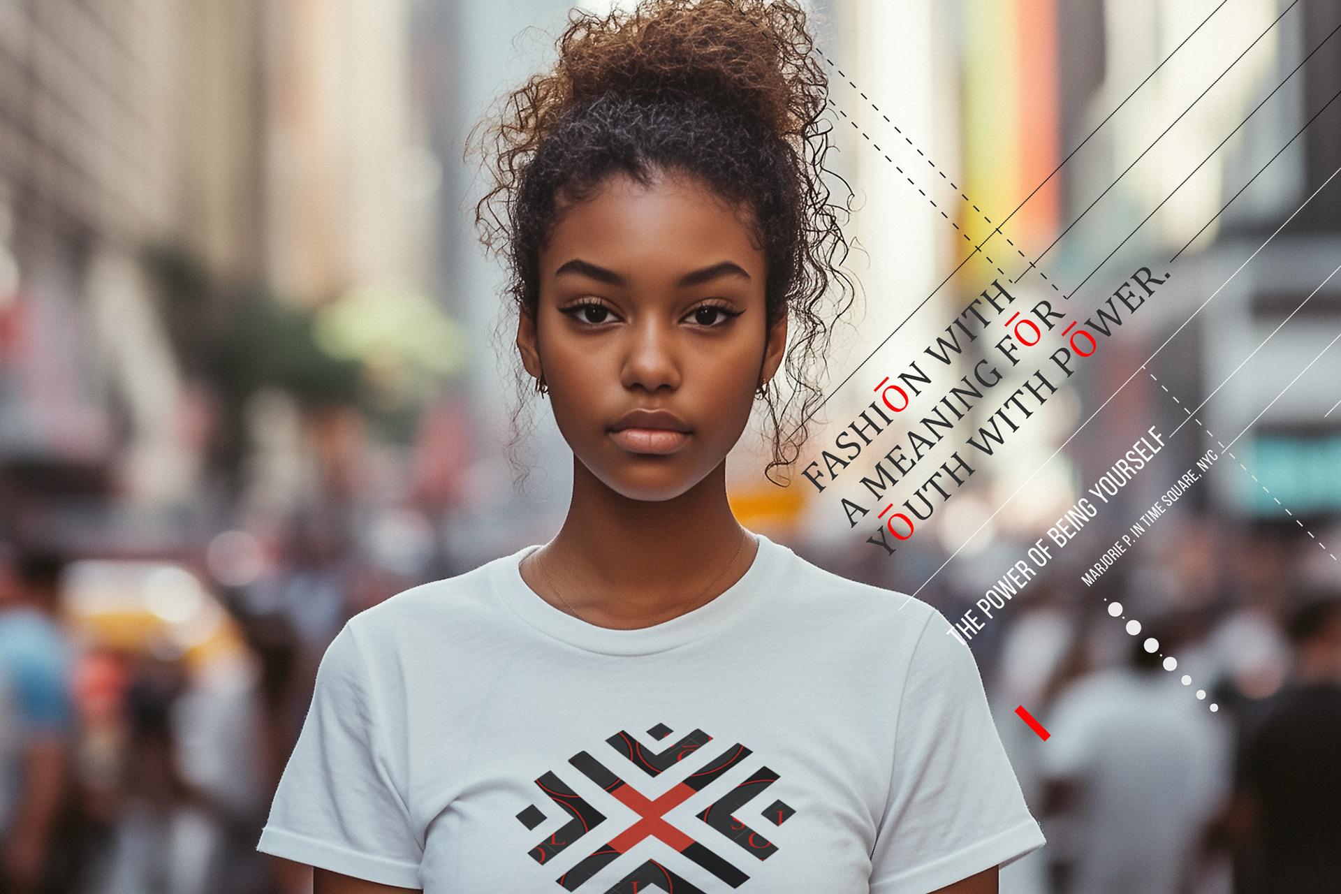
Build a youth fashion identity that feels culturally current without chasing trends
Create a system that can flex across campaigns, social, product drops, and collaborations
Establish clear brand recognition in a saturated youth/street fashion landscape
Build a youth fashion identity that feels culturally current without chasing trends
Create a system that can flex across campaigns, social, product drops, and collaborations
Establish clear brand recognition in a saturated youth/street fashion landscape
Strategic Approach
Define ISOL as a brand platform: identity + system + content engine
Anchor the brand in repeatable cues (typography, layout rhythm, graphic language) to create instant recognition
Design for speed and scalability, supporting fast production cycles while protecting consistency
Define ISOL as a brand platform: identity + system + content engine
Anchor the brand in repeatable cues (typography, layout rhythm, graphic language) to create instant recognition
Design for speed and scalability, supporting fast production cycles while protecting consistency
Creative Solution
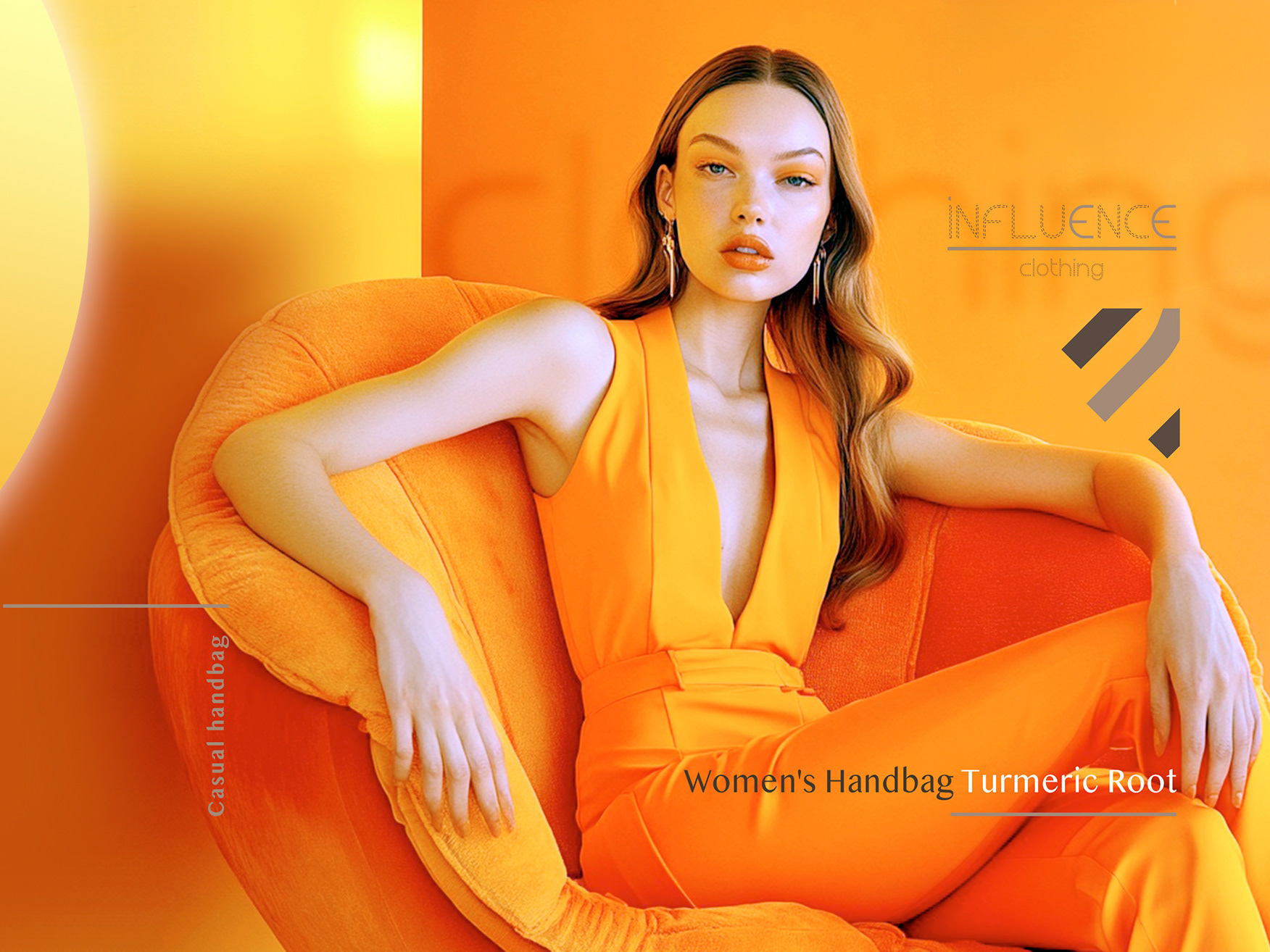
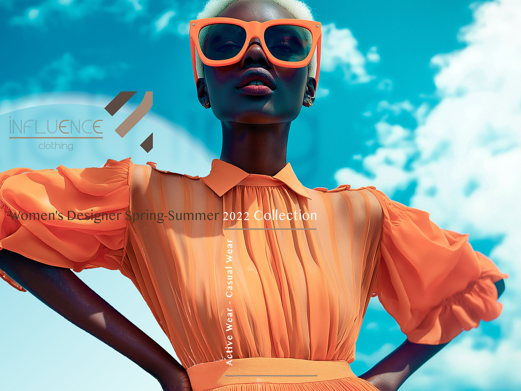
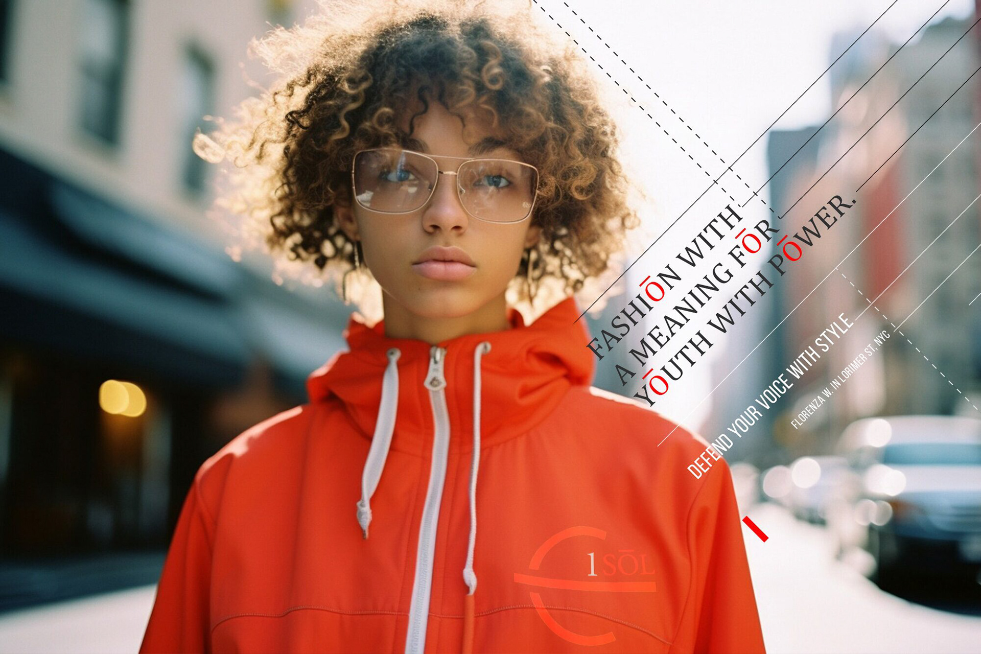
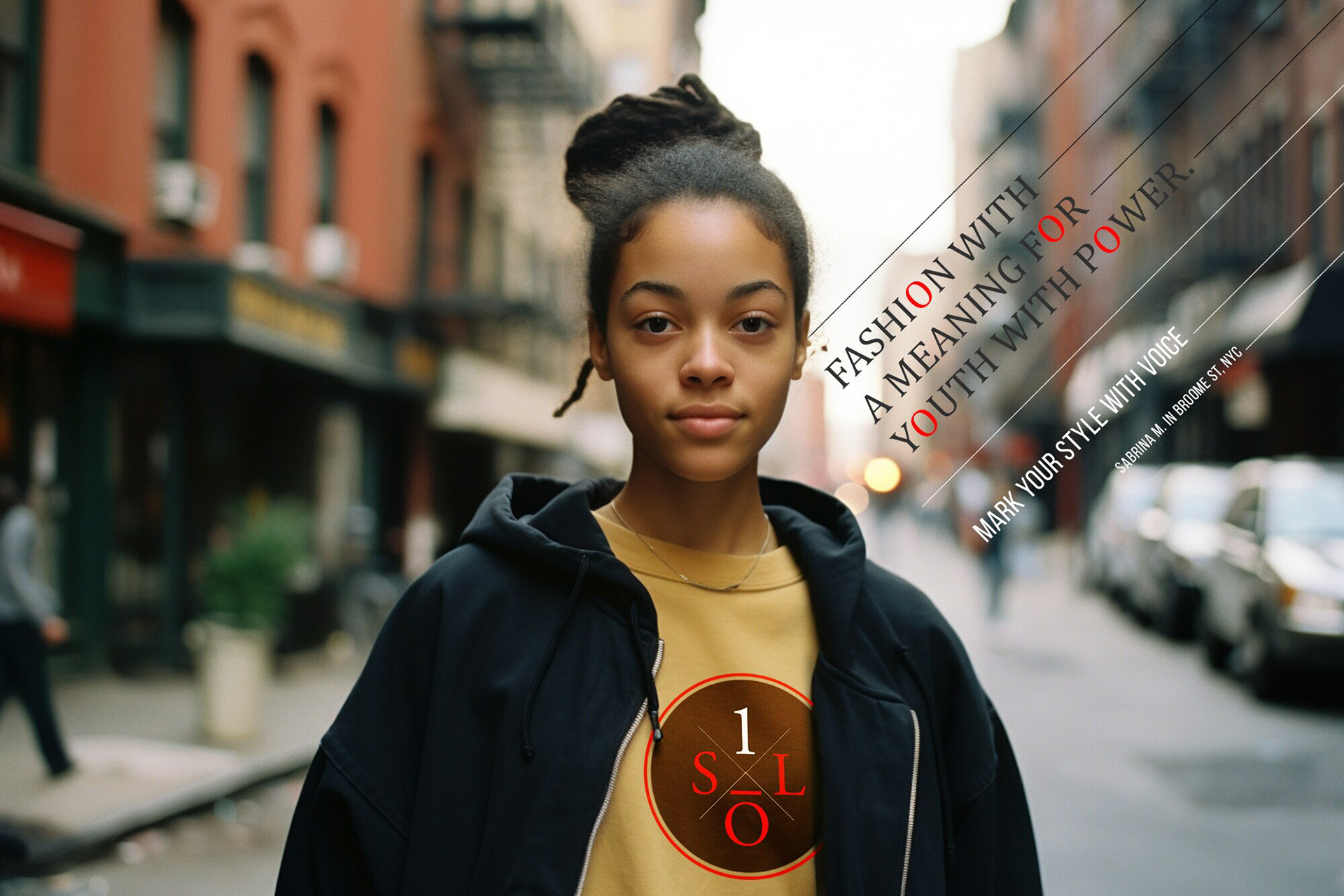
A bold, contemporary visual identity built around clarity, attitude, and restraint
A graphic language that frames imagery and messaging with strong hierarchy and rhythm
A brand system designed to carry seasonal variation while staying unmistakably ISOL
A bold, contemporary visual identity built around clarity, attitude, and restraint
A graphic language that frames imagery and messaging with strong hierarchy and rhythm
A brand system designed to carry seasonal variation while staying unmistakably ISOL
Scope & System
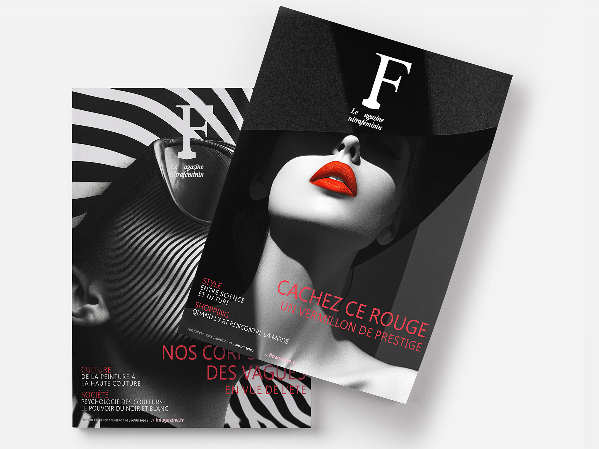
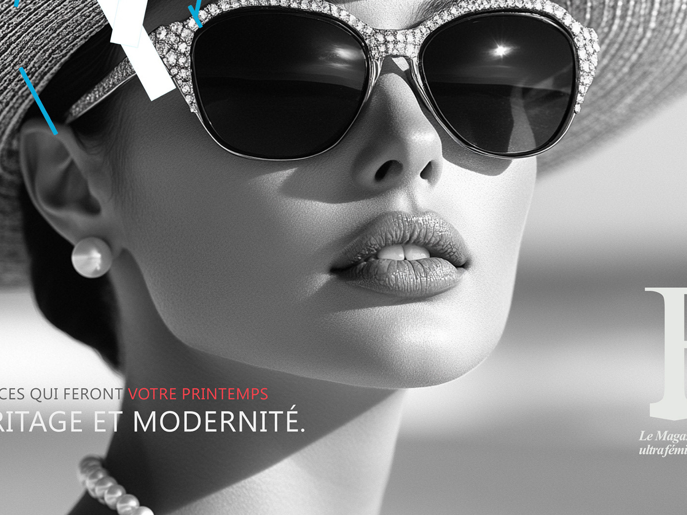
Modular grid and layout rules for campaign, social, and e-comm content
Typographic system defining voice: headline energy + functional readability
Flexible color / graphic treatments to support drops and collaborations
Rules for image treatment, composition, and messaging hierarchy across touchpoints
Key Results
Stronger brand recognition through consistent visual cues and repeatable structure
A scalable system that supports frequent content releases without fragmentation
Clear positioning as confident, contemporary, and culturally fluent
Stronger brand recognition through consistent visual cues and repeatable structure
A scalable system that supports frequent content releases without fragmentation
Clear positioning as confident, contemporary, and culturally fluent
Impact & Performance
Faster content output enabled by codified templates and system rules
Improved consistency across campaigns, social, and commerce assets
A clearer brand voice that translates across audiences and channels
Faster content output enabled by codified templates and system rules
Improved consistency across campaigns, social, and commerce assets
A clearer brand voice that translates across audiences and channels
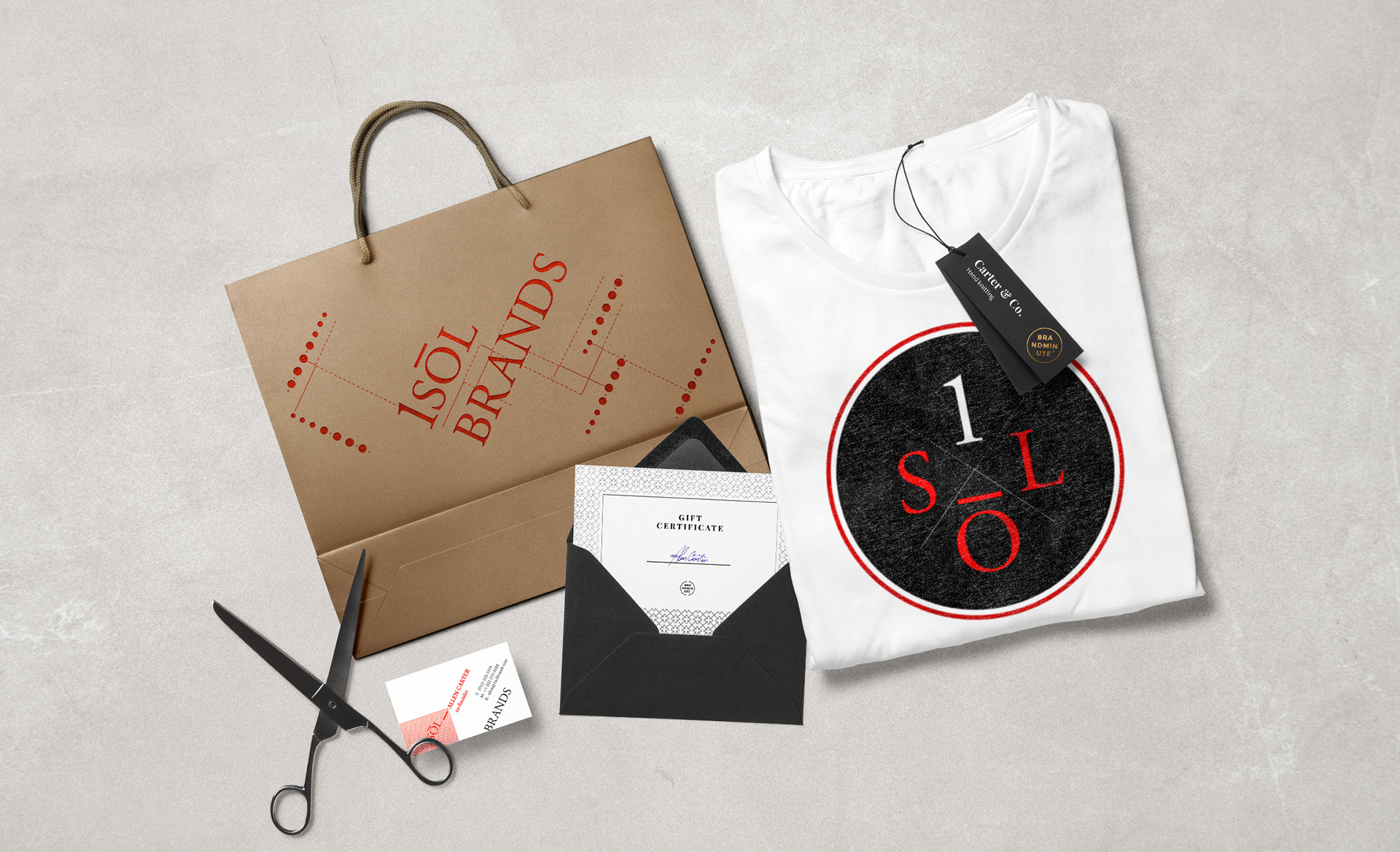
Deliverables
+ Logo / wordmark and core identity system
+ Typography, layout, and composition guidelines
+ Social templates and campaign asset toolkit
+ E-commerce visual alignment and brand-ready components
+ Logo / wordmark and core identity system
+ Typography, layout, and composition guidelines
+ Social templates and campaign asset toolkit
+ E-commerce visual alignment and brand-ready components
Role & Leadership
Brand Design Lead
Led brand direction and aesthetic positioning, building a scalable fashion identity across campaigns, social ecosystems, and retail expression.
Brand Design Lead
Led brand direction and aesthetic positioning, building a scalable fashion identity across campaigns, social ecosystems, and retail expression.
Why This Works Matters
Youth fashion changes rapidly, but brands endure only when they’re built on systems, not aesthetics.
This project demonstrates how to translate cultural energy into a disciplined identity framework, enabling the brand to evolve through drops, collaborations, and seasonal change while remaining coherent, recognizable, and scalable.
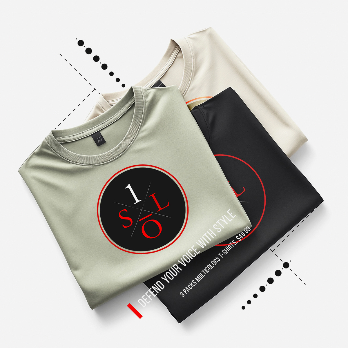
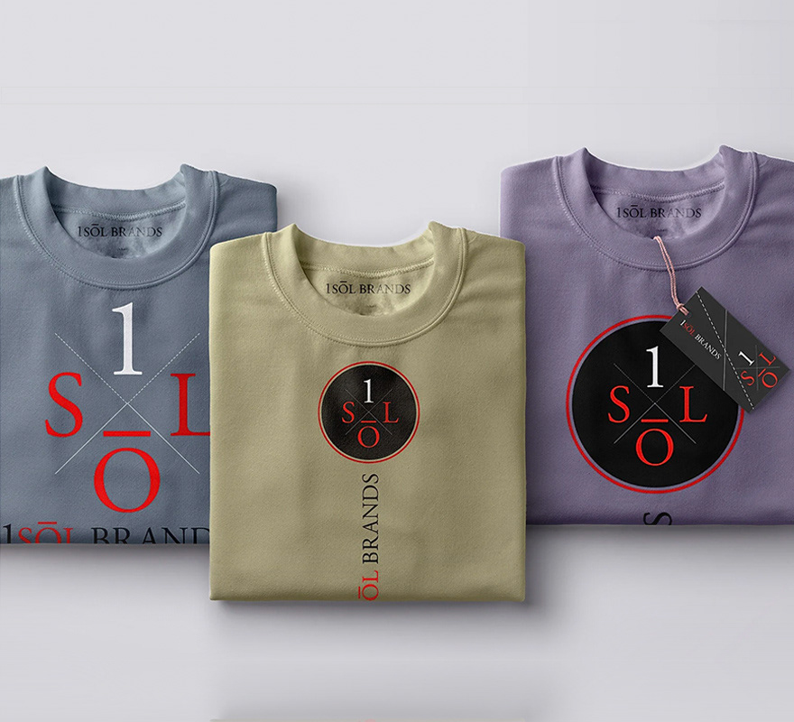

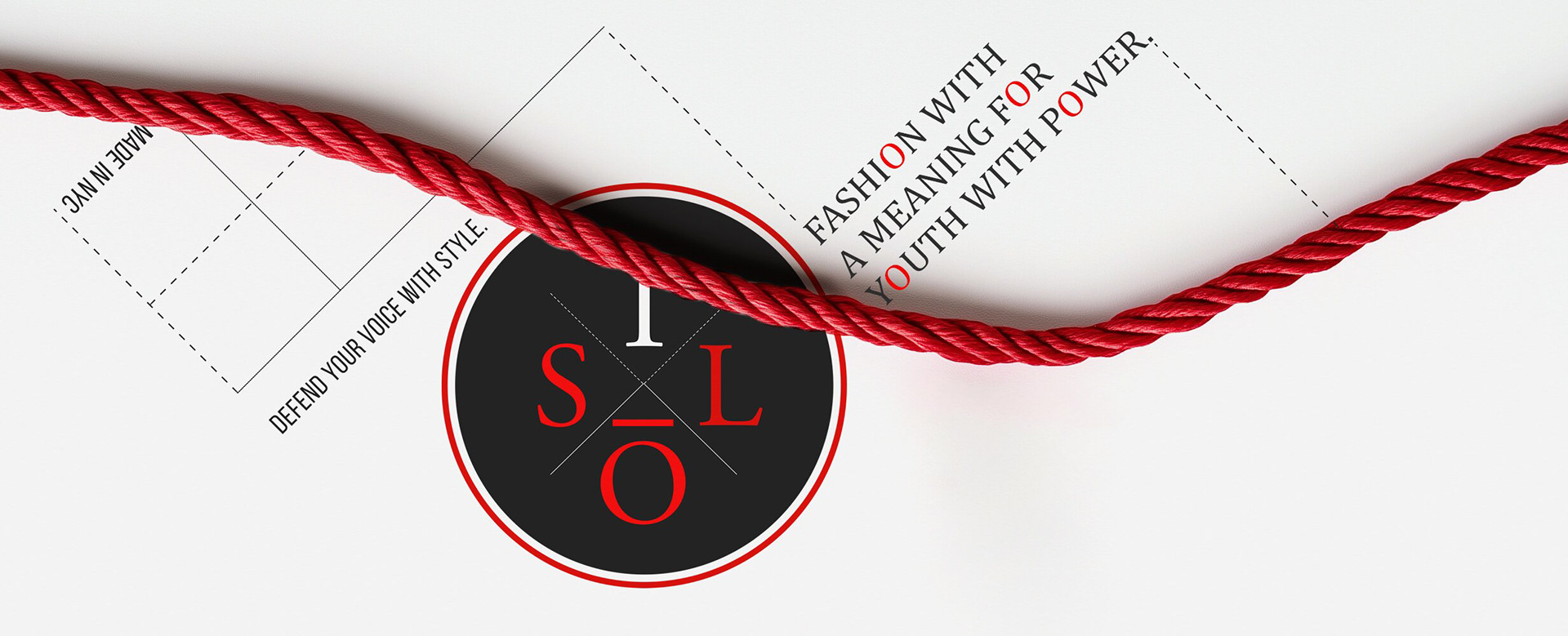
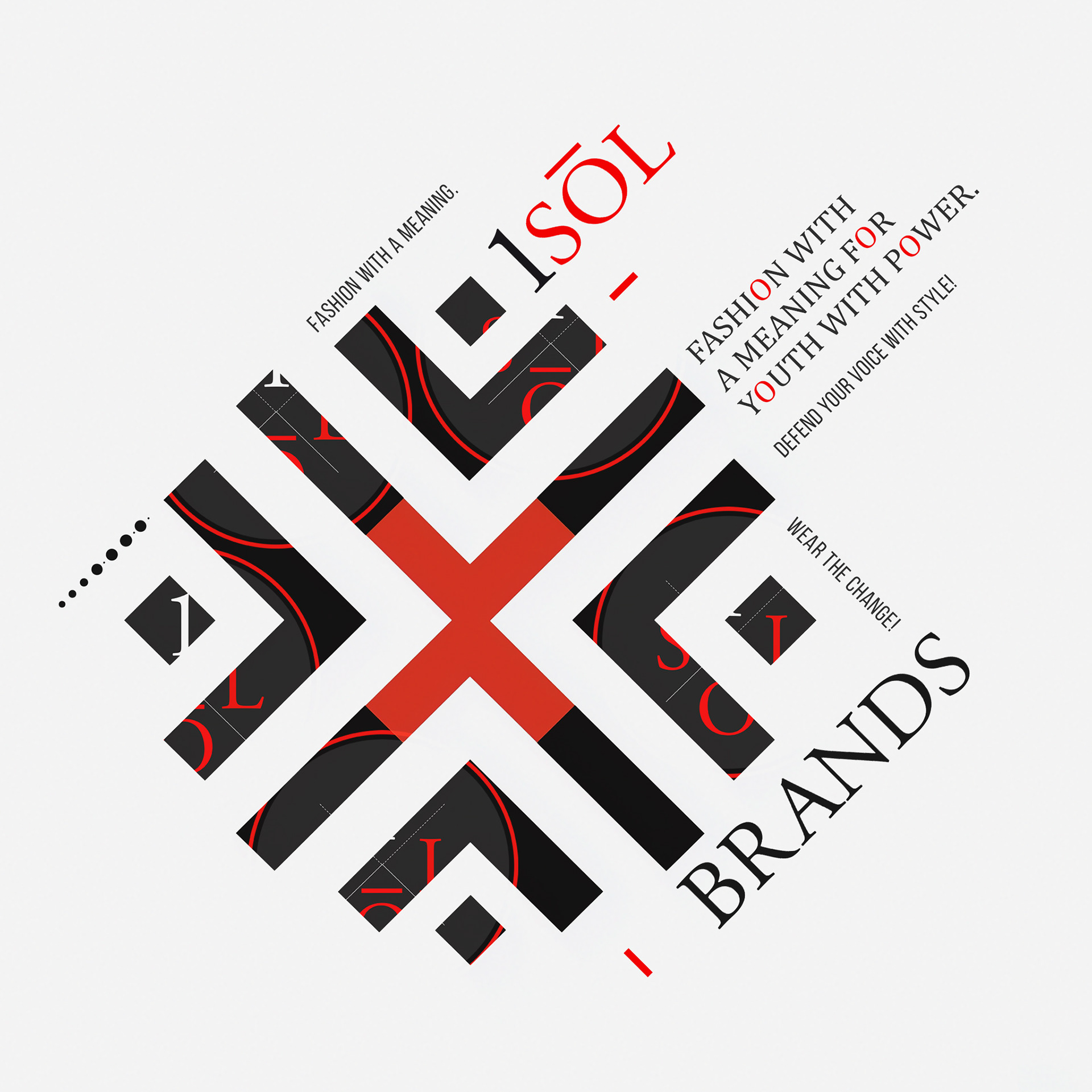
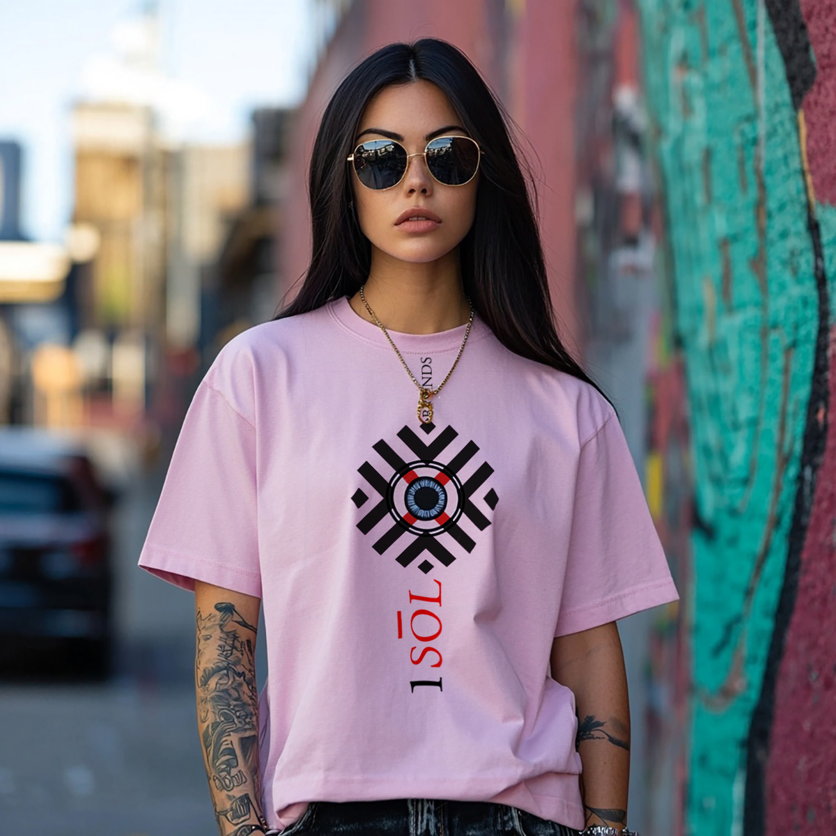
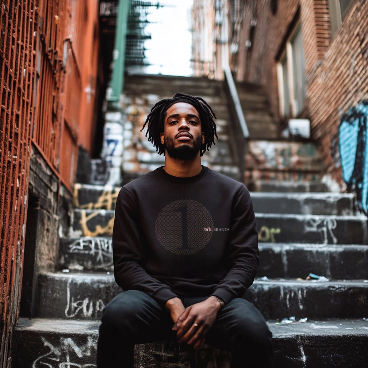
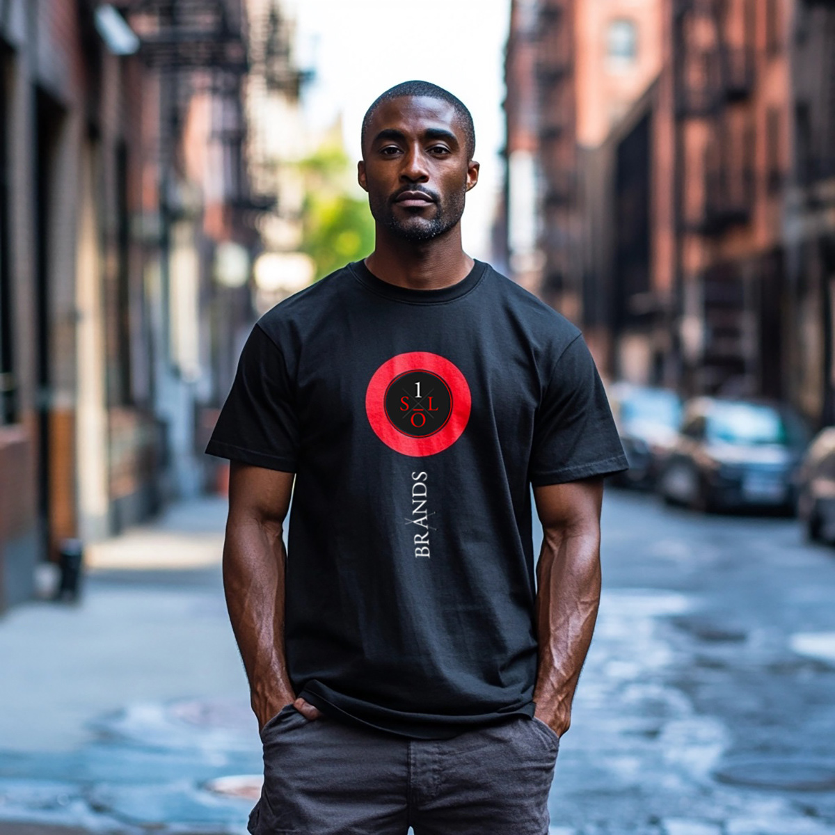
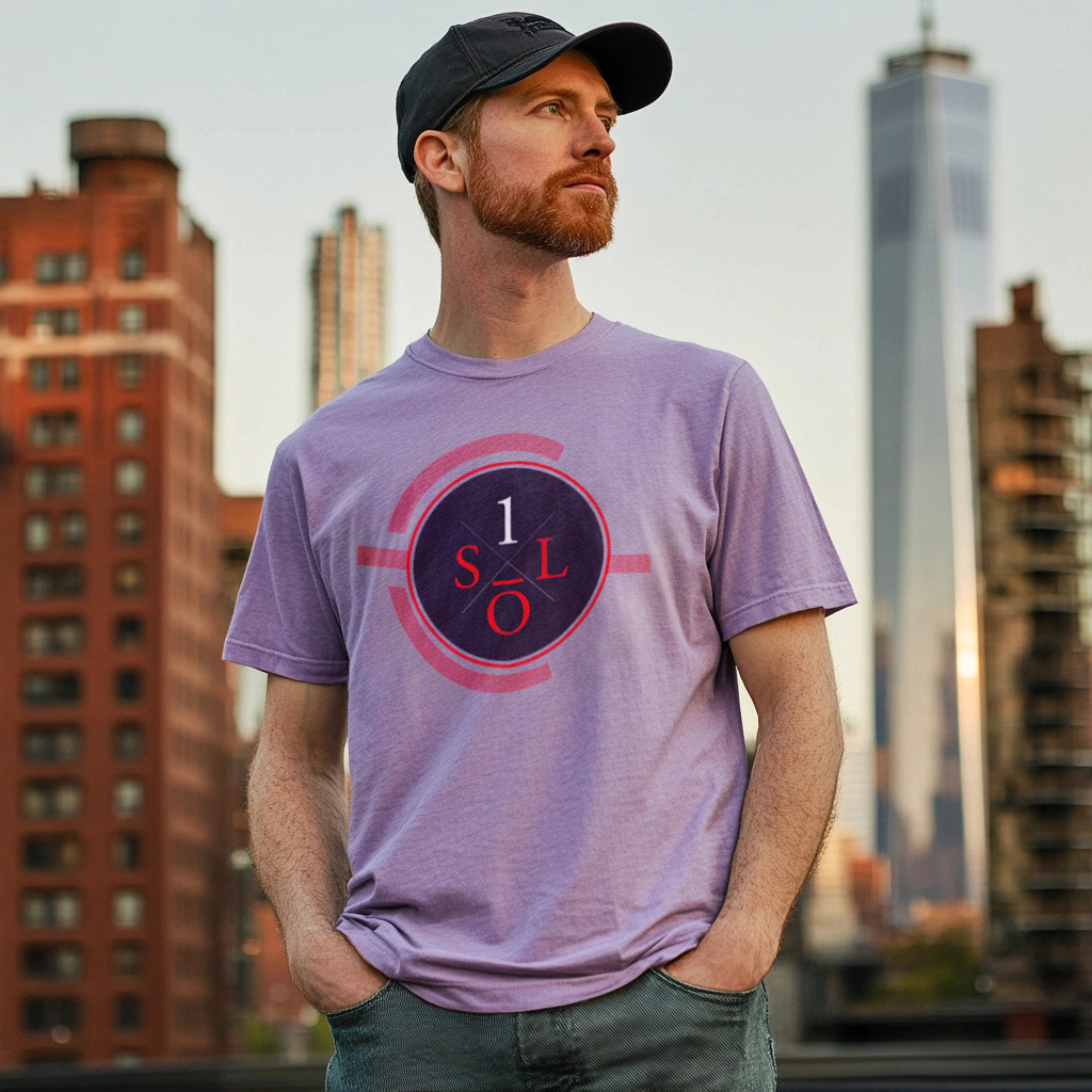
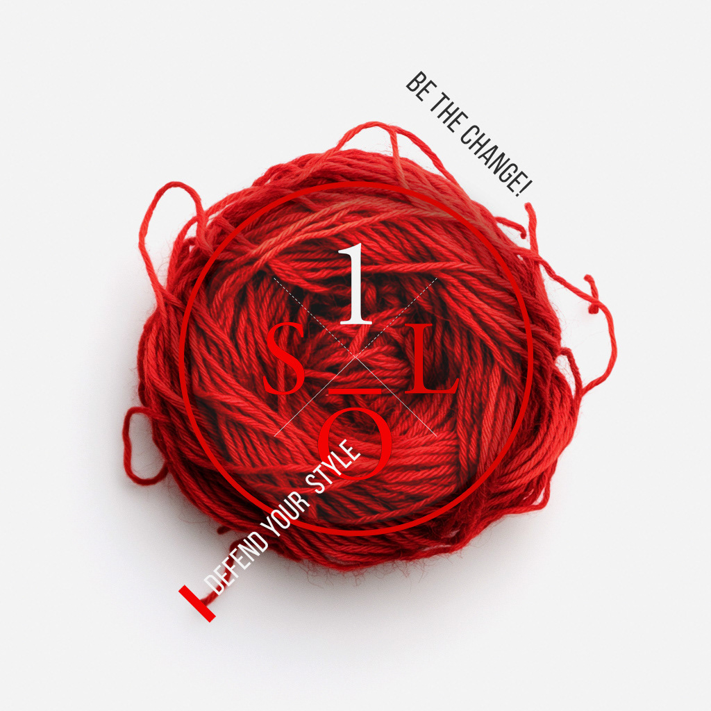
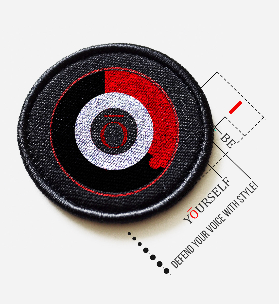
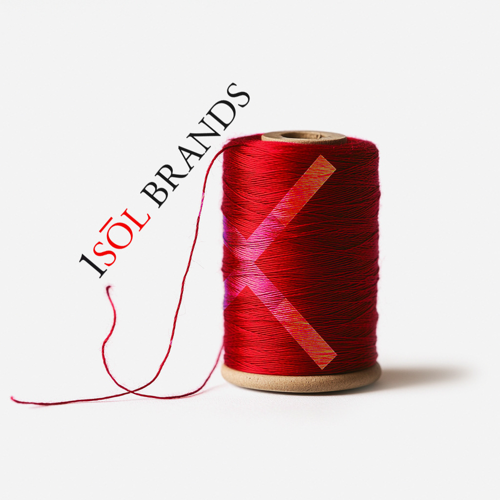
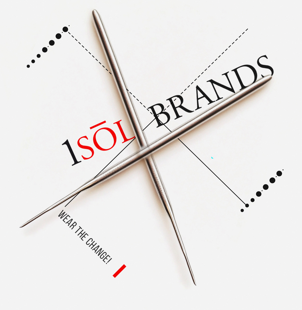
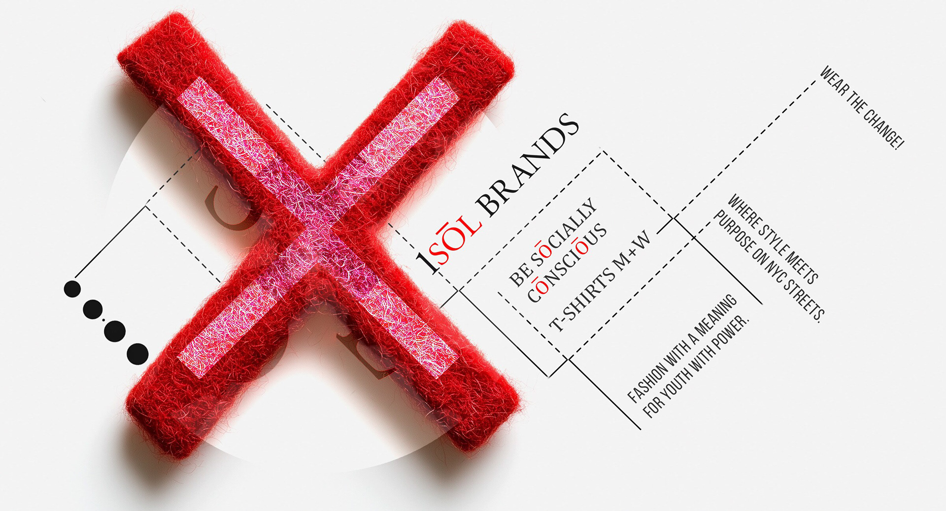
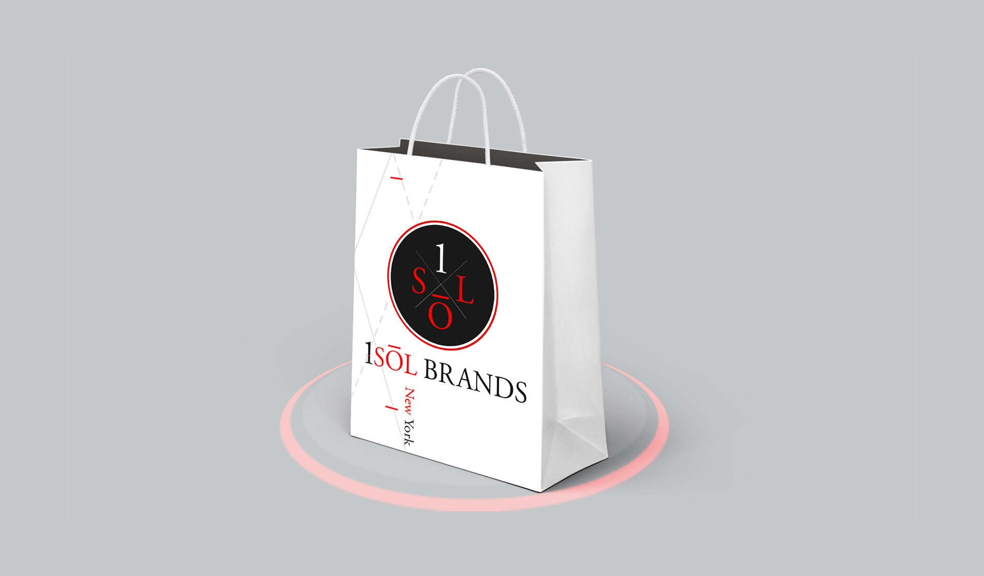
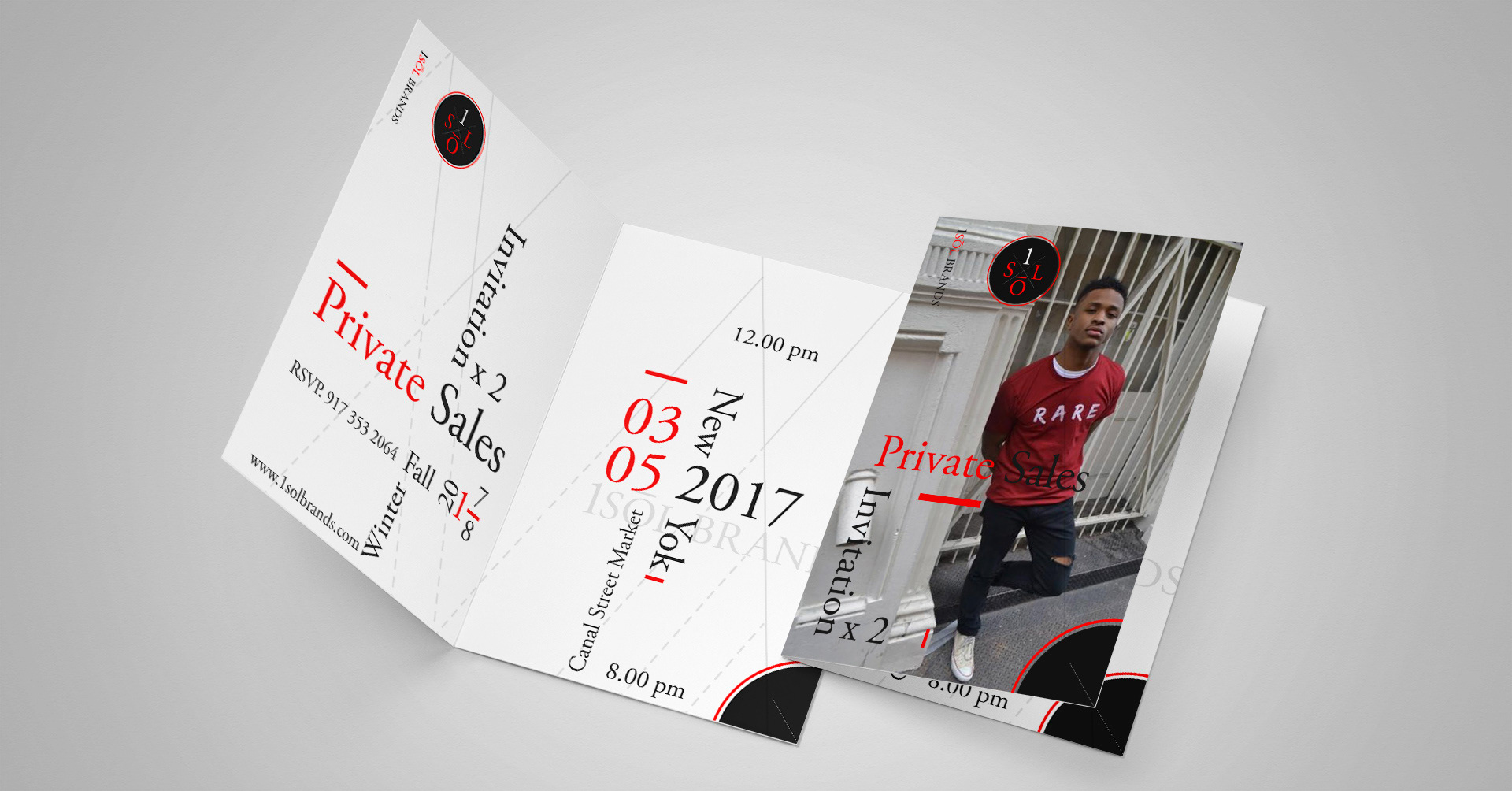
The logo was designed as a confident typographic mark, built for immediate recognition and designed to perform across campaigns, social, and product contexts.
Launching a youth brand
with bold values & big ambitions?
with bold values & big ambitions?