CLIENT / Yeah Mobi, China
Project Overview
This Start-up requested a complete brand identity to position itself as a leader in mobile CPA networks.
They wanted a design that communicated professionalism, innovation, and trust, reflecting their expertise in mobile advertising and performance marketing.
The client sought a cohesive visual identity that would appeal to advertisers and app developers.
The goal was to create a brand that stood out in the competitive mobile marketing space while conveying reliability and cutting-edge solutions.

Approach & Solution
I developed a visual identity that conveyed both professionalism and innovation:
- I chose a modern font to reflect the company's forward-thinking approach in the mobile CPA
network industry.
- I used a blue and yellow palette to balance trust and energy. Blue was selected for
its association with reliability and stability, essential traits for a CPA network.
- Yellow added a sense of vibrancy and optimism, representing the dynamic nature
of mobile advertising.
- Combining these elements created a bold, contemporary brand identity that stood out
in the competitive market.
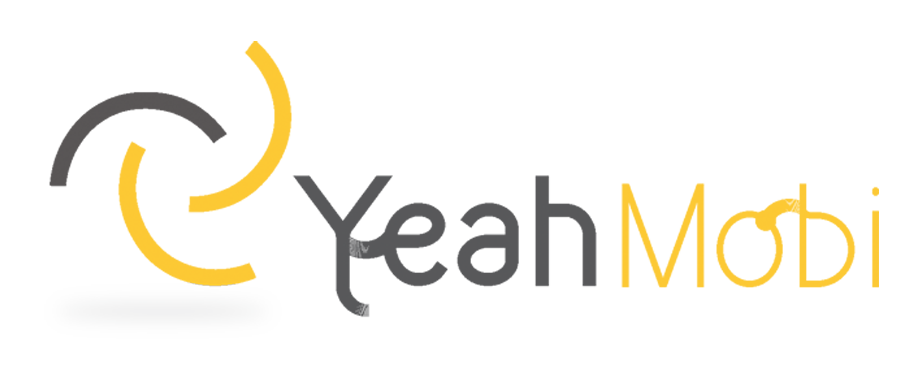
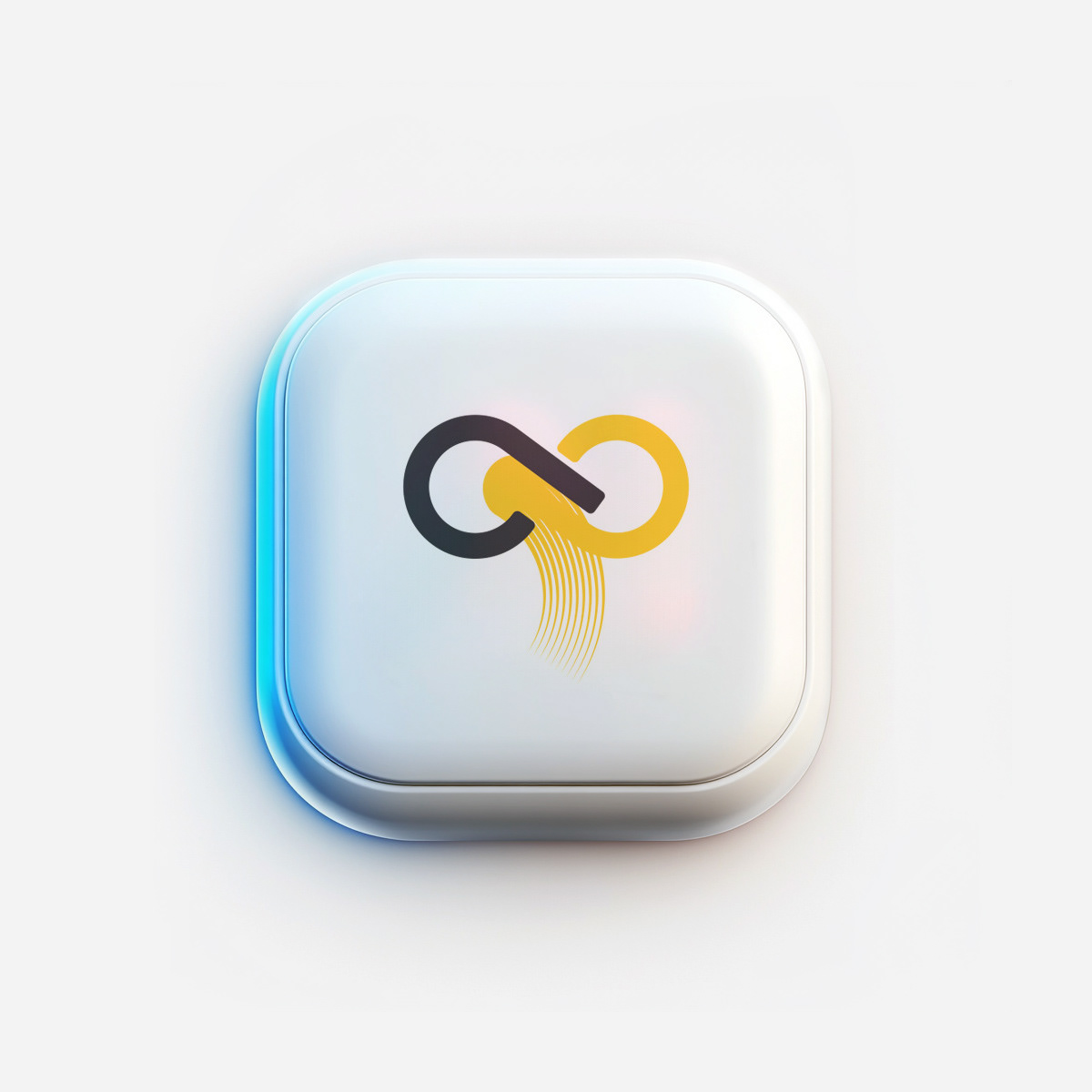
LOGO DESIGN: A BOLD FUSION OF TECHNOLOGY AND INNOVATION
Color Palette: Dark gray (sophistication, stability) and yellow (energy, innovation).
Typography: Modern sans-serif for a clean, futuristic look.
Graphic Elements: Abstract digital pathways or network-inspired symbols
|to reflect connectivity
Imagery: High-tech visuals with a blue ambiance for a cutting-edge aesthetic.
Typography: Modern sans-serif for a clean, futuristic look.
Graphic Elements: Abstract digital pathways or network-inspired symbols
|to reflect connectivity
Imagery: High-tech visuals with a blue ambiance for a cutting-edge aesthetic.
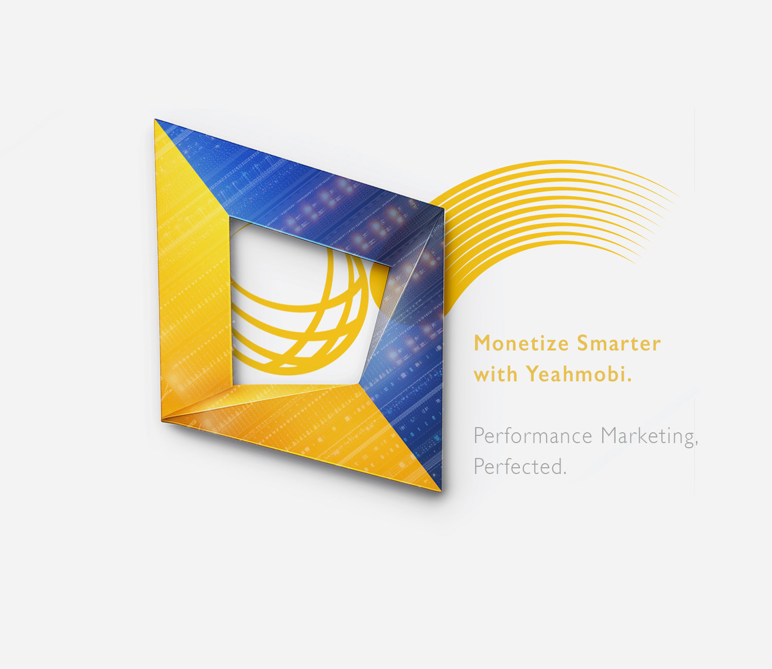

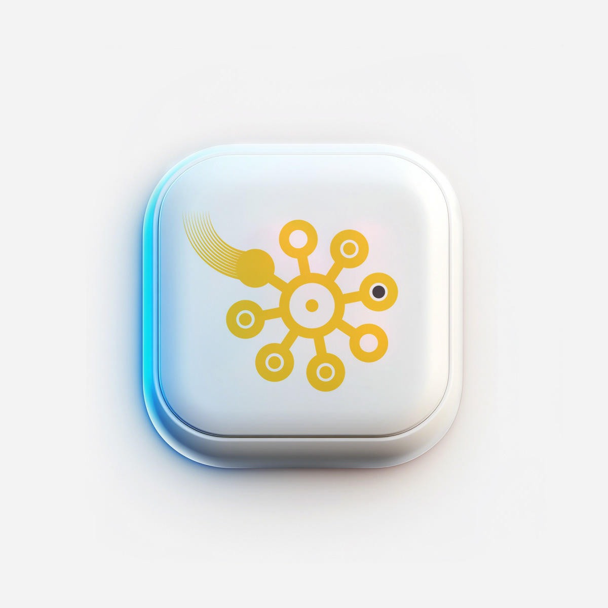
ICONOGRAPHY: DYNAMIC CONNECTIONS
These YEAHMOBI icons use bold, modular shapes and a minimal yellow-gray palette to convey energy, connectivity, and data flow.
Curved lines and rounded forms symbolize networks and integration, while motion lines add a sense of direction and progress—perfectly reflecting a dynamic, tech-forward brand.

Concept Breakdown 1: BUILDING A UNIFIED DIGITAL LANGUAGE
I use these custom icons to create a strong, cohesive visual identity for YEAHMOBI’s digital platforms and presentations.
Each icon is integrated into UI elements, app tiles, dashboards, and infographics, providing clear visual cues for different functions or services.
The icons are designed to be instantly recognizable and scalable, ensuring consistency across digital and print applications.
Their bold style and tech-inspired gradients reinforce YEAHMOBI’s innovative brand positioning, making the user experience intuitive and visually dynamic.
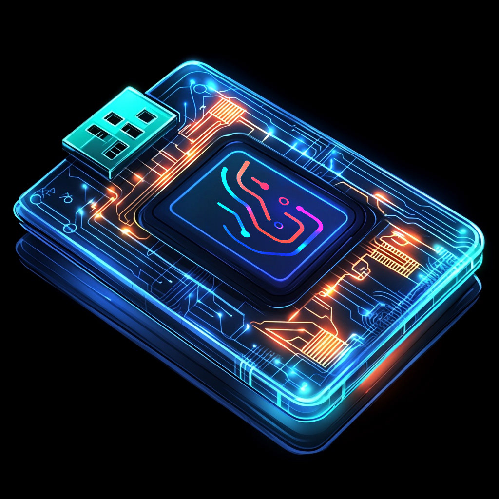


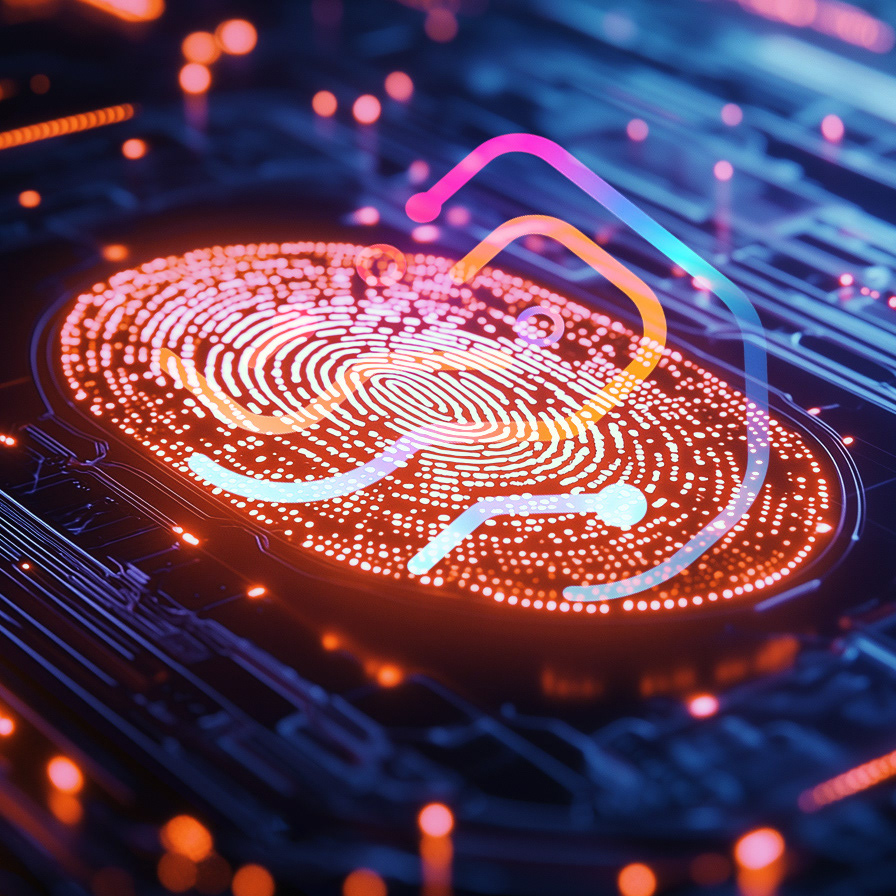


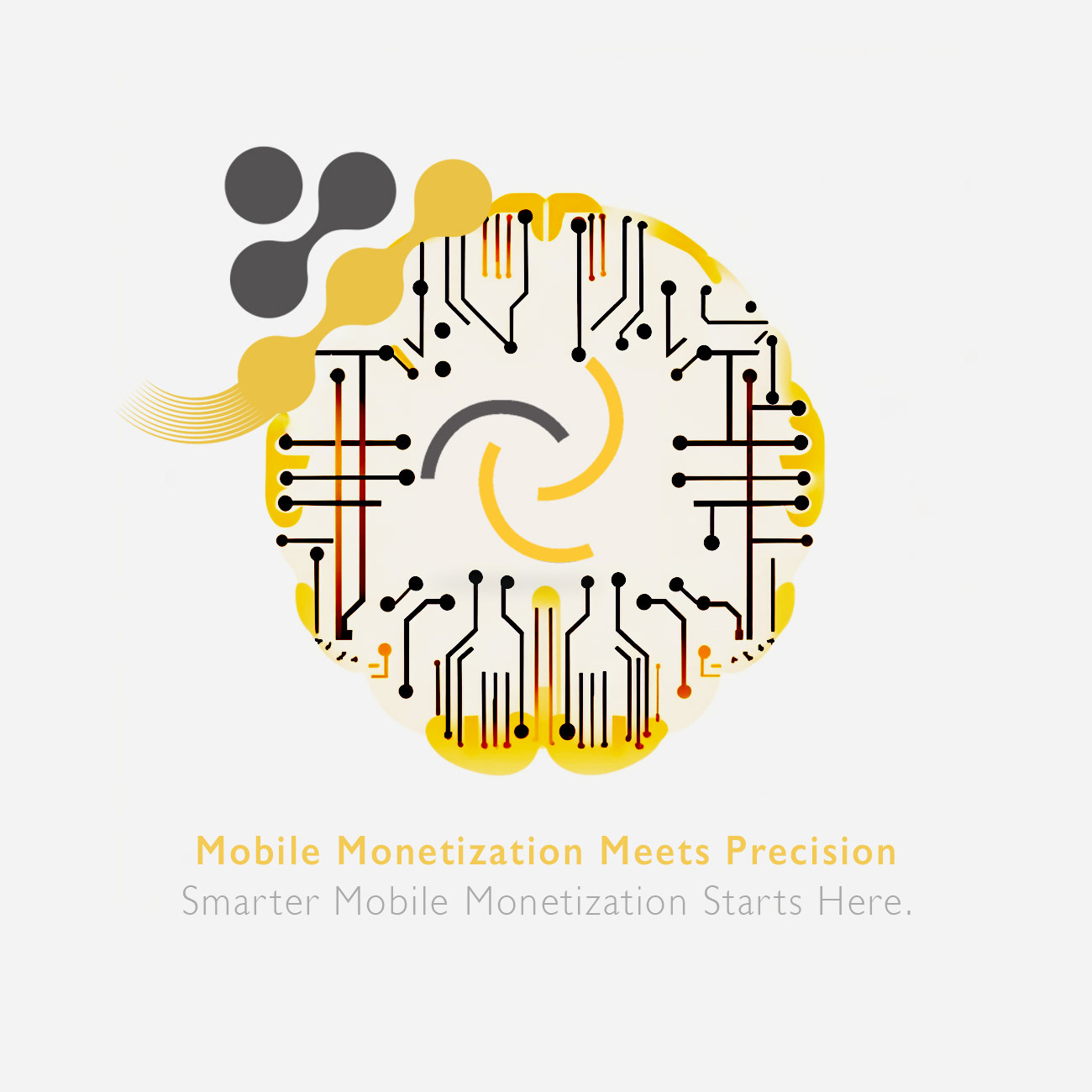
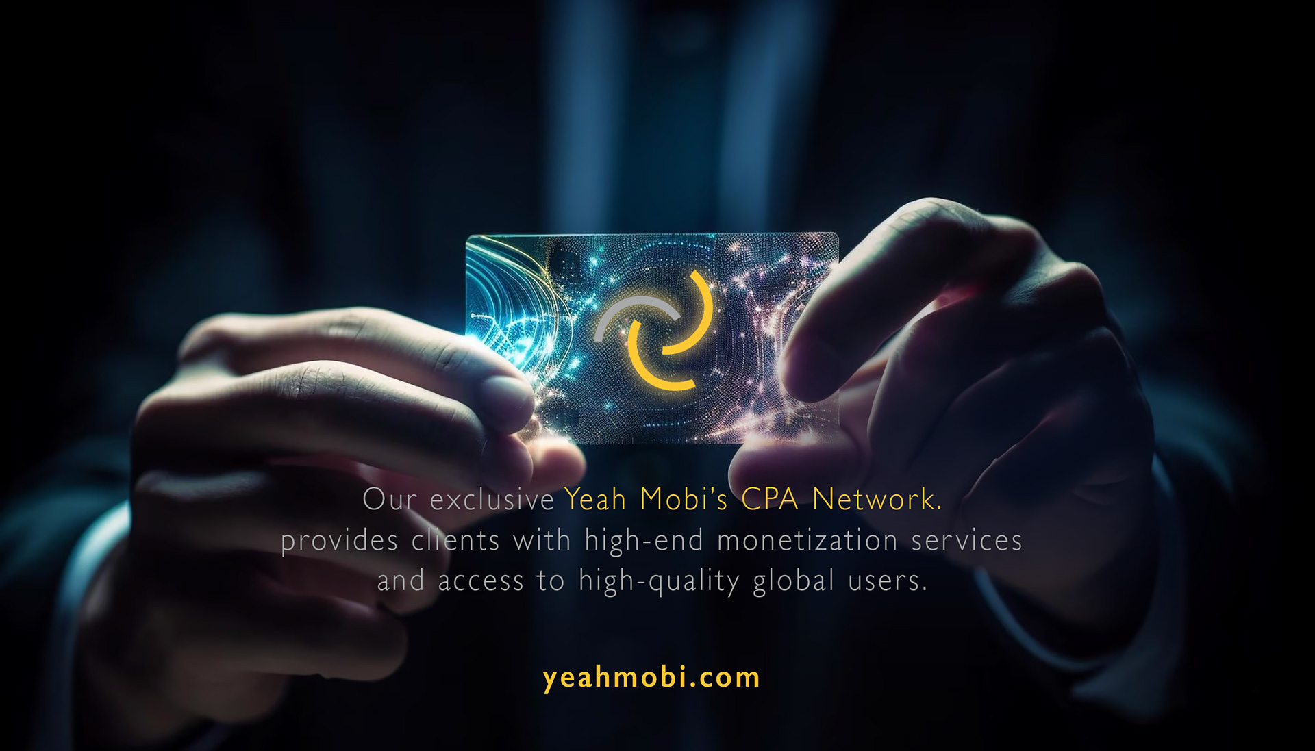
Concept Breakdown 2: TECH-DRIVEN HUMAN TOUCH
The concept blends Yeahmobi’s dynamic swoosh shapes with intricate digital fingerprints and circuit lines, visually expressing the brand’s core promise of combining global tech infrastructure with local personalization.
The fingerprint motif symbolizes secure, individualized solutions.
At the same time, the energetic curves and layered digital patterns evoke data flow, innovation, and seamless connectivity—reinforcing Yeahmobi’s expertise in smart monetization and results-driven mobile marketing.

The digital fingerprint is a metaphor for personalization and secure tech, reinforcing Yeahmobi’s expertise in smart mobile monetization and ROI acceleration.
The result is a forward-looking, tech-savvy brand language that feels both high-tech and approachable.
The result is a forward-looking, tech-savvy brand language that feels both high-tech and approachable.
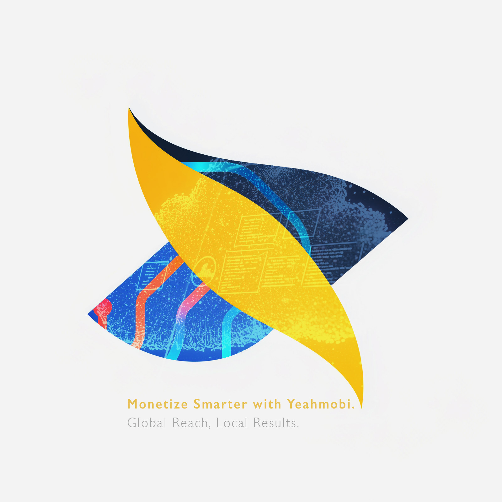
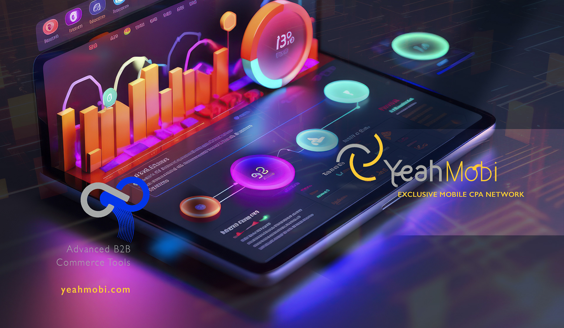
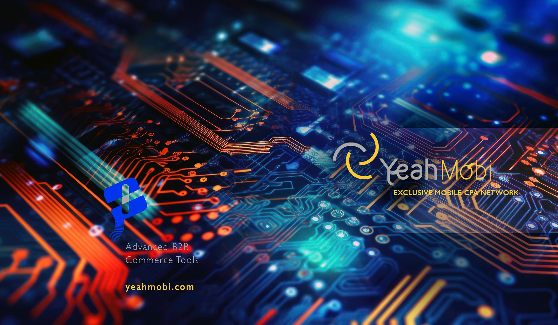
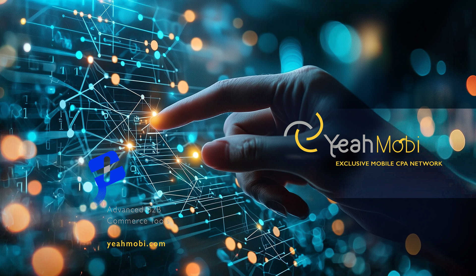
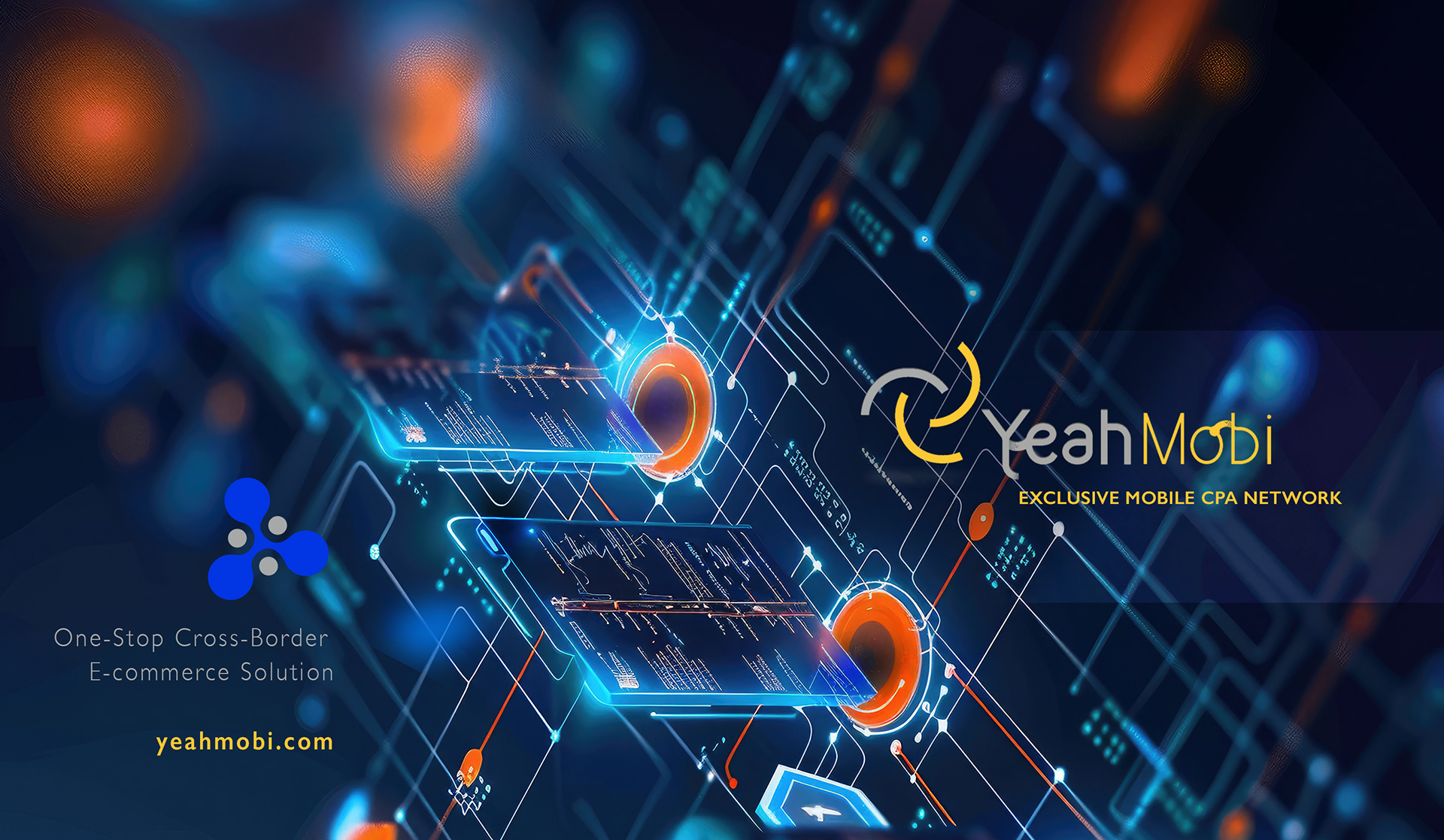
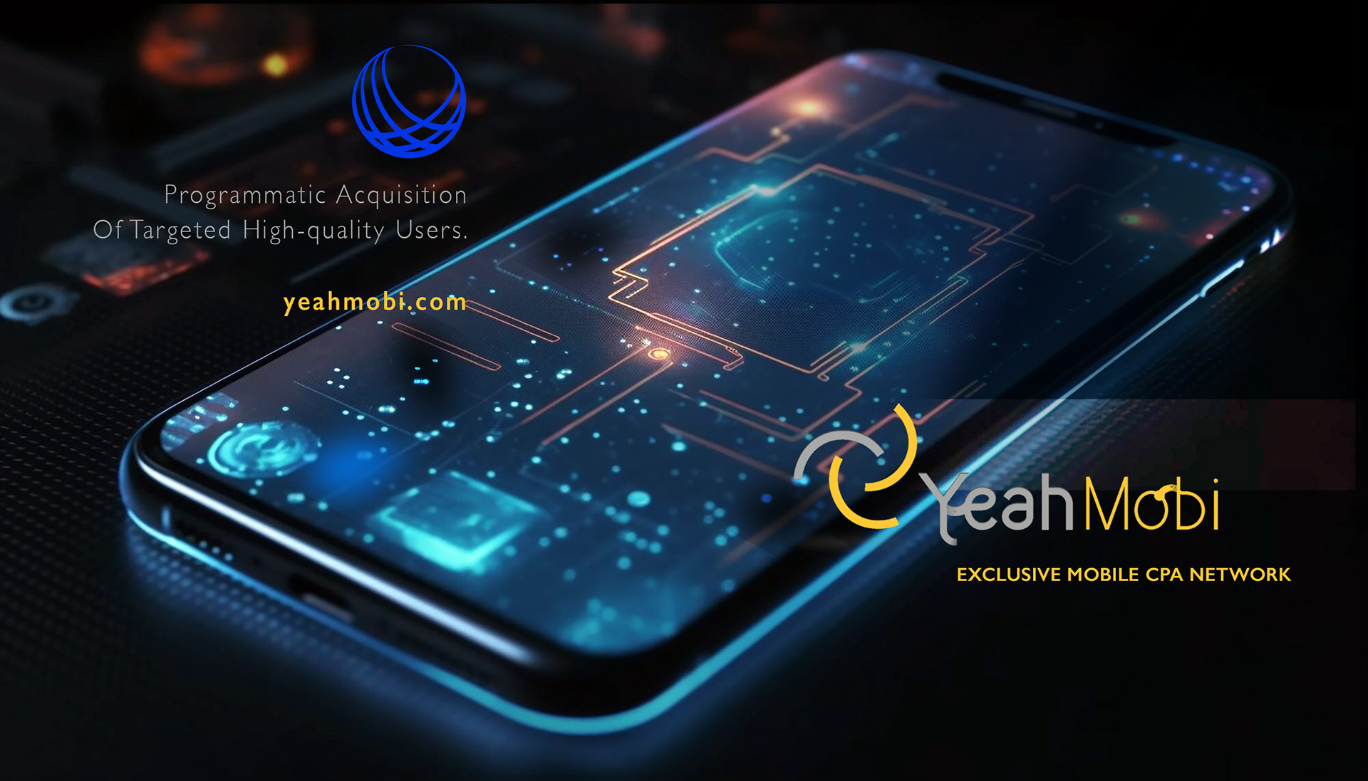
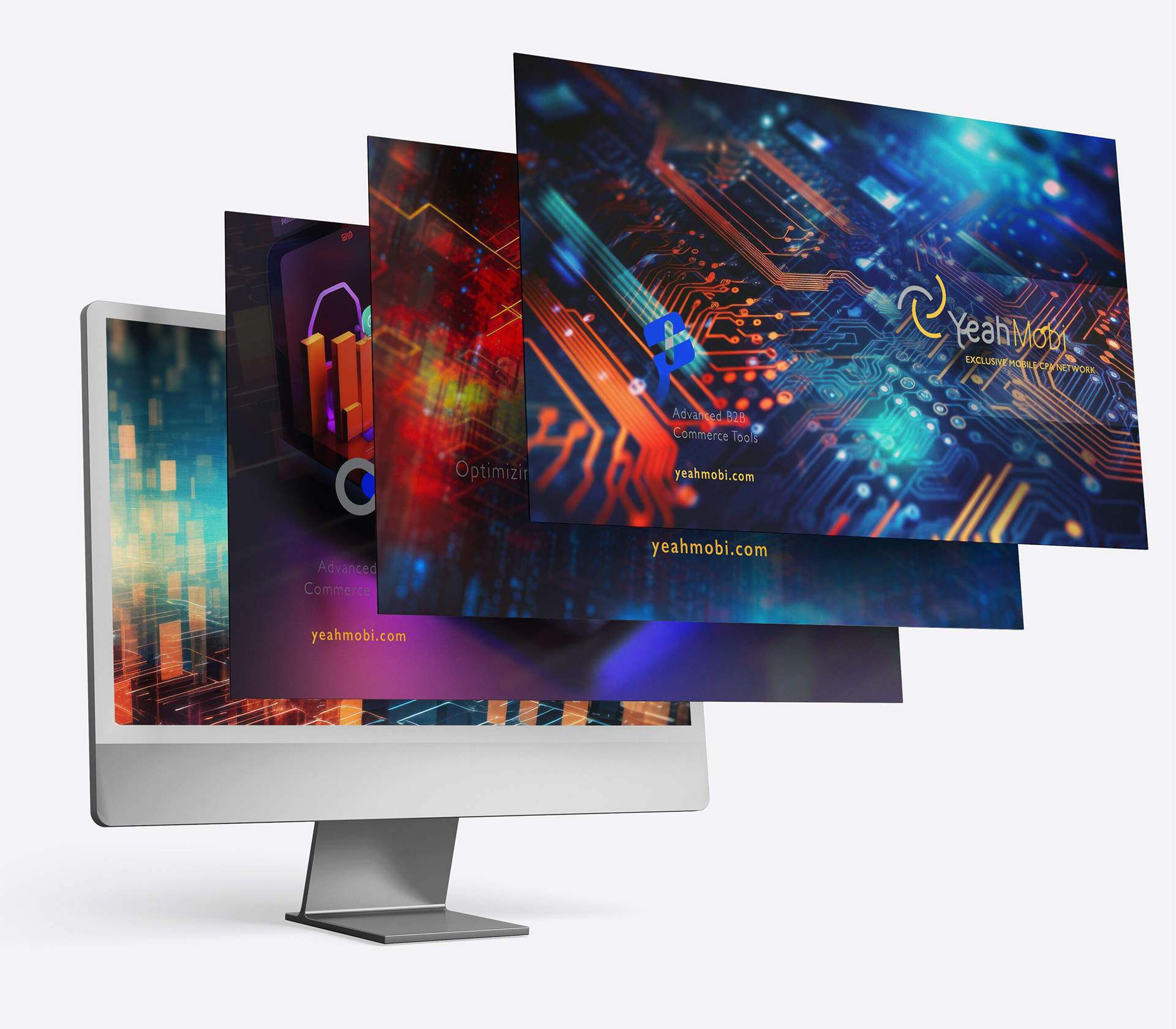
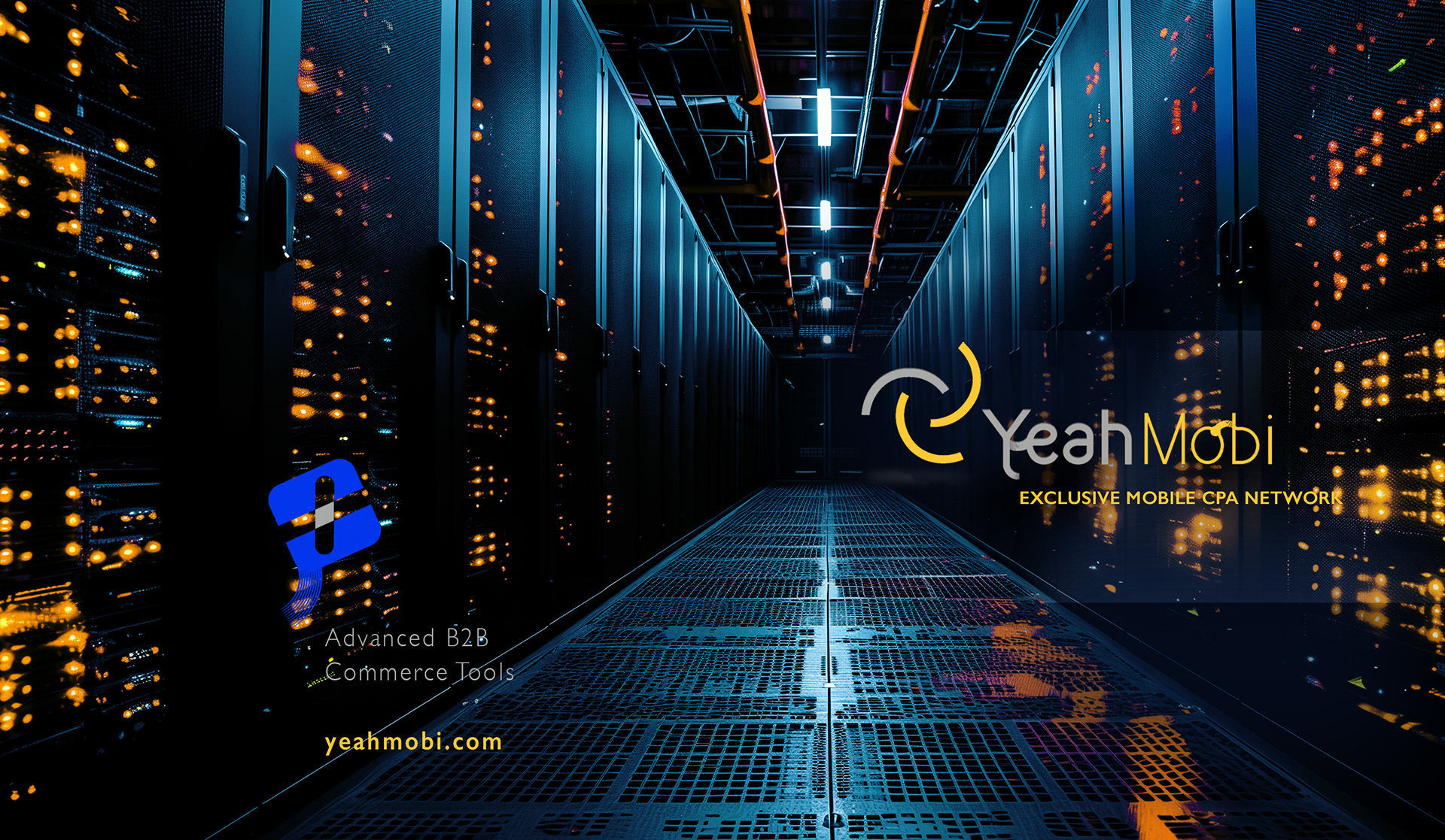
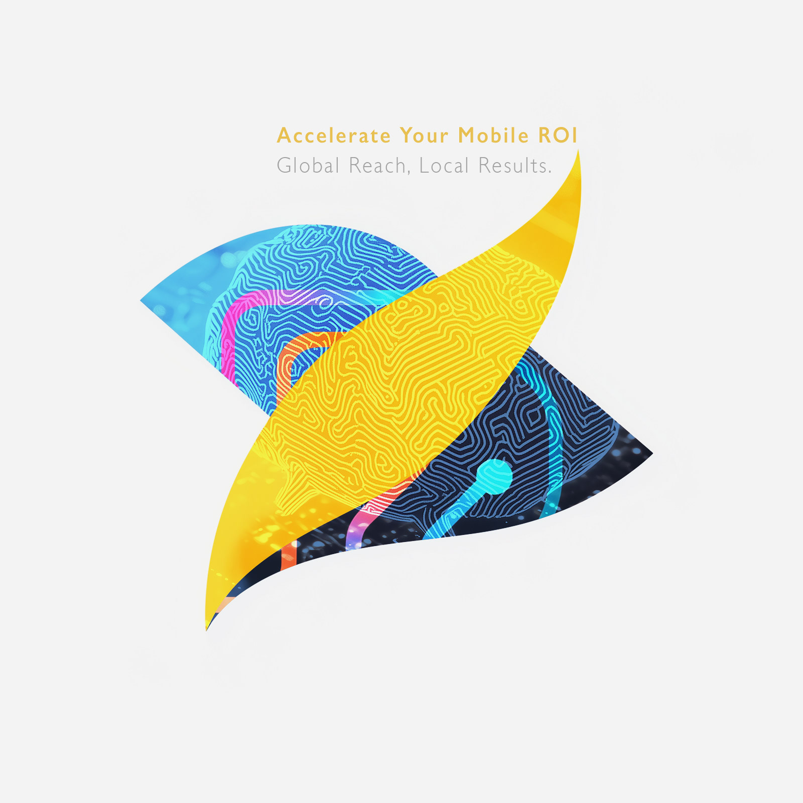
Concept Breakdown 3: WIRED IDENTITY
For Yeahmobi, my graphic approach was visually expressing the brand’s high-tech and data-driven DNA.
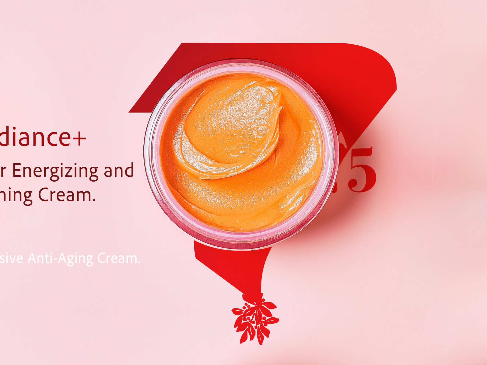
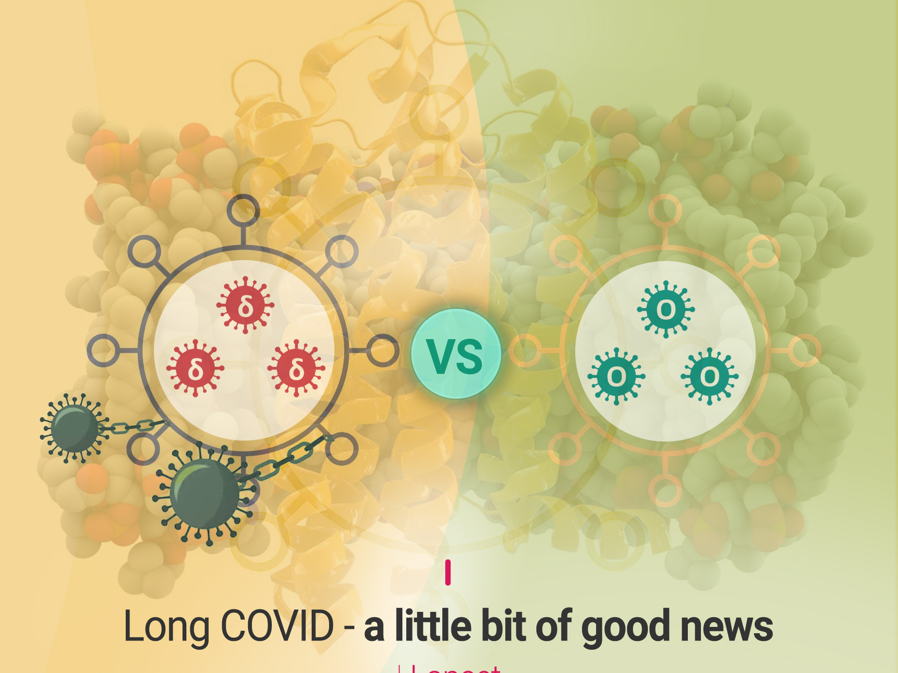
I designed imagery where circuit board patterns and electric hues (blue, orange, and yellow) create an immediate sense of innovation, connectivity, and digital infrastructure.
The branding elements—including the Yeahmobi logo and product icons—seamlessly integrate into this
tech-inspired environment, making them feel part of the digital flow.
This style reflects the company’s focus on advanced B2B solutions and mobile performance marketing, ensuring the brand instantly communicates expertise, global reach, and modernity to its audience.
For Yeahmobi, my graphic approach was visually expressing the brand’s high-tech and data-driven DNA.
I designed imagery where circuit board patterns and electric hues (blue, orange, and yellow) create an immediate sense of innovation, connectivity, and digital infrastructure.
The branding elements—including the Yeahmobi logo and product icons—seamlessly integrate into this
tech-inspired environment, making them feel part of the digital flow.
This style reflects the company’s focus on advanced B2B solutions and mobile performance marketing, ensuring the brand instantly communicates expertise, global reach, and modernity to its audience.