CLIENT ▸ Aix Box, Culture & Sport Services in Aix-en-Provence, France
ROLE ▸ Art Director Freelance (Agence Verso, Paris, France)
SCOPE ▸ Logo Design, Iconography, Illustration, Graphic Design, Packaging Design, Visual Identity
ROLE ▸ Art Director Freelance (Agence Verso, Paris, France)
SCOPE ▸ Logo Design, Iconography, Illustration, Graphic Design, Packaging Design, Visual Identity
The Challenge
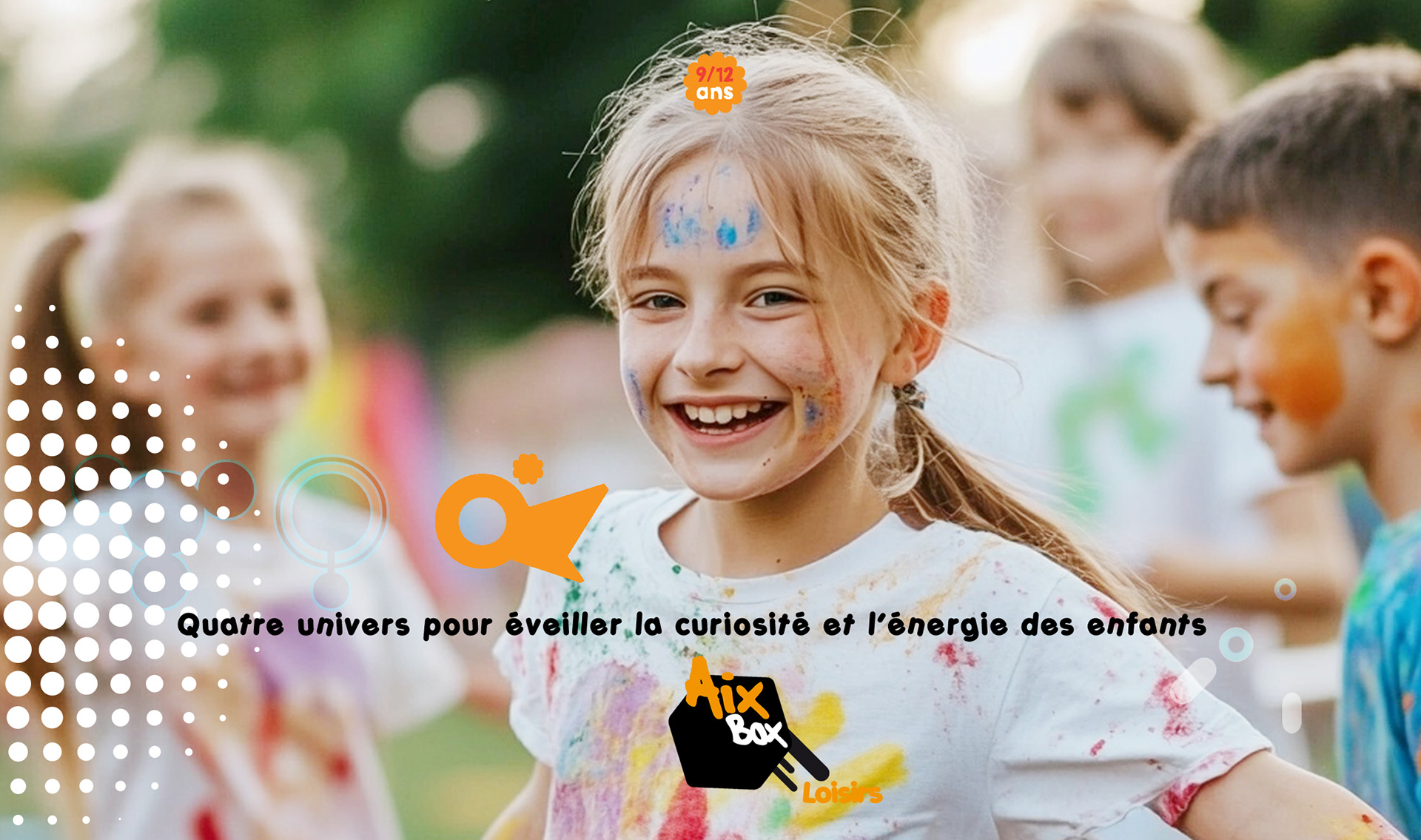
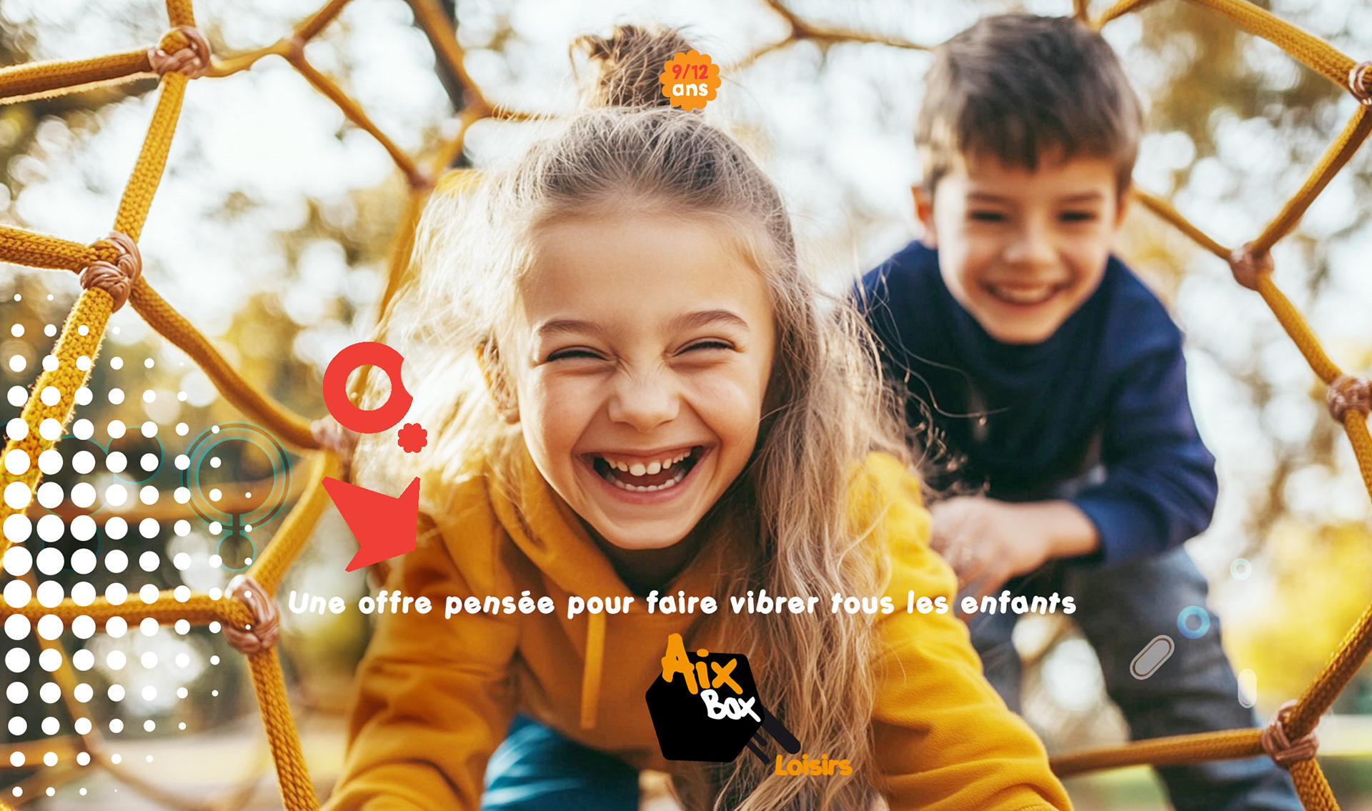
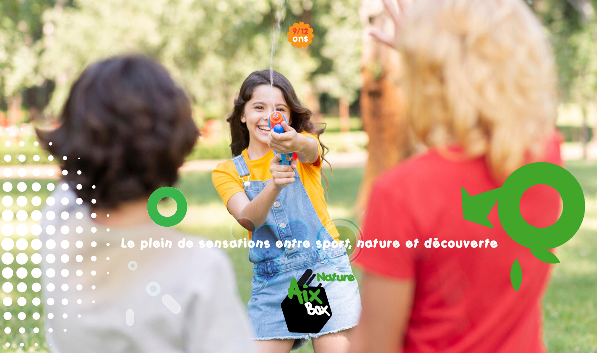
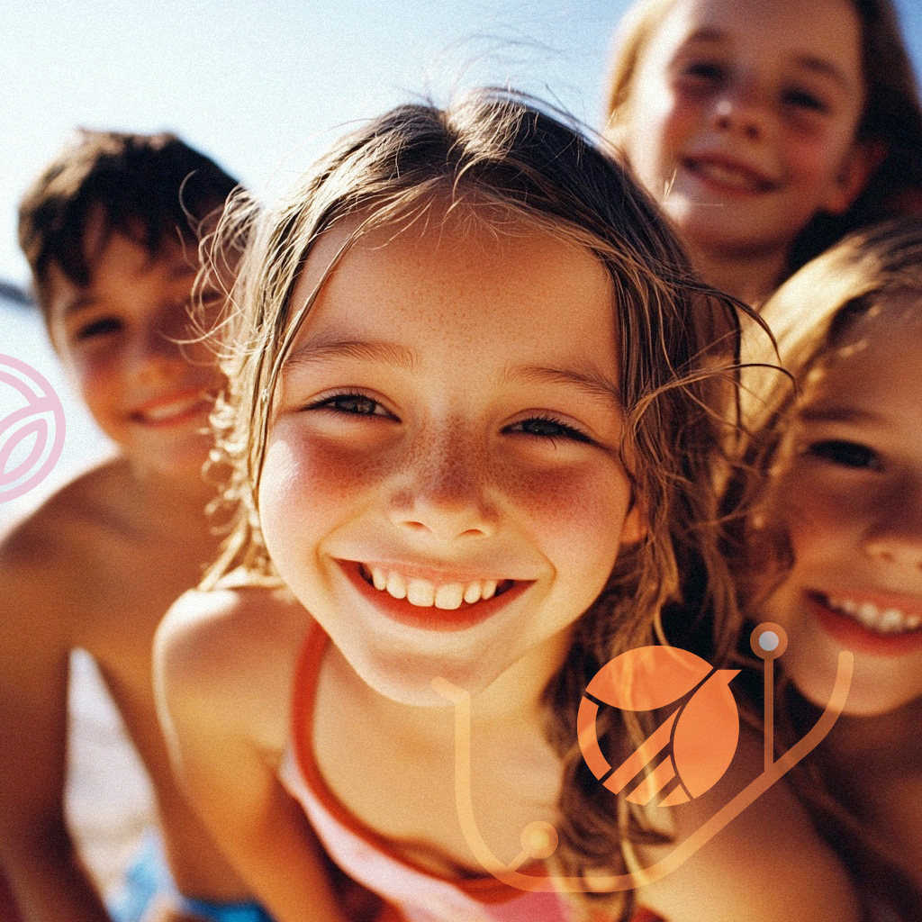
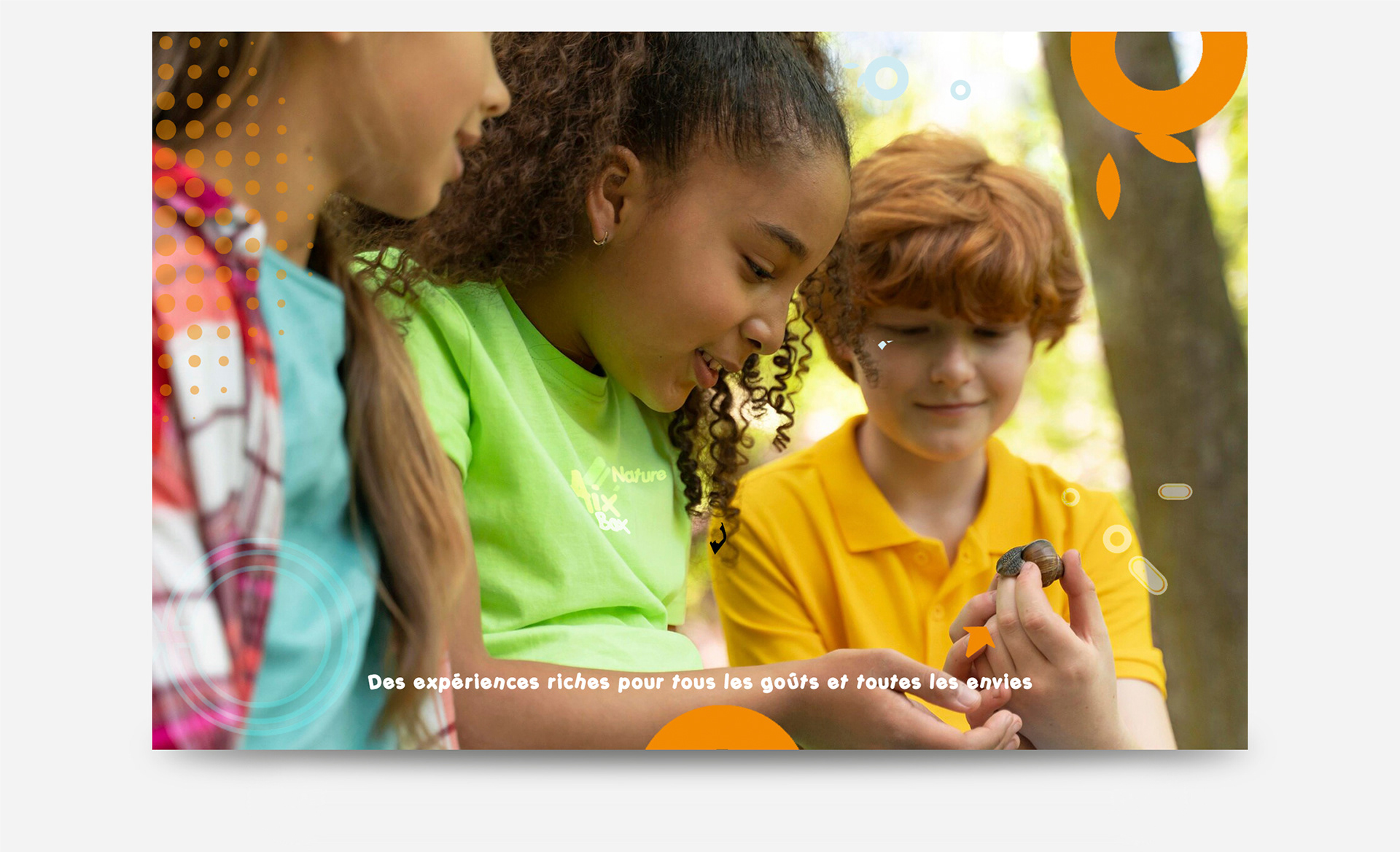
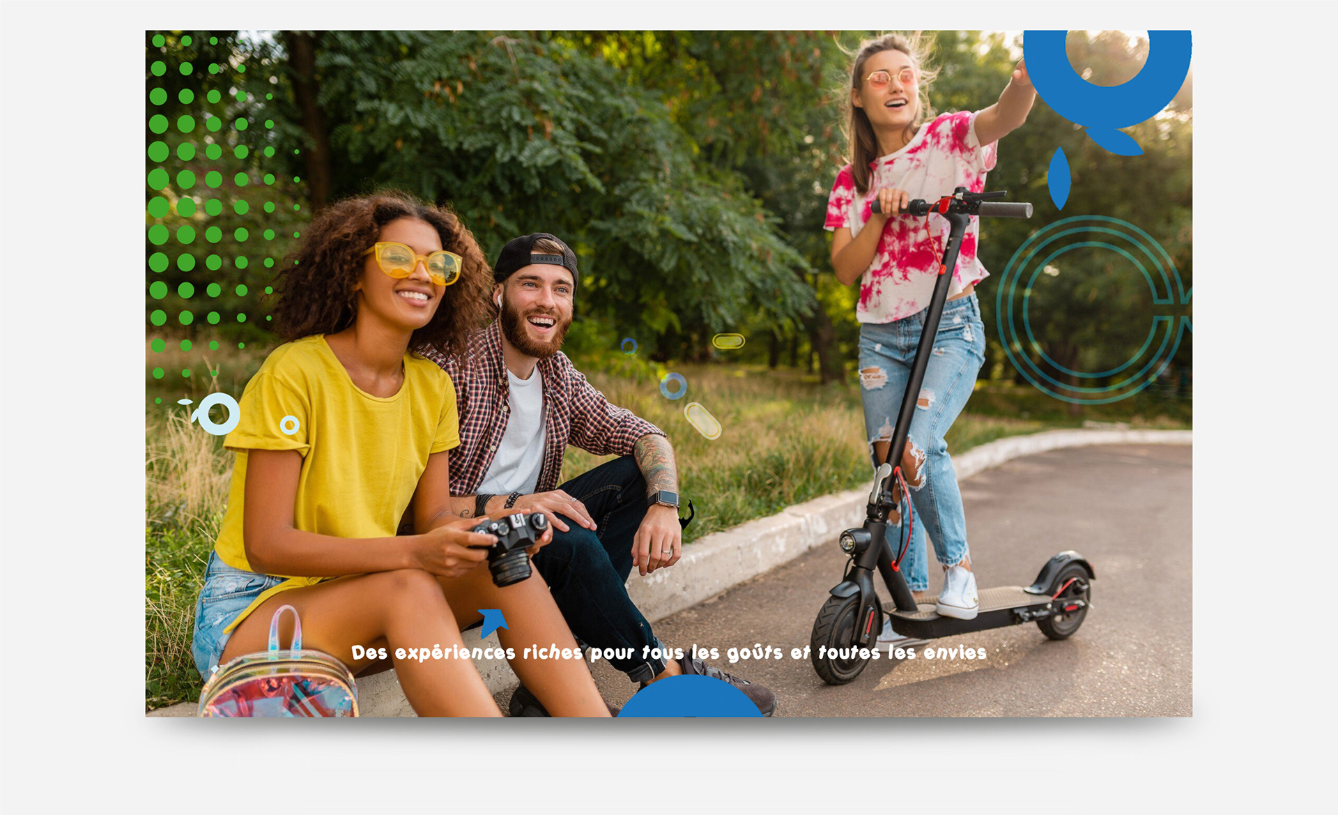
Create a youth-oriented brand without feeling childish or chaotic
Appeal to multiple audiences: children, teenagers, and parents
Build a system flexible enough to support diverse activities and programs
Create a youth-oriented brand without feeling childish or chaotic
Appeal to multiple audiences: children, teenagers, and parents
Build a system flexible enough to support diverse activities and programs
Strategic Approach
Define a brand rooted in movement, curiosity, and accessibility
Prioritize clarity and legibility across age groups and formats
Design a system that could scale across print, digital, signage, and programming
Define a brand rooted in movement, curiosity, and accessibility
Prioritize clarity and legibility across age groups and formats
Design a system that could scale across print, digital, signage, and programming
Creative Solution
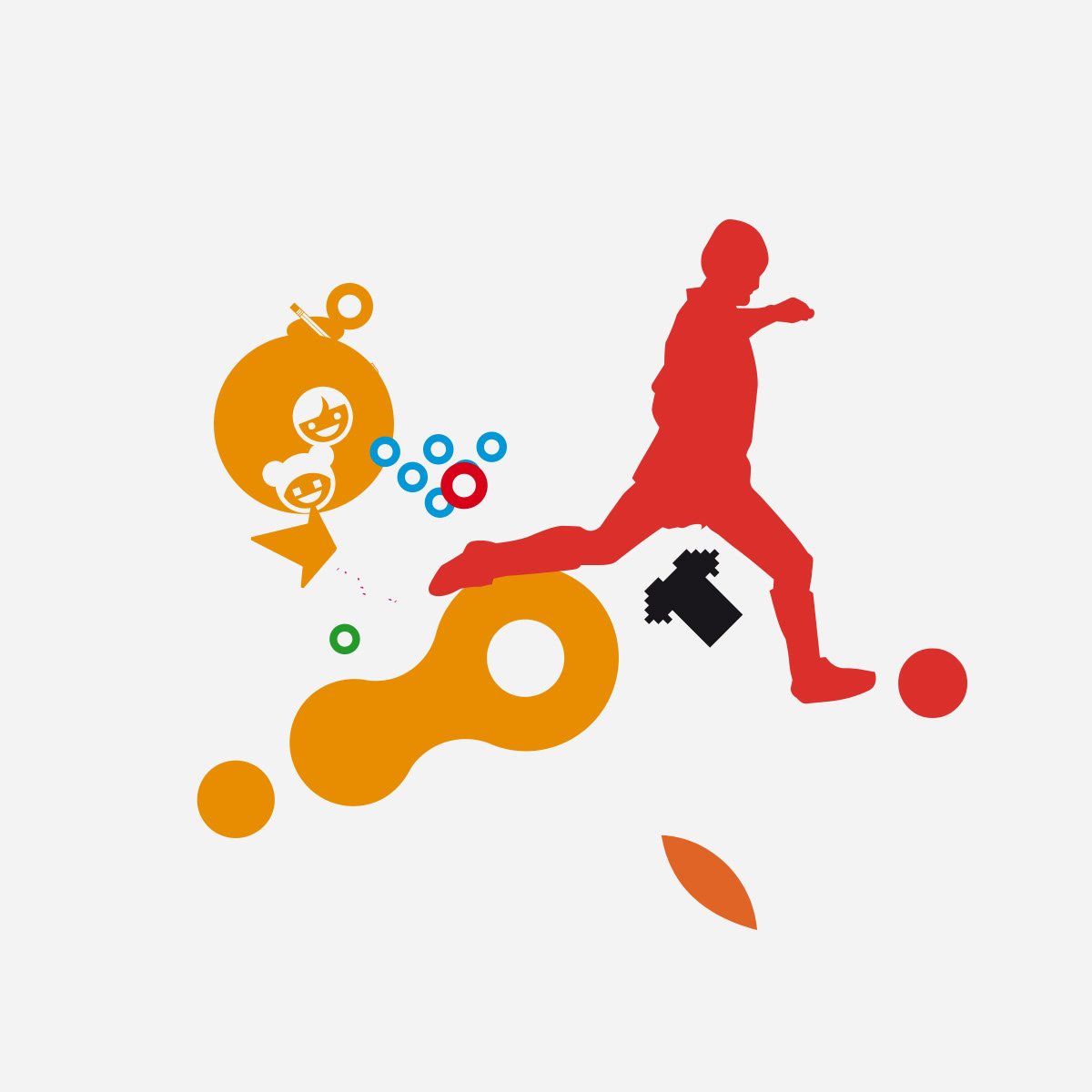
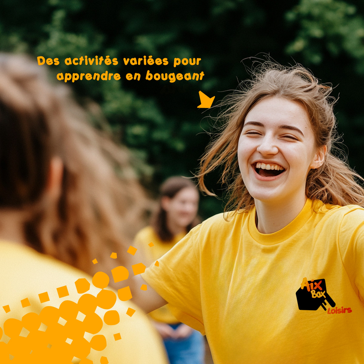
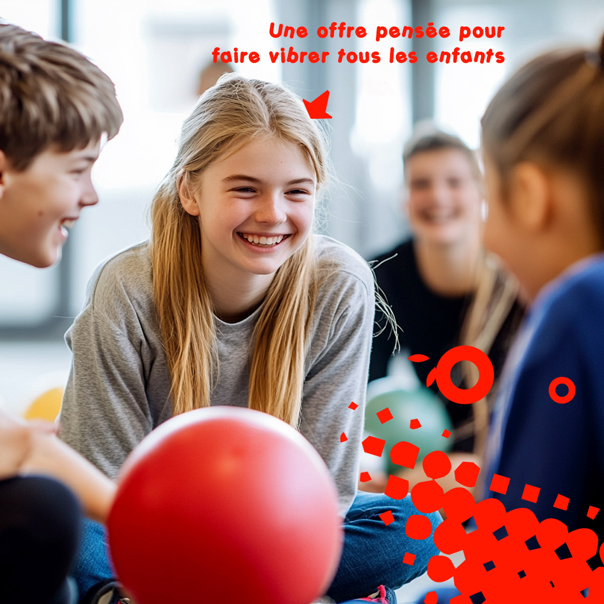
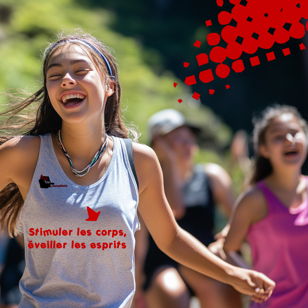
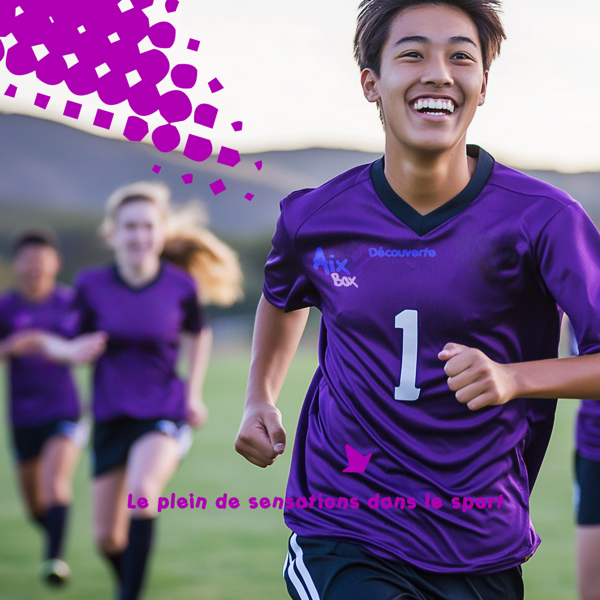
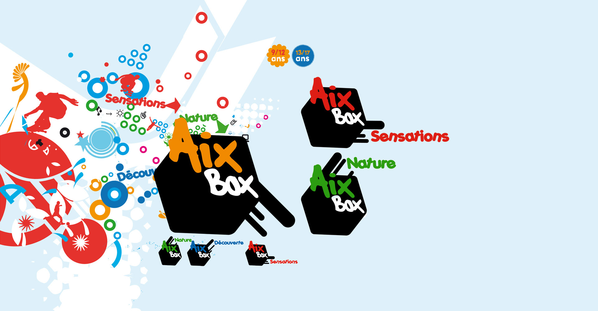
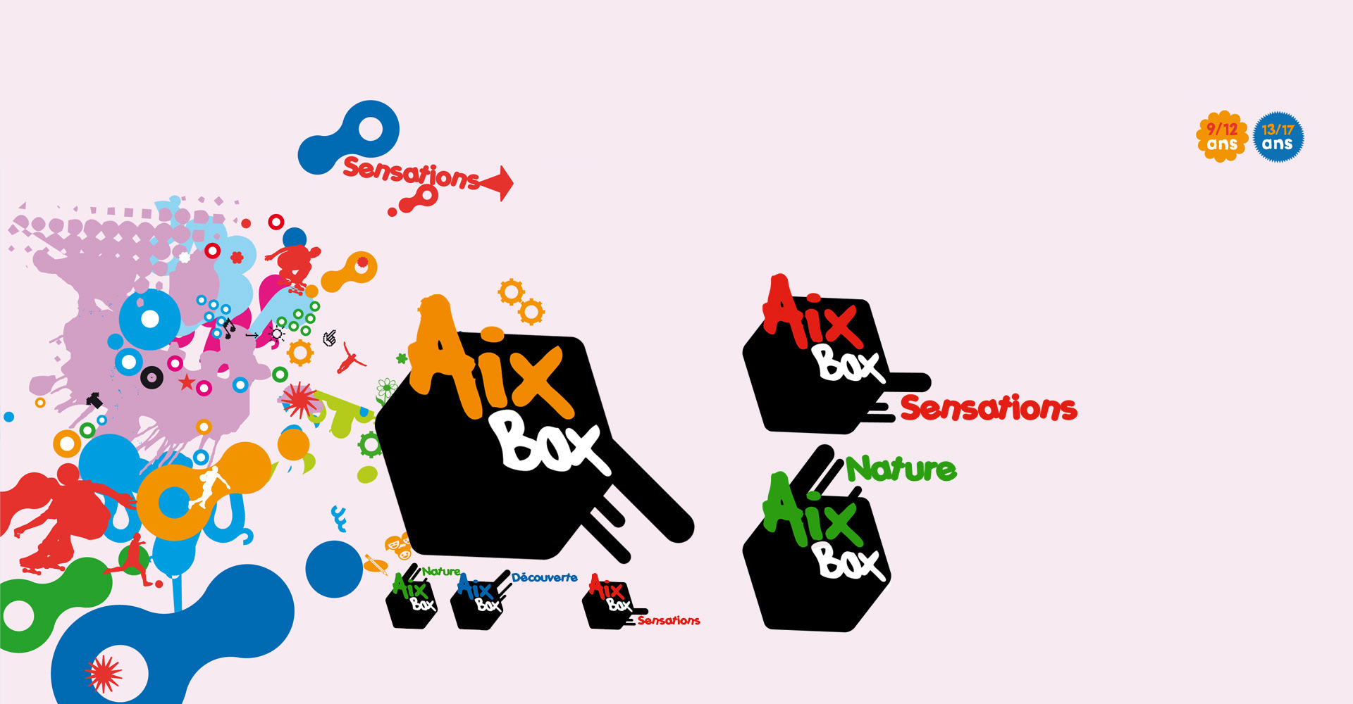
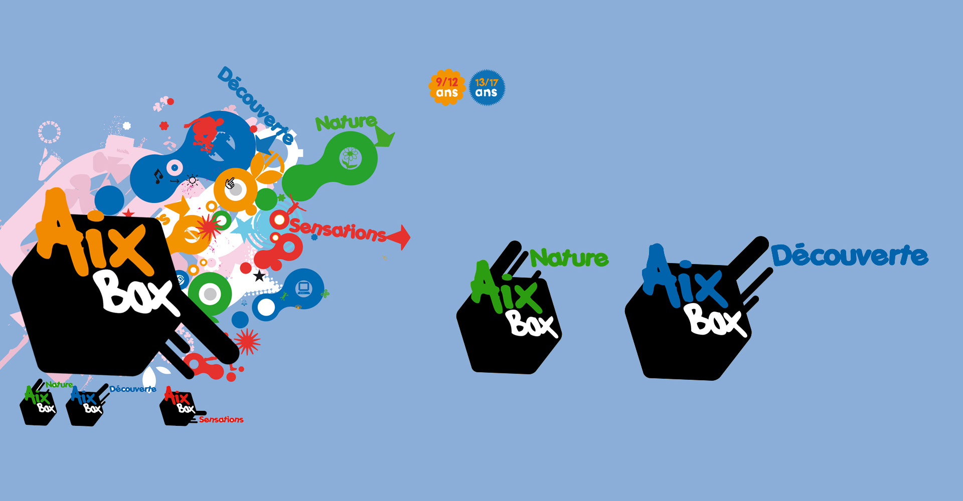
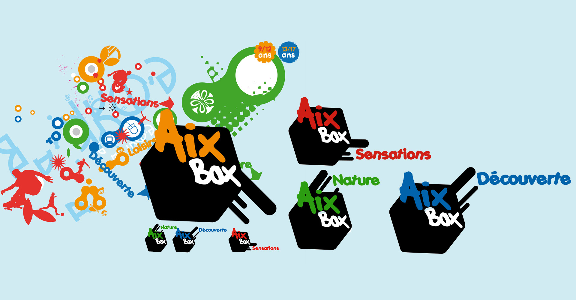
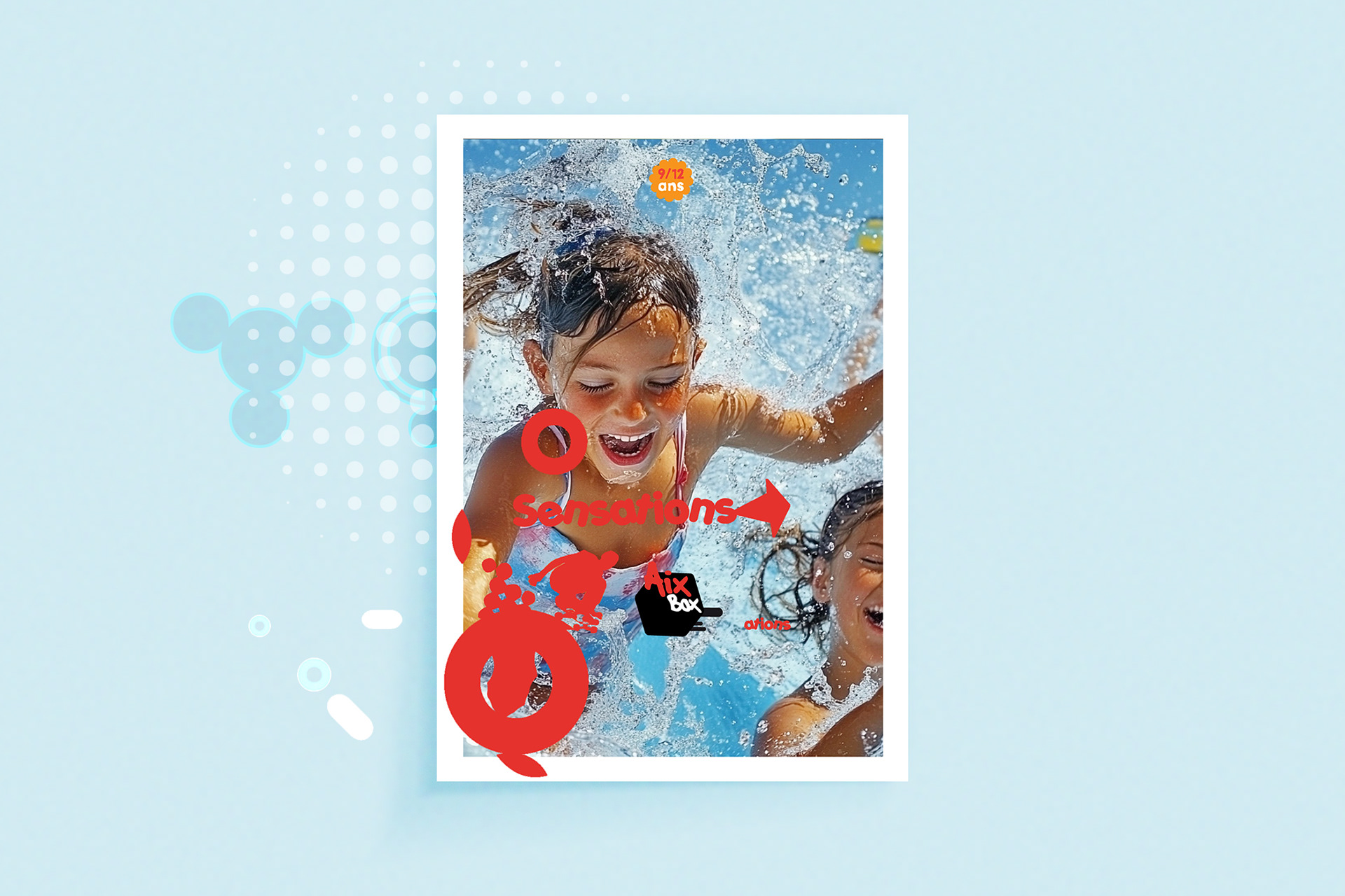
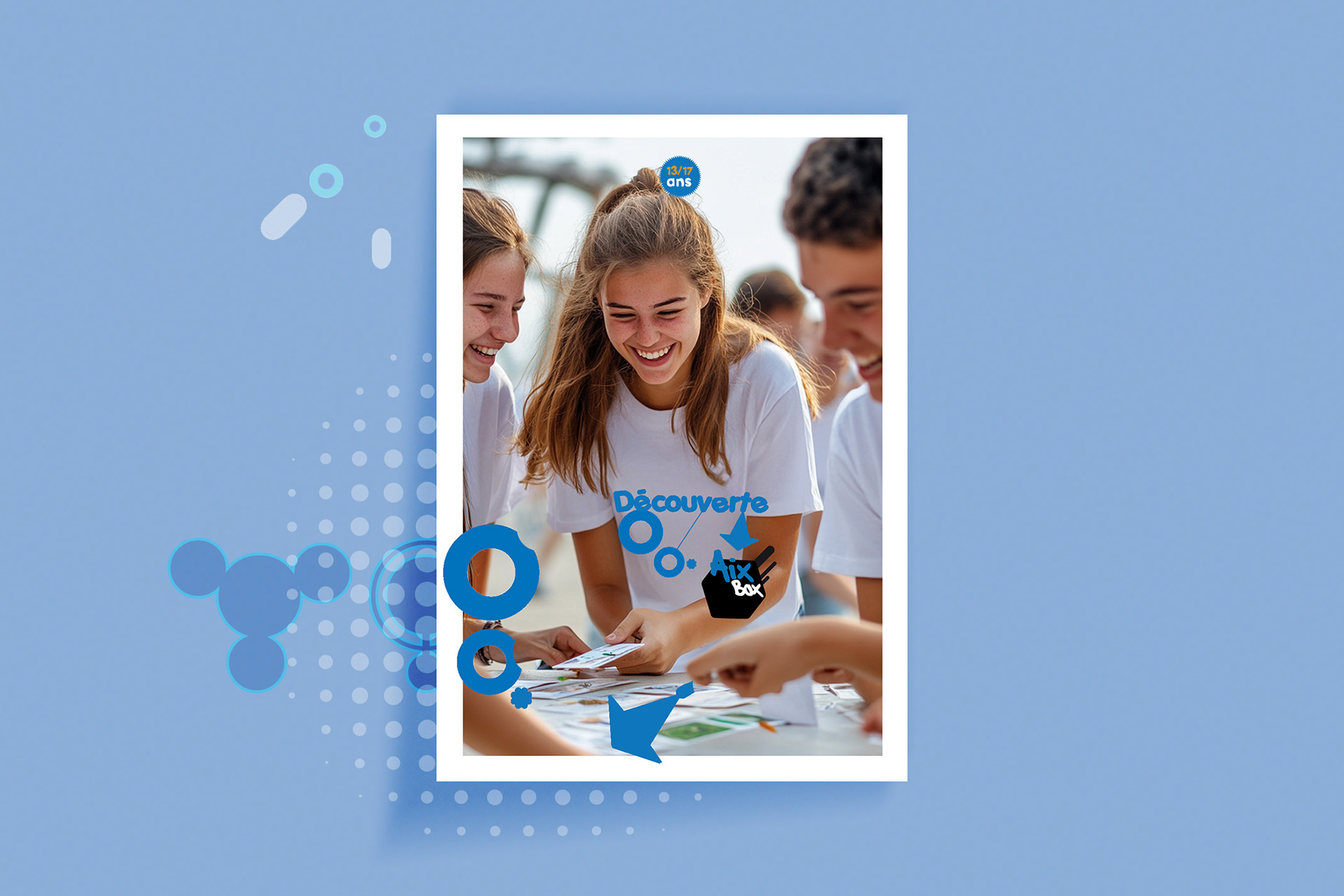
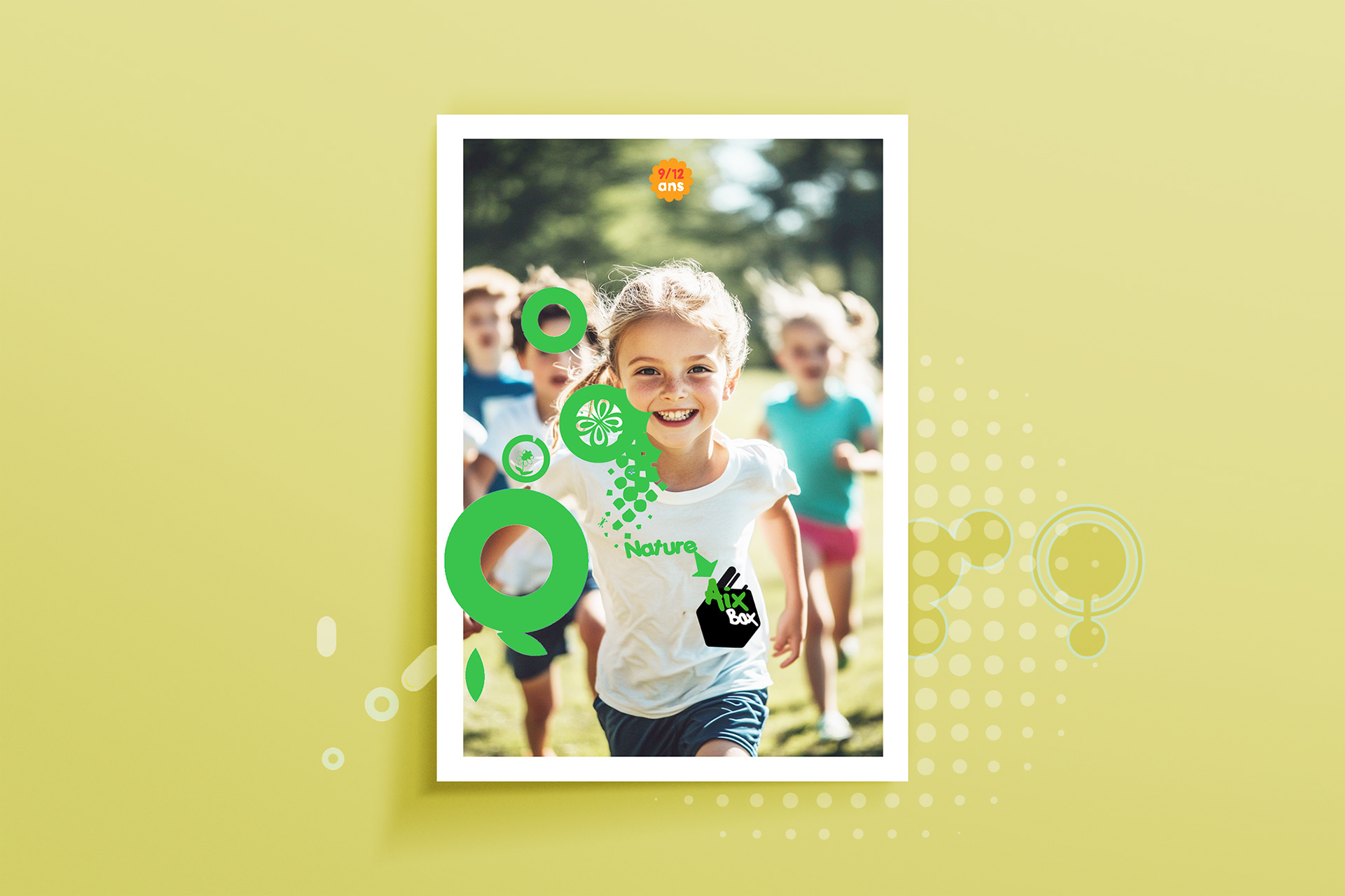
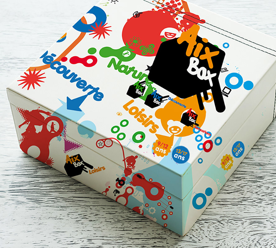
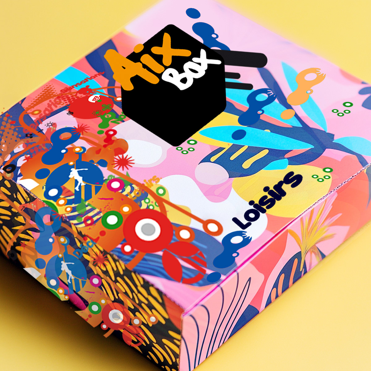
A bold, graphic identity driven by color, typography, and modular composition
Visual language designed to feel active, optimistic, and social
A balance between expressive elements and clear information hierarchy
A bold, graphic identity driven by color, typography, and modular composition
Visual language designed to feel active, optimistic, and social
A balance between expressive elements and clear information hierarchy
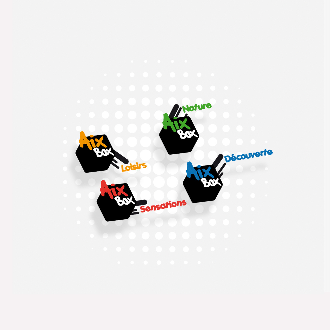
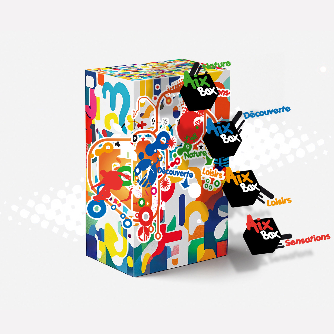
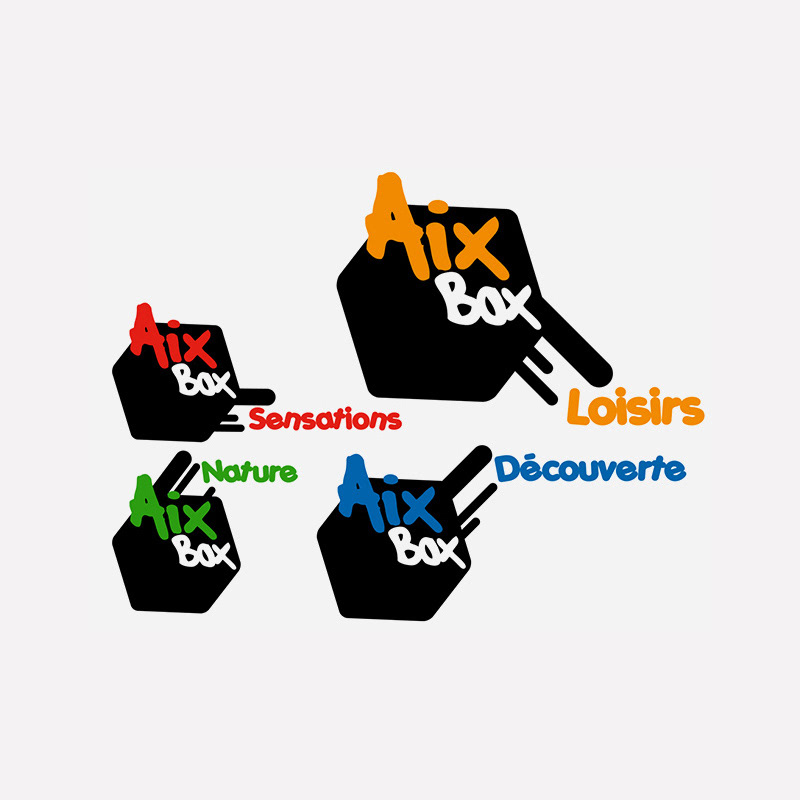
Scope & System
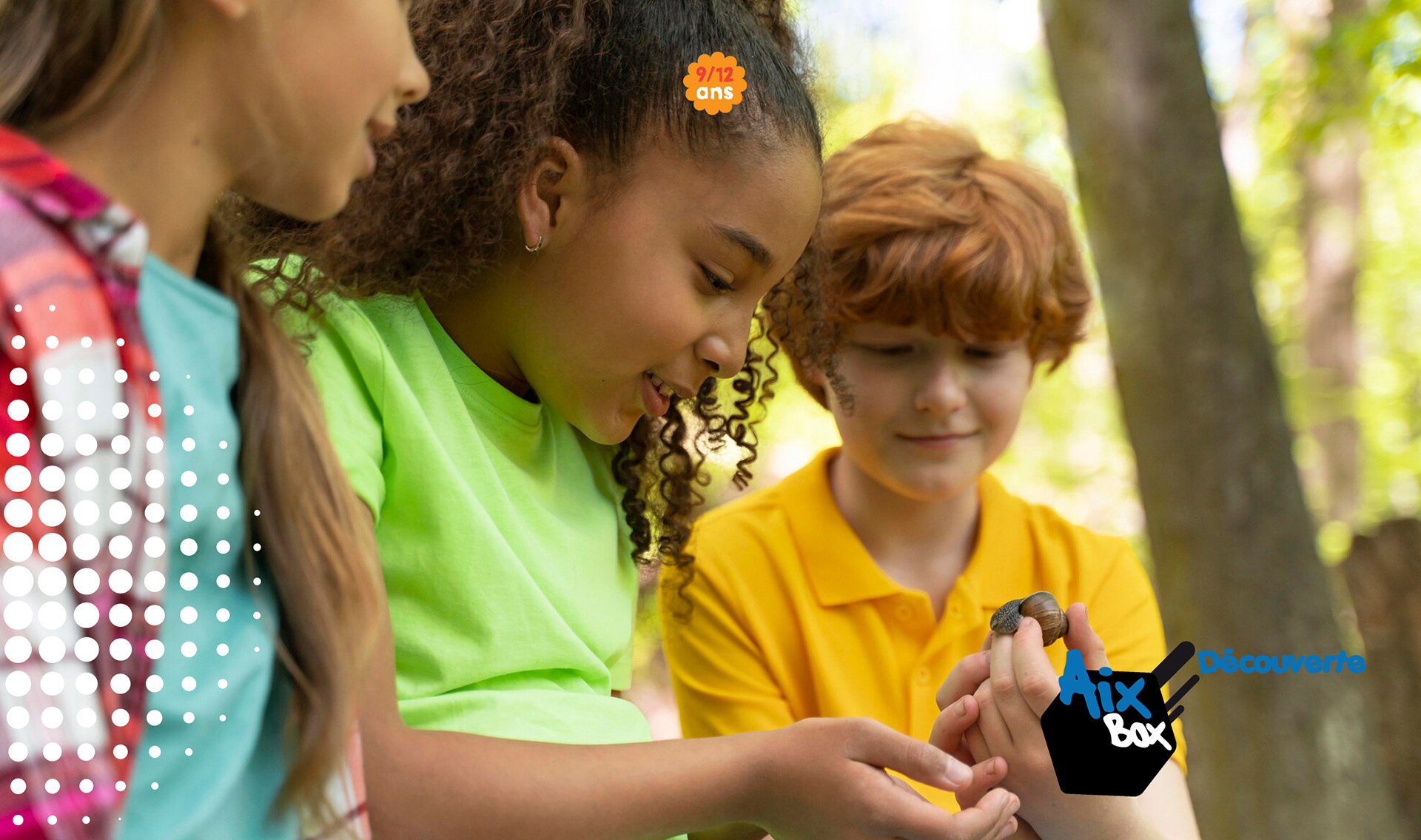
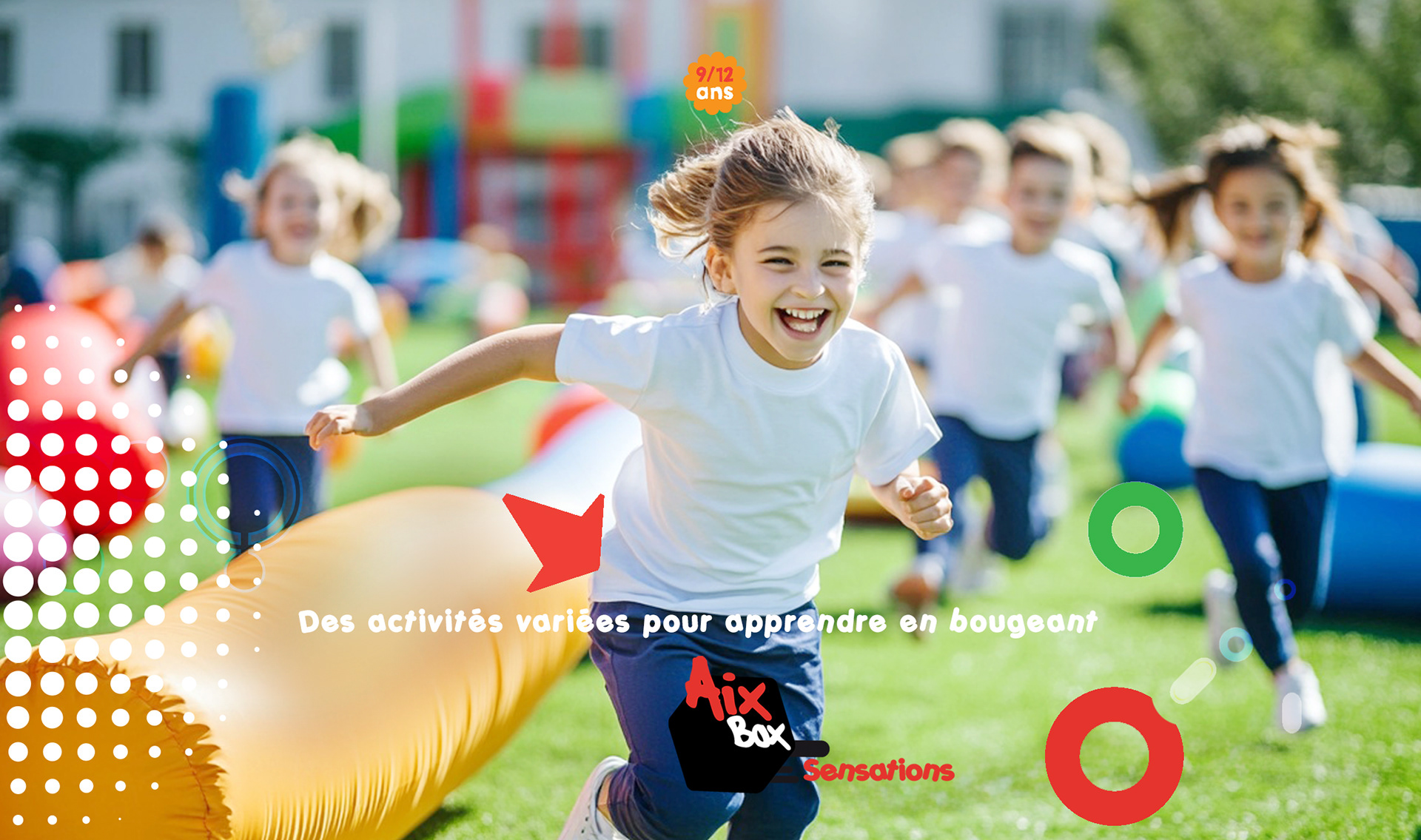
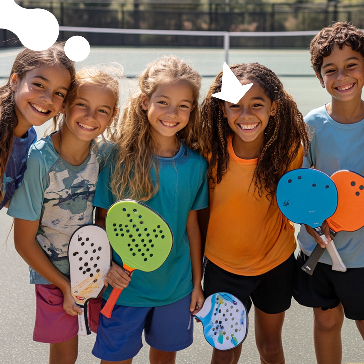
Modular visual system adaptable to multiple activities and age ranges
Clear typographic hierarchy for schedules, programs, and communications
Flexible color usage to differentiate activities while maintaining coherence
Modular visual system adaptable to multiple activities and age ranges
Clear typographic hierarchy for schedules, programs, and communications
Flexible color usage to differentiate activities while maintaining coherence
Key Results
A recognizable and adaptable brand platform for youth engagement
Clear differentiation between programs without fragmenting the brand
Strong visual consistency across touchpoints
A recognizable and adaptable brand platform for youth engagement
Clear differentiation between programs without fragmenting the brand
Strong visual consistency across touchpoints
Impact & Performance
Improved clarity for parents navigating programs and schedules
Increased engagement through a more approachable, contemporary identity
A system that supports long-term growth and new activity launches
Improved clarity for parents navigating programs and schedules
Increased engagement through a more approachable, contemporary identity
A system that supports long-term growth and new activity launches
Deliverables
+ Logo and visual identity system
+ Print collateral and program materials
+ Digital assets and communication templates
+ Signage and wayfinding elements
+ Logo and visual identity system
+ Print collateral and program materials
+ Digital assets and communication templates
+ Signage and wayfinding elements
Role & Leadership
Brand Design Lead on the project
Led strategy, identity design, and system development
Oversaw execution across print and digital applications
Brand Design Lead on the project
Led strategy, identity design, and system development
Oversaw execution across print and digital applications
Why This Work Matters
Youth brands often drift toward visual noise or over-simplification.
This project shows how a structured, flexible brand system can remain energetic and inclusive while staying clear, legible, and trustworthy for parents and institutions.
It demonstrates how thoughtful design supports real-world use, scalability, and long-term community engagement, rather than merely visual appeal.


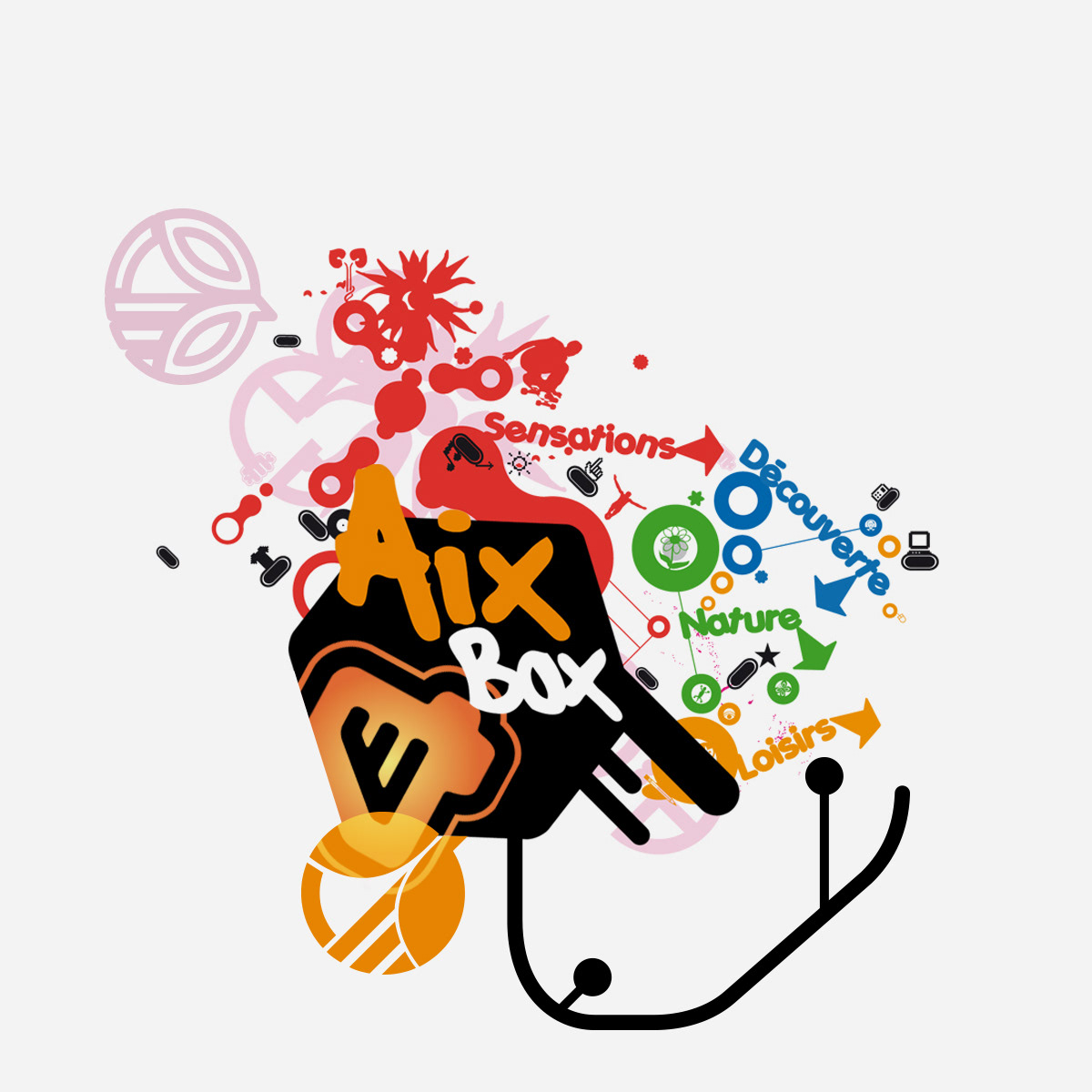

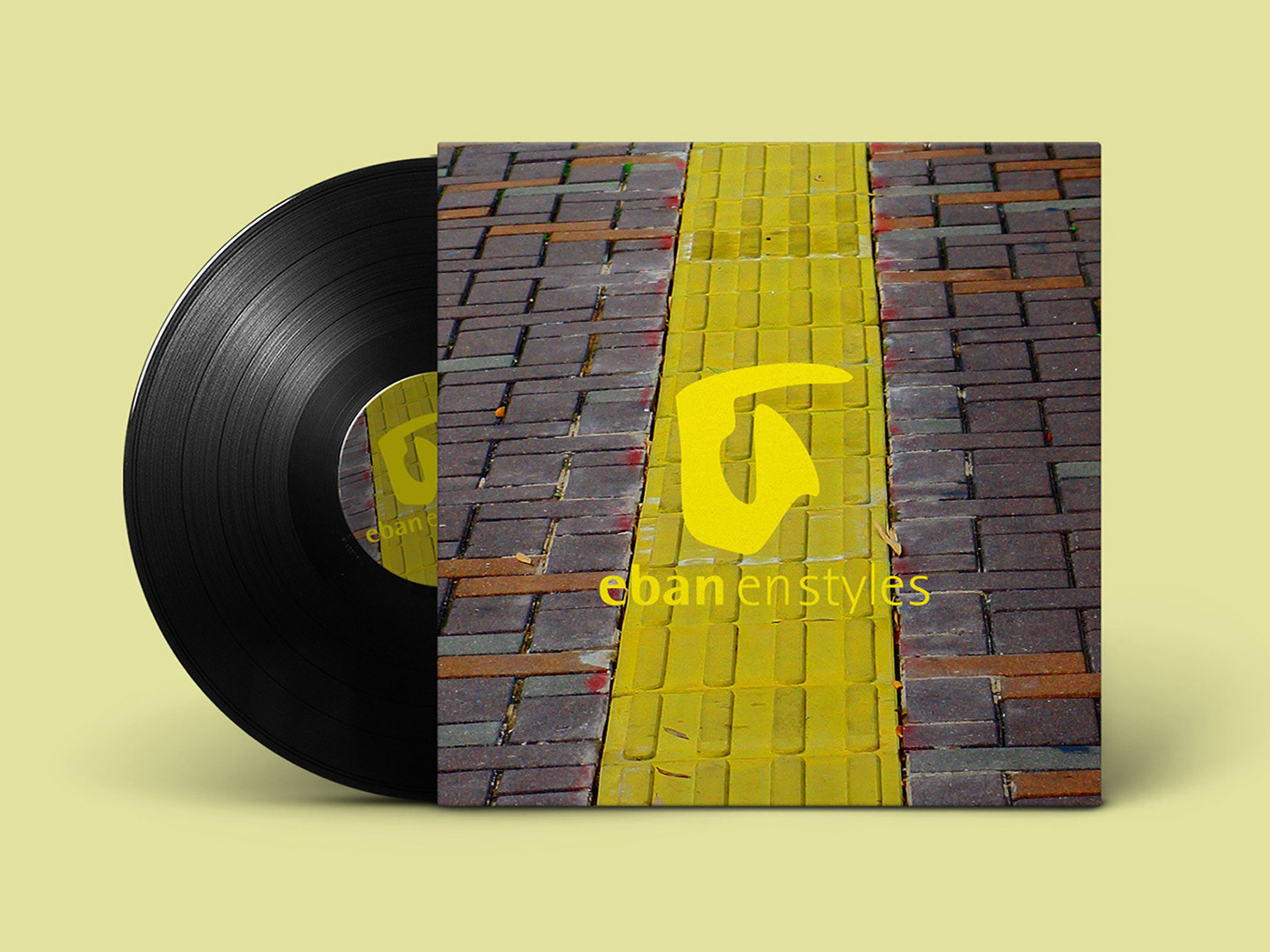
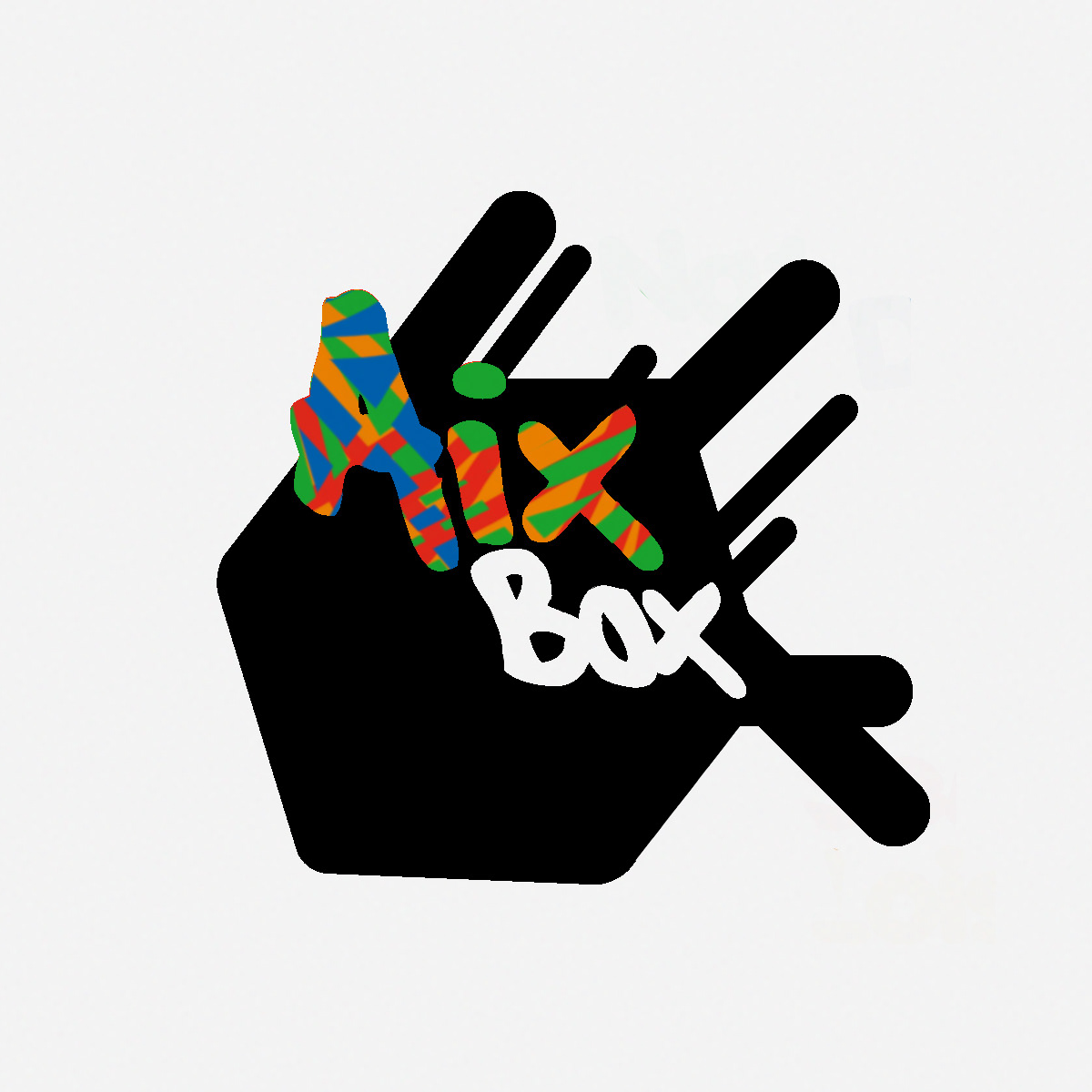
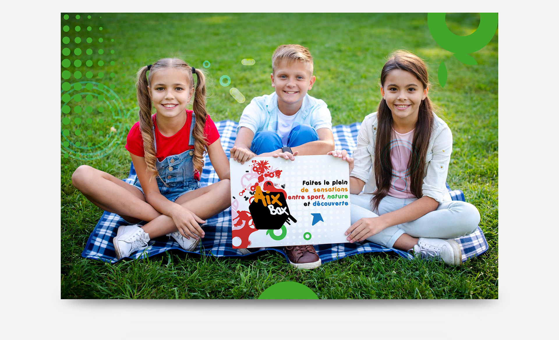
The logo was designed as a bold, friendly mark, simple, adaptable, and easily recognizable across youth-focused environments.


Ready to build a brand that connects
with the next generation?
with the next generation?