A precision medicine startup needed to look credible before its science was proven, and attract the investors and clinical partners that would make it real.
I built the full brand identity from scratch: logo, typographic system, color language, and brand guidelines.
The result: a visual framework that held up across investor decks, clinical materials, and future commercial contexts, and helped the company raise its first round of funding.
I built the full brand identity from scratch: logo, typographic system, color language, and brand guidelines.
The result: a visual framework that held up across investor decks, clinical materials, and future commercial contexts, and helped the company raise its first round of funding.
CLIENT ▸ NOFAAA Therapeutics, NJ, USA
ROLE ▸ Brand Design Lead (Freelance)
SCOPE ▸ Full Systems Brand Refresh
PROCESS ▸ Led cross-functional brand audit → workshop → visual identity system → rollout guidelines
ROLE ▸ Brand Design Lead (Freelance)
SCOPE ▸ Full Systems Brand Refresh
PROCESS ▸ Led cross-functional brand audit → workshop → visual identity system → rollout guidelines
The Challenge
Early-stage biotech needing credibility and differentiation
Highly scientific positioning with investor-facing requirements
Brand system required to scale across research, clinical,
and commercial contexts
Early-stage biotech needing credibility and differentiation
Highly scientific positioning with investor-facing requirements
Brand system required to scale across research, clinical,
and commercial contexts
Strategic Approach
System-led brand architecture
Clear hierarchy for scientific and investor communication
Visual restraint to reinforce credibility and trust
System-led brand architecture
Clear hierarchy for scientific and investor communication
Visual restraint to reinforce credibility and trust
Creative Solution
A modular biotech identity built around typographic precision and structured layouts
A controlled visual language designed to clarify complex science across audiences
A system that supports both investor-facing messaging and scientific communication
A modular biotech identity built around typographic precision and structured layouts
A controlled visual language designed to clarify complex science across audiences
A system that supports both investor-facing messaging and scientific communication
Scope & System
Established a credible biotech brand presence
Enabled consistent communication across scientific and investor contexts
Delivered a scalable identity supporting future growth
Enabled consistent communication across scientific and investor contexts
Delivered a scalable identity supporting future growth
Deliverables
+ Foundational brand framework establishing scientific tone
and visual direction
+ Modular visual elements designed for flexible early-stage use
+ Core guidance supporting consistent application
as the organization evolved
+ Foundational brand framework establishing scientific tone
and visual direction
+ Modular visual elements designed for flexible early-stage use
+ Core guidance supporting consistent application
as the organization evolved
Role & Leadership
Brand Design Lead
Led brand strategy and system design from concept through execution, aligning stakeholders and ensuring consistent rollout across teams and channels.
Brand Design Lead
Led brand strategy and system design from concept through execution, aligning stakeholders and ensuring consistent rollout across teams and channels.
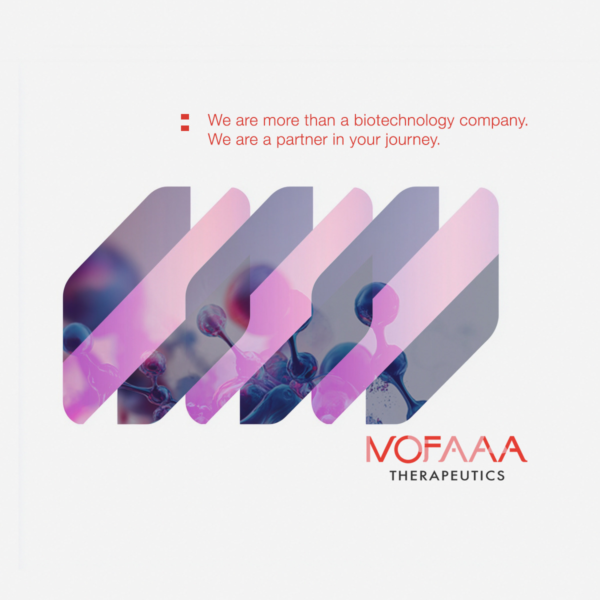
On The Work
In precision medicine, credibility shapes trust.
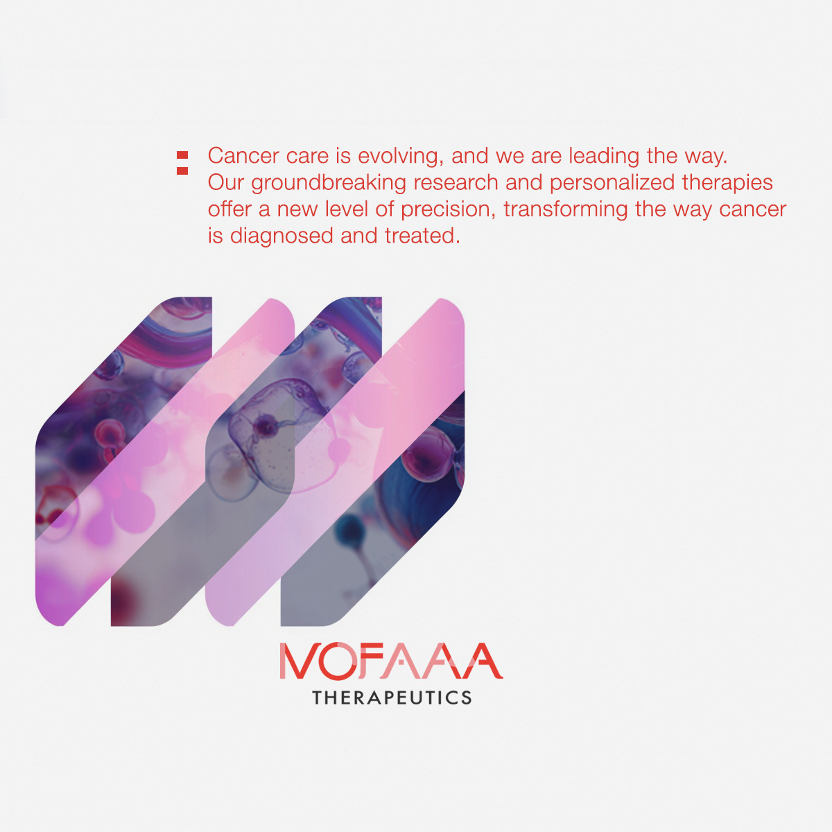
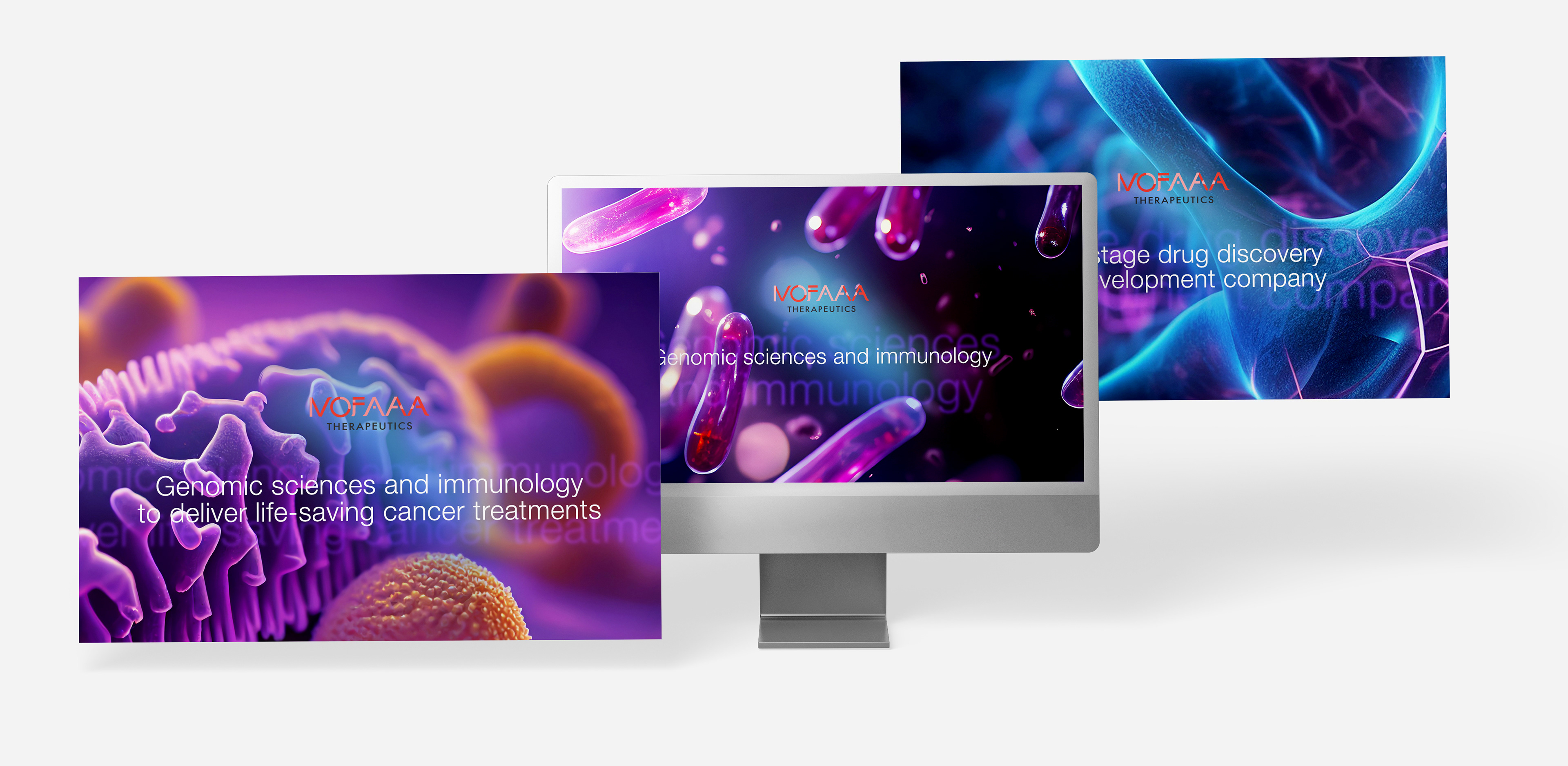
For NOFAAA, a restrained visual framework supported investor and partner confidence while allowing the brand to scale alongside the science.
For NOFAAA, a restrained visual framework supported investor and partner confidence while allowing the brand to scale alongside the science.
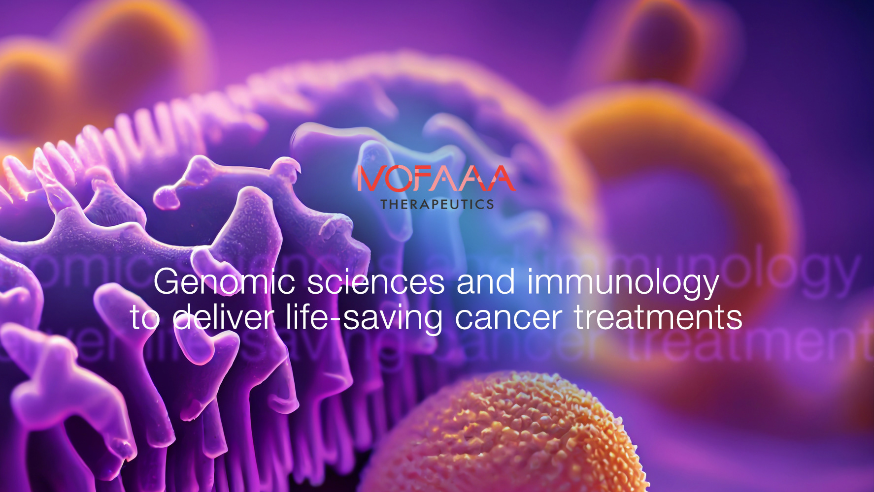
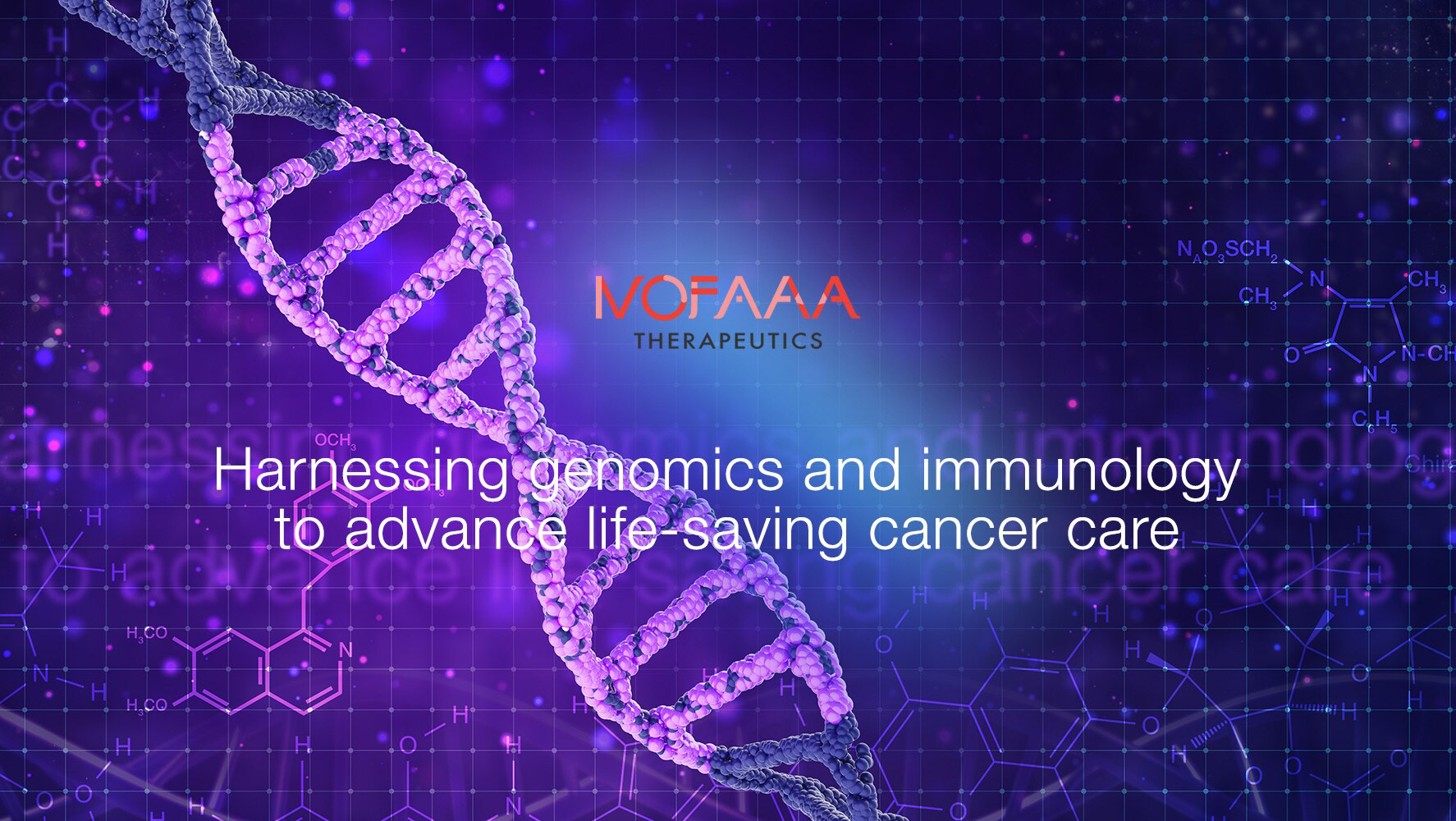
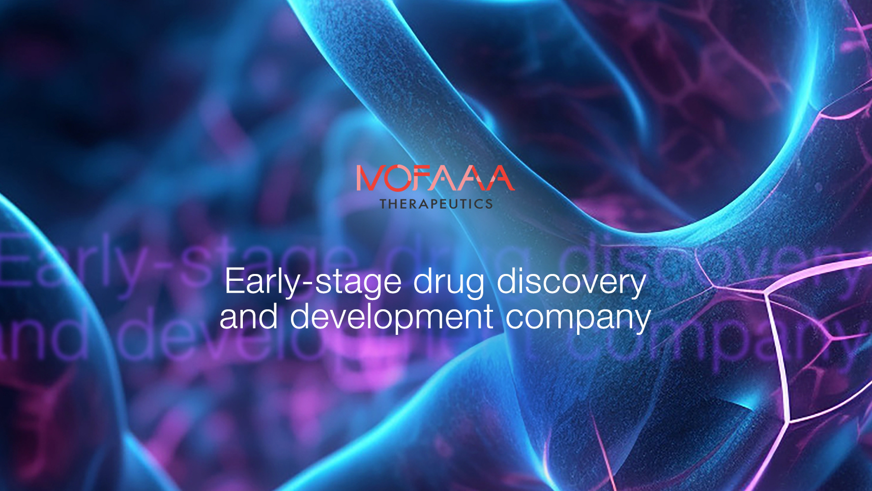



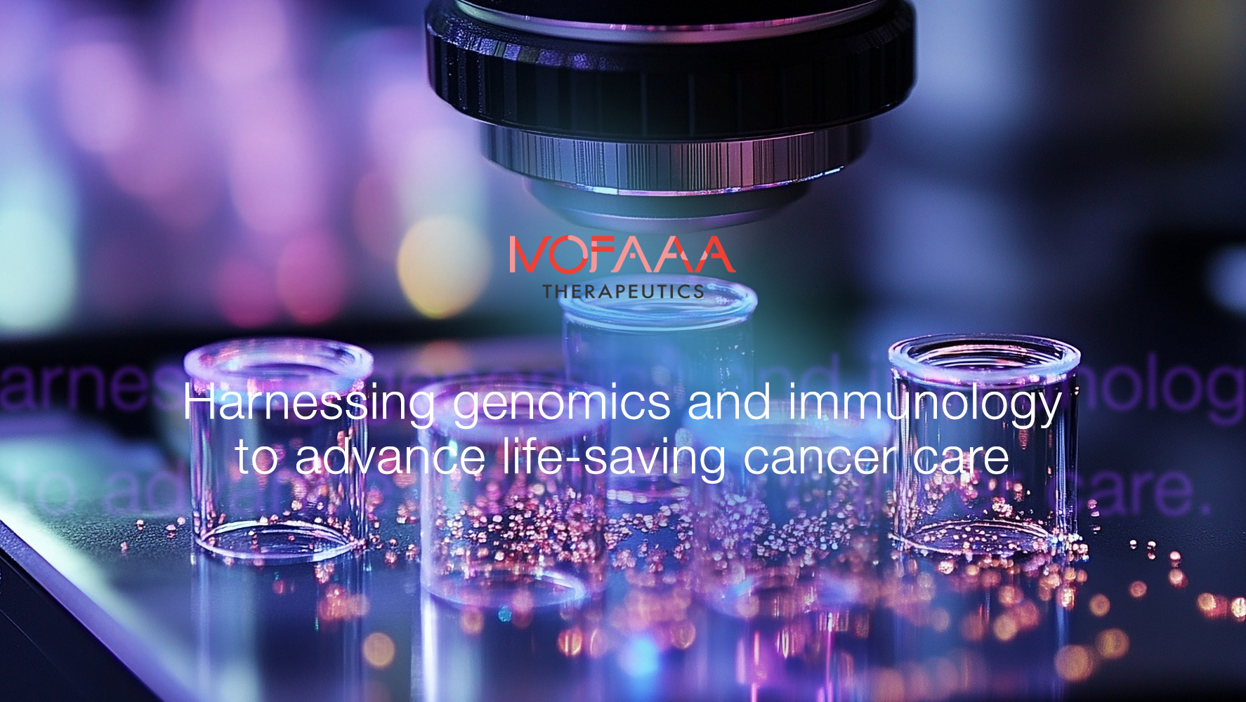



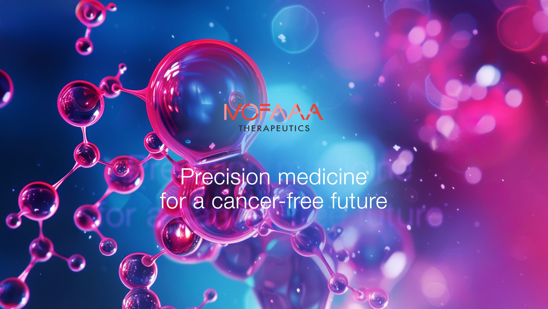
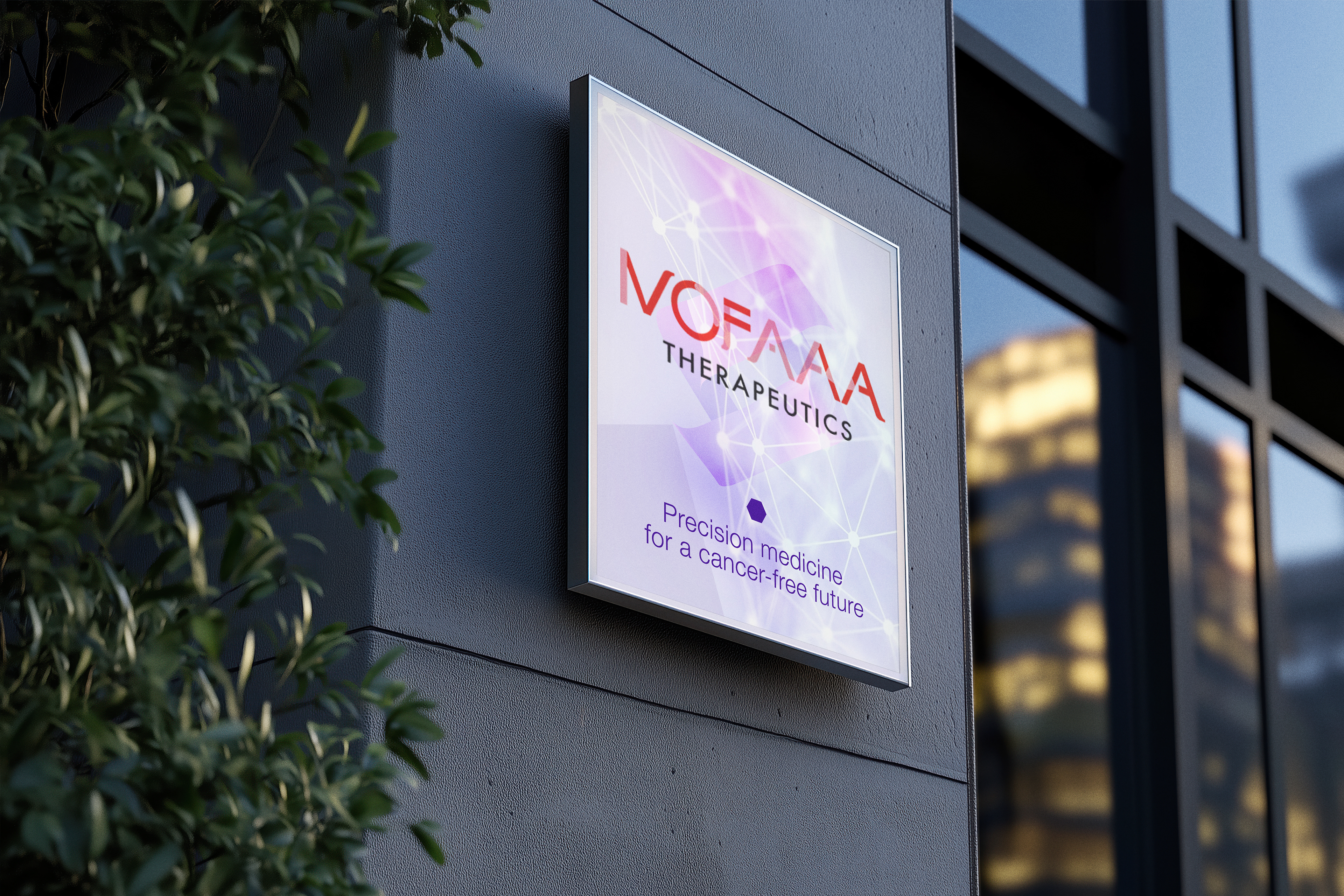
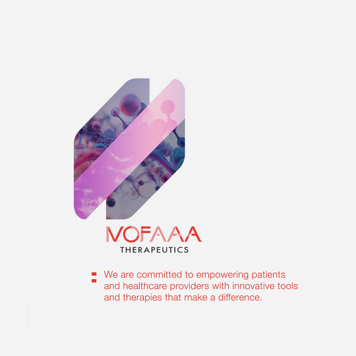
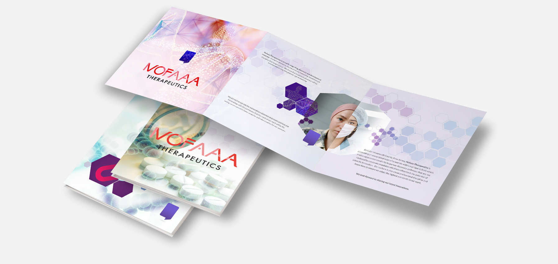
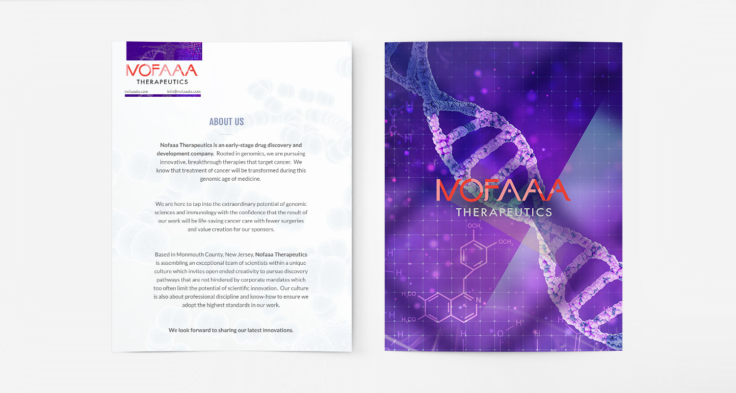
The logo was designed as a precise typographic mark, reinforcing scientific rigor and aligning NOFAAA within a contemporary biotech visual language.




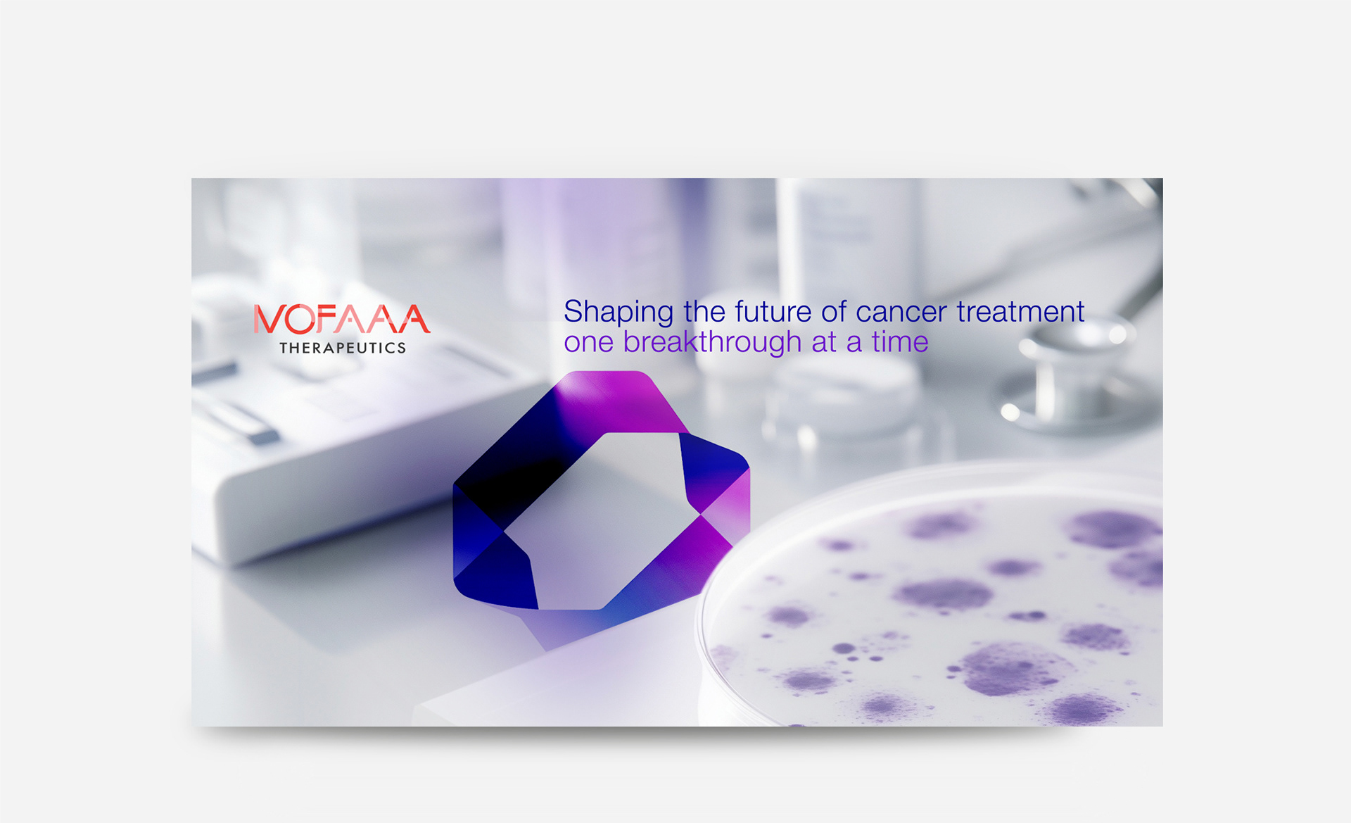

❝ Philippe brought cohesion and vision to our identity, combining scientific understanding with strong visual judgment to build our brand from the ground up.❞

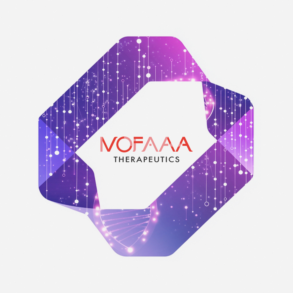
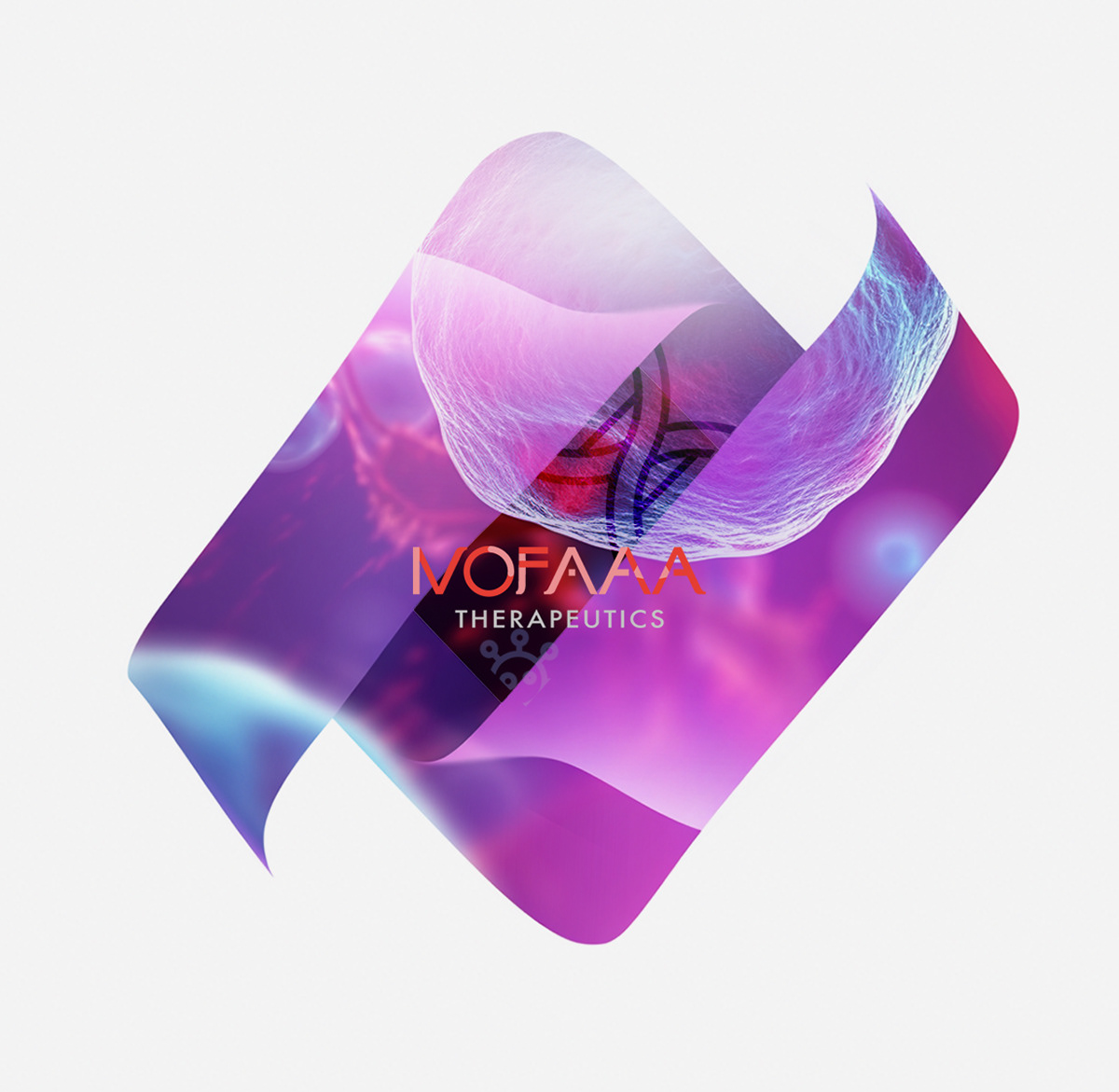
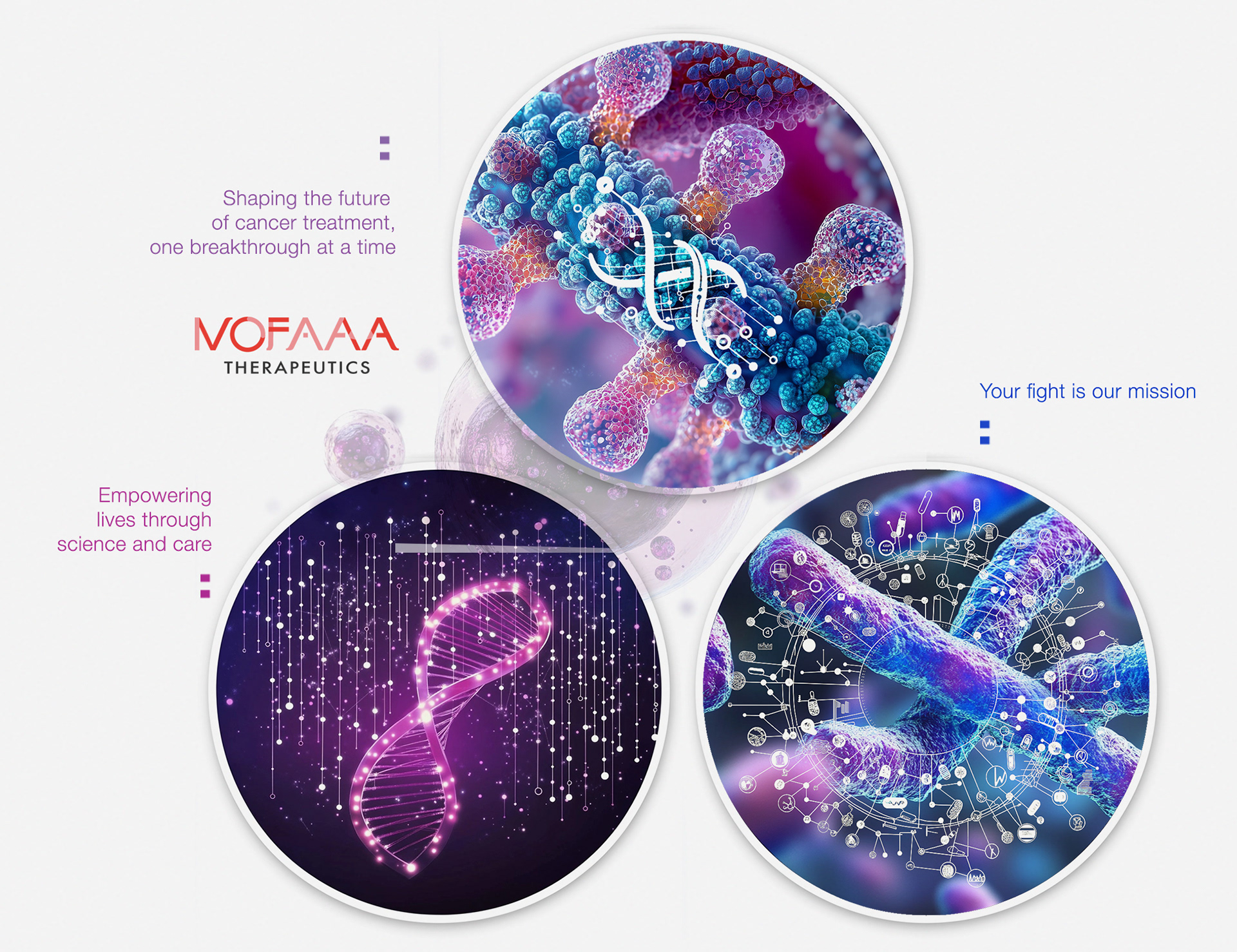
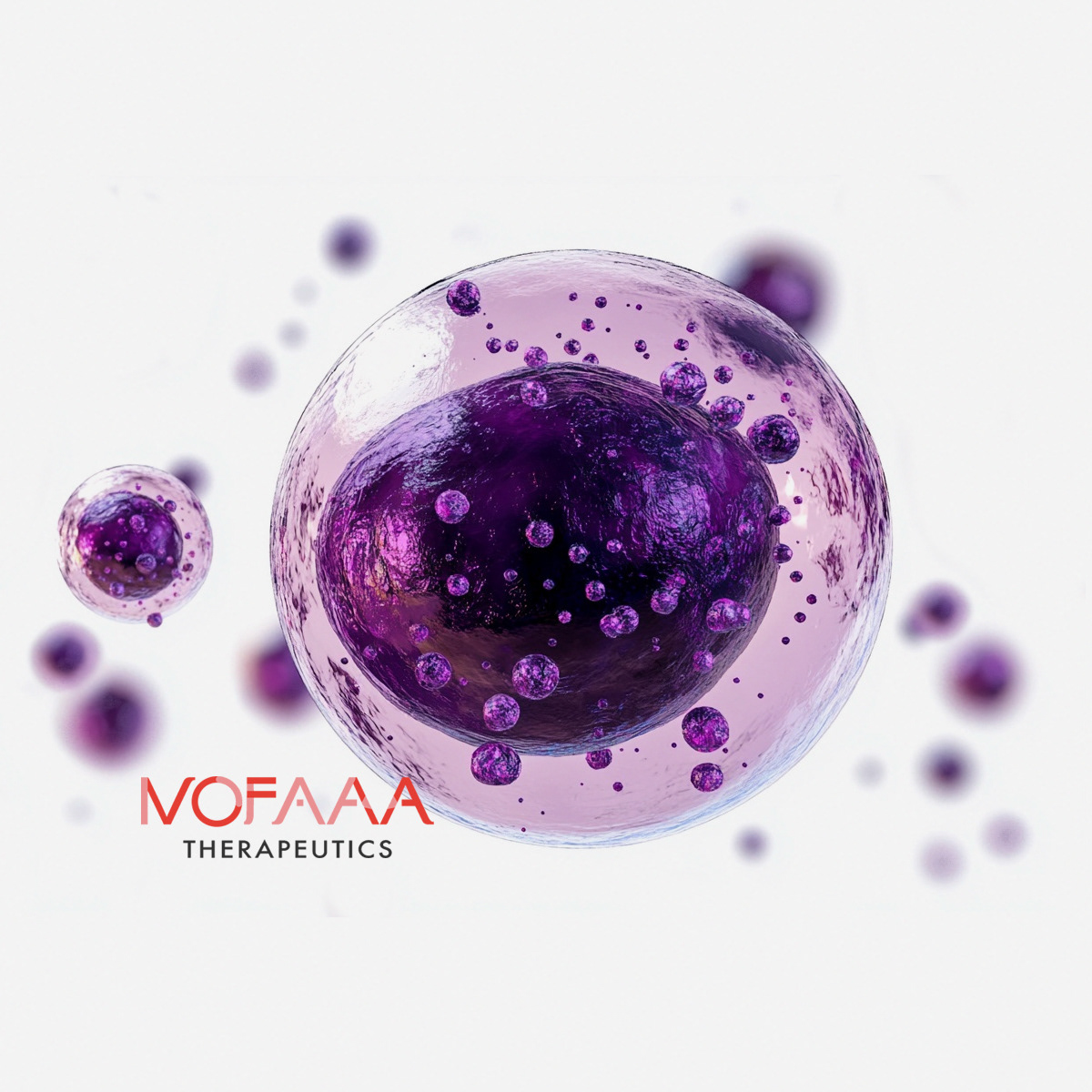
❝ I led a branding campaign that captures NOFAA's scientific expertise, forward-thinking approach, and dedication
to transforming cancer treatment.❞
to transforming cancer treatment.❞
Looking to build a biotech brand
that inspires trust & drives growth?
that inspires trust & drives growth?
