CLIENT ▸ Yeah Mobi, China
ROLE ▸ Brand Designer Freelance
SCOPE ▸ Logo Design, Brand Identity, Visual Identity, Campaign Materials, Iconography, Digital Assets
PROCESS ▸ Led cross-functional brand audit → visual identity system → rollout guidelines
ROLE ▸ Brand Designer Freelance
SCOPE ▸ Logo Design, Brand Identity, Visual Identity, Campaign Materials, Iconography, Digital Assets
PROCESS ▸ Led cross-functional brand audit → visual identity system → rollout guidelines

The Challenge
Highly competitive mobile CPA market
Complex, performance-led product offering
Need to communicate trust, speed, and scale to partners and advertisers
Highly competitive mobile CPA market
Complex, performance-led product offering
Need to communicate trust, speed, and scale to partners and advertisers
Strategic Approach
System-led brand architecture
Clear hierarchy to support product and performance messaging
Visual restraint to reinforce credibility in a data-driven environment
System-led brand architecture
Clear hierarchy to support product and performance messaging
Visual restraint to reinforce credibility in a data-driven environment
Creative Solution
Highly competitive mobile CPA market
Complex, performance-led product offering
Need to communicate trust, speed, and scale to partners and advertisers
Highly competitive mobile CPA market
Complex, performance-led product offering
Need to communicate trust, speed, and scale to partners and advertisers
Scope & System
Scalable brand architecture
Typographic hierarchy for product and performance communication
Modular layouts supporting digital-first applications
Scalable brand architecture
Typographic hierarchy for product and performance communication
Modular layouts supporting digital-first applications
Key Results
Clarified brand positioning within the mobile CPA space
Enabled consistent execution across product, sales, and marketing
Delivered a scalable system supporting platform growth
Clarified brand positioning within the mobile CPA space
Enabled consistent execution across product, sales, and marketing
Delivered a scalable system supporting platform growth
Impact & Performance
Improved clarity of product and value proposition
Stronger visual consistency across partner-facing touchpoints
Faster rollout of brand assets through reusable systems
Improved clarity of product and value proposition
Stronger visual consistency across partner-facing touchpoints
Faster rollout of brand assets through reusable systems
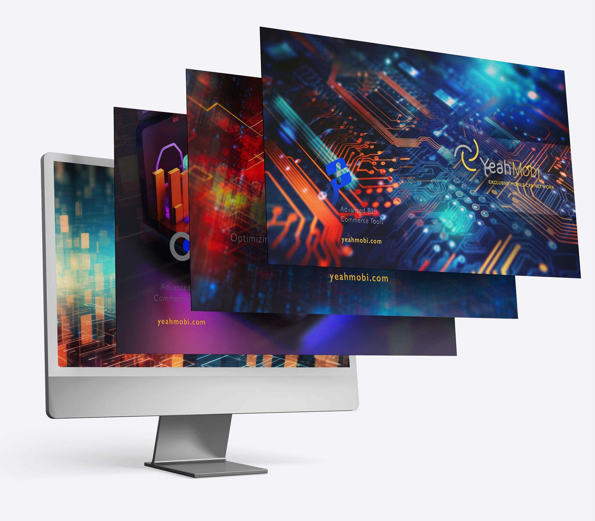
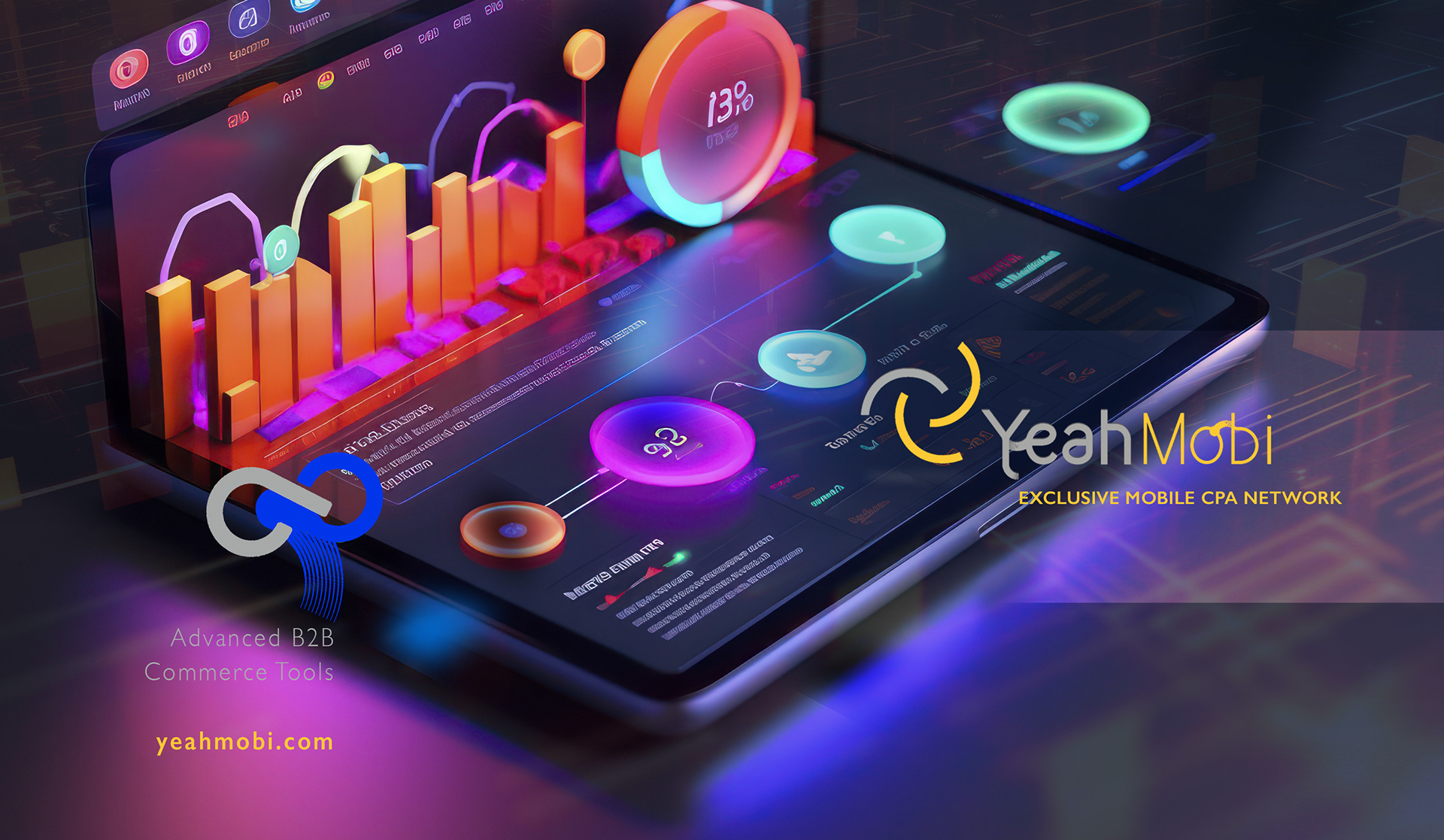
Deliverables
Brand identity and visual system
Digital brand assets and templates
Sales and partner-facing materials
Brand identity and visual system
Digital brand assets and templates
Sales and partner-facing materials
Role & Leadership
Brand Design Lead
Led brand strategy and system design from concept through execution, aligning stakeholders and ensuring consistent deployment across digital and commercial channels.
Brand Design Lead
Led brand strategy and system design from concept through execution, aligning stakeholders and ensuring consistent deployment across digital and commercial channels.
Why This Works Matters
In mobile performance marketing, clarity and trust drive adoption.
A system-led brand helps complex platforms communicate value quickly while supporting scale across products and markets.
In mobile performance marketing, clarity and trust drive adoption.
A system-led brand helps complex platforms communicate value quickly while supporting scale across products and markets.


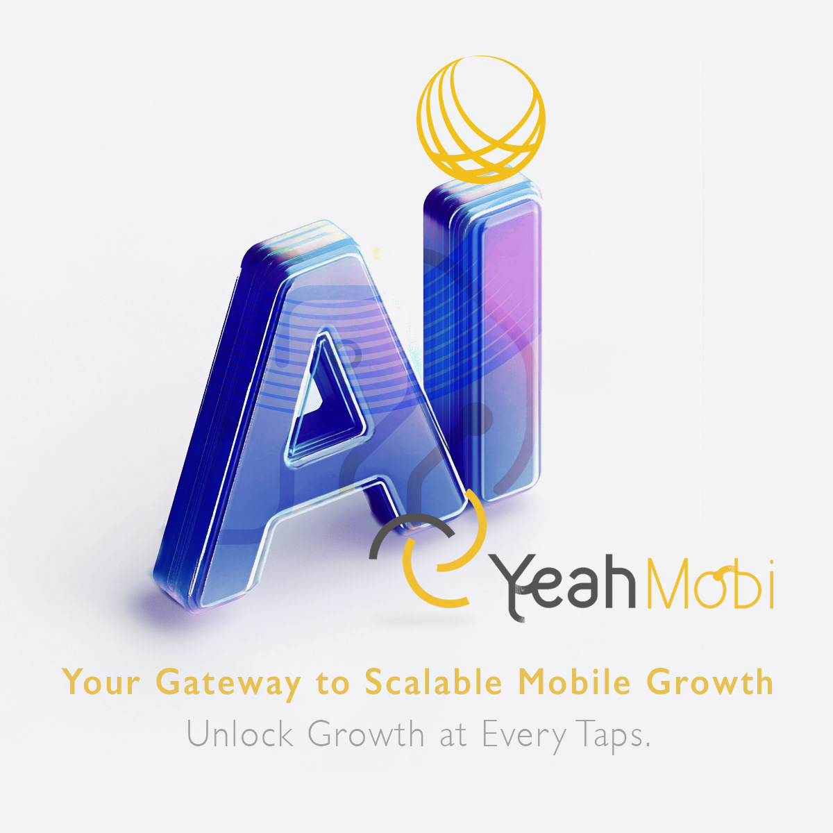
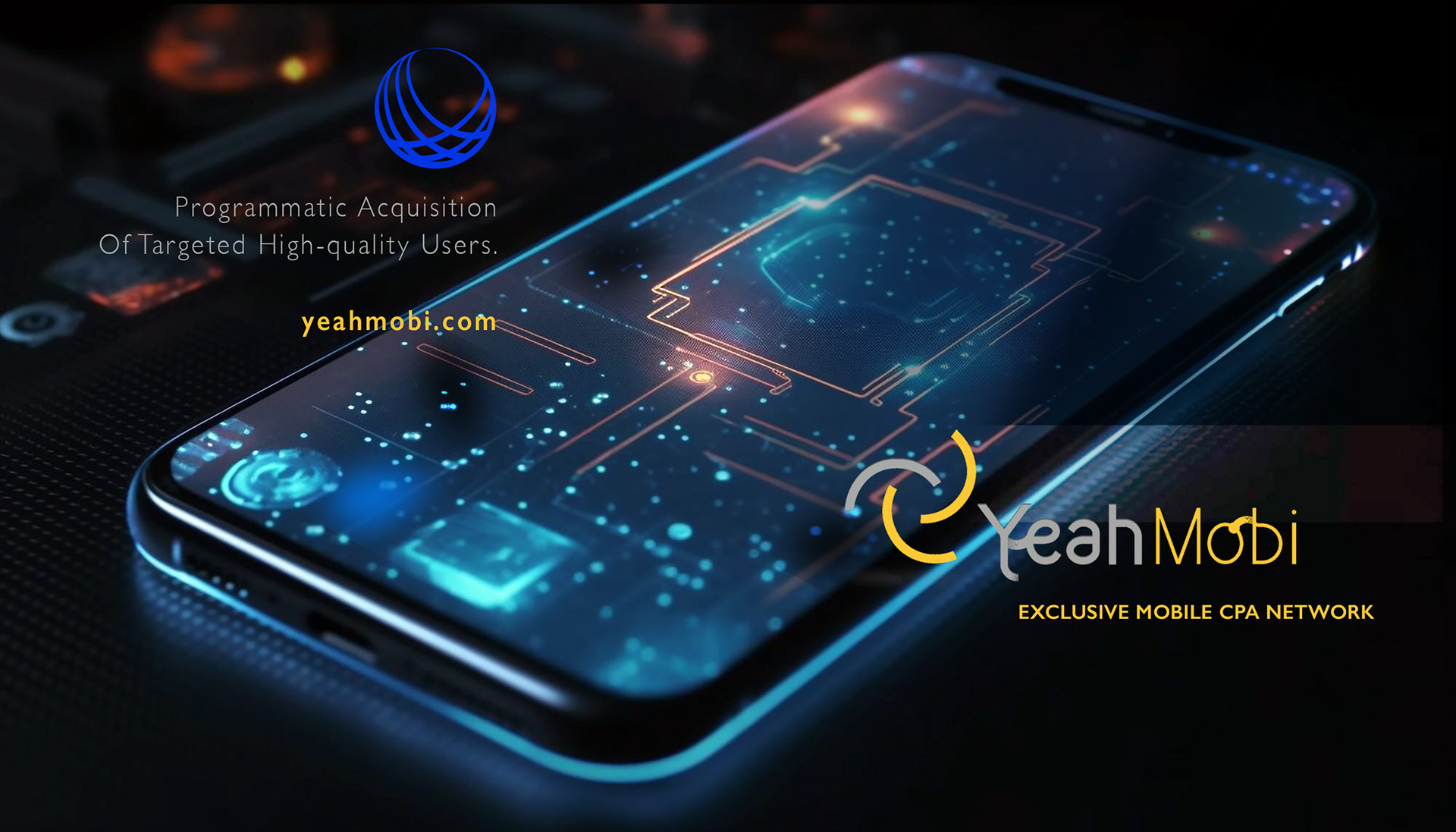
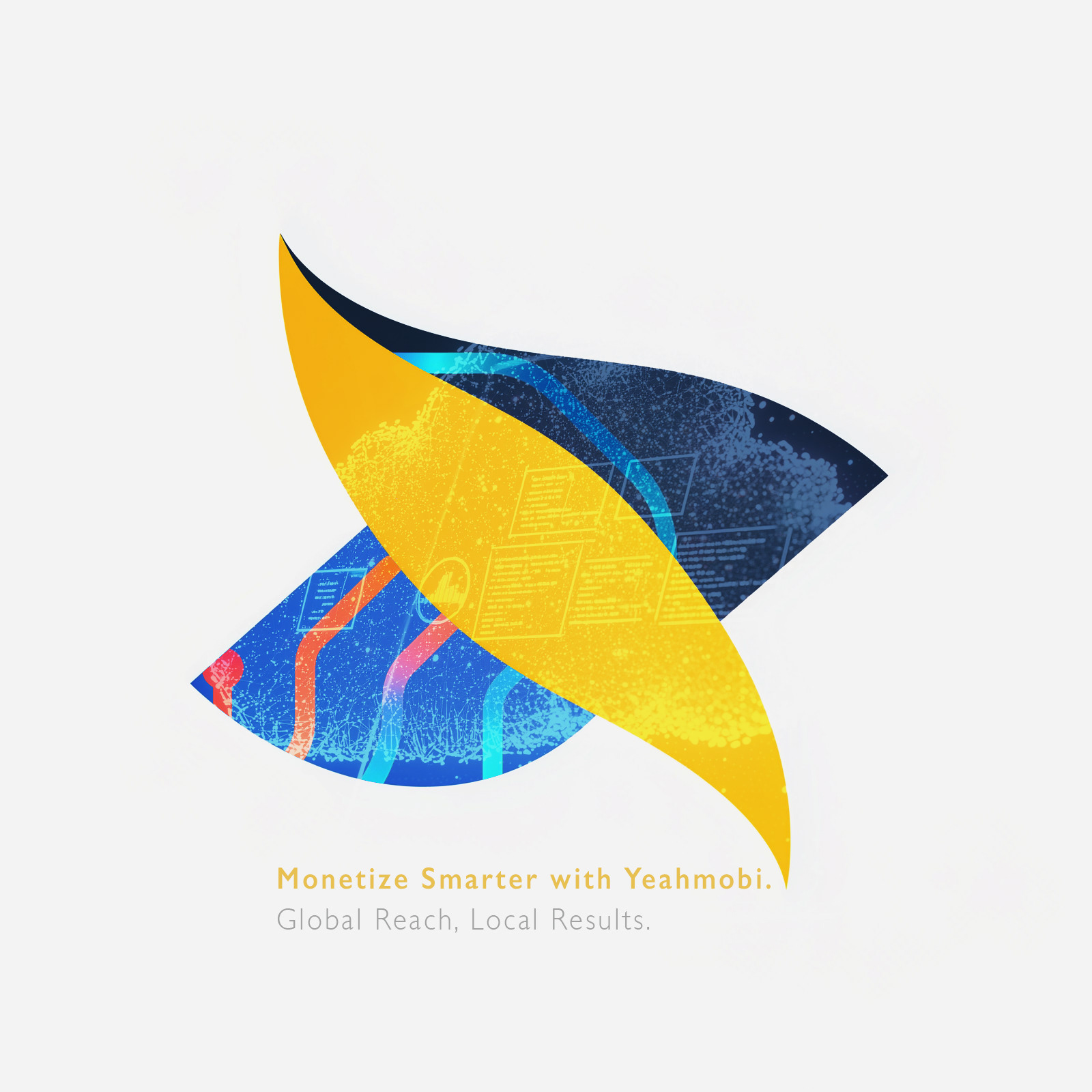
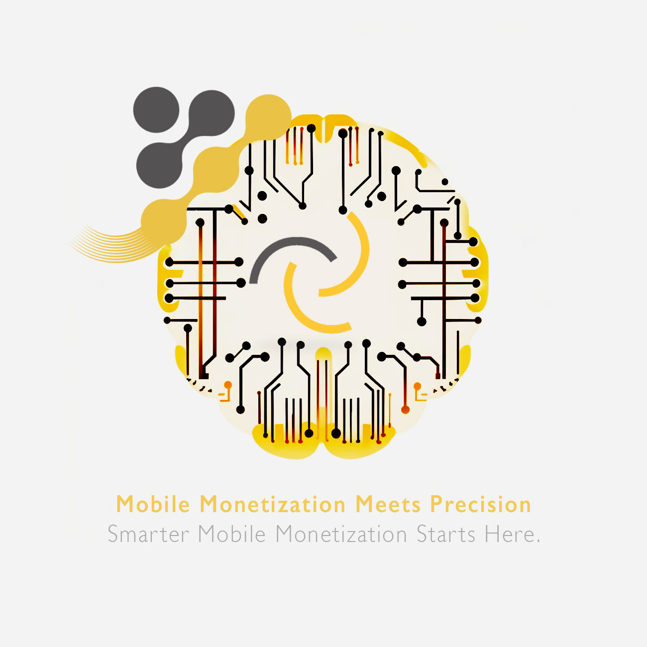
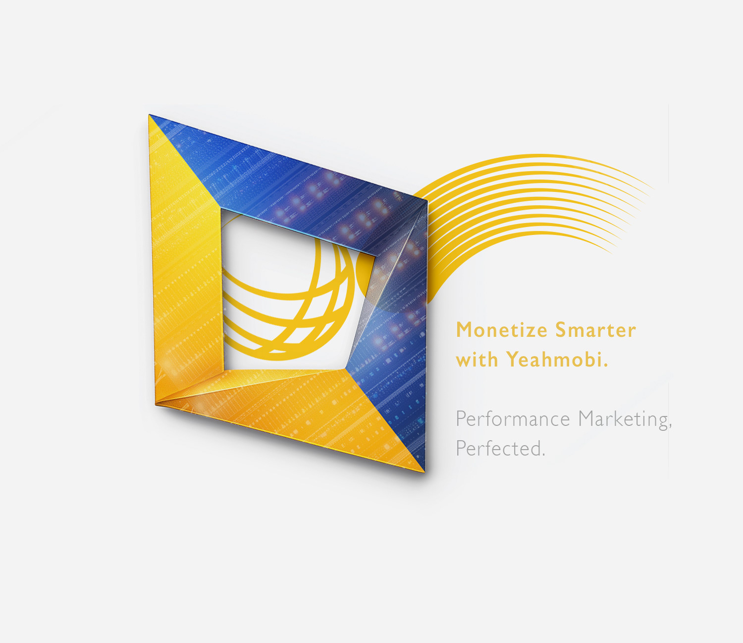
Logo built to perform consistently across digital interfaces and commercial environments.
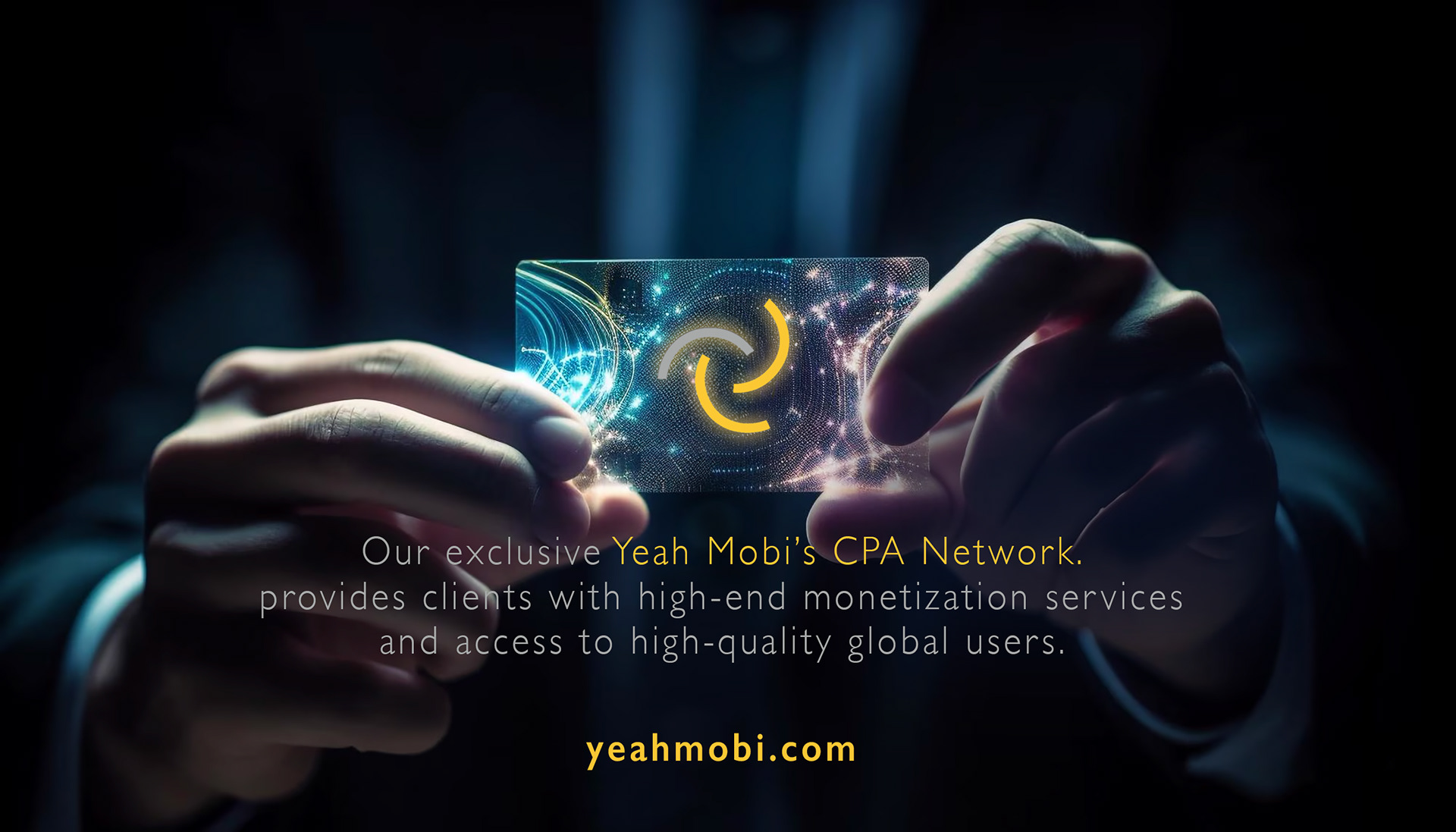
❝ The system improved clarity and consistency across high-volume digital touchpoints, supporting stronger engagement and smoother partner communications.❞


Looking to reposition your tech brand
with clarity, speed, and impact?
with clarity, speed, and impact?