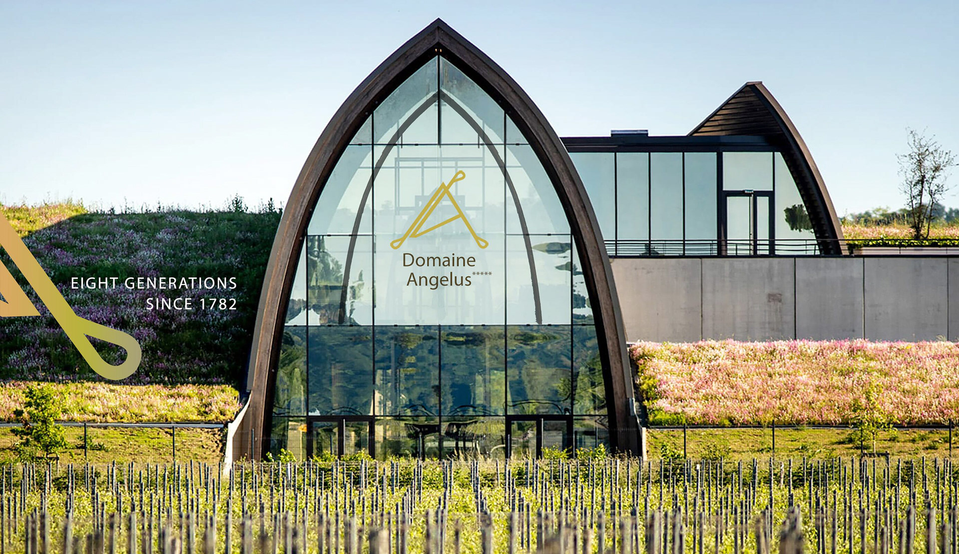
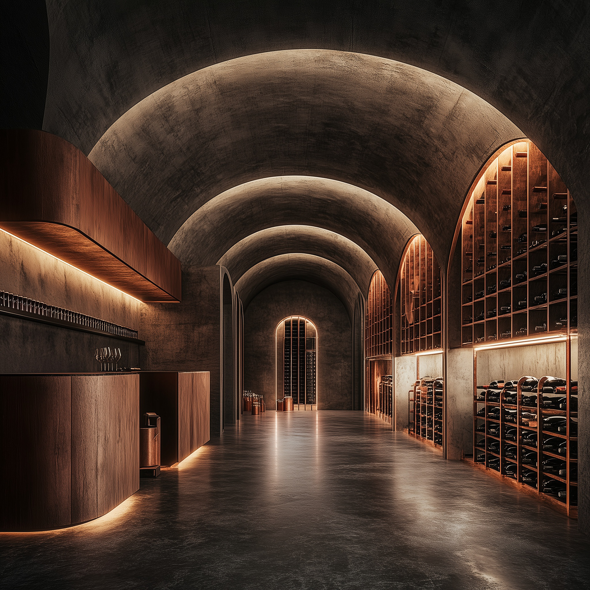
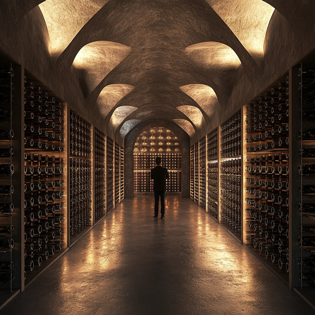
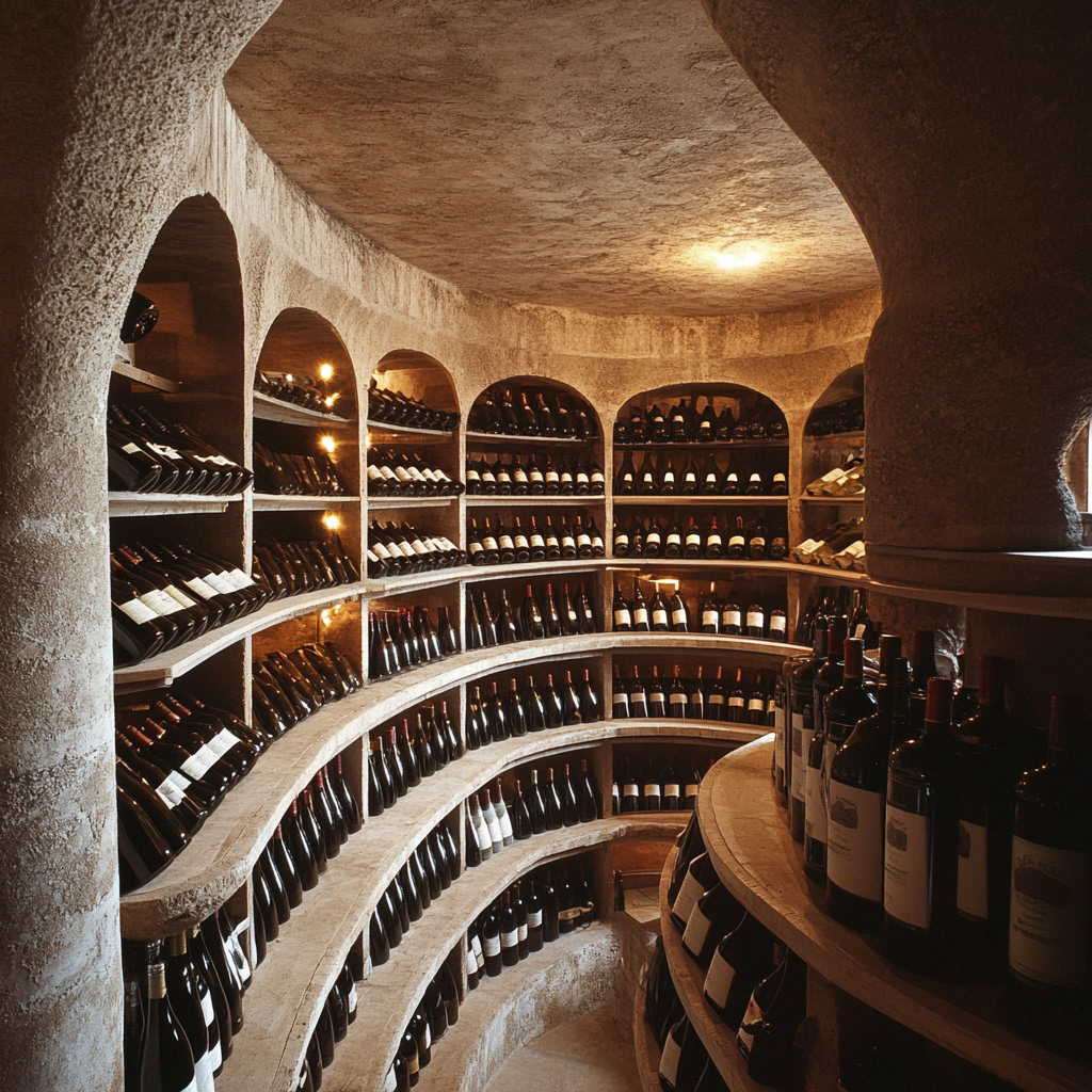
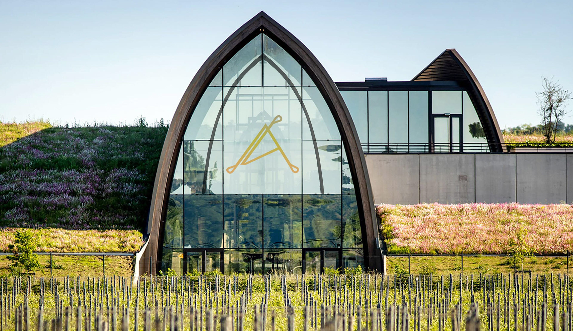
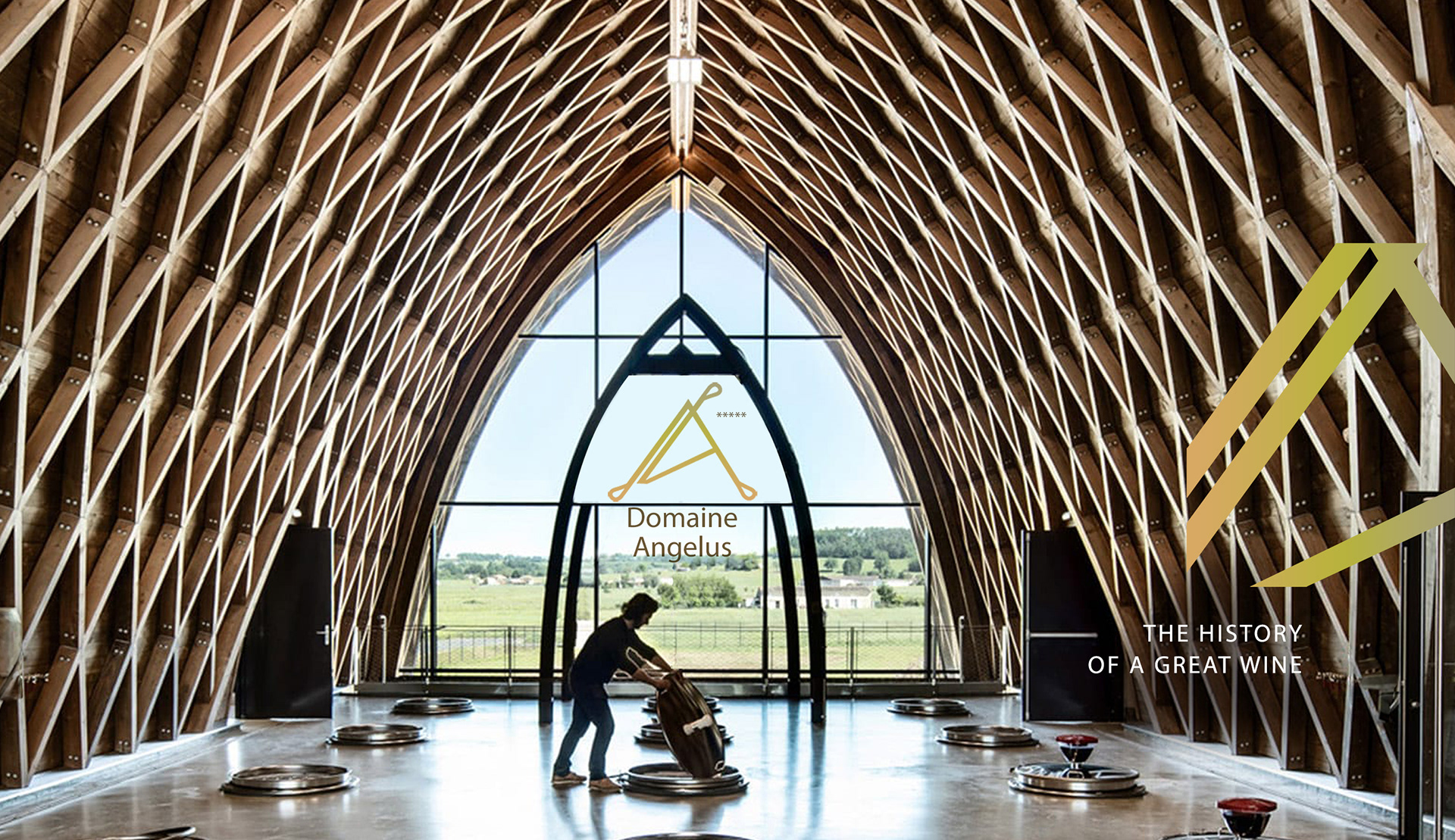
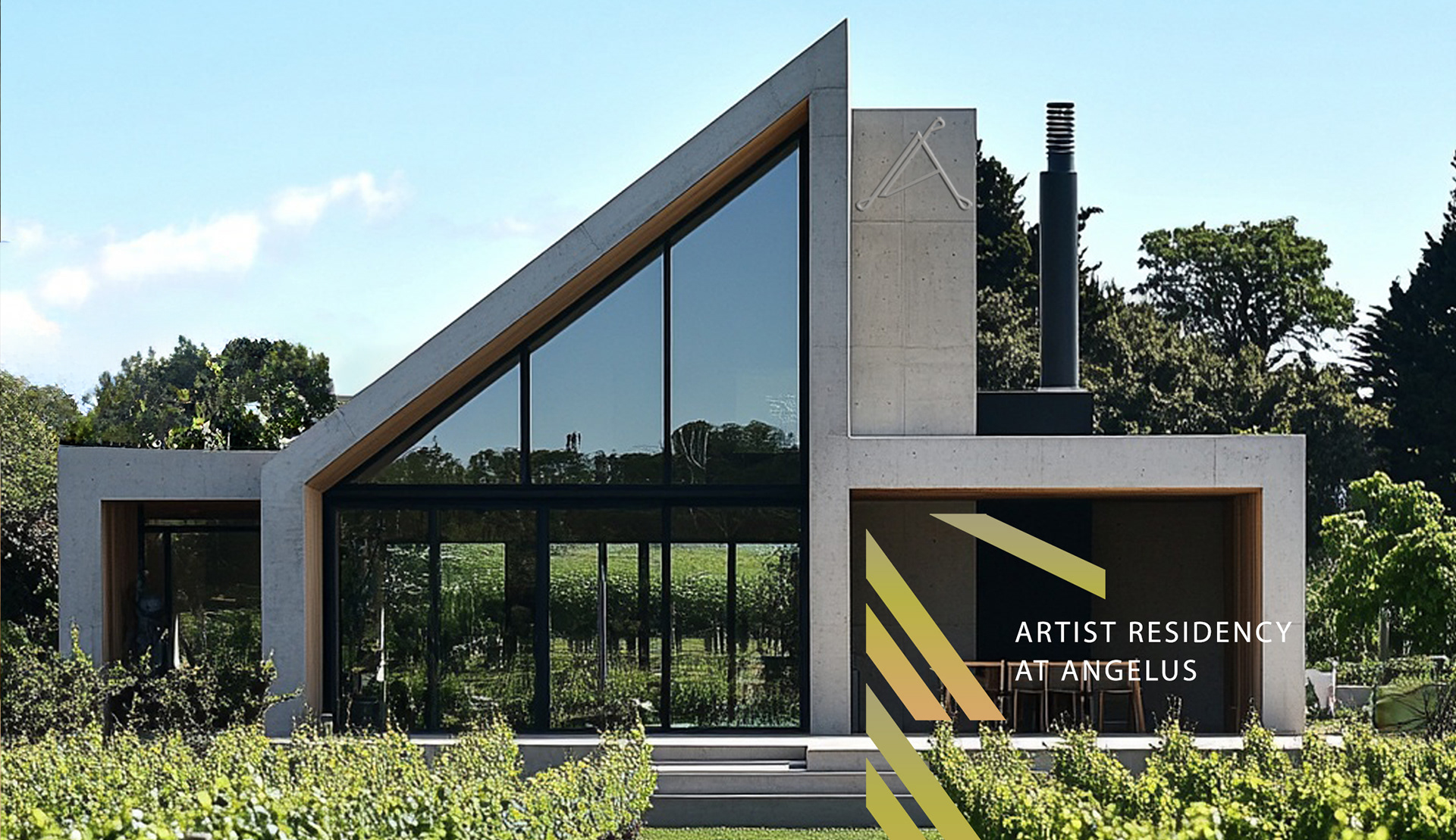
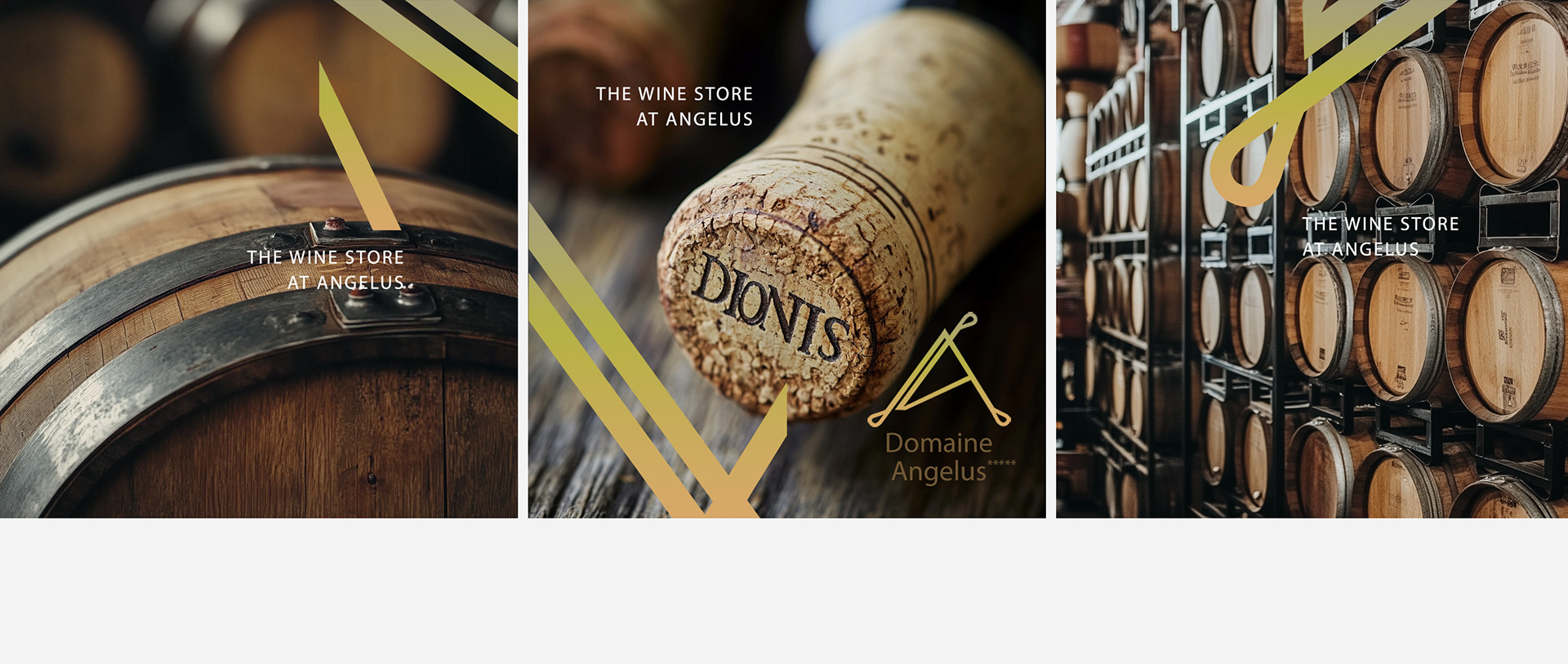
Domaine Angelus was competing in a category where every label signals the same thing: a château, a crest, a date. That shorthand is available to everyone, so it distinguishes no one. I built an identity on architectural principles instead of heritage imagery: structure, proportion, and rhythm rather than ornament, so the estate reads as serious and contemporary without giving up craft.
CLIENT ▸ Domaine Angelus, Bordeaux, France
YEAR ▸ 2024
AREA ▸ Wine & Spirits — Premium Estate
AUDIENCE ▸ Importer, Sommelier, End Consumer
SCALE ▸ 1 label, 3 print pieces, 5-month engagement
SCOPE ▸ Brand identity, packaging, print, and marketing materials
ROLE ▸ Brand Designer (Freelance)
TEAM ▸ Solo, direct to the estate
PROCESS ▸ Category audit → positioning → identity system → packaging and print applications
YEAR ▸ 2024
AREA ▸ Wine & Spirits — Premium Estate
AUDIENCE ▸ Importer, Sommelier, End Consumer
SCALE ▸ 1 label, 3 print pieces, 5-month engagement
SCOPE ▸ Brand identity, packaging, print, and marketing materials
ROLE ▸ Brand Designer (Freelance)
TEAM ▸ Solo, direct to the estate
PROCESS ▸ Category audit → positioning → identity system → packaging and print applications
Challenge
A category where heritage codes are universal, so nobody stands out by using them
Craftsmanship to communicate, without nostalgia doing the communicating
A premium claim to hold on a shelf next to estates with centuries of recognition
A category where heritage codes are universal, so nobody stands out by using them
Craftsmanship to communicate, without nostalgia doing the communicating
A premium claim to hold on a shelf next to estates with centuries of recognition
Strategic Approach
Architectural thinking: structure before surface. Proportion, rhythm, repetition
Longevity over trend. A wine label is redesigned once a generation, not once a season
Restraint as the craft signal. Doing less signals the estateis confidence in what's in the bottle
Architectural thinking: structure before surface. Proportion, rhythm, repetition
Longevity over trend. A wine label is redesigned once a generation, not once a season
Restraint as the craft signal. Doing less signals the estateis confidence in what's in the bottle
Creative Solution
An identity built as a constructed space. Typography, spacing, and negative space as the primary material
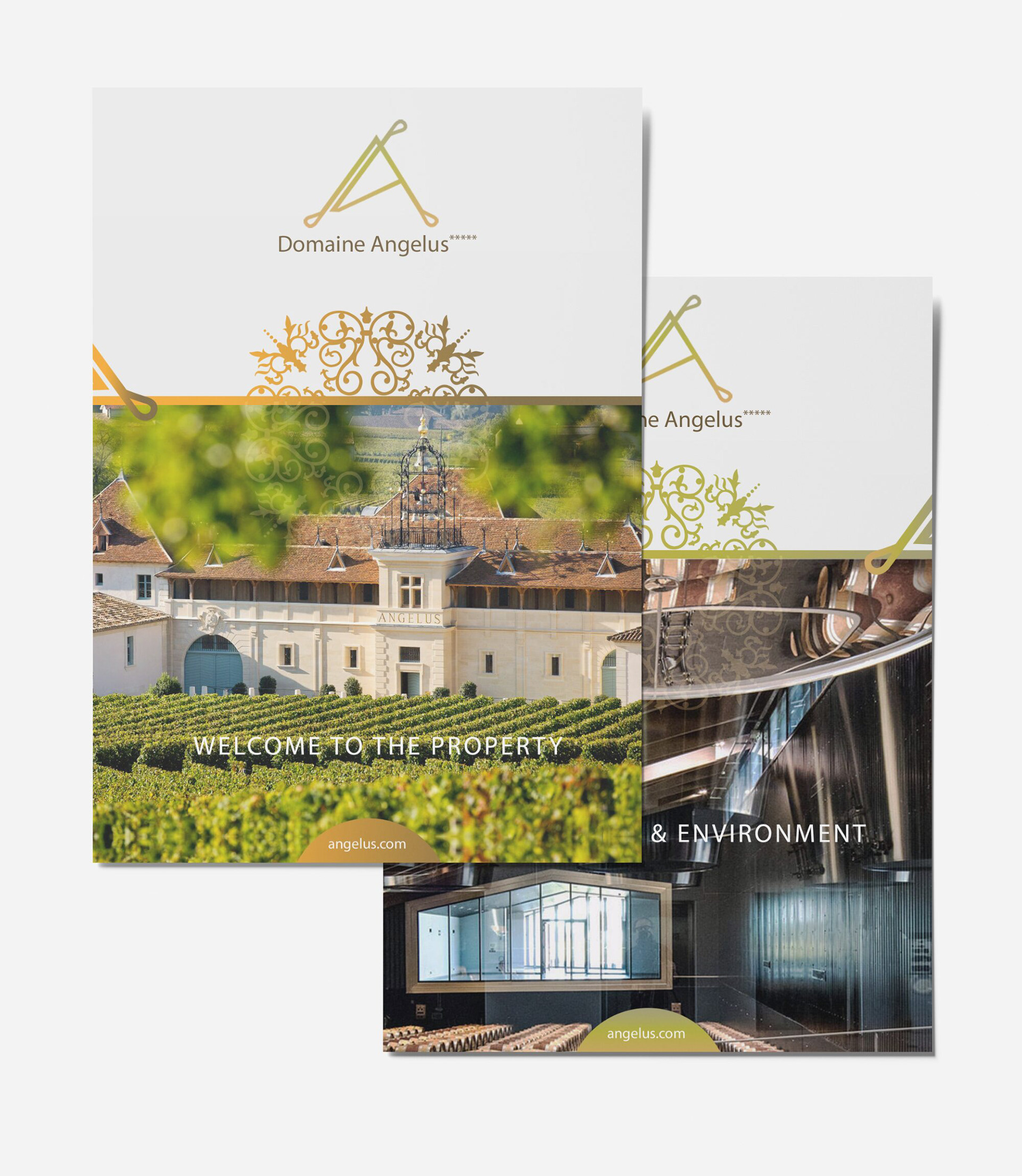
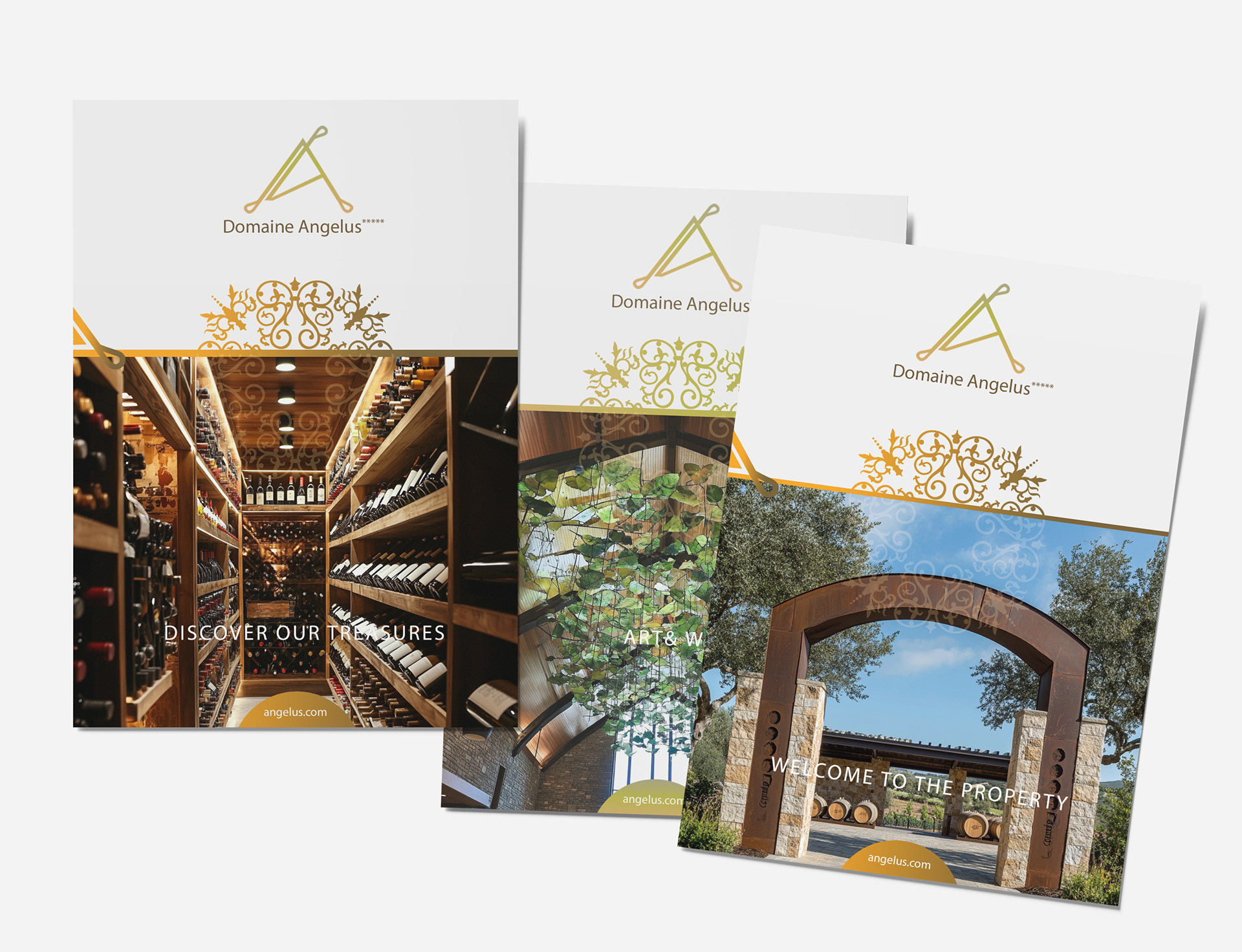
A modular grid holding proportion across every format, from label to brochure
No crest, no engraving, no date. The seriousness comes from the structure, not the props
An identity built as a constructed space. Typography, spacing, and negative space as the primary material
A modular grid holding proportion across every format, from label to brochure
No crest, no engraving, no date. The seriousness comes from the structure, not the props
Scope & System
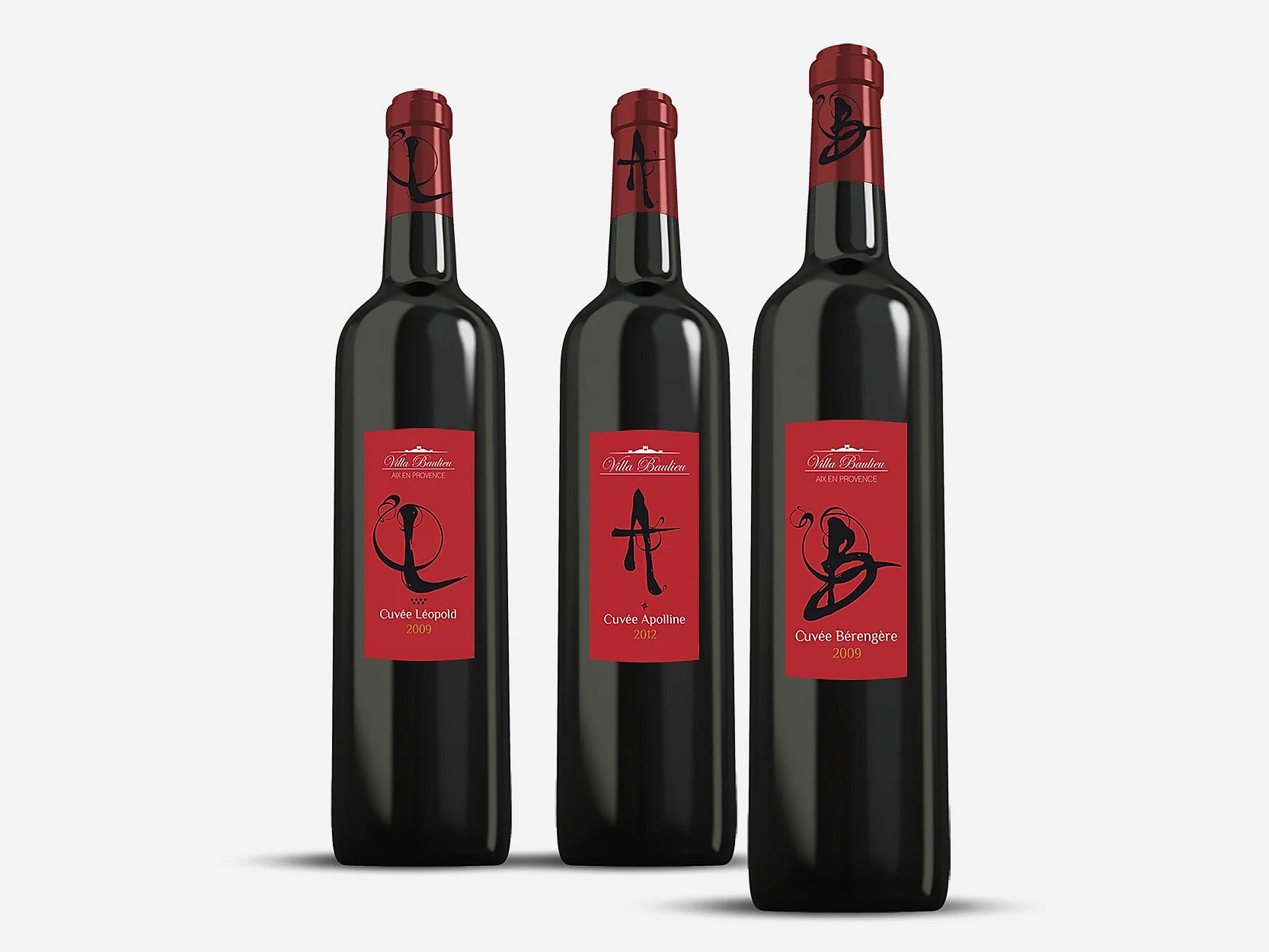
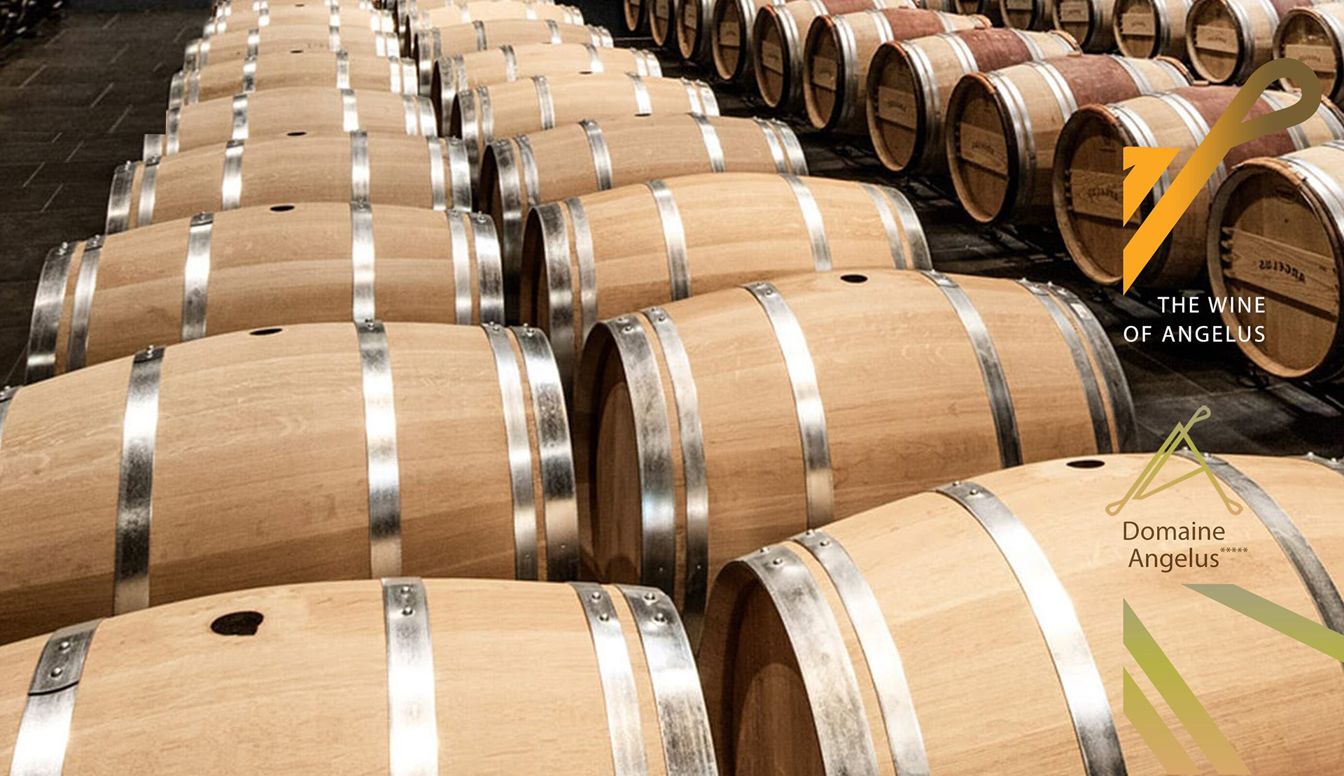
4 labels and packaging applications on one grid.
Print and brochure system with fixed hierarchy.
Rules for extension, so new cuvées and vintages sit within the system.
4 labels and packaging applications on one grid.
Print and brochure system with fixed hierarchy.
Rules for extension, so new cuvées and vintages sit within the system.
Deliverables
+ Logotype and visual identity
+ Label and packaging design
+ Brochures and print materials
+ Digital brand assets
+ Identity guidelines
+ Logotype and visual identity
+ Label and packaging design
+ Brochures and print materials
+ Digital brand assets
+ Identity guidelines
Role & Leadership
Brand Designer, positioning through production, working directly with the estate.
The argument I had to win: that removing the heritage cues would read as confidence rather than absence. In Bordeaux, that is not an easy sell.
Brand Designer, positioning through production, working directly with the estate.
The argument I had to win: that removing the heritage cues would read as confidence rather than absence. In Bordeaux, that is not an easy sell.




On The Work
Brand design is a structural discipline, not surface decoration.
In a category that leans on inherited symbols, building an identity from proportion and rhythm is what makes it belong to one estate and nobody else.
Brand design is a structural discipline, not surface decoration.
In a category that leans on inherited symbols, building an identity from proportion and rhythm is what makes it belong to one estate and nobody else.
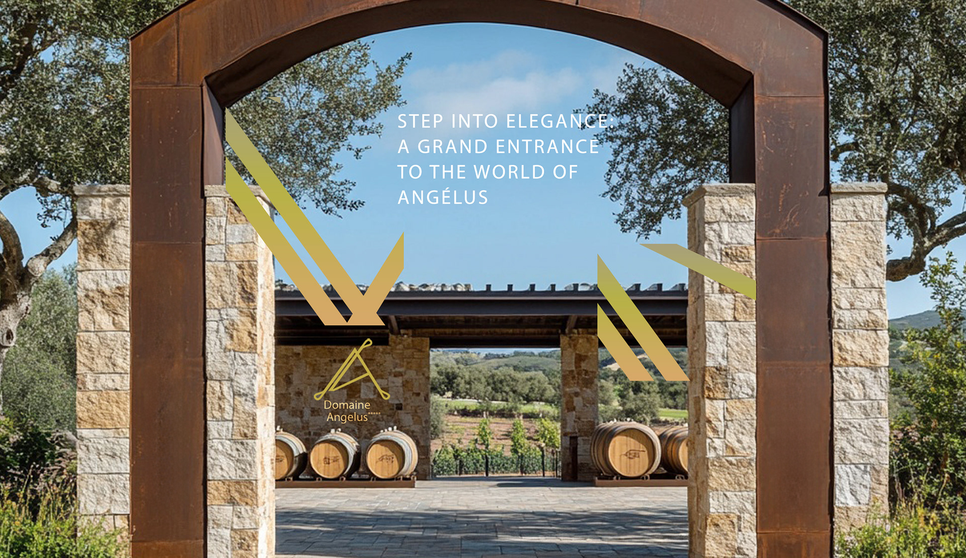
The logo was designed as a typographic mark inspired by architectural signage, precise, restrained, and built to endure across physical and digital environments.


Building a premium brand in a category
that defaults to heritage?
that defaults to heritage?