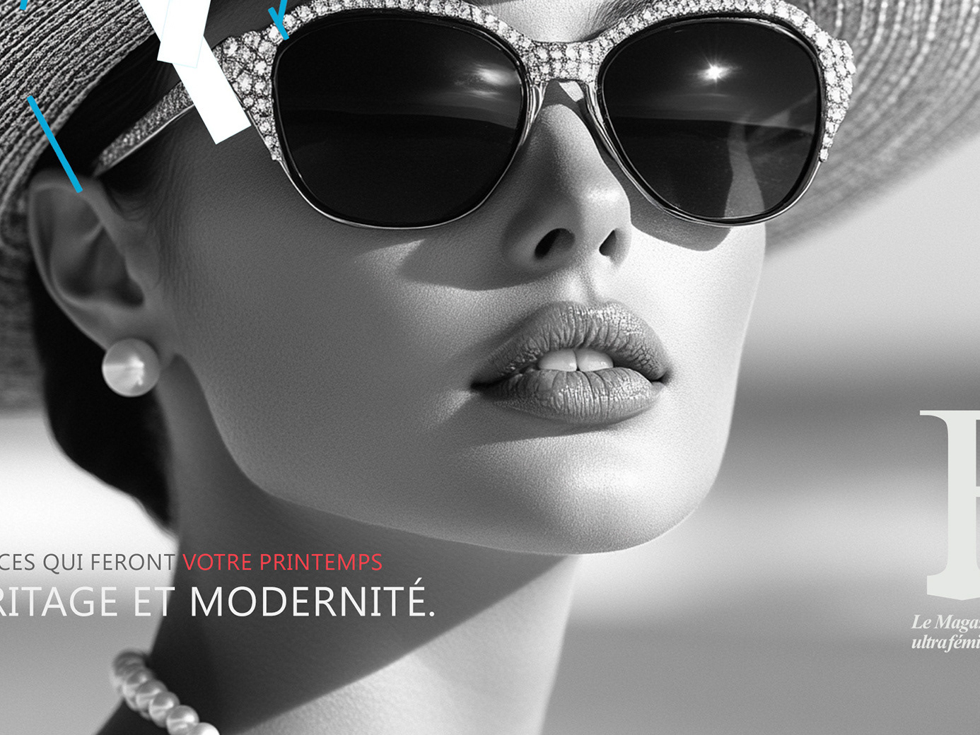
Anti-aging clinics sit at an awkward intersection: too clinical and they lose desirability, too aspirational
and they lose credibility.
This identity was built to hold both, warm enough to attract patients, and precise enough to earn their trust
in a medical context.
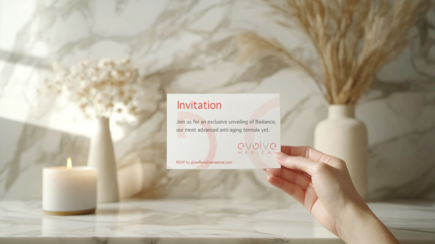
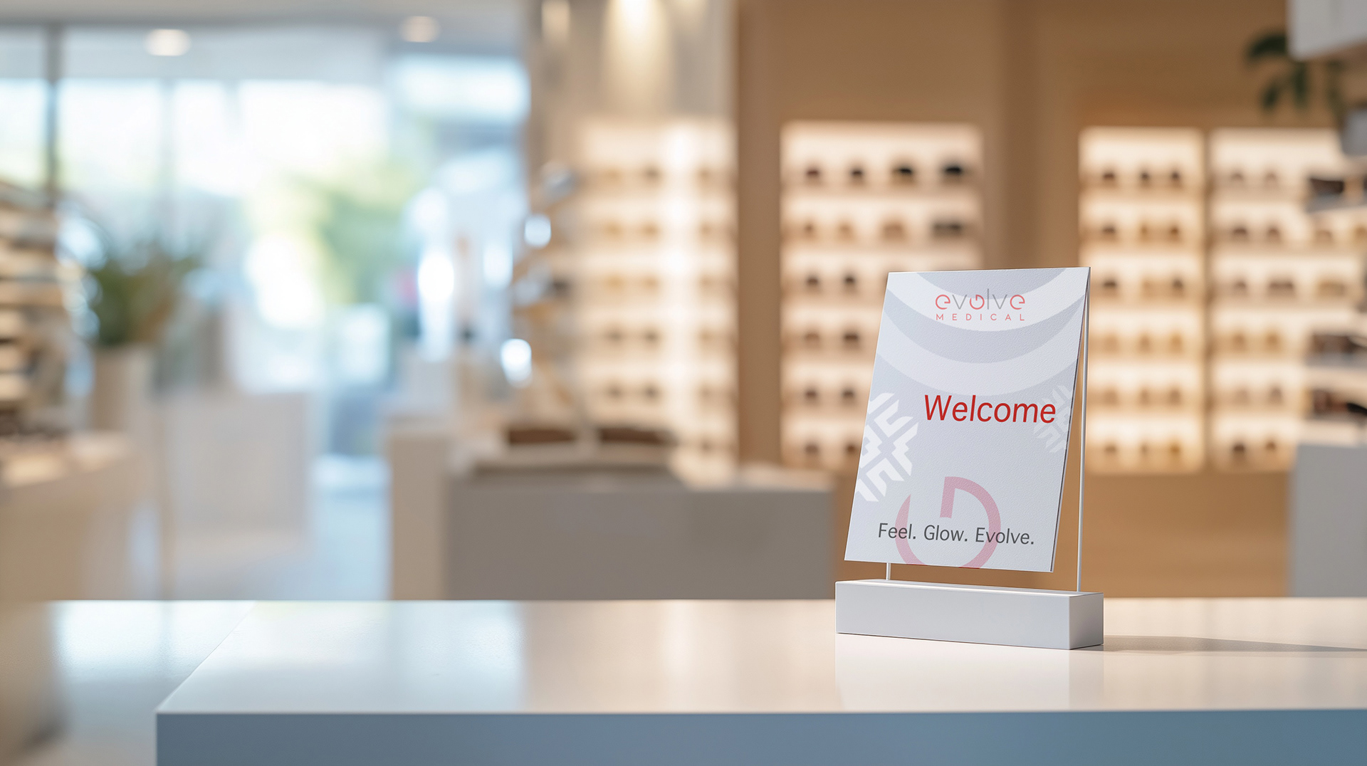
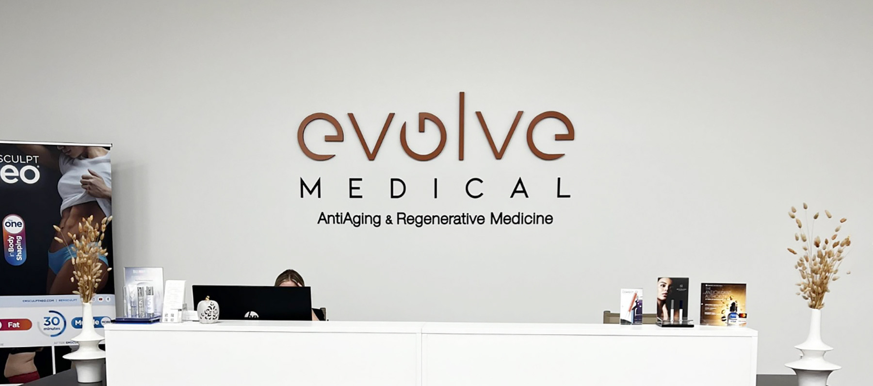
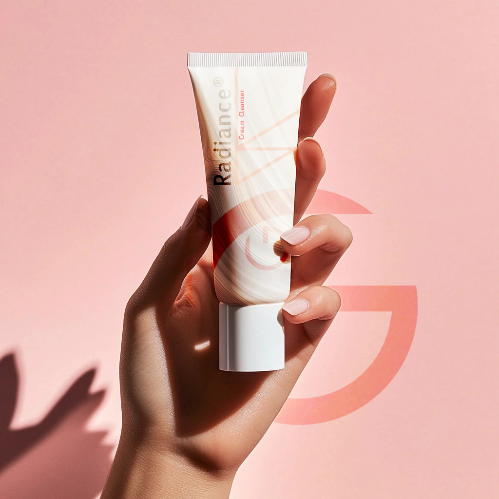
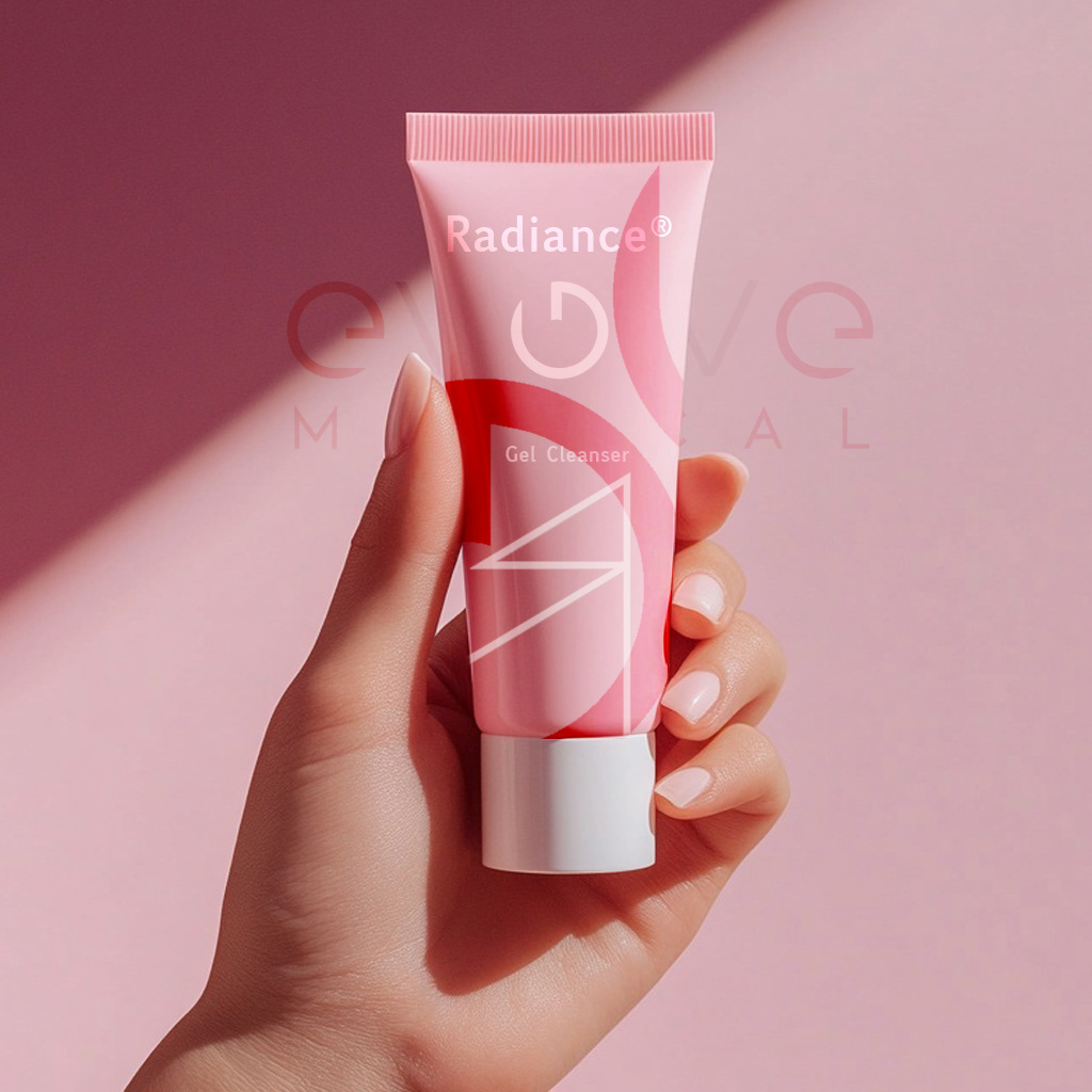
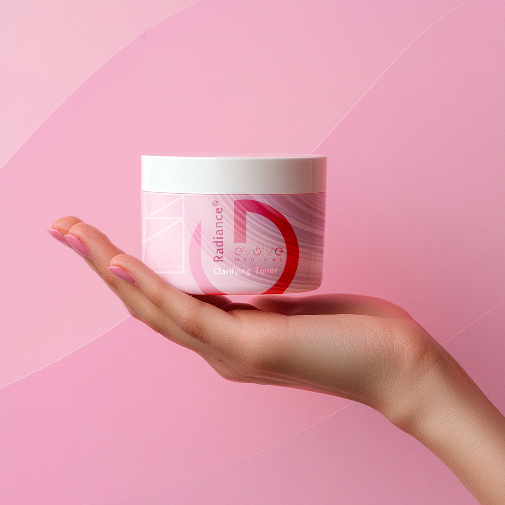
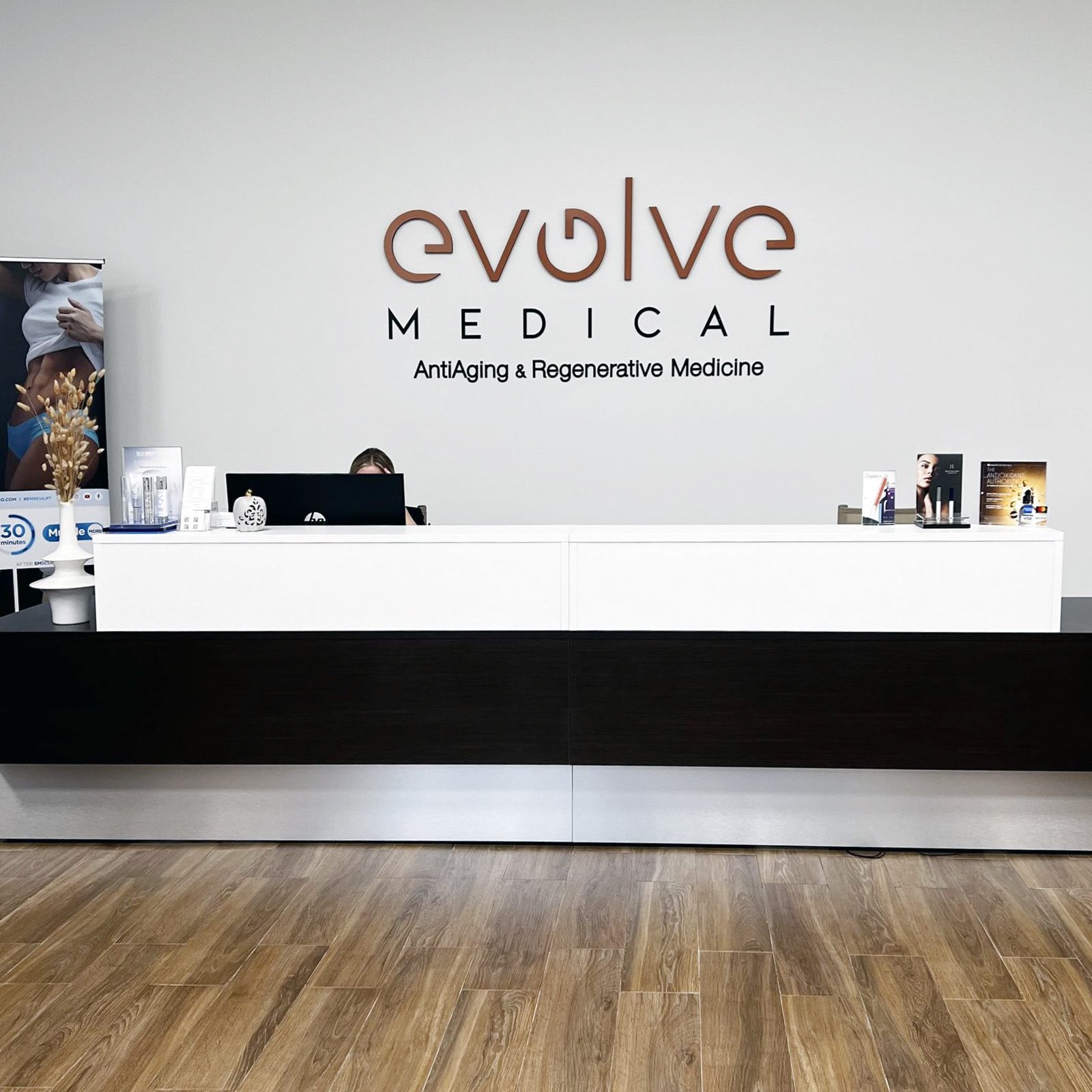
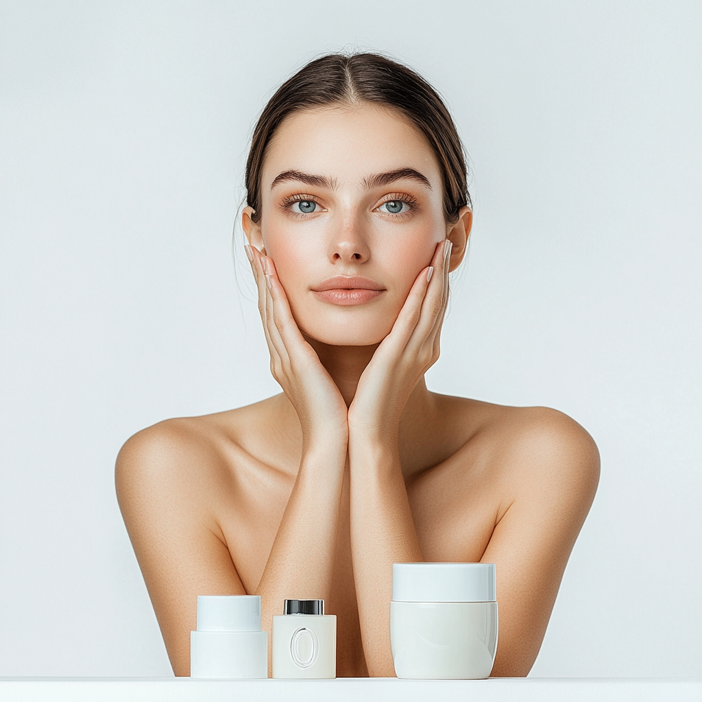
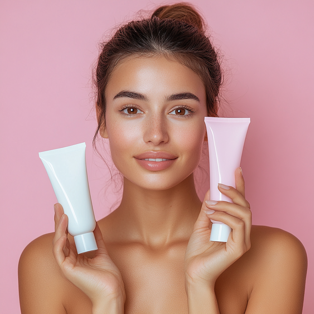
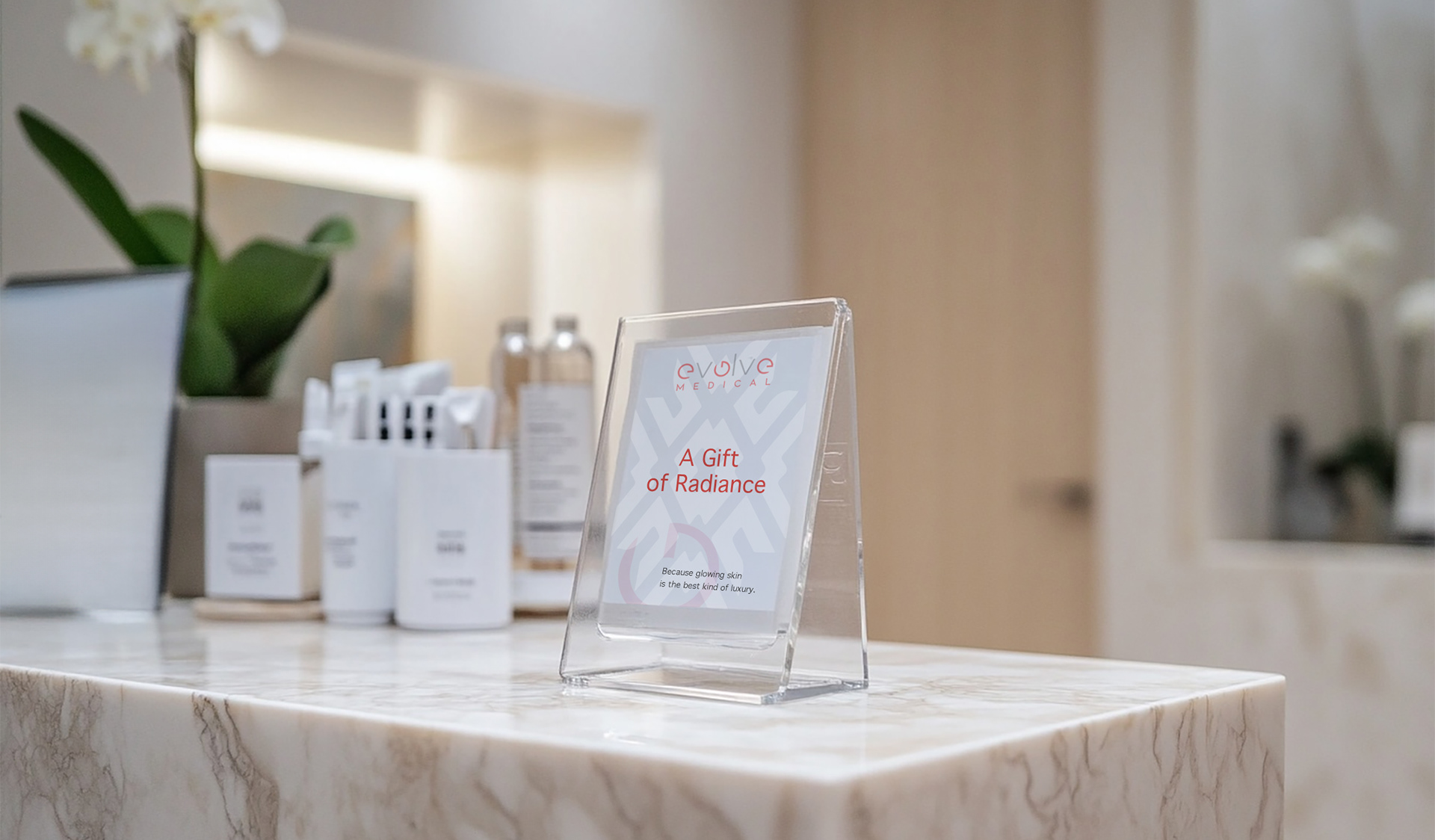
The visual system has been applied across digital, print, and environmental touchpoints at multiple clinic locations.
and they lose credibility.
This identity was built to hold both, warm enough to attract patients, and precise enough to earn their trust
in a medical context.
The visual system has been applied across digital, print, and environmental touchpoints at multiple clinic locations.
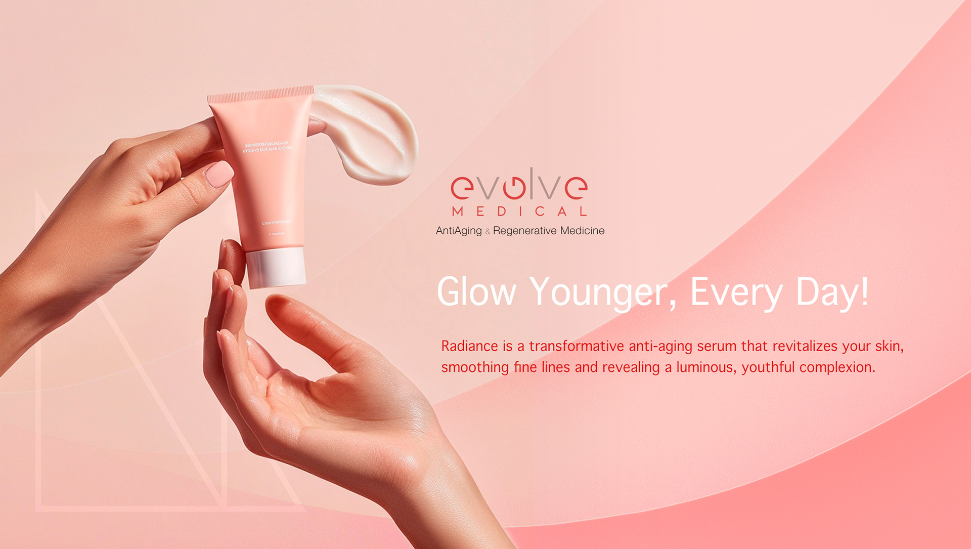
CLIENT ▸ Evolve Medical, NY, USA
ROLE ▸ Brand Designer Freelance
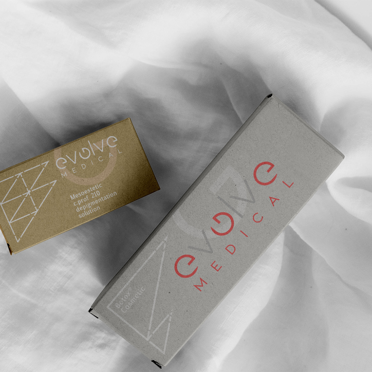
SCOPE ▸ Logo Design, Visual Identity, Packaging Design, Campaign Materials
PROCESS ▸ Led cross-functional brand audit → visual identity system → rollout guidelines
ROLE ▸ Brand Designer Freelance
SCOPE ▸ Logo Design, Visual Identity, Packaging Design, Campaign Materials
PROCESS ▸ Led cross-functional brand audit → visual identity system → rollout guidelines

The Challenge
Highly competitive medical aesthetics market
Need to balance medical credibility with aspirational appeal
Brand required to appeal to both patients and practitioners
Highly competitive medical aesthetics market
Need to balance medical credibility with aspirational appeal
Brand required to appeal to both patients and practitioners
Strategic Approach
Positioning-led identity design
Controlled visual language to bridge clinical and lifestyle cues
Emphasis on trust, refinement, and professionalism
Positioning-led identity design
Controlled visual language to bridge clinical and lifestyle cues
Emphasis on trust, refinement, and professionalism
Creative Solution
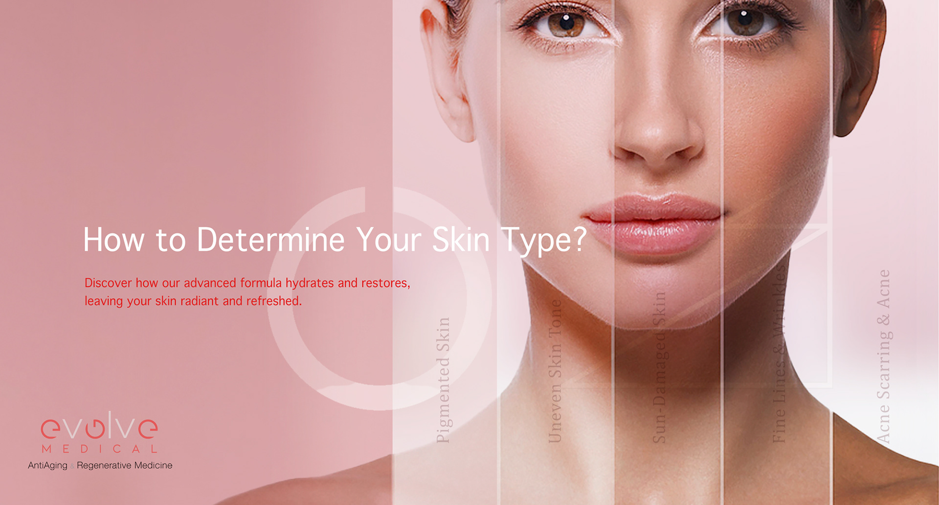
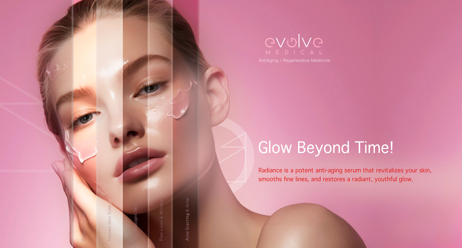
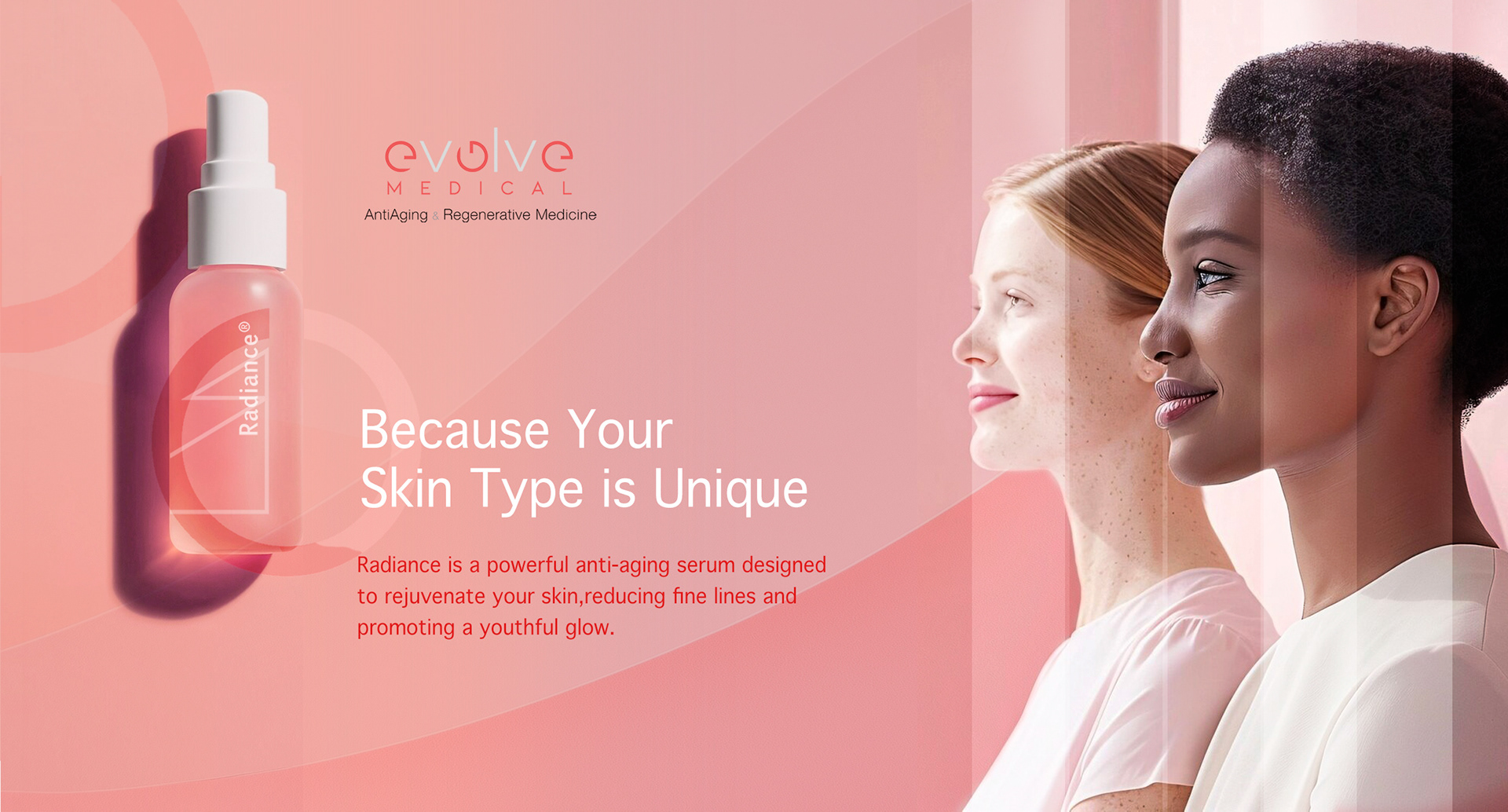
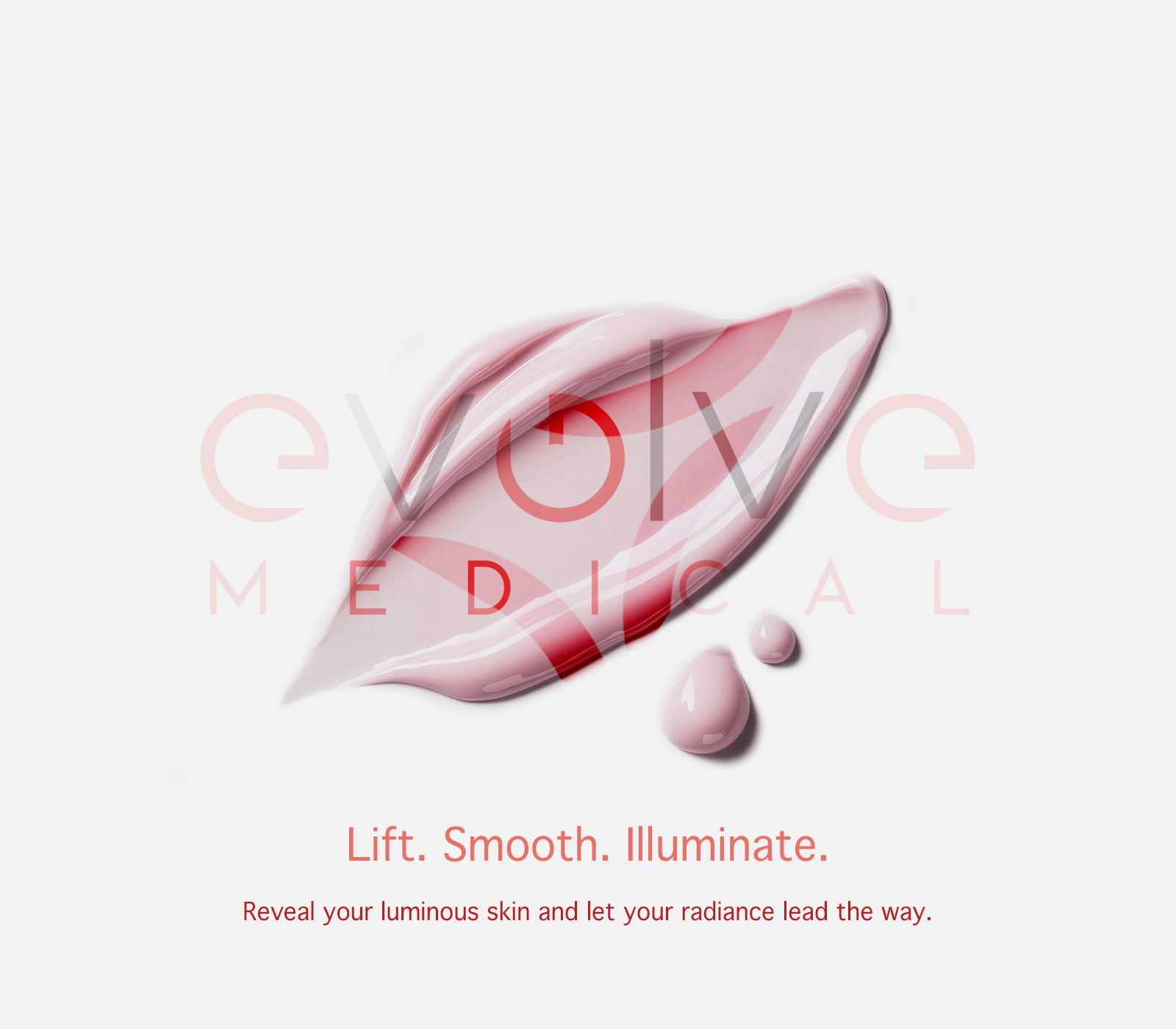
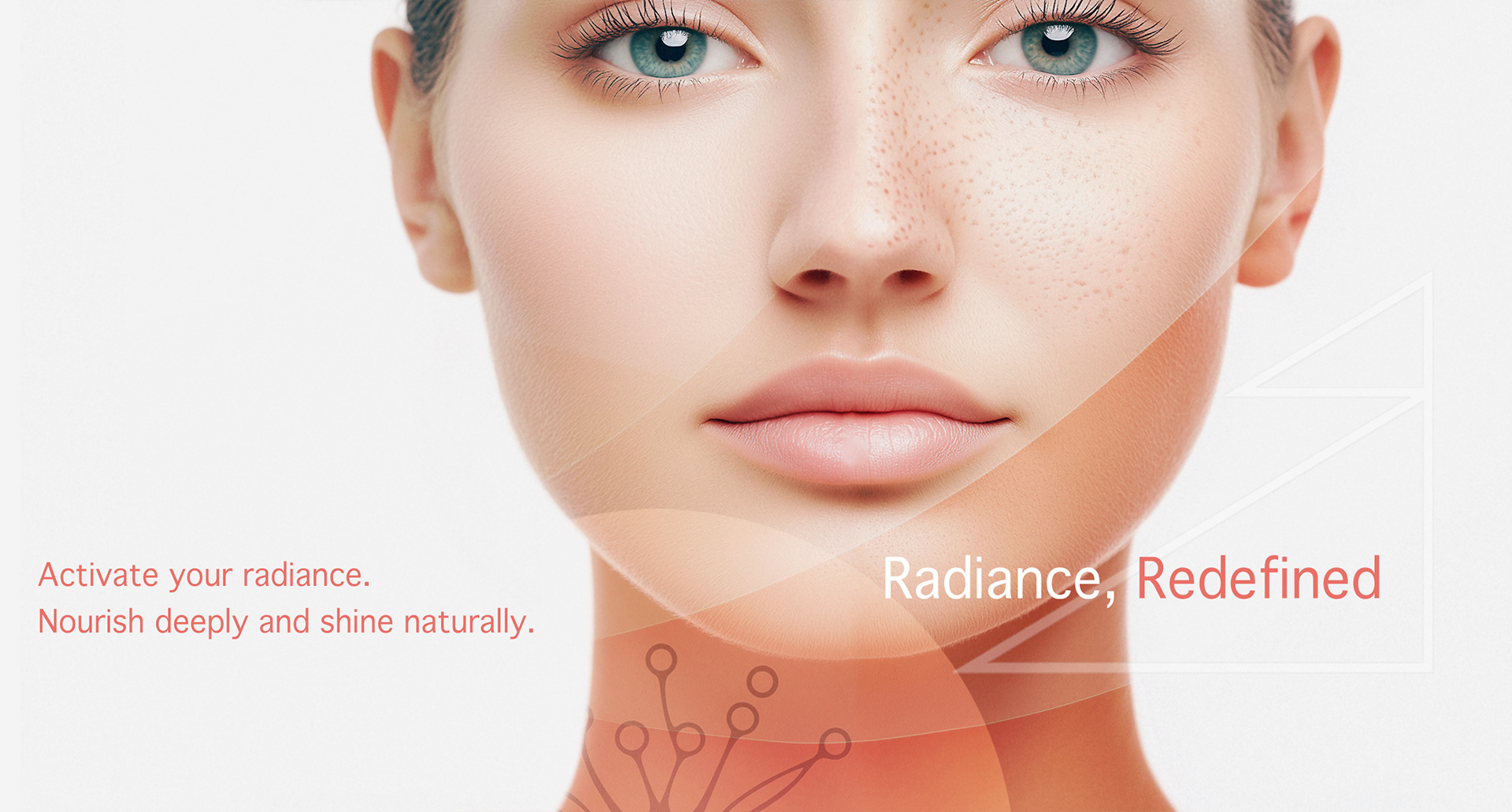
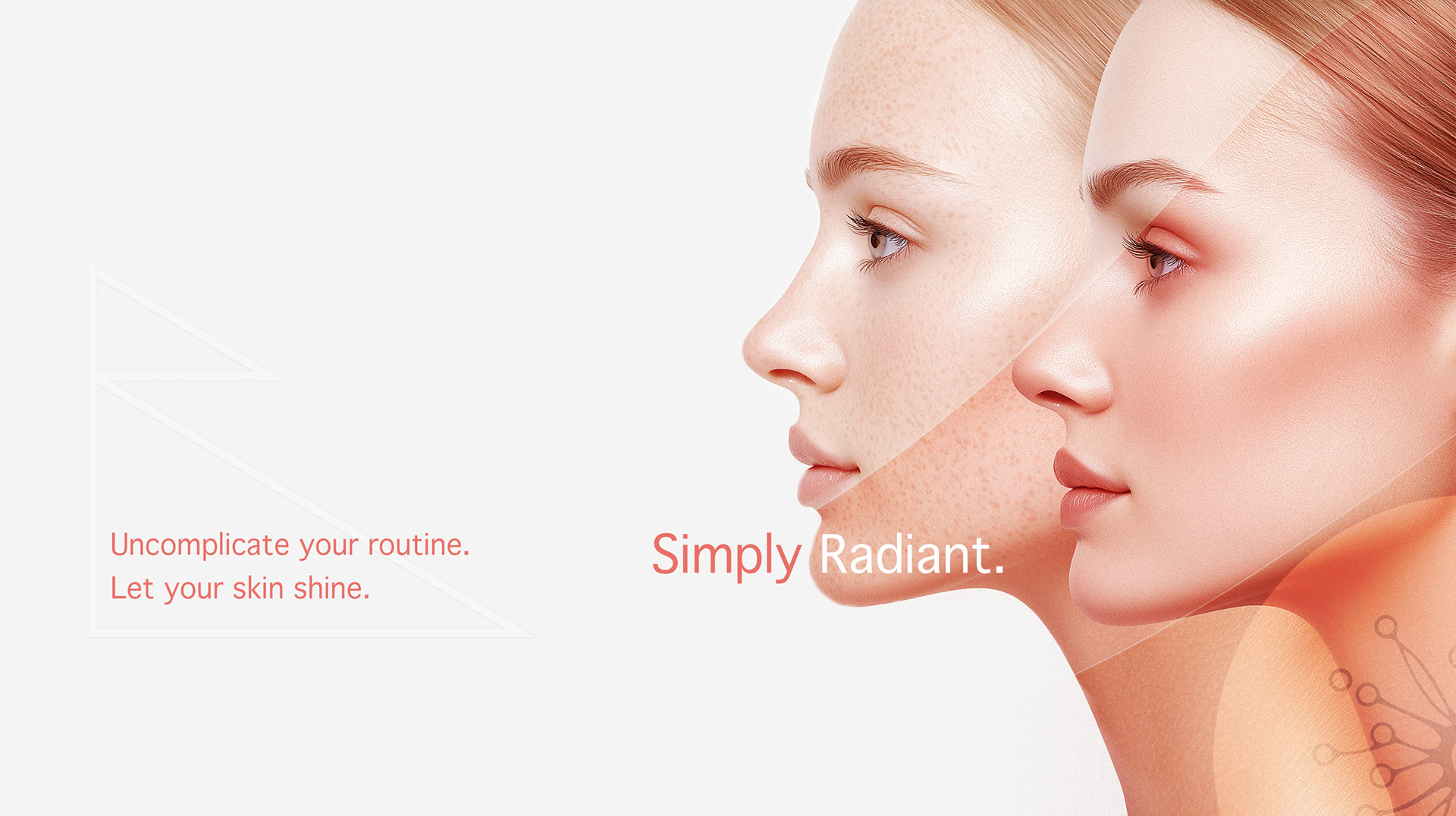
A refined brand identity expressing modern medical aesthetics
Visual cues designed to feel elevated without feeling cosmetic
Art direction that supports confidence, discretion, and care
A refined brand identity expressing modern medical aesthetics
Visual cues designed to feel elevated without feeling cosmetic
Art direction that supports confidence, discretion, and care
Scope & System
Core brand identity framework
Visual principles governing tone, balance, and restraint
Guidelines for consistent application across touchpoints
Core brand identity framework
Visual principles governing tone, balance, and restraint
Guidelines for consistent application across touchpoints
Deliverables
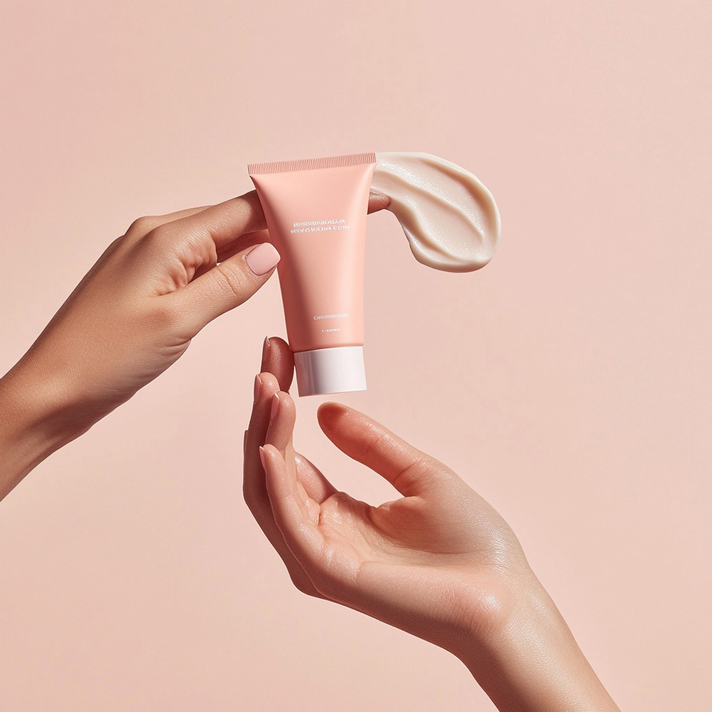
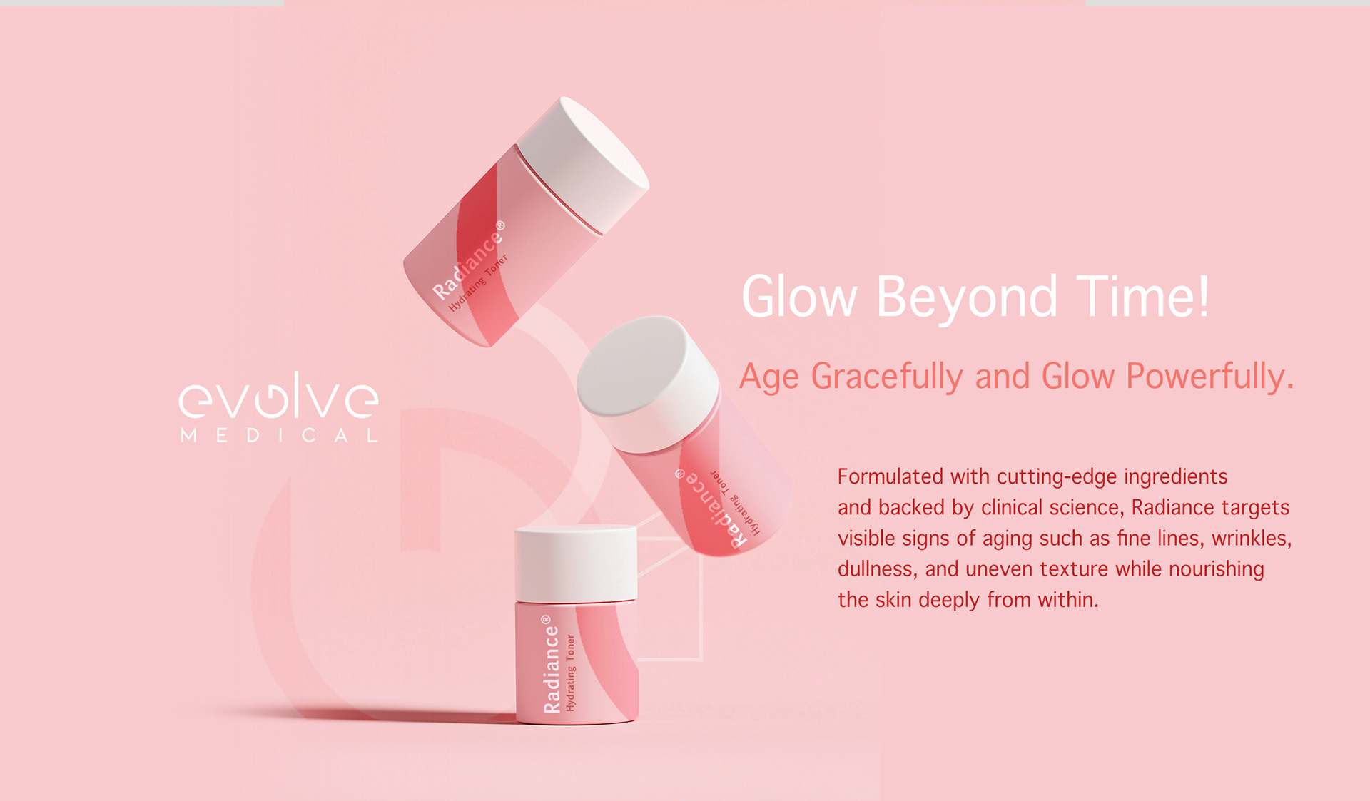
+ Brand identity system
+ Digital and print brand assets
+ Patient-facing marketing materials
+ Brand identity system
+ Digital and print brand assets
+ Patient-facing marketing materials
Role & Leadership
Brand Design Lead
Led brand strategy and identity development from concept through execution, aligning medical positioning with contemporary aesthetic expectations.
Brand Design Lead
Led brand strategy and identity development from concept through execution, aligning medical positioning with contemporary aesthetic expectations.
On The Work
In medical aesthetics, trust is built before treatment begins.
This work demonstrates how disciplined brand design can enhance perception, reinforce medical legitimacy, and create an environment in which patients feel confident, informed, and cared for.
In medical aesthetics, trust is built before treatment begins.
This work demonstrates how disciplined brand design can enhance perception, reinforce medical legitimacy, and create an environment in which patients feel confident, informed, and cared for.
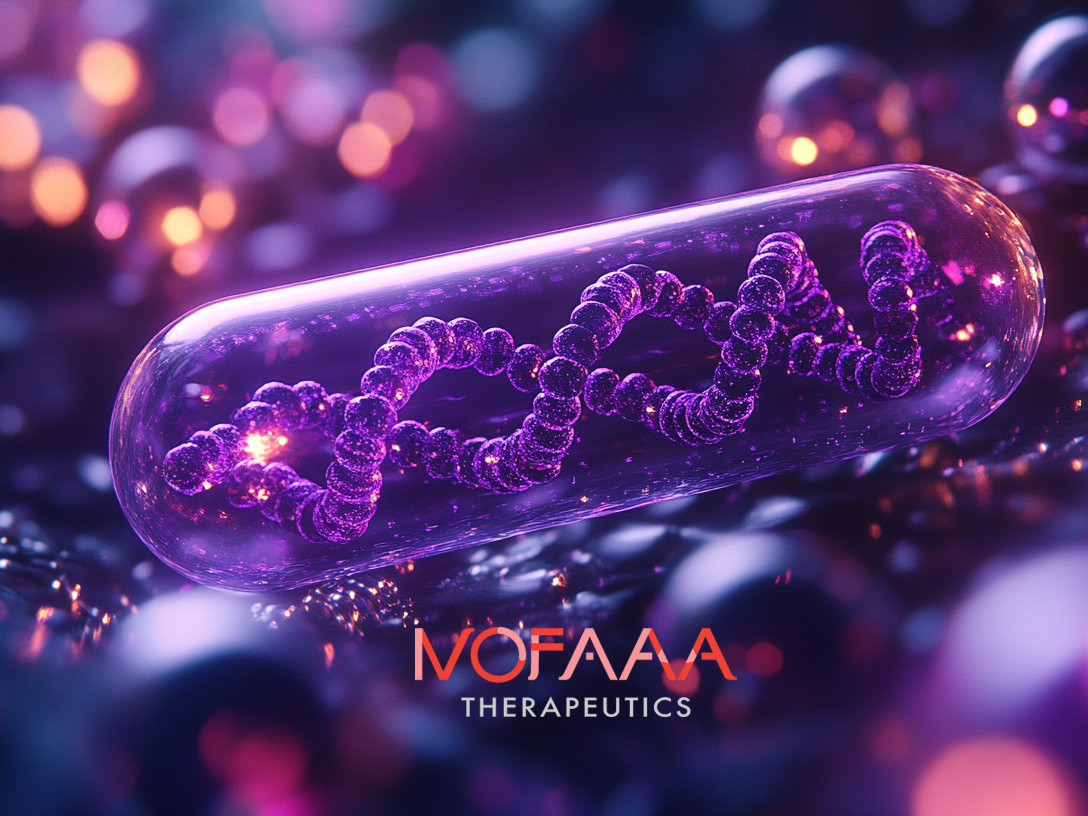
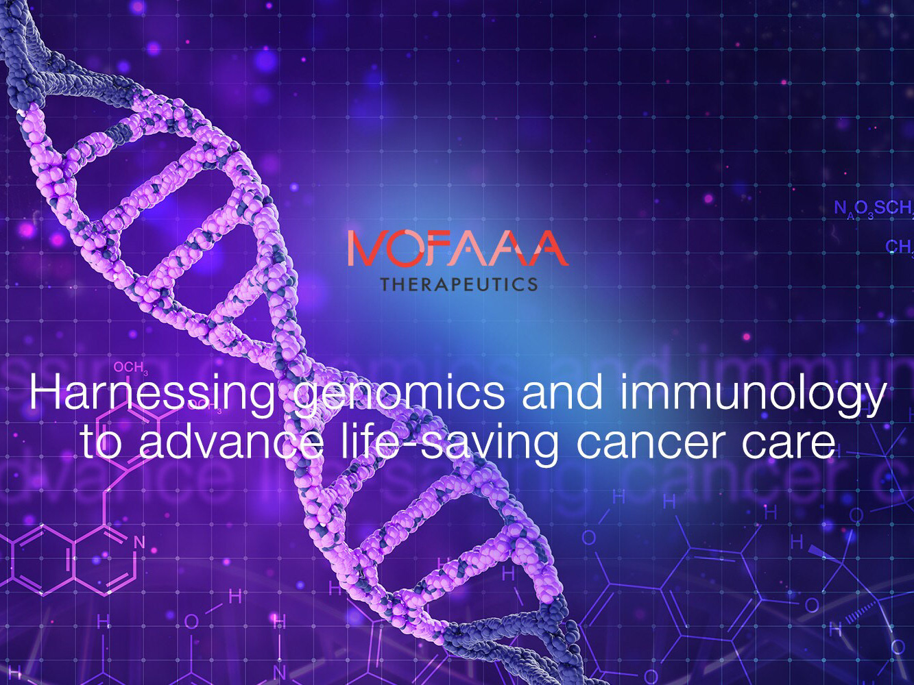
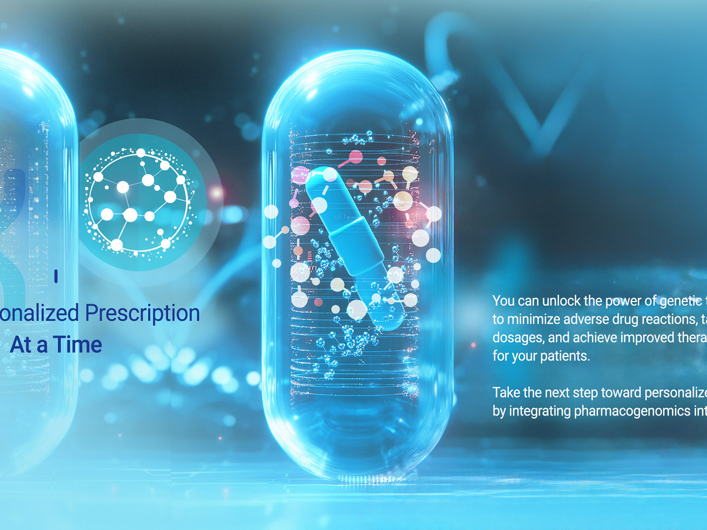
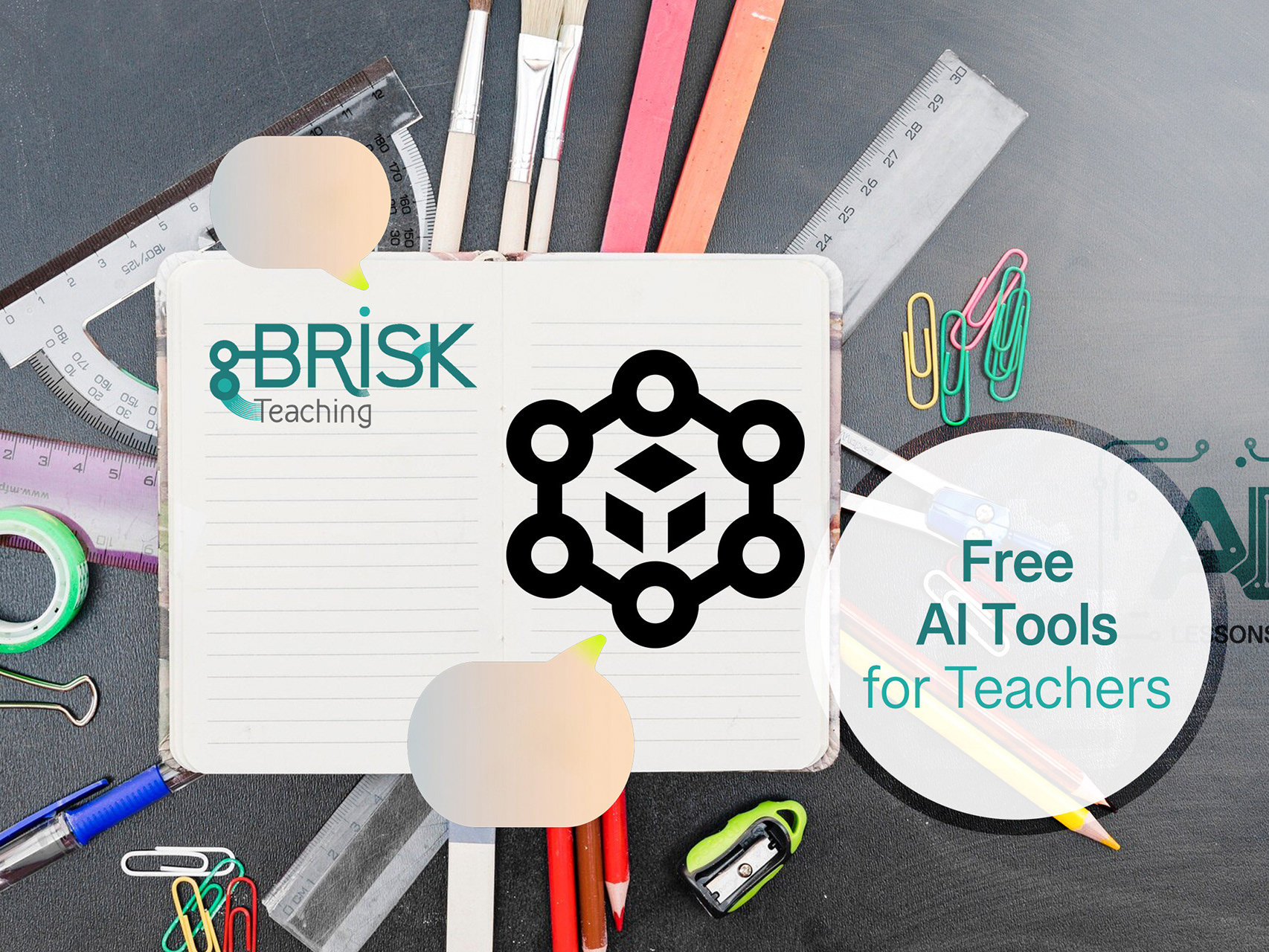
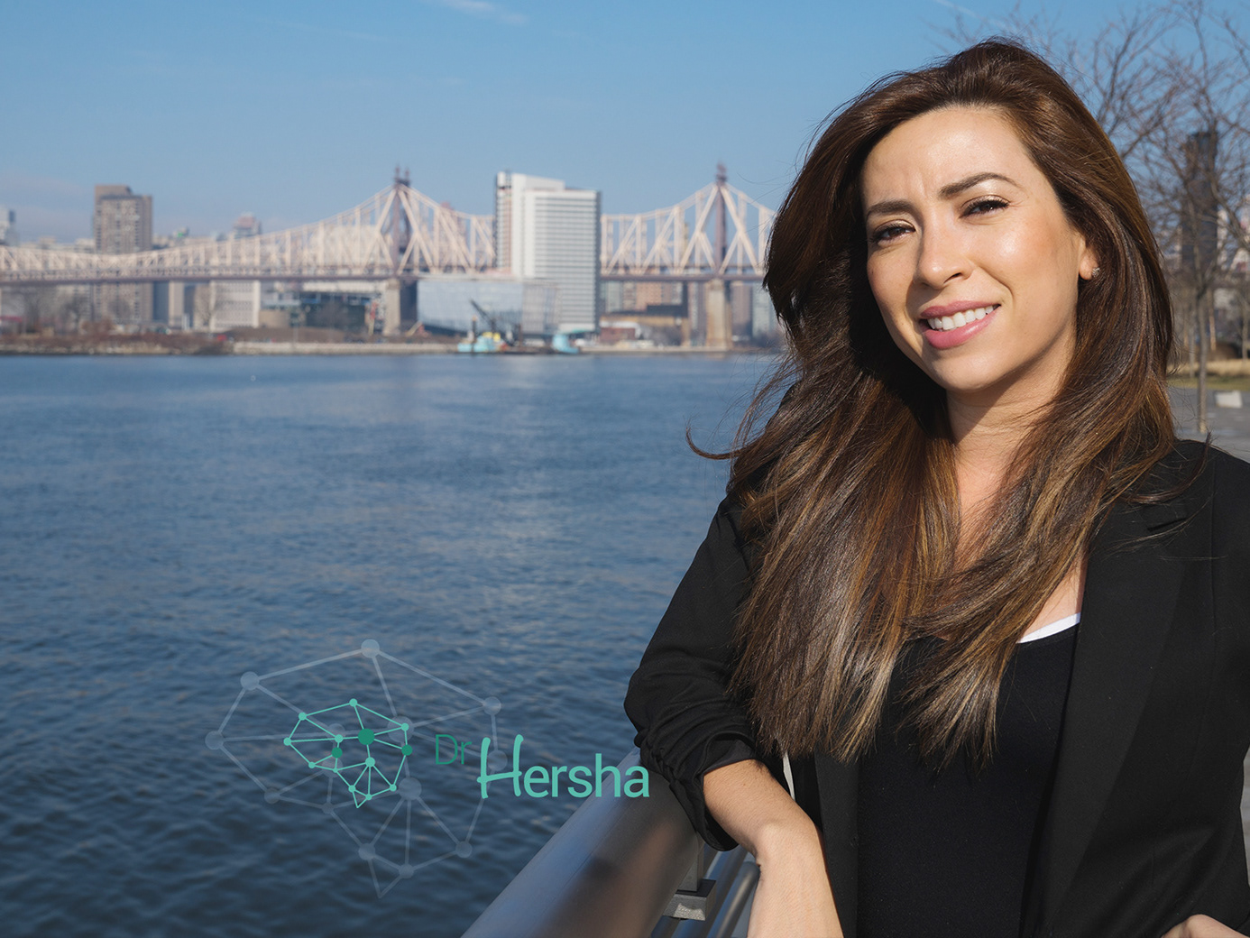
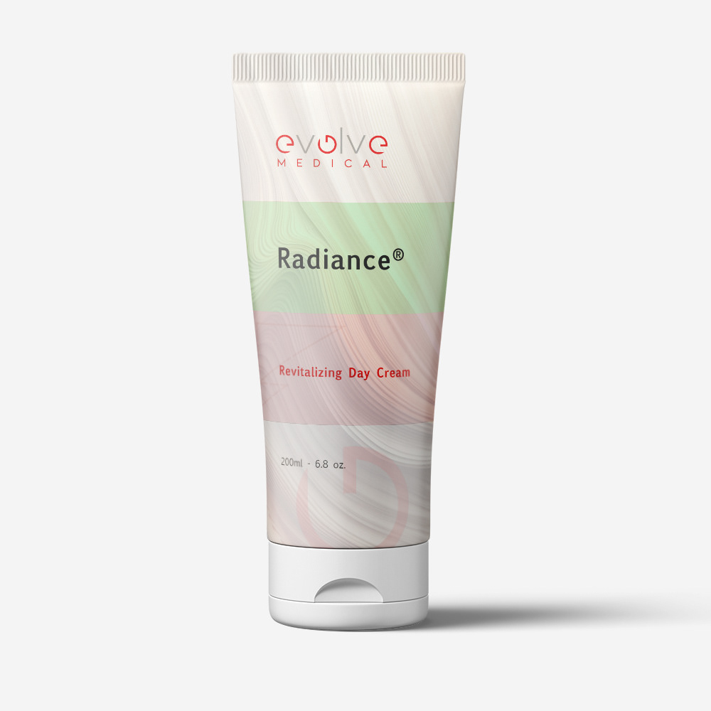
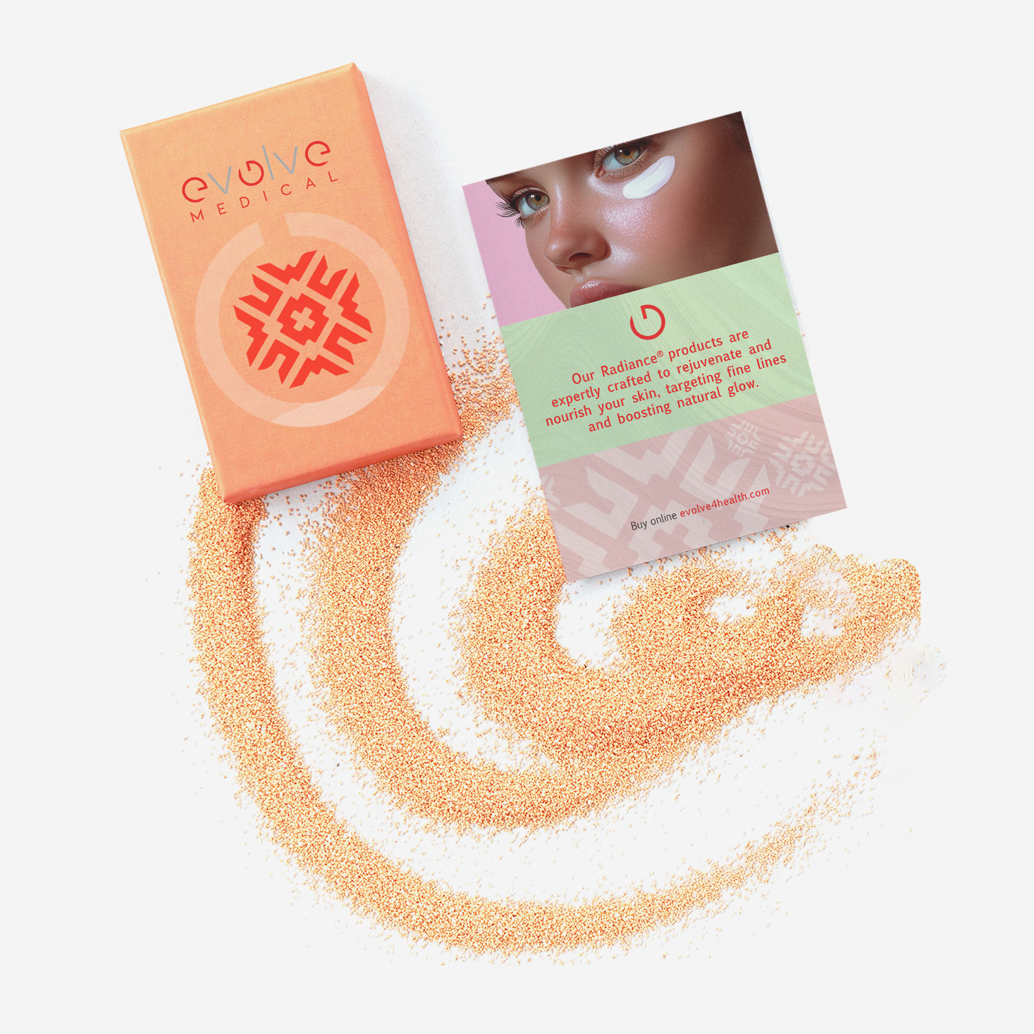
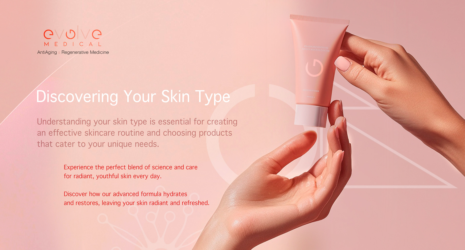
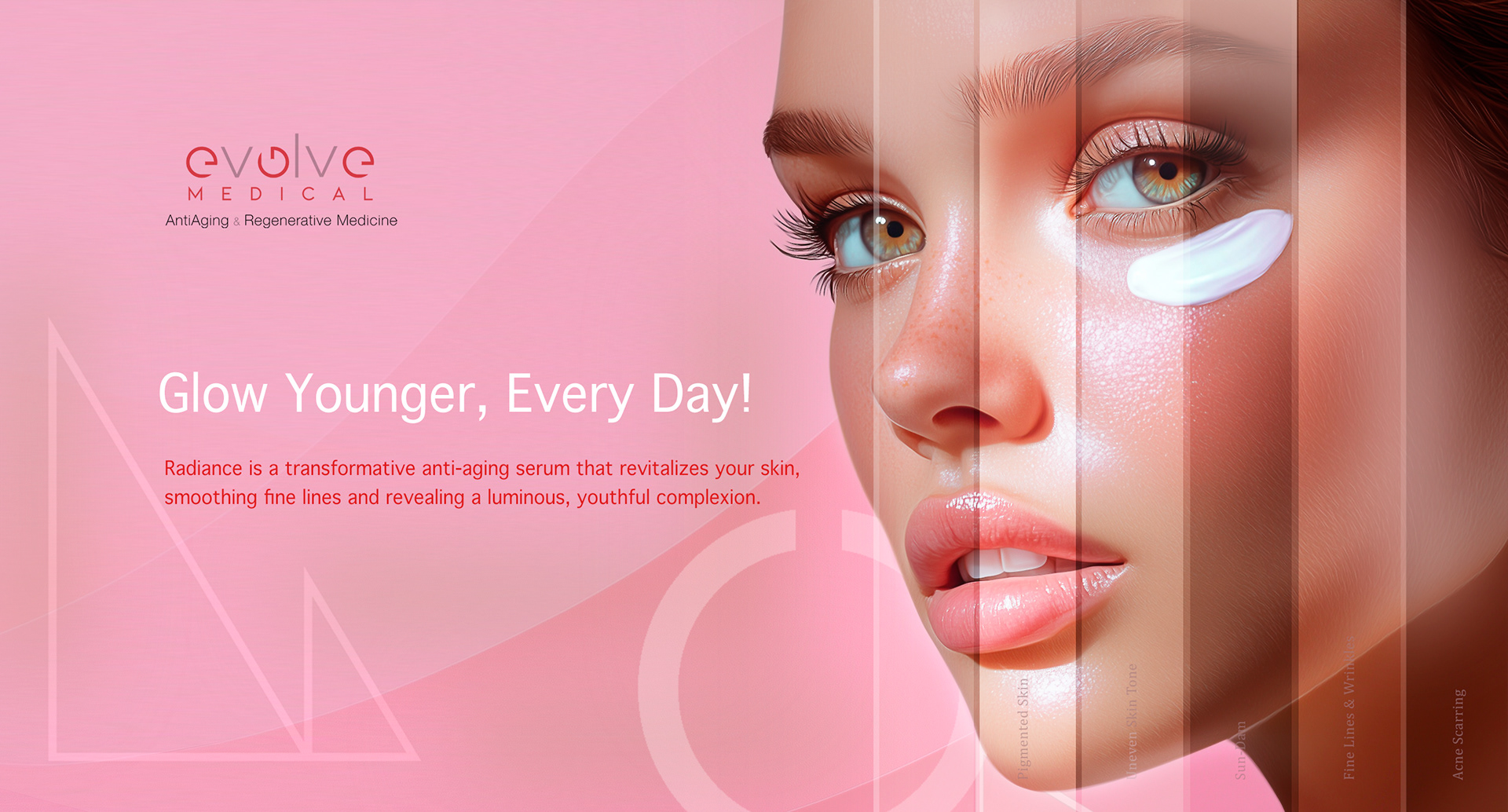
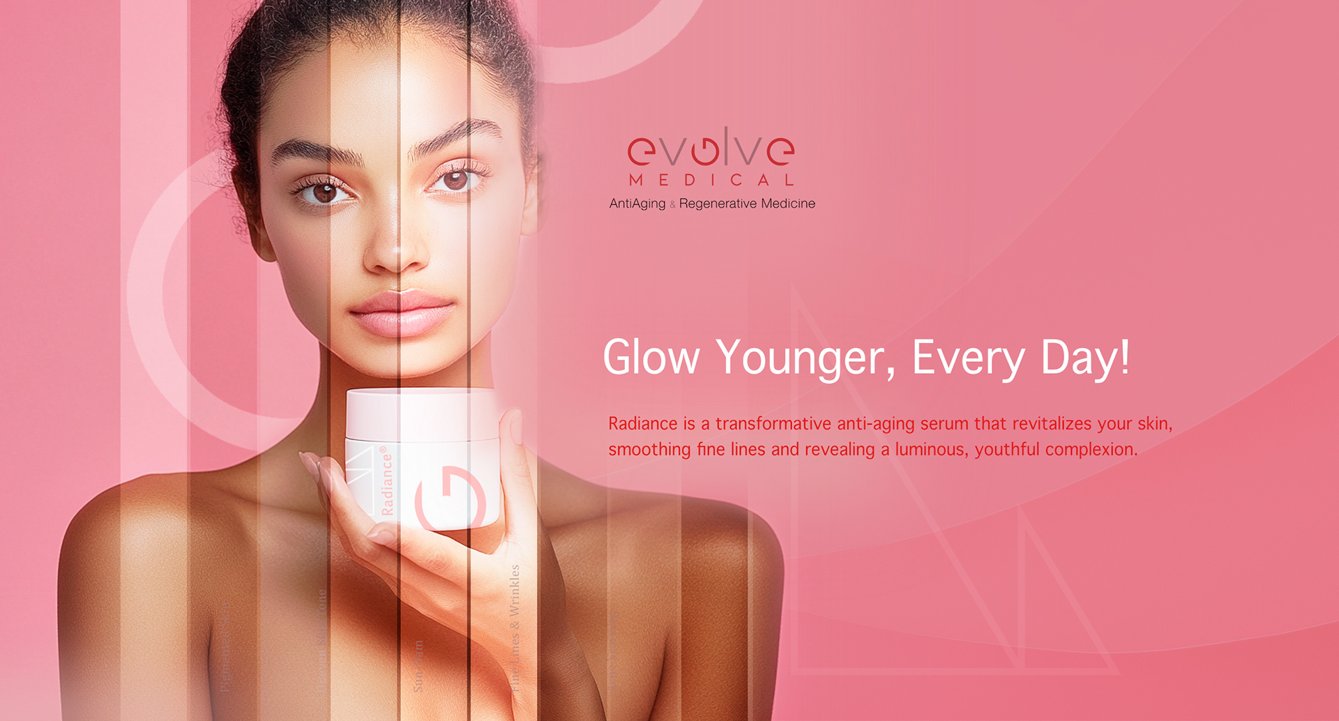
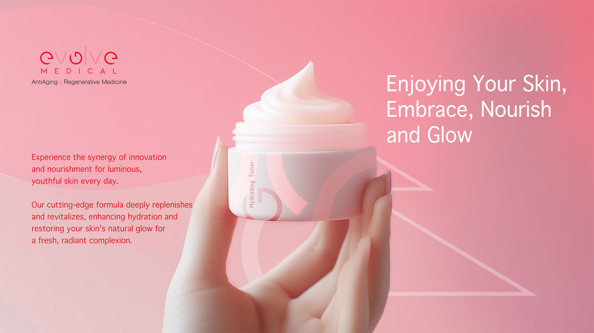
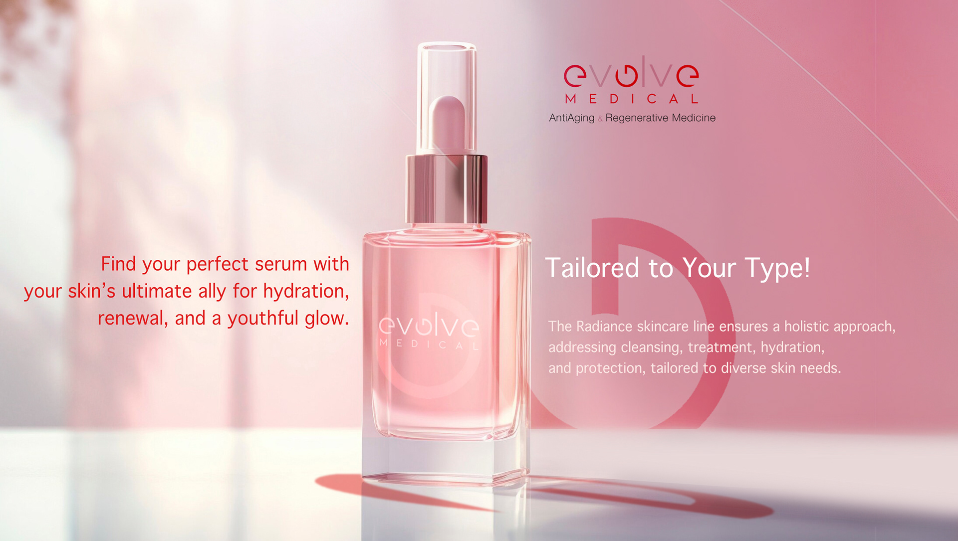
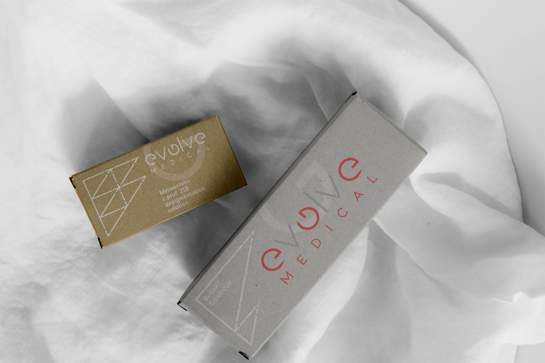
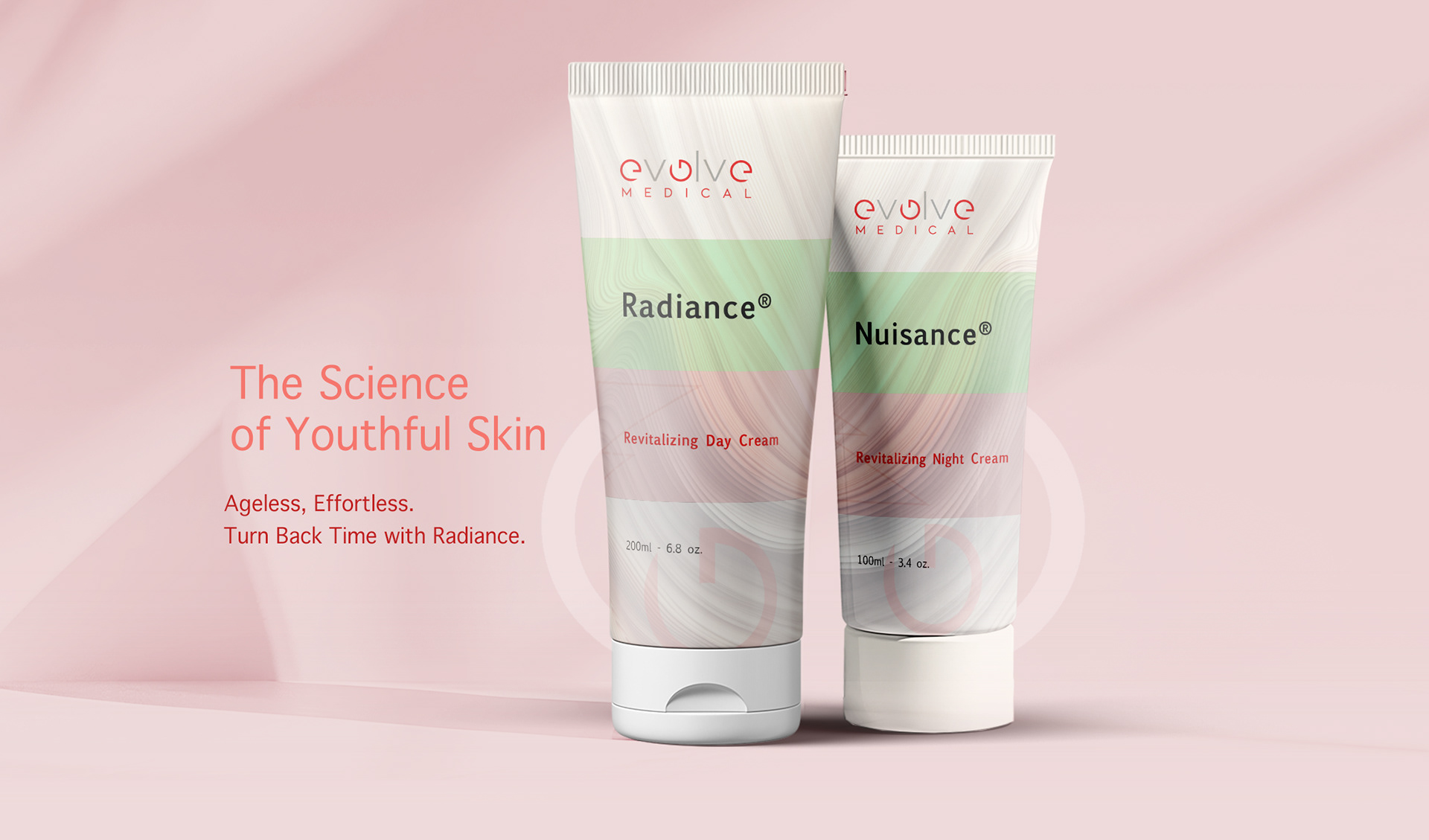
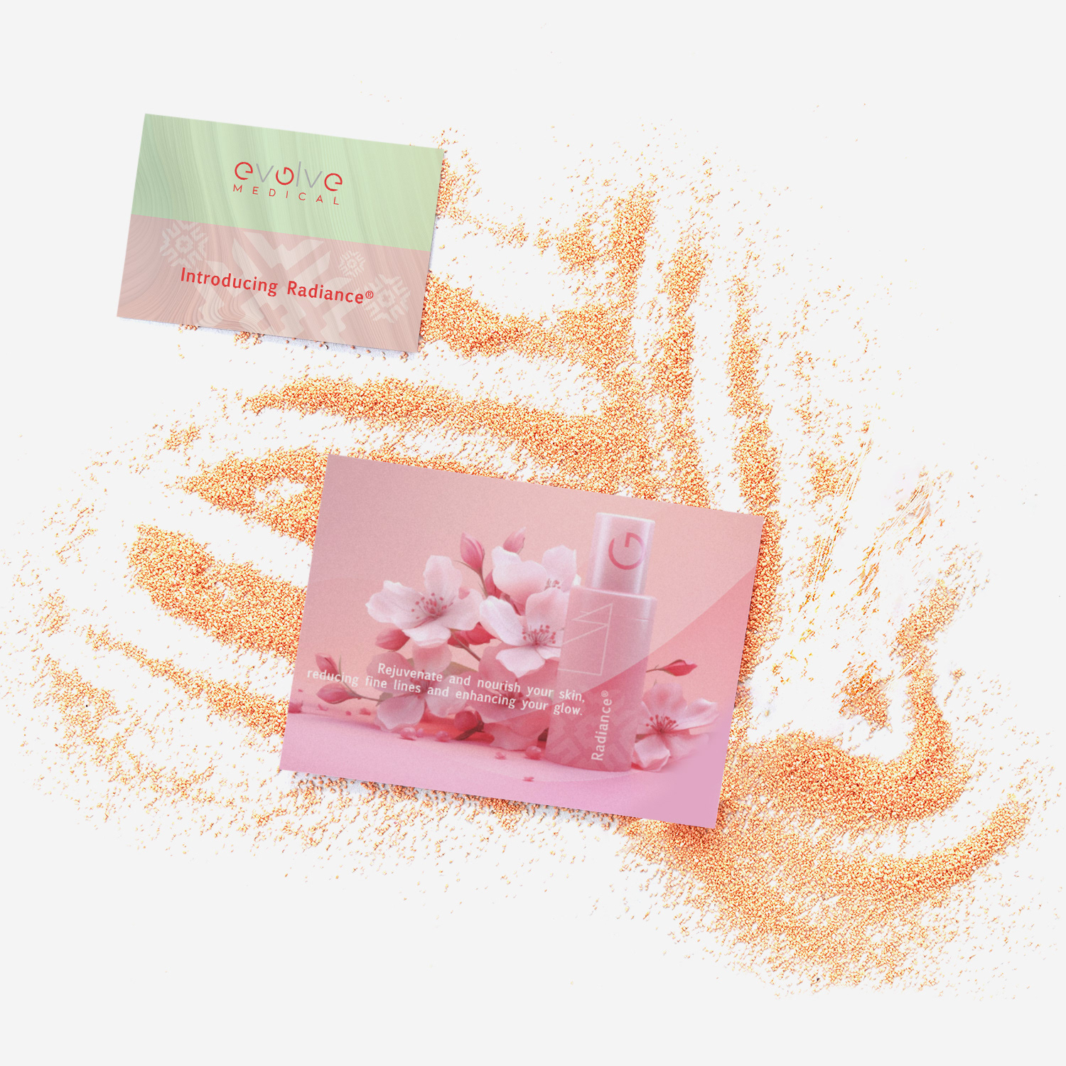
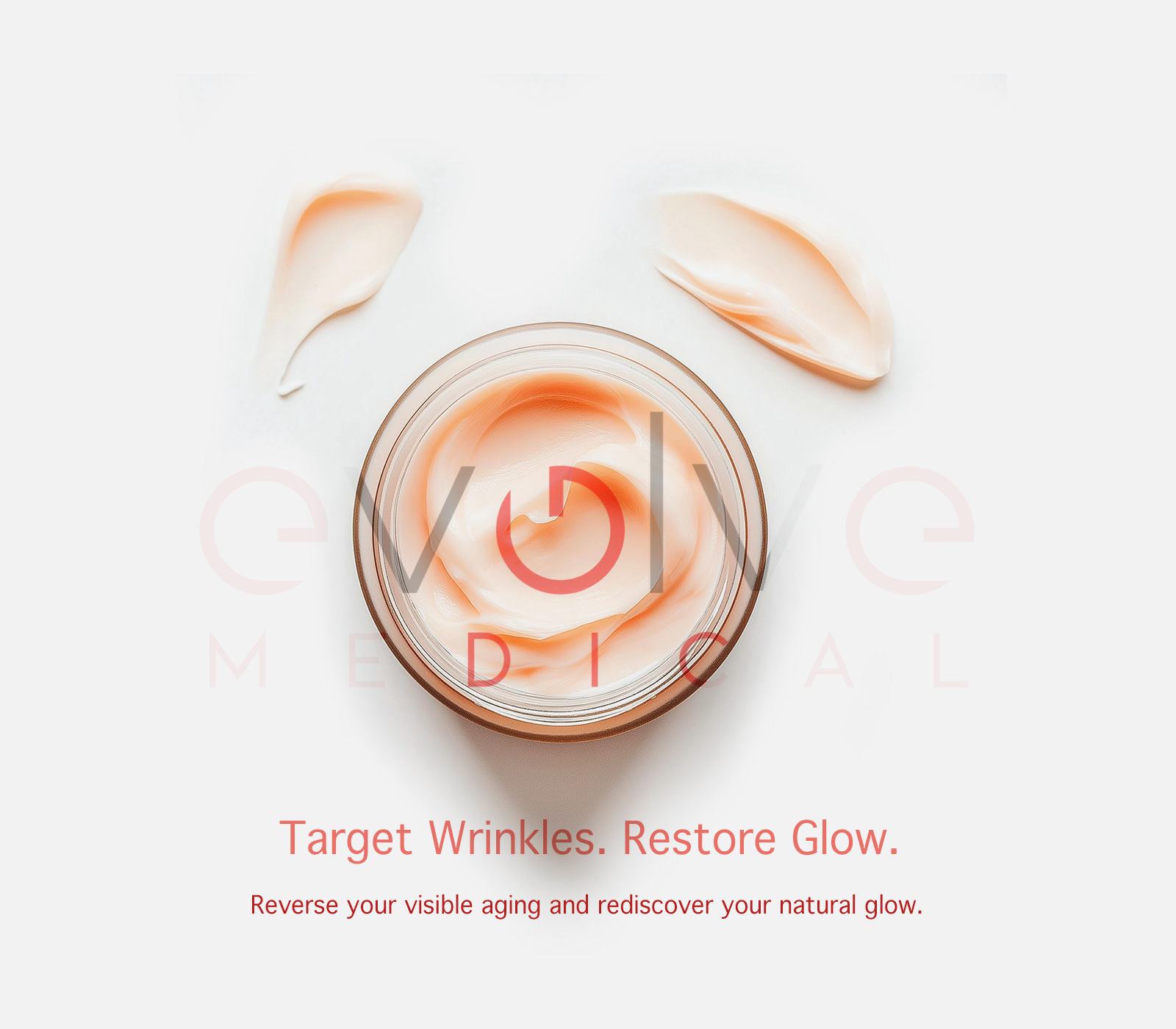
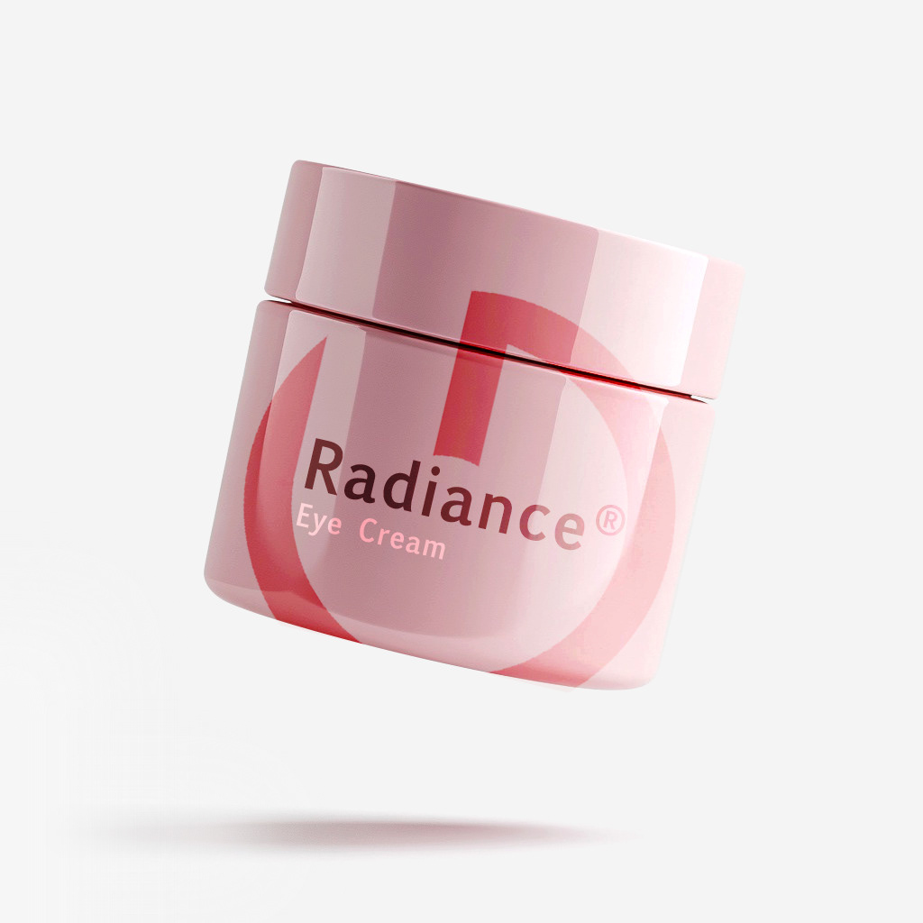
Logo designed to anchor a premium, clinically credible product line across in-clinic placement, packaging, and multi-location environments.
❝ The system reduced production friction
and improved brand consistency
across all clinic deployments.❞
and improved brand consistency
across all clinic deployments.❞
Looking to elevate your wellness
or an aesthetics brand with a refined identity
that drives real business revenues?
or an aesthetics brand with a refined identity
that drives real business revenues?