CLIENT ▸ Beegreen Foundation, Paris, France
ROLE ▸ Brand Designer Freelance
SCOPE ▸ Logo Design, Branding, Visual Identity, Campaign Materials, Print Design
ROLE ▸ Brand Designer Freelance
SCOPE ▸ Logo Design, Branding, Visual Identity, Campaign Materials, Print Design

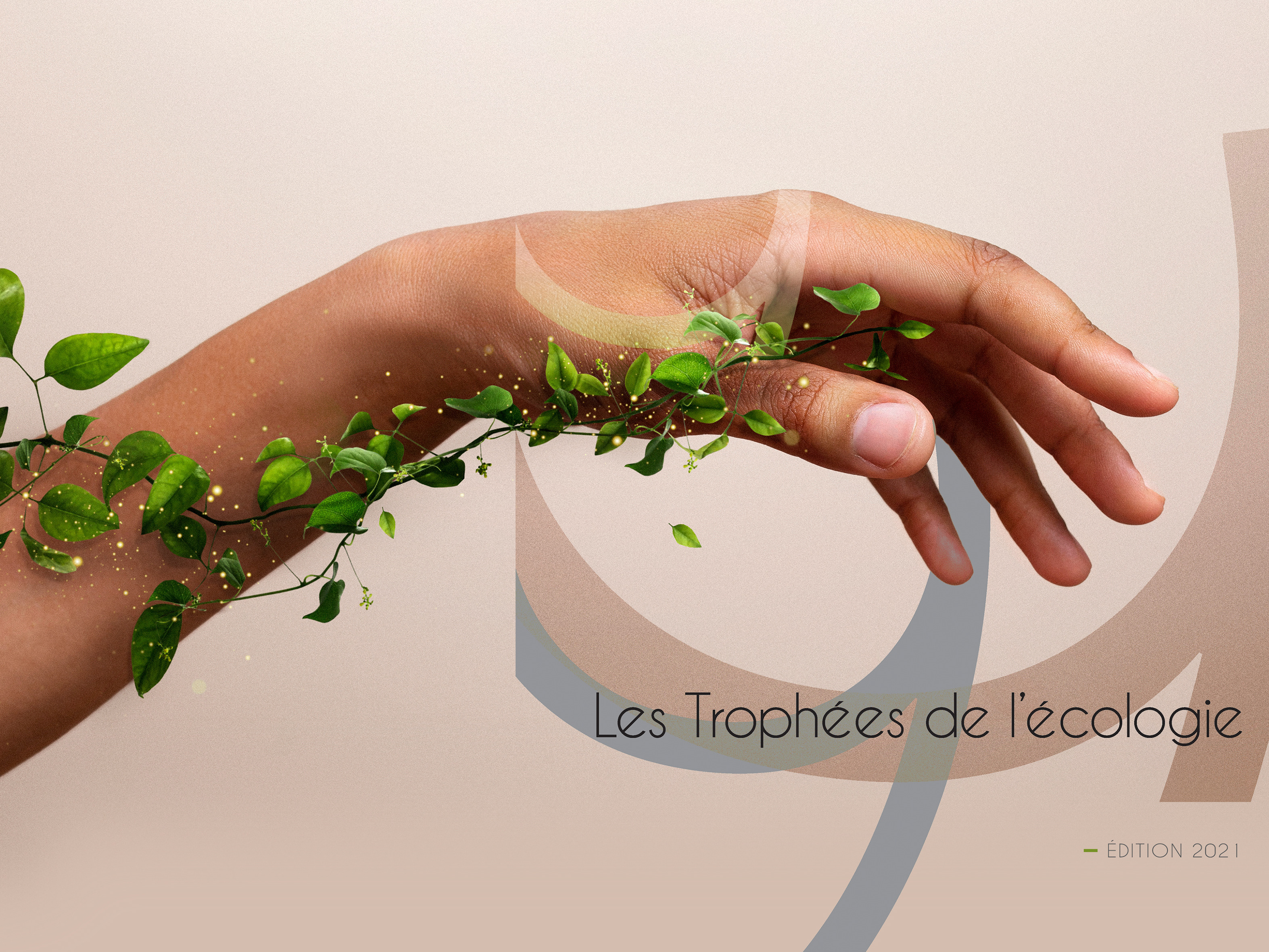
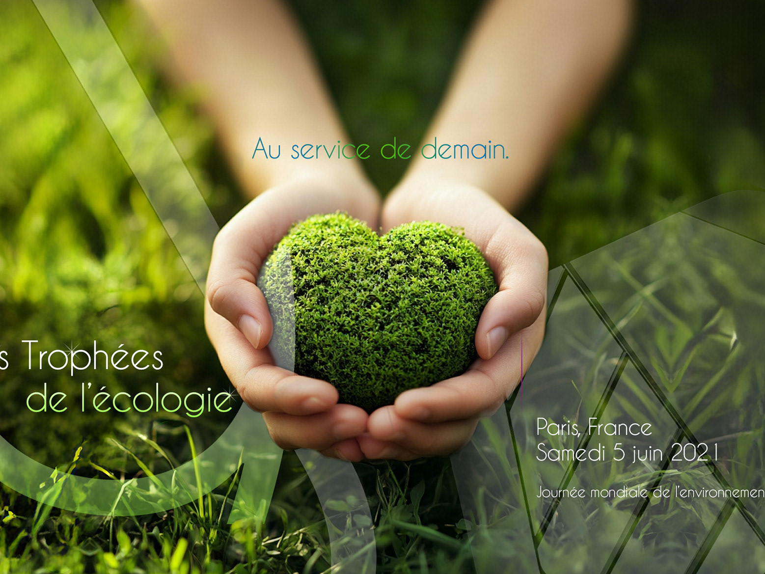
The Challenge
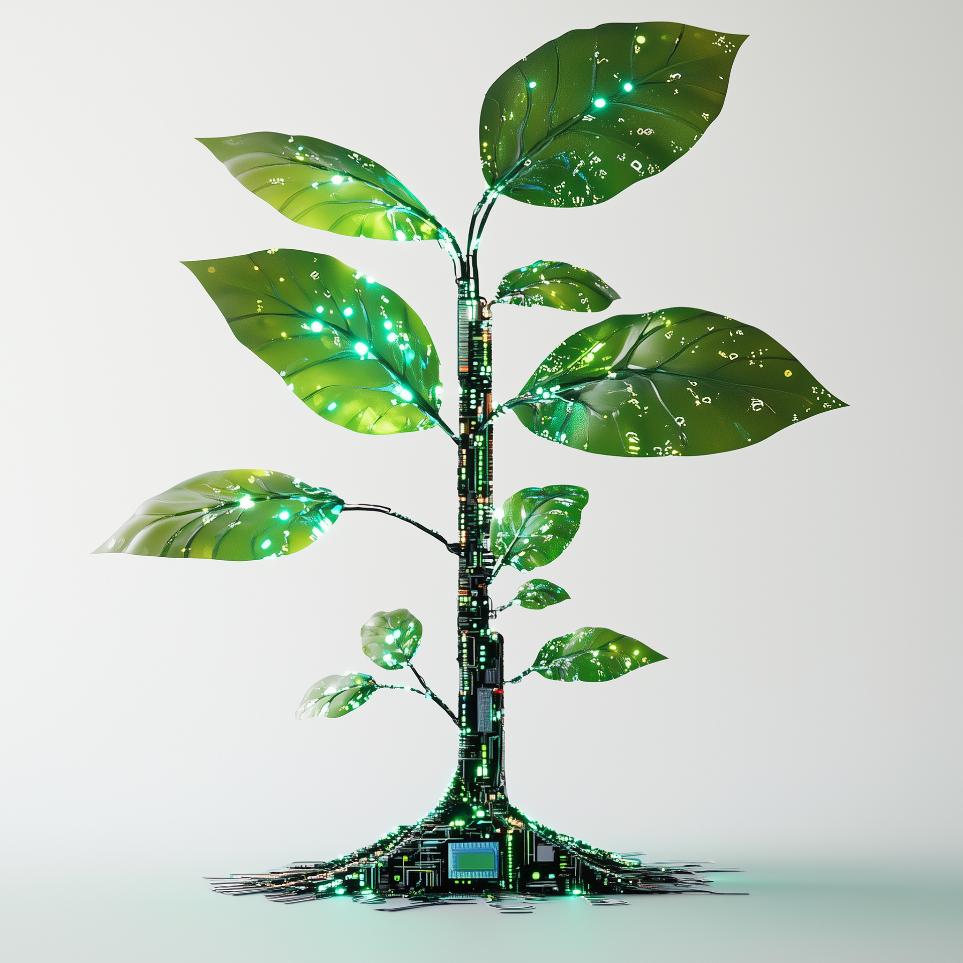
Build trust for an environmental foundation without falling into generic “eco clichés”
Create a brand that works across stakeholders: public-facing education, partners, donors, and community programs
Develop an identity that can scale across print, digital, and on-the-ground applications while staying coherent
Strategic Approach
Establish a brand platform rooted in credibility, optimism, and measurable action
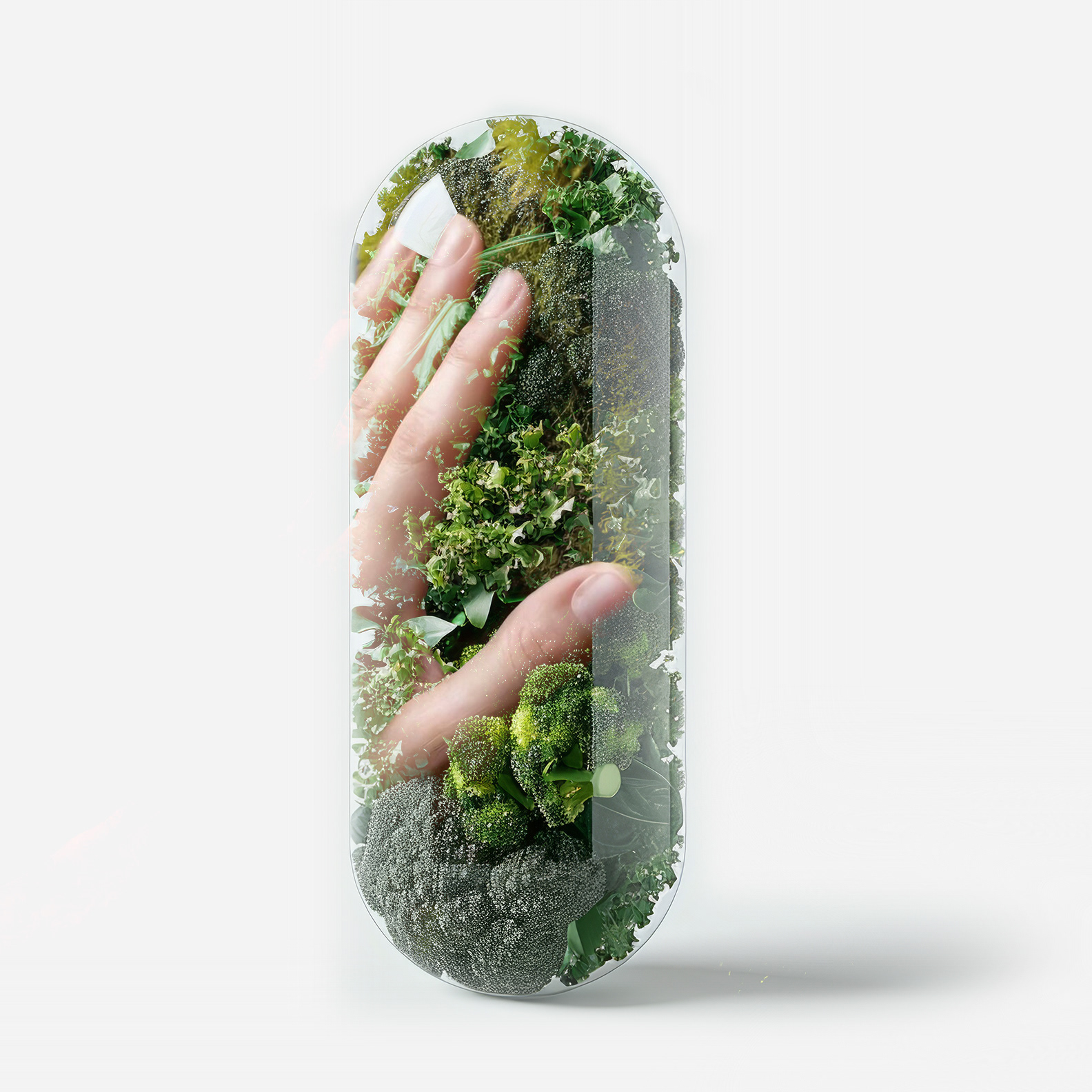
Use nature references with restraint, symbolic, not literal, so the brand feels serious and contemporary
Design a system that supports campaign messaging, program rollouts, and long-term growth
Establish a brand platform rooted in credibility, optimism, and measurable action
Use nature references with restraint, symbolic, not literal, so the brand feels serious and contemporary
Design a system that supports campaign messaging, program rollouts, and long-term growth
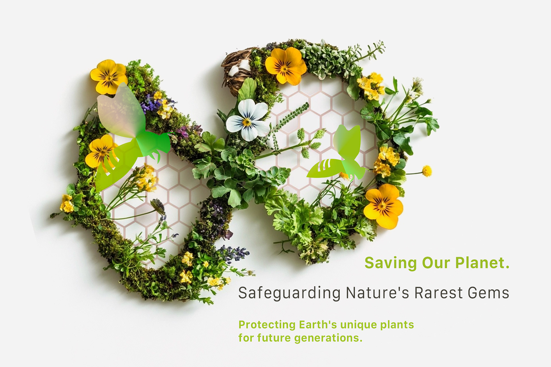
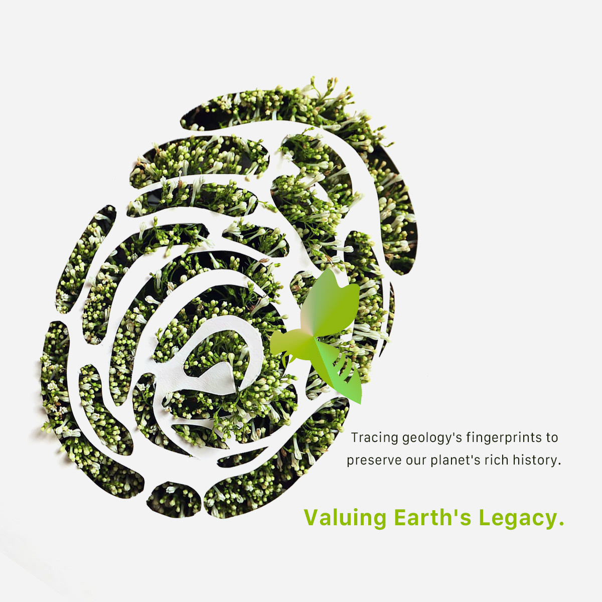
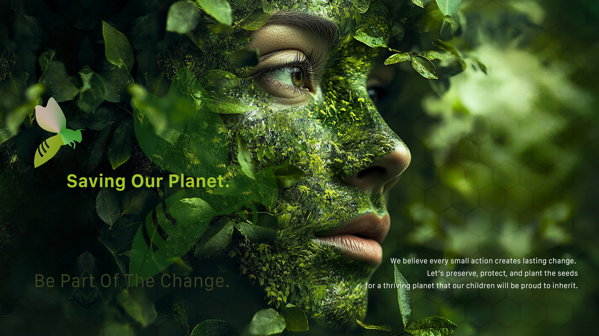
Creative Solution
A clean, modern identity that balances warmth and authority
A visual language built around clarity, rhythm, and legibility, designed to inform as much as inspire
A system that feels alive and approachable, while remaining disciplined and usable across formats
A clean, modern identity that balances warmth and authority
A visual language built around clarity, rhythm, and legibility, designed to inform as much as inspire
A system that feels alive and approachable, while remaining disciplined and usable across formats
Scope & System
Scalable identity architecture supporting multiple programs and communications
Color and typographic hierarchy designed for accessibility and clarity
Modular layout rules to keep messaging consistent across assets
Scalable identity architecture supporting multiple programs and communications
Color and typographic hierarchy designed for accessibility and clarity
Modular layout rules to keep messaging consistent across assets
Key Results
Clear positioning as a credible, action-oriented environmental foundation
A visual system that supports both education and fundraising needs
Consistency across touchpoints while allowing campaign-level flexibility
Clear positioning as a credible, action-oriented environmental foundation
A visual system that supports both education and fundraising needs
Consistency across touchpoints while allowing campaign-level flexibility
Impact & Performance
Stronger brand recognition and clearer communication structure across materials
Improved usability for ongoing content production (templates + rules)
A foundation brand that can evolve over time without losing its identity
Stronger brand recognition and clearer communication structure across materials
Improved usability for ongoing content production (templates + rules)
A foundation brand that can evolve over time without losing its identity
Deliverables
+ Logo and core visual identity system
+ Brand color palette and typography specifications
+ Print and digital templates (campaign/program communications)
+ Social and presentation assets (as needed for rollout)
+ Logo and core visual identity system
+ Brand color palette and typography specifications
+ Print and digital templates (campaign/program communications)
+ Social and presentation assets (as needed for rollout)
Role & Leadership
Brand Design Lead
Architected a mission-driven brand system that aligned purpose, narrative, and execution across editorial, advocacy, and digital platforms.
Brand Design Lead
Architected a mission-driven brand system that aligned purpose, narrative, and execution across editorial, advocacy, and digital platforms.
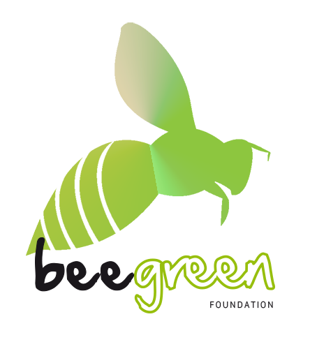
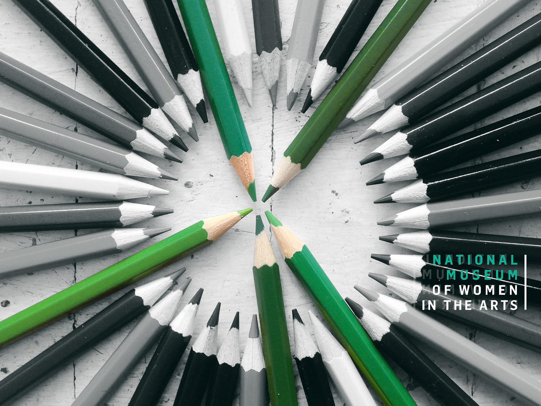
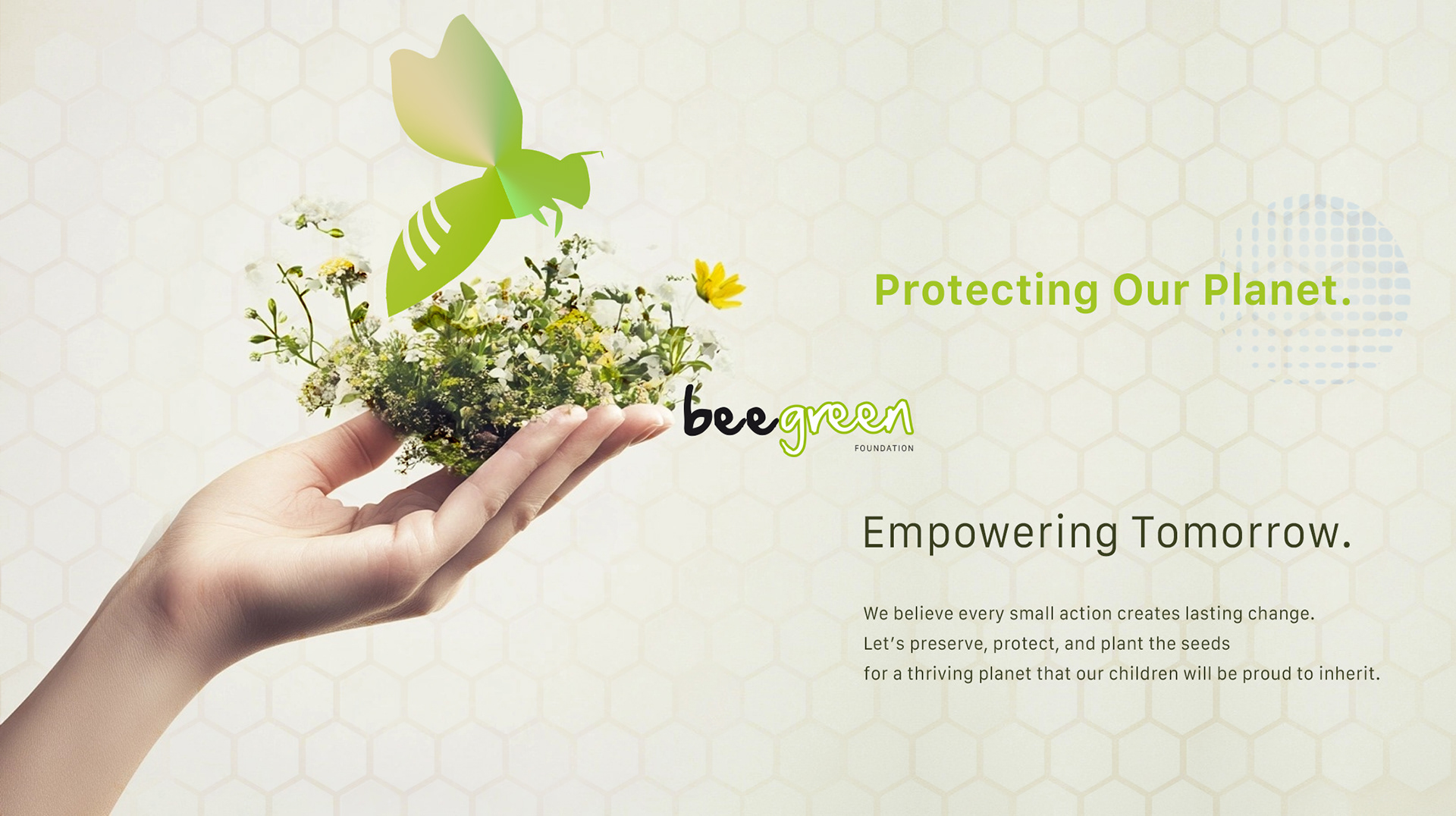
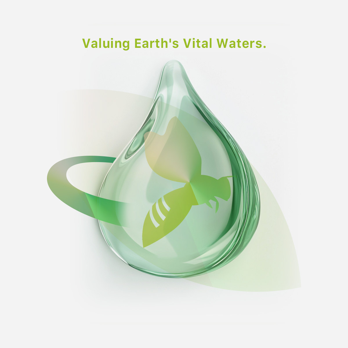
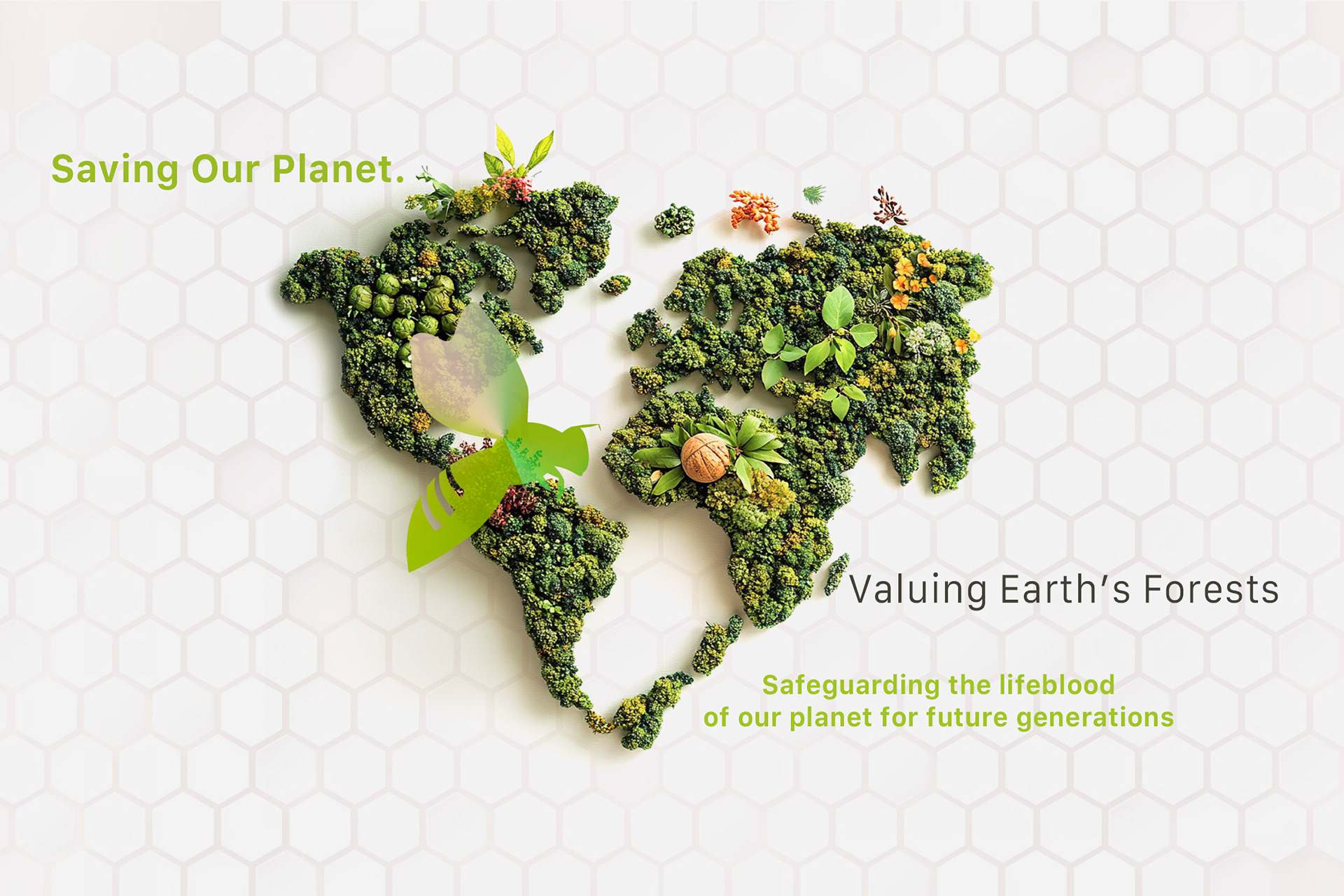
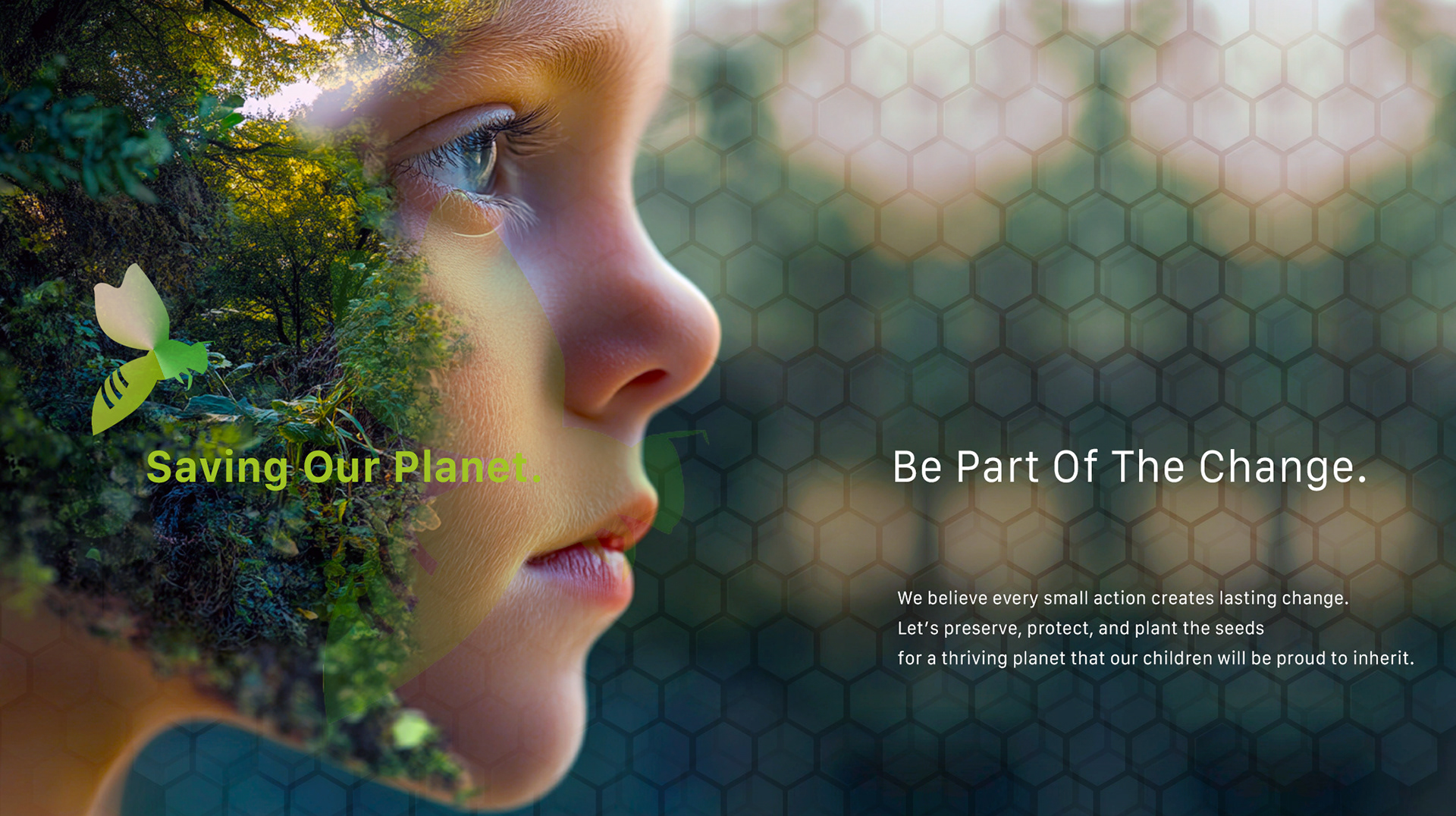
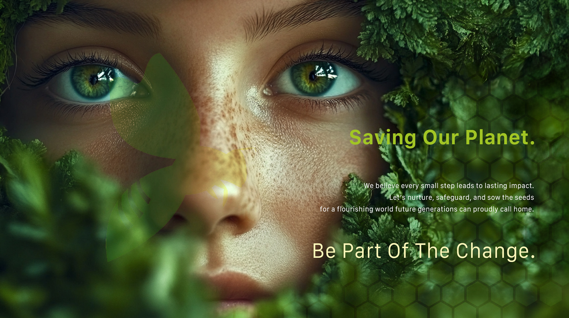
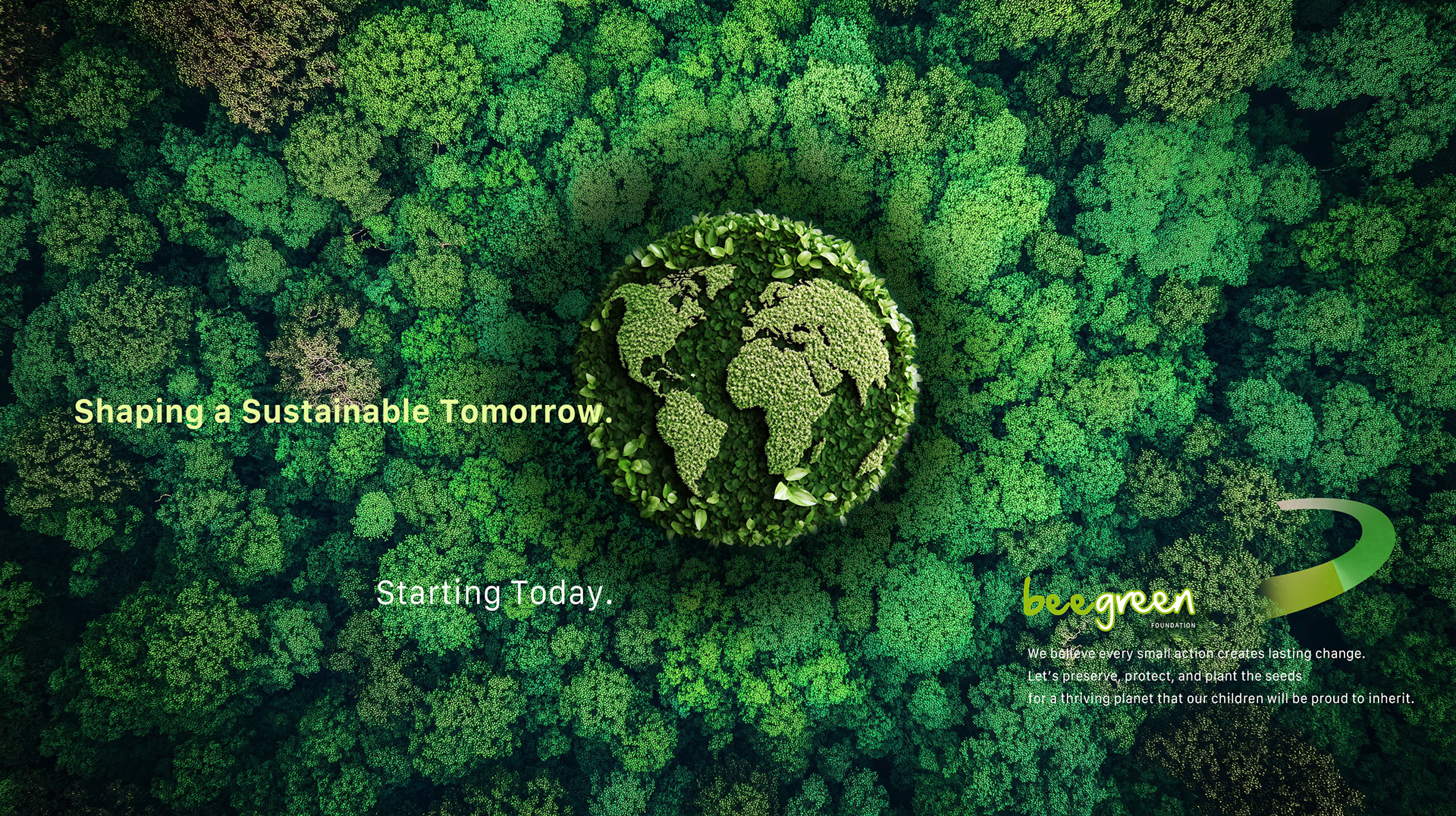
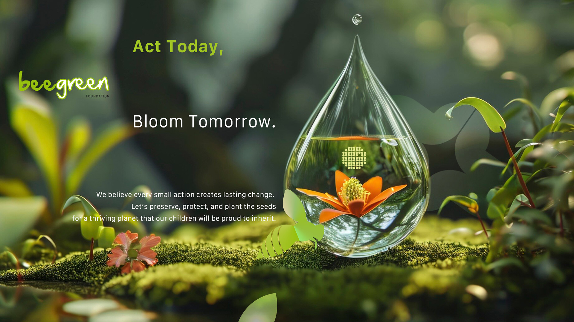
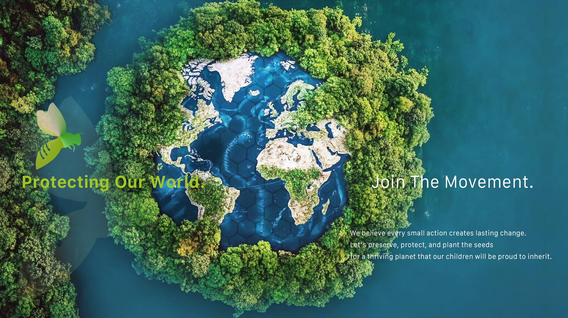
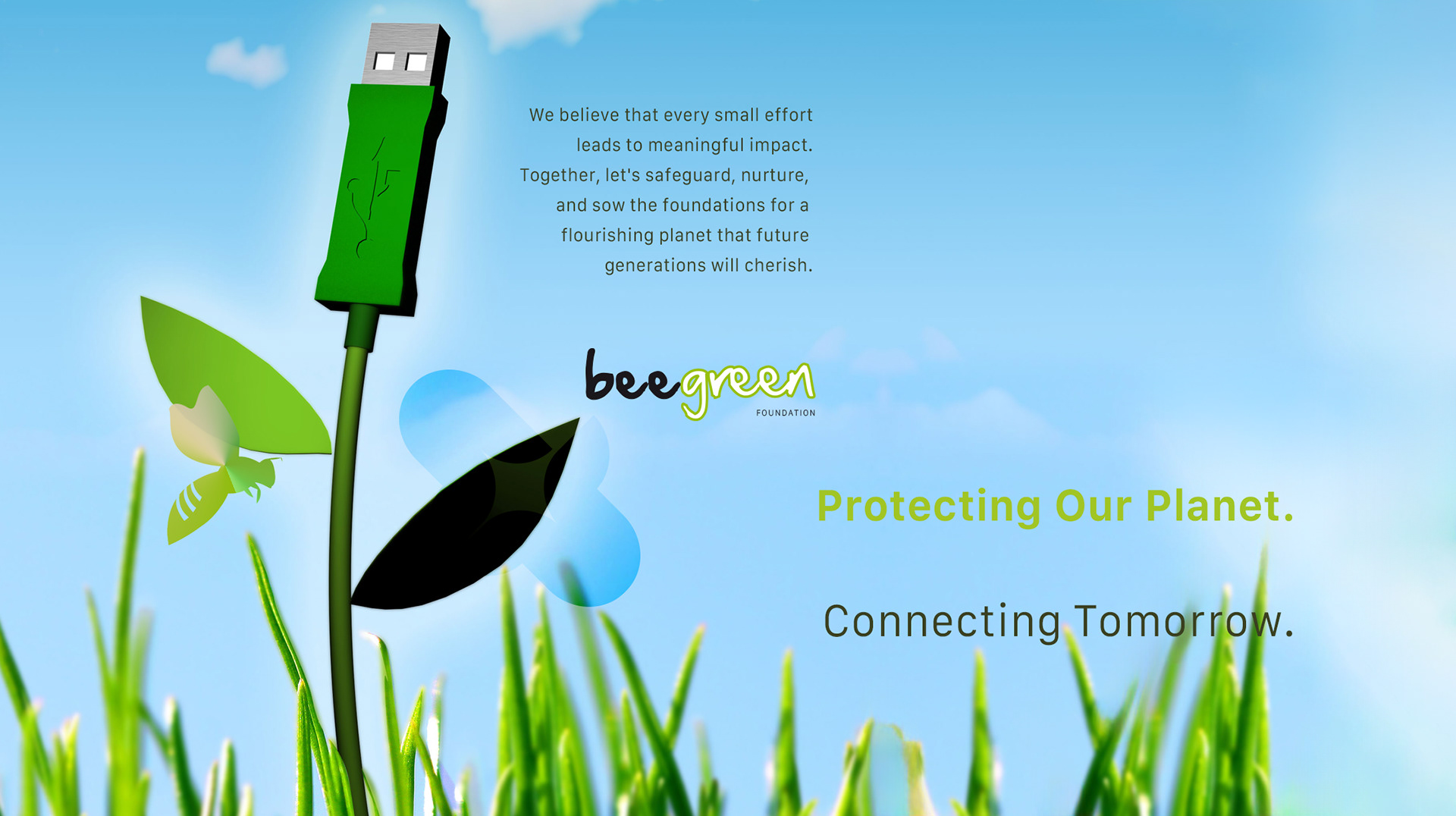
The logo was designed as a simple, memorable mark,
combining approachability with credibility, and built to perform
across signage, print, and digital applications.
combining approachability with credibility, and built to perform
across signage, print, and digital applications.


Why This Works Matters
Environmental organizations compete for attention and trust, and design plays a direct role in whether people engage, donate, and act.
This project demonstrates how a brand can communicate credibility and optimism simultaneously, through a system that is clear, scalable, and built for real-world use.
It’s not just an identity; it’s an operational tool that helps the foundation communicate, mobilize, and grow.


Looking to amplify your mission
& boost fundraising for a non-profit?
& boost fundraising for a non-profit?