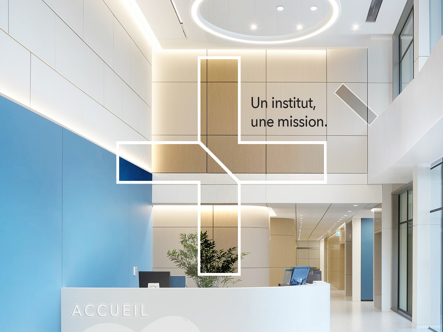
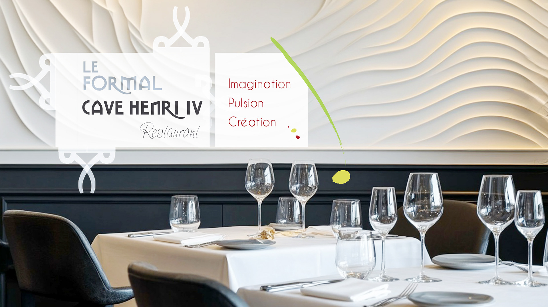
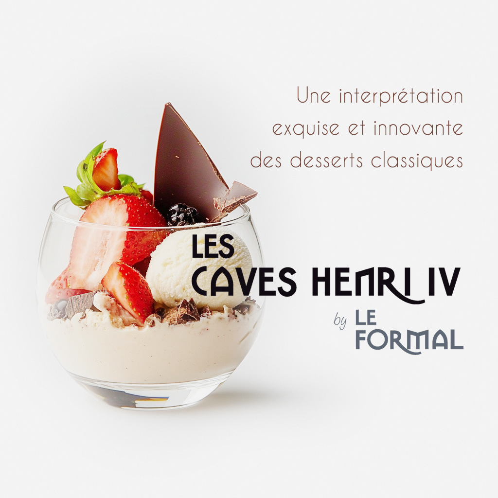
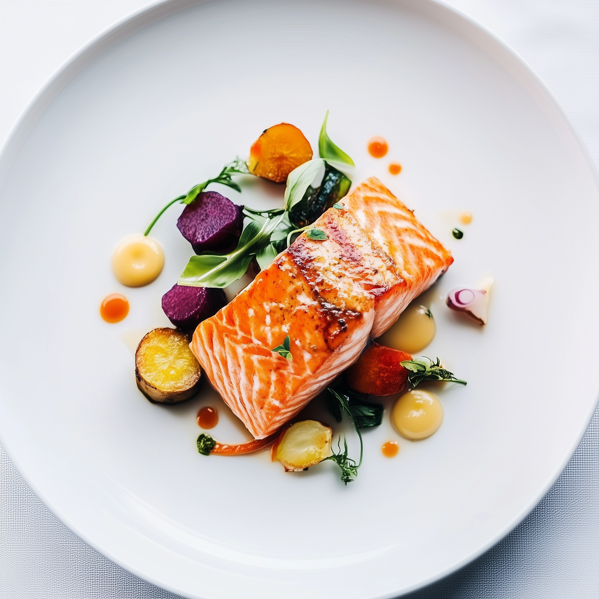
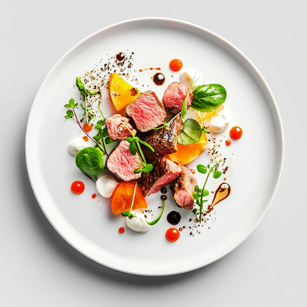
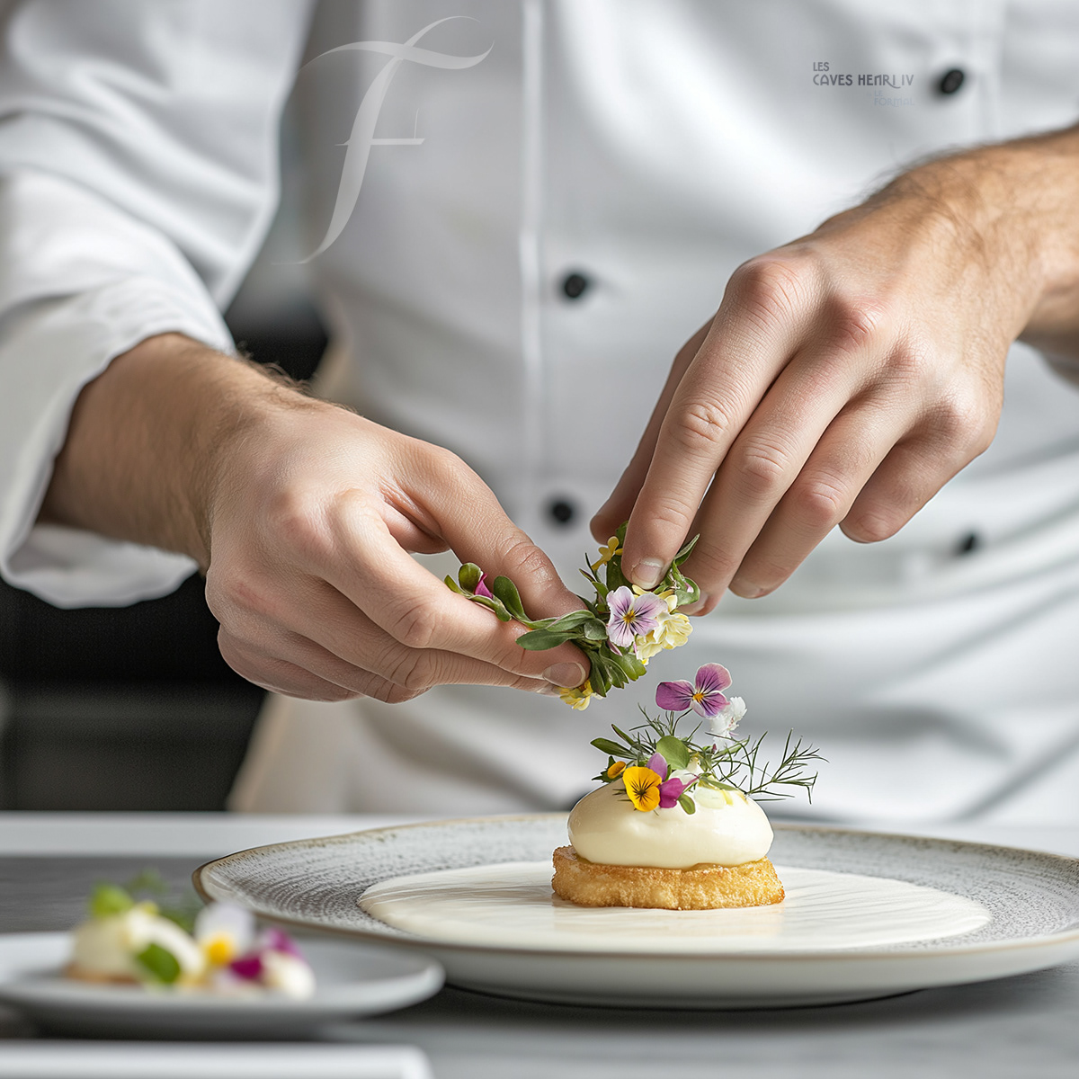
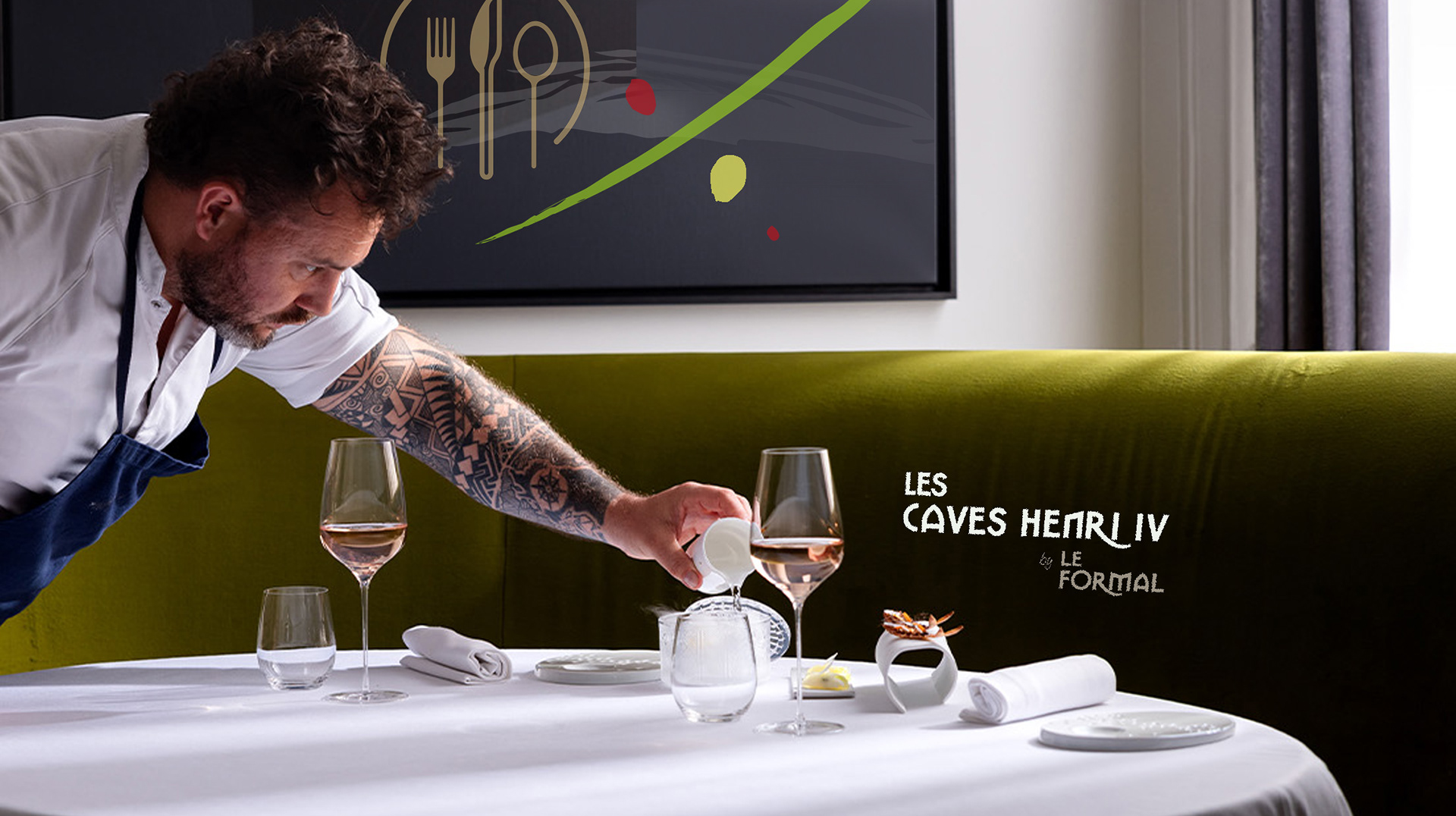
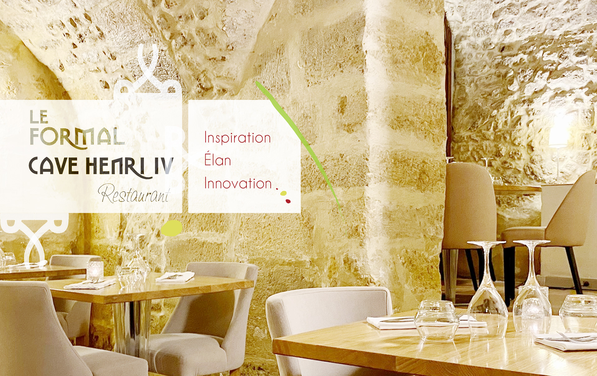
A restaurant brand rooted in French craft and contemporary restraint needed an identity that communicated quality before a guest walked through the door.
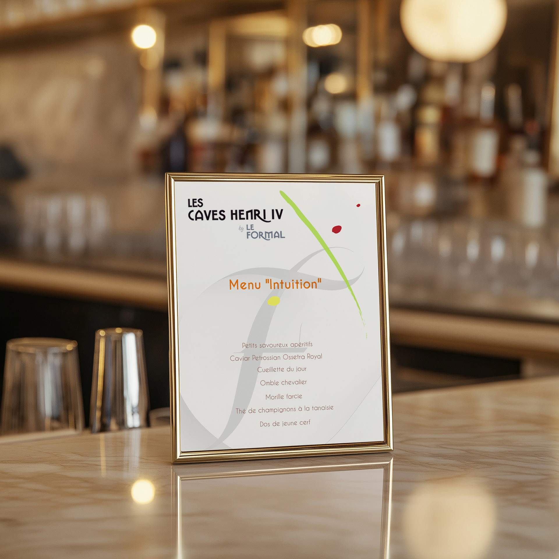
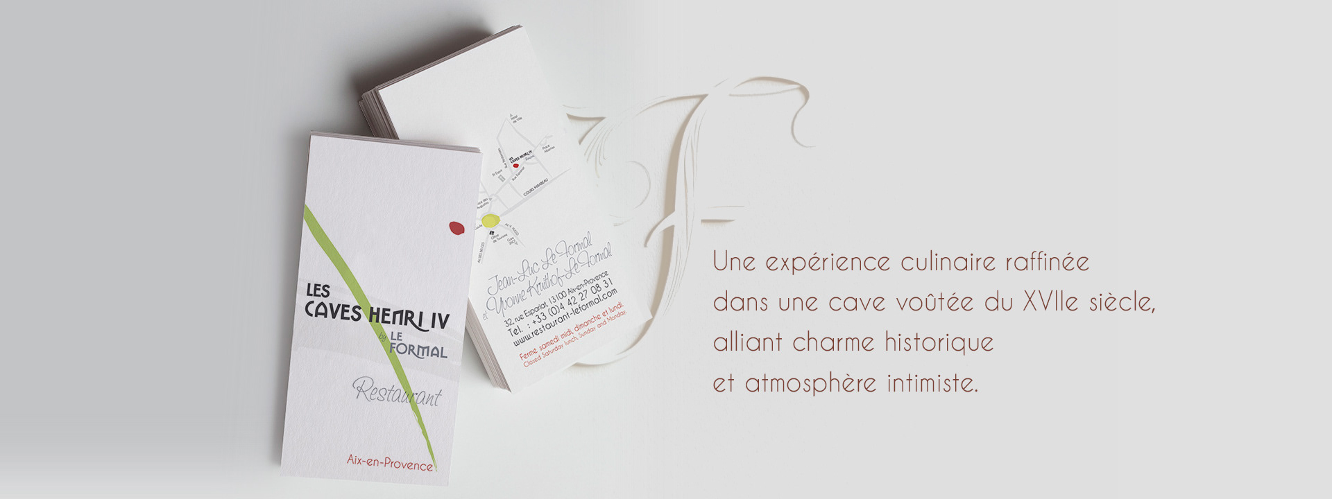
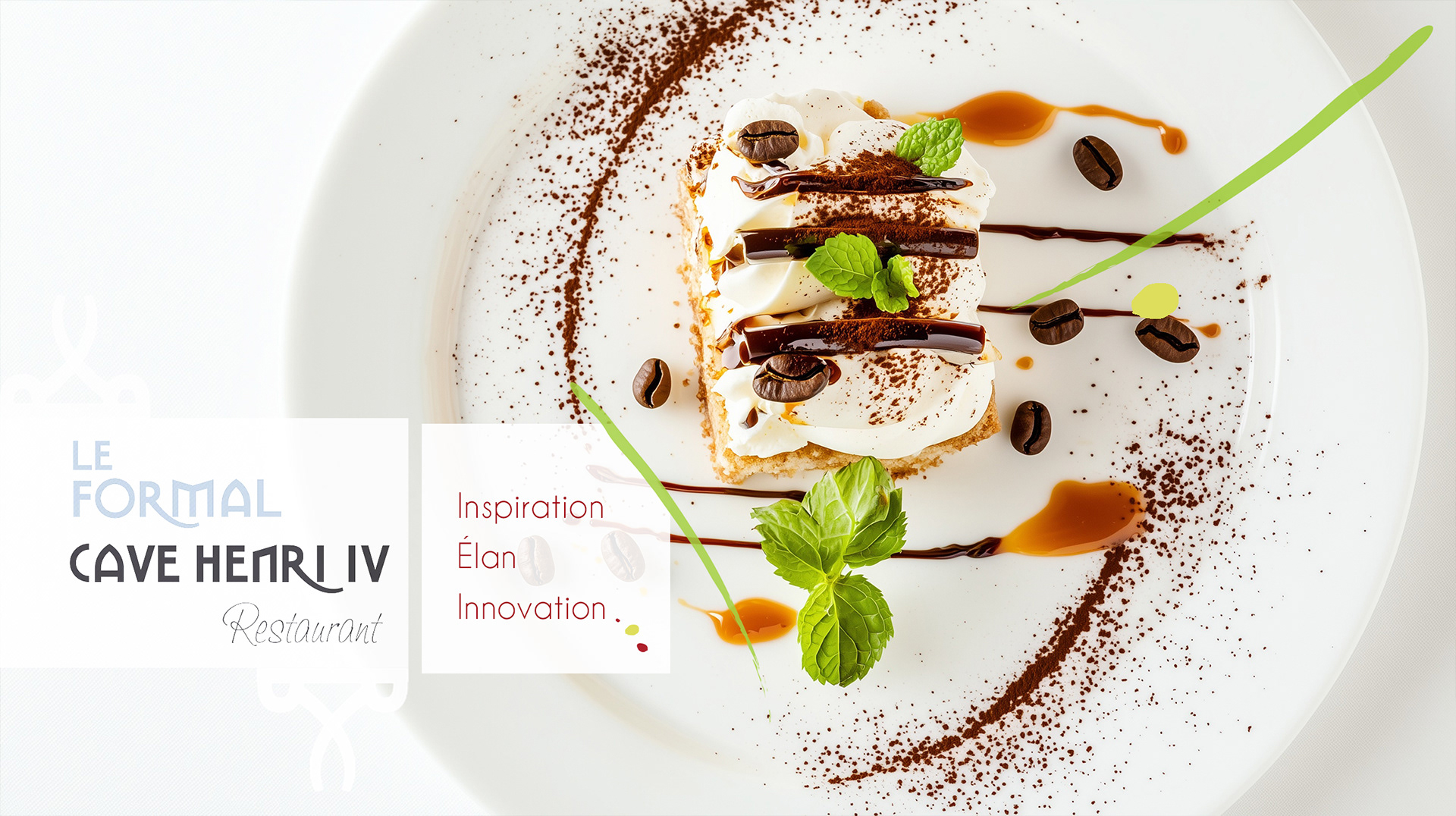
The visual language, logo, menu design, and print collateral do what the best hospitality design always does: they make you feel the experience before you arrive.
The visual language, logo, menu design, and print collateral do what the best hospitality design always does: they make you feel the experience before you arrive.
CLIENT ▸ Le Formal Restaurant, Aix-en-Provence, France
ROLE ▸ Brand Designer Freelance
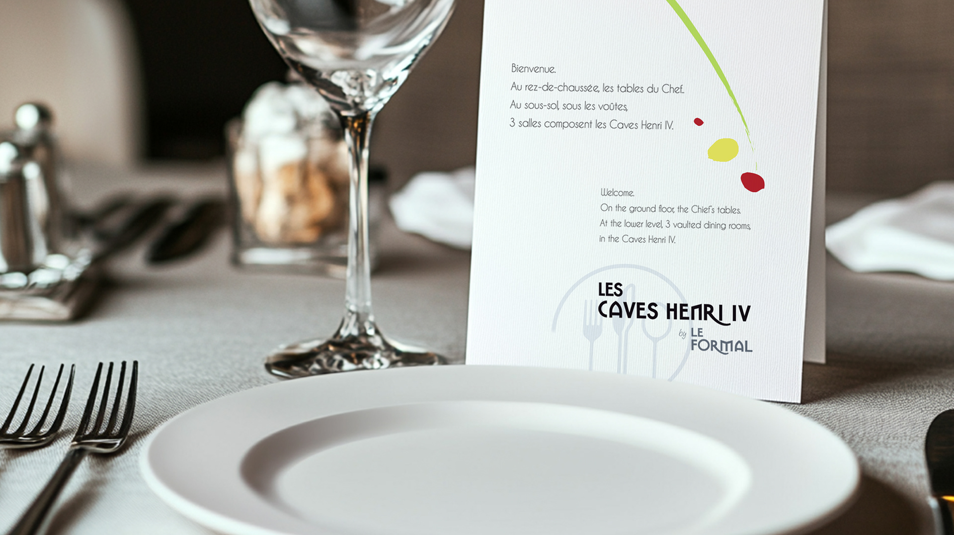
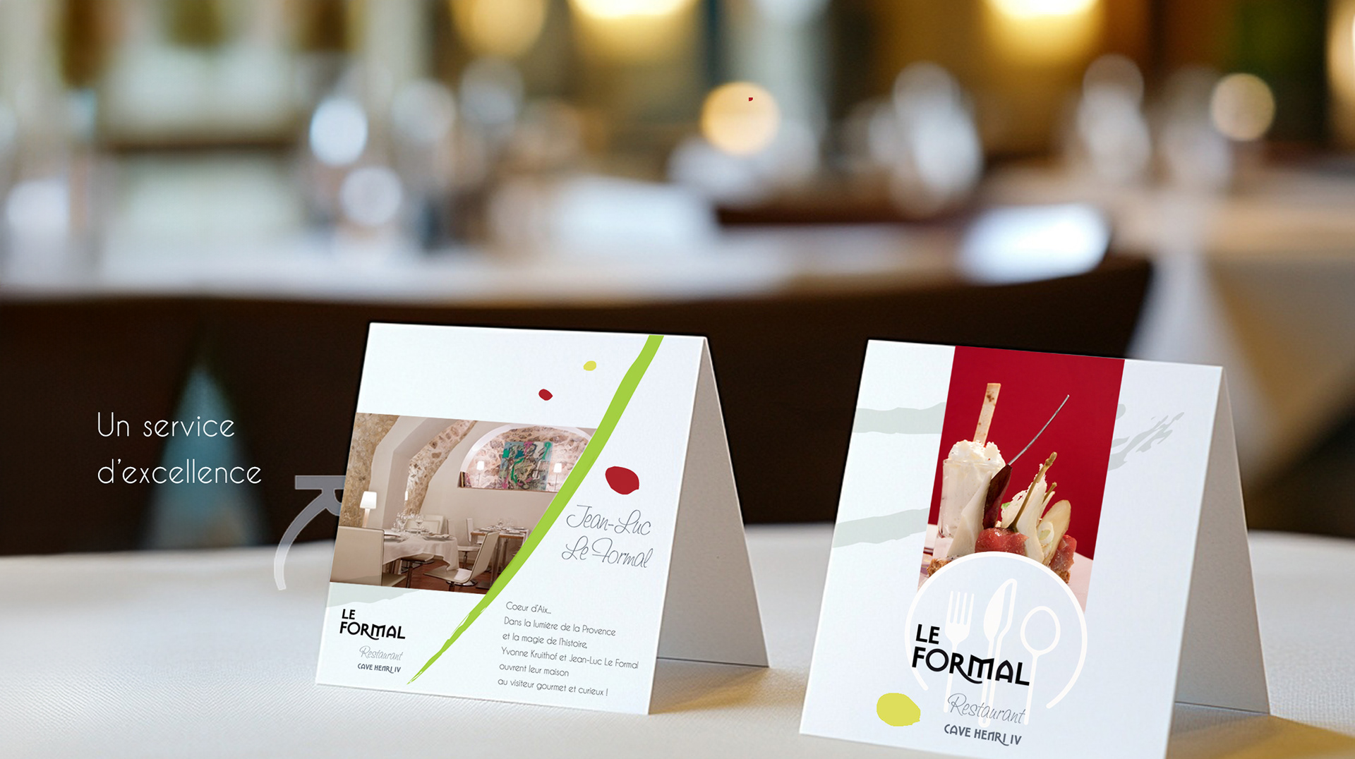
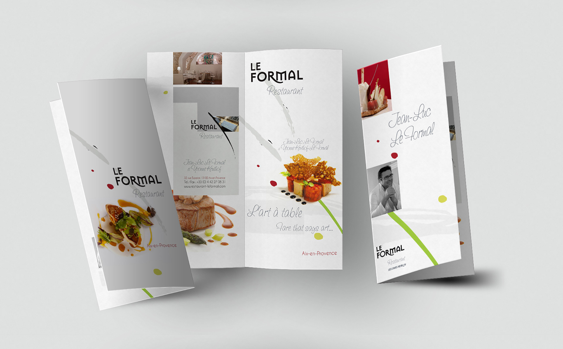
SCOPE ▸ Logo Design, Restaurant Visual Identity, Print Materials, Menu, Business Cards
ROLE ▸ Brand Designer Freelance
SCOPE ▸ Logo Design, Restaurant Visual Identity, Print Materials, Menu, Business Cards
The Challenge
Define a restaurant identity balancing refinement and approachability
Create a visual language that translated seamlessly across physical and digital contexts
Position the restaurant around craft and intention rather than trend
Define a restaurant identity balancing refinement and approachability
Create a visual language that translated seamlessly across physical and digital contexts
Position the restaurant around craft and intention rather than trend
Strategic Approach
Prioritized restraint, typography, and materiality over decorative gestures
Built a visual language focused on rhythm, spacing, and tone
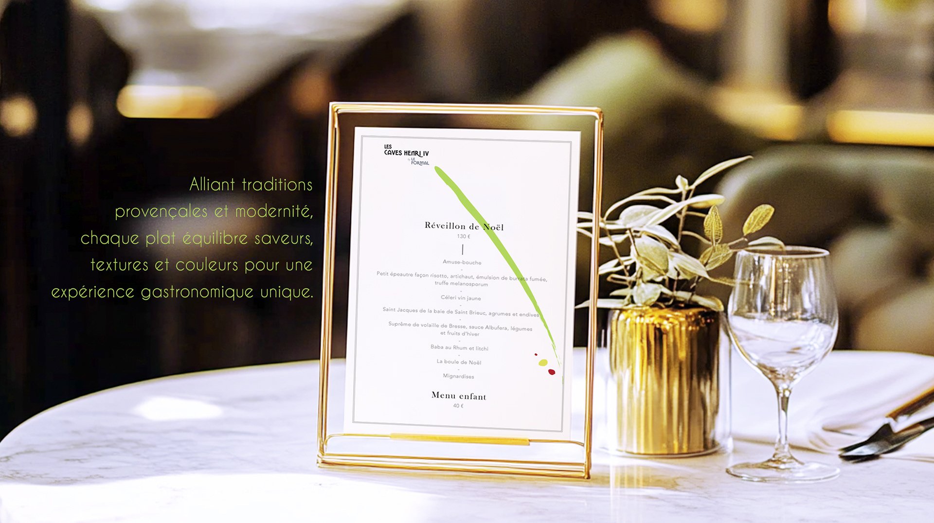
Designed with real-world durability in mind across menus and signage
Prioritized restraint, typography, and materiality over decorative gestures
Built a visual language focused on rhythm, spacing, and tone
Designed with real-world durability in mind across menus and signage
Creative Solution
Highly competitive mobile CPA market
Complex, performance-led product offering
Need to communicate trust, speed, and scale to partners and advertisers
Highly competitive mobile CPA market
Complex, performance-led product offering
Need to communicate trust, speed, and scale to partners and advertisers
Sytem & Scope
Highly competitive mobile CPA market
Complex, performance-led product offering
Need to communicate trust, speed, and scale to partners and advertisers
Highly competitive mobile CPA market
Complex, performance-led product offering
Need to communicate trust, speed, and scale to partners and advertisers
Deliverables
+ Core brand framework defining tone, typography, and visual rules
+ Identity assets adaptable across menus, signage, and communications
+ Lightweight guidance supporting consistent day-to-day use
+ Core brand framework defining tone, typography, and visual rules
+ Identity assets adaptable across menus, signage, and communications
+ Lightweight guidance supporting consistent day-to-day use
Role & Leadership
Led brand direction and identity development from concept to implementation
Worked directly with the founder to align vision, positioning, and execution
Ensured consistency across print, digital, and in-space applications
Led brand direction and identity development from concept to implementation
Worked directly with the founder to align vision, positioning, and execution
Ensured consistency across print, digital, and in-space applications
On The Work
In hospitality, perception defines the experience before the first interaction.
A restrained, disciplined identity sets expectations and builds trust.
By treating the brand as a system rather than decoration, coherence is maintained across every touchpoint.
In hospitality, perception defines the experience before the first interaction.
A restrained, disciplined identity sets expectations and builds trust.
By treating the brand as a system rather than decoration, coherence is maintained across every touchpoint.
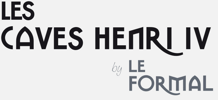
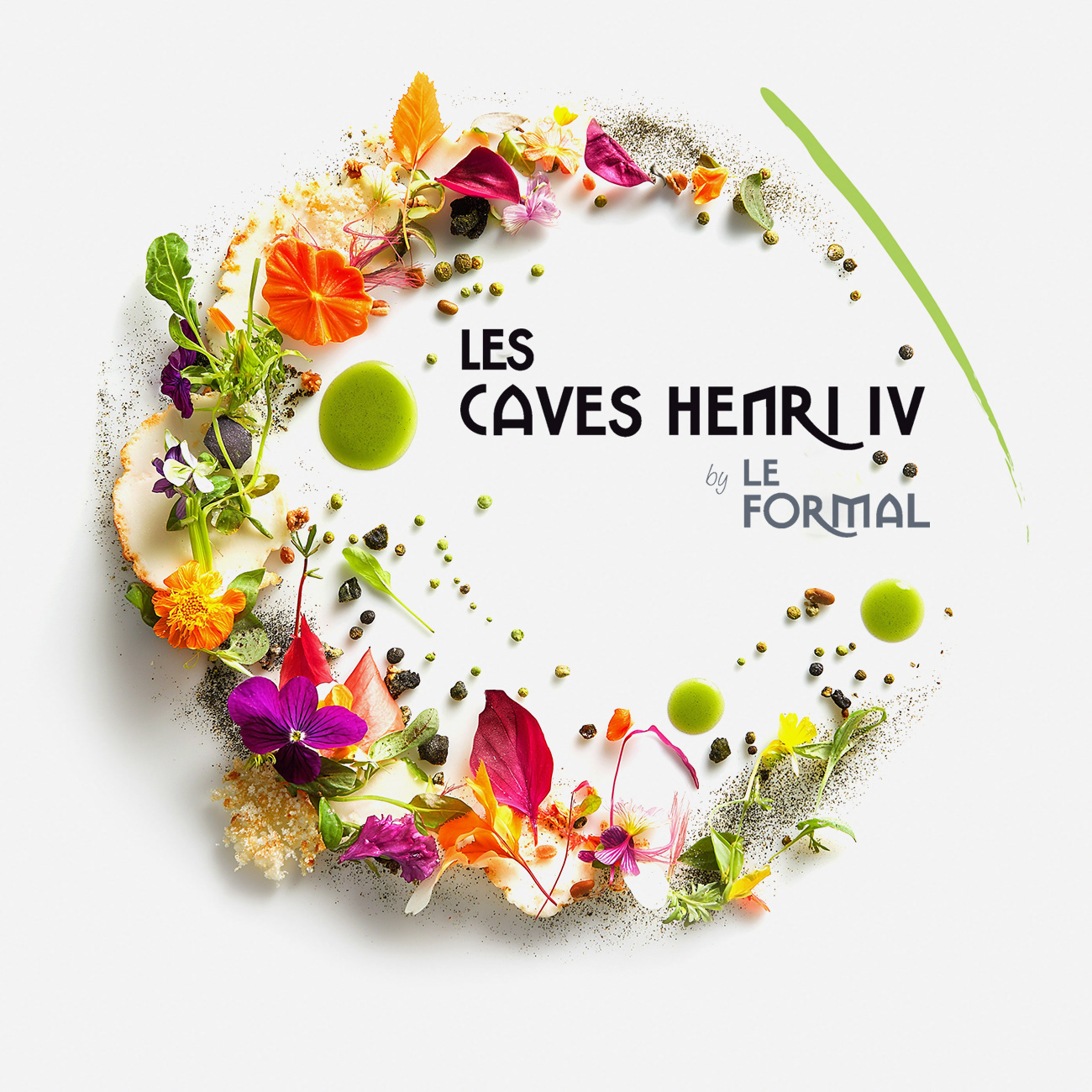
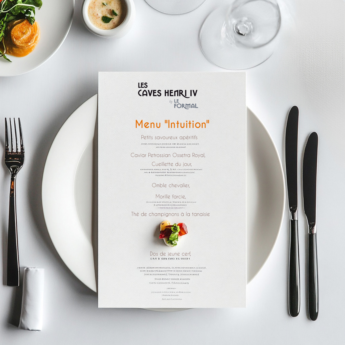
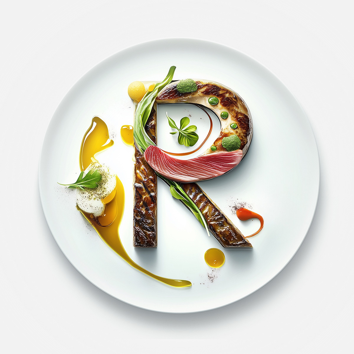
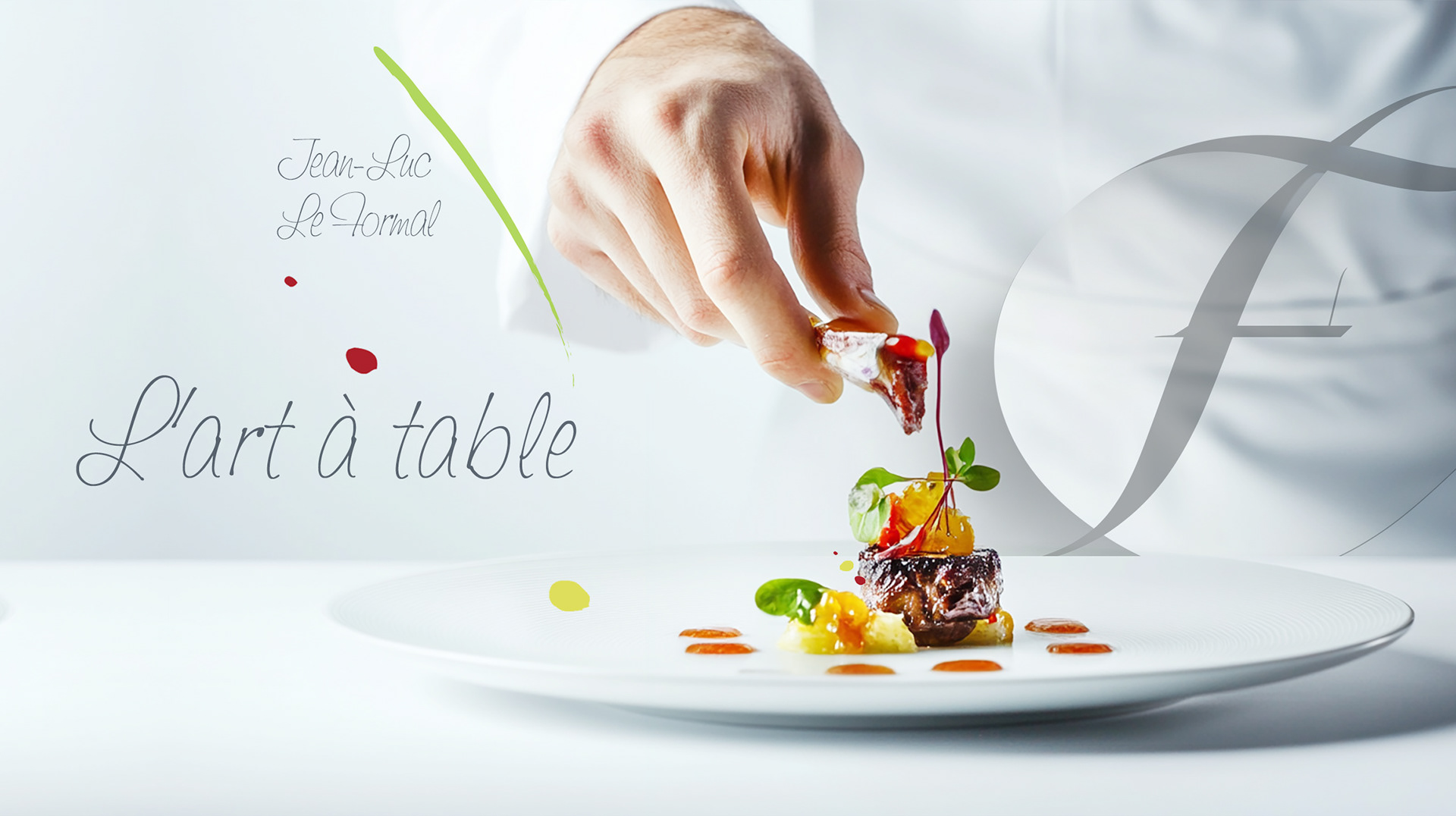
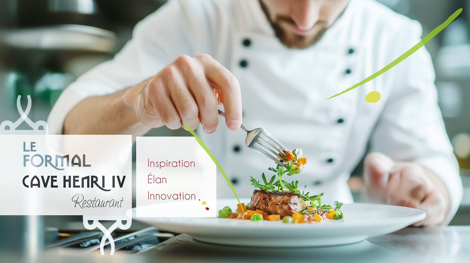
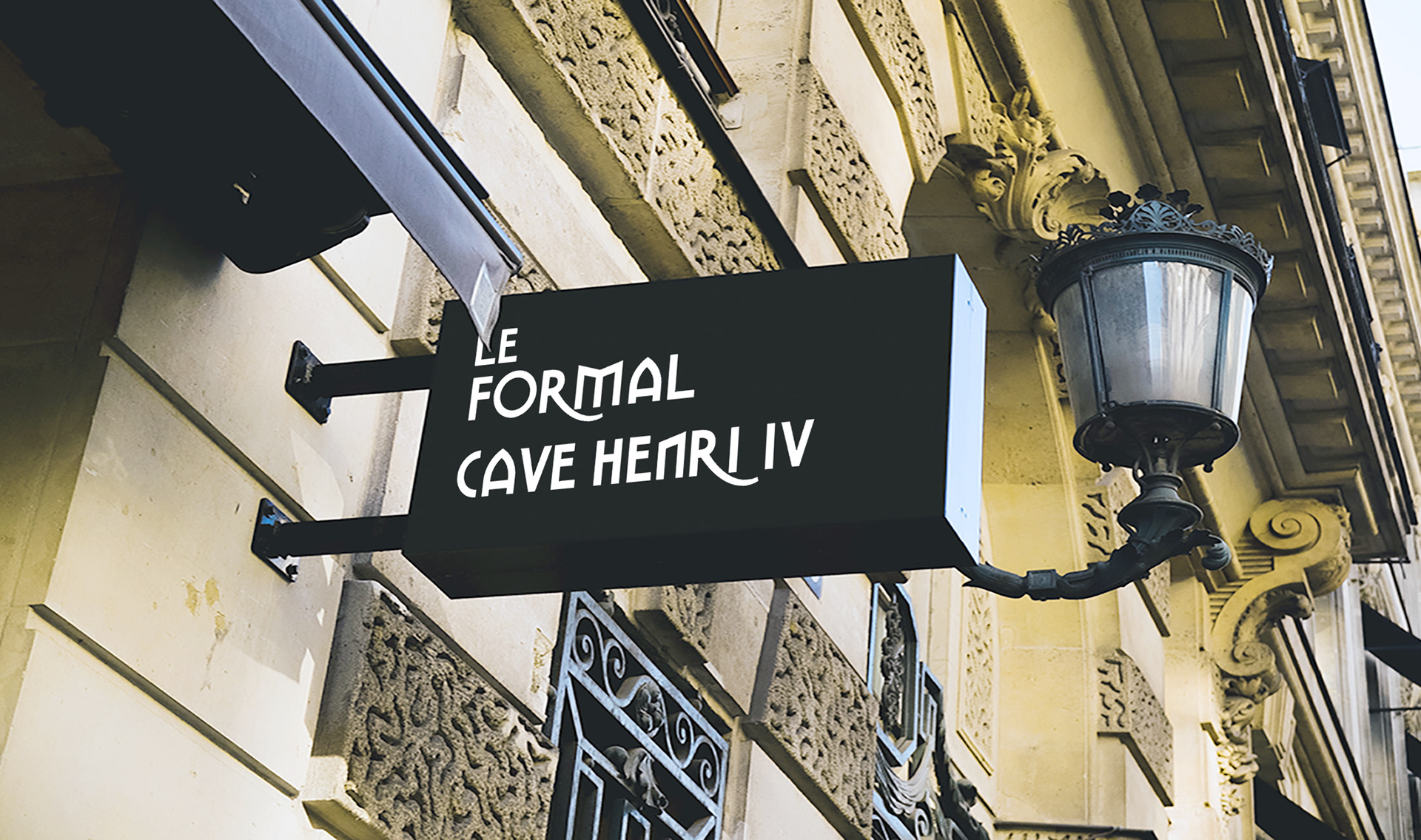
Designed a typographic logo grounded in proportion and restraint, reflecting the restaurant’s emphasis on craft, balance, and understated elegance

Need to elevate your restaurant's brand
with a refined, high-impact design?
with a refined, high-impact design?