CLIENT / Fragrence 75, Paris, France
Project Overview
Fragrence 75, a new beauty and skincare brand, sought a luxury-inspired identity, including a logo, palette, typography, and packaging, to showcase its premium products and captivate discerning customers in a competitive market.
Approach & Solutions
I set out to design a visual identity for their beauty and skincare products that exude elegance,
luxury, and sophistication:
- By incorporating warm tones and rich textures, I created an inviting atmosphere that evokes
comfort and indulgence aligning with the brand’s premium essence.
- This refined aesthetic enhances the brand’s relatability, making it more appealing to customers
seeking high-quality, elegant skincare.
- With a distinct and memorable presence, the identity stands out in the competitive beauty market,
reinforcing the brand’s commitment to sophistication and care.

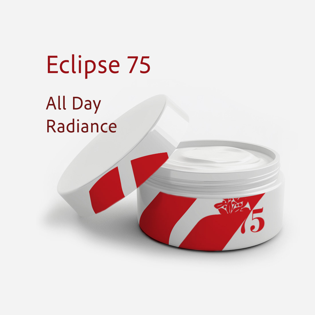
LOGO DESIGN: A BOLD IDENTITY INFUSED WITH REFINMENT
For the Fragrence 75 logo, I crafted a bold, modern identity that fuses elegance with impact:
- The fluid, brushstroke-inspired typography conveys a sense of movement,
evoking the artistry of fragrance creation and the sensuality of scent.
- The profound red color choice reinforces passion, intensity, and sophistication,
making a strong visual statement in the luxury market.
- Combining an organic, handcrafted aesthetic with a contemporary edge, the logo establishes
Fragrence 75 as a brand that embraces tradition and modernity, appealing to a refined yet
adventurous audience.
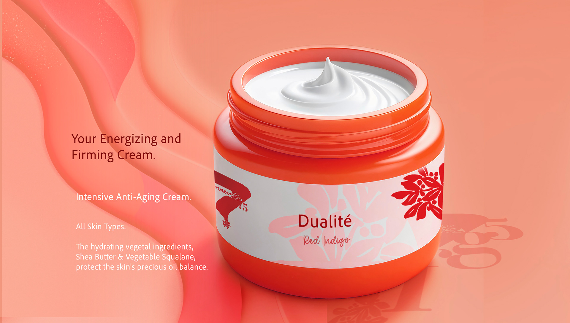
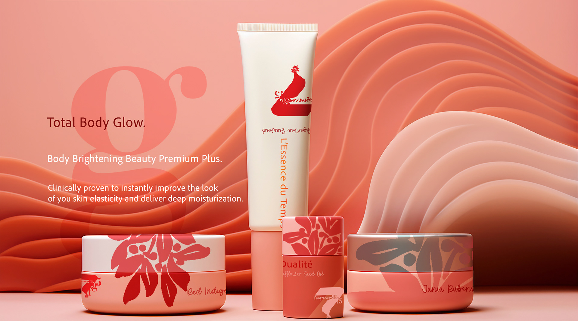
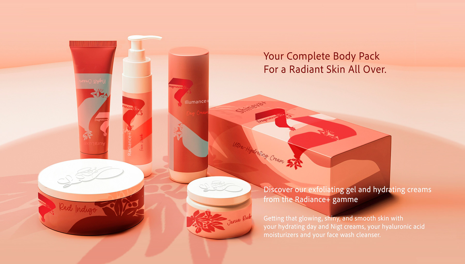
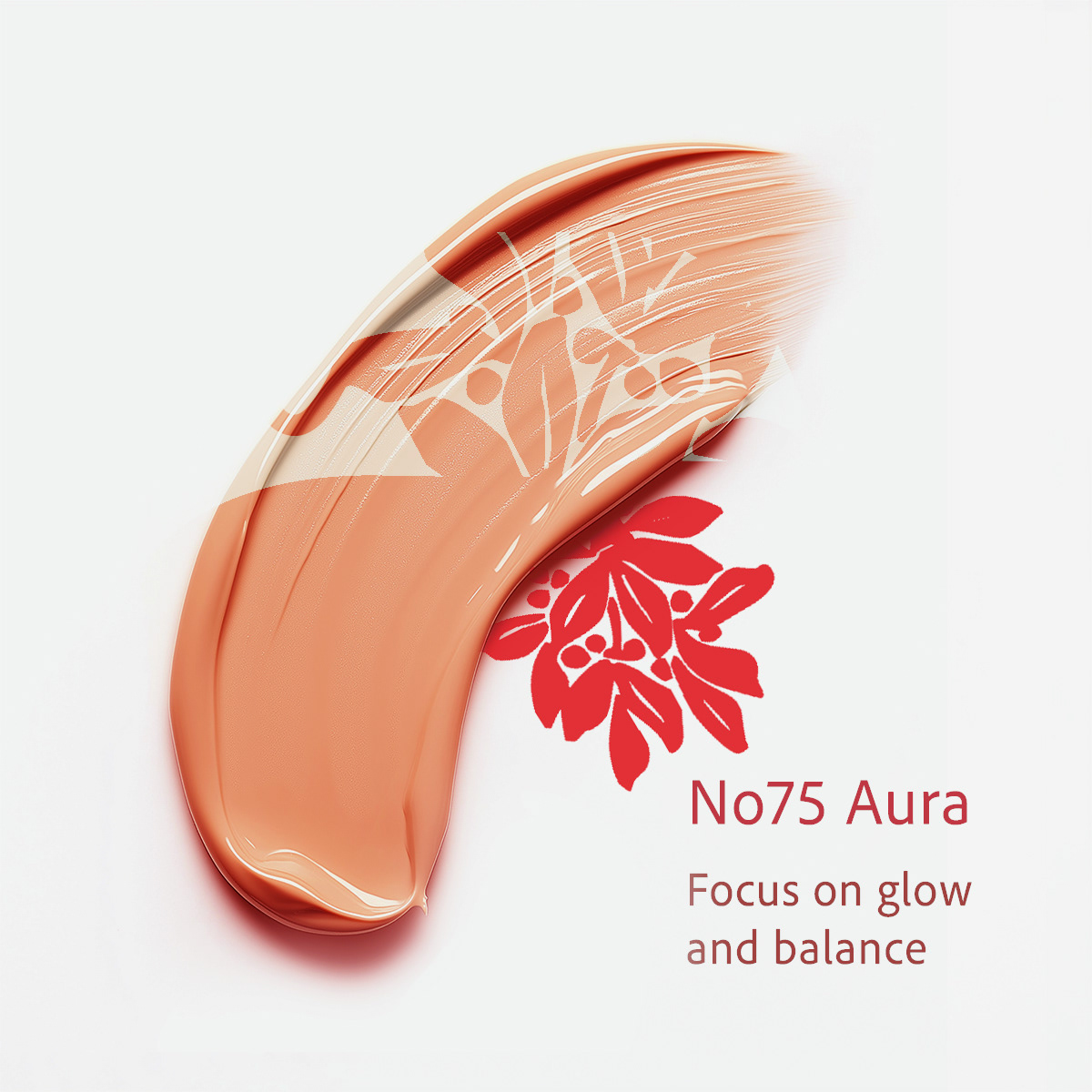
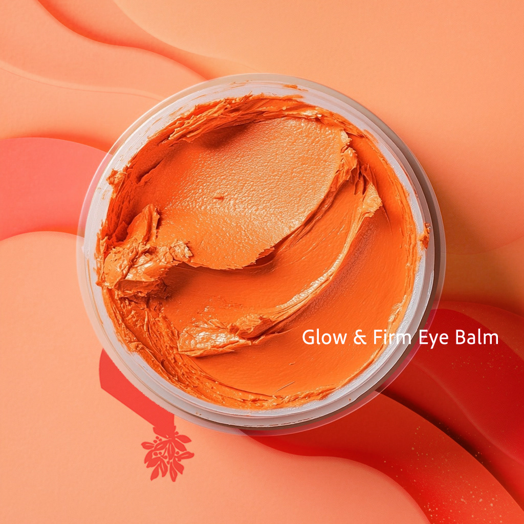
Concept Breakdown 1: WHERE RADIANCE MEETS RITUAL
This concept elevates everyday skincare into a sensorial, elegant ritual rooted in nature and design clarity:
- Color Strategy: Each product tone reflects its skincare benefit—warm and harmonious to evoke hydration,
glow, and balance.
- Graphic Language: A bold red botanical mark is a visual anchor, symbolizing natural potency
and brand cohesion.
- Typography & Numbering: Using product numbers and minimal type creates a scientific yet approachable tone.
- Backgrounds & Texture: Sculpted, layered visuals echo the skin’s surface and enhance the sense of touch
and care.


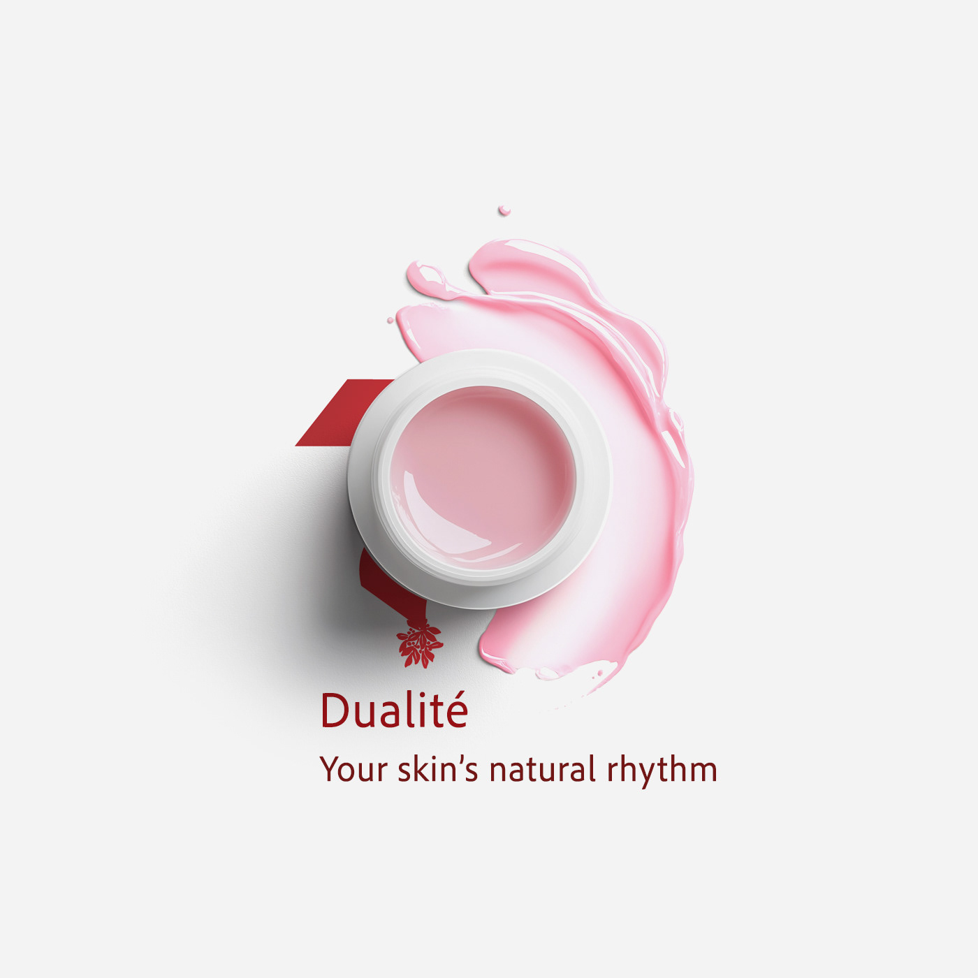
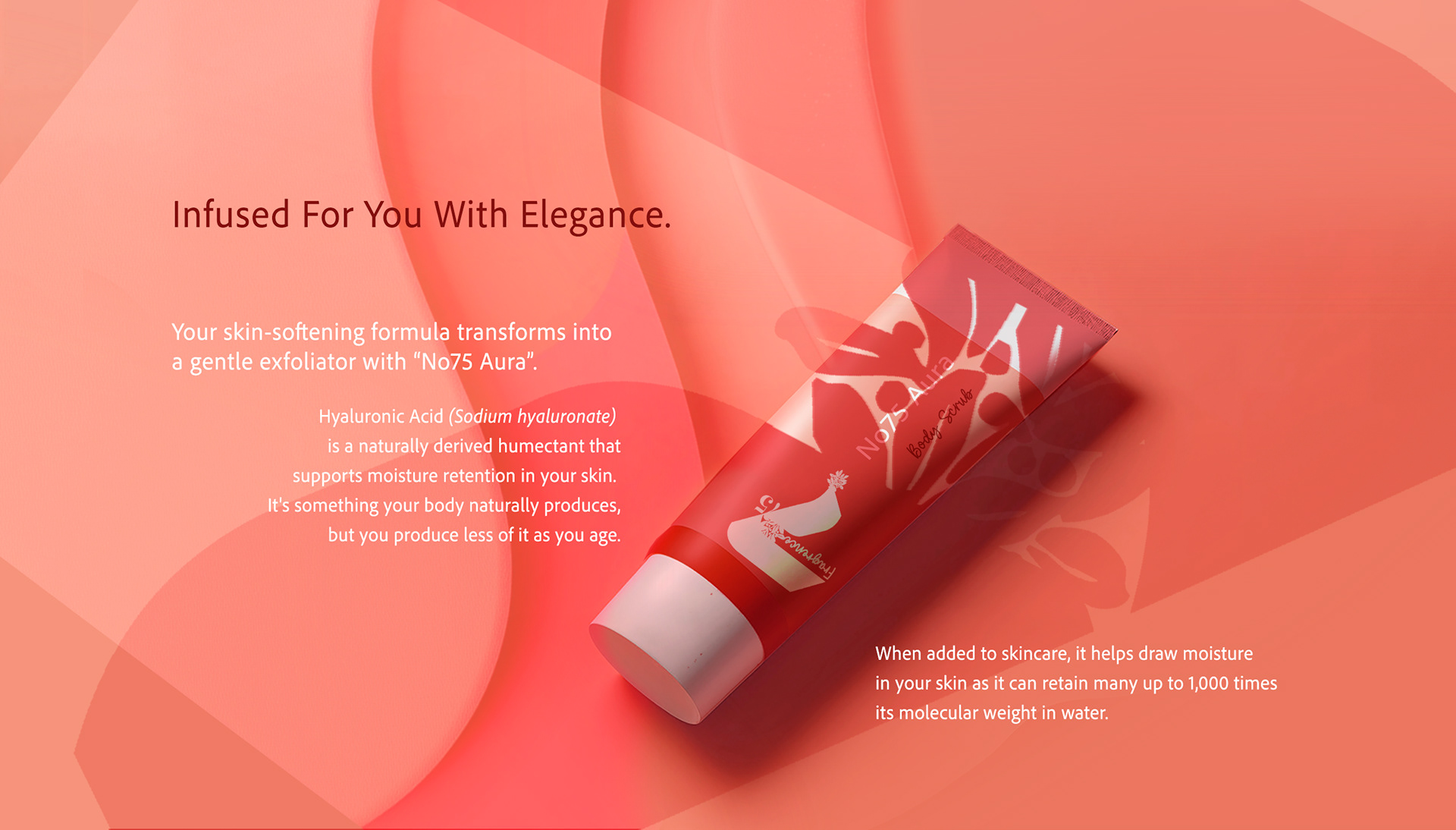
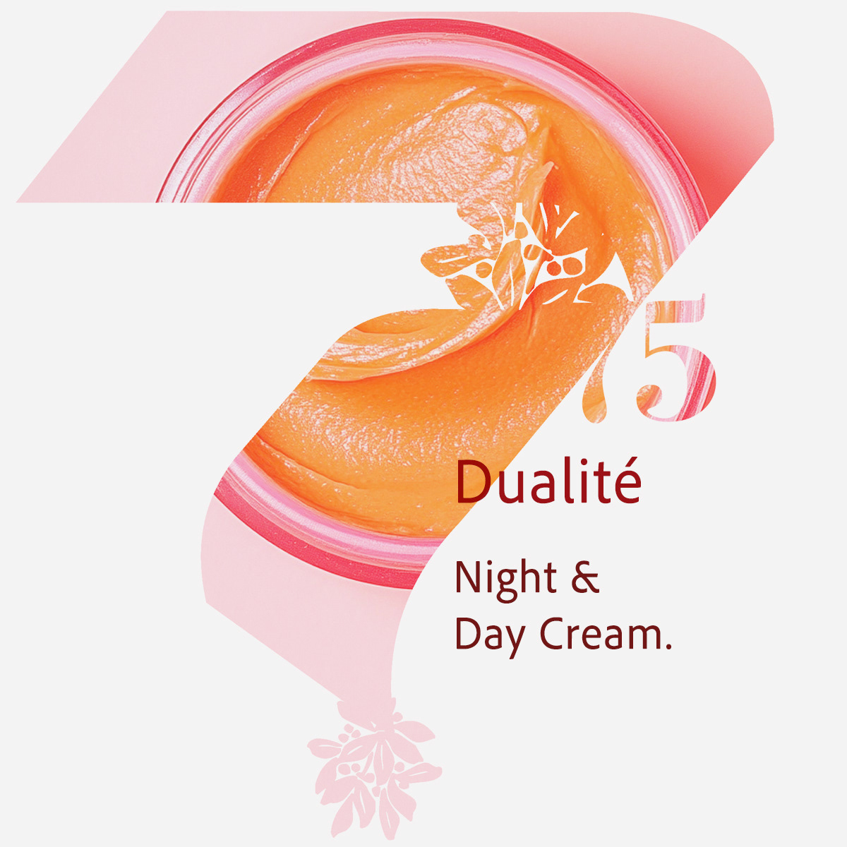
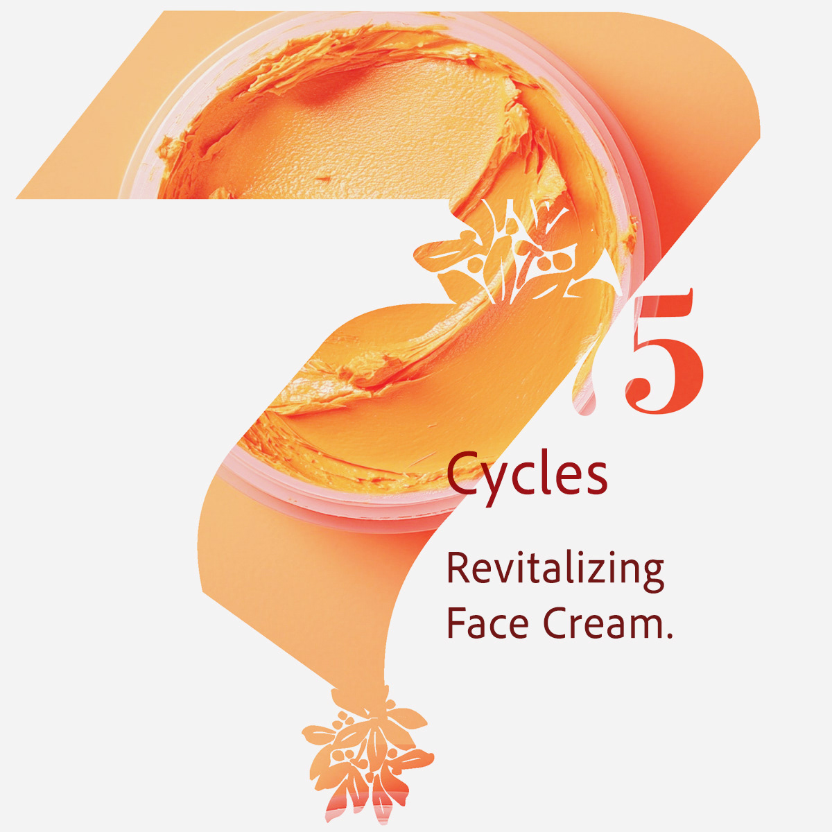
graphic Illustrations: botanical balance
The illustrations featured in the Cycles, and Dualité product visuals are custom-designed to express the organic sophistication and rhythm of the Fragrance75 skincare line.
- Botanical motif: Inspired by pressed flowers and herbal infusions, the delicate red floral illustration
suggests natural ingredients, balance, and regenerative energy.
- Integrated in typography: The drawing is seamlessly embedded into the “75” numeral, turning
the brandmark into a storytelling device.
- Evokes care and ritual: Placed at key intersections in the number form, the artwork supports the idea
of daily cycles, night and day, rest and revival.
- Bridges product and identity: The illustration links the formula's tactile quality with the brand’s
soft-scientific aesthetic, clean, nurturing, and elevated.
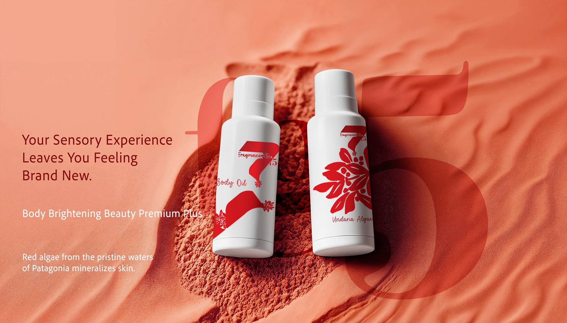
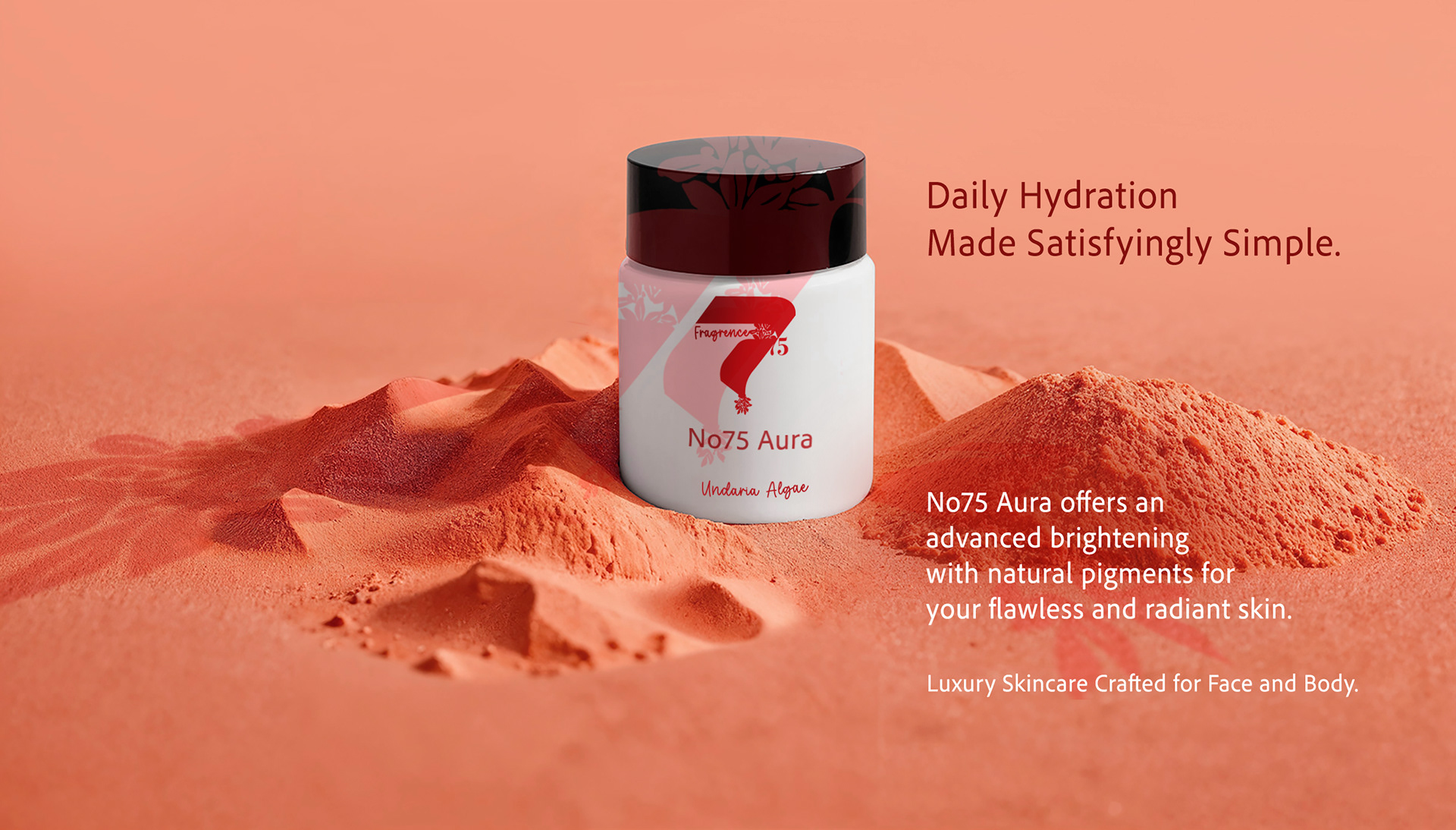
visual Breakdown 1: rooted in radiance
These visuals place Fragrance75 in sculpted sand landscapes to evoke purity, calm, and mineral-rich care.
The warm tones and soft lighting highlight natural ingredients like red algae, while the minimalist setup reflects a quiet, grounded luxury.
Each product feels like it emerged from the earth and invites a daily ritual of simple, sensory hydration.
visual Breakdown 2: the rhythm of renewal
These compositions spotlight texture and tone to echo the skin’s natural cycle.
The clean white space, flowing product smears, and bold number 75 create visual harmony, balancing science and softness.
The result is a serene, clinically elegant identity focused on resilience and regeneration.
These compositions spotlight texture and tone to echo the skin’s natural cycle.
The clean white space, flowing product smears, and bold number 75 create visual harmony, balancing science and softness.
The result is a serene, clinically elegant identity focused on resilience and regeneration.