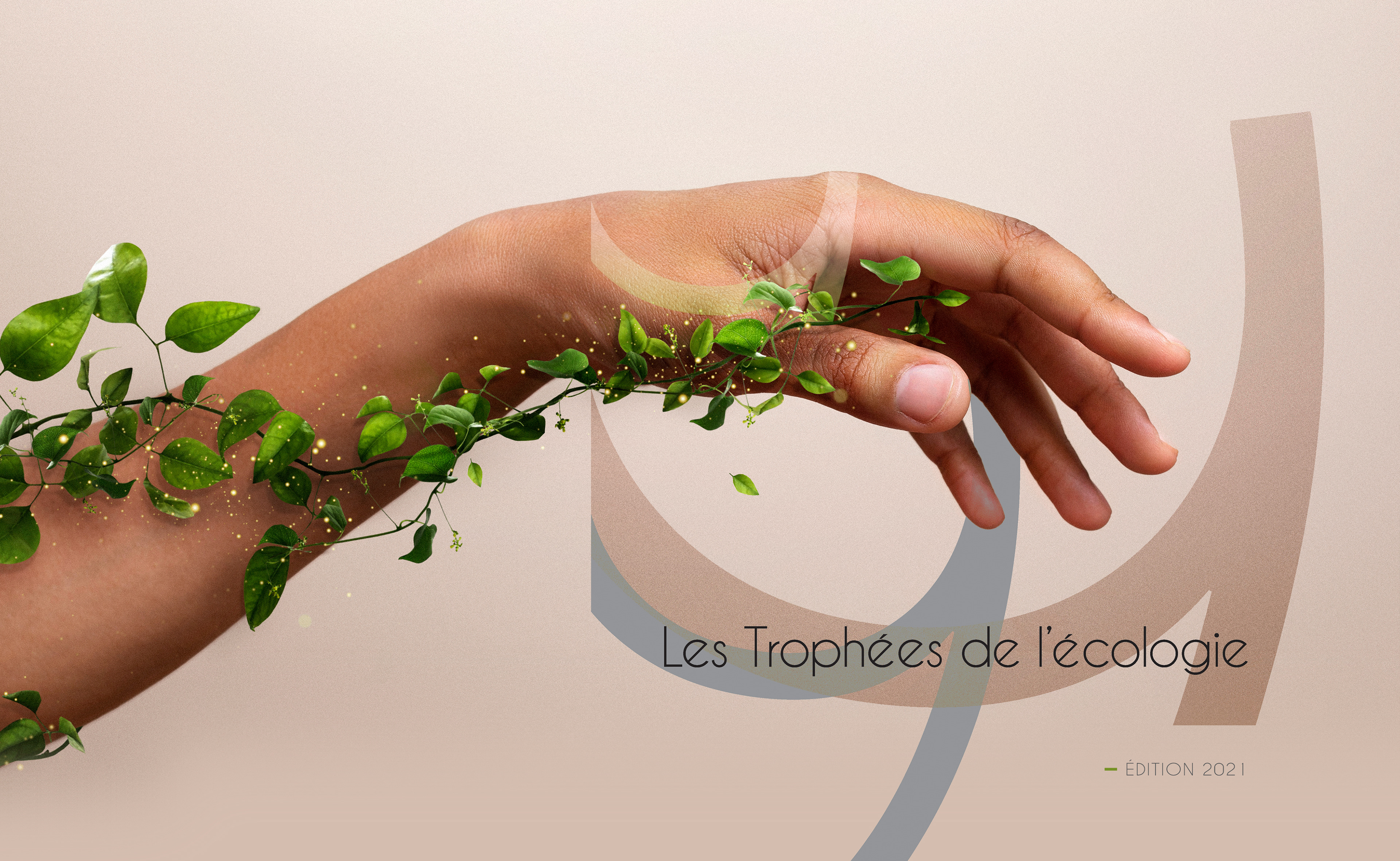
Environmental design has a default setting: green, a leaf, something hand-drawn and earnest. It signals good intentions and quietly undermines the thing it is attached to. An awards program cannot afford that, because its value rests on the weight of the jury's judgment. I built the identity on typographic discipline instead of ecological imagery, so the program reads as an institution that confers standing rather than a campaign asking to be liked. The system was designed to be reused each year rather than redrawn.
CLIENT▸ Les Trophées de l'Écologie, Paris, France
YEAR ▸ Art Director Freelance
AREA ▸ Culture & Institutions — Awards Program, Sustainability
AUDIENCE▸ Candidate companies, Jury, Press, Institutional partners
SCOPE ▸ Logo, visual identity, event identity, campaign materials, print and digital
SCALE ▸ 1 edition, 12 categories, 2 formats
ROLE▸ Art Director (Freelance)
TEAM ▸ Worked directly with the organizers
PROCESS ▸ Category audit → positioning → identity and typographic system → event and communications rollout
YEAR ▸ Art Director Freelance
AREA ▸ Culture & Institutions — Awards Program, Sustainability
AUDIENCE▸ Candidate companies, Jury, Press, Institutional partners
SCOPE ▸ Logo, visual identity, event identity, campaign materials, print and digital
SCALE ▸ 1 edition, 12 categories, 2 formats
ROLE▸ Art Director (Freelance)
TEAM ▸ Worked directly with the organizers
PROCESS ▸ Category audit → positioning → identity and typographic system → event and communications rollout
The Challenge
A category whose visual clichés actively reduce credibility
An awards program whose value rests entirely on being taken seriously
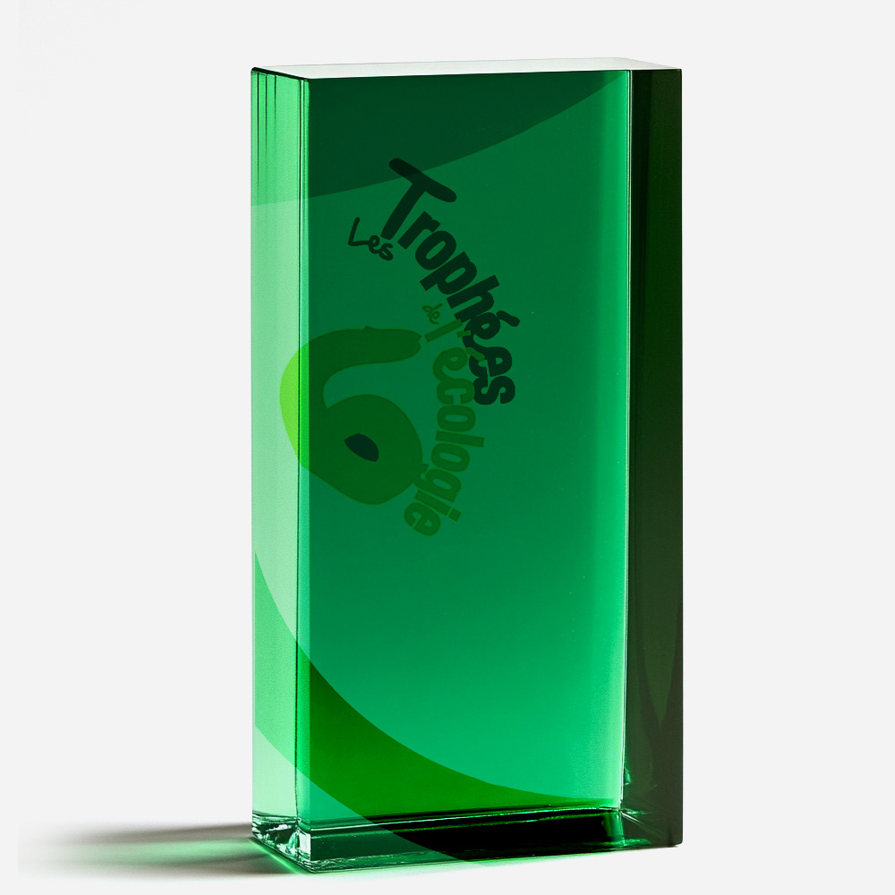
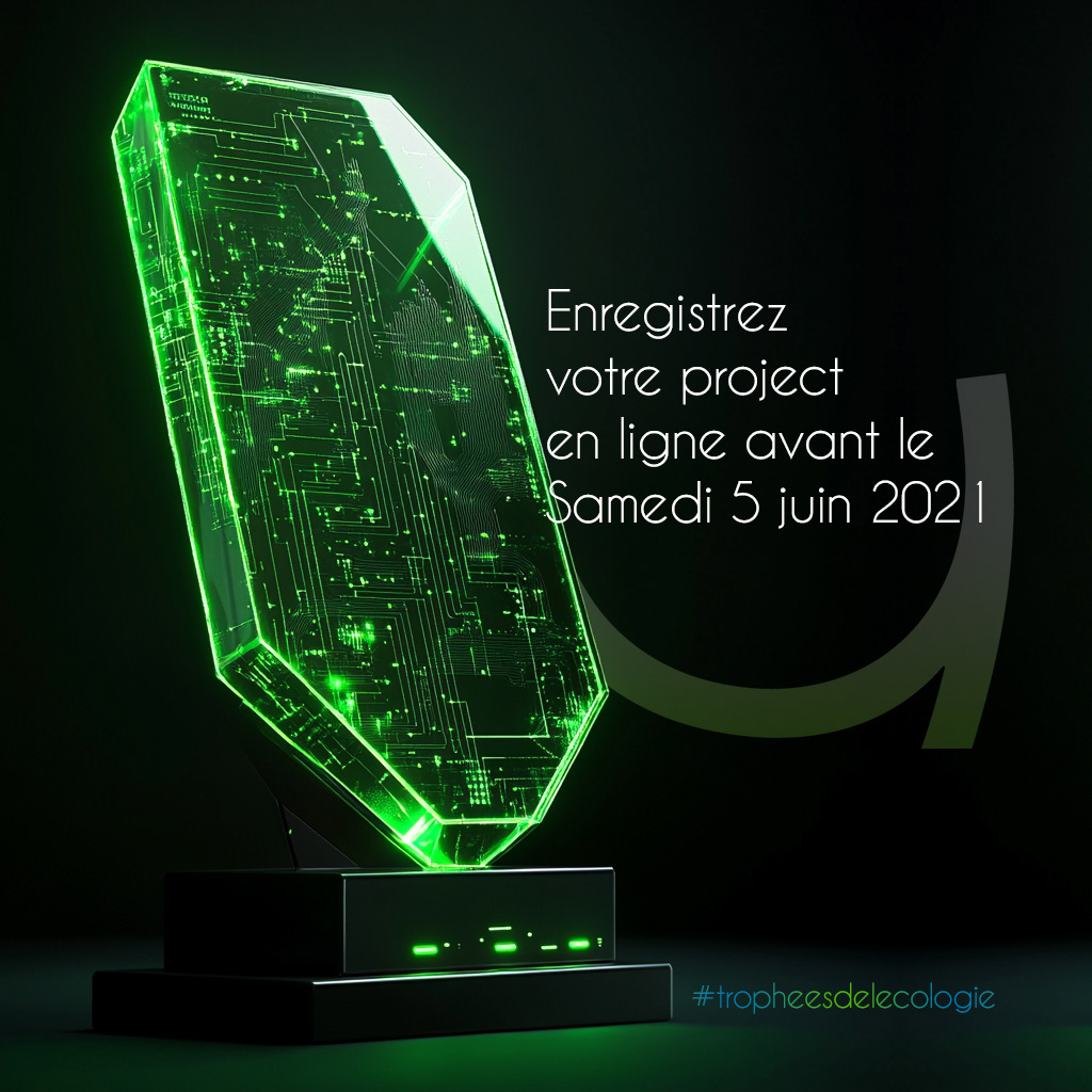
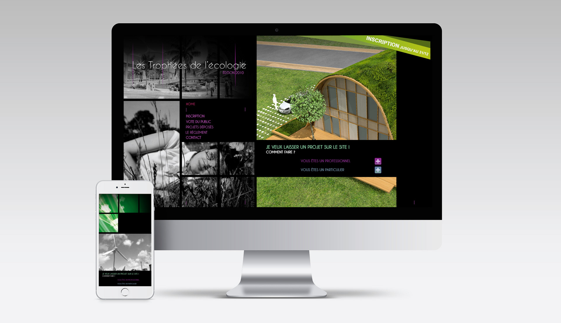
One identity that had to work on a trophy, a stage, a certificate, and a website
A category whose visual clichés actively reduce credibility
An awards program whose value rests entirely on being taken seriously
One identity that had to work on a trophy, a stage, a certificate, and a website
Strategic Approach
Positioned the program as recognition with weight, not encouragement
Refused the ecological iconography and put the credibility in the typography
Built for annual reuse, so each edition is a new year and not a new brand
Positioned the program as recognition with weight, not encouragement
Refused the ecological iconography and put the credibility in the typography
Built for annual reuse, so each edition is a new year and not a new brand
Creative Solution
Strong typographic system carrying the institutional authority
Disciplined composition suggesting progression and responsibility without illustrating them
A flexible framework that survives every format the ceremony demands
Strong typographic system carrying the institutional authority
Disciplined composition suggesting progression and responsibility without illustrating them
A flexible framework that survives every format the ceremony demands
Scope & System
Logo and identity system with governance rules
Event branding toolkit for the ceremony
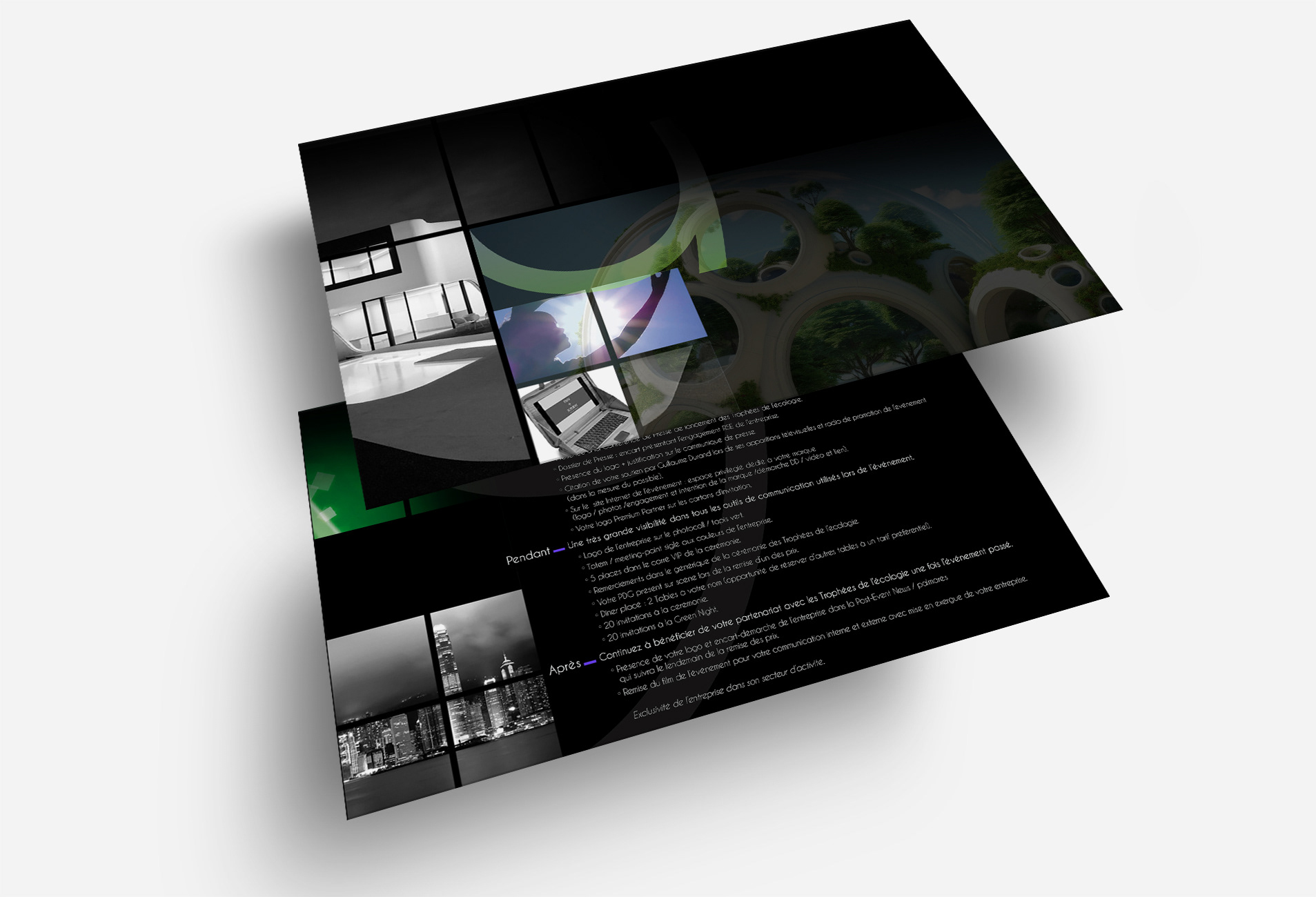
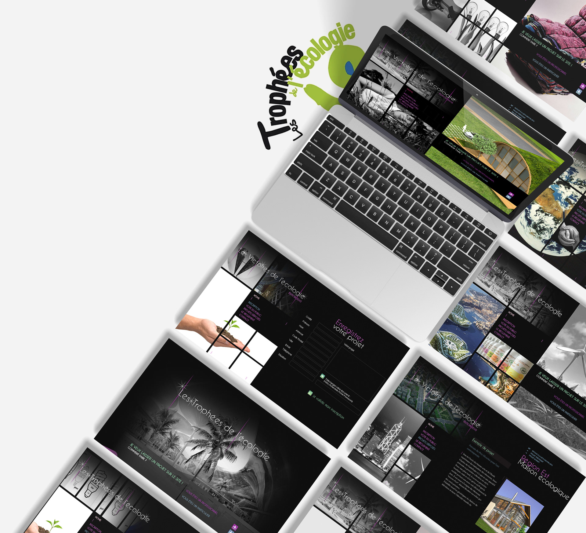
Print, digital, and presentation materials on the same rules
Logo and identity system with governance rules
Event branding toolkit for the ceremony
Print, digital, and presentation materials on the same rules
Deliverables
+ Logo and identity system
+ Event branding toolkit
+ Print and digital communication assets
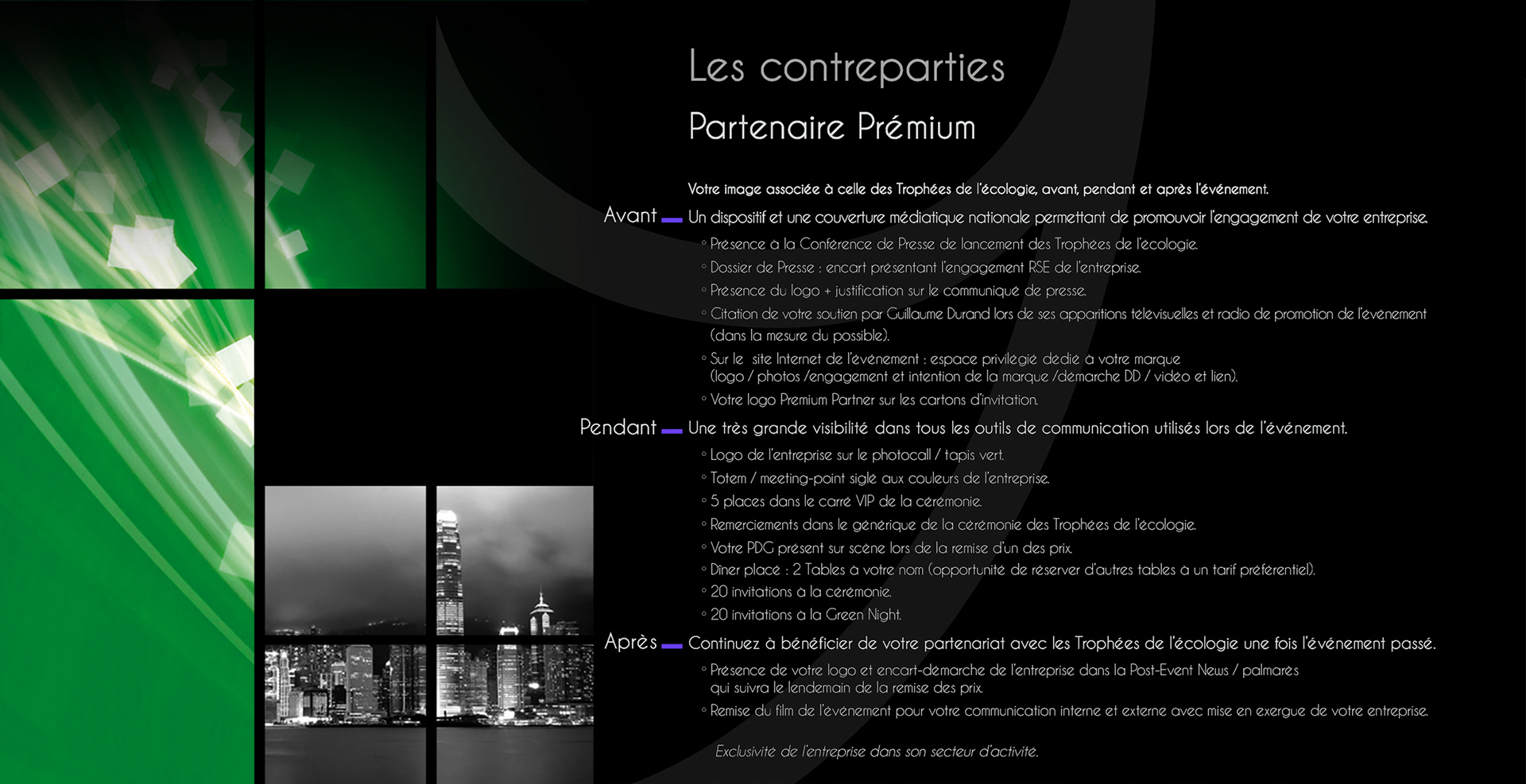
+ Presentation and sponsorship materials
+ Logo and identity system
+ Event branding toolkit
+ Print and digital communication assets
+ Presentation and sponsorship materials
Role & Leadership
Art Director and brand lead, from positioning through the event rollout. Worked directly with the organizers.
Art Director and brand lead, from positioning through the event rollout. Worked directly with the organizers.
The argument I had to hold: an environmental awards program does not become credible by looking green. It becomes credible by looking like it could just as easily say no.
On the Work
Award identities are usually designed for the first edition and quietly fall apart by the third, when a new agency adds a color and someone redraws the trophy.
Designing the governance alongside the mark lets a program build authority instead of resetting every year.
Award identities are usually designed for the first edition and quietly fall apart by the third, when a new agency adds a color and someone redraws the trophy.
Designing the governance alongside the mark lets a program build authority instead of resetting every year.
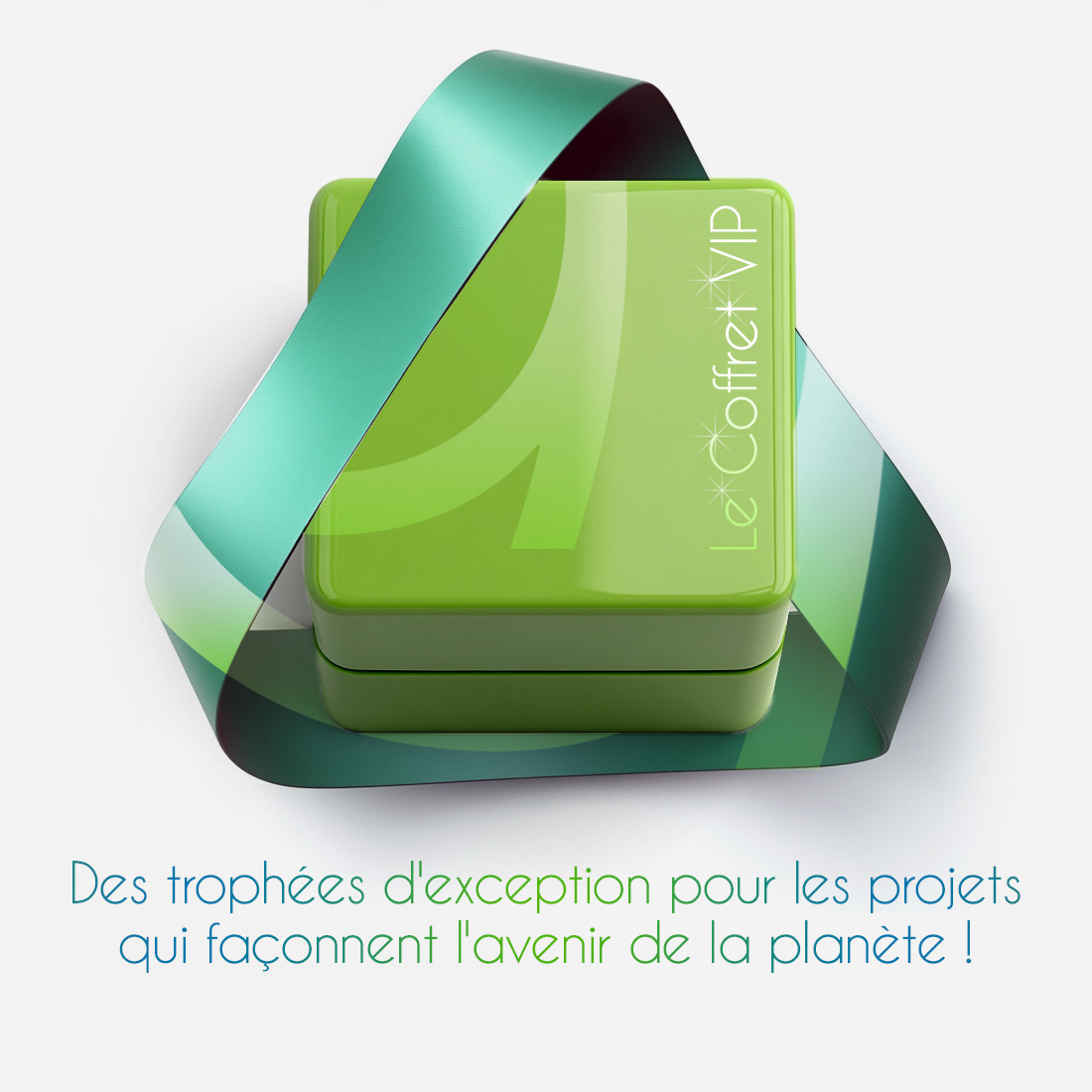
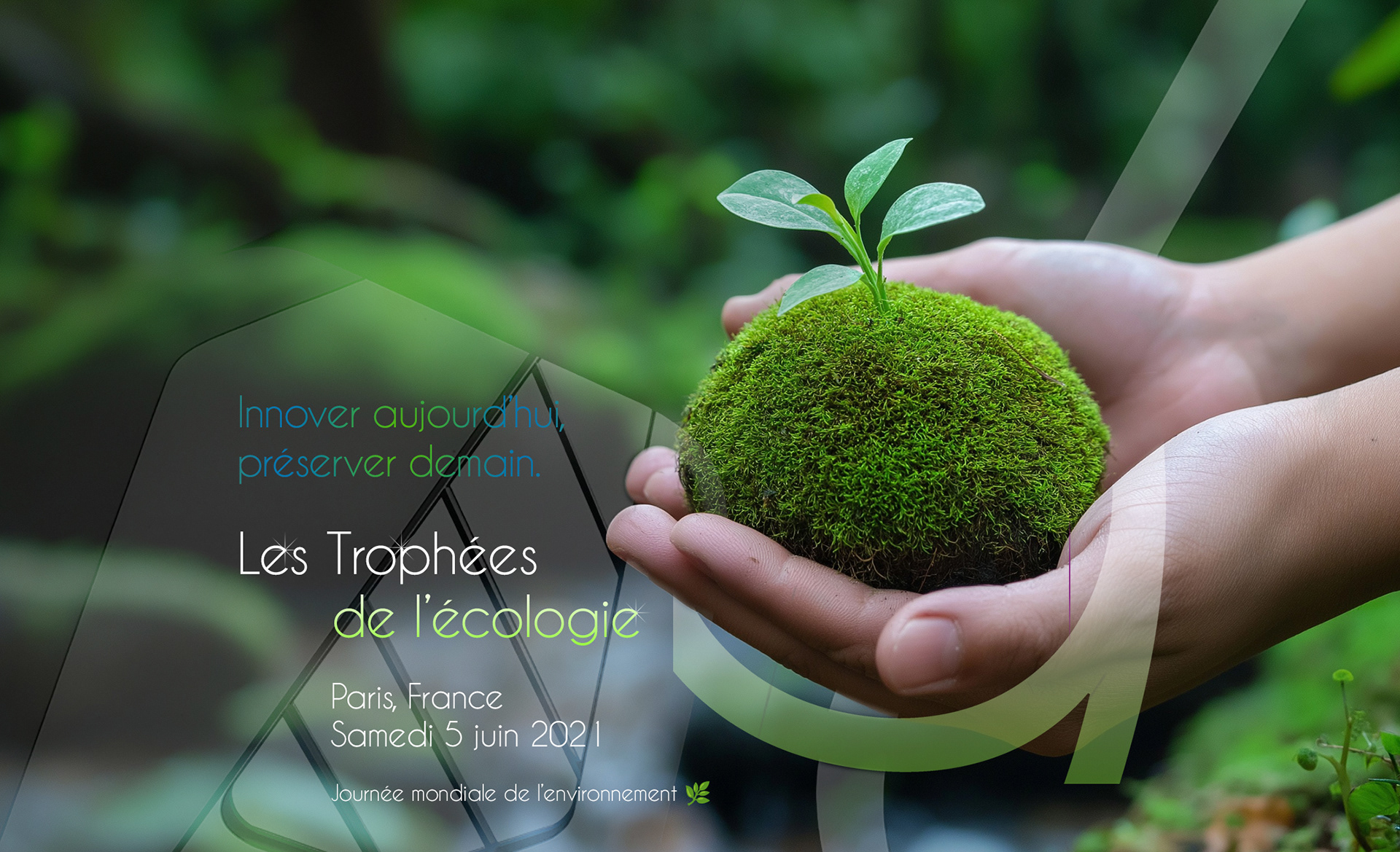
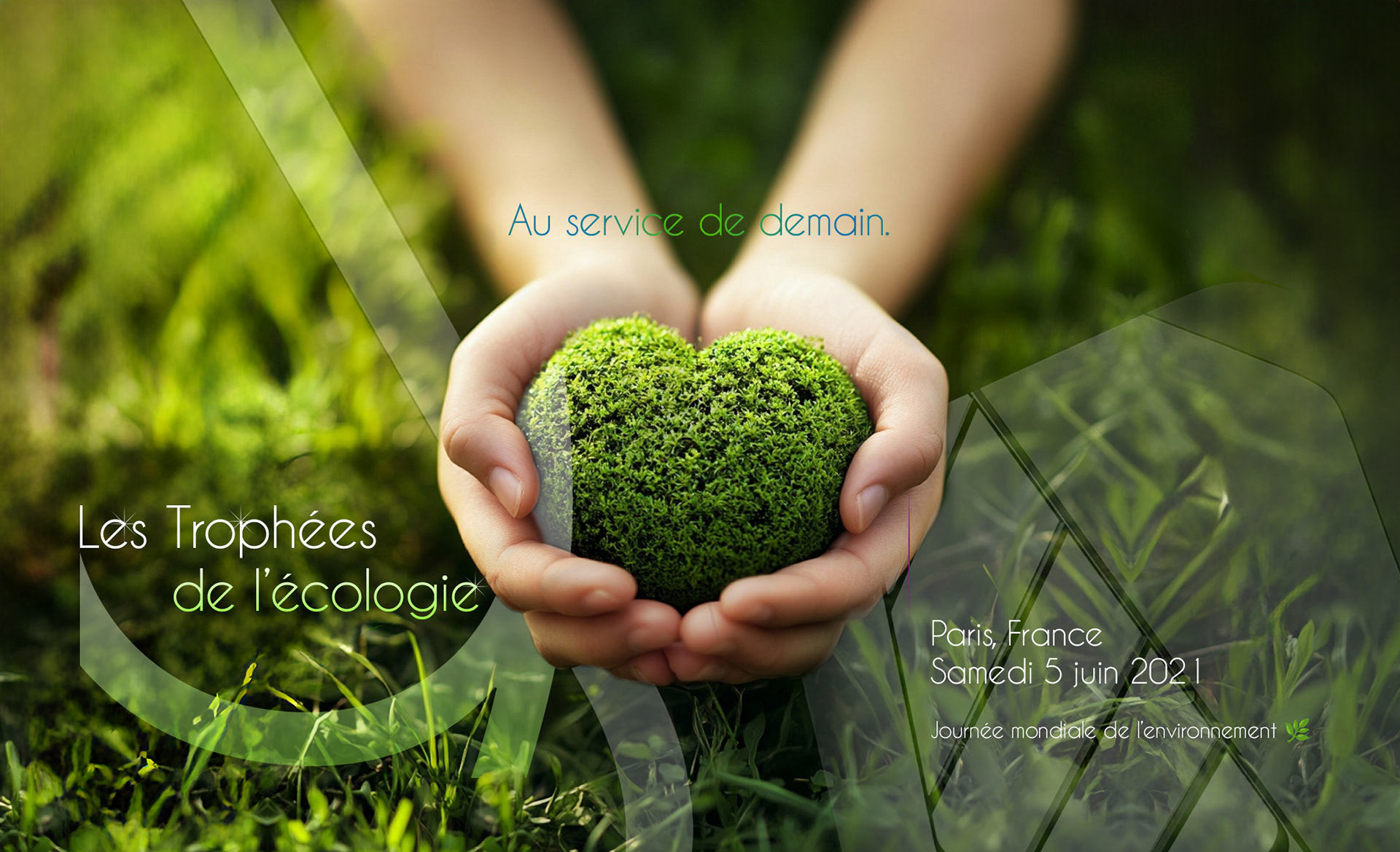
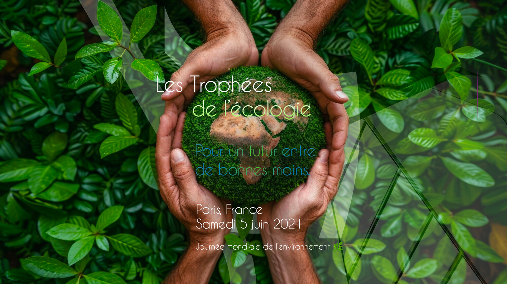
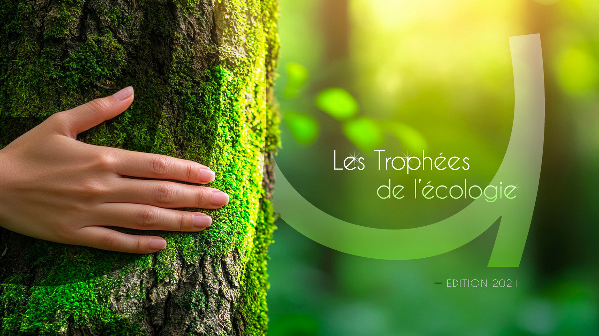
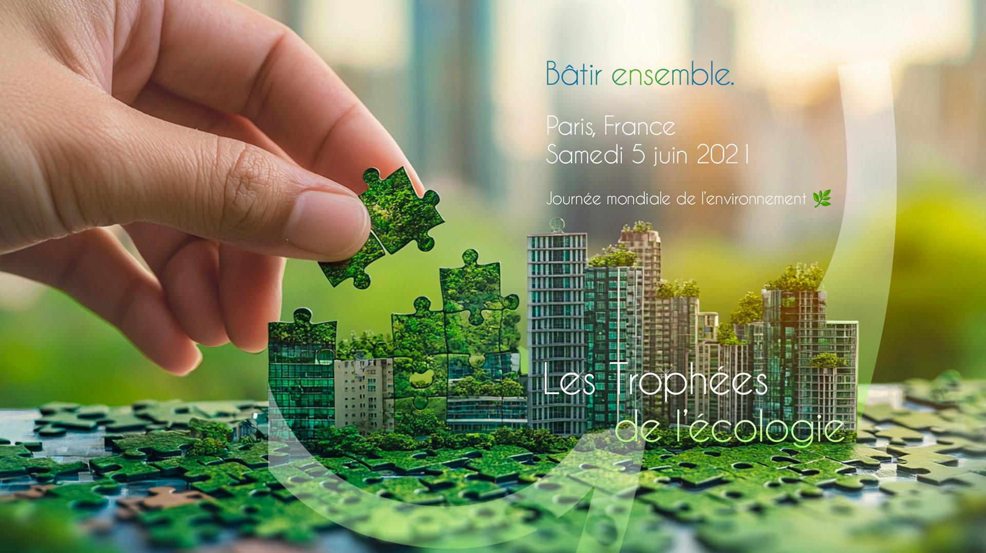
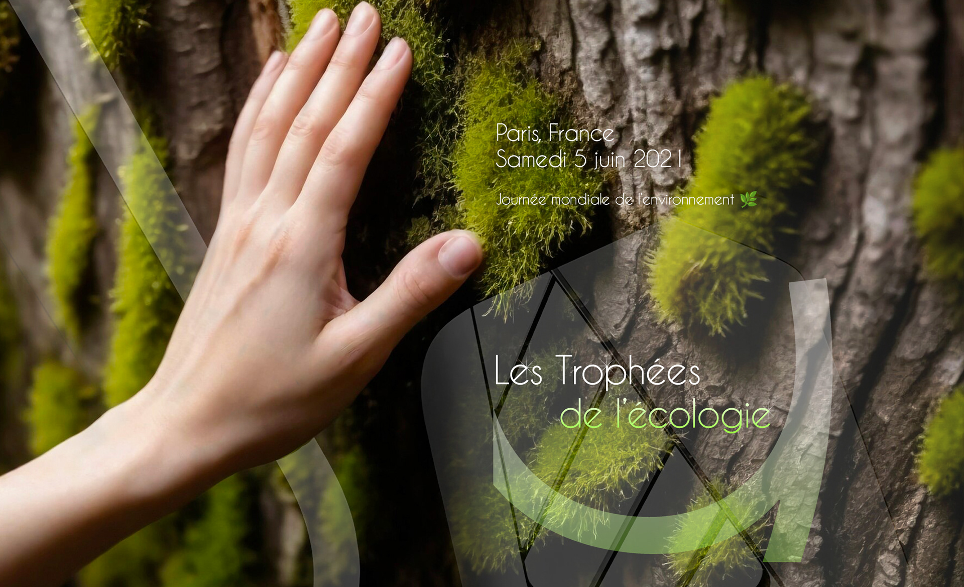
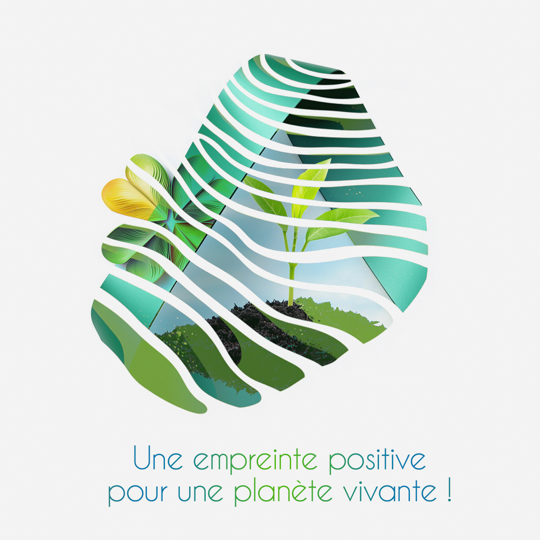
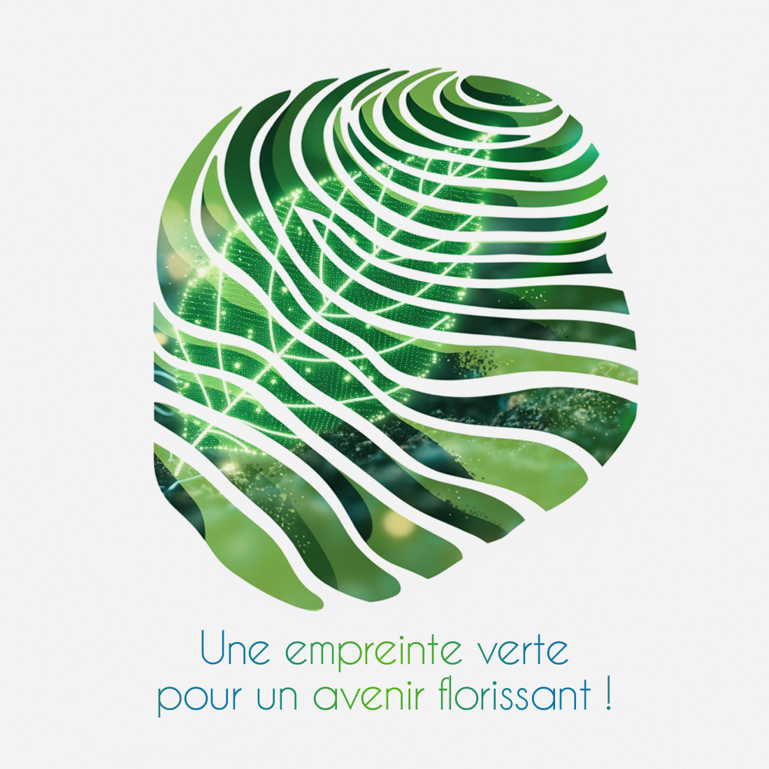
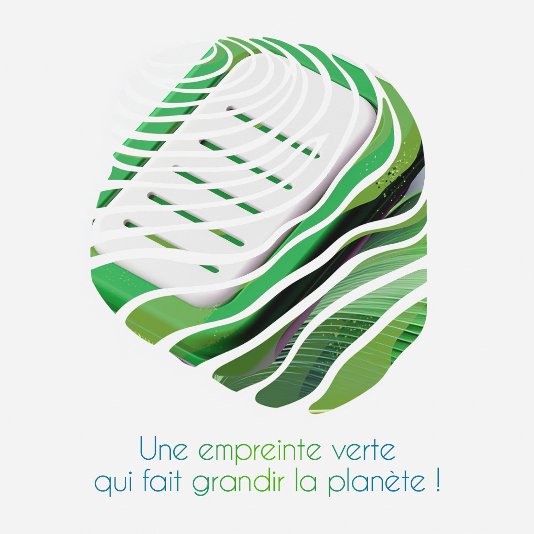
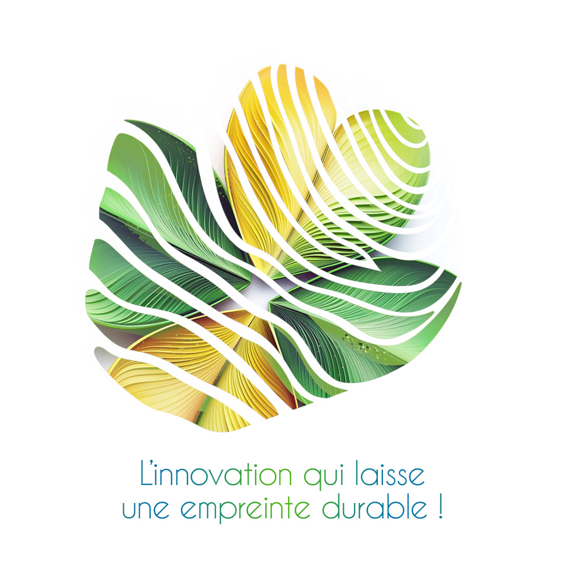
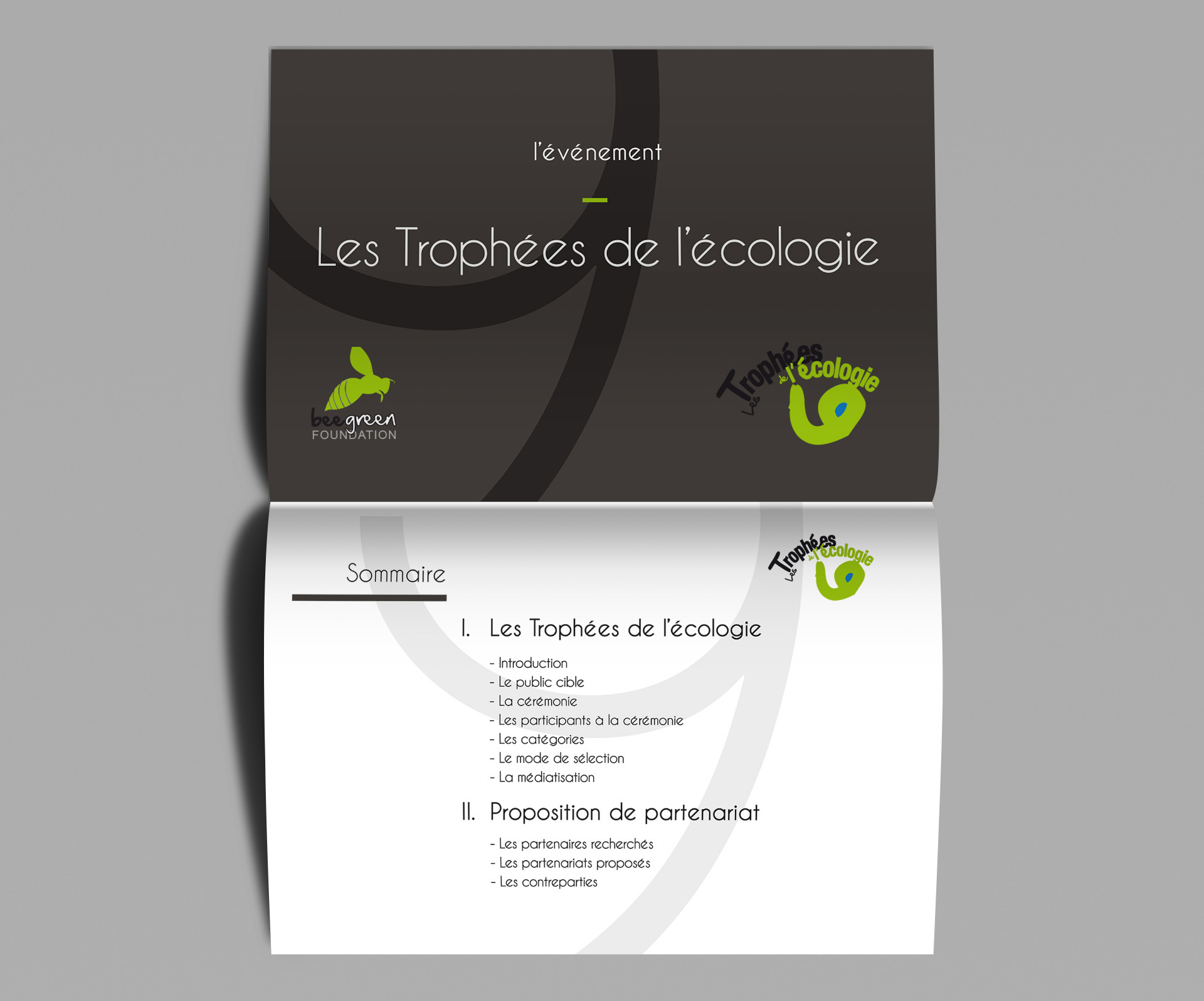
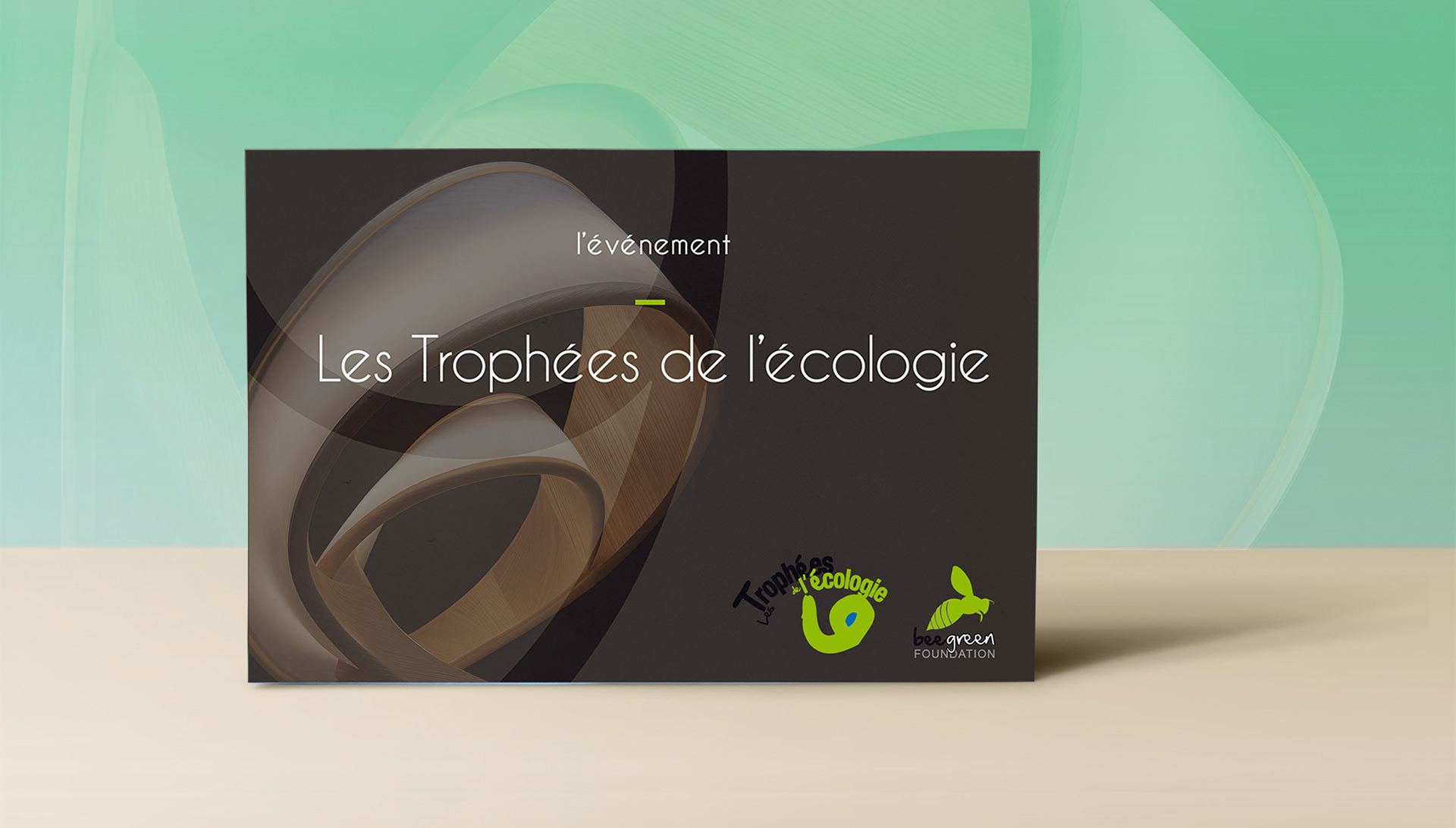
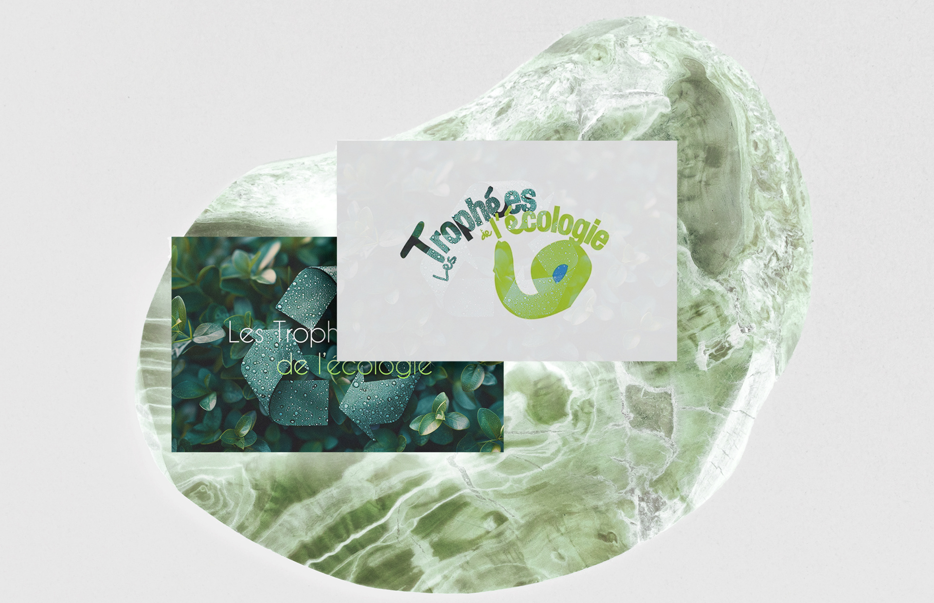
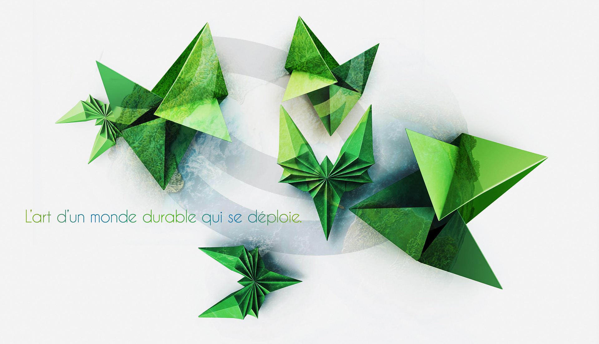
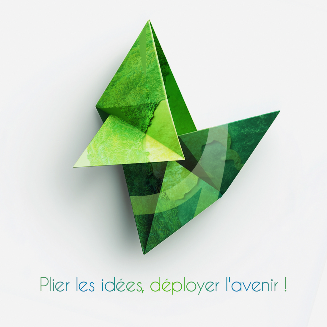
The official logo establishes the core brand narrative, combining dynamic typography and eco-symbolism to express transformation, growth, and environmental action through a memorable, movement-driven mark.
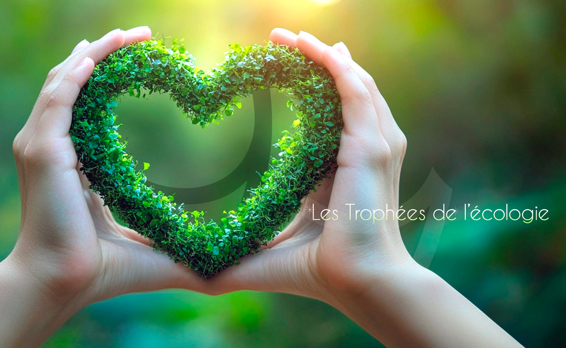
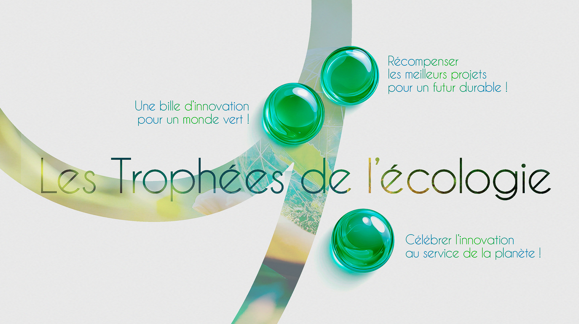
The declination translates the concept into a more structured, typographic system, enhancing legibility, scalability, and long-term adaptability across institutional, digital, and event applications.
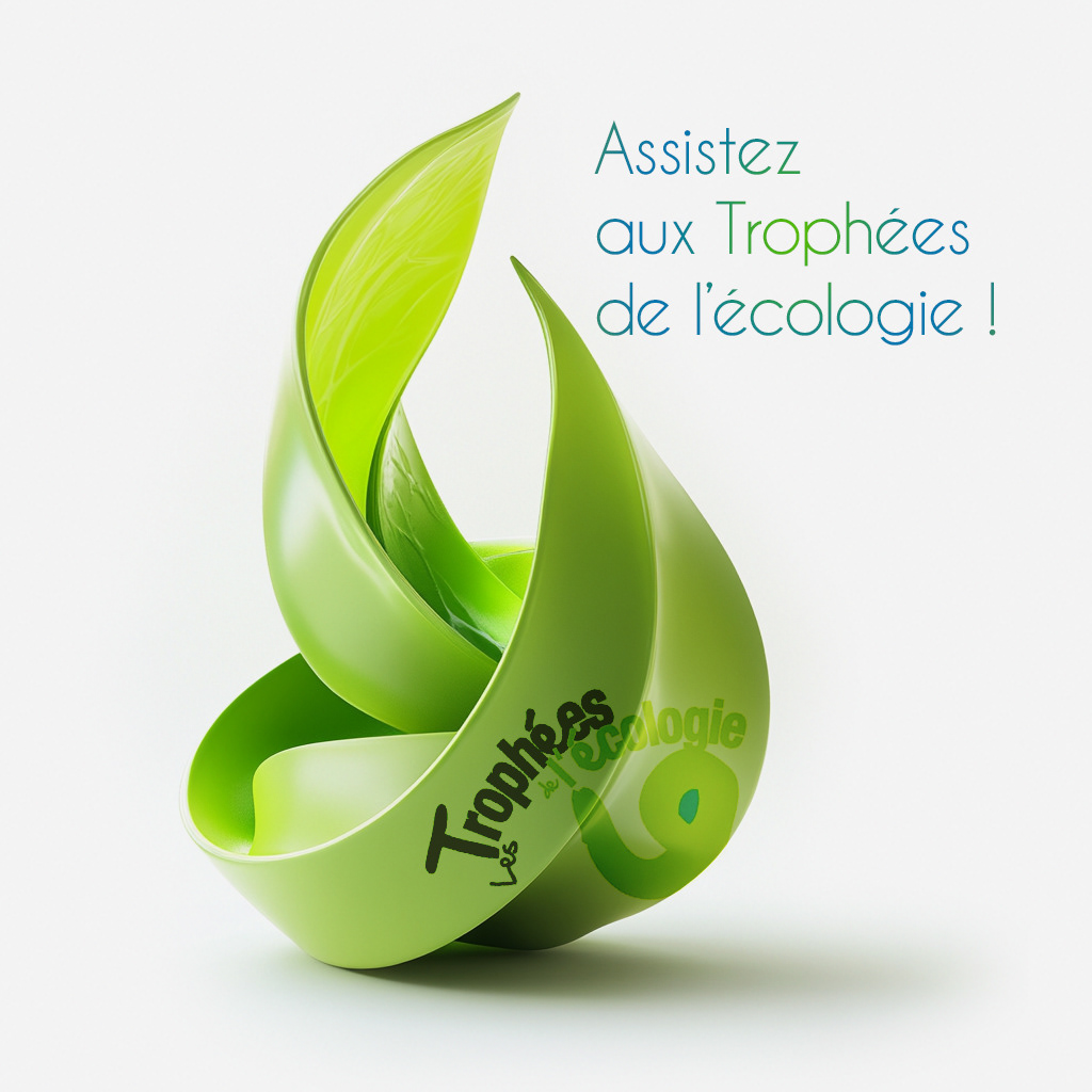

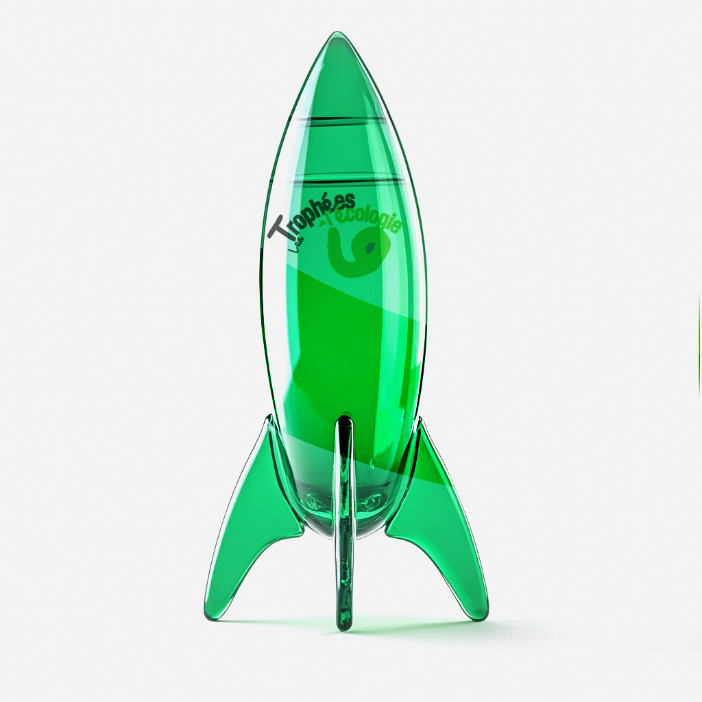








Building a program that needs to be taken seriously?