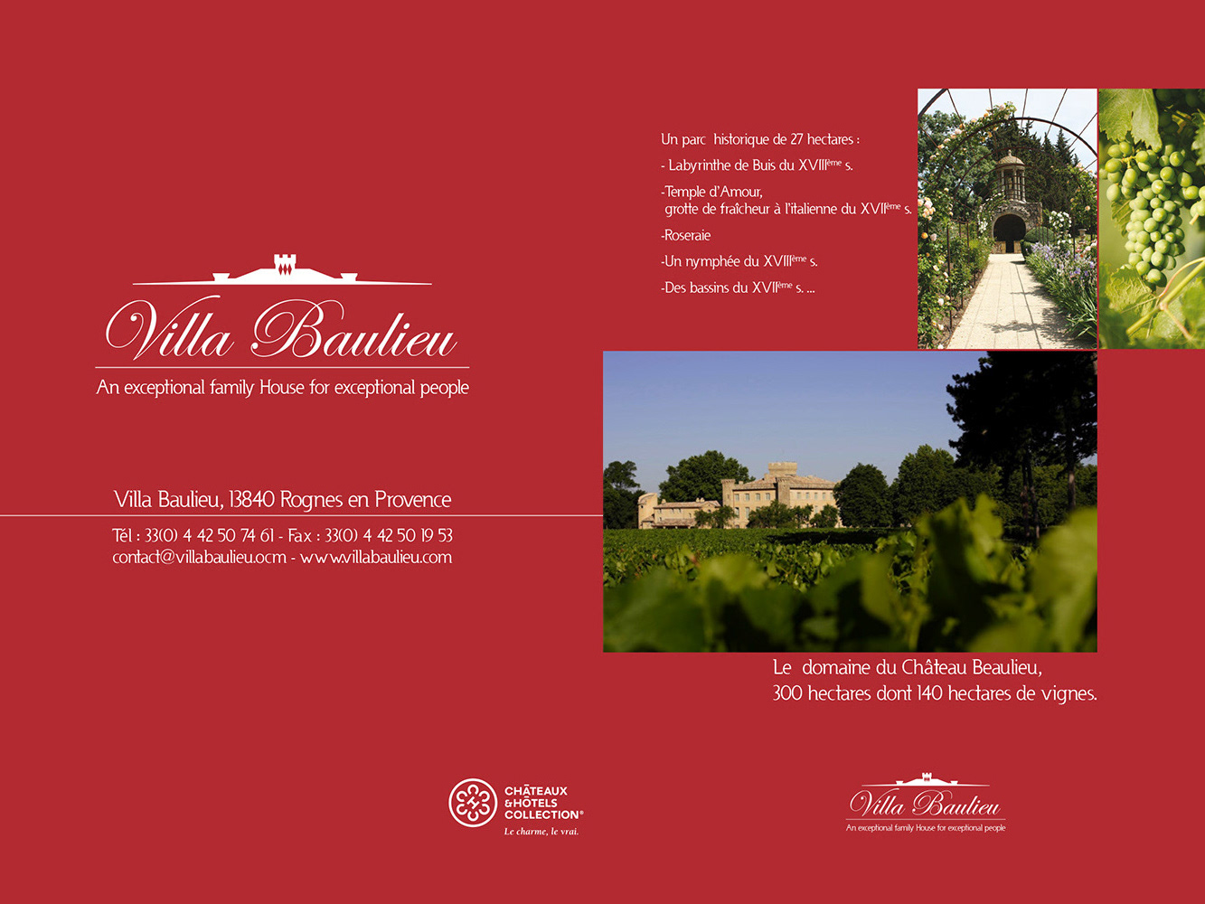
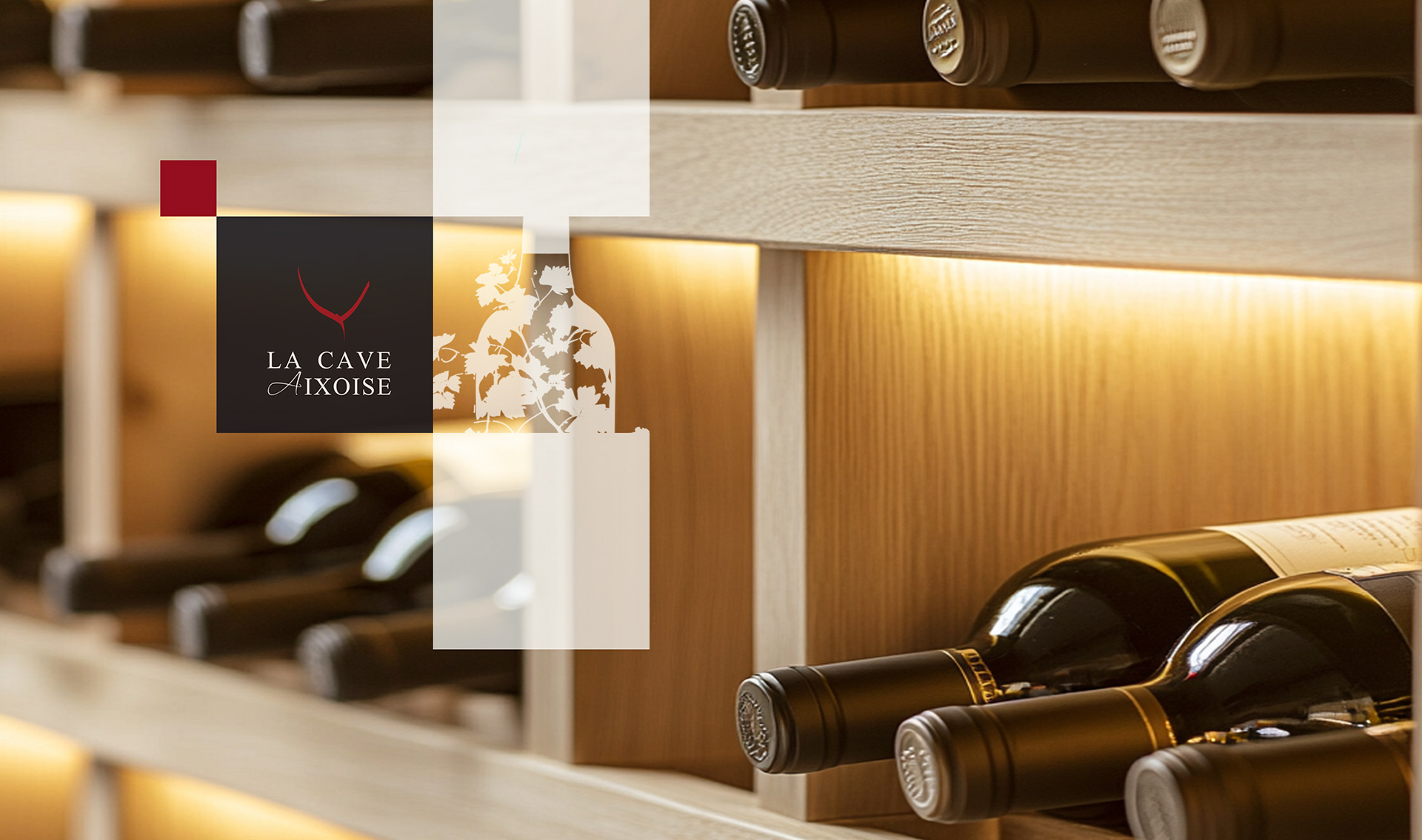
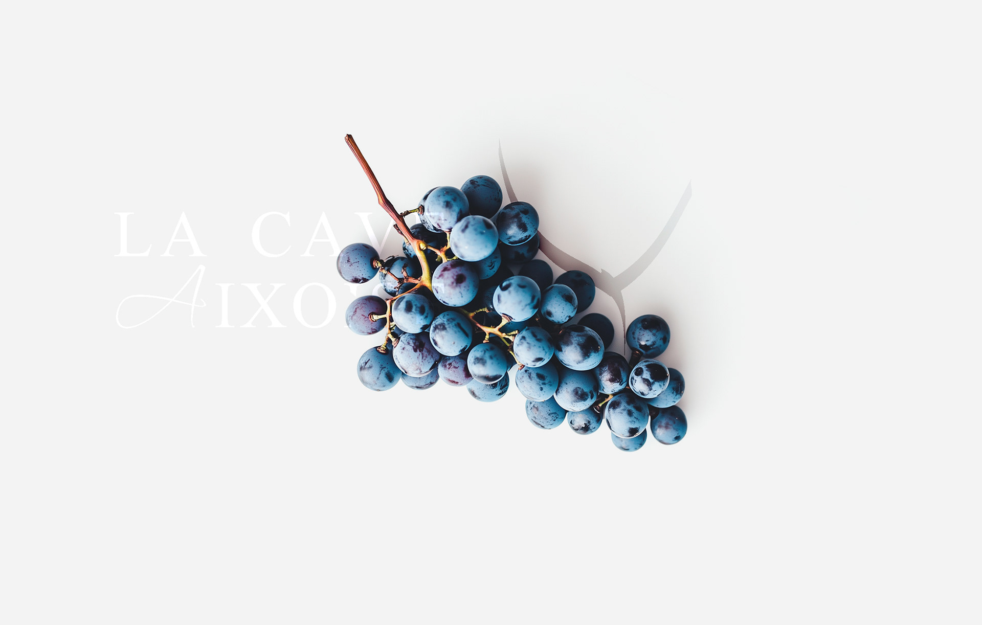
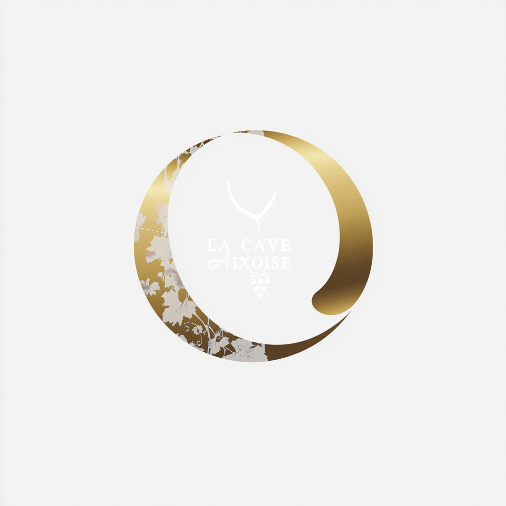
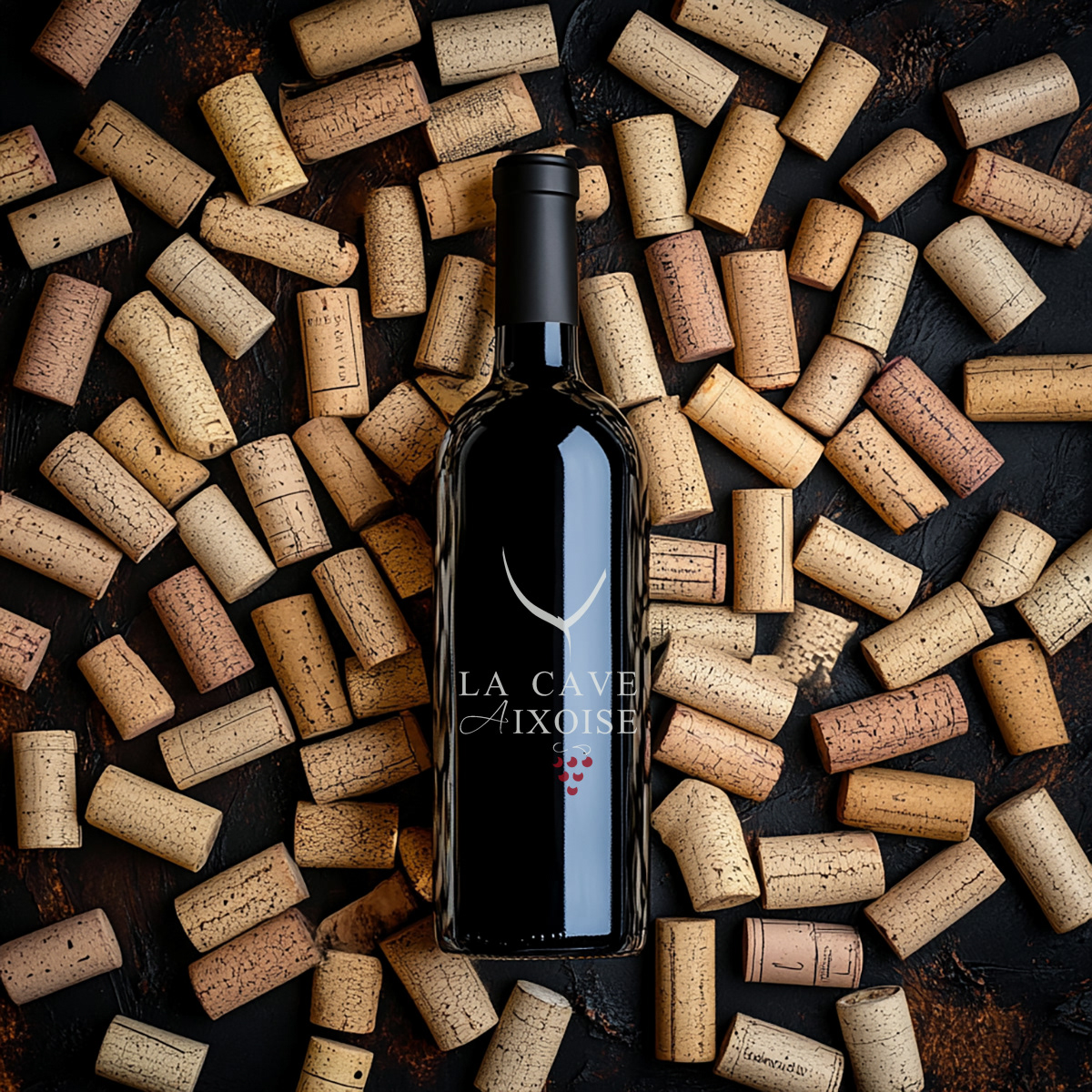
CLIENT ▸ La Cave Aixoise, Aix-en-Provence, France
ROLE ▸ Brand Designer Freelance
SCOPE ▸ Logo Design, Identity Chart, Packaging & Print Design, Retail Design
ROLE ▸ Brand Designer Freelance
SCOPE ▸ Logo Design, Identity Chart, Packaging & Print Design, Retail Design
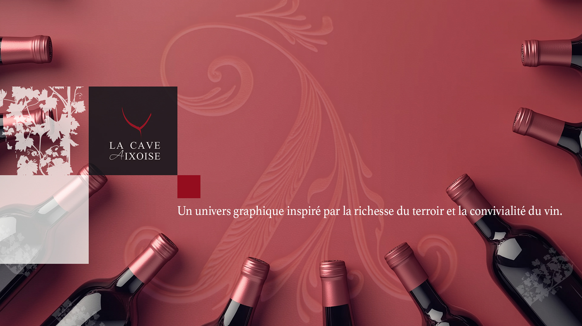
The Challenge
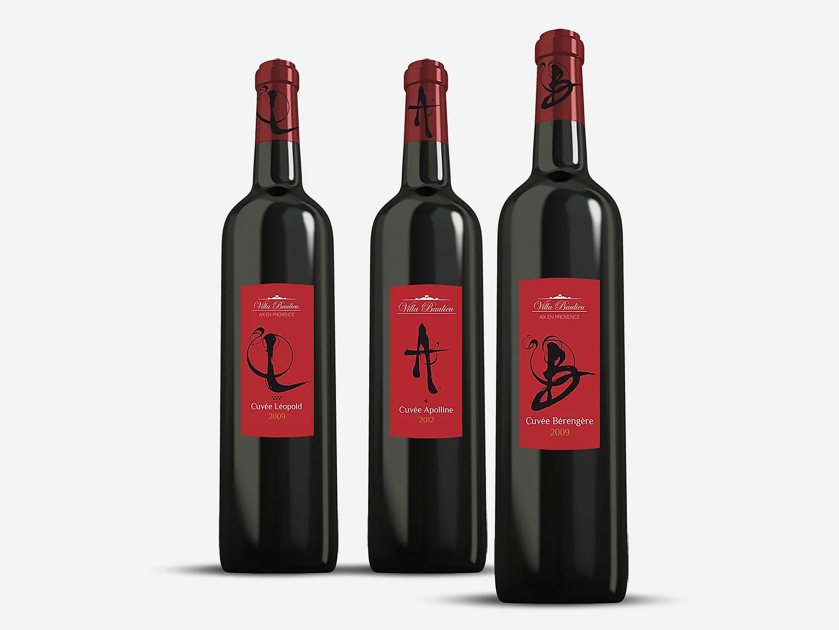
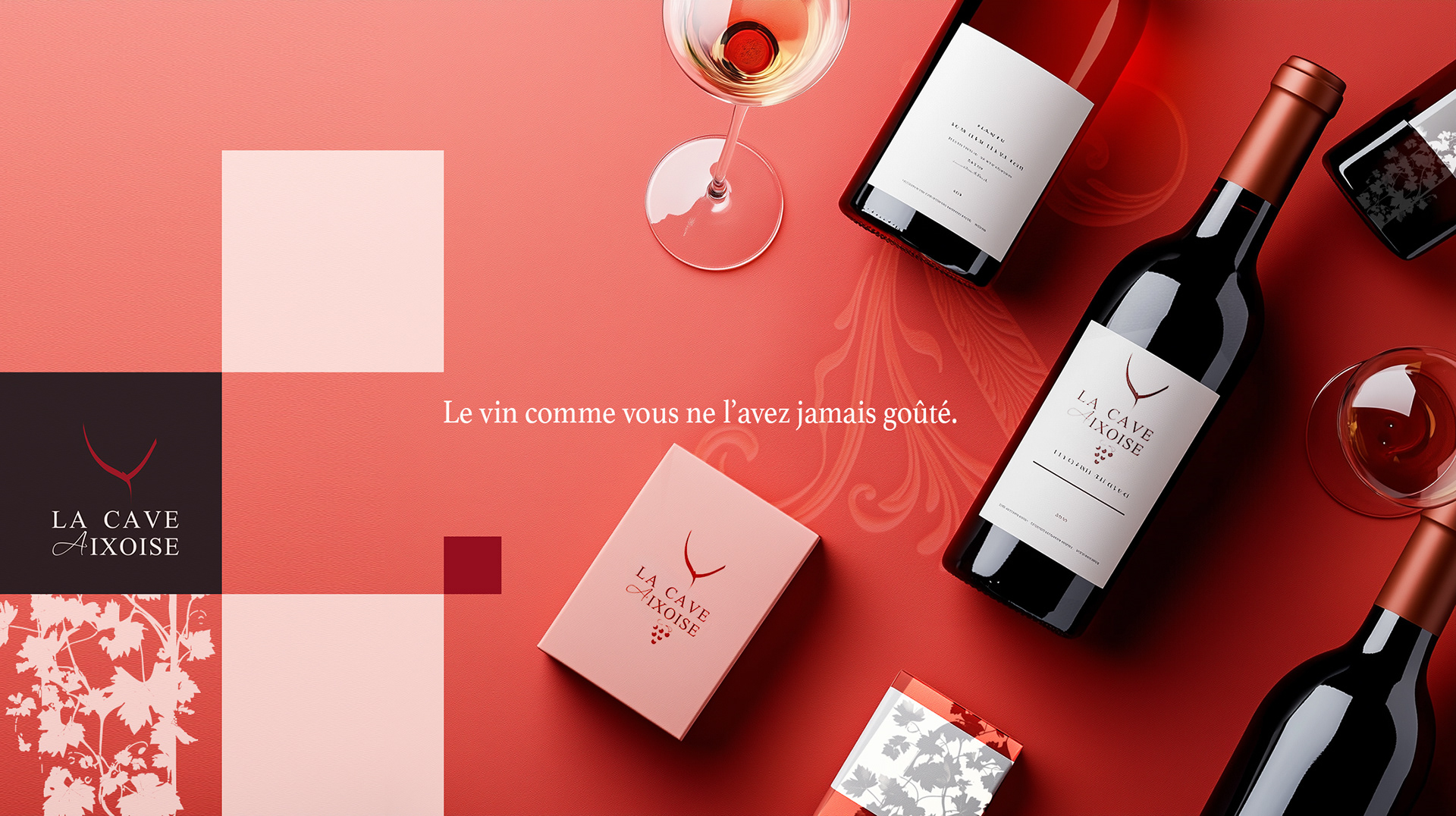
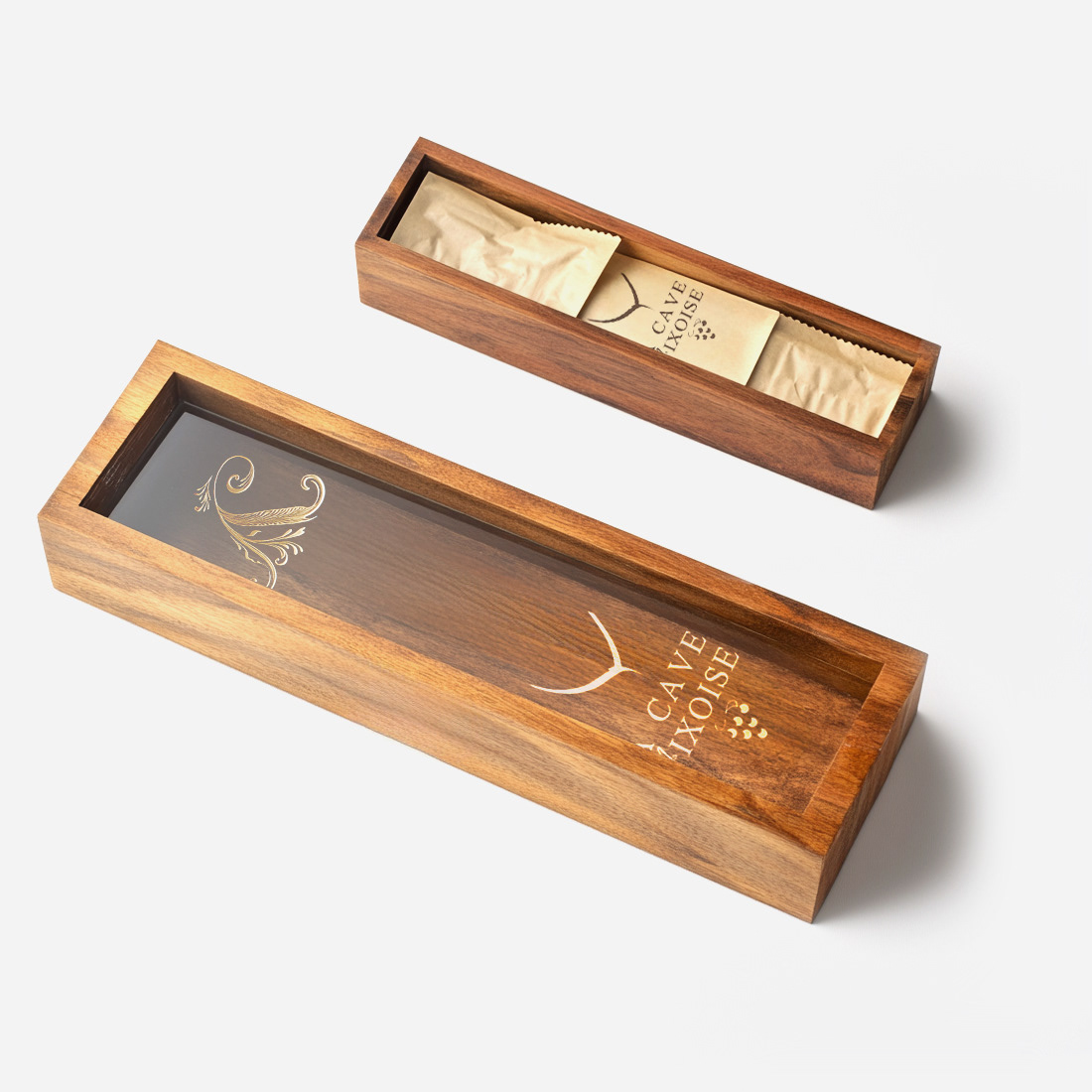
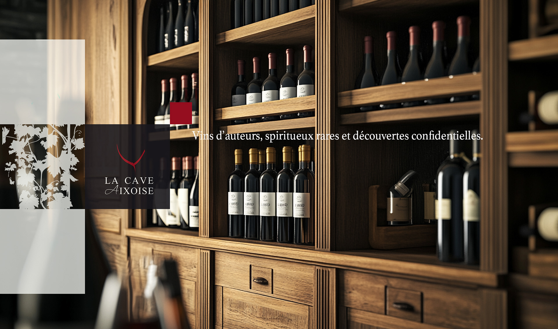
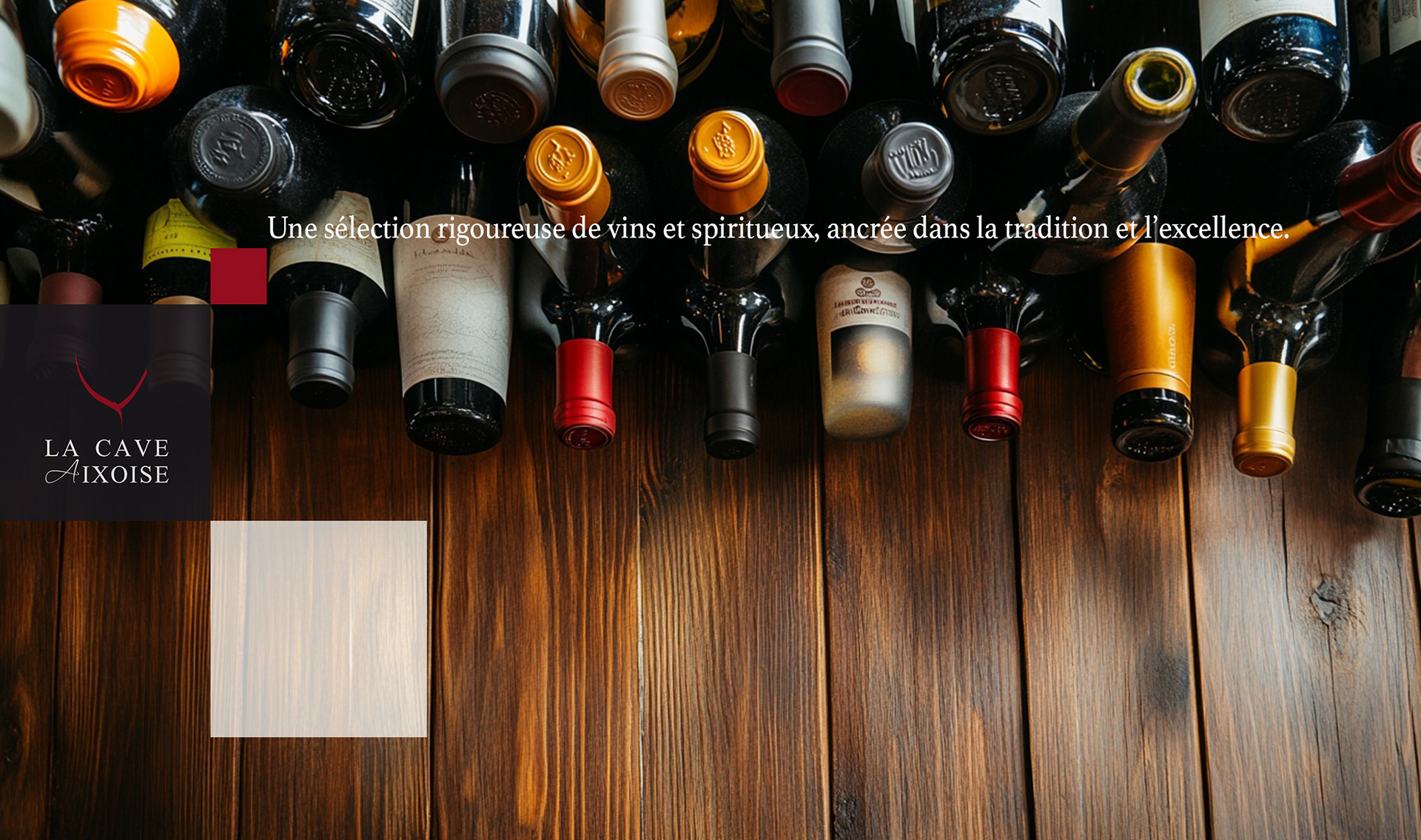
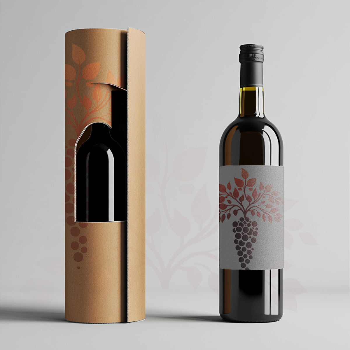
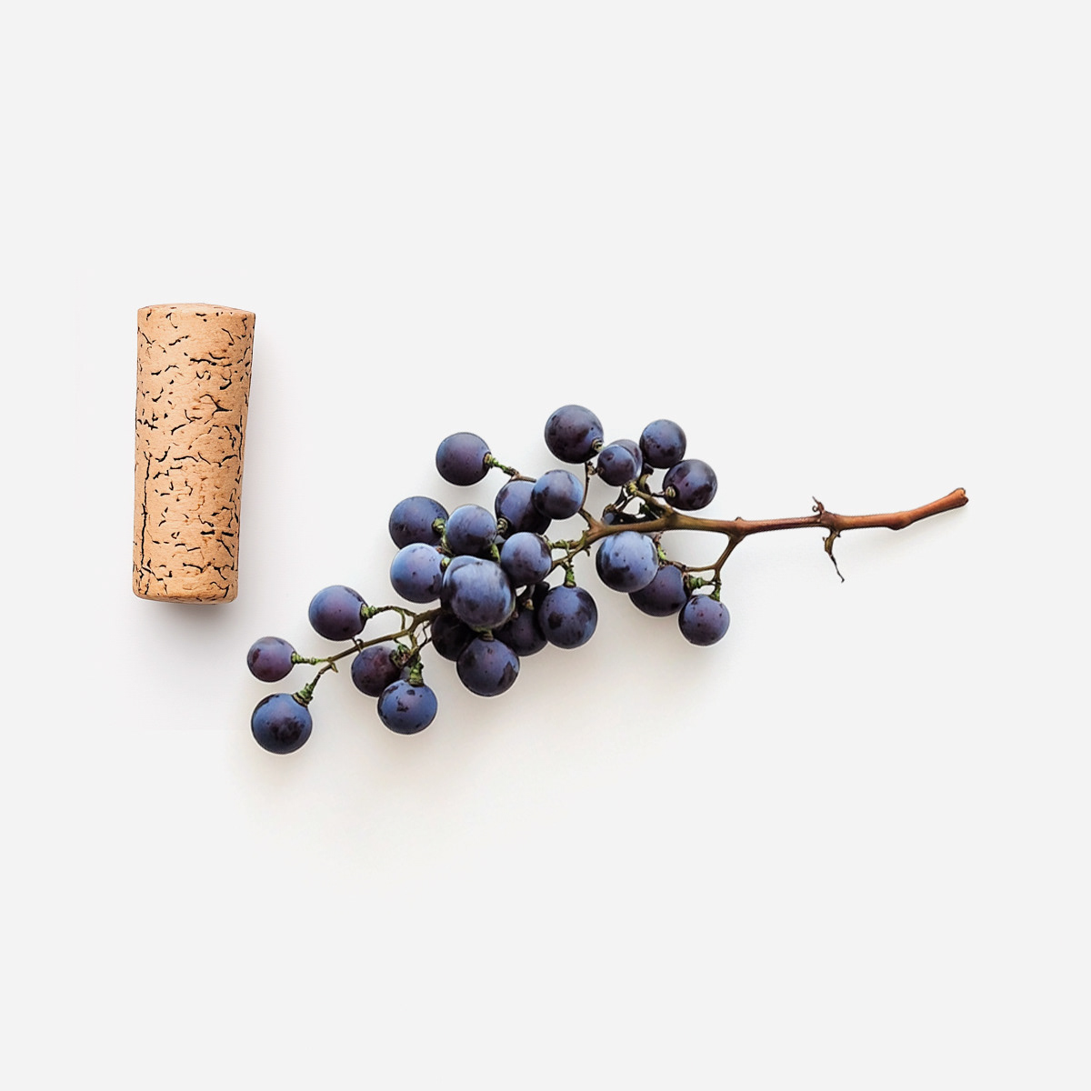
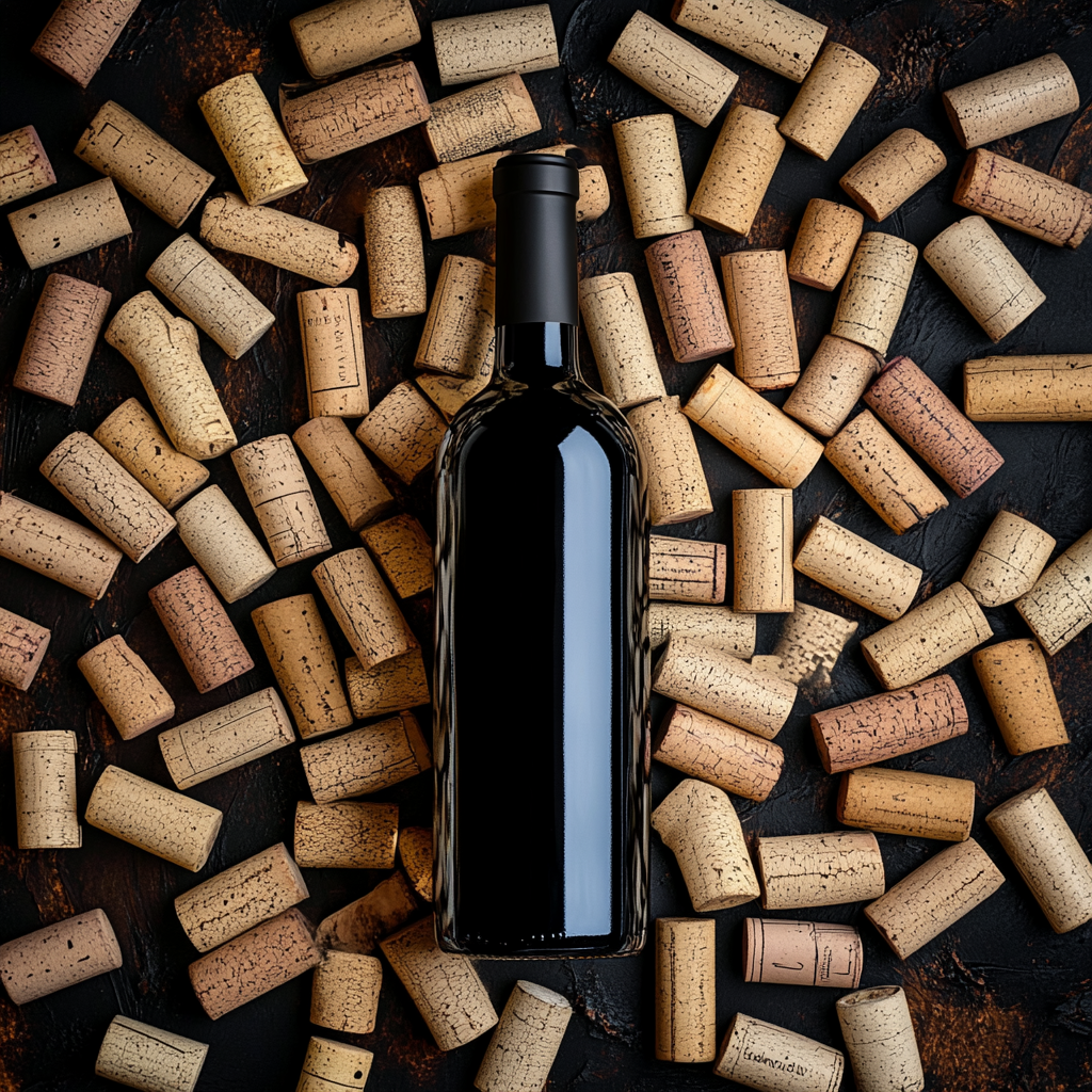
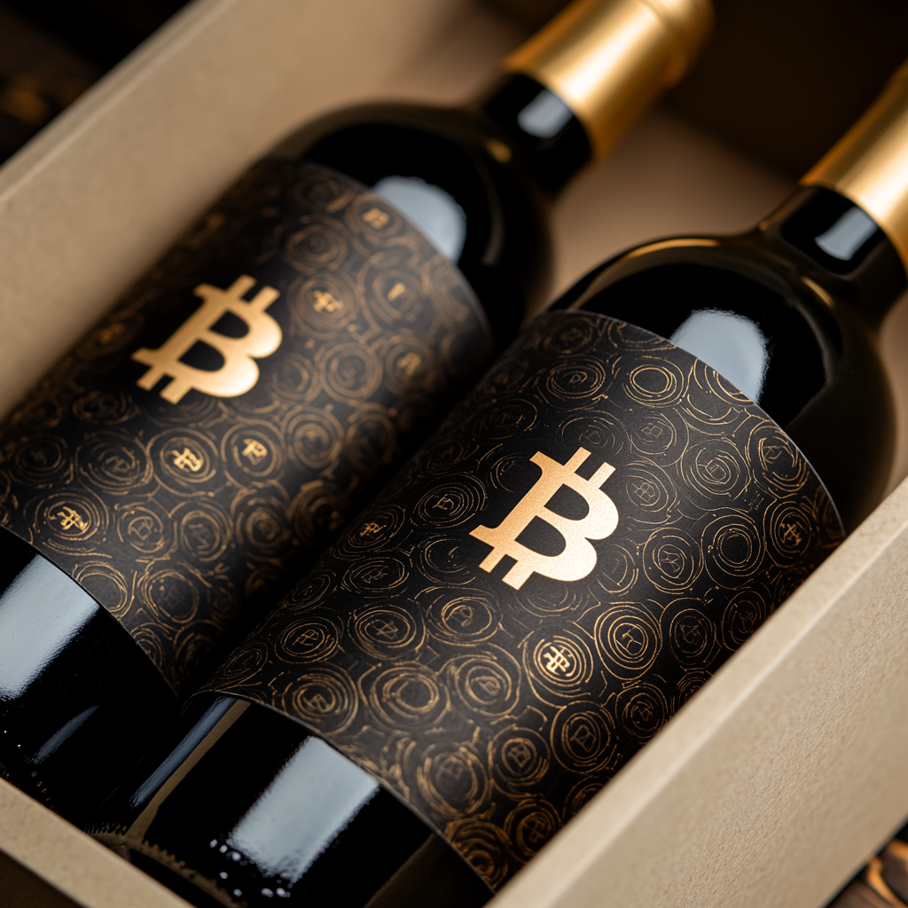
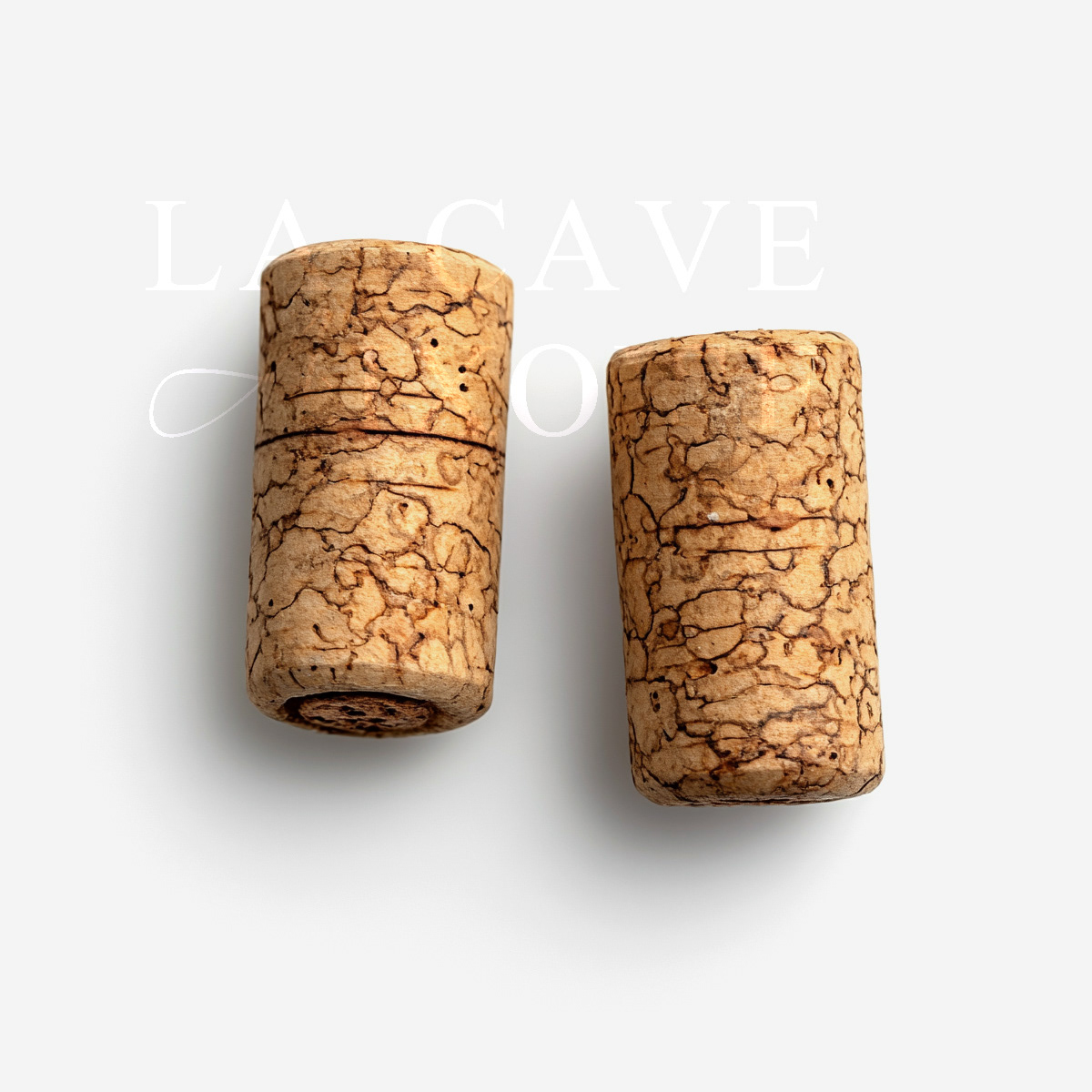
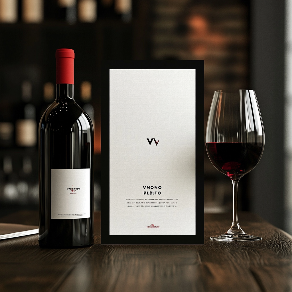
Create a retail-ready wine packaging identity that could stand out on shelf without relying on trends
Balance premium cues with approachability for a broad retail audience
Ensure the system can extend across multiple SKUs while remaining cohesive
Create a retail-ready wine packaging identity that could stand out on shelf without relying on trends
Balance premium cues with approachability for a broad retail audience
Ensure the system can extend across multiple SKUs while remaining cohesive
Strategic Approach
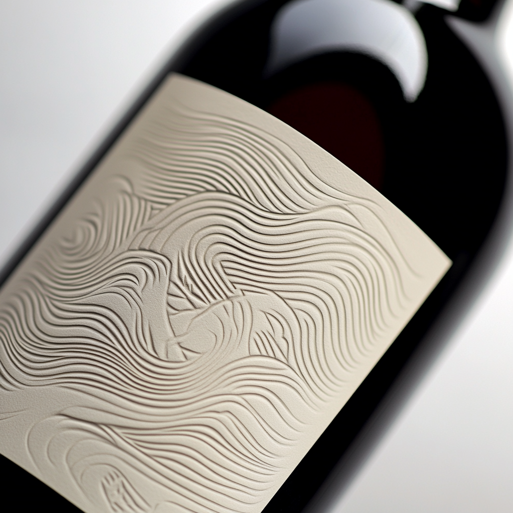
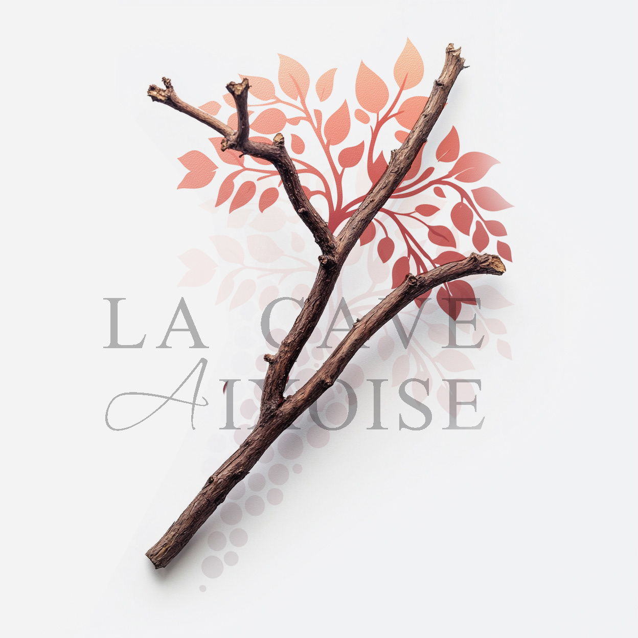
Focused on clarity, typography, and material contrast to establish shelf impact
Designed a packaging language flexible enough to accommodate varietals and future extensions
Prioritized legibility and hierarchy to support fast consumer decision-making at point of sale
Focused on clarity, typography, and material contrast to establish shelf impact
Designed a packaging language flexible enough to accommodate varietals and future extensions
Prioritized legibility and hierarchy to support fast consumer decision-making at point of sale
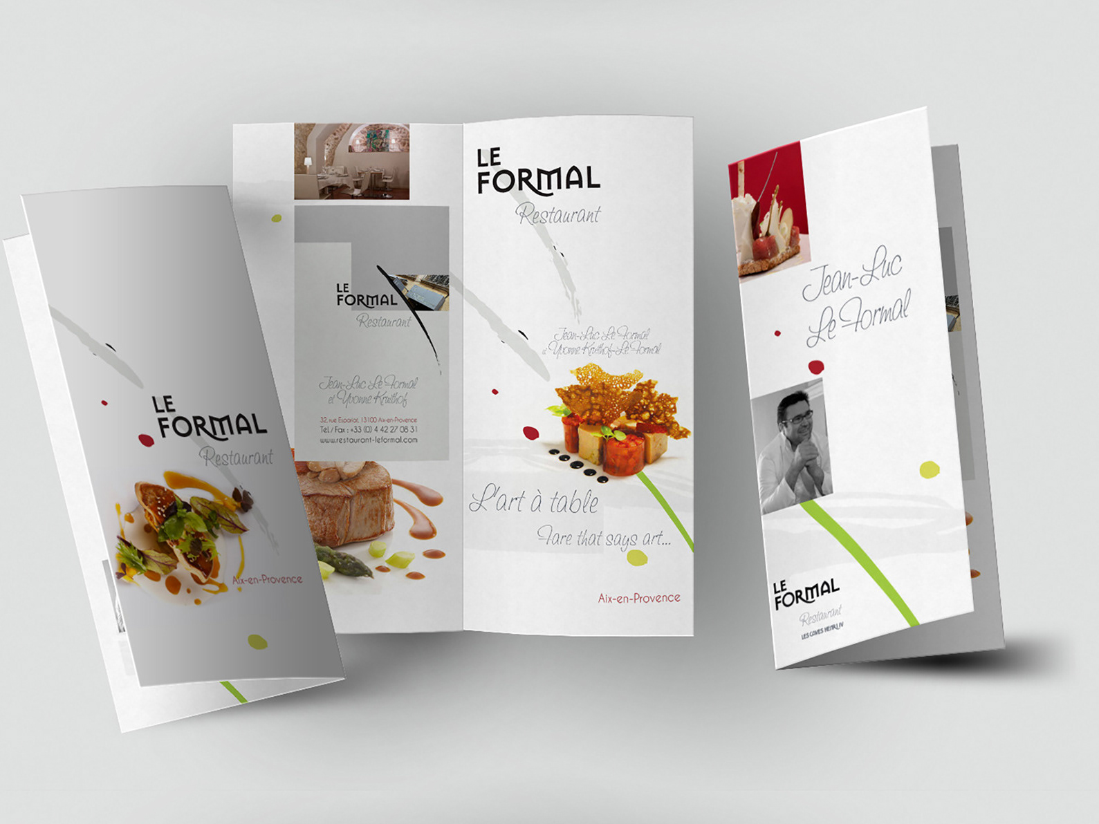
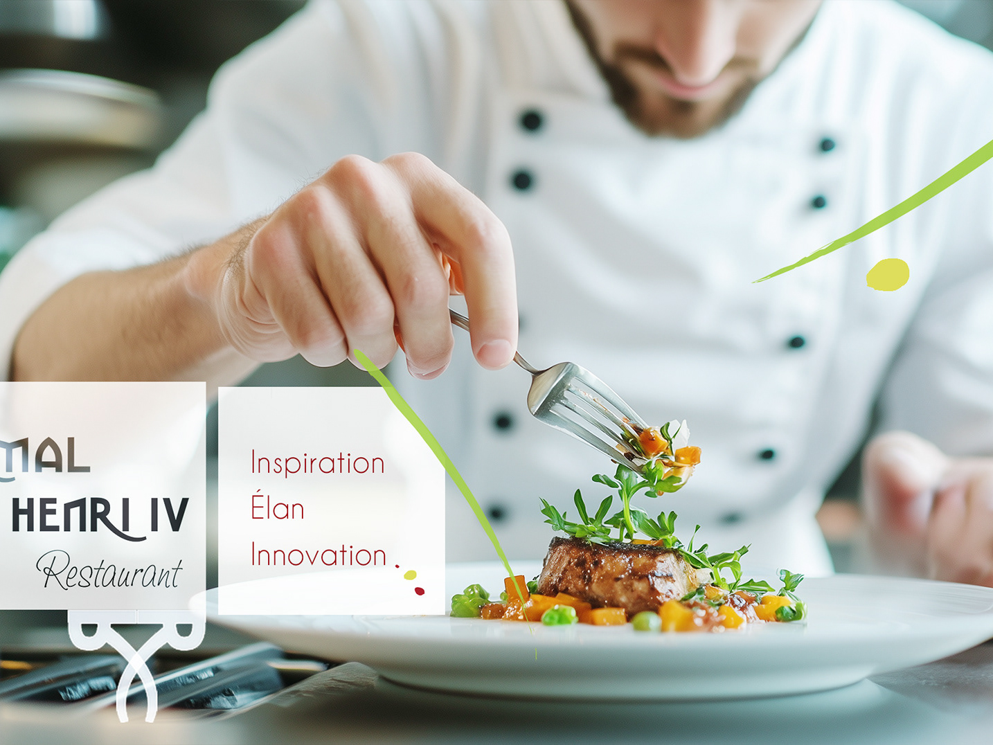
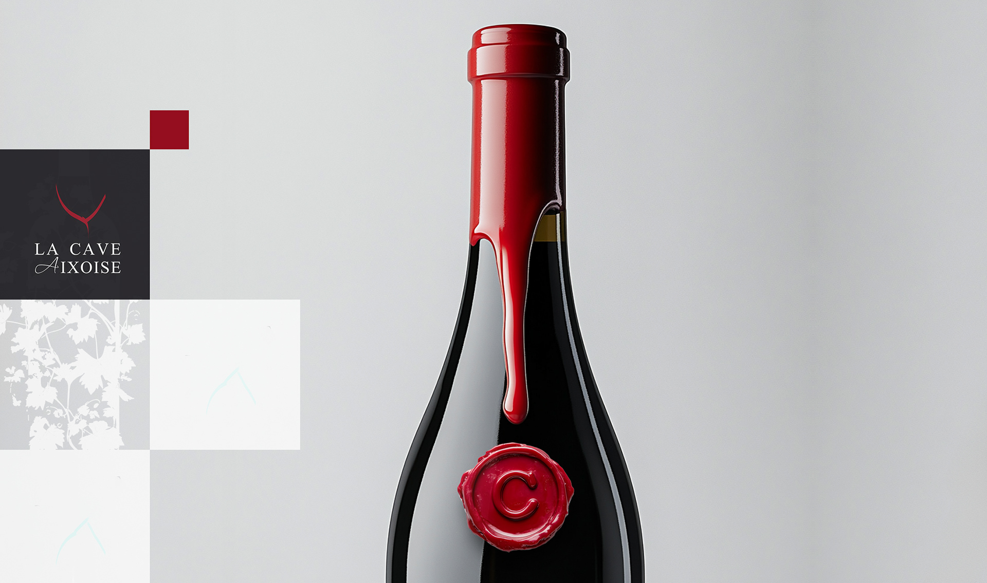
Creative Solution
Define a restaurant identity balancing refinement and approachability
Create a visual language that translated seamlessly across physical and digital contexts
Position the restaurant around craft and intention rather than trend
Define a restaurant identity balancing refinement and approachability
Create a visual language that translated seamlessly across physical and digital contexts
Position the restaurant around craft and intention rather than trend
Scope & System
Define a restaurant identity balancing refinement and approachability
Create a visual language that translated seamlessly across physical and digital contexts
Position the restaurant around craft and intention rather than trend
Define a restaurant identity balancing refinement and approachability
Create a visual language that translated seamlessly across physical and digital contexts
Position the restaurant around craft and intention rather than trend
Key Results
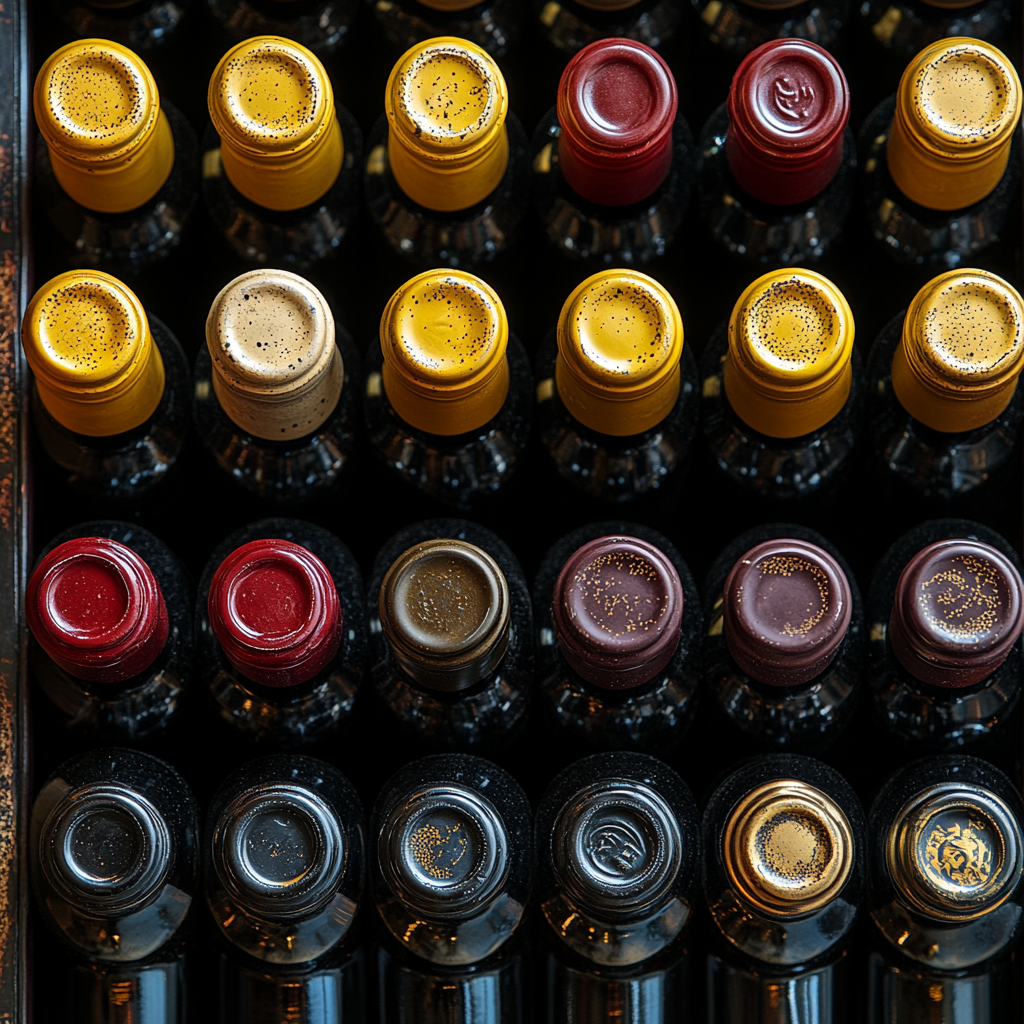
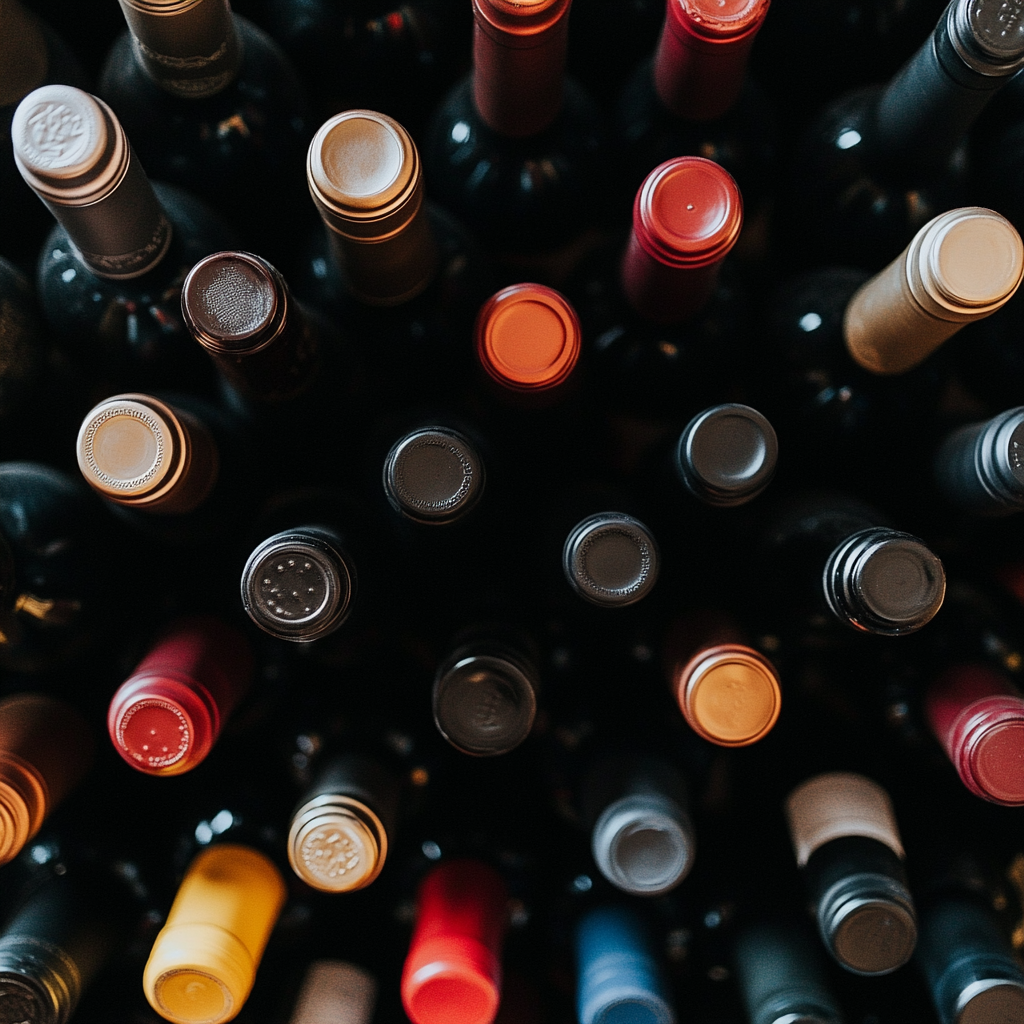
Established a clear, recognizable shelf presence within a competitive retail category
Enabled consistent brand expression across multiple products
Delivered a scalable packaging system supporting future line extensions
Established a clear, recognizable shelf presence within a competitive retail category
Enabled consistent brand expression across multiple products
Delivered a scalable packaging system supporting future line extensions
Impact & Performance
Improved shelf visibility through disciplined hierarchy and contrast
Reduced design friction for new SKUs by establishing a repeatable system
Supported brand recognition across retail environment
Improved shelf visibility through disciplined hierarchy and contrast
Reduced design friction for new SKUs by establishing a repeatable system
Supported brand recognition across retail environment
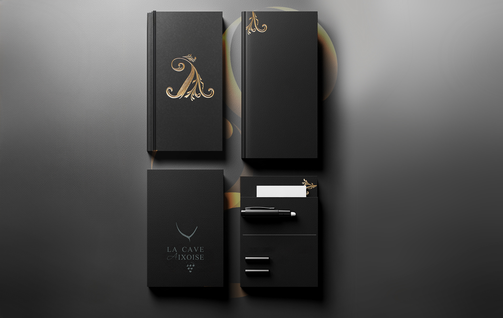
Deliverables
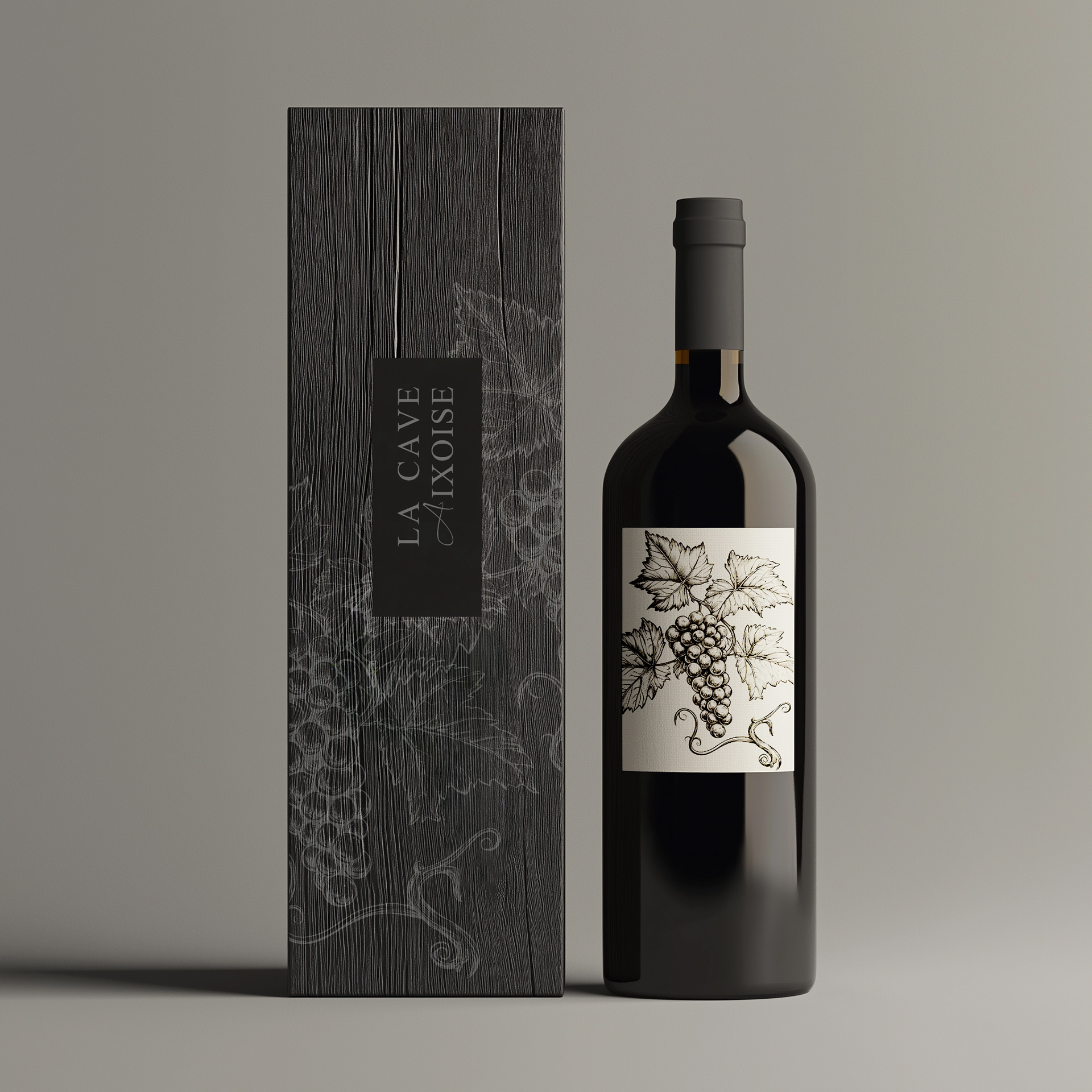
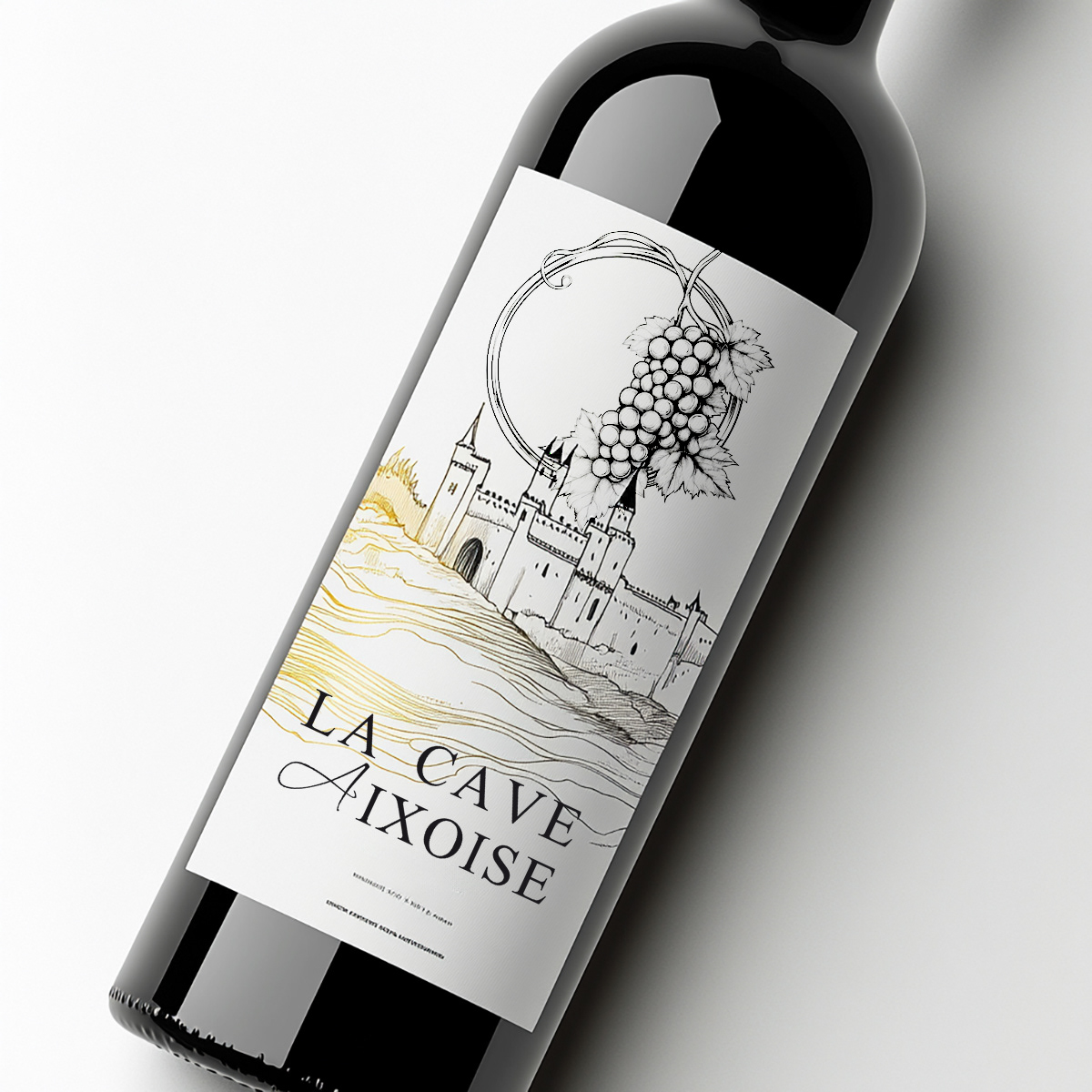
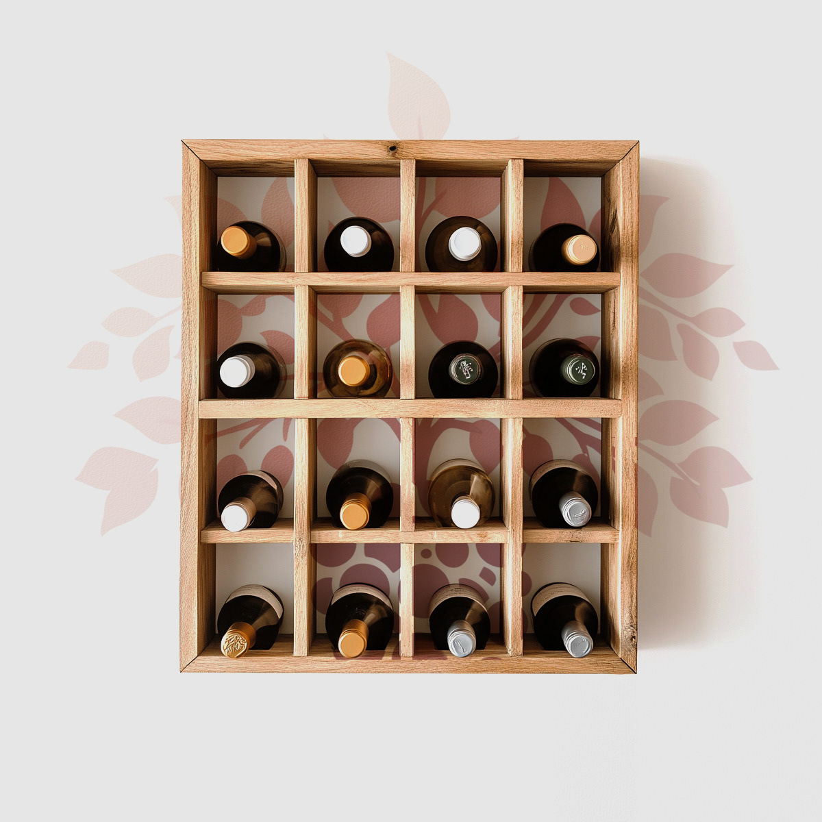
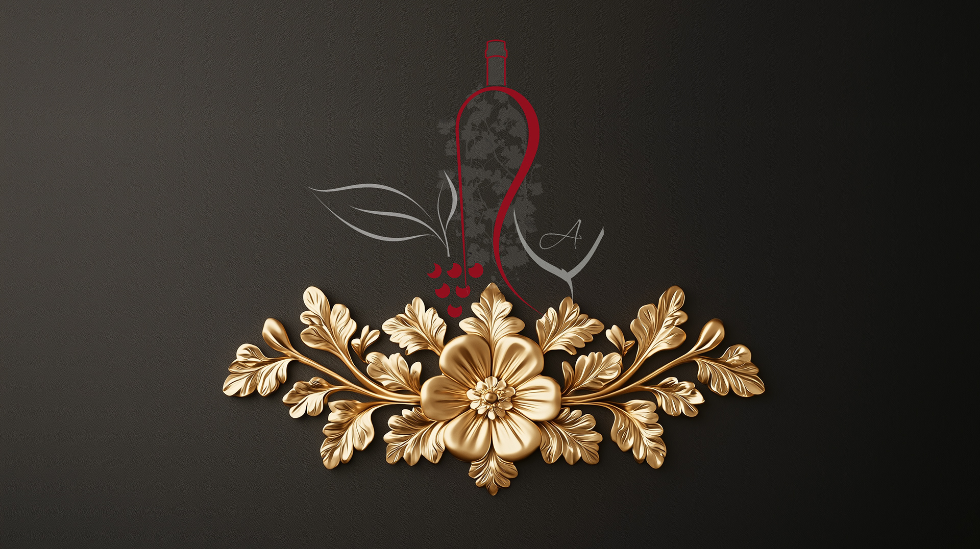
Core packaging design system adaptable across multiple wine SKUs
Label layouts defining typographic hierarchy and visual rhythm
Production-ready files aligned with retail and print requirements
Core packaging design system adaptable across multiple wine SKUs
Label layouts defining typographic hierarchy and visual rhythm
Production-ready files aligned with retail and print requirements
Role & Leadership
Led packaging design and visual direction from concept through production
Defined the packaging system logic to ensure consistency across SKUs
Collaborated with stakeholders to align brand positioning, retail constraints, and execution
Led packaging design and visual direction from concept through production
Defined the packaging system logic to ensure consistency across SKUs
Collaborated with stakeholders to align brand positioning, retail constraints, and execution
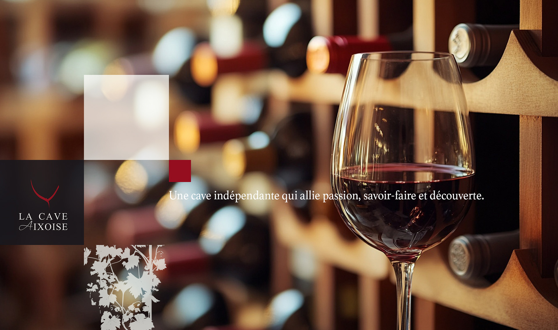
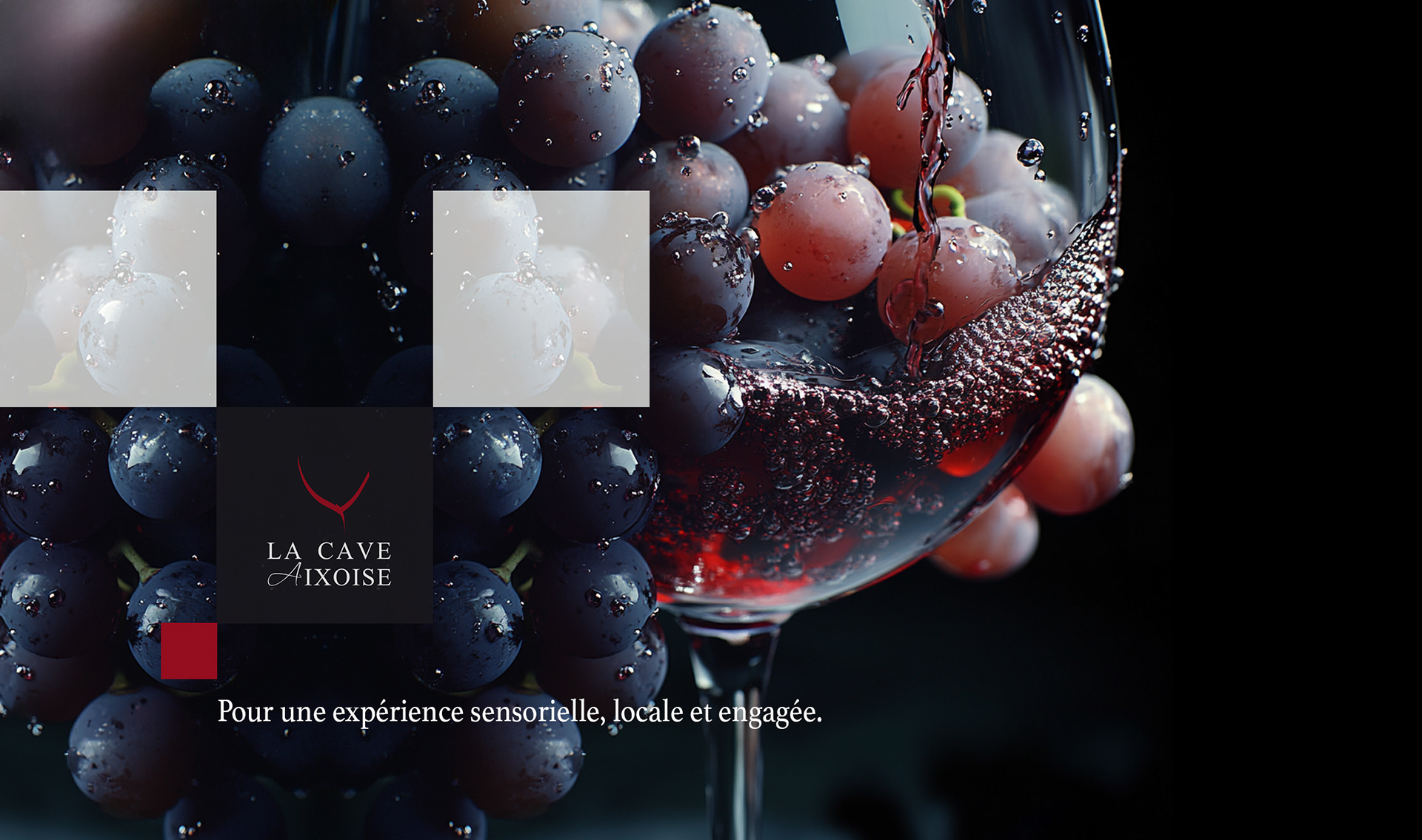
Why This Works Matters
In retail wine, packaging often defines the first interaction with the brand.
Clear visual systems help consumers quickly navigate crowded shelves, while a system-based approach ensures consistency as product lines expand.
In retail wine, packaging often defines the first interaction with the brand.
Clear visual systems help consumers quickly navigate crowded shelves, while a system-based approach ensures consistency as product lines expand.
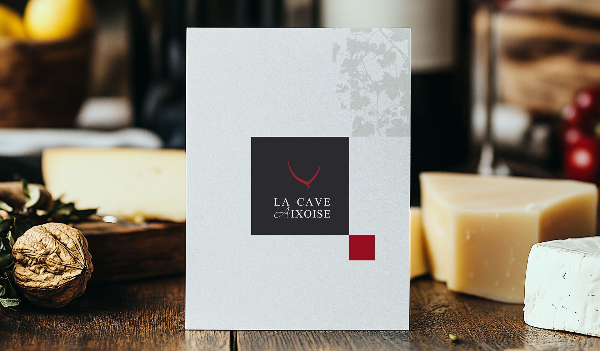
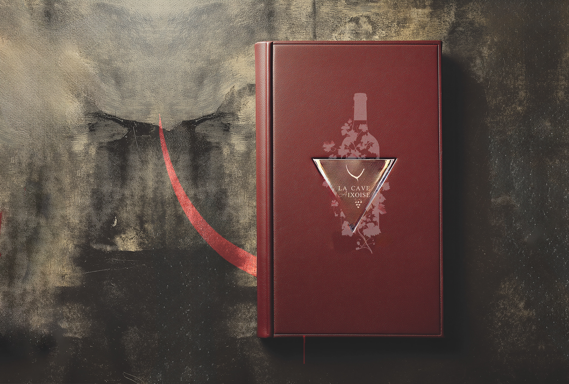
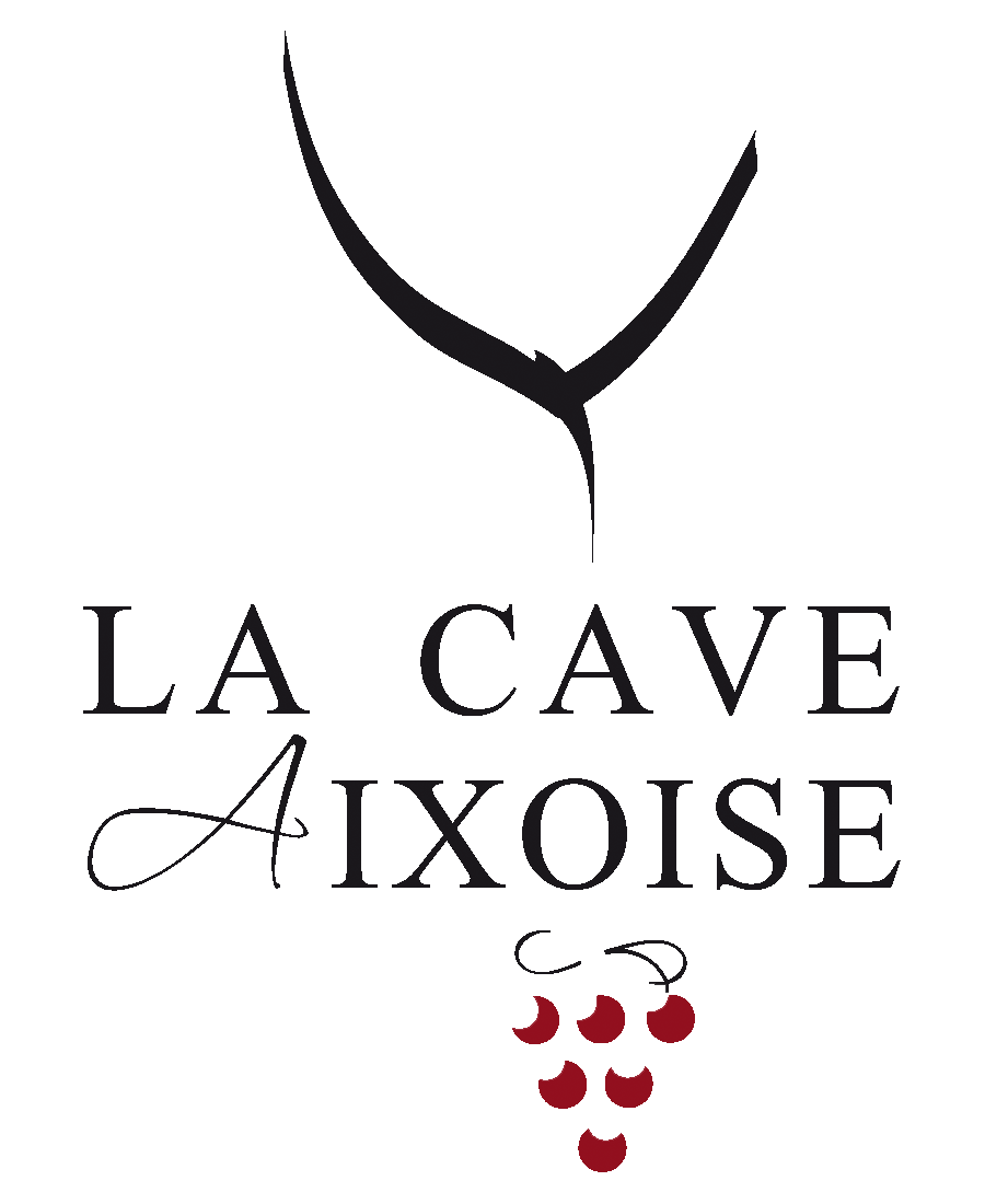
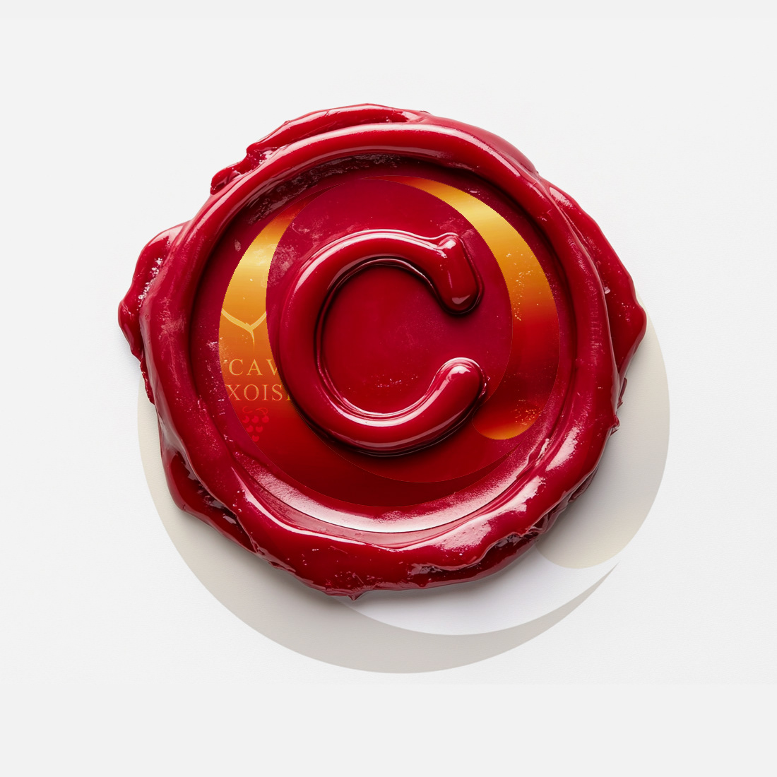
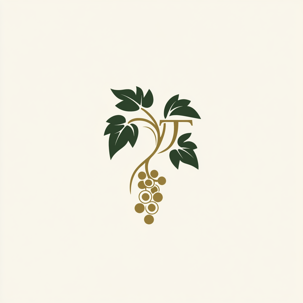
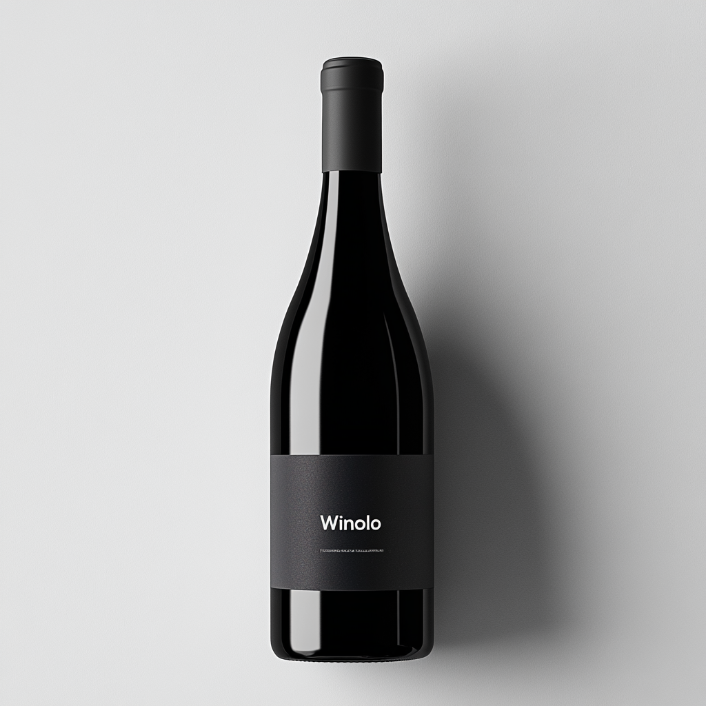
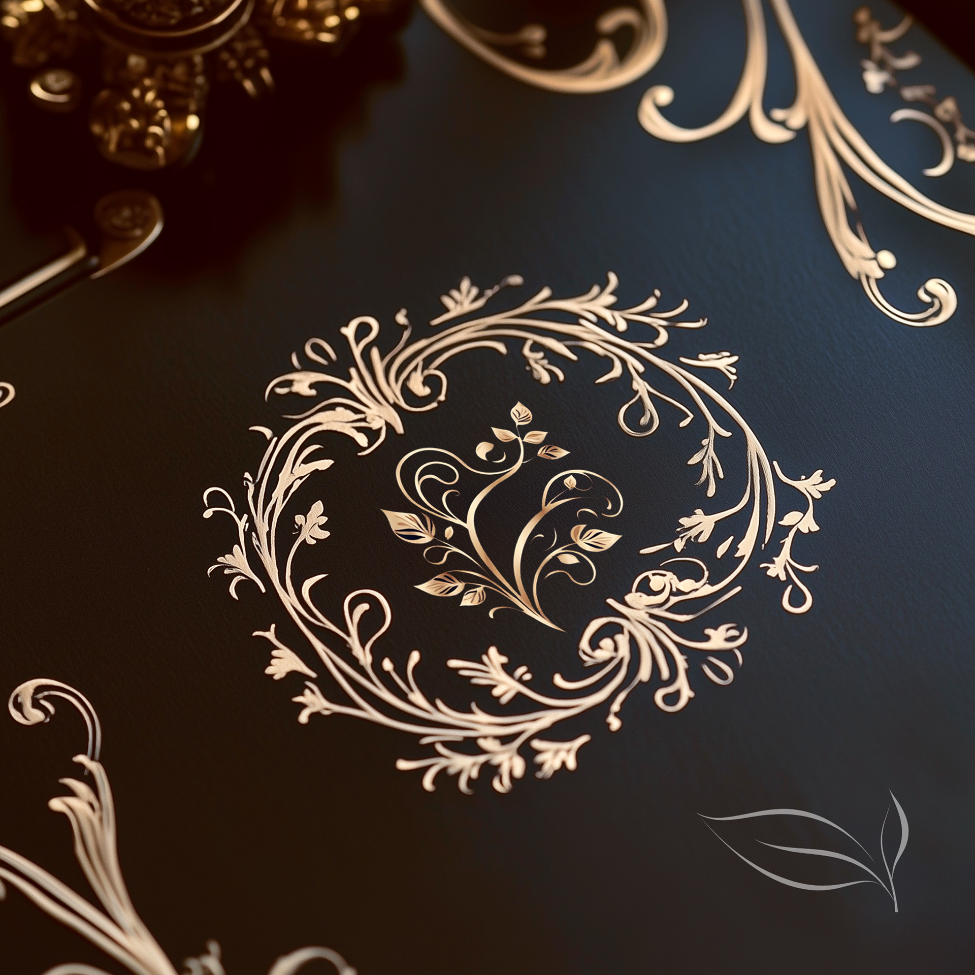
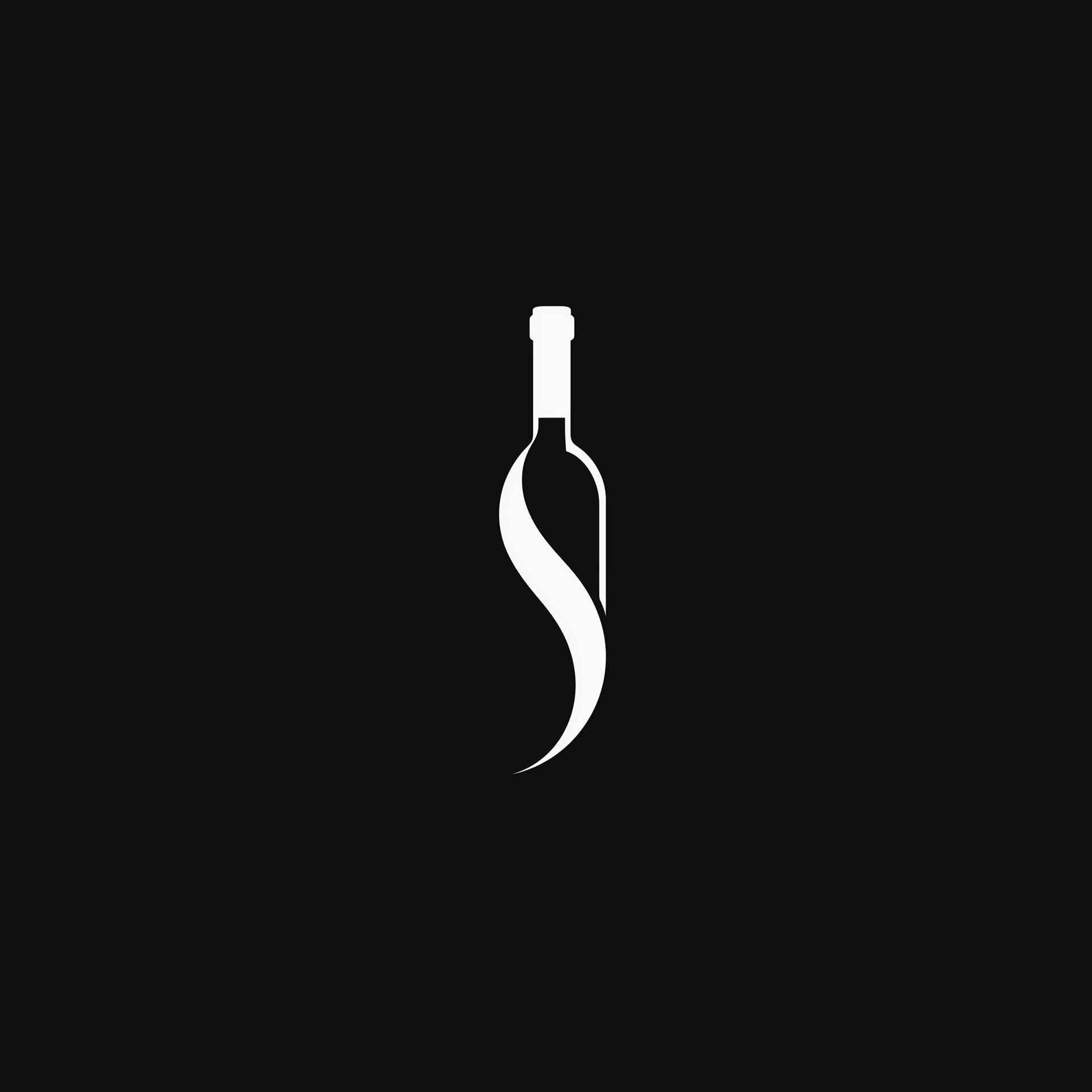
Designed a typographic mark that anchored the packaging system
and reinforced brand recognition across SKUs
and reinforced brand recognition across SKUs


Want to refresh your retail brand
and drive real business results?
and drive real business results?