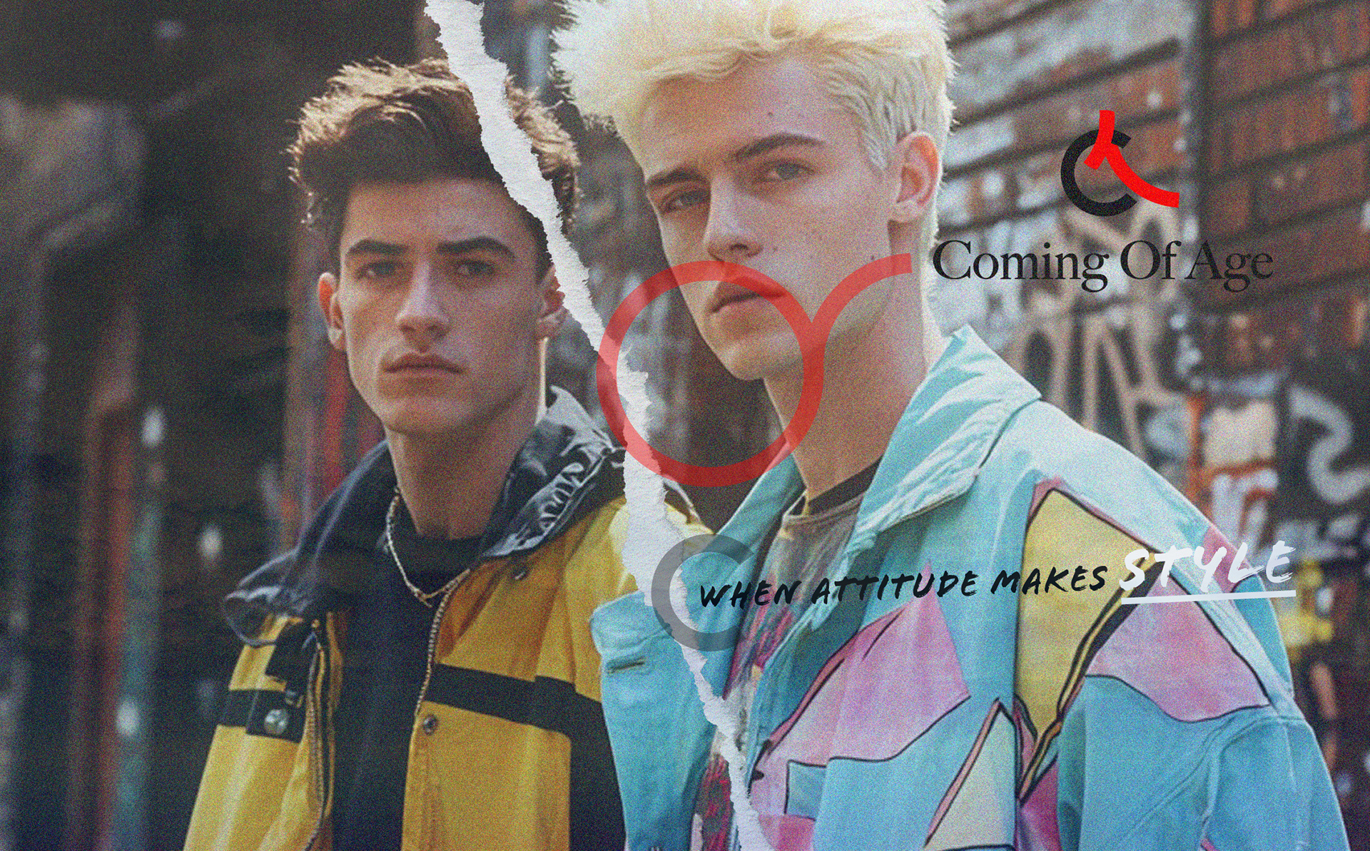
Coming Of Age was built for an audience that can smell a brand trying too hard. The identity had to feel like something you found rather than something marketed at you, and it had to hold together across a campaign, a feed and a print run from the first collection onward. I built it on typography and contrast instead of a logo and a trend, then wrote the rules that let the team produce new work without me in the room. The look stays constant while the content moves.
CLIENT ▸ Coming Of Age, New York
YEAR ▸ Brand Designer Freelance
AREA ▸ Fashion & Apparel — Streetwear, Youth Culture
AUDIENCE ▸ Gen Z consumer, Retail Buyer, Press
SCOPE ▸ Brand identity, campaign system, editorial and print
SCALE ▸ 1 collection launch, 3-month engagement
ROLE ▸ Brand Designer (Freelance)
TEAM ▸ Led 1: photographer and retoucher. Direct to founder.
PROCESS ▸ Culture and category audit → typographic system → campaign and editorial rollout → templates and guidelines
YEAR ▸ Brand Designer Freelance
AREA ▸ Fashion & Apparel — Streetwear, Youth Culture
AUDIENCE ▸ Gen Z consumer, Retail Buyer, Press
SCOPE ▸ Brand identity, campaign system, editorial and print
SCALE ▸ 1 collection launch, 3-month engagement
ROLE ▸ Brand Designer (Freelance)
TEAM ▸ Led 1: photographer and retoucher. Direct to founder.
PROCESS ▸ Culture and category audit → typographic system → campaign and editorial rollout → templates and guidelines
The Challenge
An audience that rejects anything that reads as marketing
A brand that needed to feel current without chasing whatever was current
One look that had to survive a feed, a lookbook, and a printed piece
An audience that rejects anything that reads as marketing
A brand that needed to feel current without chasing whatever was current
One look that had to survive a feed, a lookbook, and a printed piece
Strategic Approach
Built the identity on typography and contrast, not on a mark that dates
Set the rules before the aesthetic, so the system could absorb collections that did not exist yet
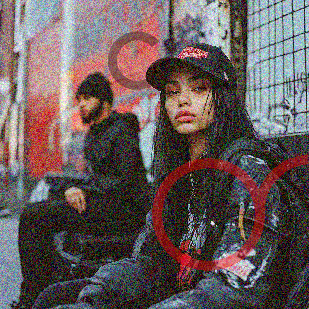
Kept the expressiveness controlled, so premium execution and street energy sit in the same frame
Built the identity on typography and contrast, not on a mark that dates
Set the rules before the aesthetic, so the system could absorb collections that did not exist yet
Kept the expressiveness controlled, so premium execution and street energy sit in the same frame
Creative Solution
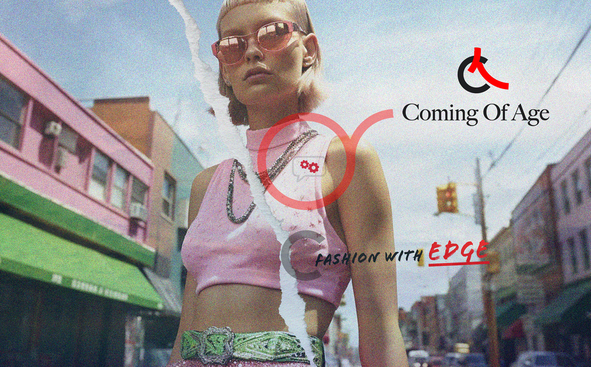
A typographic system doing the recognition work a logo usually does
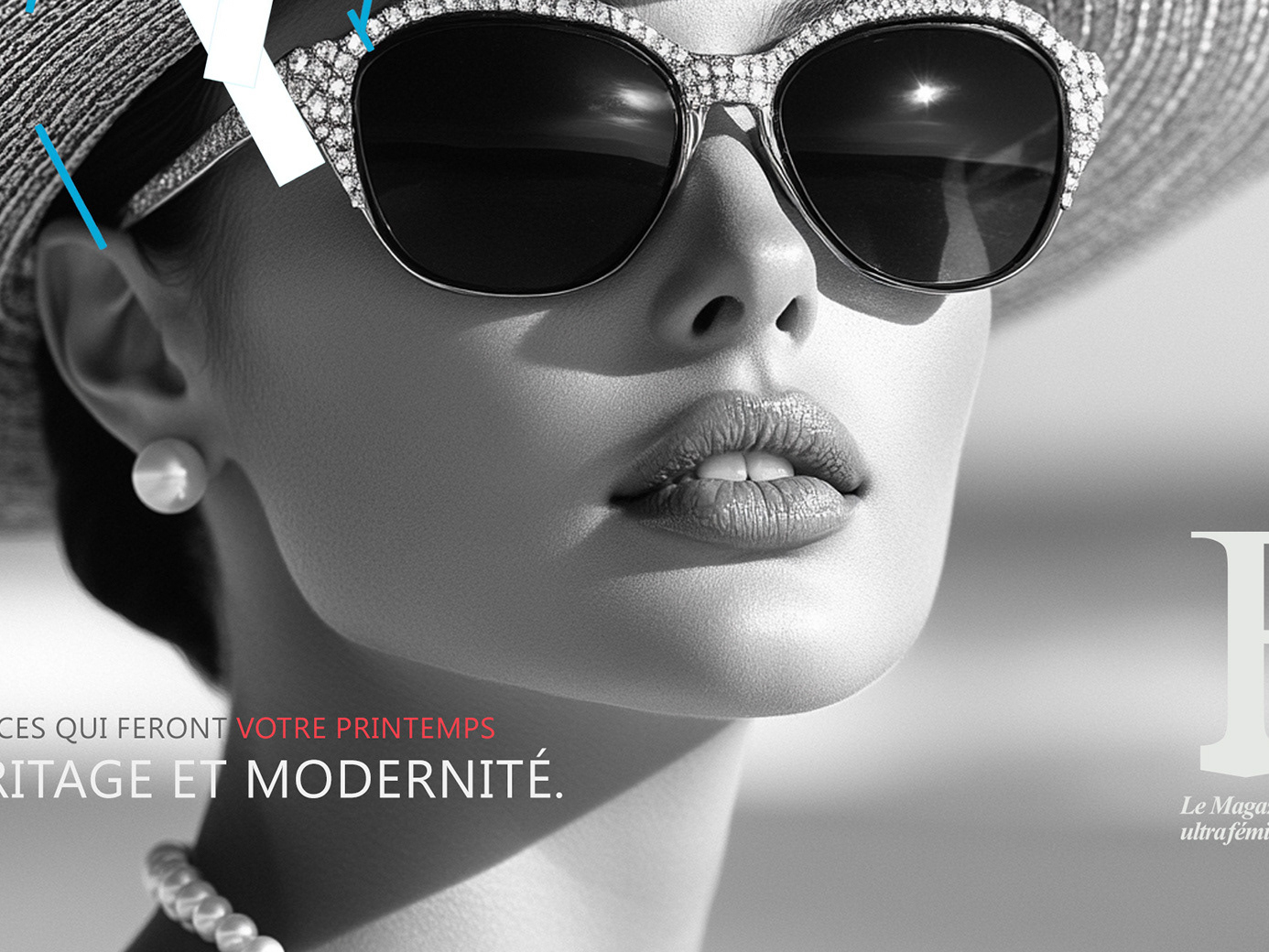
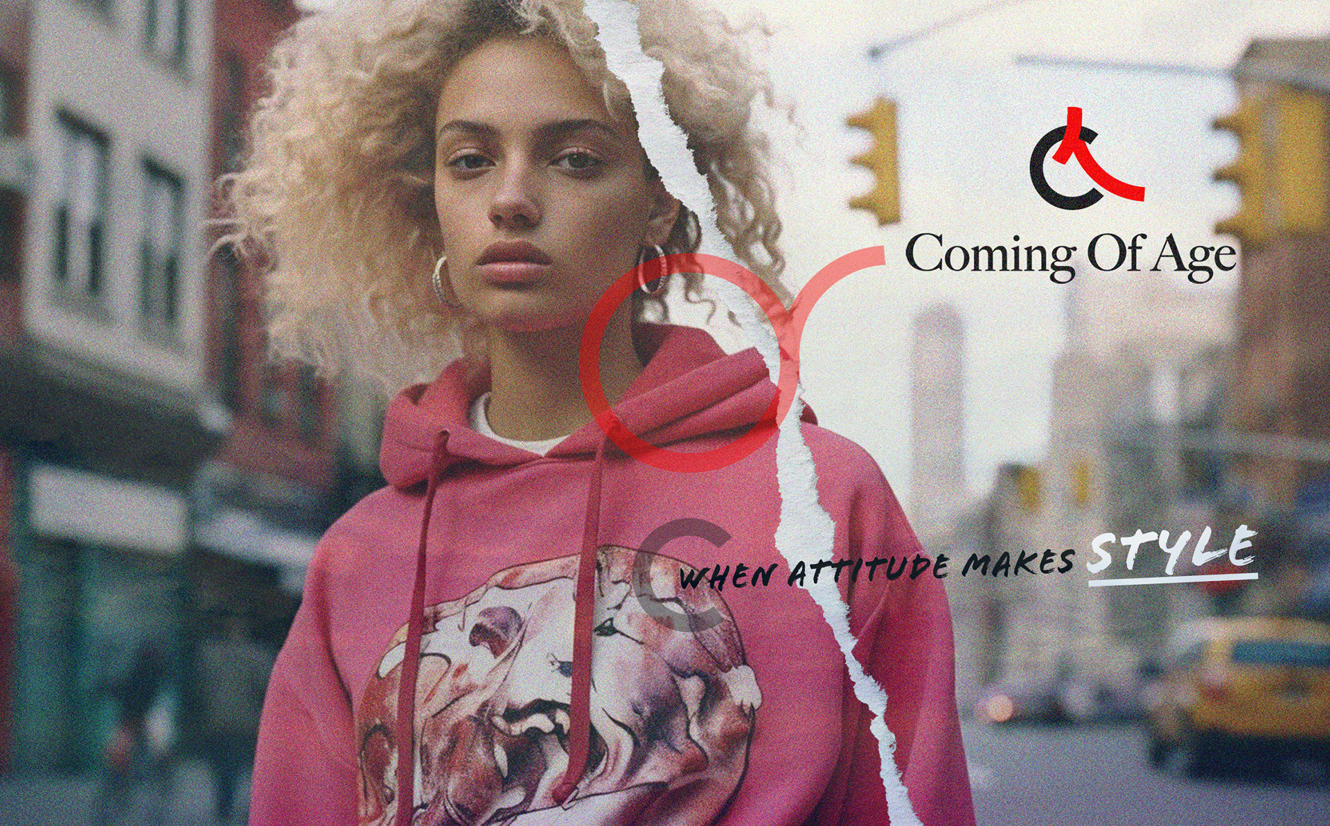
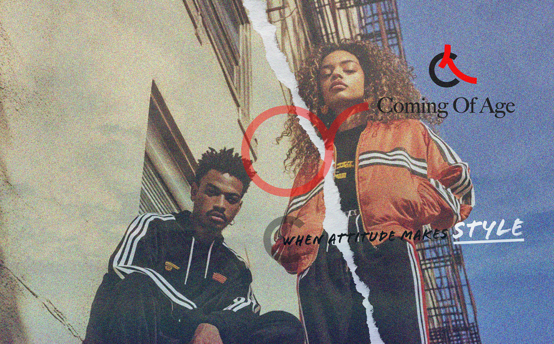
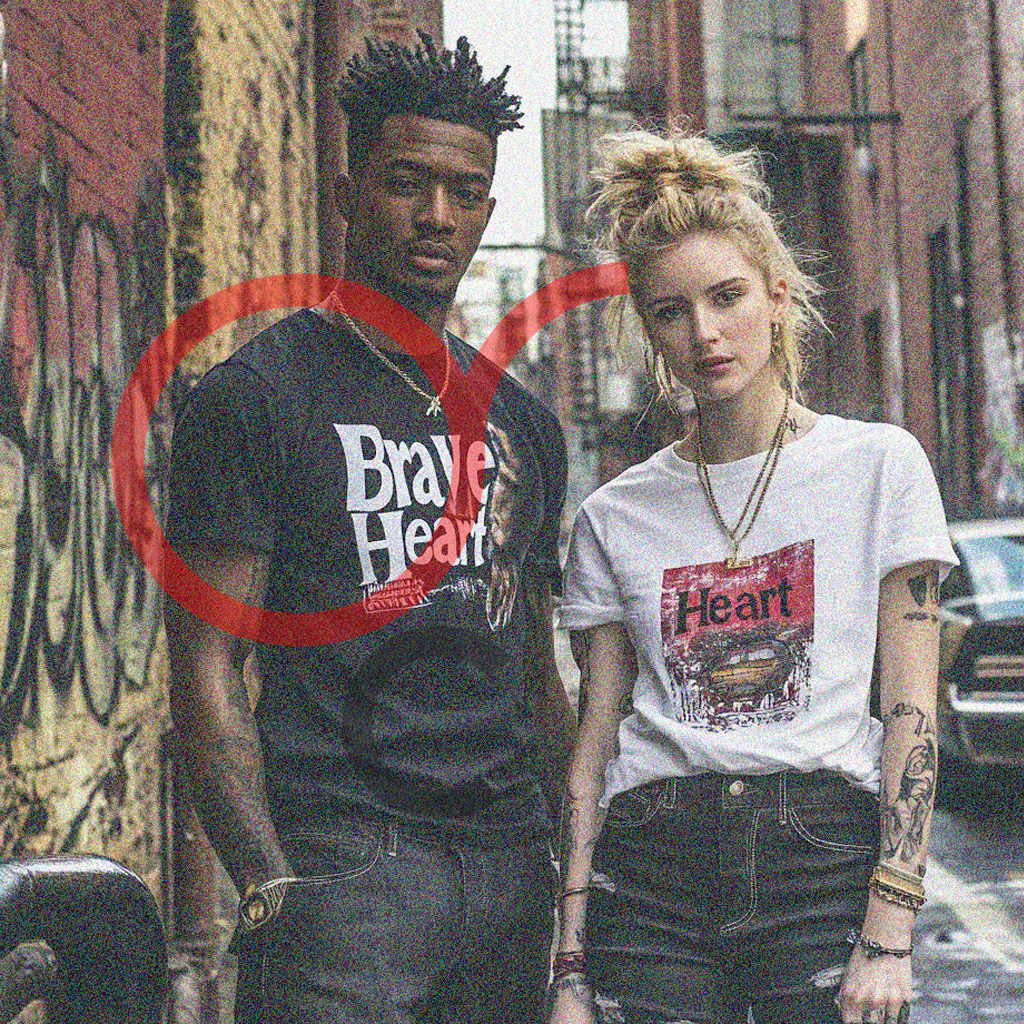
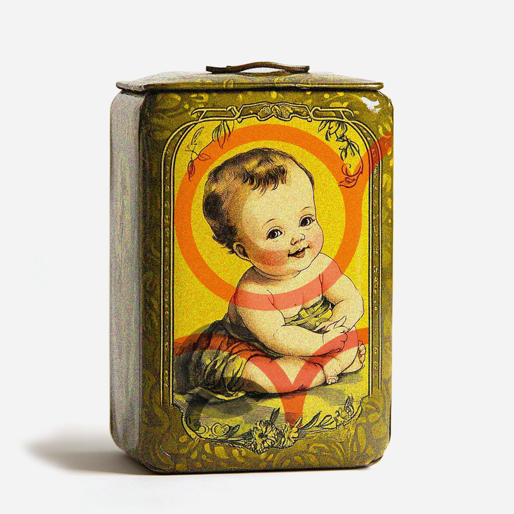
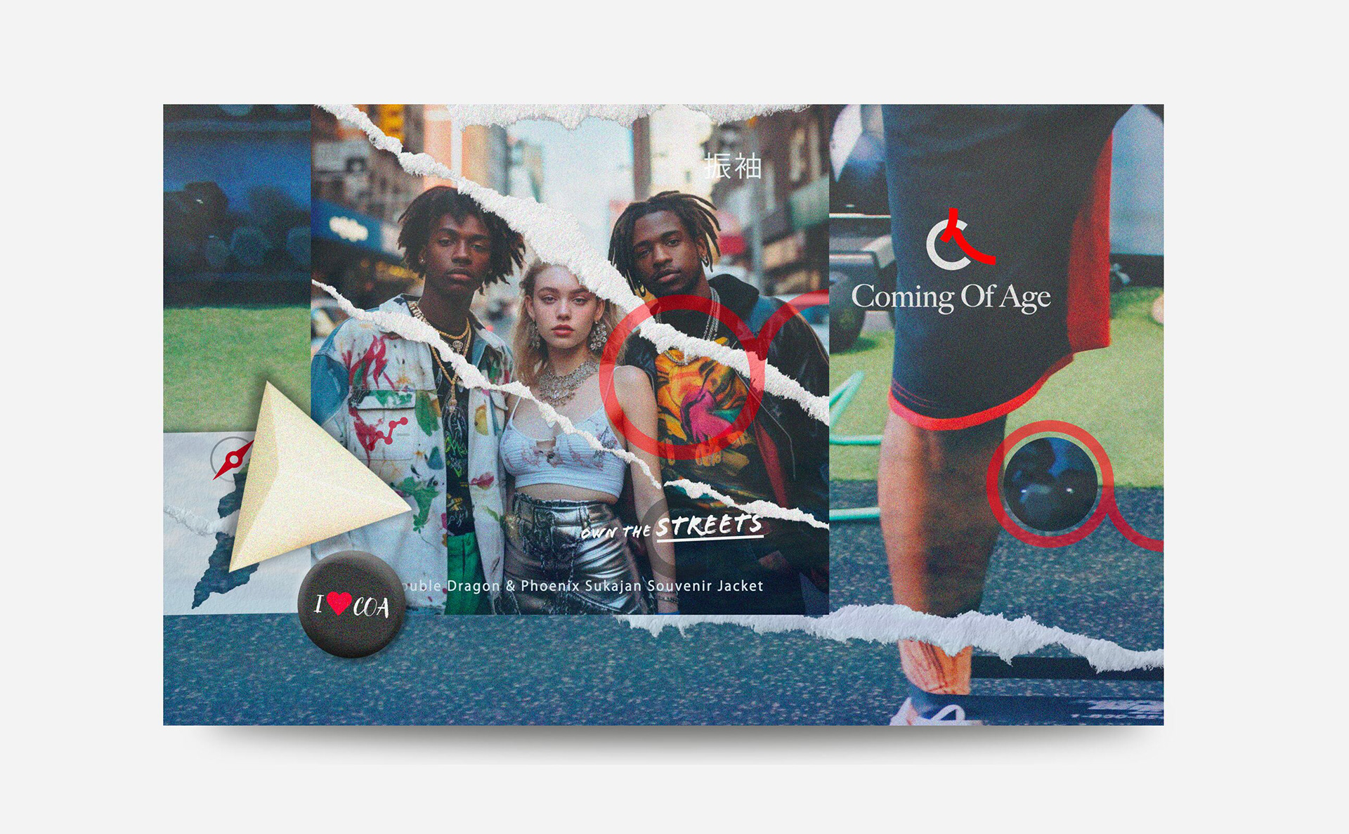
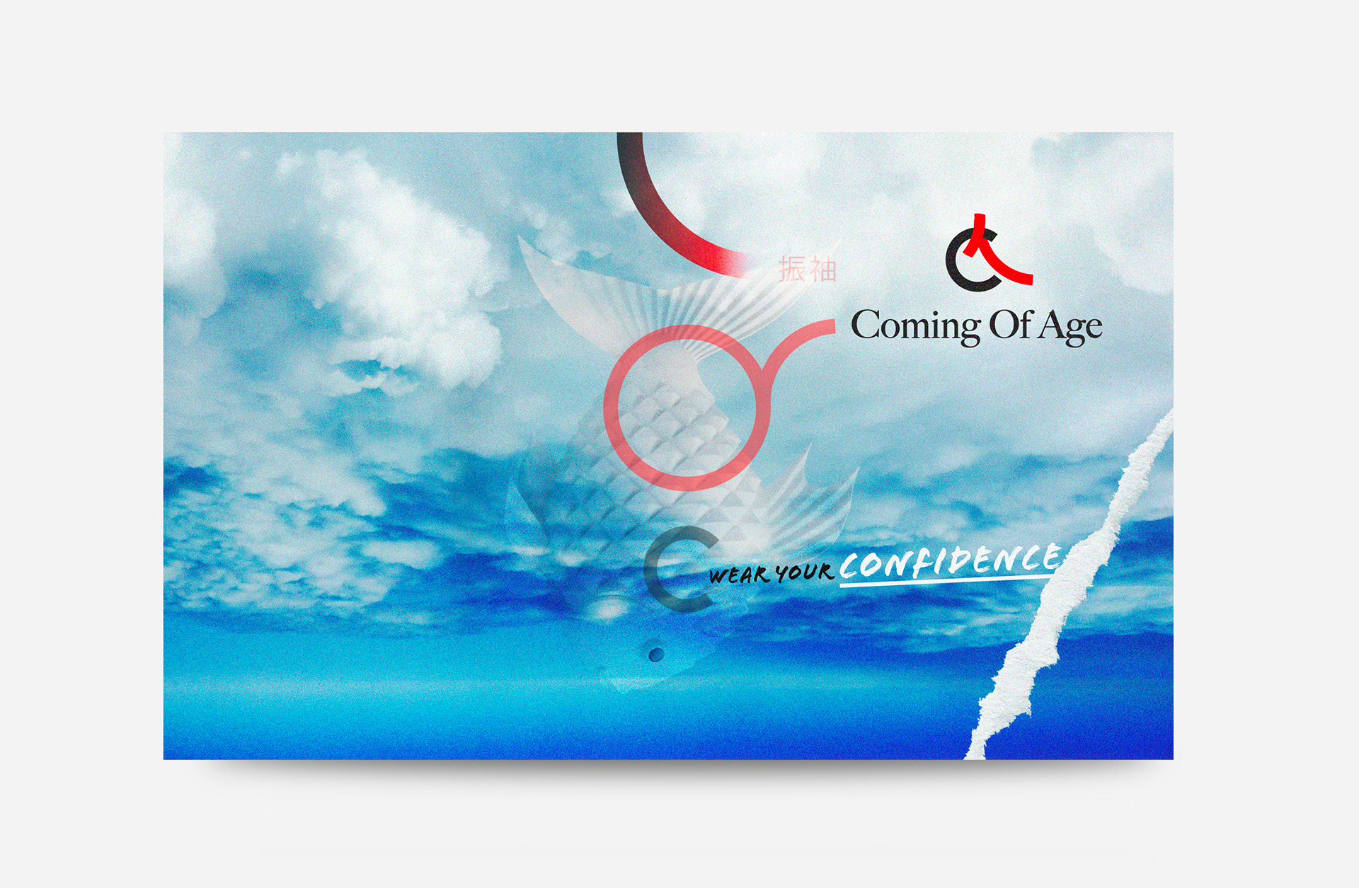
Hard contrast between soft imagery and rigid type; the tension the brand lives in
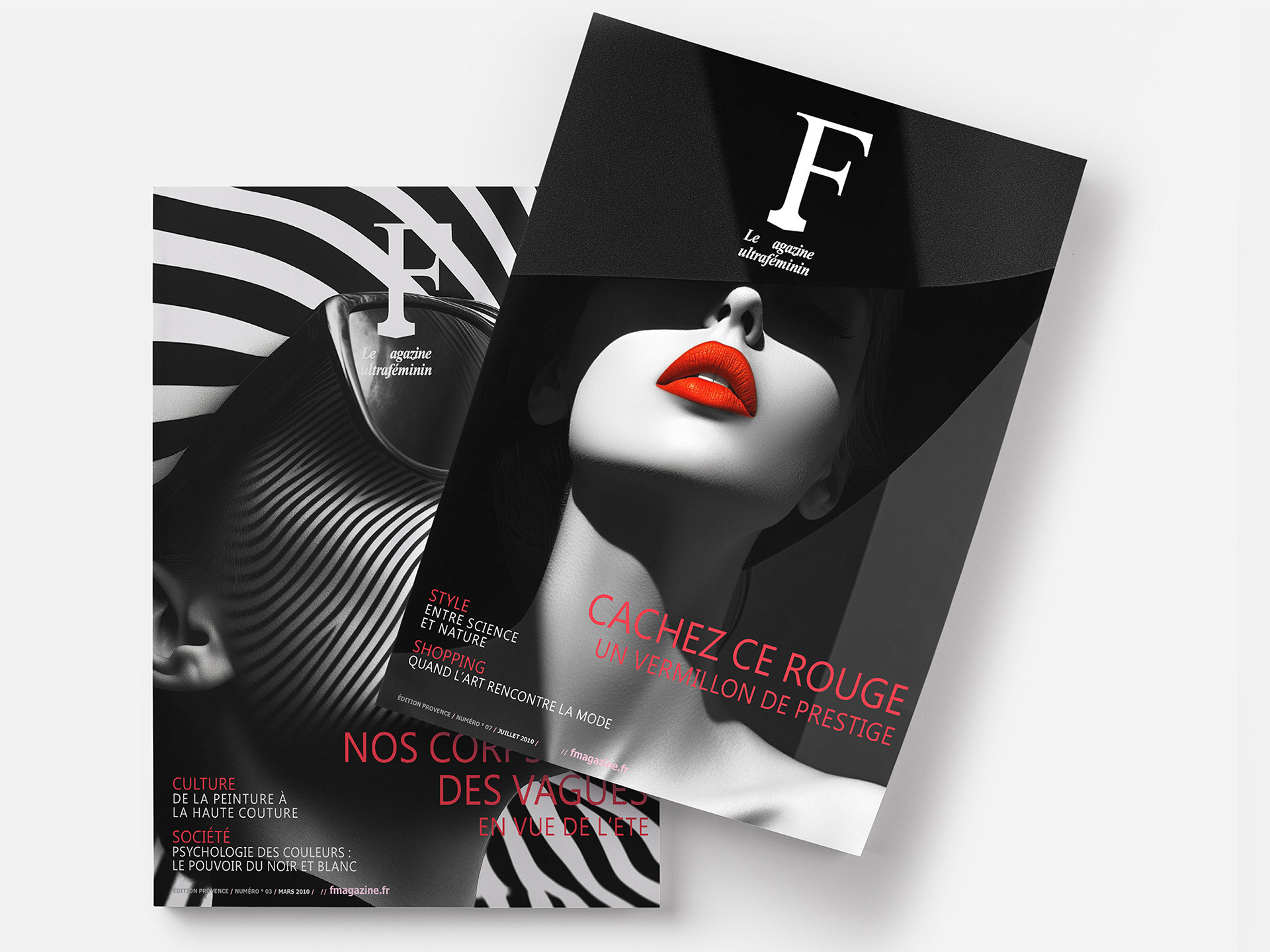
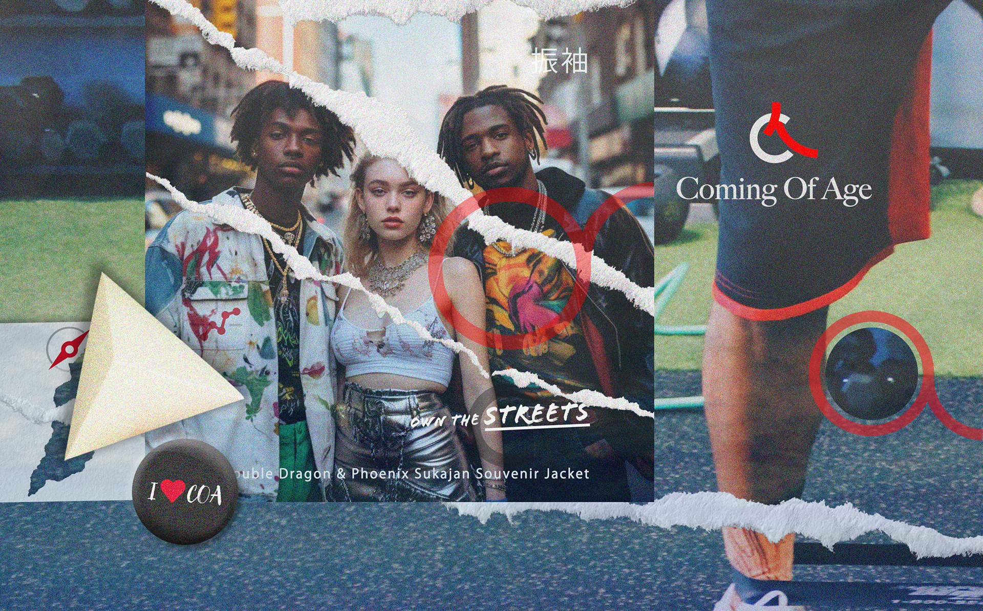
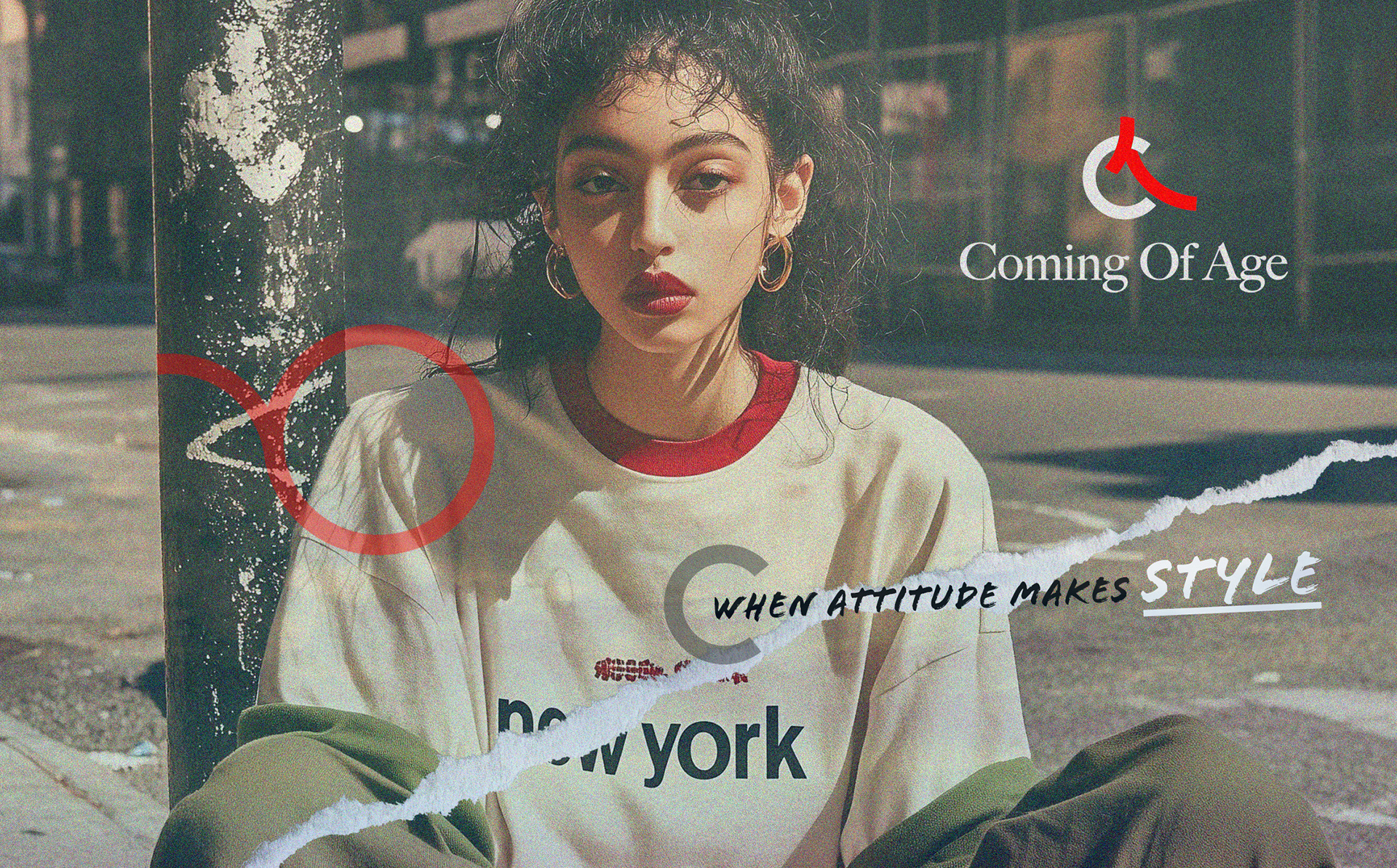
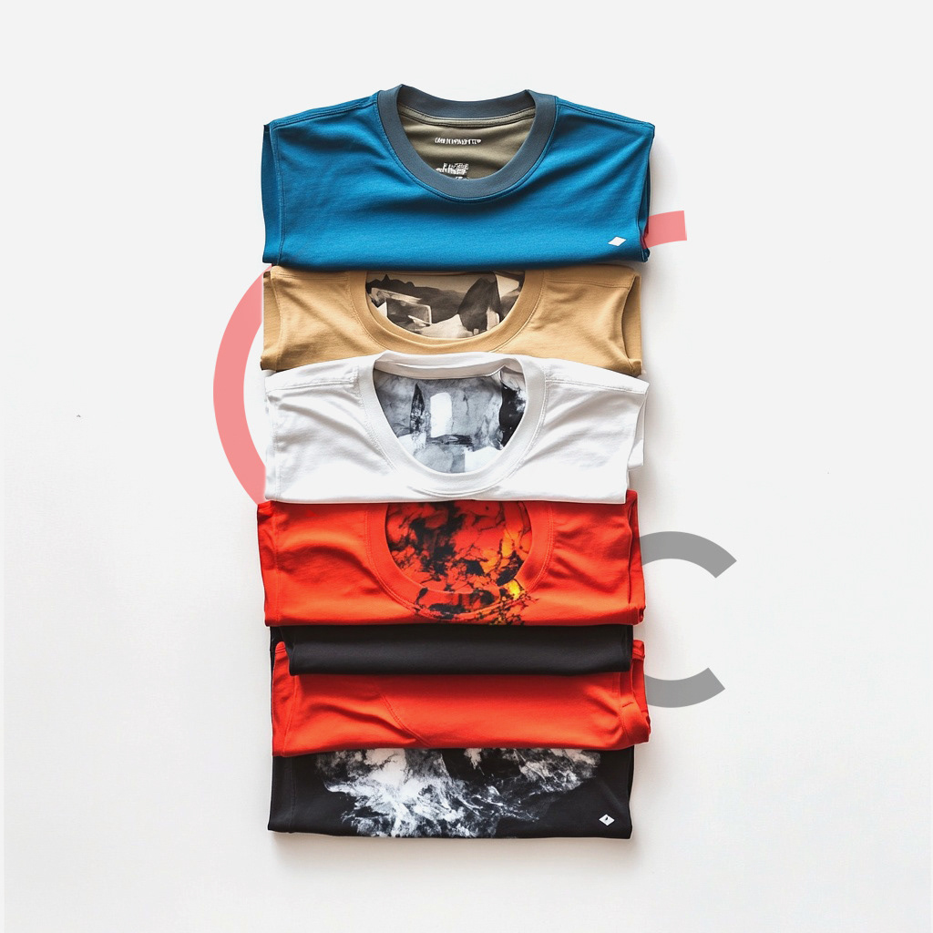
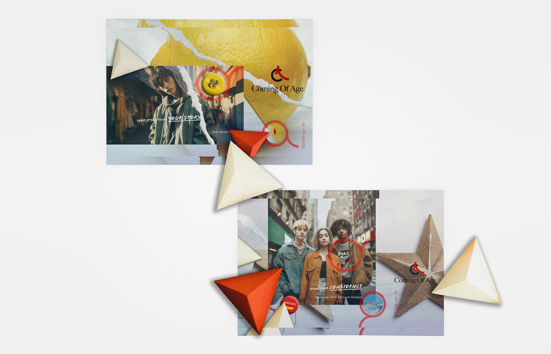
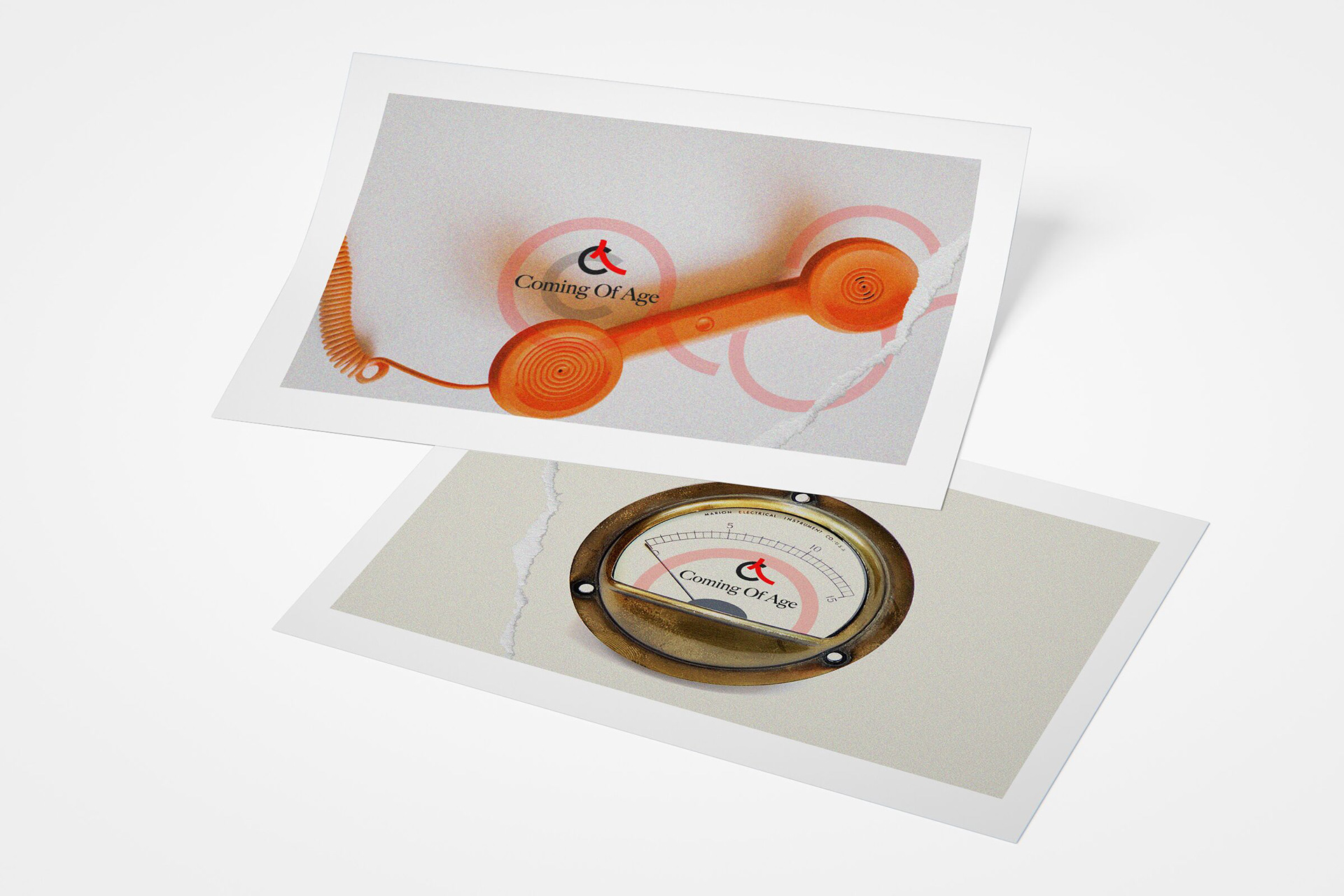
Modular layouts that let the same rules produce a campaign image and an editorial spread
A typographic system doing the recognition work a logo usually does
Hard contrast between soft imagery and rigid type; the tension the brand lives in
Modular layouts that let the same rules produce a campaign image and an editorial spread
Scope & System
Typographic hierarchy, spacing rules and a flexible palette
Modular layout templates for social, campaign and print
Retouching direction so the imagery reads as one body of work
Typographic hierarchy, spacing rules and a flexible palette
Modular layout templates for social, campaign and print
Retouching direction so the imagery reads as one body of work
Deliverables
+ Logo/wordmark and core identity system
+ Typography and composition templates
+ Campaign and social asset toolkit
+ Lookbook / editorial layout framework
+ Logo/wordmark and core identity system
+ Typography and composition templates
+ Campaign and social asset toolkit
+ Lookbook / editorial layout framework
Role & Leadership
Brand Designer, from positioning through rollout.
Brand Designer, from positioning through rollout.
Led a photographer across the shoot and the retouching, so the imagery and the type system were built together rather than one dressed onto the other.
The argument I had to hold: a youth brand does not win by looking new. It wins by looking like something that was already there, found rather than launched, which means the recognition has to sit in the typography and not in a logo that will feel dated by the second collection.
The argument I had to hold: a youth brand does not win by looking new. It wins by looking like something that was already there, found rather than launched, which means the recognition has to sit in the typography and not in a logo that will feel dated by the second collection.

On The Work
Youth brands usually buy a logo and a mood, then redesign eighteen months later when the mood changes.
Building recognition into the typography and the rules lets the brand keep moving without starting over.
Youth brands usually buy a logo and a mood, then redesign eighteen months later when the mood changes.
Building recognition into the typography and the rules lets the brand keep moving without starting over.
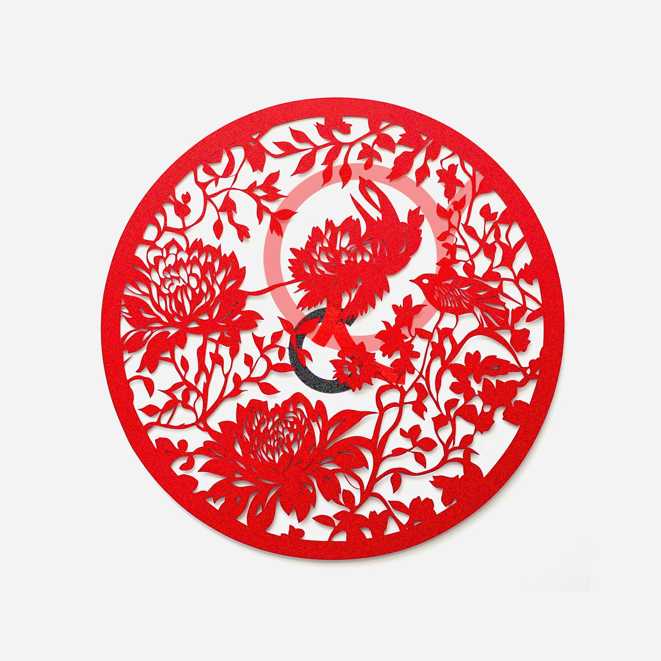

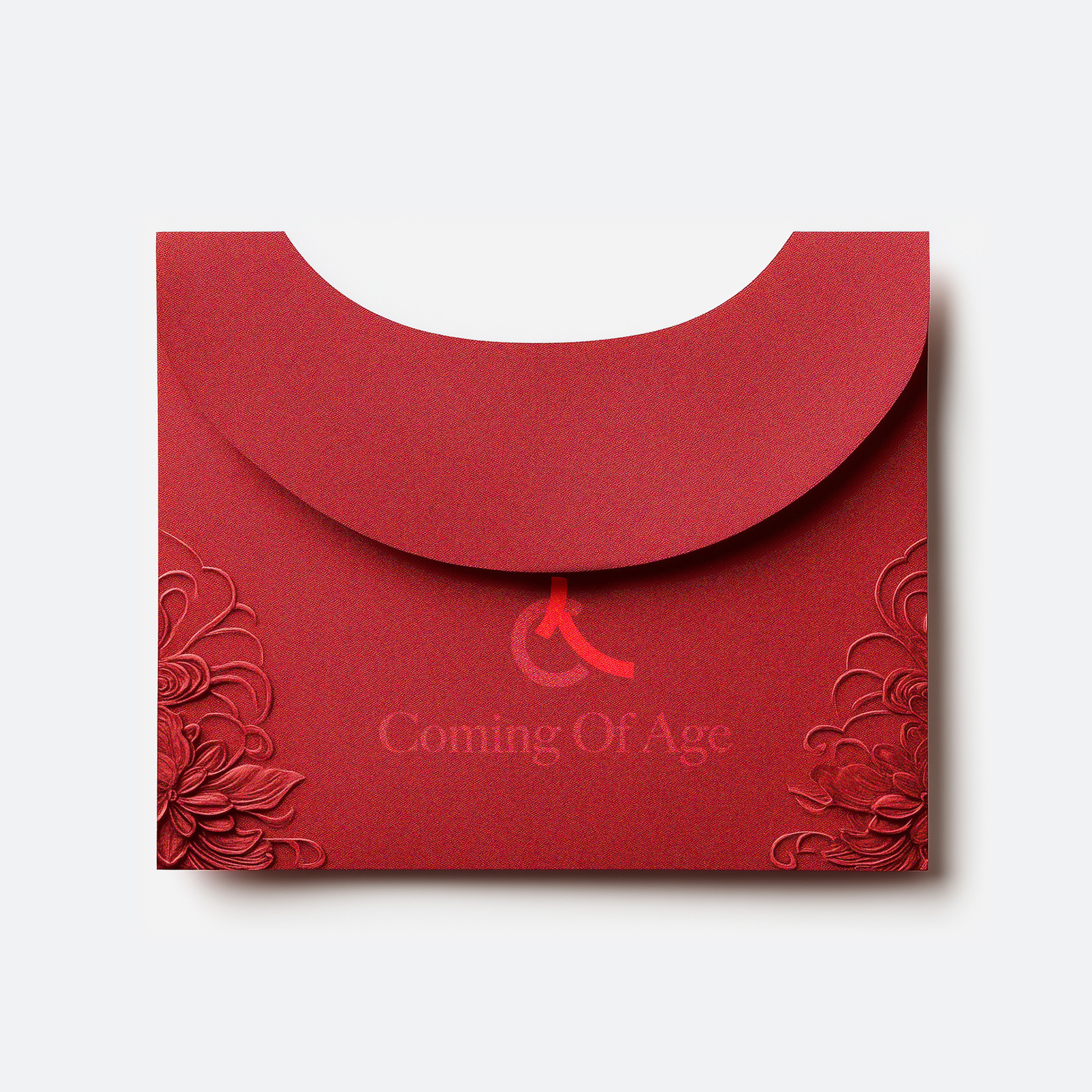
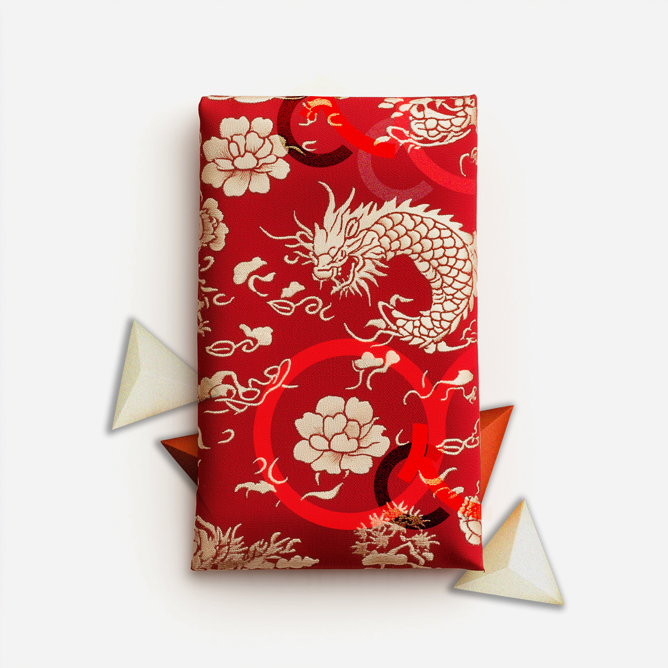

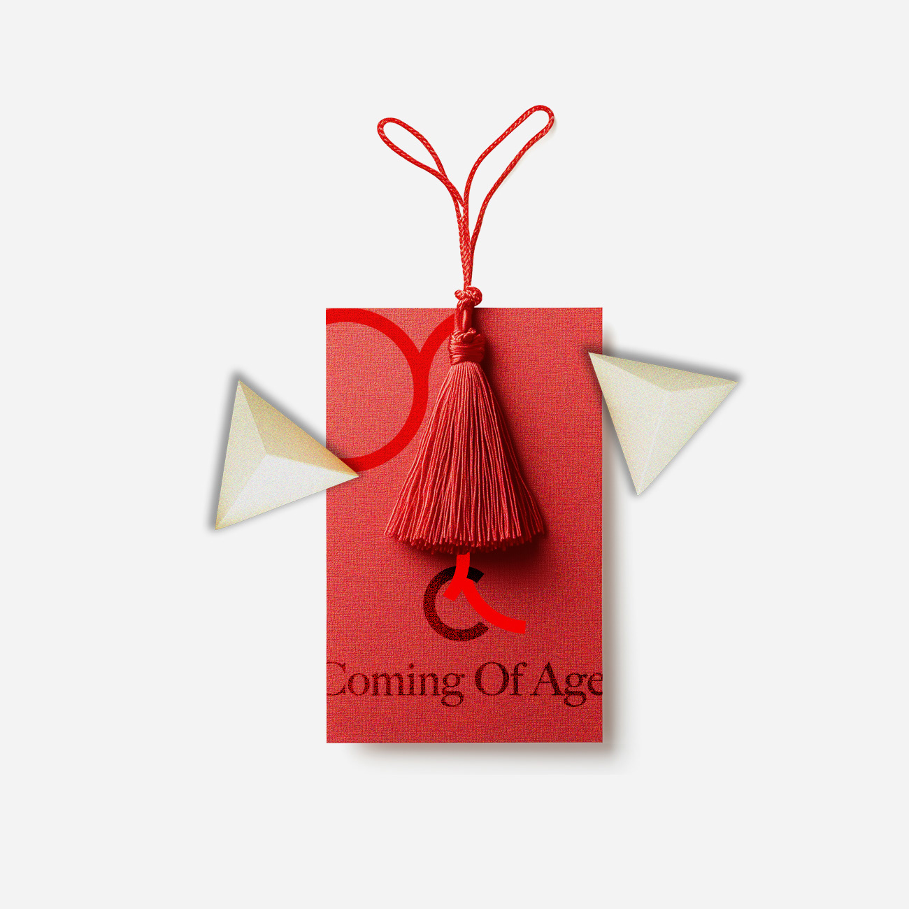

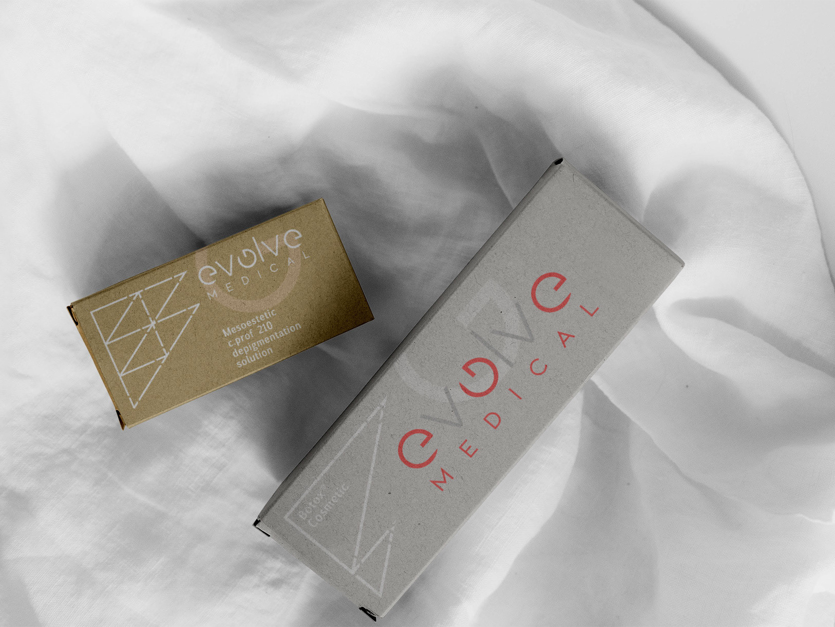
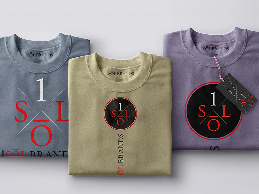
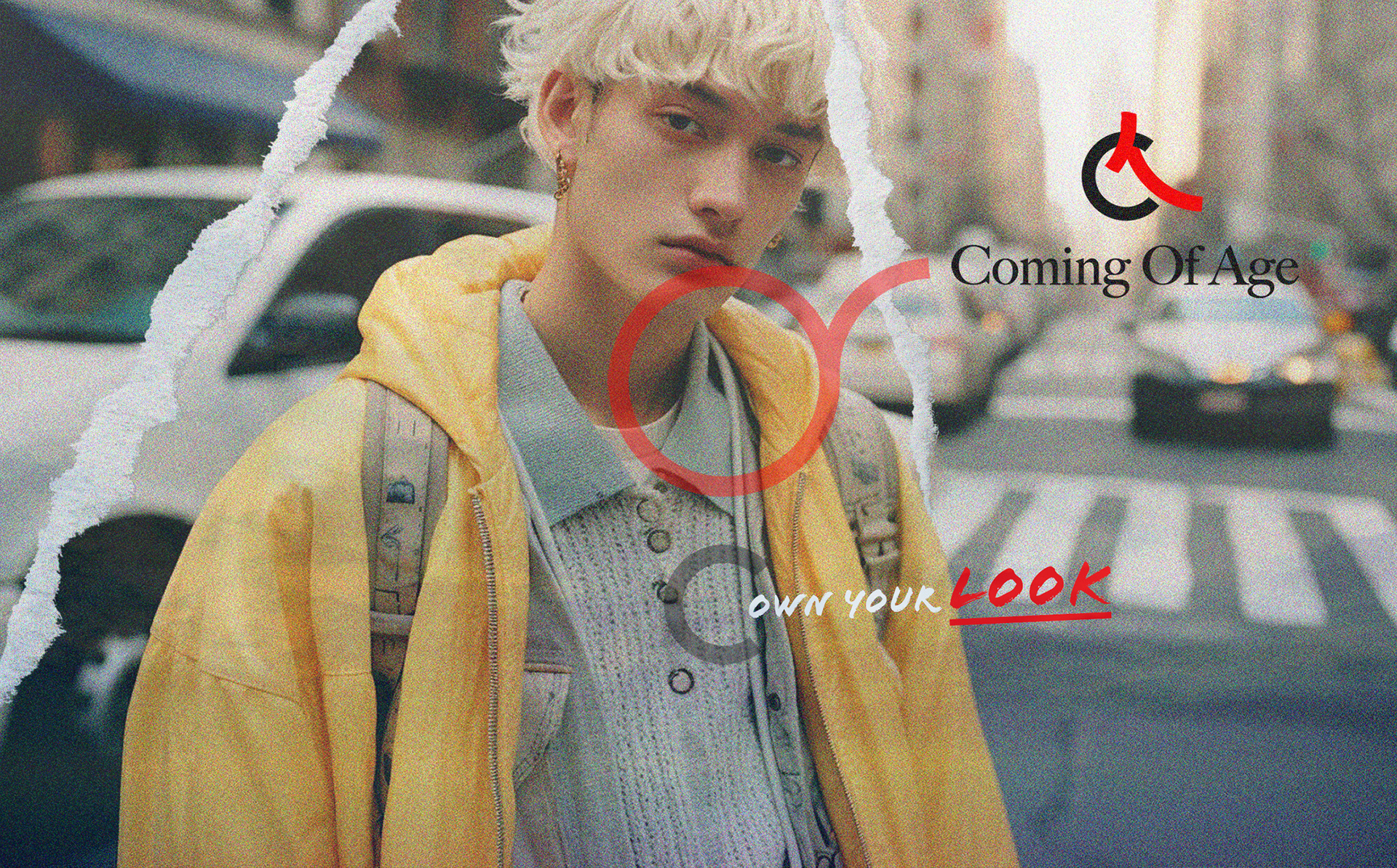
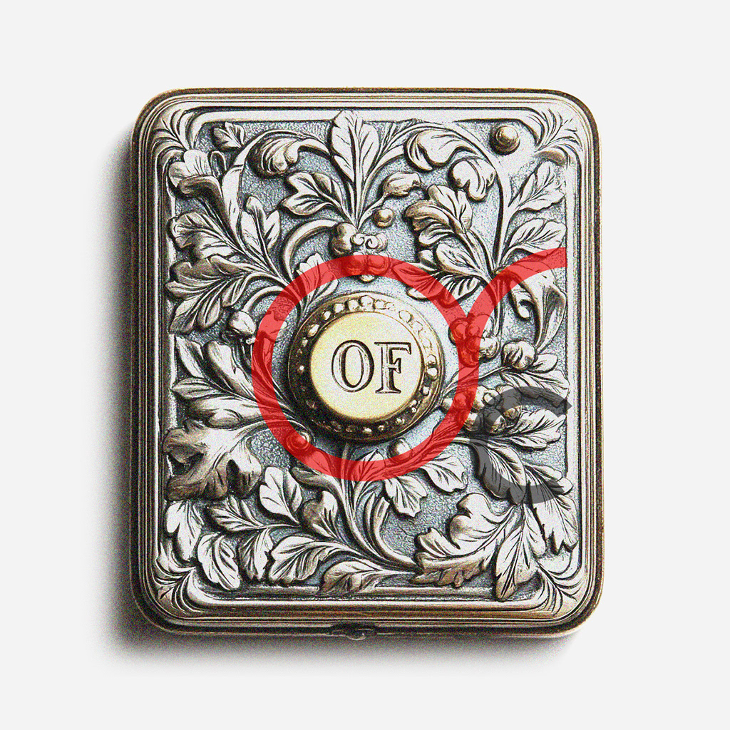
The logo was designed as a typographic signature, confident, minimal, and built to anchor expressive imagery within a consistent brand frame.

Ready to take your brand
from concept to retail success?
from concept to retail success?