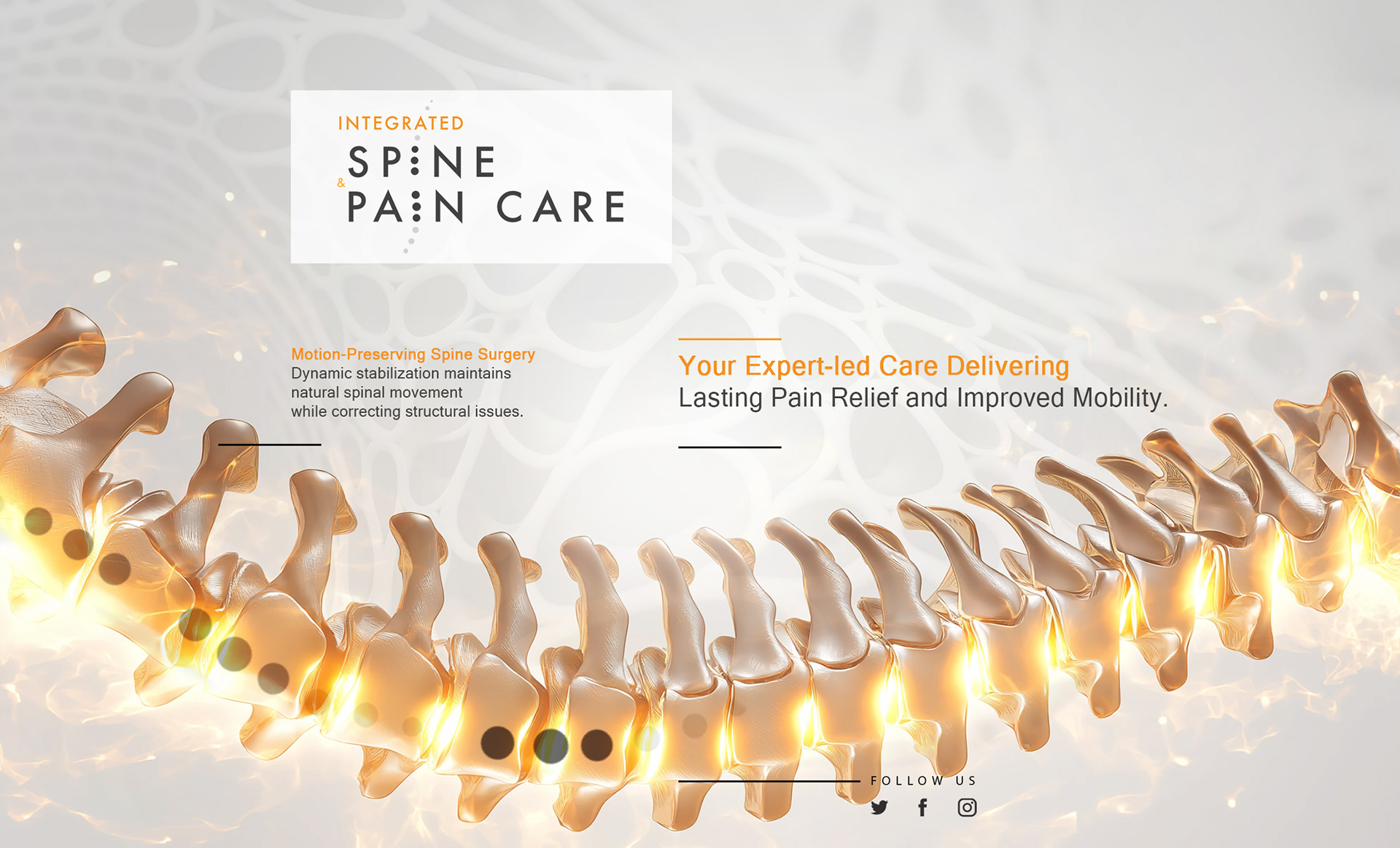
CLIENT / Integrated Spine & Pain Care
ROLE / Art Director Freelance – Brand Identity
SCOPE / Logo Design, Branding, Visual Identity, Campaign Materials
ROLE / Art Director Freelance – Brand Identity
SCOPE / Logo Design, Branding, Visual Identity, Campaign Materials
The Challenge
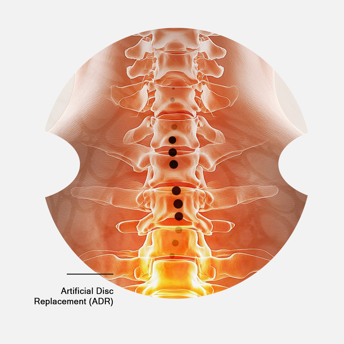
Develop a trustworthy and differentiated identity for a pain medicine provider in a highly sensitive medical category
Balance clinical credibility with compassion and patient-centered care
Create a brand system that communicates professionalism without feeling cold or institutional
Develop a trustworthy and differentiated identity for a pain medicine provider in a highly sensitive medical category
Balance clinical credibility with compassion and patient-centered care
Create a brand system that communicates professionalism without feeling cold or institutional
Strategic Approach
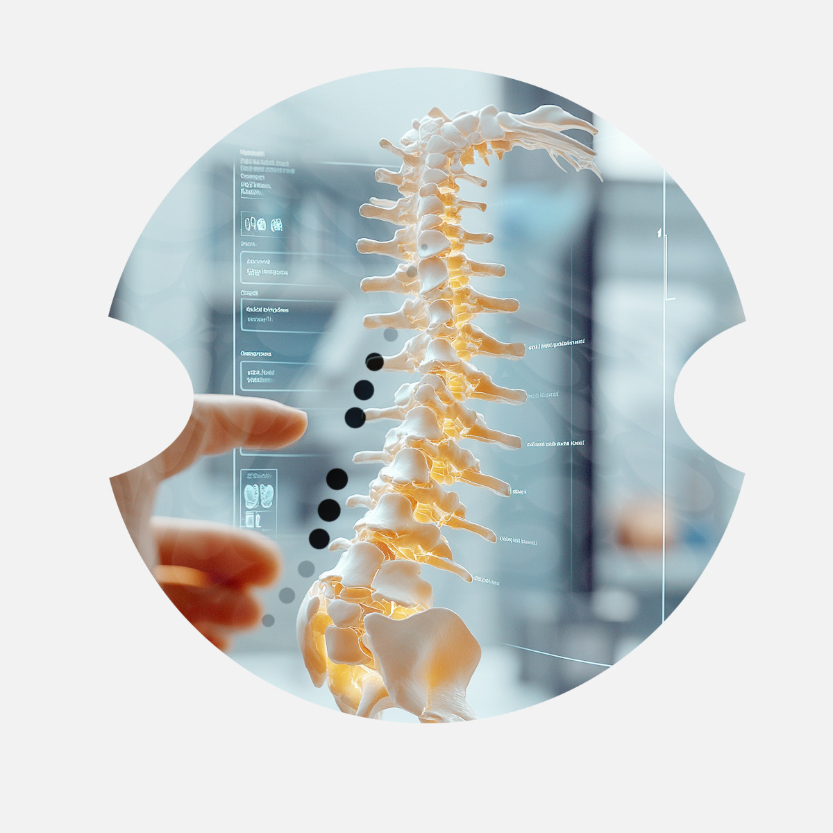
Position the provider at the intersection of precision treatment and human empathy
Build a visual language rooted in clarity, calmness, and structure
Prioritize accessibility and readability across patient-facing and referral communications
Position the provider at the intersection of precision treatment and human empathy
Build a visual language rooted in clarity, calmness, and structure
Prioritize accessibility and readability across patient-facing and referral communications
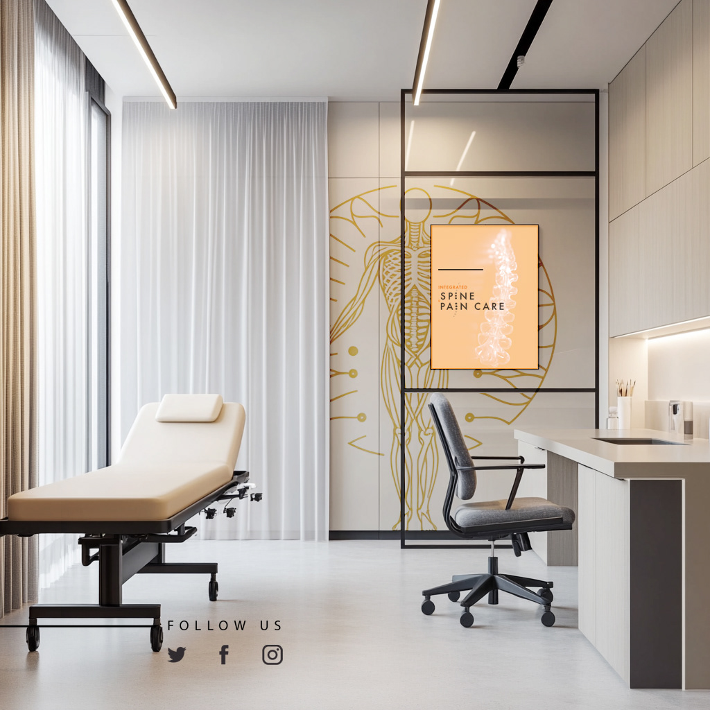
Creative Solution
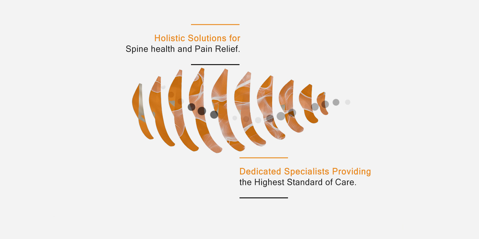
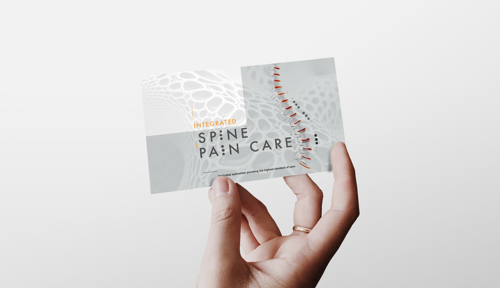
A refined, reassuring identity built around soft structure and controlled typography
A visual system that communicates stability, trust, and care
Subtle color logic designed to evoke calm without leaning into generic medical tropes
A refined, reassuring identity built around soft structure and controlled typography
A visual system that communicates stability, trust, and care
Subtle color logic designed to evoke calm without leaning into generic medical tropes
Scope & System
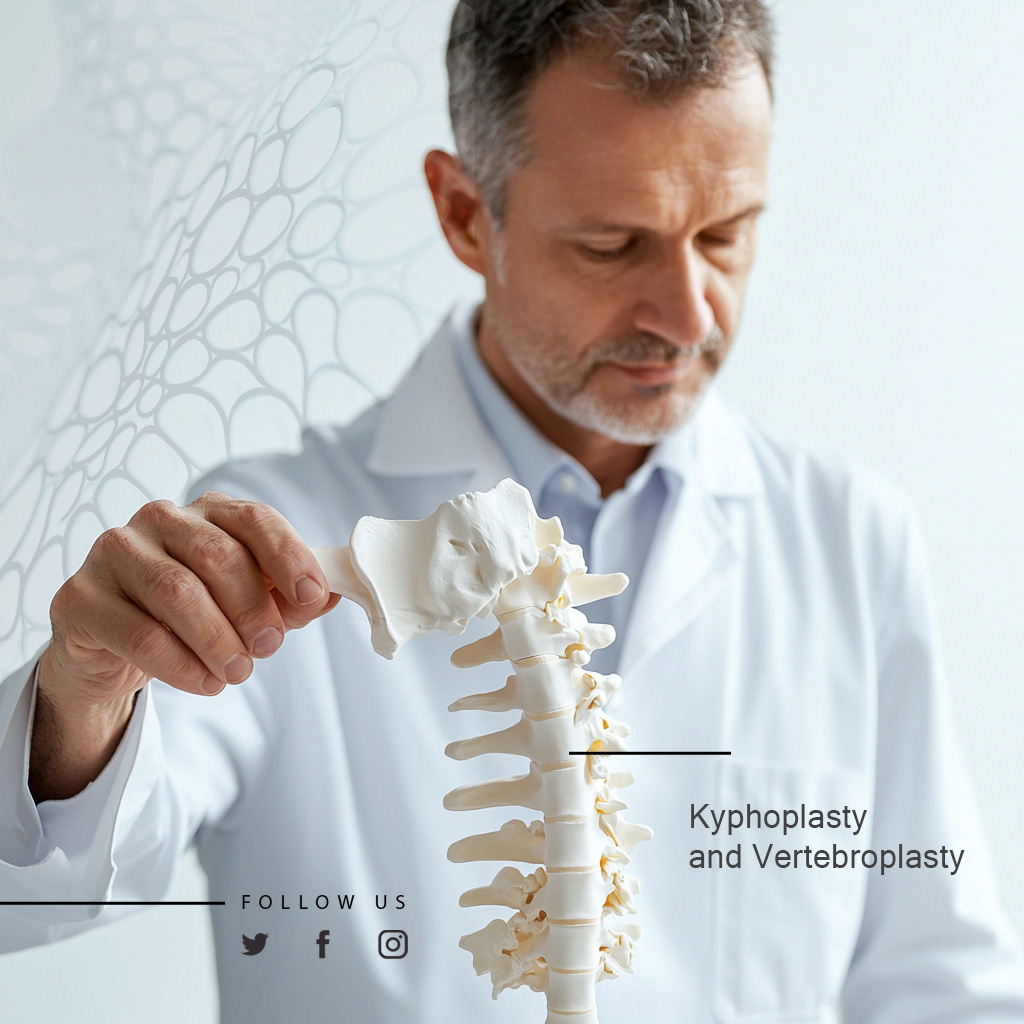
Logo and core identity architecture
Defined typographic hierarchy for patient materials and professional communication
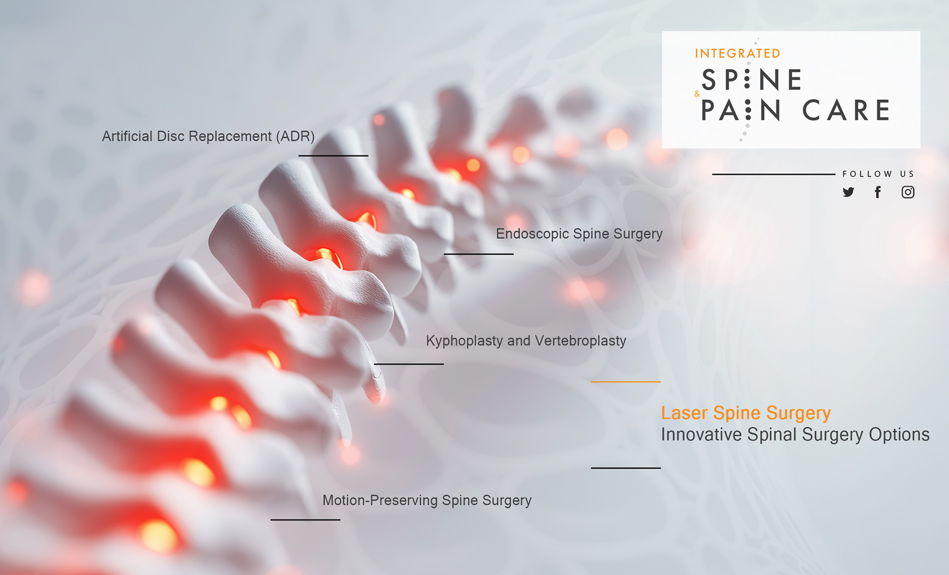
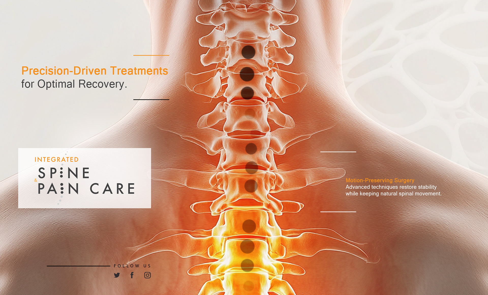
Modular layout framework for brochures, website, and intake documentation
Color and visual rules ensuring clarity across digital and print applications
Logo and core identity architecture
Defined typographic hierarchy for patient materials and professional communication
Modular layout framework for brochures, website, and intake documentation
Color and visual rules ensuring clarity across digital and print applications
Key Results
Stronger brand credibility among patients and referral networks
Clearer, more reassuring communication materials
A cohesive identity that differentiates the provider within a competitive healthcare landscape
Stronger brand credibility among patients and referral networks
Clearer, more reassuring communication materials
A cohesive identity that differentiates the provider within a competitive healthcare landscape
Impact & Performance
Improved perception of professionalism and care
Greater consistency across marketing and clinical materials
A scalable system supporting long-term growth and service expansion
Improved perception of professionalism and care
Greater consistency across marketing and clinical materials
A scalable system supporting long-term growth and service expansion
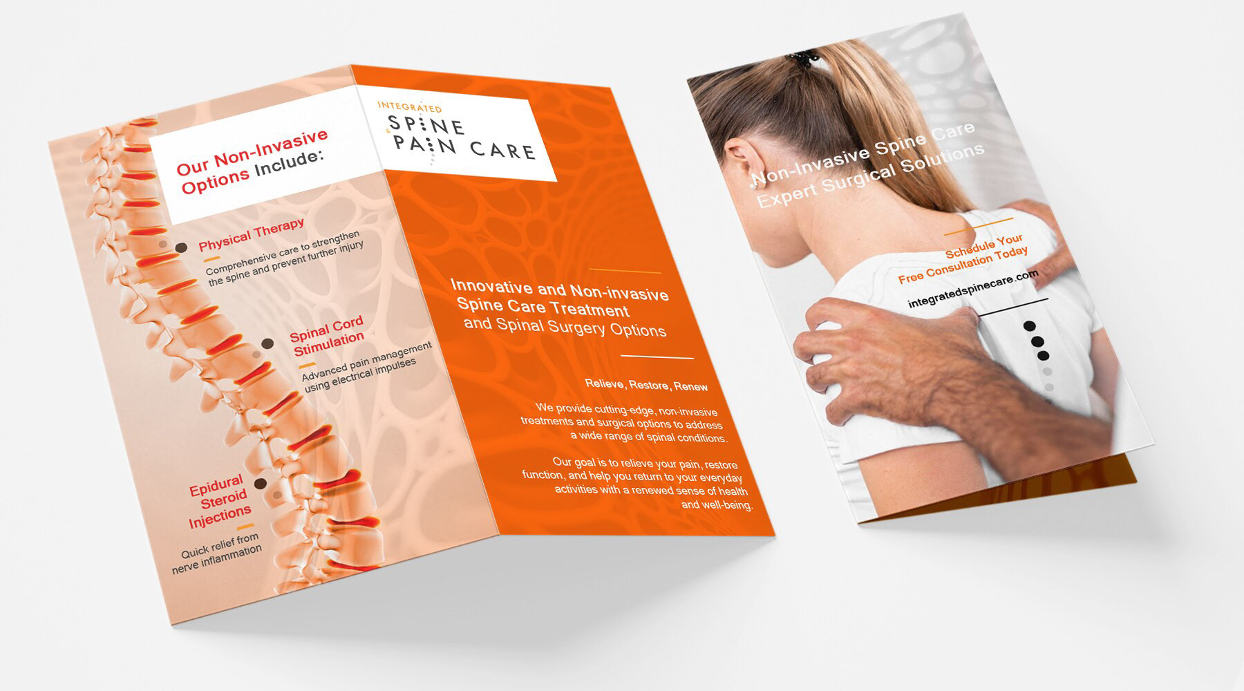
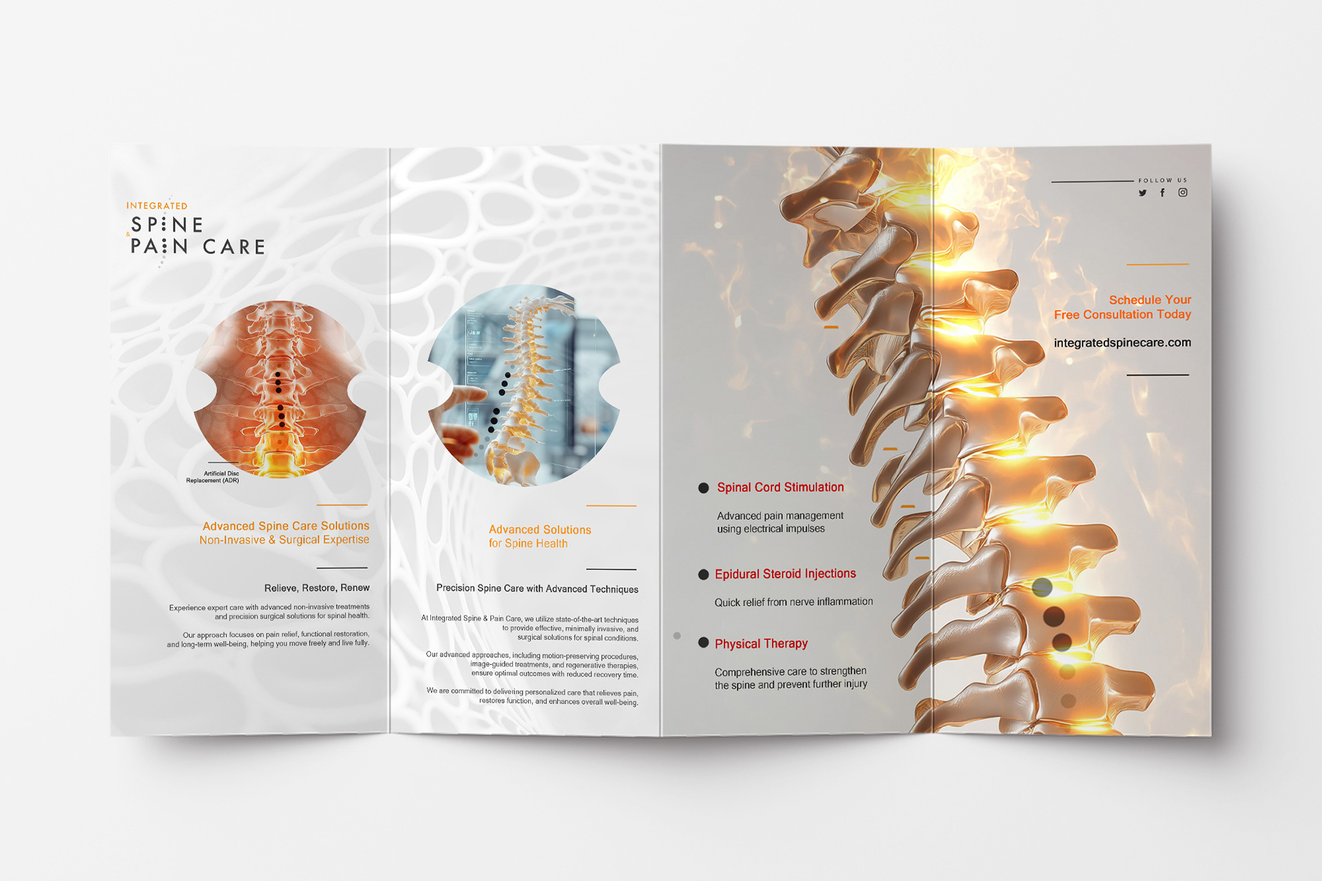
Deliverables
+ Logo and visual identity system
+ Brand guidelines
+ Patient-facing materials
+ Website visual direction
+ Marketing collateral
+ Logo and visual identity system
+ Brand guidelines
+ Patient-facing materials
+ Website visual direction
+ Marketing collateral
Role & Leadership
Brand Design Lead
Led strategic positioning and brand system development, aligning patient trust, regulatory clarity, and professional credibility.
Brand Design Lead
Led strategic positioning and brand system development, aligning patient trust, regulatory clarity, and professional credibility.
What This Work Matters
In pain medicine, trust is foundational.
Patients seek clarity, reassurance, and professionalism
at moments of vulnerability.
This project demonstrates how strategic brand design can support
medical credibility while reinforcing empathy, creating a system
that communicates both expertise and care.
In pain medicine, trust is foundational.
Patients seek clarity, reassurance, and professionalism
at moments of vulnerability.
This project demonstrates how strategic brand design can support
medical credibility while reinforcing empathy, creating a system
that communicates both expertise and care.


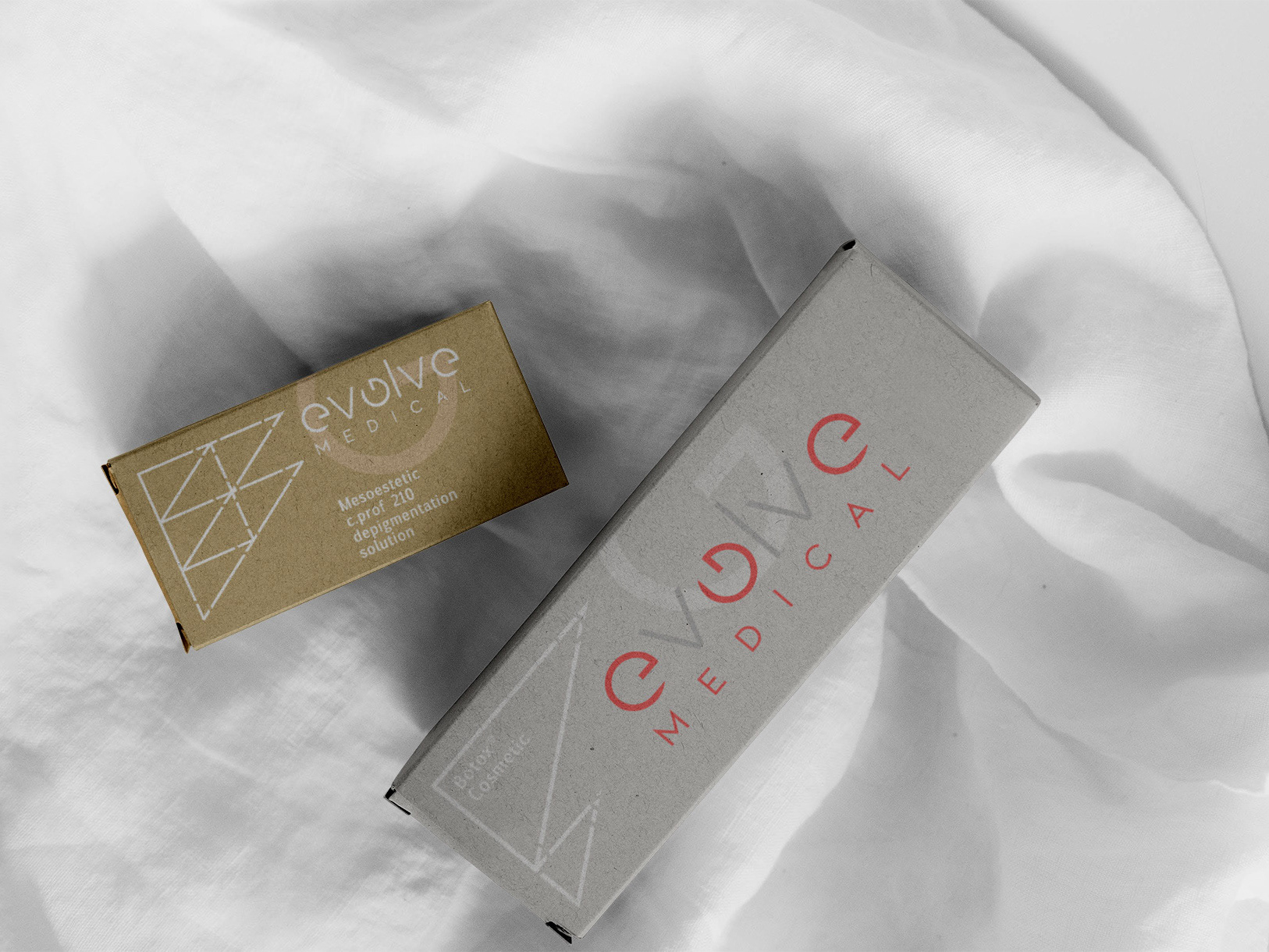
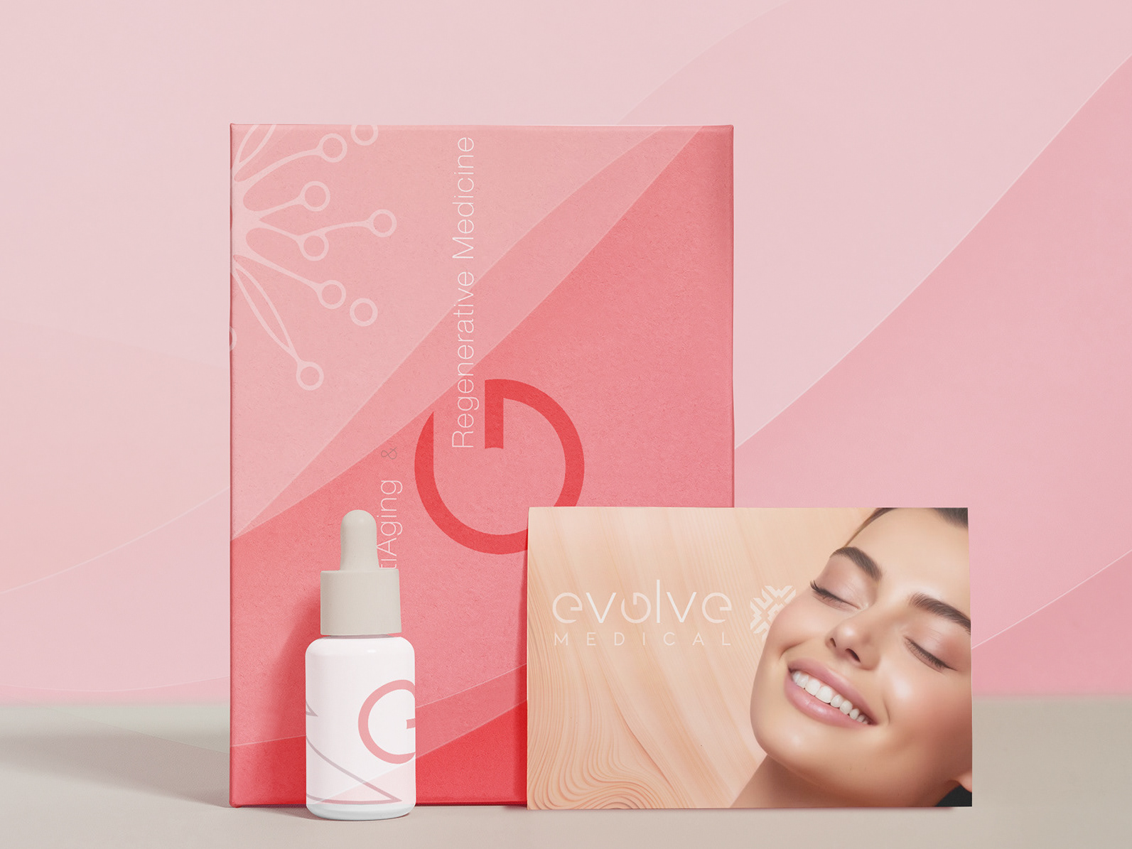
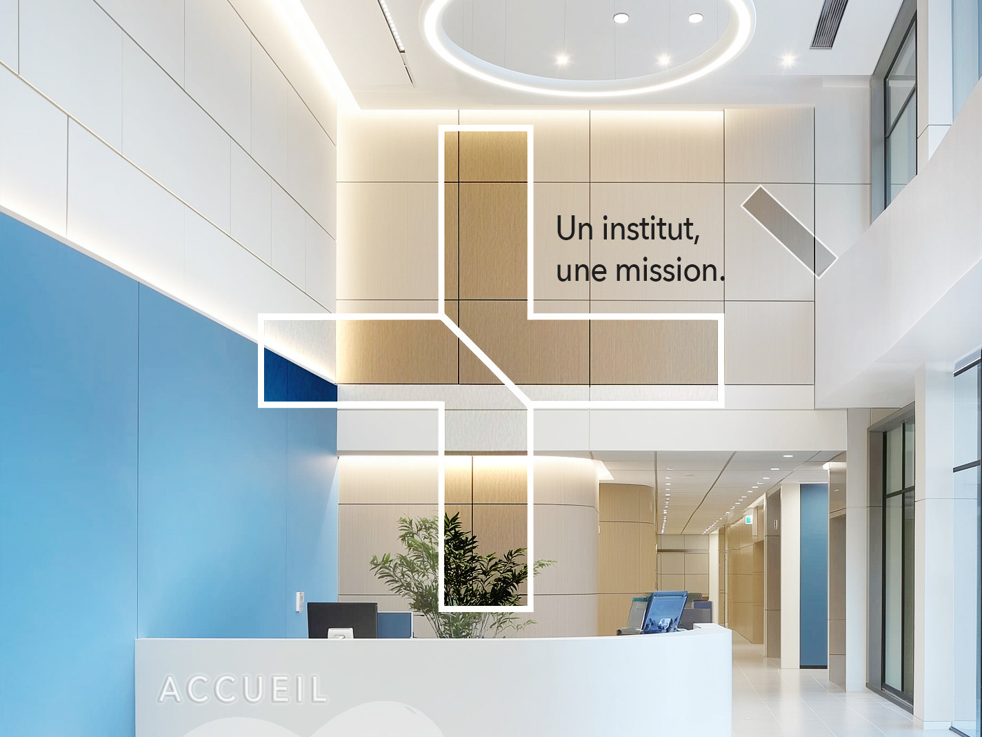
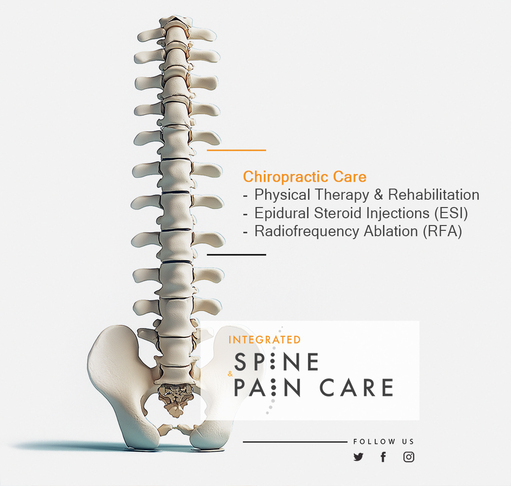
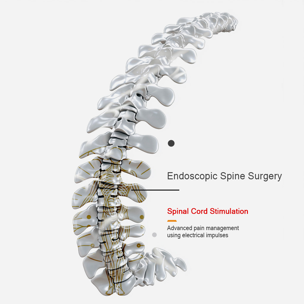
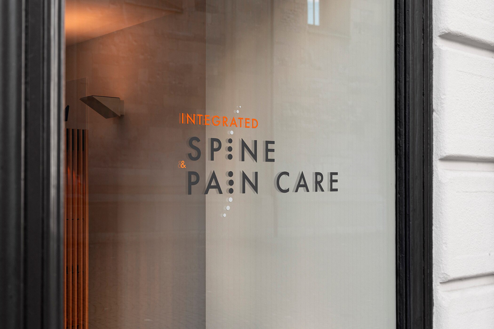
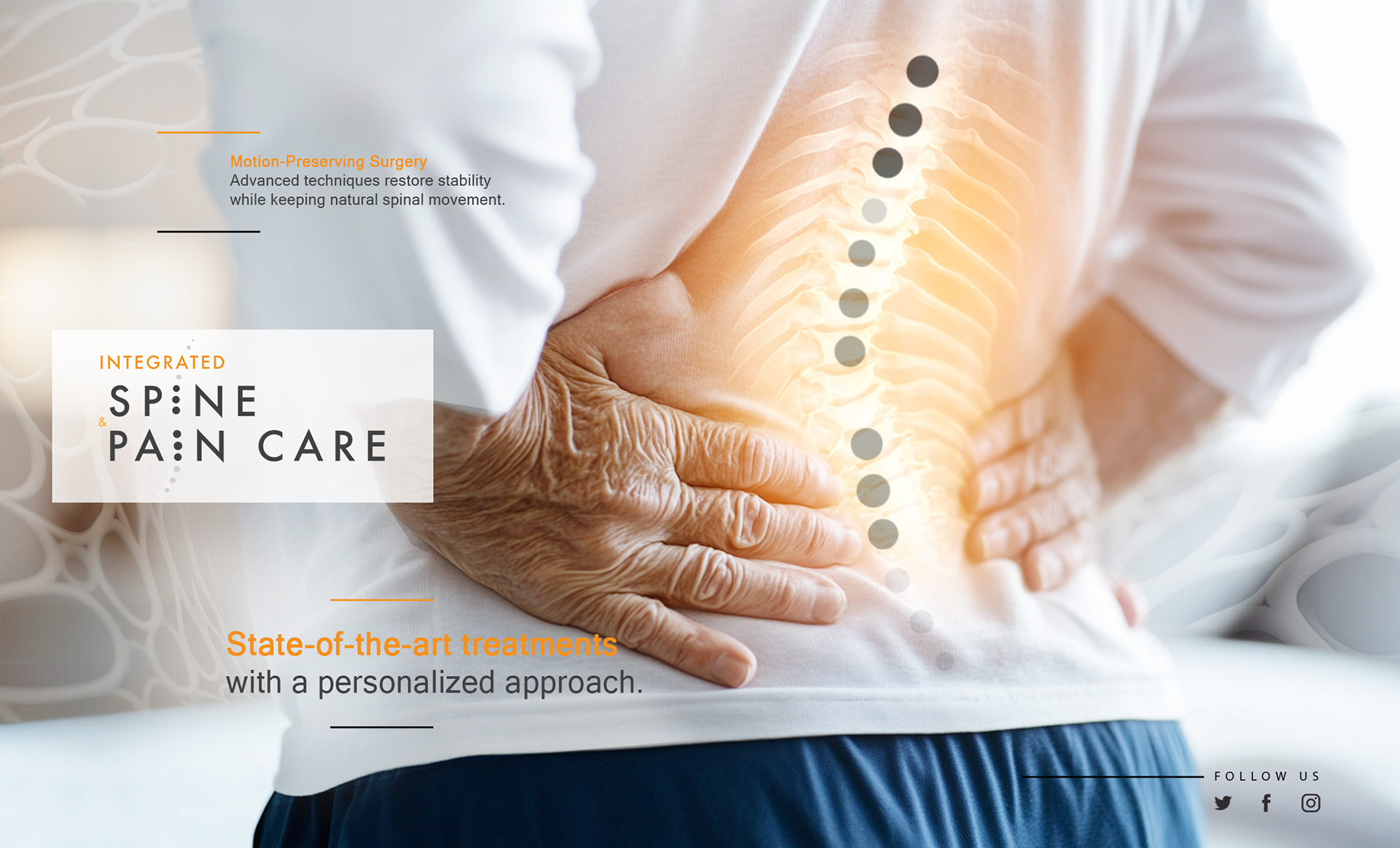
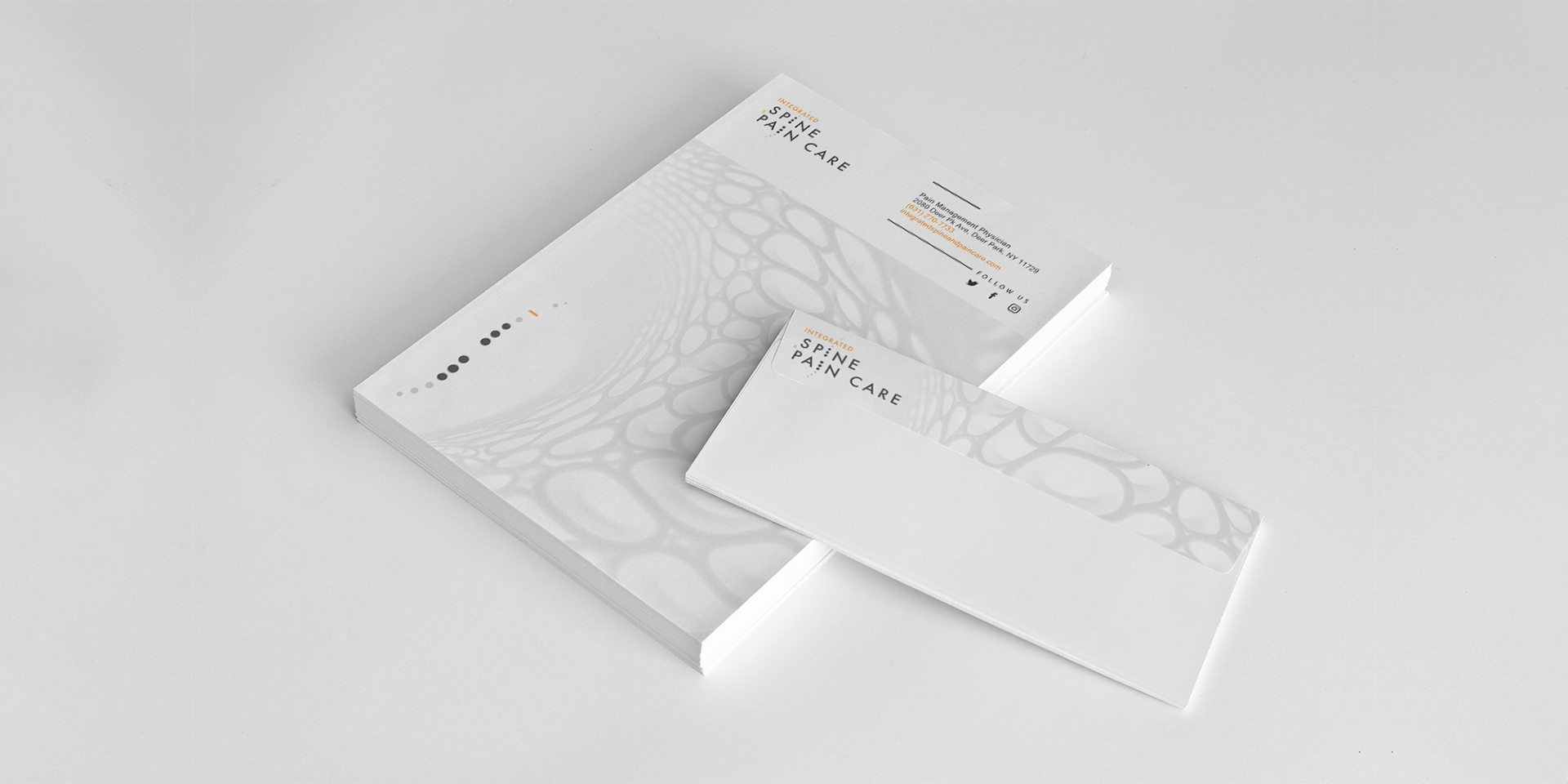
The logo was designed as a calm, structured mark,
balancing clinical precision with a subtle sense of reassurance.
balancing clinical precision with a subtle sense of reassurance.


❝ Philippe worked with agility and care.
He understood our mission in health innovation and gave it a visual system that felt human, precise, and optimistic.❞
He understood our mission in health innovation and gave it a visual system that felt human, precise, and optimistic.❞


Ready to give your healthcare brand the
clarity, trust, & visual strength it deserves?
clarity, trust, & visual strength it deserves?