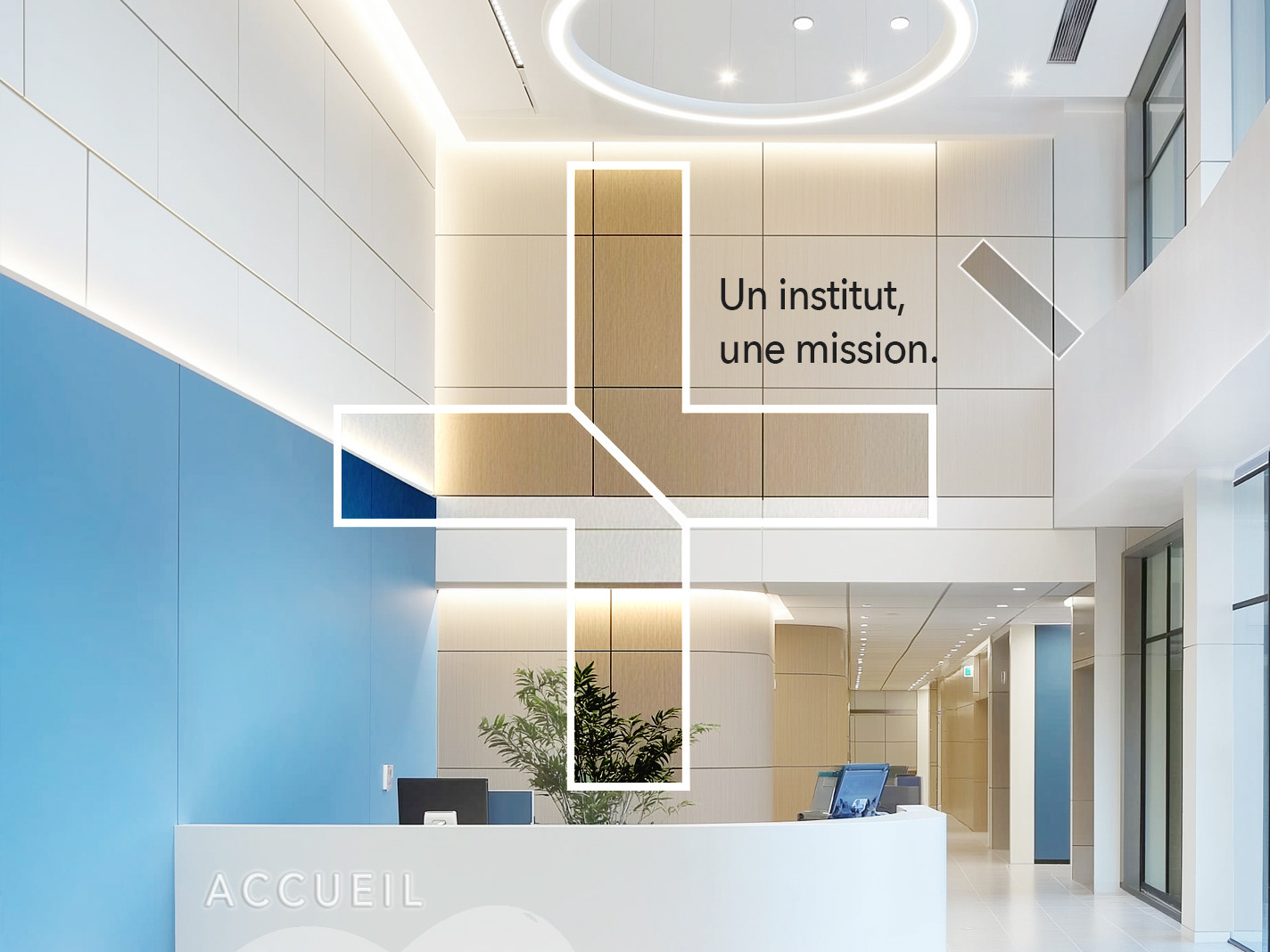
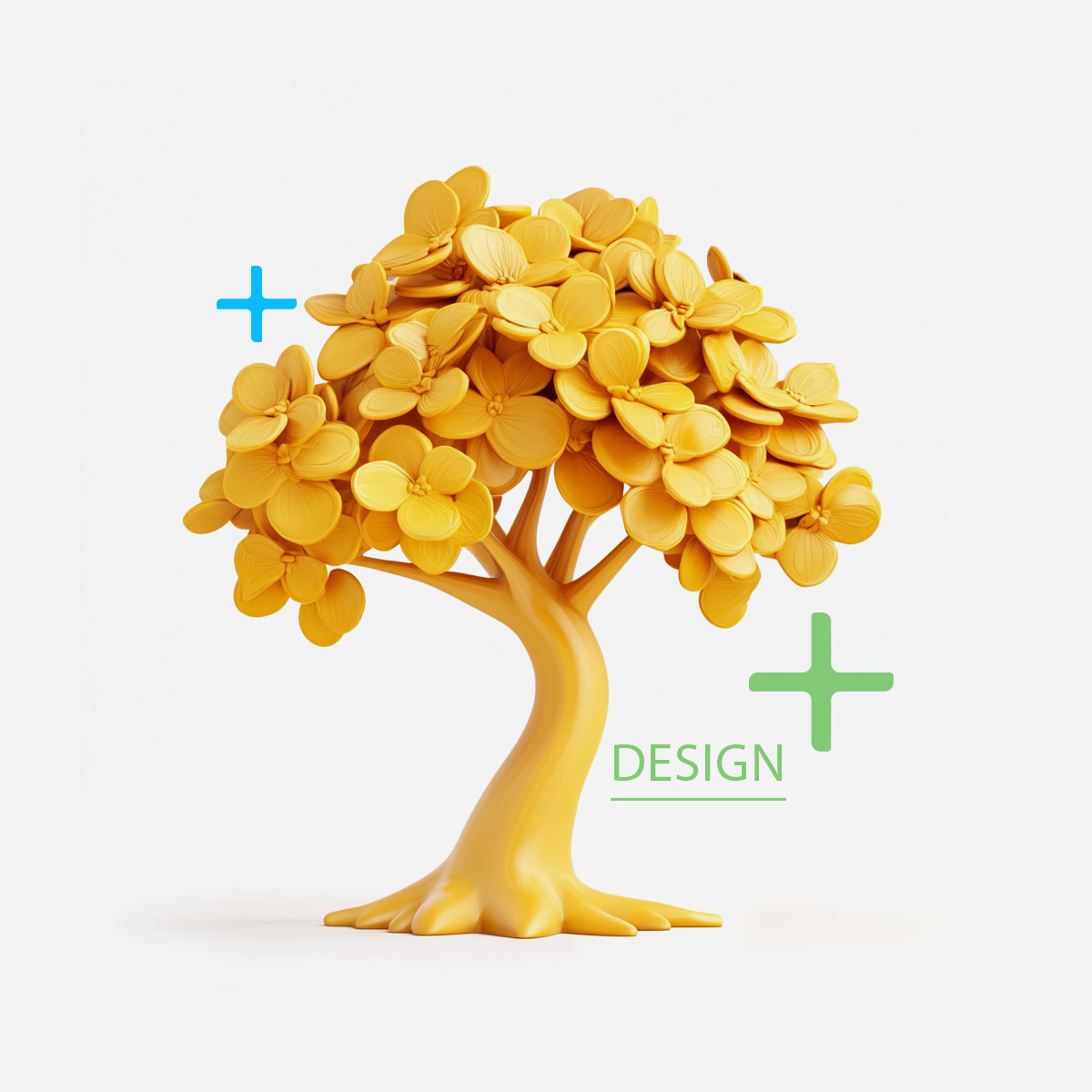
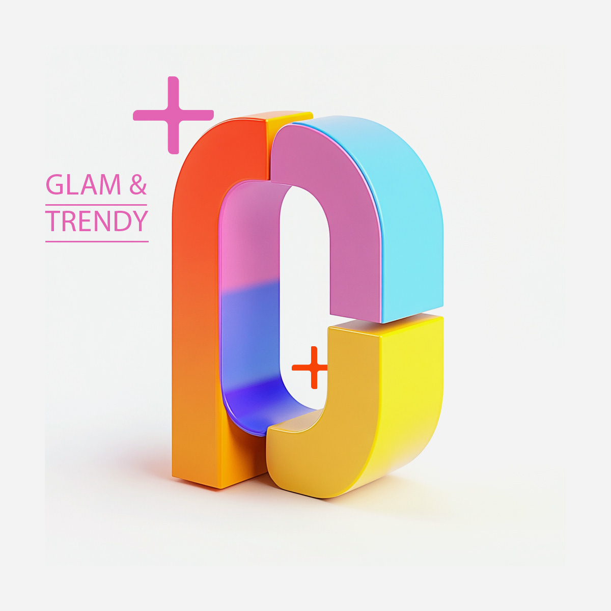
A Paris-based hybrid culture magazine needed a design system flexible enough to handle essays, interviews, photography, and reviews, issue after issue, without losing coherence or editorial identity.
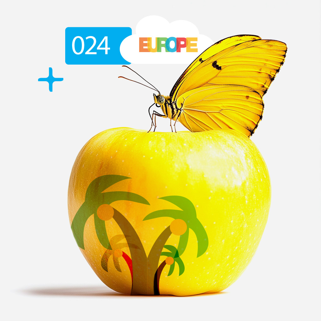
I built the full visual system: logo, typographic architecture, modular grid, iconography, and illustration direction.
Speed for editors. Craft for readers.
I built the full visual system: logo, typographic architecture, modular grid, iconography, and illustration direction.
Speed for editors. Craft for readers.
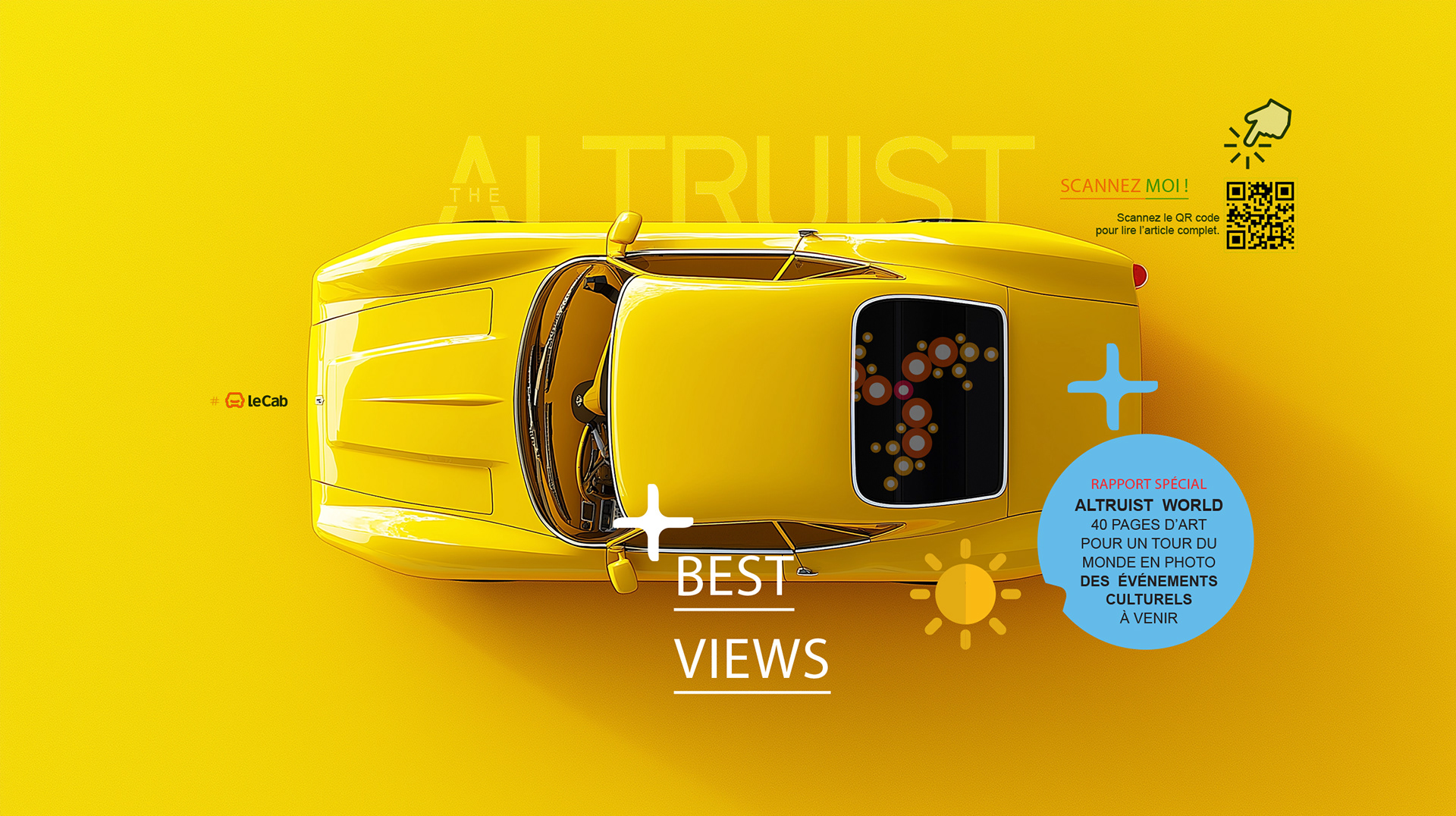
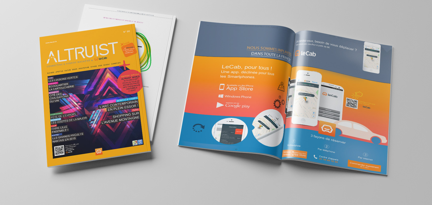
CLIENT ▸ The Altruist by Le Cab, New Hybrid & Connecting Magazine, Paris, France
ROLE ▸ Art Director Freelance
SCOPE ▸ Logo Design, Visual Identity, Magazine Layout Design, Print Design, Iconography, Illustrations
ROLE ▸ Art Director Freelance
SCOPE ▸ Logo Design, Visual Identity, Magazine Layout Design, Print Design, Iconography, Illustrations
The Challenge
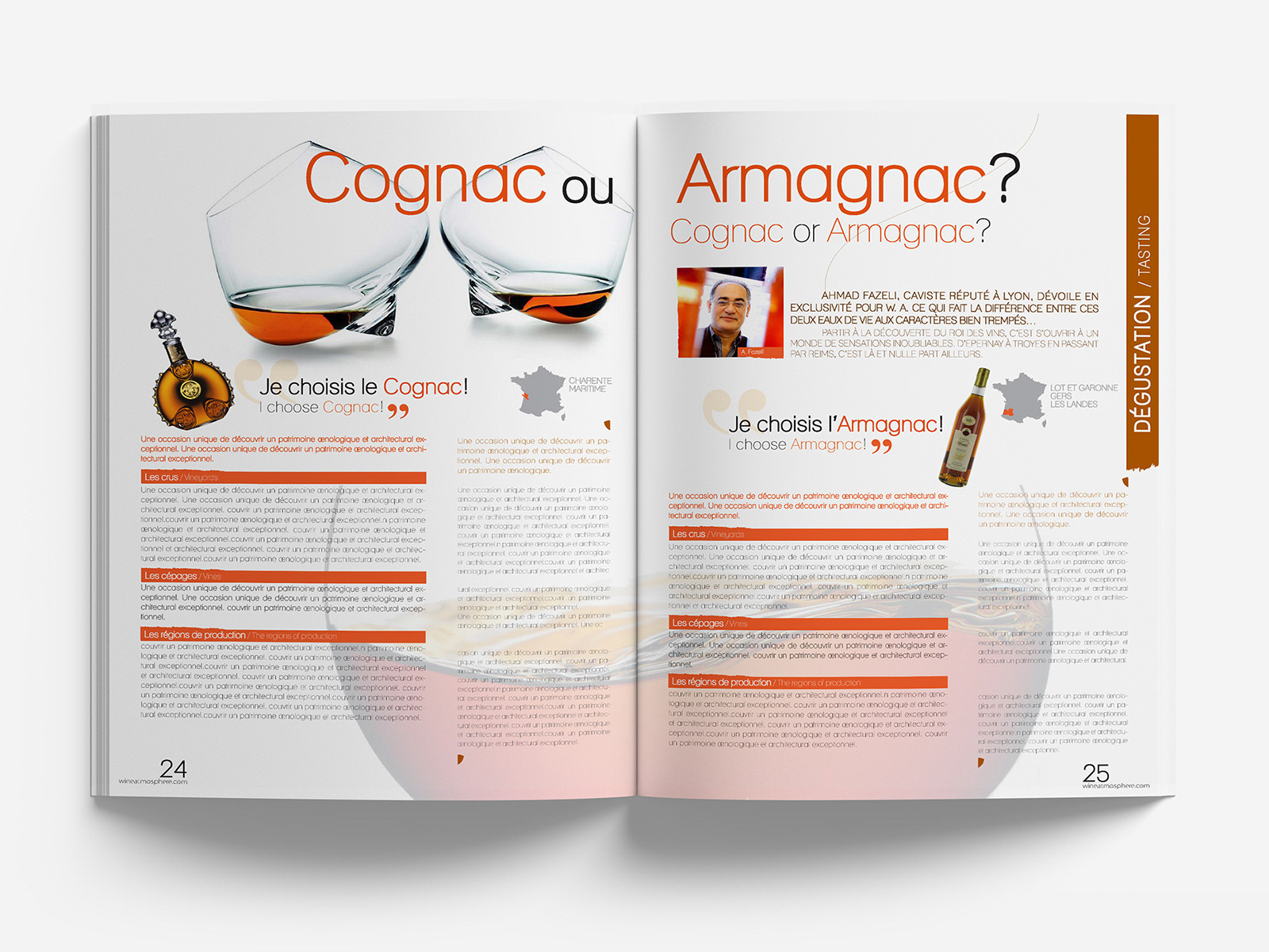
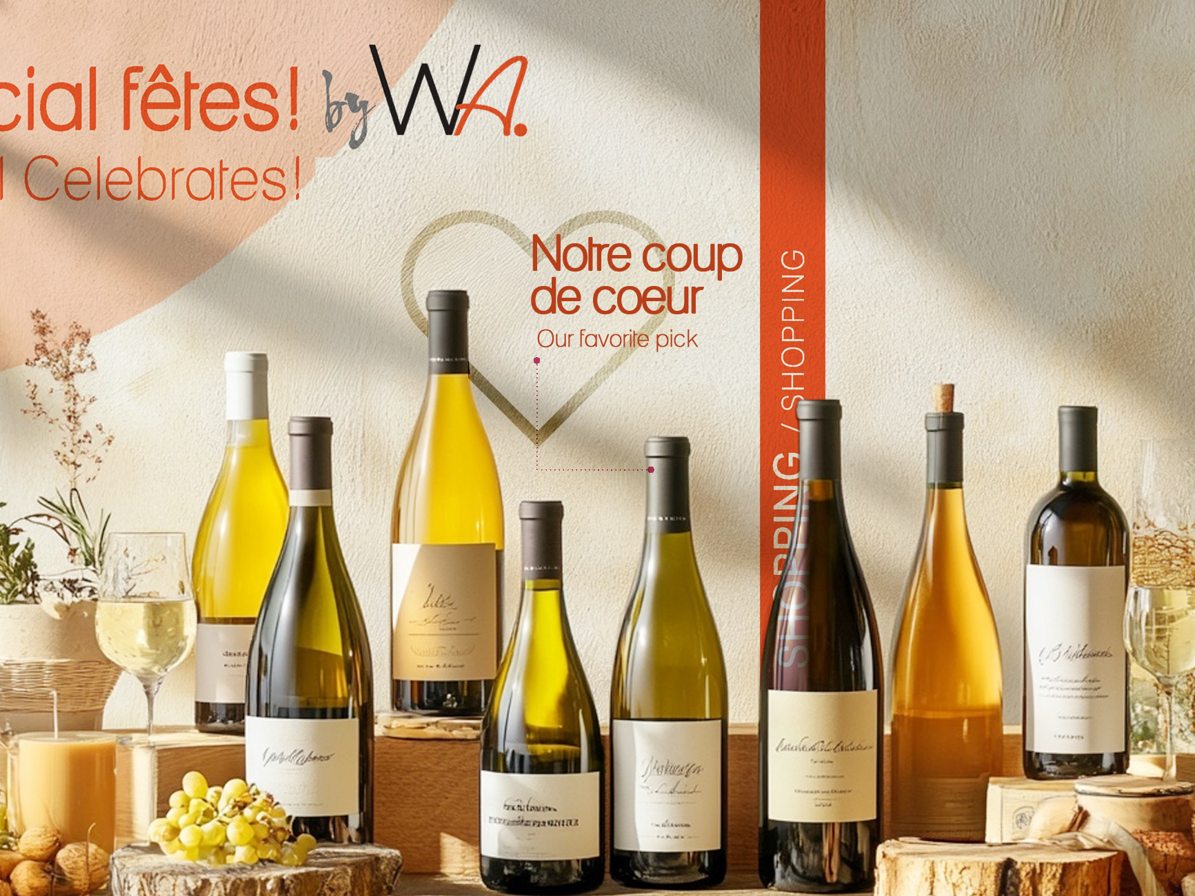
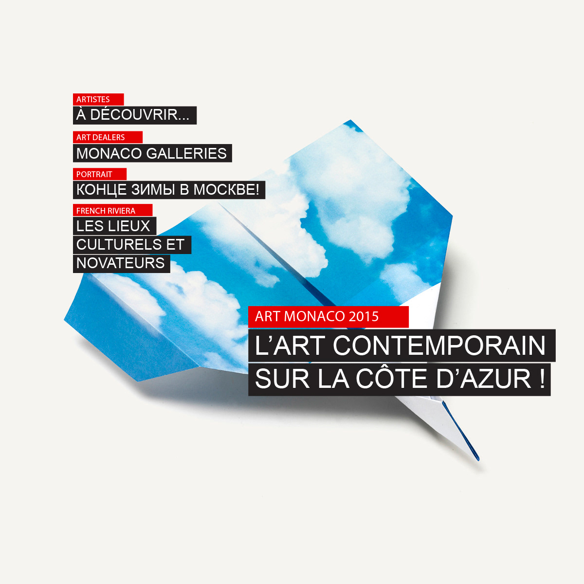
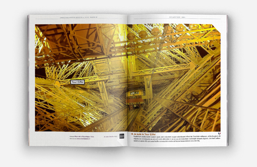
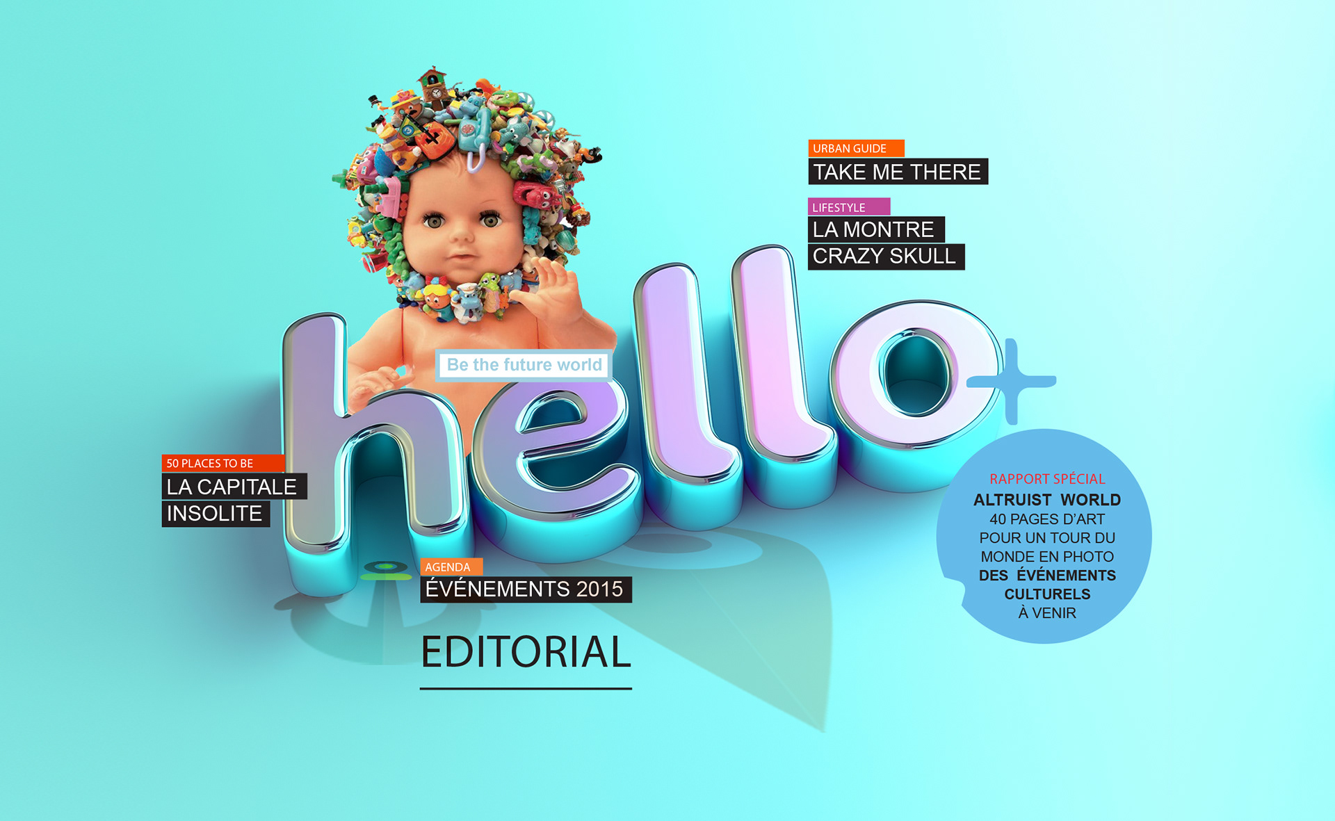
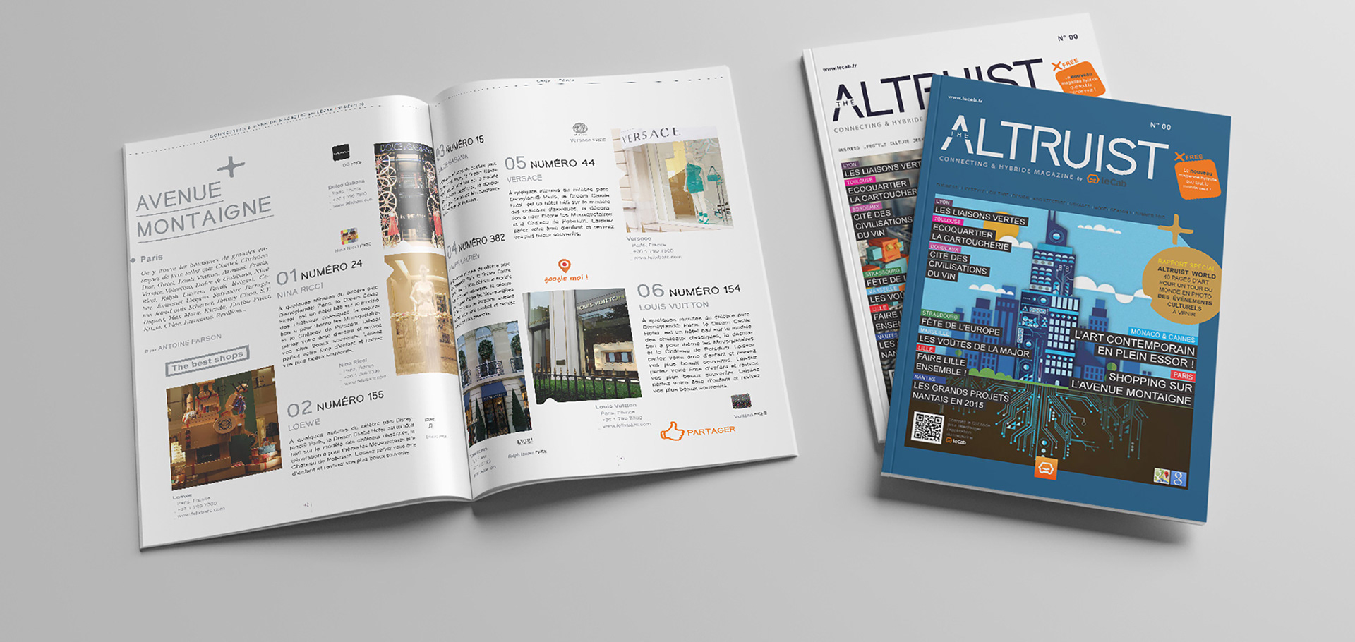
Create a contemporary culture magazine layout that feels premium and readable, not over-designed
Support diverse content types (features, interviews, essays, reviews) without losing cohesion
Build a system that enables speed and consistency across issues
Create a contemporary culture magazine layout that feels premium and readable, not over-designed
Support diverse content types (features, interviews, essays, reviews) without losing cohesion
Build a system that enables speed and consistency across issues
Strategic Approach
Treat the magazine as a publishing system: hierarchy, rhythm, templates, repeatability
Establish a flexible grid and typographic architecture that can absorb variation
Prioritize pacing and readability to elevate content and improve engagement
Treat the magazine as a publishing system: hierarchy, rhythm, templates, repeatability
Establish a flexible grid and typographic architecture that can absorb variation
Prioritize pacing and readability to elevate content and improve engagement
Creative Solution
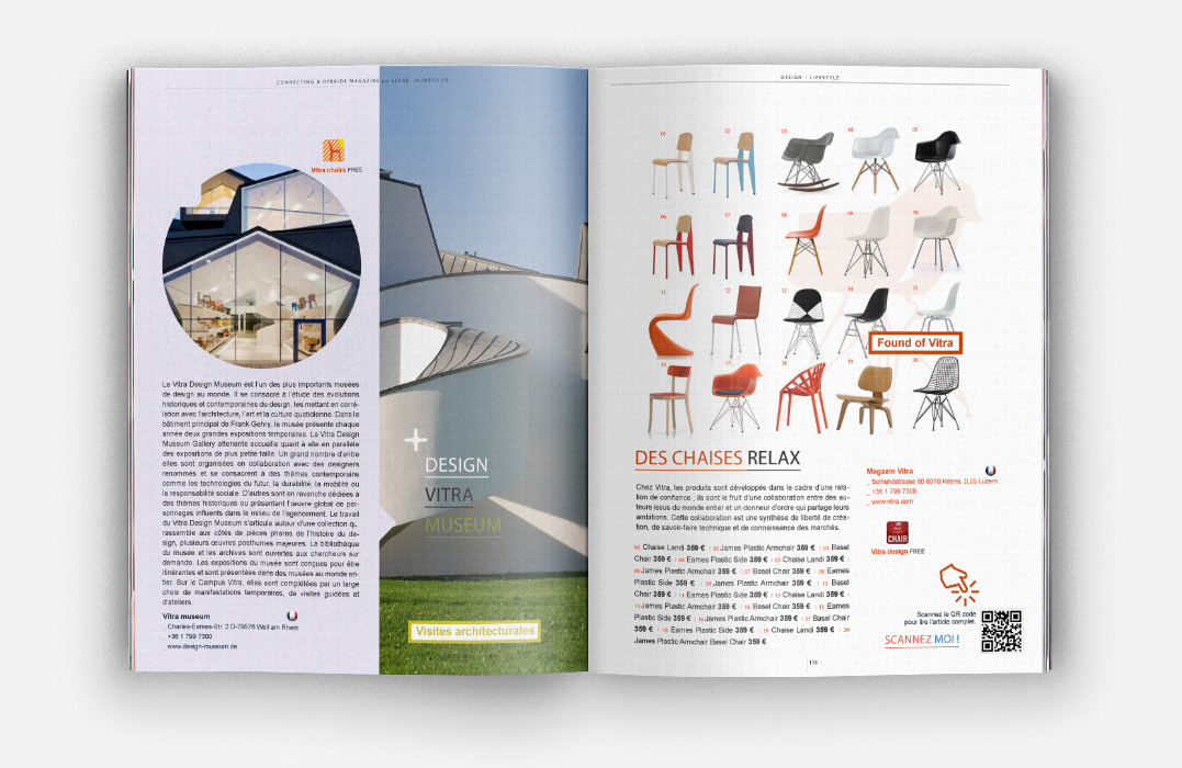
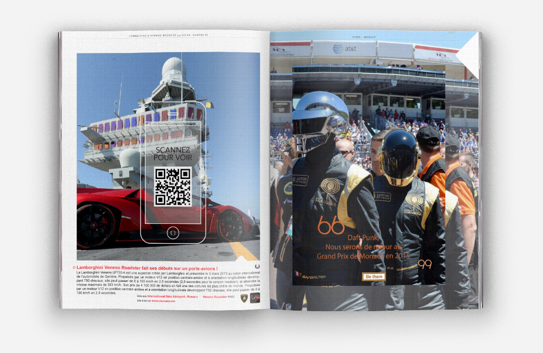
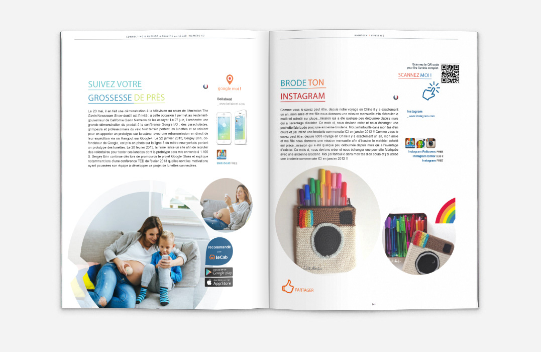
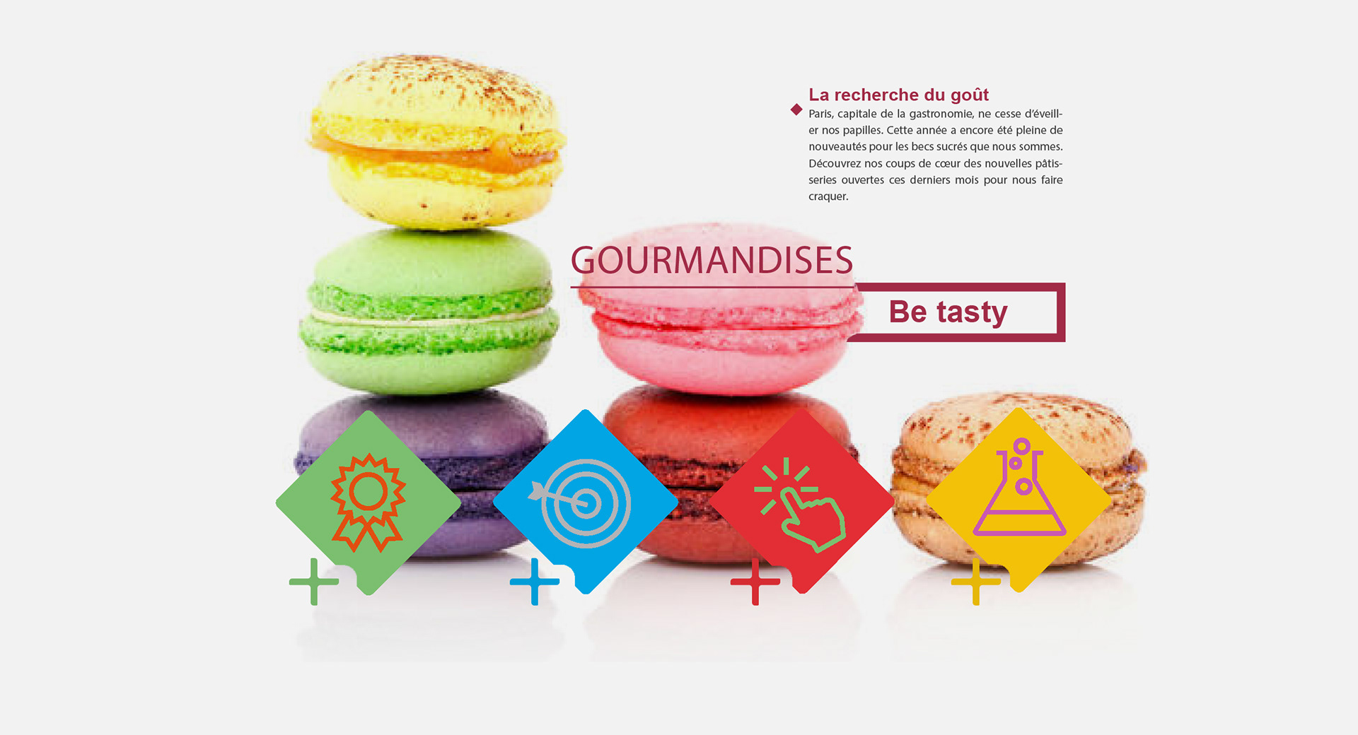
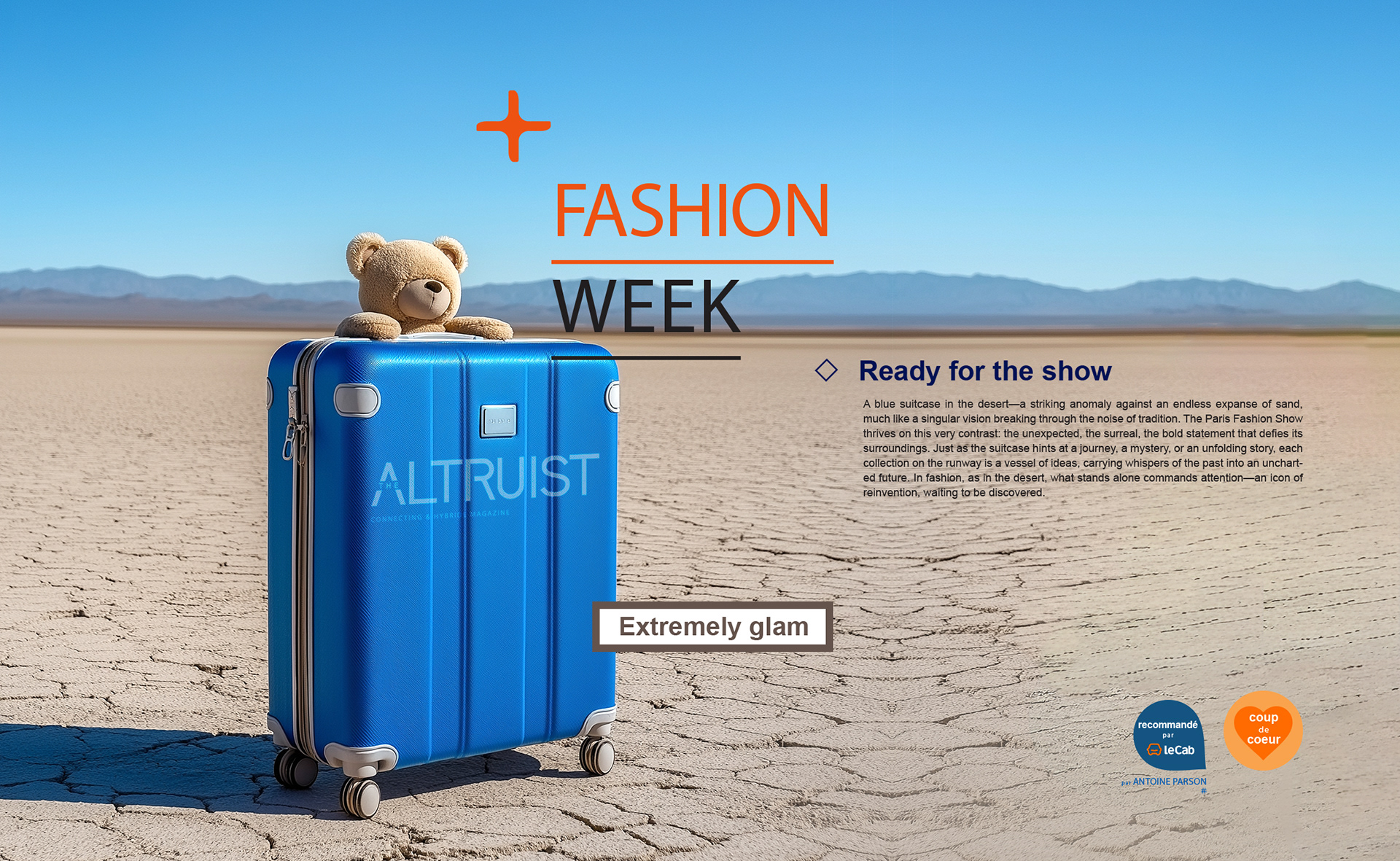
A refined editorial design language anchored in strong typography and disciplined spacing
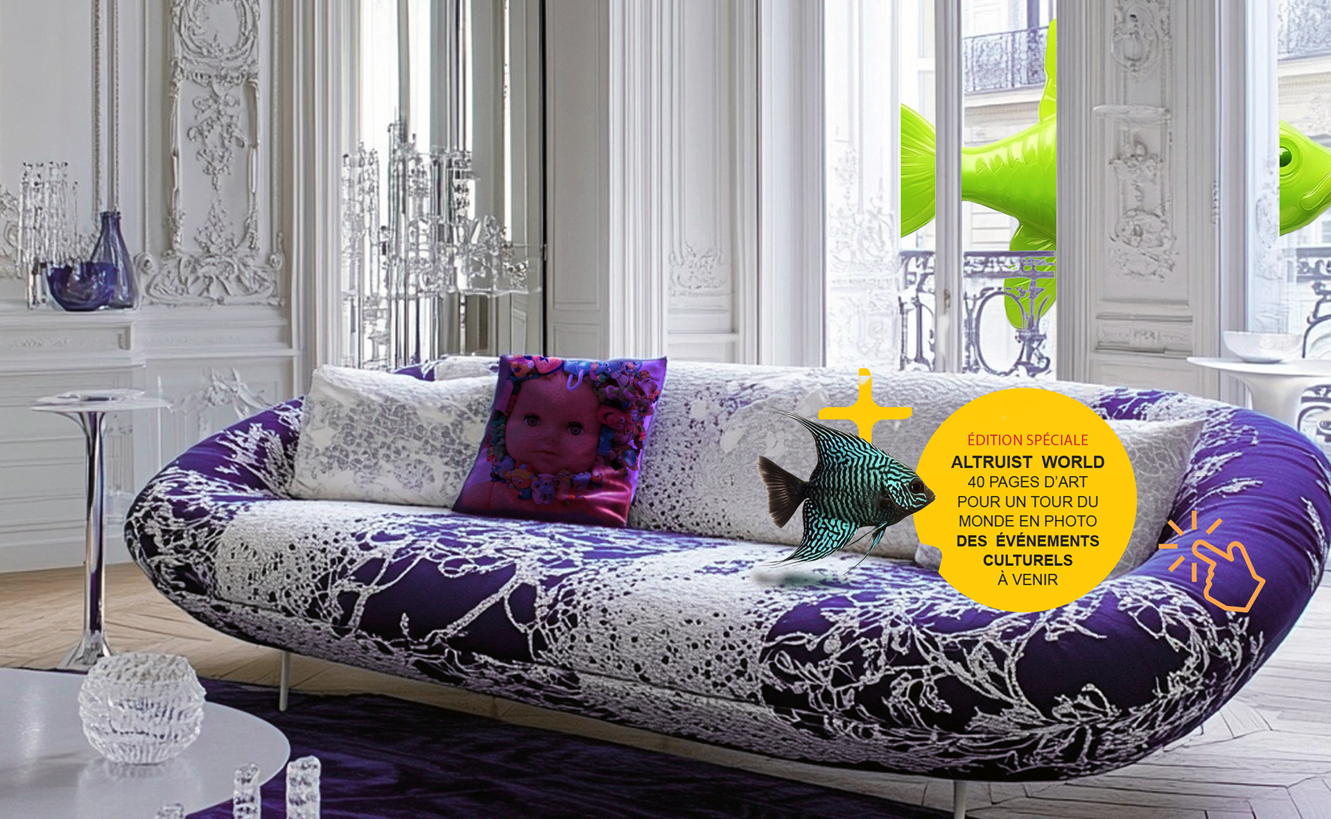
A modular layout approach that creates consistency without visual monotony
A visual rhythm that supports long-form reading while maintaining cultural edge
A refined editorial design language anchored in strong typography and disciplined spacing
A modular layout approach that creates consistency without visual monotony
A visual rhythm that supports long-form reading while maintaining cultural edge
Scope & System
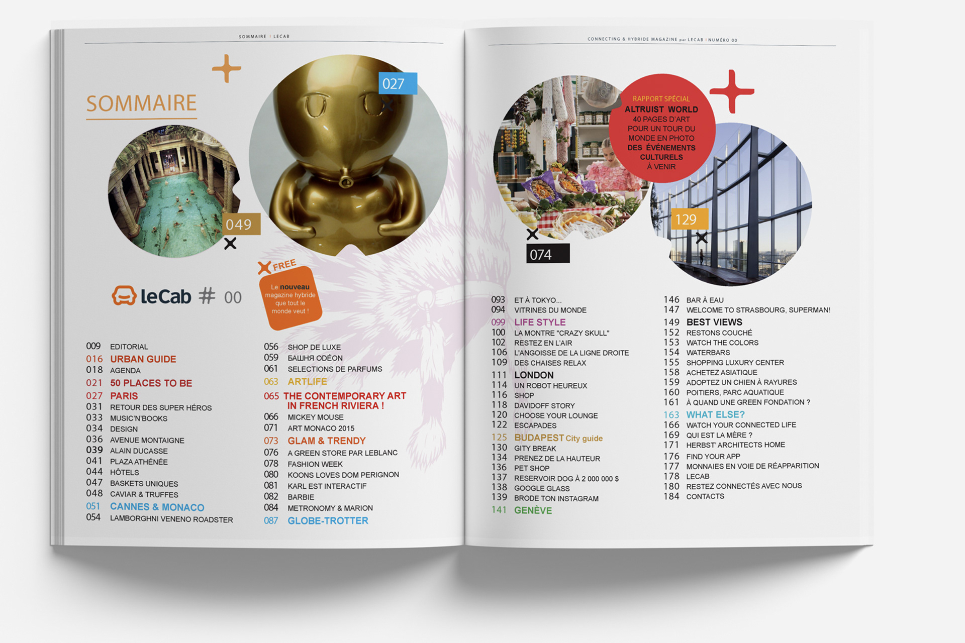
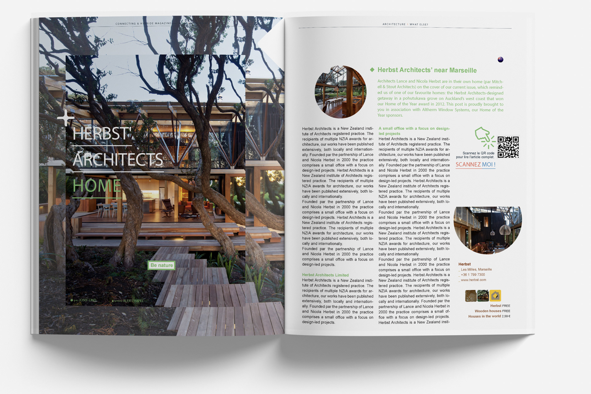
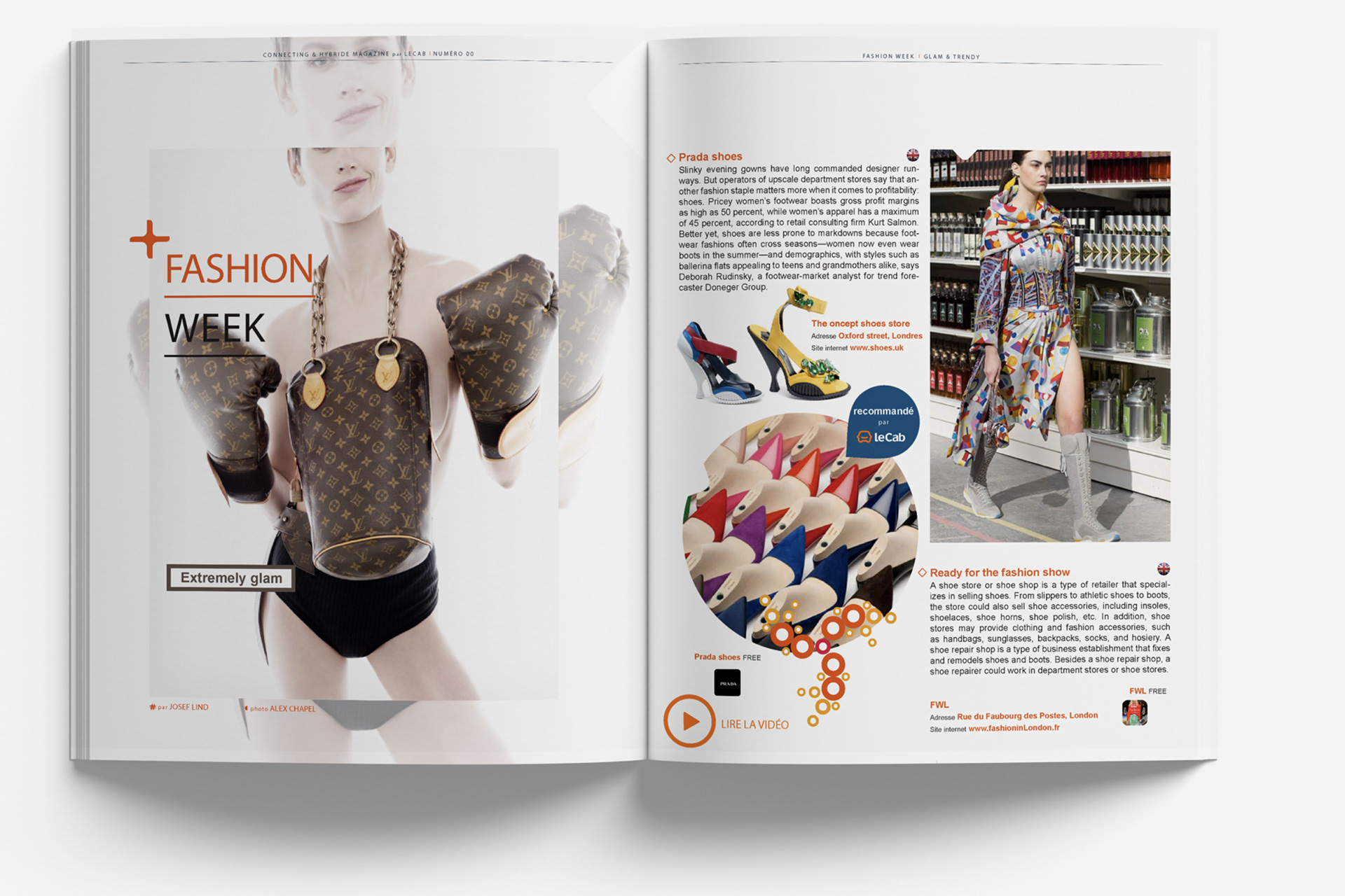
Modular grid system for features, openers, and recurring sections
Typographic hierarchy for headlines, decks, body, captions, pull quotes, and credits
Template architecture to accelerate production while protecting craft
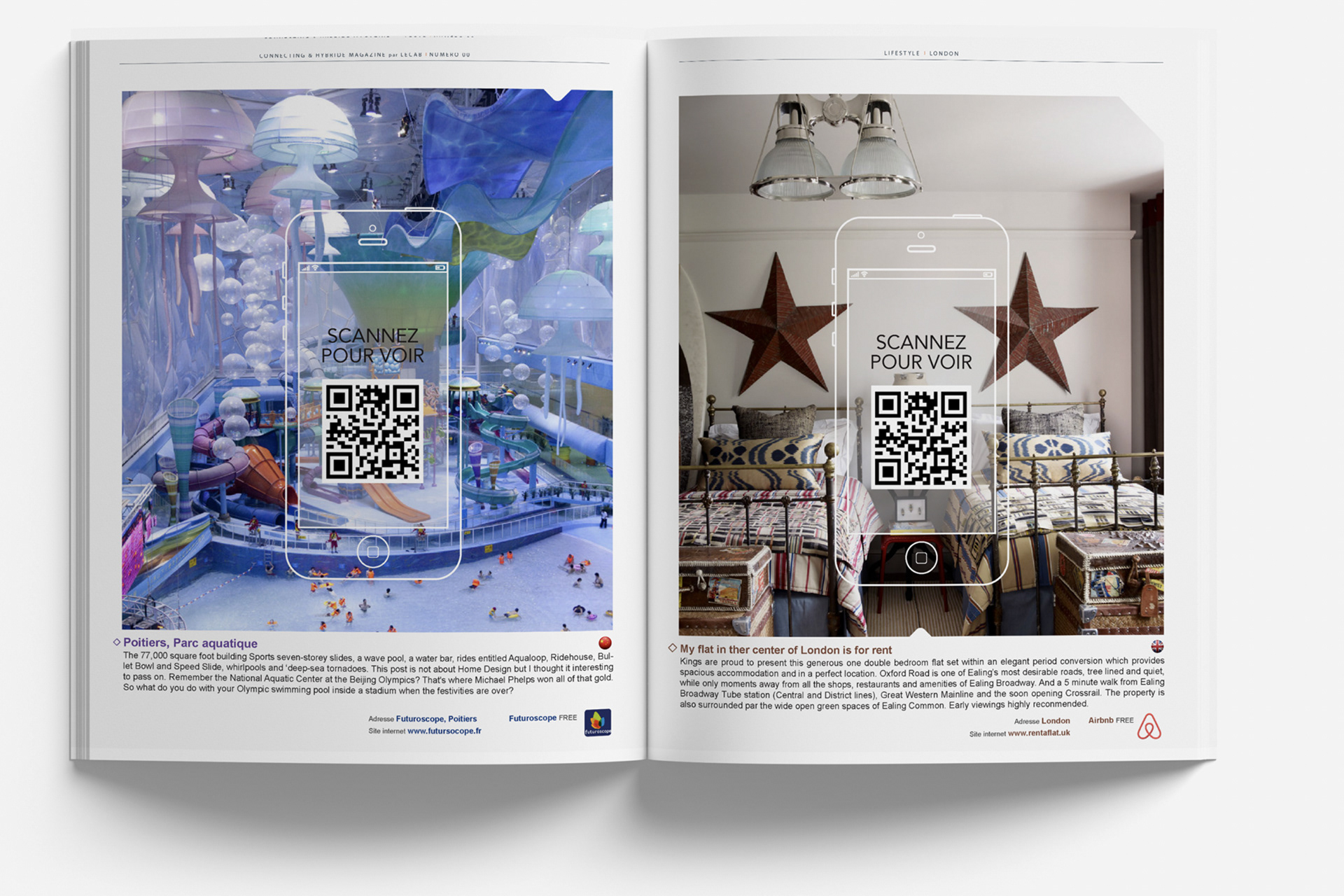
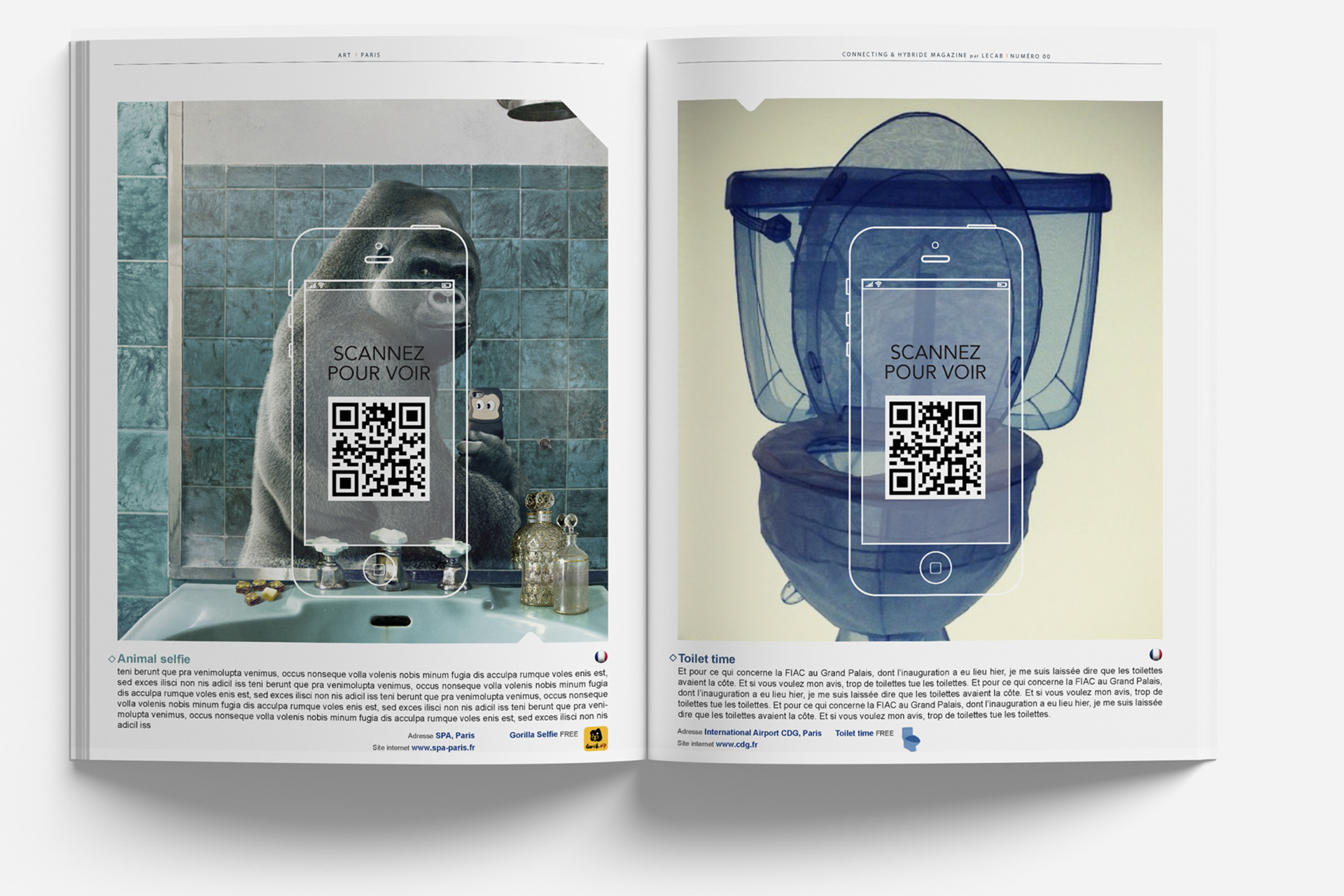
Image rules and layout pacing for consistent editorial storytelling
Modular grid system for features, openers, and recurring sections
Typographic hierarchy for headlines, decks, body, captions, pull quotes, and credits
Template architecture to accelerate production while protecting craft
Image rules and layout pacing for consistent editorial storytelling
Deliverables
Full magazine layout system (print + digital-ready)
Reusable templates for key sections
Style rules for typography, spacing, grids, and image treatment
Production-ready page files and exports
Full magazine layout system (print + digital-ready)
Reusable templates for key sections
Style rules for typography, spacing, grids, and image treatment
Production-ready page files and exports
Role & Leadership
Art Director
Led the editorial design system from concept through production, defining the grid, typographic hierarchy, and templates to ensure consistent publishing quality across issues and formats.
Art Director
Led the editorial design system from concept through production, defining the grid, typographic hierarchy, and templates to ensure consistent publishing quality across issues and formats.
On The Work
Culture magazines succeed when design disappears into flow, guiding attention, creating rhythm, and letting stories land with clarity and emotion.
This project shows how a disciplined editorial system can elevate content, maintain consistency, and speed up publishing without sacrificing taste.
Culture magazines succeed when design disappears into flow, guiding attention, creating rhythm, and letting stories land with clarity and emotion.
This project shows how a disciplined editorial system can elevate content, maintain consistency, and speed up publishing without sacrificing taste.
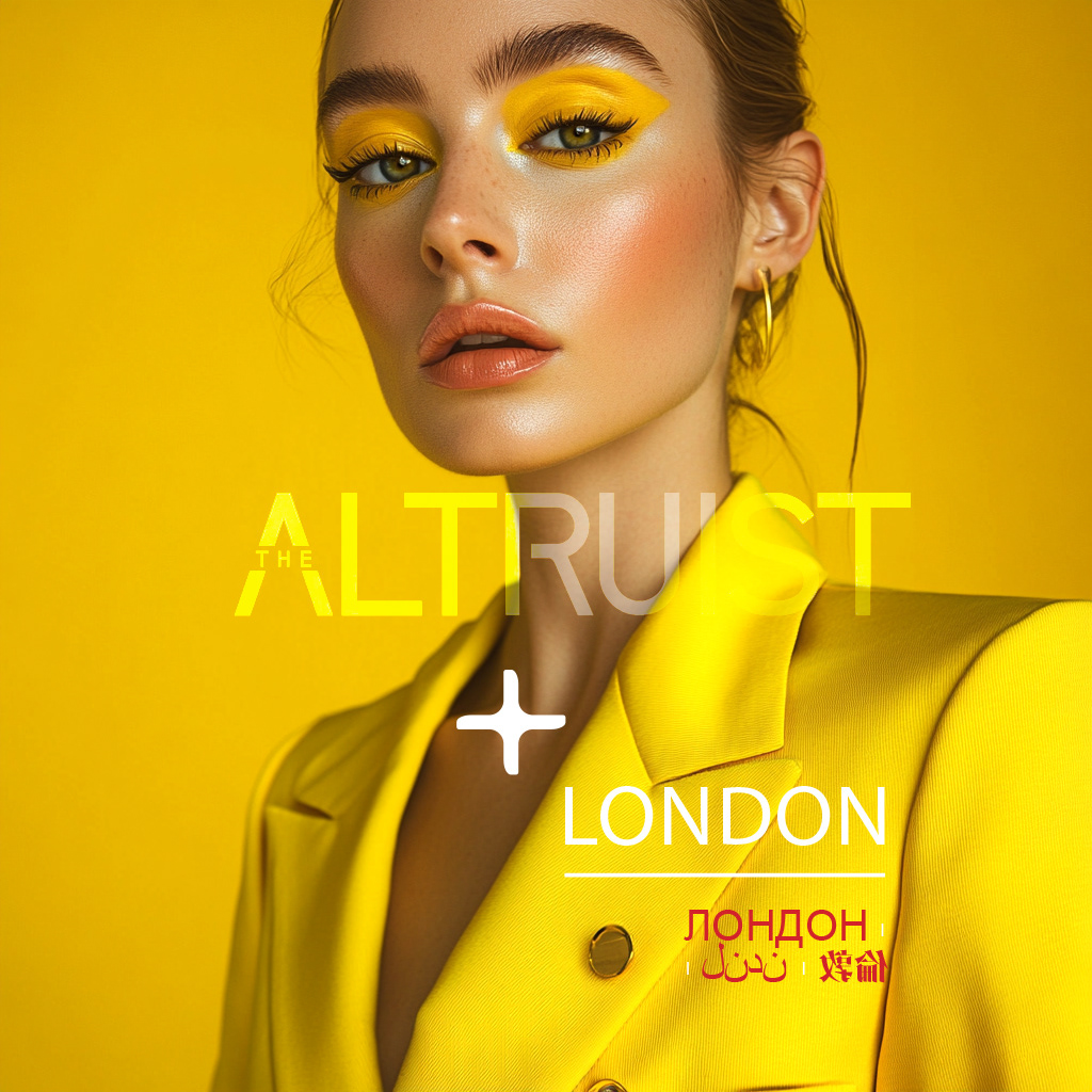

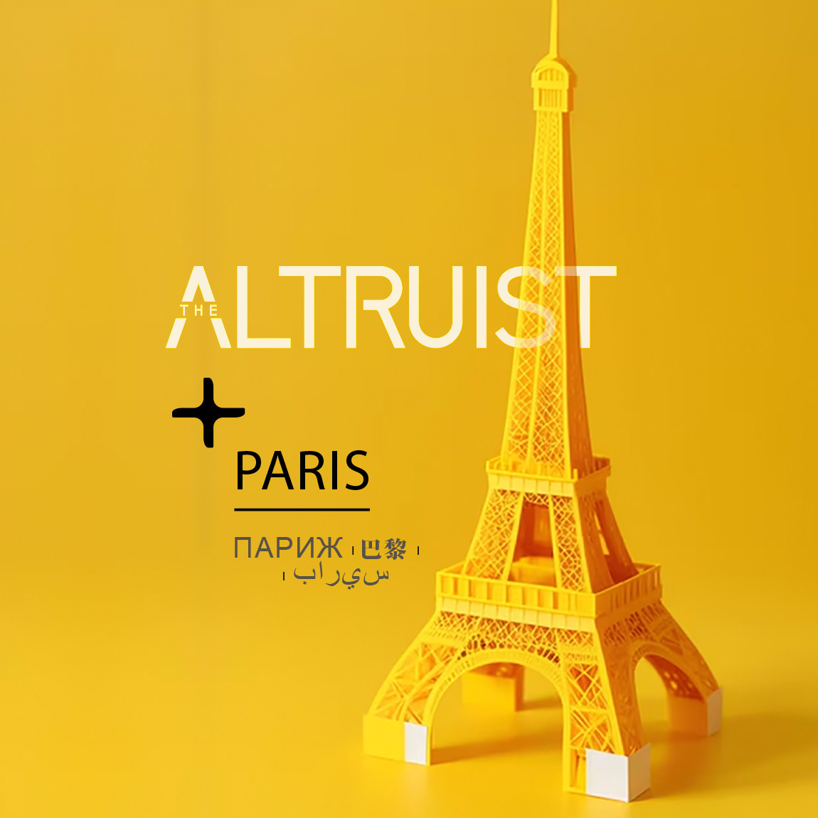
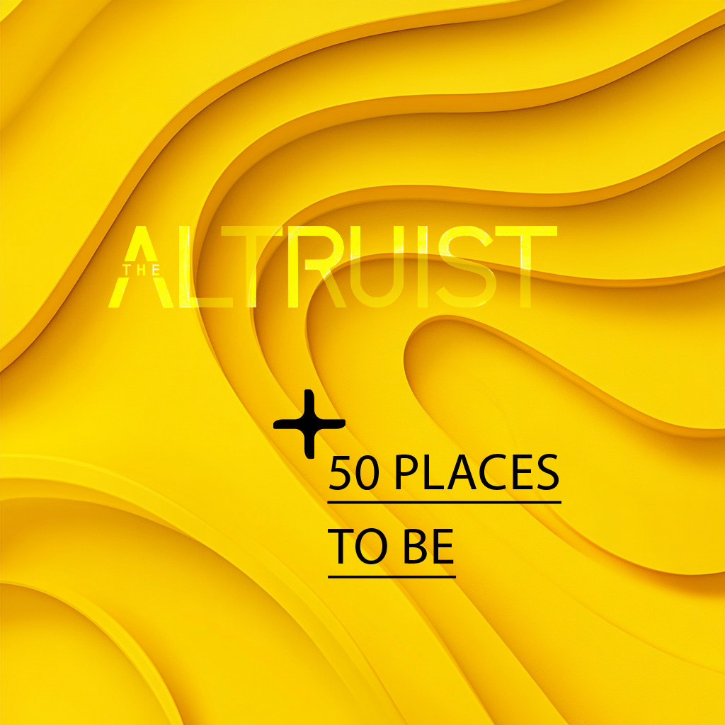
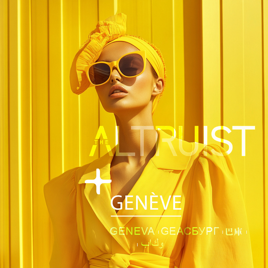
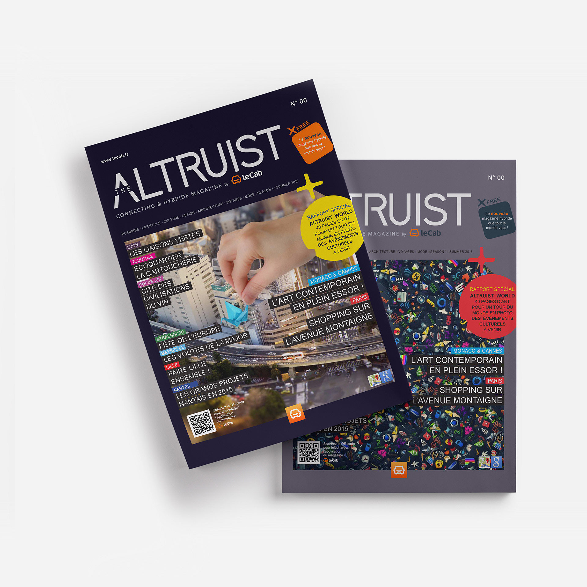
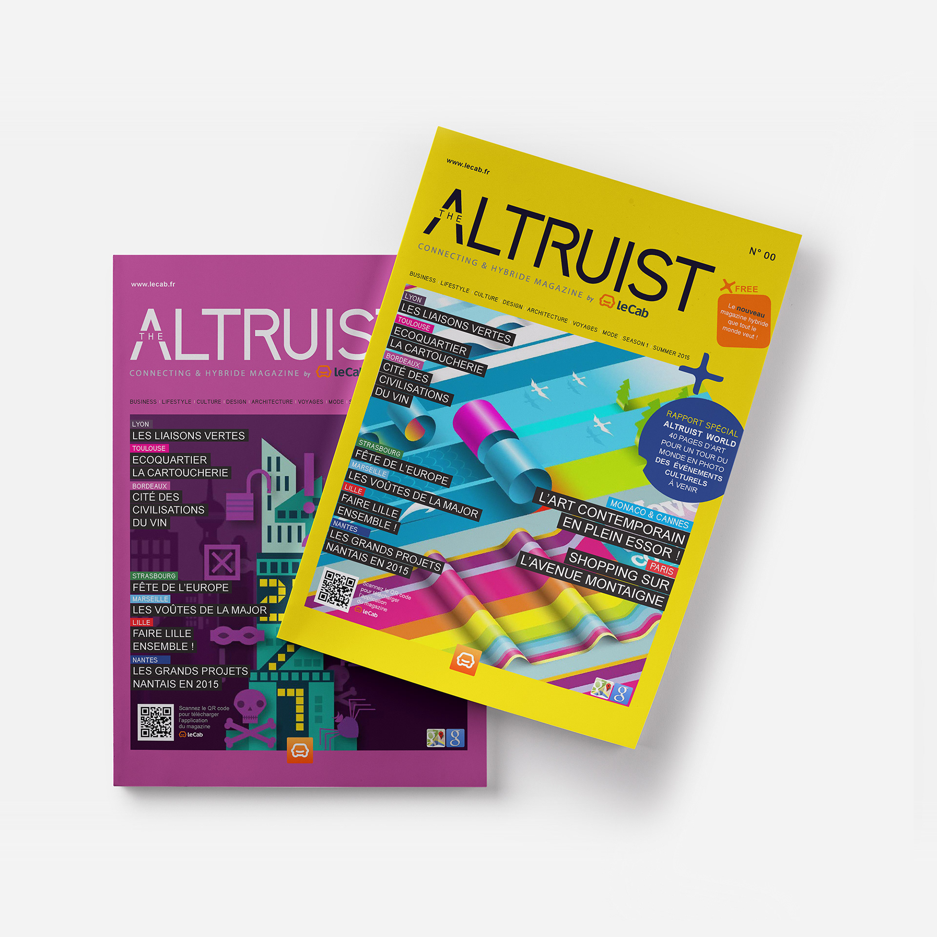
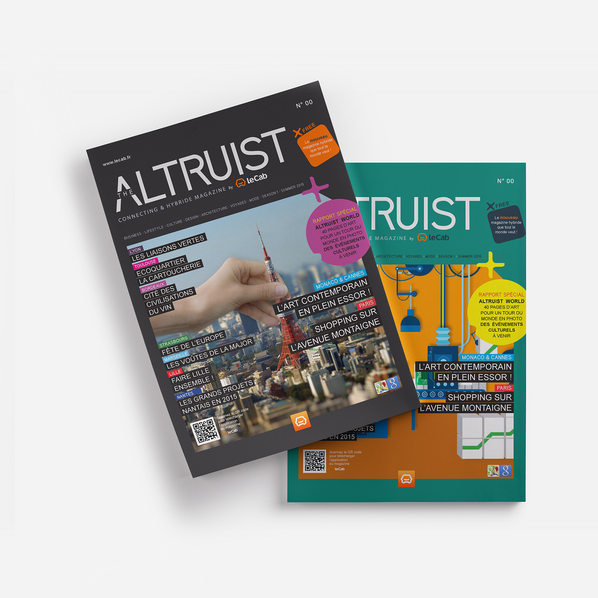
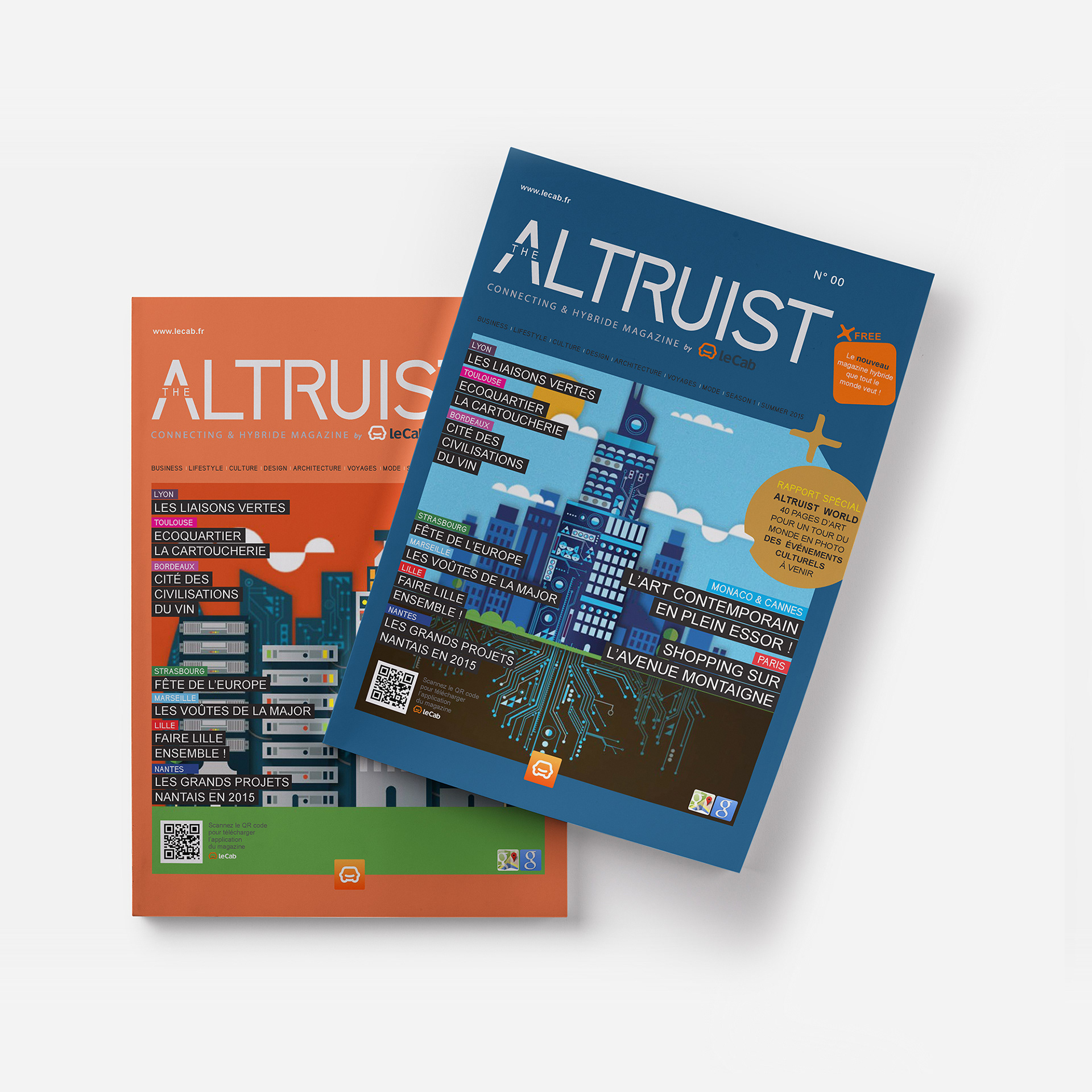
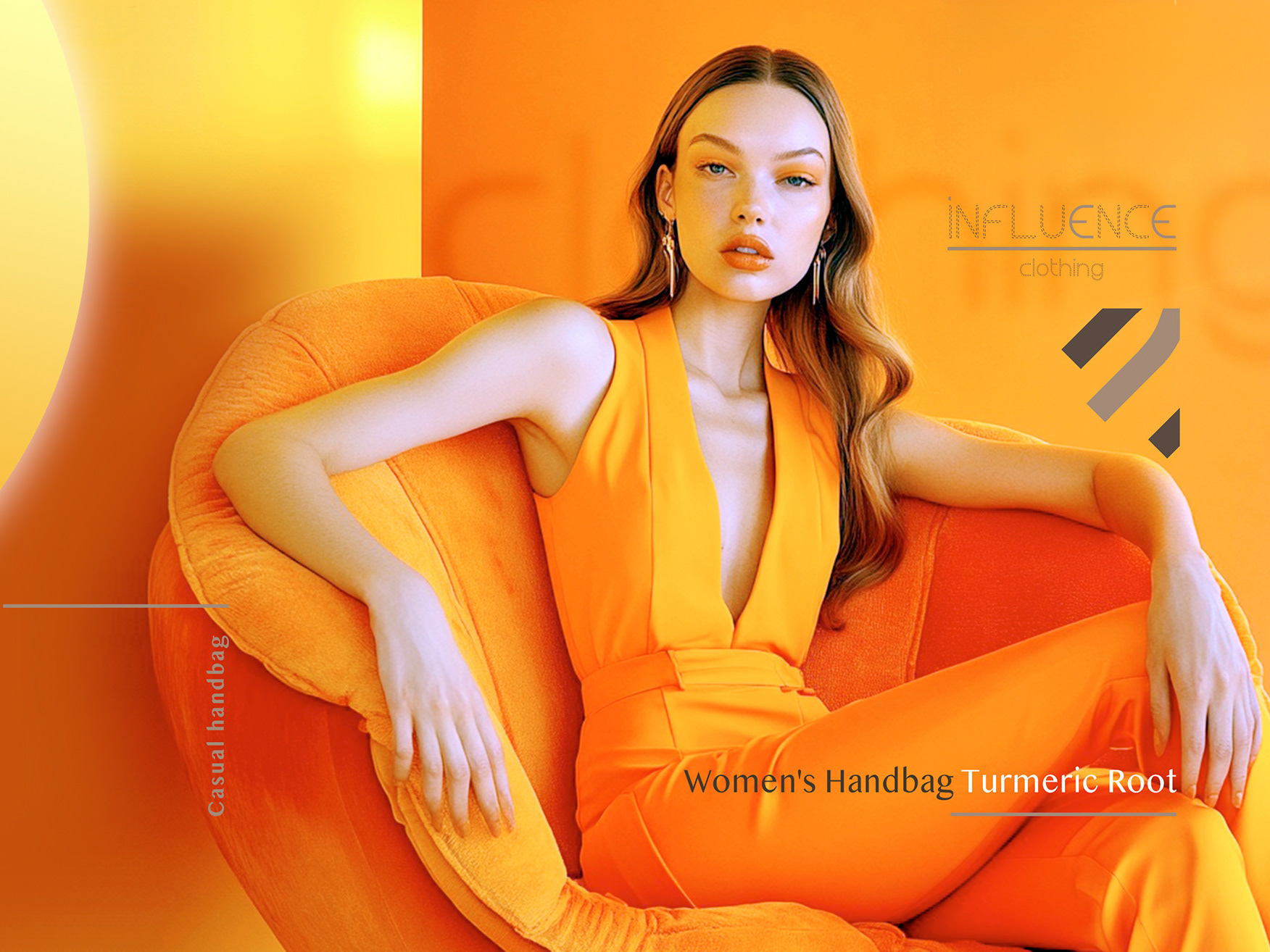
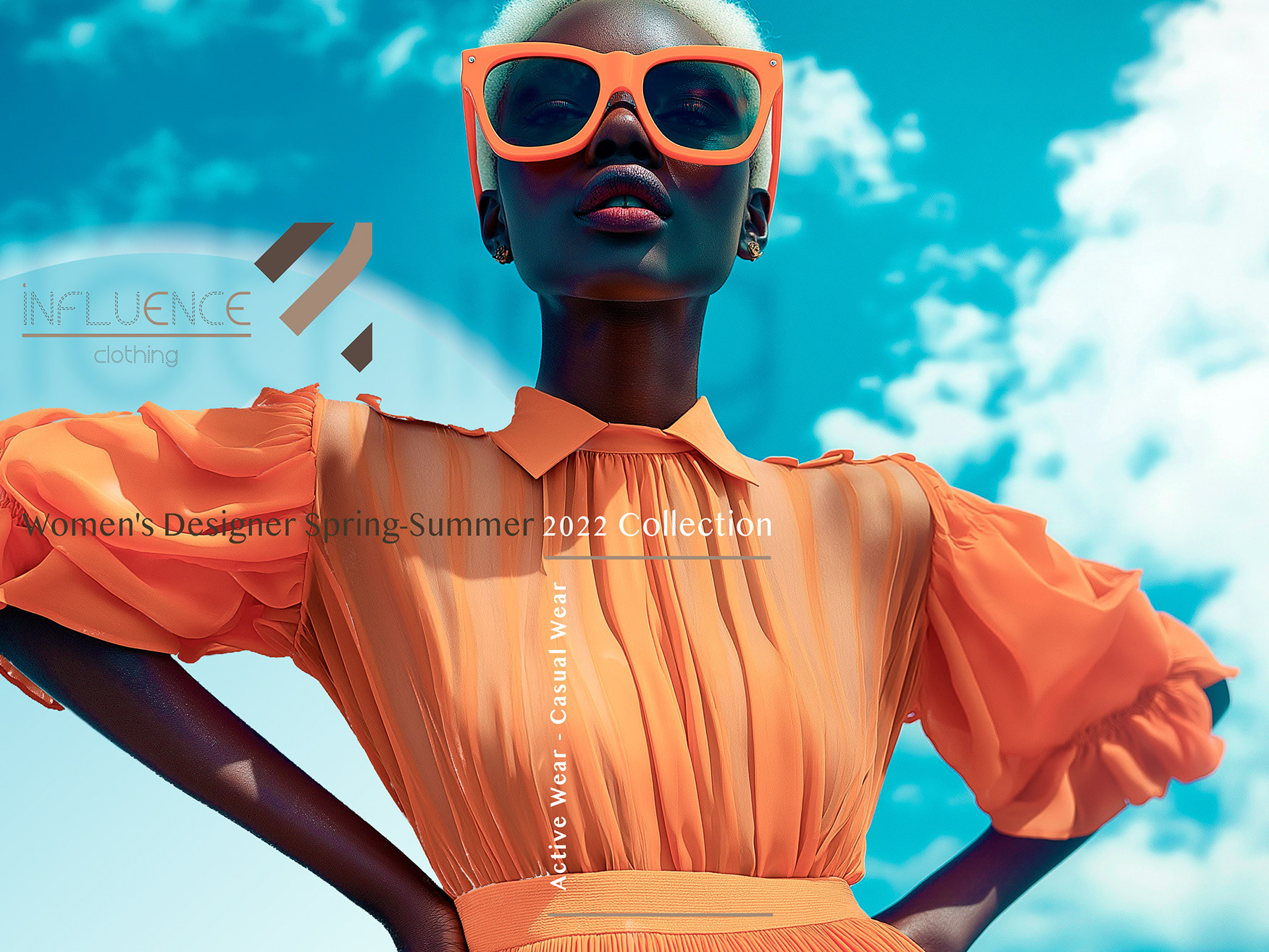
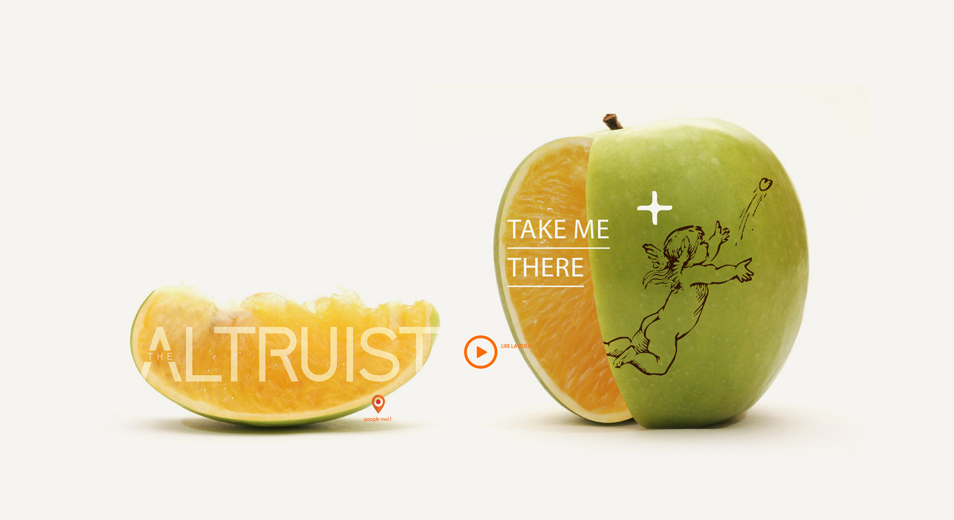
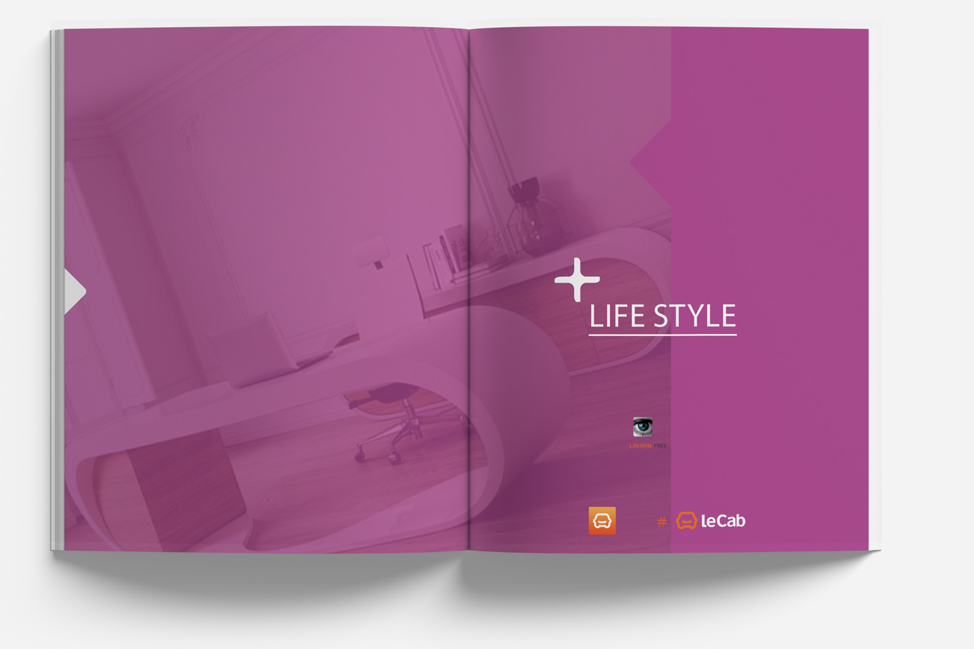
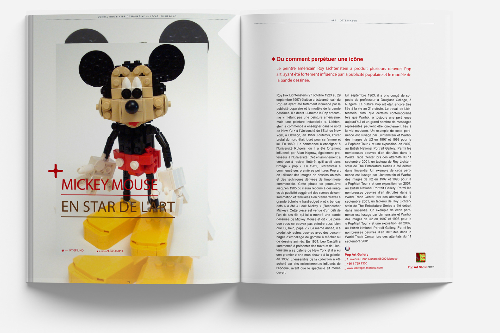
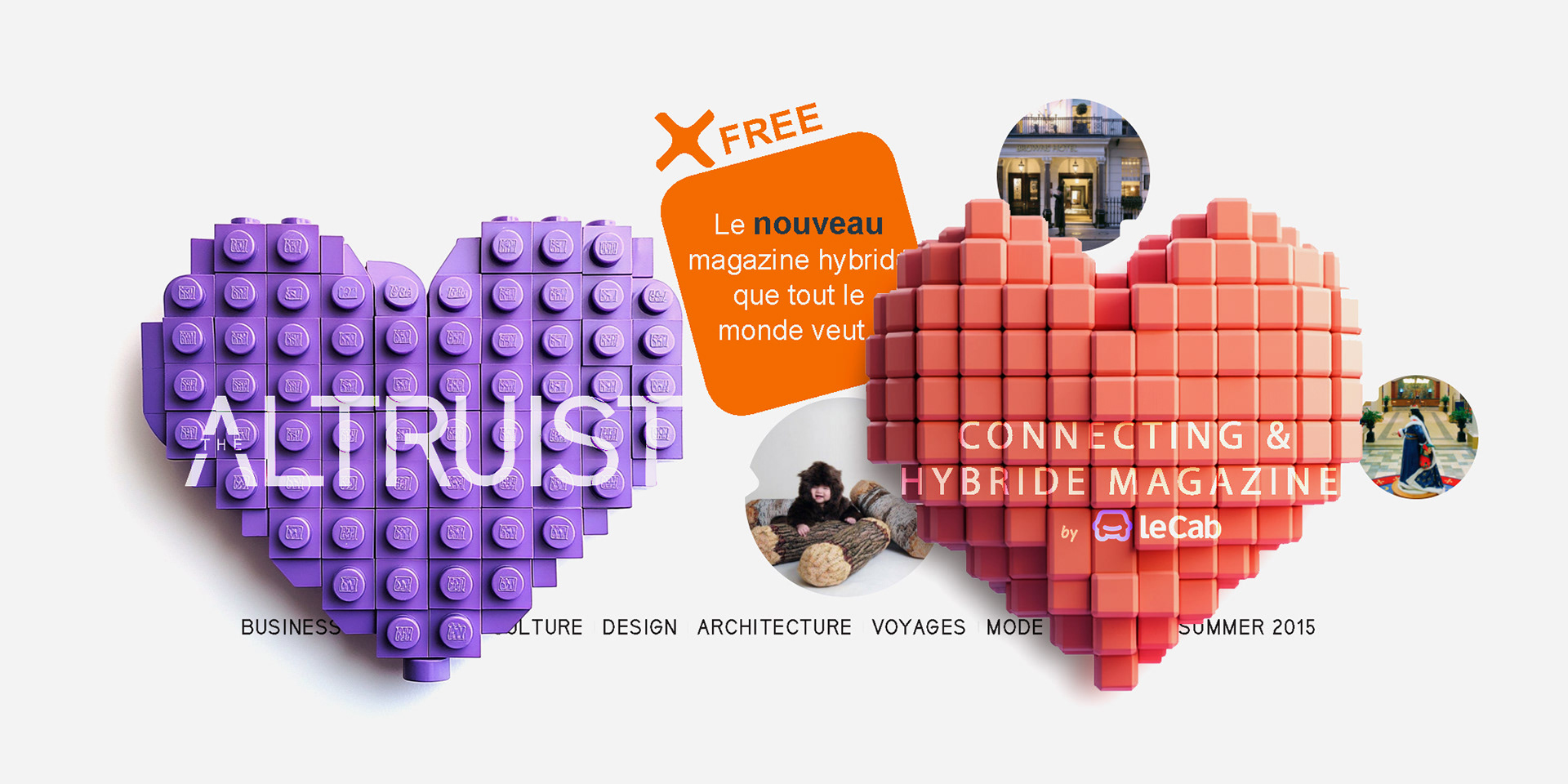
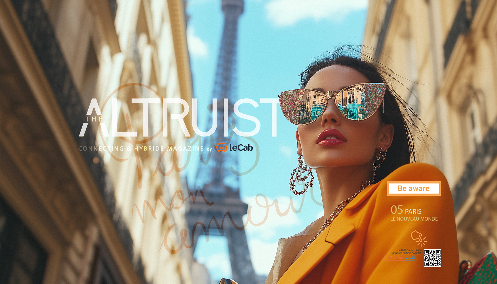
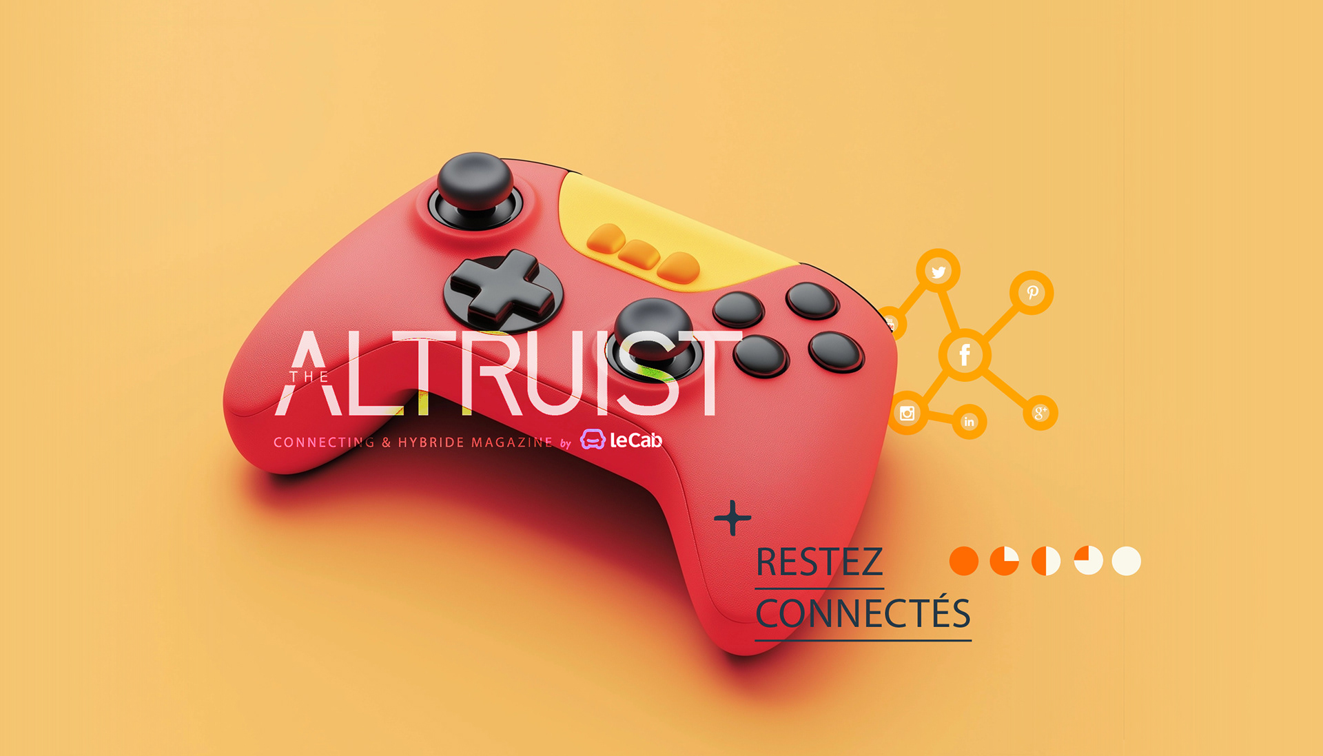
The logo was designed to be editorially neutral and typographic, acting as a flexible signature that supports a wide range of cultural topics without imposing a fixed aesthetic.
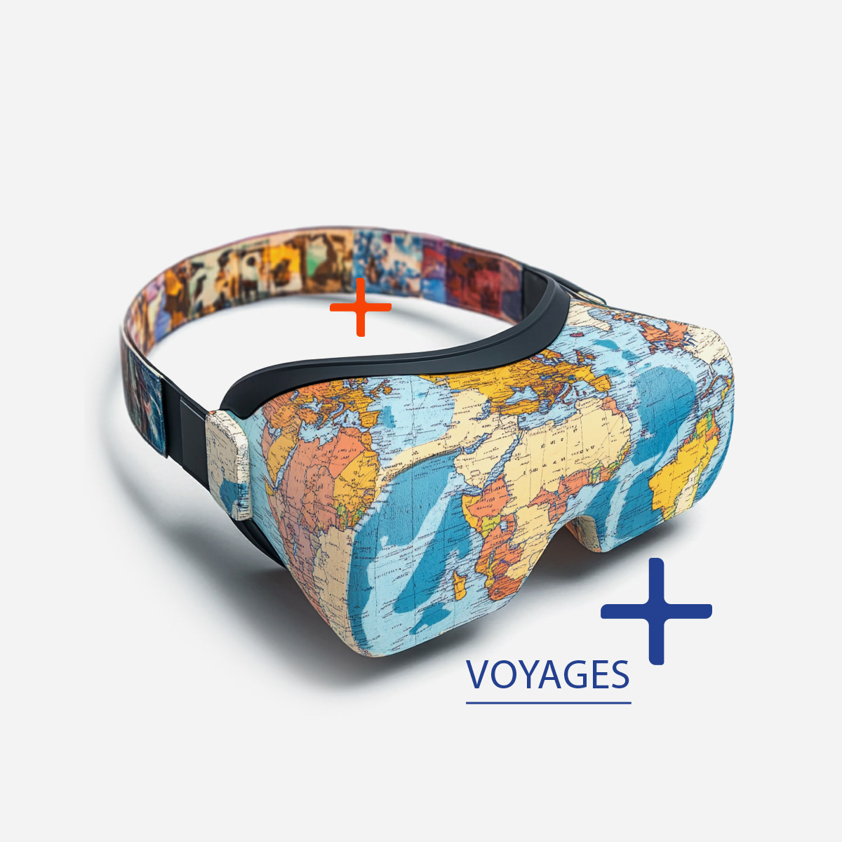
Looking to expand your brand's reach through smart editorial design?