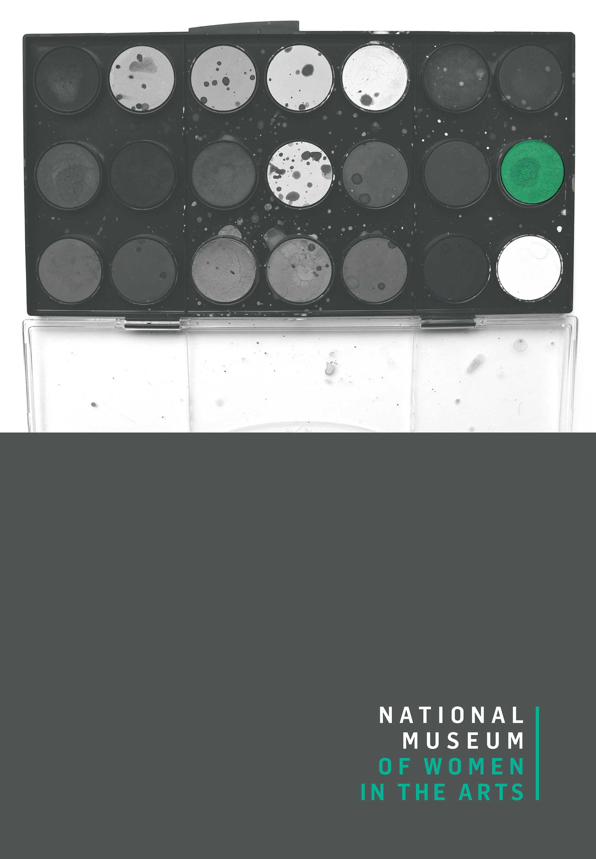
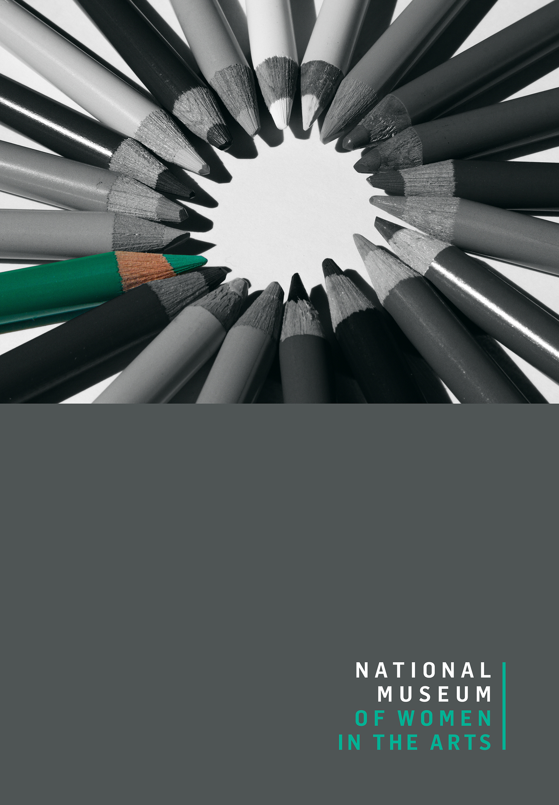
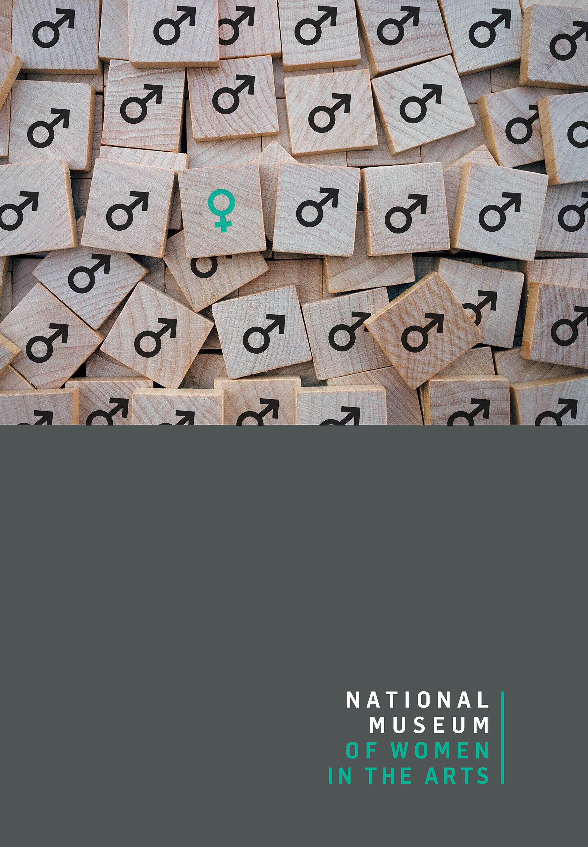
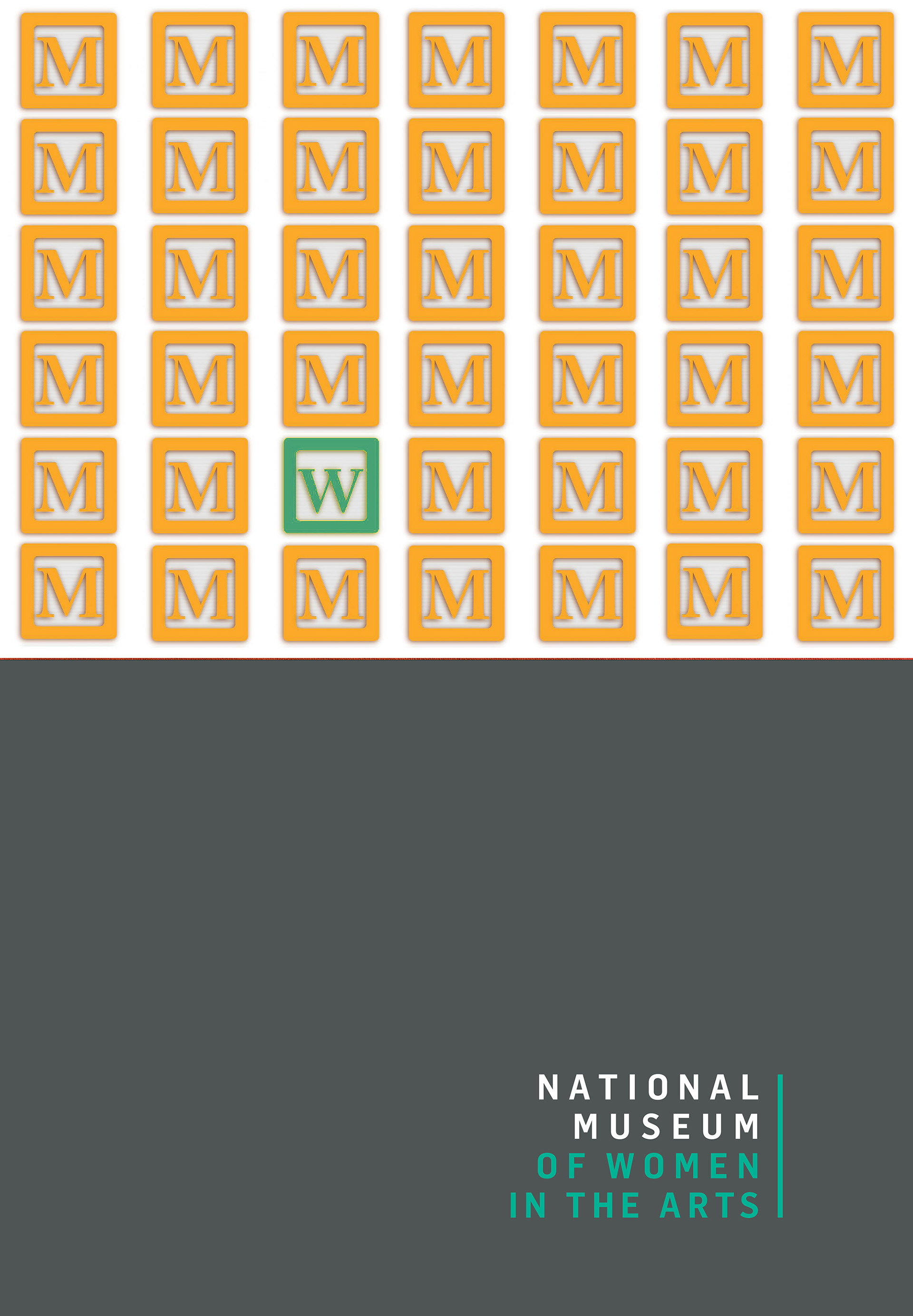
The National Museum of Women in the Arts needed a campaign identity for a public conversation about gender disparity in the art world, on a tight timeline and across posters, digital, social, and event materials. Campaign work fails in the gaps between formats: the poster is strong, the social crop is weak, the event banner is somebody else's file. I built a typographic system with enough rhythm and repetition to stay recognizable wherever it landed, and simple enough to deploy fast.
CLIENT ▸ NMWA, National Museum of Women in the Arts
YEAR ▸ 2018
AREA▸ Culture & Advocacy — Museum Campaign
AUDIENCE ▸ General Public, Museum Visitors, Press
SCOPE ▸ Campaign identity, poster and print, digital and social, event materials
SCALE ▸ 5 formats, 4 assets, 6-week timeline
ROLE ▸ Art Director, through Trovit Group, New York
TEAM ▸ Worked with the Trovit creative director and the museum's copywriter
PROCESS ▸ Brief and message audit → visual language → campaign system → multi-format rollout
YEAR ▸ 2018
AREA▸ Culture & Advocacy — Museum Campaign
AUDIENCE ▸ General Public, Museum Visitors, Press
SCOPE ▸ Campaign identity, poster and print, digital and social, event materials
SCALE ▸ 5 formats, 4 assets, 6-week timeline
ROLE ▸ Art Director, through Trovit Group, New York
TEAM ▸ Worked with the Trovit creative director and the museum's copywriter
PROCESS ▸ Brief and message audit → visual language → campaign system → multi-format rollout
The Challenge
A cultural message that had to cut through in public, not just inside the museum
A tight timeline, with assets needed across print, digital, social, and events at once
Recognition across formats built by different people, at different sizes, at speed
A cultural message that had to cut through in public, not just inside the museum
A tight timeline, with assets needed across print, digital, social, and events at once
Recognition across formats built by different people, at different sizes, at speed
Strategic Approach
Rhythm and repetition as the recognition device, rather than a single hero image
A cultural signal, not a corporate one. This had to look like a conversation, not an announcement
Designed for deployment speed, because a campaign that needs a designer for every asset stalls
Rhythm and repetition as the recognition device, rather than a single hero image
A cultural signal, not a corporate one. This had to look like a conversation, not an announcement
Designed for deployment speed, because a campaign that needs a designer for every asset stalls
Creative Solution
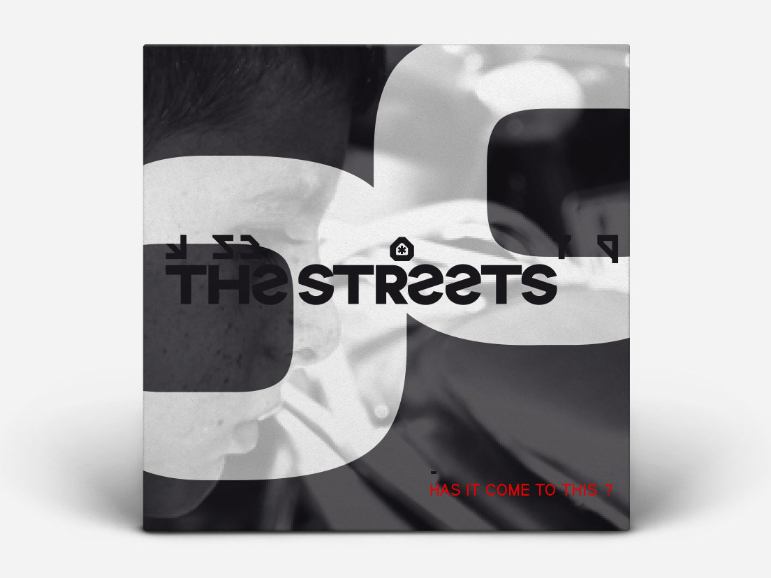
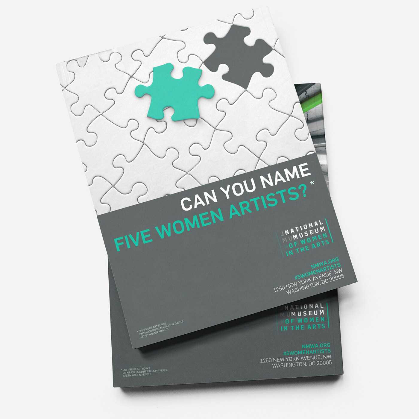
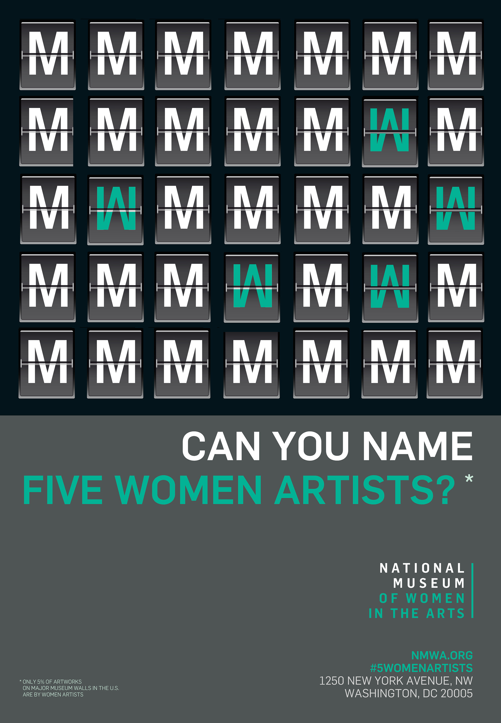
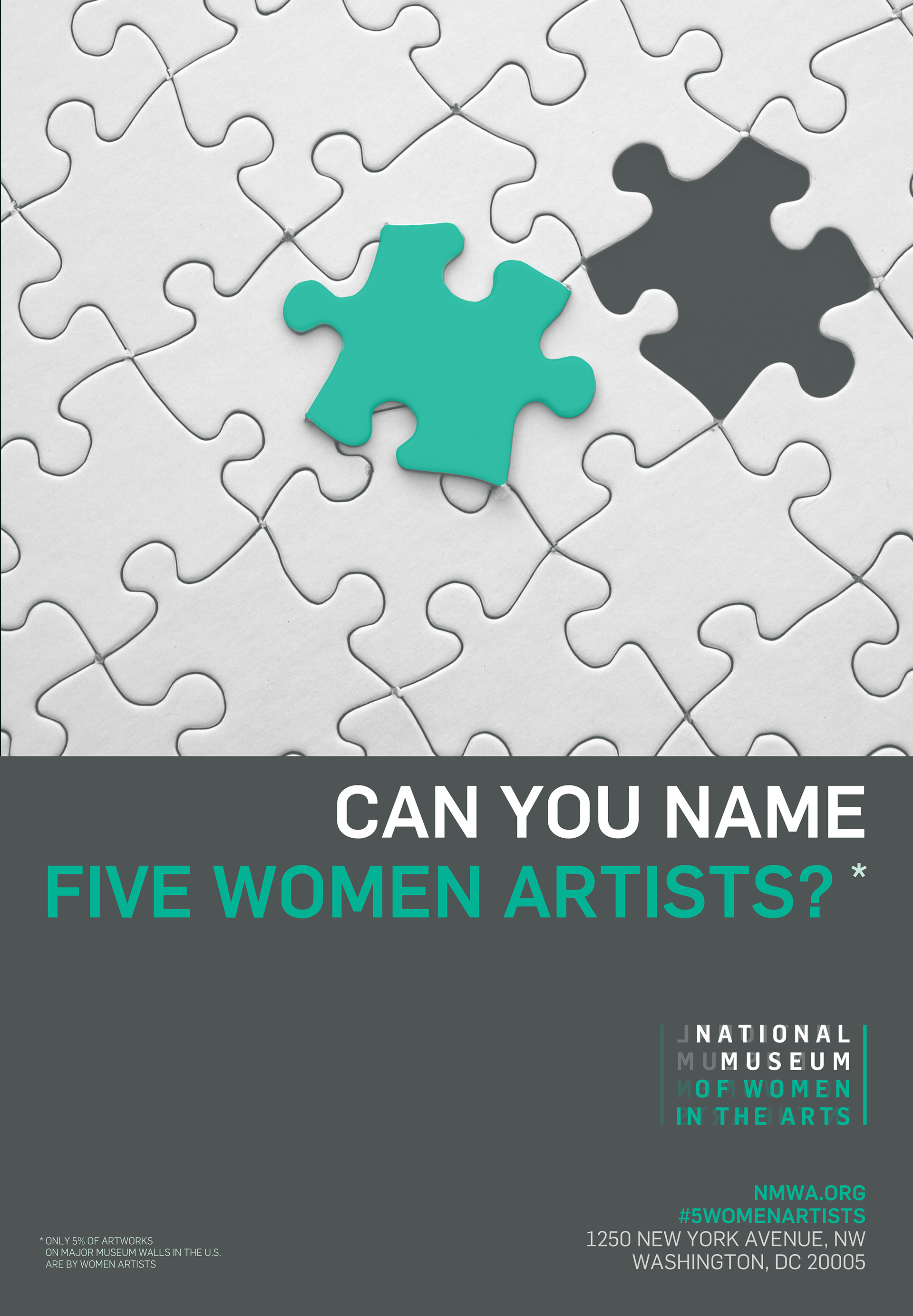
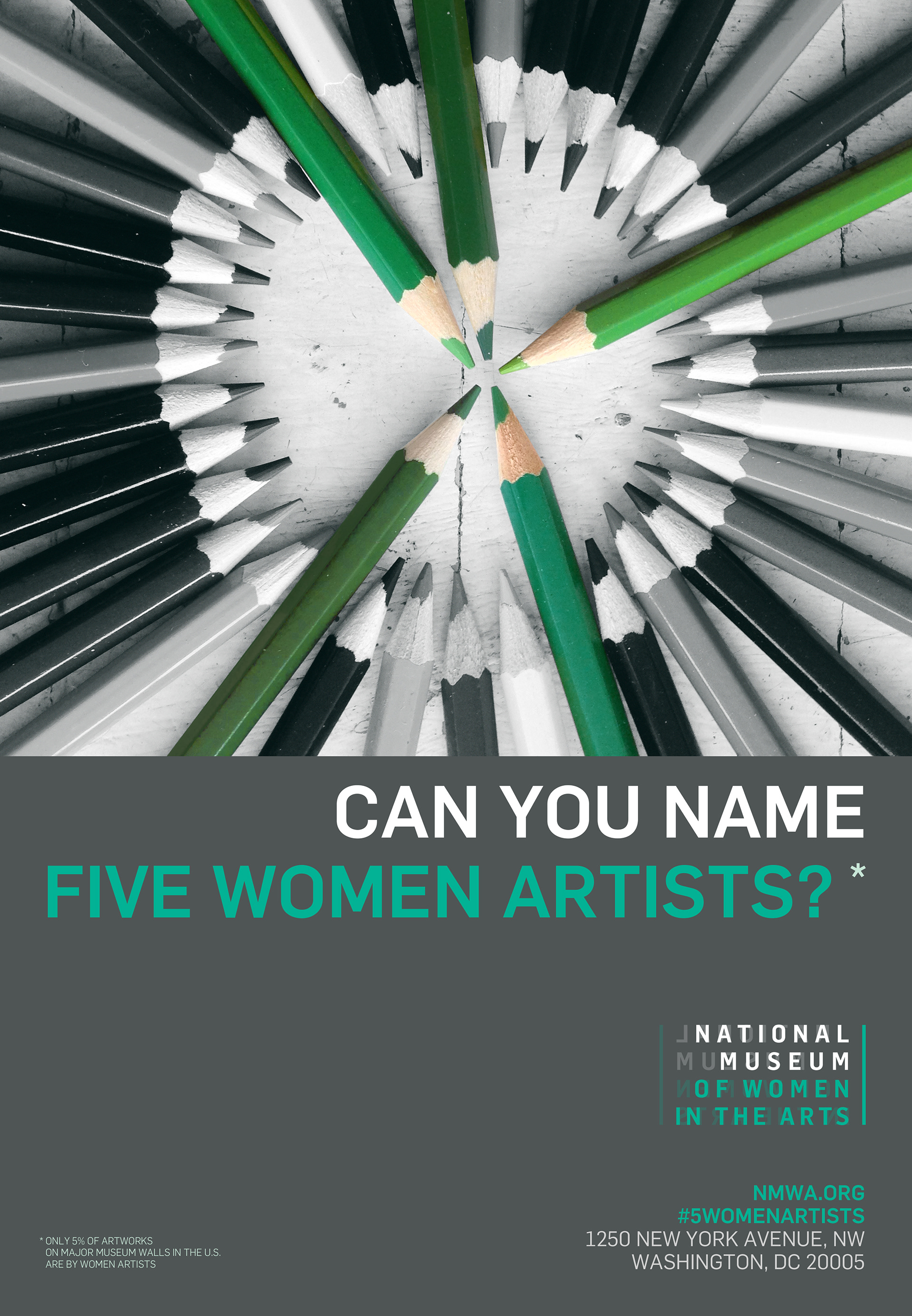
Bold typographic composition with high contrast, carrying energy without illustration
A structure that holds at poster scale and at thumbnail scale, which is where most campaigns break
Consistent rules for every format, so a social post and an event banner read as the same campaign
Bold typographic composition with high contrast, carrying energy without illustration
A structure that holds at poster scale and at thumbnail scale, which is where most campaigns break
Consistent rules for every format, so a social post and an event banner read as the same campaign
Scope & System
Campaign identity across 6 formats: poster, print, digital, social, and event.
Composition and typographic rules that hold up under resizing and cropping
Asset framework built for rapid production under a compressed timeline
Campaign identity across 6 formats: poster, print, digital, social, and event.
Composition and typographic rules that hold up under resizing and cropping
Asset framework built for rapid production under a compressed timeline
Deliverables
+ Campaign visual identity system
+ Poster and print assets
+ Digital and social materials
+ Event promotional content
+ Campaign visual identity system
+ Poster and print assets
+ Digital and social materials
+ Event promotional content
Role & Leadership
Art Director, working through Trovit Group, New York, alongside their creative director and the museum's copywriter.
The message came from NMWA, so the design job was to give it a form that could travel without the museum in the room. Working directly with their writer meant building the type system around the actual lines, not a placeholder.
The discipline was restraint under time pressure. A short timeline pushes teams toward one striking image; a system is slower to set up and far faster to run, and it is the only thing that holds a campaign together across four channels.
Art Director, working through Trovit Group, New York, alongside their creative director and the museum's copywriter.
The message came from NMWA, so the design job was to give it a form that could travel without the museum in the room. Working directly with their writer meant building the type system around the actual lines, not a placeholder.
The discipline was restraint under time pressure. A short timeline pushes teams toward one striking image; a system is slower to set up and far faster to run, and it is the only thing that holds a campaign together across four channels.
On The Work
Expressive design and systematic thinking are usually treated as opposites.
In campaign work, they are the same problem: structure lets the expression survive contact with a dozen formats and a two-week deadline.
Expressive design and systematic thinking are usually treated as opposites.
In campaign work, they are the same problem: structure lets the expression survive contact with a dozen formats and a two-week deadline.

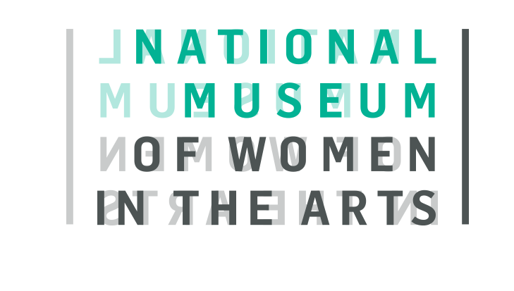
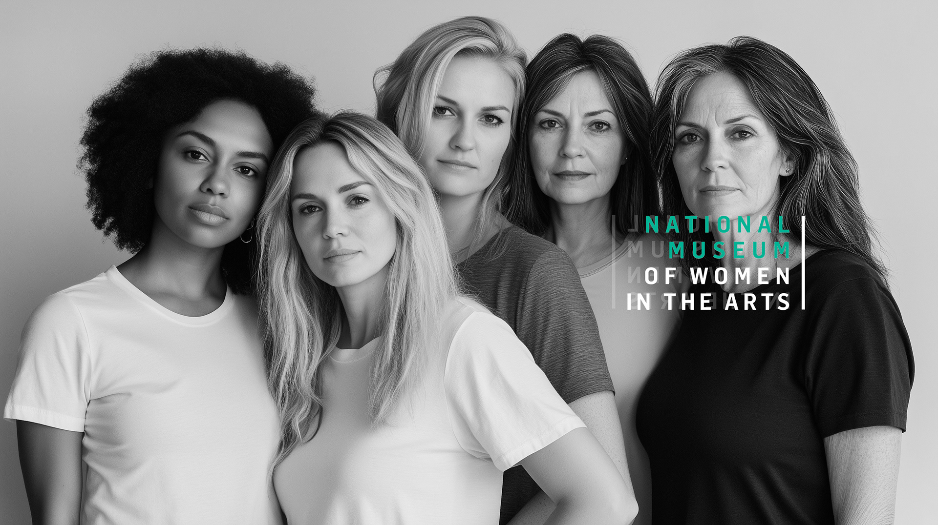
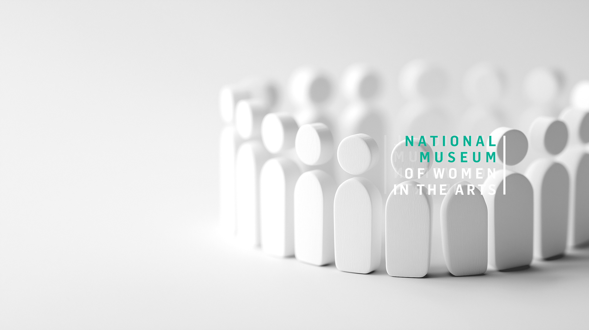
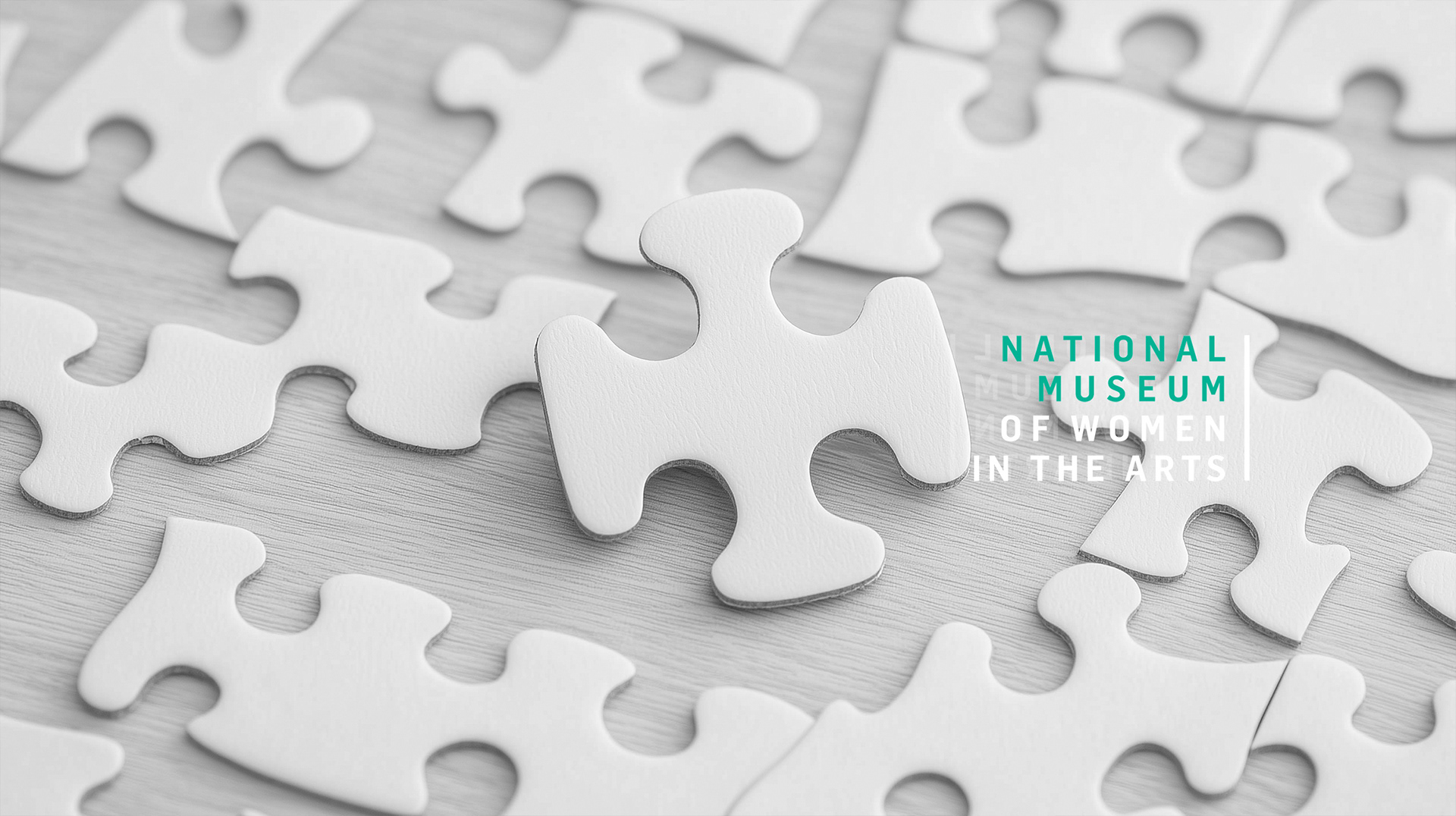
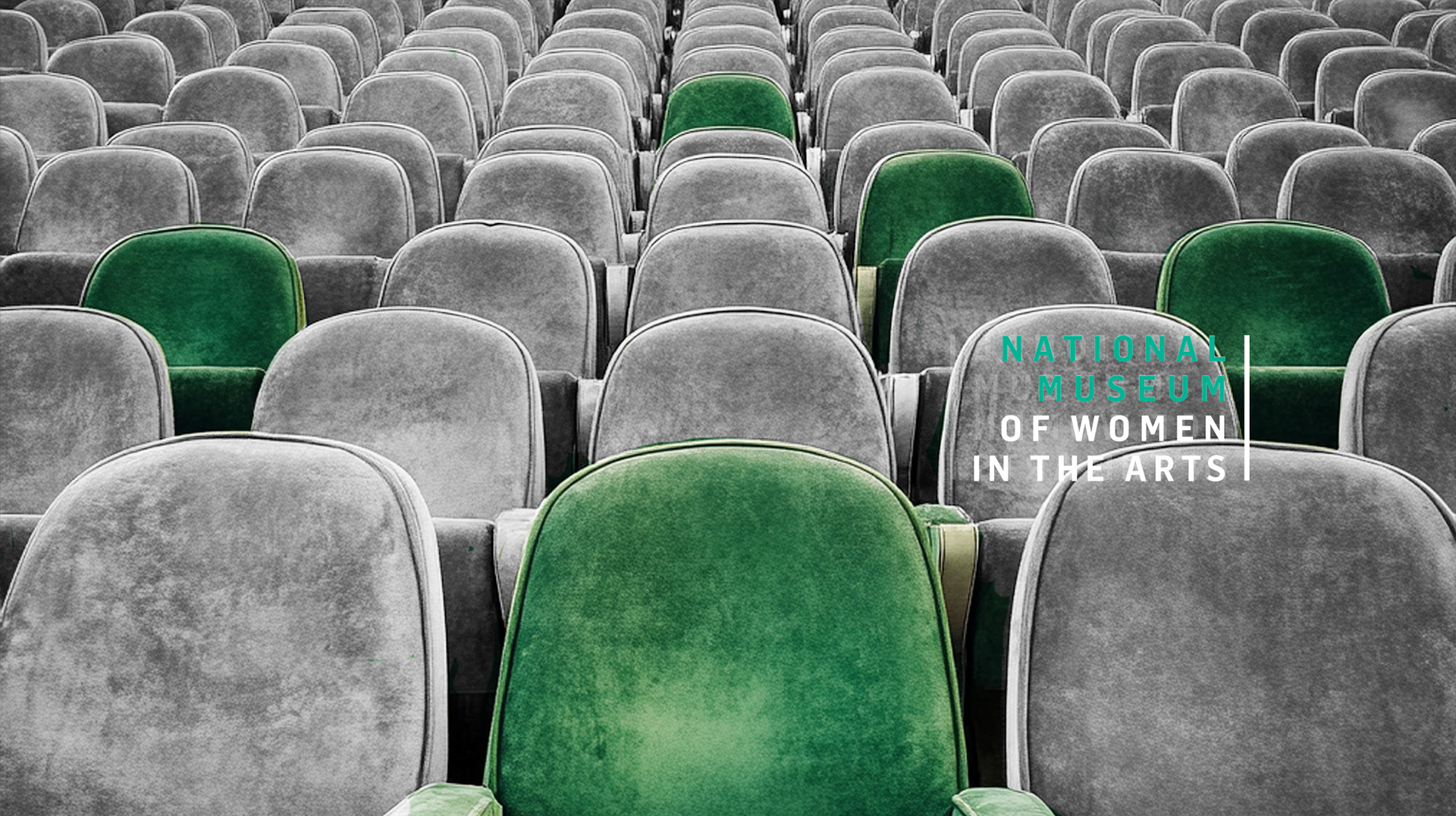
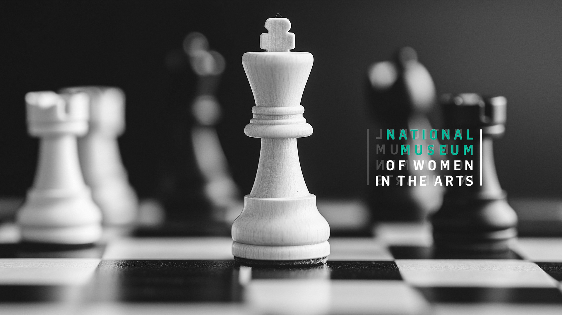
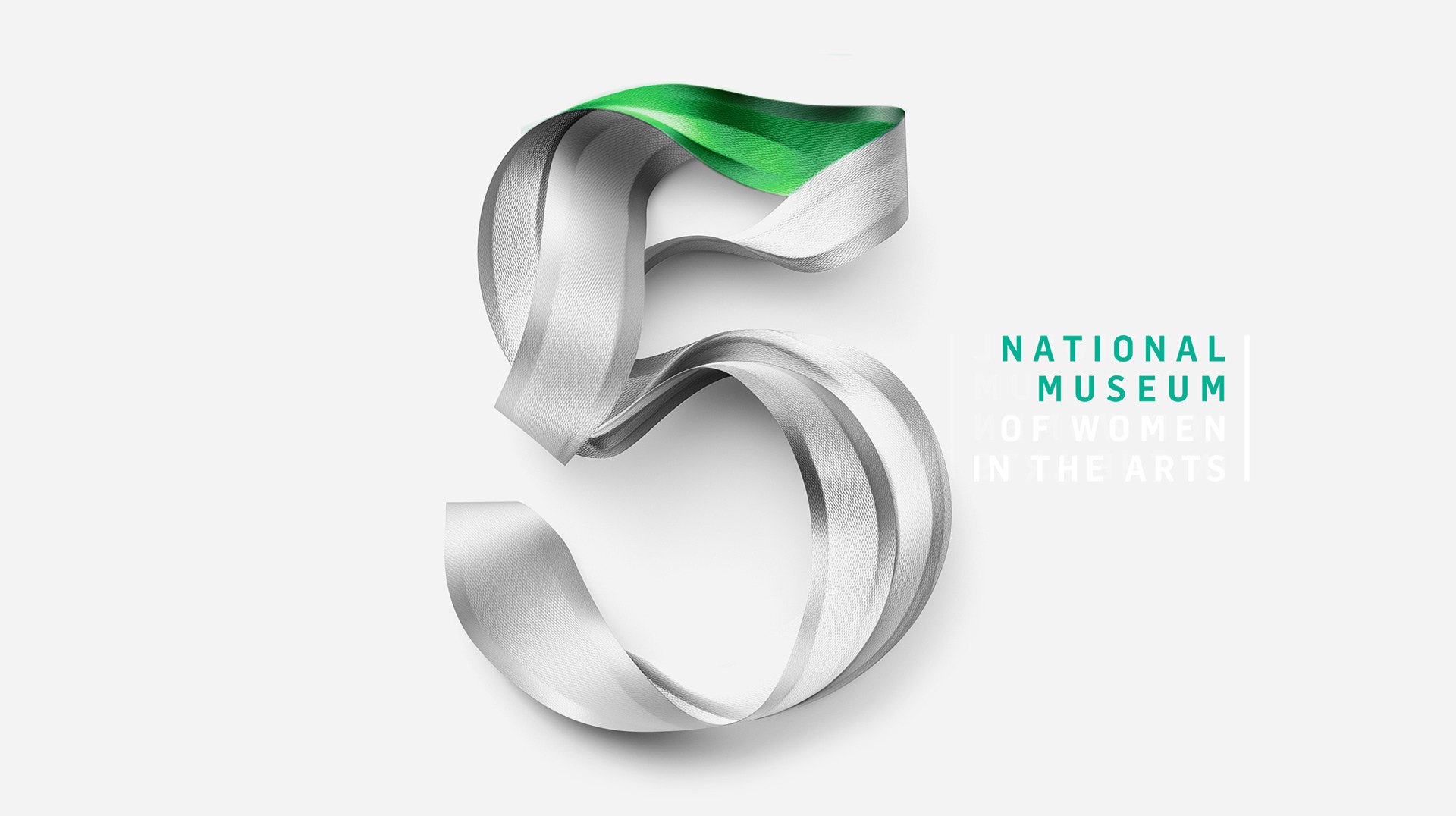
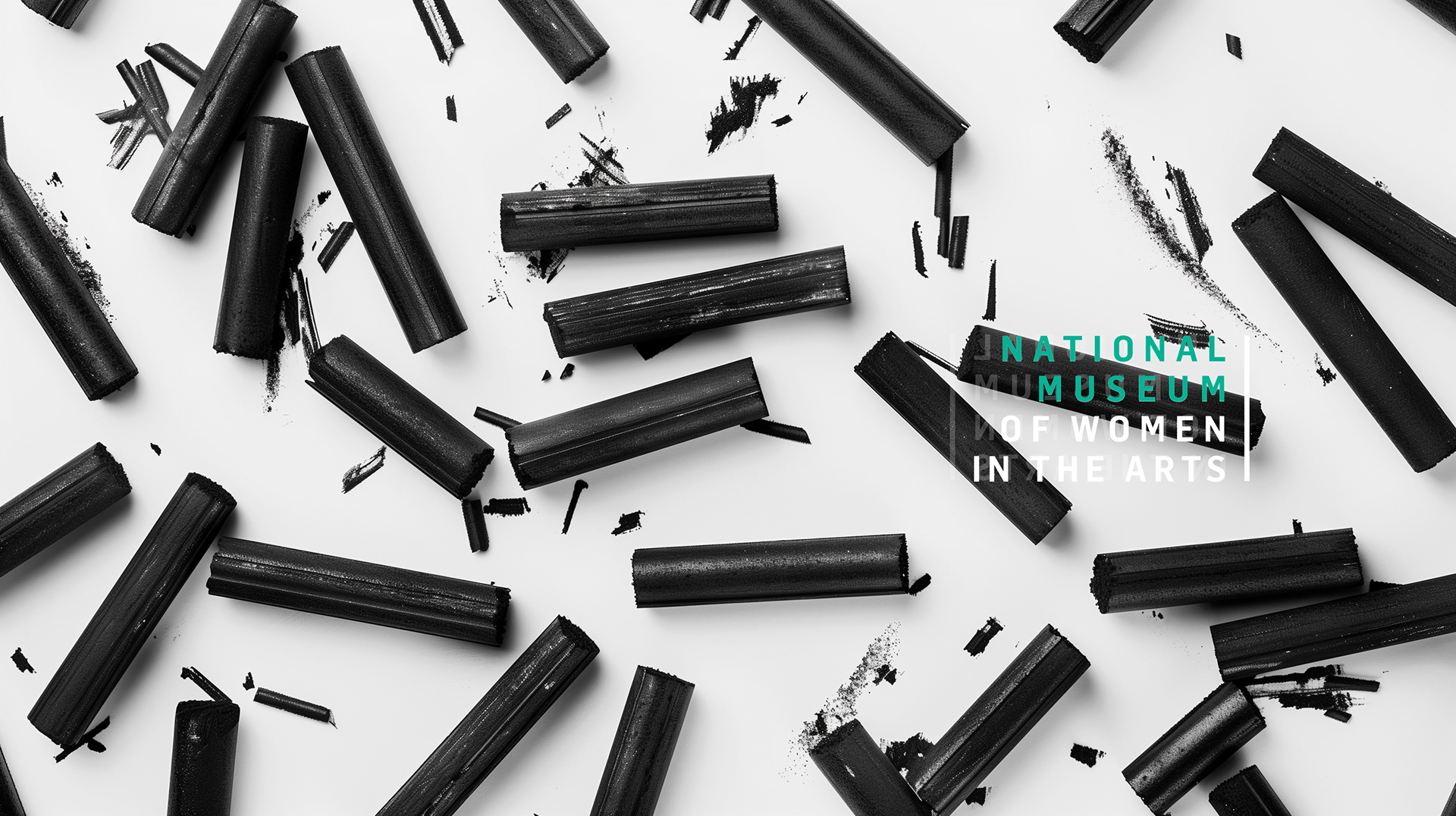
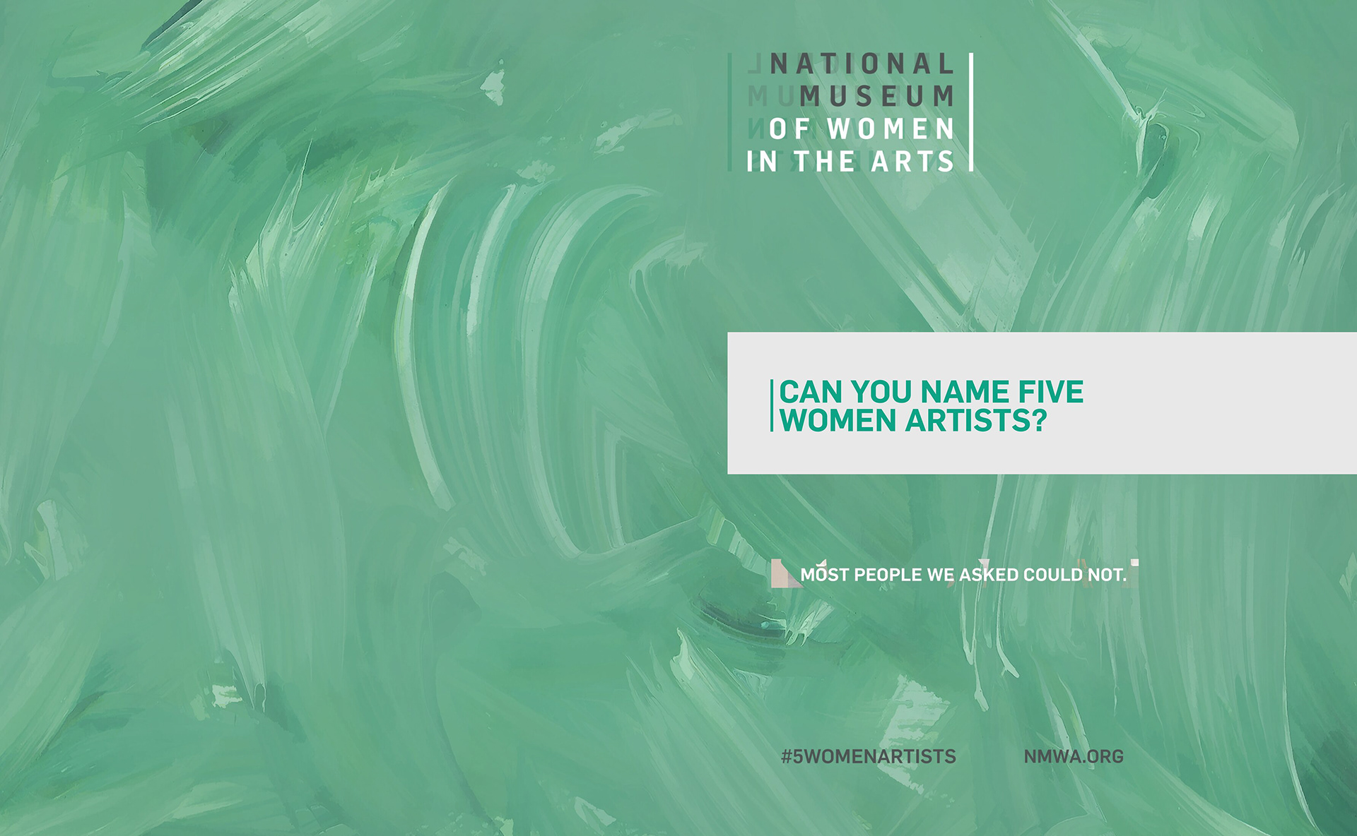
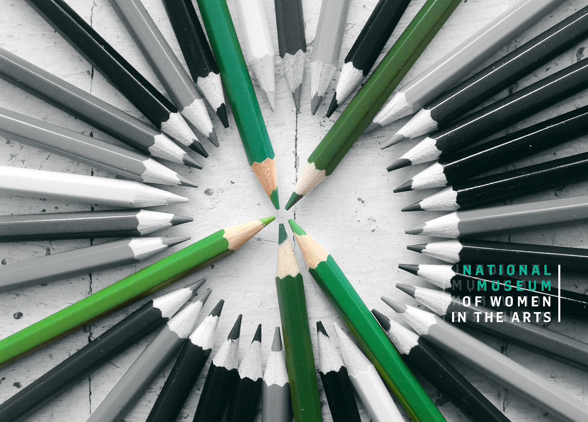
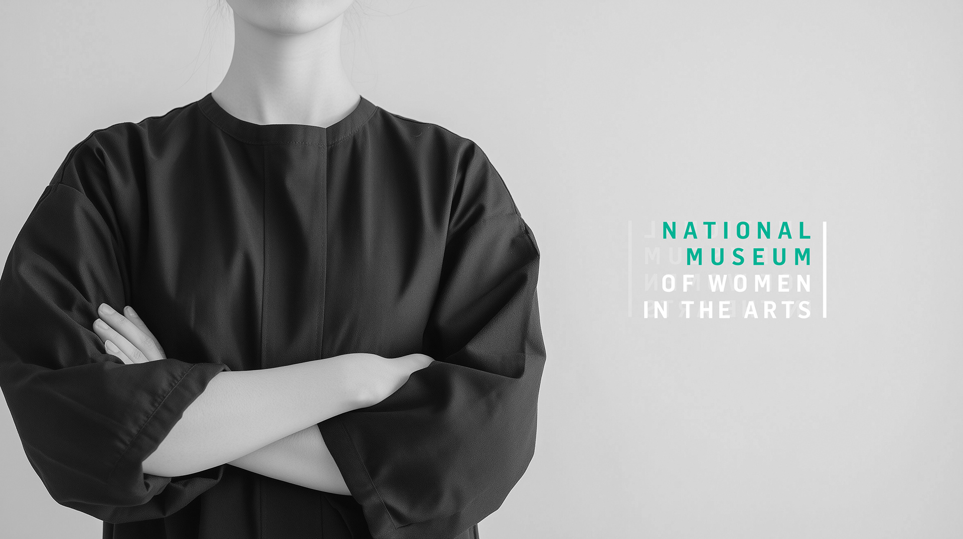
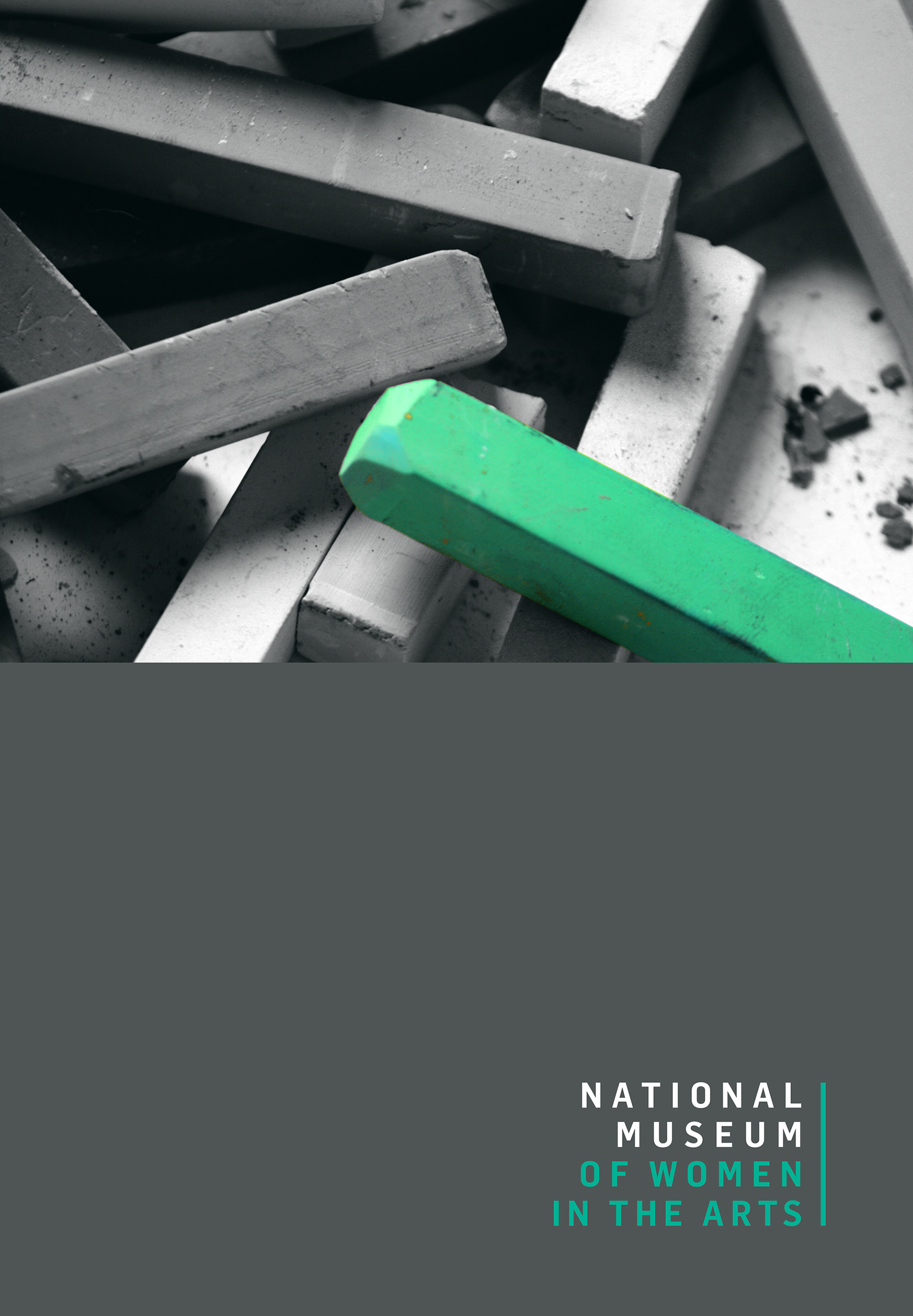
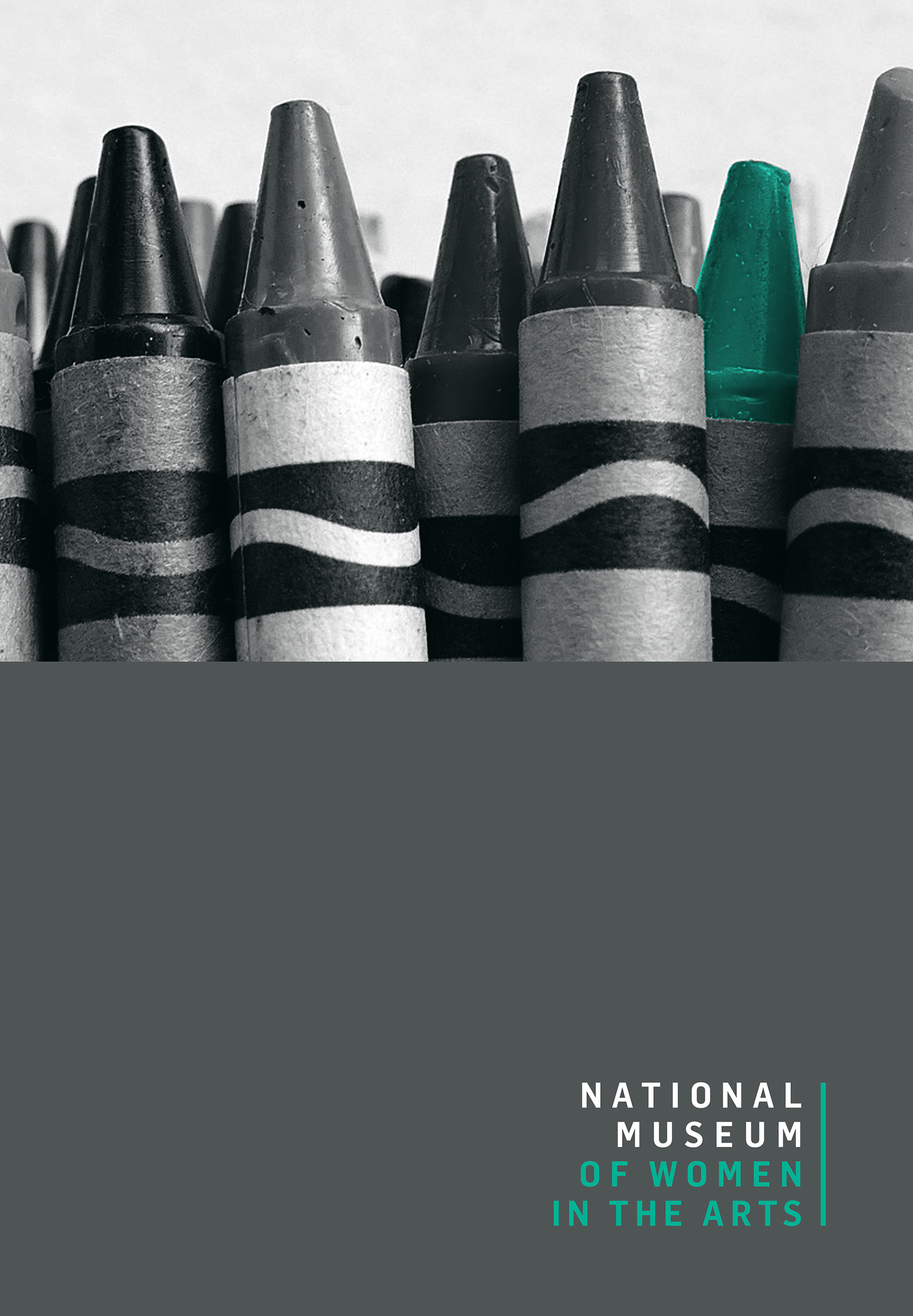
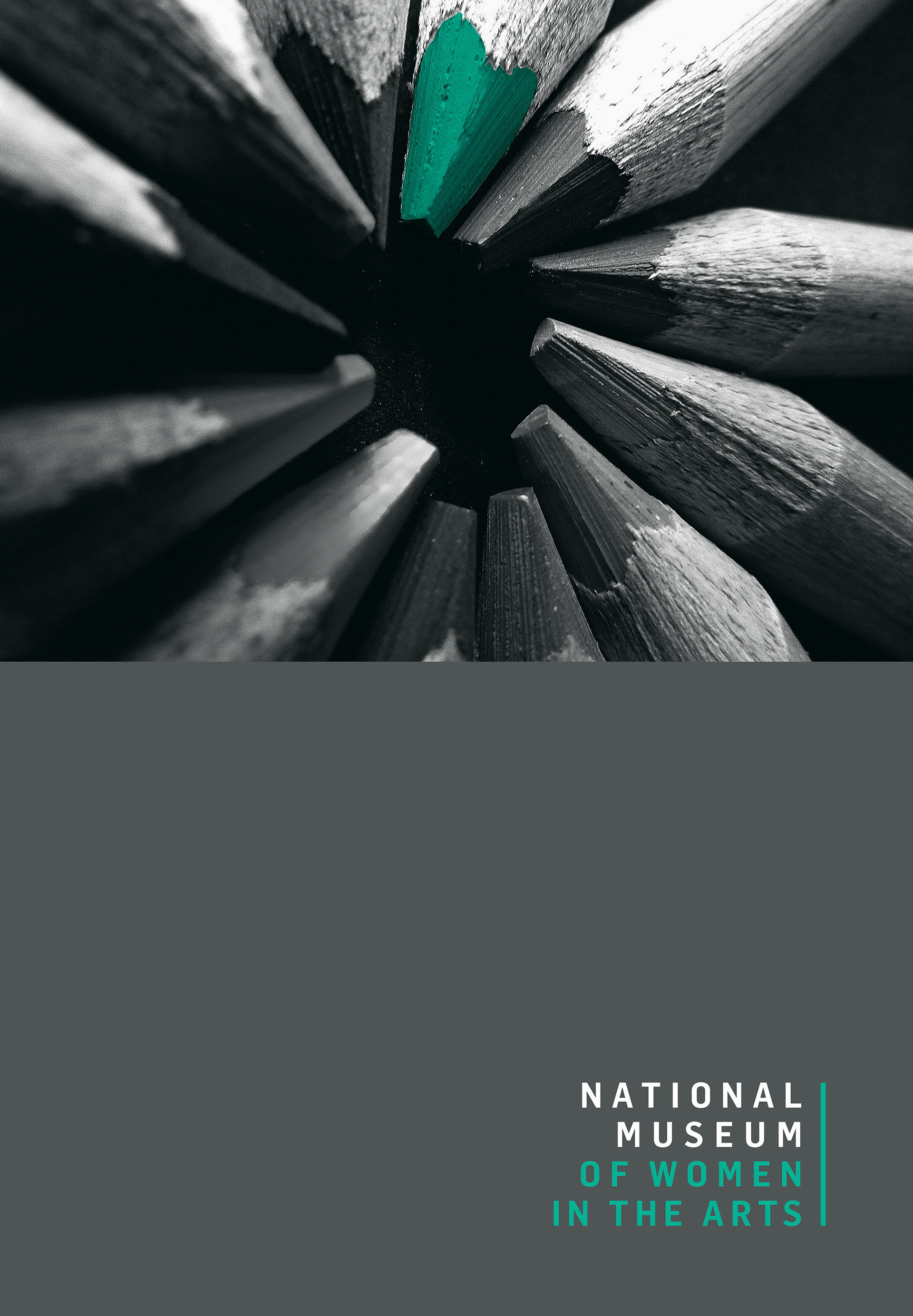
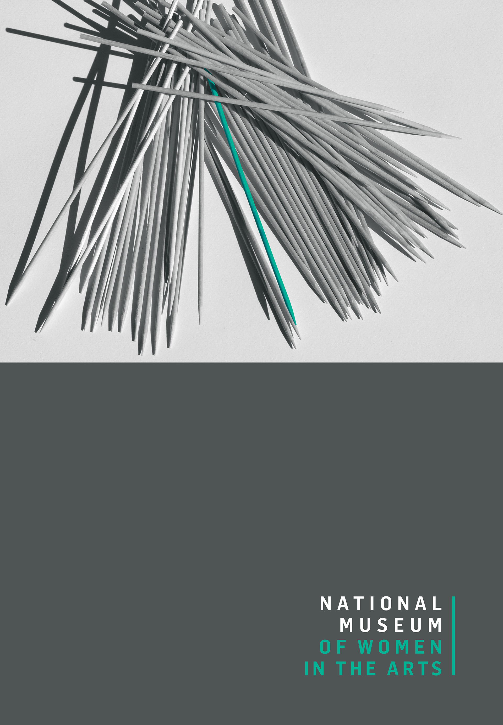
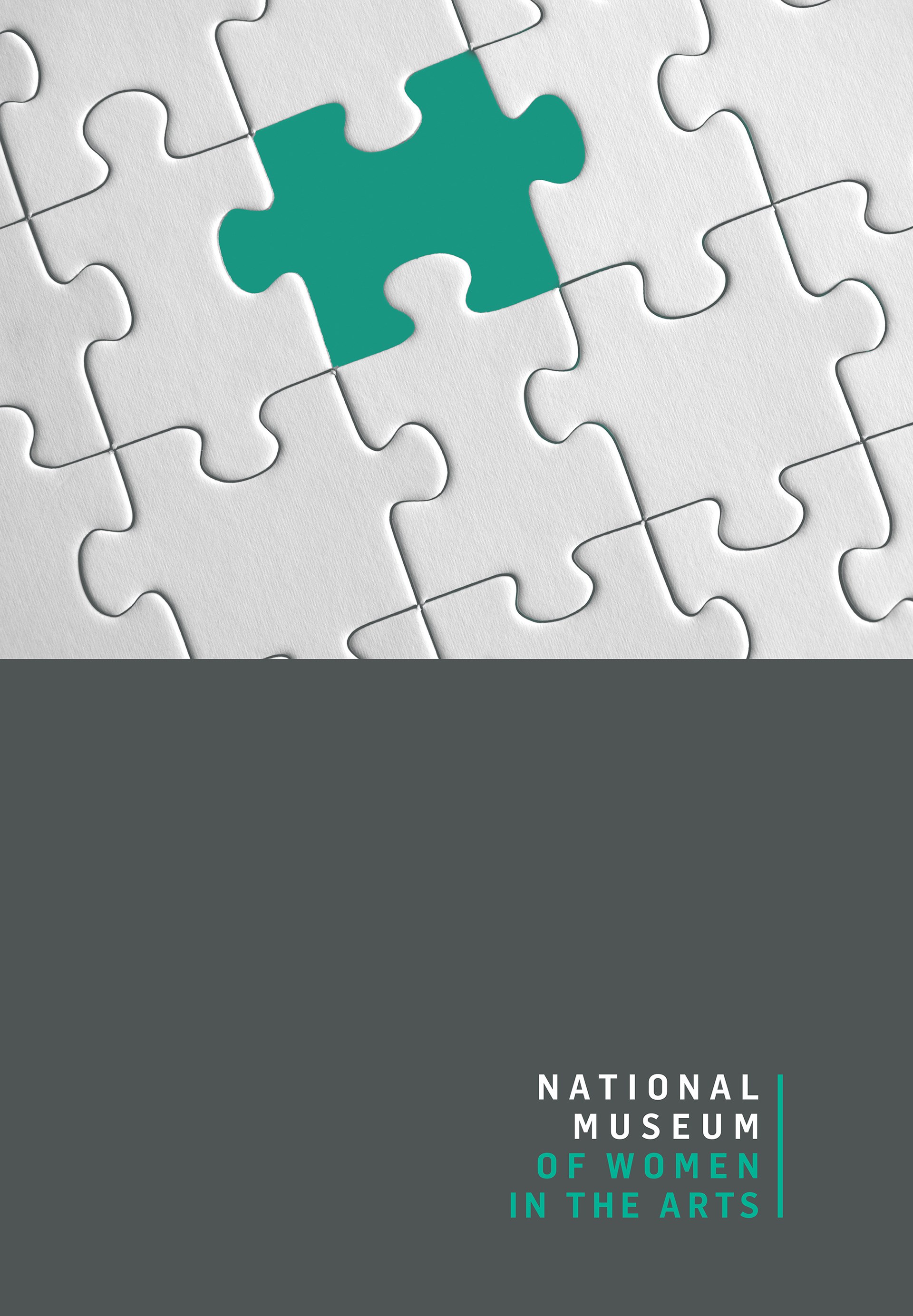
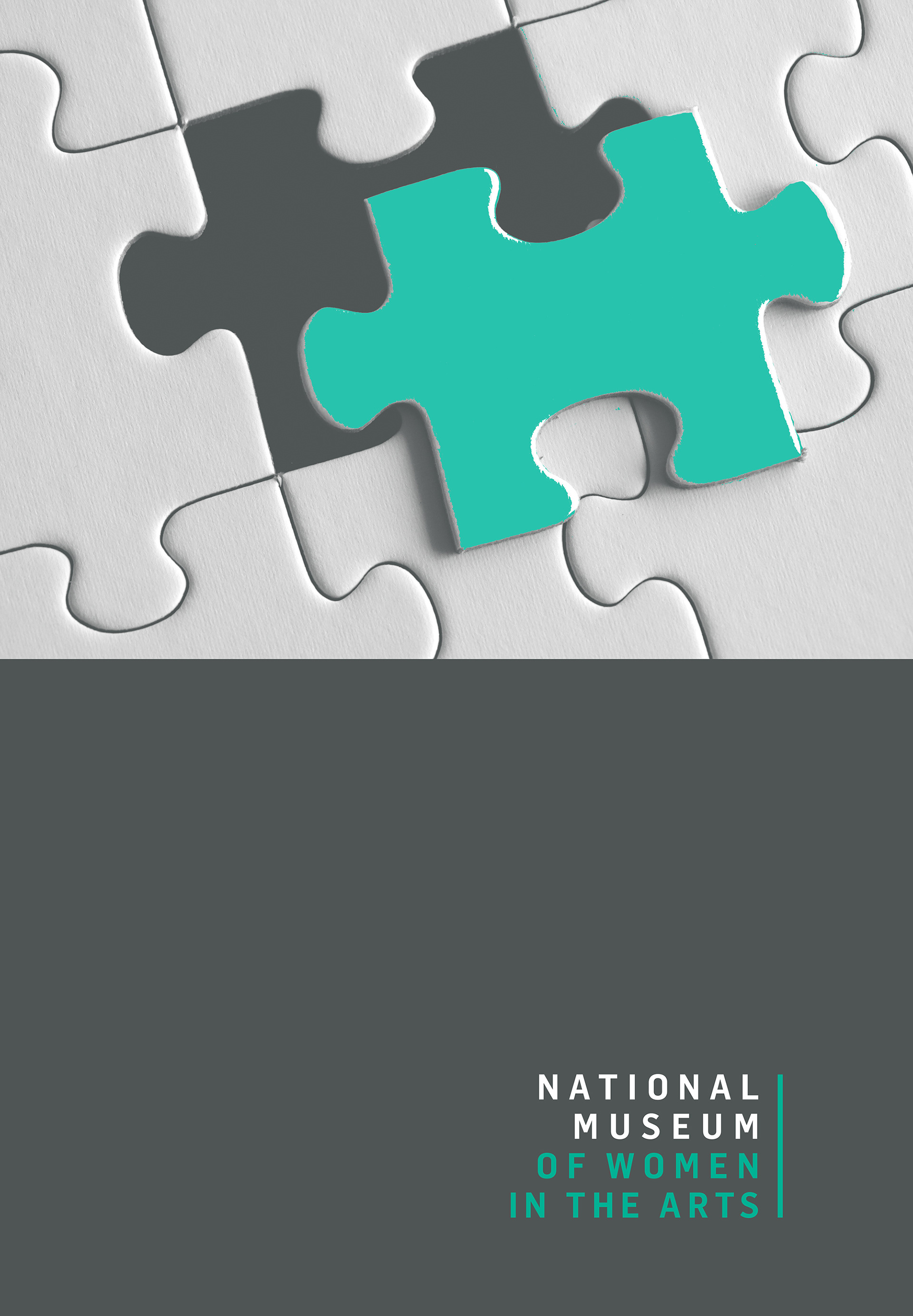
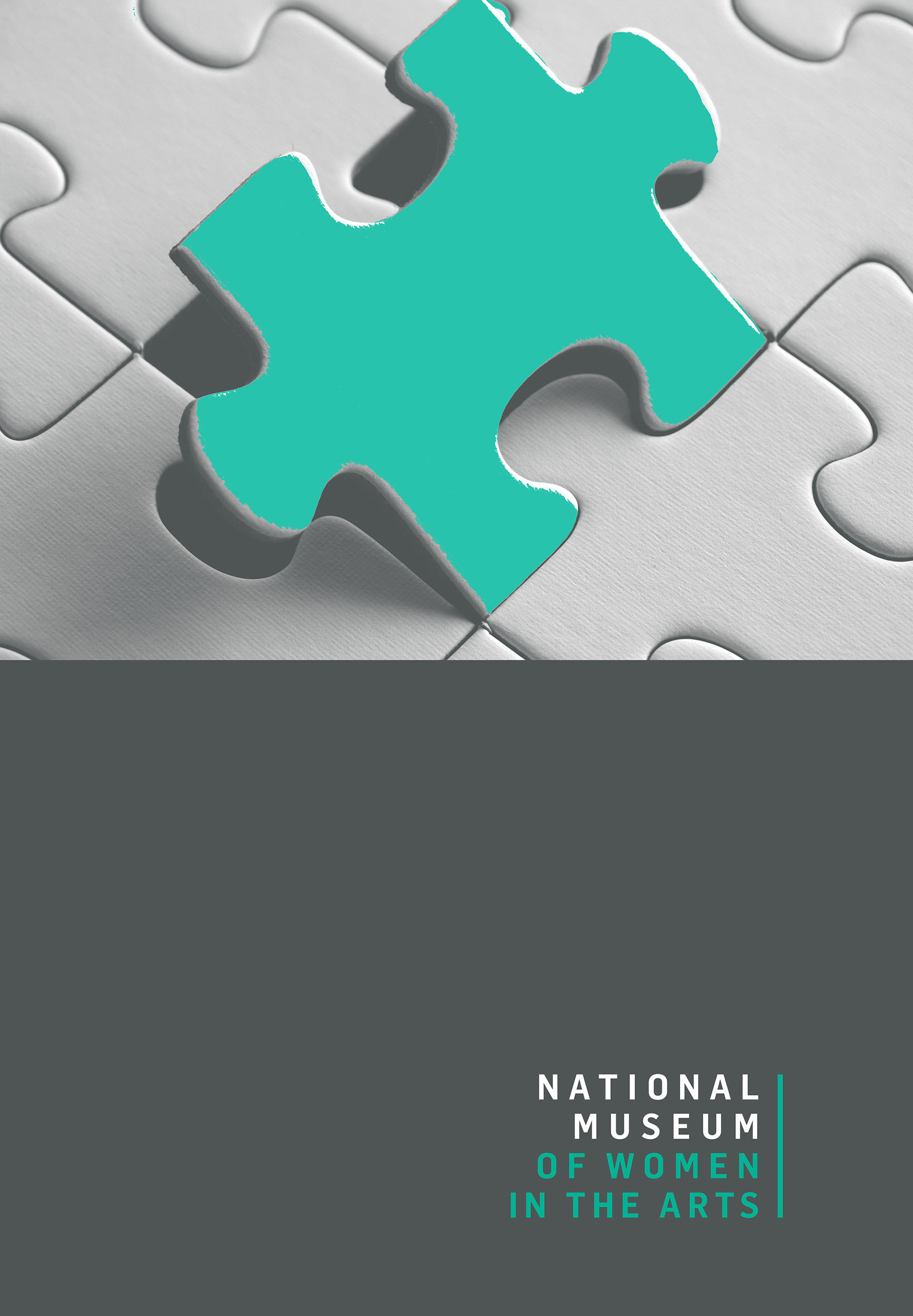
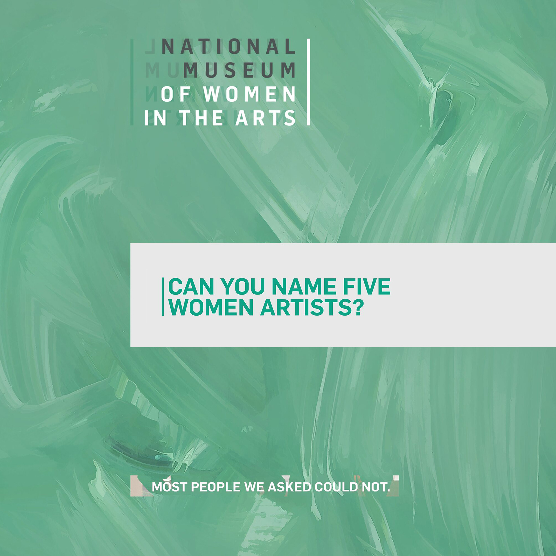
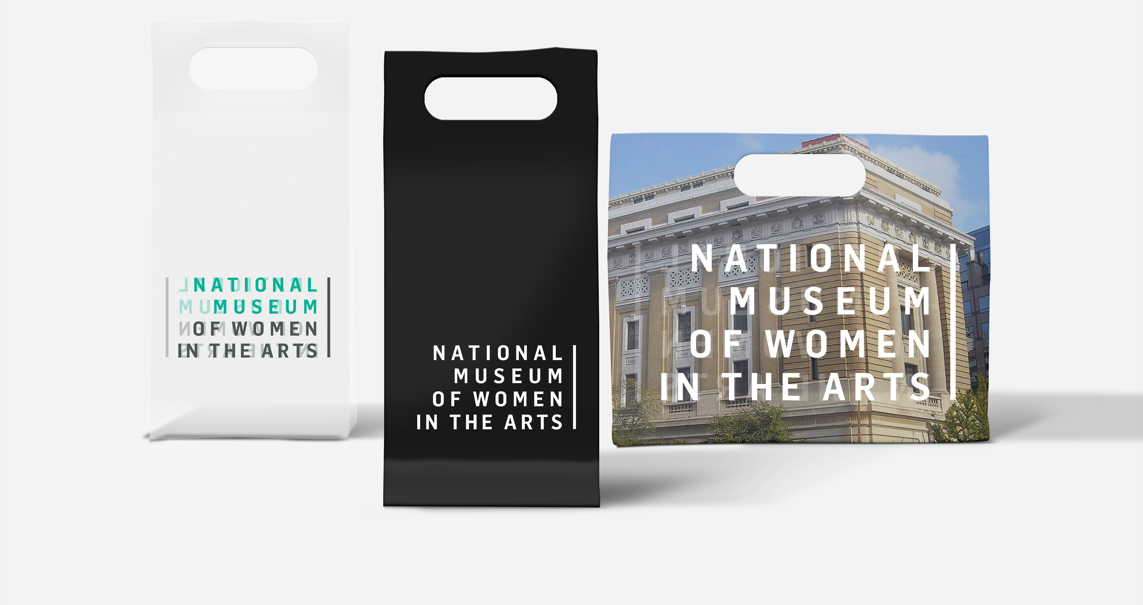
The logo was designed as a bold, typographic mark—direct, assertive, and built to carry the campaign’s message with clarity and authority.




Running a campaign that has to hold together across every format?