CLIENT ▸ ILCV, Institut Lorrain du Cœur et des Vaisseaux, France
ROLE ▸ Brand Designer Freelance – Brand Identity
SCOPE ▸ Logo Design, Branding, Visual Identity, Campaign Materials, Print Design, Brochure, Advertising
ROLE ▸ Brand Designer Freelance – Brand Identity
SCOPE ▸ Logo Design, Branding, Visual Identity, Campaign Materials, Print Design, Brochure, Advertising
The Challenge
Develop a cohesive brand system for a clinical organization operating across multiple touchpoints
Establish clarity and authority in a highly regulated healthcare environment
Create a scalable framework capable of supporting growth and service expansion
Develop a cohesive brand system for a clinical organization operating across multiple touchpoints
Establish clarity and authority in a highly regulated healthcare environment
Create a scalable framework capable of supporting growth and service expansion
Strategic Approach
Position the clinic as precise, modern, and patient-centered
Build a system-first identity that prioritizes structure, readability, and consistency
Align brand perception with clinical rigor and operational efficiency
Position the clinic as precise, modern, and patient-centered
Build a system-first identity that prioritizes structure, readability, and consistency
Align brand perception with clinical rigor and operational efficiency
Creative Solution
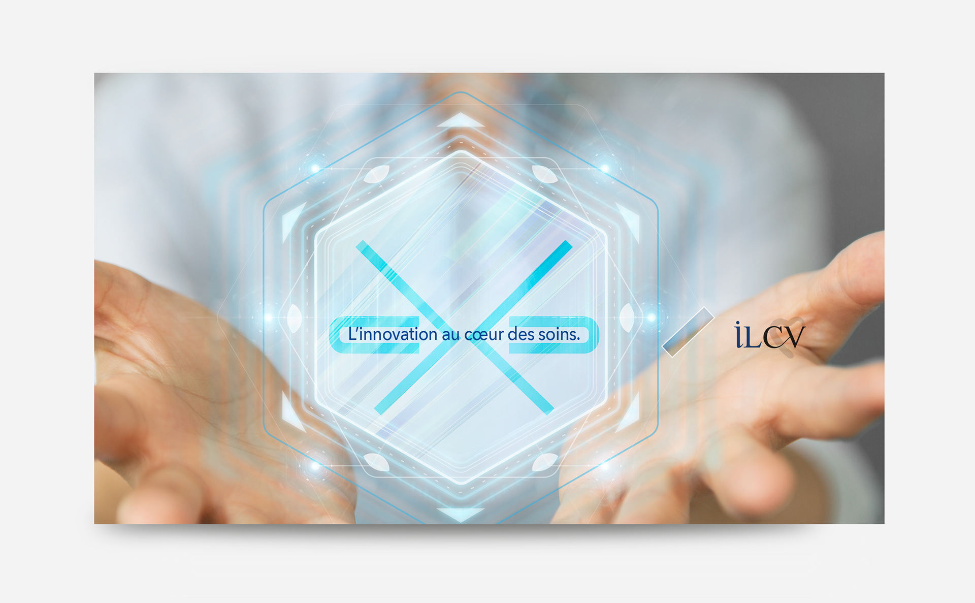
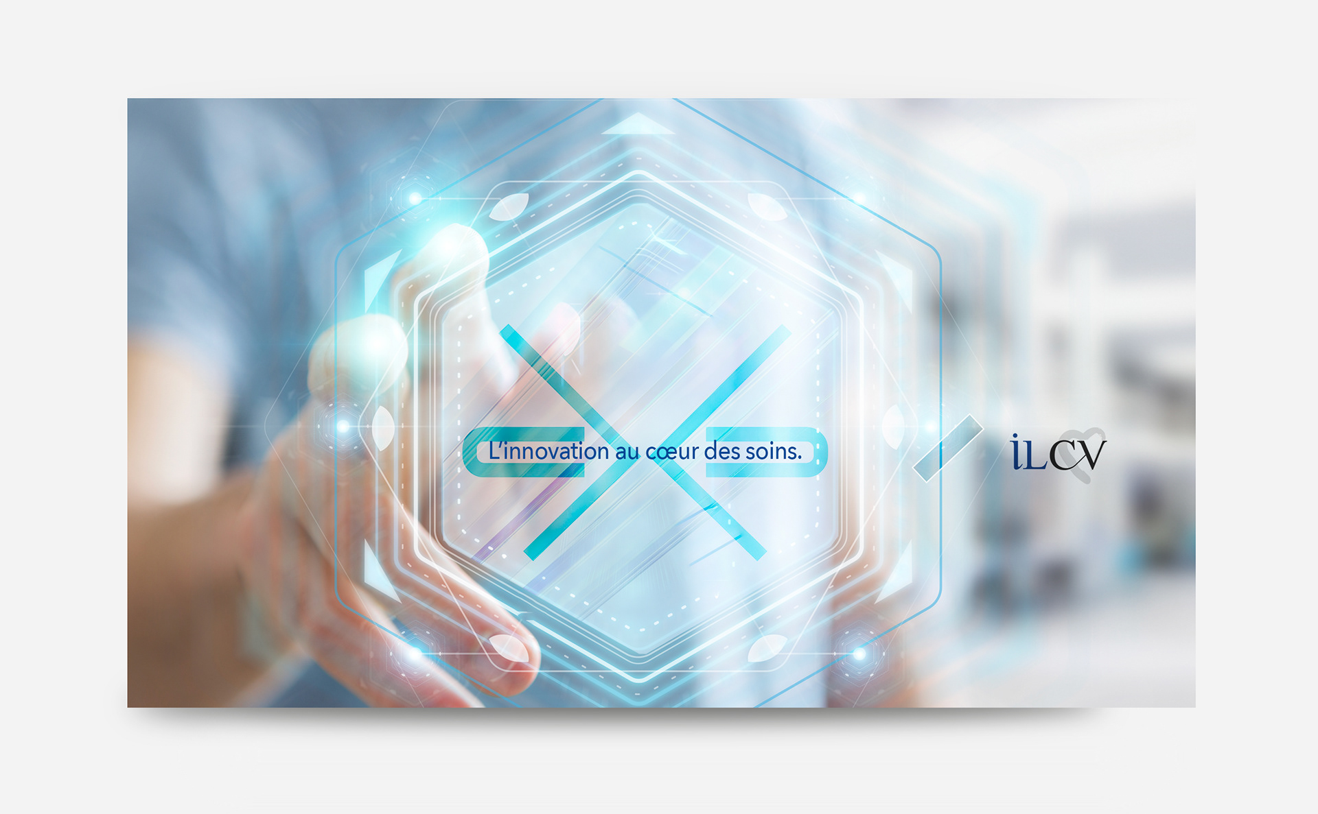
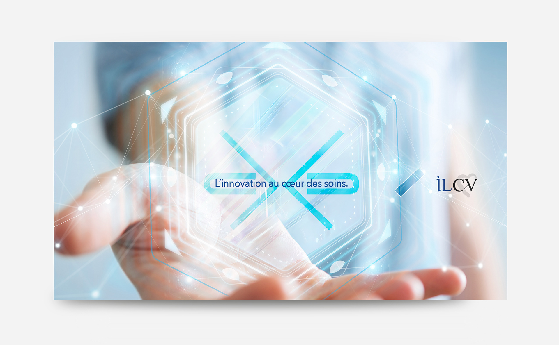
A disciplined visual architecture built around typographic hierarchy and grid logic
A clear, modular system adaptable across print, digital, and clinical materials
A restrained color and layout language, reinforcing trust and professionalism
A disciplined visual architecture built around typographic hierarchy and grid logic
A clear, modular system adaptable across print, digital, and clinical materials
A restrained color and layout language, reinforcing trust and professionalism
System & Scope
Logo and core identity architecture
Comprehensive brand system with defined hierarchy and layout rules
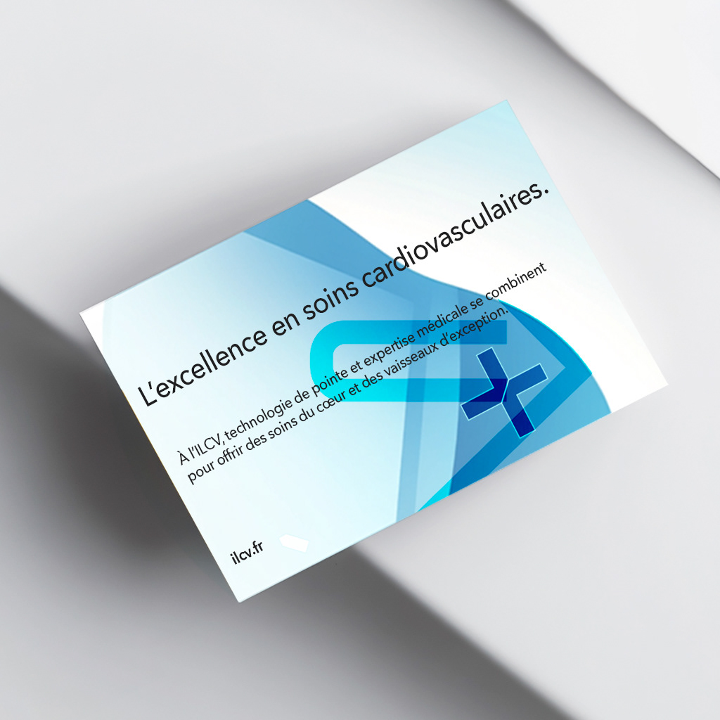
Templates for clinical documentation, marketing, and internal communication
Digital alignment across website and patient-facing materials
Logo and core identity architecture
Comprehensive brand system with defined hierarchy and layout rules
Templates for clinical documentation, marketing, and internal communication
Digital alignment across website and patient-facing materials
Key Results
Stronger brand consistency across departments and outputs
Improved clarity in patient and referral communications
A scalable foundation supporting future expansion
Stronger brand consistency across departments and outputs
Improved clarity in patient and referral communications
A scalable foundation supporting future expansion
Impact & Performance
Elevated perception of professionalism and operational maturity
Faster content production through codified templates
Clearer brand differentiation in a competitive clinical landscape
Elevated perception of professionalism and operational maturity
Faster content production through codified templates
Clearer brand differentiation in a competitive clinical landscape
Deliverables
+ Logo and identity system
+ Brand guidelines and implementation framework
+ Print and digital templates
+ Website visual direction
+ Logo and identity system
+ Brand guidelines and implementation framework
+ Print and digital templates
+ Website visual direction
Role & Leadership
Brand Design Lead
Developed and governed a comprehensive clinical brand system, ensuring operational consistency across digital, print, and institutional touchpoints.
Brand Design Lead
Developed and governed a comprehensive clinical brand system, ensuring operational consistency across digital, print, and institutional touchpoints.
Why This Work Matters
In healthcare, brand systems are operational tools, not aesthetic layers.
A disciplined identity improves clarity, reinforces trust, and reduces friction across every interaction.
This project demonstrates how structured design can elevate perception while supporting real-world clinical efficiency.
In healthcare, brand systems are operational tools, not aesthetic layers.
A disciplined identity improves clarity, reinforces trust, and reduces friction across every interaction.
This project demonstrates how structured design can elevate perception while supporting real-world clinical efficiency.
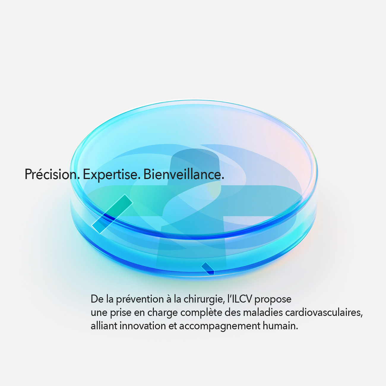

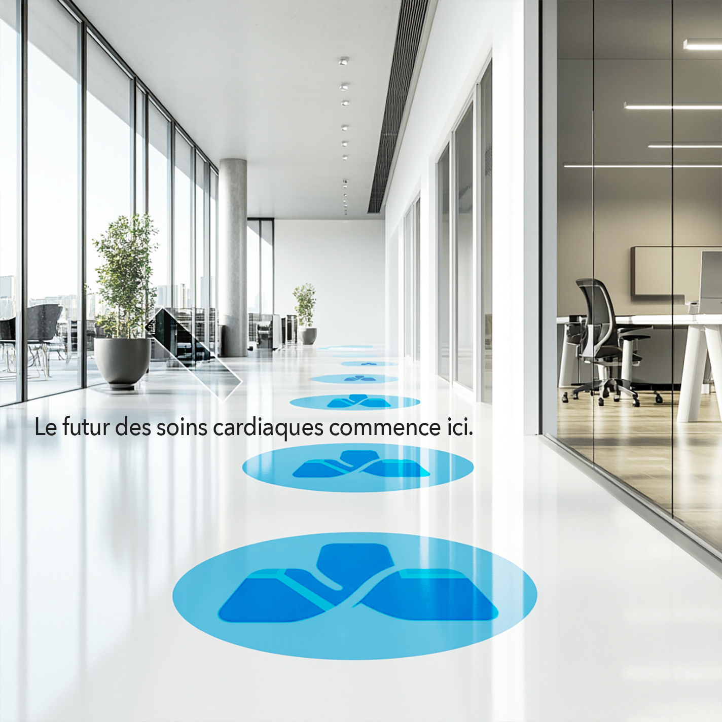


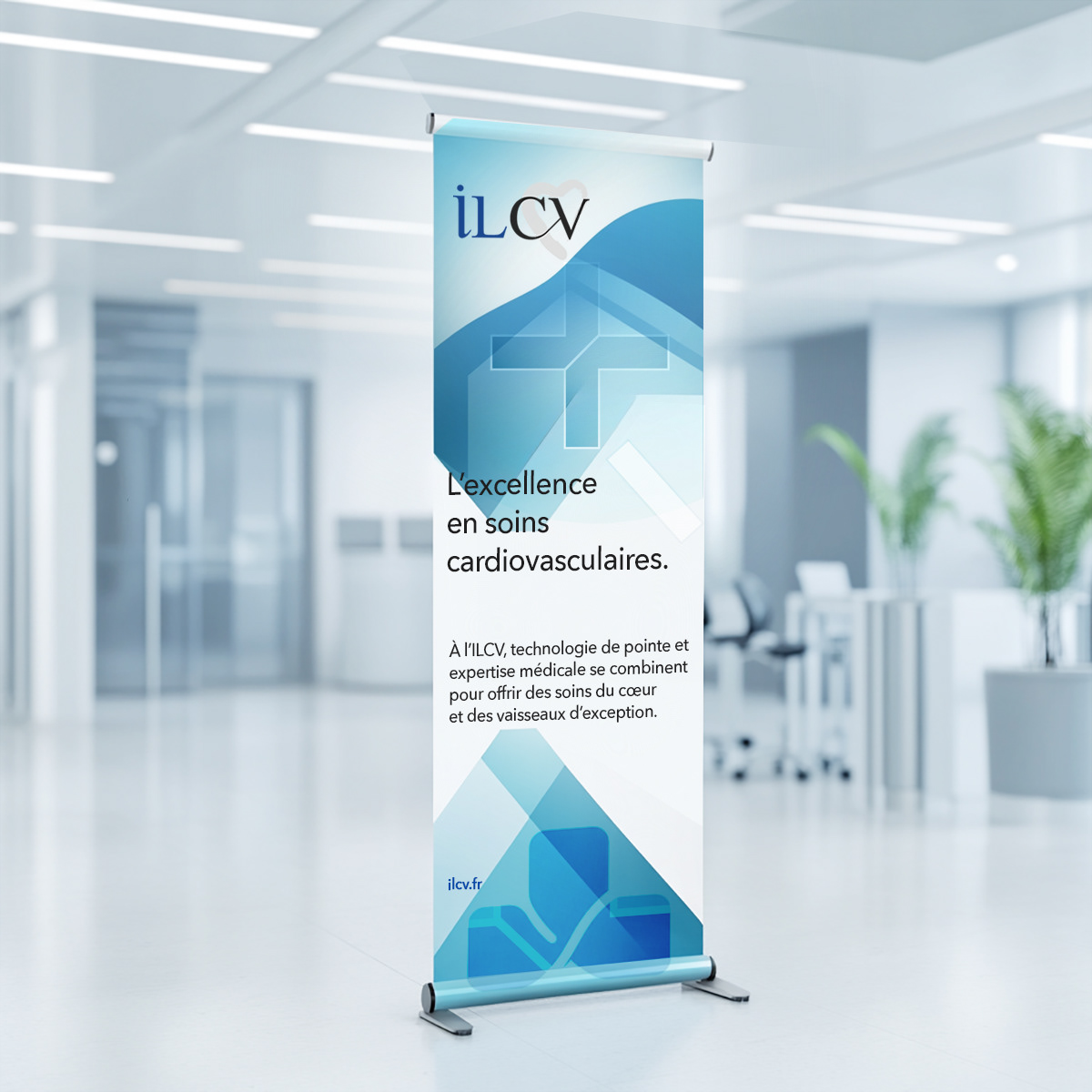
The logo was engineered as a clean, typographic mark,
reflecting precision, stability, and institutional confidence.
reflecting precision, stability, and institutional confidence.












Want to create a healthcare brand that leads with trusted excellence & innovation?


